


Hubac's Historian
-
Posts
3,309 -
Joined
-
Last visited
Content Type
Profiles
Forums
Gallery
Events
Everything posted by Hubac's Historian
-
 Oh my! What are your plans for this battlefleet?
- 132 replies
-
- 1
-

-
- charles martel
- battleship
- (and 1 more)
-
I love that Airfix kit. The detailing is better than on the more recent Revell version. Years ago, I scrapped my first attempt at it, which was somewhat regrettable because the paint was really good. I have a second one, though, and someday I’ll get to doing something good with it. Anyway, I’ll sure enjoy watching you build it!
- 244 replies
-
- 2
-
-
- heller
- soleil royal
- (and 1 more)
-
I wouldn’t say it’s a necessity, but it’s a nice detail if you choose to take it to that level. I chose not to because I was having a difficult enough time re-joining the knee extensions, where I had cut them. After all of that, I wanted to paint and move on.
- 244 replies
-
- 3
-

-
-
- heller
- soleil royal
- (and 1 more)
-
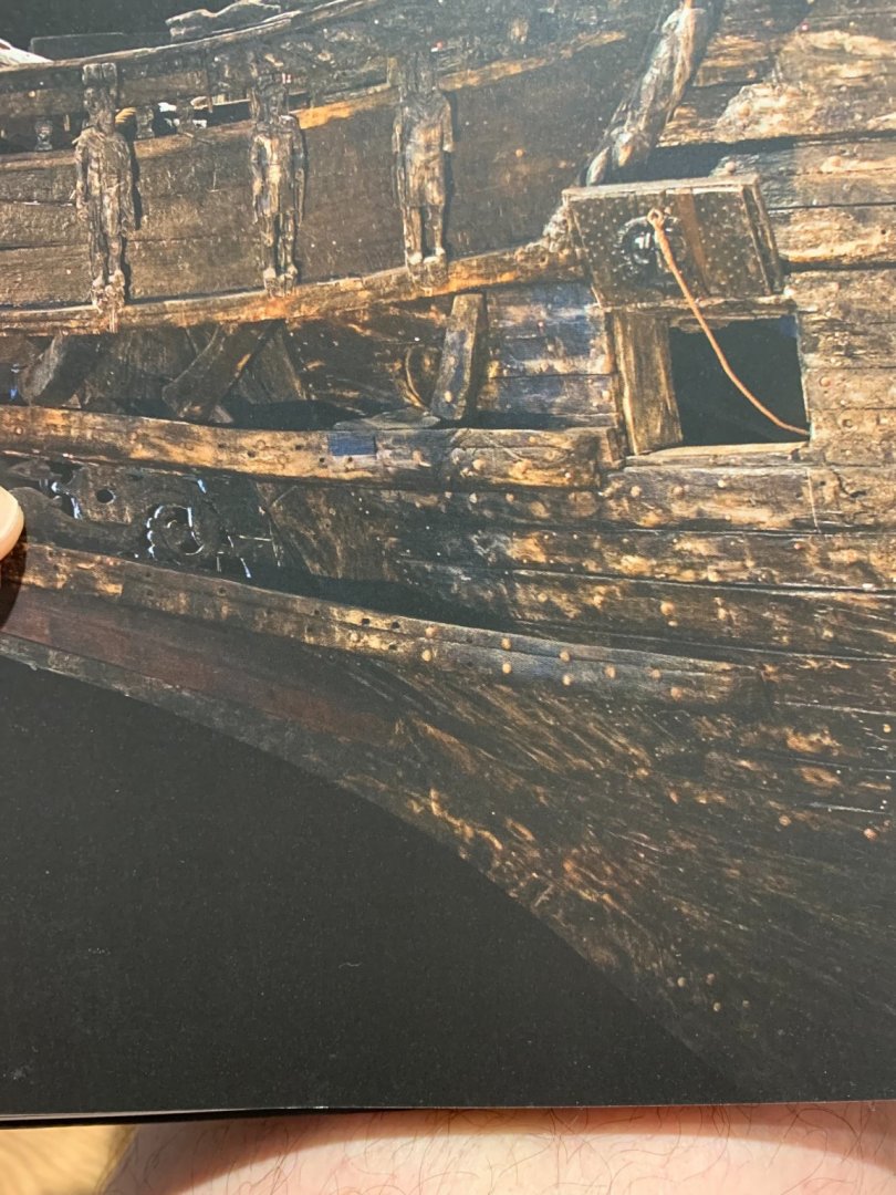
Confirmed, albeit, a little hard to see in this photo from Fred Hocker’s book:
- 244 replies
-
- 2
-
-
-
- heller
- soleil royal
- (and 1 more)
-
It is a feature rarely seen on models, but I think it’s origin predates, even the ships of the first marine. I’d have to check, but I’m pretty sure this breakwater exists in the original timber of the Vasa. It’s purpose is to relieve turbulent stress on the knees of the head.
- 244 replies
-
- 2
-
-
- heller
- soleil royal
- (and 1 more)
-
This looks interesting!
-
will you show us a few pics of the other hulls, in process? Just curious.
- 132 replies
-
- 3
-
-
- charles martel
- battleship
- (and 1 more)
-
My suggestion would be not to worry about changing the hull shape. If anything, you need more of a concavity in this area, so it would be more a problem of subtraction than addition. Sometimes - most times, in fact - I think, the pre-determined kit architecture can’t reasonably be defied. More importantly, though, the Heller shape is close enough to be reasonably representative, here. If you have it in mind to attempt these sorts of plastic surgeries - and there will be a whole host of incongruities, in the bow area, between the Heller Hull and the SP monograph - then, I think you would be far better served carving a solid hull from the SP plan-set, and then detailing that with either wood or styrene. I have always thought that the primary motivator of modifying this kit was that one could use the basic hull shells as a their basis; not having to construct a hull, from scratch, is a huge time-saver. You will want that time later, as the project progresses, because adding all of the missing detail and the particulars of the SP ornamental plan will be extremely time consuming. ... my two cents.
- 244 replies
-
- 2
-
-
- heller
- soleil royal
- (and 1 more)
-
The unfortunate thing, I think, is that the hobby has fallen out of favor with young people. With today’s tech, kit manufacturers could put out product that is vastly superior to Heller’s best efforts in 1977. But, there isn’t a long-term market for it. My son sees me working on the model, all the time, in the evenings. We’re slowly building a model plane together, but he has little drive or inclination to work on the thing himself. It is very difficult to compete with tech for young people’s attention.
-
All great advice - thank you, gentlemen!
-
Well, Mark - that should take the guesswork out of the whole equation. Thank you for the references!
- 2,699 replies
-
- 4
-
-
- heller
- soleil royal
- (and 9 more)
-
I do not think it is accurate to say that blue colors could only be derived from blue stones, prior to 1706. I am pretty sure paints were being mixed with copper oxides to produce lighter blues.
- 2,699 replies
-
- 2
-
-
- heller
- soleil royal
- (and 9 more)
-
I enjoyed watching the feature, Doris. The recognition of your talents is well deserved.
- 1,035 replies
-
- 3
-
-
-
- royal katherine
- ship of the line
- (and 1 more)
-
Coming along beautifully, MD - nice, clean work!
-
I agree completely with Kirill. To be clear, I am not arguing against blue and gold. Blue will still figure very prominently in what I am going to do. My main argument, here, is that it would not likely have been a dark ultra-marine. I have chosen this lighter Cerulean shade as my primary blue, mostly because I like the way it looks against the yellow ocher. Strictly speaking, though, I do not think this is a period-correct color for 1689. All models are a pastiche of correctness and stylistic choices. Some of the paint choices I am making are deliberately to emphasize all of the work that was put into the ornamental program. As a finishing touch, I will buck orthodoxy and make the style of lanterns that I would like, as opposed to what Berain drew. That doesn’t necessarily make them “correct” choices; just my choices.
- 2,699 replies
-
- 5
-
-
- heller
- soleil royal
- (and 9 more)
-
Hello Chris, For a variety of reasons, I have had nothing to do with FB, from its inception. Mark Zuckerberg’s apparent willingness to promulgate dis-information and propaganda under protection of “free speech,” in recent years, has cemented my conviction to never create a profile. Indirectly, he has infected the minds of millions with straight-up nonsense, while simultaneously eroding their ability to discern objective reality. It is a real problem in America, in particular. That being said, I don’t condemn anyone else’s use of the platform. Live and let live; just don’t pee on my leg and tell me it’s raining 😉 If you would like to publish pictures of my model on the SR page, you are free to do so. I’m more than happy to engage with anyone who then decides to join our community at MSW. I don’t know that I will necessarily take on the mantle of “leader of the reds.” What I am doing, I think, is historically plausible; the faded evidence of red exists on Berain’s original drawing, as you noted. I would never say, though, that what I am doing is absolutely the truth. It all remains an educated guess.
- 2,699 replies
-
- 5
-
-
- heller
- soleil royal
- (and 9 more)
-
The objective reality - through microscopic paint analysis of the ship’s timbers - is that she was painted red. Deep, ultra-marine blues were cost prohibitive throughout the 17th Century, as they are made from ground pigment of lapis. Our tendency to want to paint models that color is a conditioned preference, resulting from popular depictions, like Landstrom’s work - as noted by Bolin. If you don’t like red, there is nothing to stop you from painting the ship blue. It is your model, after all, and you only have yourself to answer to. If you absolutely want to know the truth, though - the truth is red.
-
That really helps a great deal, Michael - thank you!
- 222 replies
-
- 3
-
-
- reale de france
- heller
- (and 1 more)
-
Red is the correct exterior color and it makes an excellent backdrop, if you intend to paint polychromatic figures. On the other hand, blue is a more striking backdrop, IMO, if the figures are to be done all in gold. Gold gets a little lost against red.
-
You have to remember that SR has a gangway that connects the forecastle and quarter decks, thus overhanging and obscuring any view of the waist. The upper bulwark thickness could be a little heftier, but the view through the ports does not particularly bother me. I’ve found it useful to make some hard decisions about what to modify; the butcherblock table of a cutwater, with its wholly unrealistic engraving of timbers was worth spending the extra time. Respectfully, I have to say that the upper bulwarks thickness is not for me. I will add spirketting at the deck level, and a vestigial waterway.
- 244 replies
-
- 3
-
-
- heller
- soleil royal
- (and 1 more)
