Hubac's Historian
-
Posts
3,309 -
Joined
-
Last visited
Content Type
Profiles
Forums
Gallery
Events
Everything posted by Hubac's Historian
-
 Wow - well, that is impressive indeed! How do you brush the varnish onto these complicated shapes - without bleeding onto the carving ground - and still have enough open time to apply the leaf? In other words, how much open time do you have before the varnish won’t still be tacky enough to hold the leaf? Or, do you simply blanket the part in leaf and then go back and carefully - ever so carefully - paint the ground?
- 222 replies
-
- 2
-

-
- reale de france
- heller
- (and 1 more)
-
You are doing a fabulous job, Michael. Is that real gold leaf, or a really good facsimile?
-
The 1:10 museum model at Vasa Museet remained unpainted for many years. Eventually, micro-analysis of paint remaining in the ship’s timbers revealed her true colors. You can not hope for a more historically accurate guide to painting the Vasa than the museum model, itself. Fortunately, the AIRFIX kit is among the most finely detailed of all plastic sailing ship kits - at least, with regard to the sculpture work. Although Rex chose to do her topsides in blue, he is a true professional who achieved remarkable results with detailing this kit: https://shipsofscale.com/sosforums/threads/modified-airfix-1-144-scale-classic-series-wasa-c-1628.5559/ This is an indication of what is possible with some research and extra effort. I wish you luck on your build, and look forward to watching it unfold.
-
Congratulations on a job well done!
-
Well, Chris, I think this all sounds like a reasonable plan. The colors that Lemineur arrived at seem to change, a bit, depending upon the conditions the model was photographed in. Here, the colors seem a little too bright: Yet, here, the red seems to take on just slightly more of the orangey cast of the dry pigment you have pictured above: Neither representation is displeasing, or fails to represent the period, IMO. It is unclear to me whether you plan to purchase raw pigment powders and bind them in linseed oil. I will advise against doing that on a plastic model. Without driers, the oil will remain tacky for an inordinate time, and in any case - you are sure to obscure whatever fine detail you want to represent. This is also the reason that I don’t like enamel paints for wooden ship models. They are too heavy bodied. For plastic ship models, acrylics are the way to go - even if you find you must mix several colors to arrive at the shade you want. I like Testors Model Master for my red, random tan, black and white. I can modulate these colors with my wash coats, and their ease of application can’t be beat. Vallejo acrylics are also excellent and come in a broad spectrum of colors. Lastly, I like Citadel for their metallics and ver-de-gris, and other wash coats. I think, with these French Baroque warships there can be a tendency to become overwhelmed by the sheer volume of details that exist for consideration. I encourage you to NOT try and figure out every last thing, right at the start. This was advice given to me by Herbert Thomesan, of Artitec renown. You have a solid foundational plan. You have made a good start of it. Just keep going. So many of these questions and considerations become clearer as you build. In the end, our models are an amalgamation of detail that - considered as a whole - strikes an impression of mostly correctness, or some lesser variation. If you consider the two models that were constructed for the SP monograph, Jose Tusset’s fully-rigged version is vastly superior in the overall standard of execution. Nevertheless, the impression cast by the admiralty version (pictured above) is highly representative of the period. Don’t sweat it too much. If you break it down into manageable chunks, and take your time, the results will be very good. Trust your sub-conscious to incubate the nitty gritty, while your hands are busy with the broad strokes. This has been my guiding philosophy with woodworking, and it applies equally well to ship modeling.
- 244 replies
-
- 4
-
-
- heller
- soleil royal
- (and 1 more)
-
If you look at Lemineur’s overhead plan view of the QG, in fact, you can see that he has pierced the ship side - just forward of the entry to the QG - with a gun port. It seems that stowage of the gun would not present any issue in peace times because it would not be present. In war times, though, if the navy were willing to subject all of their beautiful ornament to cannon shot, I don’t think they would worry too much about the truck wheels scuffing the parquet.
- 244 replies
-
- 3
-
-

-
- heller
- soleil royal
- (and 1 more)
-
I think it is quite possible that the central false window of the quarter gallery, on the middle deck tier, would have had a port piercing through the hull for an additional pair of guns. This would be just forward of the functional toilet. I believe these false windows were actually partially or wholly removable panels. I doubt that they were continuously armed, though.
- 244 replies
-
- 2
-
-
- heller
- soleil royal
- (and 1 more)
-
That is such a strange thing about the replica - the stem running perpendicular to the keel. If that is the case, though, your keel length wouldn’t seem so out of line with actual practice.
-
If I can offer one small critique - ships of the 1670’s would still be steered by tiller and whipstaff. Wheel and drum steerage does not emerge until a little later in the 1700’s. I realize this is a fantasy ship, to some degree, and perhaps not intended to be a strict adherent to historical accuracy. If I remember, the movie ship also has a wheel. Anyway, it is something to consider or ignore, as you wish.
-
If the Concepcion is your basis, I don’t think you can go wrong - your lines look very good, Radek, and convey the fullness of the hull, at midships, that is so apparent in good period portraits of Spanish galleons. This is a very exciting project! It will be fun to see the Neptune round into a realistic form.
-
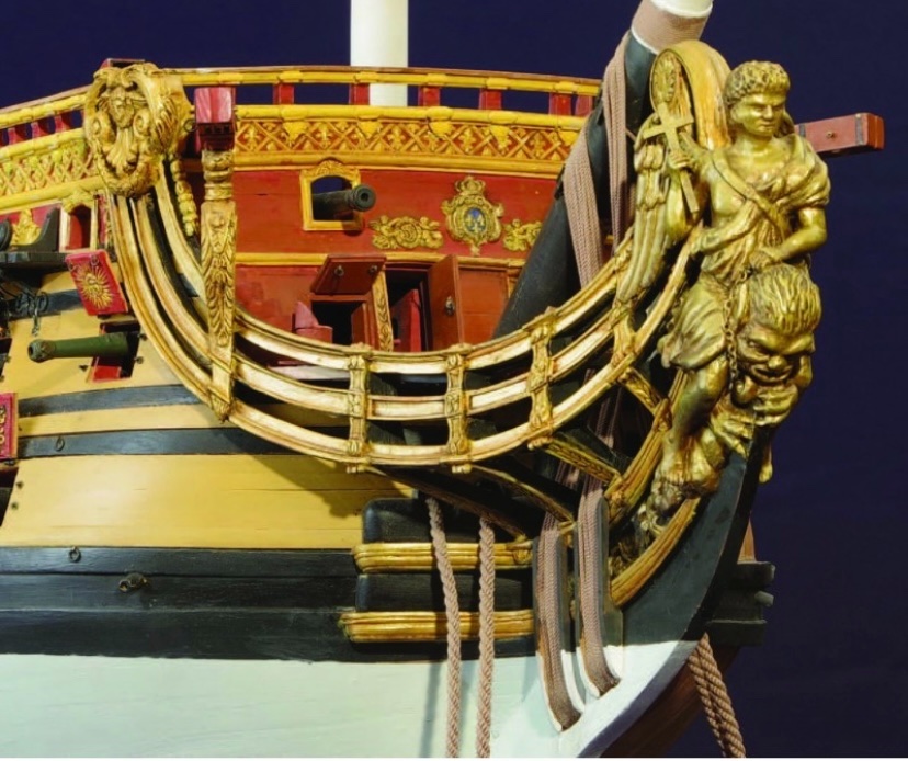
I have always found this replica movie ship to be fascinating. The set designers seem to have drawn much inspiration from early French design from around the time of the First Marine, 1666-1670. The structure of the quarter galleries, in particular, is quite similar to what the French were constructing, at this time. I don't know that the ship is particularly Spanish or French, but it is impressive! I will enjoy watching your progress on this project. If I may encourage you to do one thing, that would be to more correctly scale the figurehead. The movie ship's Neptune figure is so huge, I am surprised she doesn't go down, bow first, under the weight of him.
-
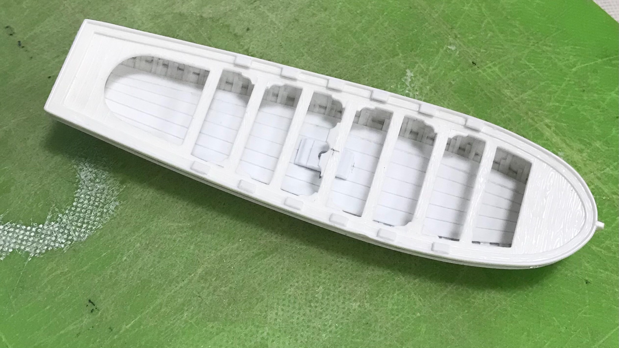
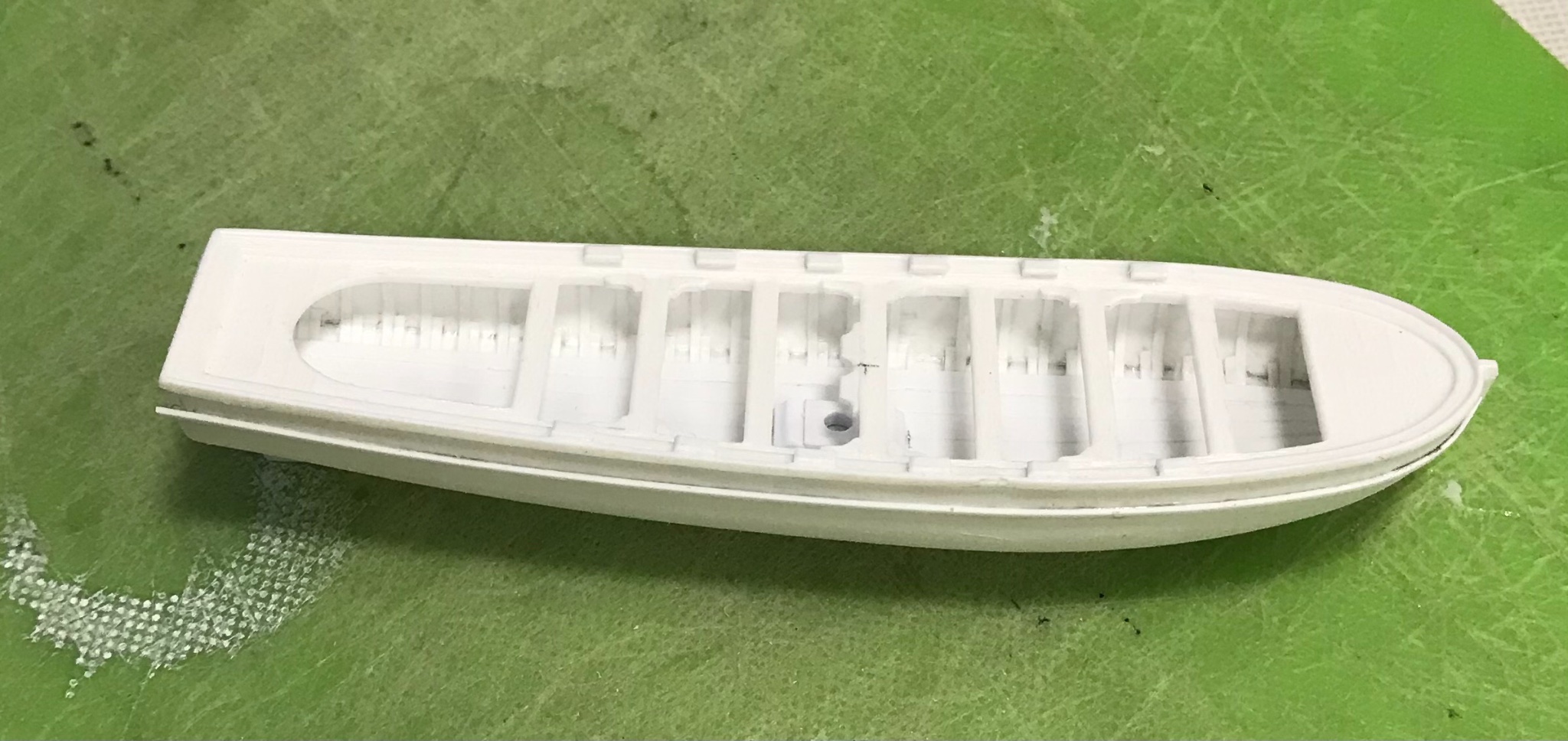
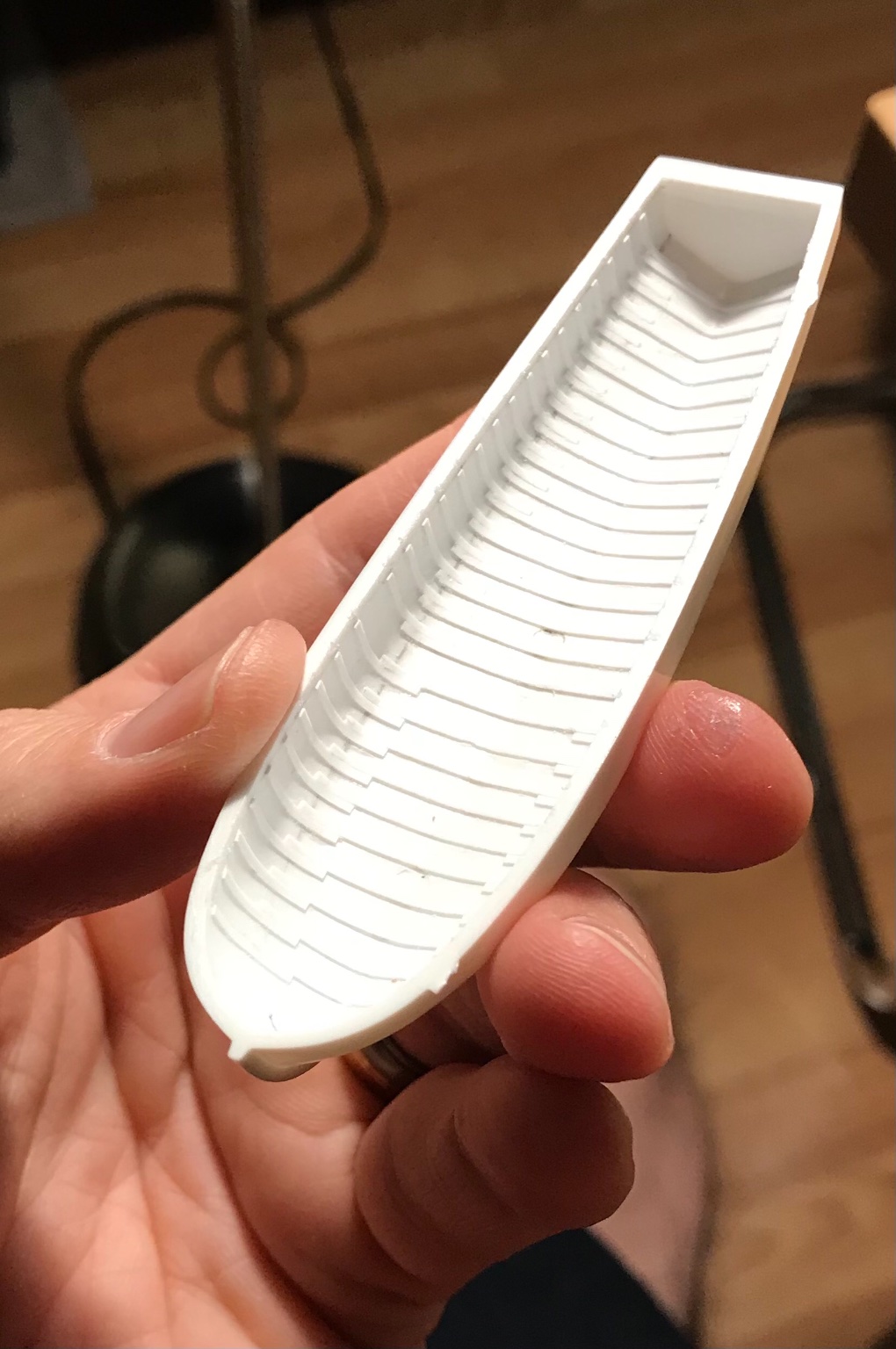
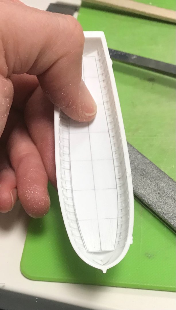
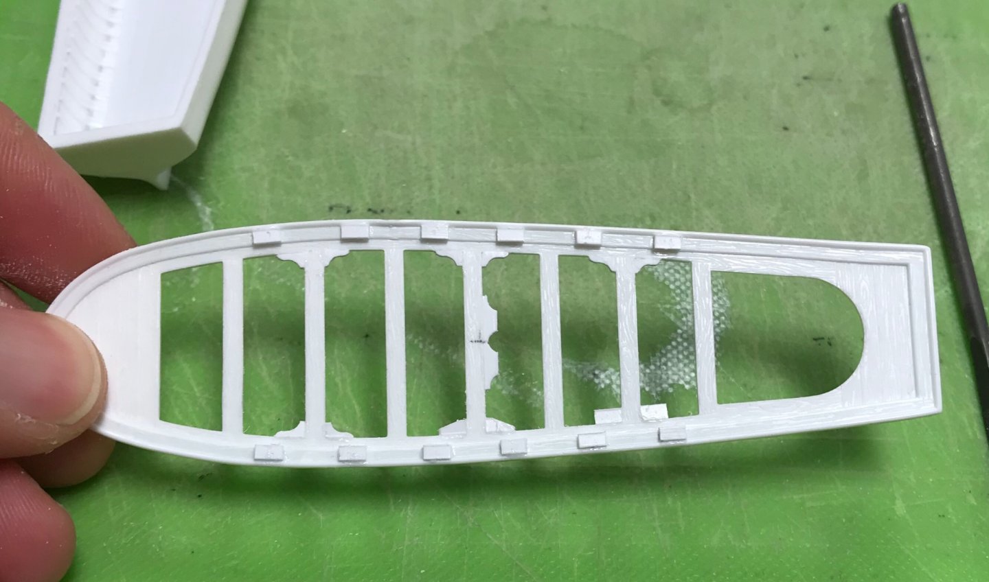
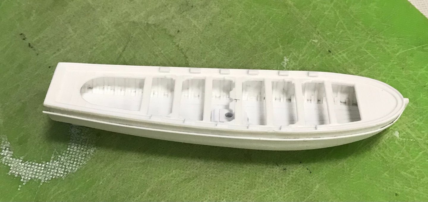
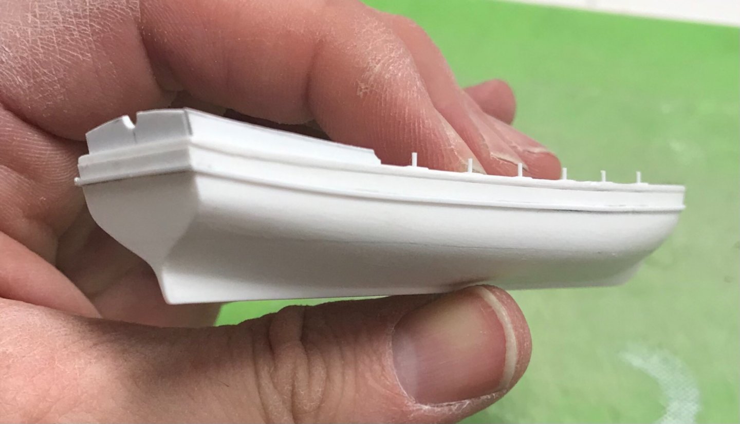
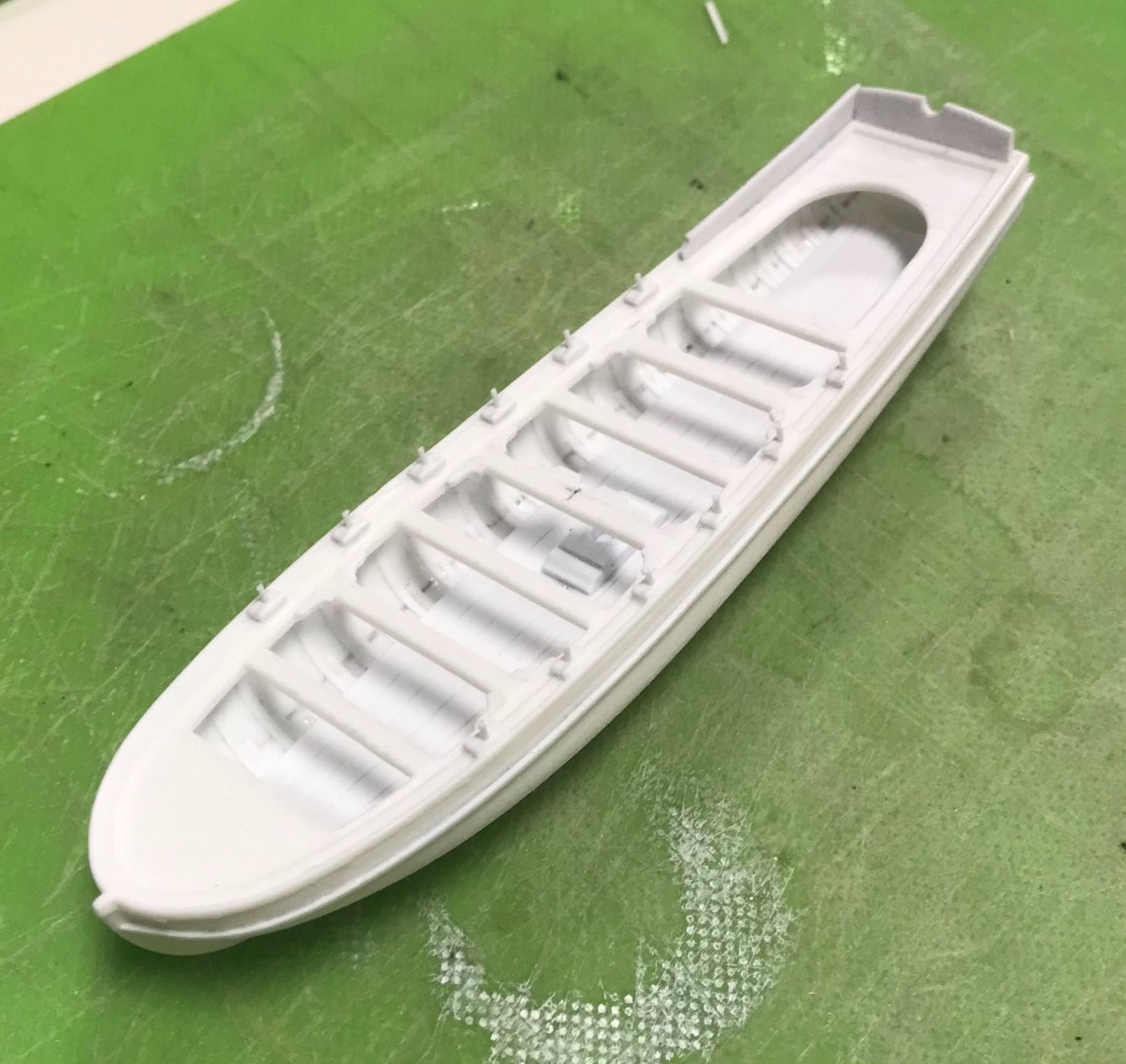
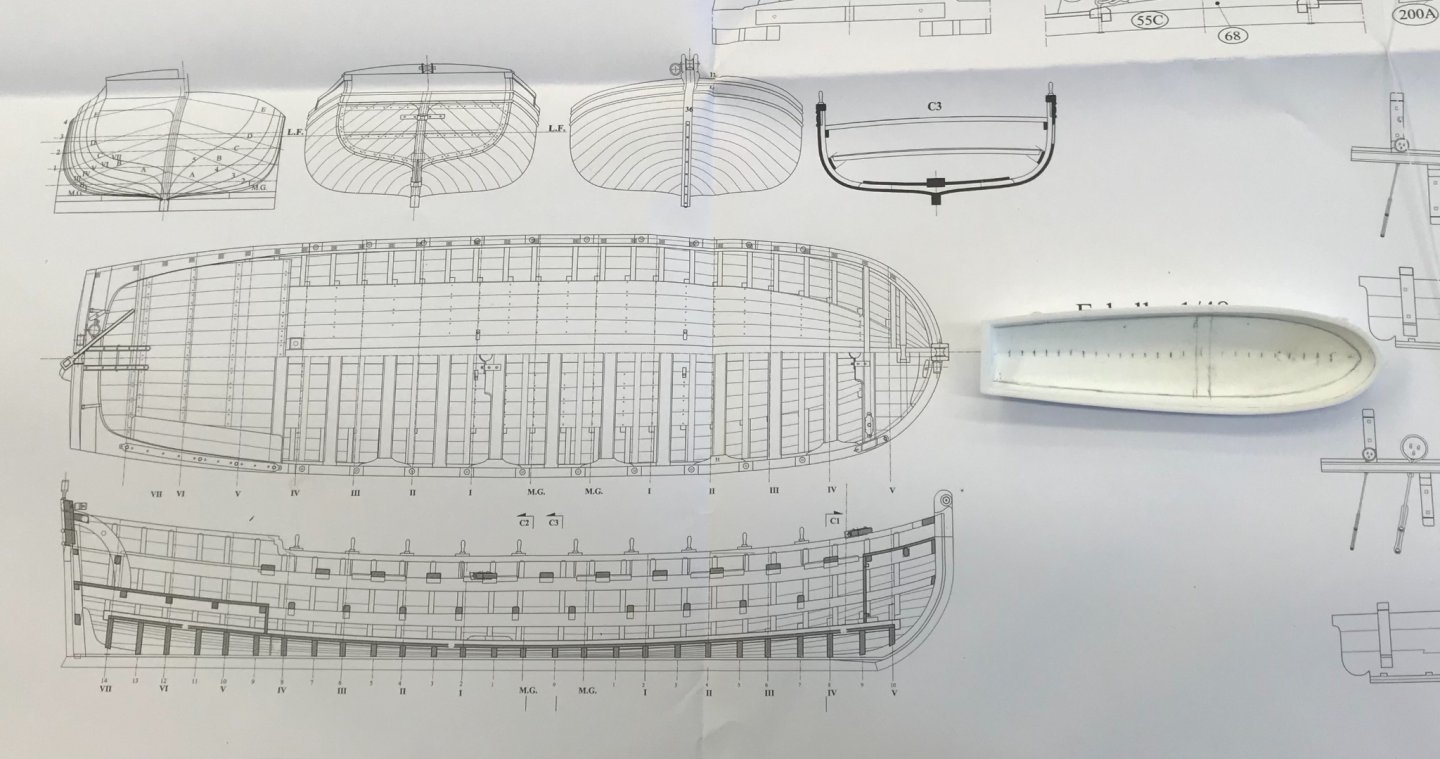
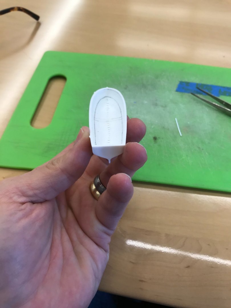
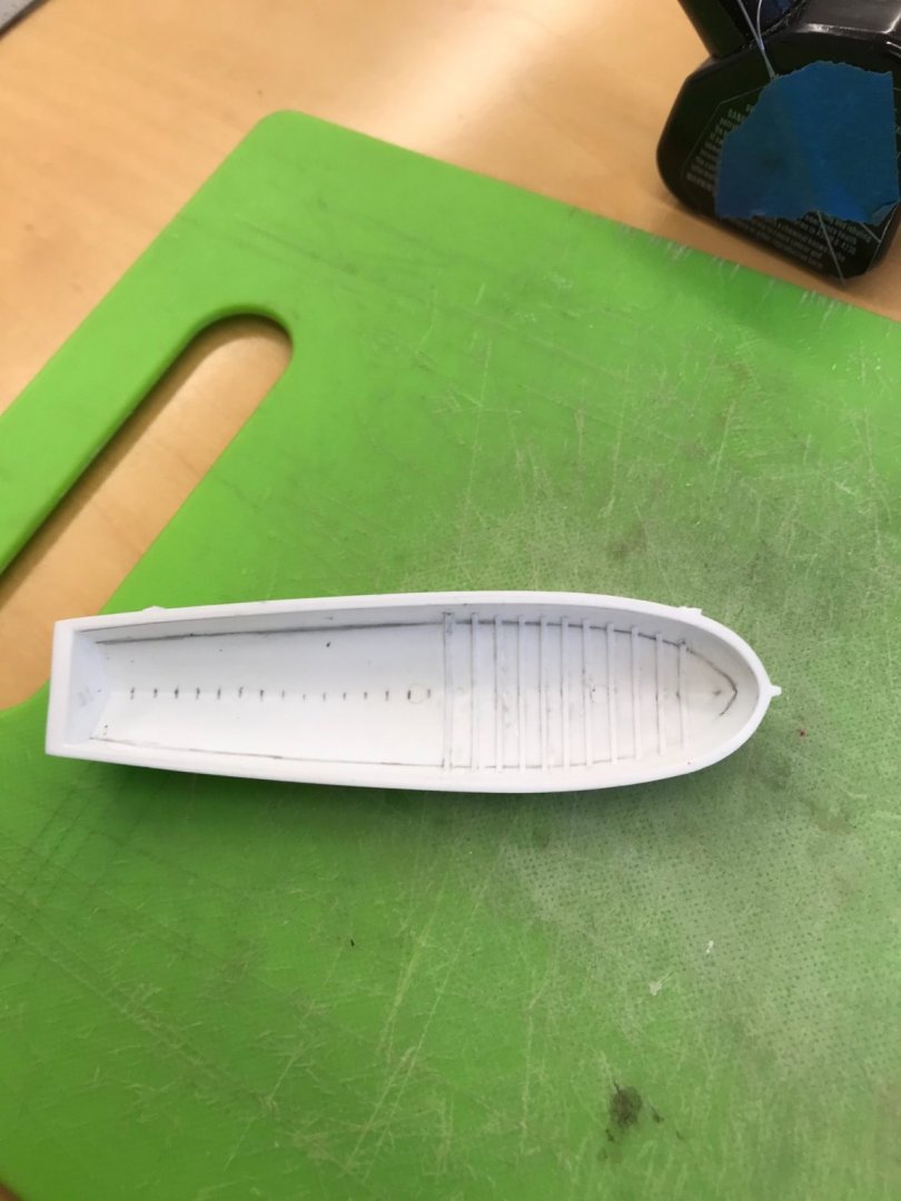
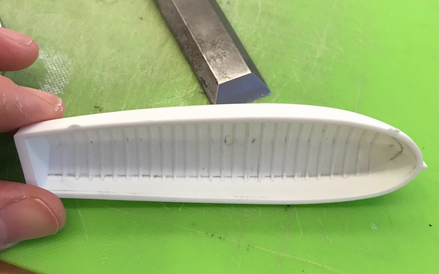
Exactly, EJ - these quarter galleries are quite a challenge with so much happening in a small space. Work on the grand chaloupe continues: Above and below, I’m laying out the floor on a 1/2” grid. I simply took measurements to one side of the centerline, so that ultimately, the doubling of frames would still be visible: I laid out tapering planks: Although the chaloupe is some 30’ in length, I am not going to show any butt joints in the planking. Below shows the series of shaping steps for making the bench corner braces: From lower right to left: the glued-in blocks; angled waste cut made with a triangular file; and final shaping with rounded files. These pieces are too small to work without them being attached, so it is just easier to shape them, in place. Note, also, the oar-lock blocks that have been added. I added a mast step: Note, also, the rub-rail that I added below the sheer. French chaloupes always seem to have an elegantly tapered sheer step at the stern, so I patterned that, and gave the transom a nice rounded top profile: As it stands, this is quite a lot of nice additional detail. After finishing up the other sheer step, I will probably add a metal mast collar, at the bench level, as well as a bowsprit collar next to the stem. The stem top will also be replaced so that it might more realistically buttress the sprit mast running right beside it; the little nub that the kit provides is not sufficient. Work on the starboard QG continues. I made and fit the forward block, and also attached the outer pilasters to these fore and aft blocks: With all of this structure in place, I could begin leveling all of the tops. One really fortunate bit of news: I realized that I could remove a 1/16” from each side of the window panel. Even that small difference significantly reduced the amount of material I would need to remove from the bottom corners and top middle, in order to get the window plate to fit within this parallel space. The pilasters will overlay and cover this join between the window plate and the end blocks. I still have to fair the top edge, but even if I dip into the ornament topping the central window frame, I will probably be able to alter the carving a little to make it work. The gap remaining at the bottom can be filled and faired with a strip of styrene, and the pilaster bottoms can also be filled-in and faired. The bottom gap is only a heavy 1/64”. Here’s the plate, resting in place, to give an impression of what it will look like: Earlier, I made the transitional top mouldings that serve as the base of the walkable, wrapping stern balcony. It has yet to be reduced, in depth (from hull), or scribed to the hull side. The extension, off the stern, is also over-length. I am relieved that it now seems likely that I can use my window plates, after all. Little by little, we are getting there!


- 2,699 replies
-
- 21
-
-
- heller
- soleil royal
- (and 9 more)
-
Whether it’s handwork with traditional tools, or working with technology - engineering the process for producing the results is always the greatest challenge, IMO. The results you are getting with CNC are superb, but the machines will only do what you tell them to. Your talent as a maker of fine things is abundantly clear, even if the means of expressing it is less familiar to most, including myself.
- 589 replies
-
- 4
-
-
- le gros ventre
- cargo
- (and 1 more)
-
Roter Löwe 1597 by Ondras71
Hubac's Historian replied to Ondras71's topic in - Build logs for subjects built 1501 - 1750
Beautiful, clean work, as always, Ondras. It is a real pleasure to watch her come together. -
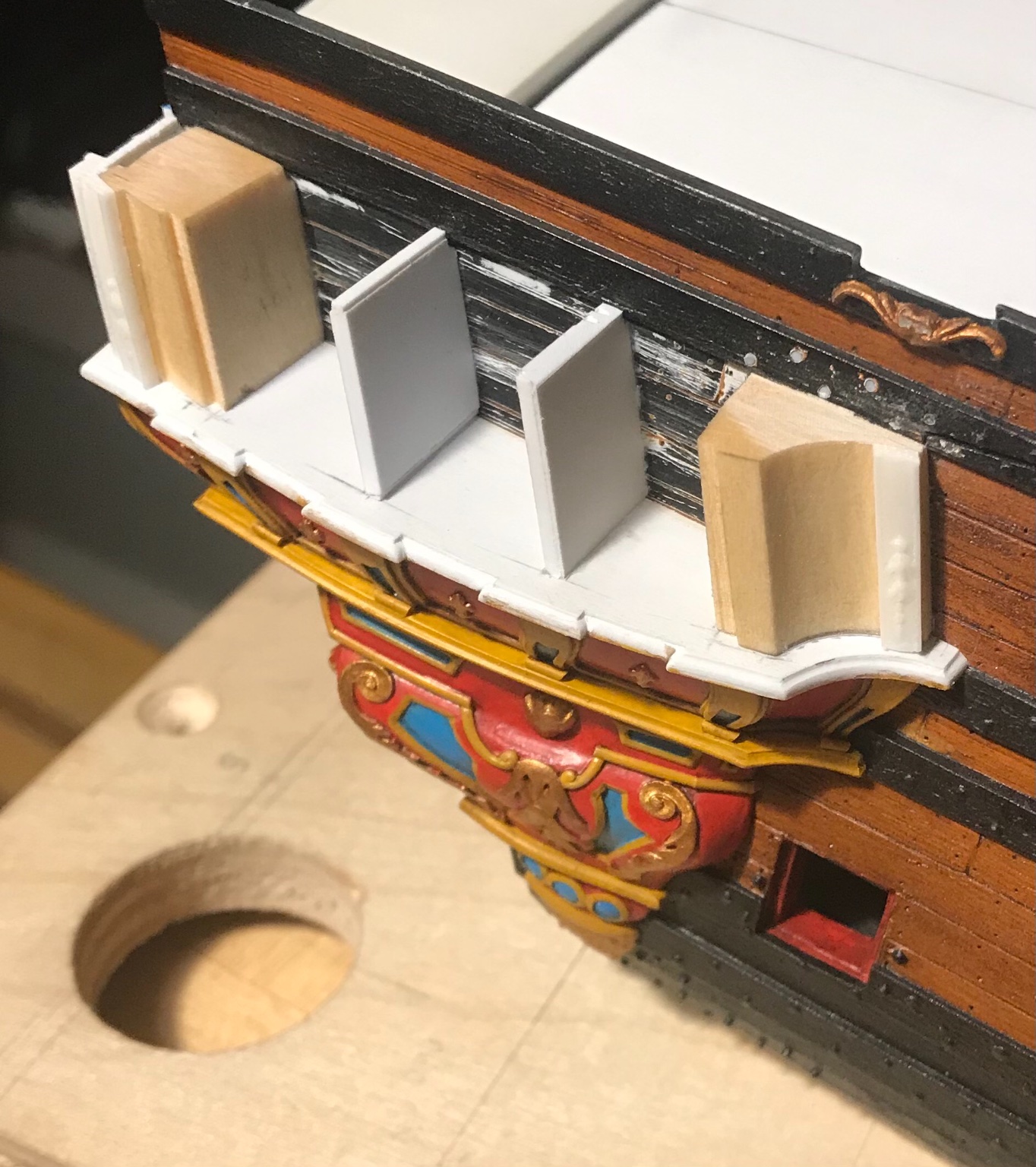
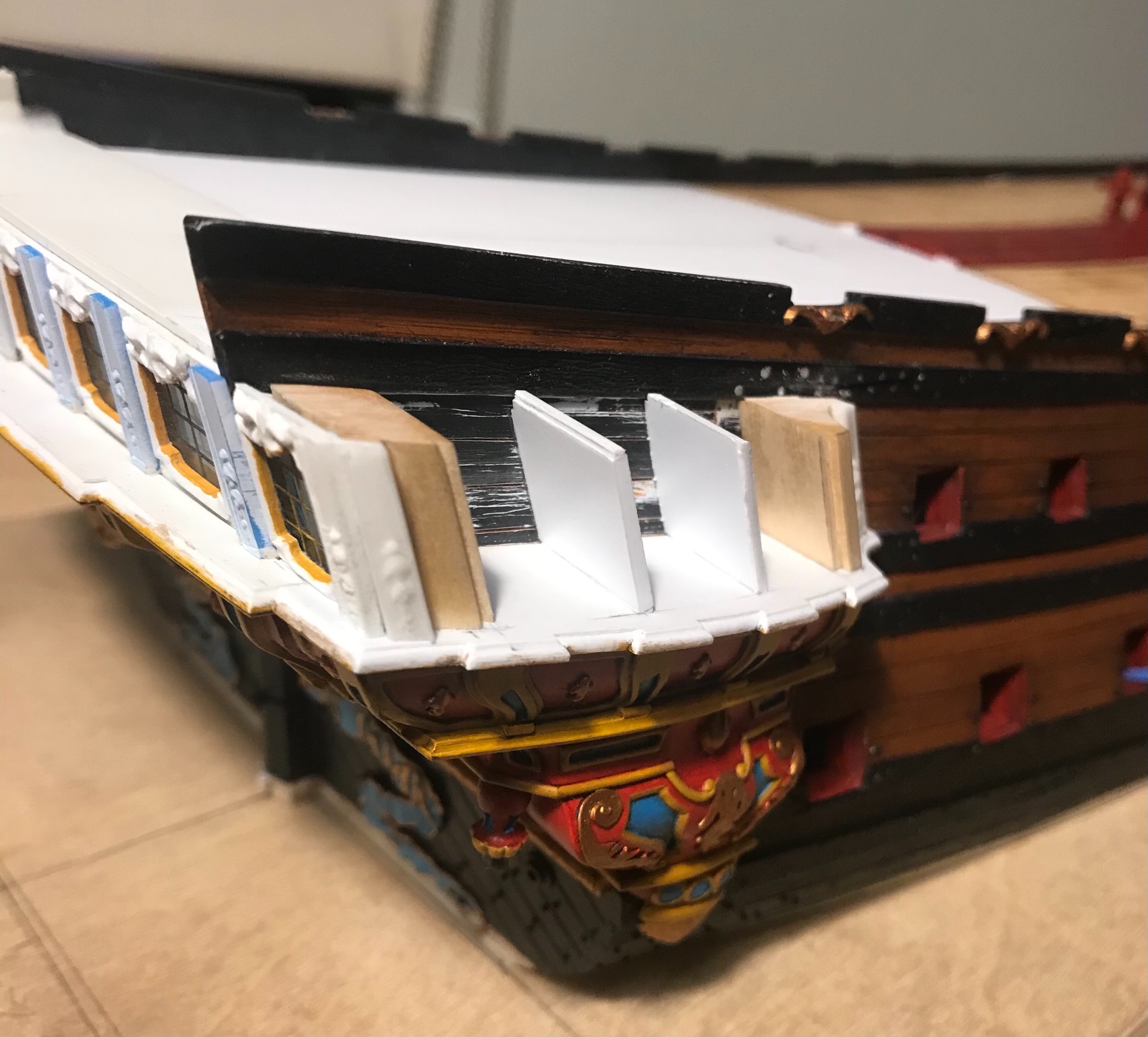
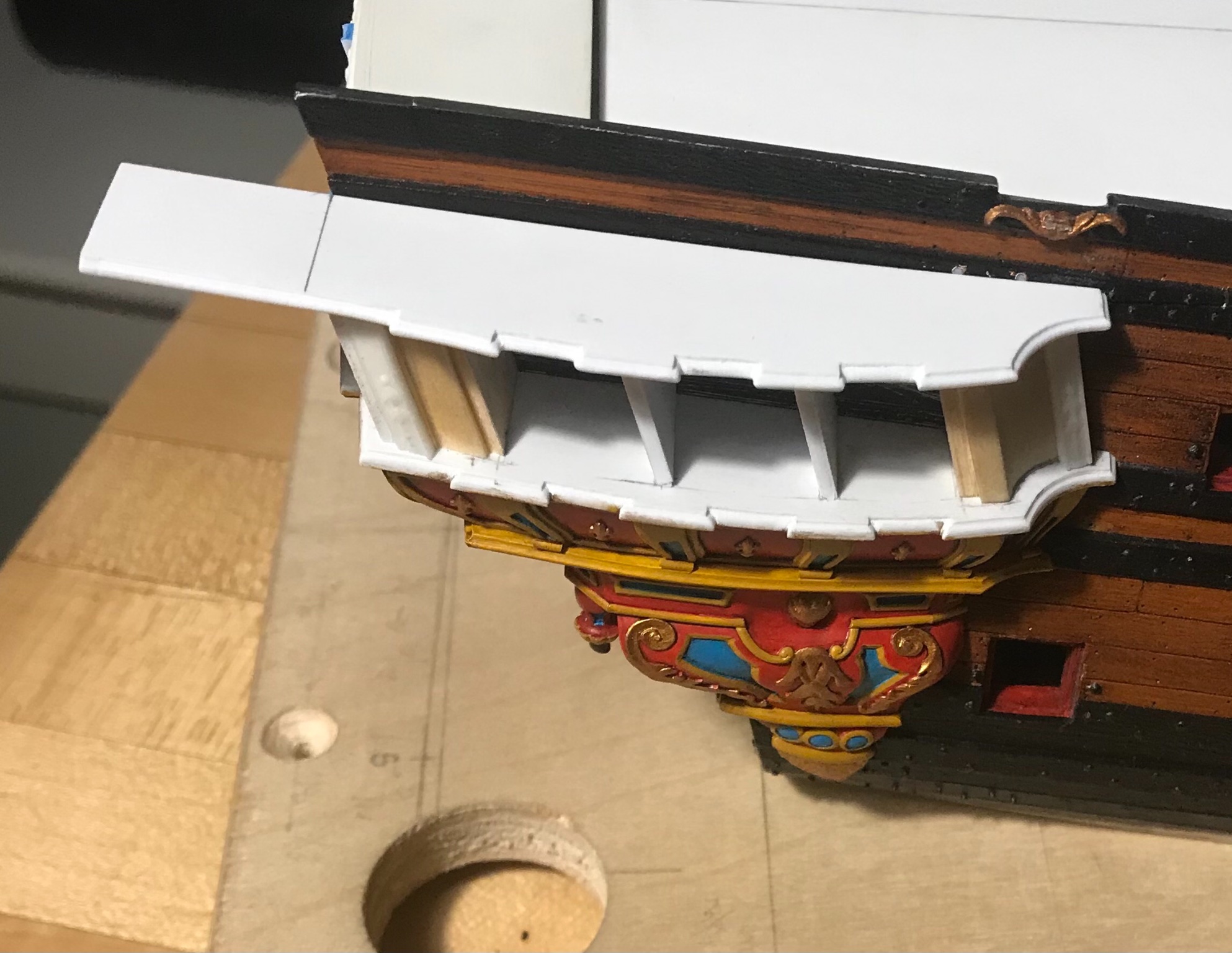
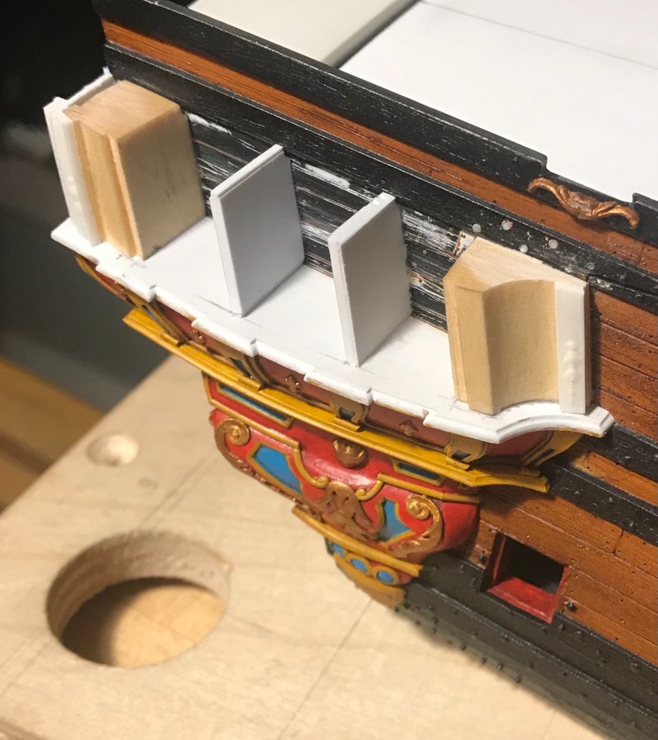
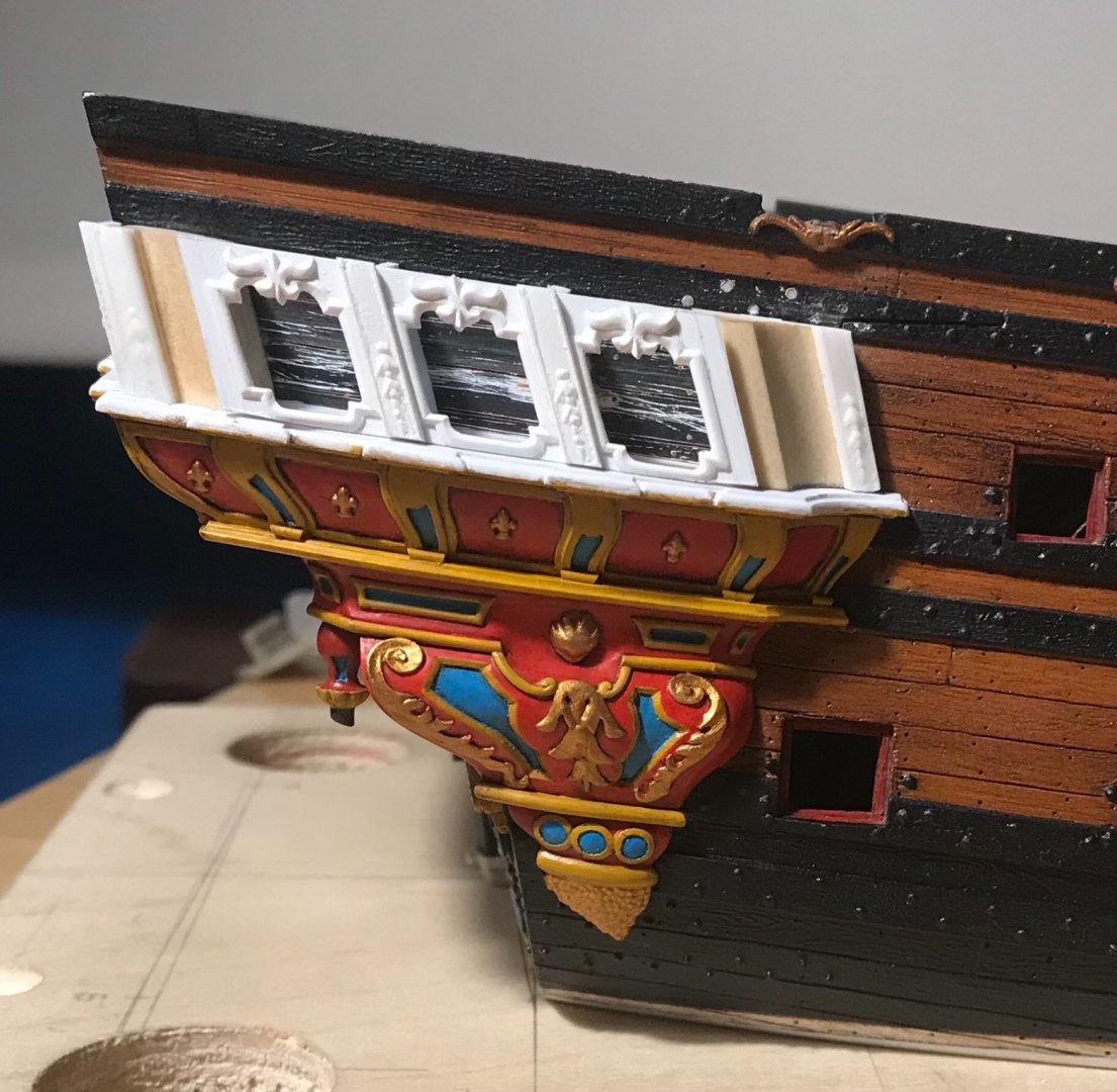
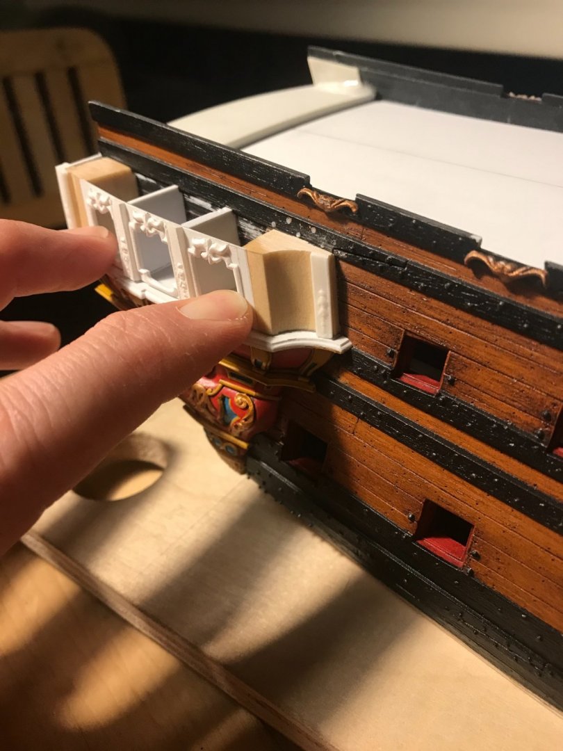
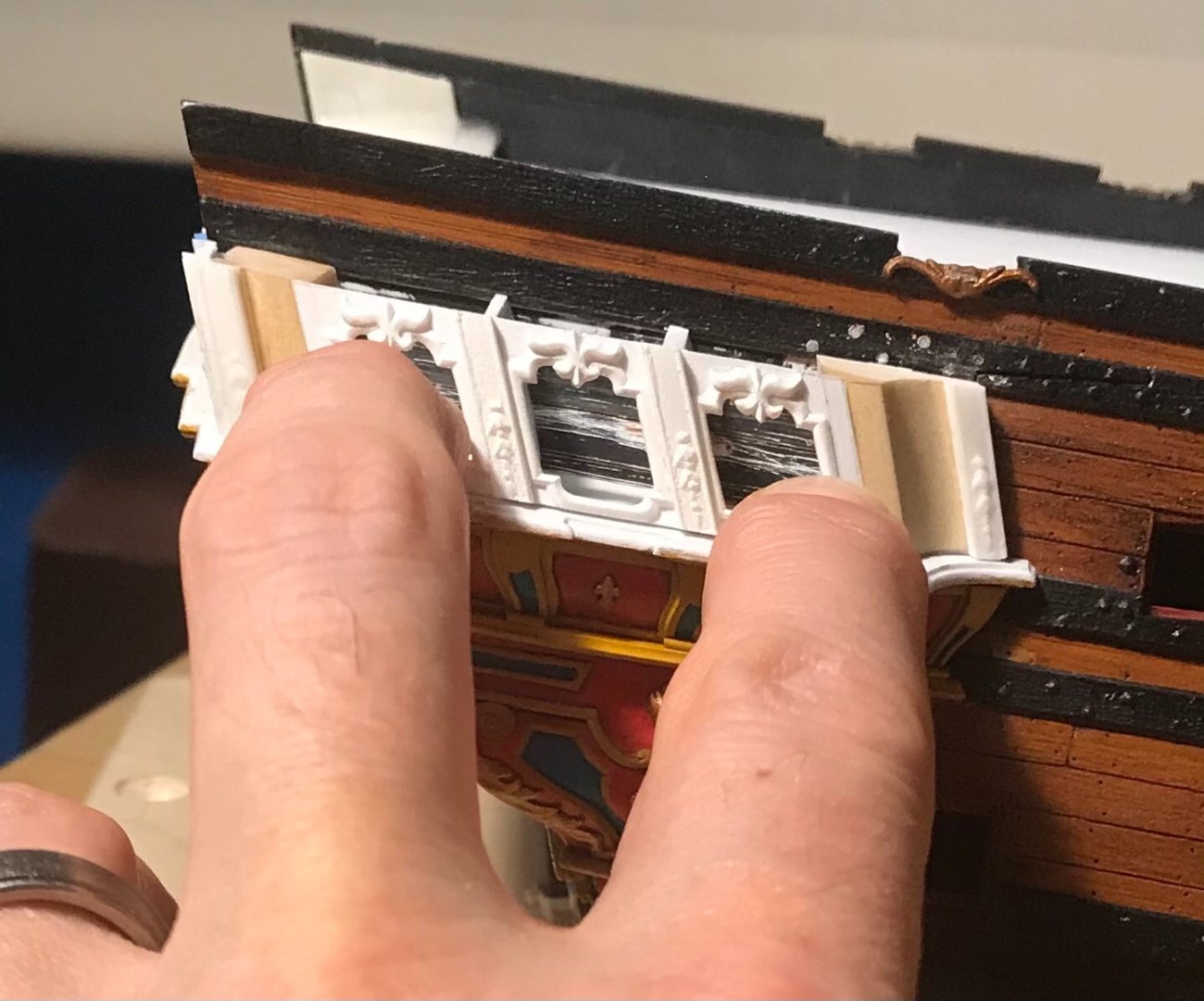
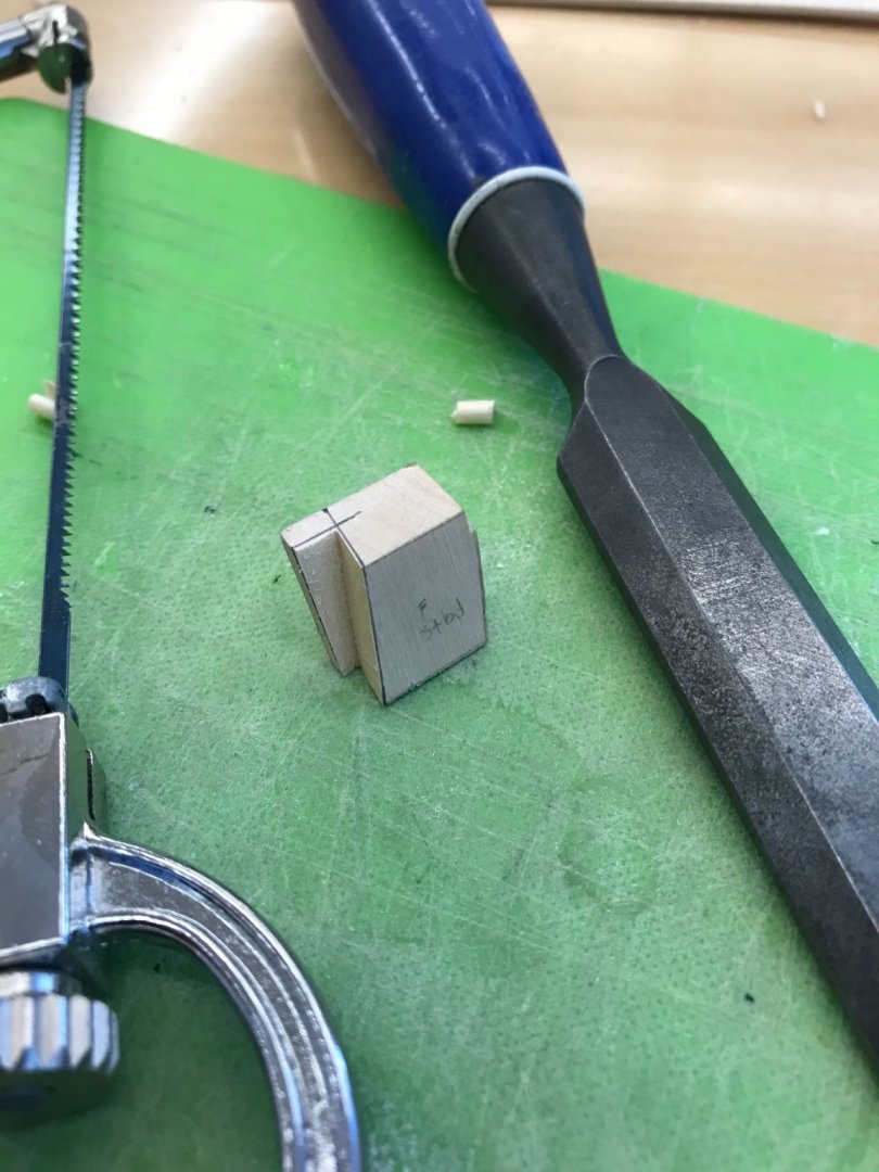
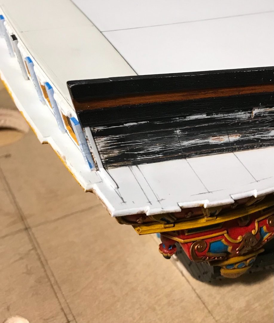
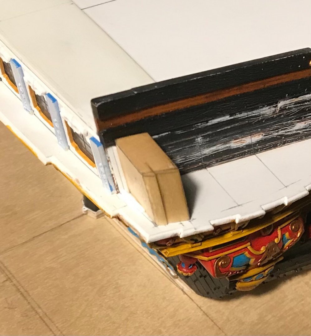
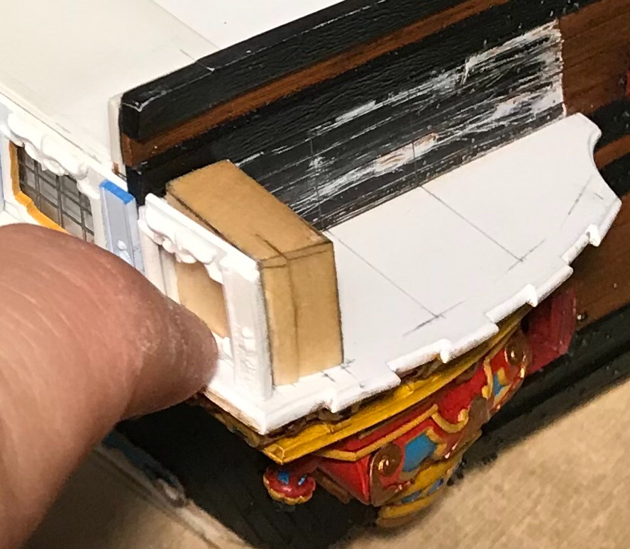
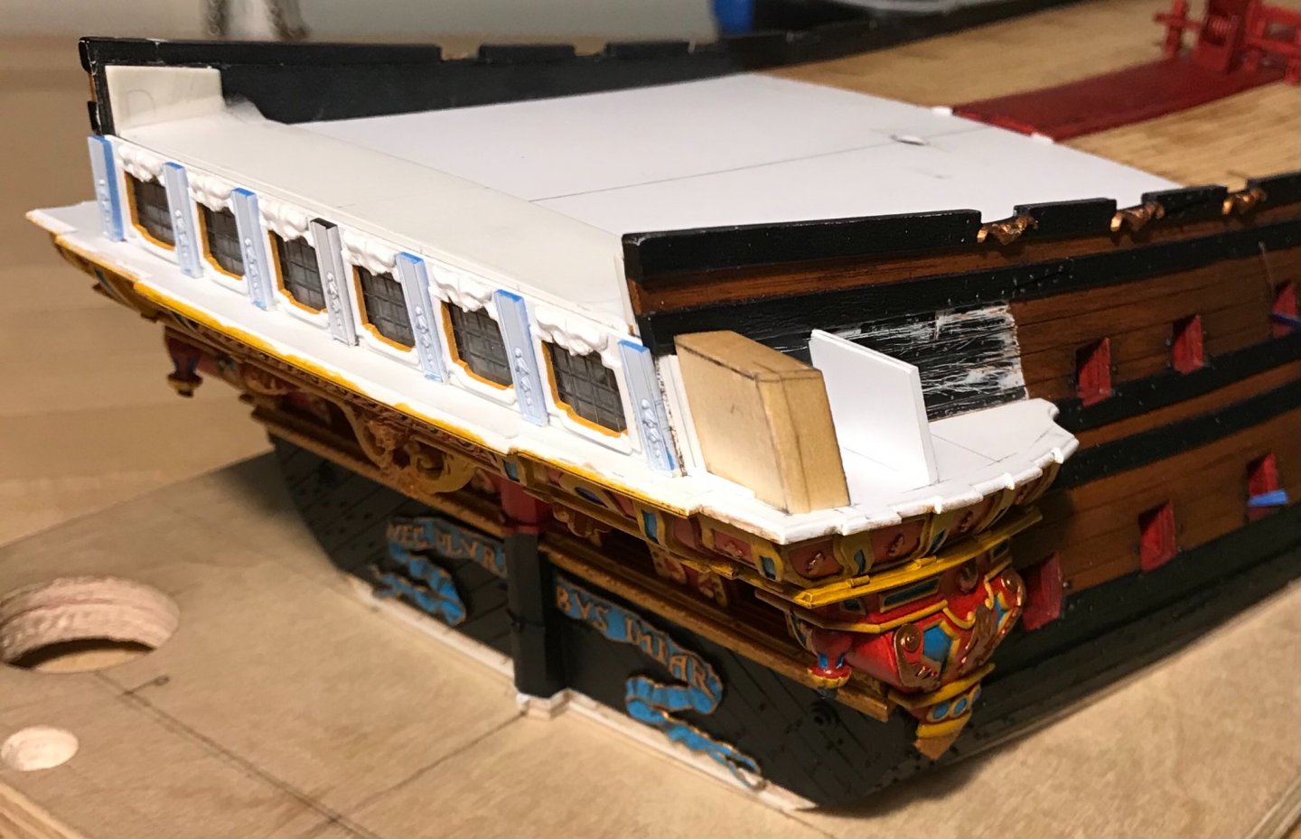
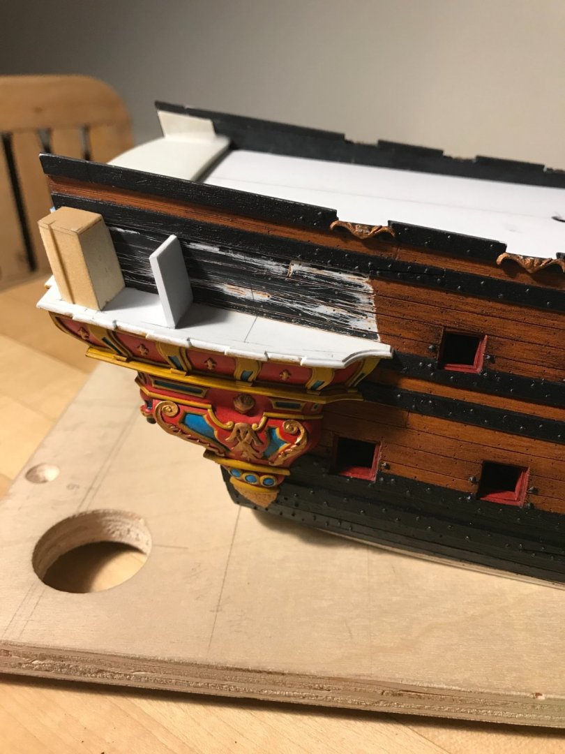
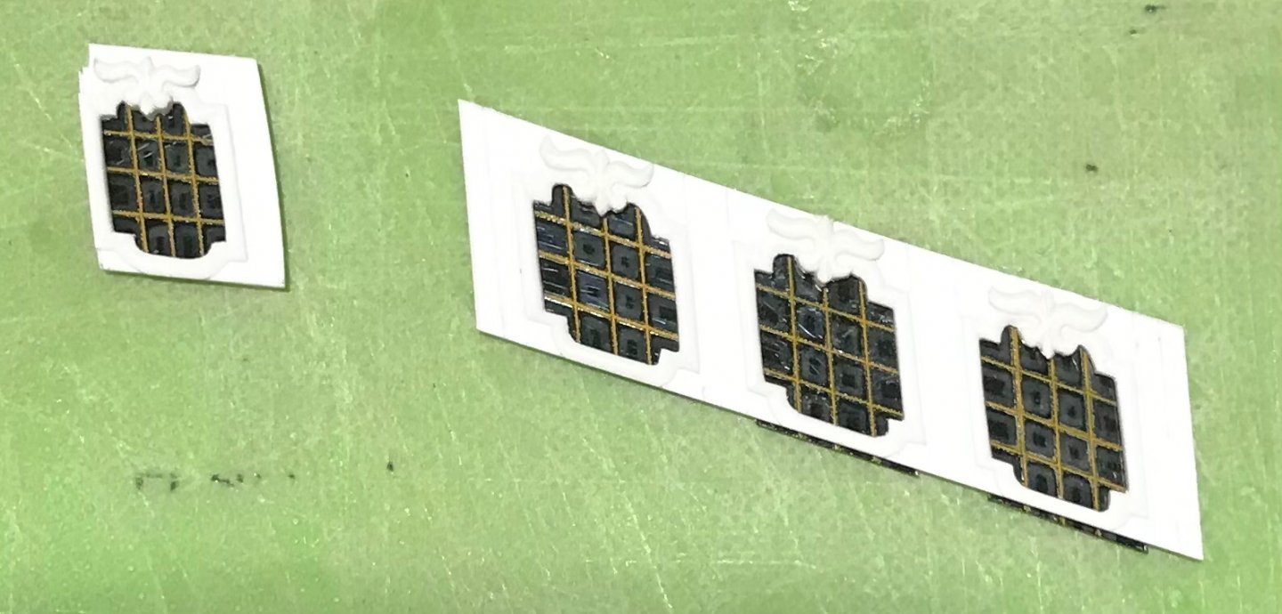
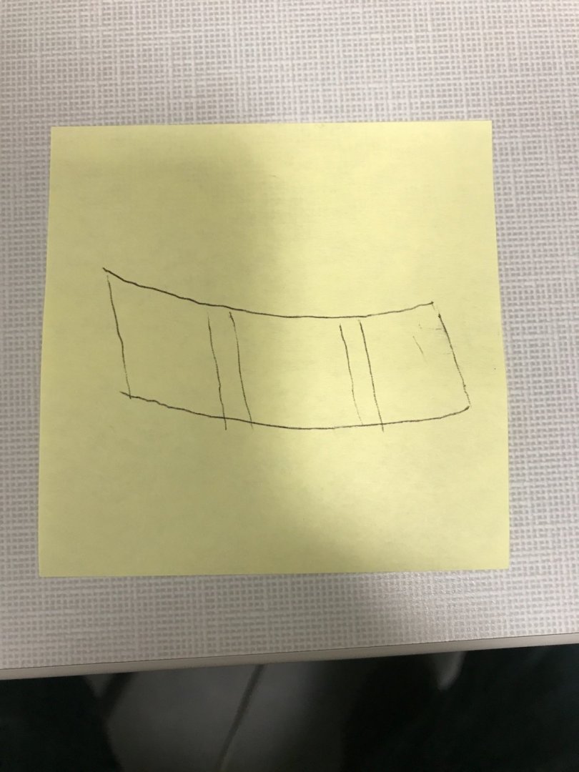
One of my first revelations was that the aft-facing window must also follow the continuation of the stern round-up. If I were to position that window square with the ship’s side, then it would create an awkward angle along where the window bottom edge meets the transitional moulding that it sits upon. The other thing that quickly crystallized in my mind is the difference between drawing something in the one-dimensional plane and the practical application of that drawing to a space that requires compound angles and elegant transitions between curved and flat surfaces. To begin with, the outboard edge of this aft-facing QG window has a subtle curved profile: I very much wanted to include this detail because it is one of the many small details that would be glaring, in its absence. The difficulty is that the three windows of the side QG exist in a flat vertical plane, angled-in towards the ship side, while also conforming to a elegantly bowed horizontal plane (more on that later!😤). First, I decided to provide myself with a pair of glue cleats that would help position these aft windows on their back-raking angle, while also conforming to the round-up: Forward of those cleats are a series of reference lines drawn at a right angle to the ship sides. These lines delineate the aft window backing-block and the window pilaster framing gussets. Next, I needed to make the backing-block. I had some 3/8 stock left over from the making of the lower finishing. This was exactly the right width (according to my flat 1-D drawing that neither accounted for round-up or outboard bowing 😭), to provide room for the aft-most pilaster, the crossed diamond ornament, as well as a 1/16” landing ledge for the aft edge of the window plate to recess into. So, I first cut the back-raking angle onto a piece of this 3/8” stock, and then I scribed it to the tumblehome. With that much established, I could then lay-out the outboard angles and profiles. A photo montage that I hope will explain this better than I can: Here is the fore-face of the block. That shadow-line on the side is the transition from the flat vertical plane of the side windows to the curved pilaster of the stern profile. The aft face of the block has a small styrene spacer strip that abuts the aft-window glue cleat: The aft-window held in place - I am riding pretty high and feeling really good about myself, at this point. I had established the interior depth of the pilaster gussets and made the first of those: Initially, I had cut the height of this gusset too short because I was foolishly thinking that it sat perpendicular to the transitional moulding: it does not, obviously (after finally seeing the reality of it), because the windows have a back-raking angle. No biggie! I simply glued strips of styrene to the top and bottom edges of the gusset, and then beveled them, accordingly. I went to bed feeling accomplished - like “a million bucks!” I woke up, though, to a horrible realization. My window plate - drawn in a flat, one-dimensional plane - has straight and parallel top and bottom edges: In order to conform to this space, that billows outward in a gentle curve, while tipping in, toward the hull, this window plate must actually be shaped like this: Well, that is a bit of a set-back! There remains the small possibility that I may be able to extract and still use the frames that I spent so many hours making. I won’t really know, however, until I complete the underlying framing, as well as the forward block, and can make a cardboard template that fits this space. Maybe the plate I made can be scribed without losing detail. I sincerely doubt it though. My preliminary quick test on a flat surface looks as though I’ll lose about a tapering 1/32” at the bottom ends - which might be doable - but, also, a probable 1/16” at the top middle, which is not doable. I have zero margin at the top, or bottom, for that matter. If that weren’t enough to chew on, I probably made the windows too tall, in the first place, which means that my window panes are probably also un-salvageable. I won’t know for sure, though, until I have a working template to compare against. And things were moving along so nicely😖 More to follow...


- 2,699 replies
-
- 13
-
-
- heller
- soleil royal
- (and 9 more)
-
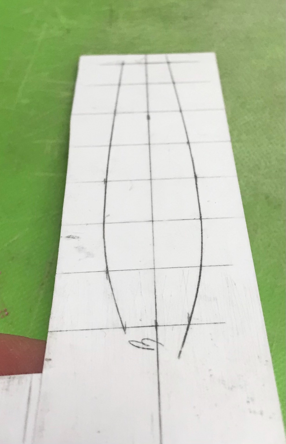
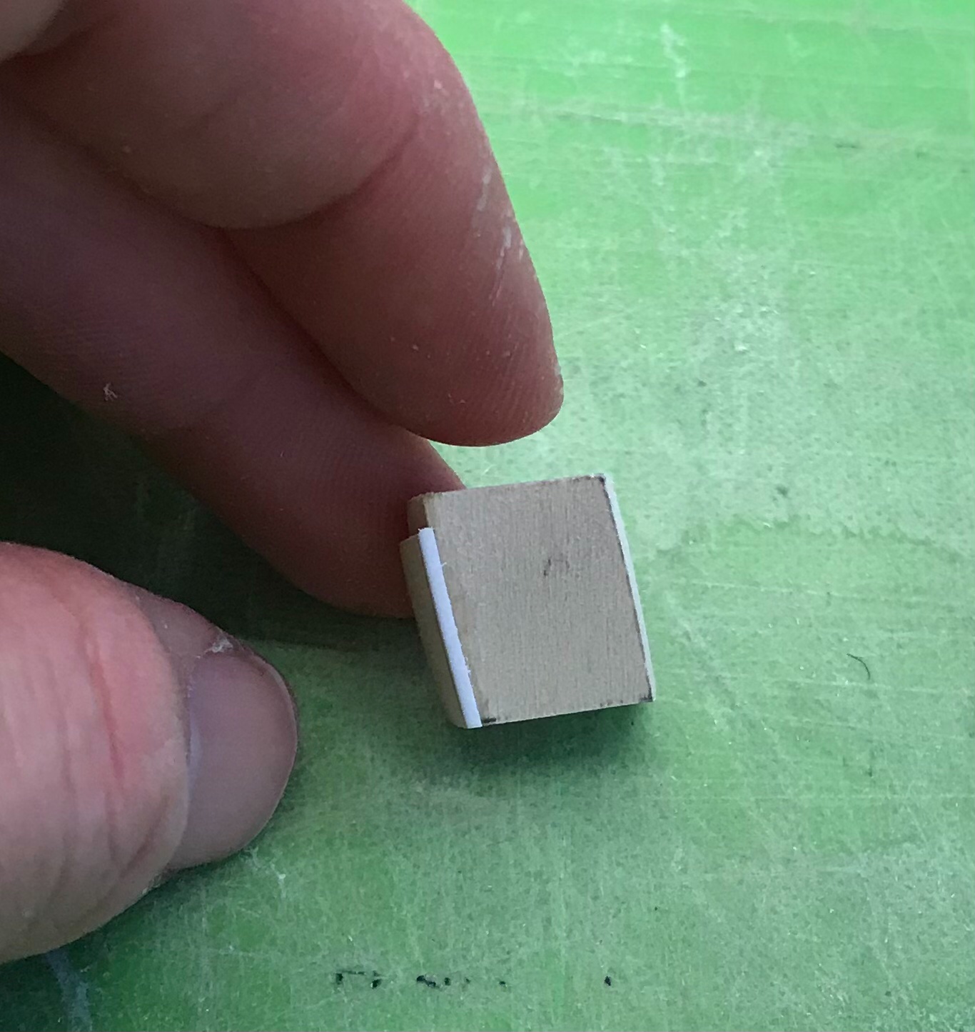
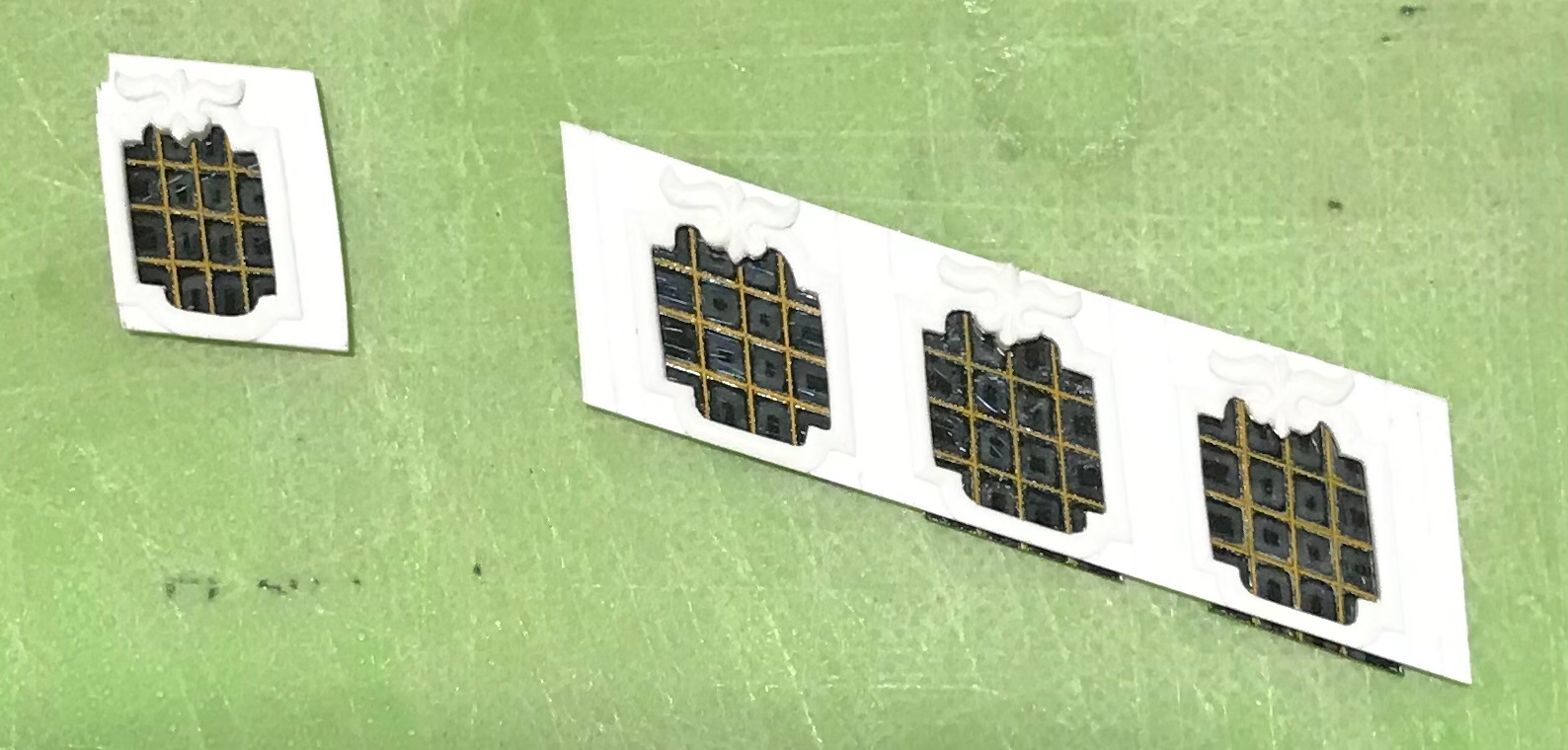
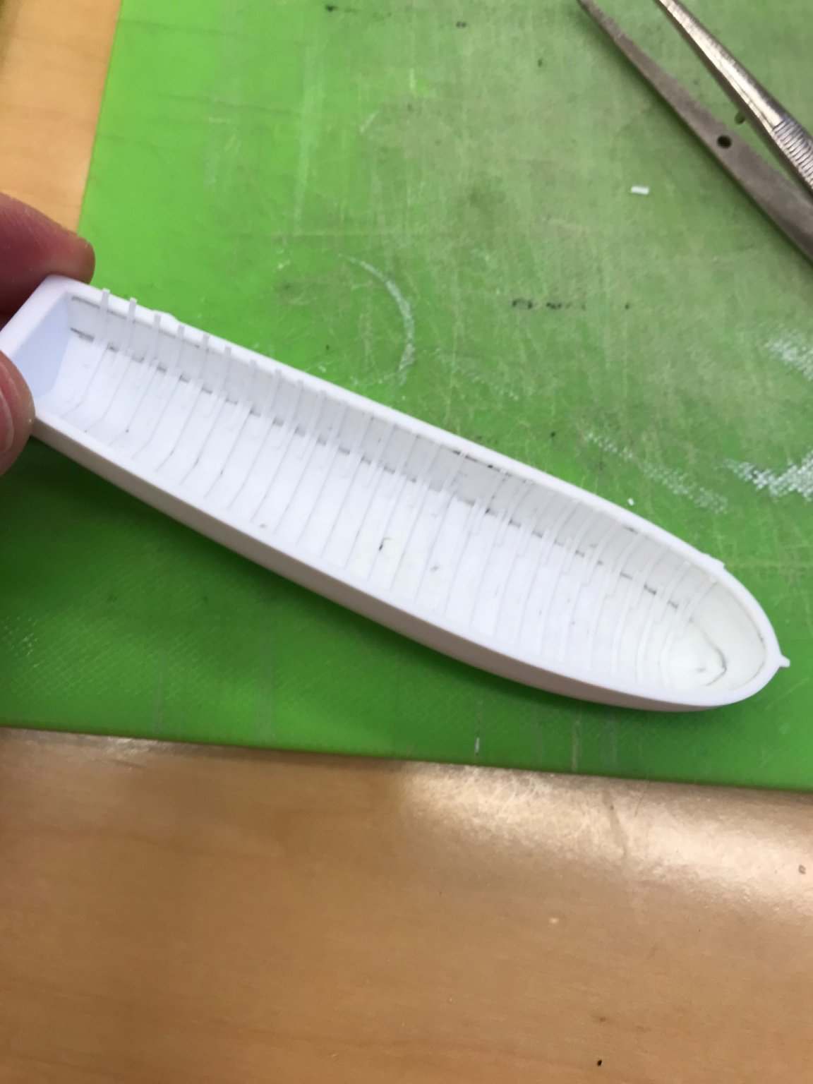
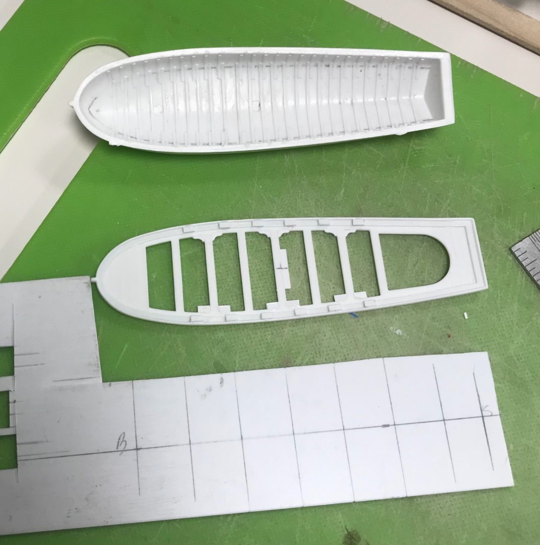
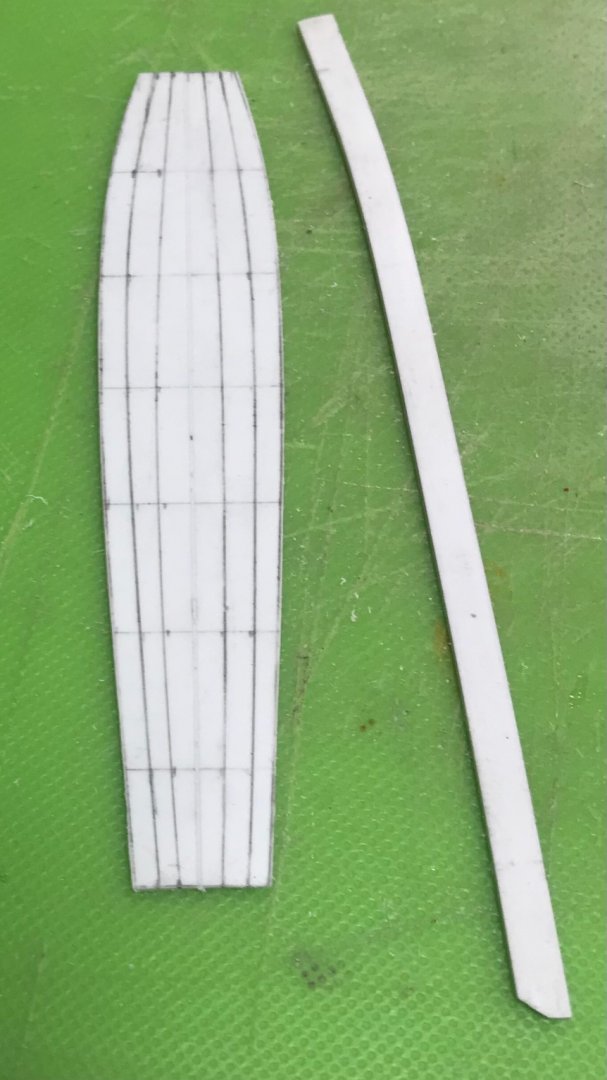
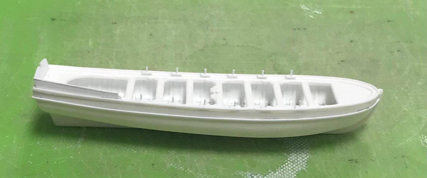
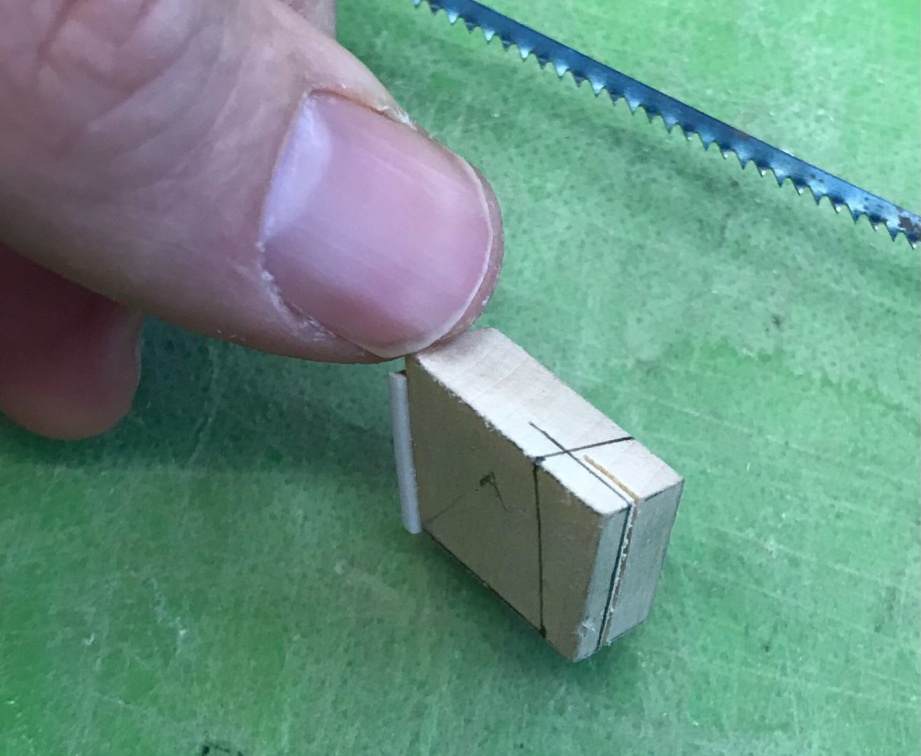
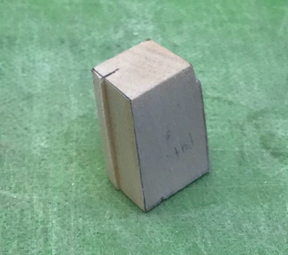
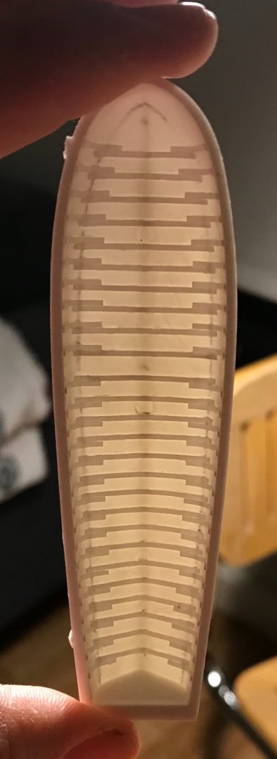
With the construction of the framework of the QGs underway, I was searching for a small-work project to take to work with me for my down-times. There was no immediate need for anything that didn’t require very specific and concrete measurements to work from; parameters I don’t yet have because I haven’t gotten that far. So, I decided to focus on detailing the ship’s boats. I started with the grand chaloupe - the larger of the two. I am using the St. Philippe plans as a reference for their detailing. I won’t go all-in, but I will add frames to the interior, floor planking, a mast step, bowsprit brace hardware, bench braces, oar locks, and a small aft sheer step. A few pics of the framing process that includes floors and futtock top timbers: The plan shows some 27 frames. At 1/8” spacing, I managed 26. Interestingly, at a point just forward of midships, the top timber futtock placement runs forward toward the bow, and aft toward the transom. I’m not really sure why that is, but that’s what the plan shows, so that is what I did. To establish the floor spans of each frame, I simply sketched in a line midway through the turn of the bilge. I did it by eye. It is reasonably symmetrical. The floor timbers will be mostly covered by the floor planking. Once the floors were in, I trimmed their ends for a fair run, fore and aft. Then, I started with the top timbers: I had traced a line one heavy 1/32” below the sheer. I trimmed my top timbers to this line because the kit bench framing has a glue lip that requires clearance here. These glueing operations are inherently messy. The frames are cut from .011 x .033 styrene strip stock, and one must apply a liberal amount of cement to afford enough open time that the small pieces can be tweaked into position. After the floors were all in place, and the glue had cured overnight, I came back and scraped away the excess glue with my 1/8” chisel, scraping on a skewed angle between frames. This is tedious, but it works well enough, and ensures that distracting glue ghosts won’t telegraph through the paint. I have decided that I will not be placing these boats on the main deck, over the gratings. I spent too much time adding camber to those gratings to cover them up. Instead, they will be set into the sea and tethered to the ship through the stern chase ports, as is often shown in VDV battle portraits. In light of their less prominent placement, all of this detailing is probably excessive, but I am a man of excesses, afterall. In the evenings, I have been building the underlying structure of the QGs. It made sense to me that the logical starting point would be the aft-facing window, working forward. I will try not to, but I could write a book about this aft corner. Let me post this much, and then I will continue in a second post. Cliffhanger alert: my so carefully rendered plans were not as carefully considered as they should have been 😱


- 2,699 replies
-
- 12
-
-
- heller
- soleil royal
- (and 9 more)
-
Hi John - your fleurs look very good. I like the low relief that the gel medium provides. As for the aft upper bulwarks, you will have much more space to create an ornamental program of your choosing, if you eliminate the continuation of the many drift rails, emanating from the timberhead sheer railings. This is what I had to do, in order to create my frieze which, nonetheless, is informed by the run of the drift rails that I sanded away - if that makes sense. What I’m trying to say is that their presence just takes up too much space. The fitting of the beakhead bulkhead (and the stern plate, for that matter) reflect the practicalities of commercial kit manufacture. They both overlap the edges of the upper bulwark pieces. This is not reflective of actual practice, whereby the planking of the upper bulwarks would overlap the plank ends of the beakhead bulkhead and stern planking. Heller, I suppose, reasons that this convenience of manufacture, and simplification of construction is mostly obscured by the headrails and the quarter galleries, respectively. For my part, I went to some trouble to recess the beakhead bulkhead within the upper bulwark pieces, even going so far as to scribe plank ends into the upper bulwark pieces. I did the same, at the stern, where I am laying individual styrene planks, flush into these hand-cut rebates. The plus-side of doing all of that are joints of better structural integrity with much less need for putty fillers. On the downside, though, very little of my effort at super-detailing, in this instance, will be visible on my finished model; only a small bit of the lower transom, beneath the transom moulding and whatever one can see above the beakhead roundhouses. All that considered, I am still happy with the effort because it resulted in more accurately scaled plank-ends, and it is reflective of actual practice. It is an awful lot of trouble to go to, though, for a minor detail. I certainly would not have done this for the stern upper bulwarks, if I had realized, back then, that the detail would be covered by pilaster mouldings. I would simply have firred-out glue cleats to the inner surface of the bulwarks for attaching my plank ends. Anyway, the modification process can go on, ad-infinitum, but you must decide what is worth your time and effort, and what is not.
-
To the three Marks of distinction - thank you very much - and a big thanks to you, as well, John and Bossman. I am always in pursuit of a model that will withstand close scrutiny, despite having numerous flaws and compromises in construction. I am equally indebted to everyone here for all that they have shared with me on this project and their own.
- 2,699 replies
-
- 2
-
-
- heller
- soleil royal
- (and 9 more)
-
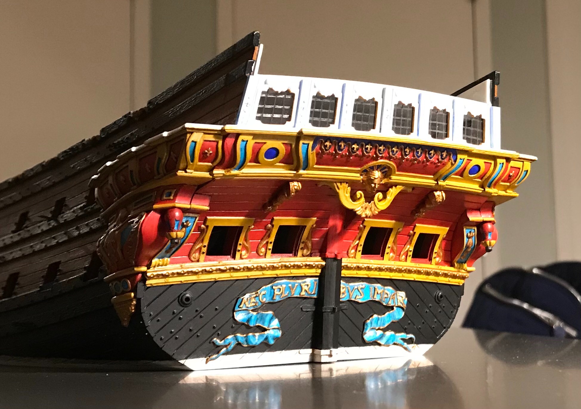
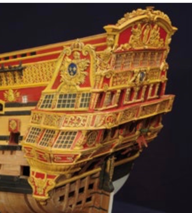
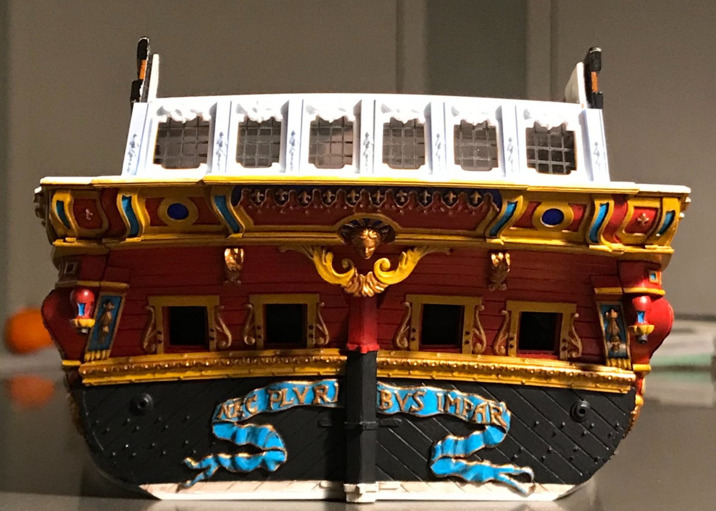
EJ, Kirill and Dan - thank you very much! Well, it has been a slow and painstaking process, with much re-touching, but the lower stern is finally painted: From here on out, the paintwork should not be so challenging. Thank you for stopping by!

- 2,699 replies
-
- 20
-
-
- heller
- soleil royal
- (and 9 more)
-
Aha - thanks! ‘Much appreciated.
-
Thanks for the reference on the pliers, Mark. I was hoping, though, that you could show a picture of the micro nippers.
-
The chandlery is all pretty reMarkable, if I do say. This problem of rings has been vexing me for a while now. The parallel pliers are a great help, and I will add them to my tool kit. I would like to know what the micro-angled nippers look like, though.
-
Wonderful progress - I agree that the faceted turret is much better and truer to the original design. Very well done!
-
All the superlatives apply, here - most impressive! I really like your creative engineering of the open rail scroll head.
-
It is an interesting exercise to try and climb into the mind of the prior builder. You are doing a lovely, clean job!