


Hubac's Historian
-
Posts
2,990 -
Joined
-
Last visited
Content Type
Profiles
Forums
Gallery
Events
Posts posted by Hubac's Historian
-
-
Although Blue Ensign doesn’t specifically say, my guess is that the yellow ocher paint he mixes with the PVA is an acrylic, as both acrylic and PVA are water based.
There is latitude, here, to experiment with color. One could follow Blue Ensign’s protocol with yellow ocher, and then very lightly dry brush streaks of a faint grey acrylic/PVA mix - more along the perimeter of the sail - before drying the ModelSpan tissue. The difficulty, there, is that you will not yet have drawn in the sail cloths with pencil. Perhaps, though, you could suspend a paper pattern beneath your box opening to help guide you in your distressing efforts.
Having never attempted this before, I’m not sure what that would actually look like, but it’s worth a little research (into realistic sail weathered appearance) and experimentation, IMO.
The question of how many reef points to include is one that probably varies by nation and time period. I am interested in 17th C. French ships, and they appeared to employ a single band of reef points on the main and fore sails, for example, and two bands on the topsails.
As a general rule of thumb, probably one reef point per sail cloth is a reasonable guide. Generally, though, I try to reference the best known contemporary examples of my type of ship, in both portraits and models.
As for affixing the reef points, a single knot to both sides of the sail will keep them in place, and I am thinking that a mixture of dilute PVA glue will allow you to drape them in a realistic way.
The best and easiest thing you might try first, though, is to PM Blue Ensign. I have found virtually everyone here to be exceedingly helpful whenever I have reached out.
- popeye the sailor, J11, EJ_L and 1 other
-
 4
4
-
Hello, Johnathan. Excellent progress on your Alabama! If you would like to save yourself $200, and almost certainly achieve a degree of scale realism that will match or exceed the efforts of any professional sail maker, then I will refer you to the following build by Blue Ensign. This is one of the finest plastic kit-bash projects that I have found on MSW, and he provides a full tutorial of his sailmaking technique, using ModelSpan tissue. The process is not complicated, and I will eventually be using this technique on my build:
- popeye the sailor, EJ_L, J11 and 2 others
-
5
-
You are certainly welcome Christopher! And, yes, I’m sure there will be a certain amount of trial and error in making card templates - particularly for the main and quarter deck balcony rails which will have to follow the camber of the stock kit stern windows that I am re-cycling.
I may even be able to extend, and thereby salvage the QD stern balcony because I have an extra one and the balusters are a simple, repeating element.
I wish I were capable of sweet KISS(es), Chris, but all I do is
S entences
L ingering
O ver
B reakfast
B usiness
(&) E arly
R etreat (to bed)
-
Thank you, everyone for your likes, your comments and for looking in!
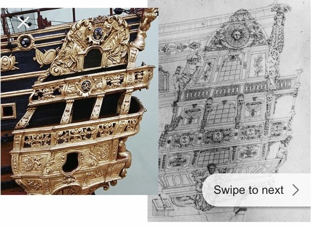
What’s interesting to me, EJ, is that these sets of drawings were created for approval, first, so there is every likelihood that the actual construction varied, somewhat from the drawings.
The models, though, are a different story. Before 1700, there aren’t many (if any?) contemporary models that still exist. It isn’t until the late 1820s into the 1830s that the Musee de la Marine, under the direction of Admiral Paris, makes a serious effort to re-construct the best examples of each rate, from the time of the Second Marine, in the early 1690s, when the practice of French naval architecture finally begins to coalesce into a codified discipline. This is where Paris’s Souvenirs De Marine come from.
For his part as the head model maker, at that time, Tanneron was tasked with making models of at least the four primary rates; hence we now have La Capricieux (a fourth rate, of uncertain date to me), L’Agreable and Le Brillant (both dated to 1827), and finally culminating with Soleil Royal (1834). Additionally, for each of these rates, a series of mostly un-planked frame models were made to better illustrate the underlying structure of Soleil Royal, Le Brillant, La Capricieux, among others.
It appears likely that Tanneron’s sources would have been concentrated around this time of the birth of the Second Marine, and the choice of subjects appears to reflect that.
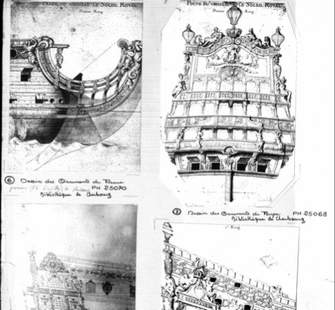
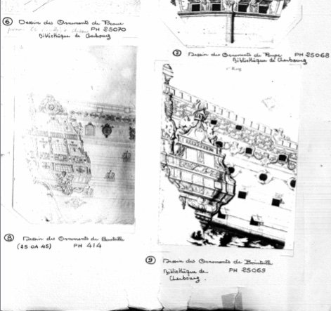
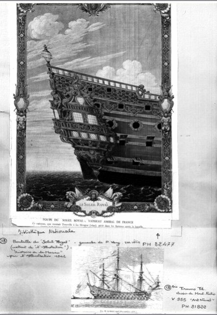
For Soleil Royal, though, where there are conflicting sets of ornamentation, it appears to me that Tanneron struck a compromise between what was known of the early First Marine (open quarter galleries, for example), and the Louis Quinze model, which was a near contemporary of the re-constructed Soleil Royal (1693):
Concurrent with the Musee’s efforts, at this time, other contemporary marine artists of the 1830s and the decades following, helped to broaden the revival and stoke interest in the baroque shipbuilders’ art.
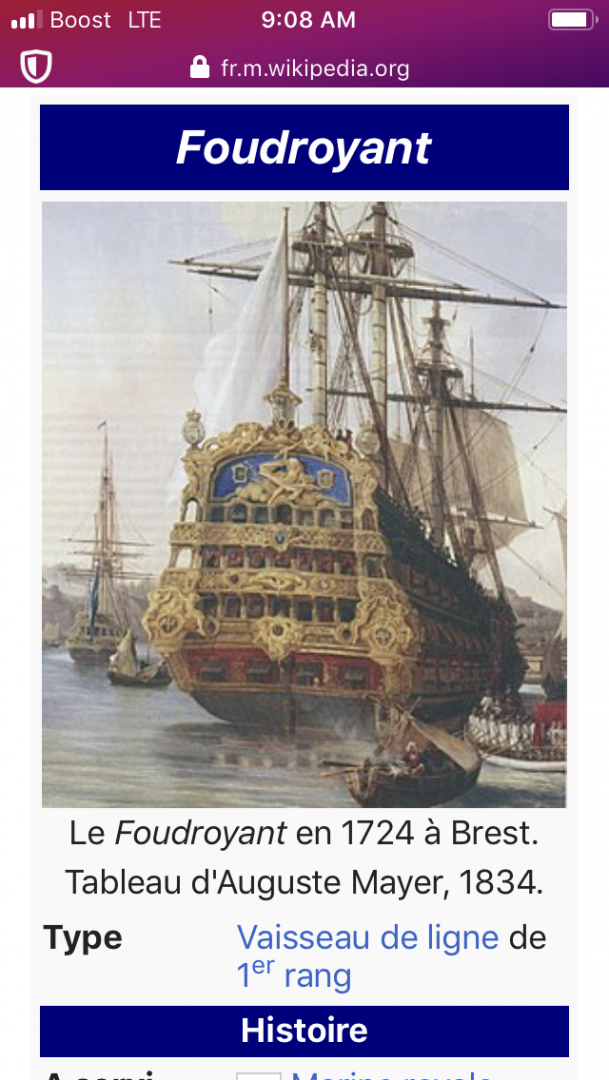
August Meyer gave us Le Foudroyant of 1723, in colors:
And Christian Molsted would eventually paint several excellent portraits of the Danish ship Christianus Quintus:
Above at the Battle of Koge Bay in 1677, and below - perhaps of the same action:
I would love to speak with someone at the Musee, in order to obtain a better understanding of Tanneron, and the sources for his work. Unfortunately, the Musee has remained largely un-responsive the last several times I have sent email inquiries.
Years ago, they sent me the following collection of imagery, which Victor Yankovic (who had made his own inquiries) was gracious to forward to me, more recently:
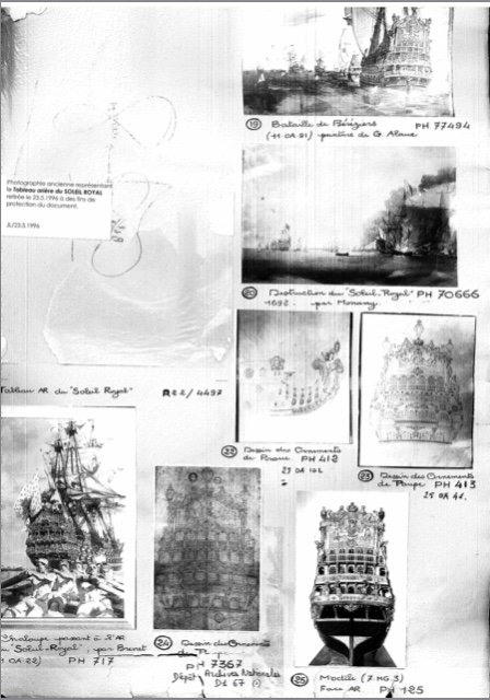
It came, though, with no explanation or context. It seems as though one must arrange a sit-down meeting at the Musee, in order to get any clear information about the collection. I wish a trip to France were in the offing for me, but that will have to wait until my kids are done with college!
- mtaylor, GrandpaPhil, J11 and 3 others
-
6
-
I am home, now, after an enjoyable week in Bovina, in the Catskills. This is serious cow country(!), where I saw many unusual sights, such as this:


Just a small herd of bucolic cows grazing along the woodsy hillside. I became a little nervous, though, when they started to climb toward me, and I couldn’t see udders!
All in all, a restful family vacation in the mountains. While I was up there, I continued with my super-detailing and assembling of the main deck gun carriages. Work, there, is coming along nicely and I will soon have a montage post on their construction. Hull painting continues at home.
Now that I have completed my light re-design of the Berain/Vary quarter galleries, I also had time to reflect upon some of the questions and criticisms that scholars levy against the likelihood that they are the rightful companion to the known Berain stern drawing, for this time that I have targeted in 1689.

In correspondence I have held with these individuals, they cite anomalies in the scale and execution of this drawing.
The lower false stern balcony, for example, is grossly exaggerated. They also mention that the relative proportion of the windows at each of the three levels does not neatly correspond with the relative proportions shown on the stern drawing. If that weren’t enough, the diamond-hatch, leaded cames of the lower gallery windows is of the antiquated (First Marine) style, and it does not match the cross-hatched mullions on the stern drawing. I agree that these anomalies are hard to jibe with what is clearly an exquisitely rendered stern drawing, where not one line or detail seems out of proportion or place.
All of these individuals point toward the missing elephantine head-dress of the figure of Africa; has Berain suddenly forgotten that what he shows from the stern perspective must also appear in the quarter view, they wonder? I wonder that too.
Not lastly, but also notably, these individuals point to the mermaid figures as being wholly inconsistent with the stern allegory, and more likely a relic of the earlier First Marine style of ornamentation. Again, I find it hard to argue against these observations.
In fact, I will probably never be able to definitively say that this QG rendering is the hand of Berain, because as these men also point out, it is not archived as a set with the stern drawing. Nevertheless, these considerations won’t stop me from attempting to bolster my central argument - that these stern and quarter drawings do correspond.
And so, ever remaining consistent with my approach to research, I am always studying SR’s better documented contemporaries and near contemporaries in search of structural and ornamental patterns of consistency.
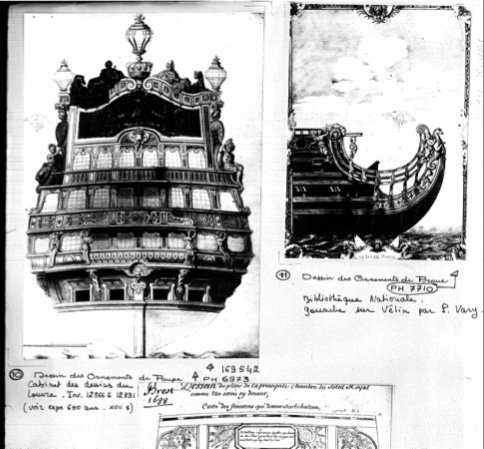
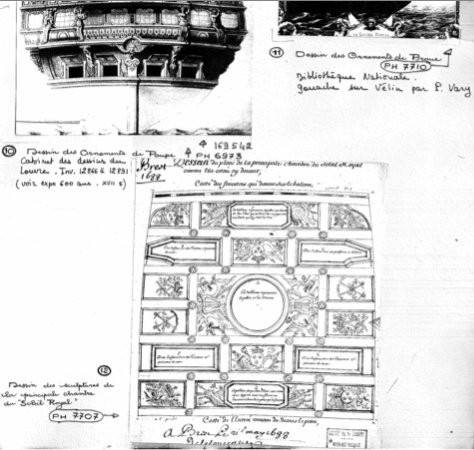
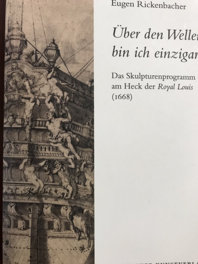
This book, Floating Baroque (thanks again to Heinrich) has been an invaluable resource because it provides me with archival quality reproductions of ornamental sets that are known to correspond with each other, from a specific time, and originating at the hand of Jean Berain.
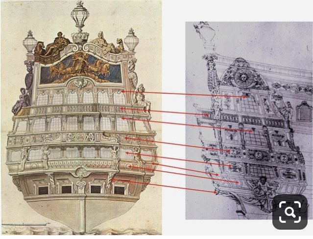
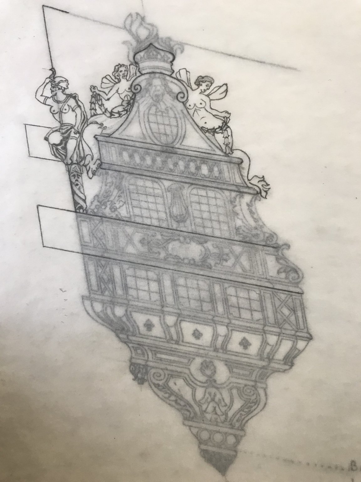
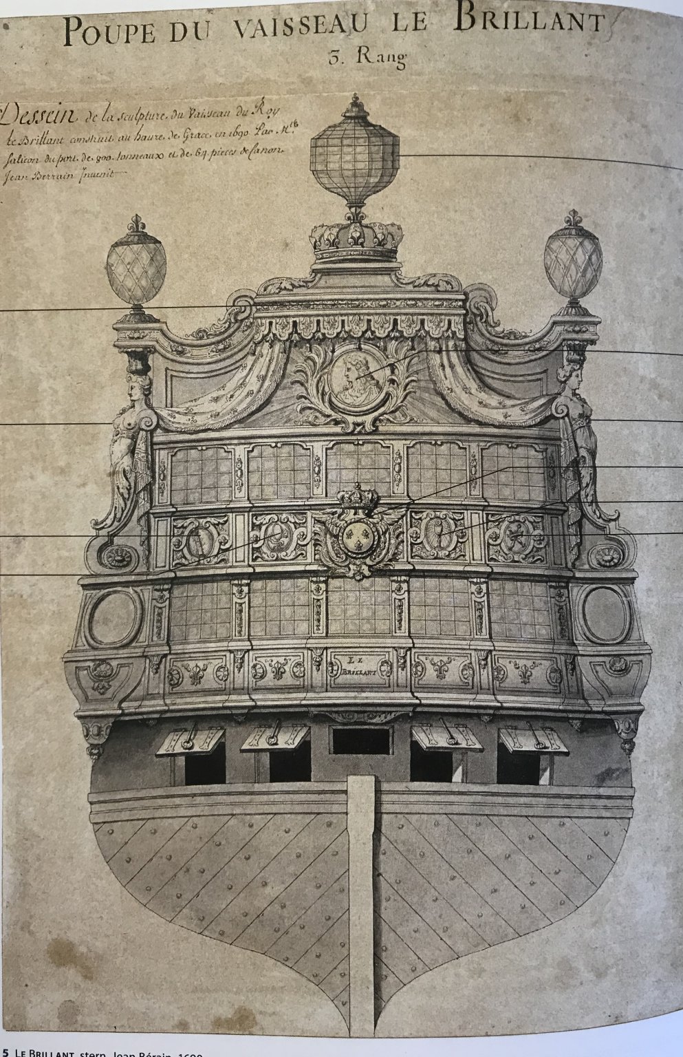
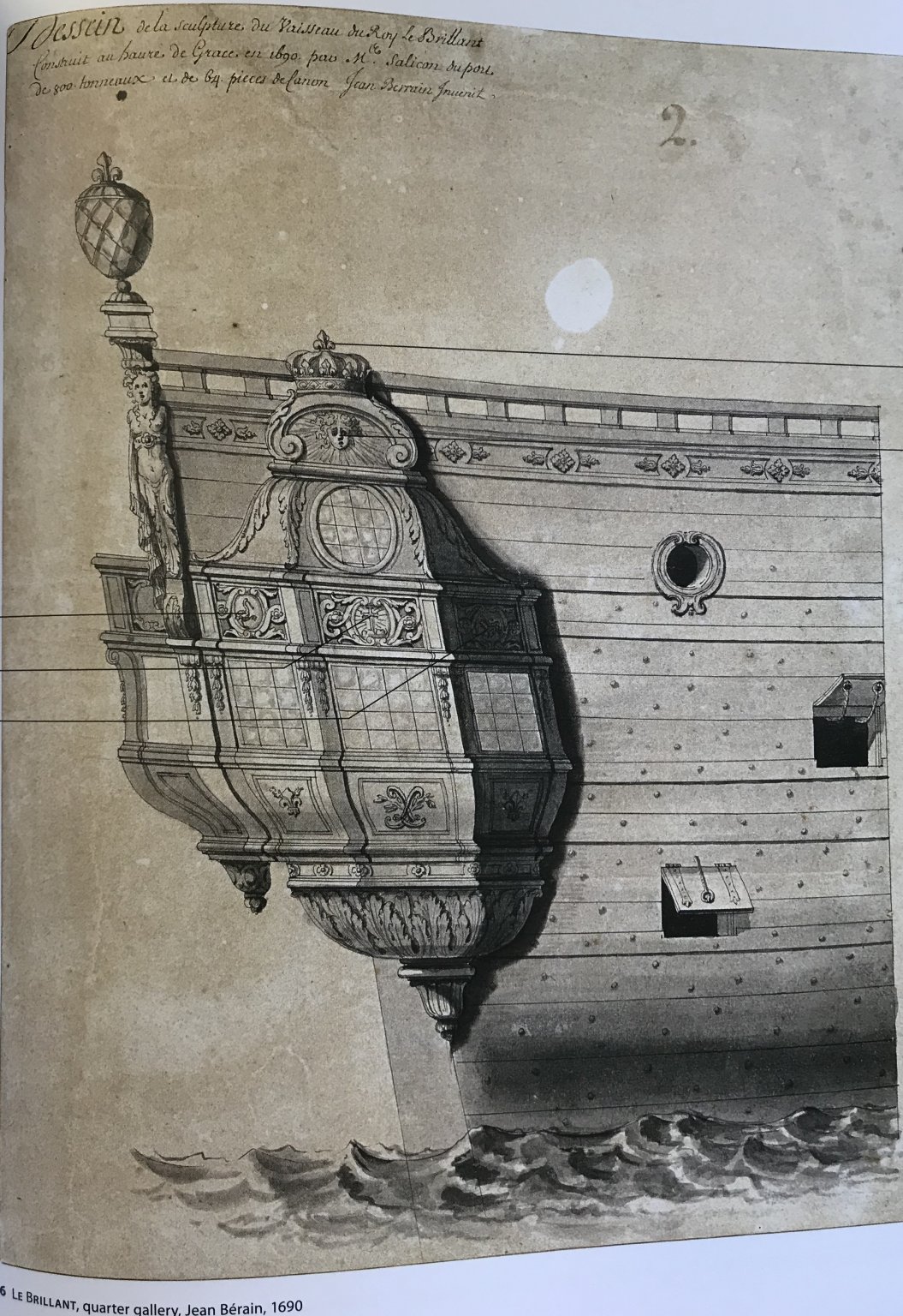
For the first time, I am able to closely examine exquisite renderings of the sets for Le Brillant, for example:


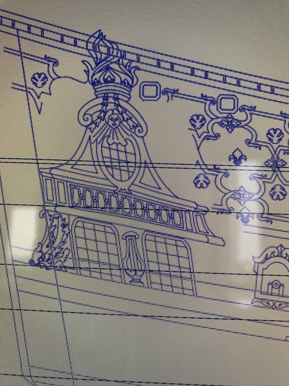
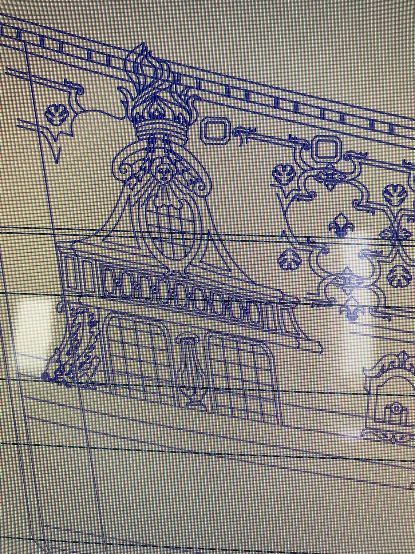
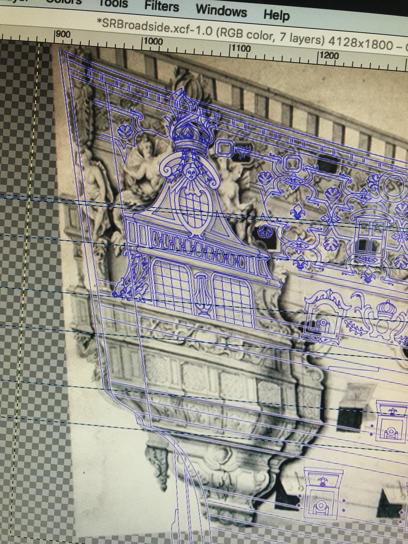
The coronation of the QG upper finishing, and the ovoid window, at the quarter deck level are closely consistent with that of the SR drawing. The same can be said for the filigree banding, along the upper balcony level, and the paneling beneath the lower gallery level of windows. These are all familiar elements of Jean Berain's oeuvre, arranged in his characteristic style.
While it is known that this set corresponds with each other, it can quickly be observed, however, that there are also strange anomalies between the stern and quarter views.
As in the SR stern drawing, at the quarter deck level, there is a shadow line that suggests an overhanging stern balcony for Le Brillant. The quarter view confirms this. There is, however, nothing in the stern view of Le Brillant to suggest that the stern counter also projects as an open, walkable balcony, and yet, that is precisely what the quarter view shows. In fact, this lower balcony seems to project even a small bit further than the upper balcony.
The trouble, here (so far as my research seems to indicate), is that by this time in 1690, the French had long abandoned walkable stern balconies at the counter level. They remained, only, as vestigial shelfs for corbels supporting open galleries above.
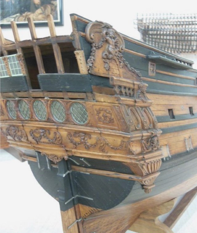
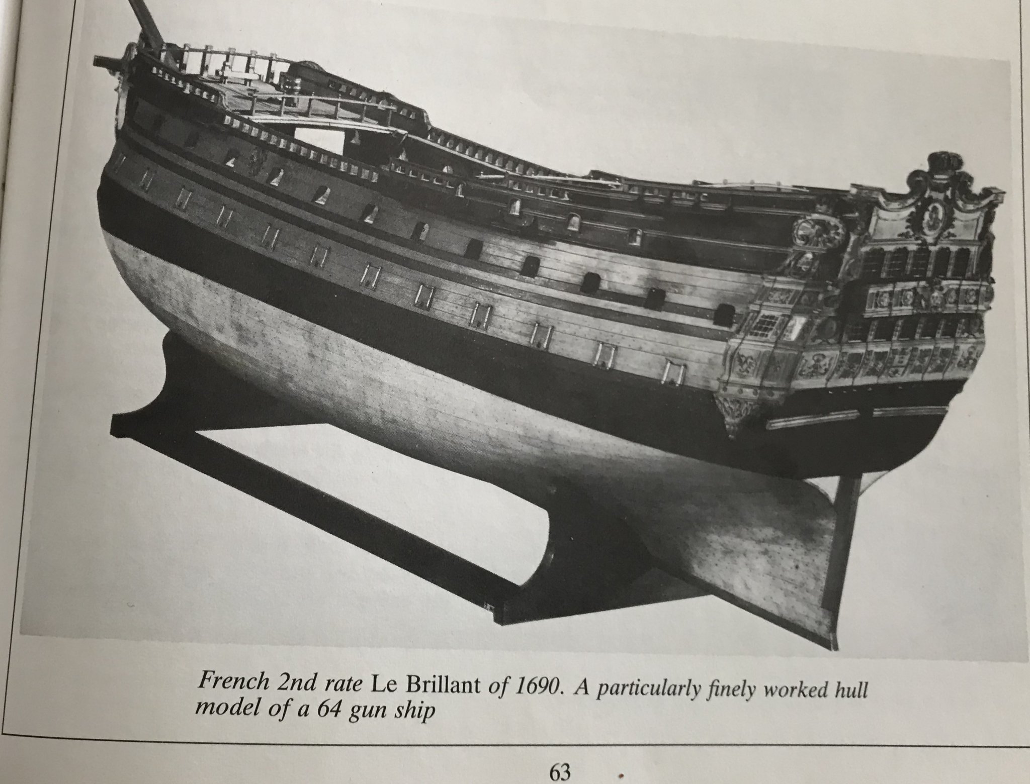
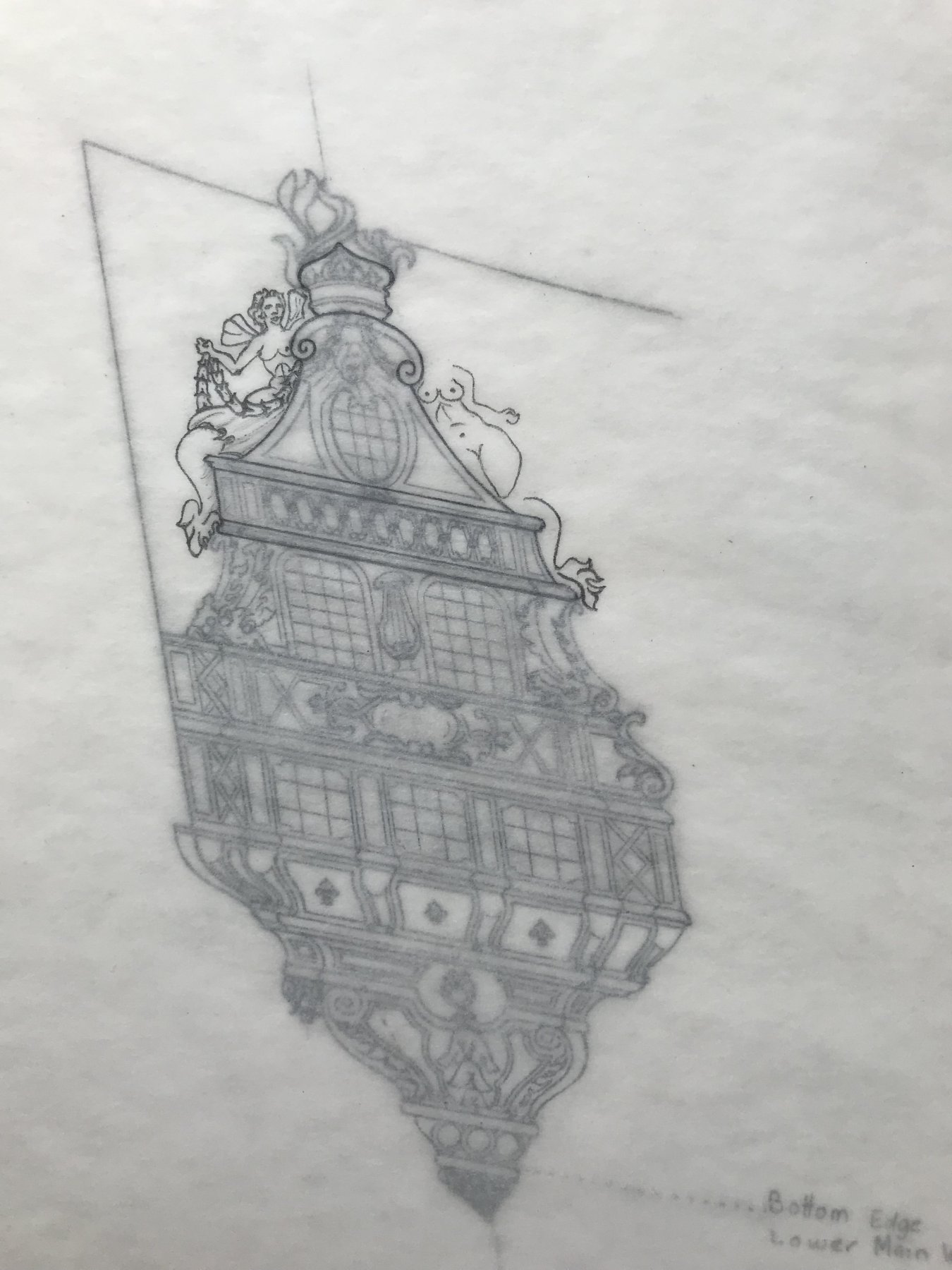
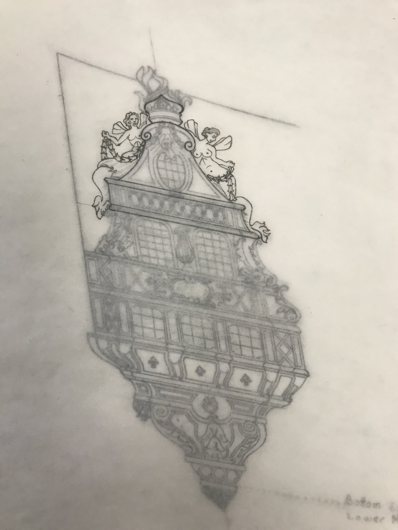
During his illustrious career as a model maker at La Musee, Tanneron also made a model of Le Brillant. His resolution of these incongruities is, I think, the correct one:
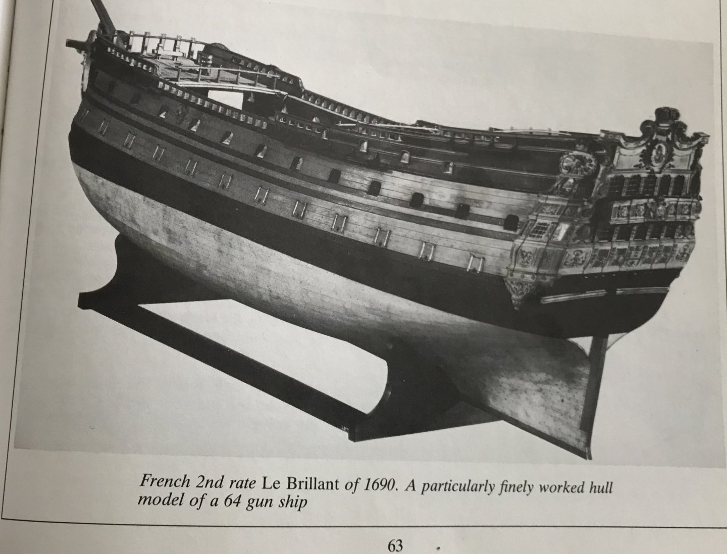
(Pic from Wolfram Zu Mondfeld)
Curiously, though, while his execution of the ornament is, for the most part, extremely close to what was drawn, for some reason he chose not to include the royal drapery swag that flanks the central medallion of Louis, on the tafferal. He also chose to replace the lambrequin tasseling above the medallion, as it was drawn by Berain, with a foliate garland. Certainly, the relative complexity of execution could not have been a deciding factor for a talent like Tanneron. He must have settled on this interpretation for other reasons.
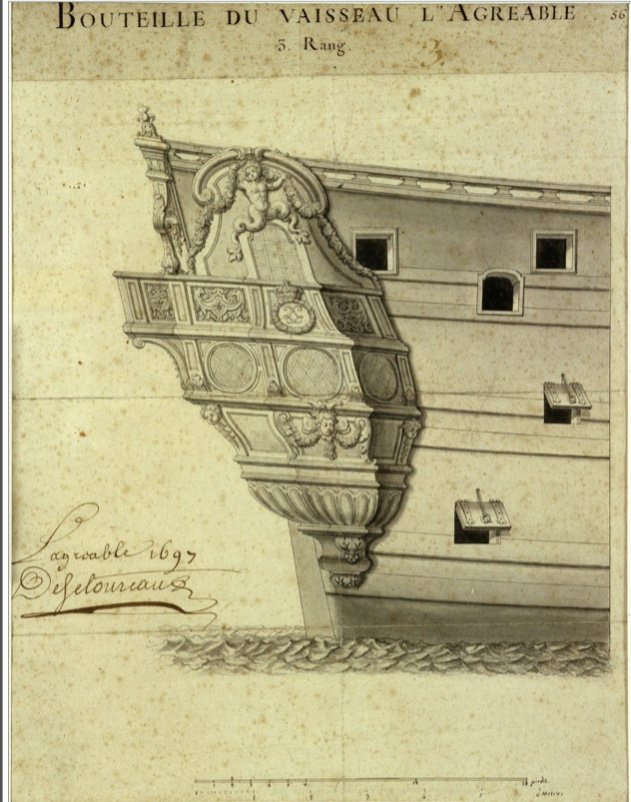
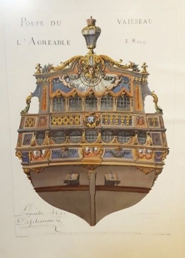
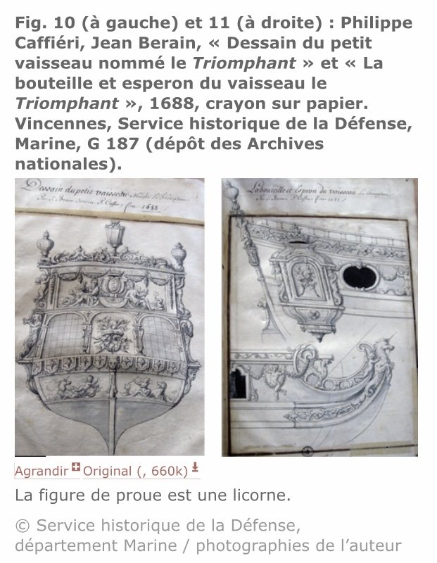
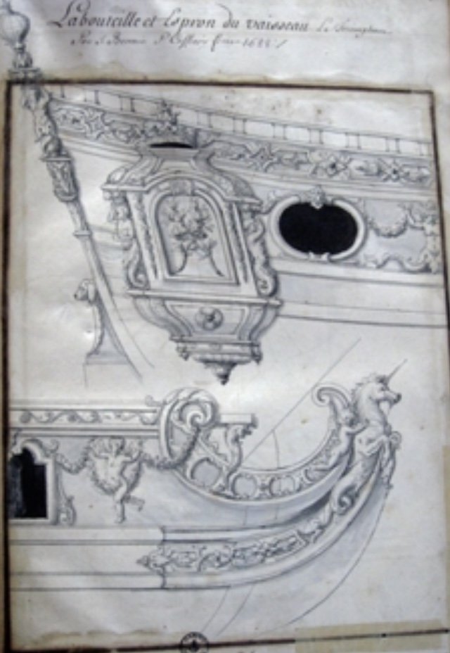
Likewise, I have found the stern and quarter views of L’Agreable to be equally fascinating. Following are studies drawn by Berain for the ship’s major refit in 1696/97:
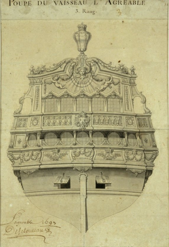
They are signed and dated by Desclouseaux, the intendant at Brest at the time, where the work was performed. As an interesting side note, L’Agreable was originally a Toulon built ship from 1670, and she was one of the longest-lived ships of the French navy, serving faithfully until she was condemned in 1715.
It is also interesting to note that Berain drew the lower transom in the architectural manner of ships prior to the Reglement of 1672 - whereby, the wing transom that defines the widest span is located above the chase ports. This is also, notably, the case for Berain’s stern drawing of SR.
For those interested in period coloring, I also found a colored print of the stern, which gives an idea what that all may have looked like:
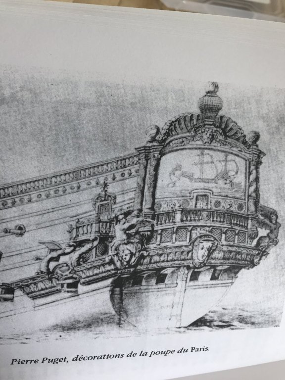
Anyway, what first drew me in with L’Agreable was the split-tailed triton above her quarter deck level, QG window. This figure, it seemed to me, was closely reminiscent of the First Marine stylings of Pierre Puget. Here, on Puget’s portrait of the Monarque (yes, I can hear the Royal Louis nay-sayers) are the very same sort of figures supporting the main deck quarter gallery walk:
Likewise, these figures are not un-related to the antiquated-seeming mermaid figures on the QG of Soleil Royal. Yet, here this figure appears on L’Agreable, in 1697, by the hand of Jean Berain.
So, what shall we make of that? Personally, as I have presented earlier, Jean Berain’s presentation of Soleil Royal’s stern isn’t a wholly original composition, but more an updating of the earlier execution of Puget, as first conceived by LeBrun. If it is true that some of the original ornament survived and was re-incorporated into the re-build, in 1689, why is it so far-fetched that these Puget-like mermaid figures might not also be re-imagined into Berain’s tableau?
Perhaps, in her first incarnation, split-tailed mermaid figures supported the main deck, open-walk of Soleil’s quarter galleries - as opposed to the tritons you see on the Monarque. Perhaps Berain has simply chosen to re-style them as low-reliefs that flank the upper finishing.
While none of this is certain, or even provable without a detailed and reliably attributed contemporary portrait of Soleil Royal, circa 1680, I think I have at least succeeded, with earlier posts, in demonstrating that ornamental motifs were carried over from one iteration of a ship, by a given name, to the next.
Returning to the drawings of L’Agreable, it is also of interest to me that the lower gallery windows are drawn with the antiquated diamond-hatch caming, in opposition to the cross-hatch mullions of the stern drawing - just as is illustrated in SR’s stern and quarter views. Perhaps, this diamond hatching isn’t so antiquated, after all - even in 1697.
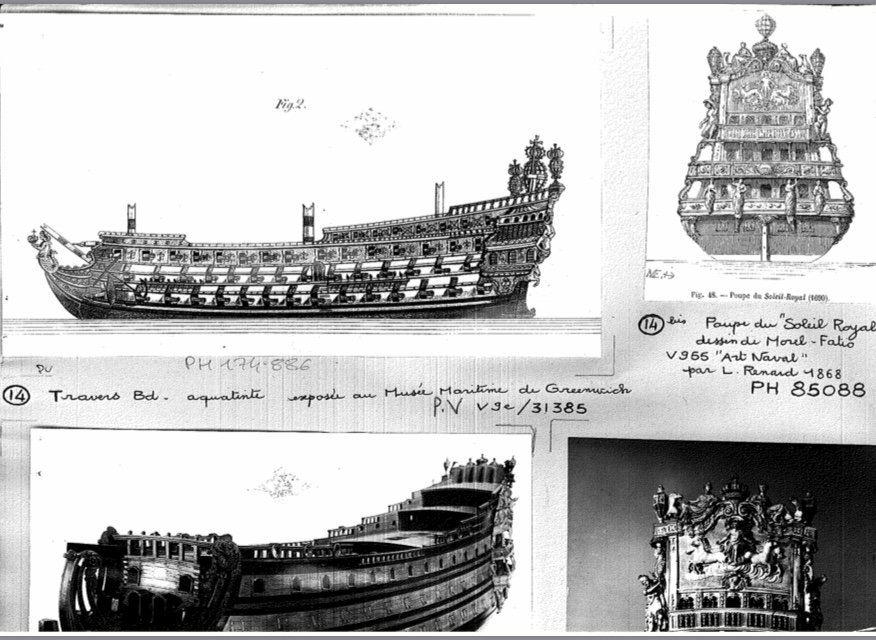
Tanneron didn’t seem to think so. In fact, in his model of L’Agreable, he chose to represent the lower stern windows as diamond-hatched, instead of the cross-hatch that Berain drew. Why? It’s anyone’s guess:
What I really find fascinating about this Tanneron model, though, is the number of windows represented. Tanneron modeled five windows within the extension of the quarter galleries, from the ship’s sides. However, Berain’s drawing shows 7 window frames within the QG extensions!
Now, it is quite possible that the outer two frames are merely representational, and not actually glazed. They are of a more narrow silhouette. Whatever the case may be, Tanneron decided not to include them.
It could be that, with reference to whatever other sources were available to him, Tanneron decided that these two vestigial windows cluttered the presentation of the stern, since they did not also carry up to the quarter deck bank of stern windows. That would essentially amount to the same kind of artistic editing I performed with my drawing of SR’s QG, when I reduced the lower gallery tier from five to three gallery windows. I felt that the fifth, forward-most window was representational, at best.
All of these considerations, though, bring us full-circle to one of the fundamental questions about Tanneron’s model of Soleil Royal: just why did he choose to model a five-window stern, as opposed to the six-window stern that Berain drew? In truth, I can not say, but perhaps Tanneron demonstrated an artistic preference, there, for a lesser profusion of windows. Along that line of reasoning, he certainly simplified the tasseled lambrequin carving that Berain drew for the lower, false gallery.
Whatever the truths may be, I think it is clear that there is precedent for divergence in the model makers’ art when interpreting these primary source drawings - even when there is a high degree of congruence between stern and quarter views.
Until better sources emerge (and I’m always looking🤓), I’m going to stick with this as my operating theory of the epoch.
And just because they are interesting, here are a few drawings for the ornamentation of a Versailles fountain barge (I believe that’s what it represents) that Berain collaborated with Philippe Caffieri to create in 1688:
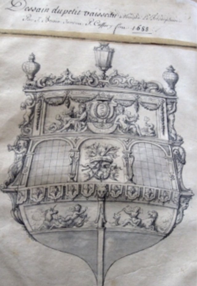
It is, in my view, a mixture of old and new styles, with a bulwark frieze that echoes that of Soleil Royal.
- GrandpaPhil, hexnut, druxey and 5 others
-
8
-
As is everyone else, here, I am sorry that you are facing such a difficult time, Mark. My hope is that you will find the strength and support you need to get through it all with your spirit and heart intact.
-
Hi Chris - funny visual with the Rolls!
Yes, I certainly feel that one can take a few liberties with decor and coloring, as long as they are historically plausible.
The use of lapis-based ultra-marine would have been sparing, at best - even on the most prestigious first-rates. As a general rule of thumb, you can count on the backdrop to the arms of France as being ultra-marine.
If you wish to use ultra-marine elsewhere, I think that less is more, however, I see no reason why you couldn’t incorporate it above the tafferal carving. As long as what you decide upon is balanced and presents some kind of logic, then I think it should be just fine.
On the other hand, I personally would be dis-inclined to represent areas above the waterline as “natural”, because of the French practice of using iron fasteners, as opposed to tree-nails. An un-painted French ship would soon look like your streaky Rolls Royce, up there, with the added embarrassment of loose planking, as the iron nails corrode and lose their integrity.
In response to AnobiumPunctatum’s question, I think the issue of whether to aggressively kit-bash or build from scratch, depends upon a builder’s perspective, their circumstances, and their conception of a challenge worth pursuing.
From my perspective - while there are certainly problems with the Heller hull it is, in fact, a very close copy of Tanneron’s model; simply by raising the waterline on the Heller kit by a 1/4”, or so, helps one to arrive at something that looks much fuller and more plausible.
Despite its problems (many of which can be corrected or mitigated without too much trouble), though, the Heller hull has quite a lot going for it as an example of late 17th C. practice. As Chris says, it is a tremendous benefit to have a ready-made hull form, even if one must build up the stern and quarter galleries from scratch.
Another thing that I personally love is the flexibility of plastic as a medium for scratch-work. Unlike wood, it is much easier to scrap an attempt at executing some detail, if it doesn’t look right, and start anew. Plastic is also a benefit to people like myself, who have no shop space to speak of. I work off of my kitchen table, just as I did when I was a boy. When I’m done for the evening, the model is stored in its purpose-made box until the next evening, or whenever I have time for it.
Lastly, it is tremendously rewarding, I think, to push the boundaries of what is possible in reverse-engineering this kit to represent a more specific point in her career, or another French ship, altogether.
When I started my Soleil Royal project, I had an idea about making the hull wider, in order to incorporate the missing sixth stern light; it was going to involve some complicated plastic surgery, and I really wasn’t sure whether I would be able to pull it off. When I succeeded at that, it felt like a major accomplishment, and it motivated me to keep going. So, keep going I did.
For some, these kinds of builds may seem like exercises in pure tedium. For others, though, they are an opportunity for experimentation, and skill development. For me, it’s just satisfying fun, and I really enjoy watching what other builders do with her.
- EJ_L, mtaylor and GrandpaPhil
-
3
-
I hear what you’re saying here, Chris, but in all fairness even the St. Philippe project is a bit of a forensic re-construction. In my opinion, the detail is appropriate for the time period, and I am not surprised that Lemineur is taking a bit of a boilerplate approach to the small things like this. If there were Van de Veldes of the SP, that clearly showed the detail, I might feel differently. As it stands, though, there is very little documentary reference to the French style of chesstrees in the latter 17th C. Take heart - it was still money well-spent😁
-
That is excellent advice, EJ & OC! It sounds as though the key is to not lock in your belaying points until all of the rigging is in place. And, as you say EJ, to take a balanced approach to the work.
- EJ_L and Old Collingwood
-
2
-
Hi EJ,
Have you found that there is a particular order of rigging a model like this that prevents line-sag as you work your way up?
My first attempt at rigging SR started well, but before I knew it, my line tension was all off, and the topmast and t’gallants were raking aft at an un-natural angle; more like violin bows. The fact that the masts were made of plastic was a contributing factor, but I’ve seen plenty of plastic modelers succeed in smaller scales without their spritsail topmast looking like a fish-hook. Any advice on that front?
-
-
-
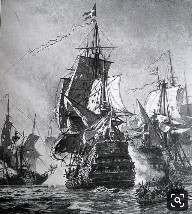
Hey, Chris! Thank you for sharing this model of Soleil Royal. It is an interesting amalgamation of period 17th and 18th century details; the modeler gave her Victory’s beakhead bulkhead, the Napoleonic-era styling of the gun strakes, and a pretty faithful recreation of Tanneron’s stern. I had never seen this model before, and like all models of Soleil Royal, it is an attempt at reconciliation.
To answer your question, the decks will be incorporated into the build as I go.
I must first create a flat base plate from 1/16” styrene sheet, which will delineate the outer parameters of the model, while establishing the new round-up of my custom fabricated stern.
The hull halves will be joined at their stem and cemented to the base plate, with an appropriate opening left at the stern, into which I will frame and plank (all with styrene sheet and strip) the new lower transom.
On the interior, the joint between the hull halves and base plate will be heavily reinforced with alternating 1/8” blocking and fitted gussets, at spaced intervals. These gussets will become the attachment point for transverse (no camber) deck beams. The hull/plate joint will be further reinforced with epoxy.
I will probably also glue in a 2-3” band of transverse doubling of the base plate, at the fore and main mast locations. At the moment, I can’t remember where the mizzen mast steps on the stock kit, and I haven’t decided, yet, whether to also use the plastic of the lower mizzen, as I will do for the fore and main masts. I may make tue mizzen entirely from wood.
For the lower and middle decks, I will use the kit supplied decks, which I have separated, on both sides, along the raised lip that establishes the depth placement of the gun carriages.
Because I have no intention of shifting the mast locations, it is convenient to take advantage of the mast locations that are pre-cut into the kit decks. I may increase the aft rake of the main mast by a degree, but that will require a little mocking up to see how that affects the relationship between the shrouds and the main deck guns.
More gusseting and false beams will support the middle deck. The difference will come at the main deck level.
Starting at the main deck level, I will introduce camber to the false beams that will support the new decking.
This new decking will be made from 1/16” styrene sheet, which will be laid out and scribed with a more period-correct arrangement of butt shifts and tapering plank widths.
The good news is that I am close to completing the painting of the lower hull, which means I can soon start assembling it into a THING!
- mtaylor, paulsutcliffe and EJ_L
-
3
-
-
Okay, so in reference to Chris's post just above:
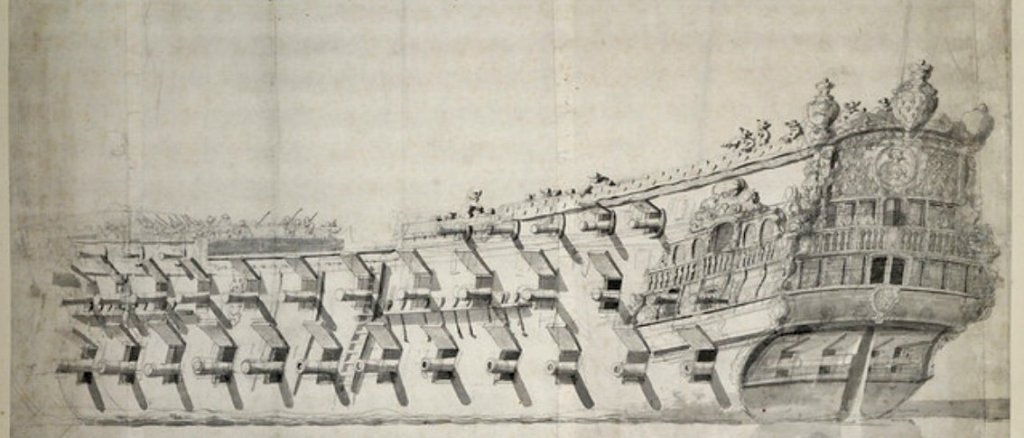
Winfield and Roberts identify the first ship as very likely, the Terrible, and not the Royal Therese. Believe me, I have no magical abilities, but I trust their reasoning in making that identification.
The second ship, the three-decker, is La Reyne.
The third portrait is one that I personally believe to also be the Terrible, and not the Royal Therese, as it is often labeled. In my view, although the general aspect seems lower in the water than the first portrait (starboard quarter view), the guns match up, and certain details of the stern and quarters appear to correspond.
The Royal Therese has a very distinct appearance.
The very unclear starboard bow portrait of a large two decker may also be the Terrible. I suspect that it is. Unfortunately, the image is just too vague to read for detail.
-
Oh, okay, got it!
As for the VDV drawings, there definitely seems to be only the suggestion of the top, lower main wale and the top, upper main wale (at main deck level), in most of these portrait drawings that they did. To them, I suppose, the actual run of the wales, in between, could be worked out between those delineations.
Most of these VDV drawings, detailed though they are, are more suggestive than photographic. I am highly fascinated by the following vague drawing, which I also suspect is Le Terrible:
It is confusing, though, how the starboard aspect of this portrait may agree with the port side of this portrait, which I also believe to be Le Terrible:
There are definite similarities in the overall architecture. It seems to me, though, that the vague upper portrait is a better and more realistic representation of a French 2nd-rate, than the lower portrait which seems a little more stylized, at the stern.
These are both VDV portraits, so the question, for me, becomes one of artist’s perspective, relative to the subject, at that moment in time.
- EJ_L, GrandpaPhil and mtaylor
-
3
-
-
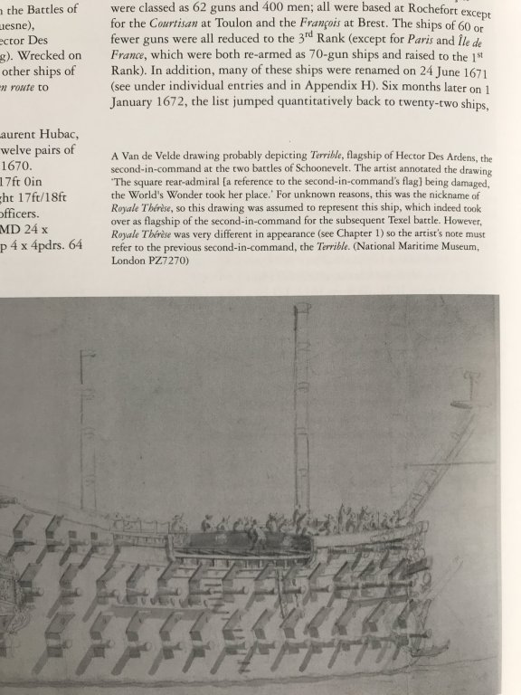
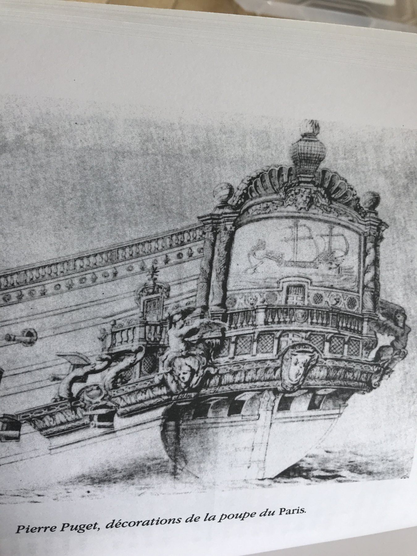
For the sake of comparison, here is Puget’s portrait of the Paris, as she was before re-naming/decorating to the Royal Therese:
They’re obscured by the projecting side gallery, but the four round windows are present, as R and W say.
- mtaylor, GrandpaPhil and EJ_L
-
3
-
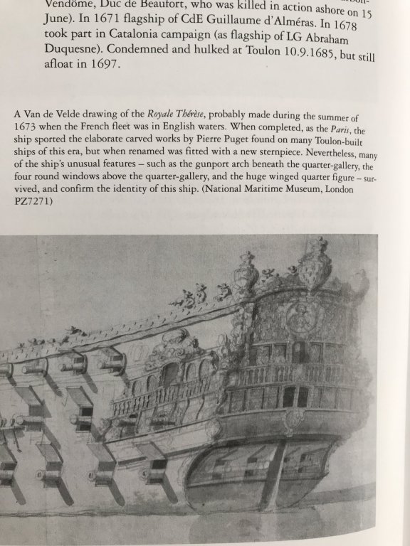
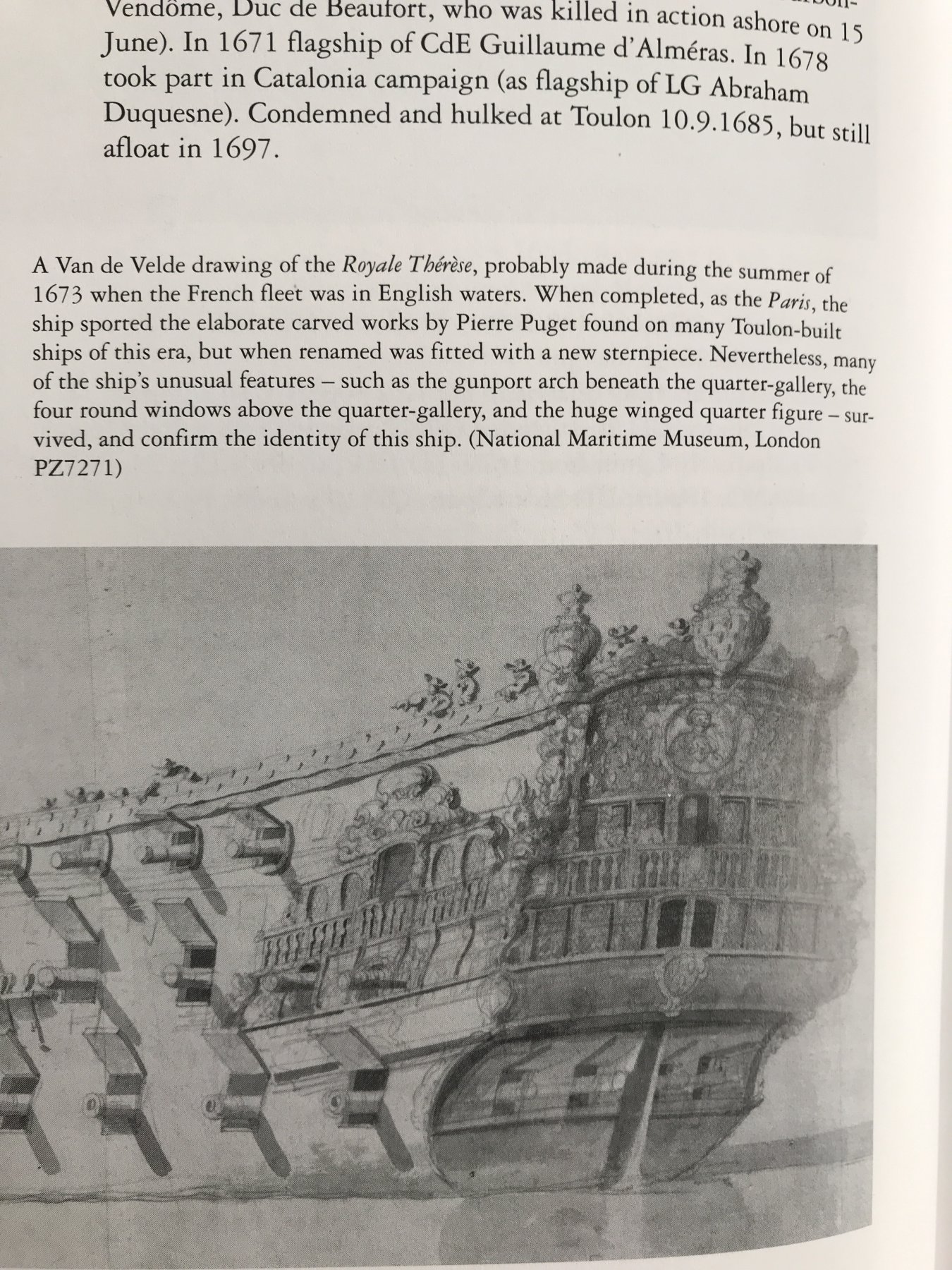
Here is the Royal Therese:
Winfield and Roberts have convinced me that this is so:
As for modeling the round-up of the transom - I would model the transom shape and plank up to it.
I’m confused as to what your approach will be, here, Chris. Are you going to plank over the cardboard patterns with styrene strip, or are you going to cut new decks from styrene sheet and plank over those?
As for taking on another Heller conversion build, La Reyne is the best candidate, IMO, because she was a near sister ship to the original SR: same yard, same builder, same rate, only a year apart in construction, and with only minor differences in size and armament.
I think Cedric may have abandoned his model because he is un-willing to accept certain compromises in the kit architecture. Perhaps, with all of the research he has done - and it is quite significant - he is drafting plans for a full scratch-build. I hope he is.
On the other hand, if you can accept the forward sheer of the Heller wales, and if you can accept the layout of Heller’s guns, and if you can reverse engineer the older style of head rails onto the Heller architecture, then, there is no reason whatsoever that one can’t make a very satisfying facsimile of La Reyne from the Heller kit.
- GrandpaPhil, mtaylor and EJ_L
-
3
-
-
-
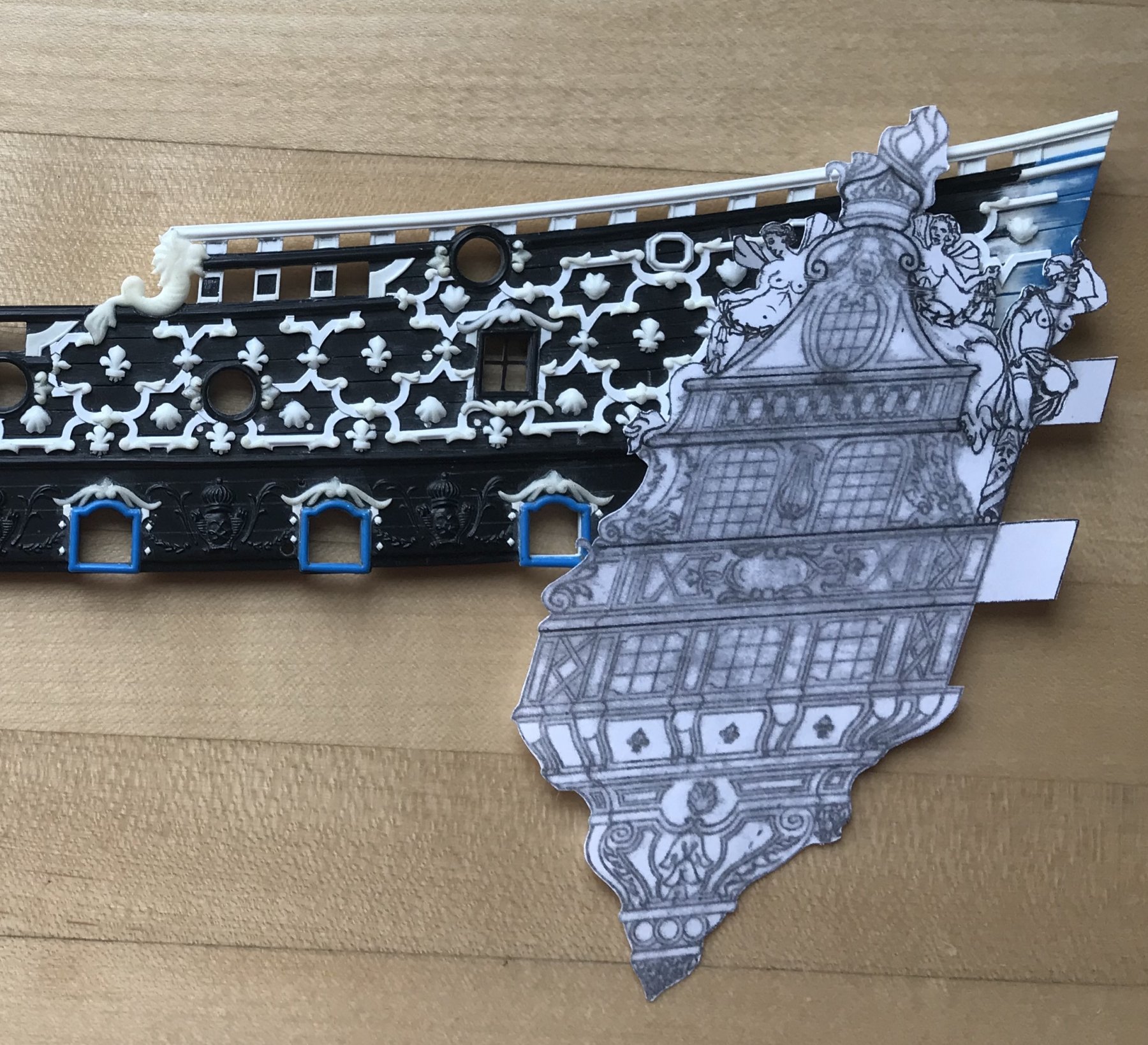
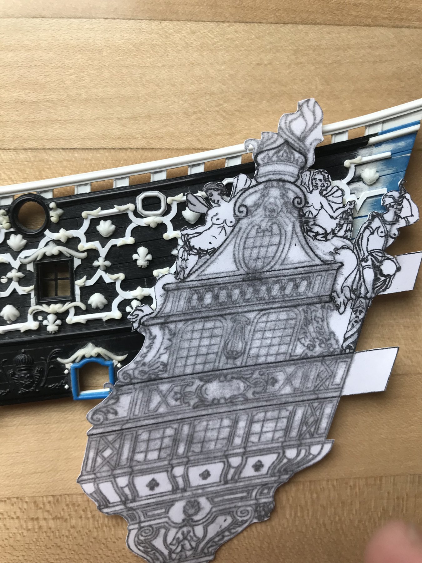
I was so excited to get home and cut out a template of one of the QGs and offer it up to the model to see how close I am.
Well, as a now-retired work friend often used to say: “it isn’t broke, but we can fix it!”
The lower half, from the main deck down is good. I’ll need to do a little re-shaping of my stern counter/false lower balcony, but everything lines up with where it’s supposed to:
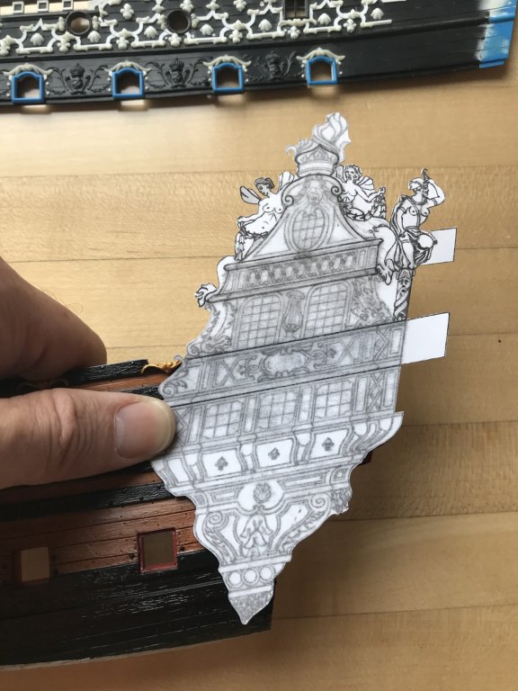
There’s some minor interference with the aft-most main deck port, but a little re-shaping of that scroll is all that is required, there. I expected there to be an overlap, there, with the way that I drew that detail.
The upper bulwarks are where it gets interesting:
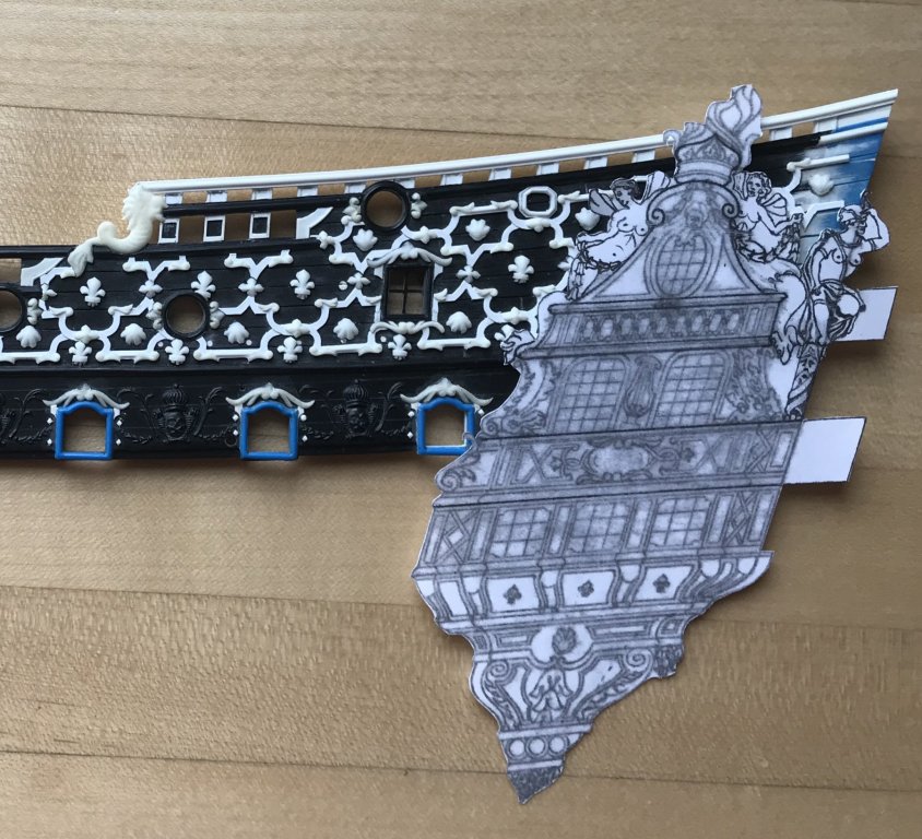
First of all, the entire layout seems to rise higher than I intended. It isn’t necessarily a big deal that the crown finial crosses over into the sheer railing. What confused me so much is why the aft octagonal port was almost completely covered by my siren. After all - I measured my drawing again and again!
Any lapping over of the frieze elements, BTW, was anticipated. My plan always was to cut the QGs into the frieze. Where the Siren tail mostly covers a fleur-de-lis, for example, I would simply eliminate the fleur, altogether.
I expected there to be some distortion of reality, considering the manner in which I began drawing this project; I essentially made a scale outline by literally tracing the outline of the lower hull, and then measuring up from the upper main wale, to map out the upper bulwarks. this drawing was then digitized and detailed in GIMP.
But why are elements now being covered, which were not supposed to be?
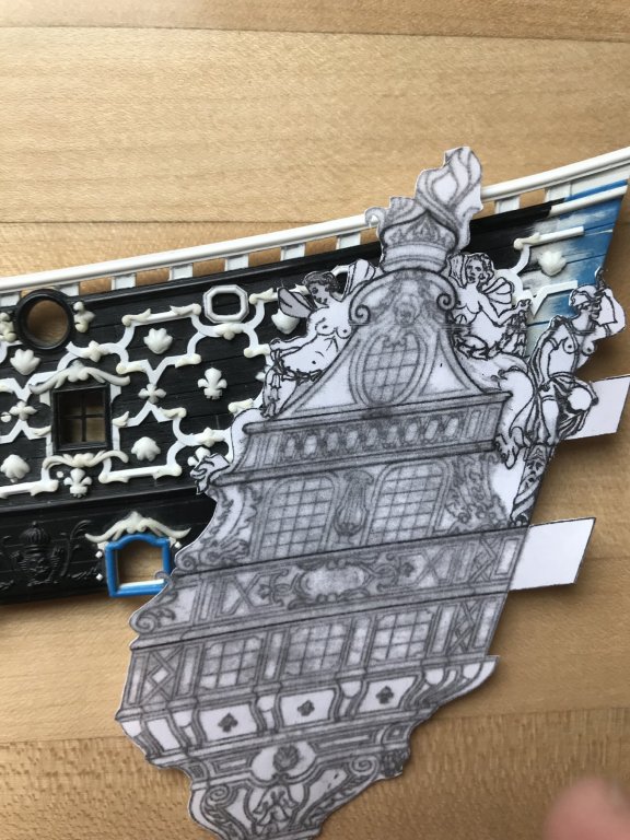
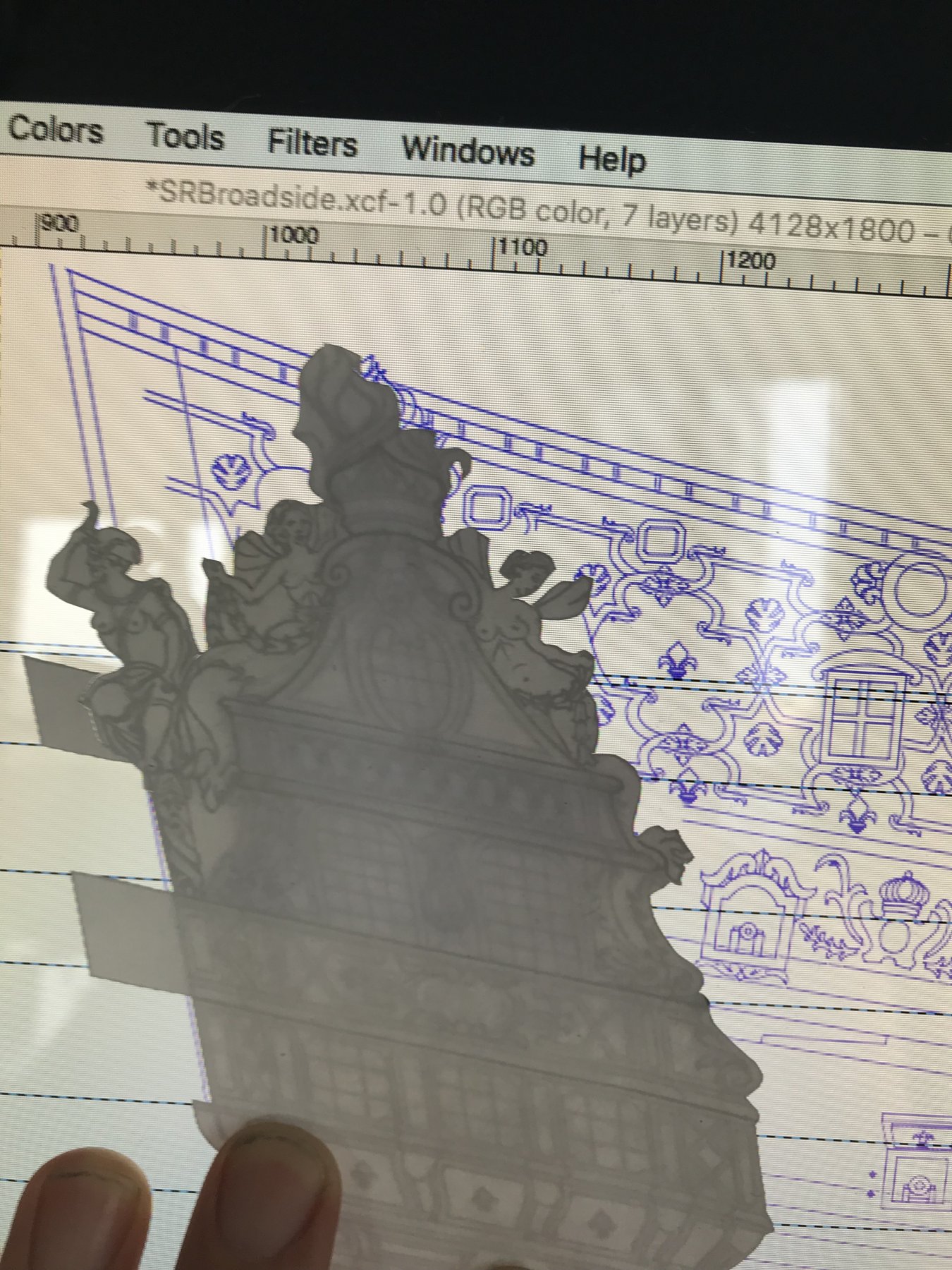
I opened the software and offered my cutout up to the screen:

Mmhmm, okay, everything seems to line up. Although, I don’t have a picture of it, when I offer the upper bulwark to the screen, it also matches up very closely, +/- 1/32.
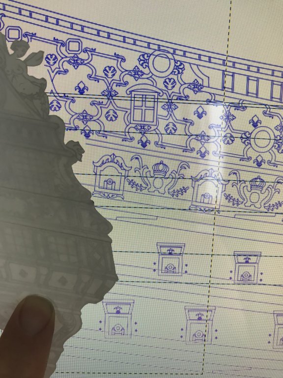
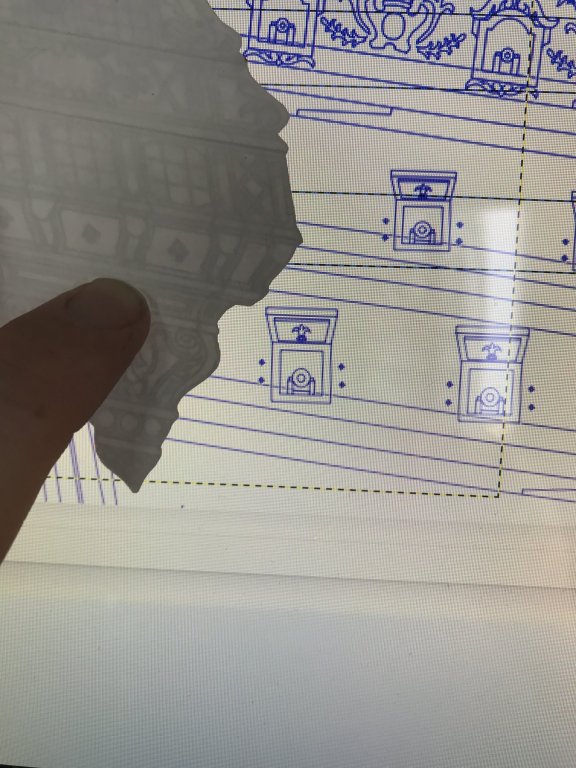
Oh, wait a minute! I think I see it:
Aha! In my digital drawing, I aligned the lower edge of the main deck QG windows with the bottom edge of the upper main wale. Really, though, those windows should begin above the upper main wale, because the upper main wale coincides with the gallery rail, on this level.
But, why did I do that, in the first place? Well, the answer is that I manipulated a scan of the QGs so that it seemed to fit well within the parameters of my available space. I remember thinking, at the time, that it didn’t matter if the windows dropped beneath the upper main wale.
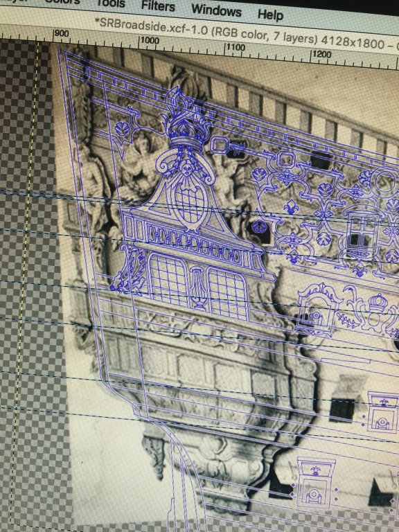
But that’s not what I drew on vellum, and that’s why my drawing sits and finishes higher on the model. The height discrepancy is pretty exactly the width of the wale.
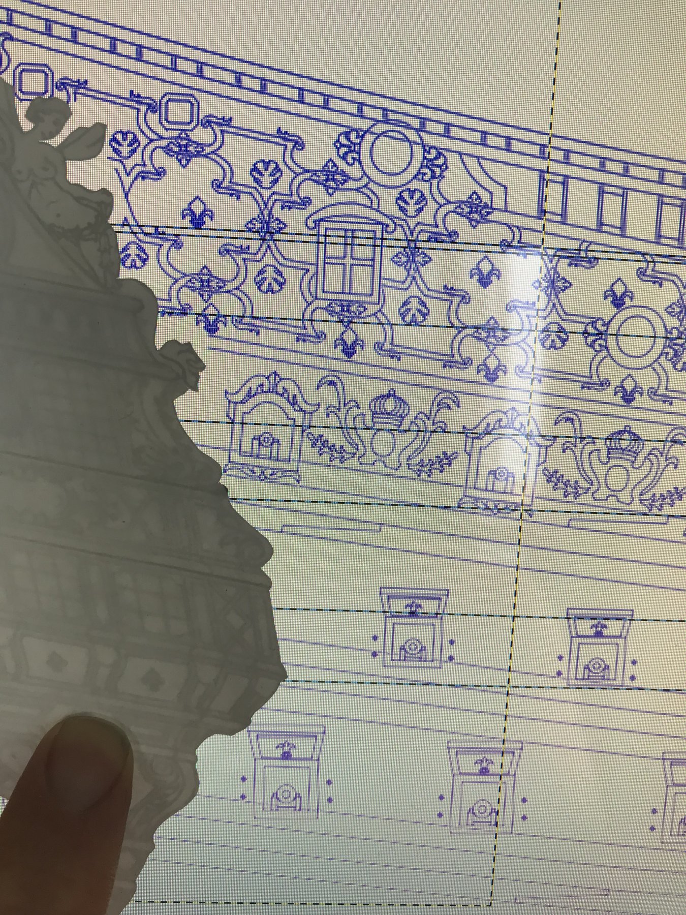
So, what to do about all of this? Re-drawing is not an option, and besides - the important parameters align nicely. The stern balconies are where they are supposed to be. There’s enough room for my quarter pieces, still. The overall aspect and proportion of the drawing is good, IMO
I could simply eliminate the aft-most octagonal port. Really, there are only supposed to be two gunports on the poop deck. Heller provided one round port. I could leave my forward octagonal port as a vestigial reminder of what the Berain/Vary drawing intended.
But, dammit, if those octagonal ports didn’t come out well! I’d really like to keep both.
Option B would be to clip the wings of my forward Siren, and maybe give her a new hair style that doesn’t interfere with the port framing.
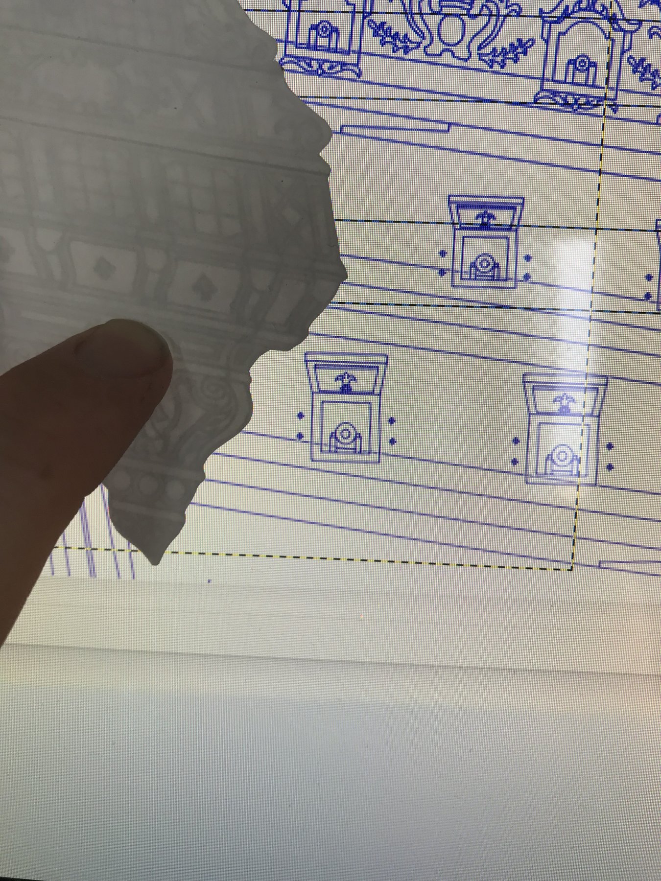
Option C would be a combination of measures to reduce the overall height of the QG. First, I could razee one line of glass panes from the main deck windows. I had to re-draw the lyre for patterning, anyway, and it wouldn’t be a big deal to re-fair the lines of my dolphins, after this surgery. That’ll buy me about 3/32”.
That, alone, may be enough to save the port. I may be able to recover additional ground by reducing the upper finishing, from the QD window on up, on the photocopier, in increments of -2%.
The only thing complicating this approach is that the Sirens inhabit this tier, as well as the tier below. There may not be enough tail width to withstand the un-shrinking border cutting into the Sirens’ tails. Or, maybe 2-4% won’t impact this area that much.
Fortunately, these are easy, no-risk/high-reward experiments with paper cutouts that will help me clarify my thinking.
- yancovitch, jgodsey, J11 and 6 others
-
9
-
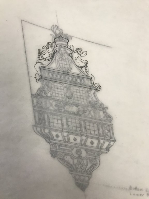
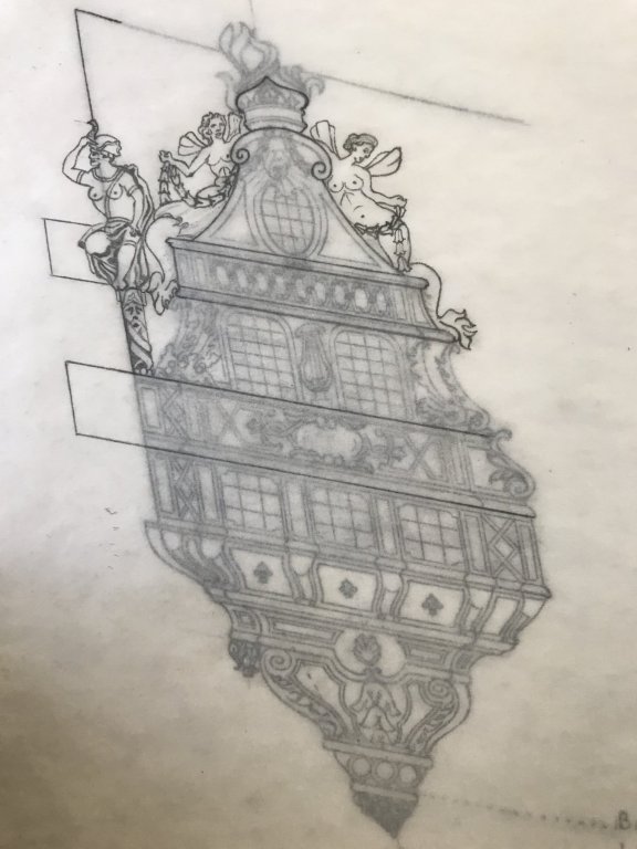
This concludes drawing for now. When it actually comes time to model the figures, I’ll do stern perspective drawings of the Americas and Africa, so that I can get the proper shape for these figures in two planes.
I may, in fact, be able to re-use the kit figure for the Americas, since the pose is correct, but the scale may not be. I will definitely have to carve Africa from scratch, though. There’s no way to kit-bash the kit figure to arrive at this cross-legged pose.
The good news is that I can re-cycle the side-lantern quarter pieces, as well as the Four Winds carvings that adorn the pedestal the the Americas and Africa sit upon.

- GrandpaPhil, kirill4, EJ_L and 2 others
-
5
-
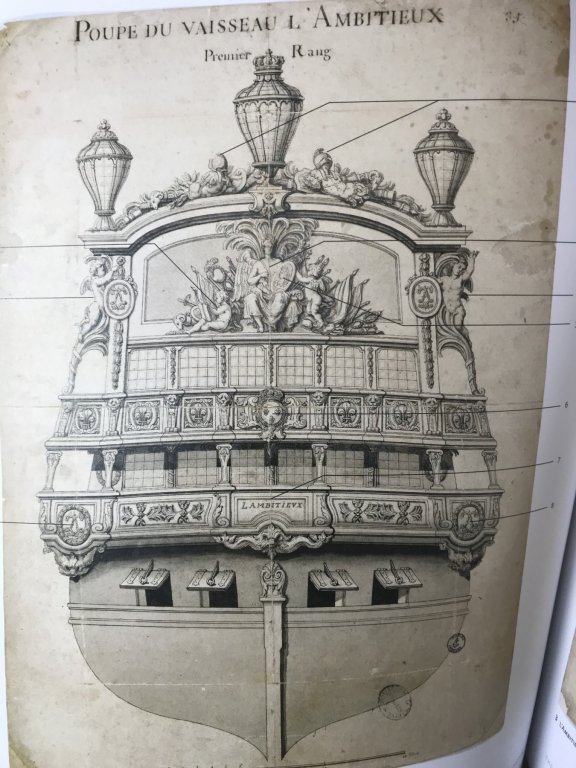
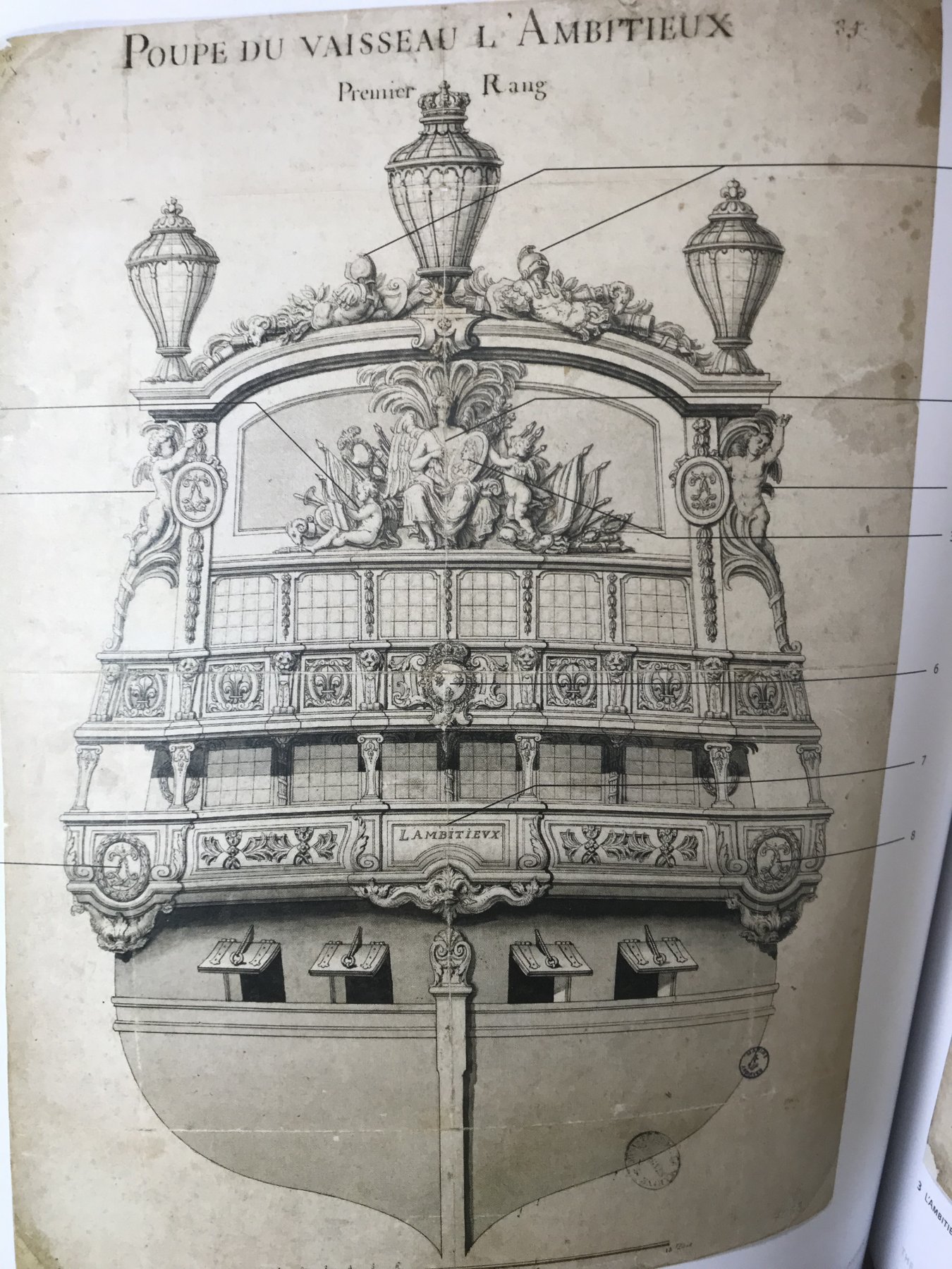
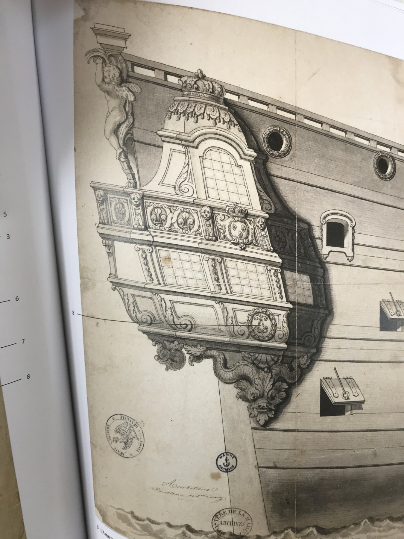
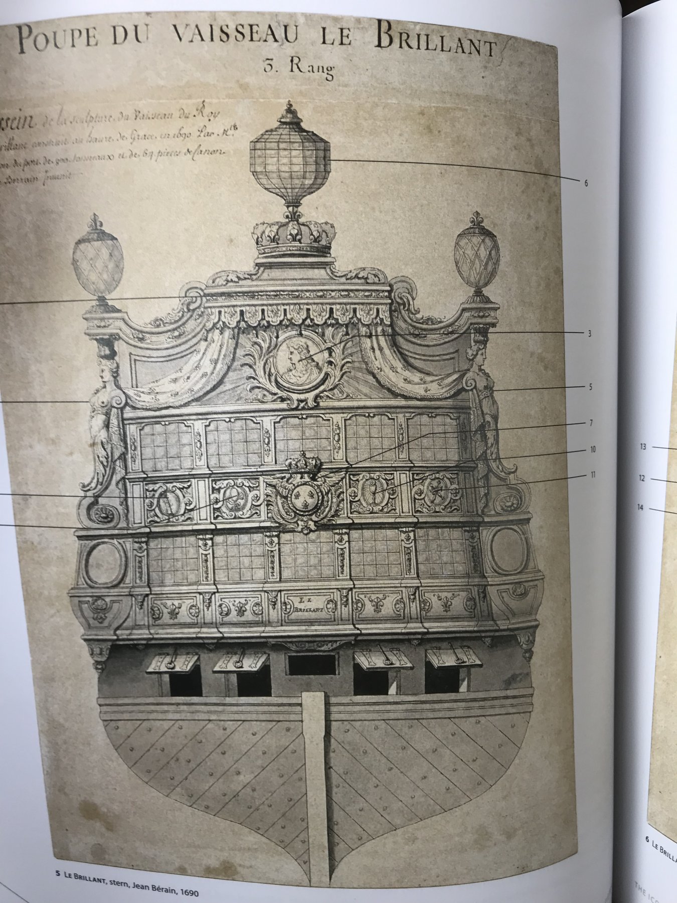
You can see what I mean in the following examples. Even in low-relief, these lower finishings would read as visible projections from the stern view.
L’Ambitieux:

Le Brillant:

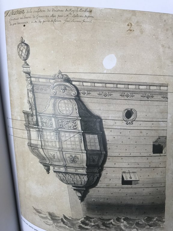
This dichotomy between stern and quarter views may explain why the Berain stern drawing makes no visual reference to the mermaid figures, nor the amortisement, which would surely project somewhat from the ship’s side.
L’Ambiteaux, which also would have had an amortisement, above the main deck level, is also a good illustration of this omission.
It is my opinion that Berain did not include these details in the stern view because they would only serve to clutter the stern drawing, when they could be better understood in the quarter view.
- Mirabell61, GrandpaPhil, druxey and 5 others
-
8


CSS Alabama by J11 - Revell - 1/96 scale - PLASTIC - kit bash 90% historical accuracy
in - Kit build logs for subjects built from 1851 - 1900
Posted
Anytime, Dude! Glad to be helpful.