


Hubac's Historian
-
Posts
2,990 -
Joined
-
Last visited
Content Type
Profiles
Forums
Gallery
Events
Posts posted by Hubac's Historian
-
-
-
-
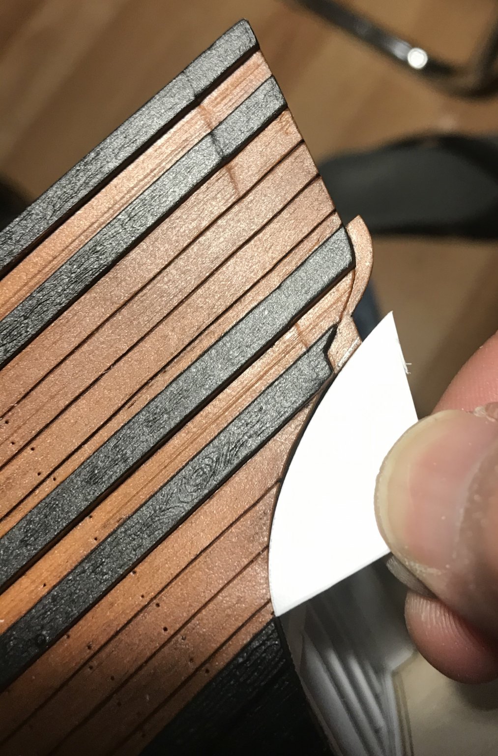
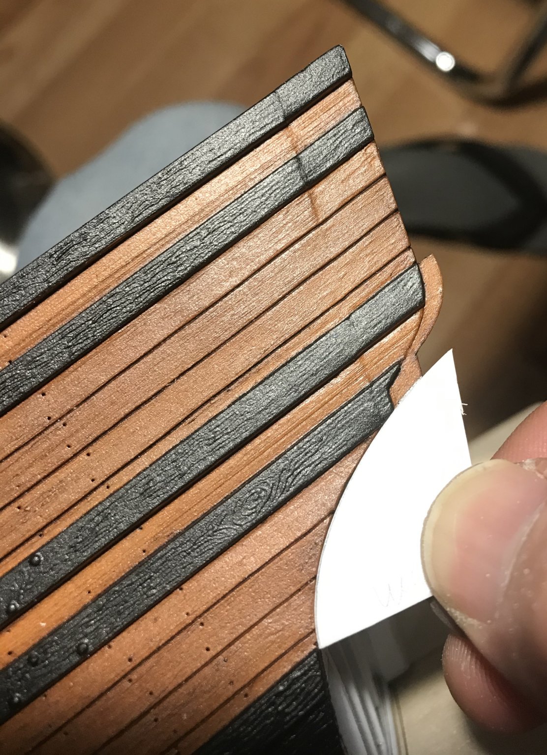
Hi EJ - thanks for weighing in! Yes, definitely, the camera exaggerates the degree of shine. I just use my iphone to take pictures, which are decent, but highly dependent upon whatever ambient light I have going.
- Old Collingwood, EJ_L and mtaylor
-
 3
3
-
Thanks, EJ, and thank you, O.C!
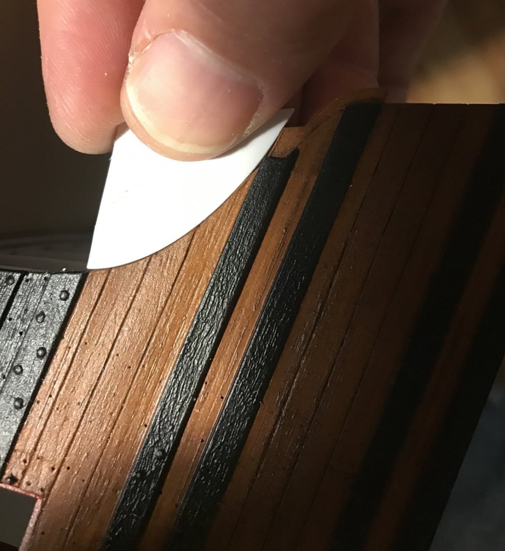
To answer your question: if I were actually representing bare wood, then, absolutely, I would flatten the sheen. When I get to them, the upper decks will have a flat finish.
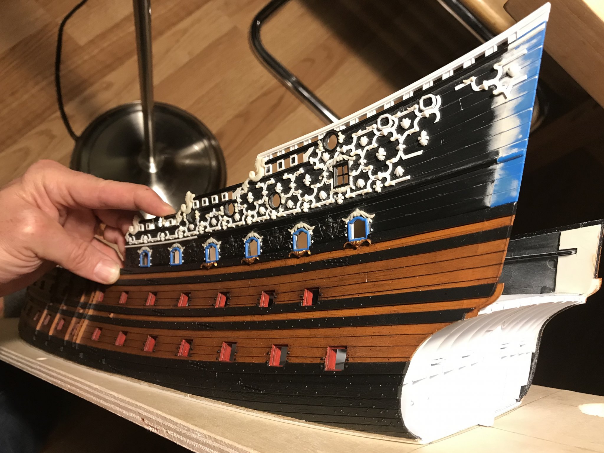
On French ships, though, the planking between the wales would have been painted as a means of protecting all of the iron fastenings.
Although the distressed color I have arrived at is very wood-like, it is intended to represent “ventre-de-biche,” or belly of the doe.
In reality, 17th Century paints would also probably have had a flat finish. When I made my sample work-up, I tried flattening the sheen, which was a little too burnished, after distressing with the oil paint and a chip brush.
I didn’t like the result; the dull-coat seemed to rob the surface of all it’s depth and vitality. The matte spray medium that I ended up using is a sort of middle-ground between dead flat and a lustrous burnish. This is a preference that satisfies me, and the pictures don’t quite capture the effect accurately. It looks better, in person.
I am still debating whether to flatten the finish of the wales. I may yet do that. What I wonder, though, is whether the “black stuff” would not have had an oily appearance, considering the ingredients that it was made up from.
Anyway, a little more research, there, should help clarify that question. Please feel free to weigh-in, anyone, if you have a theory or an answer to that one.
All the best,
Marc
- mtaylor, Old Collingwood and EJ_L
-
3
-
Dan, you will be first with a complementary copy - signed first edition!
Mike - thank you for the kind words. Personally, though, I would hesitate to place my project in the realm of any of the MSW superstars (Amalio, Mark Tiedens, Druxey, Chuck, Kudin, among many others); their research is much better grounded in historic fact, while much of what I’m doing is merely an educated guess. I certainly appreciate the compliment, though.
- EJ_L, marktiedens and mtaylor
-
3
-
Druxey and EJ - thank you very much!
I suppose that if I hadn’t cut away the lower hull, there wouldn’t be as much necessity for custom framing. On the other hand, representing the closed-in, “false” lower stern balcony, as well as the stern round-up kind of necessitated it. In any case, I am having fun playing with the boundaries of what can be done with a plastic kit. I view this model as a great introduction to scratch-building. There have been numerous opportunities to develop new skills.
At some point, I do plan to start printing out the build-log. There are specific blocks of research that would help make up the substance of my proposed book. Whenever I do get around to printing it, I’ll make you a copy, as long as you cover the costs for paper and postage. It is gratifying to me that you have found this information to be of use.
The Gilded Ghost, on the other hand, would have very little to do with this model that I am making now. It would be a conjectural monograph that attempts to resurrect the early bones of Soleil Royal on the basis of her known dimensions, and what is understood about her better documented contemporaries - particularly Brest-built ships by Laurent Hubac.
My operating theory is that early SR looked very similar, structurally, to the Monarque and the Royal Louis, but that the stern allegory would have largely resembled Berain’s designs, while the bulwark friezes would have been more specific to the profusion of heraldic ornament that is seen so clearly on the Monarque and the latter Dauphin Royal drawing.
In my mind’s eye, what all of that would actually look like becomes clearer, by the day. Several people have already produced credible hull forms for first-rates, of this period. I would never be able to definitively say that this is what she looked like, but I believe I could make a plausible argument for my case.
Anyway, locating that portrait would go a long way towards propelling that project forward.
As always, thank you to everyone for your likes, comments and looking in!
-
-
Oh, interesting. I had so many problems with this post, this morning. Initially, it seemed to want to embed a video file, when I hadn’t even uploaded a video.
so I copied and pasted the text into a word doc, and cleared the editor. When I pasted back into MSW, the pictures showed up again (at least on my screen), and I was able to save the post.
When I get home, in a while, I do just a picture post for anyone else having similar issues. I love this forum, but the site is awfully wonky at times.
Thanks for letting me know, guys!
-
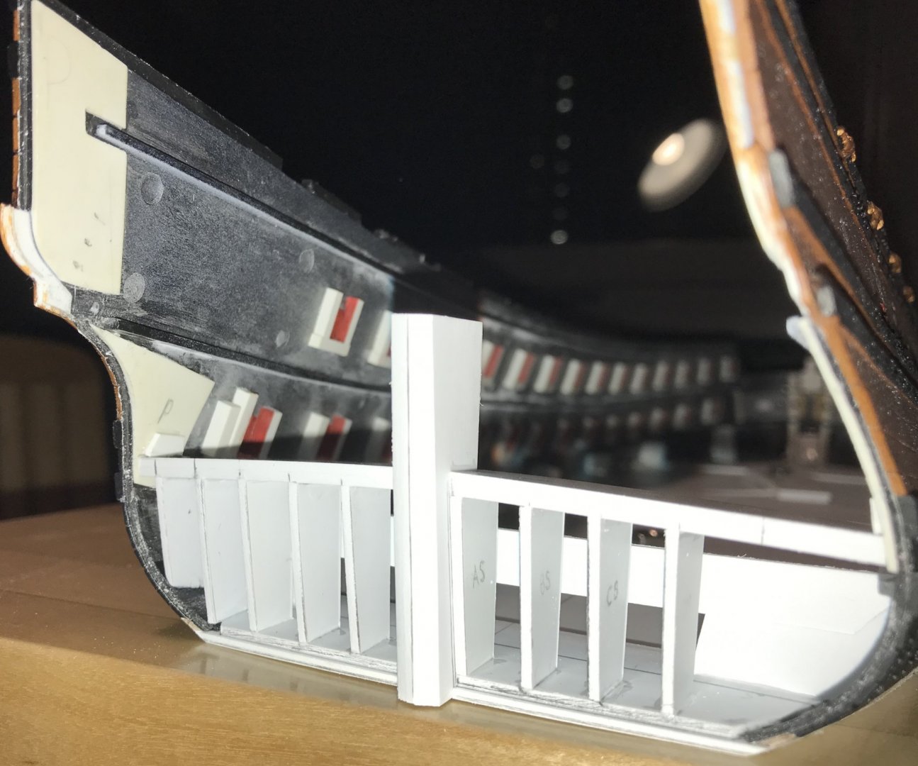
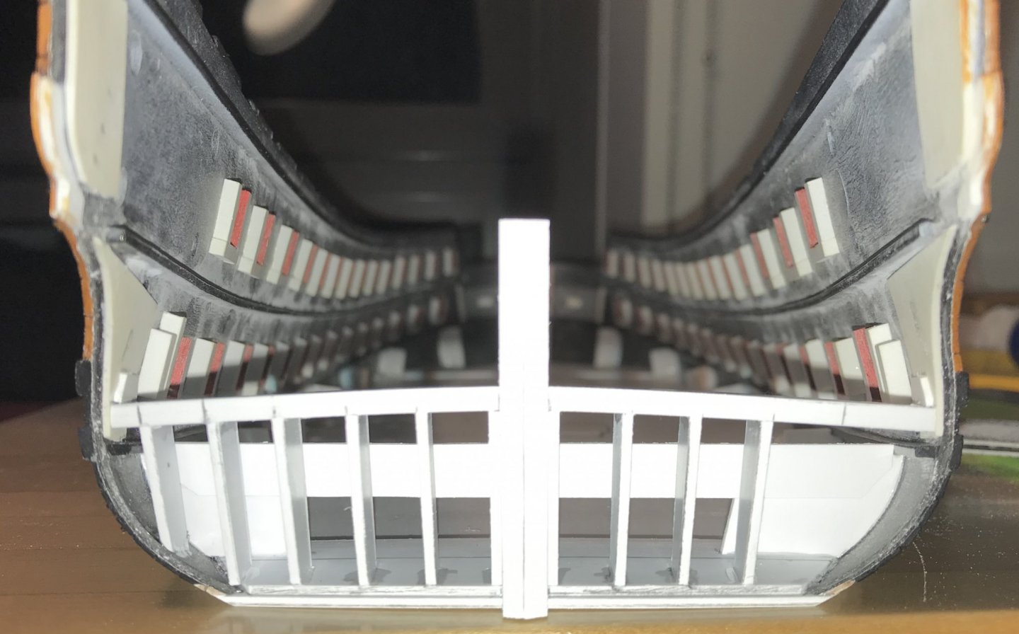
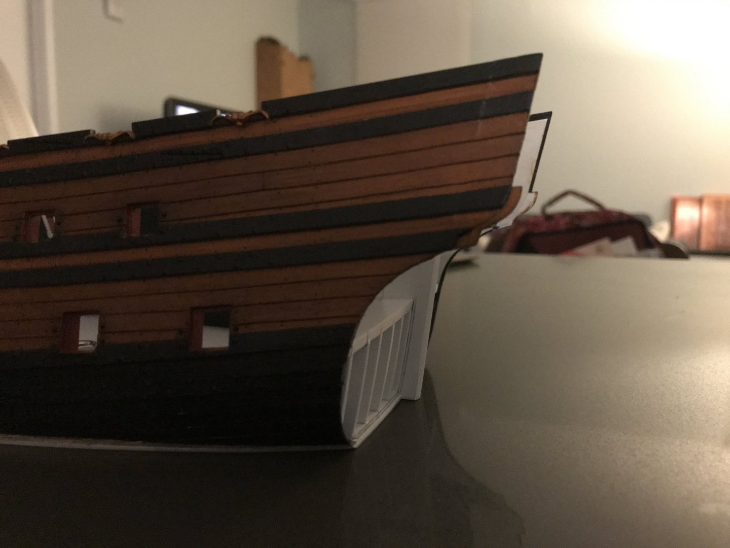
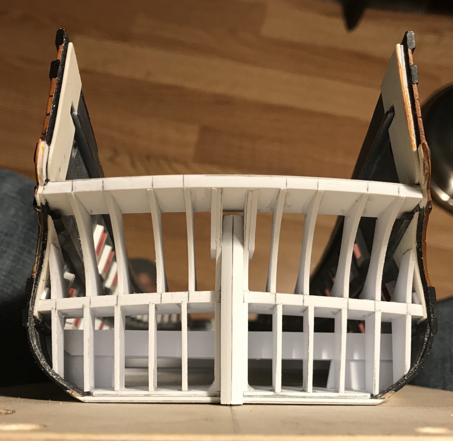
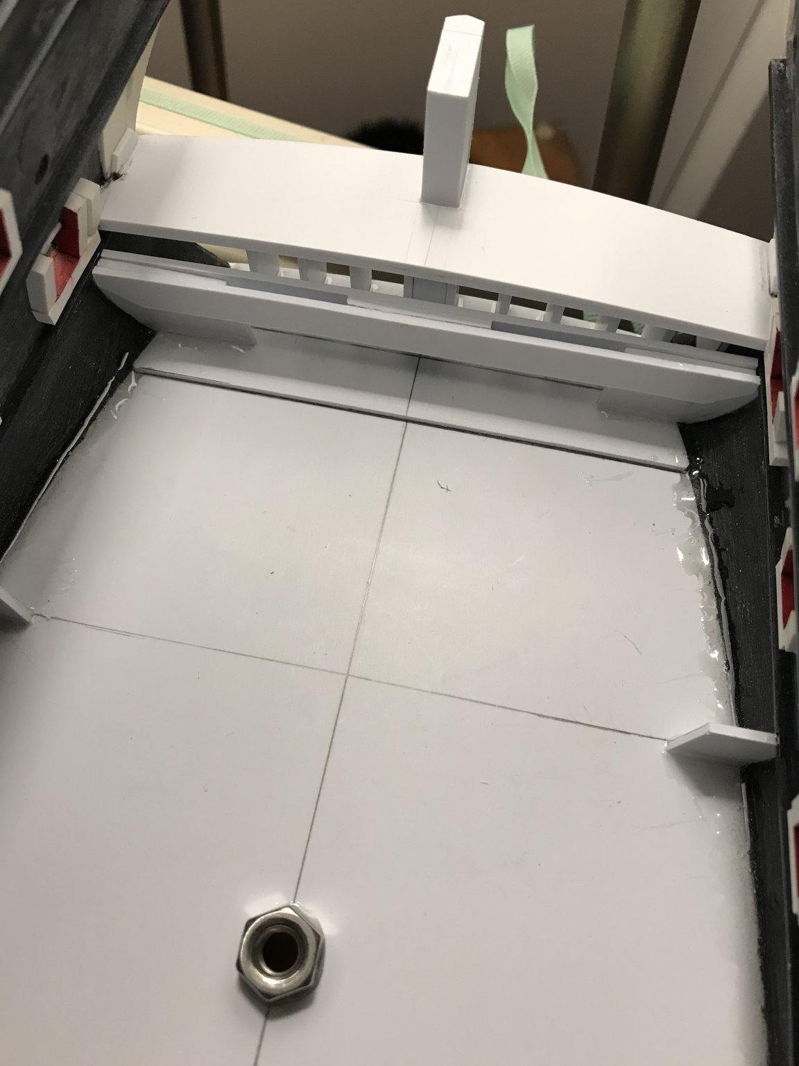
The framing of the stern continues in this installment, up to the stern counter. Initially, the process was identical to what I did below. The key difference was that I had to space my bulkhead framing to accommodate the placement of the stern chase ports. My initial layouts had the chase ports too close together and too close to the stern post. Eventually, I settled on the following layout:

BTW, I have found my plywood build-board to be a great help in freeing up both hands for fitting and eventually painting. I can clench the board between my knees, with the bow end resting on the floor, and it is quite comfortable to work. This will be critically important when it comes to painting the stern. The board also keeps my grubby hands off the paint 😀
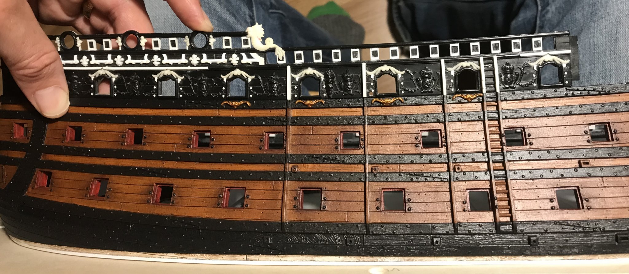
The location of the ports is hash-marked in pencil on the transverse round-up formers. I got lucky, in that I did not actively consider the fact that there are caryatid carvings, between the chase ports, whose placement must align between the 1st/2nd & 5th/6th stern windows. Directly above these caryatid carvings are the middle balcony supporting figures of Spring and Summer; if all of these carvings do not align properly, then the finished result will destroy the harmony of Berain’s design. Anyway, as I had only realized this, after I had glued-in all of the bulkhead formers, I am very glad that I didn’t have to cut the whole lot out and start over, again.
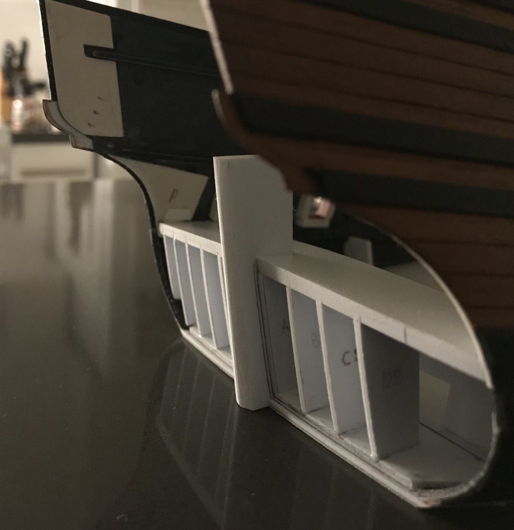
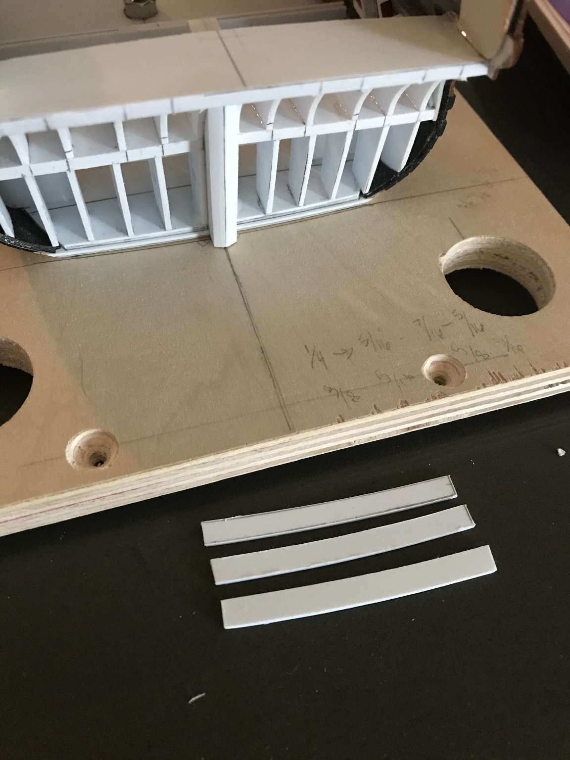
I thought I might be able to simplify waste-removal if I made stock for the port sills and headers that followed the transverse curve of the round-up:

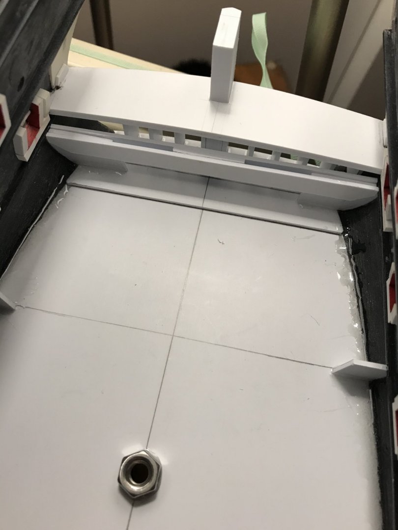
I glued in the sills by eye, adjusting them for level. I then made a 5/16 spacer block to mark the parallel location of the headers. The resulting ports appear taller than they are wide, but this is merely an optical illusion; the openings are 5/16” square, just like the broadside ports:

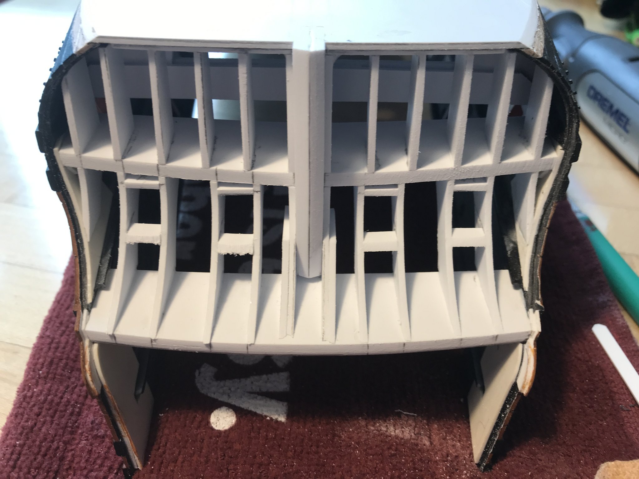
Above, you can see that I used a coarse drum sanding attachment in the Dremmel to rough back the starboard side. I don’t think I really saved myself any time, as I still needed to do quite a bit of fairing-in by hand to get the sills to follow the compound curvature of the stern counter. Additionally, their in-board profile was not as perfectly symmetrical as I had hoped, but it won’t matter in the end. After painting, there will still be a sense of the transom being bolstered by its internal structure.
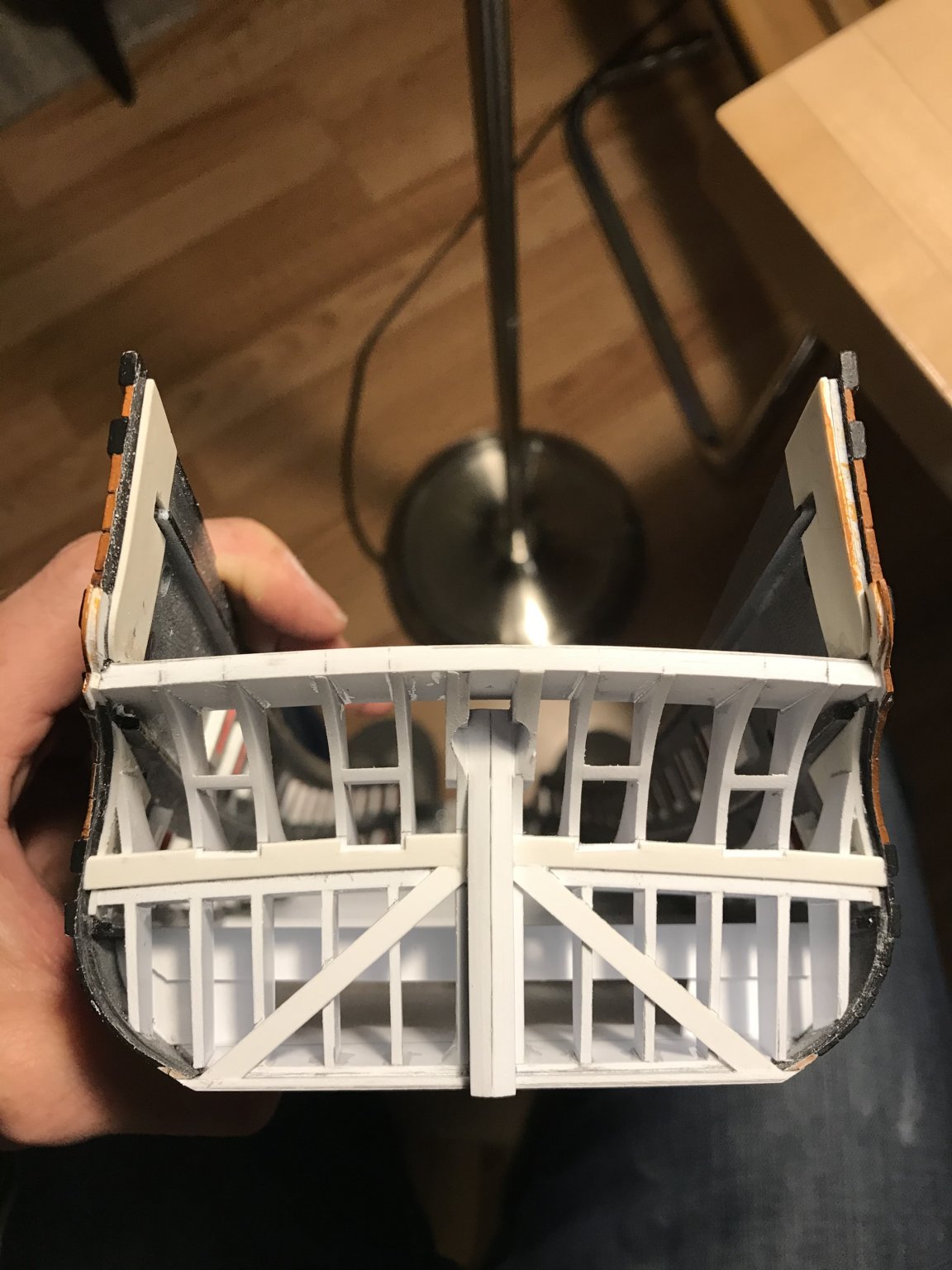
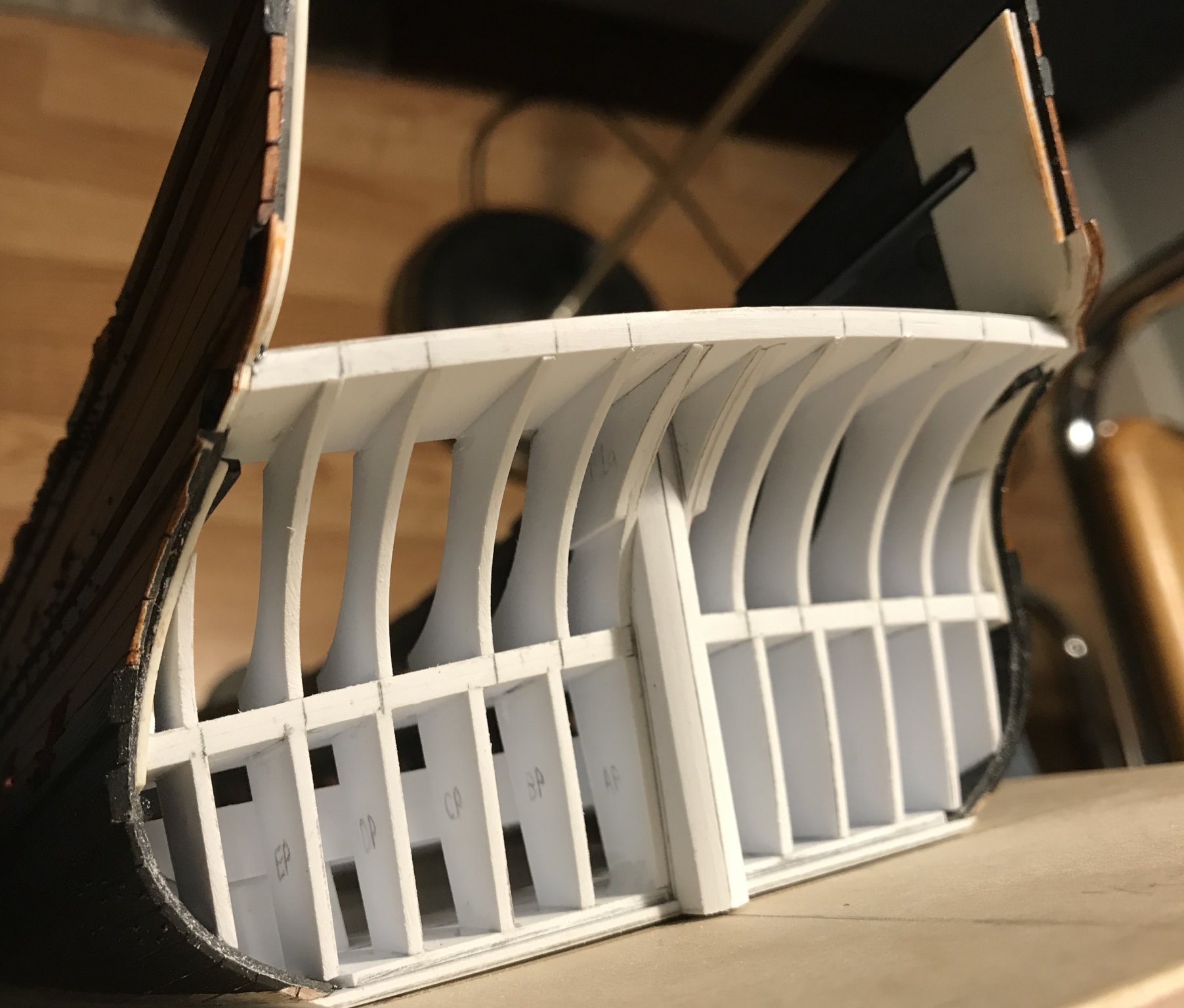
The ports and bulkheads faired:


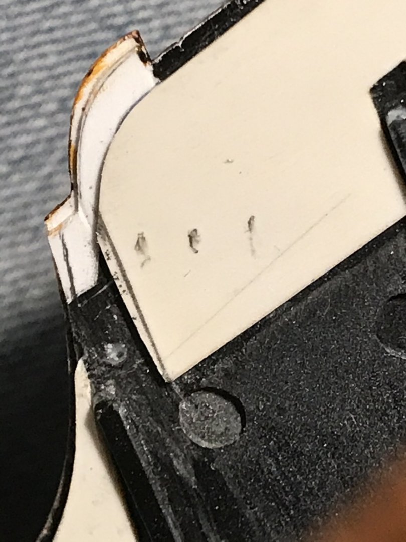
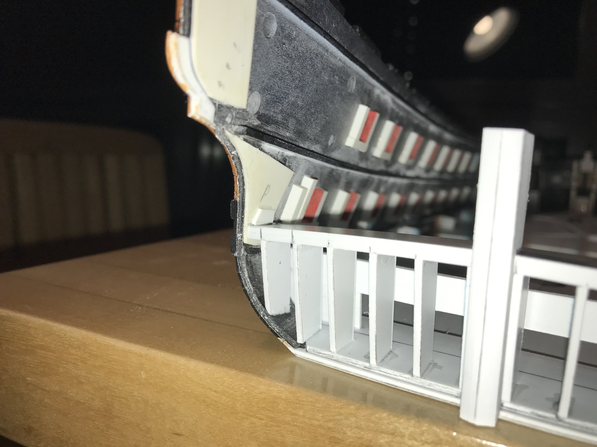
You may notice a partial doubling of the bulkhead formers at the top of the stern post. This was to accommodate the cutting-in of the “jaumiere” opening for the rudder head.
The stock Heller transom plate shows the juncture of two angled, straight lines, extending out from the stern post, and intersecting with a shallow arc.
All of the best Arsenal models I have observed show a softer, almost heart-shaped opening. This remains a work in process, but the starboard side reflects the finished shape I will match to, on the port side:


I now have a fair surface that I can plank to. I will begin by establishing the lowest horizontal plank that nibs beneath the sills of the chase ports. Below that, I will establish the herringbone angle of the planks for the lower transom.
Following all of that, I will create the ornamental transom wale, as well as my addition by authorial license: a flowing, carved banner (like the Provincien name banner) that is inscribed with what could be considered the motto of Louis XIV
NEC PLURIBUS IMPAR
Roughly translated, this means: not un-equal to the illumination of many [suns].
Well, while I am very happy with the process, so far, this is a long and winding road. Sometimes I like to daydream about where all of this is going:


Maybe today, my latest title will arrive. After struggling mightily through Uber Den Wellen, I went ahead and ordered another German language book:Versailles Der Meere. The author beat me to the title, so I am eager to learn what he has to say... if I can translate it.
Perhaps the author will have located a better image of my Gilded Ghost. Oh wait a minute - that sounds as though it could be the title of an, as yet, unwritten book:
The Gilded Ghost:
A Forensic Reconstruction of Laurent Hubac’s Soleil Royal, 1670
©️by Marc LaGuardia
Now the title’s mine 😉
- GrandpaPhil, EJ_L, shipmodel and 2 others
-
5
-
-
My book recommendation would be:
Les Trois-Ponts du Chevalier de Tourville, 1680.
Although La Belle represents the smallest of armed vessels - the barque longue - she is a microcosm (IMO) of all of the larger ships of the line, from this time period.
From a general construction standpoint - what applies to the big ships, would mostly also apply to the smaller ships.
- Oliver1973 and mtaylor
-
2
-
Marc - happy to see you back! Vermeer could not do a better job of imparting realistic flesh tones. All of that is impressive.
However...
How’s’bout a few more broad photos of all of the planking work you have been doing 😀
Can we see some more of that, s’il vous plait?
- mtaylor, EJ_L, FrankWouts and 1 other
-
4
-
Something more like this:
- FrankWouts, catopower and J11
-
3
-
I remember this kit well from the ModelExpo catalogs, in the 80’s. I always liked the model and thought Amati did a decent job of representing the ship. You make an interesting point about the number of bulkheads; that should make for a more fair hull.
One thing you might consider - because I think it can he done convincingly without having to alter anything else - is to modify the profile of the cutwater; Amati represents a more curved shape, but in reality, English ships of the period would have had a cutwater that was a straight line from the turn of the figurehead to the footing of the stem. It will look great, either way, but it is something to think about.
You are off to a great start, and I will gladly follow along!
-
Oh, cool. Well, if you haven’t already - check out md1400’s build of the Corel version; he really did so much to make the model more authentic. A lot of really good ideas there.
- J11, EJ_L, Old Collingwood and 1 other
-
4
-
Hi Johnathan!
Which maker’s model of the Vasa are you going to build?
-
I’m sorry to hear about the loss of your Dad. We lost my mom 3 1/2 years ago, and my father has long out-lived anyone from his side of the family. Nevertheless, at 85, he soldiers on and we are lucky to still have him. I wish you healing and fond memories as your family grieves his loss.
The model looks spectacular, by the way.
-
Marc Yeu is also a first-time scratch builder, but his innate talent and willingness to take his time are producing first-rate results - as are your talent and patience. Keep it up!
I will definitely take a look at Olivier’s build log. Merci, for sharing.
- Oliver1973 and mtaylor
-
2
-
Are you familiar with this builder?
http://olivier.gatine.free.fr/og/index.html
His model of La Belle is, in my opinion, just one of the cleanest, most elegant, and most superbly carved models I have seen. Olivier really captures the elan of French design. He is an inspiration to me, and whenever it is that I am equipped to build my first Arsenal style model, La Belle will be the subject; she’s the perfect microcosm of French naval architecture from this period that interests me the most.
The model you are making is on track to be every bit as good. I am following your resourceful methods with great interest.
- mtaylor, Oliver1973 and Ondras71
-
3
-
-
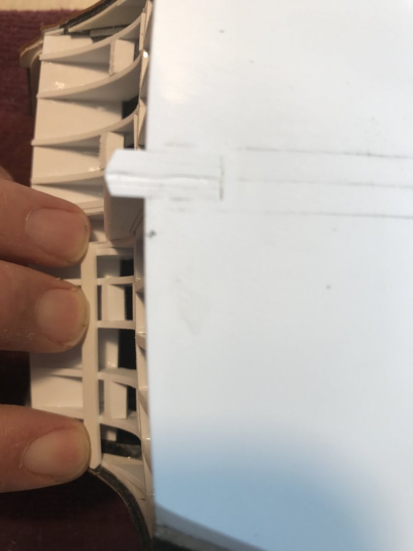
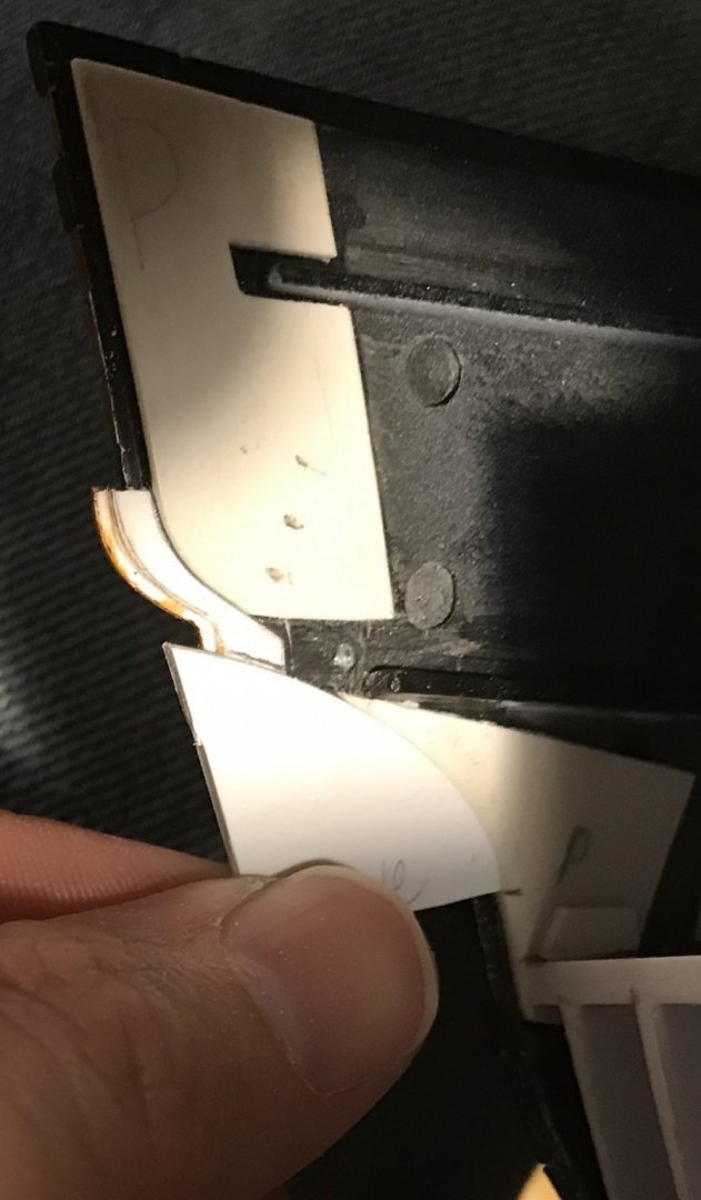
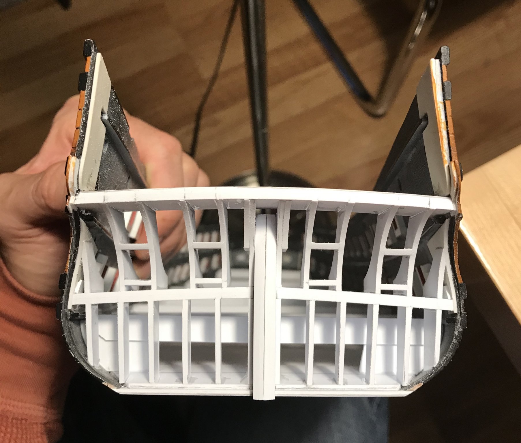
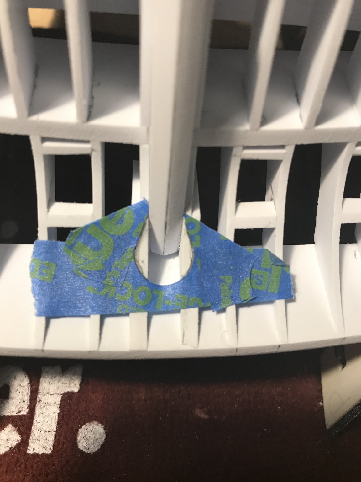
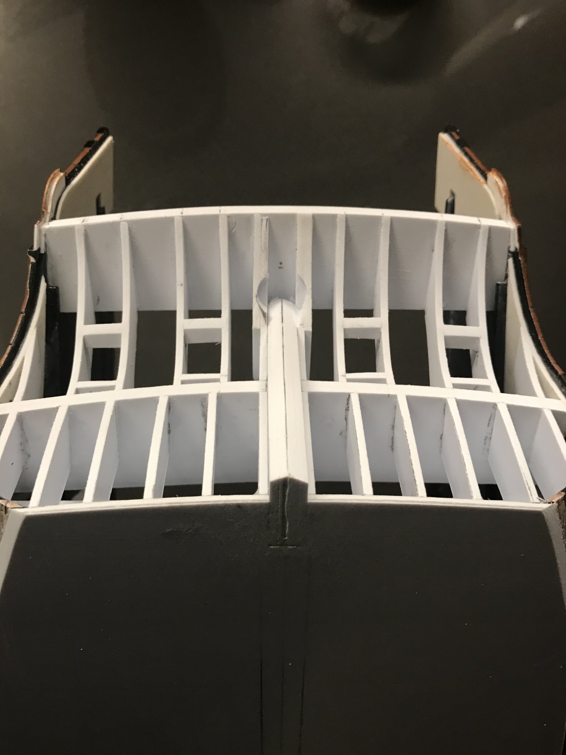
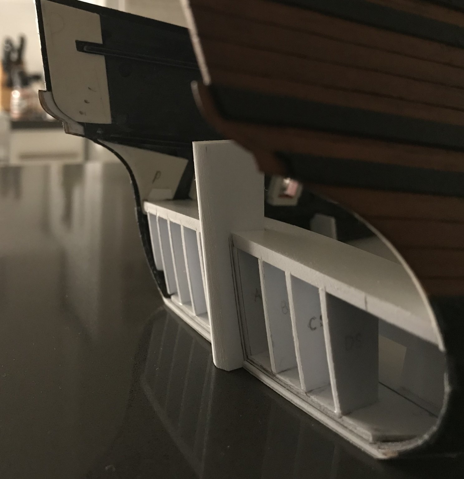
The lower transom bulkheads are all in and faired. All but two of the lower deck beams are in. I wanted to install the lateral round-up former at the counter level, however, I realized that I should first make a pattern of the interior planking rabbet, as the vertical bulkheads would need to match this shape.
With a piece of green tape abutting the wing transom former (in the hope that I could simultaneously establish the bottom angle of the fashion pieces), I took a tracing of the planking rabbet:
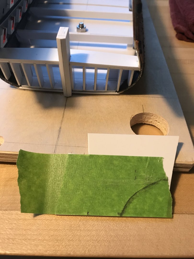
With drawing curves, I established a fair line, and I also marked the inboard and outboard boundaries of the lateral formers so that I knew how deep the cantilever of these counter bulkheads needed to be.
After connecting all the dots, this is the over-tall pattern that I arrived at:
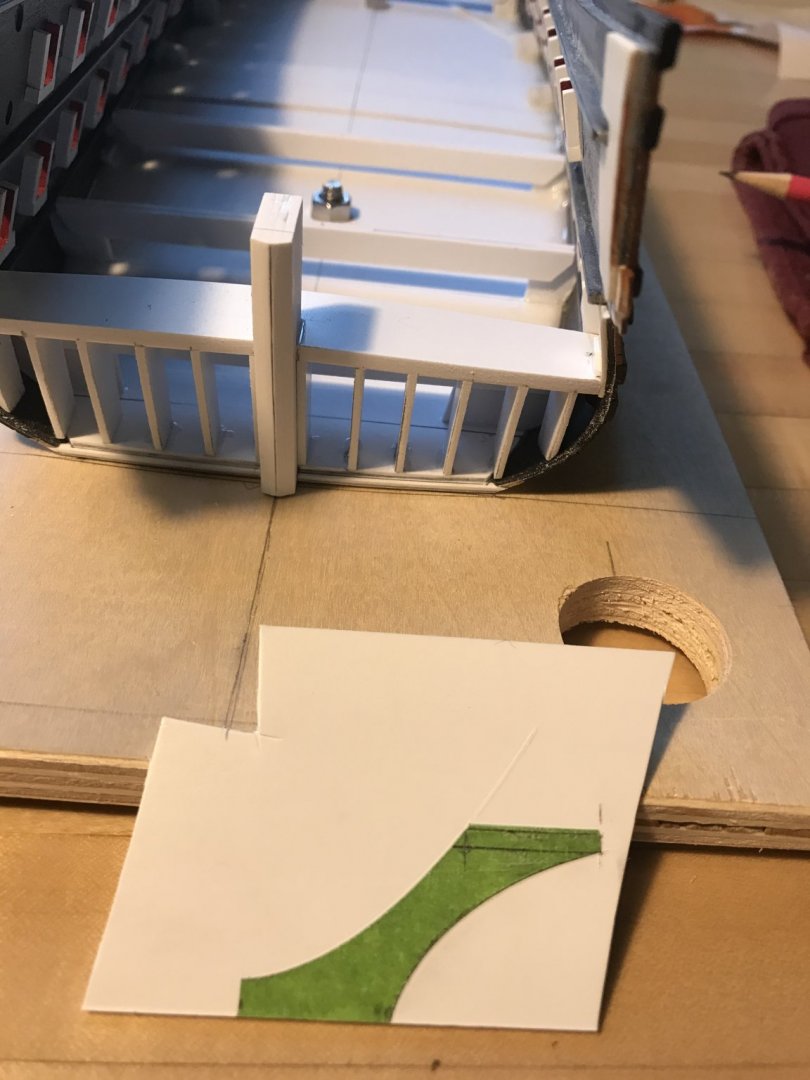
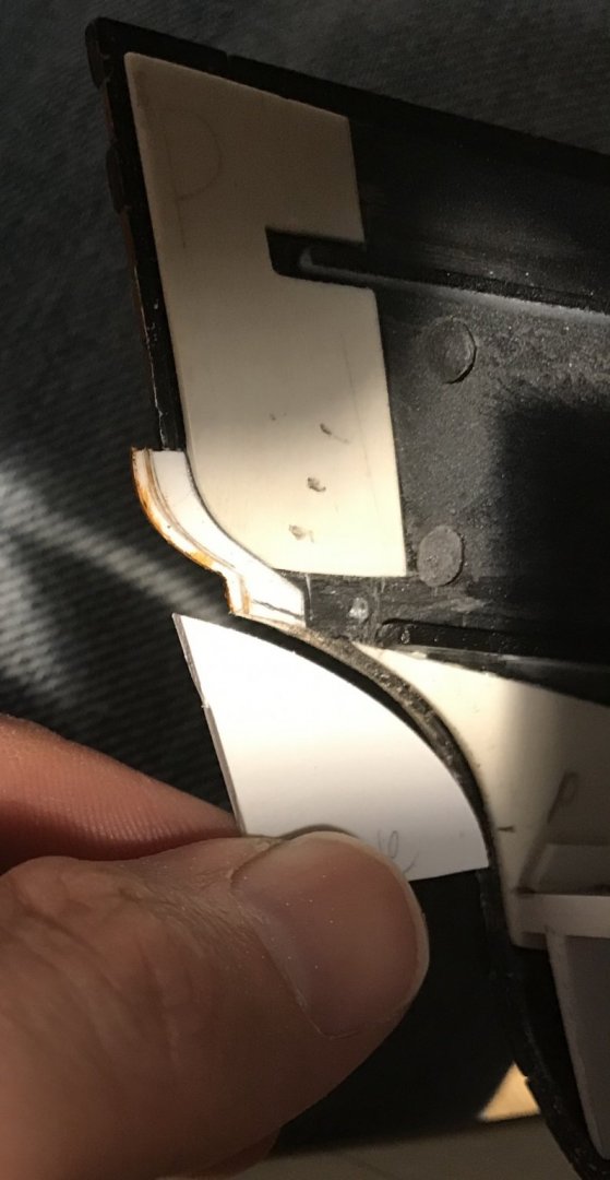
I cut close to my lines and then tested the pattern at various points along the wing transom. On the starboard side, from which I established the pattern, agreement between the bulkhead former and the outboard profile of the fashion pieces was very nearly identical.
However, as I moved the bulkhead pattern across the wing transom to the port side, it became visually apparent that the shape of the port side fashion piece was a different, more compressed arc. The question became just how much these two shapes differed, and what to do about it.
Doing nothing would result in an unfair and awkward run of the planking as it seated on the port side. Creating two different patterns that converged toward the centerline did not seem like a better approach.
This difference was difficult to ascertain, concretely, by eyeballing the bulkhead pattern as I shifted it slightly inboard or outboard, relative to the fashion pieces. It dawned on me, though, that I could make a “negative space” pattern from the bulkhead former and then offer that up directly to the fashion piece profile.
Above, on the starboard side, the match is nearly perfect. However, on the port side, I could now clearly see the variance:
I could also, now, use my negative pattern to trace a new line over the top end of the fashion piece, just beneath where the stern counter rises: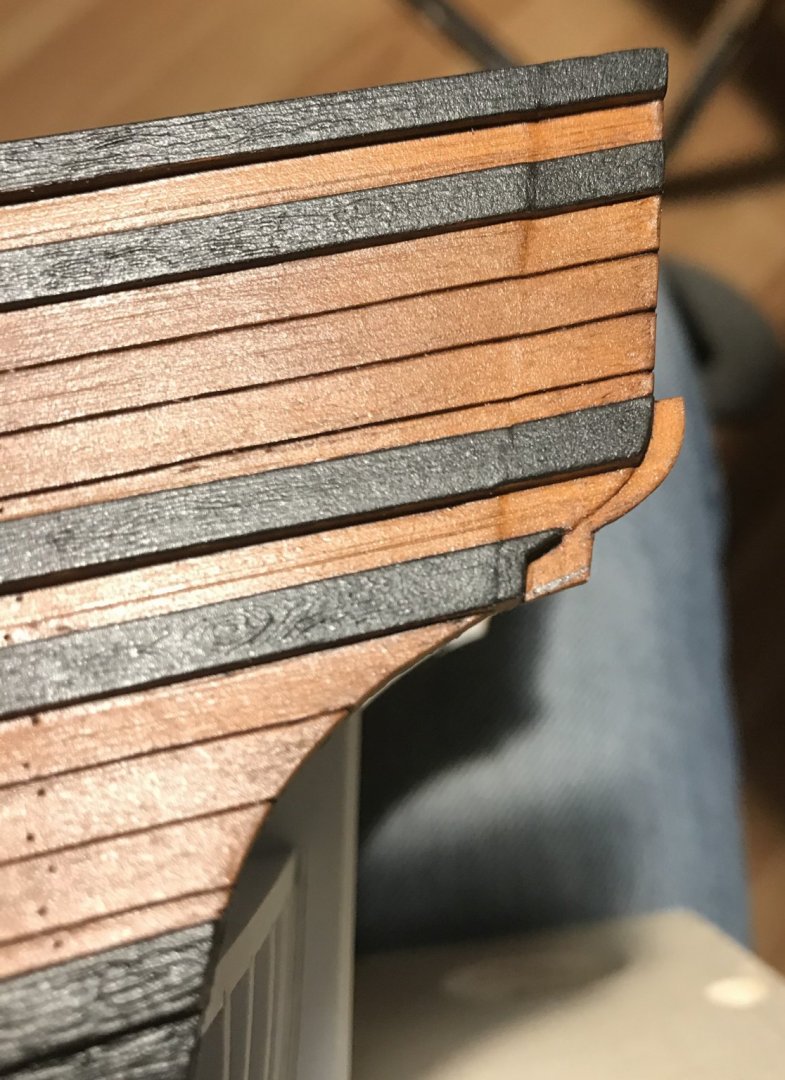
With that sorted out, it became a simple matter of reshaping the outboard profile, in order to achieve a perfect match between starboard and port.

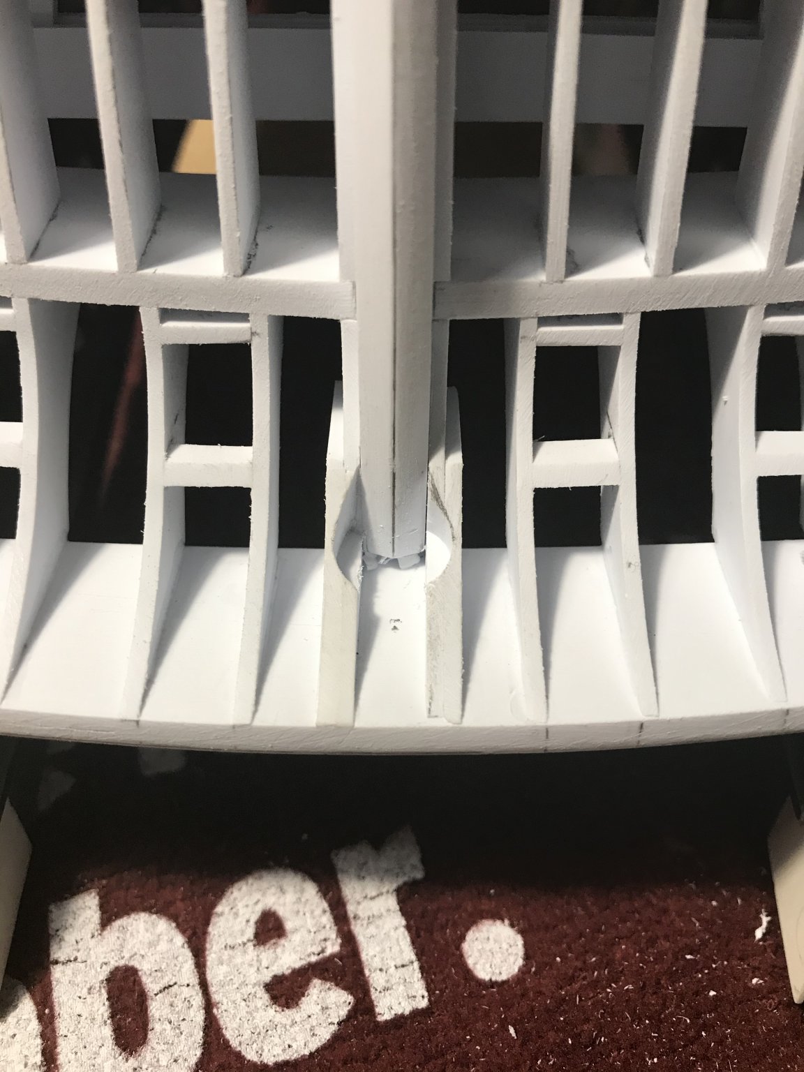
This same principal could then be applied to the planking rabbet, in order to ensure that the rabbet was a consistent depth, all along:
This new reference line showed me exactly how much higher I now needed to set the counter former on the port side:
By this point, I was getting too tired to reliably do the actual fitting, so I left off here. After making these adjustments, though, I should be able to glue in the counter former and use one bulkhead pattern to frame-in this space.
- md1400cs, shipmodel, popeye2sea and 9 others
-
12
-
-
-
Work continues. I have profiled the stern post, which to the best of my knowledge, is not tapered. The aft edge of the rudder, on the other hand, has a definite taper that increases below the waterline.
I installed the aft-most lower deck beam because the transom bulkheads would soon make this area in-accessible. These lower decks have no camber, so the beam tops are set flush with the top edge of the pre-moulded deck ledge. The doubled construction will give plenty of support and glue surface to the lower decks, and they continue at regularly spaced intervals.
The vertical round-up is based on one curved pattern that begins at the point of greatest height - adjacent to the stern post - and carries through to the hull sides. As with the gussets, great care was taken to ensure good mating joints. Spacing between transom bulkheads is 3/8”. While I pre-beveled the bulkheads, prior to installation, I fair those bevels once the glue has set to ensure that I remain within my planking rabbet at the base and along the hull sides.
Following is a photo montage of variable quality, that will give a better sense for what this looks like:

It annoys me a little bit that the glue I paid along the joint sides isn’t neater, but it really won’t matter one bit because you will never see it. I will also glass-in the principal structural elements with epoxy, anyway.
After a nice visit with my father, this weekend, I brought home the remaining guns and their carriages. Work has already begun to clean and assemble those parts. These are the quarter, f’ocsle, and poop deck guns, which will all be super-detailed, as before.
I also brought home the lower mast sections, which will be reinforced with birch dowel. With the main mast, I can now step its footing and establish the rake.
I also plan to make new tops of a somewhat broader diameter, so that the topmast ratlines have a more convincing spread, or slope. That’s another good small-work project for my downtime.


Soleil Royal by Hubac's Historian - Heller - An Extensive Modification and Partial Scratch-Build
in - Kit build logs for subjects built from 1501 - 1750
Posted
I kind of like the imagery of your head on a seagull’s body, Vic. Please - just don’t bomb the ship!😂