


Hubac's Historian
-
Posts
2,992 -
Joined
-
Last visited
Content Type
Profiles
Forums
Gallery
Events
Posts posted by Hubac's Historian
-
-
Hi Daniel!
No, not yet, but it is on my Christmas list of the only thing that I want. My wife has been informed, and is quite happy to have the guessing taken out of the equation.
I’m excited for the St. Philippe because this new monographie will provide an invaluable bridge between the First and Second Marines. I suspect that it will be quite possible to use this work as a starting point and to work backwards, in the century, toward the first Soleil Royal (referencing the work and research of Frolich, Saunier, Devroude and the Album de Colbert), as well as forward to the second SR.
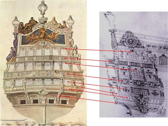
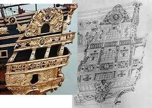
As ornamentation goes, I believe Berain’s stern is recreated exactly for the second SR, but that the quarter galleries and frieze would reflect the changes on the new navy, presenting a more austere ornamental scheme that still harkens back to the rebuild of 1689.
A little food for thought for your next project, should you decide to go that route:
You mention that you are selling your SR; is this a kit you haven’t started, or a model you have completed and would like to sell? Out of curiosity, which kit is it?
-
The build-up to Thanksgiving slowed my roll quite a bit, these past few weeks, but I did manage to prep my spare hull blanks for experiments in paint protocol.
All the modification and prep work I’ve done is wasted, if the paint work doesn’t lend a level of realism that a waterline diorama calls for.
One of the things that struck me was that my decision to represent the nailing of the “dead works” would probably telegraph a little too severely, through the paint, and especially after any kind of distress wash was applied. On the actual ship, with the deadworks painted, the nailing would hardly show, if at all.
Thinking back, I remembered a brush-on acrylic product called dull-coat that had enough paint solids in it, perhaps, to fill those drilled holes just enough so that they remain a mere suggestion, and not a stark hole.
The other challenge is that Herbert Tomesan’s paint protocol for realistic, weathered wood depends upon scratches into the plastic, in order to retain enough of the distress wash, thus patinating the surface in a realistic way.
The Heller kit, on the other hand, has raised, moulded grain detail, which will definitely retain some of the distress wash, but the effect will be very different, and I’m not really sure that’s what I want.
So, with all of that in mind, here is what I have to work with:

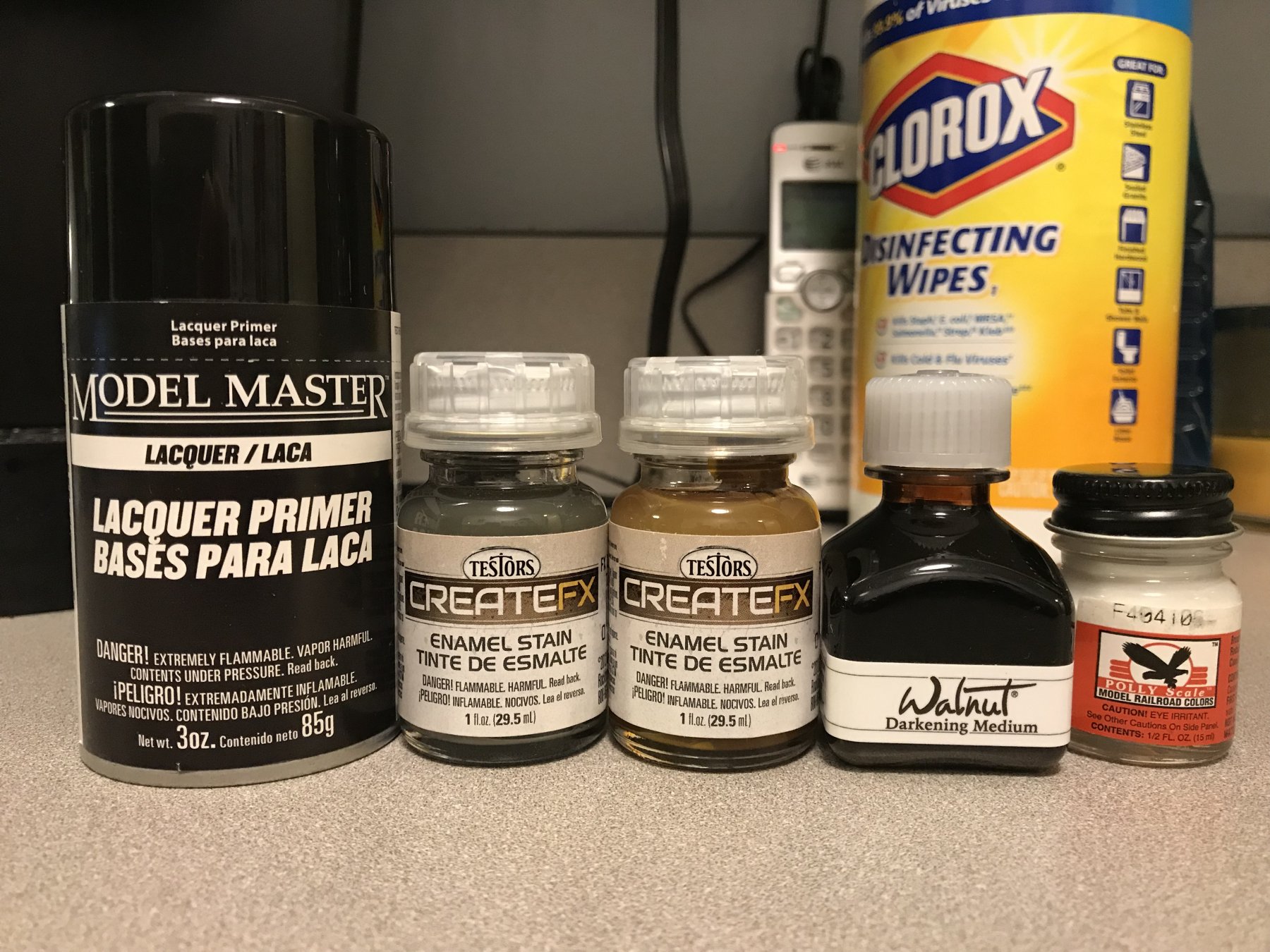
I found that Testors makes this super-fine flat-white primer now in a rattle can. This will be my primer base.
I also picked up a couple of Testors enamel washes to try over my acrylic base color. One is a medium brown color to be used as an overall distress wash. The other is a dingy grey that I intend to experiment with for the sort of vertical water streaking, you would see beneath scuppers, and flowing down from the sides of any hull protuberances, like the channels, for example.
I also think this grey can be brushed directly over the flat-white primer, for the thin remaining strip of lower hull, below the water-line, that will still be visible. That should dinge-down the white a bit. Although, it’s not pictured, I plan to experiment with dry-brushing some shade of algae green, also down from the water line.
Next to the enamels is a bottle of walnut ink that might make for a good overall distress wash. It shouldn’t present any compatibility problems with the underlying acrylic, which the enamel washes might because they are solvent-based.
Also not pictured is a tube of artist oil, Van Dyke Brown, which is what Tomesan uses as his distress wash, over a light sand acrylic base (also haven’t bought that secondary, lighter color yet).
Finally, the milky white stuff is the dull-coat. Here are my paint blanks:
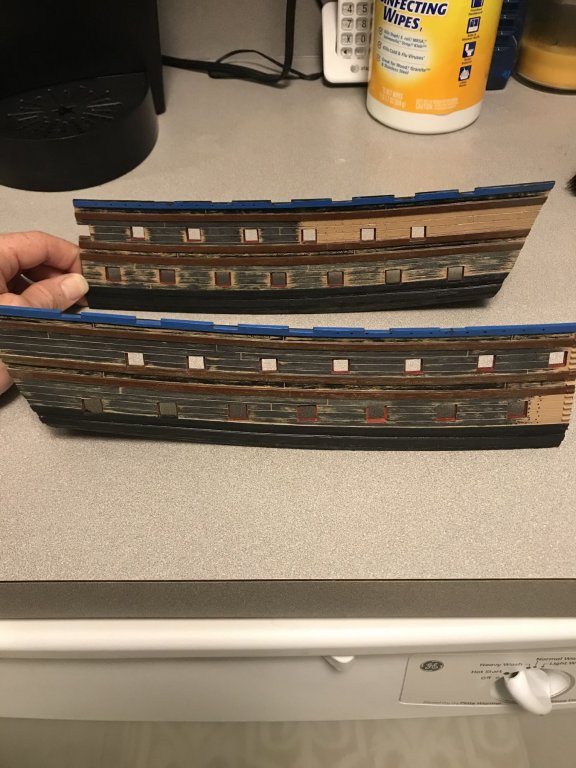
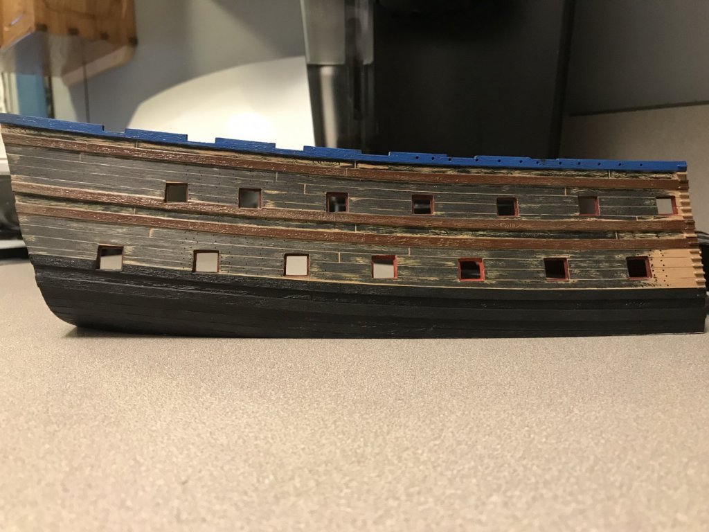
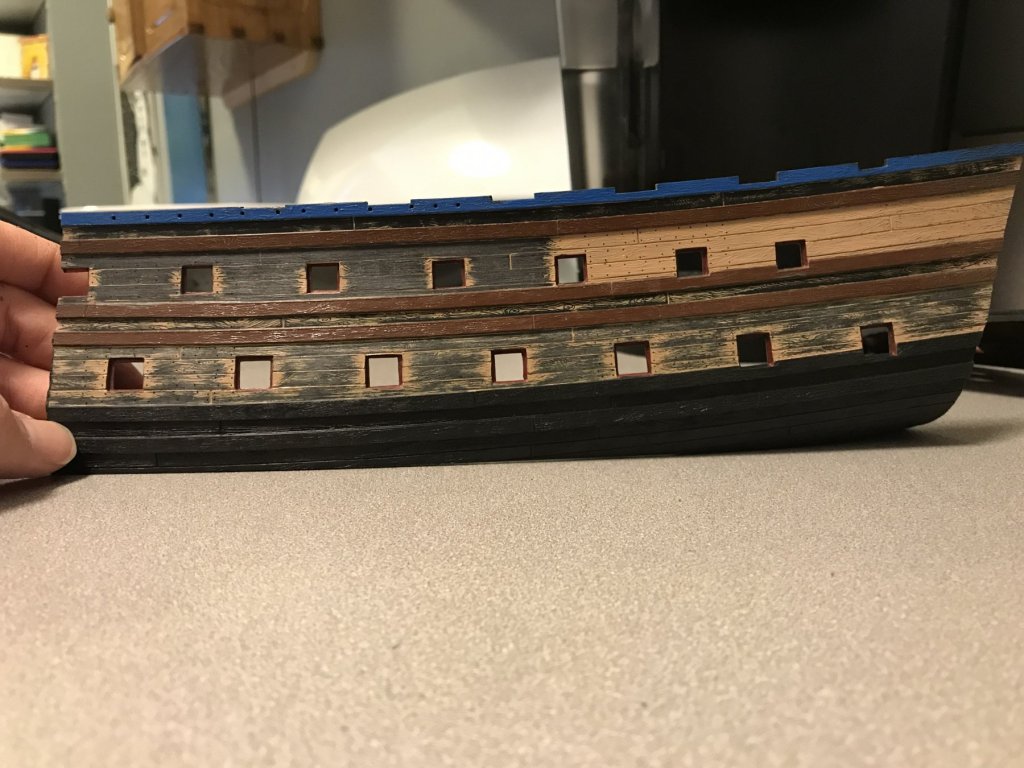
I’ve cut away the lower hull so that I can practice cutting in the top edge of the wales - a detail that Henry had executed to perfection, by the way. The other benefit of doing so, though, is that I will be able to see more clearly what my waterline distressing will really look like on the finished model.
Next I drilled in smaller sections of the nailing pattern. I just eye-balled it, so it isn’t as neat as on the actual model, where I used a straight edge guide.
Then, I scraped and then sanded (with 80 grit garnet paper) the lower and middle deck tiers to varying degrees of leaving moulded grain detail. The idea is to see what the distress washes look like in different combinations of scratched and raised grain.
One issue is that I had already applied my through-bolts and washers for the gun carriage tackles to the finished hull. I really don’t want to scrape this detail away and re-do it, just so that I can sand down my hull grain before painting.
So, in order to avoid all of that, you can see in the lower picture, lower deck level, that I carefully scraped/sanded between the ports, taking care to avoid the area just to either side of the port opening.
Well, this will all be an experiment to work up something that I like, but it will be time well-spent.
In research news, I’ve had some back and forth with Michel Saunier, regarding the placement of the ship stoves, which I’d like to represent, as well as the period practice of constructing the lower masts. Michel gave some good advice there, which I will expand upon when the time comes to focus on those things.
I have also struck up a correspondence with Tony Devroude, who if you are not familiar with him, is the only other person, besides Michel Saunier, whom I have discovered to be building large, fully-framed models of French first-rates from the First Marine of Louis XIV. I would include Marc Yeu, in this group, but his excellent model uses a different construction method.
Mr Deveoude has developed his own plans for a model of Le Dauphin Royal of 1668, that pulls from a variety of contemporary resources, as well as the research of the late Mr. Boudriot, J.C. Lemineur, and the still existing architecture and furniture that were produced by the same artists and artisans responsible for the Dauphin Royal.
His research, which is detailed in a two-part series of articles for the NRG quarterly, back in 2010 is truly fascinating and still obtainable through the NRG website.
In the intervening years, though, Mr. Devroude has obtained better information, in some respects, and he is very graciously answering a number of questions I had of the period, and of his model, in particular.
With his permission, I hope to copy the full text of his responses into this build-log. Stay tuned!
- yancovitch, mtaylor, EJ_L and 3 others
-
 6
6
-
Also, just taking a quick glance back at your earlier posts - the carving castings look to be of a pretty decent quality. Will you use some and remake others, or do the whole ornamental scheme from scratch?
- Bill Morrison, FrankWouts, zappto and 3 others
-
6
-
There have been some very nice builds of this model, here, on MSW! Per usual, you are off to a brilliant start, EJ, and I know your willingness to upgrade and experiment will propel this build into the next level. I look forward to following along. This kit is 1:90. Is this the same scale as SR and La Couronne?
- FrankWouts, EJ_L, popeye the sailor and 2 others
-
5
-
-
Hi Patrick!
You are absolutely correct that there are alignment issues with the lower hull, when you build the kit straight out of the box. That is, in part, why I decided to cut away the lower hull altogether, below the waterline (which I raised by a solid 1/4”, BTW), and make the project a waterline diorama.
Ever since I saw photos of Richard Romaniak’s SR - which I had assumed was also cut down, but was actually photographed on her waterline in actual water - I had thought that the Heller model looked much better balanced without her abbreviated lower hull.
If you go back to somewhere around page 8 of this build log, you will see that cutting her down was the first modification I made. Doing this was the only way that I could possibly broaden the ship’s beam enough to include the missing sixth stern light.
I took great care, while fitting these new bow extension pieces (which were salvaged from a donated (Thx again Popeye2Sea!), damaged hull) to ensure that the alignment fore and aft was true, and that the stem halves were square to the centerline. At the time, this involved some fiddly heat bending of the thick plastic over an open flame, but luckily the extension pieces didn’t collapse into molten pools of uselessness.
The hull is fairly large and cumbersome to paint when assembled, though - especially details like all of the gun port linings, where it is advantageous for the work to remain flat while painting. On the other hand, when I am trying to cut-in the top edge of the wales, in black, it will be particularly handy to simply stand my hull halves up on the table, so that my brush hand can ride along the table, as I pull my strokes.
-
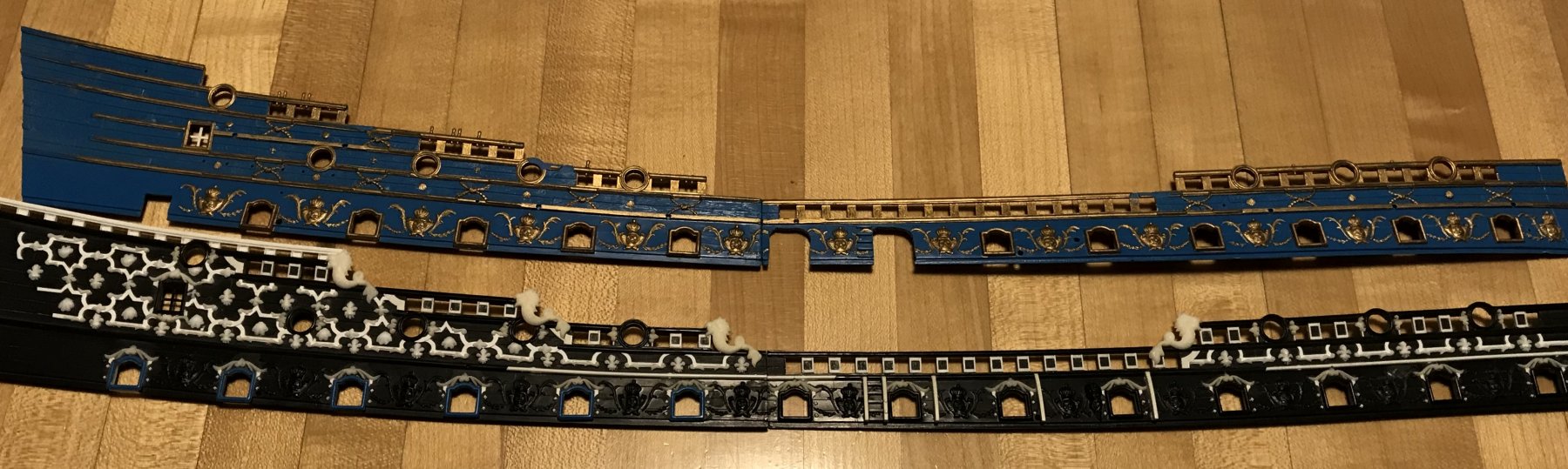
After several months of effort, I have finally completed the frieze on the starboard side, at least. I’m still ornamenting the port quarter.
Here’s one last comparison shot:
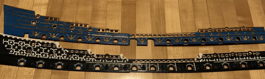
Taken as a whole, I think this experiment in stretching Berain’s frieze downward and forward is a success, even though it is not what was strictly drawn. I happen to think that the acanthus escutcheon carvings are just too large to exist between the quarter deck guns, and that their presence, at that location, cramps the frieze. There are certainly many things wrong with the Heller kit, but their decision to move these ornaments down to the main deck level was a sound one, in my opinion, and one that was grounded in documented practice among SR’s contemporaries.
A closer look:
And, I think, a pretty fair run with the drift rails:
While this particular phase of the project represents one of the most dramatic alterations to the kit, and the process of creating it was very educational and satisfying - it was also extremely fatiguing. I love it, but I’m kinda’ sick of it.
While I still have work to do on these upper bulwark pieces - the upper amortisement of the quarter galleries, and the bow and stern angels - I will soon put these parts away for a while, after I have cut and framed the two small octagonal windows at the poop-royal level.
Following that, I will focus on getting the lower hull halves painted so that I can mount them and begin actually building the model. I bought a sheet of 3/32” styrene sheet that will serve as the base cap of my waterline diorama. Dan Pariser once suggested using brass, instead, out of concern that a styrene base would warp. Styrene to brass sheet would be a purely mechanical bond. My thoughts are that styrene to styrene would provide a welded joint and I plan to gusset and epoxy the hull interior like crazy, for extra lateral stability. Does anyone out there have additional thoughts/experience on this point?
-
I’m sorry Mark, but I have to call you on your modesty. Yours is approaching Amalio standards of flawless execution. He’s in a class, all his own, but you are not far behind.
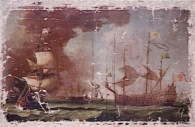
Recently, I saw the Kriegstein Collection model of the Royal James at an exhibition of the Dutch maritime master painters in Washington, D.C..
Now, this is an amazing example of the model makers’ art, of the period. Yet, when compared with much of the work being done today, it seems positively crude by comparison. Of course, the circumstances under which these models were made dictated that they speed up their process a little, and take certain shortcuts in their representation and/or omission of various details. Nevertheless, the models being made today are much more complete and meticulous records of previously obscured and forgotten knowledge. Your efforts and the efforts of everyone else that is dedicated to their process should inspire the next generation of modelers to jump down the rabbit hole.
Just incredible! Take a bow, my friend, because you’ve earned it!
- mtaylor and paulsutcliffe
-
2
-
Life challenges have done nothing to diminish your talents, Doris. As always, the work is superb, and I really appreciate your willingness to make alterations for authenticity, as your understanding of the ship evolves. Your efforts are what this site is all about, and we are all beneficiaries.
Here's to better days ahead

- Piet, popeye the sailor, mtaylor and 3 others
-
6
-
I love your 74 kit-bash, above, and the work on the Sovereign, so far, promises equally excellent results. I will gladly follow along with your build. The version of the Sovereign that most interests me is the 1660 rebuild, pictured above. I think that, someday, it would be fun to attempt modeling her, at this stage of her career. But, really, all stages of her career were exquisite.
-
-
-
Really interesting tip - I love this idea!
- Geoff Matson, thibaultron and mtaylor
-
3
-
-
-
-
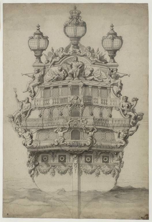
Yes, on my Pinterest page, I have seen this stern image tagged for Soleil Royal. But, then, the connection of this stern view to the starboard quarter view is un-mistakeable, and that image is almost always labeled as the Monarque. The signature on the portrait seems to answer that question, but it is easy to see where the internet leads us in various directions.
I have often seen what looks like a pretty amateur line sketch of the Monarque's stern, that is labeled as the Royal Louis. I have yet to find an attribution for that line drawing. That both ships were built in the same yard, within a year of each other, lends credence to the possibility that both ships would share similar architecture and ornamentation, even if they were built by two different shipwrights.
Well, this build-log began with a bunch of open questions about what context in which to place all of this imagery. There are some things that I think I can reasonably say identify a particular vessel, or characteristics that fit within the evolution of 17th Century practice. I don't know whether I am right, or not, but I believe I'm closer to the truth now, than when I started. Just gonna' keep on digging.
-
Well, at least one mystery is solved. If you enlarge the third, starboard quarter photo of the Monarque, you will see on the upper left corner of the portrait, an inscription that is partially legible; what you can make out is:
... Monarque
... par P. Puget
I only noticed this after blowing it up on my home computer.
- druxey, CaptainSteve, EJ_L and 3 others
-
6
-
-
Thank you, EJ, for your kind words and thank you to everyone for your likes and looking in!
So, I was quite surprised to find yet another amazing image of the Monarque of 1667. I keep coming back to this vessel because she represents, in my estimation, a pretty close facsimile of what Soleil Royal might have looked like in her first iteration. That every thing is drawn with such an acute sense of proportion and detail lends the portrait (attributed to Puget, who also designed the ornamentation for the ship) a sense of credibility that is akin to the work of the Van de Veldes.
This portrait, below, agrees in every way with two other, better circulated images of her stern and starboard quarter, but shows her port broadside under sail. Here is a montage for your viewing pleasure.
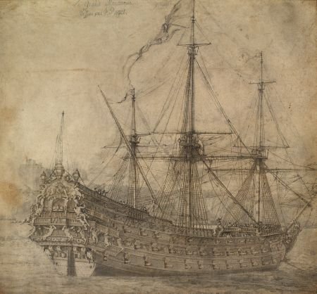
There is quite some debate, online, as to whether these images are of the Monarque or the Royal Louis of 1668. While the particular headrail arrangement and open, walkable tiers of the quarter gallery mark this vessel as an early construction of the First Marine, I believe the answer to her identity lies in a counting of the guns as compared with the lists of the Kings ships.
The Monarque, built at Toulon, and launched in 1667 was armed with 94 guns. The Royal Louis of 1668 was also built at Toulon, but by a different designer, and her initial armament is listed as 120 guns. Counting the guns in the first picture, above, one arrives at 94 guns - according to what is visible; the possibility/likelihood of there being at least two bow chase guns, on the main deck level, only brings you up to 96. That is a far cry from 120.
Now, up until now, I have been operating under the assumption that the following image is of the Royal Louis of 1668. However, in light of this conversation about armament, it seems much more likely that this is the Royal Louis of 1692, carrying 110 guns.
According to what I have learned, so far, the significantly reduced sheer, the semi-closed quarter galleries and the triple-tiered headrails are more consistent with this later, Second Marine development of the kings navy. Counting the visible guns, and assuming four bow chasers and four stern chasers, one arrives at 110. So, there's that. If that is, indeed the case, then this portrait has particular value for my modeling of SR in 1688/89.
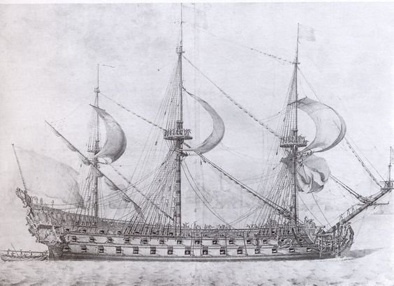
Now, according to memory, I believe that Michel Saunier told me, once in response to a side conversation, that the following image is of the first Royal Louis:
Perhaps that is so. It does appear to have the completely open quarter galleries. Interestingly, the image does show 16 guns on the lower battery, which only La Reyne and Soleil Royal were supposed to be armed with. Nevertheless, that 16th port, closest to the stem was only armed by moving the next gun aft, forward, when required. So, at most, the first battery would only have had 15 actual guns per side. I'll have to look back on that correspondence to confirm, but I think that is what Michel was telling me. Anyway, all pieces of a very complicated puzzle! Make of it what you will.
- mtaylor, popeye2sea, CaptainSteve and 5 others
-
8
-
Incredible attention to detail. I’ve always said that the first time you build something is when you get into the nitty gritty of drawing it. Fabulous insights into the why and wherefor!
-
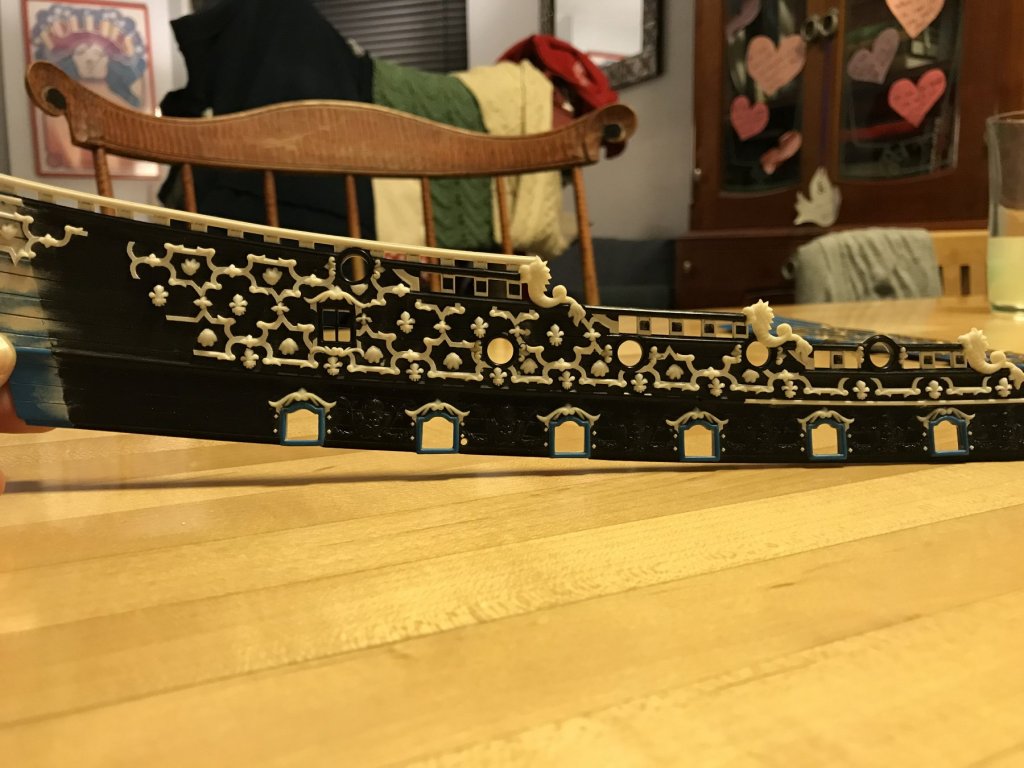
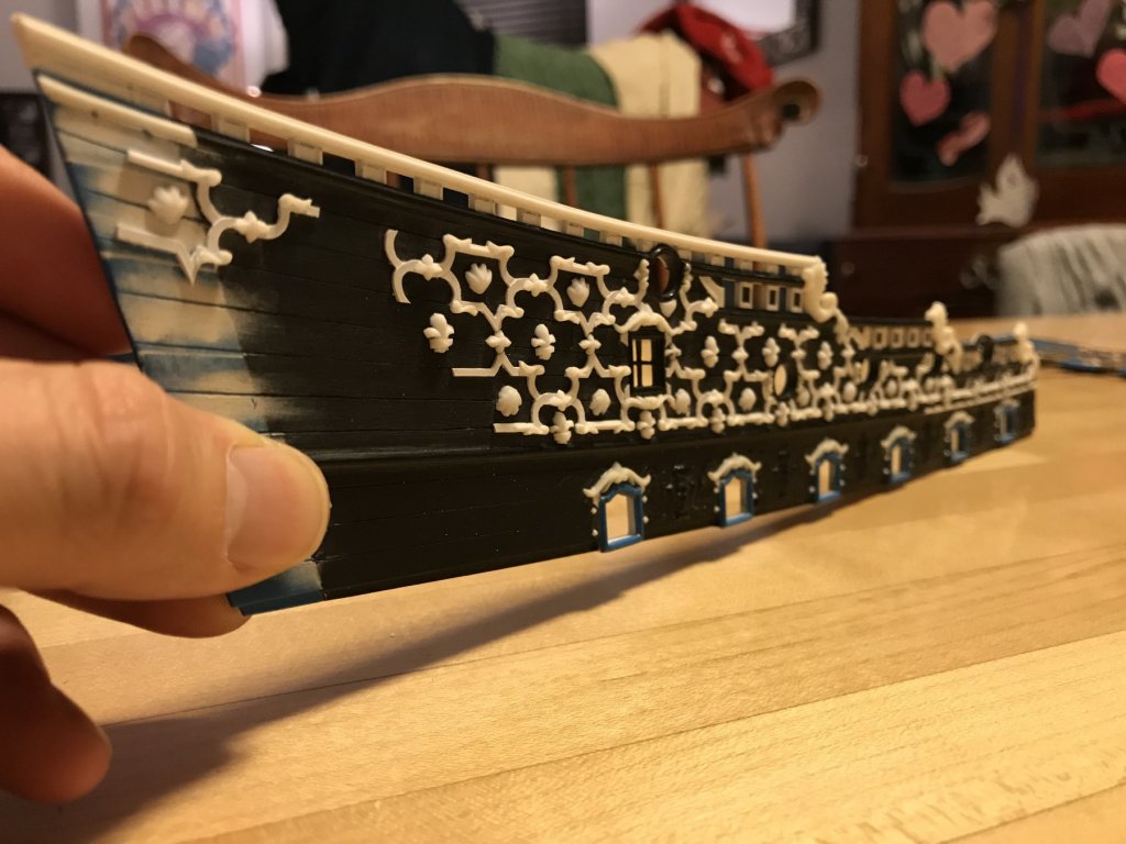
Applying the frieze is a lot like cutting-in wallpaper; you have to work your way into and around projections, without distorting the repeat of the pattern, and the only way to do that, really, is just to take your time.
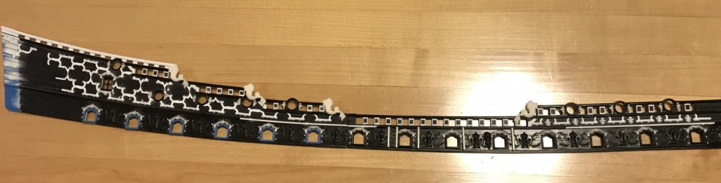
On the starboard quarter, the frieze is almost fully in place. There is one last small segment that bridges the two upper bulwark halves, but I will wait to glue this in, until after I have installed the upper bulwarks. I want this joint to be as seamless as possible. When you build the kit, as stock, much of the joint is covered over by the main channel. Now that I have lowered the channels, though, it will be imperative to do a good fill job on the joint.
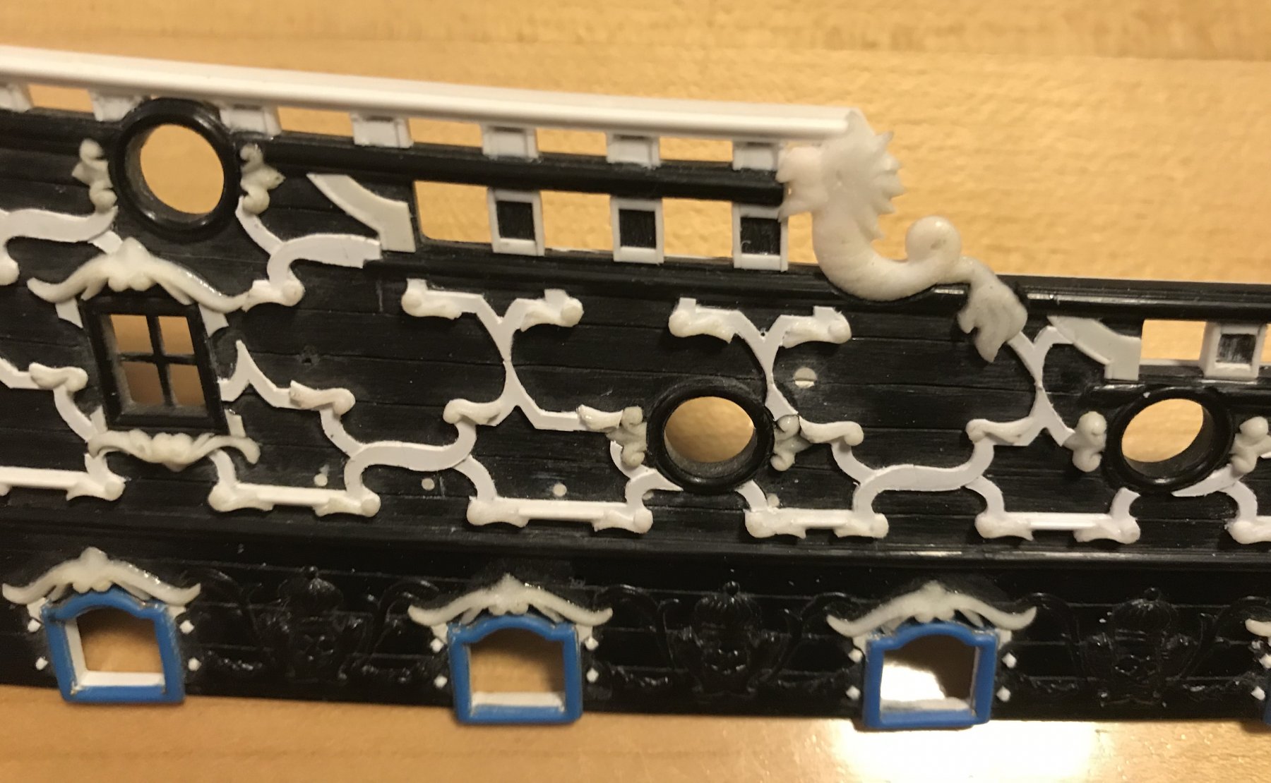
The stern quarter bulwark is scraped clean of any squeeze out, and the X’s have been lightly relieved to give a more three-dimensional effect. This piece is now ready to be adorned with foliate diamonds, shells and fleur-de-lis. I can’t write that without thinking of Lucky Charms cereal ☘️
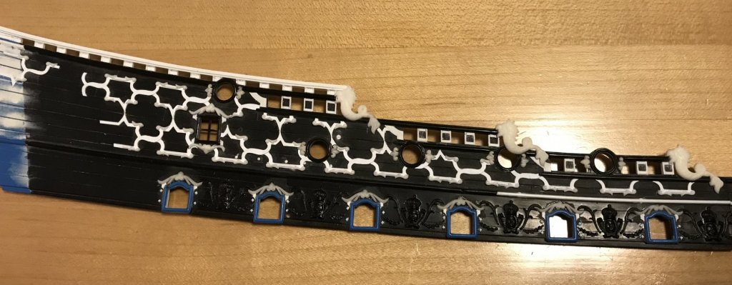
This closeup gives a better sense for some of the difficulty of breaking the frieze up into smaller and smaller segments for the cutting in. Foliate diamonds will cover the joints in the center of the Xs, and will be let between the pointy joints where the upper and lower tiers of the frieze meet. I shortened the ears of the crowning ornament, above the window. This will make a more sensible layout for letting-in the foliate diamond, just forward of the window.

On the other hand, the forward bulwark pieces were much more straight-forward, and placing them was much easier and faster.
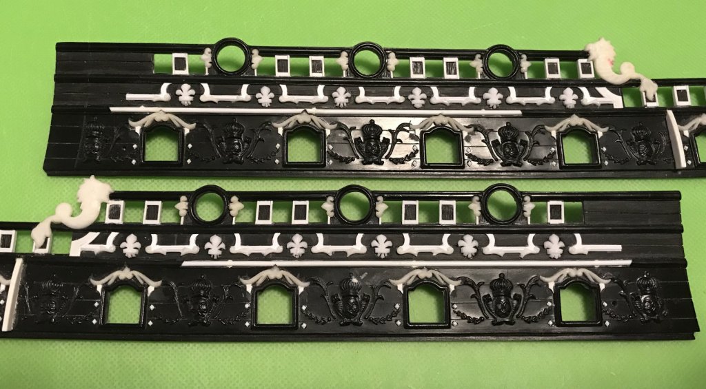
The difficulty with the forward bulwarks was fitting the fleurs. I still had to do a bit of shortening and re-shaping of the central petals to get them to fit within the allowable space. I still think they’re a little too large, but the effect is pleasing enough that I don’t feel motivated to make new, smaller masters; this is especially so, after seeing the now completed model of the Saint Philippe, with it’s diamond-hatch frieze of significantly smaller fleurs. Granted, the St. Philippe’s frieze is more dense. Nevertheless, smaller is better in both cases.
Anyhow, this would be one of my hard limits on this particular model. It is close to what I drew, in the first place, and in scale with the black and white Berain drawing, where the fleurs are quite large. In wood, though, I would go the extra few miles to get it absolutely right.
- rybakov, Baker, yancovitch and 9 others
-
12
-
-
Yeah, I won’t be waiting too long on this one!
In build news, the starboard frieze is going up nice and methodically. It’s a lot like wallpaper, with the cutting in and around ornaments and openings.
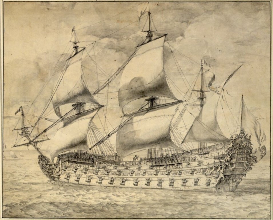
I’ll post pics when I have a nice progression. In the meantime, here’s a nice rendering of a typical French second rate, of the period:
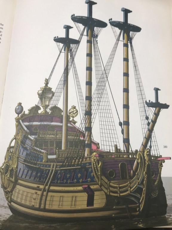
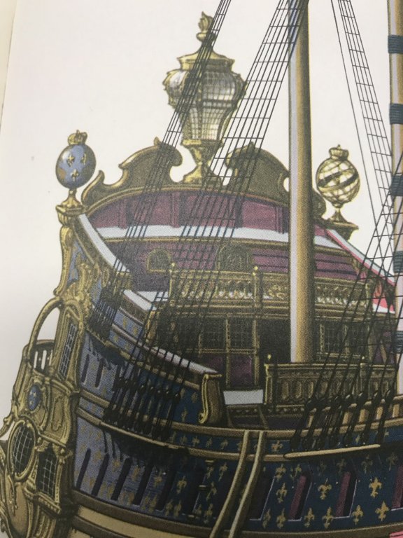
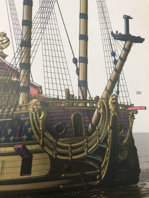
This drawing provides a good sense for the convolutions of the quarter galleries.
- mtaylor, popeye2sea, Old Collingwood and 1 other
-
4


Soleil Royal by Hubac's Historian - Heller - An Extensive Modification and Partial Scratch-Build
in - Kit build logs for subjects built from 1501 - 1750
Posted
So, my plan was to follow a paint protocol that was developed by Herbert Tomesan of Artitec Modelbeau.
Fairly simply, it is the following:
A primer base coat, followed by light acrylic wood tone (I used ModelMaster Random Tan, and also Academy Raw Sienna), followed by full strength Windsor and Newton Van Dyke Brown (brushed on thick like shoe polish), then wipe away excess with rags, Q-tips and a coarse (chip) brush, and finally a soft brush, if you desire.
It seemed so straight-forward, and in fact, it was!
Calling back to an earlier post, when I expressed concern that my nail holes would end up popping too priminently, I first brushed on two coats of dullcoat, across the entire upper battery, before priming.
After priming, this did seem to make a small difference, but then after two coats of acrylic base coat - there was a notable difference.
The ModelMaster acrylic paint is a dream to brush on directly from the jar. Two coats were necessary, but then the color saturation was consistent.
The Academy artist acrylic in the tube, on the other hand, is a much heavier consistency, and it took some experimentation with adding water to get a consistent even color. Maybe next time, I’ll get it right and only two coats will be necessary.
Working from the center of my samples, toward the ends, I decided to first experiment with the walnut ink (made from actual walnut shells). At first, because it’s so watery, I did not think I would get much color penetration into the acrylic.
It wiped away easily, though, and to my surprise - gave the surface an instant patina. You can see the difference between the stained sections and the raw acrylics quite clearly.
The walnut really got into the sandpaper scratches, and left just a slight indication of the nail pattern. I was getting really excited about this!
As for “wood” tone, I thought the walnut stain left the Random Tan side looking kind of dead, for lack of a better word. Maybe like weathered oak, but it wasn’t nearly the impression that Herbert’s models make.
On the Raw Sienna side, though, the walnut stain gave better depth to the base color and the two of them, together, had a warmer, more appealing tone.
Then, tonight, I masked off for the Van Dyke Brown oil paint. I guess I had pressed the masking tape on with too much force, because it took some of the Sienna basecoat off with it. That won’t be an issue when I paint the actual model, though.
Well, the VDB oil is very much like shoe polish, and I was skeptical that removing it wouldn’t be a huge chore. Much to my amazement, the bulk of it wipes away really easily. I let it sit there for five minutes, or so, but the paint has driers in it to speed the cure time, so I didn’t want to wait too long.
Wow, what a difference! Both base acrylics looked much richer with the VDB. The chip brush really helps to soften the wash coat and even the whole thing out. Here are a few detail shots:
I may end up using the Random Tan/VDB combo for the decks, if I end up making those from plastic. I will almost certainly do the Raw Sienna/VDB combo for the lower hull, between the wales. I will still paint in the wales on these samples, and some of the gun port linings just for practice and to get a better sense for the whole thing.
I also have a brown enamel wash that I will try, just to see what that looks like. I’ll post pics of that, if it’s any good.
Whichever way I go, I think the key is just to work in manageable sections (4-5 gun ports in a row), so that I can remove paint carefully around all of my applied detail.
As for varying the degrees of moulded grain removal - it does seem to me that the more grain one scrapes and sands away, the better this technique appears. The patch where I left the kit grain intact just ended up looking kind of muddy.
I won’t mess with my wales, though, because they are fully detailed, at this point, and the flat black paint will minimize the difference in surfaces. If anyone is crazy enough to go through all of this in the future - they’d be well served to scrape away all of the raised grain before adding any detail.