Keith Black
-
Posts
6,746 -
Joined
-
Last visited
Content Type
Profiles
Forums
Gallery
Events
Everything posted by Keith Black
-
 Really impressive, Paul. Just a gorgeous build.
 -
Alexey, welcome to MSW. Glad to have you aboard.
-
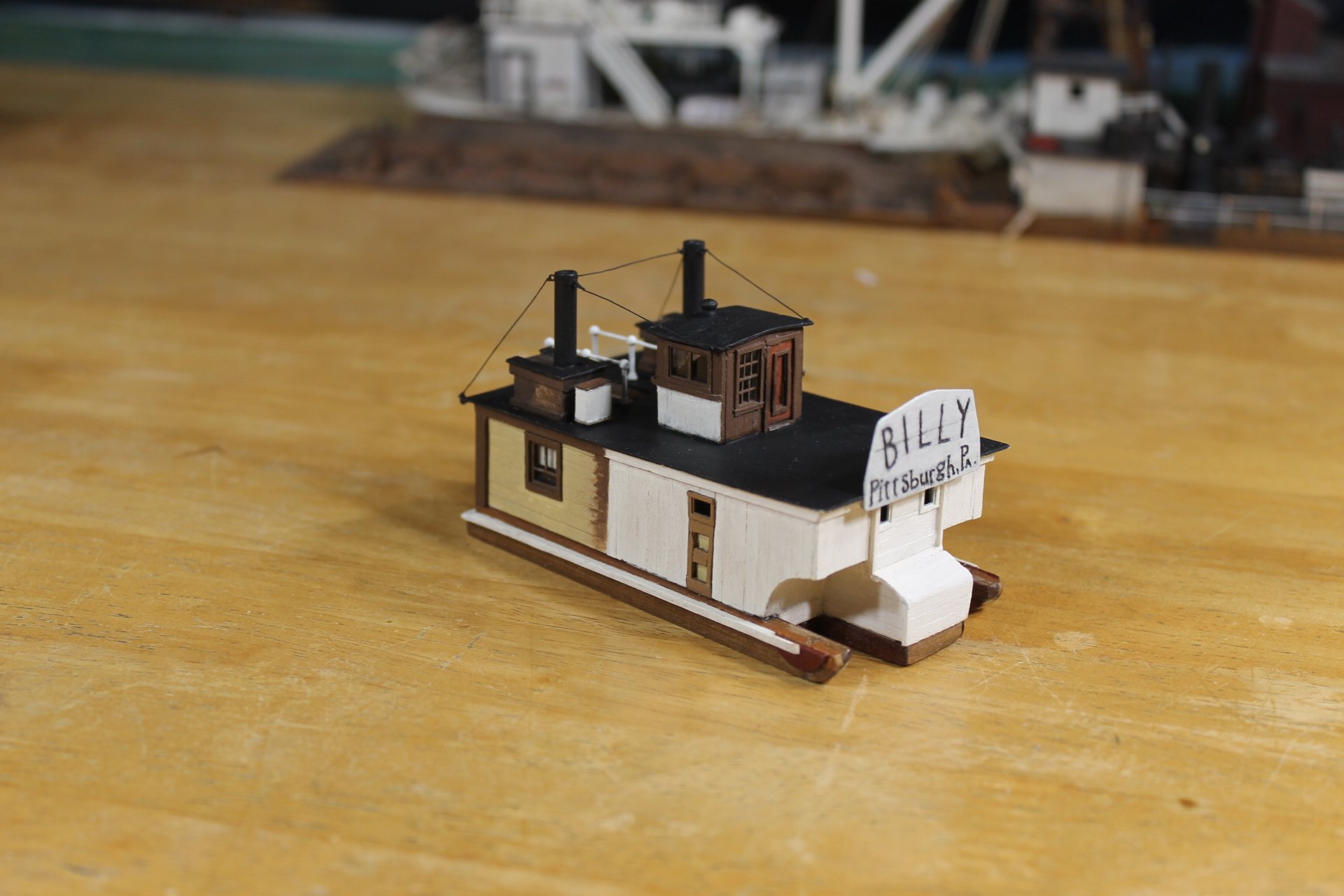
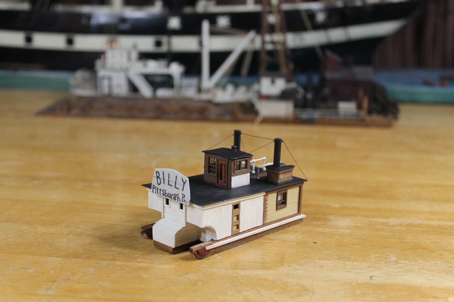
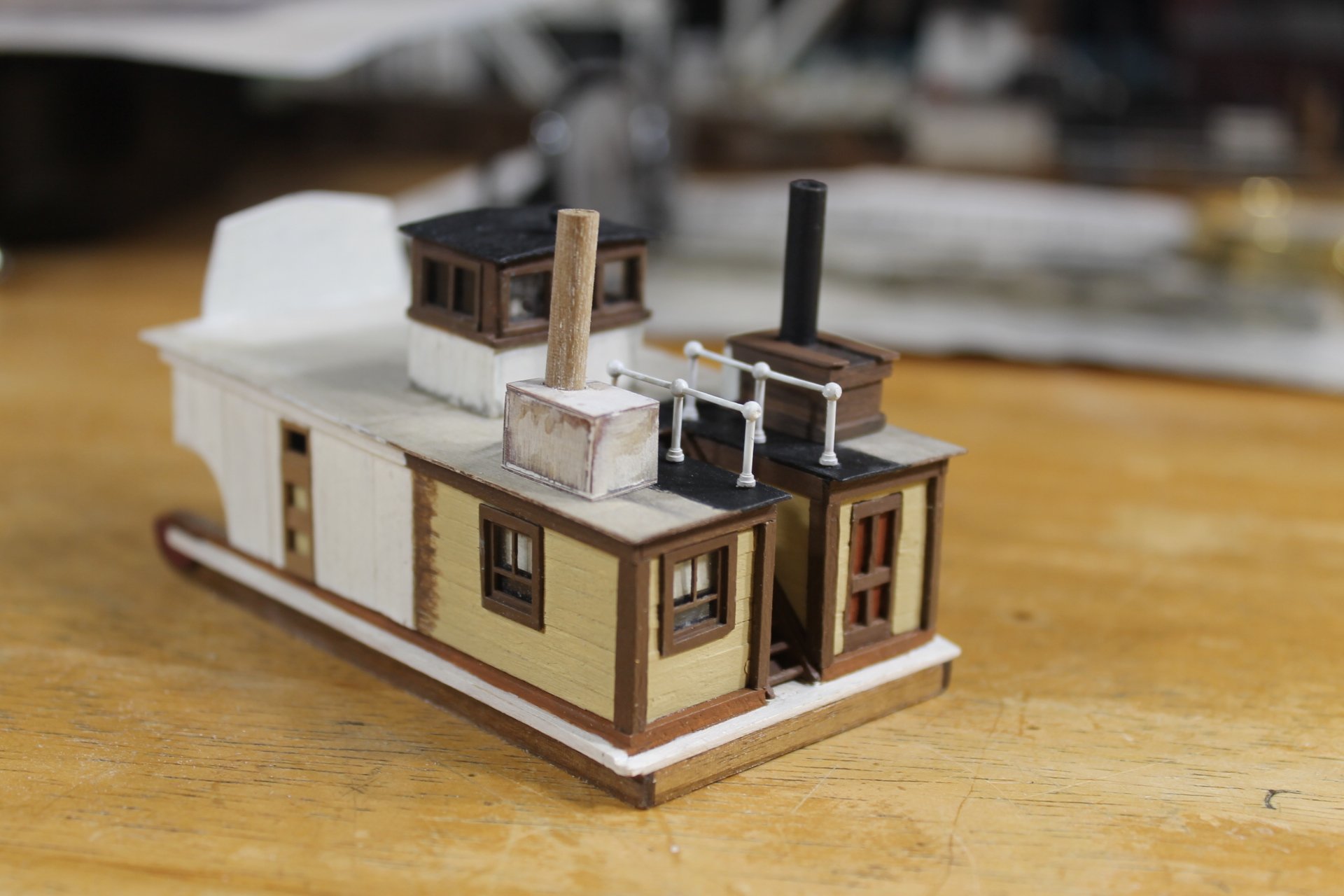
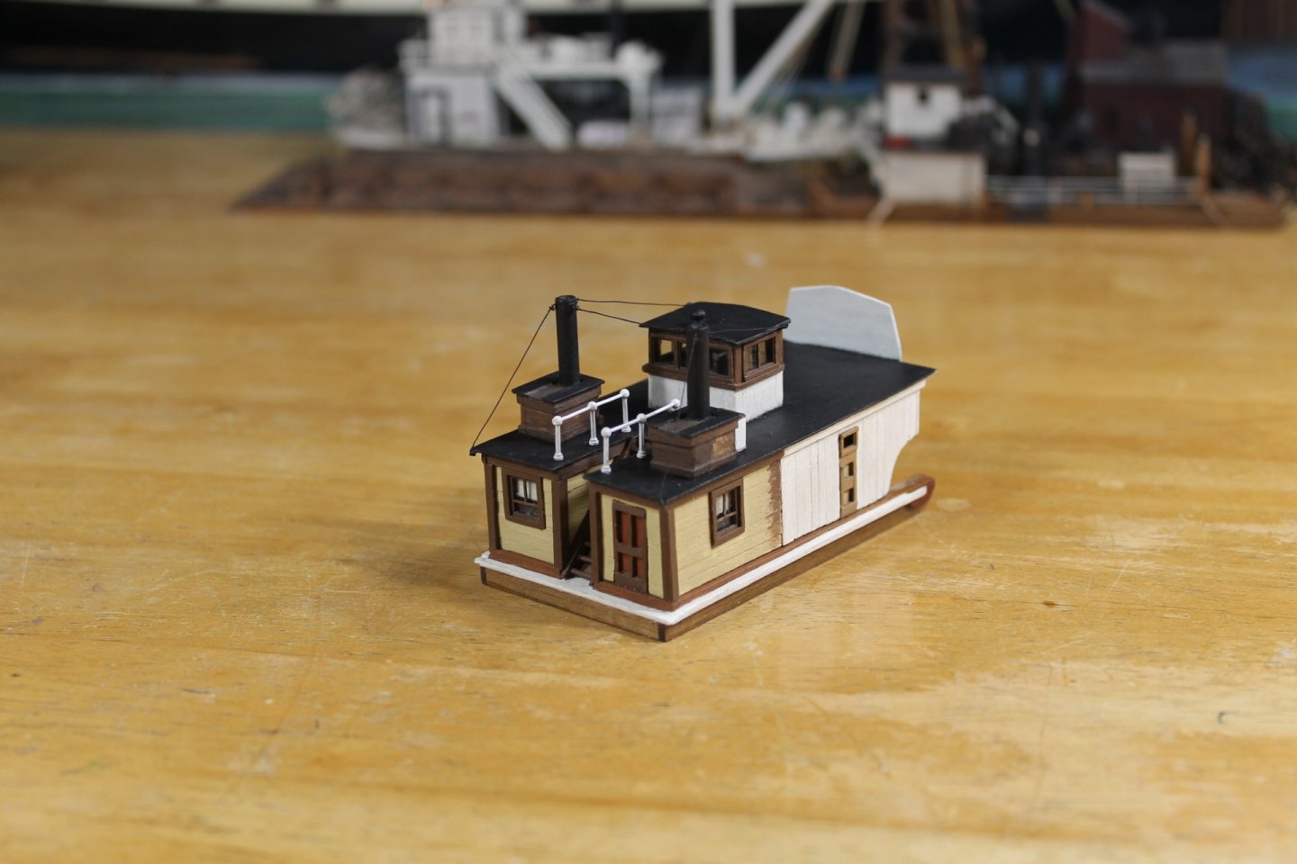
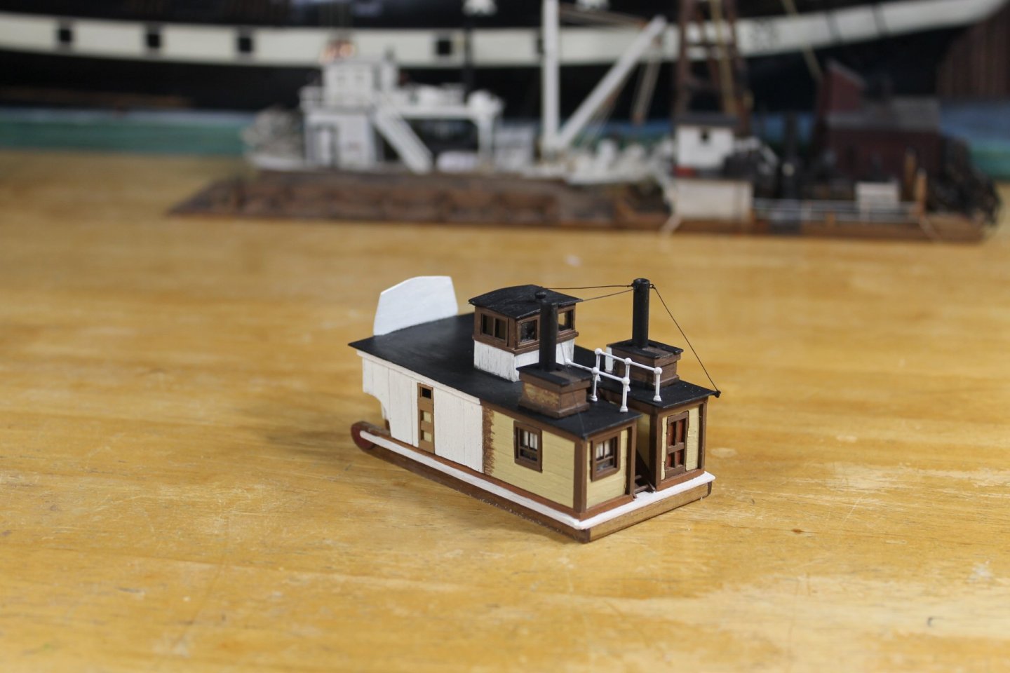
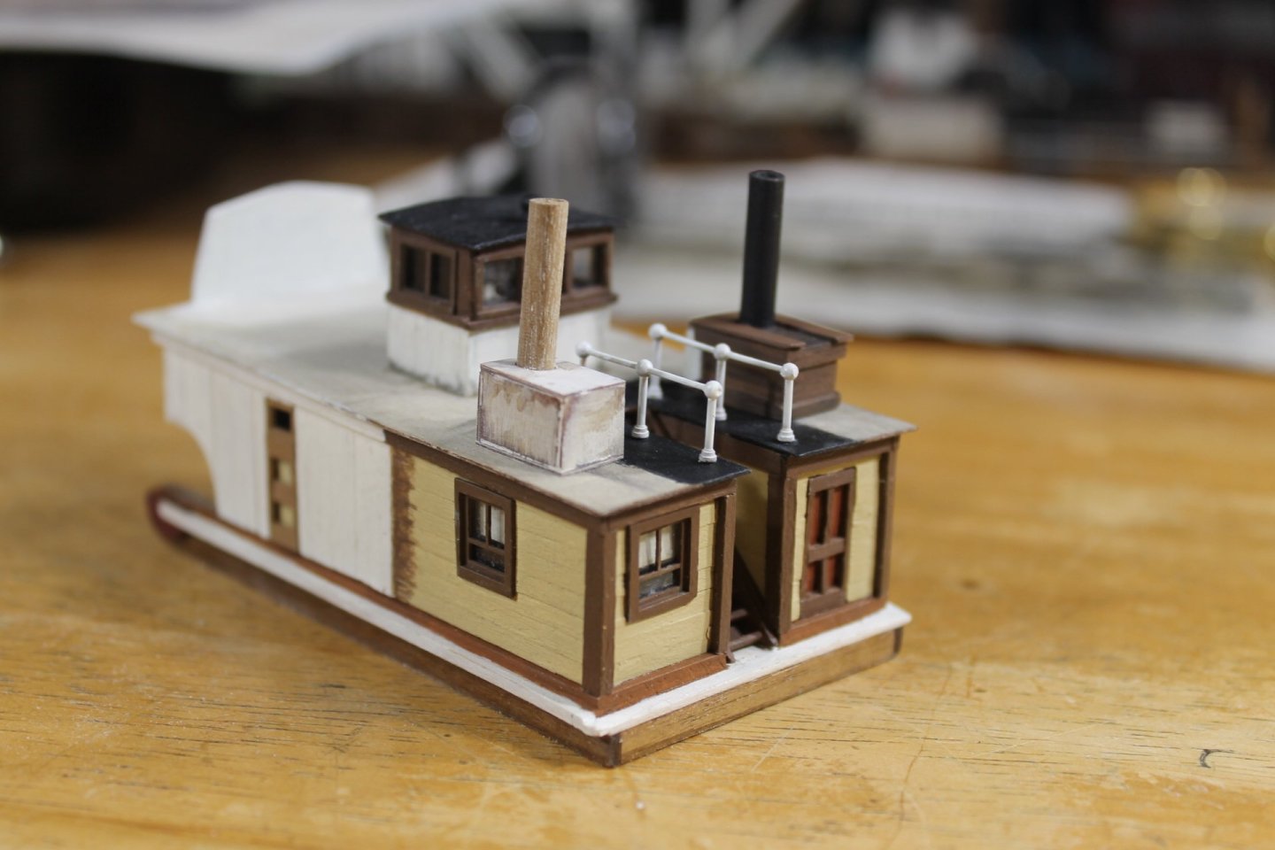
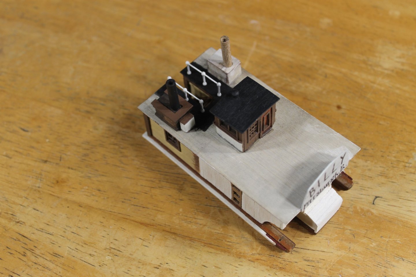
Thank you to everyone for the likes and the comments. I appreciate your support so very much. I said in the last post that the next post would see the boiler deck finished. I lied, I still need to add lumber and metal bits strewn about. John, I'm not procrastinating, honest. Way too much black, I can't wait to get after this with some pastels. With the exception of the paddle wheels the heavy lifting is just about done. I'm not all that pleased with the way the dummy stack stays turned out. I used 32 GA brass wire for the stays and my go to small photo etched eye pins for connecting points. It's all a bit flimsy for my taste so there maybe a stays 2.0 at some point. I've had more revisions with model that any of the previous. Thank you to each of you for following along. Keith


- 381 replies
-
- 25
-

-

-
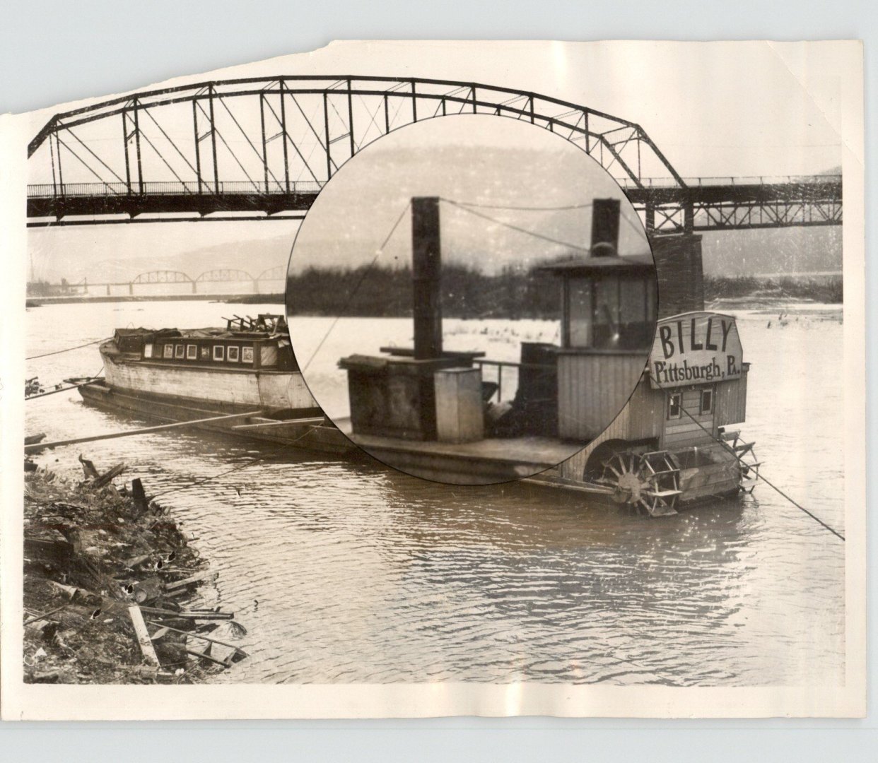
- Billy
- sternwheeler
- (and 1 more)
-
That planking looks so nice, Jacques.
-
A great restoration, Steve. She looks really nice and ready to serve.
-
Brant, welcome to MSW. Glad to have you aboard.
-
Thank you, John. Delay allows me to make sure I've considered all the possibilities of potential failure and how to avoid failure and what options are available if I do fail. Thank you, Steve. I'm pretty tired of looking at the whorls on my finger tips, once Billy is completed I'll be ready to move back to a larger subject.
- 381 replies
-
- 7
-
-

-
- Billy
- sternwheeler
- (and 1 more)
-
Thank you very much, Bob. I hope your New Year was filled with promise. Bubba, would you please do me a favor and keep that dang cold and snowy weather of yours to yourself.
- 381 replies
-
- 6
-
-
-
- Billy
- sternwheeler
- (and 1 more)
-
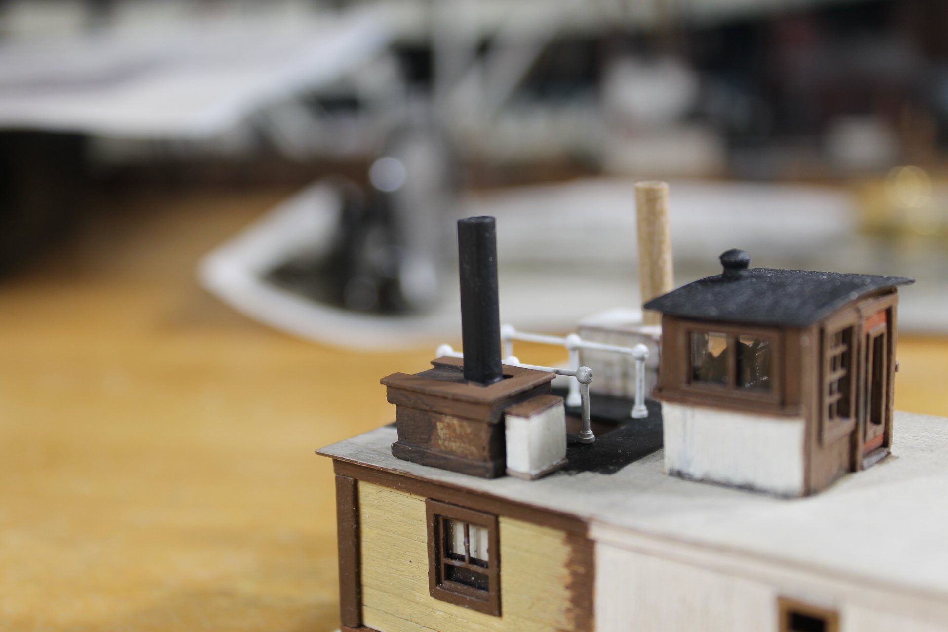
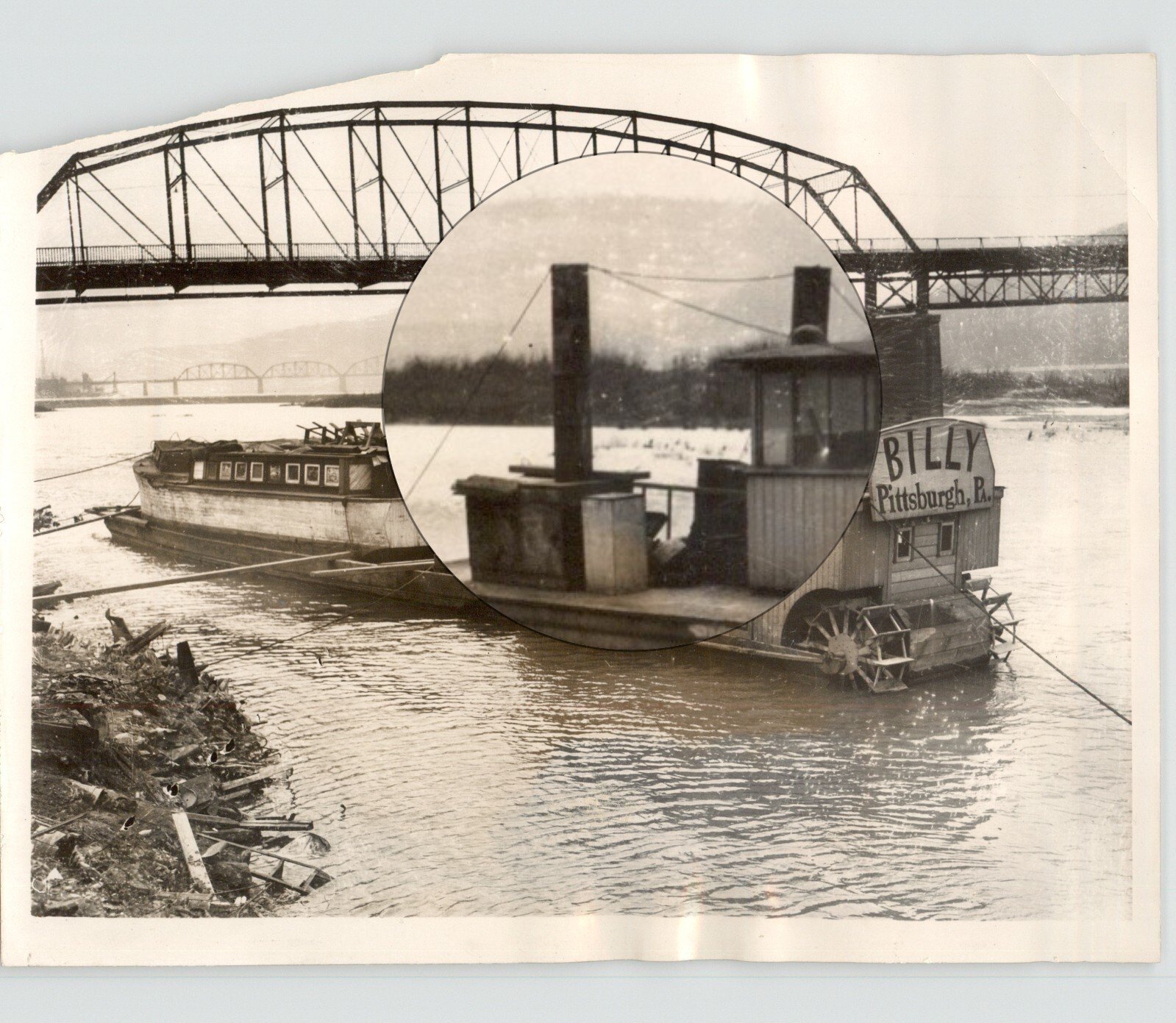
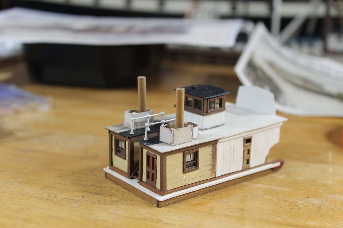
Thank you for the likes and for the comments. I'm calling the boxes that Capt. Engel built for the dummy stacks to sit inside, stack boxes. Pretty stinkin' original, huh? After a couple of months of trying to recreate Engel's work I have a pretty good feel why he did some of the crazy things he did but these stack boxes really puzzle me. The port side one looks unfinished and the starboard side one looks like Elgel ran into something. I'm going to build the starboard side box just like the port side with the dummy stack straight. The boxes are six sided measuring 0.30" x .030" x 0.50". Sorry for the lousy photo. It took 19 pieces to make the finished box not including the stack. With the stack and the three eye pins for the stays each box will consist of 23 pieces.in the assembly. That packing crate aft of the port side box will not be repeated on the starboard side. We'll see what interesting bits I can come up with to add aft of the starboard stack box. I'm leaving railing 2.0 as is, the more I look at it the less it bothers me. I was hoping this post would find me finished with the boiler deck, the next post for sure. That will leave adding three pieces of pipe and the paddle wheels. Billy is getting close to being finished. Thank you for your support and for following along. Keith

- 381 replies
-
- 26
-
-
-
- Billy
- sternwheeler
- (and 1 more)
-
Welcome to MSW. Glad to have you aboard.
-
Very nice Cutty Sark, Giovi. How long have you been working on her?
-
Giovi, welcome to MSW. Glad to have you aboard.
-
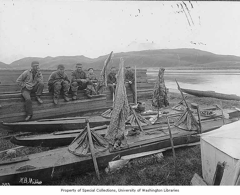
Harvey, in your link to kayaks you've built I don't see any doubles or triples. My wife is 50% Aleut and when we lived in Egegik I became very interested in Aleut culture and history. Kayaks were no longer built by the elders as memory of how to had long faded. I did have the opportunity to witness the building of a traditional dogsled built by a village elder sharing his knowledge. A great photo of doubles. Aleut sea otter hunters resting next to kayaks, gut parkas hanging up to dry, and kayak covers, Unalaska, Alaska, 1896
-
Here's hoping the new year brings peace and good health to you and yours, Keith.
-
Absolutely beautiful work, Mark. A very nice post to start of the new year.
-
Happy New Year to you and yours, Eberhard.
-
I don't bother counting down anymore as I'm fast asleep long before midnight.
-
MC, welcome to MSW. Glad to have you aboard.
-
Thank you, Keith I do wish we could select two emojis in response to a post.
- 381 replies
-
- 6
-
-
- Billy
- sternwheeler
- (and 1 more)
-
I can see doing the fiddle part of bending and rolling and getting sub assemblies made and ready to attach to the main assembly but hitting the exact mark necessary for alignment with parts that small is a bit mind boggling. Chris has to have either a very steady hand or a very good rest.