Hubac's Historian
-
Posts
3,308 -
Joined
-
Last visited
Content Type
Profiles
Forums
Gallery
Events
Everything posted by Hubac's Historian
-
 Despite the oversight on the blocks, Frank, your upgrades to this forward structure are really fantastic. With just a little extra effort, you have improved the kit immeasurably. Well done!
- 510 replies
-
- 2
-

-
- reale de france
- corel
- (and 1 more)
-
At some point, when I have a chance, I’ll look through my pictures from that time. It would make sense that the carving would be integral to the whole timber, but my recollection was that it was picked out and framed with yellow paint. I’ll have to get back to you on that one.
- 2,699 replies
-
- 3
-
-
- heller
- soleil royal
- (and 9 more)
-
Well, that was worth the wait! I marvel at your dedication to authenticity and your willingness to correct details. It is all superb!
- 1,035 replies
-
- 4
-
-
- royal katherine
- ship of the line
- (and 1 more)
-
First of all, Bruce, thank you for the kind compliments. I appreciate that this interests you. But - WOW! Quite honestly, I’m not really sure what to make of these early 20th C. auction items you have posted here. I will say, though, that they are completely fascinating!! To me, they are documented echos of something that may have been better appreciated, and understood in an earlier time; co-incidentally, this was also the time of the hugely influential R.C. Anderson. Your posting, here, is the perfect example of one of my main motivations for starting this build log. There exist fragments of information; apparently authentic glimpses into a long-forgotten past, but most often - without context. And so, for me, things like this go into the “evidence” file for my forensic reconstruction. I’m always searching for context. And, I will say that these carvings do certainly seem French, and the near twin female figures do not seem as though they would be out of place on the Dauphin Royal, for example. Whether you realize it or not, you are my Secret Santa this year. This is awesome - thank you so much!!
- 2,699 replies
-
- 6
-
-
- heller
- soleil royal
- (and 9 more)
-
Also noted, Chapman. As a matter of fact, back in 2003 when I was volunteering at Batavia Werf, the “spiegel,” or mirror, of the Provincien was in place and the wing transom did, in fact, have a carved moulding on it’s exterior surface. This was just before they re-framed the stern for greater fidelity to construction practices of the 1660’s. I was disappointed, at the time, that I wouldn’t have a hand in building of the Provincien, but all work on her had stopped for the re-design. I did, on the other hand, do a lot of satisfying maintenance work on Batavia. I appreciate the thought on placement of the banner. Unfortunately, Berain’s design has a few caryatid figures between the chase ports, as well as some perimeter paneling, that break up the free expanse of the stern counter area. Below the transom moulding was the only clear space where something like this could exist. My authorial license, in this instance, aside - I’d like to remain faithful to Berain’s scheme for everything above the transom moulding. As ever, thank you for weighing in.
- 2,699 replies
-
- 2
-
-
- heller
- soleil royal
- (and 9 more)
-
Noted, Druxey. Thank you!
-
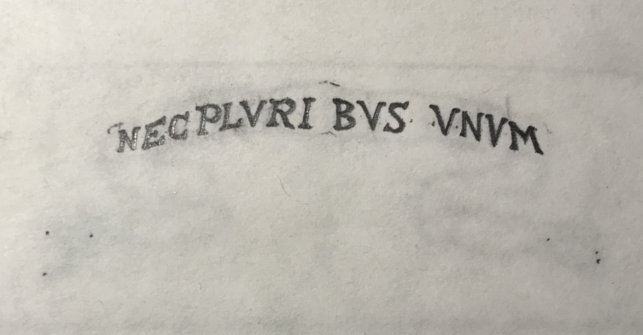
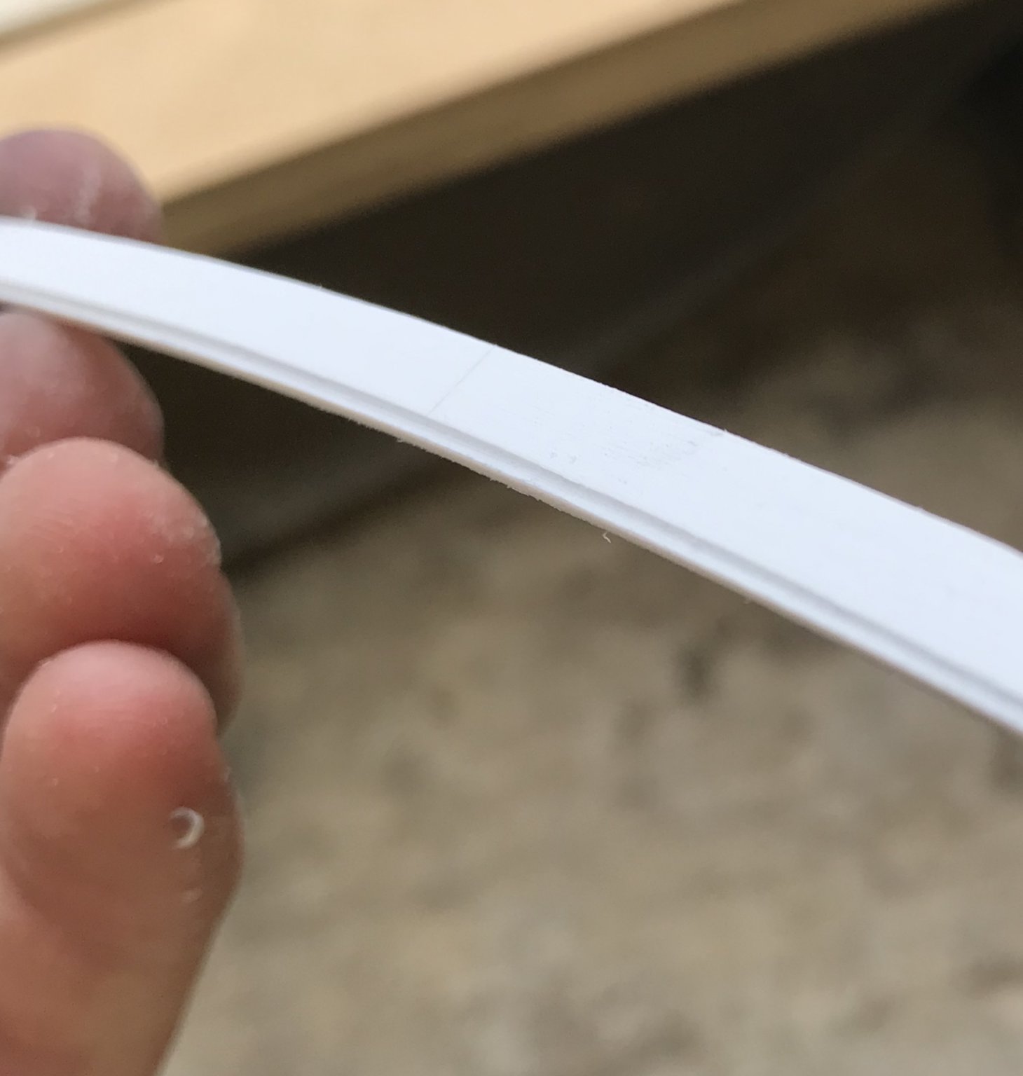
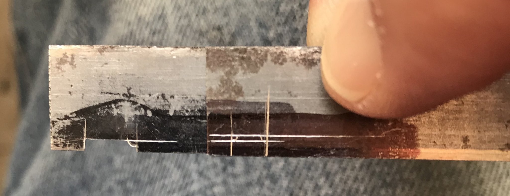
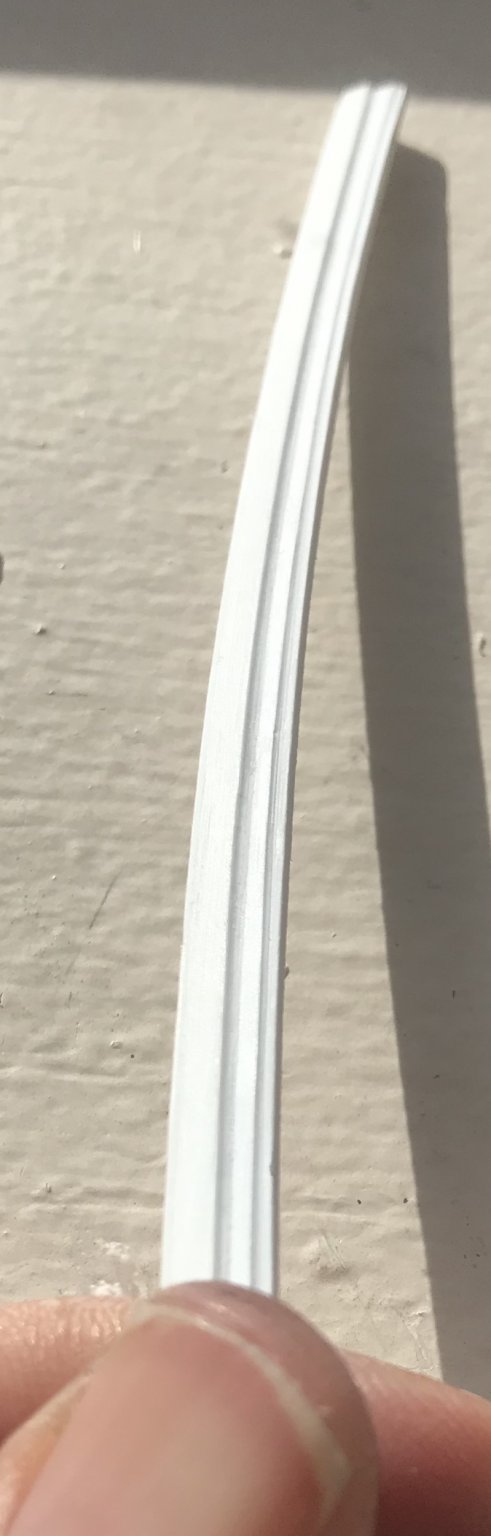
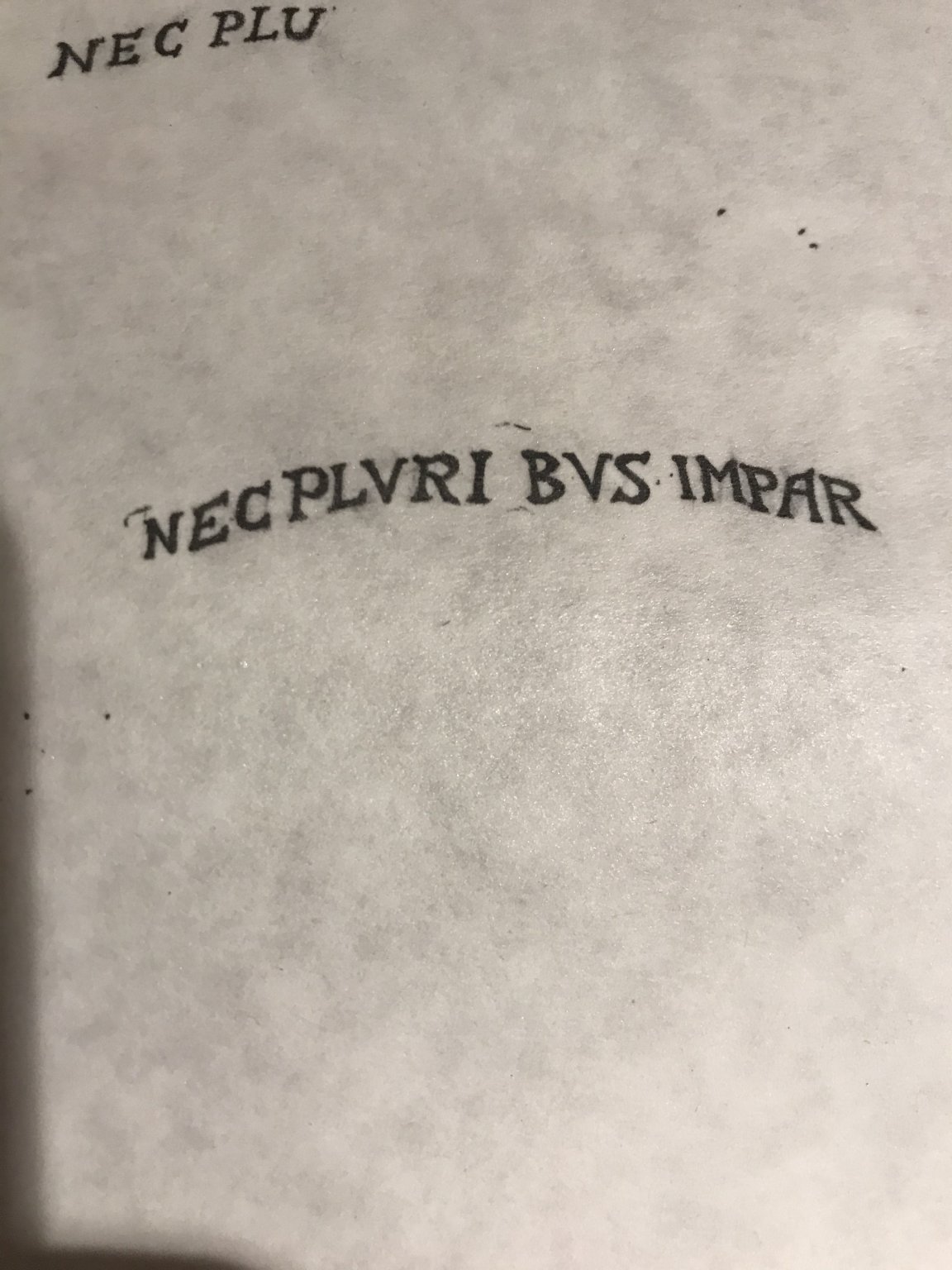
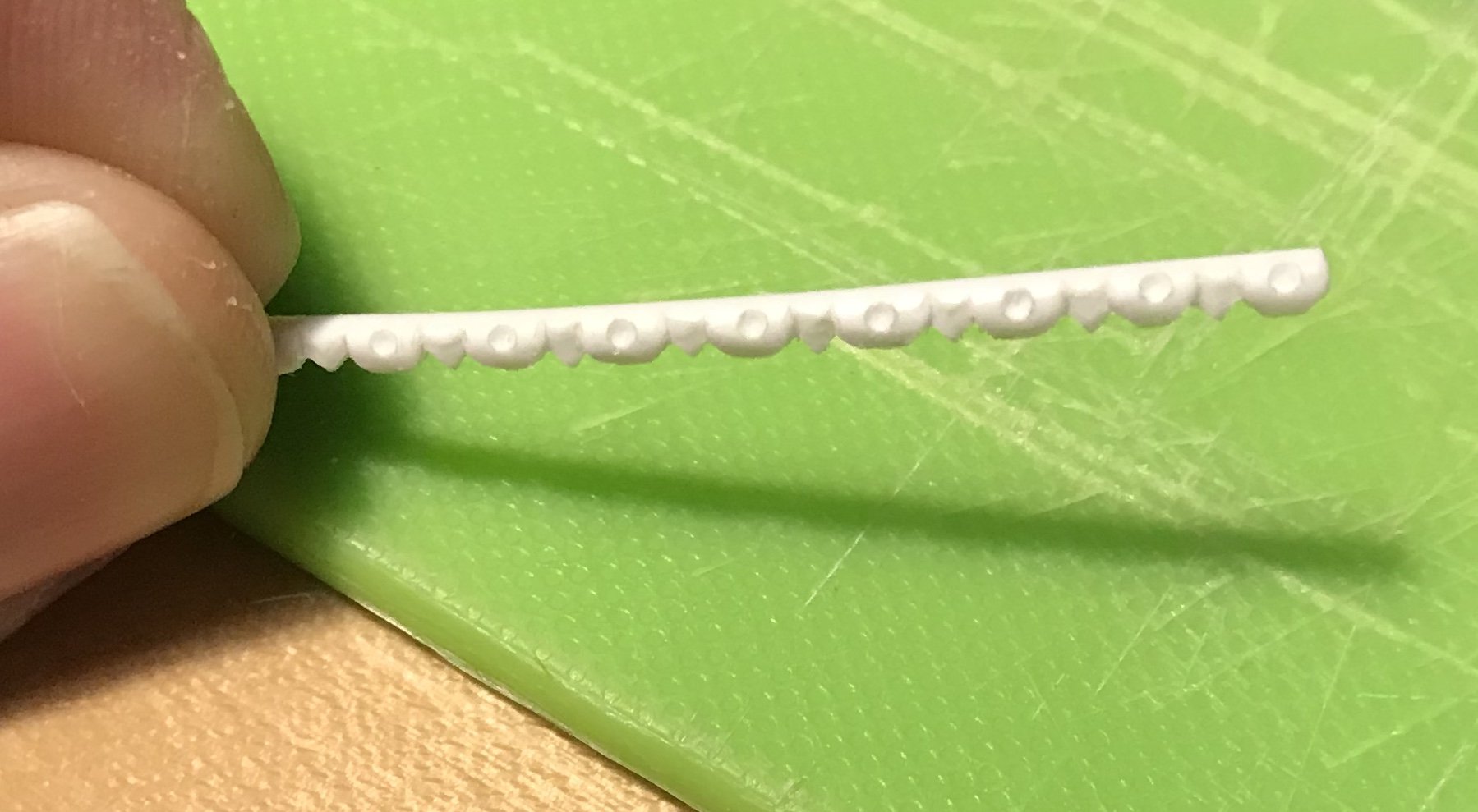
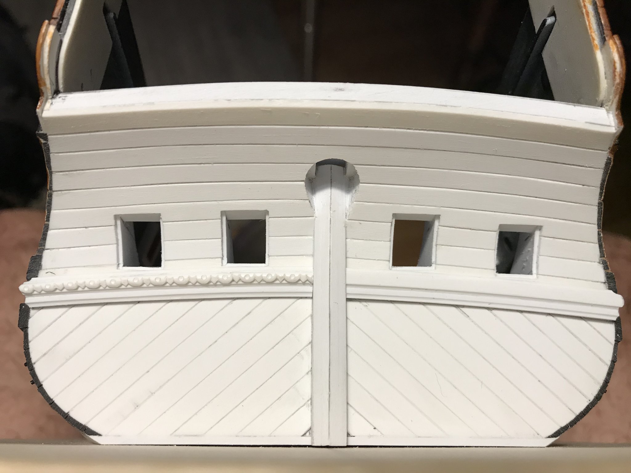
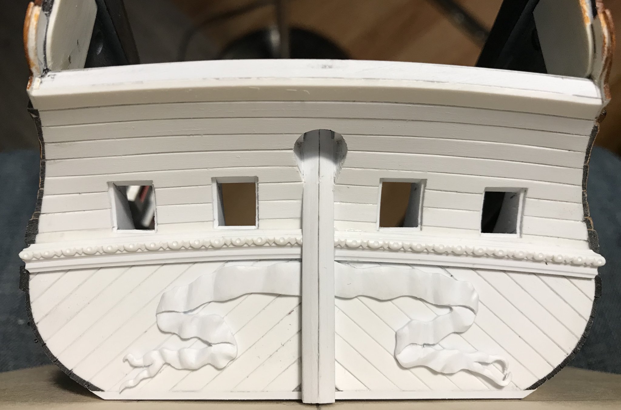
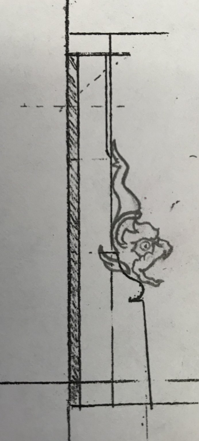
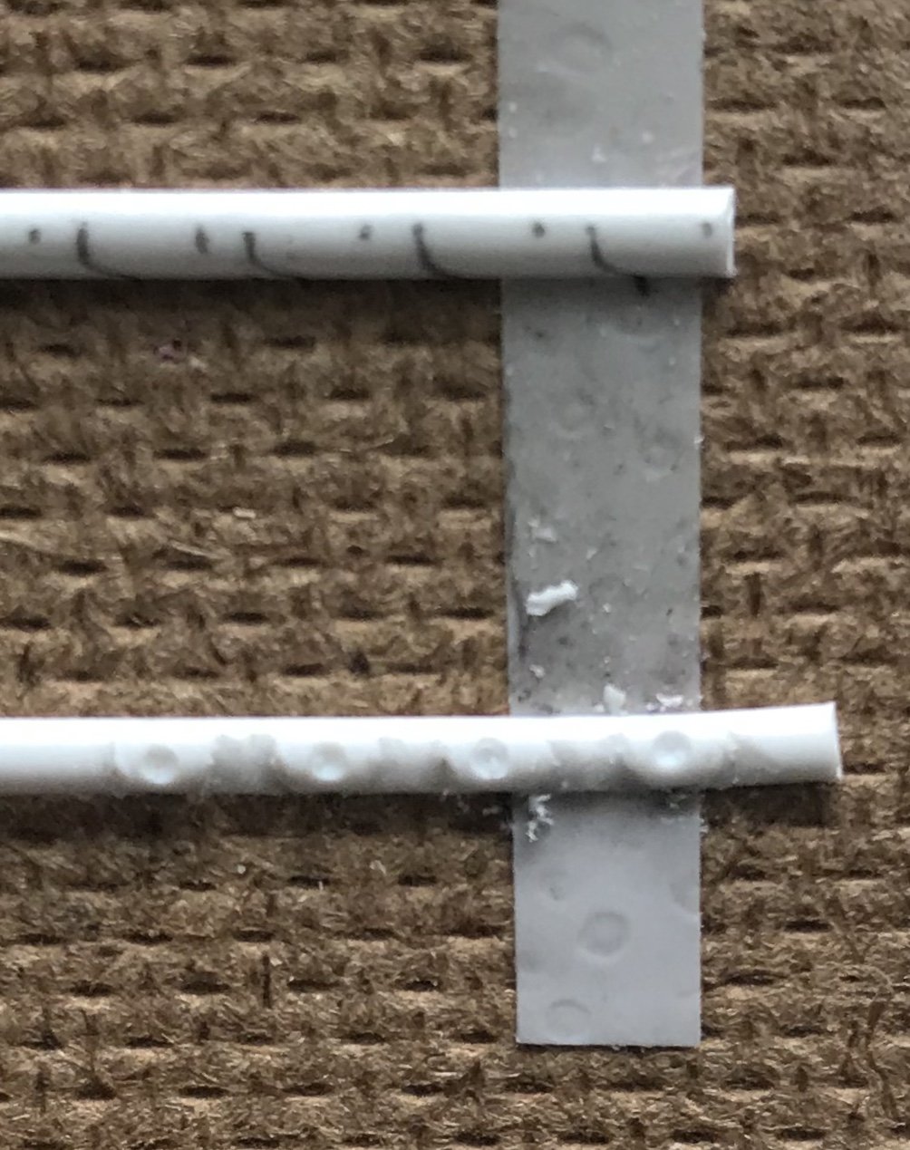
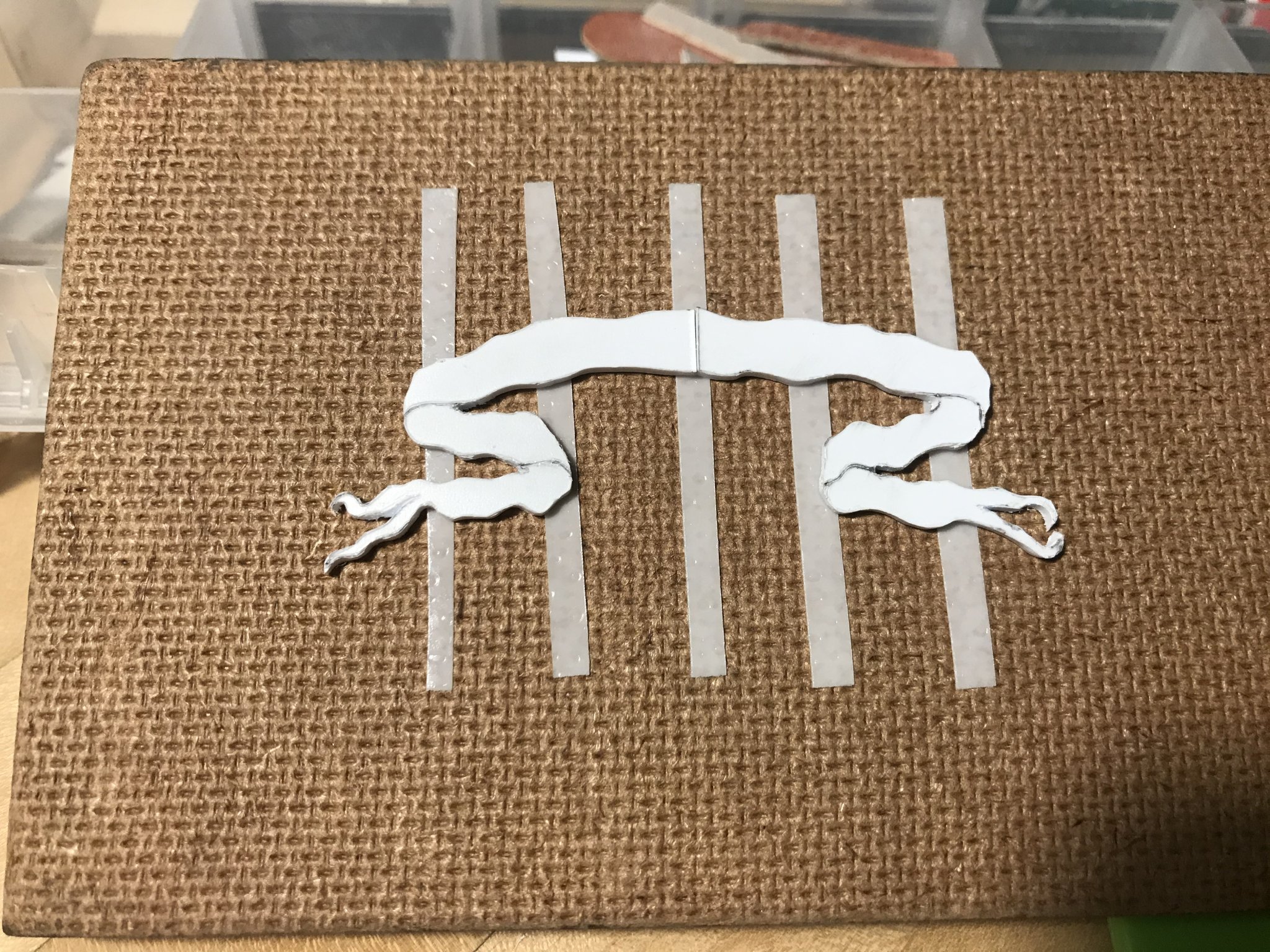
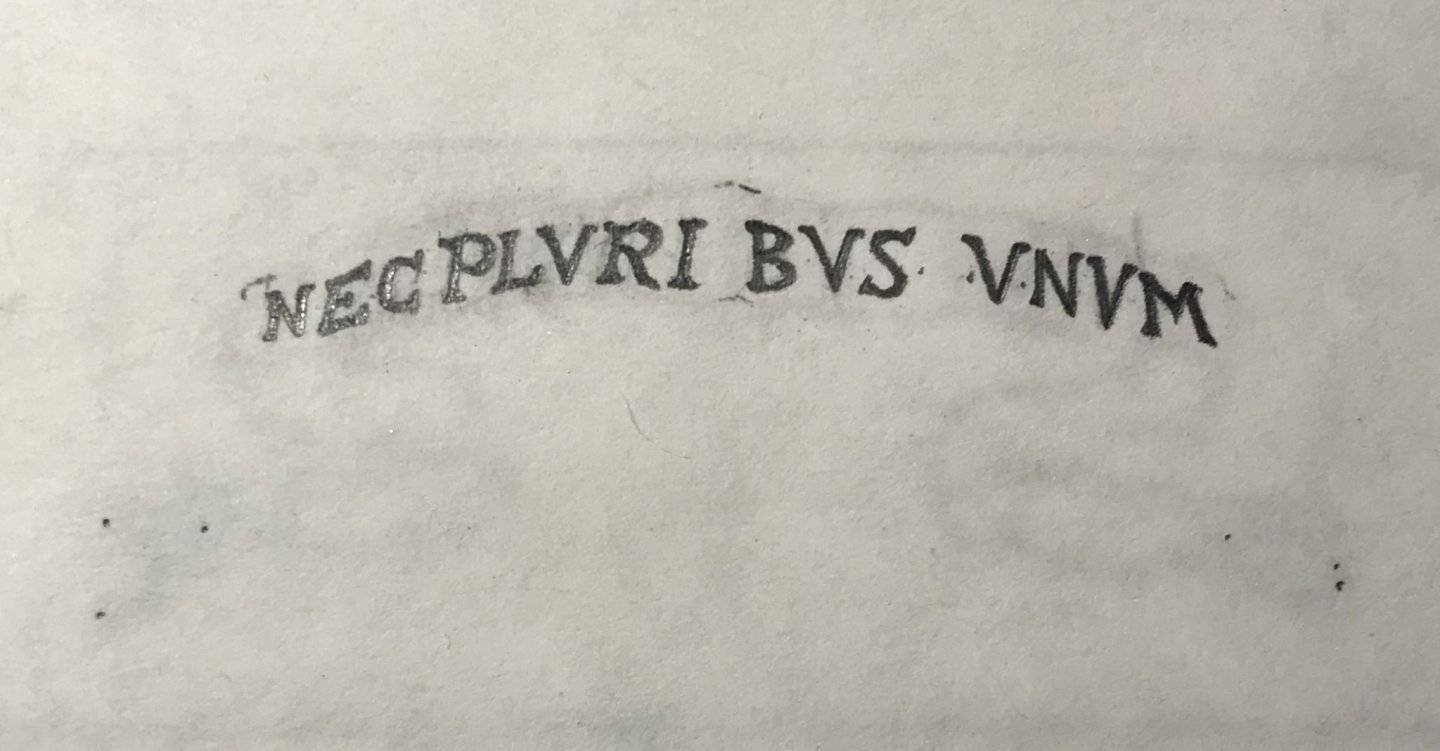
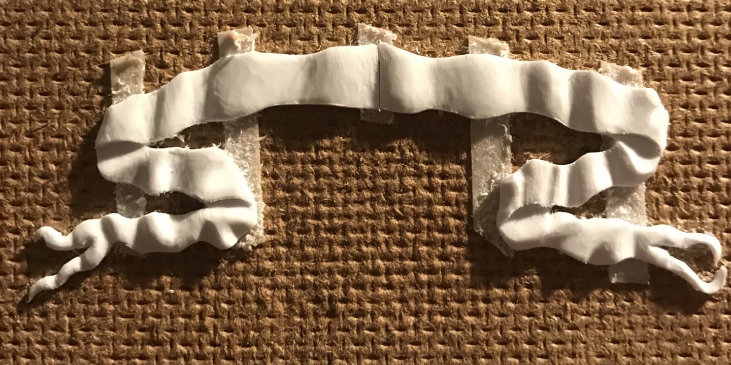
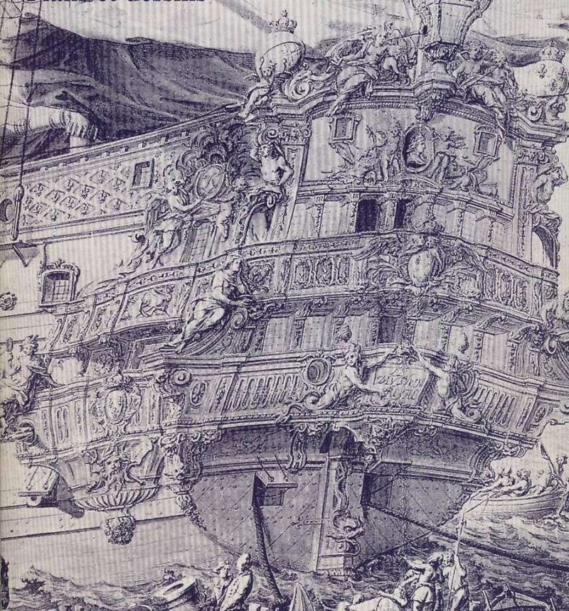
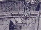
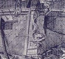
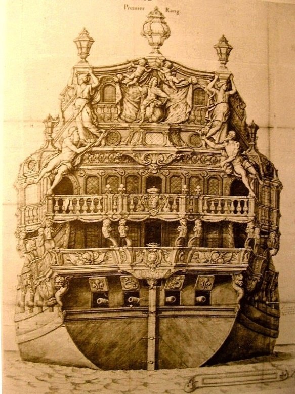
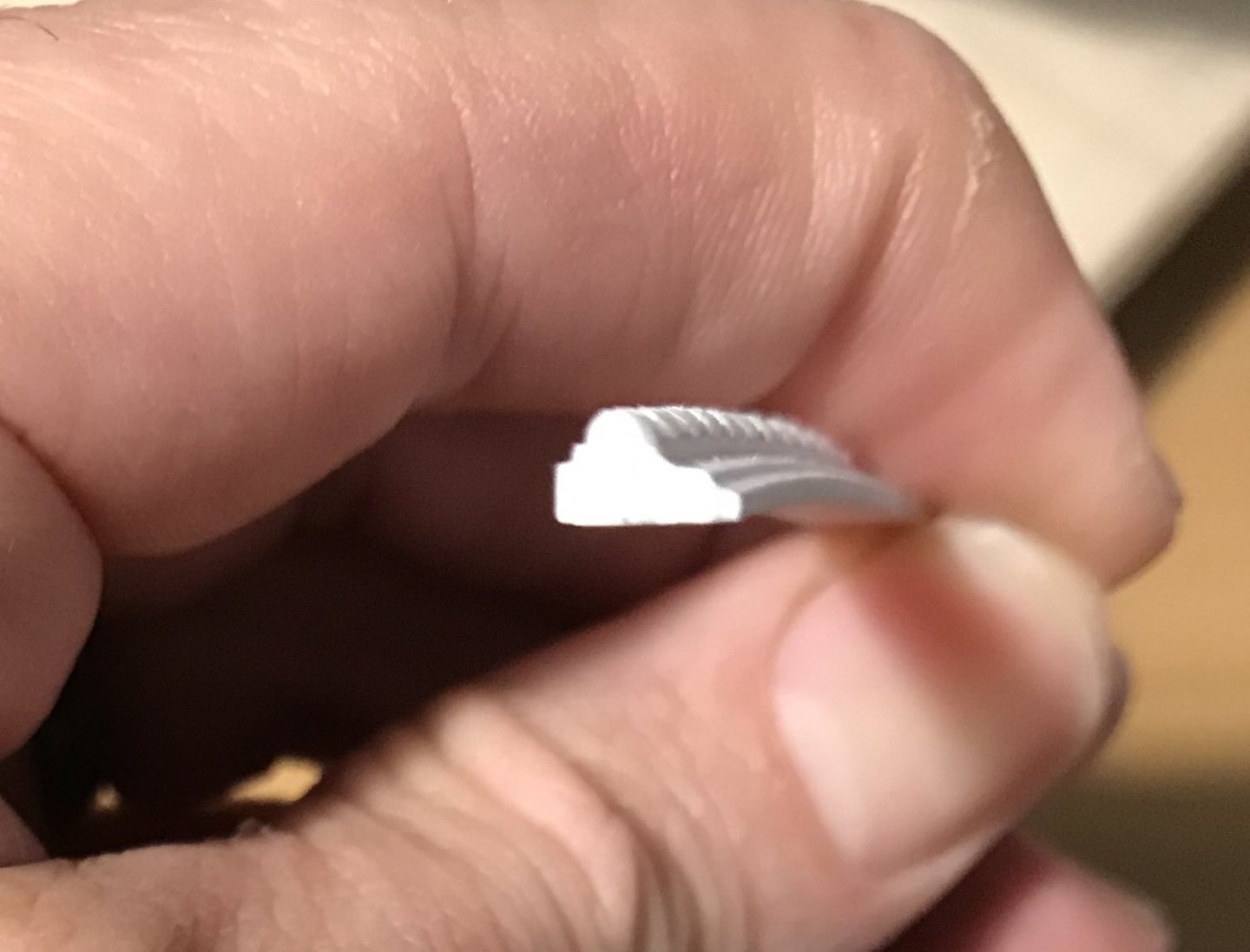
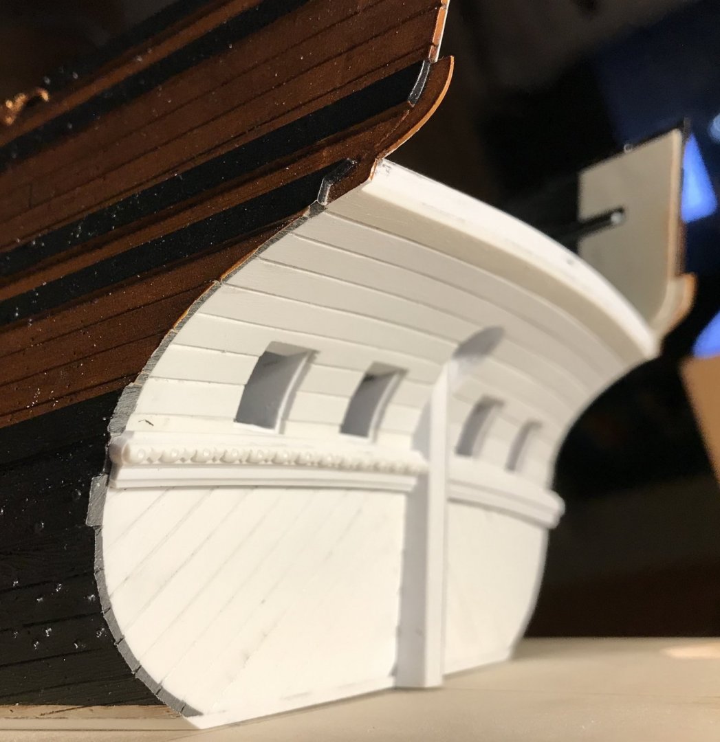
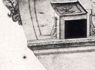
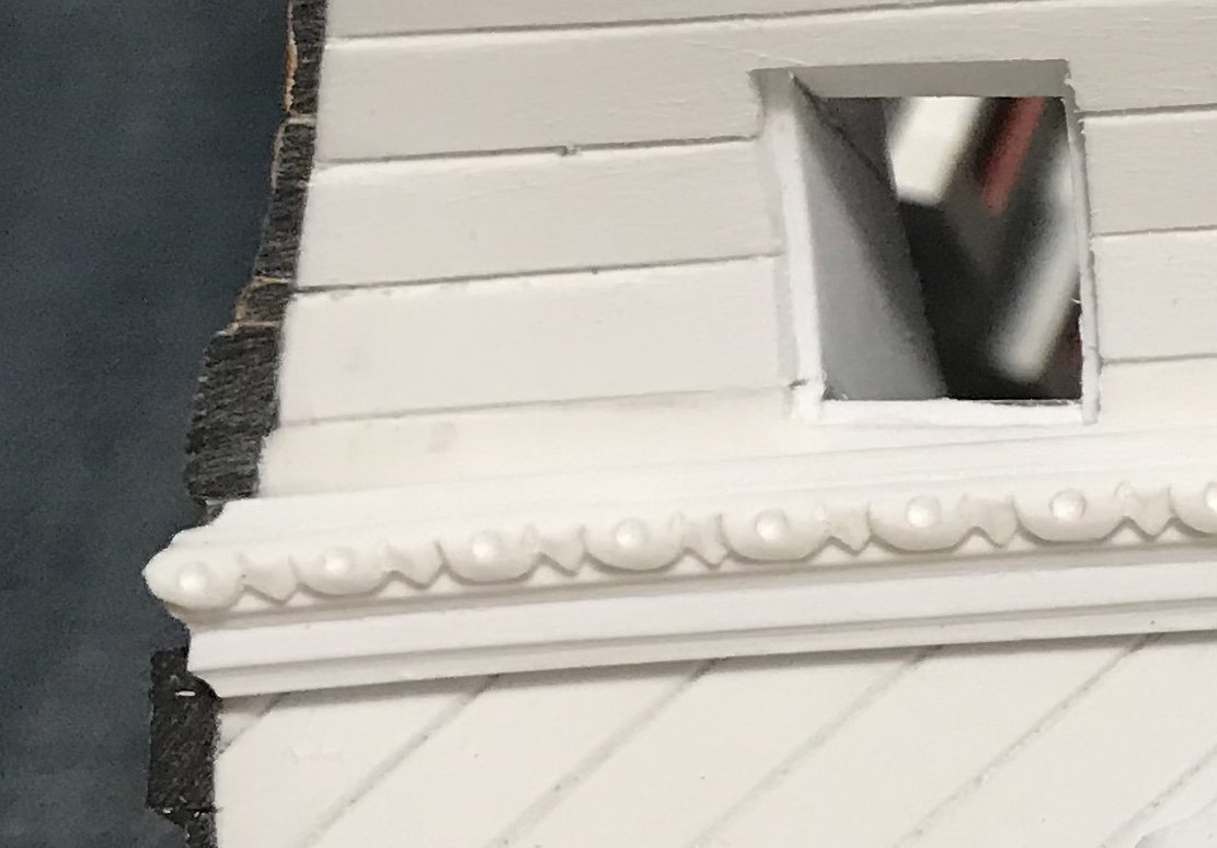
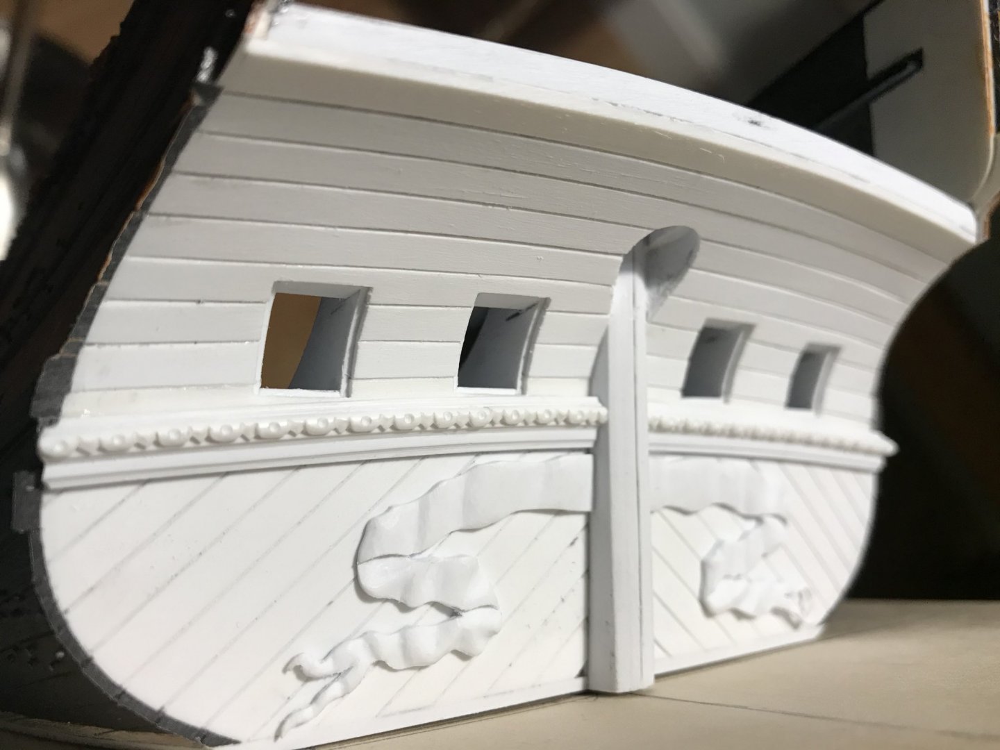
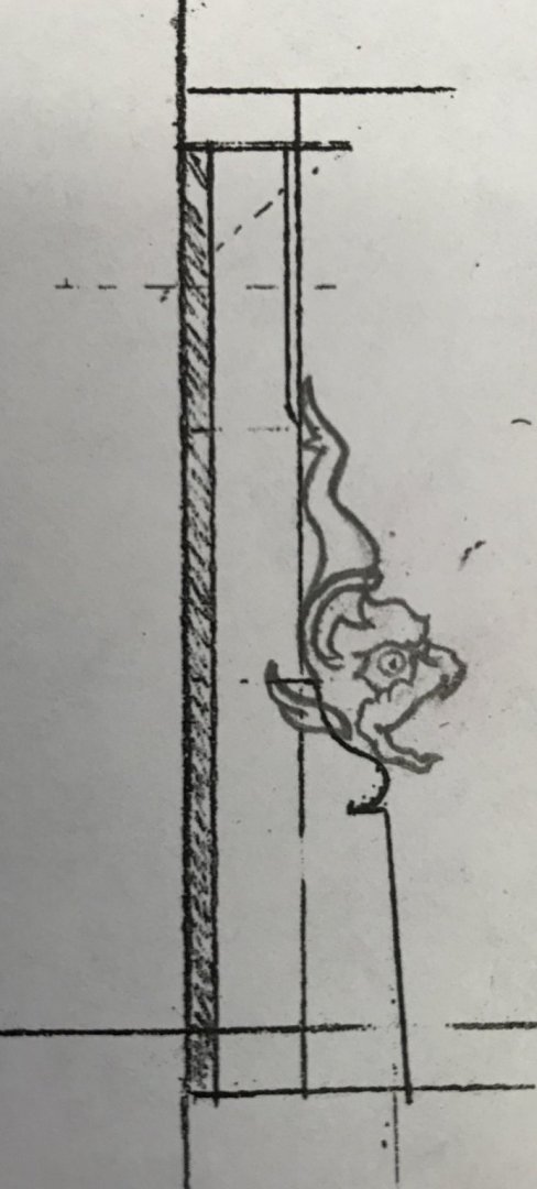
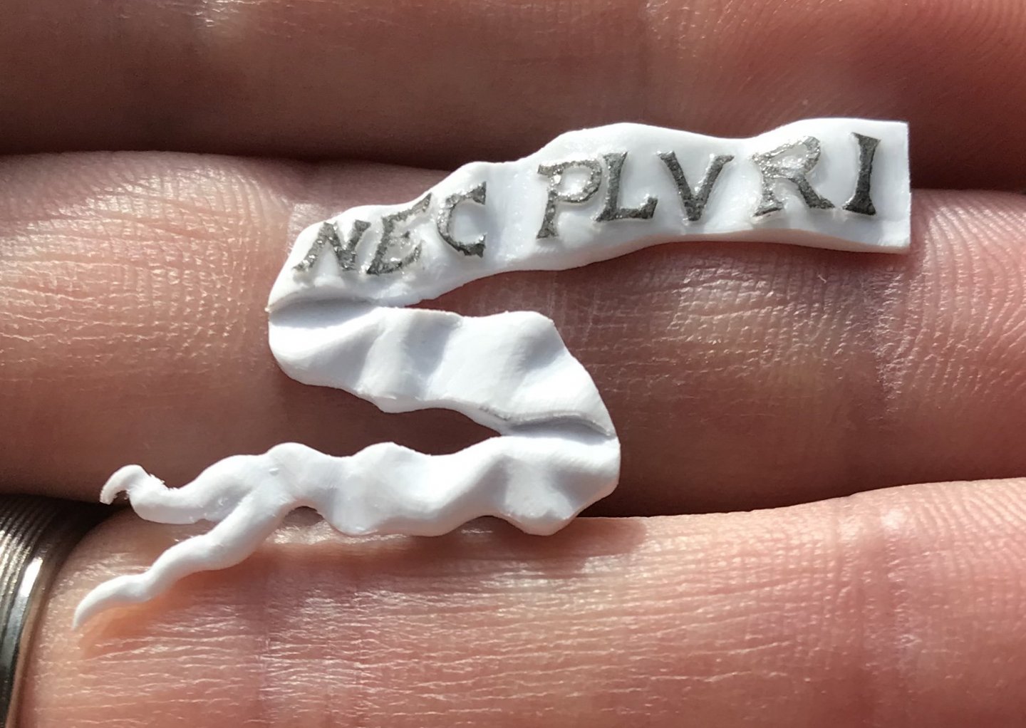
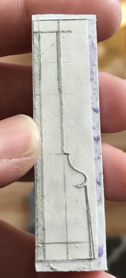
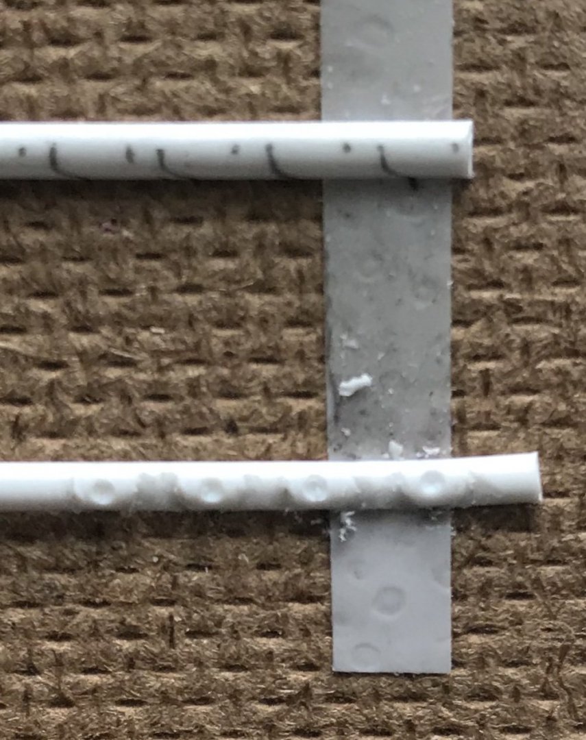
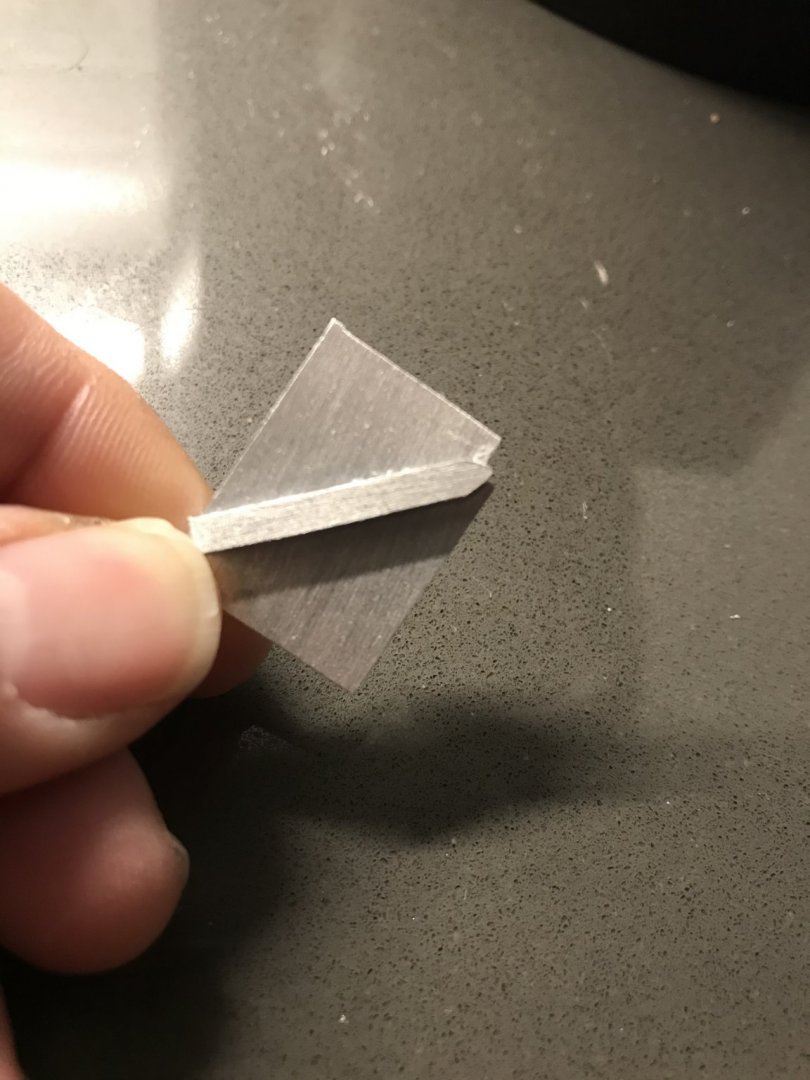
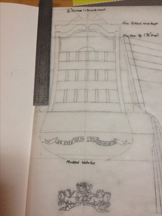
Well, it has been very nearly a WHOLE week! I was going to do one mega-post, in a few weeks, but then I realized that I had quite a lot to say about the transom wale and the motto banner. I’ve been quite busy. Anyone who may be bored by it all is, of course, free to pass this over in their email 😉 So, here is what I am trying to replicate with the transom wale: For a somewhat clearer illustration of its profile, let’s zoom-in on this remarkable Puget (I am assuming this is his hand) portrait of Le Dauphin Royal: As a side note, several people have expressed their opinion to me that this was not an ornamental program that was ever installed on the DR, anytime after her original appearance of 1668: Their thinking is that this was merely a proposal for decor. Personally, although I can’t yet say definitively, I think that this blue-tone drawing is an actual portrait of the DR, after her first refit. There are several reasons why I think this. First, while it is true that the Van de Veldes occasionally drew ships that were entirely fictional, the tradition for decor proposals, in France, was already pretty well established by the 1680’s: proposals were minimally two-dimensional plan drawings of the stern and starboard quarter, with a third such drawing of the starboard bow. As previously discussed, even among known sets from a particular time (signed and dated by the Intendant of the shipyard), there are often weird anomalies and discrepancies between what the quarter and stern drawings depict. With this blue drawing of the DR, there are no such discrepancies. It is a fully coherent, and three- dimensional drawing of photographic detail and clarity. Even details that aren’t fully rendered, are clearly suggested - as with the faint representation of either carved or painted ornament on the stern counter, just beneath the lower false balcony. Simply put, there is just too much specific detail for me to discount this portrait as anything other than a real representation of the ship as she was. This drawing will soon prove invaluable to me as it so clearly depicts the bombastic undulations of the quarter galleries, as well as what the amortisement’s likely composition may have been. Continuing along, if we look more closely at the stern post, we can see the same shape for the transom wale more clearly: As it is apparent that this is a moulding of some significant depth, and given that I am new to moulding profiling, I decided that it would be best to make up the transom wale as a series of layers. My base layer is the widest piece - a shy 5/16” by 5/64” thick. Fortified by Dan’s tutorial on moulding scrapers, I ground away the teeth and blacked a line on an old hacksaw blade, so that I could scratch in the first coved profile (on the left): The scratched profile on the right was the second scraper I made for the middle layer of the stacked moulding. So, first I scraped the bottom edge of the base layer with the first scraper, and lightly cleaned up any remaining chatter with the tip of a round needle file: Then, I cut the second layer from thinner styrene, incorporating the camber, as before. After scraping with the second scraper, the moulding looked like this: So far, so good, but how exactly I was going to carve an ornamental profile into the third half-round layer - which is only 3/32” wide - became the subject of much trial and error. As with any repetitive moulding, the essential aspect is a uniform layout. Eventually, I arrived at spacing of a shy 1/8” for the eggs, and a shy 1/16” for the darts. Using my steel rule, I ticked off the spacing and then came back with a simple coved tracing pattern to mark each half of the egg: Adding a small dimple with the tip of a micro drill bit, gave some much needed dimension to the eggs - the edges of which were softened a bit by scraping with a short-sweeped gouge that I use for virtually all of my carved work; just three knives, mostly. Finally, I cut back the arrow sides, a bit, to make the egg shapes a little more apparent: After a little clean-up and refinement with a triangular needle file, I glued sections of the third layer to each half of the transom wale, after first fitting the transom wales and profiling their ends, at the ship sides: Suffice it to say, this was quite a lot of work, but the results were worth the effort. I got lucky in that the depth of the transom wale does not exceed the beveled break of the stern post. The visual weight of the wale, IMO, is a pretty good approximation of what is show in the portrait of the DR, above. Next up, was the carving of the motto banner. This was where I started: The important thing when carving something like this is a basic understanding of how fabric really swags because that informs where you scallop in your troughs, as opposed to your convex billows. It is a difficult thing to describe, however maybe this early picture (in the process) will make it more clear: Once your troughs are defined, it is a simple matter of scraping-round your billowing transitions, and looking for opportunities to incorporate subtle highs and lows. This work can only be achieved slowly, and in a raking light: And now, to get a sense of what this will look like in place, beneath the transom wale: The lettering for the motto was drawn onto parchment with graphite, using a darkened copy of the outline of the banner, as a guide beneath the parchment. At first, I drew this, and I liked it, but something seemed wrong: A couple of days later I realized that I had jumbled my Latin. This is what I was going for: With that settled, I sprayed the parchment with matte medium, in order to fix the graphite and stiffen the parchment for cutting. I sharpened a #11 blade to a gleaming edge and very carefully extracted the letters. Finally, using the tip of that blade to pick up each letter, I dragged the backside of each letter through liquid cyano and very carefully placed each letter on the banner: Once each letter was fully conforming to the shape of the banner, I sealed the whole thing under a wash of liquid cyano. I will probably spray prime these banner sections before glueing them in place. Next up - the rudder head. Using Frolich’s L’Ambiteaux as my main guide, I arrived at the following: At first, I had exaggerated the outboard widening of the rudder, so I revised that taper a bit, and am now ready to profile the rudder head. It is over-long in both directions, so that I can place it where I need to on the model. Looking back at the DR, though, I wanted something ornamental for the rudder head and thought this ornament would be a sensible choice: So, after I have shaped my rudder head and cut in the aft taper, I will make up a carving blank based on this drawing: So that’s where we are at, for now. Enjoy your Holidays, all, and thank you for looking in and following along.


- 2,699 replies
-
- 15
-
-
- heller
- soleil royal
- (and 9 more)
-
Here is an excellent cross-reference for your build:
-
There are few things I love more than a vaisseau de guerre from this time period. I am following with great interest.
-
Thanks, guys. I really appreciate the thought, there. I think, though, that I may have lost a few valued friends by posting too often. It happens. Build logs can become cumbersome. Nevertheless, I appreciate everyone who has continued to follow the build. I won’t lie; I’ll be at this for a long time. It will be a number of years before I finish what I started. But, I will finish it. I’m too invested not to.
- 2,699 replies
-
- 6
-
-
- heller
- soleil royal
- (and 9 more)
-
These are all good and interesting ideas for the glass, guys. I appreciate the input. I will definitely be using Druxey’s approach of scribing the mullions into polycarbonate. I may experiment with dabbing the surface of the poly, as MD suggests. Mark, when I was thinking to recycle the kit windows, I probably would have taken your approach with some sort of liquid glazing. Well, work continues. The banner looks really good, and the transom wale is almost complete; I just have to carve my egg and dart motif into the last half-round layer of the stacked moulding. It will look like a slightly crisper version of this sample that I finally arrived at: Dan showed me how to make scrapers for the other sections, and the results are better than I expected. I’m going to disappear for a while until after the holidays. When I return, the entire lower transom will be completely detailed. The counter/false balcony will be planked. A start will be made of the detailing/paneling of the lower gallery, and the next section for the lowest tier of windows will be framed in. I will try, from here out, to exercise a little more restraint in posting. Sometimes I get carried away on my morning commutes 😉. Anyway, until then, be well and enjoy your holidays!!

- 2,699 replies
-
- 6
-
-
- heller
- soleil royal
- (and 9 more)
-
I am glad to hear that you are feeling stronger and will soon return to the shipyard!
-
Well, you have to admit that the number of times people ask to see videos of her sculpting process is a little out of control. Firstly, she always incorporates them into the log, so they can be found there, if curious minds look a little. Then, there’s her presence on YouTube where quite a number of those videos reside in one place. I have to say that as many times as I’ve watched these videos - despite how easy she makes it seem - I had such a time replicating anything passable. I gave up, for the time being.
- 1,035 replies
-
- 5
-
-
- royal katherine
- ship of the line
- (and 1 more)
-
Hi Frank, The scale of the kit guns does not bother me, and in fact, I find them to be quite nicely proportioned castings. I like them as they are. Your build had me browsing Heller Reale builds and the artillery on that kit is also quite stout. Some have posited the opinion that the Van de Veldes, for example, may have exaggerated the scale of artillery on their ship portraits, but I do not believe this is so. The Galleys were, in fact, intended to be fighting ships, and not merely transports for the king.
- 510 replies
-
- 1
-
-
- reale de france
- corel
- (and 1 more)
-
You know, it is so great to see her in natural light, where all of the extra detailing work you have done really pops, EJ. You really have done an incredible job of transforming this kit into something so much better than the sum of its parts. I really love your top work, and as I’ve said before - the shrouds and ratlines are top-notch!
-
Hi Clark, This image came from my Pinterest page, French Vaisseaux. When I clicked the embedded link, it just took me to a blank page. All I have for you is the partial web address you see in the screen capture, above. However, if you visit my Pinterest page, you will find nearly 900 images of French ships from the 17th and 18th century; portraits, models, etc. As far as I know, it is the most extensive database of related imagery on the web. Check it out - there’s other Galley stuff in there, as well.
- 510 replies
-
- 2
-
-
- reale de france
- corel
- (and 1 more)
-
Hey MD - thank you for the thought and for your kind words. I know that I should probably space out my postings to reflect more generous progress, but I am very glad that this interests you, nonetheless. What I ended up buying for the window stock was a clear poly carbonate, maybe 3/64”, but not quite a 1/16”. I’d say for sure, but I don’t want to wake my wife, rummaging around for it. Dan Pariser once told me about a marriage that went south over a very long, long build. Anyway, when you pull away the plastic protective film, it’s just a perfect mirror glass finish. How, exactly, would the treatment you’re proposing, affect the surface sheen? I am always open to suggestion, here.
- 2,699 replies
-
- 3
-
-
- heller
- soleil royal
- (and 9 more)
-
Is this, by chance, the painting you are searching for:

- 510 replies
-
- 1
-
-
- reale de france
- corel
- (and 1 more)
-
The last line: Along the railing at the stern are two figures with wings recognizable. Next, an angelic figure is visible, which seems to be after the rudder (T). Furthermore
-
I copied a picture of the text into my Google Translate App. This is what it came up with: La Réale - Royal Palaces and Galley Vows by Florian Vitz The viewer sees a detailed drawing of a ship with PI. | I is numbered. Subtitled is the drawing with the words "Marine, Dessein d'une Galere à la Rame nommée la Réale" .² Based on the accompanying text from the maritime area of the Encyclopédie and the explanation at the bottom left edge of the picture, the observer learns that the drawing of M Belin was made.3 Jacques-Nicolas Belin (1703-1772) was a well-known nautical cartographer, 4 who played a major role in the creation of maritime articles such as the corresponding encyclopédie (planches) prints.5 However, the present Image panel around a copy of Belin's original drawing. Consequently, the illustrator is the Louis-Jacques Goussier (1722-1799) image-plate. He was a mathematician, draftsman and Diderot's mechanical arts assistant.7 The right side (starboard) of the ship can be seen. At the stern of the ship (A), the observer sees some elaborate engravings that can be recognized on the outside. Along the railing at the stern are two figures with wings recognizable. Next is one
-
That’ll be great, Dan. I just responded to the group mail that I’m coming, and I’ll bring some of the hacksaw stock that I’ve been saving all this time for just this purpose. I’m looking forward to seeing you, and unlocking the arts and mysteries of moulding scrapers.
- 2,699 replies
-
- 3
-
-
- heller
- soleil royal
- (and 9 more)
-
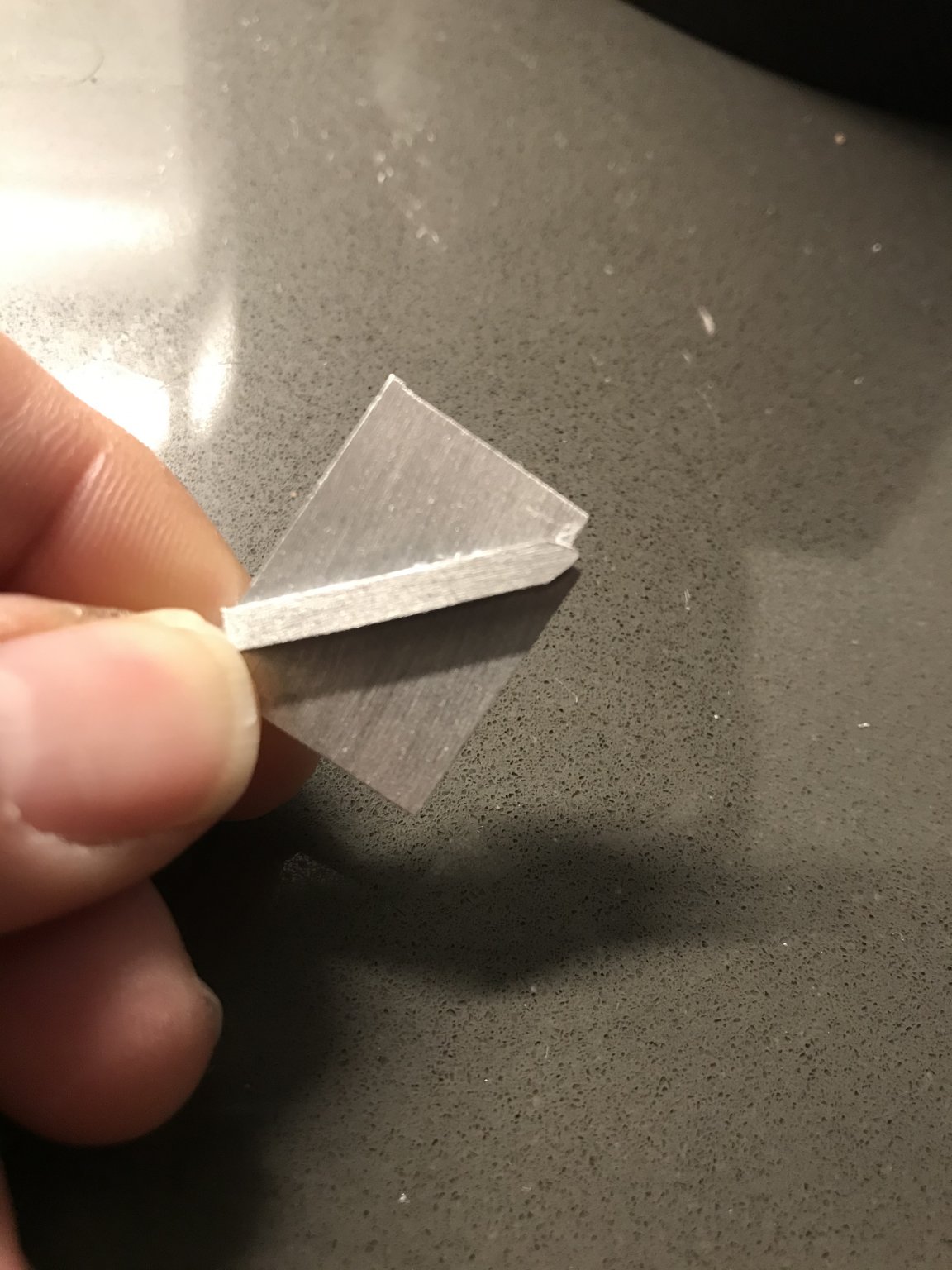
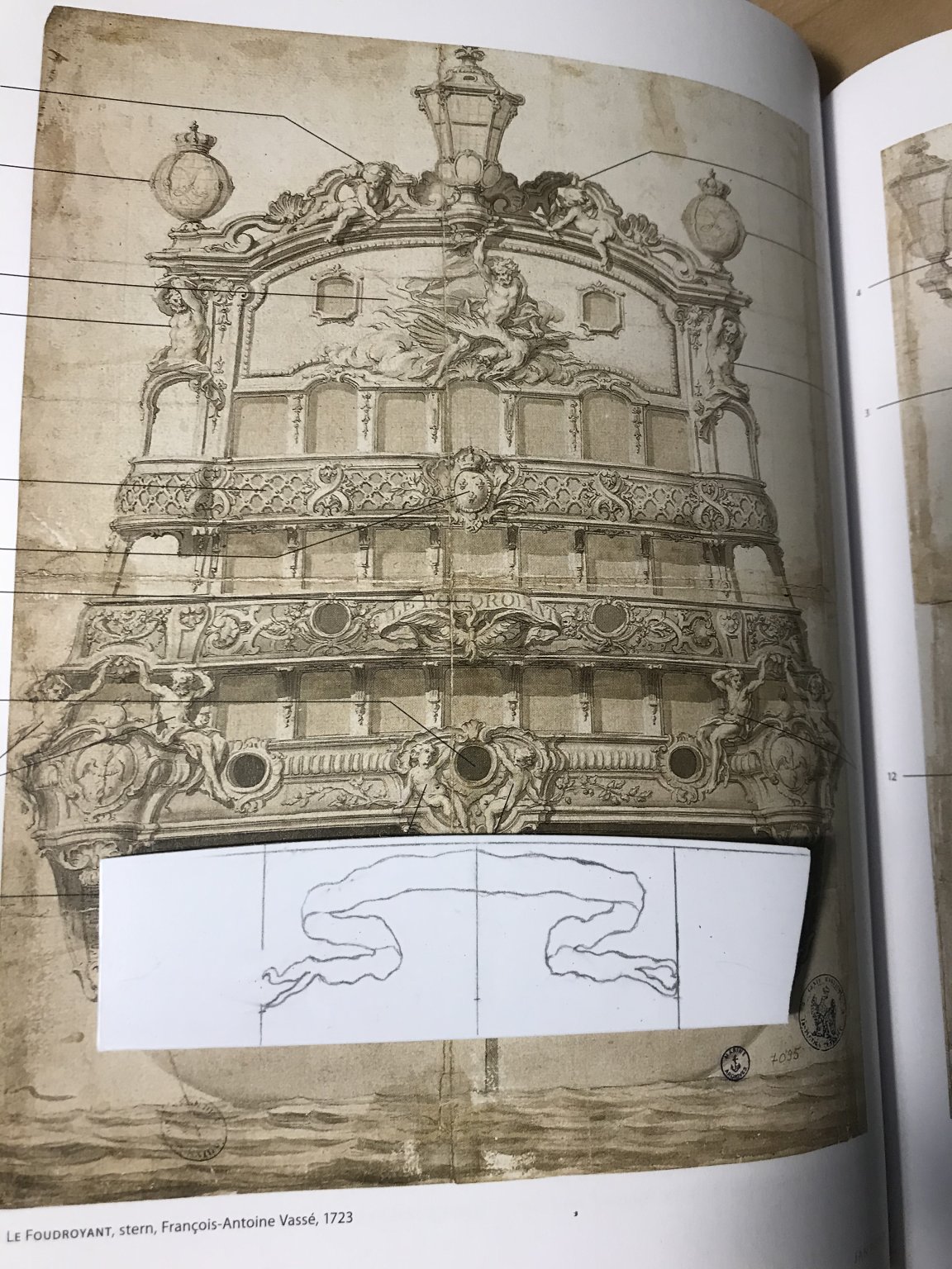
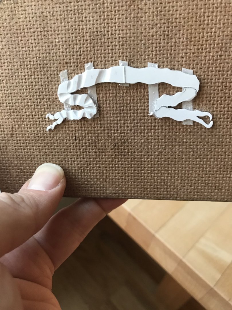
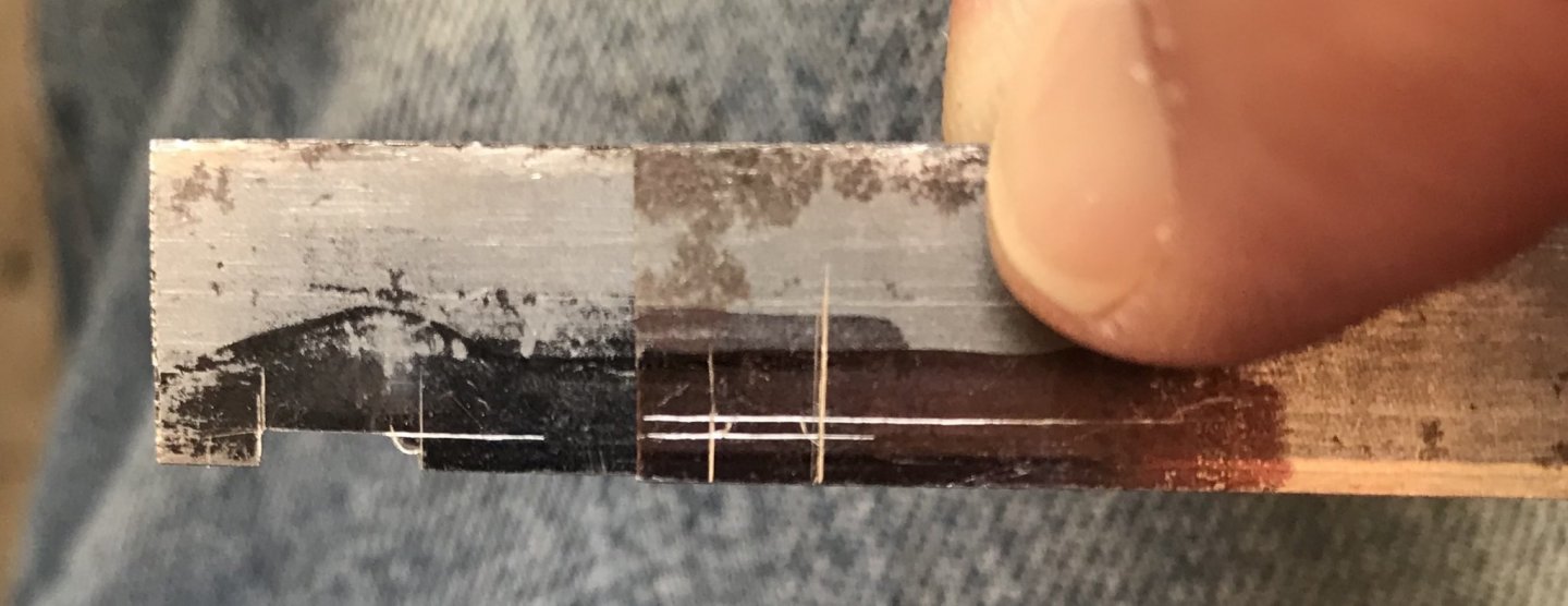
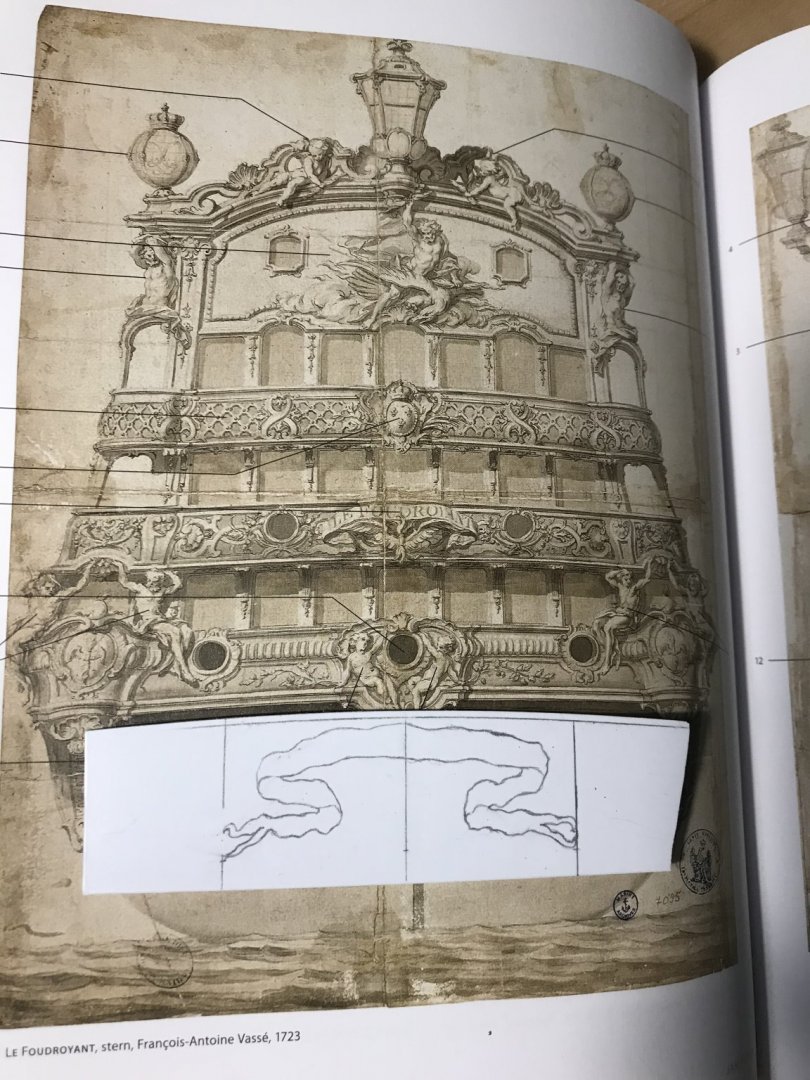
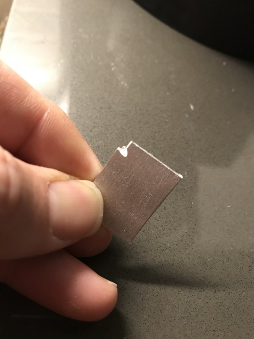
So, among other small projects - the bulkheads and the transom wale - I’ve made a start of the scrolling banner that I will carve for the area beneath the transom wale, and between the through-bolting of the transom knees. The scrolling banner that I initially drew was always a sort of placeholder, but not one I really liked. The motto shown, here, was my own bit of authorial license, before Dan brought something much better to my attention. It’s a little too cartoonish for the French Baroque period: Eventually Drazen Caric got around to an amazing step-by-step of the carving for the name banner on his incredible Provincien. The sense of movement that he conveys is much more the impression that I am after. If anyone is not familiar with his impeccable work, you can find it here. Posts concerning the name banner begin with post # 304: The other guiding inspiration is the name banner for the Foudroyant of 1723, which I could finally see in all of its splendor in Floating Baroque: What I have patterned, here, is not an exact drawing, but it captures the overall shape and sense of movement that I think will look very good in the available space. Carving the three-dimensional undulations of the ribbon will be a fun little project. Bear in mind that there will be a 1/4” separation between the two halves, for the sternpost. I’m thinking that I will probably draw the letters for the latin motto, NEC PLURIBUS IMPAR, onto parchment. I can then stiffen them with dilute varnish and cut them out, individually, to be affixed to the banner. My other experiment was making a moulding scraper. My first problem is that I want to cut very small coves into the edges of my transom wale - not much larger than 1/32”. To my mind, at this scale, it is very difficult to shape that small cutting nub into a hardened steel scraper, while maintaining sharp corners. I have little idea, really, how to do that convincingly. My first thought was that I’m scraping styrene, so maybe the scrapers don’t need to be steel. They also don’t have to last forever. Maybe, I thought, I could make them from aluminum scraps, which I have in abundance. My second thought was that maybe the cutting nub didn’t have to be shaped into the scraper body; maybe it could be an independent part that I cyano’d in place. So, this is what I came up with: I filed a chip relief into the corner, but I did not file all the way to the very back face if the scraper. I left about a light 1/64”, and I think that even that small lip is enough to clog the action of the scraper. It works pretty well for a few passes, and then not at all until you really clean it out. Today, I’ll release the cuter, file back that lip, and introduce a very slight burr to the cutting edge, and we’ll see what that does. If that doesn’t work, I’ll have to figure out how to make the one-piece, steel scrapers.
- 2,699 replies
-
- 7
-
-
- heller
- soleil royal
- (and 9 more)