


Hubac's Historian
-
Posts
2,950 -
Joined
-
Last visited
Content Type
Profiles
Forums
Gallery
Events
Posts posted by Hubac's Historian
-
-
Thanks, Mark! I'm eager to get started, as well, but I feel this is time well spent, as this ship is all about the ornamentation. I'll get there eventually, and I really appreciate your interest in and support of the project.
-
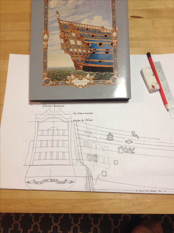
Given the crowded and complicated nature of the ornament surounding the quarter galleries, I wanted to sketch in the various elements (the mermaids, the figure if Africa sitting on her caryatid archway, the quarter piece supporting the side lantern, and the crown and flames), in order to get a sense for their relative proportions and whether I could make it all work in the space available to me.
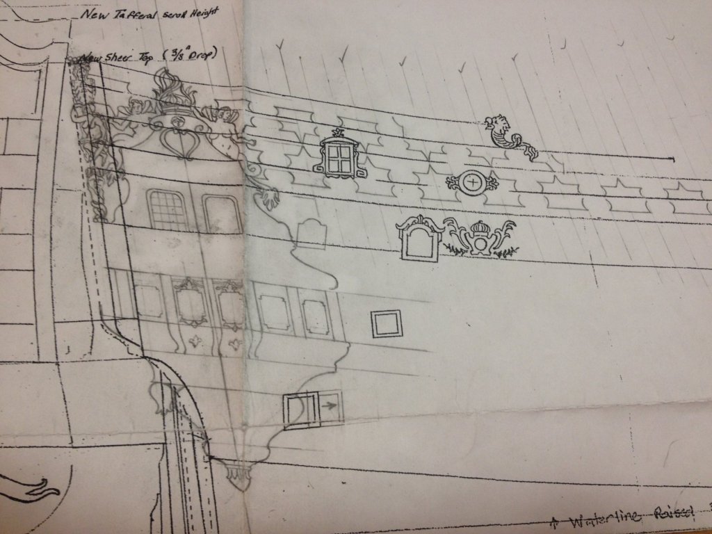
What I found was that the 1/4" extension I was adding to the stern was not going to be sufficient, however, if I added an extra 1/8" (the dotted, parallel line that previously represented the round-up of the upper stern) - then I had enough room to make it work.
once all of those elements were sketched in place, and relatively close to their ideal shape and size, I was able to complete the freize layout around them. I think that when I digitize this image, I'll be able to shorten Africa a bit, and lengthen the quarter piece just enough to seem right. Anyway, now that I can see where the frieze falls, in the midst of it all, I am now fully confident that I can pull this project off and produce something good.
I can't really continue to fill in detail on this sheet of regular bond paper because the surface integrity of the paper is failing with all of the erasures and re-working of the design. As tends to happen with this approach - the surface is also becoming too muddy with loose graphite. I just wanted to make sure that I wasn't going to commit all of this time to learning software, only to discover that there are layout problems that I couldn't overcome. An astute eye will notice discrepancies between what I am drawing and what is shown in either the black and white stern drawing or the Compardel interpretation of the same, however, there are a few small choices that were necessary for me to either include certain important detail, or omit less critical detail that overly clutters the design. Again, the proportions of all of this are not yet ideal, but workable now, with the software.
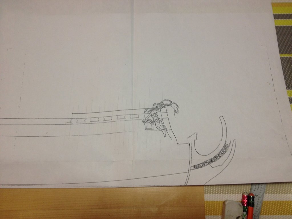
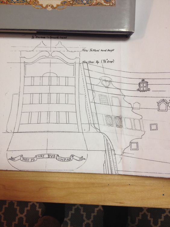
here is how the frieze layout translates to the f'ocsle:
-
After frittering away a few weeks trying to find Adobe disc software that is compatible with my operating system, and failing miserably, I have conceded that I will have to subscribe to the creative cloud on a monthly basis, which should provide ample incentive to get the drawing done.
In the meantime, though, I was playing around with layouts for the upper bulwark frieze and have settled for spacing that I think works really well, with the existing architecture. Bear in mind, of course, that I haven't yet drawn in the other quarter deck ports, the railings, or the ribbon strakes in their entirety. This is just a line drawing to see how a pattern repeating every 3/4" spaced out. I haven't extended the pattern further aft, just yet, because much of this space is filled with mermaids, the figure of Africa and the quarter piece supporting the side lantern.
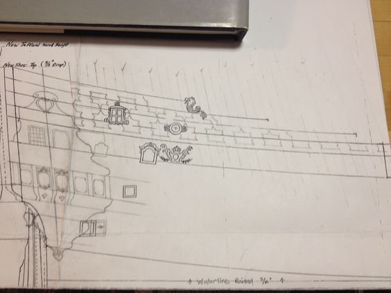
I think this arrangement gives me reasonable space for all of the alternating shells, fleur-de-lis, scrolls and diamonds that accent the frieze to co-exist without seeming too cluttered. I had hoped that I wouldn't have to entirely scrape away the ribbon strakes that delineate each level, but with the exception of where they frame a railing - I will have to scrape away the rest and use their ghost footprint as my guide for laying down the new pattern. The frieze will be made up from fairly thin sheet styrene that I can cut easily with an Exacto blade, and build up a little bit with fine styrene rod, or half-round running the center line of each lattice segment.
One thing that is apparent to me now, is that I will have to simplify my quarter deck window embelishments; excising the side details, but perhaps leaving the coved arch and the fid beneath the sill. At the aft end of each railing, I am experimenting with a small scallop cut-out into the planking which does not match the placement of the detail, beneath the sea serpent rail cap, but nonetheless echos the detail and might add something of value to the design. Maybe not, though.
That's the thing about this sort of interpretation; out of necessity, I will not be able to copy exactly what is pictured in the Compardel portrait, but I should come pretty close and create a pretty strong impression of the original idea.
- EJ_L, CaptainSteve, hexnut and 4 others
-
 7
7
-
In my on-going conversations with Mr. Saunier, it was brought to my attention how unlikely it would be that a short open walkway would exist on the main deck level of the quarter gallery without there being any connection to an open walk on the stern. Having taken a closer look, I can now see that the figure of Autumn is visibly supporting a projecting gallery on the main deck level. Given Autumn's position at the far, starboard edge of the stern, he must be supporting a gallery that extends to the edge, and in all likelihood wraps beneath the arch supporting the figure of Africa, and connects with the short open walk of the quarter gallery. Access to the walk would, then, naturally be from the stern. I am amending my theory to include this wrapping walk, on the main deck level. For the time being, I am not sure whether I am going to change my opinion of the quarter deck stern walk above it, which I currently believe to be a very abbreviated walk that only spans the central two windows of the stern. Perhaps, it too, extends at least to the quarter figures, but I am inclined to read the shadows of Berain's black and white image of the stern as flat. I have no doubt, though, that the lowest tier of lights is not a projecting gallery at all.
Given this new realization, my new conception of SR's stern now more closely matches the arrangement of La Reyne's stern, on the middle and main deck levels. For the record, while Mr. Saunier has been extremely helpful to me, and generous in sharing his research, he does not share my theory of the ship. Like Mr. Lemineur, he sees too many inconsistencies between my choice of quarter gallery and Berain's stern. He, too, is bothered by the use of the Heller kit for the basis of a more serious exploration of what the ship may have been. I respect his scholarship and his opinion.

I have also said, previously, that I did not think the officers' waste pipe was present in Berain's stern drawing. After really examining this black and white image, however, it now seems that the waste pipe is the primary element of the lower finishing that can be seen here. One thing that I cannot reconcile, between the stern and quarter views, is why the stern doesn't also show the rest of the lower finishing which should appear to drop down to the level of the lower main wale. It is not there, though. In it's place there only appears to be a fuzzy detail of indeterminable form.
For my part, though, I maintain that these portraits were produced for a reason. They must correspond with a specific period in the ship's history, and I believe that there is much evidence of Berain's hand in the design of these quarter galleries. Therefore, it seems reasonable to me that this appearance of the ship would originate around the time of her re-fit.
The other thing that occurred to me is that the particular triple-tiered arrangement of the headrails, in the Compardel portrait of the bow is significantly different from the headrail arrangement of La Reyne in the VDV portrait of her port bow. The figurehead is the same, but the headrails are different. To my thinking it seems reasonable that two first rank ships built by the same man, in the same yard, within a year of each other would - upon launching - quite reasonably share the same headrail arrangement. Yet, the Compardel headrails are distinctly different. While this is not signed and dated hard proof, this does, for me, signify the strong possibility that the Compardel headrails are also the work of Berain - thus this seems to re-enforce the notion that these bow, quarter and stern views are one continuous tableau.
This is my reasoned opinion. It may, in fact, be historically inaccurate. However, I have yet to find any signed and dated proof to absolutely say that it is not, at least, plausible. I welcome anyone in possession of that kind of evidence to come forward and change my mind.
-
Hi Dan! Thanks for that.
No, I haven't yet drawn a top plan view, but I was thinking about doing that because I will need to layout some form of ladder between the quarter and poop decks, and certainly, that view would help resolve the depth of the galleries at the main and middle deck levels.
I think what you are referring to is the hash line that runs vertically and parallel with the hard line of the stern. This is intended to represent the round-up of the stern, above the stern counter. It may be a little bit exaggerated, but the detail seems consistent with all the good models of French ships that I've seen, from the period.
Over the weekend, I've been fiddling with my sketch-in of the quarter galleries. I went ahead and filled in the aft-edge of the lower finishing, as well as an outline for the officers' waste pipe. In the drawing from the post above, I had been trying to cheat the lower finishing a little further aft, so that I could clear the last gun port on the lower deck. I realized, when I sketched in the lower finishing, that the sense of balance of the lower finishing was totally distorted because the carved detail of the lower finishing must be centered on the axis that runs the length of the quarter gallery.
So, in this next revision, I centered the LF on this axis and redrew the forward edge of the LF, which will necessitate filling and moving this gun port 1/4" forward. I wasn't too enthusiastic about this, at first, but then I measured the distance of the middle deck port, just forward and above it, to the next port on that middle deck level. The distance between those ports is 25/32". If I move the lower deck port forward that 1/4", the new distance to the next port will be...
25/32"
This is an alteration, that isn't a perfect solution, but one that I can live with. I think when this whole thing is layed out in the digital realm, the layout will not be jarring. Moving the port, however, very much improves the sense of balance to the quarter gallery, and that - in my opinion - is the larger issue.
I've also settled upon the size of the five lower gallery windows and the extra ornamental details to fill in the extra space above and below. The top detail, is taken directly from the upper bulwark frieze, where the frieze becomes most narrow, on the quarter deck level. Again, I expect purists to take issue with all of this, but that is the nature of this build; additions, subtractions - filling in the gaps.
-
-
-
As a matter of fact, EJ, I just read in the Vasa book that over 1,000 oak trees went into her construction, and as many more into the forges that produced her hardware and cannon. And that doesn't even account for the other lighter species that would have planked her decks and upper works. Consider, then, the massive increase in size from Vasa to Soleil Royal!
-
Hi EJ,
Your points are well taken, and certainly, the subject of SR's quarter galleries is one of much confusion and debate. I will definitely be making simple card templates, when the time comes, that show both the outline of the galleries against the hull, as well as their projection from the hull at the middle, main and quarter deck levels.
At the moment, I am in correspondence with Mr. Michel Saunier concerning his spectacularly complete scratch-build of Soleil Royal. His approach to the quarter galleries is decidedly different from what I am attempting, but he has reams and reams of documentation to support his theory of the ship, and his research is really quite fascinating.
I had been waiting to see whether Mr. Lemineur and Mr. Peters would explicitly grant me permission to share their insights, but I have not heard back from them, and I think Mr. Lemineur has grown tired of this project, anyway. To each his own, of course.
So, EJ, in answer to your question about whether I will portray the quarters as open or closed, the answer is: both. Following is my detailed analysis of Berain's stern drawing of 1689, as I believe it relates to the color (and more directly - the black and white rendering that I use as my avatar) draft of the stern. I am really just cutting and pasting this from one of my mails to Mr. Lemineur, which is why the text sometimes addresses him.
--
After an even closer examination of Berain's known stern drawing, in combination with the color renderings of the stern and bow, I maintain that there is, indeed, enough correlation between the arrangement and style of these two views to argue that they represent Soleil Royal's post-refit appearance in 1689.
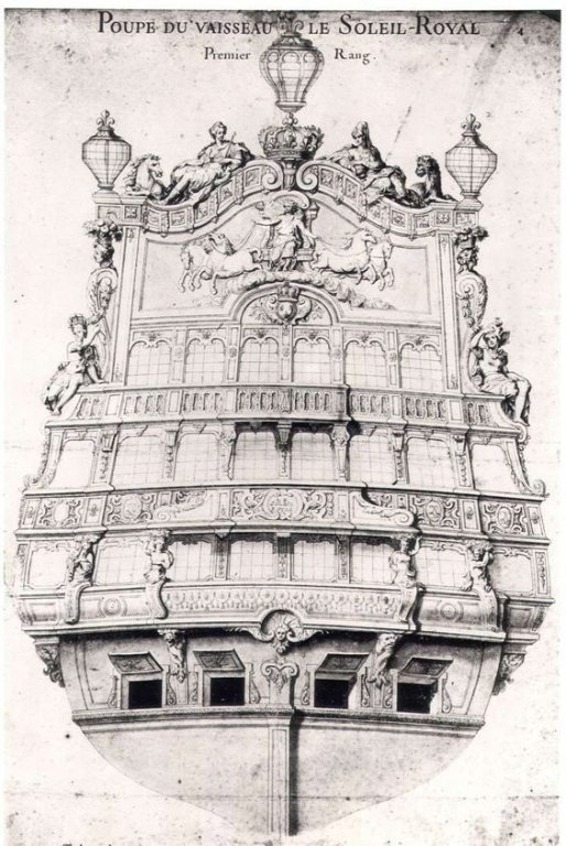
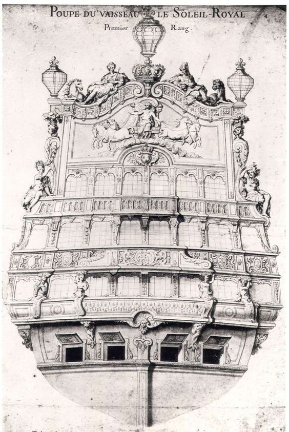
My examination of the stern and quarter views, will proceed from the arched tafferal, upon which sit the figures of Europe and Asia, down through the three galleries, toward the waterline.
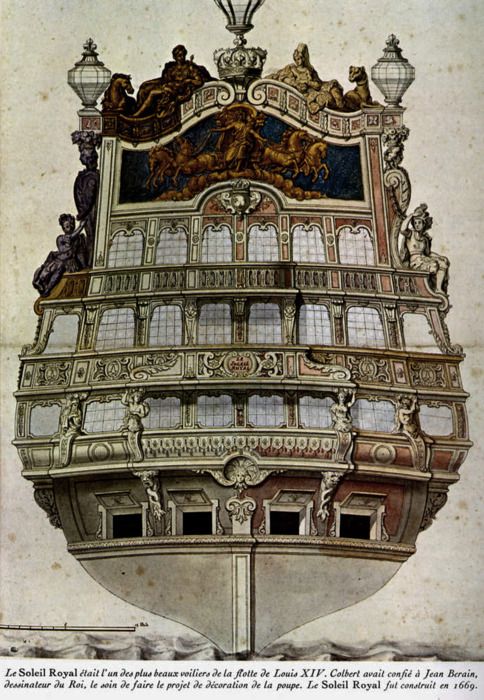
To begin with, one assumption of my analysis is that the glaring absence of Asia, astride her camel, owes to it's obstruction by the starboard stern lantern; it is presumed to be there, but is not seen. Why, on the other hand, there is no representation of the great, central stern lantern, I can not say. Certainly, owing to it's size and placement upon the top of the scrolled pediments, it would be visible in this starboard quarter view.
The acanthus carved quarter pieces that are shown supporting the smaller side lanterns correspond directly with Berain's drawing of the stern.
Now, the allegorical figure of Africa - which you contend differs in head dress from the stern to quarter view - is shown, in both drawings, to have the same posture and positioning of her torso and limbs. Her vestments are almost identical, even showing a similar swaging of fabric across her crossed knee. The differences seem to lay in the attitude of the cape tassel around her neck, and whether the quarter view shows her wearing the same elephantine head dress, or simply that the figure's hair is shown in an "up" style. The color draft is not clear enough for me to say, absolutely, that the two do or do not correspond in this small detail.
Where there is very clear agreement between the stern and quarter views is in the style and profile of the three different types of gallery window; main deck, quarter deck and poop deck. The two quarter windows of the middle deck, beneath which, a cartouche bearing the ship's name is displayed, are enlarged, but similar in shape to the six lights, corresponding with the same level of the stern. It is my belief that at least one of these two middle deck, quarter windows (most likely the aft most of the two) actually represent a doorway to an open walkway, although this walkway does not pass beneath the grotesque masked archway supporting Africa, and thus it does not wrap to an open walkway on the stern. The archway exists, as it often does on French sterns, but it ends abruptly just before the corner of the stern.
The oval cartouches, bearing the ship's name, are almost identical from stern to quarter, with very nearly the same fretwork banding displayed to the immediate left and right of the cartouche. Likewise, the fretwork of the upper stern walk wraps to the quarter gallery top finishing, just below the oval window.
There are some small discrepancies between the lower finishing of the quarter gallery, as seen from the side and stern views; the stern view, for example, does not show the acanthus carved waste pipe of the officers' toilet. Perhaps this is because its presence, in the stern drawing, would obscure the understanding of the ornamental lower finishing of the quarter galleries. On the other hand, it is possible that the waste pipe is represented in the stern drawing, but it is difficult to decipher because this area of the stern drawing seems foreshortened in a way that does not fully account for the lower finishing of the quarter galleries.
(I should note, here, EJ, that this lower middle-deck tier of the quarter gallery is completely closed in, in my opinion. On Mr. Saunier's model site, there is quite a remarkable amount of debate as to why Berain's stern schematic of the rear-facing quarter gallery window, on this level, is not show to be glazed. Is it a solid panel, as suggested by shadow lines?; was it glazed?; was the decision left to the shipwright to work out at the time of construction? It is my opinion that privacy in the officers' toilet, on the high seas, would probably not have been a high priority. They were enclosed and protected from the elements, so that was probably sufficient. I believe this pane should be glazed.)
The upper finishing of the quarter galleries appears to me to be the sort of shallow application to the hull that is often represented to great affect on modern models of L'Ambiteaux.
While the bare-breasted mermaid figures, that flank the upper finishing, don't seem to correspond directly with the subjects of Berain's stern design, they are, at least, concretely connected to the acanthus quarter pieces by the foliate garland - and ultimately to the angel figure, poised just aft of the head timber finishing of the bow, by the same garland.
Considering, though, the dominant theme of Berain's stern - total dominion of the Sun King over the four corners of the world and all four seasons - it may be plausible to think of the quarter gallery sirens as beings that are both earthly and ethereal servants and/or playthings of the King.
Another small correlation can be found in the short, coved arch above the topmost, oval gallery window, with it's scrolled volute ends. The very same arch appears in the tafferal frieze, directly above Apollo's head. It should be noted, also, that this same stylized arch appears in other Berain designs of the Second Marine, as seen in the upper quarter gallery finishing of Le Brilliant of 1690.
Lastly, the particular shaping and style of scrolled volute that bookends the middle stern walk, repeats itself in the widening of the stern gallery profile at the middle, or quarter deck level.
It is my opinion that the differences in design vocabulary and expression, between the stern and quarter views are minimal, and may be the result of someone other than Berain, but nonetheless selected by Berain, to complete the ship's decor in a manner that is consistent with the pre-established stern schematic. I say this because the relative proportions of the color drafts do not appear as balanced as the stern drawing of Berain; in his style, I believe, but expressed by a different hand. It is interesting to note that a black and white draft of the quarter gallery exists, which closely mirrors the color draft, but exhibits a somewhat clearer refinement of line, and must be the product of yet another draftsman's hand. This sort of "passing off" of artistic assignments from the master to his apprentices and/or a coterie of established artists would be consistent with the art salons of the day. Ultimately, the master reserves final say.
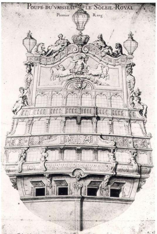

It bears mentioning that these black and white renderings agree very much with each other in both layout and style. These drawings, I believe, are the primary source work of Jean Berain (who's influence on Soleil Royal would not have come to bear before 1689, when he became the primary overseer of ornamentation to the King's ships). This is why I believe the elaborate quarter galleries and upper bulwark frieze that I have chosen to re-create on this model, represent the post re-fit ornamentation of 1689. Mr. Saunier's insight and analysis may, yet, change my opinion; he certainly seems to make compelling arguments for a different approach. For now, though, this is my operating theory of the ship, and the model I am going to build with this Heller kit. My full frame-up model of the future may take a different approach.
I think there tends to be so much disagreement on the issue, because as EJ points out - interpreting a two-dimensional rendering into a three-dimensional object is a trick of perspective. Berain's stern schematic would seem to indicate that the quarter galleries project away from the hull at considerable depth, at all three levels. If that were the case, some have posited, wouldn't the Angel/Siren figures that flank the upper finishing be visible on the stern drawing? They should be, but I believe the quarter deck and upper finishing are much more shallow projections that are applied to the hull. Perhaps for the sake of simplicity, Berain decided not to represent the shallow projection from the ship's side of the dolphin and siren figures, as they might be viewed through the open archway that supports Africa. The key for me, is in trying to interpret the shadow clues that are more apparent in the black and white rendering of the quarter gallery.
Anyway, a close examination of the Black and white quarter with the color quarter will reveal a number of small discrepancies that seem to indicate, as I mention above, that there were two different individuals creating these very similar representations of the ship. I don't think I am overstepping by saying that Mr. Peters expressed the possibility that the painter of Mr. Lemineur's color book art might be the work of Etienne Compardel. For example, he cited Mr. Compardel's painting of Konung Karl, for which Jean Berain initially supplied him with very detailed drawings for what the ship's ornamentation should be in 1694. This is known.
Although it doesn't seem so in this particular image capture of the painting, I have seen other views of the same painting that show a very similar color palate - particularly of the sea and sky - to the SR artwork. The styling of these natural elements is quite similar, indeed. One could even argue that the relative proportioning of Konung Karl, in this painting, is similarly just a tad "off," as is apparent in the stern painting of SR. Personally, I agree with Mr. Peters on this possibility.
If Mr. Saunier is amenable to sharing of information, which he certainly has been forthcoming with me, so far, then I will share what I learn from him on this thread.
-
So, my excitement over Adobe Illustrator 7 was short-lived. Once I tried to install it on my Mac - on which I had recently updated the operating system to El Capitan - I discovered that the Old Salt no longer supports the "classic environment" of this older software, with a copyright dating back to 1997.
In lieu of that, I have downloaded a 7-day trial of Adobe's current software from their Creative Cloud suite. I had been cautioned on a separate thread (What To Do About Poorly Drawn Plans), by Chuck Passaro, not to get my hopes up with regard to the Autotrace function. He (and others) certainly proved to be right, as the resulting scans of my pencil drawing - no matter the format or level of saturation (?, image density?) - proved to be full of nubby nodes and missing detail and generally useless.
As Chuck explained to me, the only remedy to this problem is to learn how to manually trace over the imported image using the pen tool; one small line segment at a time. He gave solid advice on how to effectively go about doing this, and as I always find in situations like this, YouTube is your best friend for figuring out the small stuff.
Like anything else, though, manual tracing is a skill that takes practice to acquire. At the moment, I can hand-draw somewhat faster than I can trace, but tracing affords you many advantages, such as the abilities to rescale and work in layers. The daunting aspect of all of this is that Jean Berain's stylings are replete with complex, interlacing bandwork that is remarkably tedious to trace digitally, but even more-so to capture by hand; by capture, I mean to approximate the artistry of the thing, which usually means drawing and erasing one small line over and over again. At the moment, I'm not sure what the best approach is. I'm going to keep at it, though, and see how it goes. At the very least, I'm acquiring a new skill.
During "arts and crafts time" with my daughter, recently, I decided to start laying out the quarter galleries, in pencil, onto a printed copy of my drawing. It seemed to me that the reasonable place to start this task was with laying out the tree tiers of lights; five middle deck windows, two main deck windows, and one quarter deck window. The windows of the quarter galleries must, within reason, align with the windows of the stern; I say "within reason" because the Heller kit as it is moulded and intended to be assembled does not have "windows in the middle and main deck levels, but rather, relief panels that do not have to neatly correspond with the stern - with the single exception, of course, of the quarter deck window. My choice to add a 1/4" extension piece to the hull, above the stern counter, only complicates this alignment issue - however, not so much that I don't think the problem can't be overcome with some judicious use of space management.
Ergo, this drafting exercise yielded the first of several stumbling blocks to re-scaling an artist's rendering to the established architecture of the plastic hull and upper bulwark pressings. The available space between gallery levels for those five middle deck windows is significantly taller, and consequently more narrow seeming, than rendered in the color portrait.
My instinct, at the moment, is to maintain a window opening that is closer to square than rectangular and then design an appropriate ornamental detail to bracket the top and bottom edges of each window. Alternating shells and fleur-de-lis, for example, could be one approach to balancing the available space in a way that seems deliberate, and helps to unify the composition - even if this, in fact, amounts to an artistic deviation born of necessity. Another possibility would be some form of tracery banding that takes its design cues from the walks between galleries. Here are two slightly different examples of a light, filagree addition to the top and and bottom edges of two of the middle deck windows:
This design is actually a horizontal bisection of a detail that is expressed in the center of the shield of each antler escutcheon carving, on the main deck level. To the right of these two windows are two more window spaces that illustrate how tall and narrow the openings would appear if they weren't shortened. I believe that maintaining something closer tothe appropriately sized window opening, as seen in the color rendering, is more conducive to replicating the feeling of the original decor, than any small artistic liberties taken, will detract from the effect.
I should mention that I have not bothered (at this early stage) to draw in the overlay of the lower finishing to the quarter gallery, where it crosses the edge of the transom, on the lower deck level. If I had, the sense of balance of the quarter gallery would be much improved. One might also notice that it was necessary to scallop, aftwards, the lower finishing so that I could clear the aft-most, lower deck gun. I'm not entirely happy with this, but I don't find it terribly jarring either. The line can be improved - as could all of these hand sketch lines with the curve-smoothing capabilities of Illustrator.
One last thing, though: I sometimes find it useful to crosscheck a design by looking at it upside down:

The perspective of this picture doesn't perfectly capture the effect, however, viewing something upside down often reveals glaring dissimilarities, when what you are after is reasonable agreement. Again, what is shown here is not an exact replica of the portrait, but I think, a reasonable facsimile that takes into account certain immovable features of the kit architecture. In the end, I think I will probably have to draw the quarter galleries entirely by hand. while I could import a scan into illustrator, trace it and corner-drag it to fit the three levels of the stern approximately well, my gut tells me that I will run too far afoul of the aft-most guns of her broadside.
- Archi, EJ_L, CaptainSteve and 3 others
-
6
-
-
Hey EJ - I'm full of book references lately. One read that will answer many of the grey areas in 17th C. rigging is James Lees's book Masting and Rigging of English Ships of War 1625-1860.
While R.C. Anderson provides better insight into the differences in practice between nations (Rigging of Ships In The Days of the Spritsail Topmast 1600-1720), Lees is much more reader friendly, with usefull illustrations.
- EJ_L, zoly99sask and donfarr
-
3
-
Welcome, Jason! Thank you for coming to check out the project. Build progress will, admittedly, be slow. I'm not in a rush to finish. I promise you, though, that the more substantive elements of the modification will be worth sticking around for.
EJ, interestingly, Les Vaisseaux Du Roi Soleil is now available in English. I've done a passable job of translating most of it, but it is tempting to get the English version, although I don't feel like paying full price for a second copy. The benefit has been that my French recognition and vocabulary have improved tremendously!
Andrew Peter's book, Ship Decoration 1630 - 1780, is one that I also highly recommend. He is, himself, an English ship carver, who at the time of the research for this book, was under contract to design and execute the carved work for the Swedish East Indiaman, Gotheborg. The book is a really fascinating study of the primary European nations' development of their commercial interests and a navy to protect them. His focus is primarily on the artistic development of styles that are specific to each of the reigning powers, but his study draws upon the contemporary commercial and architectural influences that shaped tastes in art and eventually found their way down to the shipyards. For anyone who is generally interested in the life of a 17th Century ship carver, the book paints a fairly vivid picture of what it was like to be subject to the crown, often at odds with the natives of a foreign shipyard (if your talent warranted importing), and in arrears (depending upon the state of the coffers during war times) for payment of your work.
My next book to read is Vasa, A Swedish Warship by Fred Hocker. I've only skimmed through it, so far, but it looks like an amazingly photographed and insightful examination of the iconography of the ship and the particulars of her construction. EJ, you may like this book, as well, because both Vasa and La Couronne were considered ground-breaking vessels, for their respective countries, because of their two continuous gun decks. Given the cross-pollination that was common in shipyards of the day, with Dutch shipbuilders building for the Swedish and French navies at various times, this should be a very useful resource for period construction details - many of which would probably still be in evidence much later into the 17th century.
-
Hello Everyone!
Life has continued to keep me busy, so there hasn't been much build progress (expected, by now, I know
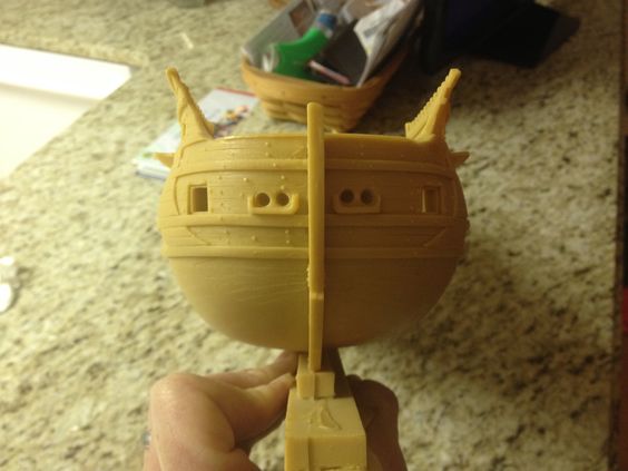
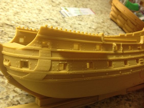
 ), but I did manage to finish the port framing. While it isn't as clear in these pictures as it is in person, there is some nice graduation in frame thickness from the lower to middle deck.
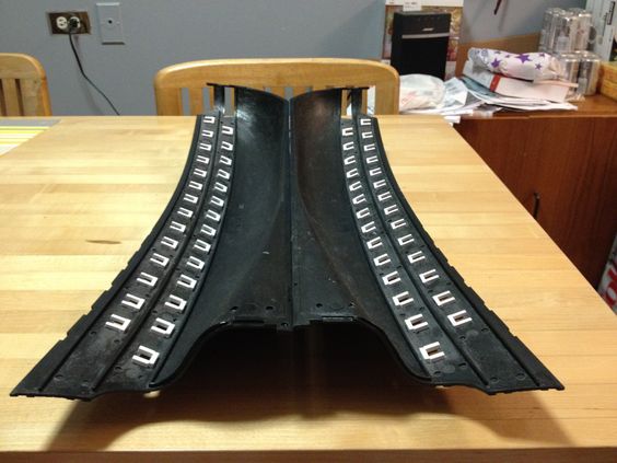
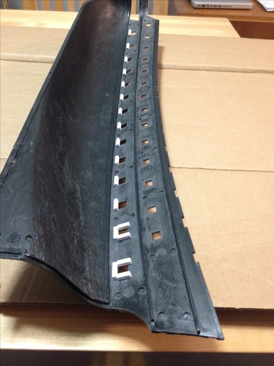
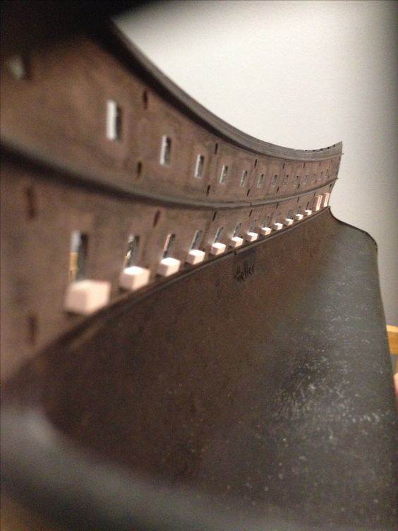
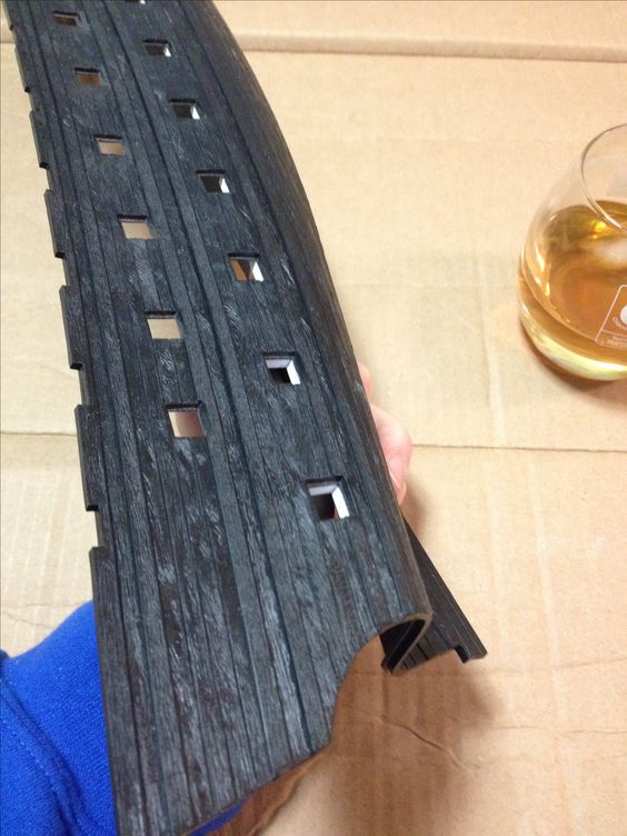
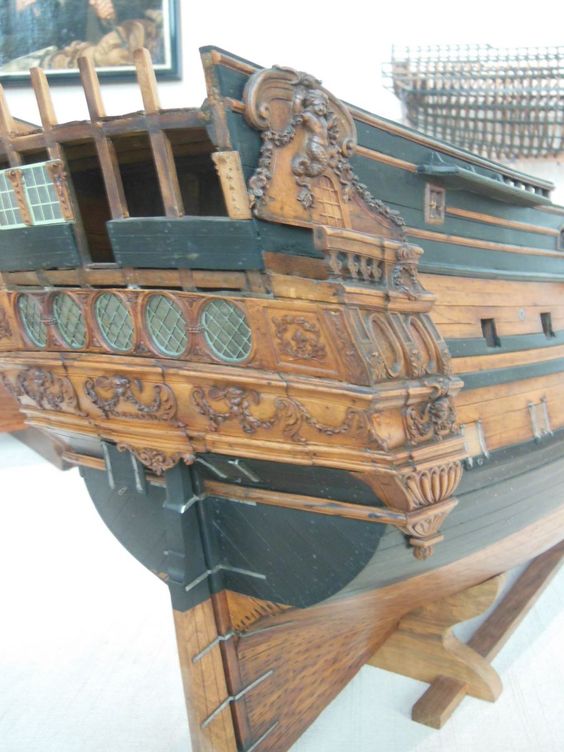
As far as added detail goes, this is just the tip of the iceberg for what I'm going to do. I've been spending quite a lot of time at my father's house, lately, and I dug up a souvenir from my time at the Batavia Werf shipyard, back in 2003. As I mentioned in an earlier post, Mr. Herbert Tomesan had a profound influence on my perspective of plastic, scratch-build modeling. Below is a defective cast-off that Mr. Tomesan sent me home with. I forget which Dutch ship this represents; I'm not even sure whether it is a model of a specific vessel, or more generally, a type he was using to fill-out the scenery of his Texel Roads diorama.
All of the detail that eventually becomes a resin-casting like this, starts out as various strip and extrusion styrene that he applies to a vacuum-formed hull shell, in order to produce a mould master.
These are some of the missing details that I will be applying, in the same fashion, to SR. It's really easy to do, and as I think you can see, the execution - although rendered to excellent effect, here - doesn't have to be flawless to be really really convincing, even in the absence of paint and weathering:
I'll be adding this protective sweep of timbers that nestles between and around the wales, in order to protect them from raising anchor. While examining this model, I was reminded of the clever tricks Mr. Tomesan had devised for simulating certain details. The tree-nailing in these protective timbers is actually the impression of a hypodermic syringe needle. Most of the simulated tree-nailing, on the rest of the model, is a simple pin prick.
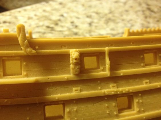
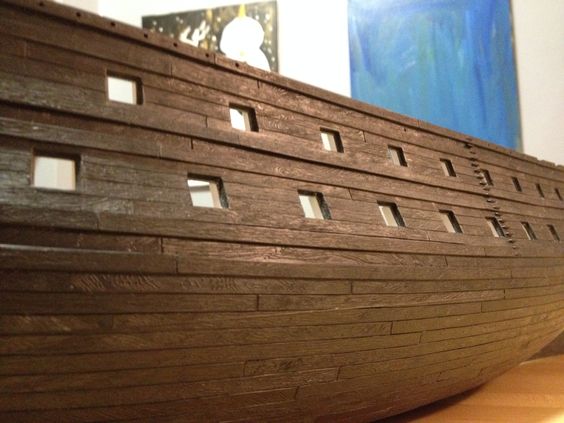
I'll need to add chesstrees, scuppers (which, here, are simply very light gauge styrene strip that he's cut into rectangles and then Exacto'd out the centers), the washer and through-bolting to the sides of the gunports for the carriage tackles, and the bolted fasteners at the wale scarfs. I will, incidentally, be filling in the Heller butt-joints on the wales and scribing in scarfs at appropriate intervals. His grain detail is simply course sand paper scratches that follow the run of the planking. While this type of grain simulation won't perfectly match the moulded grain detail in the Heller kit, I suspect that experimenting with various grits and adding just the slightest bit of variation in the run of scratches should blend in well enough to not be glaring.
On the research end, I am happy to say that I now have what I feel is an arguable, or reasonably debatable context for the model that I am building. While a number of my prior assumptions about the Heller kit, and the Tanneron model upon which it is based, have been demonstrated to me to be false, I have at least come to understand what the specific errors in kit architecture are, and how those errors create a false impression of a ship from the First Marine of Louis XIV. Some of these errors will be corrected, or at least mitigated with my build (i.e., the beam, draft and sheer), others relating to the number and arrangement of guns (particularly, the spacing between gunports), and the specific architecture of the post-1673 stern are not possible to kit-bash away on a pre-moulded hull. I am, however, at peace with this reality as I view the entire project as an effort to create a reasonable impression of what Soleil Royal may have looked like, on the whole, following her refit in 1689.
My correspondence with Mr. Lemineur (Les Vaisseaux Du Roi Soleil), and Andrew Peters (Ship Decoration 1630-1780) has been in-valuable in coming to understand the origin and context of much of the imagery I have been posting here. I have asked each of them permission to share with the forum what they have so graciously endeavored to explain to me, and I will wait to hear from them before doing so.
I feel for the sake of Mr. Lemineur, in particular, who has spent so much of his life researching the archives in an effort to discern truth from fiction, that I must be very clear about what I am doing, so as not to mislead anyone into believing that this project is in any way a definitive representation of the ship's known appearance. It is largely a work of conjecture, on my part, but one that at least draws reasonable inferences from better understood, contemporary sources. I respect Mr. Lemineur's dislike for the Heller kit's in-accurate architecture and will take some time, in my next post, to discuss what those issues are.
If, after a reasonable time, I do not hear from either of these men, I will at least post my opinion of why Berain's stern drawing reasonably corresponds with the color drafts of SR's quarter gallery and bow. These three views, it seems to me, may very likely have represented her post-refit appearance.
- CaptainSteve, RGL, EJ_L and 5 others
-
8
-
-
Excellent work, Matt! Your metal skills are truly outstanding!
- FriedClams, Canute, Jack12477 and 3 others
-
6
-
One other observation about the article about SR from the troisponts.net site:
The article opens with a brief discussion about the Reglement of 1670, which specified that only two ships - SR and the Royal Louis, both of 1668 - would be fitted out with a distinct forecastle, thus marking their special place as prestige ships. All well and good.
But then, this Van De Velde portrait of La Reyne is dated at 1673, five years after her construction, and clearly shows her as having a distinct forecastle:
I only raise the issue to point out the difficulty in weighing too heavily on one source of information over another; in this case, as seems to be the case with many of the Reglements leading up to the Second Marine, what was mandated was not necessarily what was followed. Otherwise, La Reyne would have been cut down to conform, no?
- Richard Griffith, Jeronimo, mtaylor and 4 others
-
7
-
I am now in the process of composing a letter to Mr. Lemineur, in which I debate the possibility that Berain's stern drawing (known to be from 1689), corresponds directly with the color drafts of SR's bow and stern. There are some inconsistencies between the drawings, to be sure, but a wealth of correlation. Although I have not absolutely convinced myself, just yet, I strongly suspect that these images, combined, provide a fairly solid representation of the ship, post re-fit, in 1689. I will include my analysis, sometime in the near future, after sending this letter off and giving Mr. Lemineur some time to respond. It only matters in so far as I hope to place this build within some context, i.e., here is an arguable representation of the ship from 1689.
One of the more interesting and debatable aspects of SR's popularized appearance, for example, is whether the ship's topsides were as thoroughly cloaked in blue as is almost always depicted. Mr. Lemineur maintains that the expense of producing the rich, ultra-marine blue (which would, at the time, have been costly to extract from the stone, lapis) would be prohibitive, and that instead, much of the ship was probably painted red; exceptions being made around the tafferal frieze of Apollo. That is all fascinating to consider, especially so when one considers that popular conceptions of the Vasa painted Royal Blue were completely turned on their ear, when the microscopic analysis of the ship's timbers revealed that she was mostly painted red above the main deck and that her sculptures were a riot of many colors.
Is it conceivable, given the excesses of Louis XIV's reign, that the upper bulwarks were painted in true ultra-marine? I would say that it seems plausible and worth investigating further. That does seem to be the opinion of the historian François Bluche, who is a specialist on the reign of Louis XIV, and is cited in the article above. What might be a better avenue to explore is whether anyone at this time in the late 17th century was creating deep blues from the copper oxides of Azurite. Those are all questions I am exploring and welcome any insight any of you might have to period colors for French ships of the line.
In build news, I have almost completed "framing" out the gunports and am satisfied with the effect. The lower gun deck walls seem sufficiently thick to put up a fight against incoming 36 lb shot, and the middle deck ports show a noticeable and reasonable graduation in thickness, as they would be slightly thinner in full practice. I will post a few pics, once this is complete.
My Adobe Illustrator software has arrived and I will soon turn my focus to learning how to use it, so that I can complete my drawing of the ship. This drawing will enable me to layout the fretwork frieze of the upper bulwarks, re-locate the channels and reconcile any conflict of the shrouds, relative to the guns.
- CaptainSteve, mtaylor and EJ_L
-
3
-
Dig and ye shall find!
The following is an article that can be found on the following website, which is devoted to recording the history and development of the French Navy. Here is the web address where the article can be found:
https://troisponts.net/2013/10/18/les-soleil-royal-de-la-marine-de-lancien-regime/#more-5495
This article is the work of Nicolas Mioque and draws upon the research of the following three men:
– Demerliac, Alain. Nomenclature des navires français.
– Lemineur, Jean-Claude. Les vaisseaux du Roi Soleil.
– Roche, Jean-Michel. Dictionnaire des bâtiments de la flotte de guerre française de Colbert à nos jours.Much of what is explained, here, has been laid out for me by Mr. Lemineur, with whom I am having a separate conversation about the decoration of the first Soleil Royal. As I think this concise article provides a useful understanding of the history of the four ships (but really three, as the article explains) to bear the Soleil Royal name, I recommend that anyone interested visit the web address above. I would copy and paste it here, both in French and translated (adequately enough) by Google Translate, however, I am uncertain of the possibility of copyright infringement, without express permission to reproduce the article in a separate forum. I want to be clear, though, that none of this research is my own.
- CaptainSteve, Archi, EJ_L and 1 other
-
4
-
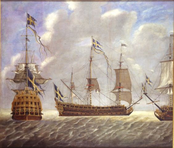
Hi Mike - I was blog surfing and stumbled upon your build. This looks like a very gratifying subject for a model and I look forward to following along. In these Swedish models that you have posted pictures of, it looks as though you have a few striking examples from which to draw upon. I wish you luck and look forward to future installments.
All the best,
Marc
- popeye the sailor, Martin W, mtaylor and 1 other
-
4
-
-
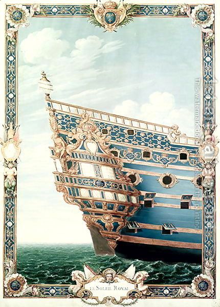
Hello Mr. Delacroix,
Thank you for relating Mr. Lemineur's thoughts, which are particularly helpful, as they answer a number of the questions I posed to the Musee. One question for Mr. Lemineur that is of particular interest to me concerns the dust jacket artwork for his book, Les Vaisseaux Du Roi Soleil. My operating assumption, so far, has been that this artwork represents the original decor for the SR of 1668, and that it corresponds, directly, with the black and white stern schematic that is attributed to Berain. Is that, indeed, so? Also, I wonder who is responsible for creating these color draughts of the bow and stern. Were they simply proposals for the decor, created by Puget, perhaps, and refined by Berain? Or do they represent an actual contemporary portrait of the ship, after she was built? Is the artist known?
I'm aware, from my meager efforts at translating his book, that there are wide discrepancies in the arrangement of the guns between the first and second SR. As I mention, earlier in this thread though, this problem of the number and arrangement of guns is not one that I intend to tackle with this build. I am also mindful of the problem of draught with this Heller kit, which is why I have decided to dispense with the lower hull, altogether, and make it a waterline model.
What I'm after is an impression of period correctness. Will my model be an academically rigorous and faithful recreation? Unfortunately, that is not possible at this time. As a side note, I should mention that I chose the screen name "Hubac's Historian" because I was an English major and am fond of alliteration. It just sounds good, doesn't it? I am not so proud to think, though, that I can unlock the mysteries of early French naval architecture. Nevertheless, I can appreciate Mr. Lemineur's frustration with the Heller kit.
I just want to see whether I can turn it into something that resembles his dust jacket artwork, because whatever version of the ship that represents - it is a remarkable work of art, in itself. It is grand, and completely over the top and awe inspiring! I only hope to understand what it is that I'm looking at. For me, the fun is in attempting to reconcile everything that isn't shown between those two bow and stern drawings.
In an effort to relieve you, Mr. Delacroix, of your role as intermediary, you can forward my email address to Mr. Lemineur:
benchmarc_woodworking@yahoo.com
I appreciate, very much, the time you have taken to explain these things. As always, I'm very appreciative of everyone who visits this thread, weighs in, or takes any interest in this project, whatsoever.
-
Although I haven't been busy on here, I have been busy. On the software front, I was initially dismayed to realize that older versions of Corel Draw are not compatible with MACs, and I didn't feel like spending big bucks for the most current CAD version of Corel, which is compatible. However, on Amazon I found a NIB edition of Adobe Illustrator 7, complete with discs! Non-software person that I am, it was a revelation to me that you generally no longer get discs with your latest and greatest software upgrades. So, that's on its way, and should be here in a week, or so. In the meantime, I've been watching YouTube videos to figure out how, exactly, to use the AutoTrace tool bar. All good.
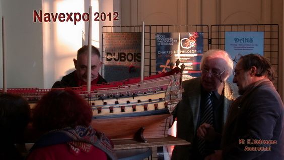
I found out, through sources in direct contact with J.C. Lemineur that the photos of the 90-gun first rate ship that I posted earlier, from NAVEXPO 2012, are indeed the subject of a new monographie that should be released some time toward the end of 2017. The ship is Le Saint Philippe, of 1693. While her construction corresponds more directly with the second construction of Soleil Royal (following the loss of the first at La Hogue), I believe there is much to be gained, architecturally, from a close study of Le Saint Philippe. I look forward to adding that to my collection, once it is available.
I've poked the Musee to see whether they had made any headway on my questions, but so far, I have not heard back from them. Perhaps they feel that I am wasting my (and their) time even bothering to ask about the first SR. However, as they say, it never hurts to ask. I will continue to prod, gently, until I hear something.
Having fulfilled my Brother-in-Law's Secret Santa wish for the cordless micro Dremel, I was delighted to discover that this - as opposed to the flexi-shaft - is light in the hand and small enough at the finger grip to allow your full range of fine motor skills. So, I'll have to place an order for that sometime in the coming weeks.
Yet, I still have time on my hands, so I decided it was time to jump in and get started with the hull detailing!
One of the things that always bothers me about plastic ship kits is that when you look through the gun port openings, the hull looks exactly like what it is: a boat-shaped shell that lacks the sort of wall thickness that can stand up to a 36-pound shot. In pursuit of realism, in this build, one of the first things I wanted to tackle was adding the appearance of frame thickness to the gun port openings.
On the first gun deck, I'm using .125 x .125 styrene strip to frame the sills and stiles of each opening, flush with the inner lip of the gun port opening. On the middle deck ports, I'll use .100 x .100 strip to simulate what would be a slight narrowing of the framing on this higher deck. I also feel that the upper bulwark rail thicknesses are too thin, but I'm not sure whether I will go so far as to plank, and thus thicken, the inner walls of these bulwarks.
The first step was to level the inside faces of each opening with a 100-grit rubber block (an eraser with sanding paper double stuck to it, actually) because the hull pressing left a crown around each opening that would make it more tedious than necessary to close the joints between my sill and stiles. One of the nice things about this build is that, for quite a while, there will be a nice contrast between the black pressings of the kit and the white styrene add-ons, as much of my modification will happen before I get anywhere near the first spray of paint. Here are the early returns:
Whether or not the dimensions of the added stock exactly scale out to the real thickness of the full-size hull at corresponding locations, is not of so much importance to me. The graduation in thickness and the appearance of depth more than make up for whatever scale discrepancies may exist in my approach. Once they're painted that deep matte red that we associate with port openings, this small addition will seem well worth the effort. At least - that's what I'm telling myself.
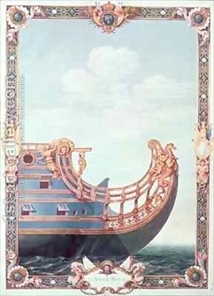
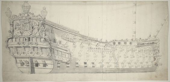
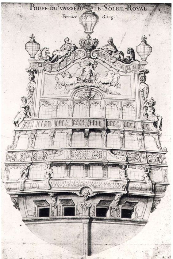
Finally, I found a close-up of SR's stern, from the 20th Century painting that I posted earlier:
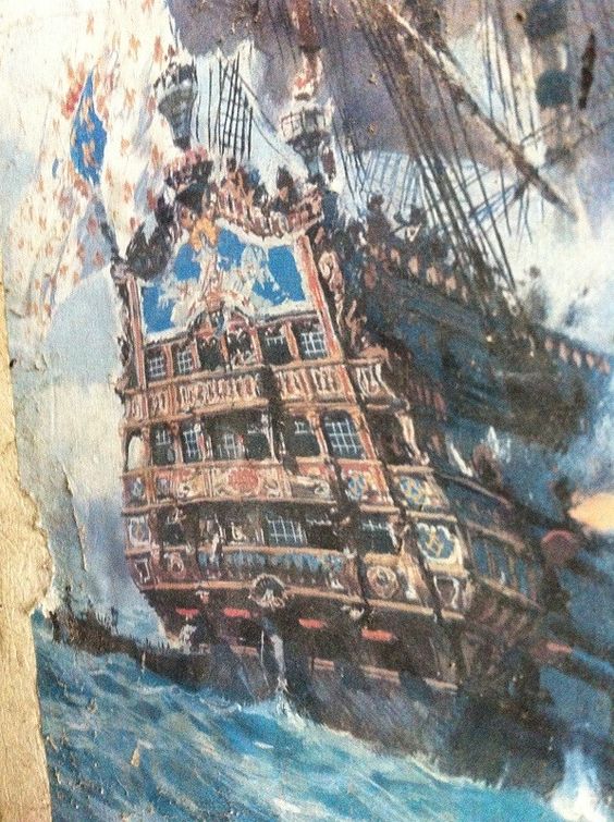
This image, more than anything, re-affirms my idea about the arrangement of SR1's stern balconies. Yes, the artist is modern, but as I stated earlier, I believe the clues to SR's stern are to be interpreted from the subtle shadow clues in the Berain drawing.
It has also, lately, been helpful to me in deciding how I will portray the quarter galleries. The enlarged photo, above, illustrates one possible reconciliation from the stern to the quarter galleries, which interestingly, is supported by Tanneron's damaged model of the smaller rated L'Agreable and also, in other small ways, by Le Brilliant.

I will devote a separate post to this when I get closer to drawing it in Adobe
- coxswain, CaptainSteve, mtaylor and 4 others
-
7
-
Alright, so I spent the evening initiating myself into the world of bitmap conversions into vector drawings, via line tracing function of various software packages, as demonstrated in a number of tutorial videos on Youtube.
Most software packages I looked at are Windows based, however, Adobe Illustrator is Mac compatible and disc software for Illustrator 9 is still available on Amazon for about $70, used, plus shipping. My layman's understanding of this is that I could use something like Adobe Illustrator (largely ignoring 90%, or likely more, of the software's capability), to import my JPEG, or my PDF file format, into a new document. From there, I can apply specific formats within the Image Trace tool bar, perhaps "line art," to automatically trace my ship image into a vector based, and grouped image. From there, I can ungroup the image, and select specific groups for copy and paste, such as my various gun port sizes/styles, and then place them where I want them. I can then import artwork for the quarter galleries, and various elements of the stern, and repeat the image tracing procedure. Also, by unlocking the image, I can manipulate lines within a grouping to better suit my purposes and design intent.
So, assuming that's the basic gist of what I need to do, here, is Adobe a workable platform for the complete novice, or would I be better served finding something more basic?
I am still very uncertain, for example, how importing what is a relatively large drawing will appear in the Adobe active screen. In all of the tutorials of various imported imagery and artwork, the graphic artist is shown corner dragging the image after import, generally, to increase it's size. However, for something large, would I first have to reduce it's scale to, say, 50% just so that I could work on large continuous details, like the wales, without having to break the image into a series of tiles that are then stitched back together later? Does anyone use Adobe for their ship modeling design purposes?
I'm also curious as to how detailed the auto line-tracing functions are, with consideration to the many intricate filigree details of a baroque warship like SR. If it is going to be necessary for me to go in and hand trace the stern gallery railings, for example, with a pen feature - with all of the attendant curves and reverse curves and mouldings, and etc - then it seems like hand-drawing and scaling would actually be faster, if equally frustrating. Or, perhaps it's easy to do that, once you get the hang of it. Is the trick to increase the scale and select, say a stern railing, from within the larger scan of Berain's stern schematic, for example, so that the railing is large enough for the auto-trace feature to pick out the intricacies of the design? No experience = no clue.
Any input into these matters is greatly appreciated.
All the best,
Marc

Soleil Royal by Hubac's Historian - Heller - An Extensive Modification and Partial Scratch-Build
in - Kit build logs for subjects built from 1501 - 1750
Posted
Alright, so I couldn't stop myself and I sketched in the dolphins to either side of the main deck windows. Again, it seemed that these were elements that I couldn't simply scan in artwork, trace and scale to fit. Maybe it really is as easy as that, but I wanted to sketch them to scale. I also filled in the panel stiles of the middle deck level and settled on a new transitional line from the stern counter, just below the middle deck windows of the stern, and the upper stern; this would be the middle line, which I think strikes a nice balance and makes for a reasonably elegant transition. But the paper really is starting to disintegrate on the crease. So, this time I mean it; digitize or bust!