Hubac's Historian
-
Posts
3,306 -
Joined
-
Last visited
Content Type
Profiles
Forums
Gallery
Events
Everything posted by Hubac's Historian
-
 Are you considering balsa fillers for the lower (below waterline) portion of the bulkheads? As you say, she has a very bluff bow and the bulkhead spacing is a little sparse. Fillers would make the under-layer of planking much easier to fair and secure.
 -
This all looks fantastic Bill - nice and clean! You did an excellent job of fairing the sheerline.
-
Ian, you continue to amaze with this build! I was just talking it up to my club, last night, so you may soon have a few new on-lookers. The bulwark sweep, previously, did not jump out at me as problematic, but after modification I can see what an improvement in practicality and aesthetics you have made. Well done!
- 536 replies
-
- 4
-

-

-
- Quadrireme
- radio
- (and 1 more)
-
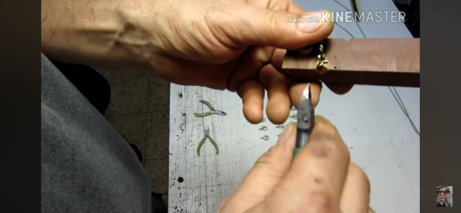
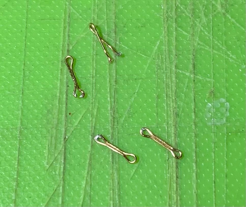
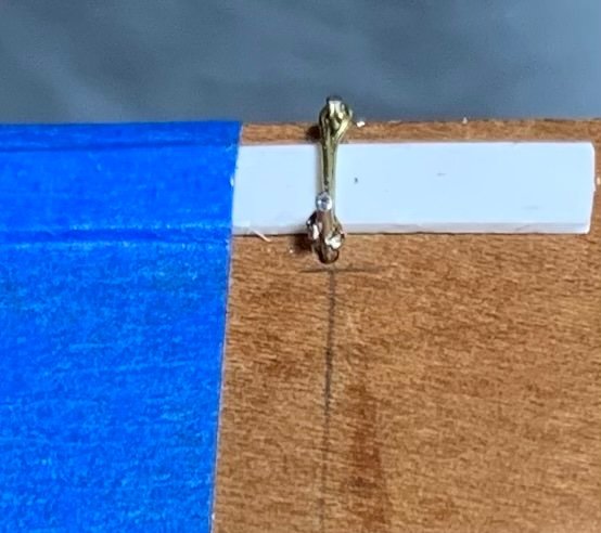
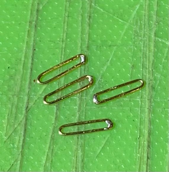
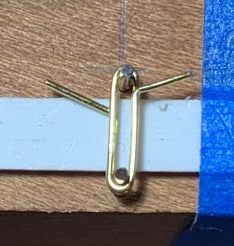
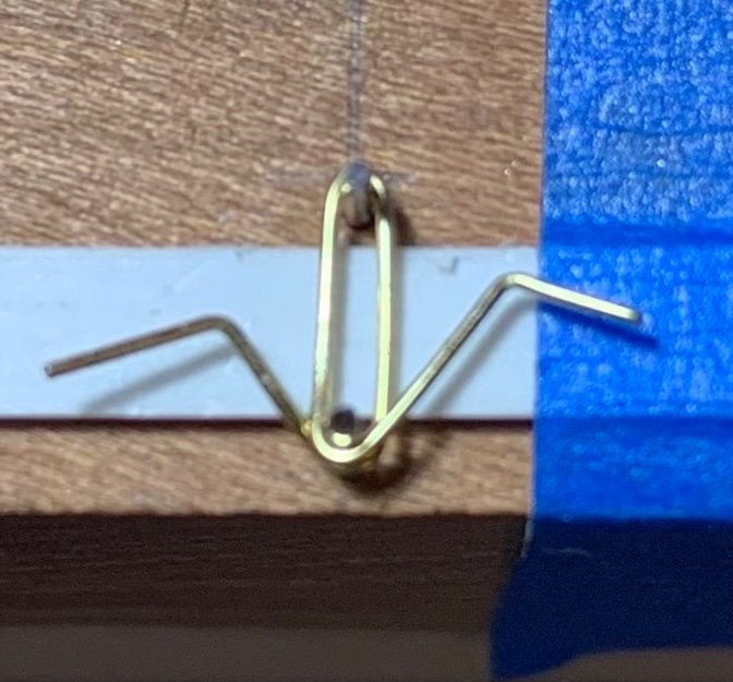
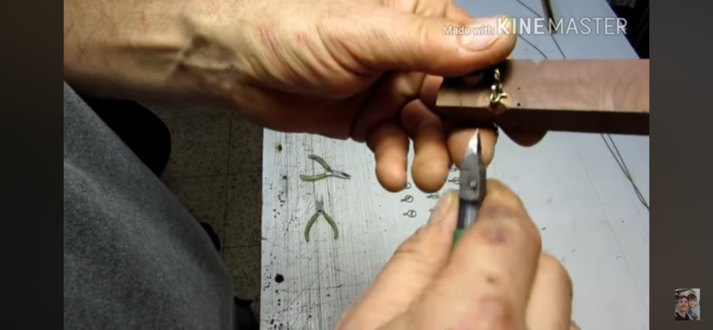
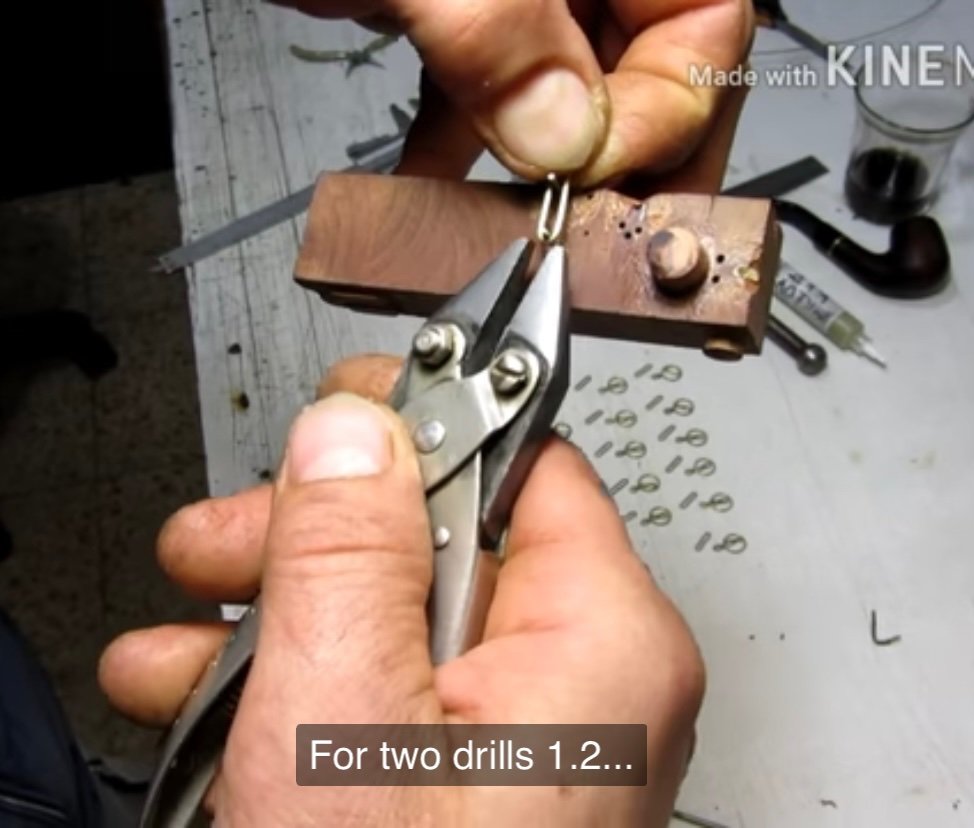
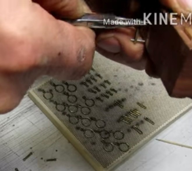
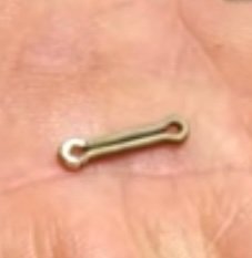
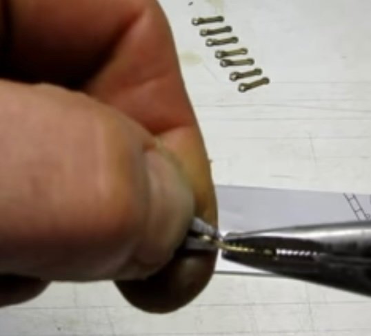
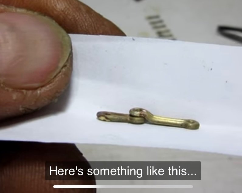
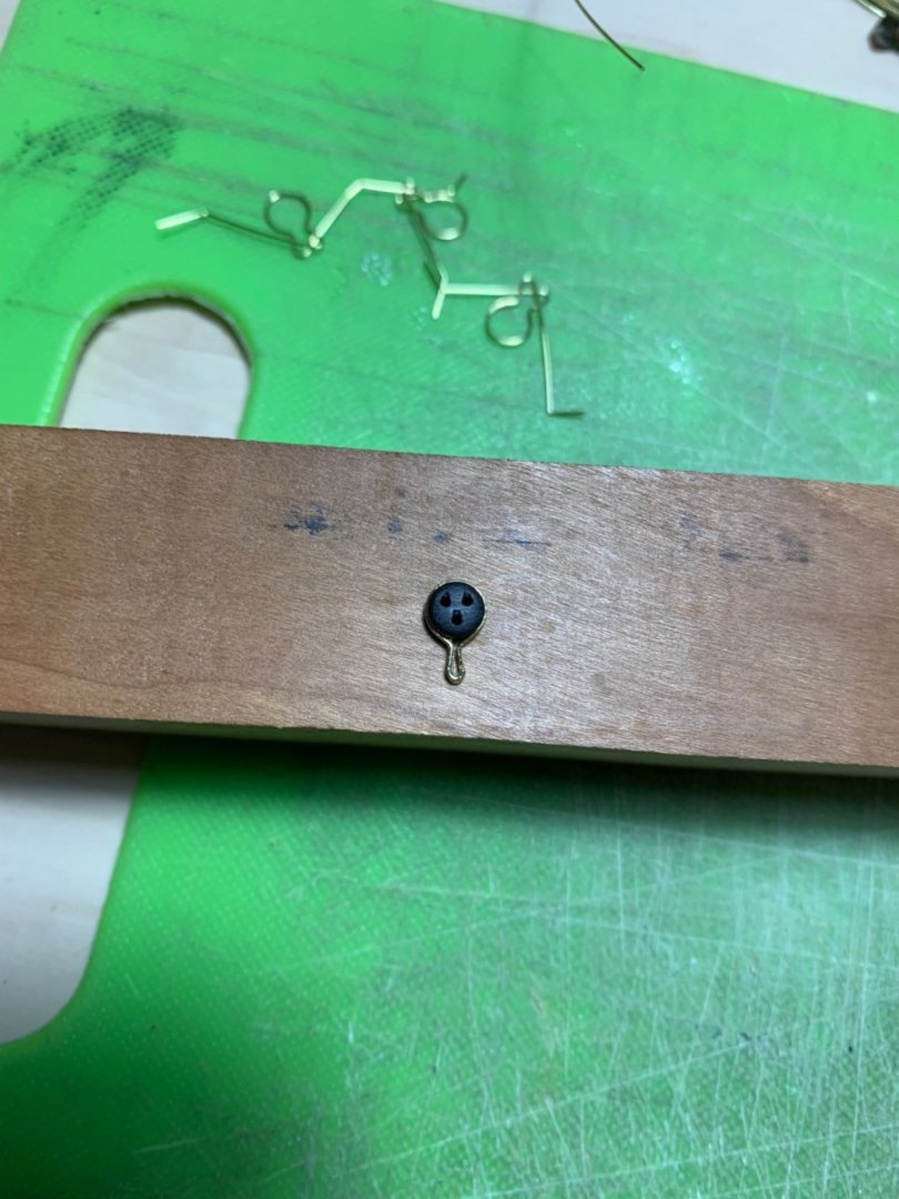
Well, the 6th grade CYO basketball season has drawn to a close and our team succeeded beyond my wildest dreams: we went 13-1, and captured the Manhattan division title. Our second and final loss came in a division matchup with the Bronx winners. We played a gritty first half, and kept it close, but made mistakes in the second half. We were simply overmatched. Nonetheless, it was a wonderful and extremely rewarding season. The Knicks, on the other hand, continue to surprise, so my attentions remain somewhat divided. That being said, I am lately looking to focus more on model building. I’ve completed all of the fore, main and mizzen channel deadeye strops. Although Andre Kudin’s particular method is definitely more efficient with less clean-up - he solders the lower strop loop at a neatly cut joint - I stuck with the R.C. Anderson overlap method I had been using because the strops were coming out uniformly, nicely shaped, and strong. I will change my approach for the deadeye strops in the tops. Next in order to be made are the chain preventer plates. One of the key differences between what I had first tried, when making the chain preventer plates, and what Andre does is that Andre bends each plate from an individual length of wire, rather than try to economize on material by wrapping a longer length of wire, many turns, around an appropriately sized former. When you do the latter, for one thing - you may succeed in crimping the continuous loop neatly around the former, but it is nigh impossible, after parting the links to get the links off the former without pulling them all out of shape. The other issue with parting the links in this way is that you end up with one neat flush end and a pinched end, which leads to a weaker solder joint. What I am after are uniformly straight chain links, free of odd kinks, and sloppy joints. To that end I set up a simple bending jig like the one I see in Andre’s videos. Following is a series of screen captures from his YouTube videos. This particular video is either #13 or #16, in the series, if I remember correctly: And following along, I first pre-bend short lengths of wire around a drill mandrel: I’ve placed a shallow spacer beneath the link area, so that the ends will be slightly raised and easier to crimp with my parallel pliers: I crimp snug around the upper pin, then use my pliers to pull each end snugly around the lower pin. I then crimp around the lower pin: I can then remove the link, and flush-cut each side of the link. A little tweezer/finger manipulation creates a nicely closed link: Silver solder paste has proven to be really great as I can control its application with the tip of an Exacto. A touch to the iron, and I have nicely soldered joints that only require a little cleanup: Now, Andre puts the soldered loops back over the two-pin jig and uses his round-nose pliers to crimp eyes at each end. I found, though, that the joints with this 28 gauge wire simply failed when I tried this: Alternatively, I found that I could place each link end over the lower pin, hold the outer end with a tweezer, and use my round nose plier to crimp around the single pin. This worked beautifully: Now, It’s a simple matter of doing that over and again about 60X. It is, of course tedious, but satisfying to achieve the result I am after. More to follow! Best, Marc
- 2,699 replies
-
- 16
-
-
- heller
- soleil royal
- (and 9 more)
-
Just awesome, Bill. A beautiful display!
-
It’s funny - I was wondering at the necessity for the card re-enforcements, but then I got a better sense of the scale with your arm in one of the previous shots. This is a fairly large hull. As always - great progress, Gary. Hull looks sweet!
-
I echo the sentiments of all above - simply extraordinary!
- 399 replies
-
- 3
-
-
-
- cutty sark
- revell
- (and 2 more)
-
Peter, you must be in the midst of the middle phase of your working life, when it is most demanding on your time. Well, fear not - we will wait for you, when you are ready. This build is too good to simply forget about. Best, Marc
- 30 replies
-
- 1
-
-
- Corel
- wappen von hamburg
- (and 1 more)
-
Well, when simulating a deck with underlying framing, you have to first determine the likely spacing of the beams. The hatchways are always a useful starting point for figuring this out. Once you have a reasonable layout - and I don’t think this necessarily has to exactly match that of the Endeavor replica, it just has to be plausible and regular - you can then figure out, at scale, where planks land on beams within the 25-30’ range. This is one of those things where, since you’re not making a rigorous, fully framed and exact copy of the original ship, there is some latitude, IMO, in executing the details. The goal is an improvement over stock, and that the execution not be jarringly wrong. Of course, the Endeavor is an example of a type of ship called a “Whitby Cat.” If you did want to produce a fully authentic deck layout, I don’t imagine you would have too much difficulty finding original construction drafts that would show the deck framing. It’s really up to you, as to how far you want to take it.
-
I hadn’t realized how far behind I’d fallen on your build, Michael. She truly is the “Golden Devil,” now! Really beautiful paint work and filling-in of the missing ornamentals.
- 324 replies
-
- 2
-
-
- Sovereign of the Seas
- Airfix
- (and 1 more)
-
Yeah, I agree that alternating butts are fine on the lower deck, but a 3 or 4 butt shift looks much better on the main deck.
-
Many congratulations, Bill, on completing this magnificent model. I have always thought this model looks best on its waterline, and the diorama you have created shows her to best advantage. I look forward to watching your Endeavor take shape!
-
This remains one of my favorite models, Siggi. The paint work is beautiful, but aged to perfection so that it is not perfectly pristine. The woodwork is beautifully executed and always in-scale, and the symmetry from port to starboard is beyond reproach. I also like that this tine period for English warships is the beginning of the end for elegantly rising sheer-lines; in the following decades everything becomes significantly flatter.
-
Ian, your insights into this kit are just incredible. It would never have occurred to me to think this far ahead.
-
Great video, Bill. I never realized there was fore and aft duct work to help ventilate the hold.
- 1,508 replies
-
- 1
-
-
- Le Soleil Royal
- Heller
- (and 1 more)
-
Guns look awesome, Kevin! Those inks are magic. I like how you printed the cap squares to be integral with tue trunnions.
-
Hi Mark - it is great to see you working again! About a decade ago, I had a pretty vexing bout of sciatica. My deteriorating hip and the resulting over-compensations are what were driving it, but I found quite a lot of relief through specific yoga stretches that helped open my lower back. Also, a lot of hamstring stretching. After the hip replacement, the sciatica went away, but I still do the stretching routine every day. I wish you relief, as I remember how debilitating that particular problem can be.
-
For carving the split-tail tritons out of wood, my inclination would be to carve from the thighs, on up, first, while leaving the twisted lower legs oversized and for last. Before carving them, I’d make a backing piece that the carving fits into, and temporarily fix it in-place with a glue that could be dissolved in alcohol later. This support block should have a long enough handle, or extension, so that it can be clamped in a vice for working the fine details. You have done really beautiful work! I’m enjoying the build very much.
-
Thanks for the reference, Eric! This is all shaping up very nicely.
- 419 replies
-
- 2
-
-
- soleil royal
- Heller
- (and 1 more)
-
Eric, can you please remind me where you purchased these rivets from? They look like the ideal fastener for my chain preventer plate links.
- 419 replies
-
- 2
-
-
- soleil royal
- Heller
- (and 1 more)
-
Ian, we are here for that when you do start your SR. You know you want to 🙃