Hubac's Historian
-
Posts
3,306 -
Joined
-
Last visited
Content Type
Profiles
Forums
Gallery
Events
Everything posted by Hubac's Historian
-
 Michael, is it a fiction of my imagination that the Sovereign had a small step ladder into the lantern, between it and the jackstaff? I remember reading in Pepy’s Diary that for fun they’d bring noble ladies up into the huge lantern so that all could marvel at the sheer size of it. I don’t see any trace of that, really, in the VdV port side drawing, though.
 -
Gor-ge-ous! Interesting thought on the rudder coat. Might be able to simulate that with wrapping tissue and dilute white glue. Would have to maybe create some kind of conforming pattern that fayed nicely into the stern counter. Not really sure how to do it, really.
- 324 replies
-
- 3
-

-
- Sovereign of the Seas
- Airfix
- (and 1 more)
-
Okay, I’ve been thinking about this for a little while now. What I would try is to make 1/2 of the moulded profile from a piece of hacksaw blade, and fix that scraper into a kerf cut into the end of an appropriately small hardwood dowel, the long end if which gets fixed into a flat board. You are essentially creating a stationary router/scraper. If hardwood dowel is too feeble, perhaps hard brass rod will do. layout your moulding shape in a piece of stock that is the thickness of the moulding and make sure the stock is large enough to move easily with your two hands. Cut out the center to your inner lines. Now you can more comfortably and gradually scrape the profile into the inner edge of the moulding. Once you have achieved the desired profile on the inner surface, you can cut the outside profile of the moulding. Next, temporarily fix the moulding to a flat surface with an adhesive that can later be dissolved with alcohol. Finally, you can re-purpose your scraper into a longer handle that enables you to easily work around the perimeter of the moulding. Once satisfied, you can separate the finished moulding from your substrate.
-
All of the woodwork is just beautifully executed. Not a stray line to be found!
-
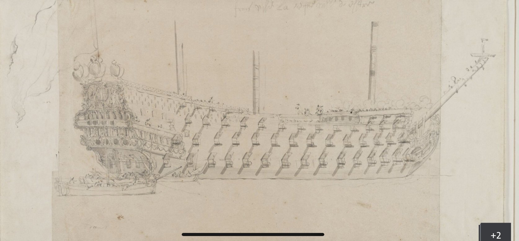
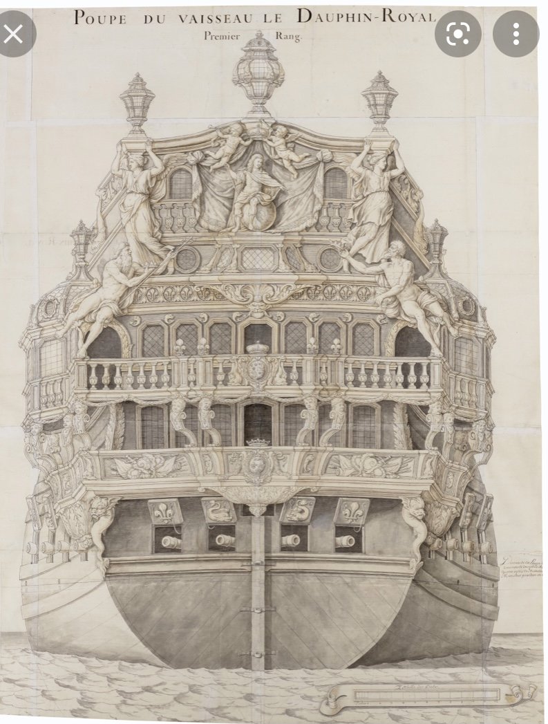
Stern view for the DR: I don’t know whether the scale ruler is legible in this format, but the port sills are drawn just about five scale feet above the waterline, which is about right. No doubt, though, Heller’s underwater hull is way too shallow, and one really should raise the waterline.
- 419 replies
-
- 1
-
-
- soleil royal
- Heller
- (and 1 more)
-
Coincidentally, this just popped up in one of a series of videos on Kroum Batchvarov’s YouTube channel: This would be a mid-17th C. Dutch Pinas, or merchant ship. Generally, the framing of even Dutch warships was significantly lighter than the French, but all the more-so on a merchant ship. You can see well, though, how the lower main wales follow the doubling of first and second futtocks, as well as the extreme rise in the sheer. French warship design was heavily influenced by the Dutch, and in fact - many of the early First Marine ships were contractually built in Dutch yards for the French, so it is a useful reference. Here is the full video: ,
- 419 replies
-
- 2
-
-
- soleil royal
- Heller
- (and 1 more)
-
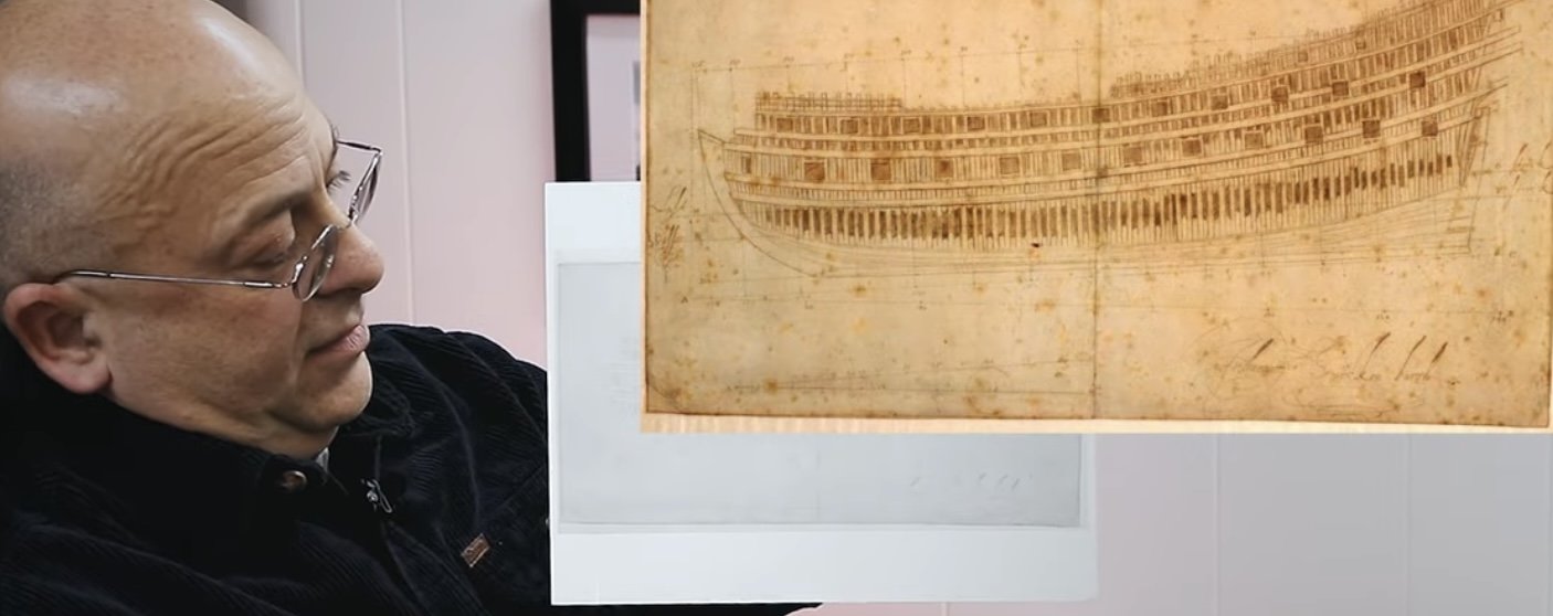
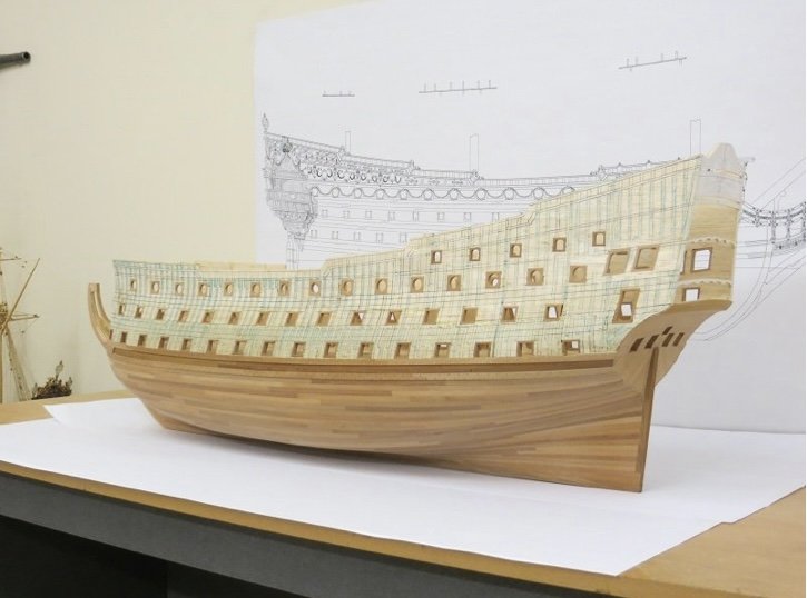
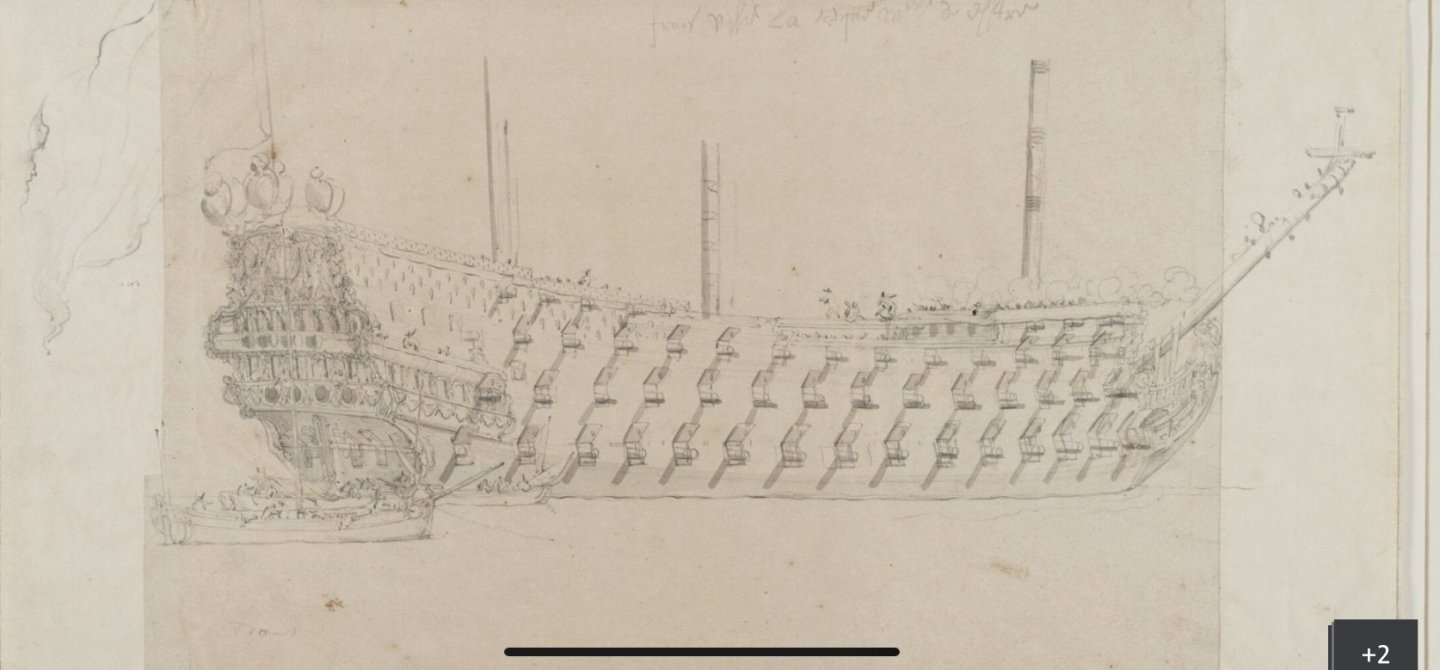
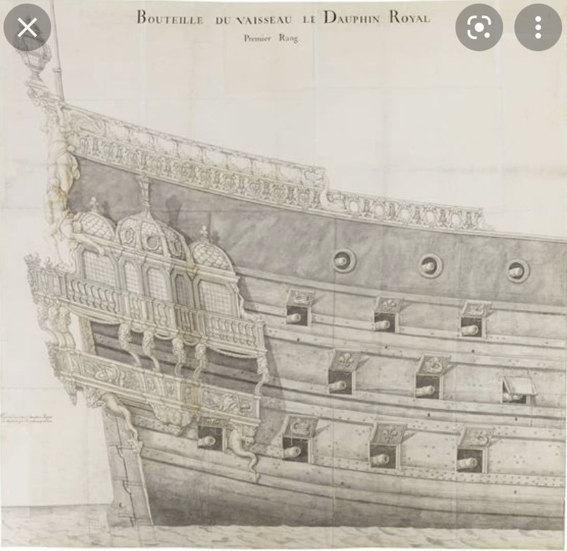
The wale sheer and deck sheer are not directly linked, but neither are they wholly independent of each other. For practical purposes of safely and effectively operating the guns, the deck sheer necessarily remains relatively flat. There is always a need to shed excess water through scuppers at the waist, so deck sheer is not perfectly flat. The wale sheer necessarily rises aft, with the superstructure of the stern, as a means of counteracting the downward strain on the ship’s hull of all that excess structure. The pair of lower main wales generally follows the line of greatest breadth, which coincides with the doubling of the first and second futtocks - through which the wales are bolted, lending great horizontal support to the framing. You can see this on Marc Yeu’s model as he drew in the framing to guide his tree-nailing: Likewise, the middle band of wales corresponds with the doubling of the second futtocks with the top timbers. Now, Marc’s model represents the refit SR of 1689, so the wale sheer and overall top-hamper of the ship would have been reduced from the ship’s original extremes. For reference, the Monarque of 1668: Here is a reliable drawing of the Dauphin Royal that shows this extreme sheer pretty clearly: In the bow and waist, the wale sheer more closely follows the deck sheer, however in the 1670s the aft wale sheer rises so sharply that the wales are frequently cut through completely by the aft-most ports, which kind of negates the upward-intended support of these re-enforcing members. For additional reference, here is a broadside view of La Reyne from 1672:


- 419 replies
-
- 4
-
-
- soleil royal
- Heller
- (and 1 more)
-
You have certainly set forth a challenge for yourself Eric. There are a lot of worms in that can, but you can achieve a nice result with sufficient planning and forethought. The most difficult aspect of this will be modifying the aft bulwark to achieve the continuity you are after.
- 419 replies
-
- 1
-
-
- soleil royal
- Heller
- (and 1 more)
-
Hi Eric - as I’m now finally ready to start assembling my chains, I was looking back on your rivet supplier. The website still seems active. Can you confirm the SKU number that you ordered - was it SKU: GLP154? I see your customer review attached to this product number. Whatever diameter rivet head you ordered is EXACTLY what I need.
-
They’re a pretty pair, together B.E., and you emerged like your most recent project’s namesake, Indefatigable, and ready for the next project. Many congratulations on yet another remarkable build!
- 648 replies
-
- 1
-
-
- Indefatigable
- Vanguard Models
- (and 1 more)
-
I considered buying a torch like that when I first picked up soldering supplies. I decided, though, to see how easily a conventional soldering iron would work with the Solder-It, silver solder paste that I purchased. There is a generous ratio of flux to colloidal silver solder, with this product, so I found that the smallest amounts make nice joins with a quick touch to the iron tip. Like anything else, it was a process of course-correction to figure out how to use these products correctly. I do know that the technically correct place to make the joints is along the straight parts, however, at this scale I was having a ton of difficulty getting my wire ends to meet nicely; I was either too long, resulting in a bowed straight, or too short, necessitating an excess solder-fill. I also made the first batch of preventer plates too long, and I wasn't using enough solder paste on the back side to bolster the join enough for bending/shaping. Dan Pariser suggested that he likes to cut meeting ends on a long bias so that they overlap like a scarf joint; more surface area produces a stronger joint. As usually happens with this kind of thing, doing something like snipping wire ends hundreds and hundreds of times has a way of sharpening your skills and discernment for where precisely to make a cut. At this point, I could fairly easily make those wire ends meet exactly where they need to. I do appreciate the correctness of what you guys are suggesting, but the method I have arrived at is working for me in this scale, and producing the clean results that are a higher priority to me than rigorous accuracy of manufacture. In larger scales, I absolutely would give the "correct" way a go again.
- 2,699 replies
-
- 6
-
-
- heller
- soleil royal
- (and 9 more)
-
As always, Kevin, your knowledge bank is astounding. I think you are right about this wire’s manufacture, but given the relatively light gauge, it has been pretty easy to pull taught around the pin-formers. What is essential to this process is a pair of parallel pliers. I’m indebted to Druxey for that tooling tip! As always, Bill and David and Michael, and everyone who is looking-in - I appreciate the support!
- 2,699 replies
-
- 6
-
-
- heller
- soleil royal
- (and 9 more)
-
All beautifully coped together.
-
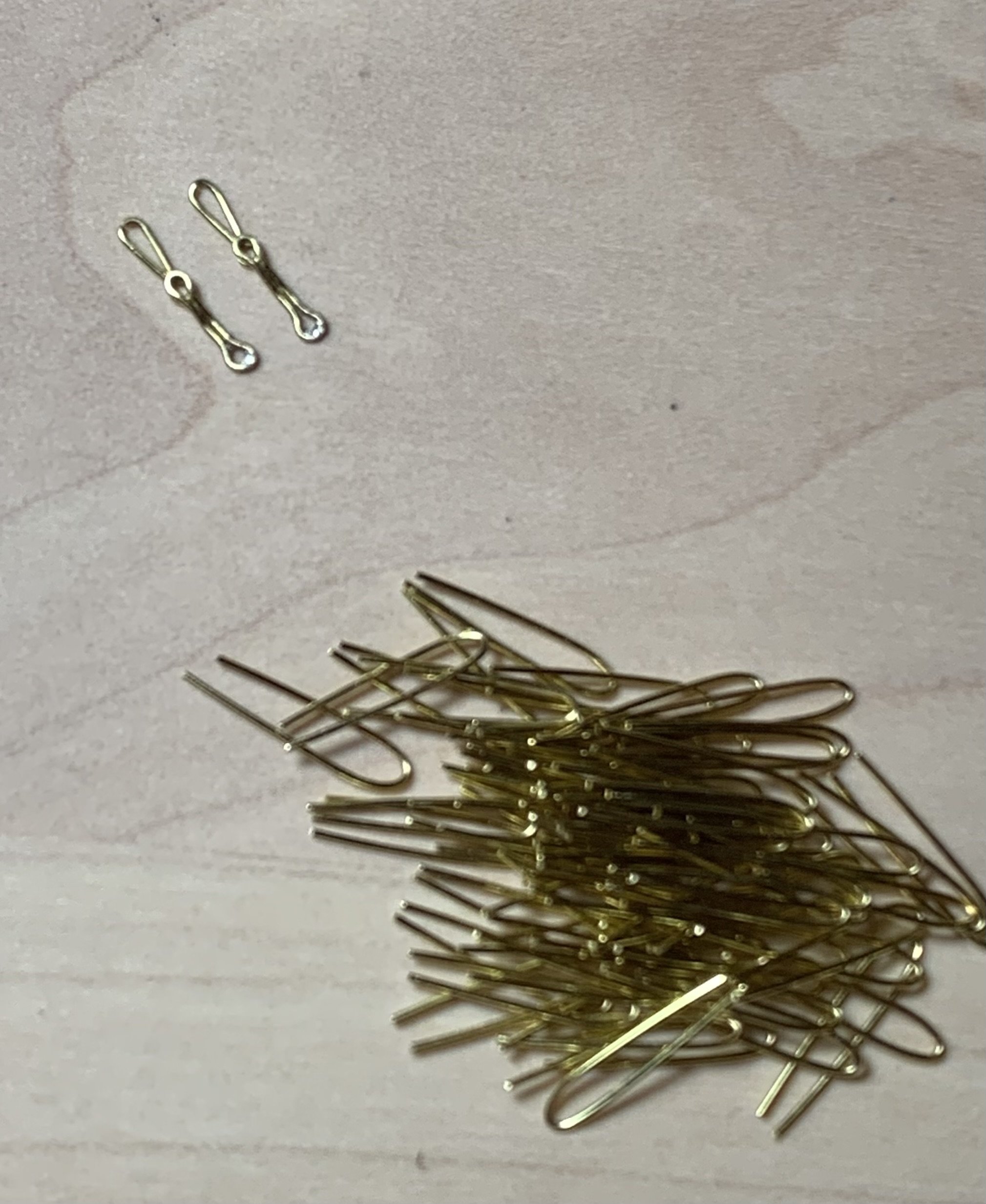
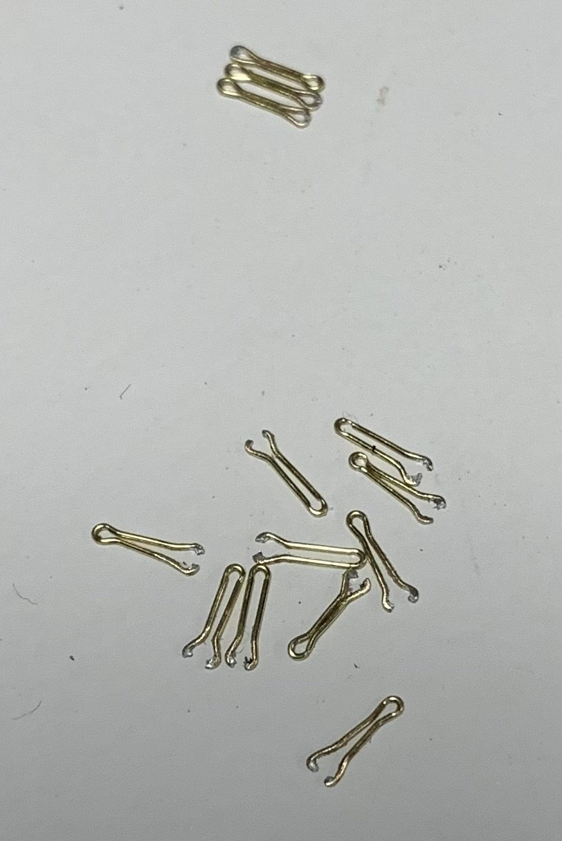
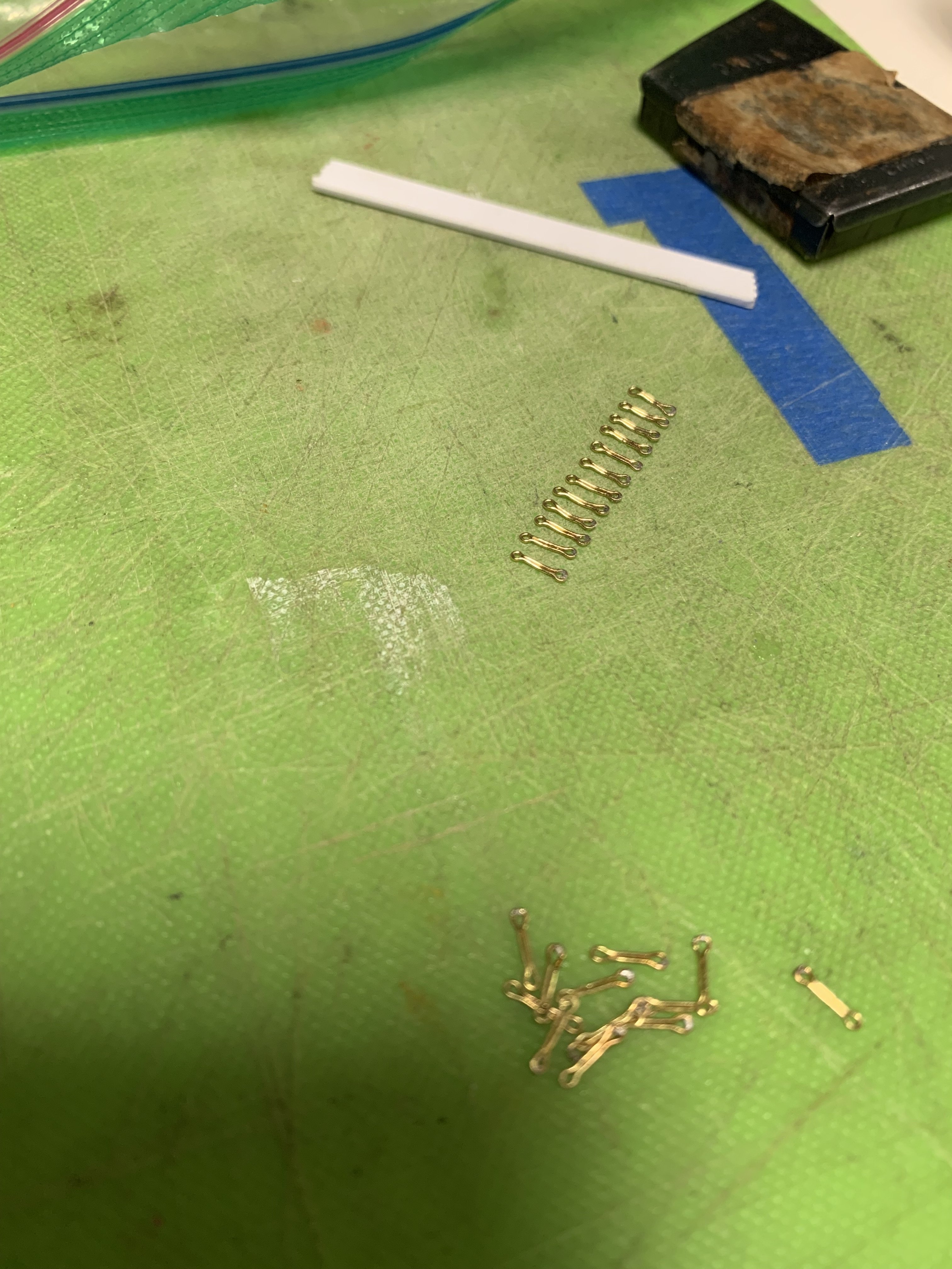
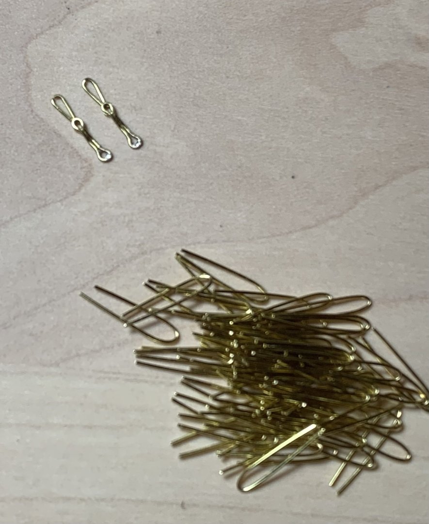
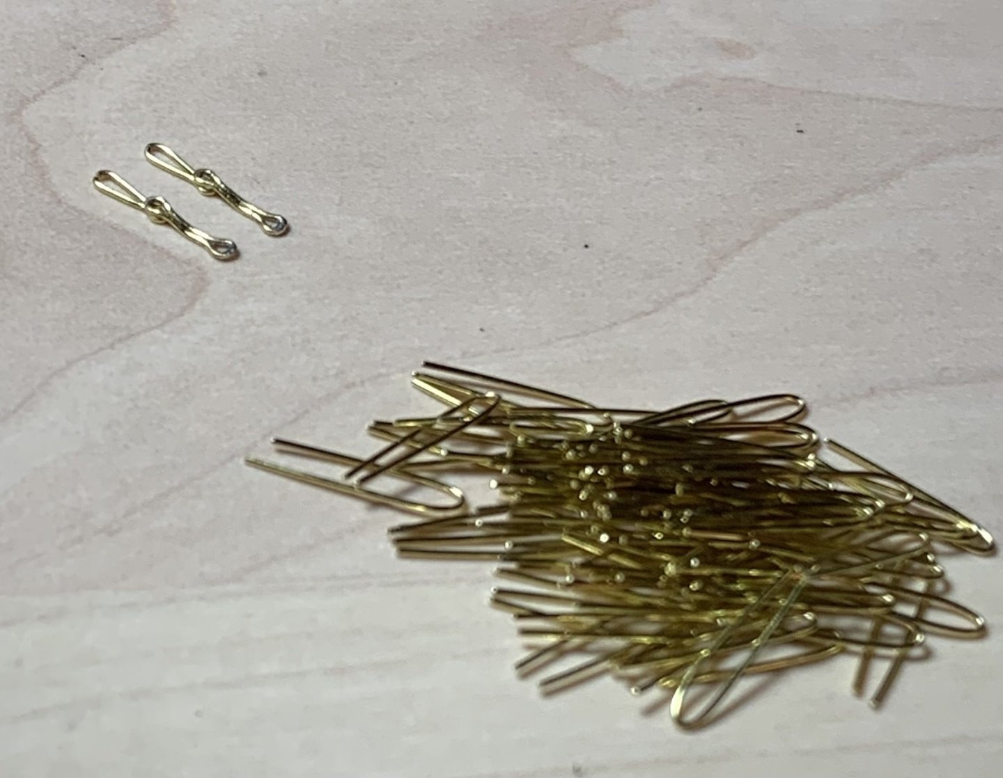
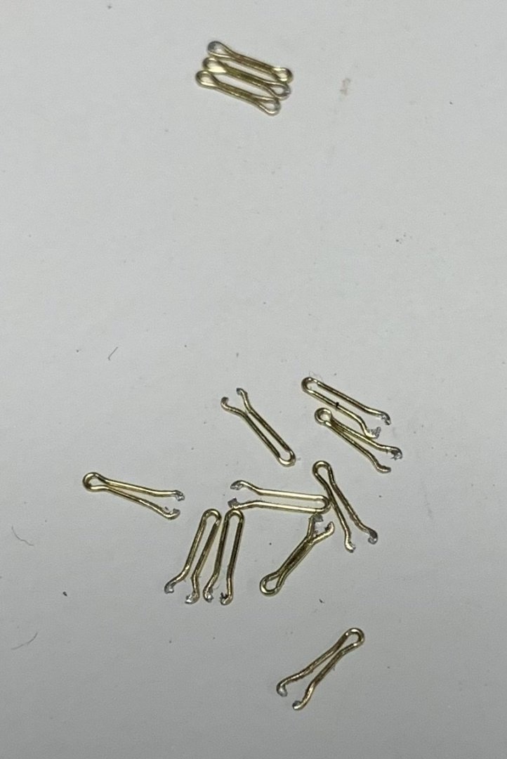
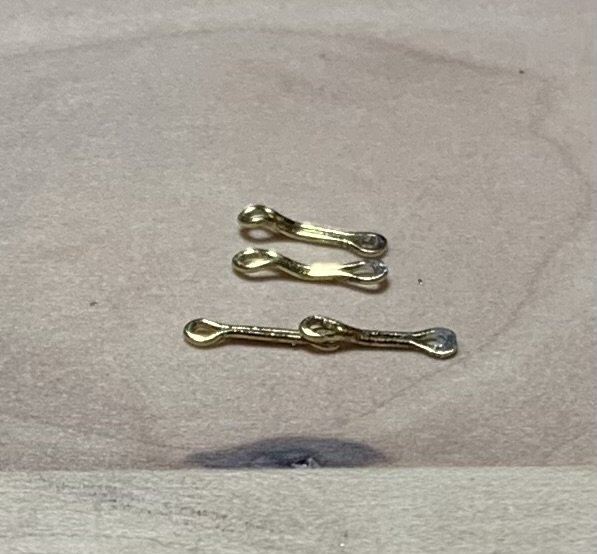
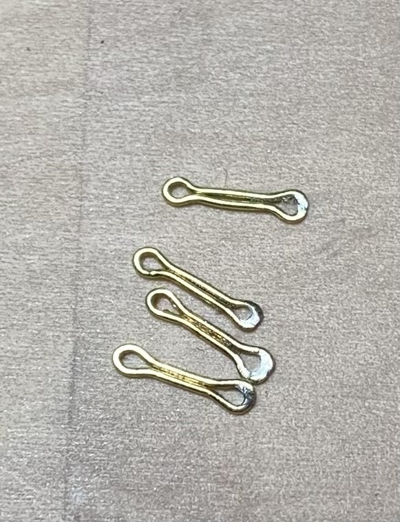
I can’t escape the fact that I continue to fail at this chain-making exercise. As the old maxim goes, though, every failure is one step closer to success. I’ve now thrown away two whole batches of chain preventer plates. While I was quite right to follow Andre Kudin’s example, for the process of their manufacture, I eventually discovered that that process is not entirely transferable from 1:48 to 1:96 scale. After forming his basic links, Andre solders them closed at one end, and then places the closed link back onto the two pins so that he can crimp an eye on each end with his round pliers. Well, the 28 gauge brass wire I’m using does not provide enough surface area for a strong enough bond to survive the crimping. My success to failure ratio was pretty poor: So, my lesson from that exercise was that I needed to do the crimping before soldering one end closed: These soldered loops will be the lowest end of the chains, bolted into the wales. That way, I could induce a series of bends into the upper half of each preventer plate, so that they could overlay the next small link: Above I’m just using another preventer plate to check that the bends I’m making are sufficient. So, I spent a good chunk of time cleaning up the solder and inducing bends into the remainder of the preventer plates. The solder joint will be re-enforced with the CA glue that fixes the pin-bolt in place: With that out of the way, I could make a new, slightly closer-spaced pin jig for the next small link, which is only crimped on one end, where it seats beneath the preventer plate. Now that I have a process that I know will work, and now that I’ve had all of this practice, these next links should go fairly quickly: I have a lot of these to make, solder and bend - about 70 to ensure I can use the best. This has all been a colossal PITA, but it was really important to me that all of this look very clean and uniformly shaped. In the process, I have acquired some very valuable metal skills that will only enhance this and future projects. That said, I am going to experiment with using black nylon thread of an appropriate diameter to connect the deadeye strop loops to the small links. This would essentially be a variation on the way that the stock kit represents these links, but I will do individual chain loops that draw tight with some form of slip-knot that I can pull up and hide behind the deadeye strop. Andre had a great method for producing these variances, but it is all just that much more tedious in the smaller scale. The advantages of doing this are several. So long as there is not a jarring difference in appearance between the black thread and the blackened metal, it will save me tremendous amounts of time. It also simplifies the difficulty of accurately measuring and keeping track of a series of increasingly longer links as the shroud angle increases from fore to aft. Lastly, it greatly simplifies the placement of the deadeyes because I can add the retaining strip, in advance, and it also makes it much easier to locate and properly secure the bottom two links. Hopefully, that will work out. Well, I keep saying that I’m going to get back in the swing of the project, and then I get sucked into coaching another basketball team - now my son’s Spring rec team. Meanwhile, the Rangers and Knicks are just too compelling to ignore this post-season. At least for now, I can see the end of the tunnel for these chains, which is tremendously motivating, and then I can return to the more immediately gratifying work of outfitting and arming the main deck. Thank you all for taking the time to look back in on This Old Build. More to come!

- 2,699 replies
-
- 19
-
-
- heller
- soleil royal
- (and 9 more)
-
Brilliant stuff, chuck!
-
Another brilliant subject, Tomek. I love the clean and simple lines.
- 9 replies
-
- 2
-
-
- Speeljacht
- card
- (and 1 more)
-
This all looks great Eric. I like your aft increase in wale sheer. I’m debating whether it makes sense to have a corresponding increase in the middle band of wales, as the sheer would have run parallel. The upper main wales - at the juncture of the upper bulwarks are pretty fixed, although one could add to to top edge of the upper most wale and feather it back. It mY not really be worth all of that extra effort, though.
- 419 replies
-
- 2
-
-
- soleil royal
- Heller
- (and 1 more)
-
Beautiful carving and a fascinating display!
-
Or, can you simply wash back the grey a but with a little solvent? Always test in a little scrap decking, or the underside of the actual decking, if it’s not already glued in.