Hubac's Historian
-
Posts
3,317 -
Joined
-
Last visited
Content Type
Profiles
Forums
Gallery
Events
Everything posted by Hubac's Historian
-
 Agreed!
 -
I will take a look around and see what I can find. I’m not optimistic about what you are describing, in particular. Most of what I remember was strictly ornamental: figurehead, fleur-de-lis, the big stern carving, the main lantern, and some other stuff that I don’t remember. Castings/pressings of what I have may be better than whatever iteration of the kit you have now. I’ll look and keep you posted. In any case - if I can find it - you are welcome to it.
-
What castings are you in need of? A modeling friend, along the way, had acquired a set of castings for what I believe is the Corel kit. I know it is definitely La Couronne. He passed them to me, as he knows I love the French ships. I’m pretty sure I still have them somewhere. They were fairly substantial bronze castings. They’re yours for the asking, if I can find them.
-
This all looks incredible, Patrick!
-
Aaah, coaching - extremely rewarding, but time-consuming! I can relate to the fact that it is definitely very difficult to find energy and time when the season is on. Dolphins look truly awesome - nicely done! As for there being more connection to the dolphin belly, they were drawn to suggest open space, but for practical strength purposes, it does not seem unreasonable that there might have been complete connection, with the inner scroll carved as a raised relief.
- 453 replies
-
- 1
-

-
- soleil royal
- Heller
- (and 1 more)
-
Aaaah, Kevin - you are here, at last! I've been patiently waiting. I understand your methodical approach, and I don't expect you to make any quick in-roads on this one, but I am guaranteed of one thing: whatever you end up doing, it will be interesting and innovative. One thought springs to mind, and that relates to your comment about tumblehome of the upper bulwarks. The kit's aft bulwarks end up relatively vertical, and more slab-sided, as determined by the stock stern-plate. I found, however, that because I made the lower hull wider, I could pitch the aft bulwarks at a much more pleasing angle/degree of tumblehome. If you are already considering the possibility of printing a new stern plate to incorporate the stern round-up, then you have the opportunity to incorporate a more pleasing slope of tumblehome. There would also be the opportunity to re-scale to a six-window stern, as opposed to the stock 5-window stern, vis-a-vis the Tanneron model. What surprised me, by the time I reached the upper tier of stern lights, was that the width of my stern at the very top, was almost exactly that of the stock stern plate +/- 1/16". I mention the possibility of six windows because the two lower tiers of lights are more vertically in-line, and lay waste to additional space below. Really take a hard look at the stock stern plate, and you'll see what I mean. Heller simply followed Tanner, on this detail, but there is room to re-scale - even without widening the lower hull. Anyway, I will be watching with tremendous fascination at what I know will be excellent. Bon Voyage!
-
Your build is very clean, and the planking is exceptional. Kurt makes an excellent point about the representation of stem construction, but I think what you have done is much less jarring than some of what I've seen out there. I look forward to your continued progress.
-
Excellent process and results. I agree to err on the side of smaller.
- 453 replies
-
- 1
-
-
- soleil royal
- Heller
- (and 1 more)
-
Excellent problem-solving and technique, John. The chains look excellent. At this scale, one has to do their best to find something that works for them. Now, I could very well be mis-remembering this, but I believe all of those extra rings, interspersed between the chains and along the length of the ship, are there to assist the carpenters as they scale the sides of the ship plugging battle damage. As always, John, it is a pleasure to catch-up on your log. You always seem to have an innovative approach to vexing problems.
-
Aleksandr, the Royal Standard you have pictured above is your best guide.
-
Your dolphins are definitely trending in the right direction, Eric. That last one is really very good. While I had some carving skills going into my project, I had no small-scale carving experience. Whatever your medium, it just takes a little while to figure out what you are doing. These, I think, are simply the growing pains of this sort of project. Your efforts are quickly bearing fruit!
- 453 replies
-
- 1
-
-
- soleil royal
- Heller
- (and 1 more)
-
Michael, you have navigated the English (style of) Channel(s) with adroit, scale precision. BRAVO
- 327 replies
-
- 2
-
-
- Sovereign of the Seas
- Airfix
- (and 1 more)
-
Roter Löwe 1597 by Ondras71
Hubac's Historian replied to Ondras71's topic in - Build logs for subjects built 1501 - 1750
Awesome! -
It’s a lot of work. Just continue to take your time, and it will all come out beautifully. Looks awesome, so far!
-
Admittedly, it would be quite awkward and difficult to repaint these details on-hull. It is probably best left as it is, which is plenty good enough. I’m sorry that I wasn’t thinking of that reality when I made the original comment.
- 176 replies
-
- 2
-
-

-
- la reale de france
- heller
- (and 2 more)
-
That's a good friend!
-
My sense, Ferrus, is that you are a young person. It is inspiring to the future of the hobby that people like yourself are taking an interest. I've been paying attention to your builds, and your skills are, indeed, quickly improving. I think you are off to a great start with this Reale. Given the stated objective of the project - to produce a work worthy of sale - I would offer the following advice: you are correct that the filigree detail of those bulkheads could be a little bit better. They're not bad by any stretch of reality, but they could be even a little bit better. Please keep in mind that I am aware that MOST people would absolutely struggle to even approach what you have done, here. It is only because you have EXPRESSED that nagging thought, that I am encouraging you to act on it. When a young person, myself, this was a pretty gradual realization of what I had to do to achieve the results I wanted. I have never regretted whatever extra investment of time, thought and effort that I have put into any given project, though. My advice would be to scotch-bright away (the grey pads are great for this) most of the paint on these bulkheads and try again. On this model. On the next attempt at painting the bulkheads, maybe consider your brush selection. Buy a fine-pointed sable brush, and practice your dry-brushing techniques for the raised gold-work. It just looks to me as though your brush is a little too saturated, and that it's bleeding down into the ground.
- 176 replies
-
- 2
-
-
-
- la reale de france
- heller
- (and 2 more)
-
As is always the case, Mark, your fore-thought and experimentation in figuring out these extremely complicated structures never fails to produce top results. I am always inspired and educated when I visit, here.
-
HMS VICTORY 1765 by albert - 1/48
Hubac's Historian replied to albert's topic in - Build logs for subjects built 1751 - 1800
Absolutely incredible, and very good choices for a look-in to the framing and inner hull. -
Hi Chuck - awesome stuff, as usual. I’m looking forward to your gun rigging tutorial. Presently, I’m struggling through that exercise in 1:96. I’d be very curious to know more about the specifics of how you attach hooks to tackles, and so forth.
-
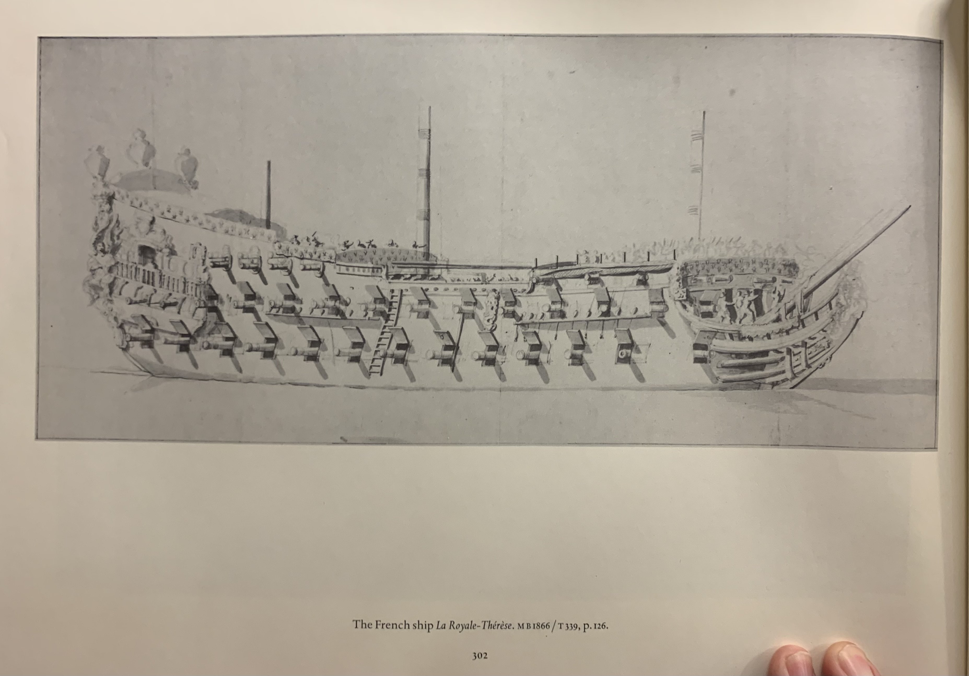
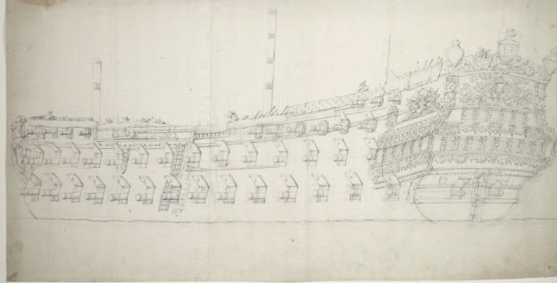
They also appear in several other VdV portraits from 1672. L’Orgieullieux: Le Terrible (Hubac-built): La Royal Therese:


- 453 replies
-
- 3
-
-
- soleil royal
- Heller
- (and 1 more)
-
Yes, Kevin - you are in for a treat, here. I have found John’s research to be on a par with Guy Maher’s, and his info-graphic presentations are second-to-none. Railroad modelers are also particularly sensitive to nuance and realism. For all of these reasons, this is one of my absolute favorite builds.
-
Tremendous progress, Eric! It’s fun to see the outline of it all coming into focus.
- 453 replies
-
- 2
-
-
- soleil royal
- Heller
- (and 1 more)