Hubac's Historian
-
Posts
3,309 -
Joined
-
Last visited
Content Type
Profiles
Forums
Gallery
Events
Everything posted by Hubac's Historian
-
 Agreed on a job well done! Sometimes you have to pick your battles!
- 222 replies
-
- 1
-

-
- reale de france
- heller
- (and 1 more)
-
This is going to be a lovely little boat, and I will gladly follow along.
- 433 replies
-
- 5
-
-
- open boat
- small boat
- (and 1 more)
-
Hey Vic! The old adage about loving your work making it feel less like work, definitely applies, here. I am fortunate to have significant chunks of time to home-in and focus, but even incremental progress in the smaller 15-30 minute windows adds up. The truth is, though, that it is hard to sit and work at something like those lattices for much longer than an hour, without a break. I’m driven forward by the gradual materialization of something that I could see quite clearly in my imagination.
- 2,699 replies
-
- 9
-
-
- heller
- soleil royal
- (and 9 more)
-
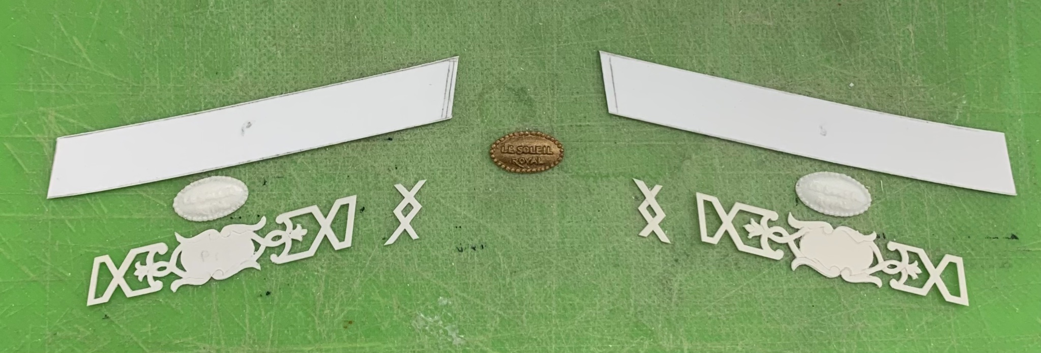
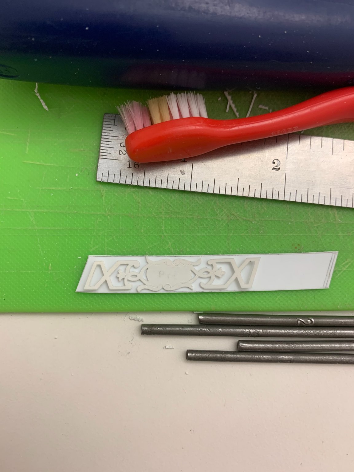
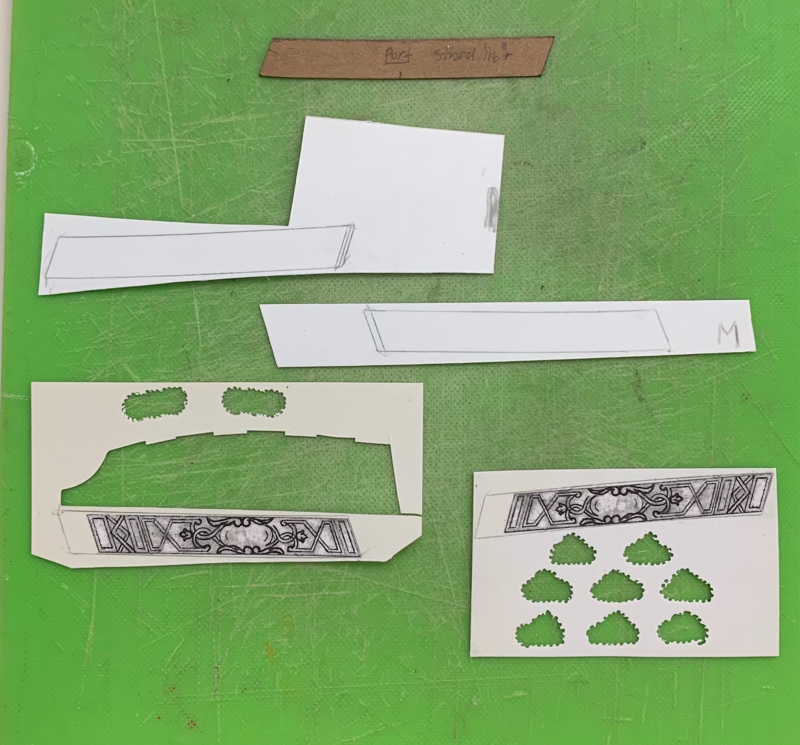
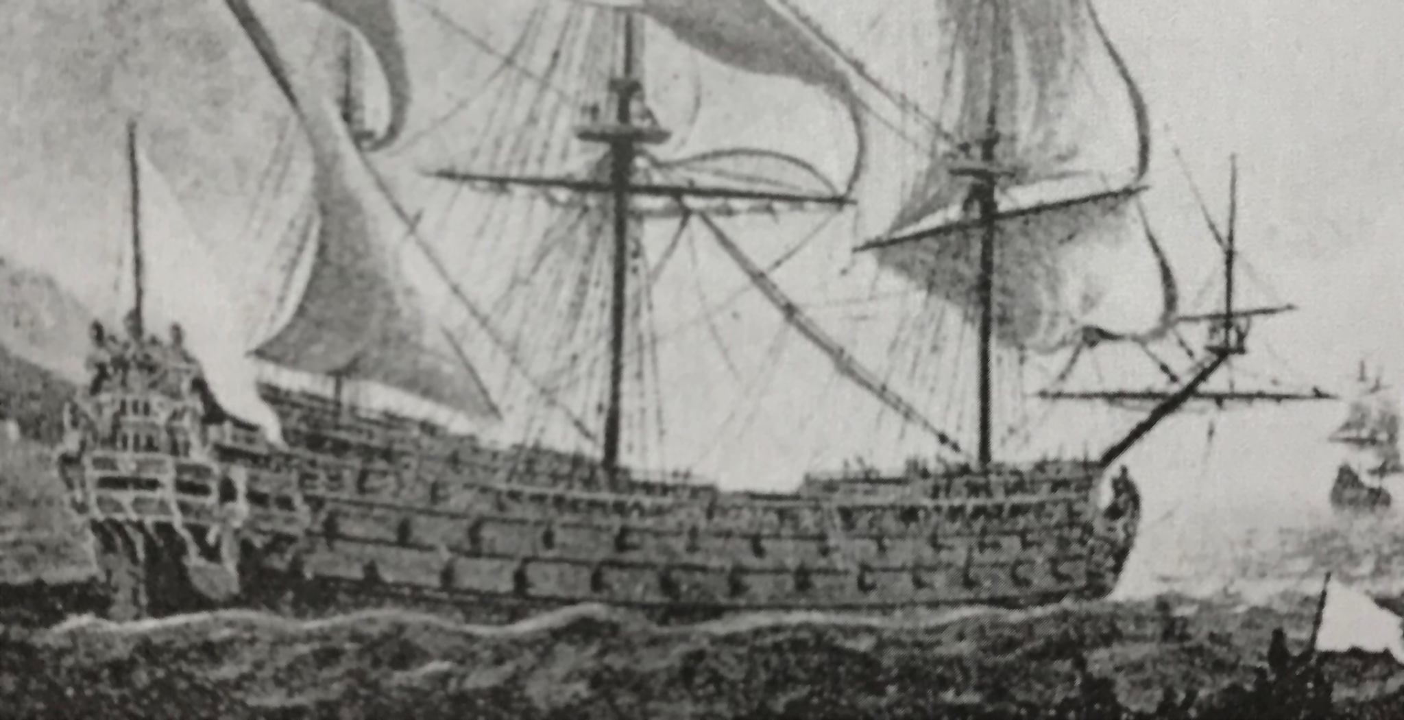
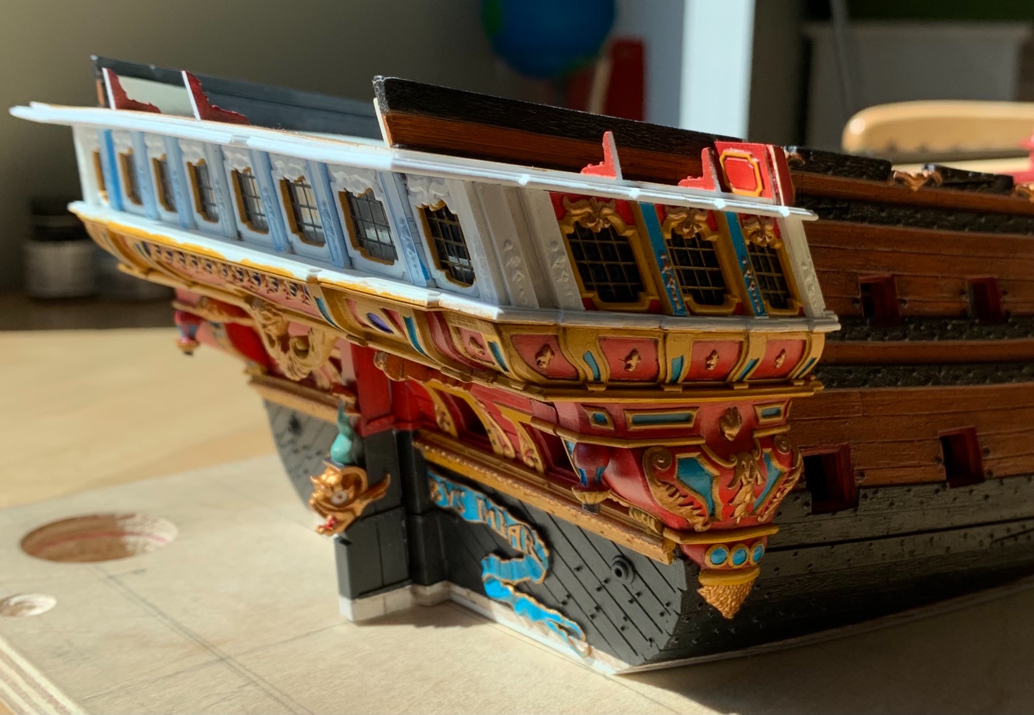
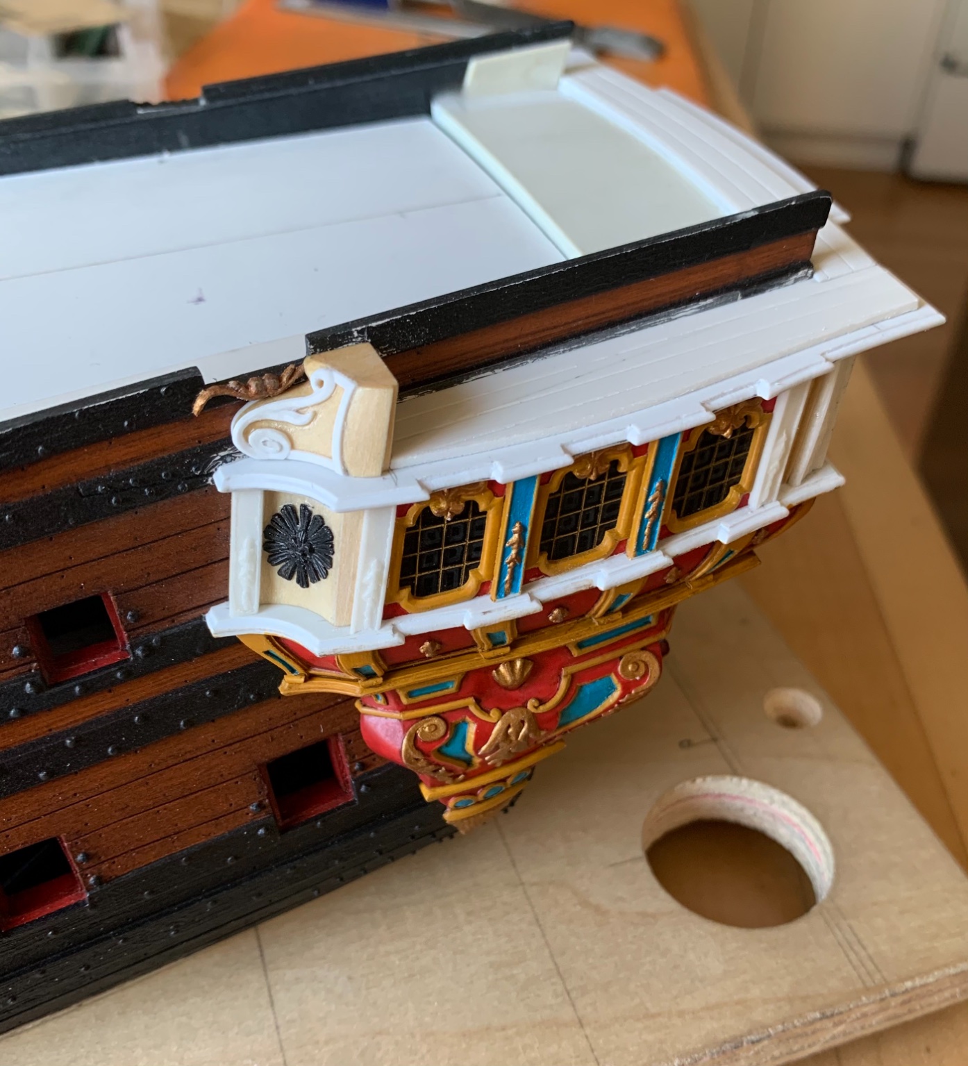
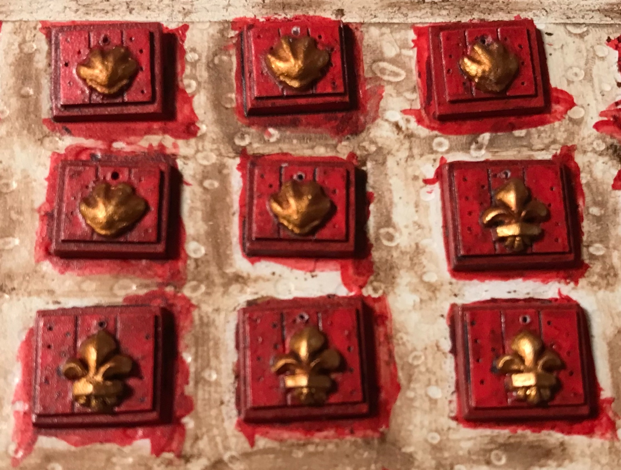
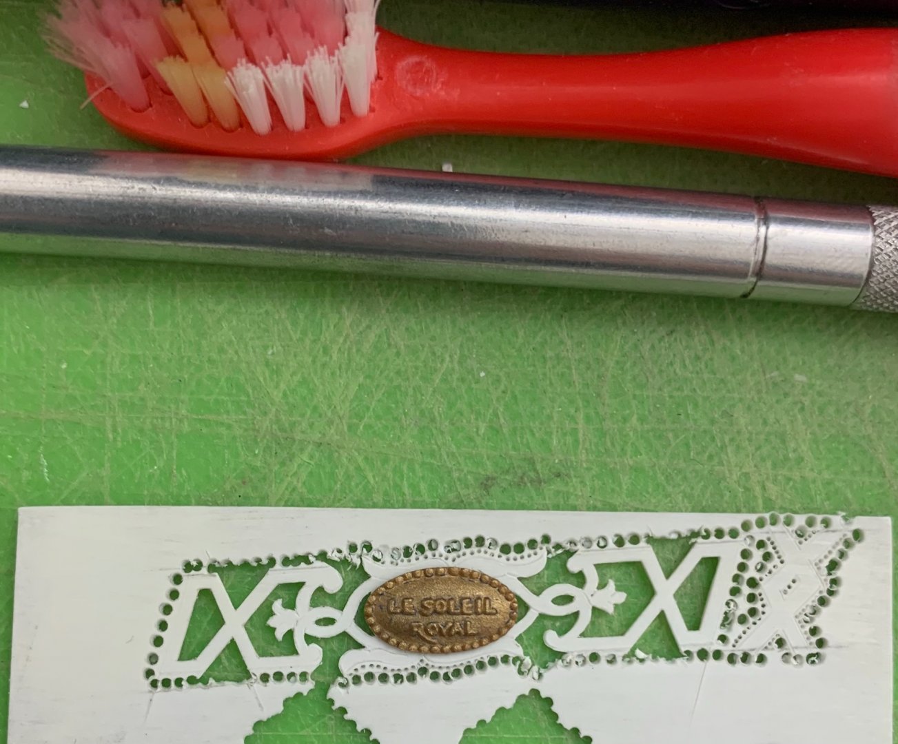
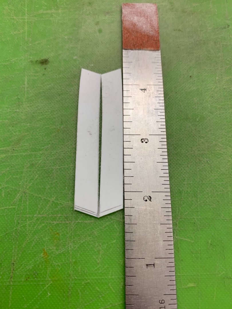
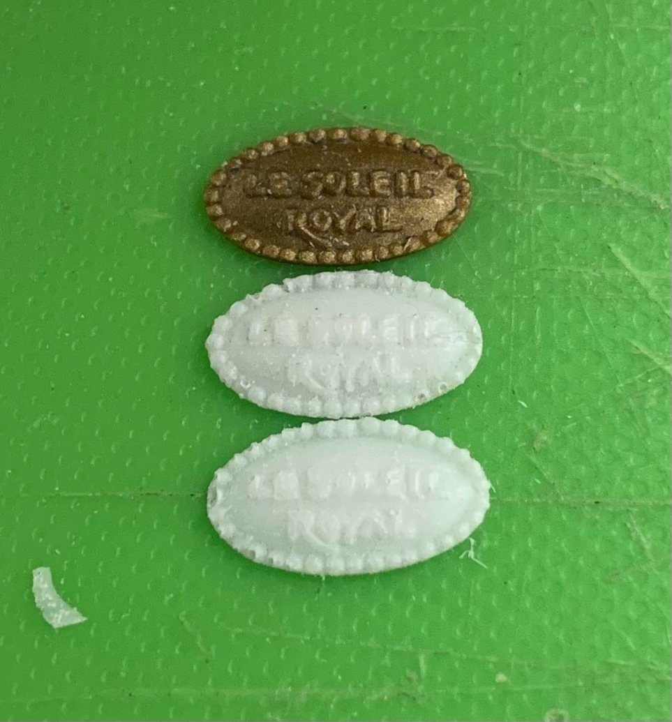
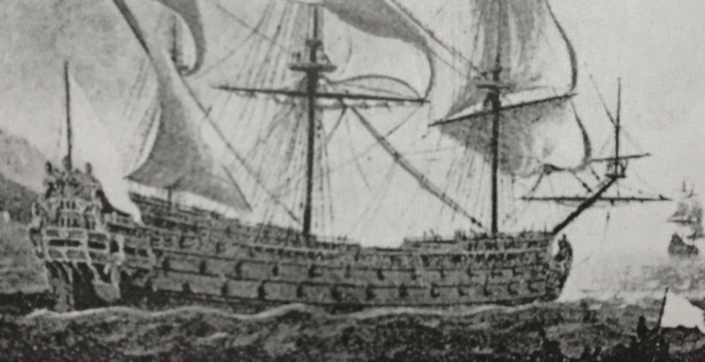
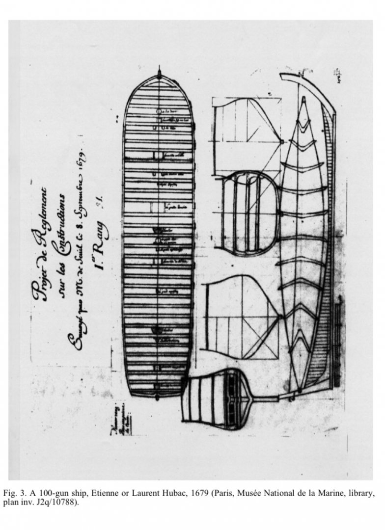
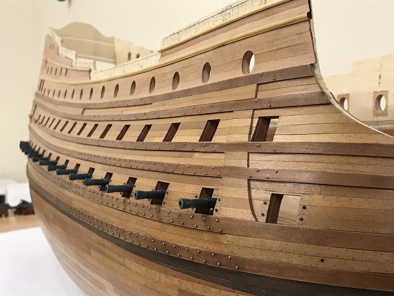
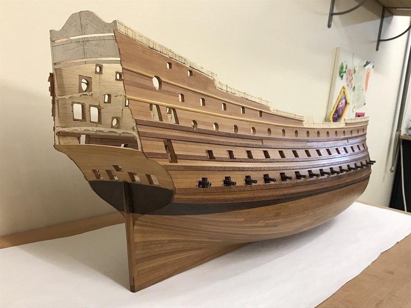
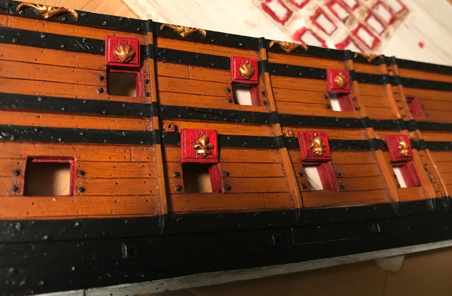
If it were solid timber, John, they could conceivably laminate several pieces of spruce, for example, as would be done for the figurehead. That assembly could then key into the wales, just as I made for the model, and then be through-bolted into the hull framing, so that the quarter gallery structure, itself, weren’t carrying the weight. This approach would allow complete freedom of form. Maybe though, as you suggest John, it was all light framing and thin plank. I have no idea, really. Painting of the stern continues at a snail’s pace. It is all crisply done, though, so the time is well spent. I’ve been making the port and starboard gallery bulwark lattices. My technique has improved since the making of the trailboard, so I am no longer breaking these delicate lattice pieces as I go. Rather than mostly trying to file these delicate pieces into shape - which fatigues the plastic in the narrowest sections of the design - I have learned to pare to my lines with a razor sharpe no. 11 blade. I’ve also learned my lesson about how to scribe part blanks for the bulwarks around an angled, curving surface: The trick to this sort of multi-level relief is to use styrene sheet of varying thickness. The bulwark uprights are cut from .030 sheet, while the lattice relief is .020. From the stock middle balcony rail, I extracted the ship name plate I will have to offer the bulwark blank up to its place on the QG, so that I can mark out the exact pilaster locations from the level below. Then, I can glue the lattice to the bulwark, and secure the pilasters and the diamond lattice detail. The pilasters will be cut from .030 sheet, and will sit just a little proud of the lattice, thus creating the desired depth effect. I made rubber moulds of the nameplate, so that I could duplicate it and have the name on both the stern and quarters. There is a significant investment in time just to get to this: I will also surface mount smaller resin scroll ornaments around the name plates, as well as diamond flower ornaments to the lattice. In other musings, I have been in contact with Mr. Portanier. He has been helpful in sharing several of his sources. Among those were several key articles from the French nautical journal Neptunia, published by Les Amis Des Musees de la Marine. In a separate posting, site members directed me to the following resources for finding back issues: https://www.aamm.fr/neptunia/recherche_articles The above links to an index of every issue and article that Neptunia has ever published. The index spans 75 years and over 300 issues. I am indebted to all of you who have been so helpful to me and this project. A listing of issues in print that are available for sale can be found here: https://boutique.aamm.fr/neptunia In going through the index, I discovered around 25 articles that are specific to my time period and/or subject. A number of additional articles, based on the abstract description, seem like they may he helpful. For 5 euros, per older issue, that seems well worth the gamble. A number of issues that I would really like to have, like a multi-part series by Bernard Frolich on the development of his model of L’Ambiteaux, are currently unavailable in print. Courtesy of Mr. Francis Graviou, I can contact the site administrator to see about obtaining those issues digitally, perhaps: contact@aamm.fr I think, perhaps, the greatest value of a substantial piece of research, like Mr. Portanier’s dissertation, is where else it may lead you to keep searching for answers. His cited works are extensive, and I can assure you that there is often great value in the reading of footnotes. I may never find the portrait of my gilded ghost ship: But I do, now, know where to look for the following: Now, I merely need to figure out how to contact the national archives and obtain a copy of these documents. I am not expecting the expansive detail that Hyatt provides in his description of the RL, but it would be reasonable to expect to glean some key information about Soleil Royal’s original structure and appearance. That could go a long way toward fleshing out a portrait of her appearance between the years 1670 and 1685. I also stumbled across this: From a time when the lead architects like Laurent Hubac were being continually nudged by Colbert’s administration to conform to a codified prescription of dimensions, this I would say, is a pretty good insight into the design modality of, perhaps, the most intractable of the arsenal shipwrights. Laurent Hubac liked a broad-beamed ship, and that is exactly what this drawing indicates. Also, if one makes a very close examination of the starboard side of this drawing, they will discover a series of regularly spaced hash marks. This drawing is of the broadest, lower main battery deck. I believe that these hash marks represent port piercings. There are 15 broadside hashmarks, with what appears to be one more “hunting” port hash mark, near the hawse entry. In other words, something very like this closeup of La Reine’s port bow: photo, courtesy of Chapman There were only two Hubac-built ships, that I know off, that were pierced for 16; La Reine and Soleil Royal. Very interesting, indeed! As always, stay well, and more is to follow...


- 2,699 replies
-
- 10
-
-
- heller
- soleil royal
- (and 9 more)
-
Matiz, do you use some sort of charring iron to waste away the V-shaped reliefs in the capstan barrel?
-
This is off to a very promising start, and it is one of my favorite French ships. I will gladly follow along.
-
Well, just where the HECK have I been - missing out on all this superb craftsmanship! Matiz, your model is wonderful and your lines are sublime. I'll be looking forward to updates, from here on out!
-
Yes, this is excellent! All POB builders would benefit from a look at what you are doing, here; so many of the un-realistic POB planking conventions could be avoided, if one were to see just what is possible with a little extra care and layout.
-
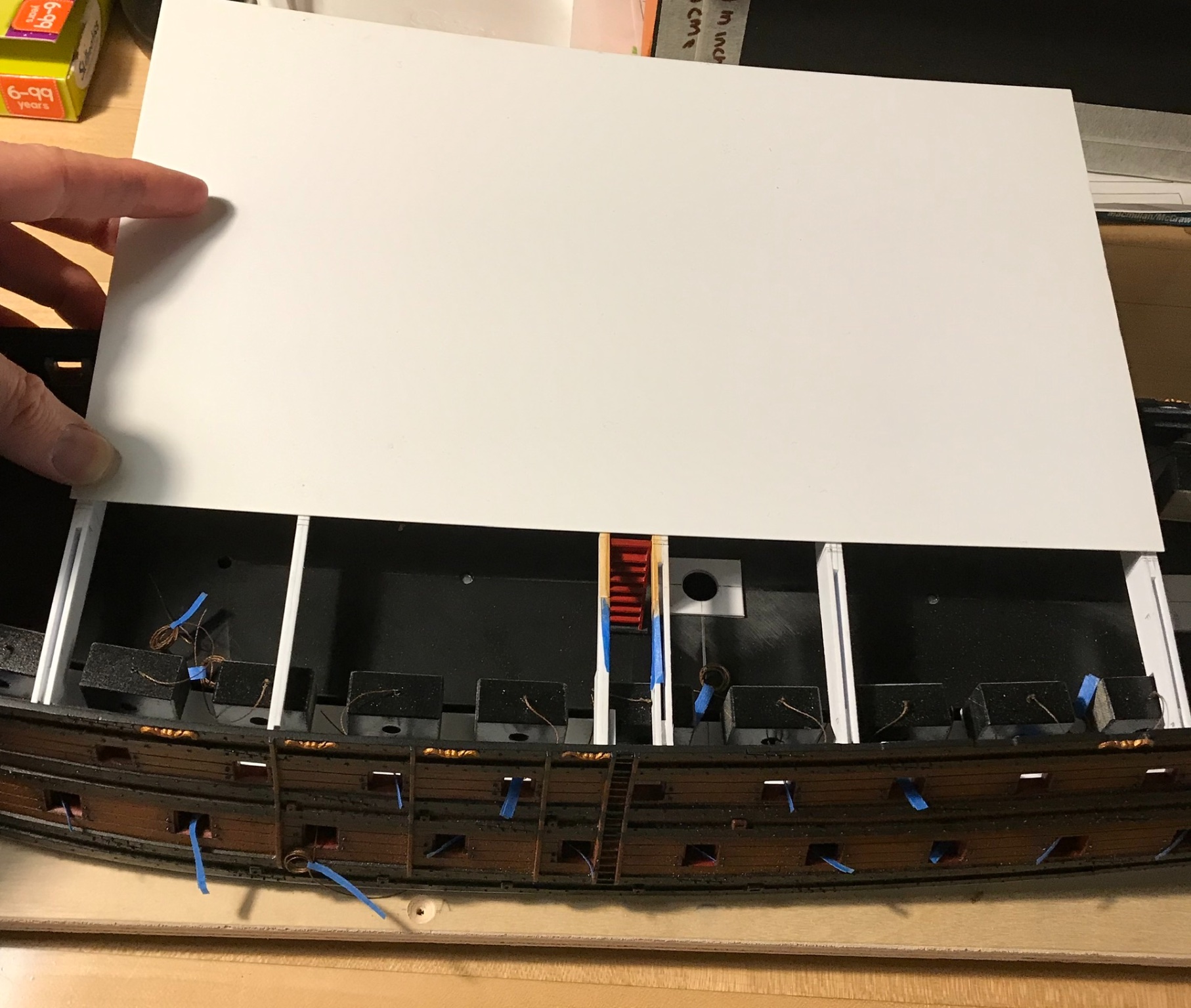
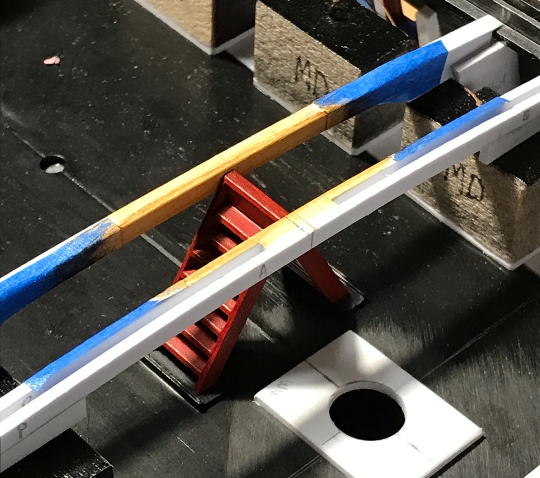
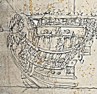
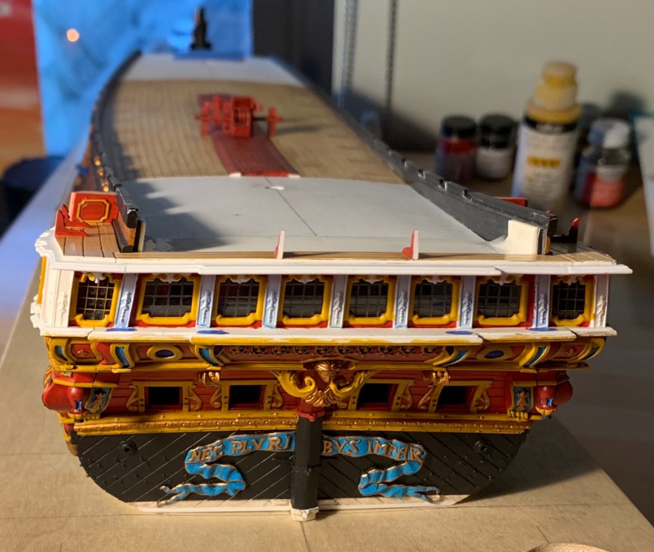
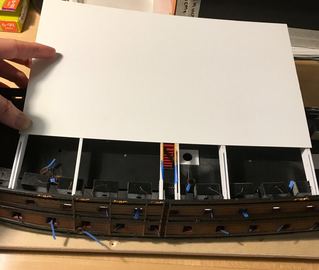
Marc and John, thank you so much for your kind words. And John, I am equally enjoying the work that you are doing with this fabulous Heller kit. Your figurehead has me considering how I will color the other robed figures that inhabit my upper bulwarks. It has been a bit of a hectic week, as I consider moving my family, yet again, in the never-ending quest for a reasonable three-bedroom apartment in NYC. Slowly, I have been assembling the QG open walk and painting the stern. It is fiendishly difficult to get into the recesses of this stern window plate, and I really wish I had painted it off of the model. Slowly, though, we are getting there: I’ve masked with blue tape, the footprints of the Four Seasons figures. I also decided to extract as much recyclable detail from the two extra stern plates that members of this community have so generously donated. On the forward end of the open walk, I thought that block could do with a little finishing, so I extracted the paneling detail from that same corresponding area on the stern-plate, turned it sideways, and now that looks a little nicer. The bombastic form of this block, which I may or may not be interpreting correctly, is very curious to me: I wonder how such a thing would actually have been made on the real ship. would they have sheathed a light framework with thin deal planks, or would they have shaped a solid balk of lightweight timber, much like I have for the model? The other interesting discovery, this past week, was Ronald Portanier’s dissertation on the evolution of French marine sculpture throughout the Ancien Regime. He has a number of interesting insights into decorative styles, color and the use of Trompe L’oeil. It is quite lengthy, but well worth the look. There are a few gems in the Appendices, also, including a super detailed port quarter view of the Monarque/RL’s stern - something I was just asking Chapman about, recently. There is also a fascinating unfinished rough sketch for the stern of an early First Marine, first-rate ship. If that weren’t enough, there are also several insightful LeBrun portraits that give a good sense for the colors that might be used to accentuate the ship’s carved figures. Check the link below for a look-see: https://spectrum.library.concordia.ca/984742/1/Portanier_PhD_S2019.pdf As a side note, the BSI debonder does an excellent job of sloughing away the finished surface of acetate. I think I will just live with the blemish. It is small.


- 2,699 replies
-
- 15
-
-
- heller
- soleil royal
- (and 9 more)
-
I really like those gallery details, Kirill. The masthead crosses are also interesting details; they are emblematic of the religious devotion of the Spanish empire as well as the sailorly superstitious belief in talismans to ward off evil outcomes. Where else to put a cross, but as close to God as possible, at the top of the mast heads. Excellent VdV grisaille drawings, as well. I’ve added these to my image files. These are particularly fine, and as close to photographic in the rendering of details.
- 228 replies
-
- 4
-
-
- spanish galleon
- lee
- (and 1 more)
-
I am sorry, Christian, that you seem to take this commentary as a personal attack. I hope you will understand that that is far from the spirit that is intended. I only offer observations and criticism when I believe the builder is capable of doing something with that information. I followed your build, in the first place, because I believe you can pull it off, so to speak. You are making a nice job of it, so far. The objective of my commentary is solely to help you avoid creating a circumstance, early, that is difficult or impossible to remedy later. Of course, I respect your wish to work privately and wish you the best of luck!
-
In contrast, here is Marc Yeu’s Soleil Royal in 1/72: photos, courtesy of Marc Yeu
-
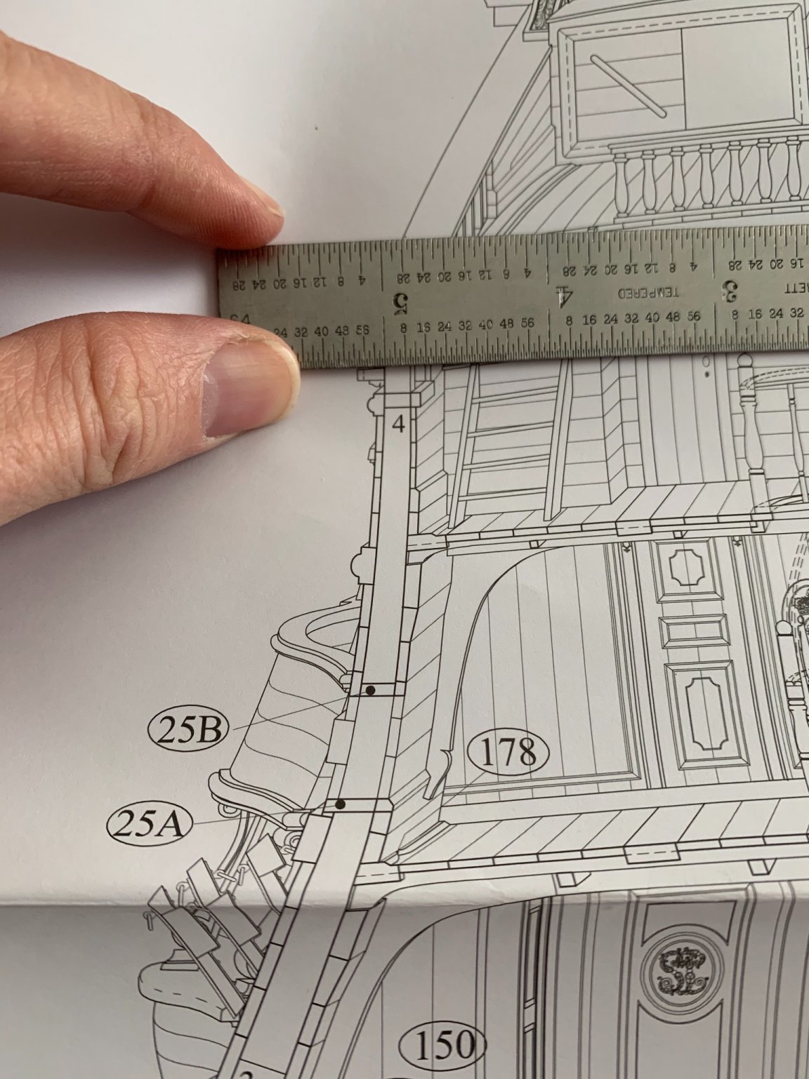
Forgive me, please, but I have to back Allan on this one. I am not accustomed to metric scale. Fortunately, though, we have the technology. My copy of the monograph is 1/48 - big enough to sail away in: The timberheads before the break between the quarter and poop sheer steps measure 10/64”, imperial. So, at 1/48”, the timberheads (inside the planking) would measure a hair under 4MM. At your scale of 1/72, this dimension should be significantly smaller, still. I agree with Allan that now is the time to thin these, before finally glueing them in. Personally, I would leave them just a little heavy to allow for fairing, after they are glued-in.

-
Here is a link to Rex Stewart’s Vasa build: It is difficult to see what his blocks are like for the upper rigging, on my phone, but maybe you can sufficiently enlarge these images on a desktop. Anyway, I think his scale of blocks looks very convincing.
- 222 replies
-
- 1
-
-
- reale de france
- heller
- (and 1 more)
-
With everything you have achieved, here, and your super-realistic wood-graining techniques, I am really excited to see what you do with that Vasa kit.
- 222 replies
-
- 2
-
-
- reale de france
- heller
- (and 1 more)
-
This is really wonderful work from both of you. It is an interesting detail that the lower transom planking appears to be let into the aft-most frame, as opposed to overlaying it.
-
My lid lanyards tie off onto an eyebolt on the top of the dummy carriage. The trick will be shortening the lanyard line enough that it doesn’t look floppy around the barrel. I left myself plenty of excess line to figure it out.
-
Bill, I will make a single eyelet that mounts to the inside (exposed) side of the lid, and I will bend the loop of the eye, downward, so that it seems to hang naturally, like a ring. I’ll seize my lanyard to that.
-
On my model, I have only drilled one hole on the center, for the pull-down lid lanyard: I haven’t gotten around to doing eyelets, yet, but the lanyards are already attached to the dummy carriages inside the hull:


-
It sounds like spalt, but it could also be bug damage of some sort or other. As your exterior hull will be planked, what do you think about injecting epoxy into this void, in order to solidify the material? As you arrive closer to your finished dimensions, you may find it necessary to repeat the process, but that should restore your material integrity.
-
From what I can see in these photos, it looks as though you will have some significant fairing to do between frames 2 and 4. Balsa fillers, throughout, would make the fairing process easier to gauge, as you go. It also will make a realistic plank shift more easy to achieve, as you will not be dependent on landing on bulkheads. The only other way to land a joint between bulkheads, is to back the joint with glue tabs, and even then you might end up with raised peaks at each joint. That seems very tedious to me. Just a thought.
-
In scales this small, it has been suggested to me to seize your lanyards directly to a single eyelet secured to the lid - rather than an additional ring attached to your lid eyelet. On my project, I will display the lids in a somewhat unrealistic way - as pulled up against the wales - because I want the lid ornaments to be fully visible. In this way, I only need to represent the single, interior, closing lanyard.
-
CriCri, when you get to glueing everything together, will you also glue-in filling blocks between the bulkheads?