Hubac's Historian
-
Posts
3,309 -
Joined
-
Last visited
Content Type
Profiles
Forums
Gallery
Events
Everything posted by Hubac's Historian
-
 Well, FC, taking an initial look-through at this project, I can fully appreciate why others here, at MSW, are concerned for your whereabouts. You are very talented! I’m late to the party, but I will read through the whole log and follow through to the end. Great work!
 -
This is what I love about MSW - someone, out there, always seems to have the perspective you are searching for. Nice work, Mark P!
-
Excellent additional insights, Druxey, and thank you Dan and Mark. A video would be better, but hopefully what I’m trying to describe is sensible enough. And, Kurt, I think we can all attest the the devastation wrought with pool noodles by covert kids who want to spray is off out comfortable floatie!😉
- 2,699 replies
-
- 2
-

-
- heller
- soleil royal
- (and 9 more)
-
This is also a question of great interest to me.
- 1,035 replies
-
- 3
-
-
- royal katherine
- ship of the line
- (and 1 more)
-
You absolutely can do it, Stephen. The primary requirements are time, commitment to a standard, and the willingness to just keep at it. I designed and made my first carved piece in 2003. It was a decent sized inlay for a piece of furniture -approximately 12” X 6”. I worked very hard at it, and it turned out okay. Mostly, because I took my time. Over the years, I learned how to work smaller and smaller - although, never really faster. If it interests you, I would suggest doing a basic relief carving, in wood, and at a reasonable size, just to get your feet wet. There are plenty of ready—made designs in books, and of course, YouTube. And, to this day, I watch carving process videos on YouTube. I am particularly interested in the early American long-rifles of Pennsylvania. Today’s master-makers are experts at the art of low-relief carving. Many of these guys have videos, online, that take you step-by-step through their relief process. This guy, Jim Kibler, is particularly instructive in his method: Really, the techniques employed are applicable to any kind of carving, at any scale. His focus and attention to detail are very high. Once you get a feel for it, anything is possible.
- 2,699 replies
-
- 7
-
-
- heller
- soleil royal
- (and 9 more)
-
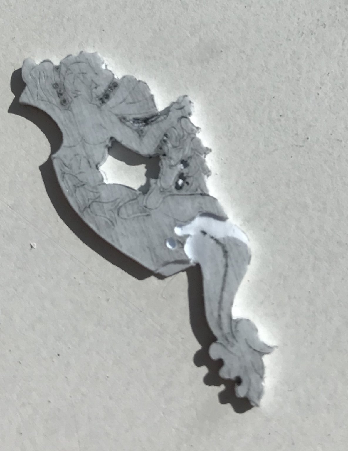
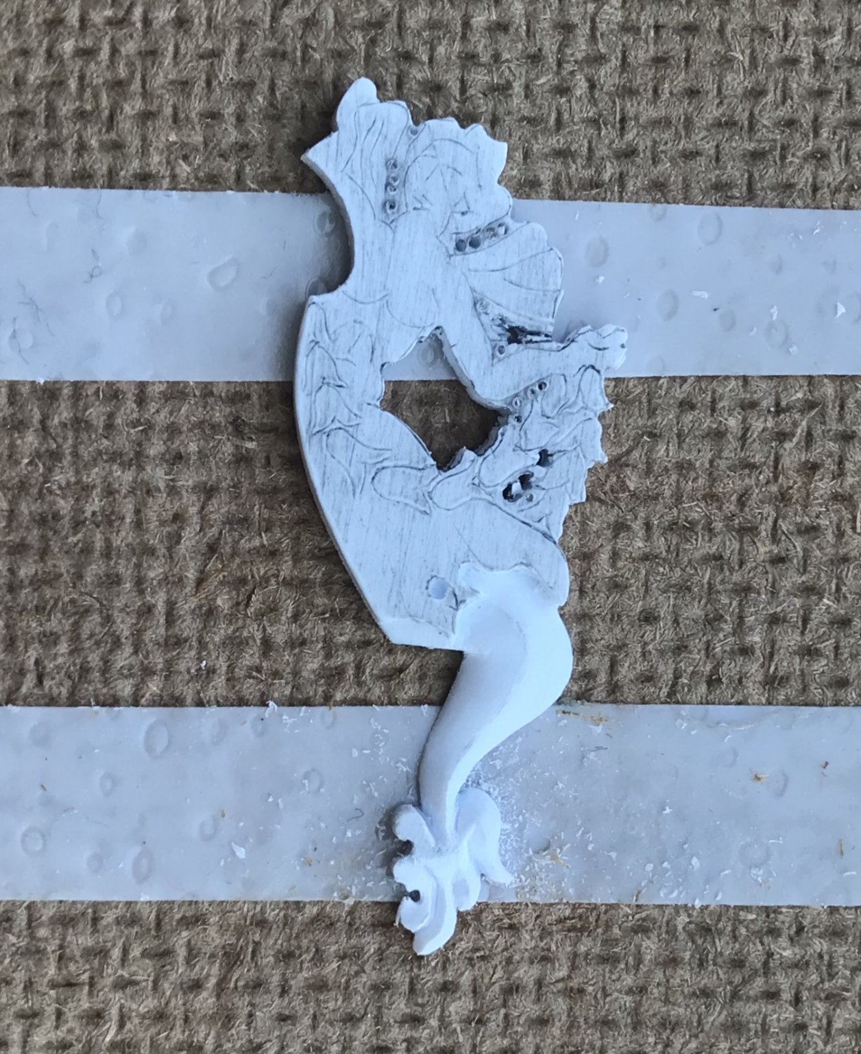
In this second installment, I’ll discuss the initial planning and approach that goes into modeling the carving, while introducing the tools that I use the most, and discussing the techniques that have given me good results. At the stage pictured, below, I’ve invested about four hours cleaning to my outlines on each carving. I’ve used the smallest diameter drill bit I have - roughly 1/64” - to get in-between the head, wings and arms. Doing so, even to this minimal degree will greatly ease the cutting-in later. The carving blanks have good symmetry. I made one small drilling error in the bell-flower garland, near the hand, on the left blank. In the end, this small mistake won’t be noticeable, and certainly it does not necessitate a redo of the blank. Below are the primary tools that I used, today, to begin carving the tail. With the exception of a few Dremel burrs that I use to do some of the initial wasting, most of the cutting-in and sculpting I do happens with my EXACTO (for deepening lines of demarcation), and my hooked BEEBE knife for paring, digging and scraping. This hooked knife, in particular, is invaluable throughout the sculpting process because its versatility enables you to achieve fine results without an arsenal of carving tools. The occasional drill bit also comes in handy when you need to define a small radius within the work - as, here, along the flowing hem of the figure’s blousy skirt. So - even though, at this point, I have made a number of similar sculptures for this project, every carving is unique and demands that you think your approach through before you begin. While not a fully rounded figure, this carving is, nonetheless, fairly involved, with the area around the head and wings providing the greatest challenge. Personally, I like to begin a carving in an area that is a little less daunting until I find my confidence, again, and the resulting momentum allows me to work through the carving by increasing degrees of difficulty. In this instance, I have decided that the tail is the best starting point because, while contoured, it is a shape that I fully understand, right now. Unfortunately, the line of demarcation, here, is the blousy skirt that has a somewhat involved hemline that one must clearly define, first. Bear in mind that the blank, in this case, starts out as 1/16” thick. As a general rule, I will reduce to 1/2 thickness along lines of demarcation, in order to convey a sense of depth. In this case, that means that the skirt steps down, roughly, 1/32” to the tail. In order to begin cutting in this line of demarcation (on the tail side of the line) I like to take the smallest round burr I have and run it in the Dremel at the next to lowest speed; because this is plastic, you don’t want to generate too much heat, thus making a molten mess of your waste. The absolute key to “relief” carving is to relieve an area for the waste to pare away easily, without having to apply too much pressure on the blade. To facilitate this, I run my Dremel burr along the line, but not on it. You want to get to within 1/32”, or so, of your line so that you can gently pare to the line with your knives. For the most part, I like to use my EXACTO to pare to lines, and the BEEBE to pare and scrape the surface down smoothly. Although it isn’t so evident in the picture below, I’m plunging the tail lower at the sides, than in the middle because, ultimately, I want the tail to take on a domed appearance. In the finished carving, it is this very slight rounding of a surface that creates the play of light and shadow that gives the carving a sense of depth. The other thing to be aware of is that, as you sculpt down through some of your reference lines, you will occasionally need to pencil-in a few guidelines as a reminder of where you are going. In the example below, I’ve penciled-in a crease line that ever so slightly favors one side of the tail, towards the top, but centers at the bottom, where it meets the foliate flipper. I have found that, sometimes, working just off-center enhances the dynamic “movement” of a carving. Also - however subtle they may be, hard crease lines define shadow and light in a way that benefits the finished carving. Developing a sense for this is simply in the doing of it, but it is useful to at least be aware of that, as you begin sculpting. Another design trick for creating a greater sense of movement and vitality is to create undulations or “waves” of varying depth. Some examples of where I have previously done this on this model are the motto banner and the rudder dolphin’s tail. Initially, it’s just a simple matter of using a Dremel side cutting, straight burr to create these waves: Note that the angle at which you introduce these undulations matters; it can either affirm natural movement or run contrary to our intuitive expectations of how tails behave. Once that’s established, you can begin really contouring the tail. Usually, I’ll begin a rough paring with the BEEBE. Then, I’ll smooth the surface and try to define my crease with the triangular And round needle files - so far as I can without cutting into adjacent sections of the work. Finally, I will scrape micro-facets with the BEEBE - particularly around the perimeter. This helps me achieve the soft rounding. The foliate tail “flipper” represents a small increase In degree of difficulty. Before I begin sculpting the leafy tail fronds, I want to achieve a sloping taper from the head of the flipper to its tip. This is easily achieved with an emory board. Next, I want to introduce a similar sense of movement with waving undulations, just as we did before with the tail body: Sculpting of the flipper fronds, themselves, begins by re-scoring the outline of each frond with your EXACTO blade. I like to “draw” a very light line with the blade, on the first pass. Then, I’ll make a few deeper, scoring cuts along this line. Finally, I’ll flip the blade and drag it through my score cut, with the spine of the blade leading the direction of the cut. In this fashion, the blade tip essentially engraves a successively deeper line into the plastic. As described, this same technique works essentially the same way on wood - particularly, across the grain. The more parallel your cut runs with wood grain, the more you will have to alternate your direction of cut Any time I’m trying to sculpt something small and leafy like this, I basically try to scrape two facets along a centerline, for each frond. Mainly, I use the BEEBE for this. I also like, where appropriate, to introduce concave hollows around round openings. There’s a small shallow gouge that I use for this, but I didn’t have that with me today. I’ll be discussing that more in the next installment. Basically, these few techniques will enable you to methodically work your way through any carving. I probably won’t do detailed updates of every step in the process, but I likely will discuss the bell-flower garland, as well as the head and wings, in some depth. Until then, be well and enjoy this extended American weekend!


- 2,699 replies
-
- 12
-
-

-
- heller
- soleil royal
- (and 9 more)
-
On the Ships of Scale site, a few members have expressed interest in my carving process. I’m still up in the air about creating a YouTube account for posting video content. I thought, though, that these Mer-Angels were a good opportunity to discuss my approach and technique in depth. The major benefit of what I do is that it doesn’t require a ton of specialized carving tools. Continue, below, for parts one and two of this series ______ I thought, perhaps, to demystify my carving process, that I would do short updates, as the carvings take shape. The first thing, whether you are working from a pre-established ornamental plan, or drawing the ornaments yourself - you are going to want to make sure that the ornamentation is appropriately scaled and detailed in the appropriate style of the nation and time period you are working from. Ultimately, the quality of all relief carving boils down to the quality of the design and layout. One aspect of model ship-building that begs for a good reference library is ship ornamentation. The single best book in my actual library, for this purpose, is Andy Peters’s book Ship Decoration 1630-1740. He covers each national style with sufficient depth to see the evolution of styles across this fairly long time period. I also have numerous books filled with pictures of contemporary models and period portraits by respected artists. What really helps me out, though, is curating several very large databases of period ship imagery on Pinterest. At the end of the day, the more you study the best examples of the shipcarvers’ art, the more fluent you will become with their oeuvre, and the better equipped you will be to draw it. My operating philosophy is that The point at which I can see something clearly enough in my mind to draw it, is also the point at which it becomes possible for me to make it. Because good carving is so time consuming, it is well-worth the extra time it takes to make extra copies of the ornamental plan so that you can edit directly to the plan, if you don’t like the direction, or slope of a line, for example, or if you find specific aspects of an ornament to be exaggerated. Once satisfied with your edits, you can make fresh photocopies, and this becomes your new pattern. Once I have a workable pattern, I paste it directly to my stock with a craft glue stick. It should be noted that almost everything I will say about carving these styrene ornaments applies equally to wood. The techniques involved in figure carving, though, are a little more involved. The first objective for one of these low-relief ornaments is to separate the ornament from the bulk of the waste. I find it easiest to drill a series of closely spaced holes all around the carving with a micro bit. Afterwards, it’s short work to connect the dots with a sharp utility knife. The next step is to set in all of your lines. In large, full-size relief carving, one would use a V-tool and mallet to do this. For something this small, I use my #11 Exacto, which I keep razor sharp. The difficulty, in this step, is that the design is full of many short radiuses, and pulling the blade through them can sometimes be quite difficult to stay on line. Having watched engravers, on YouTube, I have discovered a trick that works quite well, enabling me to scribe even the finest curved lines. Engravers use a swivel-vise to turn the work into the path of the graver, so that they only have to make minimal micro adjustments of direction, with their graver hand, while maintaining consistent pressure. What I do is very similar, with the exception that my hand holding the work (on a firm flat surface) pulls and turns the work AWAY FROM the blade tip, which my blade hand is holding with even pressure. With this technique, it is only necessary to make the smallest adjustments to blade direction, as you go. This all may sound difficult, but it becomes surprisingly easy with just a little practice. Just as one would practice cutting-in lines on a scrap piece of wood, take a small scrap of your material and draw a series of curved lines, so that you can practice the technique. Try it both ways; pulling material through and away from the blade, as well as, pulling the blade through the material. I think you will find that it is exceedingly difficult to pull the blade through the work (while holding the work stationary), and stay on-line. Almost invariably, the tension created by trying to control the large muscle groups in your blade arm, will cause you to lurch off track. In this scale, millimeters are everything, so even small distortions of line render the design illegible, once the paper is removed. Initially, I like to keep the paper on, while I fair to my lines, around the perimeter. I might begin by using a small Dremel drum sander to take away as much excess as possible. Sometimes the paper begins to delaminate and you are better off removing it. You can, at this point, soak the carving in running water to remove the paper (fine with plastic, but you will want to have used spray adhesive and solvent removal for wood). Once the paper is out of the way, I find it exceedingly helpful to darken (really darken) the whole surface in graphite. You want the pencil lead to get into your scribe lines. I then use my thumb to smudge the graphite into the lines. Doing so also lightens the field enough to see the lines more clearly. Once that’s settled, you work very carefully with a decent set of needle files to get as close to the lines as you can, all the way around the carving. Don’t worry, just now, about the fine corners and crevasses you can’t get to with the files. We’ll tackle that in the next installment.
- 2,699 replies
-
- 8
-
-
- heller
- soleil royal
- (and 9 more)
-
Any of Bellona’s crew, at the time, would certainly have agreed with you!
-
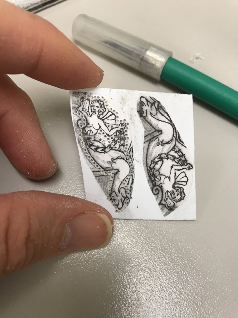
So, last night, I ordered a pair of small, brass micro-planes. The quality appears decent, on EBAY, and they weren’t terribly expensive. What I like about them is that the sole is flat for the middle third, but there’s an entry and exit relief that should facilitate light, fairing passes. We’ll see what comes of that. I needed a good small-work project, so I have decided to tackle the low-relief Mer-Angels that flank the upper finishing of the quarter galleries. I’m carving these in 1/16” white styrene, and I will begin with the aft-most pair: It’s good to carve like-figures in tandem, for the sake of consistency. The forward pair require a little re-drafting, so that they don’t interfere with my aft-most octagonal port. Anyway, this should be a fun little bit of carving.
- 2,699 replies
-
- 7
-
-
- heller
- soleil royal
- (and 9 more)
-
Hi Kudin- I love your videos! On this most recent video, I have a question for clarification: it seems that you are gluing your deck planking directly to the paper plan layout which, itself, must be glued to the sub-decking. What adhesive of paper to sub-decking do you use to ensure there’s no de-lamination? Clearly there are tremendous advantages to being able to taper planking directly to the layout, in-situ.
-
Well said, BW!
-
Thanks for the reminder, Jan. Yes, I am also considering this approach - particularly with the top and t’gallant masts because you automatically have the squared foot that the masts require. It also enables me to mill perfectly straight stock, initially, rather than having to weed through any number of dowels, searching for straight examples. I’ve always wanted a mini violin maker’s plane, and this would be a great excuse to go out and buy one.
- 2,699 replies
-
- 5
-
-
- heller
- soleil royal
- (and 9 more)
-
Hi Mark - I also prefer the first figurehead, but I do think the actual ship would not have been launched without arms, as they would add gesture and expression to the figure. On the plus side, although it certainly begs a little due diligence, I suspect that her arms would be bare; or, at most, only short tunic sleeves.
-
Hi Jonathan - can you remind me of the sail paper, please? Is it Modelspan? As for authentic sail color, perhaps take a look at the photo-log of Hermione on her maiden voyage across the Atlantic, after completion of her construction. That will likely give you a fair idea of realistic weathering.
-
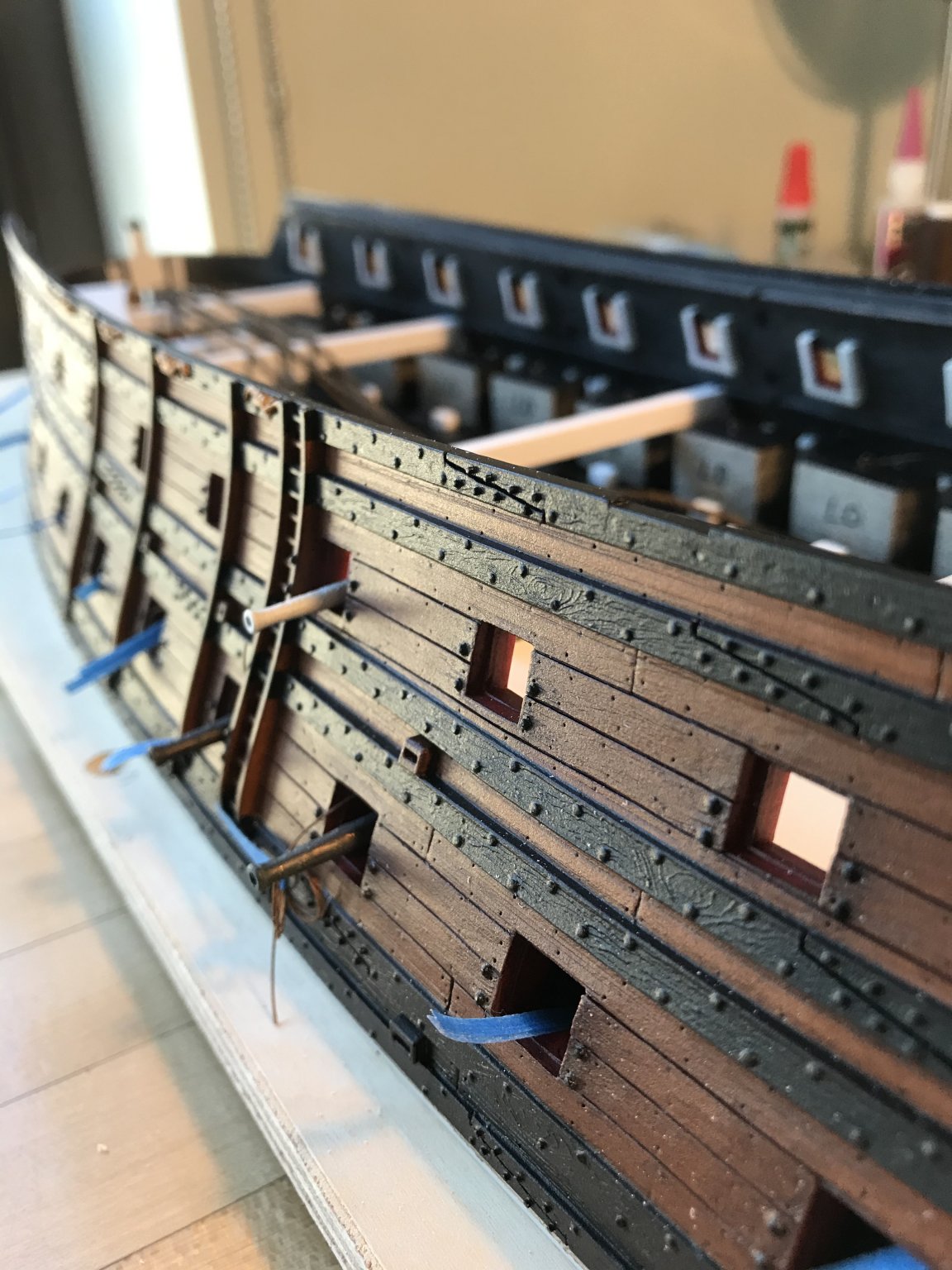
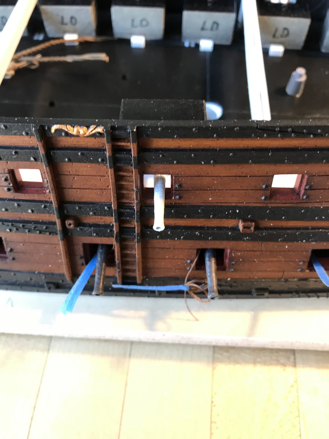
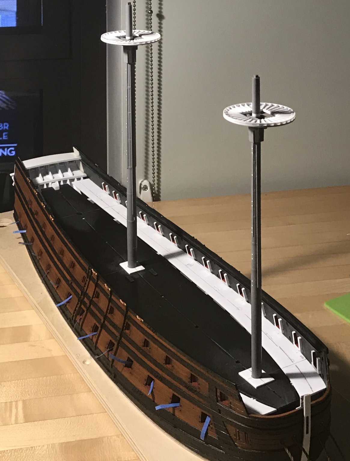
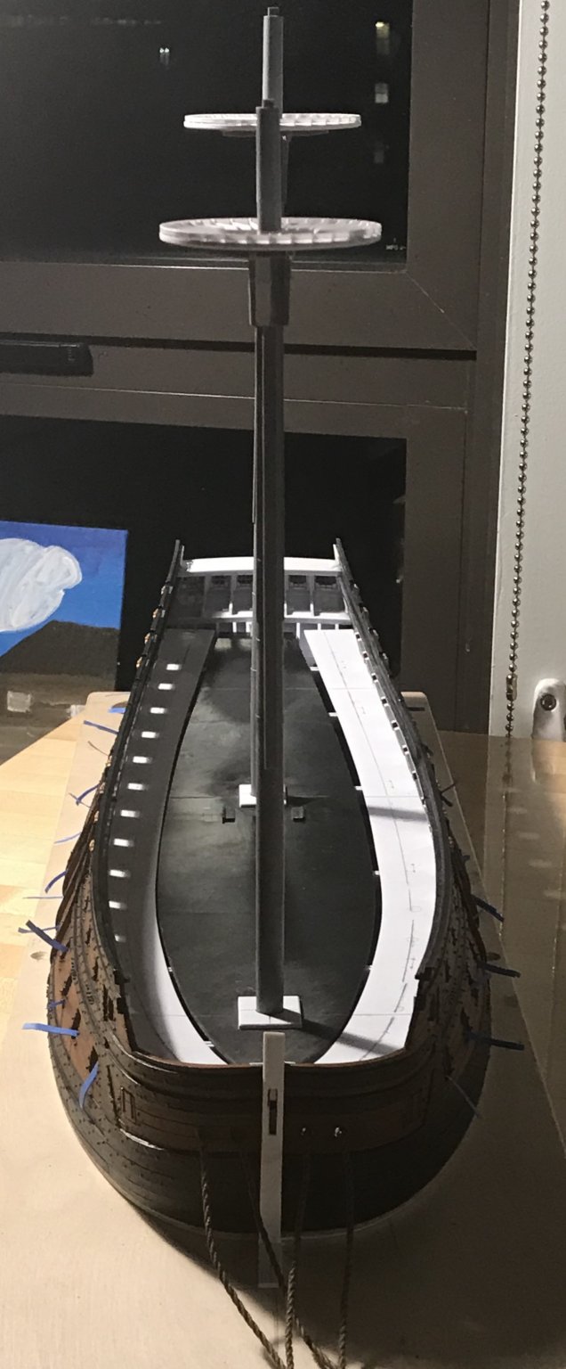
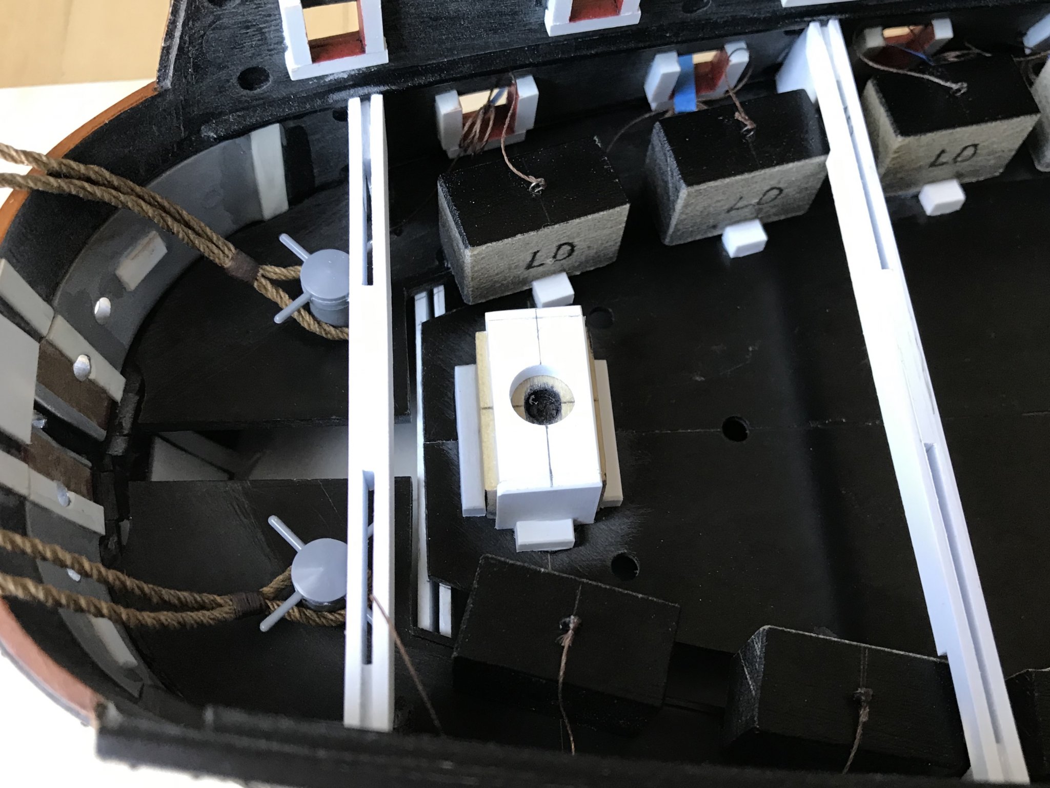
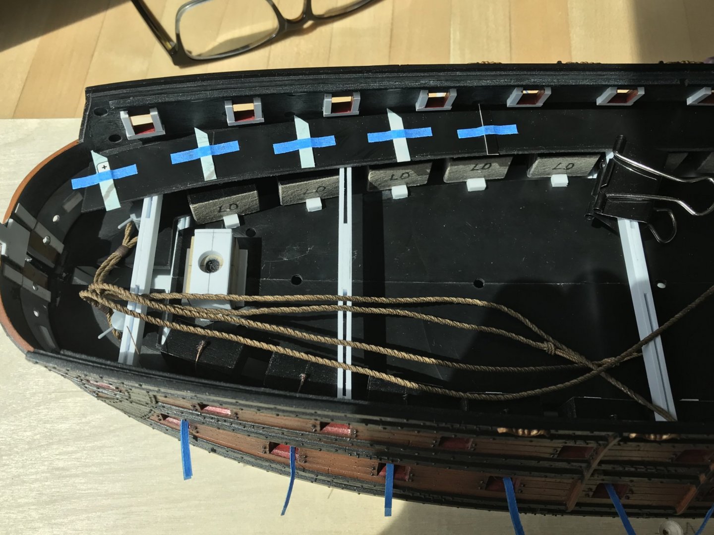
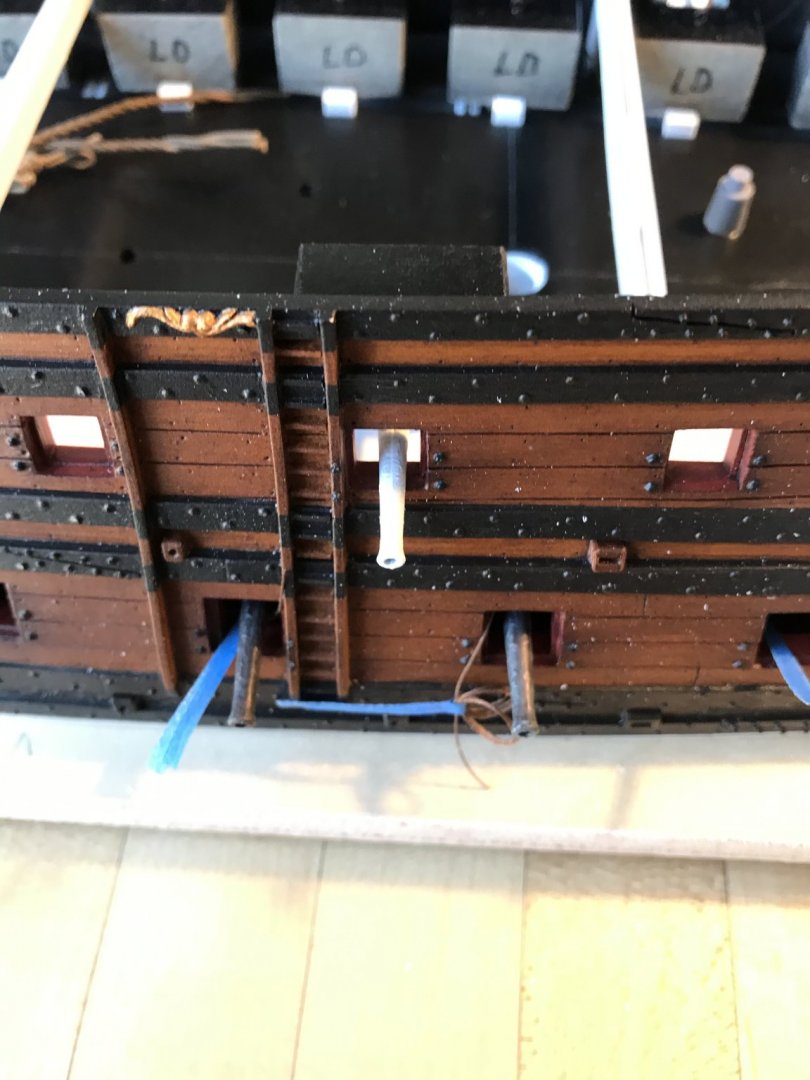
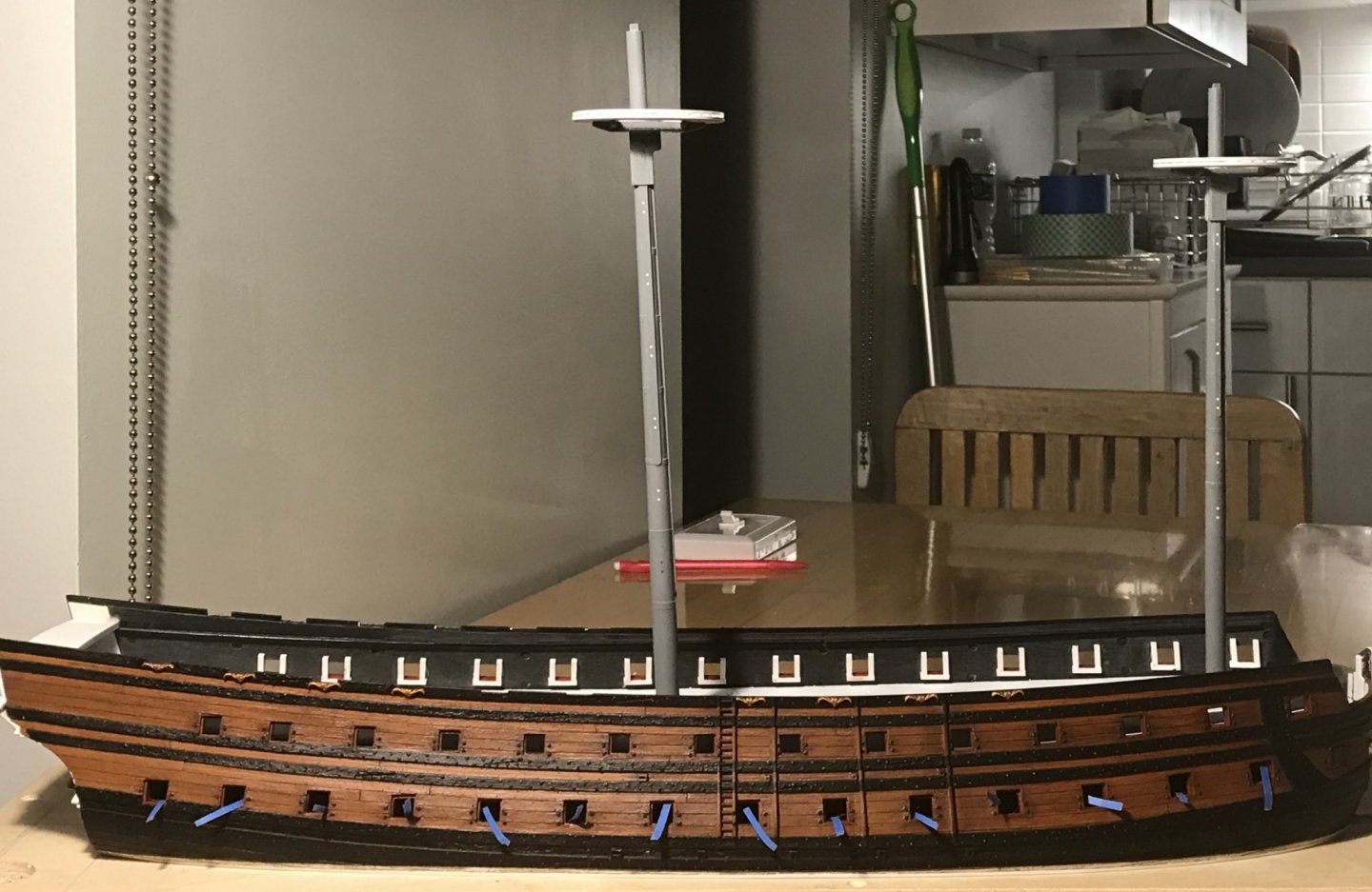
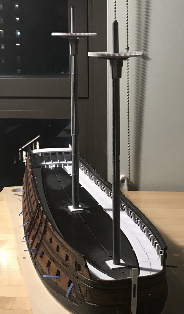
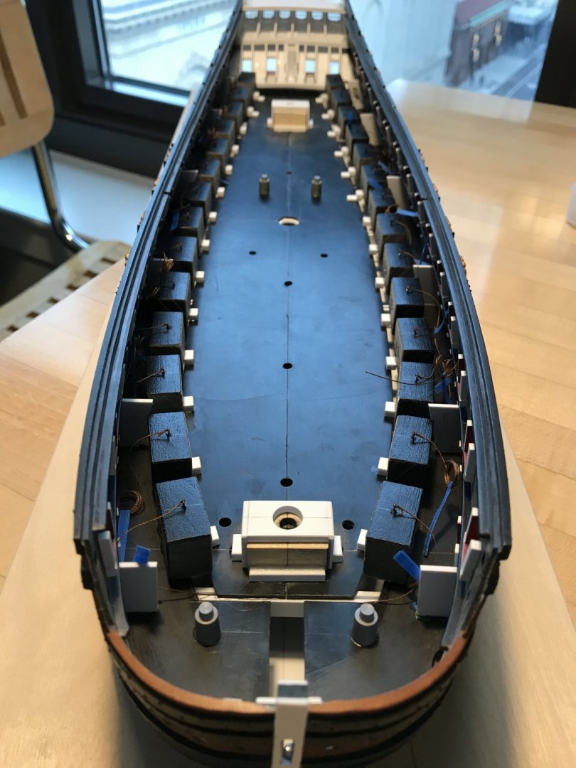
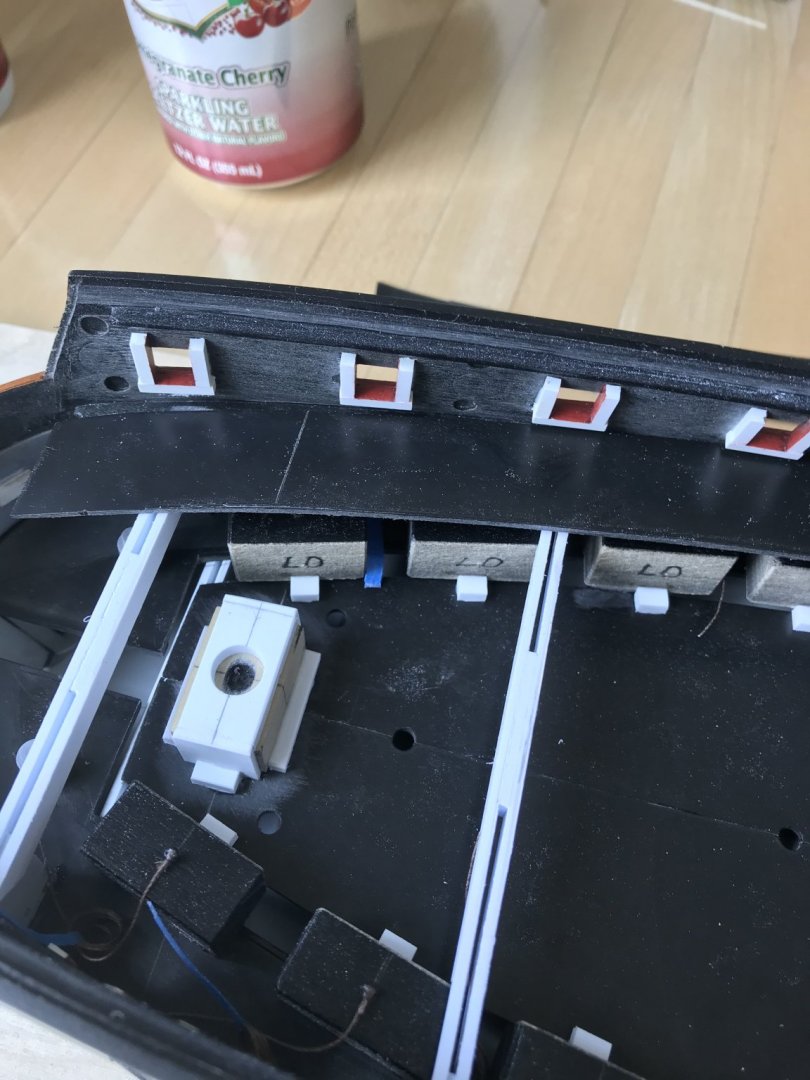
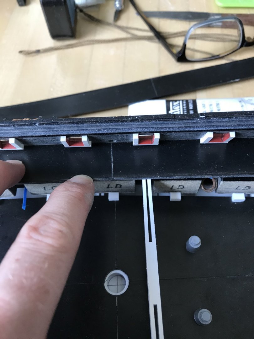
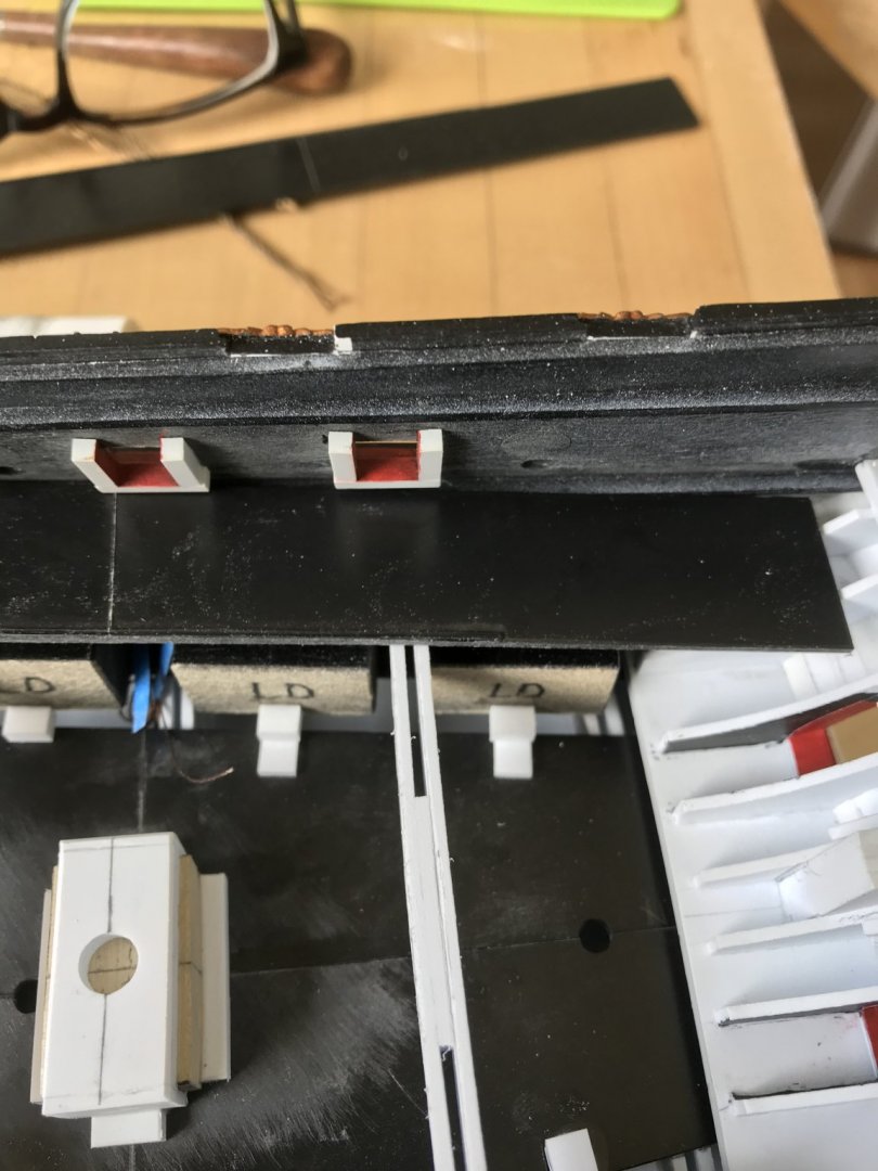
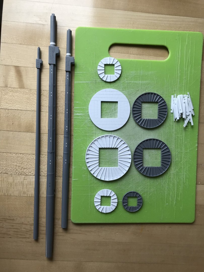
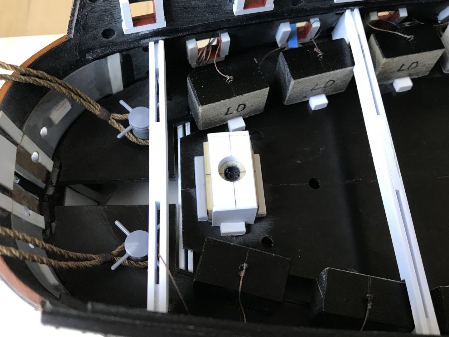
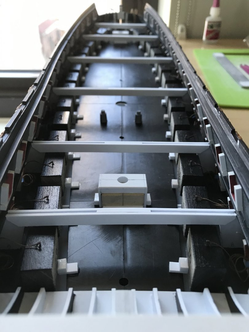
Work on the middle deck is coming along nicely. As mentioned, earlier, I found it much simpler to re-make the dummy carriage platforms from scratch, in order to achieve a close scribe without sacrificing platform depth. I used this simple scribing method to arrive at a faithful pattern for each side: You can see the relative flattening of the ship’s sides, here, with the new pattern mapped-out on white styrene: Once I had achieved a close scribe for each side platform, and before gluing them in place, I checked for the ideal positioning of the dummy carriage blocks, along the whole broadside. On the lower deck, my blocks all follow a uniform line, as they all butt-up against a raised lip at the back edge of the platforms. The middle deck presents a somewhat different reality, as the outward re-curve of the hull, in the area of the anchor lining, would make the barrel projection seem too short, if I were to simply place all of the dummy carriages at a uniform distance from the port opening. How’s that for a run-on sentence?! So, testing the depth from port to port, I discovered that the forward 5 dummy gun carriages needed to be staggered closer to the port openings in increments up to 1/16”. Splitting hairs? Yes. The result, though, will be a finished projection like this, relative to the lower battery: The added benefit of remaking the side platforms is that they are deep enough to adequately support the carriage blocks without any supplemental blocking. With all of that settled, I glued-in the side platforms and center deck sections, as before - taking care to consider the next step of raking the masts. Again - because the masts have been raised, their tapered lower diameter no longer corresponds with the openings at each center deck section level. My solution is to make mast plates that will enable me to align each mast on the ship centerline, while also establishing the rake. With Lemineur’s masting plan of the St. Philippe at hand, I set the rake for the foremast as nearly perpendicular to the waterline as eye and square could ascertain. I will still have some wiggle room to adjust the foremast, if necessary, at the main deck level; the foremast step is not even an inch below this first mast plate, and the fit is deliberately just a hair slack. The main mast is raked aft so that the main top is sensibly level to the waterline, while also accounting for the upward trajectory of the top and t’gallant masts. Here are the relative layout of mast rakes and top heights from a variety of angles: Without the upper deck and bulwarks in place to complete the picture, these mast heights may appear exaggerated, but I am confident that this impression will trend favorably as the model continues to take shape. In other works, the sprit, fore, main and mizzen tops are now complete, and I have made up all of the middle-deck dummy carriages - complete with shims for height, and lid lanyards. I will wait to set the dummy carriages until after I have made the gusset supports for the main deck beams. Placing those beams will require a little thoughtful layout, as they must accurately frame the openings for the main deck hatches and gangway. The beams around the gangway will have to be realistically sided, as they will be partially visible. So, onward and upward we will go. Thank you for the likes, your interest and for looking in!


- 2,699 replies
-
- 14
-
-
- heller
- soleil royal
- (and 9 more)
-
Really nicely proportioned carriages, and excellent consistency of effort and standards.
-
I’m particularly excited for this sail-making portion of the build. ‘Looks like you have everything prepped perfectly, and now it’s onto the magic! The Galleon model looks awesome, BTW!
-
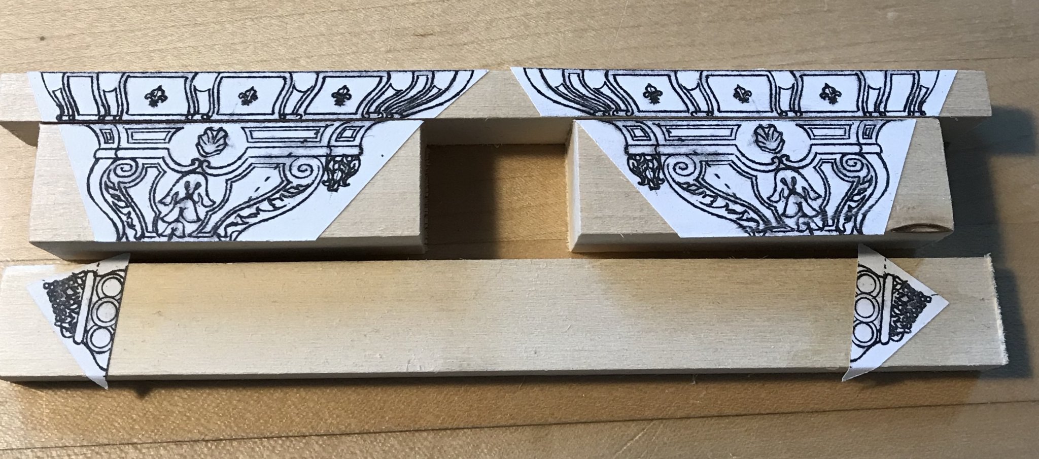
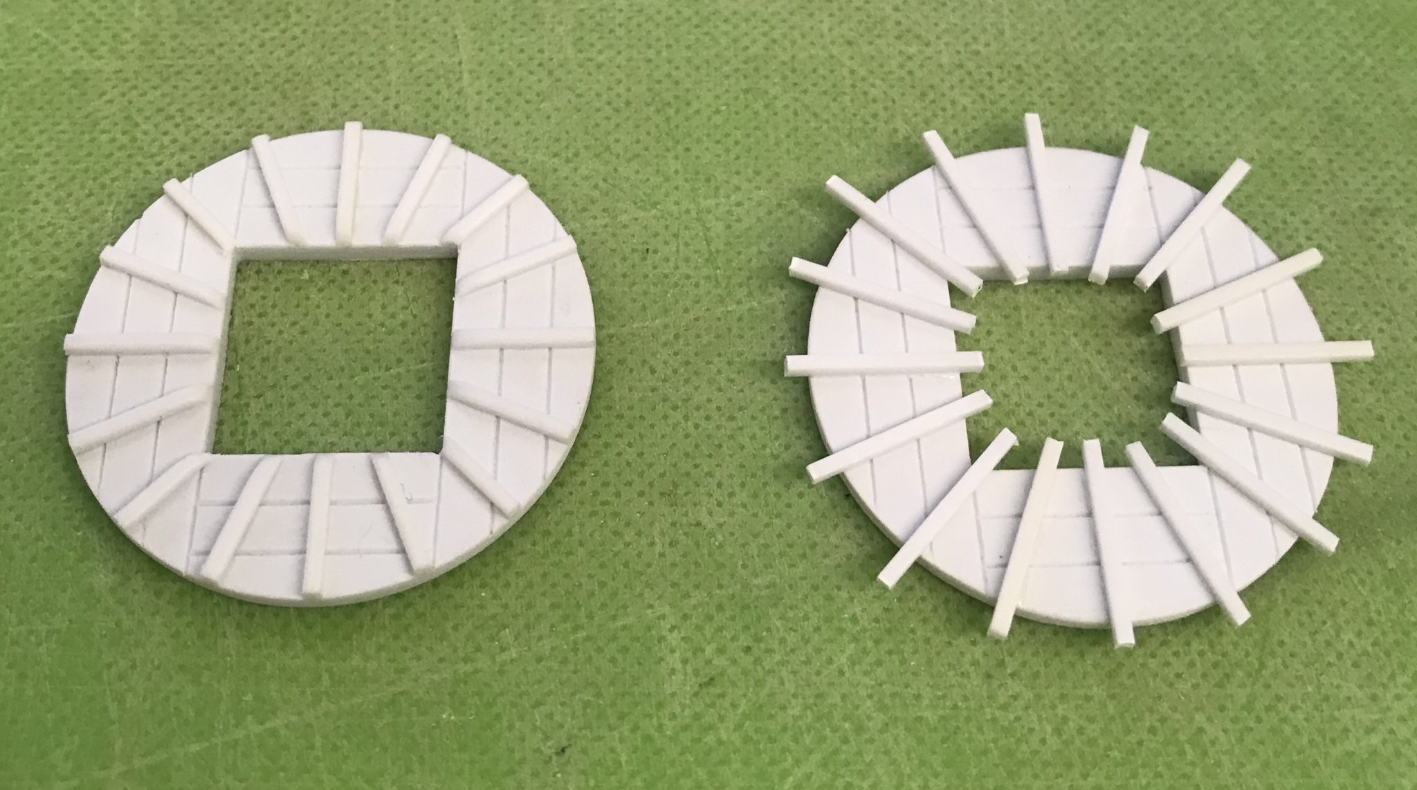
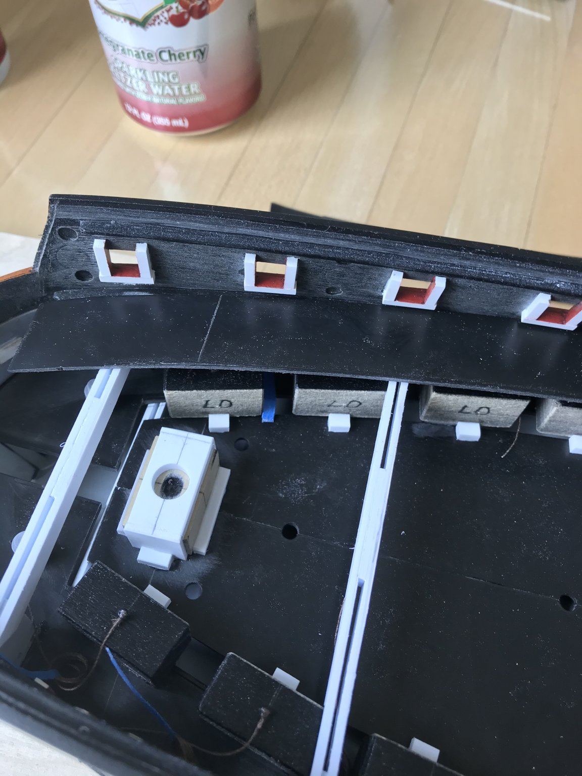
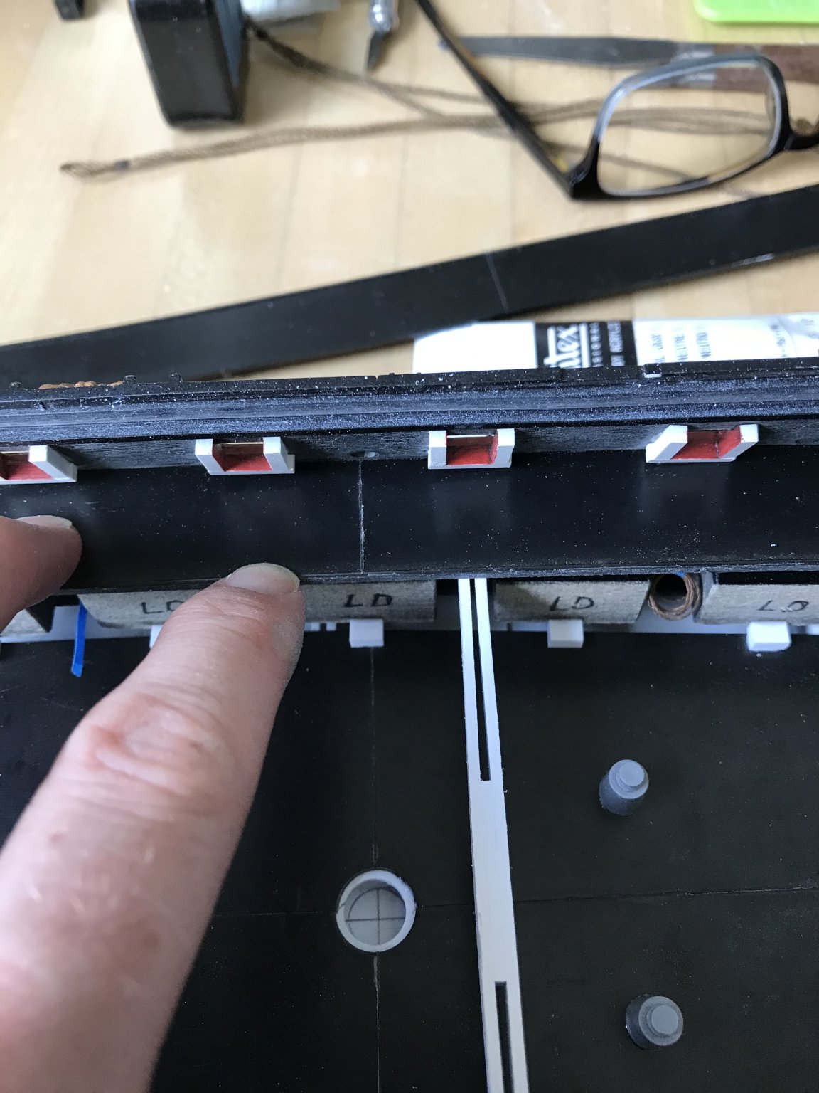
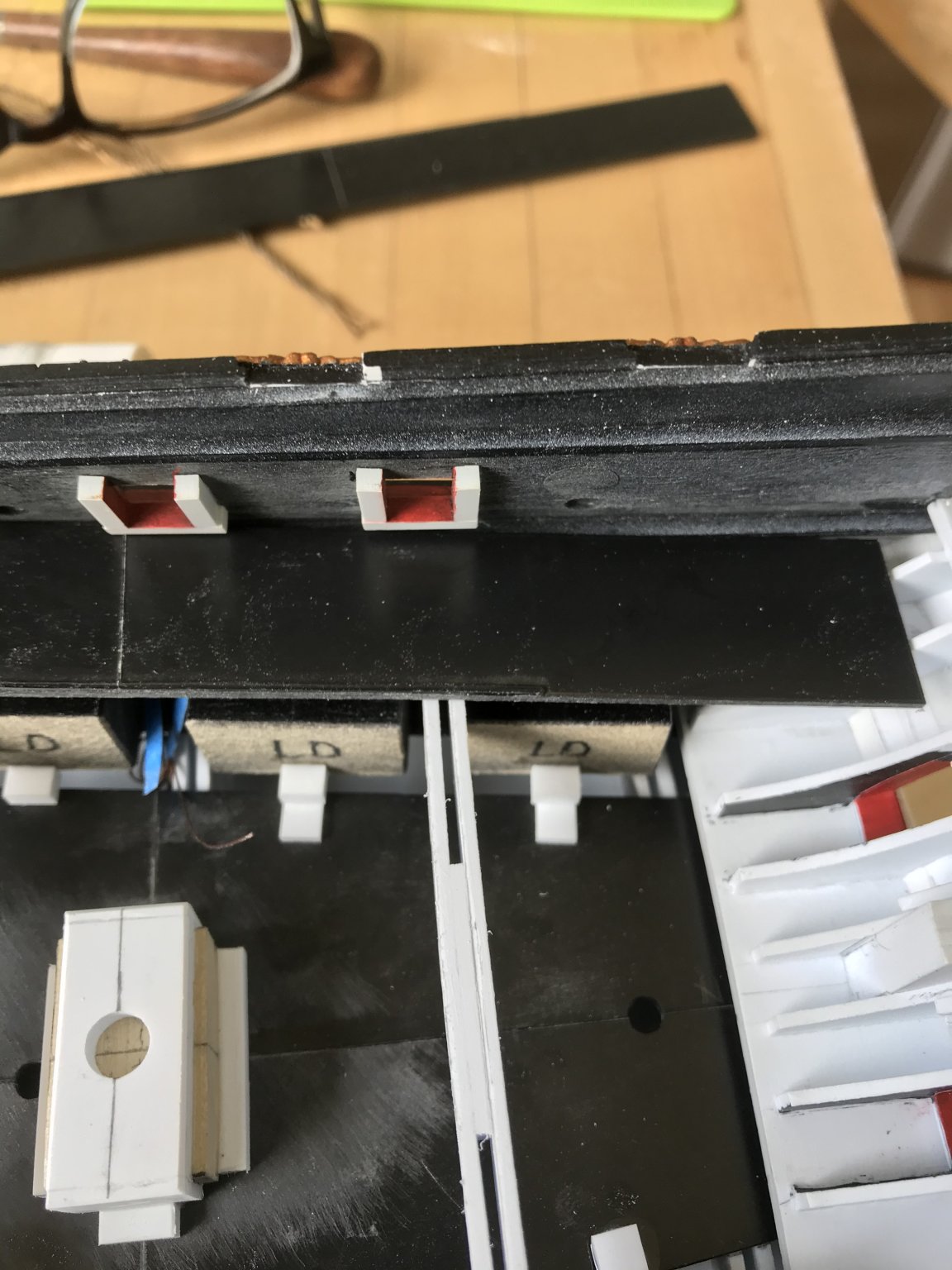
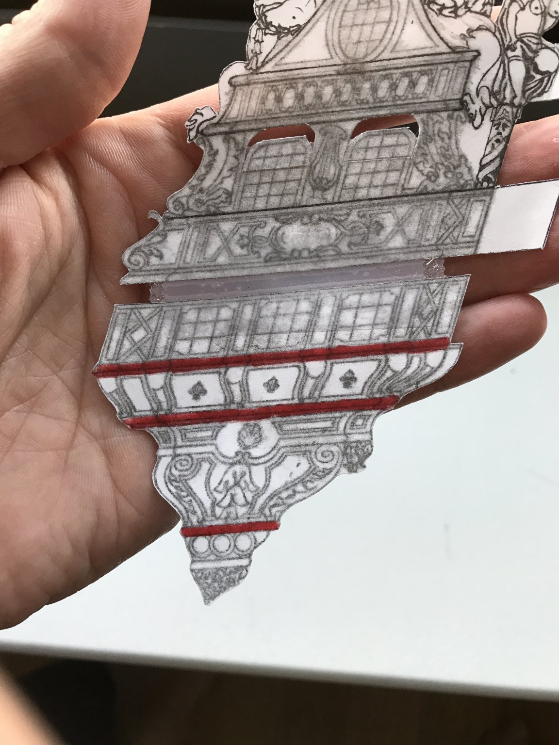
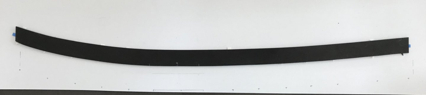
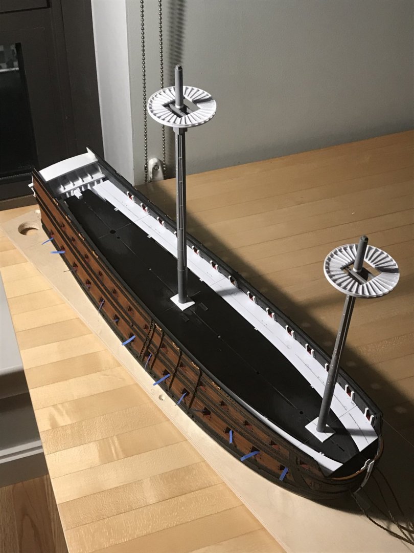
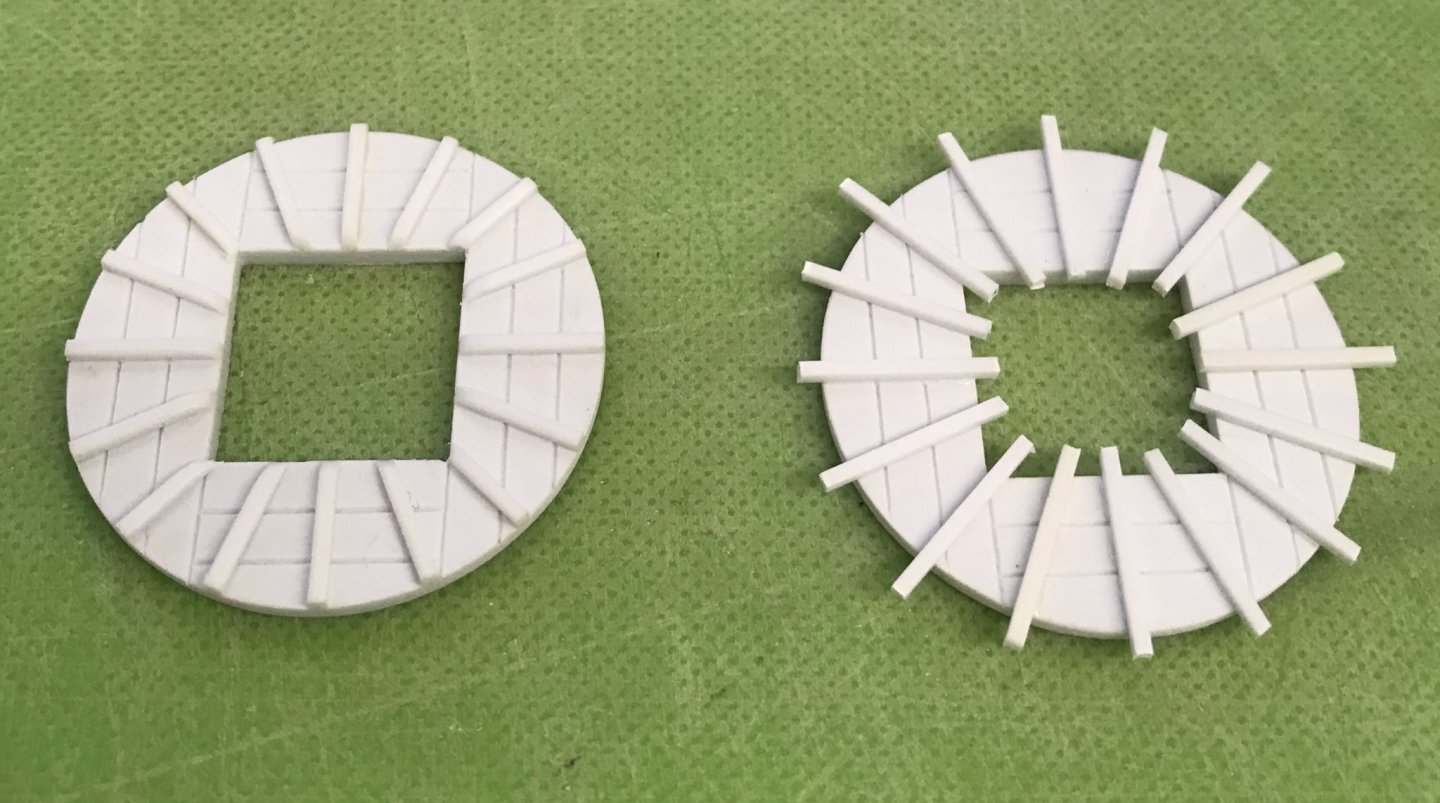
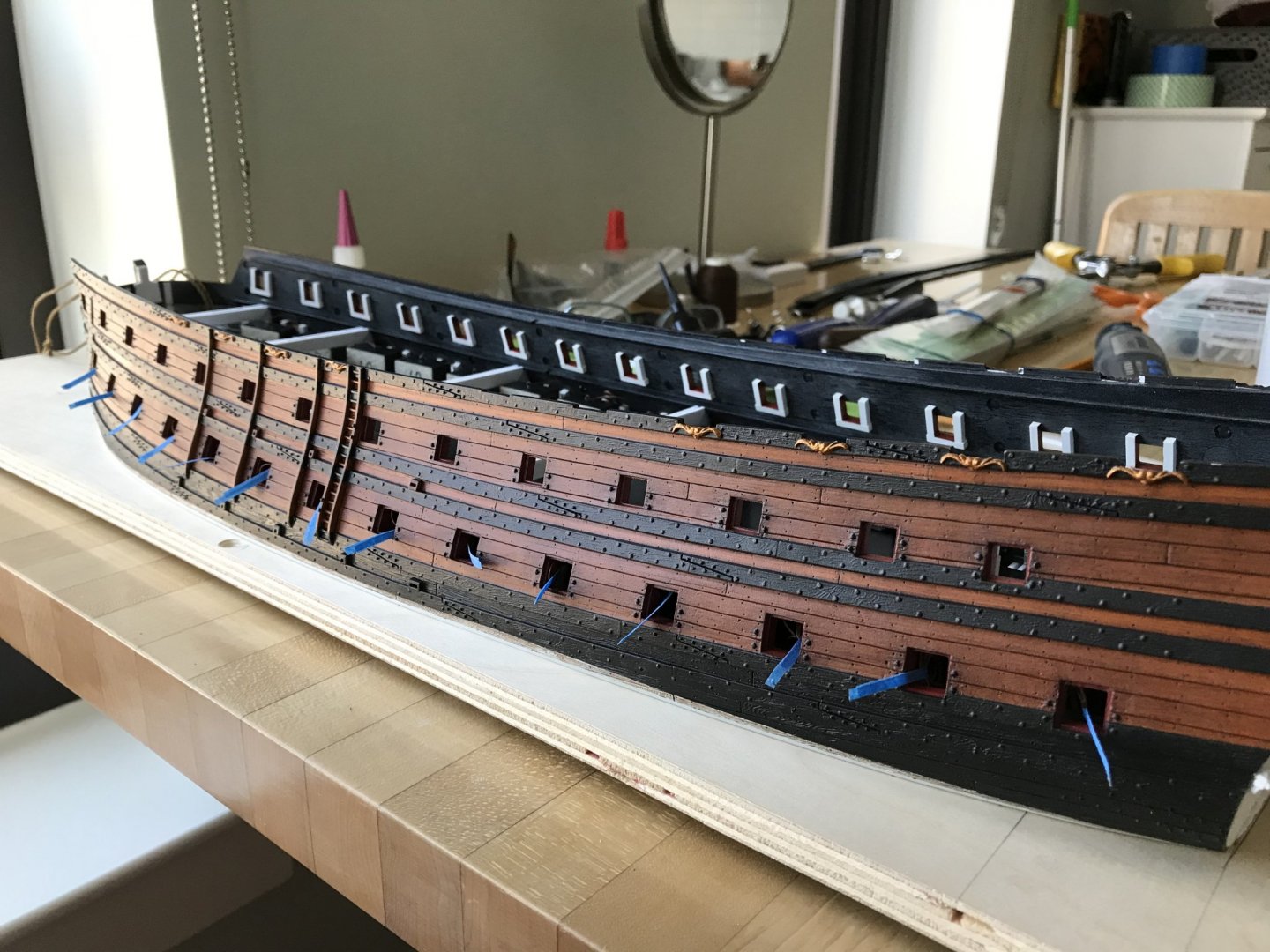
Well, since my return to work, the pace of work has slowed, but I have still managed to make good progress. This evening, I completed the lower gun deck. Typical of my approach to this build - because I want it to remain fully intact over the next six or seven construction years (hopefully shorter😉) - I have over-engineered everything. Once all of the dummy carriage blocks were in place, I decided to add backing blocks for a little extra connection/insurance, so that when I glue in the gun barrels, at the end of the project, I won’t loosen the dummy carriage blocks: It’s total overkill considering the grip this particular cyano seems to have, but it makes me feel better. Likewise the fore and mizzen mast steps, which raise each mast 1/2” respectively, are over-engineered to insure that if the mechanical cyano bond fails, then the welded plastic collar will keep the mast footing in place. Once all of that was settled, I could fit and secure the middle deck “beams”: I faired their top surfaces, this morning, which enables me to begin the whole process all over again, with the middle deck. Interestingly, though, I discovered just how much the hull flattened out, when I cut away the bottom, below the waterline. Roughly, along the waist, there’s a good 8”, or so, where the scribe is tight: Splitting the difference, fore and aft though, it’s a different story: These gaps are too much to scribe without foreshortening the waist depth (of these dummy carriage platforms) so much, that I have to create all kinds of additional carriage support. I think my better bet is to make these carriage platforms from scratch, out of 1/16” white styrene. This way, I can still use the kit center deck sections, while adding back some of the gap space to the carriage platforms. This will enable me to place the carriages so that they don’t necessarily require as much out-rigger/backstop support. Thanks to my good friend and mentor, Dan Pariser, I now have anchor cable, which I seized this morning: I’m waiting for the grey acrylic I applied to the inside of the hawse holes to really cure before threading the hawsers. Thank you so much, Dan! These cables look really great and they are just the right scale. Here’s a broadside view with all of my tapetags pulled through the ports, so that it will be easier to retrieve the port-lid laniards: In other works, I made up the stock kit mizzen mast, which I reinforced with a straightened piece of wire coat-hanger. I did also try to turn a wooden mizzen in the chuck of my drill, but the first attempt was not satisfactory. I’ll have to learn how better to do this because all masts and spars above this level will be made from wood. I also got busy, as a small-work project, making the sprit-mast, foremast, and mizzen tops. Here are the sprit and mizzen tops, which are the same size; I have yet to attach the top banding: As a frame of reference, I found that Lemineur’s masting and rigging plan of the St. Philippe in 1:96 is an excellent corollary to what I am trying to achieve, proportionally. Going forward, as I did with the new top diameters, this will be my guide for proportioning the topmasts and t’gallants. Here’s a shot of the side work, in process: You can really get a sense of the increased scale of the new tops, here. Lastly, I’ve begun preparing stock for the lower half of the quarter galleries: These are ready for my next shop opportunity to profile them on the bandsaw. I still am not sure what the material is. At one of our club meetings, Dan was divesting himself of various odds and ends in his shop, when he gave me this stick of wood. It has virtually no grain, a light yellow color (which I thought was oxidation, but remained so after milling), is lightweight, but fairly hard. I think/hope it will shape well and hold fine detail. We will see. I will save any advanced description of my process for making the quarter galleries, until I am actually doing it. Suffice it to say for now, though, that these carved lifts will be sandwiched between moulding strakes of white styrene, that will define the shape and projection of the QGs at each level. The moulding strakes are highlighted, here, in red: As ever - thank you for your interest and for looking in. Stay safe, sane and healthy, everyone!


- 2,699 replies
-
- 13
-
-
- heller
- soleil royal
- (and 9 more)
-
HMS VICTORY 1765 by albert - 1/48
Hubac's Historian replied to albert's topic in - Build logs for subjects built 1751 - 1800
Spectacular progress - very nice framing! I watch your build with great interest, as I consider converting Heller’s Victory to this 1765 appearance - way down the road. You are doing a fabulous job, so far. -
Yes, it truly is mind-boggling. In 2003, when I was standing in the guts of the Provincien, at Batavia Werf, it was almost incomprehensible to me how tall the stern rose above the keel. The counter timber was gigantic! You are really doing an incredible job, here, Mark. It’s fascinating to me, the questions that arise as one works through their process. And, as you say, it is astounding the complicated geometry that these shipwrights could render with their trained eyes and hands.
-
At the 3:11 mark, of the following video, the narrator is showing how Victory’s tiller operates, on the actual ship. Shortly after that point, you can see the tiller’s entry into the ship, and the same curved beam that you have fashioned, just beneath the entry point:
-
I love how the lighting turned out, EJ. What a magnificent job you have done by making all of the carvings yourself!