Hubac's Historian
-
Posts
3,309 -
Joined
-
Last visited
Content Type
Profiles
Forums
Gallery
Events
Everything posted by Hubac's Historian
-
 I just took a look at the expanded view because I couldn’t remember if this conjectural ship from the Album was drawn as a true three-decker of a two-decker. It’s a three-decker. That would place the pilot on the middle deck, actually, and the slot in the main deck.
- 2,699 replies
-
- 3
-

-
- heller
- soleil royal
- (and 9 more)
-
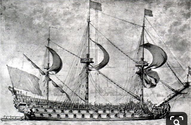
Chapman, this drawing from the Album, to my mind, definitively affirms the presence of the slot. And, yet, there are a few curious things about the drawing. First - although the rowle is shown on the deck plan view, it does not appear to be represented in the cut-away view. Second - the slot railings would seem to eliminate the possibility that the pilot stands on the main deck, and in any case the whip-staff isn’t drawn as projecting high enough above the railing for anyone to work it. So, that would seem to place the pilot on the lower deck, and facing a bulkhead that walls-off the mizzen mast - far from the action and command. It is puzzling given that these drawings are supposed to be a literal representation of how a French ship was constructed in the 1680s. Mark, you are right about the Lemineur plans. The St. Philippe monograph is a stunning piece of work, but there are numerous inconsistencies and puzzling details that often don’t appear to make practical sense. I joined the Ships of Scale site to watch one modeler, Nigel Brooke, build the S.P., according to the monograph. It’s early yet, in his build, but he’s making a spectacular job of it. His build-log is particularly insightful, concerning the vagaries of interpreting the plans, so that he can correctly loft his frames. Nigel is exceedingly sharp, but he has had to do an incredible amount of mental gymnastics to get to where he is now with the build. The model is absolutely worth the look: https://shipsofscale.com/sosforums/threads/saint-philippe-1693-pof-to-the-monograph-by-jean-claude-lemineur-by-nmbrook-1-36.3066/
- 2,699 replies
-
- 3
-
-
- heller
- soleil royal
- (and 9 more)
-
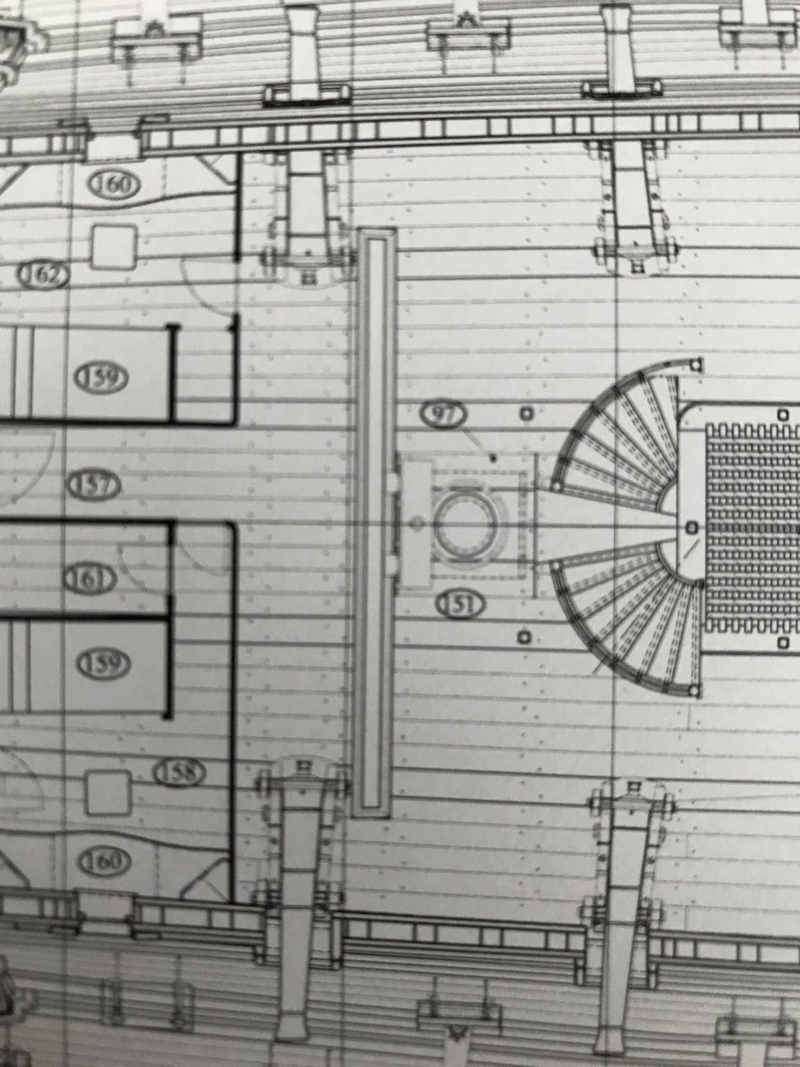
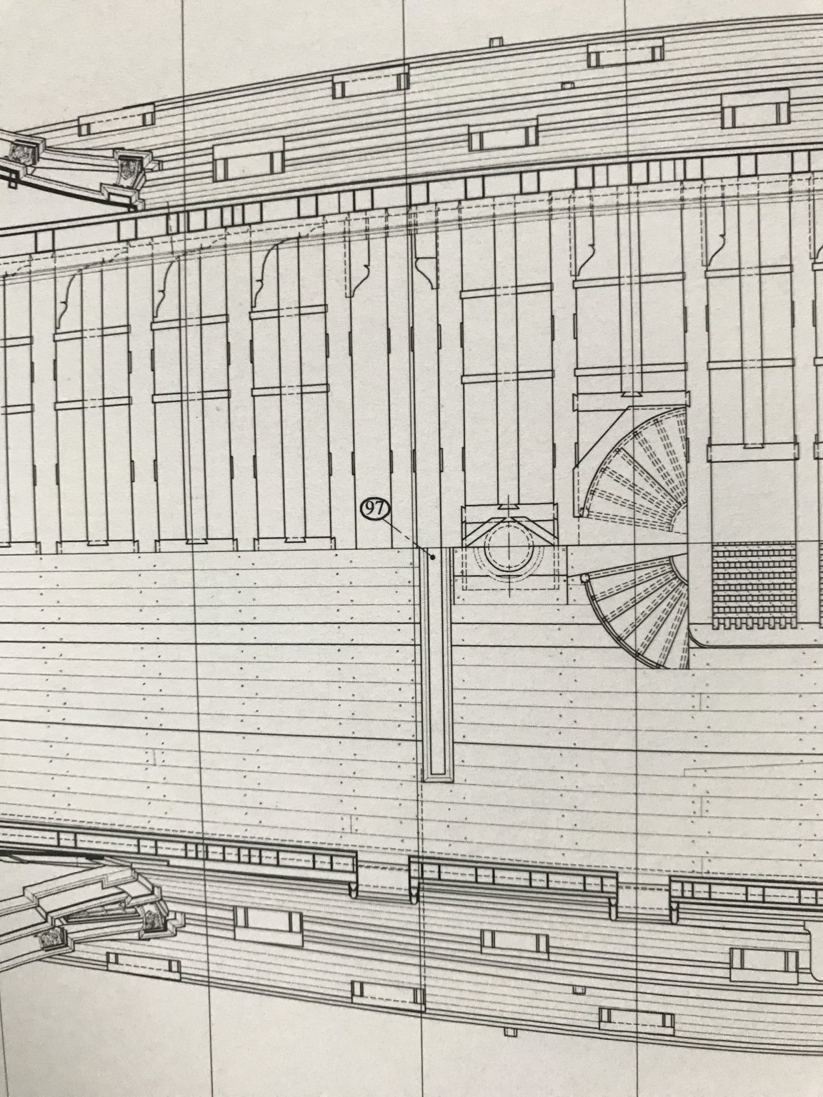
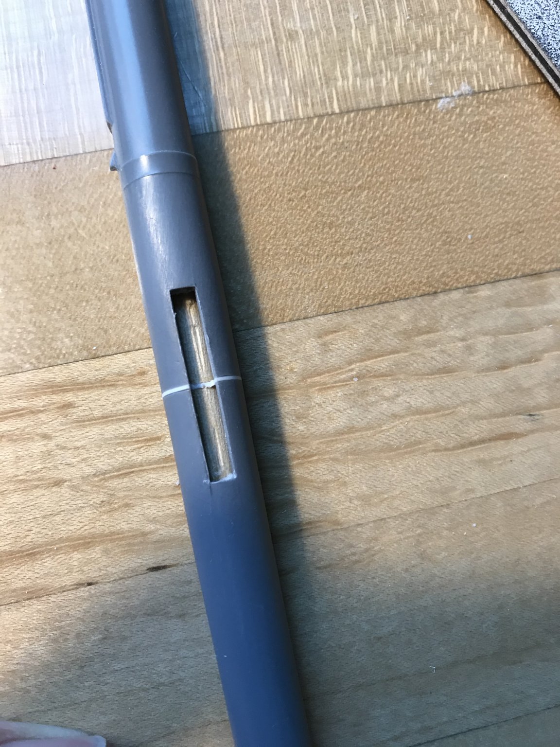
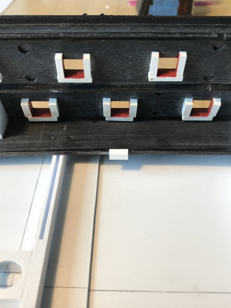
Jan, I think you have keyed-in on something fundamental to this discussion: the schaarstokken, or as I think they are called in English - the King Planks(?). These longitudinal stiffeners - because they are mortised into the deck beams - would compensate for the presence of the slot. Nonetheless, Leminuer’s drawing shows the slot crossing both pairs of King Planks, but that does not, in itself, invalidate your argument. Certainly, for all practical purposes, the slot must cross the first pair, closest to the centerline of the deck. However, given the down and over mechanics of steering hard to either port or starboard - is it really necessary for the slot to be so wide that it crosses the second pair of King Planks? Considering, also, that the guns would recoil into a slot this wide, and I think there is an argument to be made for a drawing error, in this instance.
- 2,699 replies
-
- 4
-
-
- heller
- soleil royal
- (and 9 more)
-
Dorf hits the high seas! Face first😂 Could be, Druxey. Makes sense.
- 2,699 replies
-
- 1
-
-
- heller
- soleil royal
- (and 9 more)
-
My issue with this is that the tiller man, the pilot, on the three-decker is standing on the middle deck, in this scenario, and that much further from the chain of command. There’s a lot of superstructure above him on Soleil Royal, with no view of anything but the mizzen mast and the guns to either side of him. And I’m sorry to disagree, but the pilot will have more leverage to push down through the yoke, the fulcrum, and to either side if he’s standing at the end of the whip-staff, as opposed to closer at the base. The length of the whip-staff counts too. In all fairness, this discussion of mechanical advantage heads straight towards why ship steering transitioned from the whip-staff to the wheel; as ship sheer reduced into the 18th C., the wheel system provided greater mechanical advantage with every rope turn around the drum.
- 2,699 replies
-
- 4
-
-
- heller
- soleil royal
- (and 9 more)
-
Hey Dan, Your points are well received, here. The Goodwin drawings, as well as the contemporary French drawing, is of a two deck ship, but our discussion pertains to three deckers: I wonder whether the extra deck of separation (the middle deck) wouldn’t provide the extra leverage that would make steering such a large ship much easier, particularly in a heavy seaway. Admittedly, it is less than ideal to interrupt the deck planking, at the main deck level. I wonder, though, whether the external wales, the internal riders, and all of the internal supporting knees mitigate this loss in rigidity.
- 2,699 replies
-
- 2
-
-
- heller
- soleil royal
- (and 9 more)
-
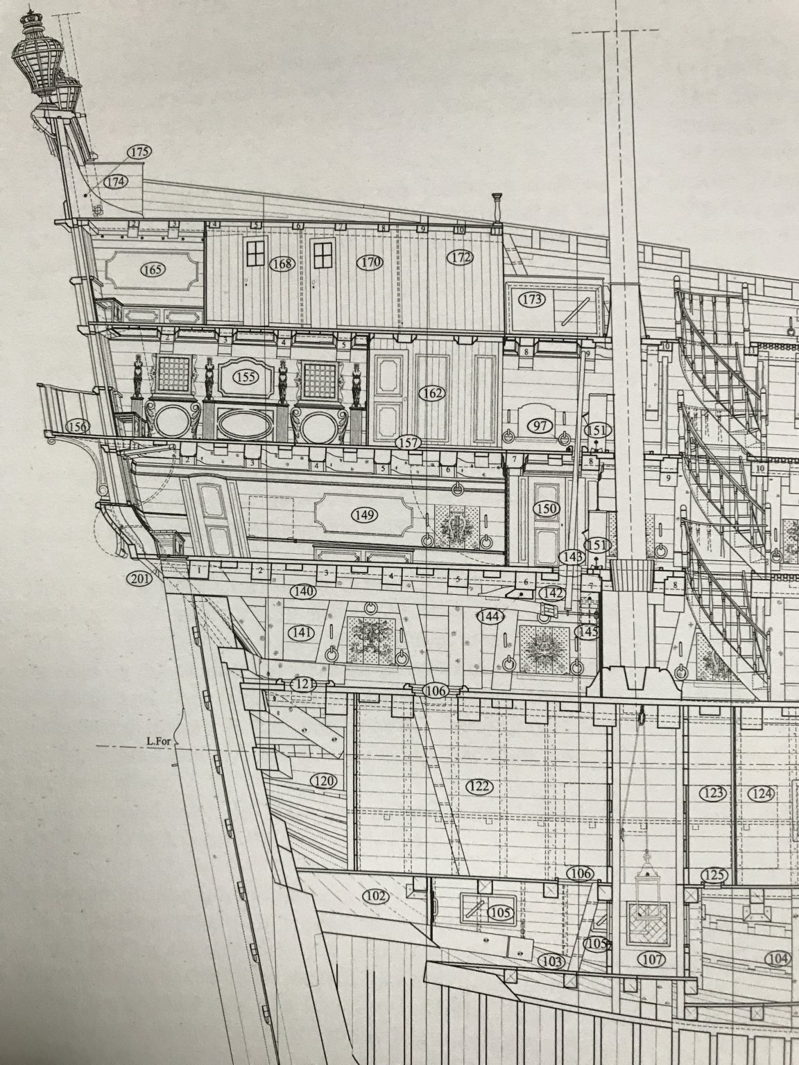
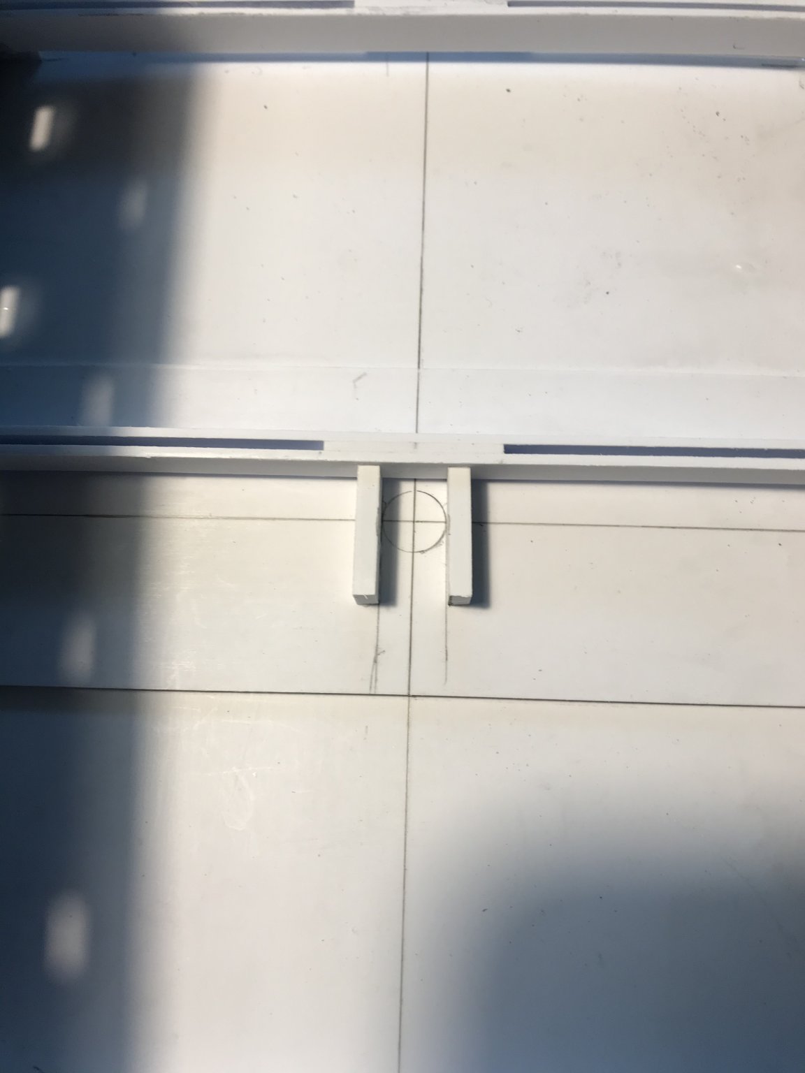
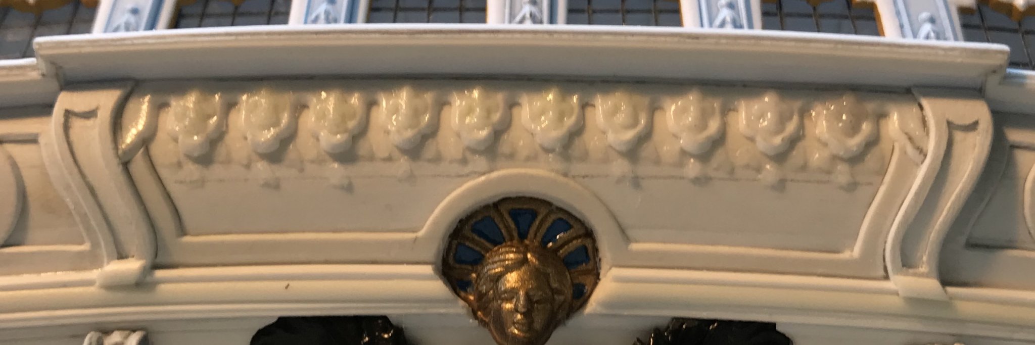
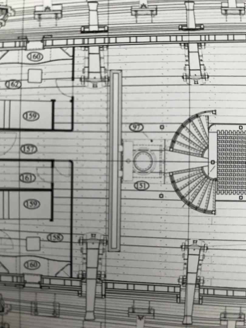
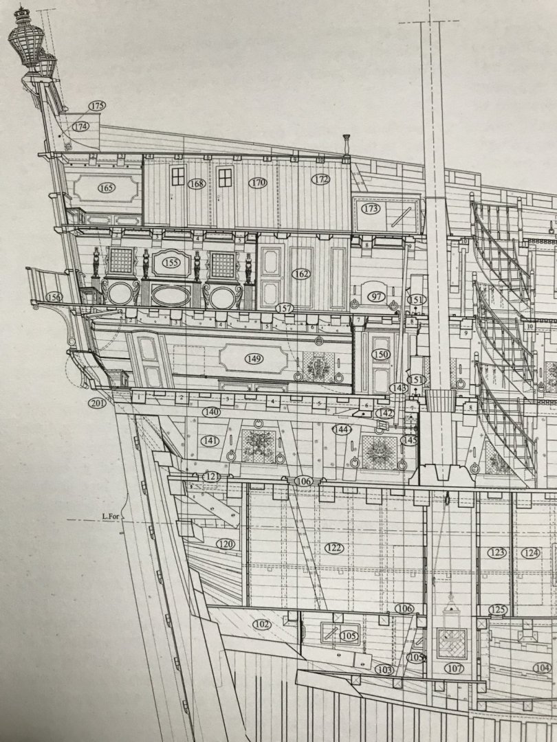
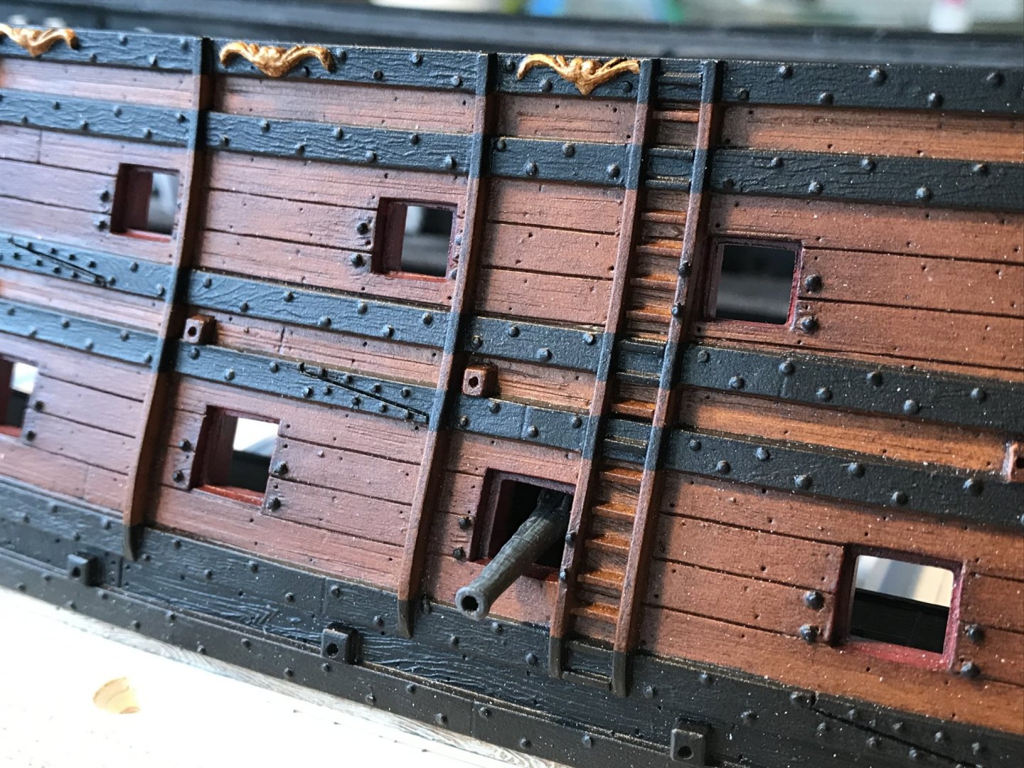
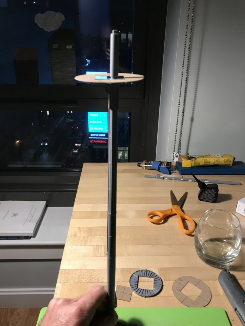
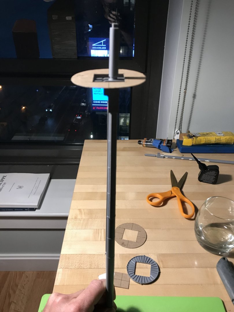
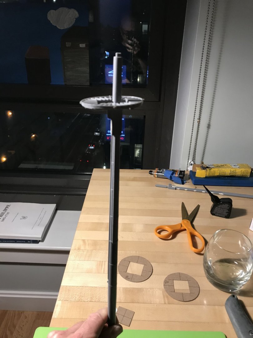
Hello Papsa, With regard to the tiller/whip-staff arrangement, here is what Mr. Lemineur drew for the St. Philippe: Tiller entry is on the lower gun deck. The whip-staff passes through the yoke, in the middle deck, and then through a slot on the main deck - all just aft of the mizzen mast. The whip-staff slot is numbered 97, in the main deck drawing above. There does not appear to be any visual accommodation for the tiller man, through the quarter deck. It seems that commands to the tiller man would be shouted down, through the aft companionway, just forward of the mizzen mast. I know we are accustomed to seeing on reconstructions, like Batavia, a small “grill” at the quarter deck level that the tiller man could see and hear through. I, myself, have stood on the small bench platform on Batavia and peered put from this grill. For all intents and purposes, though, it is not as though the view afforded the tiller man, in this arrangement, would enable him to guide the ship through his own eyes. On a large ship like the S.P., or the S.R., as long as the highly specific commands could be heard, that would be sufficient. I also have to imagine that the view from the poop-royal deck would provide a sufficient vantage point to see all around the ship, while the bow, midship, and quarter watches would be communicating, aft, anything unusual in their view. Thank you, Druxey and EJ! It is nice to have some phase of this project moving along at a swift pace.

- 2,699 replies
-
- 4
-
-
- heller
- soleil royal
- (and 9 more)
-
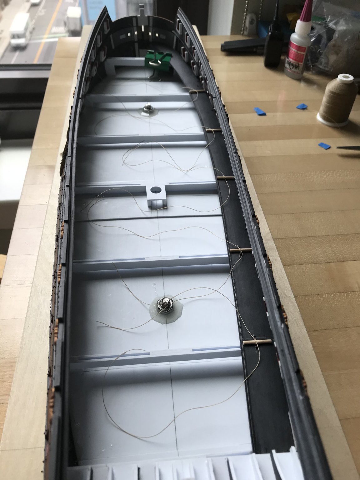
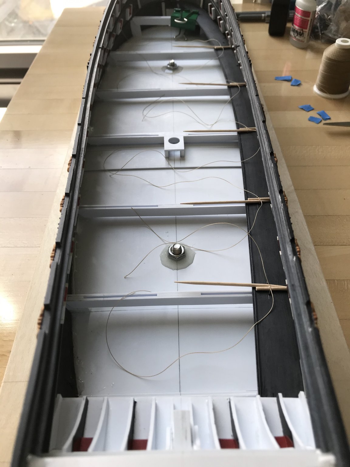
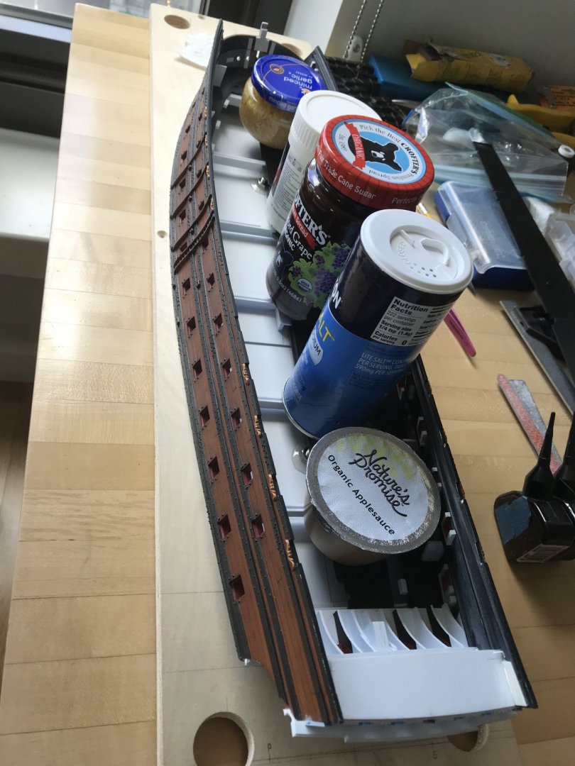
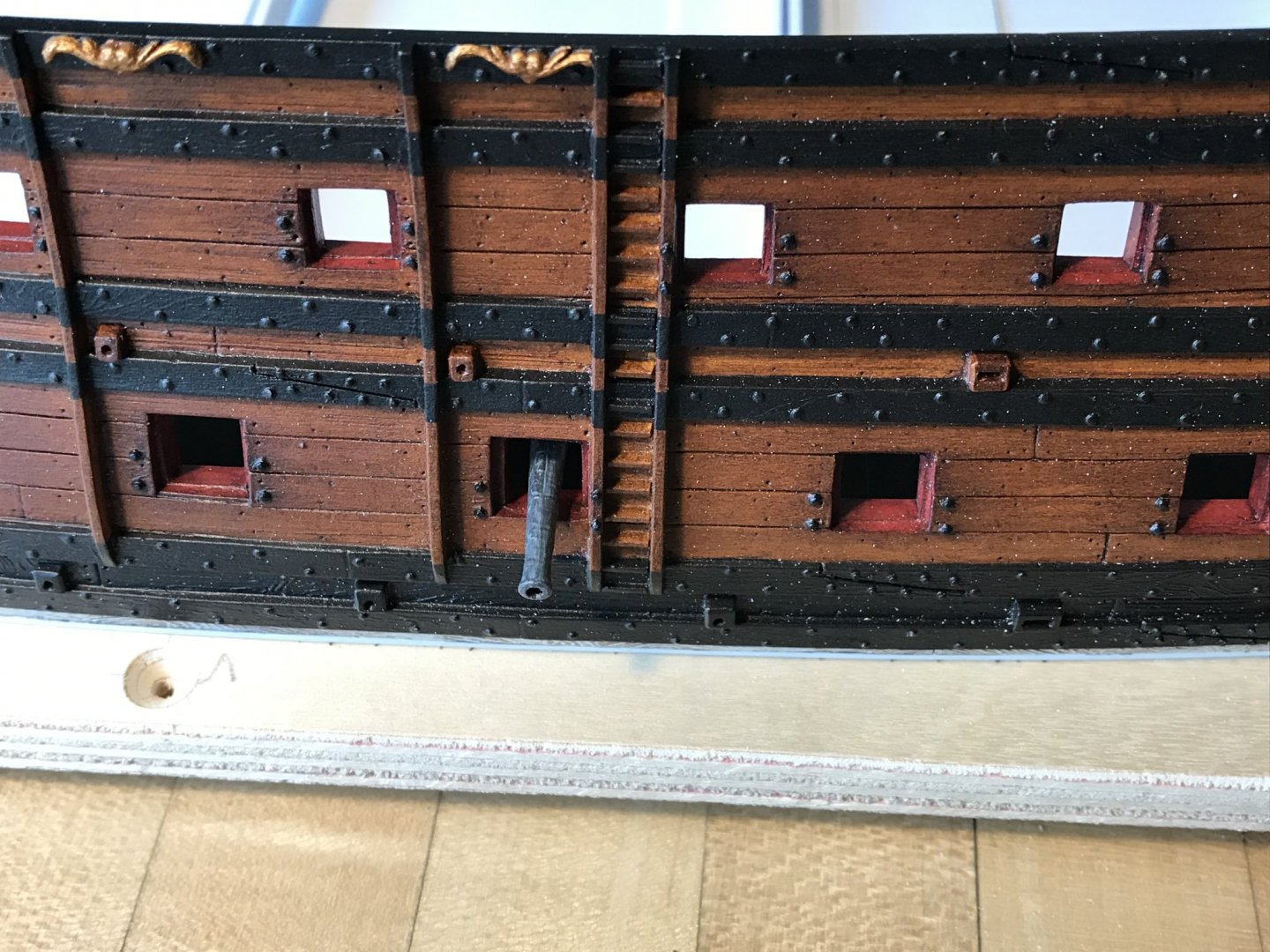
The wiring is actually the port lid lanyards, which I’ve secured to the top of each dummy block with a clove-hitch. I’ve coiled them up with blue tape for tidy keeping, until I pull them through the ports, at the very end of the build. As a matter of fact, I cook with the pink salt, but I keep this other stuff for mouth irritations and stove fires.
- 2,699 replies
-
- 3
-
-
- heller
- soleil royal
- (and 9 more)
-
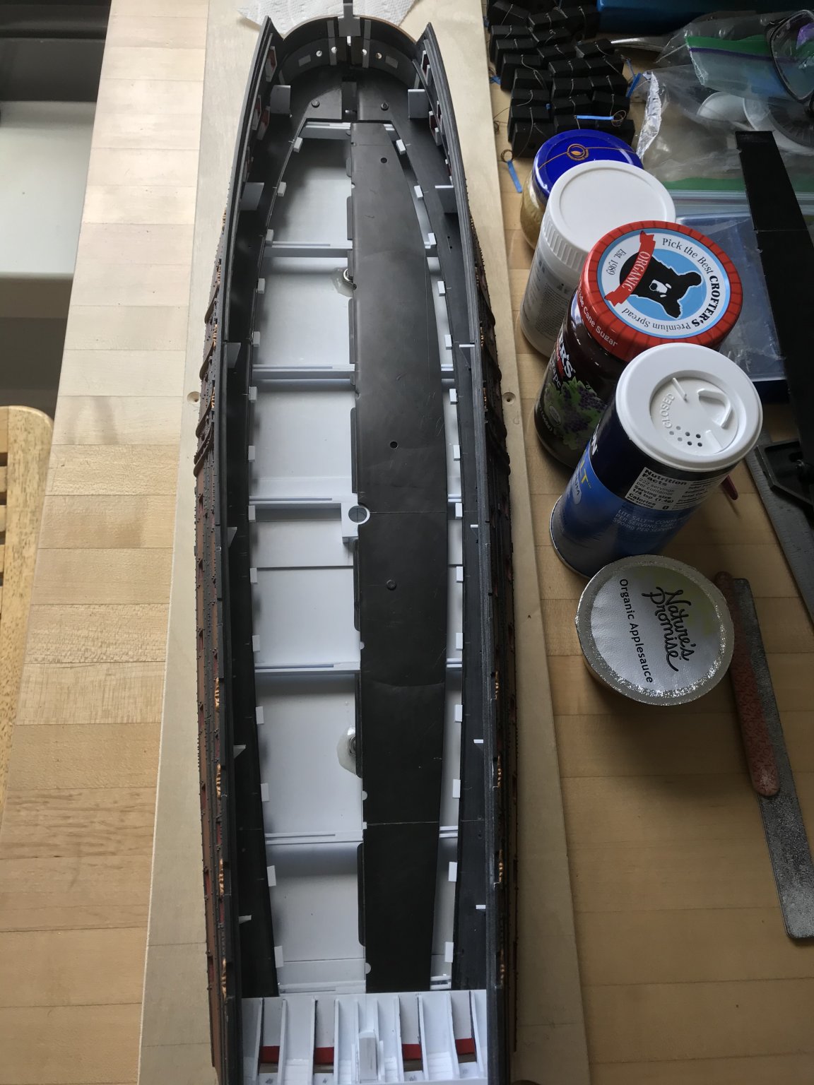
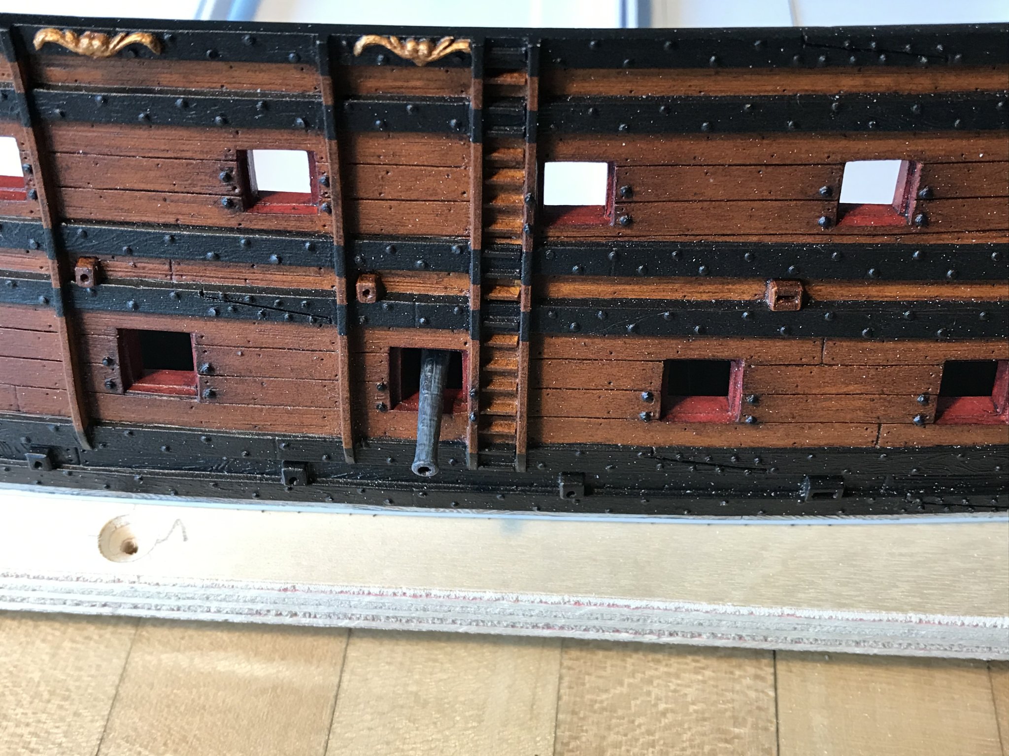
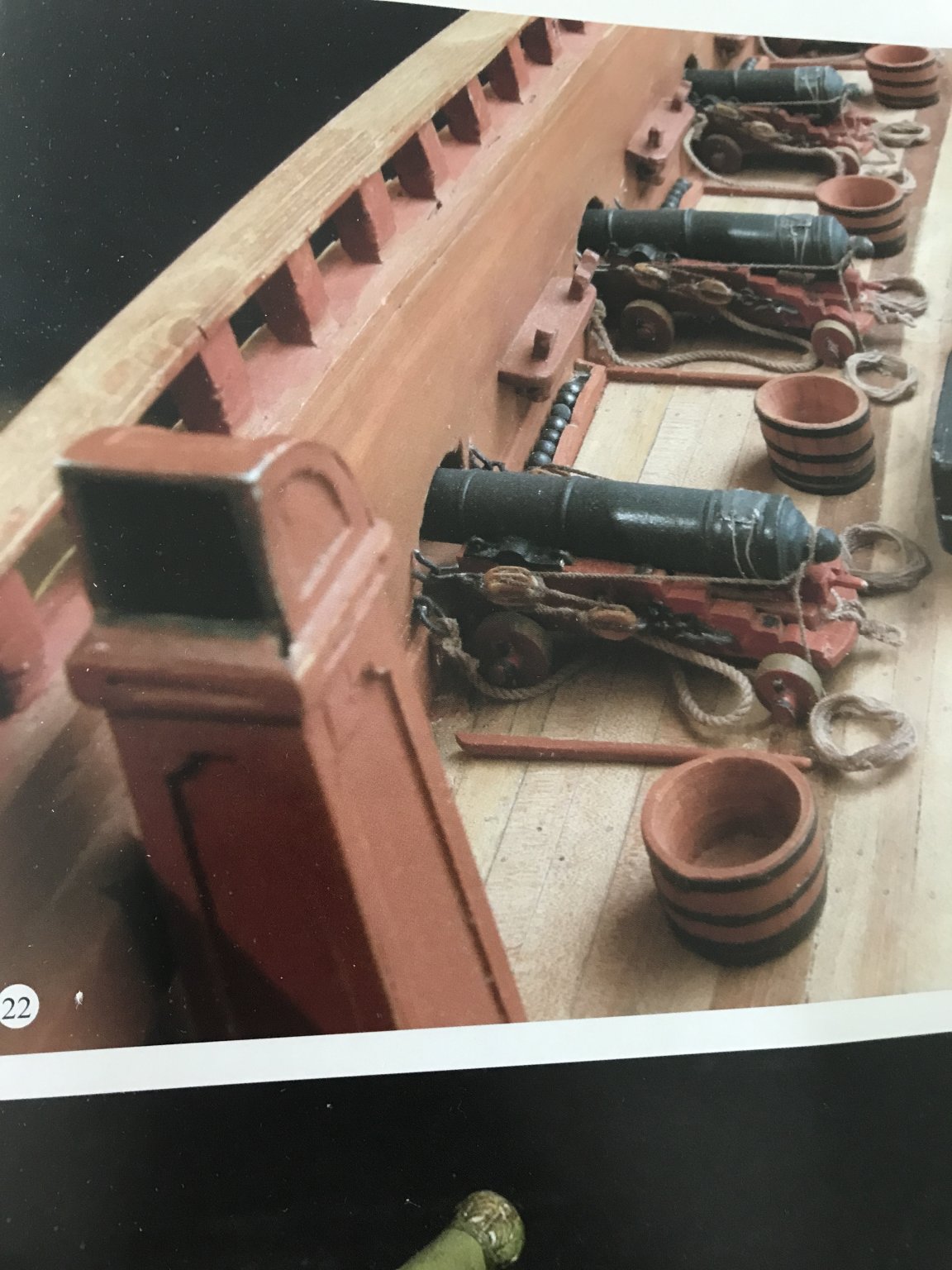
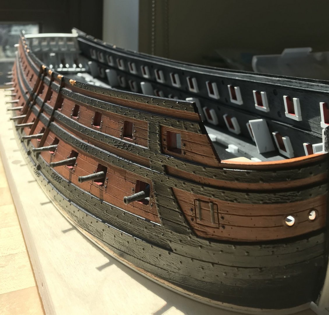
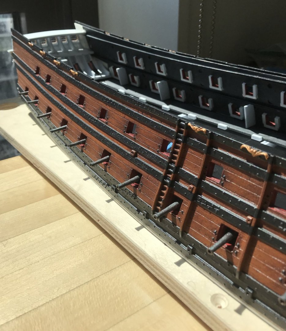
Good couple of days. I have all the lower decking installed, the cable mounts installed, and the starboard dummy carriages glued-in; the barrels are only temporarily placed to ensure they are centered on the port openings: You can clearly see, here, the impact of broadening the hull. The block, at center, is the foremast step (in progress), which will raise the height of the foremast proportionally with the main mast. Barrel projection is maybe a bit more than ideal, but it’s not markedly different than Frolich’s L’Ambiteaux: In any case, it’s a warship, and the artillery is supposed to feature prominently. I have a good cross-vent going, but I have to take a cyano break for a little while. Thank you for the likes, the interest, and for looking in.


- 2,699 replies
-
- 9
-
-
- heller
- soleil royal
- (and 9 more)
-
Thank you, MD and Victor. Well, as you know, I’m a huge fan of the Heller kit, and the main reason for that is that they were extremely attentive to re-creating Tanneron’s sculptural work. This is why I will go to some lengths to adapt as many of the large sculptural figures as I can. With the exception of Africa, whose entire posture has to be altered, I should be able to re-use them all. You made me think of another Heller prestige ship that was very finely moulded, and that was La Couronne, at 1:200. I used to own this kit as part of a large stash of un-built plastic kits. When I moved into my then girlfriend’s studio, before we married, I divested myself of all but the Airfix Prince and Vasa, which I deemed to be the best among the lot. I should have held onto La Couronne, though. This is another kit that would benefit tremendously from cutting away the lower hull, and building all of the deck furniture from scratch and to scale. The overhang of the stern counter is exaggerated, but it could be modified, somewhat. The upper bulwarks were gems, though. Aaaah, well - the things we sacrifice for love!
- 2,699 replies
-
- 7
-
-
- heller
- soleil royal
- (and 9 more)
-
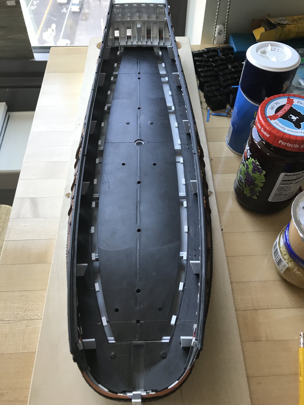
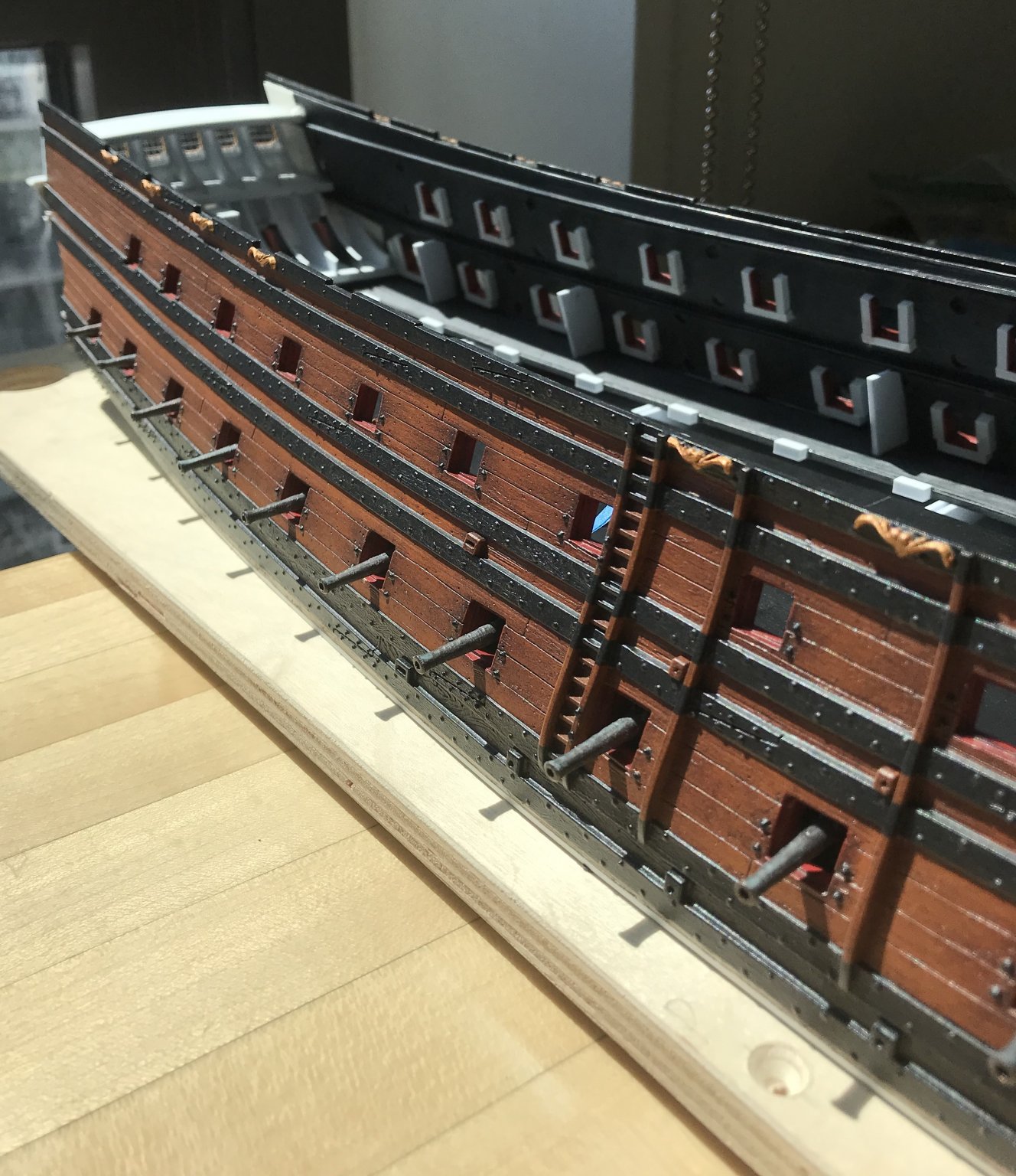
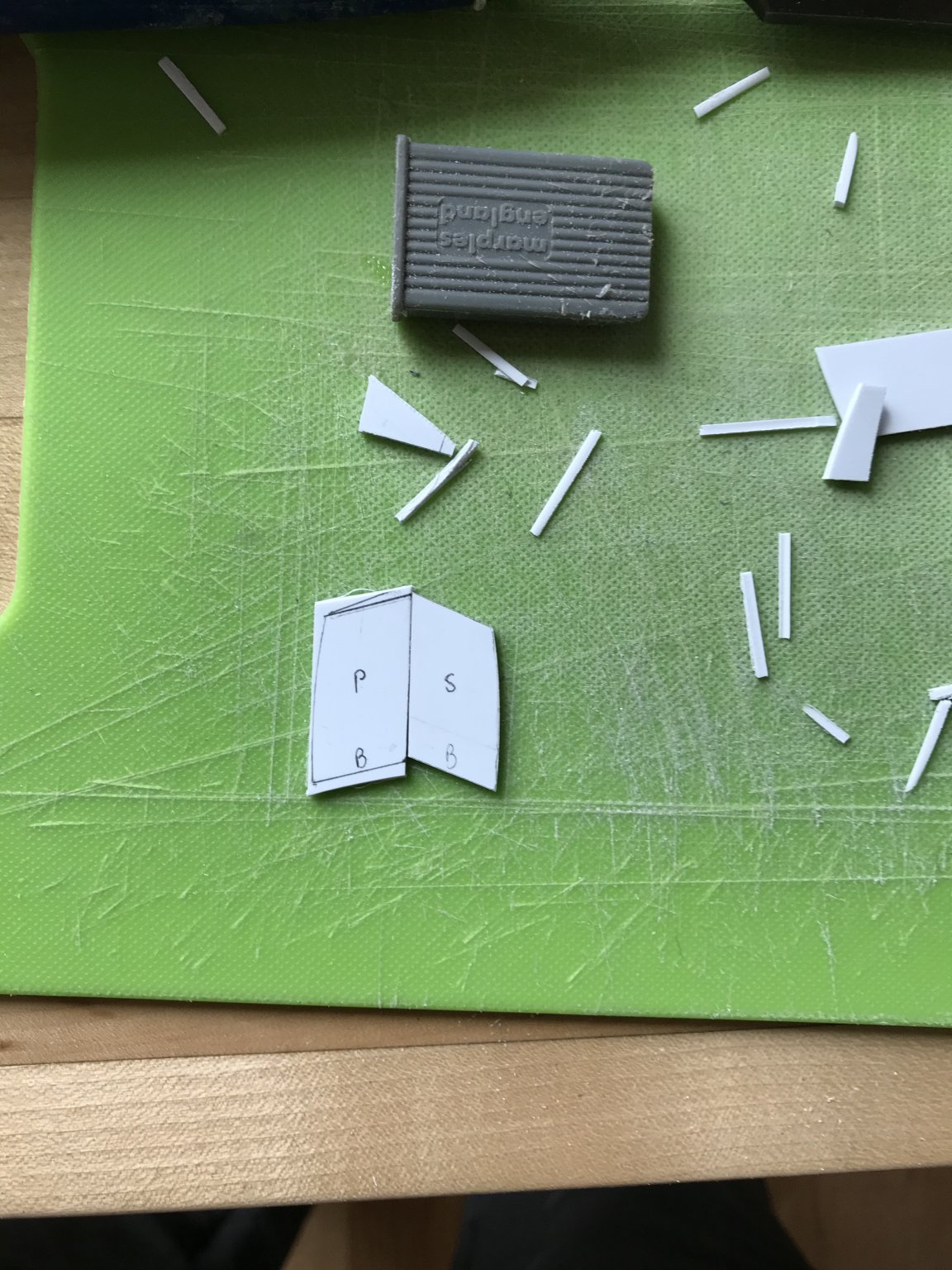
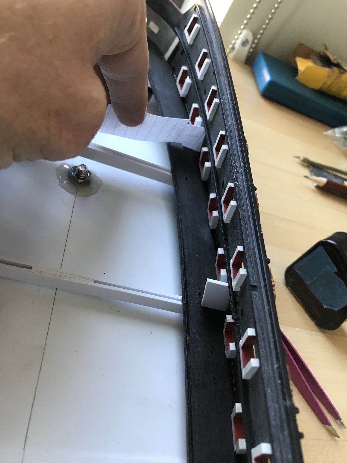
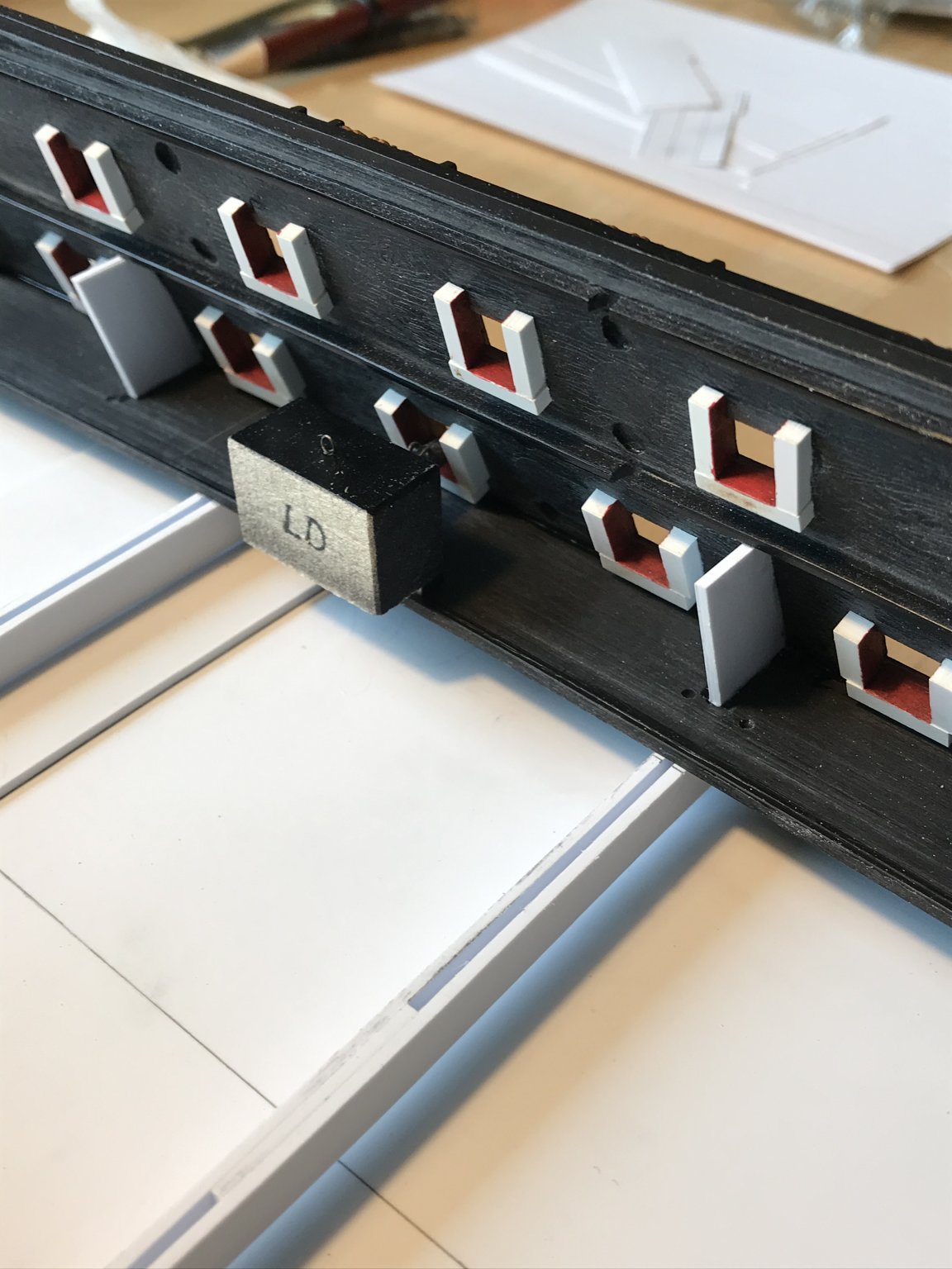
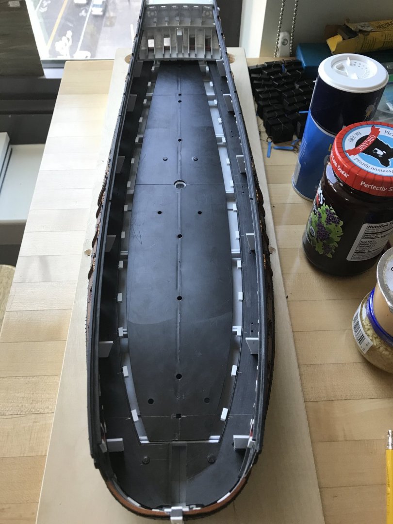
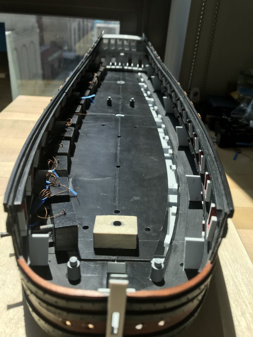
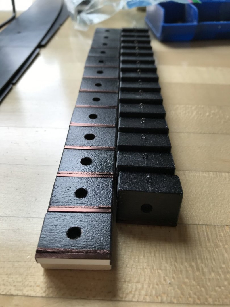
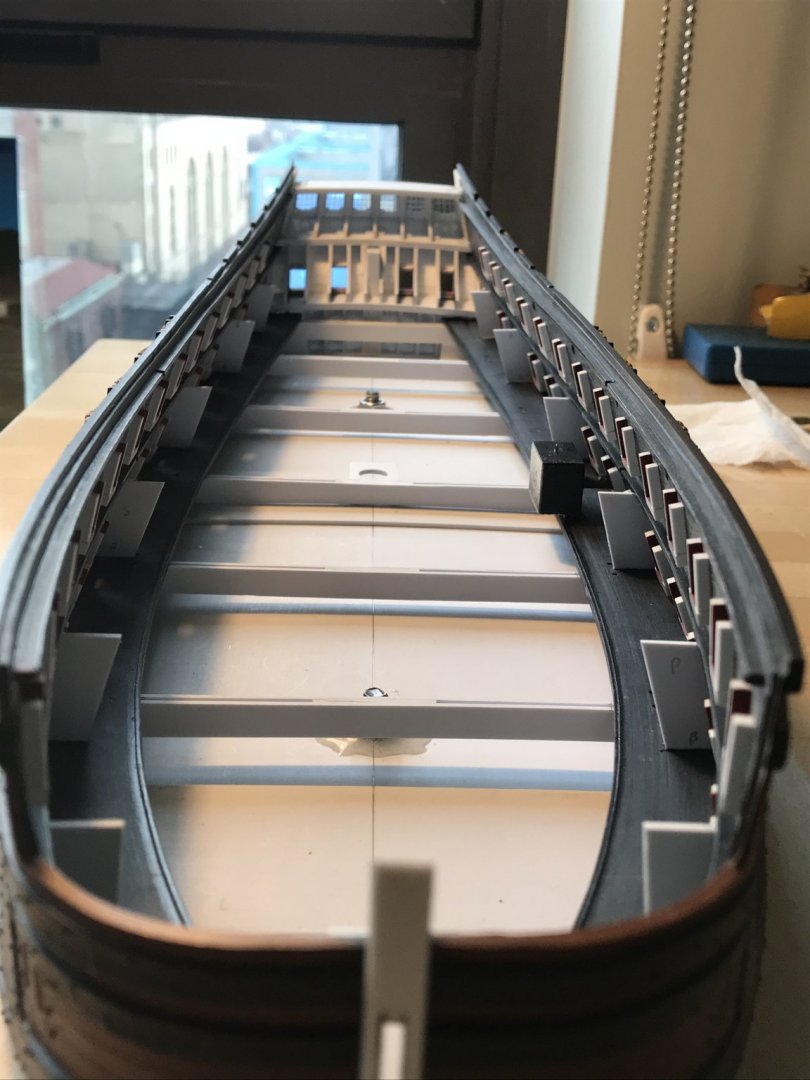
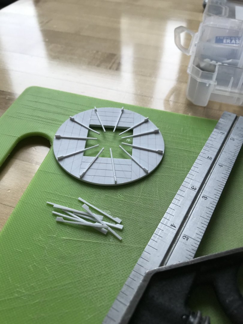
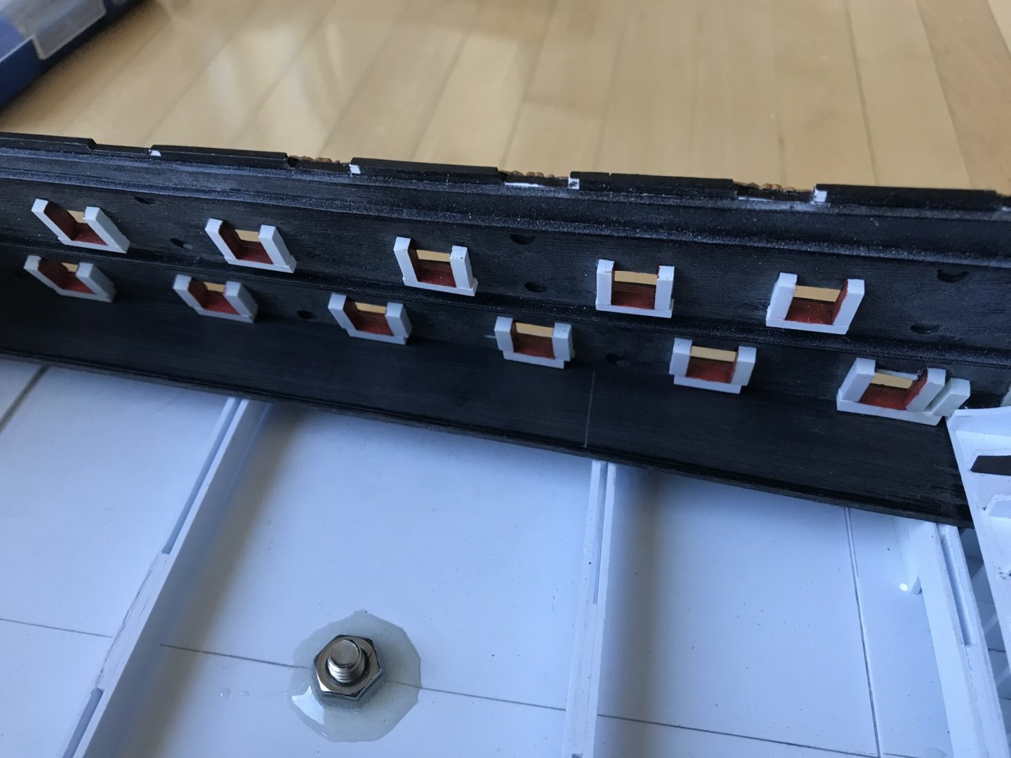
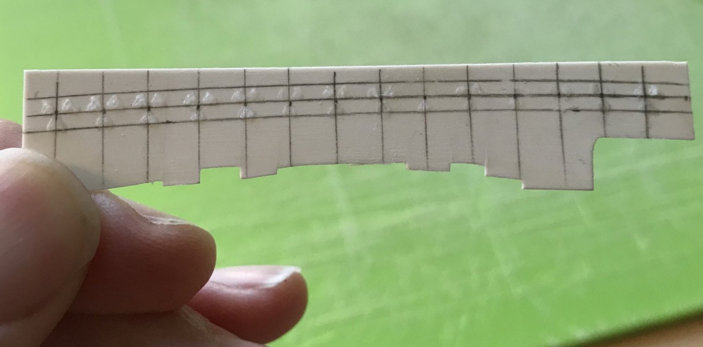
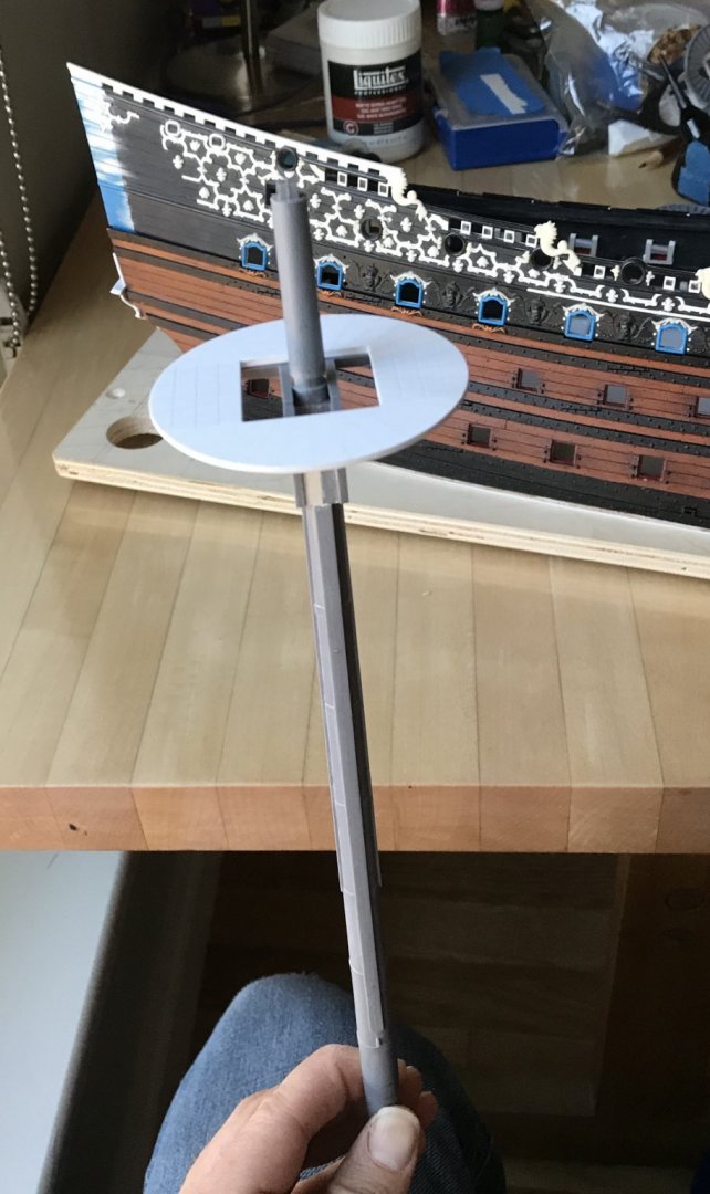
It is refreshing, periodically, to shift between the intensive ornamental aspects of the build, and the more constructive bones of the project. I enjoy the ornamental work very much, but it is fatiguing. So, I’ve been fitting-out the lower gun deck. The first order of business was to scribe and secure the side platforms that will support the dummy carriages. Clamping these to my “beams” was tricky because clearance between beam and plinth base is very limited. I could get a binder clip on, near the hawse holes, but I needed to develop a system for the rest of the way. Since none of this will be visible, I decided to drill holes on each side of each beam, through which I could thread ties that I could pull taught over a short length of toothpick (temporarily secured with double-stick tape), and then fix down tight with a drop of cyano: This worked beautifully. I then found that I could increase clamping pressure by wedging the end of a second toothpick into the tie-loop: Once the liquid plastic adhesive had cured, I knew that I had solid connection all along the length of the hull. Next, I wanted to scribe and secure the vertical gussets to which the middle deck “beams” will be secured. I was careful to space them so that they did not interfere with the lower masts. Simple templates were cut from index cards, and with only slight adjustments one template could produce gussets for that location, on both sides: This has become a pretty straight-forward framing exercise that I’ve gotten to be pretty efficient at. Here is the full run of gussets in place: Finally, I wanted to get a sense for where my dummy carriages needed to be placed, in order to have the right amount of gun barrel poking out the side of the hull. Here is where I discovered a few issues that I did not properly anticipate. First of all, my early estimate of the gun platform decking thickness, combined with the height of the gunport sills above the decking, was off. So much so, in fact, that a barrel inserted into a dummy carriage was resting on the sill. I drilled the holes too low. Okay, no problem; I simply shimmed each dummy carriage with a length of 1/16” styrene. In the following picture, you can see these shims (on the left row), which I’ve blacked out with permanent marker, as well as the annealed wire eyelets I made for the port lid laniards: The other little surprise that I failed to calculate was the sheer length of the lower deck gun barrels, after cutting off the cascabels. My Initial plan was to butt my blocks up against the slight raised lip of the carriage decking, and that would determine the outboard projection of the gun barrels. The trouble is that would place the trunnions (which had been shaved off) and the dolphin handles outside the hull! Instead, I discovered that I could place the dummy carriages a little further inboard, so that the new 1/16” shim butted up against the raised lip of the platform decking. This provided me with the extra real-estate I needed for a reasonable projection. I wanted, however, for there to be a little extra support for the carriage blocks, so I made small outrigger blocks that I’m in the process of gluing to the inboard edge of the carriage platform decking. There is a generous 1/4” gap between these outboard gun platforms and the inboard central decking that supports the masts. When it comes time to secure the dummy carriages, they will be cyano’d in-place to both the decking and the out-rigger blocks. While I won’t glue-in the gun barrels until the model is rigged and nearly complete, here are a few shots that show what that projection will look like: I think that my efforts to increase the breadth of the cannons provide a better sense of heft and scale than would otherwise be the case. So, that’s where the work is heading. I still have a fair amount of repetitive work to do before I can place the middle deck beams. I won’t get much beyond that, though, because I need to buy some appropriate anchor cabling from Syren, and it may be a while before Chuck is filling orders again. Anyway, if I get stuck, I’ll turn my attention to constructing the quarter galleries from the lower finishing, on up. Thank you all for checking in on me, and your well-wishes during my recovery. I’ve had some relapse of symptoms - which is apparently common - but nothing concerning. I’m going to be just fine. Until next time, stay well and close to your loved ones.


- 2,699 replies
-
- 14
-
-
- heller
- soleil royal
- (and 9 more)
-
No you cant! 😂😉 Just a little quarantine humor. Thanks for checking in guys. More irresistible updates to follow..
- 2,699 replies
-
- 4
-
-
- heller
- soleil royal
- (and 9 more)
-
Guys, thank you all so much for your concern and well-wishes. Today is the fourth day since I started feeling sick, and I already feel pretty much myself; no more fever/sweats/chills, no more headaches/body aches, no more weird chafing skin sensations, no more sinus congestion. I still can’t smell anything, but if that’s the worst of it, then I am well ahead of the curve. I am extremely lucky! EJ, to answer your question, I will not be doing any special detailing or paint work on the interior. The gun mounting blocks are painted flat black and are wide enough to close off any view inside because there is a fair amount of structure supporting the middle and upper decks. You really can’t even see much around the main hatch gangway, as the double ladder takes up most of that space, and the grating openings are very small. I will probably have someone seated in one of the stern chase ports, and reaching out toward the trailing launch as supplies are passed up to him. Where I will spend some time is building out at least the facade of the galley stoves beneath the forecastle deck. And I will also represent the hanging knees that would still be visible under the overhang of the forecastle and quarter decks. It would be nice to trick out the whole thing, but my process and insistence on certain things is sloooooow. Nevertheless, I would like to finish this model, at some point. I’ll save all the bells and whistles for my true magnum opus. I was marveling, the other day, at Ab Hoving on Ships Of Scale, as he laid-out very straight-forwardly his card modeling process. This time, he’s building a Dutch mid-rate frigate while simultaneously building three or four others: https://shipsofscale.com/sosforums/threads/a-143-feet-long-dutch-warship-from-1681-cardstock.4634/#post-94667 Ab doesn’t seem to take it to quite the level of detailing as Doris, for example, but the ships he creates are fantastic looking. He starts with good and accurate lines that his research background helps him to ascertain, and then his process is very quick. He uses the same distressing protocol as Herbert Tomesan, and the finished result looks highly authentic. I’m happy with what I’m doing for a variety of reasons, but the speed of Mr. Hoving’s methods is very seductive.
- 2,699 replies
-
- 8
-
-
- heller
- soleil royal
- (and 9 more)
-
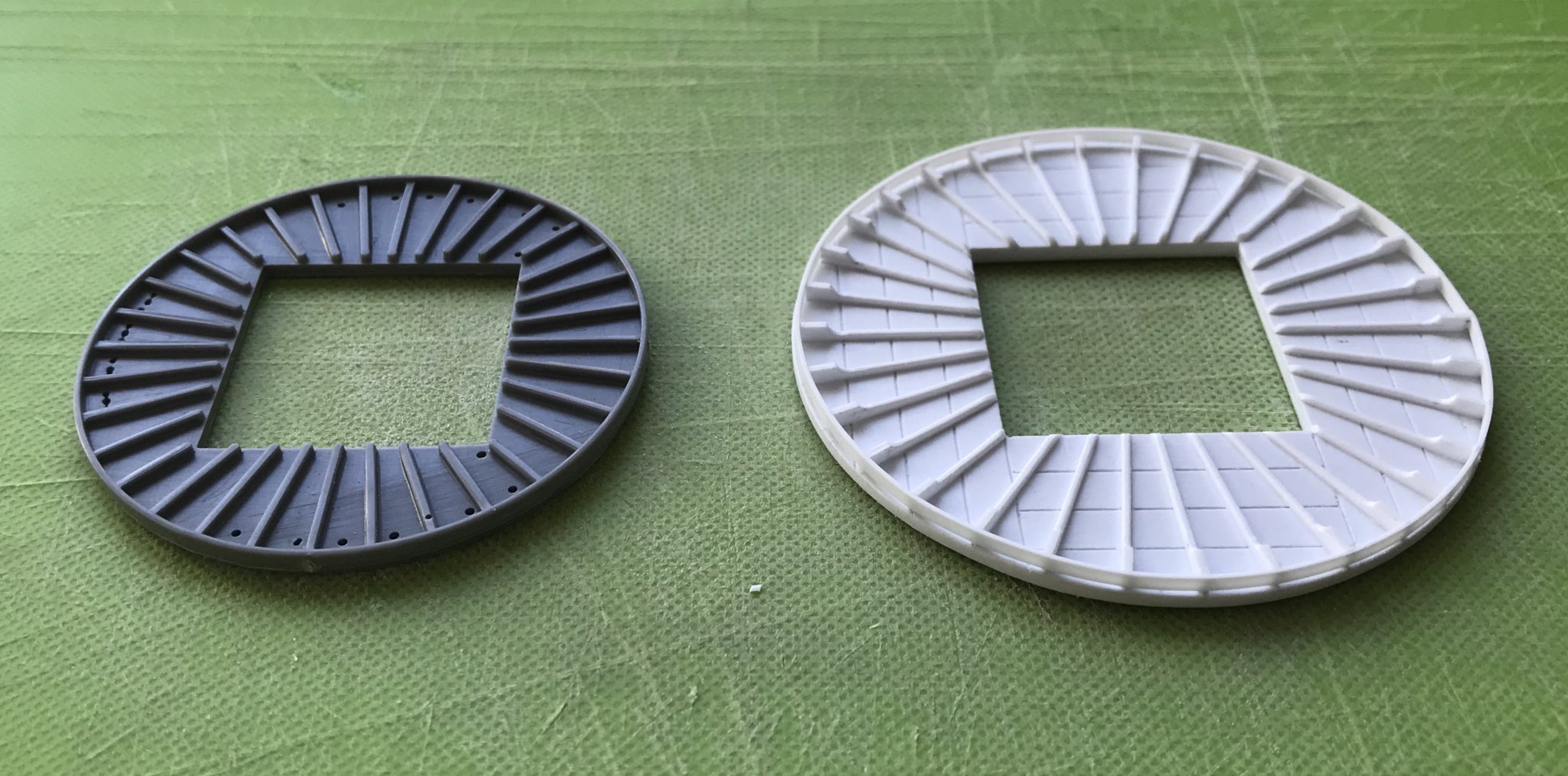
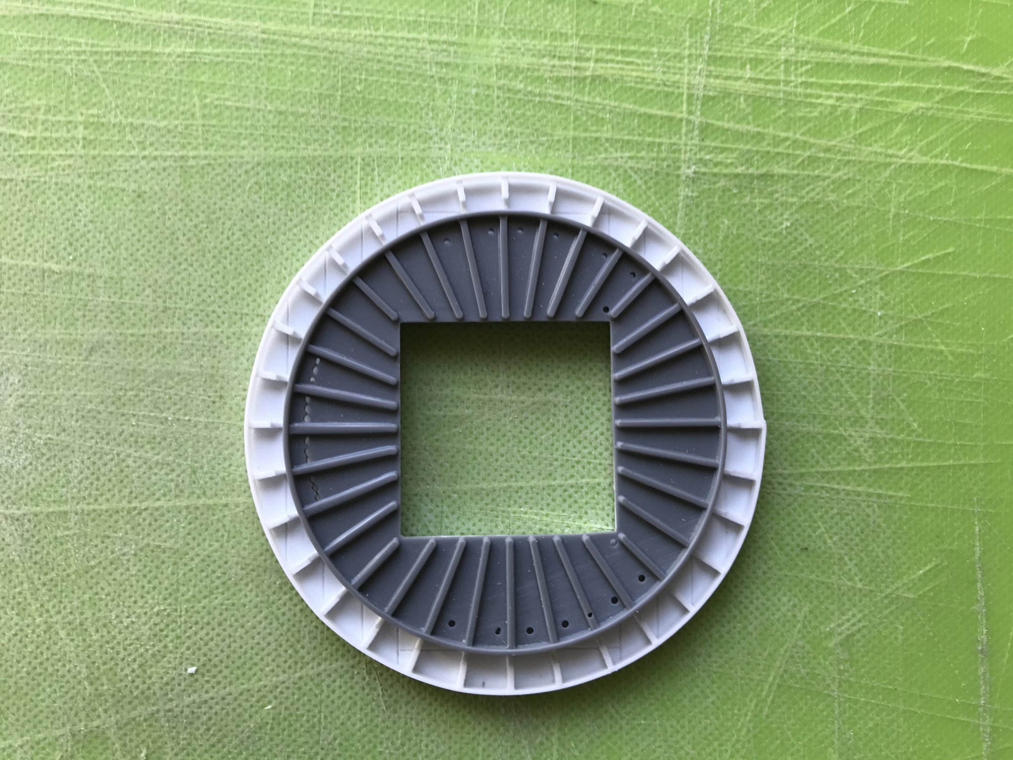
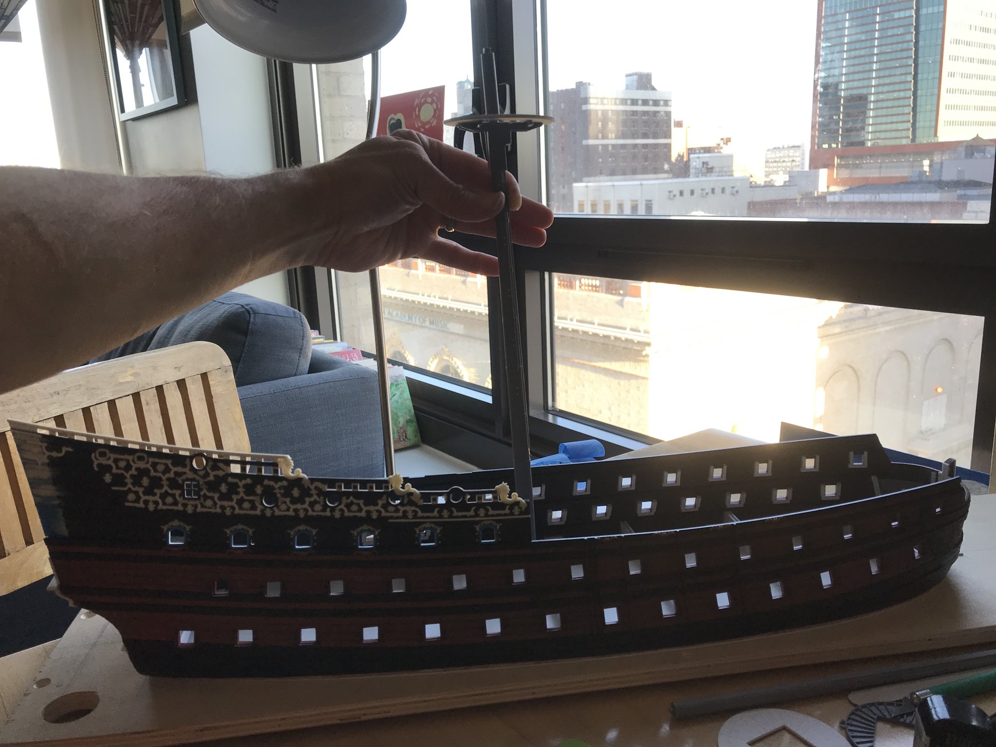
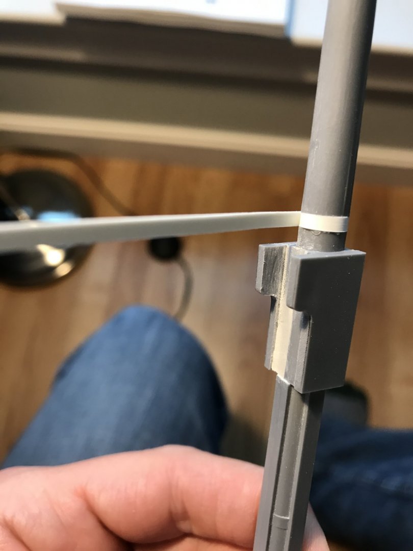
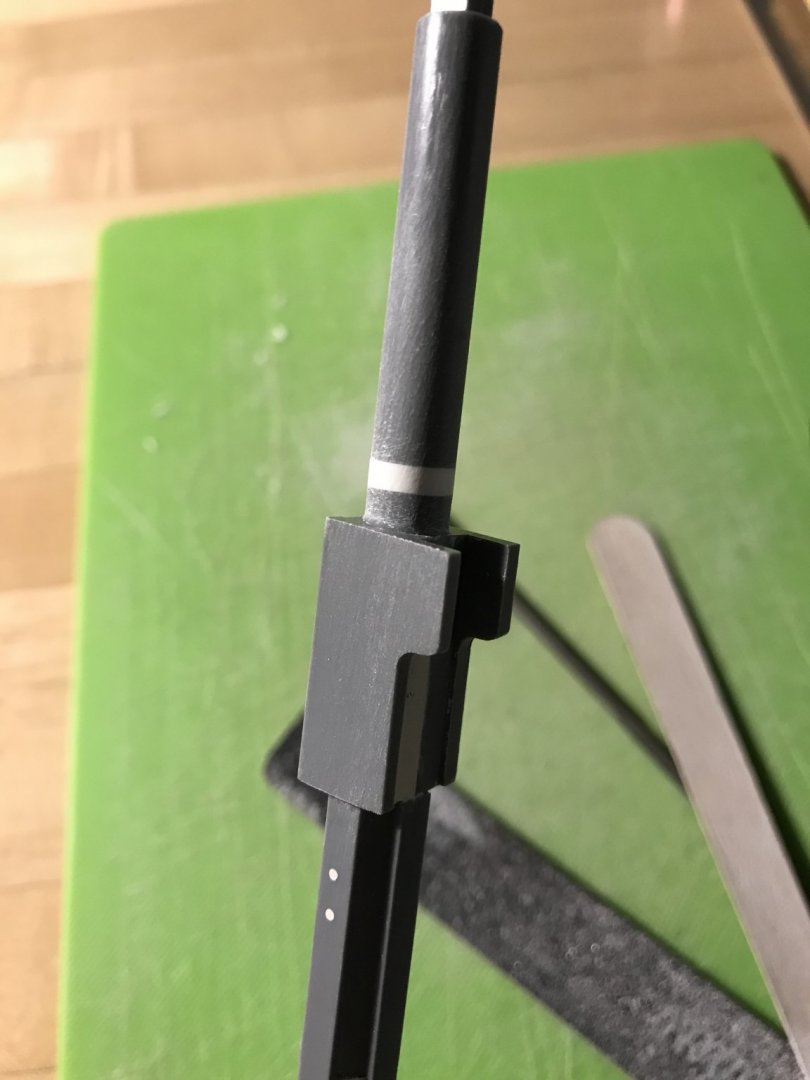
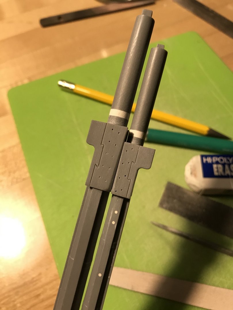
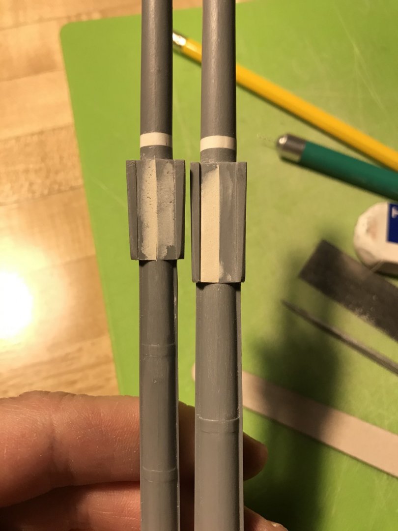
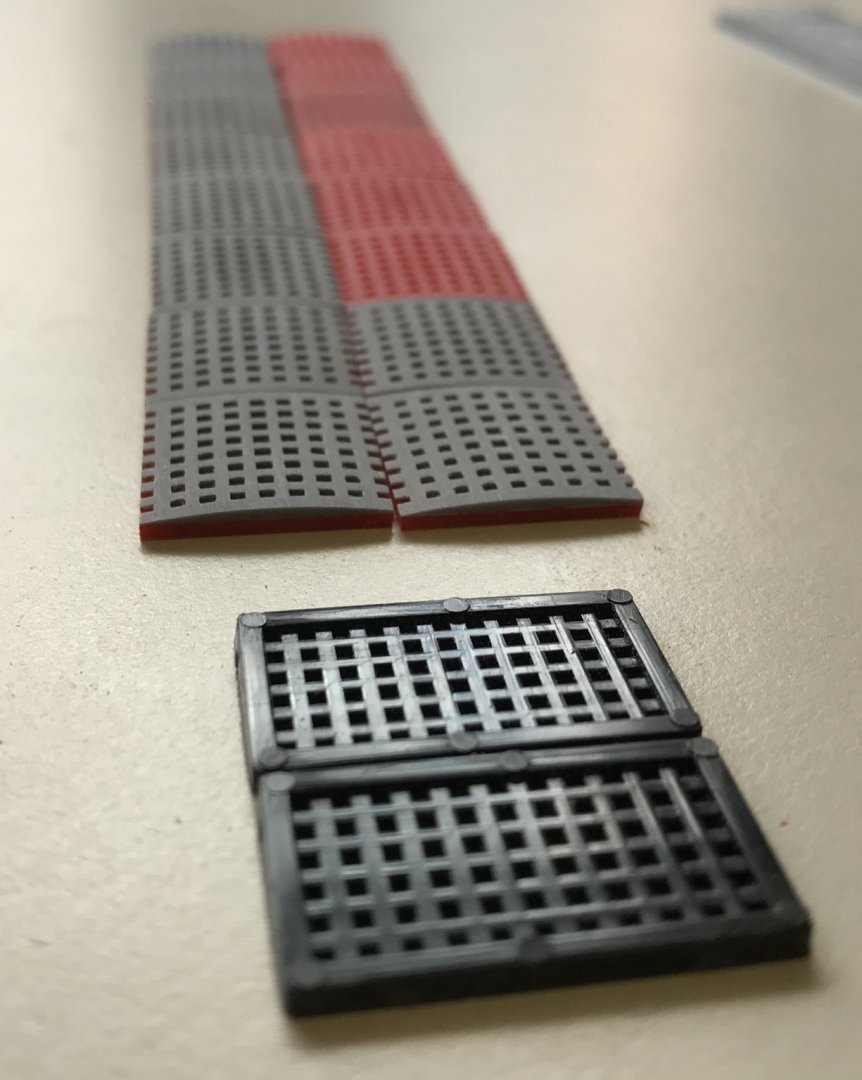
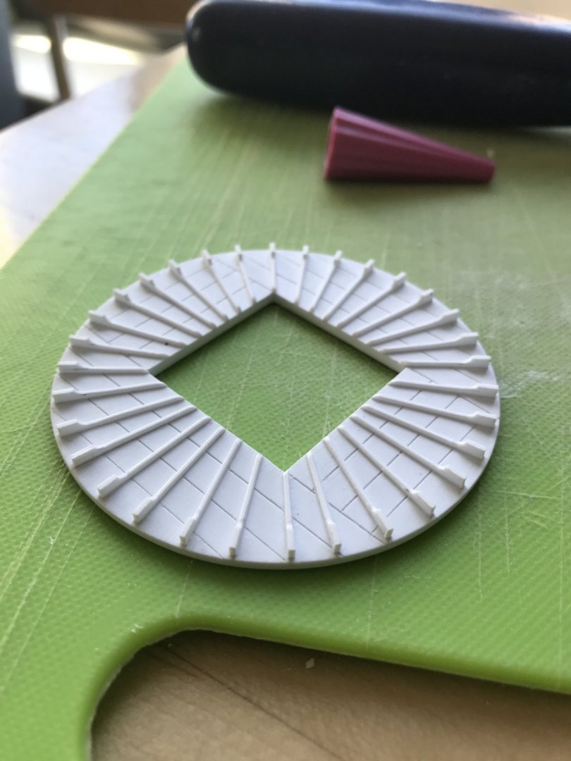
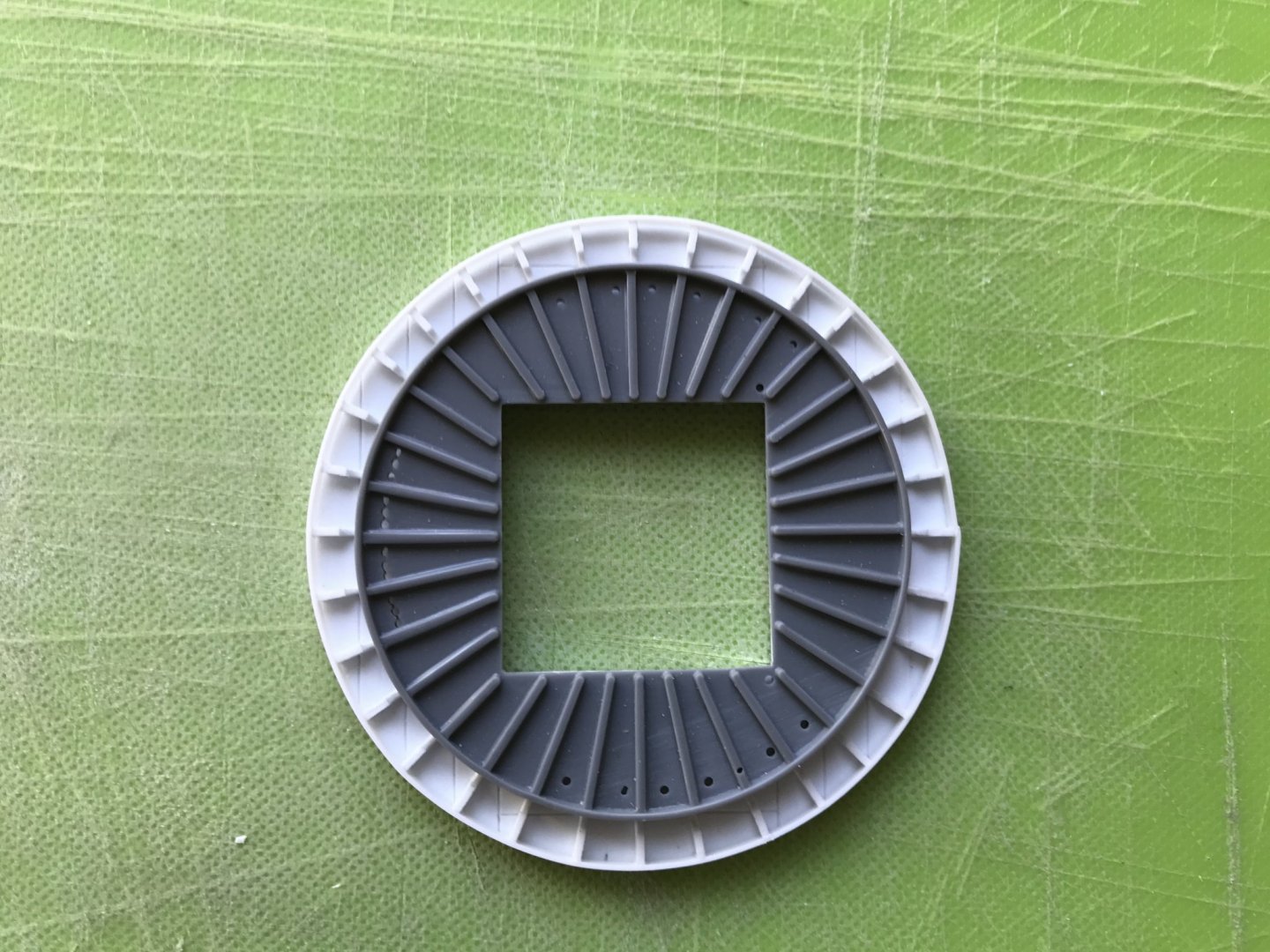
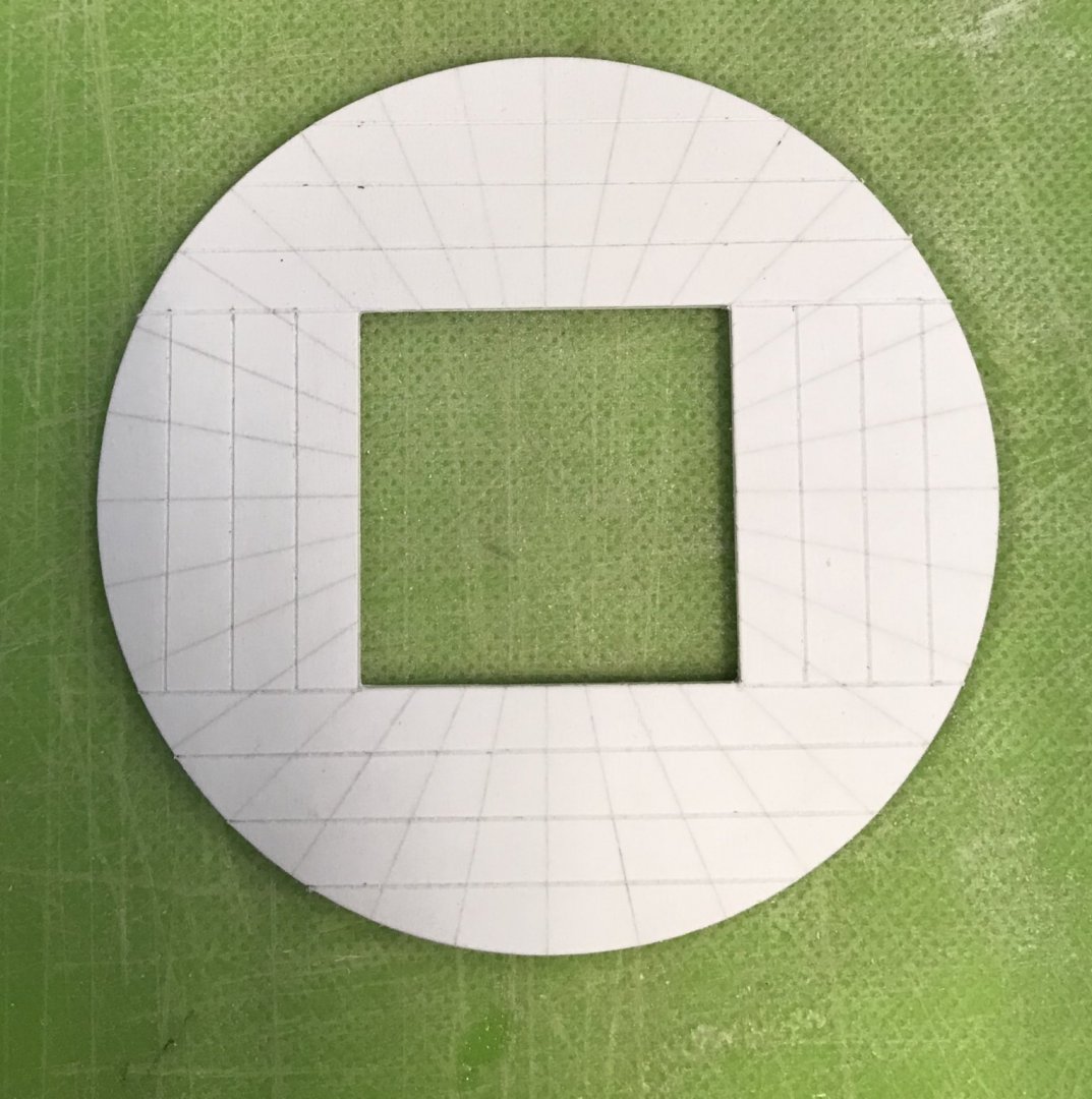
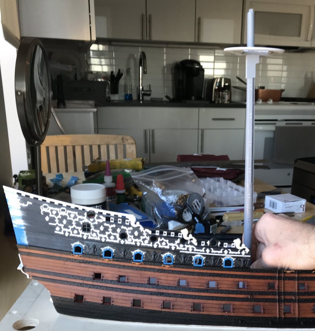
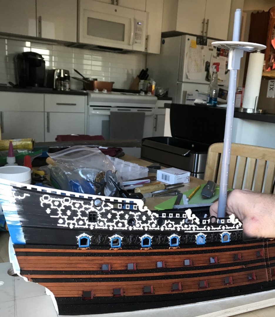
I thought that medicinal scotch was shielding me from the Corona virus. Apparently, not even scotch is strong enough to keep it away. So, I am at home full-time, now, for at least the next two weeks. I am very lucky that the worst of it seems to have been fever and body aches although, interestingly, I did lose my sense of smell. And, so, work on Soleil Royal continues, more or less full-time now. Thanks to Henry, I was able to finish modifying my gratings. Here’s a shot of the new cambered gratings as compared with the stock, flat gratings: I will be making new combings for these when it comes time to install them. I also wanted to finish detailing the fore and main masts. One of the peculiarities of the Heller kit is this groove that they let into the masthead, for the shrouds to pass over. It is unnecessary, though, and creates a weak-point in the mast. Borrowing a page from Dafi’s Victory log, I decided to fill it in with a strip of thin styrene and medium viscosity cyano: Next, I wanted to file-in a tapered profile to the hounds, which are parallel-sided on the kit: This alteration is more evident on the foremast, as seen above left. Then, I could define the bibs as distinct from the hounds: I added in the nailing of the hounds, and I also filed a slight taper to their aft edge, to give them a little extra shape: Satisfied with the lower masts, I also wanted to complete my main top, just to get a sense of that process, since I need to make three more of them. After marking out my ribs, and separating them into rough blanks, I used a simple two-step jig to cut the long, bottom edge to it’s still oversize width, and then the short top edge to height: As a note for the future, I would be wise to really hone my 1” chisel back to a razor-edge, before doing this again. The slightly dull edge caused the plastic to cleave, rather than cut cleanly, and I was left with many ribs that had skewed bottom edges. In the next step, that necessitated filing them square before gluing them in place: Finally, with the ribband strake circling the top, here are a few comparison shots with the stock main top: My version is significantly bigger, but it will now give a better spread to the topmast shrouds. And, here’s the top on the masthead: All-in-all, this was a significant amount of work, but the improved scale and detailing make the process well worth it. I can tweak the rib process a little to speed it up, so the others shouldn’t be as time-consuming. Next, I boxed-in a footing for the main mast: And, then I got to re-scribing the gun platforms to the inner hull. As a reminder, I had taken the stock lower decks and separated each deck half into an inner and outer component. This way I could re-cycle AND accommodate the increased width of the hull. It was surprising to me just how much scribing I had to do to get a good fit against the hull. Evidently, cutting away the lower hull relaxed what was left above, into a somewhat flatter-sided ship. It wasn’t strictly necessary to achieve a close scribe, here, but I want maximum connection for extra strength and rigidity. That’s all for today. Thank you all for your likes and interest. Stay safe, everyone.


- 2,699 replies
-
- 11
-
-
- heller
- soleil royal
- (and 9 more)
-
I was intrigued by your Pegasus figurehead profile pic - the carving is excellent! - so I came to check out your work. I’m glad I did, and I’ll be following this project to completion. You’re doing a wonderful job, here. These models are quite large, eh?
-
The rig is really shaping up nicely, EJ. I really like the trim of her sails, and the way that they taper up from the main course to the t’gallants. Excellent work!
-
It’s a little annoying that I spent all of today’s allotted model time fixing this problem, but I am happy enough with the outcome, and have restored faith in the integrity of the mast: The dowel, in this section, apparently favored the un-cut half of the mast, so it appears that about half the dowel was still intact. Thanks for looking in😁


- 2,699 replies
-
- 12
-
-
- heller
- soleil royal
- (and 9 more)
-
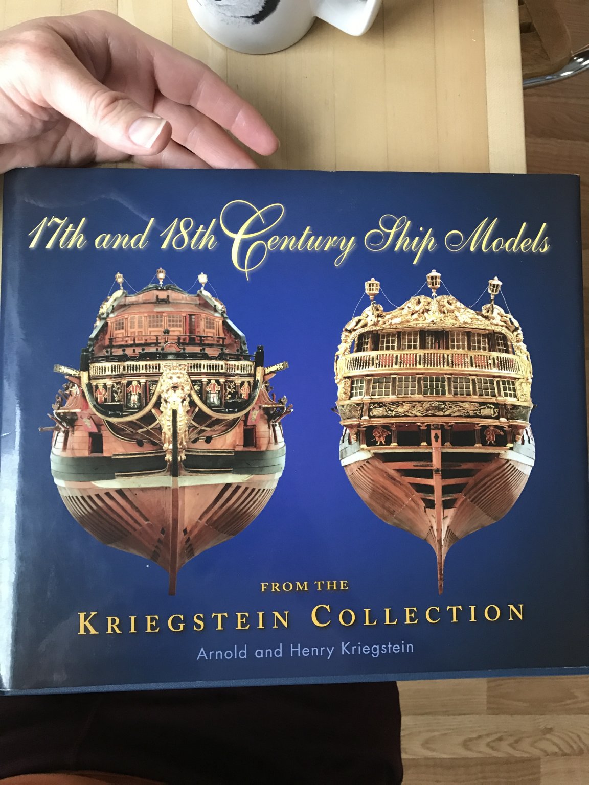
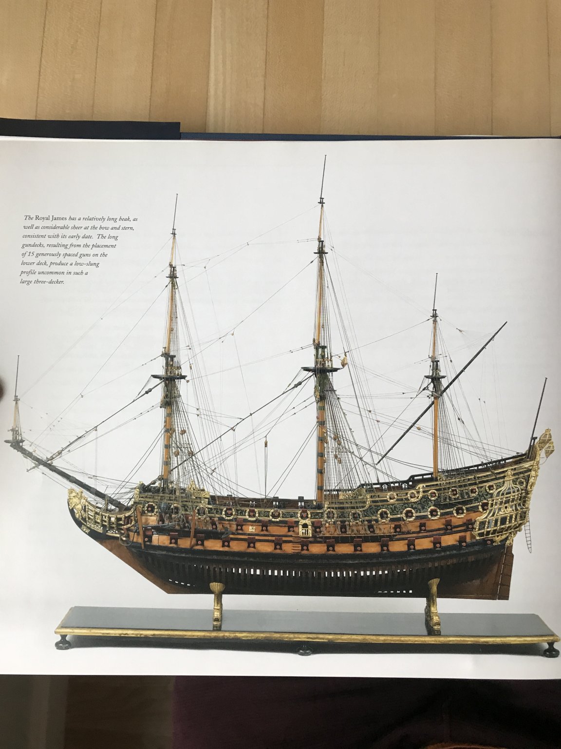
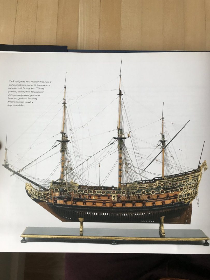
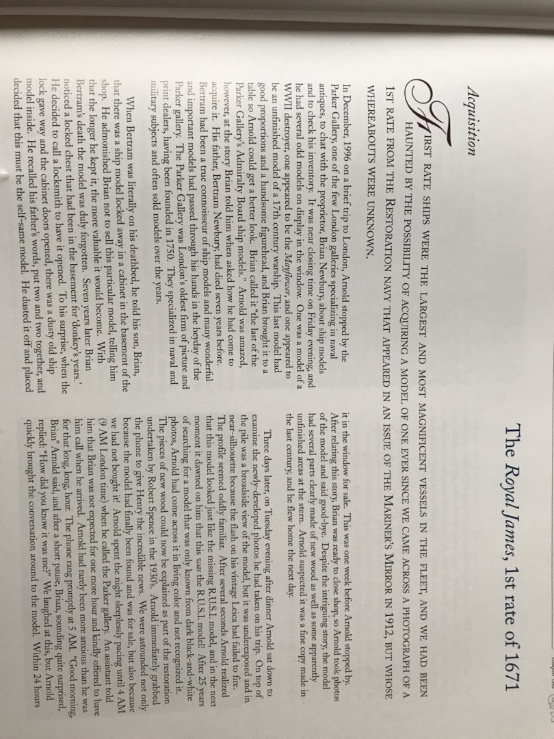
Well, certainly I can appreciate the difficulty you describe, as when I’m reading all of these French language texts, and the technical descriptions often don’t translate well to English. Well, I have another book for you that may be a good visual guide for you: In particular, this section concerning the Royal James of 1671 is well described and beautifully photographed. The James is a few years later than the Katherine, but I would think the rig would be largely the same. I few years ago, I took a bunch of pictures of this model while on a trip to Washington D.C. If you P.M. your email address to me, I will send you the pictures that I have. I hope this is helpful.

- 1,035 replies
-
- 8
-
-
- royal katherine
- ship of the line
- (and 1 more)
-
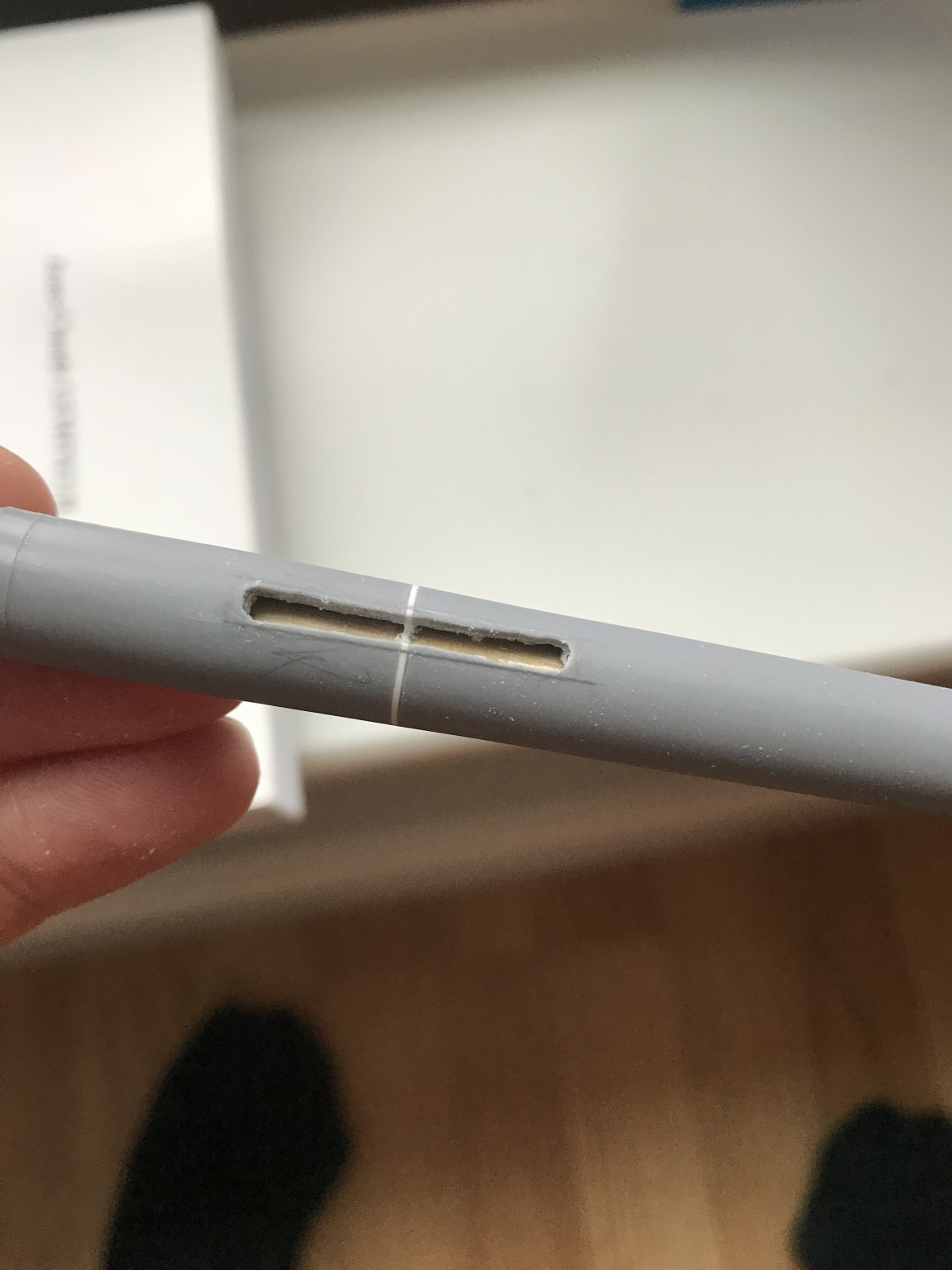
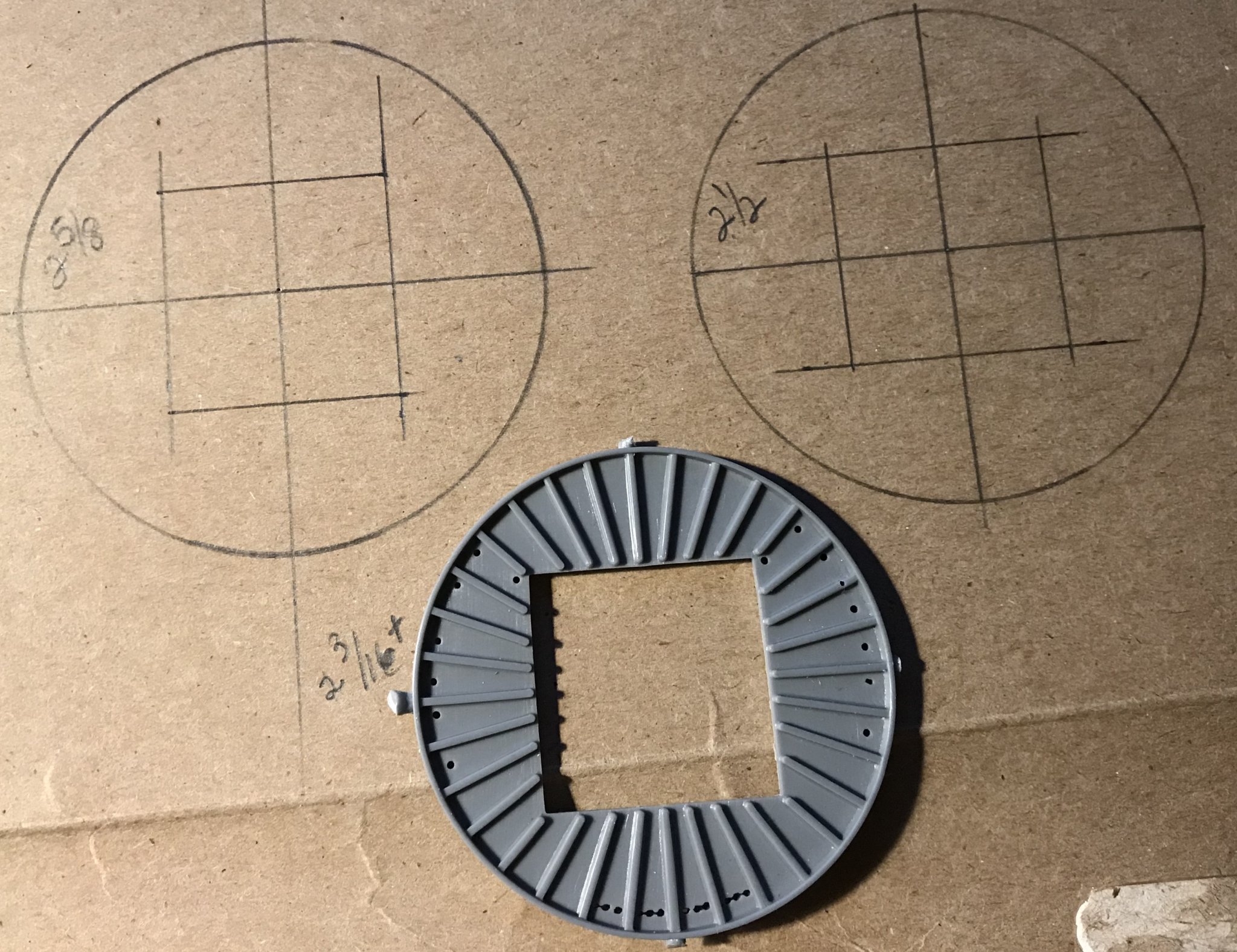
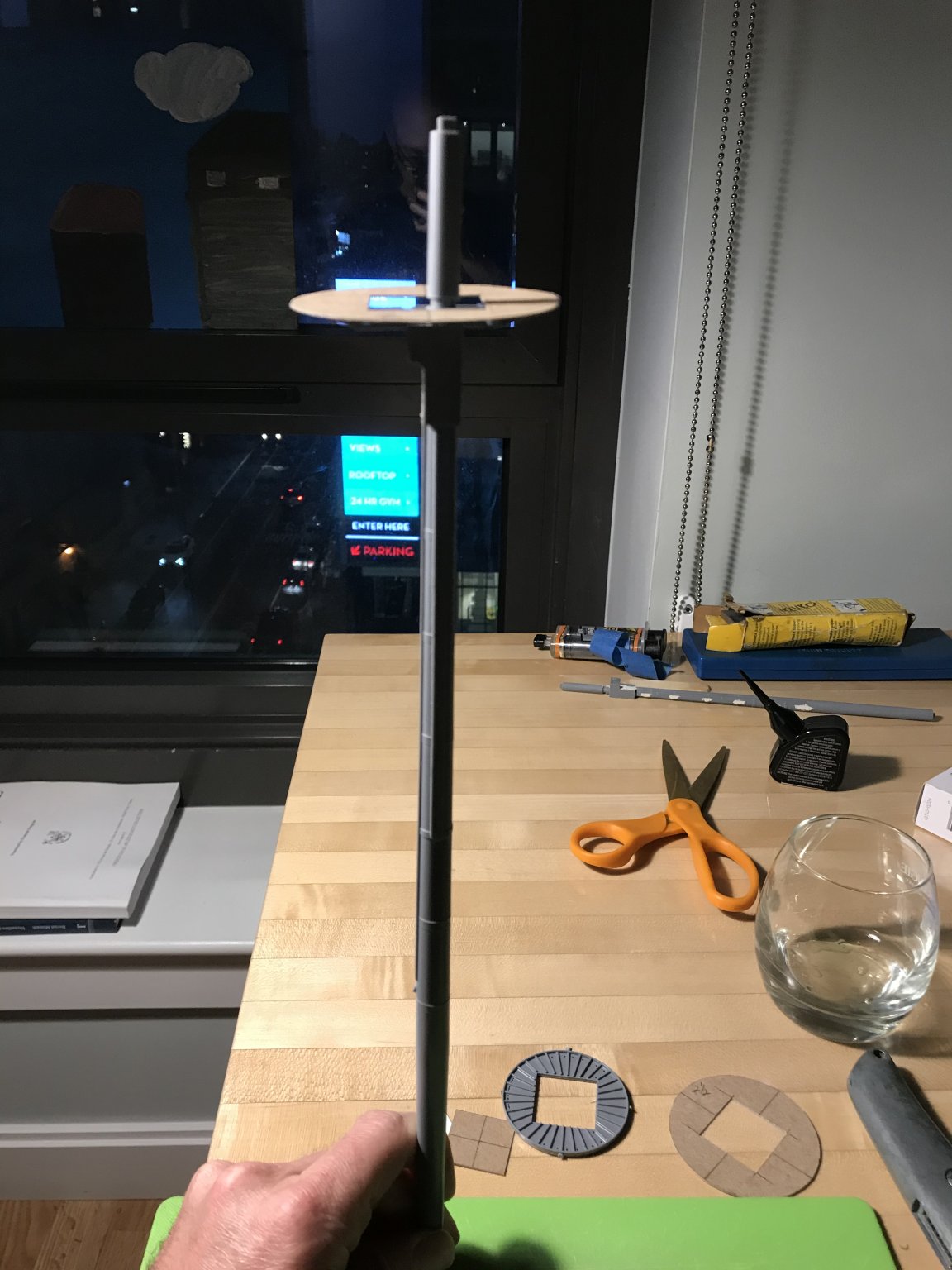
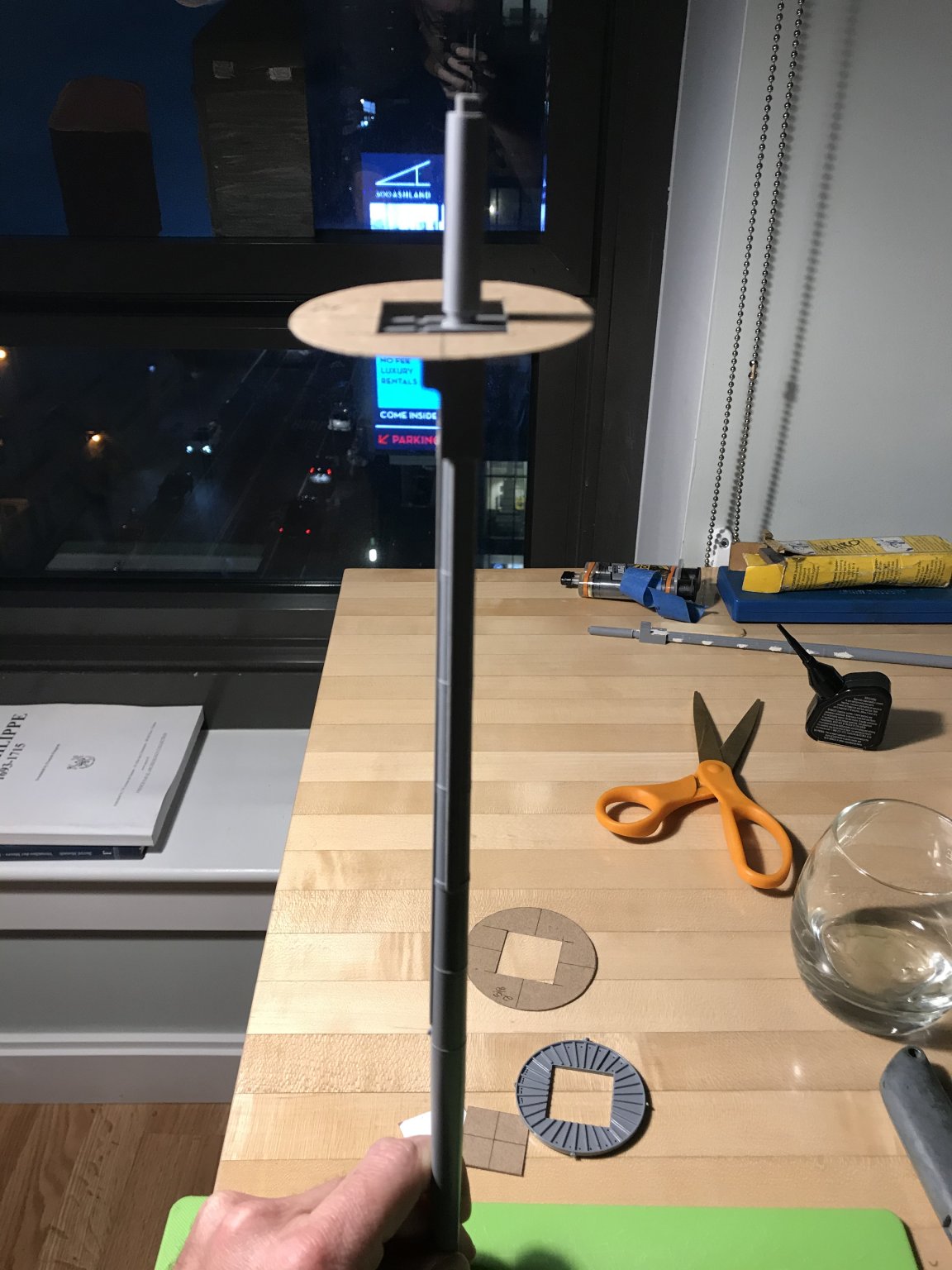
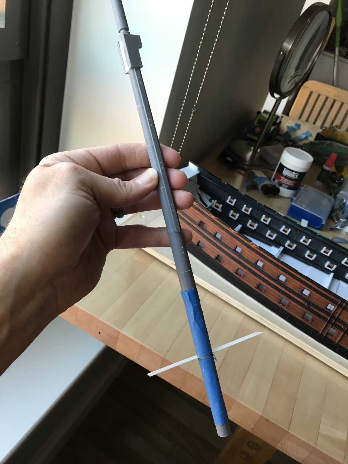
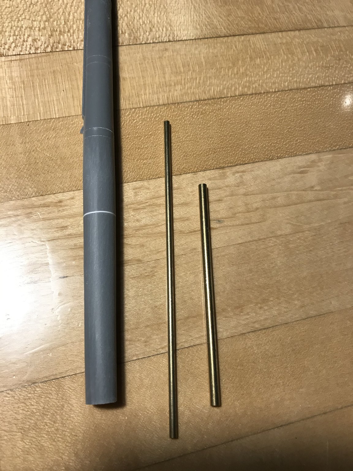
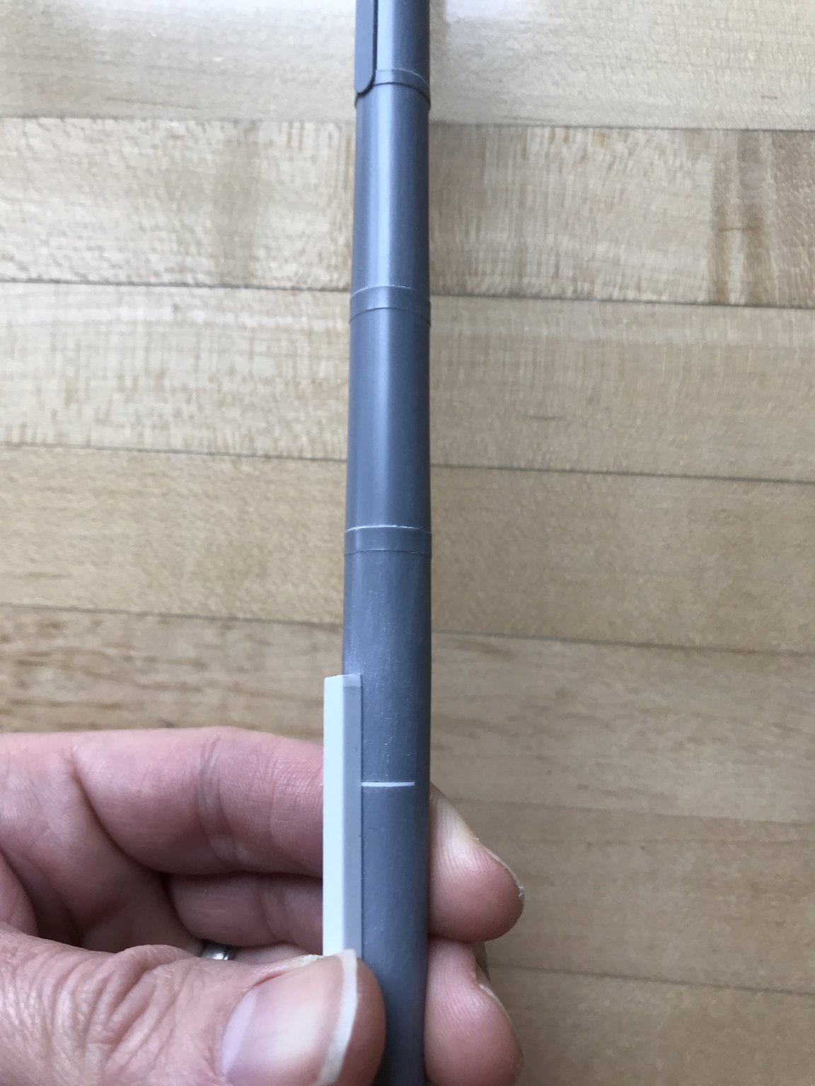
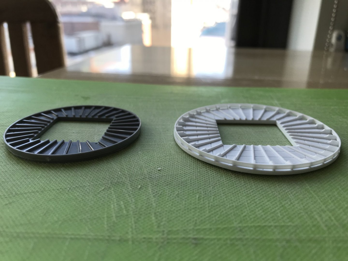
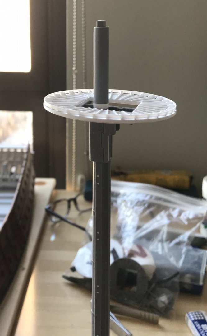
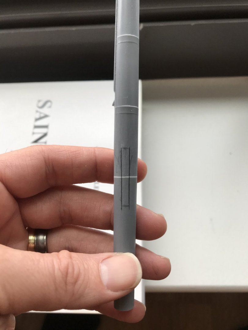
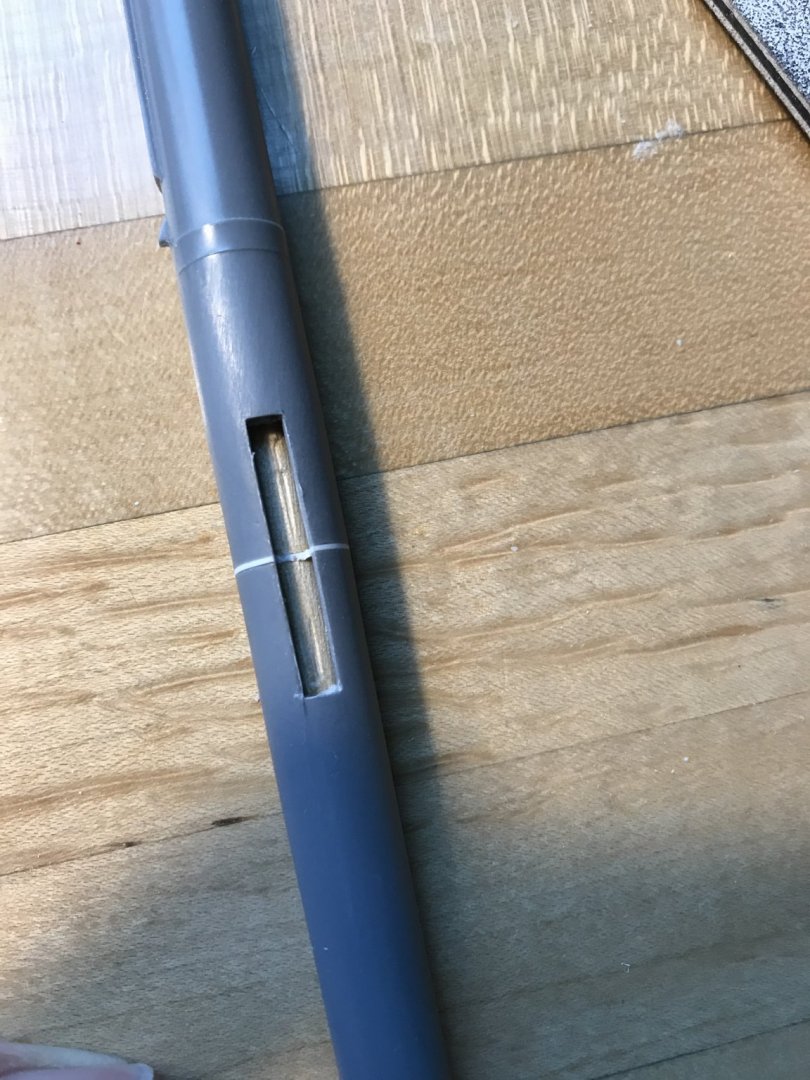
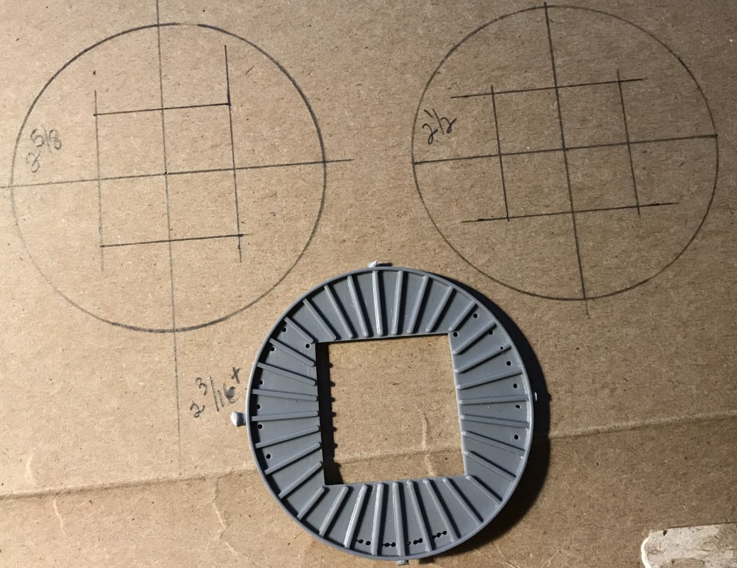
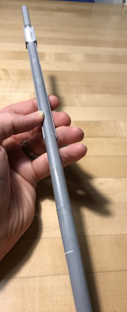
Yes, the dreaded fireship. Can you imagine the gruesome spectacle of the English fireship slowly drifting toward the beached and battle-scarred, but still magnificent Soleil Royal? I continue to distract myself from the pandemic and my isolation from my family with work on the model. As you know, I’ve been experimenting with Liquitex Extra Heavy Gel medium. At first, I was trying to brush it in place, but I lack a fine enough brush, and all art stores are closed for the foreseeable future. But then, I happened upon this build video on YouTube, and I was fascinated by his use of common toothpicks to paint in the fine statuary on this Revell 1:150 kit of the Vasa: This inspired me to sharpen the end of a toothpick and try that as an application method. First, I made up a piece of scrap that gave me the spacing I need for the tasseling: The Liquitex is an interesting product. It has the consistency of thick moisturizing cream, and I found that the dime-sized dollops that I would dole-out onto a paper towel, would skin-over within a few minutes. It was necessary to “stir” the dollop every few minutes, in order to apply the product with ease. After a few stirrings, a new dollop would be necessary, but there is an entire lifetime of product in one small jar, so it is not a big deal. What I was aiming for was a sort of Hershey Kiss, triangular shape. I found that three applications gave enough depth of relief that I will not have trouble picking the tassels out with a brush, or maybe a toothpick 🙃 I found that the cured gel medium could be scraped away from my sample strip, without too much effort, using your finger nail. The counter area on the model, however, is more coarsely sanded and should provide a better mechanical bond. That being said, I will probably paint over the finished tassels with thin cyano, just for the added insurance that provides. I am sure the eventual paint film would he sufficient, but this cyano treatment is fast becoming part of my process. So, at this stage, I became free to focus on building up the lower gun deck. Before I can do that, I needed to cut the lower main mast to height, and create a boxed footing for the mast. I also wanted to mock up, and then make the larger diameter main top, in order to get a sense for what the slightly increased height above deck needs to be. If you are new to this log and wondering why I am increasing the main top diameter, I will ask you to consider that my addition of 5/8” to the breadth of the hull makes the stock tops seem even more in-adequate than they were to begin with. The other consideration is that I hope to improve the spread of the topmast shrouds; on the stock kit, the slope is negligible. I began by drawing a few different diameters onto a scrap of cardboard: The stock main top is 2 3/16”. As you see, I went up from there to 2 5/8”. Then, I took each size and placed them on the stock cross trees: Then, 2 1/2”: Then, 2 5/8”: This may seem to be a big jump in diameter, but not so much when you consider the height of the masthead, above the top, and the scale of the cheeks, supporting it. Now, I know that purists may be appalled that I am not referencing known tables for correct dimensions relative to the height and breadth of the main mast, etc and so forth. On this go-around, though, that is not the kind of rigidly accurate model that I am building. In many ways, this is an artistic and impressionistic model, in which I am trusting my eye and sense for the proportion of these things to arrive at a better overall impression. With specific regard to the tops, what I am going for is what you see in this Puget portrait of what I believe is the Royal Louis of 1692: Ultimately, I decided to go ahead and pattern the largest top in styrene. The tops are not difficult to make, but they present an opportunity to incorporate a wealth of detail that is missing from the stock tops. My first attempt at laying out the ribs wasn’t quite right, though: On the right, you can see that the rib layout is slightly off-center; there should be a rib radiating from each corner of the lubber hole. Rather than expend all of that effort to carefully make and glue all of those ribs to a wrong layout, I decided to just make a new top (on the left) Each top will have a lower, base layer of thinner styrene, that is of a slightly smaller diameter than the main layer. The main layer is of 1/16” styrene. I’ll have to rip strip stock from 1/32” styrene sheet for the ribs, and I would like to use 1/2-round moulding for the banding that runs around the perimeter of the ribs. I will also, eventually, make a lantern for the main top, but I haven’t figured out how I want to approach that, just yet. So, here is the top as it stands, now, with the lower and main layers glued together, as well as the rib and planking lines engraved into the plastic: For a sense of scale, here is the top at the main deck level: And here is the top on the masthead: So, next, I was attempting to determine what the new height above the main deck should be. On the stock main mast, there is a subtle transition where the mast tapers from it’s widest diameter to the narrowing of its foot. That place is where my thumb is in the picture above. I was considering a 1/4”, 3/8” or 1/2” increase in height above the main deck. using a straight edge, spanning the main deck ledges (clamps), in the location of the main mast, I determined that there was 2 3/8” to account for from the top of the deck to the plinth base if the model. This dimension includes both the thickness of the deck material, and the camber at the ship’s centerline. So, to begin with, I measured a 1/2” below where the mast tapers down to its footing, and then I measured down a further 2 3/8” from there. This was to be my first cut-down. I attempted to account for the rake of the mast top in my cut of the footing. I also placed the starboard upper bulwark, so that I could get a truer sense of proportion: I liked this. This looked good to my eye. I decided, though, to cut down an additional 1/8”, and I will explain why in a moment. Here’s what 3/8” looks like in better light, after the second cut: This is what my main mast height will be, and I will use this dimension to establish the relative heights of the fore and mizzen mast tops. Now, here is why I cut a little further. Bear in mind that I love the comedian Patton Oswalt, and I have recently discovered that Siri will play any stand-up I can think of in an endless loop, almost without repeats; this really helps me keep my mind off of the dreariness of what-all is going on. I was listening to Patton and laughing away, as I distractedly taped off my first cut. Unfortunately, I was a little past halfway through the mast when I realized that I had taped off the location where the mast rises above the deck, and not the footing! 🤦🏼♂️🤦🏼♂️🤦🏼♂️🤦🏼♂️🤦🏼♂️ Well, that is a BUMMER! I was so angry with myself for falling asleep at the saw, so to speak. I didn’t cut completely through the dowel, on the inside; there is maybe a 1/3 of that diameter still intact. My initial solution was to pack the kerf with medium viscosity cyano and then fill the kerf with perfectly mating styrene sheet. After trimming and fairing the surface, the repair looks well enough. It will be un-detectable, anyway, because it will now sit below the deck surface (the reason for that extra 1/8” cut), and the repair seems strong: Me being me, though, I wish to ensure that it is extra strong. My first thought was to attempt to drill up through the end of the birch dowel, and into the repaired area, so that I could epoxy in a length of either 3/32” or 1/8” brass tubing: I am skeptical, though, that even if I work through a progression of bits - that I will be able to keep a drill bit on-track through that expanse of end-grain. My woodworking background, on the other hand, has given me another, I think, safer idea. Much as you would to stop an end-check in a solid wood table top, for example, I can let-in a key (maybe dovetail, but considering the size, probably not) that crosses the repaired kerf. The goal is to get deep enough in the dowel to increase glueing surface area and unify the whole construction: This 1/8” styrene extrusion should be up to the task, and it matches my smallest woodworking chisel. A half inch above and below the kerf will be more than enough, and my repair will never be in danger of failing. If I don’t do a perfect job of inletting, the gel cyano will pick up the slack, and this reinforcement will also be undetectable. So, a Dremeling we will go! And with much greater care, this time 😉


- 2,699 replies
-
- 11
-
-
- heller
- soleil royal
- (and 9 more)
-
Really beautiful detailing, Marc! Is it your plan to make every ornament from scratch, by hand, or will you 3-D print some of the ornament?
- 208 replies
-
- 3
-
-
- le soleil royal
- 104 guns
- (and 2 more)
-
Hi Dan - this is one of two models made for the St. Philippe monograph. It is a pretty good model, but not nearly as good as Jose Tussett’s fully rigged version. It appears to me that they were in a rush to complete the admiralty model so that they could release the monograph in time for the Rochefort conference in 2018, where both models were on display. This is just conjecture, on my part. I don’t know whatever the story may have been, but there is plenty of evidence of a rushed job, despite the talents of this second modeler being plainly evident, otherwise.
- 2,699 replies
-
- 3
-
-
- heller
- soleil royal
- (and 9 more)
-
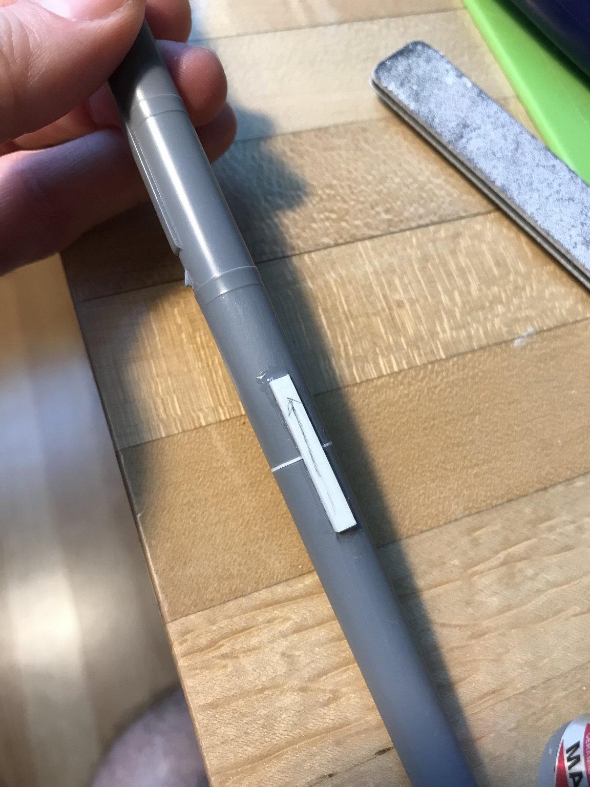
Never-mind - I see, now, how Lemineur’s chimneys open forward, and not at the top: Also, according to Lemineur the chimneys are copper lining within a wooden frame, and they can be removed before battle, with deck caps in their place to cover the holes.
- 2,699 replies
-
- 7
-
-
- heller
- soleil royal
- (and 9 more)
-
Nicely done, Jose!
-
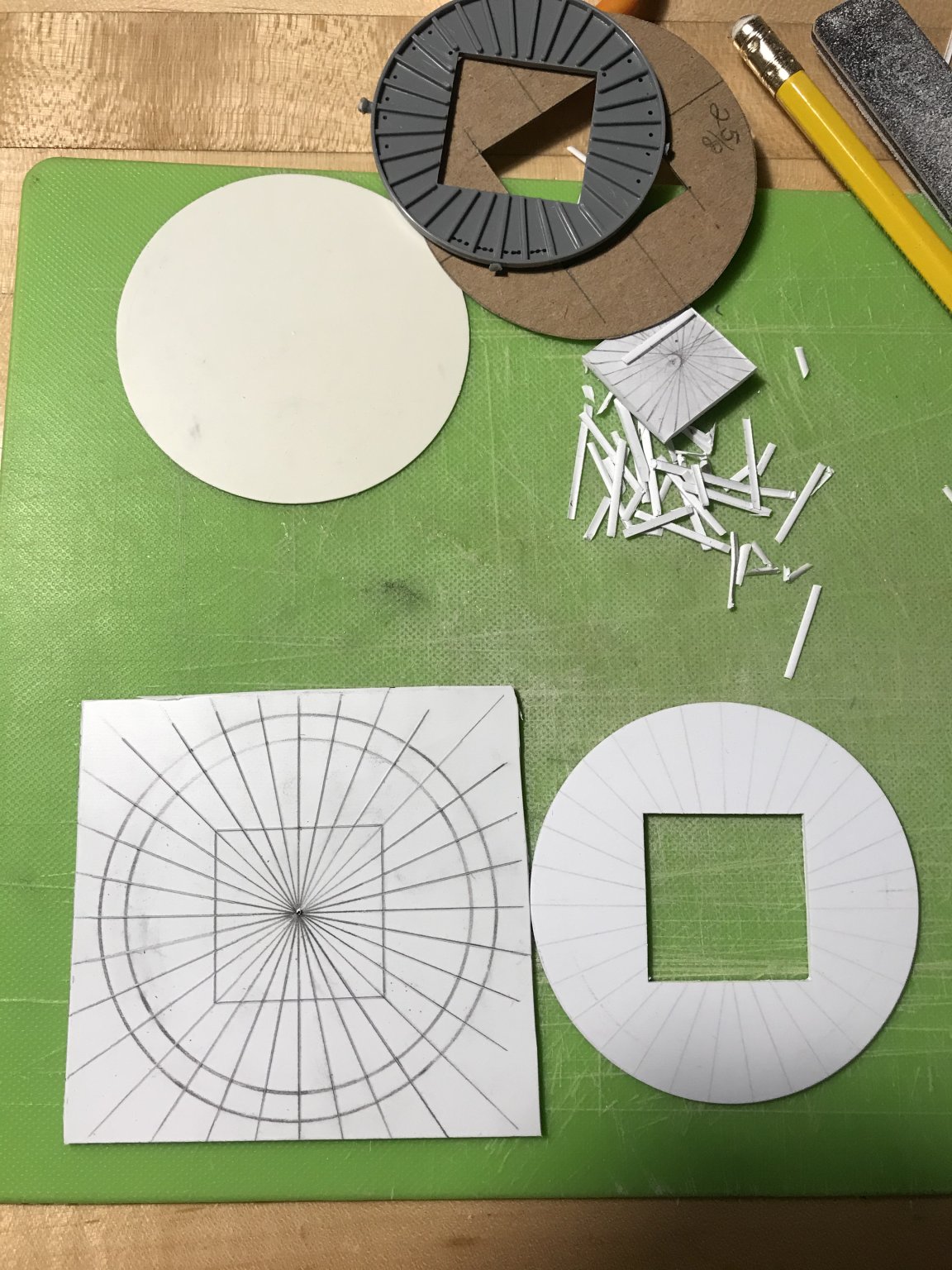
Yes, the question of the ship’s stoves is one that I’ve been turning over in my head. On the St. Philippe, where there is no cover of a forecastle deck, it makes sense for the stoves to be placed on the middle, or weather deck. As Soleil Royal is equipped with a forecastle deck, it would be appropriate to place the stoves higher, where they pose less danger to the ship, as a whole. That being said - because SR’s forecastle deck is armed, it would not be possible to pierce the forecastle deck for a chimney, along the sides, because there would be a forecastle cannon above where the stove sits between two main deck guns. So, it seems to me, the best placement for the stoves would be beneath the forecastle deck, but centered between the guns, and sharing one common chimney. Now, whether the chimney should resemble the simple, open boxed construction that Lemineur shows, or a weather-shielded construction with a 90 degree bend, I can not say. Presumably, if the exterior of the chimney is a wooden panel and frame, it would be lined with copper or iron. Or, perhaps there is no wood in the construction, and it is all copper or iron. Anyone with insight, here, would be greatly appreciated.
- 2,699 replies
-
- 3
-
-
- heller
- soleil royal
- (and 9 more)