shipmodel
-
Posts
941 -
Joined
-
Last visited
Content Type
Profiles
Forums
Gallery
Events
Everything posted by shipmodel
-
 Hi Marc - Looking really good, like a warship should. I am a bit behind in following this. My system has been marking your posts as spam for the past several weeks, and I just caught it. Will stay on top of it more in the future. See you soon. Dan
- 2,699 replies
-
- 3
-

-
- heller
- soleil royal
- (and 9 more)
-
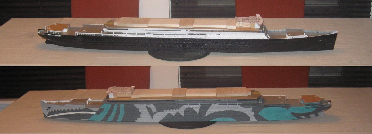
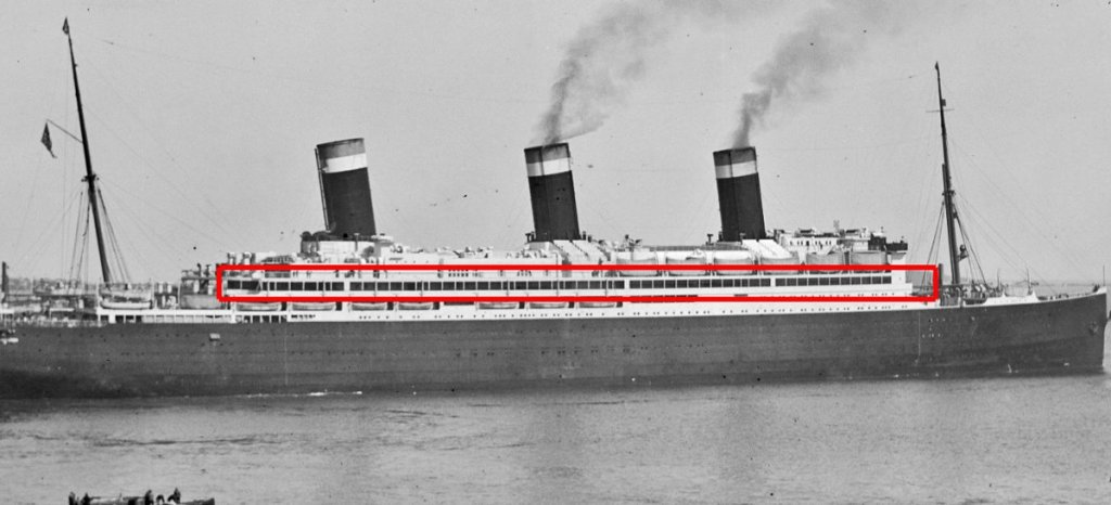
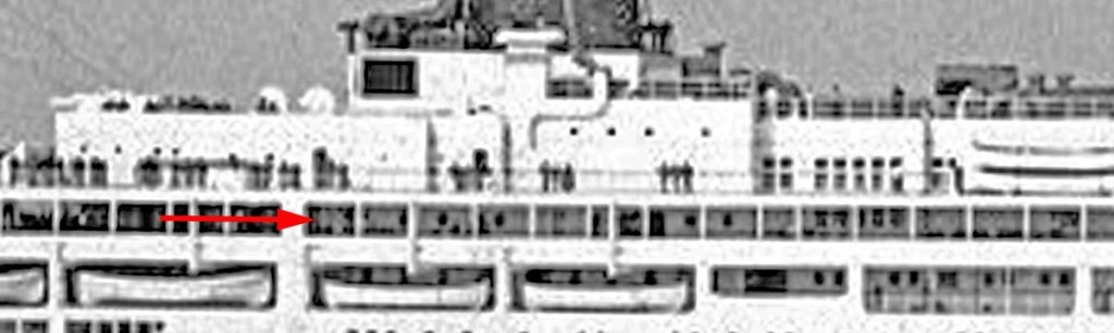
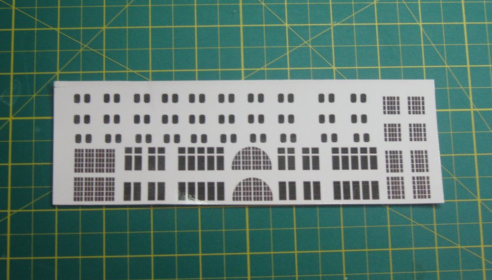
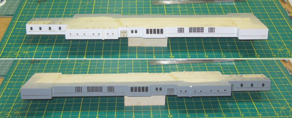
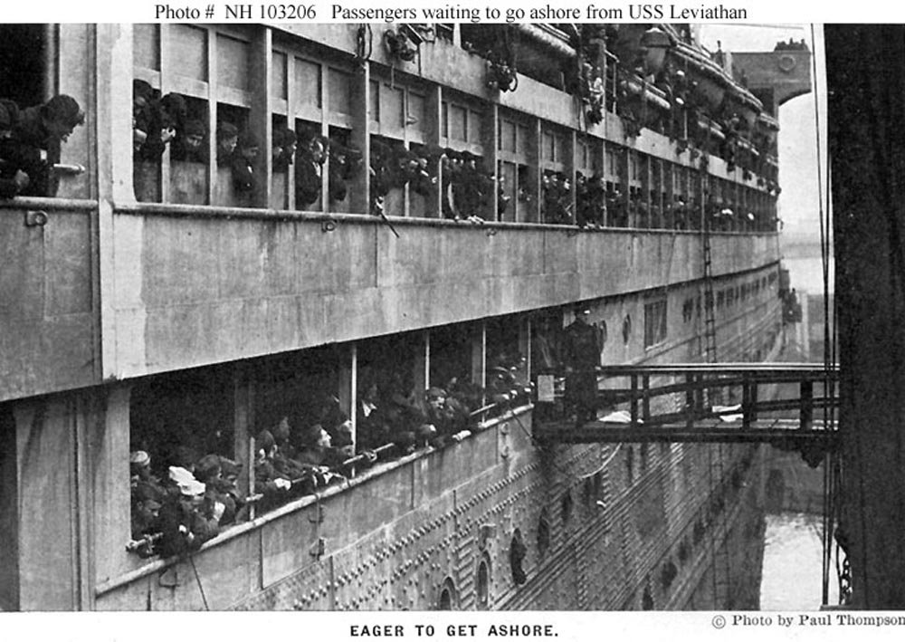
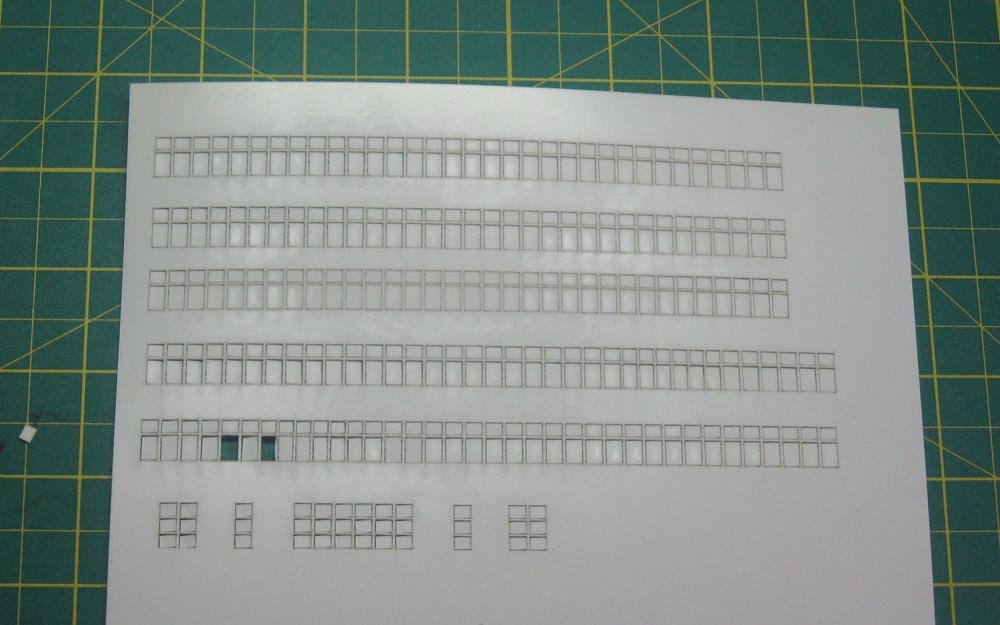
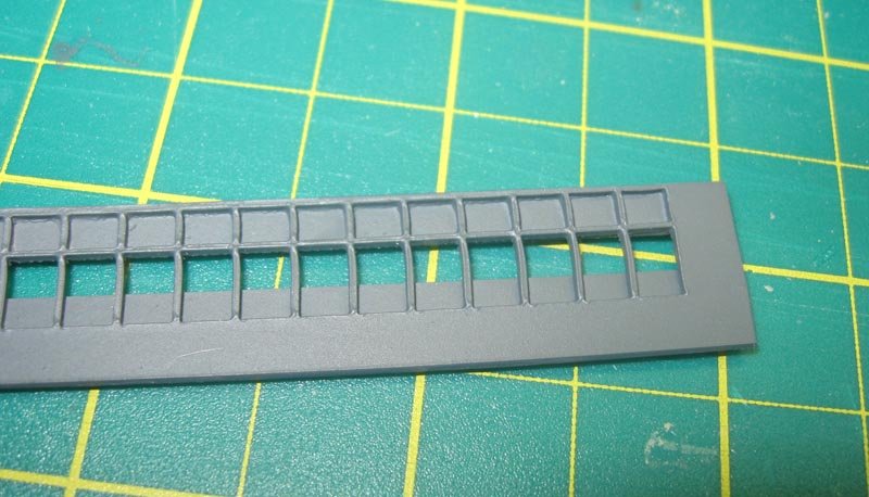
Hello again and thanks to all who are following along. I buckled down and put this together a bit sooner than I thought I could, and I hope you enjoy it. This segment catches up the build to about December 1 of last year. Soon I hope to be current. First, I got some welcome confirmation from Professor Smith of our best guesses for the dazzle paint colors. Somewhere in the archives of the museum he came up with color chips of the paints used during World War I. The one most in question, Blue Green 1, is at the upper left and matches quite closely to the color already on the model, so no overpainting will be needed. Whew! Construction itself continued upwards with B Deck, which is highlighted in the photo below. This and other pictures told me that only the forward two long sections are enclosed by window units, while aft of them the side is open with pillars and a solid rail. The details of the deck house are rarely seen since it sits well back from the side of the ship. I relied on the one photo below which was taken at just the right angle to show the doors and windows at this level. After lots of time spent poring over the photos and trying to decipher the notations on the plans, I came up with these windows for the deck houses of both B and A Decks. It’s a bit surprising what can be done pretty easily with Photoshop and clear decal film for an ink-jet printer. The deck house shape was taken from the plans and was assembled from various rectangular pieces of ½” basswood. After sheathing it in styrene the troop ship side was painted grey. Portholes were drilled and installed, followed by the doors, window decals, and handrails. At the side the forward window sections are built up from smaller sections and panels, but most of the photos are taken from too far away to be really helpful. In a close-up of the troop ship I learned that the windows consist of three-panel units with added pillars in between. The frames have cross-pieces setting off the top third of each panel, but no corresponding lower frames. The upper and lower thirds have solid panels behind the frames, leaving only the center third open. I laid out the repeating frame units in Photoshop using the ‘copy’ function a lot so I could generate the long runs that I needed. A similar set of windows was laid out for the face of the forward superstructure and its deckhouse. These were laser cut for my by Charlie Zardoz, a good modeler with some build logs on this site, and a great guy. He managed to get the penetration set so the windows just pop out while the frames remain sturdily behind. After sizing and cutting out the lengths that I needed two back panels were installed to cover the upper and lower thirds, then the units were painted. Here is one of the troop ship pieces before installation. And after. The darker area seen through the open windows is the side of the deck house which is set back and painted flat black to create the impression of depth. The dust is not for effect and will be removed. The process was similar on the ocean liner side, but with more colors. I have not located any color photos or paintings of the liner which have this detail, so I opted for a warm brown for the frames and tan for the backing pieces. The pillars are each added individually and left the bare color of white styrene. A black background proved too much of a contrast with these colors, so a warmer grey was used. The aft portion of the ship’s side at this level has numerous pillars set every 14mm on the model. As before, they are 0.032” brass rod, painted white on the ocean liner side and grey on the other. A quick wooden spacer and guide ensured that the opening was a consistent 10mm tall and that the pillars were vertical. Gluing them with cyano and white glue double locked them in place and strengthened the support for the deck piece of A Deck, which had a tendency to warp a little. The face of the bow superstructure got a run of tall window frames as well. The frames match the ones on the side of the ship, but have no backing pieces or added pillars. Here they are in place with the window filling pieces taken out on the ocean liner side and set over a grey background. I left the window pieces in on the troop ship side to match photos showing covers over them, probably to block any stray light. The edges of the frames were given a dark wash to improve contrast. Above, the smaller window units have been applied to the initial mock-up of the A Deck house. So here is the model status as of December 1 of last year. Bit by bit, taking small steps, I am working inward and upward toward the upper decks and funnels. I find it quite interesting that changing the paint scheme changes the look, to my eye, of the husky, tall troop ship into the low, sleek ocean liner even though I know, for a fact, that they are identical. More soon. Dan

- 238 replies
-
- 19
-
-
- leviathan
- troop ship
- (and 2 more)
-
Gracias, amigo - I have the luxury of a reasonably complete work day to devote to building, not to mention all the time I spend in the evenings thinking about my next move. But I am seriously behind in writing this log. Sorry, I'll get something out soon. I tend to rely on photographs over any plans that I can find. Even modern plans are usually "as designed" and not "as built". Those from over 100 years ago, like those of the USS Maine and the Leviathan, can be significantly different. Fortunately she was a famous ship in her day and newspaper cameramen were producing lots of photos, many of which are now in various libraries who have put their collections online. We live in a time of unparalleled availability of knowledge. I could not begin to do the depth of research that I do, or attempt the level of accuracy that I aim for, without their generosity. But photos are not the last word either, except for a frozen moment in time. I have images from all of her incarnations - as the Vaterland from 1914-1917; as the USS Leviathan, 1917-1919 (and in storage 1919-1922), relaunched as the SS Leviathan 1924-1934. Each of these periods has a surprising number of differing details, even structural ones. Figuring out which ones to include and which to reject is part of the fun. Thanks for following along. Dan
- 238 replies
-
- 5
-
-
- leviathan
- troop ship
- (and 2 more)
-
Hi Mark - Sorry your first experiment with photoetch did not work out. There is something quite satisfying about working your way up the learning curve and doing a difficult job yourself. That said, there is also something satisfying about achieving a desired result, even if it takes some help from someone else. Take a look at the monograms that Chuck Passaro is producing over at Syren Ship Models. They are very realistic, they come in 3 sizes. and cost only $12 for 90 of them. https://www.syrenshipmodelcompany.com/turned-brass-cannon.php#!/Monograms-English-1750-1820-for-brass-cannon-3-sizes-90-per-pack/p/58972038/category=5764759. For the record, I am a friend of Chuck, but have no connection to the company other than being a happy customer. Best of success. Dan
-
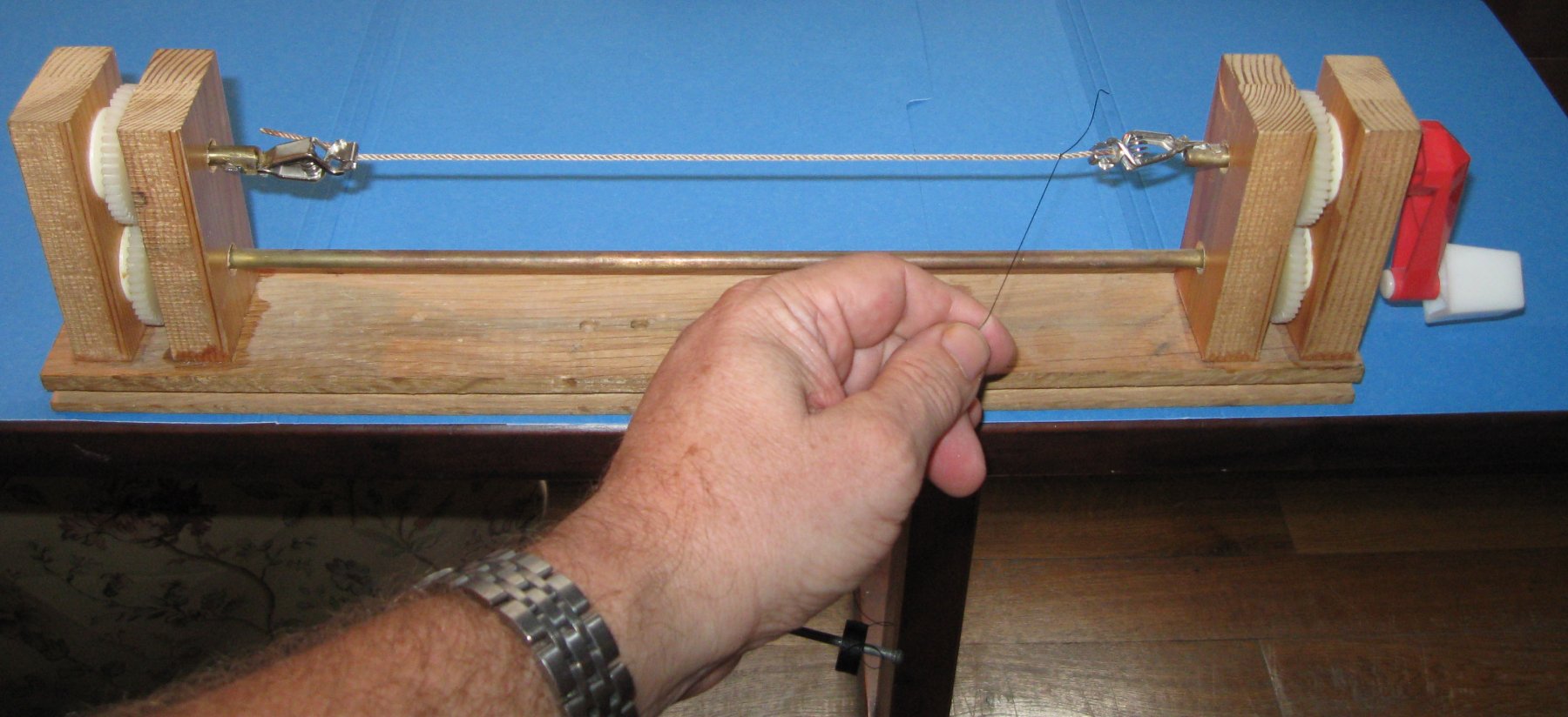
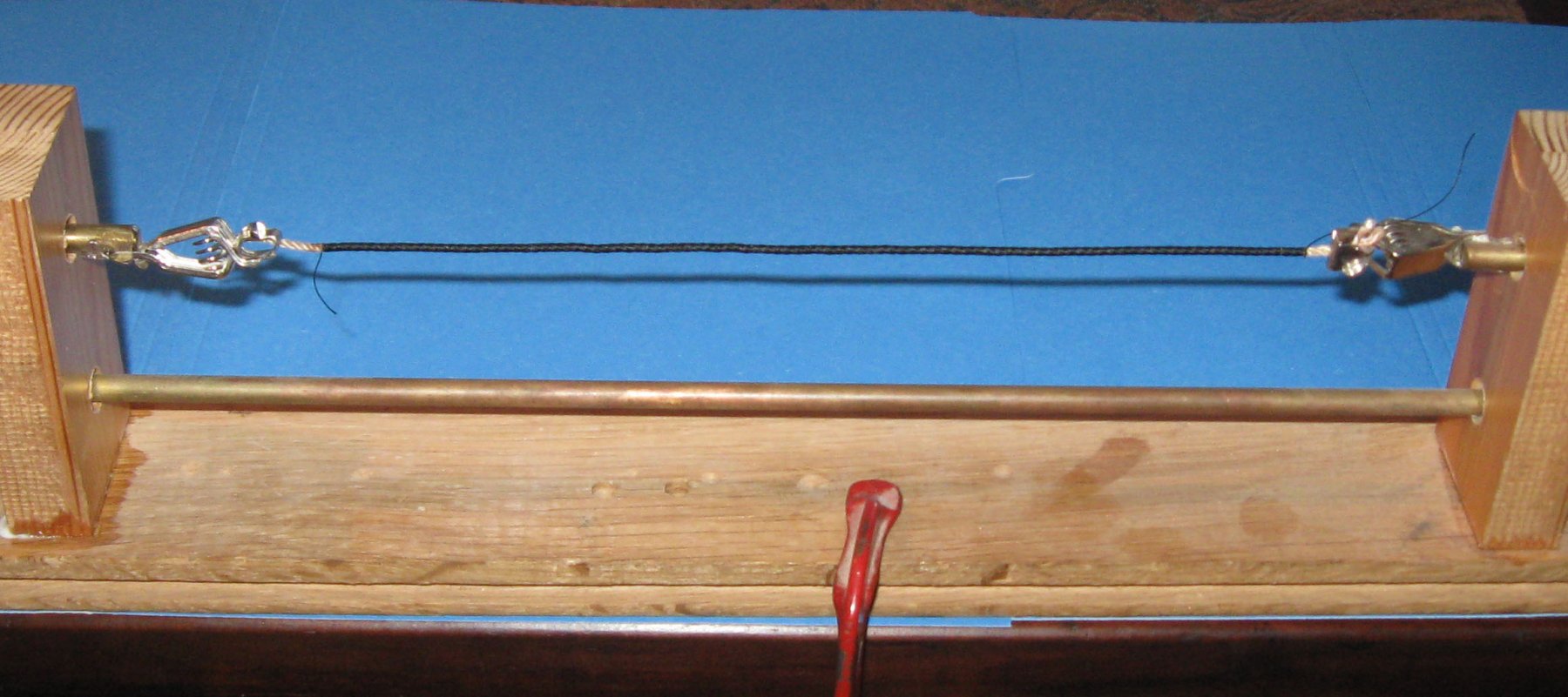
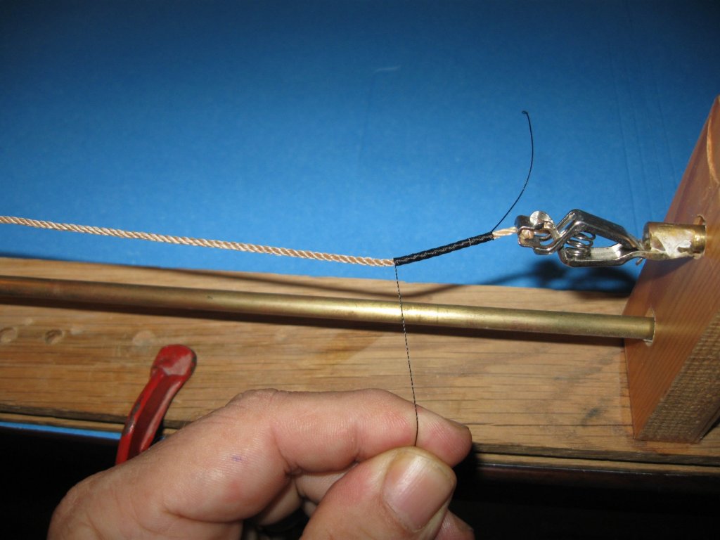
Hi Johann - Yes, I have wormed mainstays and forestays down to a scale of 1/96 (1/8" = 1'). I used a hand-cranked serving machine of my own design (see photos for the serving setup. I don't have a photo of the worming process, but it is essentially similar). The trick is to start all three worming lines at the same time, hold them in between thumb and fingers of one hand, which makes the tensions equal, and then to crank very slowly. It lays up pretty easily. I prefer the hand-cranked machine because I can stop and reverse easily if anything gets off-line. Securing them with dilute white glue, as Druxey suggests, is the final step. Best of success. Dan


-
Hi Keith - Welcome back and Happy New Year. You have made my year a bit happier already, anticipating following along with another of your lovely builds. Dan
-
Marc - For more pictures of the SL models at the convention, and many more, go here - https://shipsofscale.com/sosforums/threads/international-convention-of-model-shipbuilding-rochefort-france-18-th-21-st-october-2018.2050/
- 2,699 replies
-
- 4
-
-
- heller
- soleil royal
- (and 9 more)
-
Actually, it's dead easy. I can show you the next time you are over, but here is a quick explanation - 1. Lay out your nail pattern on a wooden plank that is longer and wider than you need and about 1/4" thick. 2 . Use a drill press to make holes the same size as the needle shaft. 3. Suspend the plank parallel to and about 1/4" above a hard, flat surface like a piece of glass. 4. Slide the needles through all the holes until they just touch the glass. 5. Flood the top side of the plank around the needles with thin CA. 6. When dry and the needles are fixed in place, turn over and flood the bottom side. 7. Trim the stamper from the plank, trim off the excess needle shafts, mount a handle and start stamping.
- 2,699 replies
-
- 3
-
-
- heller
- soleil royal
- (and 9 more)
-
Those rings you need are much smaller than I can make. Instead what I do is make an eyebolt. This gives me both the ring and a shaft to secure it to the model. After installation the ring can be bent in any desired direction. A piece of fine wire is folded around the shaft of a small drill bitt and the tails are twisted together until the eye forms around the drill. Doing it that way I can get even smaller 'rings' than you need. It works for me.
- 2,699 replies
-
- 3
-
-
- heller
- soleil royal
- (and 9 more)
-
Marc - Once again you inspire me with your scholarship and perseverance. It would drive me mad, Mad, Mad I Tell You !! - sorry about that little moment - so when I did the nailheads on the copper plates of Oneida, I made up a block of needles in the right pattern and impressed them all at once for each plate. Of course, I had to make a lot of them, so it more than justified the time spent making up the stamper. In your case, not so much. Whatever method you settle on, I know your result will be equally inspiring. Dan
- 2,699 replies
-
- 3
-
-
- heller
- soleil royal
- (and 9 more)
-
Hi Marc - How do you plan on making those numerous nailheads on the inside of the port lids. I never did it. They always seemed to be too much trouble to replicate on a surface that would rarely be seen. On a wooden surface they would have to be done one at a time. But on plastic, I think a custom decal could be created. Just musing out loud. Dan
- 2,699 replies
-
- 3
-
-
- heller
- soleil royal
- (and 9 more)
-
Coming along very nicely and neatly. Well done. Dan
- 714 replies
-
- 3
-
-
- lady nelson
- victory models
- (and 1 more)
-
Hi Vossie - The short answer is - they are all correct. Each shipyard, each designer, each shipwright would have had his own style and construction method that he preferred. Even two similar ships coming out of the same shipyard, built by the same shipwright, might have different details depending on when during his career the ship was built. Deck design would have been particularly variable, depending on the availability of longer or shorter planks at the time of construction. Unlike some French designs, the deck of an English or American cutter is not a significant structural component, so the only consideration would have been how to make it sturdy with the least wood wasted and the least manpower expended. Nibbing, hook scarphs, and other fancy joinery would have been limited to as few locations as possible, consistent with eliminating weak spots and reducing the chances of rot, unless the ship owner asked for all the bells and whistles. On a model, however, the appearance of the deck planking is a significant visual element. Like you, I have seen all combinations of nibbing, straight planking, tapered planking, hook scarphs, and many more besides. I expect that some things have been done on a model that were never done on a working ship. It is just a question of style. So go for it. Do the nibbing, the complicated scarph joints, hook joints and any other joinery that fits with the overall artistic presentation of your model. Whatever you decide, you can rest easy knowing that there was almost certainly a ship out there whose builder made the same choices. Be well Dan
- 714 replies
-
- 5
-
-
- lady nelson
- victory models
- (and 1 more)
-
Don't sell yourself short, Marc. This is dissertation level research and writing. Thanks for sharing. Dan
- 2,699 replies
-
- 3
-
-
- heller
- soleil royal
- (and 9 more)
-
Hi Carl - Yes, you are quite right. The optical effects of distance can be significant. Since it is a diorama, I planned to do a bit of weathering with filters, washes and glazes anyway, and I will take your advice to heart. But I first wanted to get the base colors as close as I could. The exact shades and tones may depend on the colors and intensities of the ocean once I model it. But that is for much later. Dan
- 238 replies
-
- 6
-
-
- leviathan
- troop ship
- (and 2 more)
-
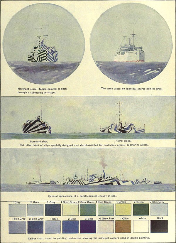
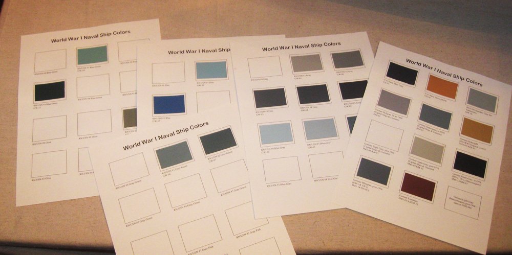
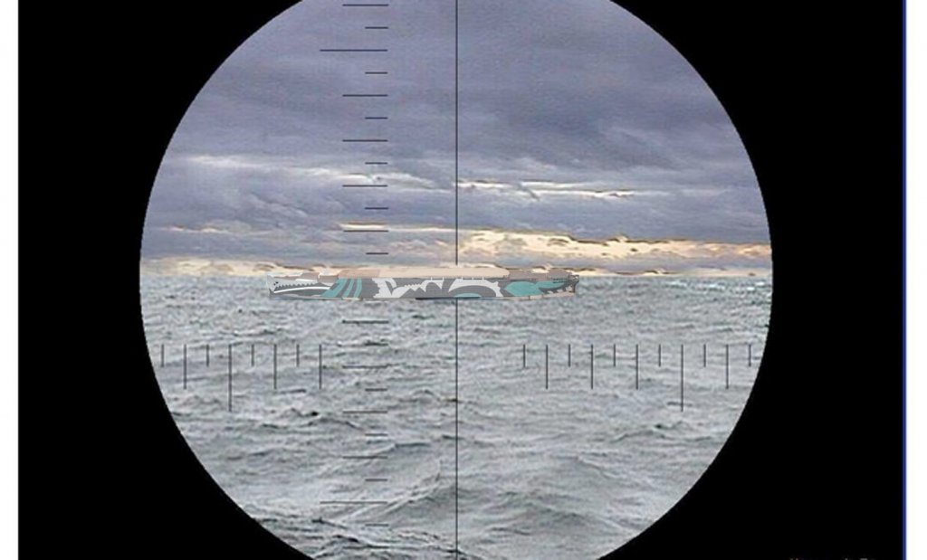
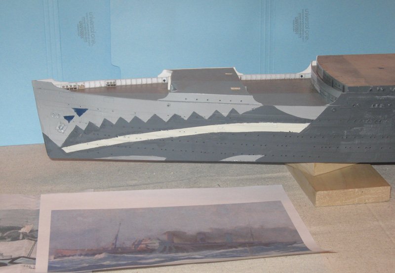
Hi all - Glad you all liked the dazzle work. I am still a bit uncertain about the tint of the Blue Green color. Living with it for a while I believe that it may be too green and maybe a shade too light. Professor Smith has some paint chips that should help. I think the other colors are good, so the upgrade will not be too difficult. Jan - I have evidence that the camouflage was painted on the forward face of the bow superstructure deck house, but none of the photos show the midships deck houses that are set back from the side of the ship, so I do not have that information. I am leaving them grey until more information becomes available. Marc - Confusion is precisely the goal of the dazzle schemes. Here is an approximation of what a U-Boat commander might have seen. With the Leviathan steaming along at 26 knots any hesitation would have meant that the opportunity for a torpedo shot would be quickly lost. "Gunnar! Ein torpedo los! "But, Capitain, was do I aim at?" Be well Dan
- 238 replies
-
- 7
-
-
- leviathan
- troop ship
- (and 2 more)
-
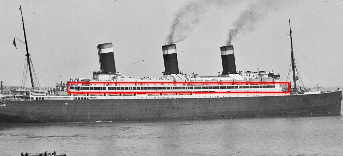
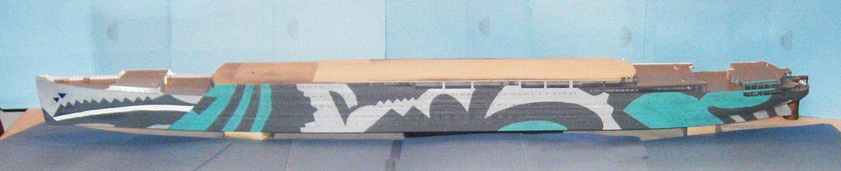
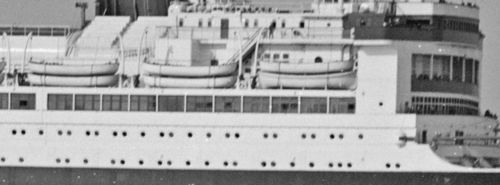
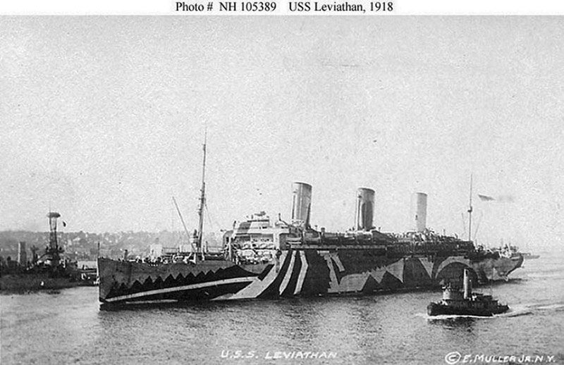
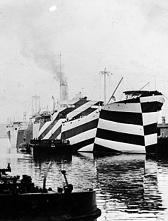
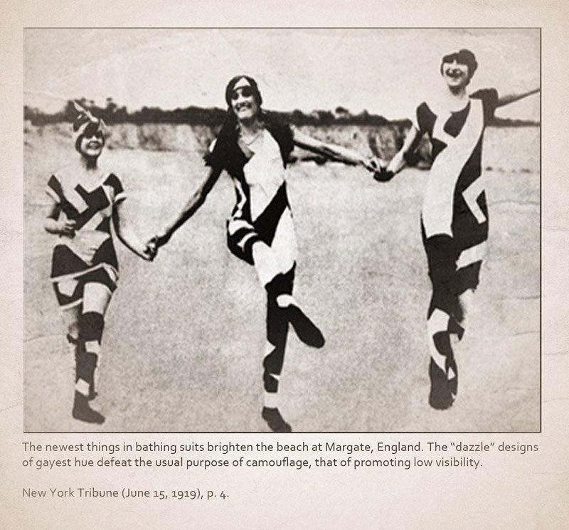
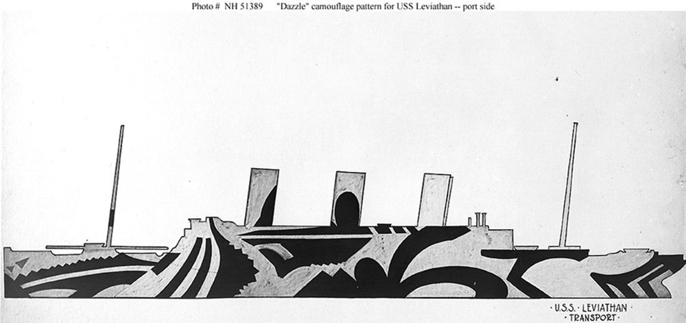
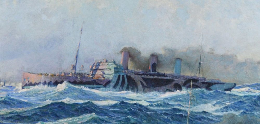
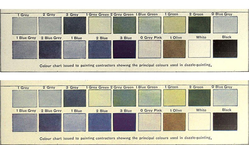
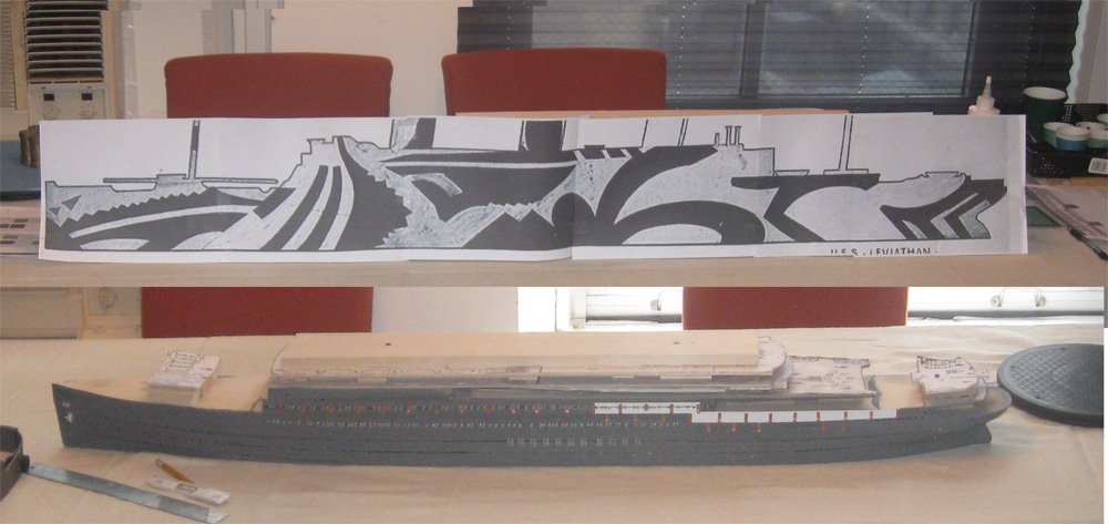
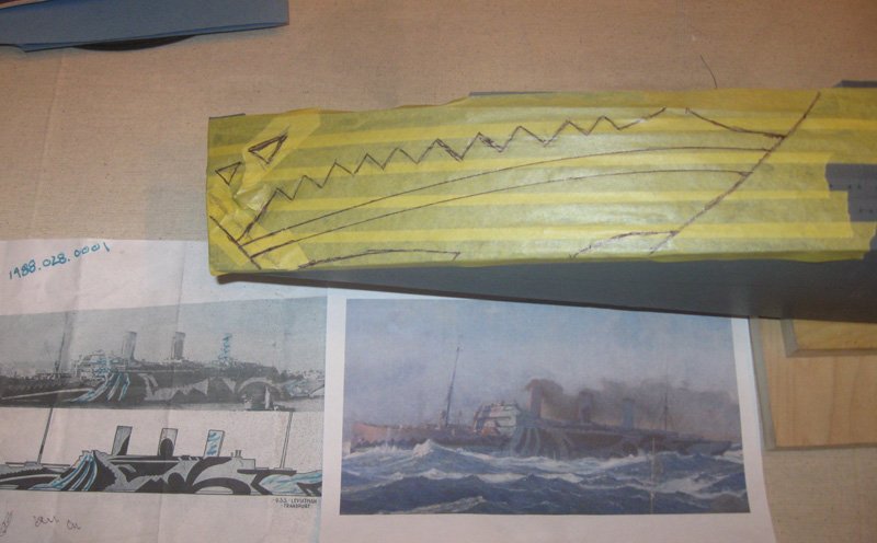
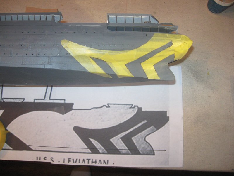
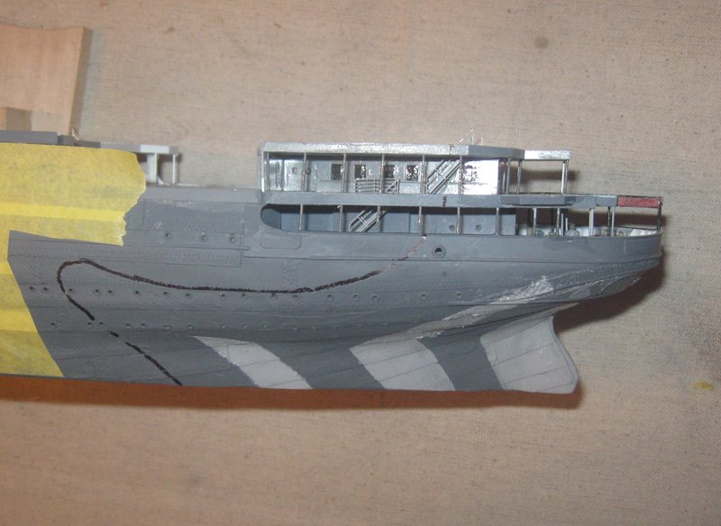
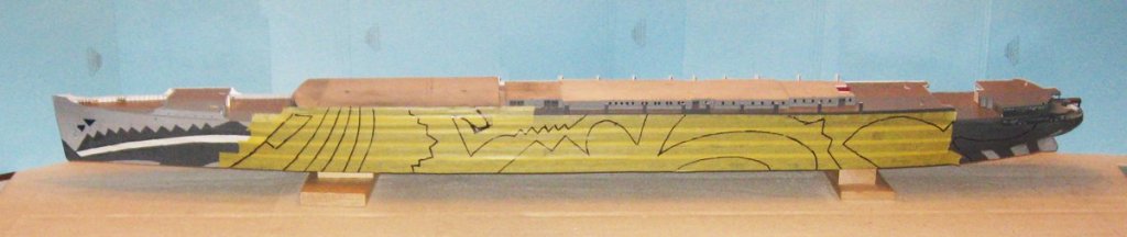
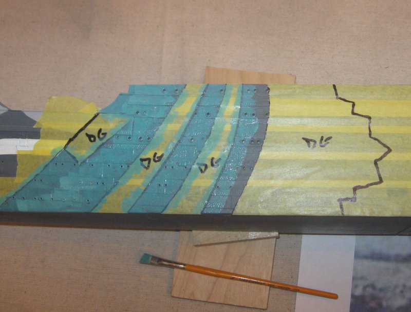
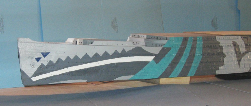
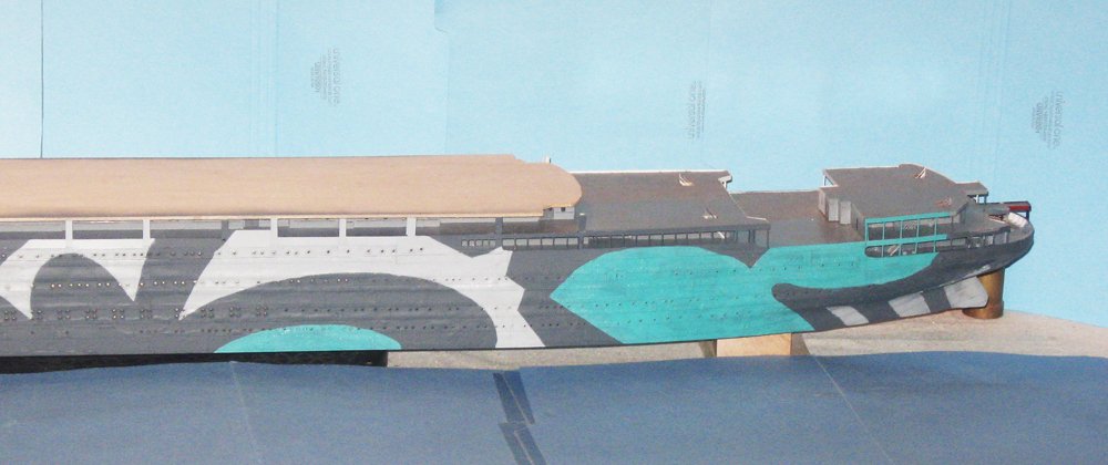
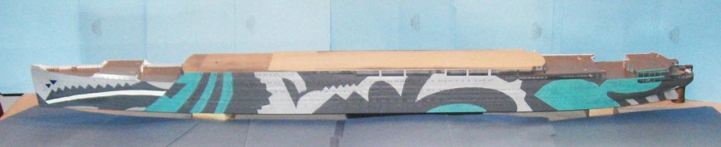
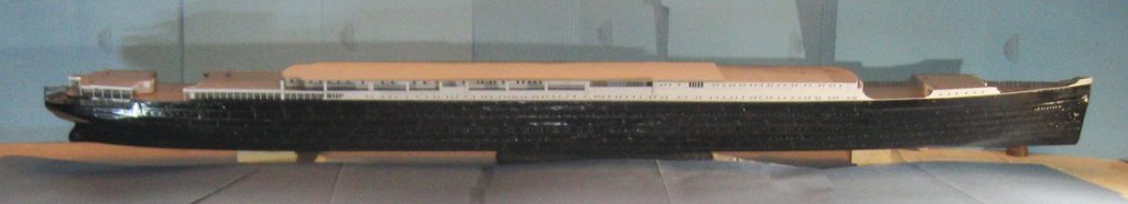
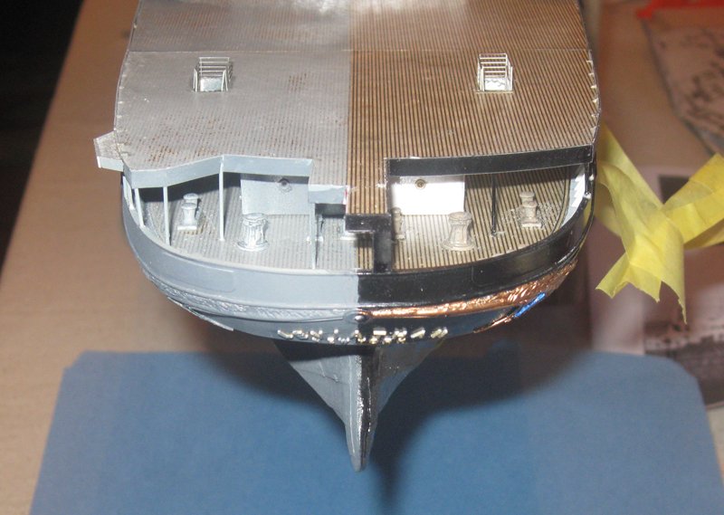
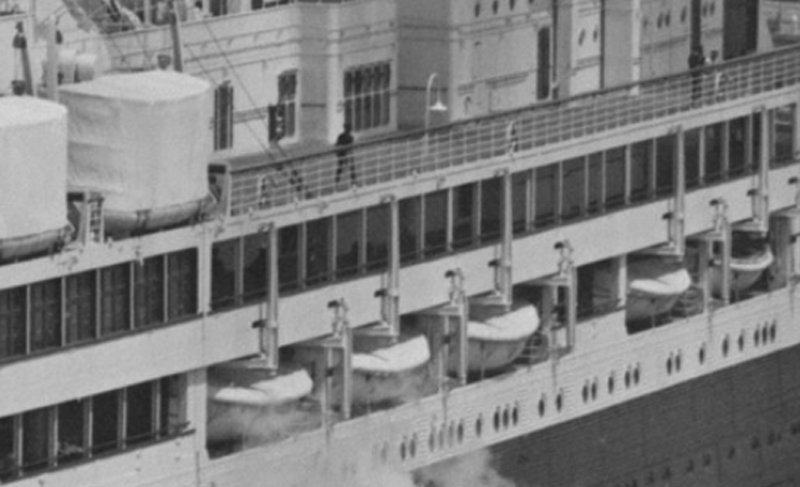
Thanks for all the likes and comments. And Marc, never hesitate to point out something that I may have missed. More eyes just means that fewer mistakes will get through to the final product. With the model hull on the port side fully primed, it was time to figure out how to paint the complex and confusing ‘dazzle’ design that the troop ship bore. Dazzle camouflage, called ‘razzle-dazzle’ by us Yanks, was developed in England during World War I in response to Germany’s use of unlimited submarine warfare. Credited to both a marine artist and a zoologist, the idea was not to make a ship invisible, as overall grey tries to do, but to make it difficult to estimate a target's range, speed, and heading. It was intended primarily to mislead the enemy about a ship's course and so to make him take up a poor firing position. It generally consisted of complex patterns of geometric shapes in contrasting colors that interrupt and intersect each other. It has been suggested that it works on the coincidence rangefinders used by submarines by making it hard to align the split images in the eyepiece. The clashing patterns look abnormal even when not seen through a rangefinder. Below is an actual photo of the USS West Mahomet. Try to find the bow. As seen in this 1922 illustration from the Encyclopedia Brittanica, dazzle can work for single ships, but for a convoy the appearance can be overwhelmingly confusing. Its effectiveness was analyzed after the war. Although British data is equivocal, among American merchantmen 2,500 tons and over, 78 uncamouflaged ships were sunk, but only 11 camouflaged ships sunk by torpedoes. No camouflaged US Navy ships were sunk at all. In the words of a U-Boat captain: “It was not until she was within half a mile that I could make out she was one ship [not several] steering a course at right angles, crossing from starboard to port. The dark painted stripes on her after part made her stern appear her bow, and a broad cut of green paint amidships looks like a patch of water. The weather was bright and visibility good; this was the best camouflage I have ever seen.” This may have been what he was looking at - Fortunately I did not have to rely on photographs of the troop ship to get the dazzle design I needed. The National Archives contains drawings of the dazzle pattern for Leviathan. Here is the one for the port side. This and the several photographs of the ship taken during the war were my starting point. Obviously, both the pattern and the photos are in black and white, but color was also a central part of dazzle camouflage. For Leviathan it appears from the different shadings within the various areas of the pattern that several colors were involved. The Brittanica page has a chart of all the colors used, but which colors went in which area? Fortunately, the Merchant Marine museum has a large painting of the ship in moderately heavy seas. It was done by Frederick J. Waugh, a marine artist who had been part of the American Camouflage Section which was responsible for designing the patterns for US Navy ships. The painting was very helpful in identifying the look of the ship, but for model making it has some problems. Careful comparison with both the drawn pattern and the photographs reveals some inconsistencies in the size and location of some of the camouflage shapes, so I went back to the photos for the final layout. As for the colors, I was somewhat hesitant to rely on Waugh’s choice of hue and tone since he has other artistic factors to consider beyond exact reproduction. Instead, I went back to the color chart on the Brittanica page. It was clear that the page had yellowed somewhat, so I took the chart and adjusted the contrast, hue, and saturation until the background color of the page and the white color chip looked as close as I could get them, which is the lower set of colors. After consultation with Professor Smith, we selected 1 Grey, 3 Grey, 1 Blue Green, 2 Blue, and White. With those decisions made I took the dazzle layout and enlarged it to the size of the model. Here it is, propped against the model. I should have put them side by side for comparison, but forgot to take the photo. So for comparison here is a shot of the port side from an earlier date. The red things are the backs of our dining room chairs. To lay out the design I knew that I could not simply cut out the pattern. The model has too many curves that would distort the shapes, and I found that in any case the pattern did not accurately match the landmarks and dimensions of the model. I would have to draw the pattern on the model by eye. I decided to start with the bow, even though it is the most complicated area, because it had a clearly defined edge that could be reliably fixed to a landmark on the ship. I covered the bow with strips of masking tape, then drew on the diagonal line at the aft edge starting with the point where the superstructure met the side bulwark. Using the photo, the drawing and the painting, together with a small straightedge and some ships’ curves, I sketched in the outlines of the color areas. A word here about the tape. It is “Frogtape” in the yellow formula for delicate surfaces. I find that it holds quite well and releases cleanly with no residue. I messed up drawing the bow pattern several times and had to remove all of the first layer of tape which came up without damaging the surface at all. No connection to the company, just a happy customer. I repeated the process at the stern, which has a much simpler pattern, but has to work around much more acute curves. You can see how the shapes had to be modified to hit the landmarks on the ship rather than simply taking them from the drawing. Once the drawing was satisfactory, I cut down through the tape to the hull using a new paper cutting blade. The tape was burnished down and a sealer coat of clear acrylic was brushed along the edge to reduce bleeding. Then the three open areas were sprayed with the 1 Grey color. When the tape was removed the results were surprisingly satisfactory considering how uneven the surface is. Only a little cleanup along the edges was needed. Returning to the bow the long white stripe was cut and unmasked, burnished, sealed and sprayed. When it was dry the area was re-masked with tape. The inside of the bulwarks, the tops of the deck houses, and all other side areas were masked with tape and newspaper before the light grey areas were unmasked and painted. When everything was dry the masks were all removed. The result was a - - - Disaster! Despite the burnishing and sealing there was bleeding at so many spots that I spent more time hand-painting the edges than I had spent on the masking. Ultimately I was satisfied with the sharpness of the edges and the layout of the pattern, but it took a lot longer than it should have. With most of the kinks worked out I taped over the long midships section and laid out the pattern. This time, after removing the masks from the Blue Green areas, I lightly brushed the paint from the edge of the tape inward toward the center of the area. Using a fairly dry brush gave me no bleeding under the edge so when the tape was removed the edge was cleanly marked by a light layer of paint. A second coat was hand painted up to the edge to even out the hue and to make it fully opaque. This was not difficult with the edges so cleanly marked. The same was done for the light grey areas. Here is the forward portion of the ship. And here the stern. I will never look at this without seeing a rabbit chasing an octopus. I wonder what the U-Boat captain might have thought, seeing this in his periscope. By way of comparison, here is the boring black and white of the ocean liner. Travel and family gatherings will fill the rest of the month, so I bid everyone a joyous Happy Holidays and excellent New Year. Dan

- 238 replies
-
- 24
-
-
- leviathan
- troop ship
- (and 2 more)
-
Beautiful work, Marc - Seeing it coming together like this, especially in the close up shots, is truly striking. Dan
- 2,699 replies
-
- 3
-
-
- heller
- soleil royal
- (and 9 more)
-
Hi Marc - It is great fun to watch your experiments. Some of the results really look like weathered wood. Well done! I am a bit unsure of how much weathering the ship herself would have been allowed, given that she was a major capital ship which was in port for long periods of time with a crew available for nearly continuous maintenance work. Looking forward to seeing which look you go for. Dan
- 2,699 replies
-
- 4
-
-
- heller
- soleil royal
- (and 9 more)
-
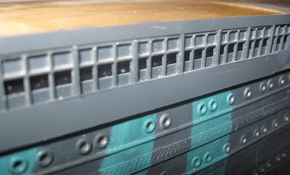
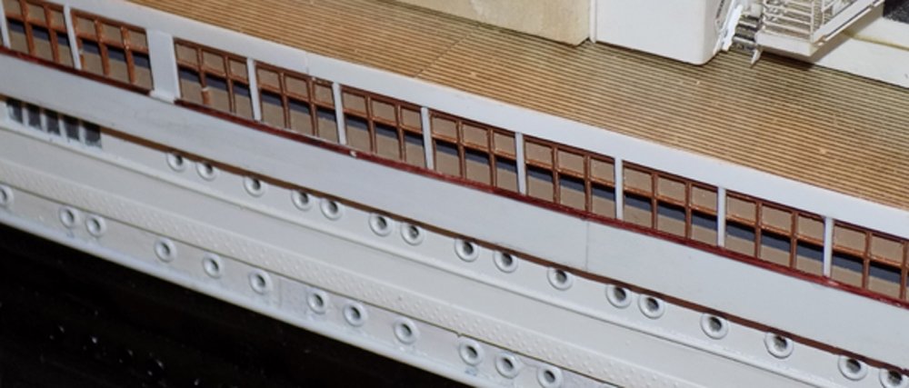
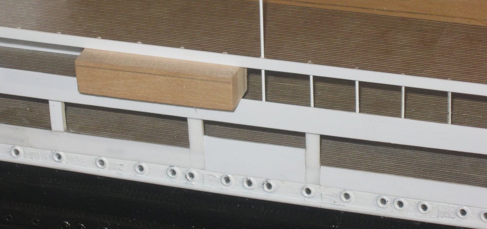
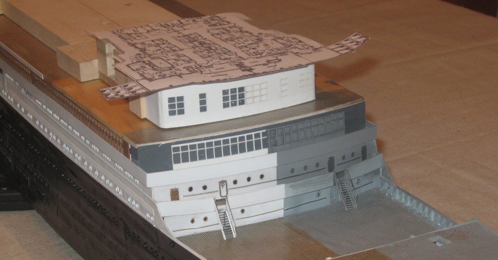
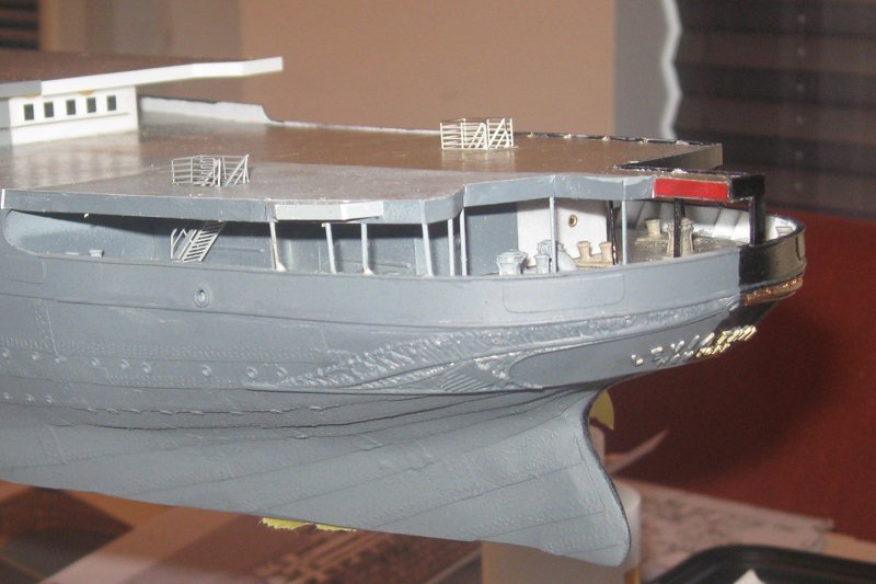
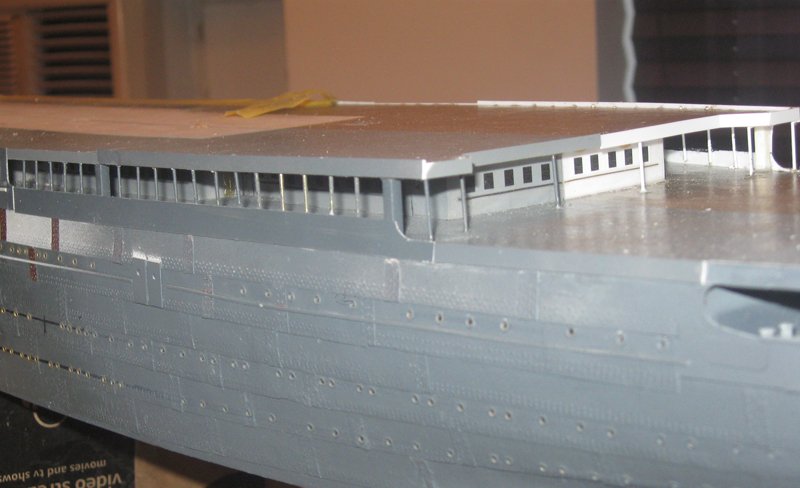
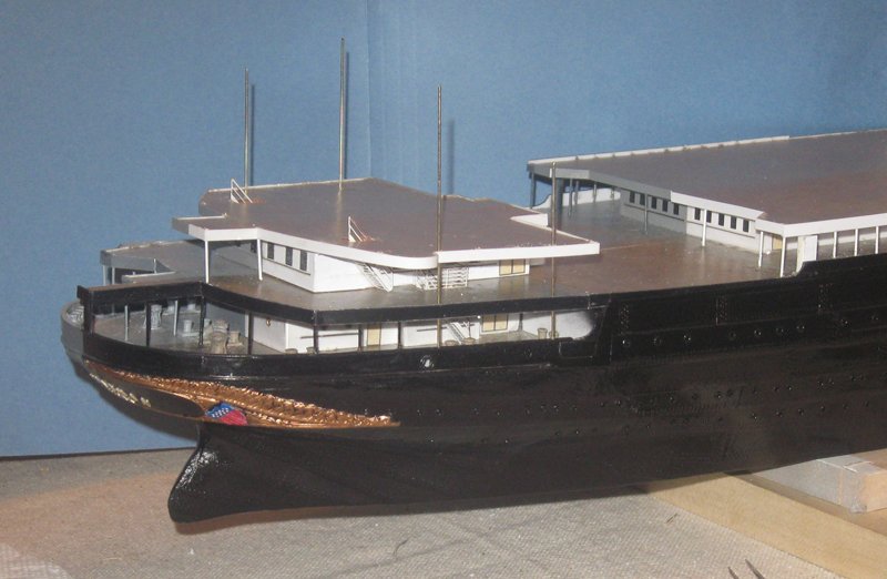
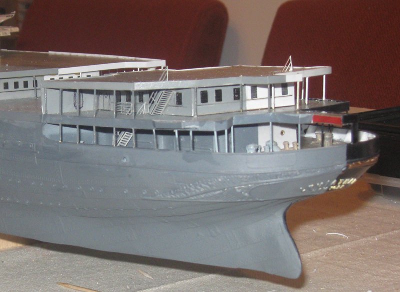
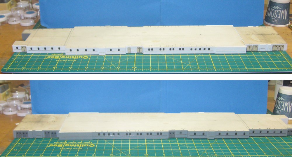
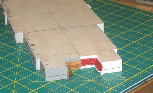
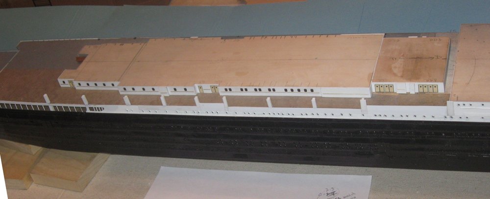
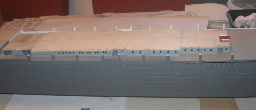
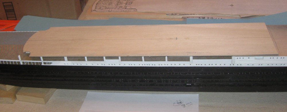
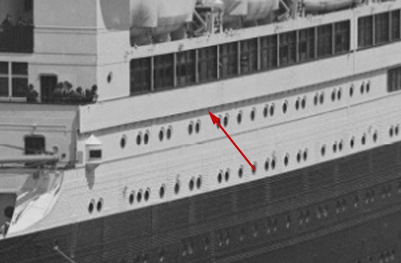
Hi again to all, and I hope you had an excellent holiday. Thanks, as always, for the likes and comments. So, with the stern decorations done, I could work inward and upward without having to turn the ship upside down any longer. This set me up to permanently install the two partial decks at the stern. The first was the E level deck house topped by the D level deck with the added gun platform. It was placed so the perimeter was exactly above the caprail below it. Once it was glued in place I slid stanchions down through holes that were previously drilled in the deck. The stanchions were made from 0.032” brass rod, painted grey on the port side and black on stbd. They were clipped short so they sank below the level of the upper deck. The holes will be covered by a margin plank and the base of railings yet to come. Forward of this area the D deck house sits back from the sides of the ship, creating an open walkway for a portion of its length. The shape of the house was taken from the plans, then cut, sheathed and painted. The windows, doors and handrails were added and it was secured in place. Along the perimeter two pillars of 1/8” square stock hold up C deck where it overhangs the deck house and gives a roof to the walkway. The C deck piece was carefully aligned and glued in place, then stanchions were painted, located from the photographs, and installed as before. The small D deck house island had to be located so its perimeter stanchions rose exactly above the ones below. To do this I slid in extra-long rods through the holes in both decks and adjusted them until everything lined up. Then the island could be permanently glued in place. The remaining stanchions were drilled through and installed, completing the stern structures. Photoetched stairways and railings add detail and a sense of scale. The one stanchion that is a bit askew was later corrected after examining this photo. Continuing up and in, the large C deck house was built in the usual sequence. I am finally happy with how the dark windows and doors set off the grey of the troop ship side. The aft end of this deck house is labelled on the plans as the ‘veranda’, with a feature that I could not understand. There were no photographs of the area because it is deep under the overhang of the deck above. I chose to interpret it as casual seating with a plain wooden bench for the troops but upholstered seating for the paying customers. No one will see it, but I will know that it is there. The deck house was installed, leaving an even wider and longer open space than the walkway below. At the perimeter of the ship ten pillars support the overhanging B deck and divide the area into sections. The edging is quite low, almost at deck level for most of the length of the area, but with raised solid railings in two of the sections. Rather than being a promenade, as is present on most ocean liners, this open area houses some of the many lifeboats that the ship carried, even as the Vaterland. Was this a change made during construction in response to the Titanic sinking only two years before her launch? The exterior location and ‘added on’ look of the boat cranes that you can see in the photos perhaps points in that direction. An interesting question, but one I do not have time to explore now. The port side received the same pillars and railings, only in grey rather than white. Now I could give the entire troop ship side its coat of dark grey primer. This visually flattened out all of the rivets, portholes, doors and moldings that I worked so hard on, leaving only a sense of rough texture. This was just the look I was going for. With the B deck piece set in place you can see how the solid and open areas are forming and defining the unique look of the ship. It turns out that this is a good point to pause in the structural construction. B deck actually extends out beyond the lower hull. The overhang is only about 18 inches on each side, but it makes a distinct shadow line that appears in this photo and many others, and has to be accounted for on the model. Above this line the design of the ship gets very complicated and intricate, so I took the opportunity to do the final painting on the lower hull while the masking was easy. Next time – the dazzle scheme. Till then, be well. Dan
- 238 replies
-
- 22
-
-
- leviathan
- troop ship
- (and 2 more)
-
Marc - Really excellent dedication to experimentation to find the best solution. I might have chosen the more golden tone, more like what I recall in the various paintings and Doris' work, but the darker tone is probably more realistic. It will provide a clearer contrast with the decorative details that you have worked so hard on. Looking forward to seeing how it all comes together. Dan
- 2,699 replies
-
- 2
-
-
- heller
- soleil royal
- (and 9 more)
-
Congratulations, Nils. She is a beauty. What a wonderful, whimsical piece of art to have in your home. And you will always know that it was made with your own hands. Bravo! Dan
- 692 replies
-
- 4
-
-
- eagle of algier
- chebec
- (and 2 more)
-
Hi Chuck - Beautiful work, as always. Your color choices and contrasts are strikingly beautiful. I would put in the last set of thole pins. You have eight thwarts, so there should be eight sets of pins. They may not all have been used all the time, but you would want to have them available if you needed additional oarsmen for speed or power. Happy Thanksgiving. Dan
- 421 replies
-
- 2
-
-
- medway longboat
- Syren Ship Model Company
- (and 1 more)
-
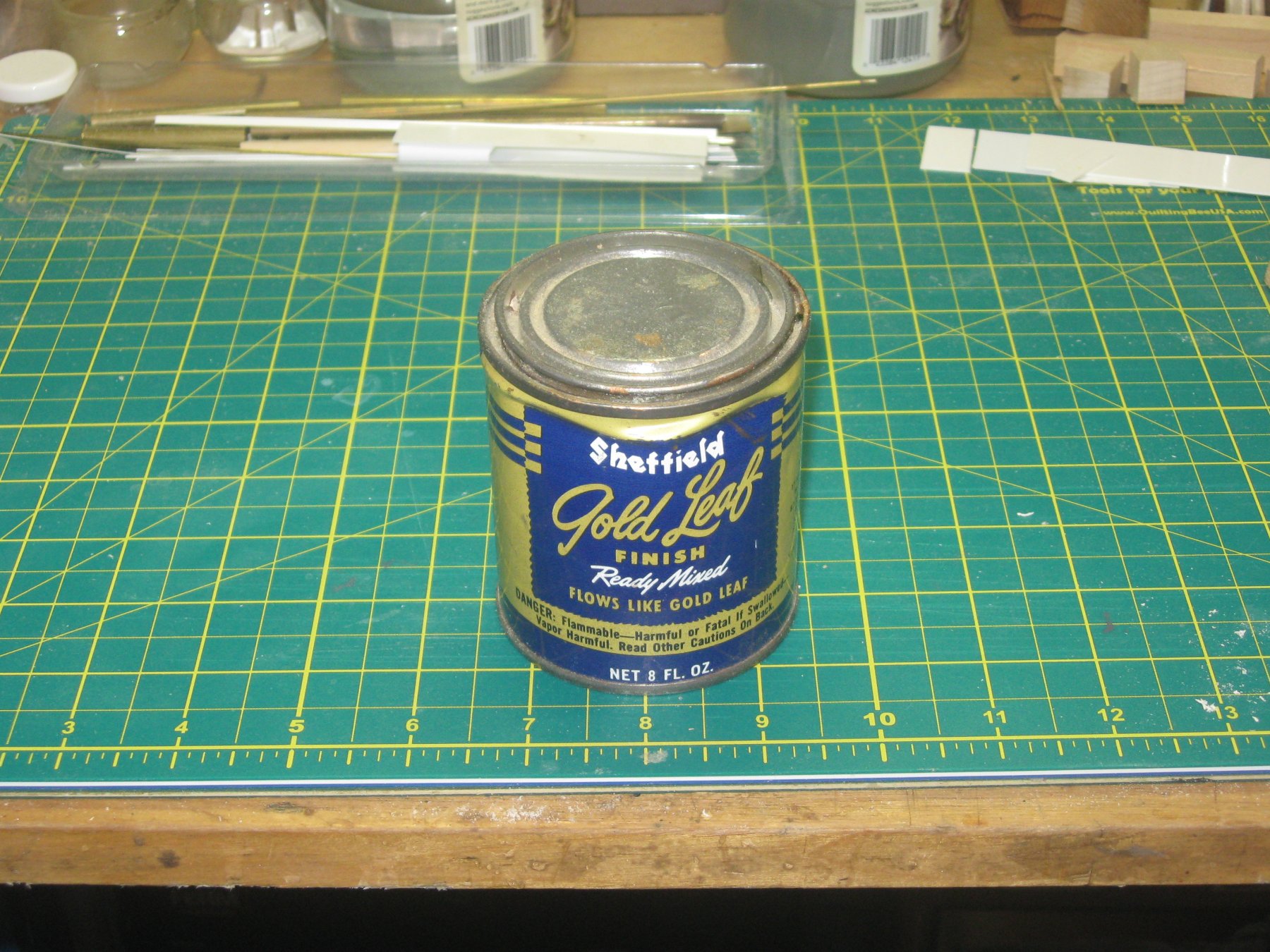
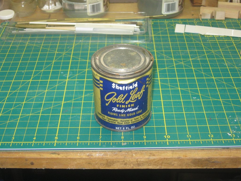
Hi Nils, Druxey - And thanks to all who hit the 'like' button. Druxey, here is the gold leaf paint that I use. I have had the can for quite a while and do not remember where I got it. Dan
- 238 replies
-
- 7
-
-
- leviathan
- troop ship
- (and 2 more)