Hubac's Historian
-
Posts
2,941 -
Joined
-
Last visited
Content Type
Profiles
Forums
Gallery
Events
Everything posted by Hubac's Historian
-
 The build originated under Michael’s old screen name: SafeMaster. He recently changed his screen name to 72Nova.
 -
This whole build is a treat for the eyes. Not only is the decorative work superlative, his natural wood effects are some of the best I’ve seen.
- 1,503 replies
-
- 1
-

-
- Le Soleil Royal
- Heller
- (and 1 more)
-
Since you are planning to actually gold leaf the ornament, I would take a look at Michael’s (72Nova) Reale build. He did such an amazing and convincing job of it.
- 1,503 replies
-
- 2
-
-
- Le Soleil Royal
- Heller
- (and 1 more)
-
Hi Bill - I recommend you take a look at this section of Popeye2Sea’s log, to get a better sense of materials and process. 4 Gauge is going to be much too heavy. I haven’t really figured this out yet, myself, but I think 28 gauge is the biggest I would go.
- 1,503 replies
-
- 1
-
-
- Le Soleil Royal
- Heller
- (and 1 more)
-
Often the best approach, Vic. The eye is more sure than the hand - every time
- 2,437 replies
-
- 4
-
-
- heller
- soleil royal
- (and 9 more)
-
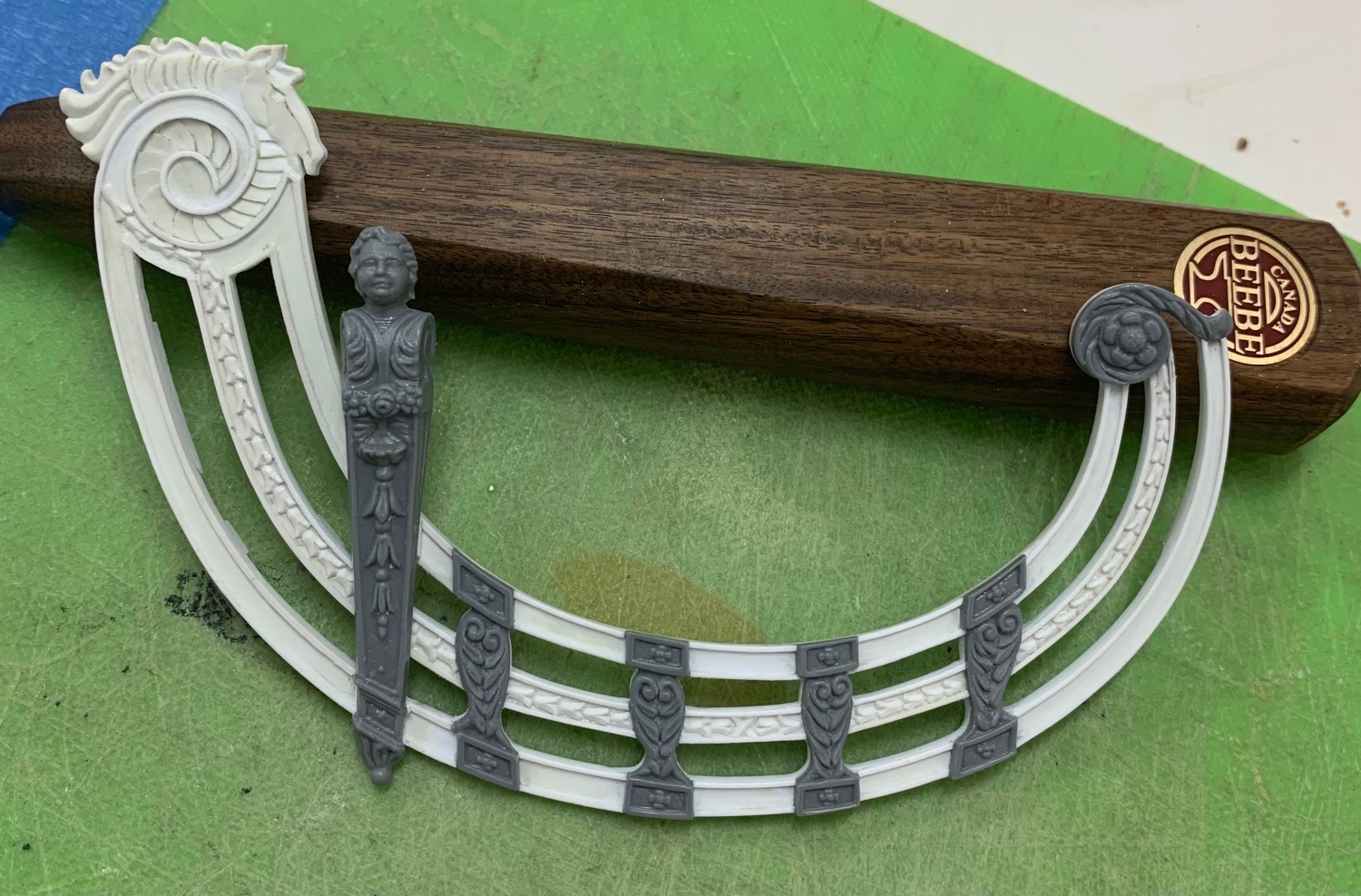
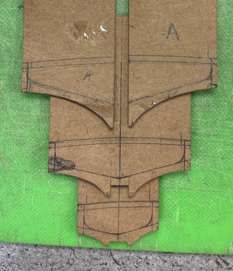
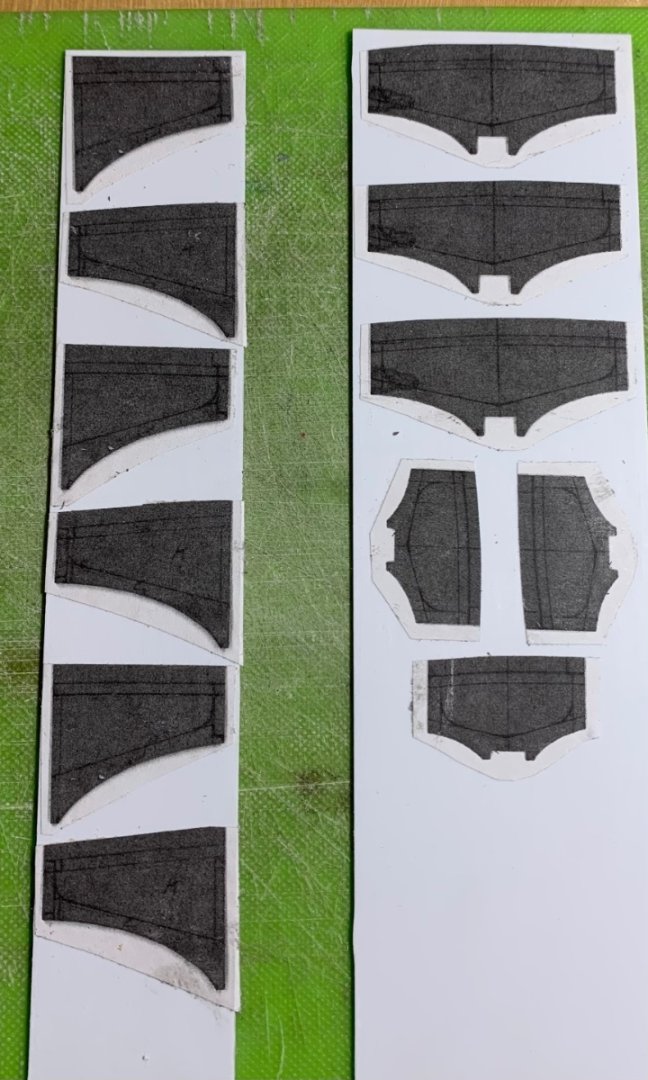
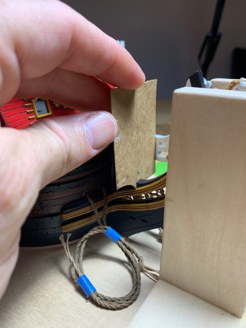
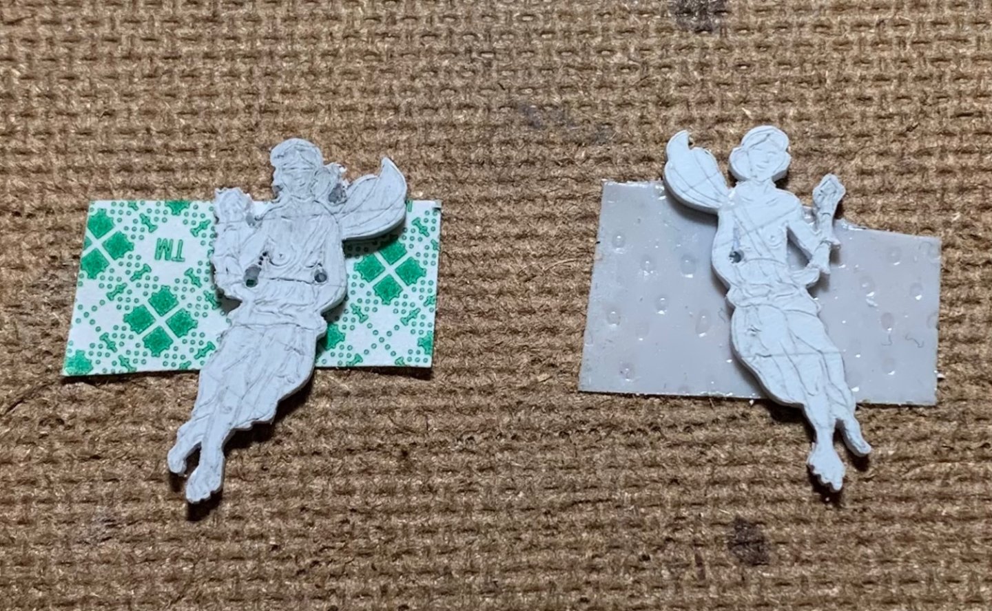
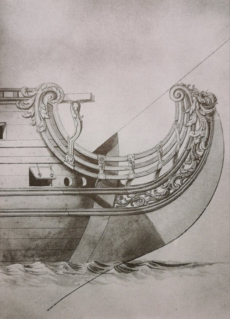
Thank you, Kevin. Despite this incident, I still love loving in a big city. I grew up in the suburbs, and that was great until it wasn’t anymore. Still a nice place to visit, though. As for astronomy, it seems as though astrophysicists are making quantum optical strides all the time. I’d hold onto those telescopes, too, but then I’m loath to throw anything away! So, I’ve spent the past few nights mapping and templating card patterns for these headrail support structures. Anyone who has been following this build can attest to my love for lamination, and these parts will be no exception; each station is made up of three layers of .030 styrene card stock. The method will become clearer in subsequent postings, but the primary challenge - once again - is coping with a similar trapezoidal asymmetry in the bow, as in the stern; the starboard side of the beakhead bulkhead projects further forward than port. Co-incidentally, it is also the starboard side, at the stern, that projects further aft. How the starboard side ended up so considerably longer than port, when the mid-ships ladders were my alignment point of reference - I will never understand. Anyway, as any good field carpenter must do, this will be about making the installation appear correct and seamless. A few pictures: With a centerline drawn on the cardboard, as a visual check against the center of the stem, I found the distance to each headrail, working one side of patterns at a time. I also marked the bottom of the lowest headrail, and just above the midpoint of the middle headrail on each pattern. This enabled me to map the scalloped pattern on the undersides of these supporting timbers (as well as the cambered uppers) so that they ultimately extend out beneath the underside of the lowest headrail. As I first drew the interior scanting of these structures, they were much too heavy and there was no reasonable transition from rising timber to vertical timber. I wish I had taken pictures to show the difference, but I did not. I consulted JCL’s St. Philippe monograph and was rewarded with a much better impression of what these structures should look like. It bears mentioning that these structures are still oversize, so that I can fair to final form after lamination. Keen eyes will observe that one side rises higher (about a 1/16”) than the other. This is one result of the asymmetry that I am referring to. It can’t be fixed; only mitigated. Fortunately, from any viewing angle on the finished model, the combination of gratings camber and consistent alignment with the middle rail on both sides will mask this deficiency. Proof of concept may prove me wrong, but I’m pretty confident that if I weren’t pointing this all out - it would not be obvious to even trained eyes. For the time being, though, I am pleased that my patterns are glued and ready for wasting: In other works, these fair maidens are rounding into form: They’ll have to see a podiatrist, but then - don’t we all? As always, I appreciate the support of everyone who comes to visit this page. Thank you all very much! More to follow.
- 2,437 replies
-
- 17
-
-
- heller
- soleil royal
- (and 9 more)
-
This all looks so perfectly good, Kevin!
-
Michael, this is a really fresh approach to an old, old kit! I love the modifications, and you have really nailed the tone on the PEG-preserved timbers. I'm really going to enjoy watching this one take shape!
-
I’ll be making up my own chains. What you are aiming for is what you see on the Frolich model of L’Ambiteaux: photo courtesy of Marc Yeu
- 1,503 replies
-
- 2
-
-
- Le Soleil Royal
- Heller
- (and 1 more)
-
According to Puget, round deadeyes are right-on!
- 1,503 replies
-
- 2
-
-
- Le Soleil Royal
- Heller
- (and 1 more)
-
The sheer of your wales runs very true to the times, which is a detail that not many builders of this kit pay close attention to. It all looks superb to my eyes!
-
Thank you, Marc! My jaw has made a full recovery and suspect posters are now posted in the subways, which is good. I don’t really expect anything to come of it, but one never knows. I’ve begun patterning the headrail supports structures and the cambered head grating. This will be a fun and interesting component of the build.
- 2,437 replies
-
- 8
-
-
- heller
- soleil royal
- (and 9 more)
-
I’m not really sure why Heller opted for triangular deadeyes, but round would certainly be appropriate for a French ship of this period.
- 1,503 replies
-
- 2
-
-
- Le Soleil Royal
- Heller
- (and 1 more)
-
She’s a remarkable achievement, Bill! I hope you’ve cracked into a bottle of Papi Van Winkel, or something similarly rarified to celebrate the occasion. I’ll be looking for your SR log. The main thing on that build will be to take your time. My recommendation would be to sand away all of the raised grain with 50 grit paper; the resulting scratches in the surface of the plastic will give you a much better sense of grain structure that shows well with wash coats. I’ll see you there in a beat or two!
-
Fantastic finish, and an exceptionally beautiful model, B.E.! As always, I look forward to your next project with great anticiption.
- 858 replies
-
- 5
-
-

-
- Sphinx
- Vanguard Models
- (and 1 more)
-
Congratulations, Chuck, on a very fine build. This is inspiring stuff!
- 1,784 replies
-
- 5
-
-
- syren ship model
- winchelsea
- (and 1 more)
-
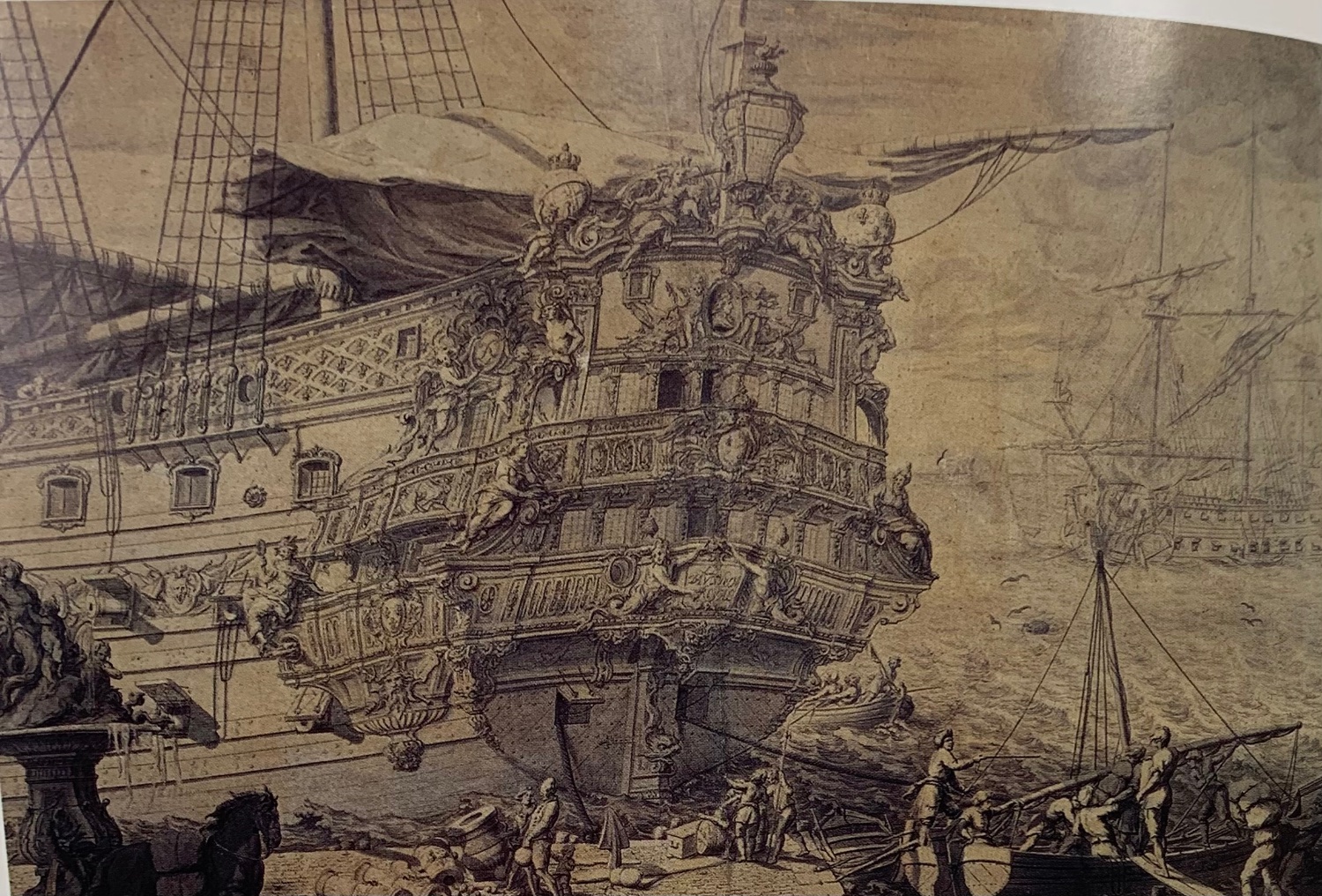
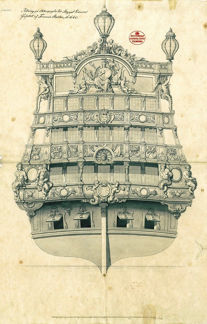
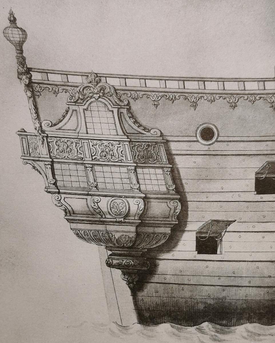
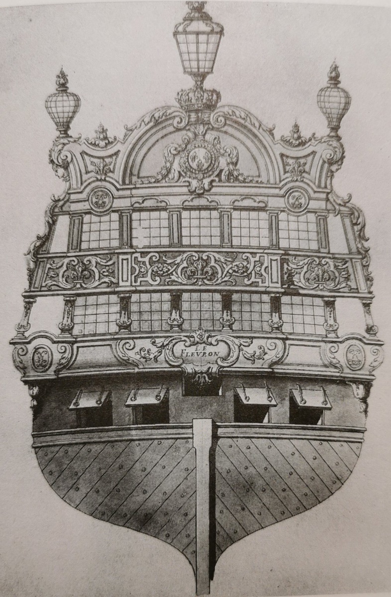
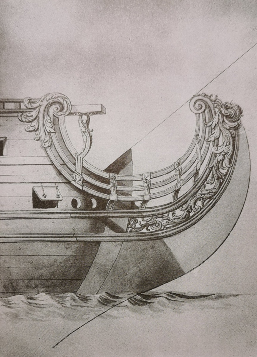
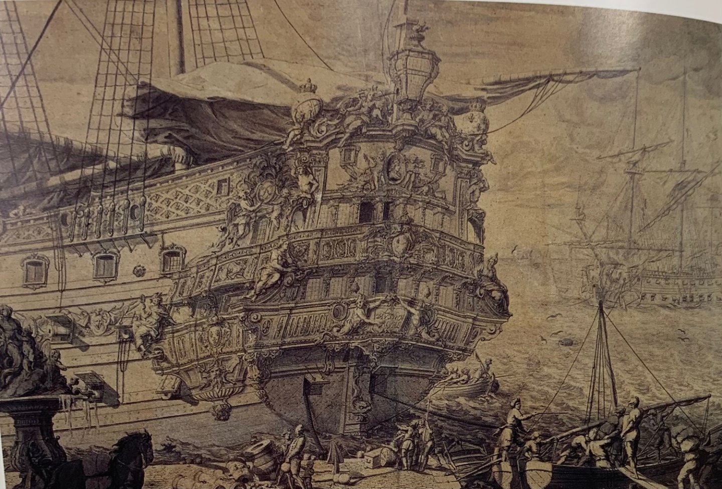
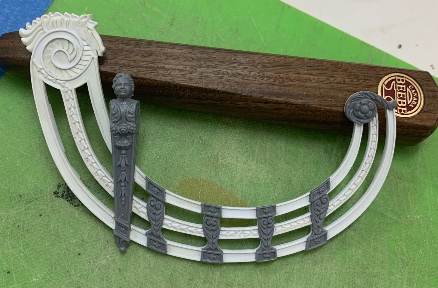
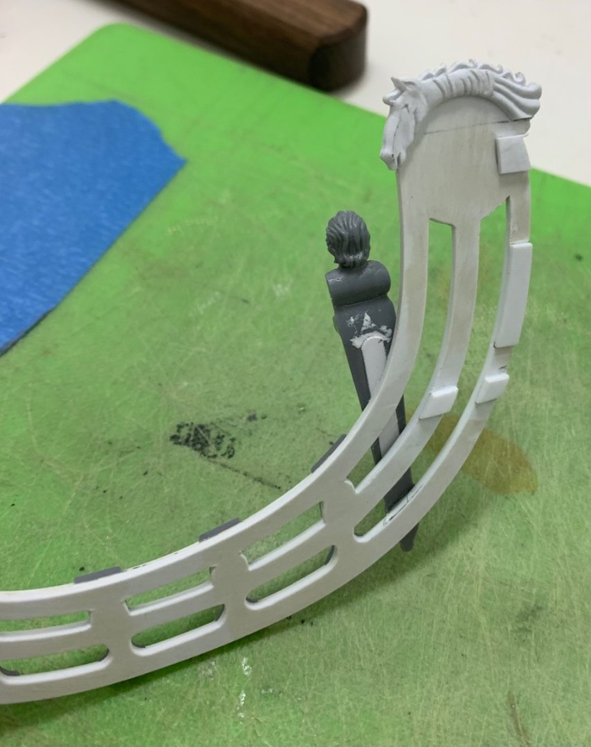
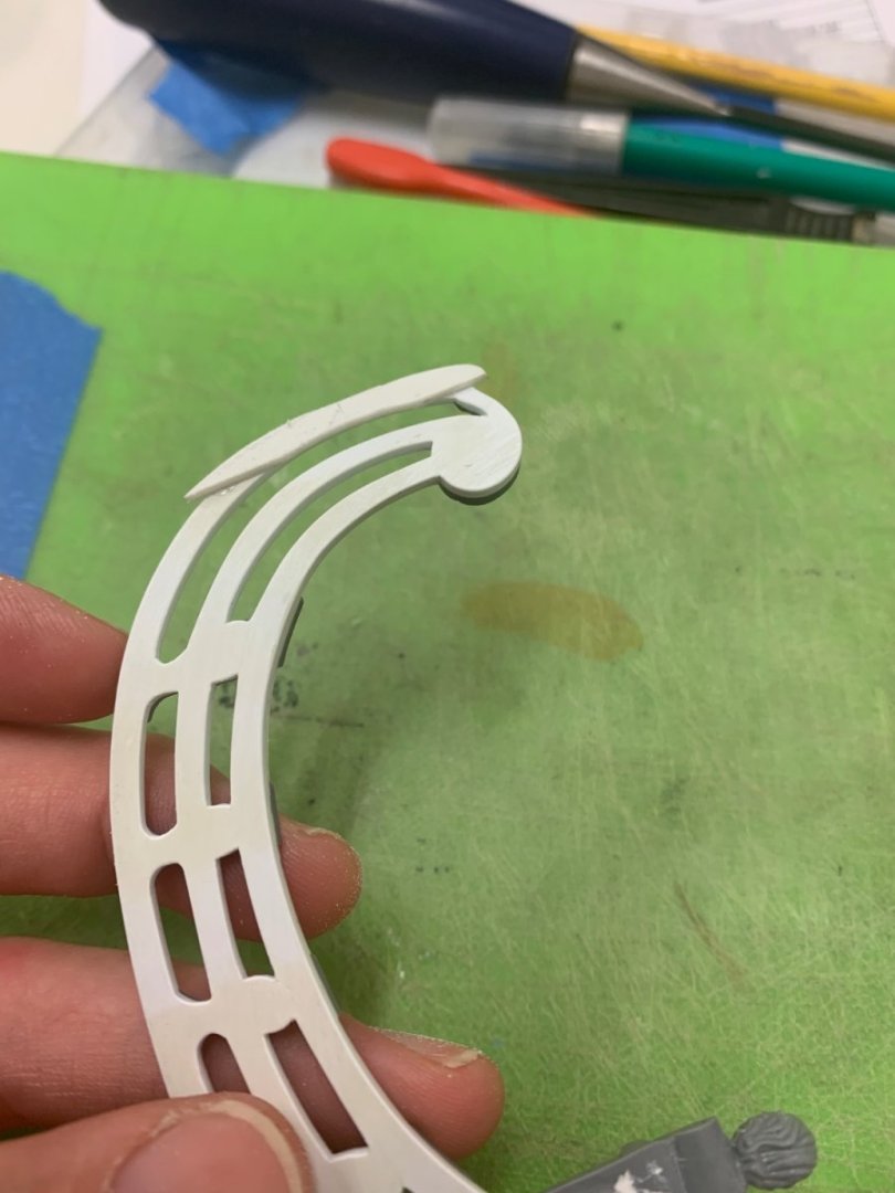
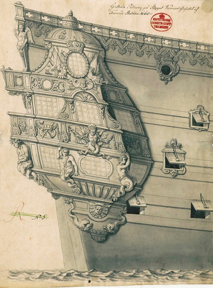
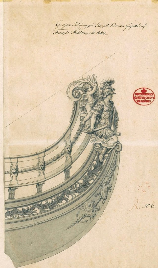
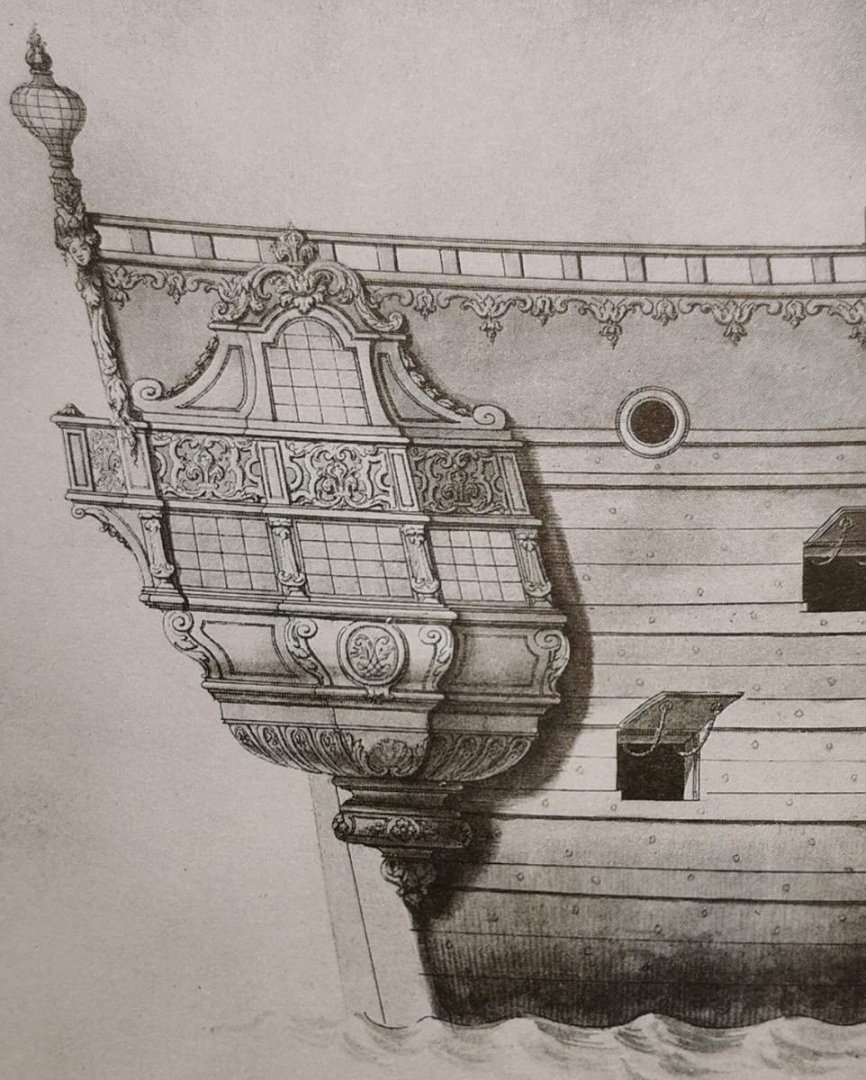
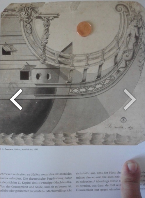
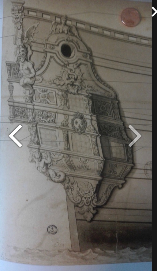
The past month has been quite a ride; painting, packing, moving, start of school for kids, COVID for my wife, sick kids, unpacking, and an un-provoked subway assault (I got lucky, ‘am fine, but I had a really sore jaw for a week, case pending) - after all of that, I kind of lost my mojo for the project. The ship has just been sitting, locked up in its travel box, and waiting while we configure this new place. Last night, I took the ship out to retrieve the starboard headrail. Very slowly, I did manage to remake that horse carving, so today, I flushed-up all of the edges and finished that aspect of the project: Weeks ago, when I was trying to tuck this headrail in, behind the figurehead, I was a little overzealous and removed too much material at the wrong angle. I added back a little plastic, here, to make a good joint: What has lit a little fire in me is the awareness that the 40th Annual Joint Clubs Meeting isn’t that far away. My home club, The ShipCraft Guild of New York, is hosting and we are in the planning stages with the hope of putting on a really good show, in this anniversary year. And, so, I have set goals for the project before the show. I would like to have the entire head structure assembled and painted with all accompanying ornament. I would also like to have the third balcony tier, in-place. If I really get moving again, perhaps it is possible that I will have at least the outline of the tafferal in-place. As I would like to construct cambered head-gratings, it is fortuitous timing that Chuck Passaro happens to be designing that structure for his Winchelsea group build right now. His sequencing of assembly has helped me to clarify my own modified approach to building this structure, and I will soon get started on making that happen. On a tangentially related note: I am always on the look-out for 17th Century drawings and I recently discovered very clear images of the sets for this Swedish ship, The Kronan: There are so many interesting things about this set. One can see that this is a Swedish ship because the Royal coat of arms with three crowns (as opposed to fleurs) is centered on the upper balcony rail. Each drawing is inscribed in Swedish and translates to: “Drawing of the ship Kronan written by Francis Sheldon 1660s” Now, it is true that Francis Sheldon was contracted by Sweden to construct this huge three-decker for their expanding navy, in the late 1660’s. The Baltic remains of the ship still bear witness to the heavy English influence of Sheldon upon her architecture. This ornamental set, however, has absolutely nothing in-common with English design or ornamental practice. In fact, apart from the coat of arms, everything about these drawings is distinctly French and very specifically the hand of Jean Berain. Consider the following sets for Le Fleuron and Le Terrible: And so, it is curious that these drawings would be marked as the hand of Sheldon, when at least one near contemporary portrait of the Battle of Oland, paints a very different picture of the Kronan, at the moment of her loss in 1676: It makes more sense that the Kronan would have had a round-tuck stern, and that her side galleries may have been more similar, in structure, to the Sovereign of the Seas. My guess is that, perhaps, the Swedish crown had plans to build a second Kronan in the 1690s, and had contracted Berain to produce an ornamental proposal. As far as I can find, though, the original Sheldon Kronan of 1672 is the only Swedish ship to carry the name in the 17th C. Anyway, it is all interesting to look at, and to consider that Berain may have been reviving the twist-tail tritons of Puget’s style, later in the century.


- 2,437 replies
-
- 20
-
-

-
- heller
- soleil royal
- (and 9 more)
-
Agreed - the oddness of their appearance is magnified when stripped of their utilitarian context.
- 858 replies
-
- 5
-
-
- Sphinx
- Vanguard Models
- (and 1 more)
-
Oh, interesting! I wonder of that was a Chevy thing. That’s pretty forward-thinking for 1972. I was born in ‘73, and lately, I wish I were made from galvanized steel.
- 222 replies
-
- 1
-
-
- reale de france
- heller
- (and 1 more)
-
I’m surprised the rocker panels maintained structural integrity.
-
There are so many cool things happening in these pictures; awesome cases, interesting just how big Reale is relative to 1765 Vic, impeccable ‘Nova! Did you have to do a lot of metal work on the body, or was the car in good shape from the start?
- 222 replies
-
- 1
-
-
- reale de france
- heller
- (and 1 more)