Hubac's Historian
-
Posts
3,314 -
Joined
-
Last visited
Content Type
Profiles
Forums
Gallery
Events
Everything posted by Hubac's Historian
-
 Well, this is something to get excited about! You never disappoint, B.E., and I'll be following along with great interest. This looks to be a fabulously engineered kit.
- 648 replies
-
- 7
-

-
- Indefatigable
- Vanguard Models
- (and 1 more)
-
Beautiful work, Mike.
-
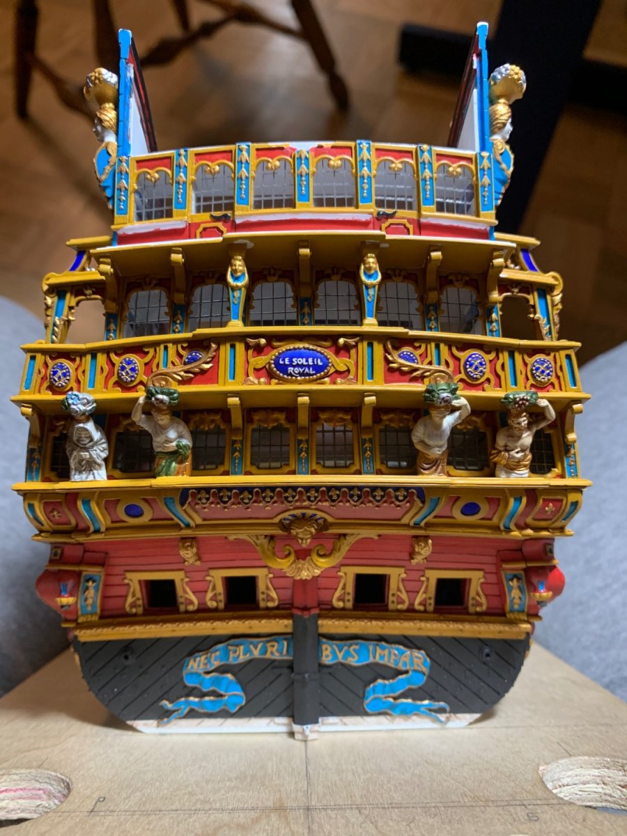
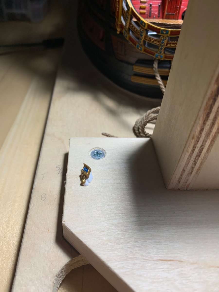
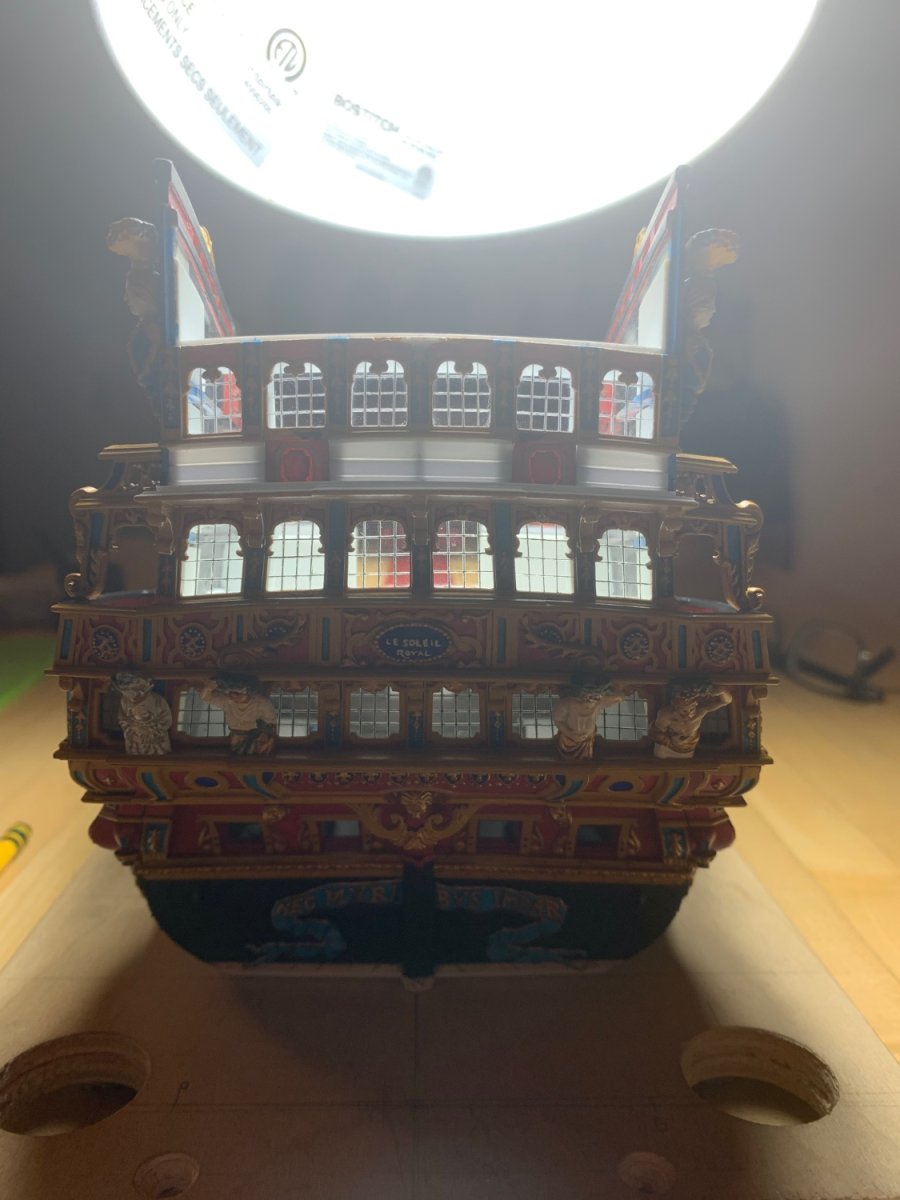
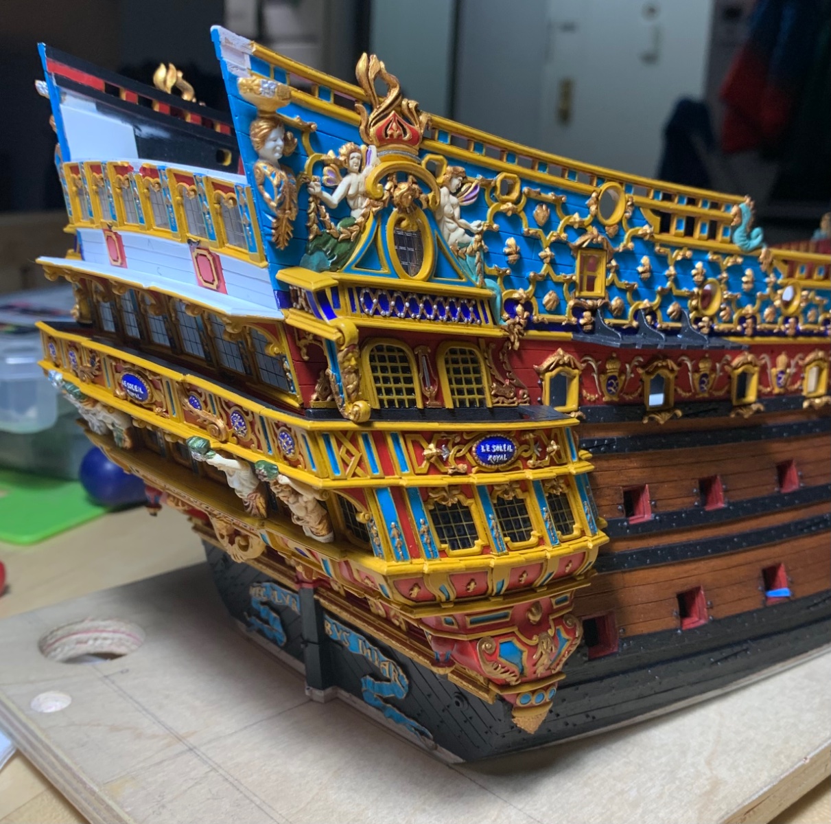
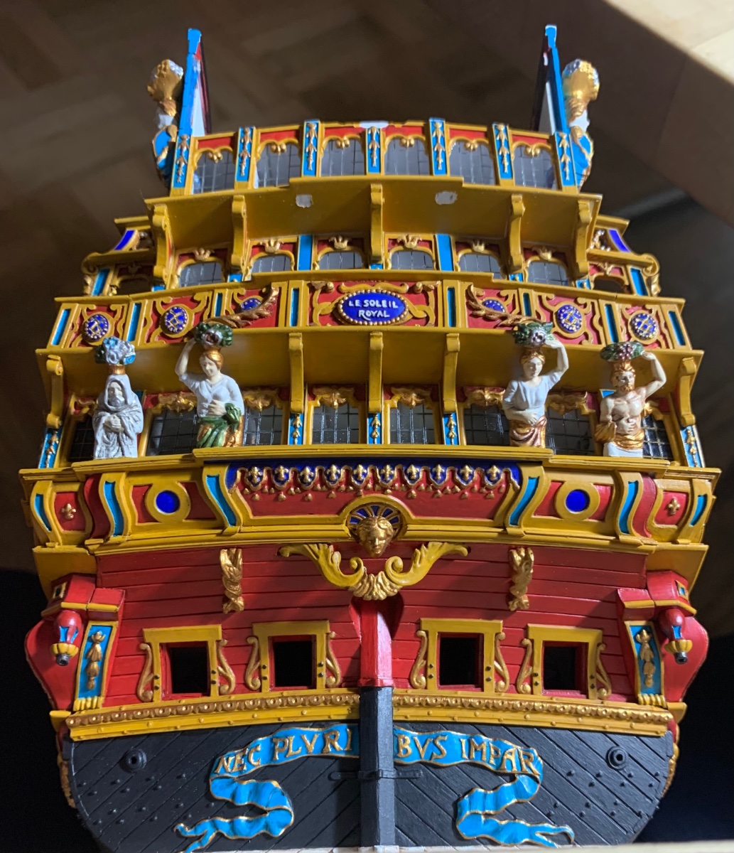
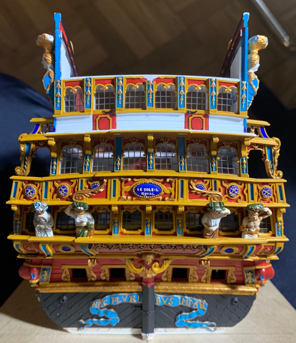
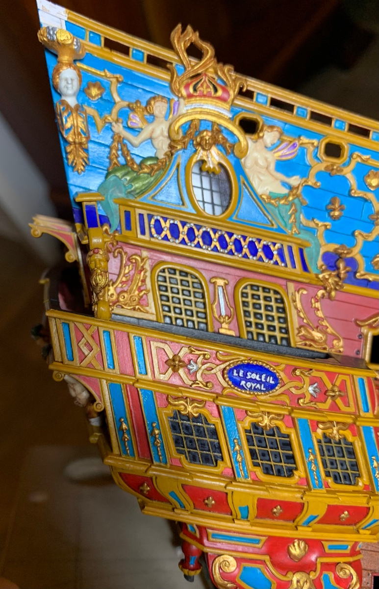
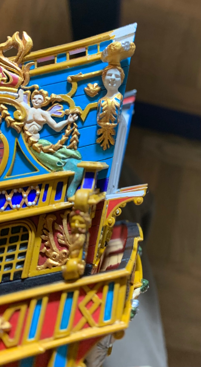
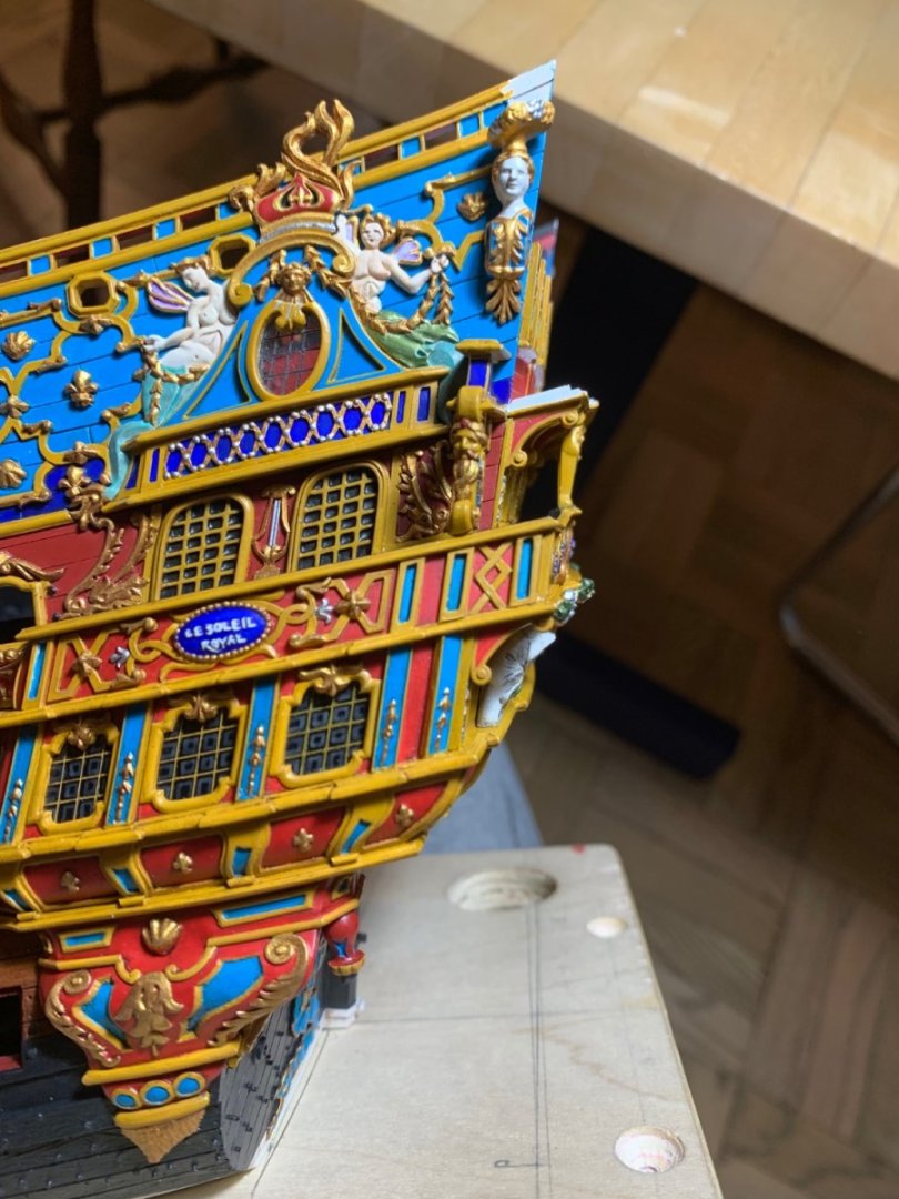
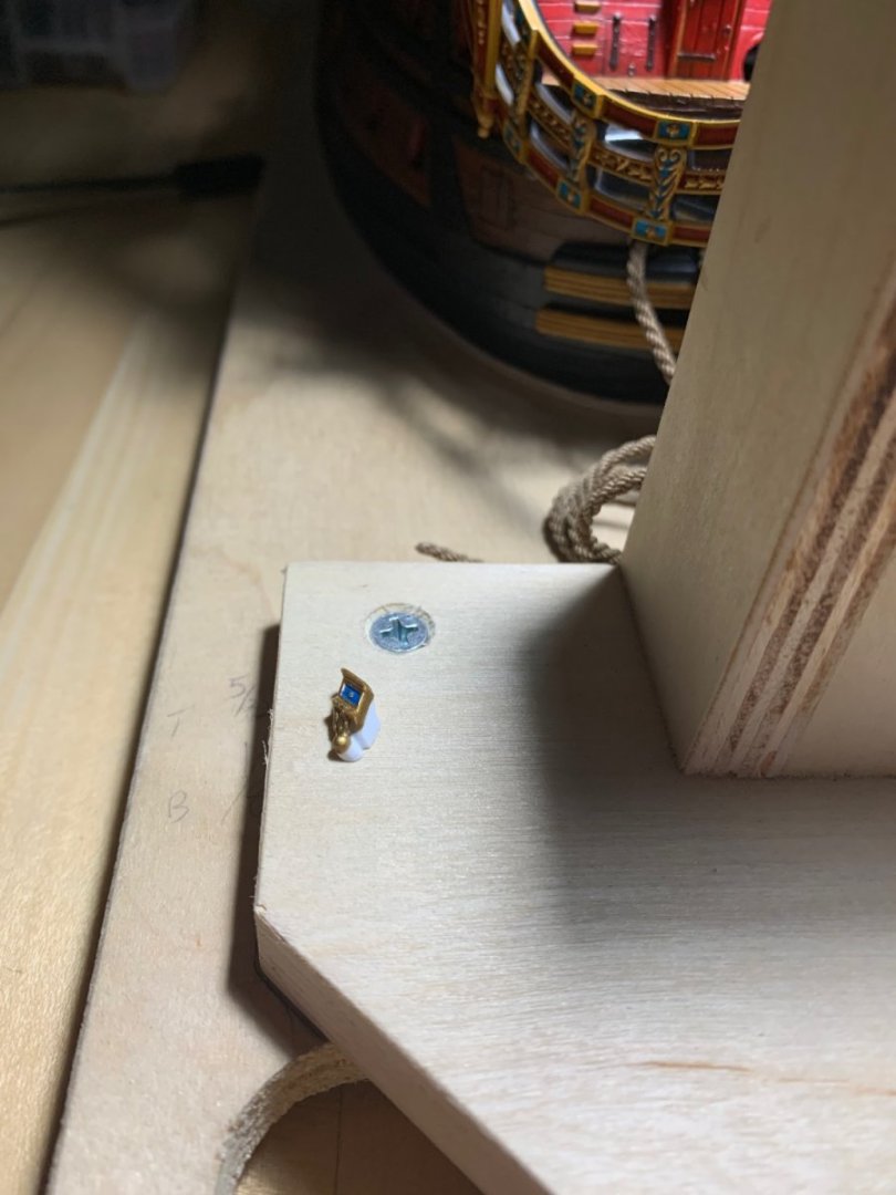
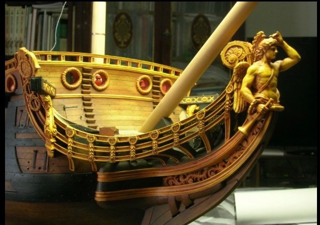
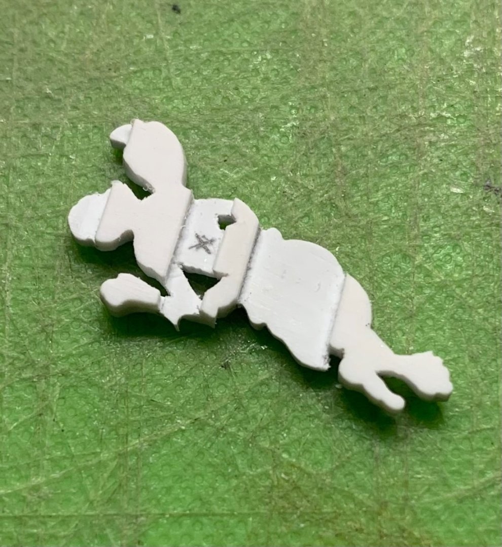
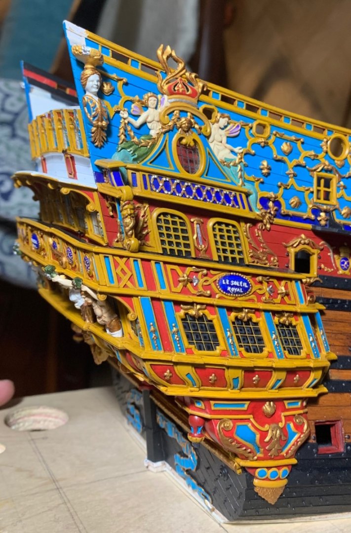
Thank you all for the likes and the kind comments. Chapman, yes, this print has been quite fascinating to me. I suspect that it is directly connected to or derived from the “Gilded Ghost” portrait. While this engraving is often labeled Soleil Royal, there is not enough specifically detailed information to make that connection. The only detail that seems to hint at this possibility is the figurehead. What is more interesting is the caption note that explains that this is a Levant fleet ship, which would make it more likely a representation of the Royal Louis. In any case, I like the crossed fish tail ornaments on the upper bulwarks, and I will attempt to incorporate this idea into my decor for the SR 1670 project. This weekend, I painted and installed the upper balcony support pillars: I definitely think that beefing these up was a good idea. I also finally managed to glue-in the starboard headrail. Before doing so, I decided to add a small support that attaches to the middle main wale. This is a small detail that I have observed on various models and portraits: I had an extra pair of cathead supports, so I used these to fashion these small supports: I like the continuity of this small addition, as now all of the ornamental pilasters of the headrails are supported. It is well in keeping with the spirit of the kitbash. Now, I can prepare the figure carvings that are placed just aft of the headrails, and which bridge the bellflower garland between the main deck guns and the headrails: Prior to installation, I pad the backs of these carvings so that the carving can seat just above the drift rails: Little by little, we are getting there. There is a continual process of paint-retouches and weathering that is happening simultaneously. Next, I’ll secure the port headrails, so that I can fill-in the intermediary headrail support timbers and begin filling-in the head grating. Thank you for looking in.


- 2,699 replies
-
- 17
-
-

-
- heller
- soleil royal
- (and 9 more)
-
That would be my guess as well
-
The so-called “spirketting” or baseboard, was also my way of getting around this ugly gap. The added benefit is that it is a correct detail.
- 1,508 replies
-
- 1
-
-
- Le Soleil Royal
- Heller
- (and 1 more)
-
Thanks, Michael! Yes, you are so right about that. When I finally get the head together, it will feel like a massive accomplishment - even if it isn’t exactly correct in all respects. It will be far closer to the truth than the kit allows for.
- 2,699 replies
-
- 3
-
-
- heller
- soleil royal
- (and 9 more)
-
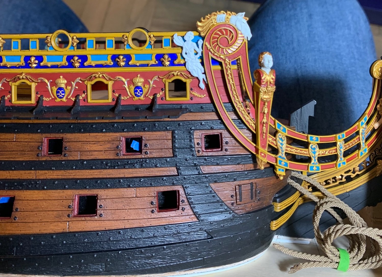
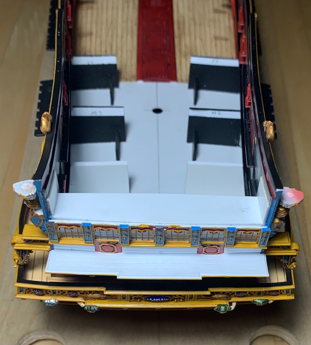
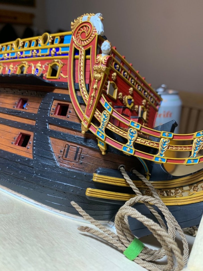
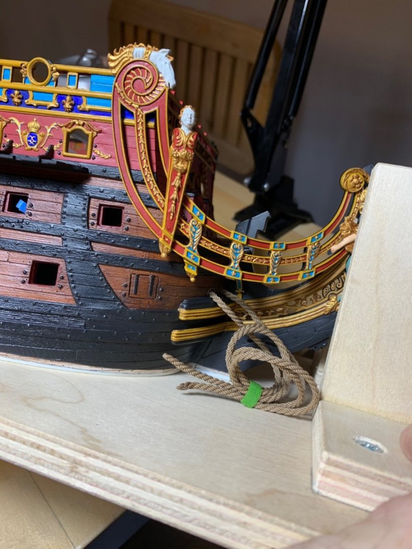
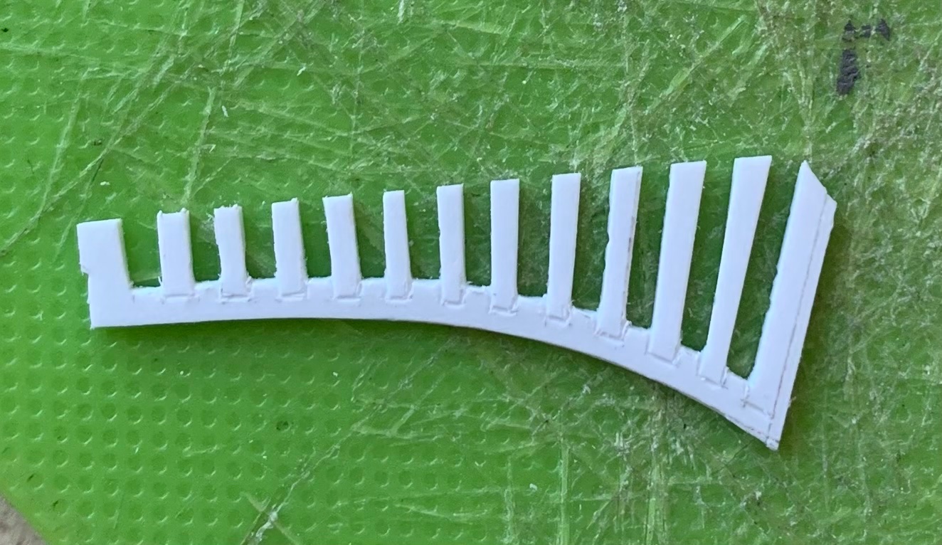
Thank you, Kevin. I appreciate the compliment. With regard to the figures, though, my approach is very simple. I apply a coat of Model Master Random Tan acrylic, as a base-coat, and then I usually apply thinned coats of this Citadel red wash, which gets into all the creases and folds. For the Autumn figure, I used a brown enamel wash that I applied quickly and then wiped off the excess before the solvent softened the base coat. I just got lucky with that one because he turned out better than I thought possible. It’s been a pretty active modeling week. I’ve been alternating between the bow and stern. Now that the Bitumen of Judea had arrived, I could finally stain my new cables. It was a test of patience to feed these through one hawse hole and fish it through the next with an improvised hook. Eventually, I got them: The bow assembly has to happen in a very specific sequence. Above, you can see that I installed the aft, starboard headrail support timber. Before moving on, it’s essential to scrape away any glue squeeze out and re-touch the black paint, because you won’t have access to that area later. Also above, I am making a card template for the first section of grating slats that lead out onto the head. I just thought it would be much easier to make this piece as a unit, rather than as individual slats: The outboard end (above right) of this is the mount for the new seats of ease that I will make a little later in the process. I spent a lot of extra time fine-tuning the fit of the starboard headrail so that the glue blocks make good contact with the hull. Before I can glue that part on, though, I have to paint and glue-in the starboard grating piece. Once the headrail is in, I can glue in the middle and forward headrail supports. Simultaneously, I’ve been making the upper balcony bulwark. A montage: The two panels on the right haven’t been sanded down yet, but you can see what a difference it makes to clean up the face of these balusters. Having learned from prior experience, I find it much easier to frame in all of the borders and pilasters with styrene strip: Up to this point, the balusters look pretty good. Not perfect, but decent. However, once I start adding the accent bits, the whole thing homogenizes and begins to look a little more uniform: I still have to make the side panels and the railing, but I am satisfied that I have made a part that is at least as good as the kit version. Thank you all for your interest and support. More to follow.


- 2,699 replies
-
- 15
-
-
-
- heller
- soleil royal
- (and 9 more)
-
That is a good point about having to scrape paint away, anyway, for glue. You could also place a strip of thin blue tape over each skid location and then take a profile. These days, I like to make patterns out of thin soda box cardboard. Here’s one I made last night: Once I cut my initial pattern in the cardboard, I saturate the cut edge with thin CA, then I can sand and file the fit-edge more like thin plastic that won’t disintegrate, until I have a good fit. Maybe go through that process, once, to see how close a pattern you can make. It might give you the confidence you need to go for it. Be careful not to use a tape that’s too aggressive. You don’t want to pull paint. Also keep in mind that, while I was accustomed to making patterns for furniture, I had never done anything like this on a scale model before this project. But, I gave it a shot, and it wasn’t as difficult as I imagined. It’s really just about taking whatever time is necessary to work your patterns until you are happy with the fit. One last tip: after you cut your pattern and transfer that profile to your skid plastic - leave the plastic oversize until you get the fit you want. Only then do you scribe a parallel outside edge. I just run a compass along the inner edge to transfer the shape, sans wale notches, of course.

-
Hi Bill, When I was making the skids, I used one of these to give me the profile of the hull at any given point: https://www.google.com/search?q=carpenter’s moukding gauge&ie=utf-8&oe=utf-8&client=firefox-b-1-m In my case, though, the hull wasn’t yet painted and these pins would probably mar your paint.
-
That’s quite lucky on the fit. It is always a good idea to scrape paint away for a plastic to plastic weld. Without doing so, your bond is only as good as the paint’s adherence to the plastic. Looking great, Bill!
-
Scale is far more important, and your tiny blocks have a nice shape as well. Really impressive work!
-
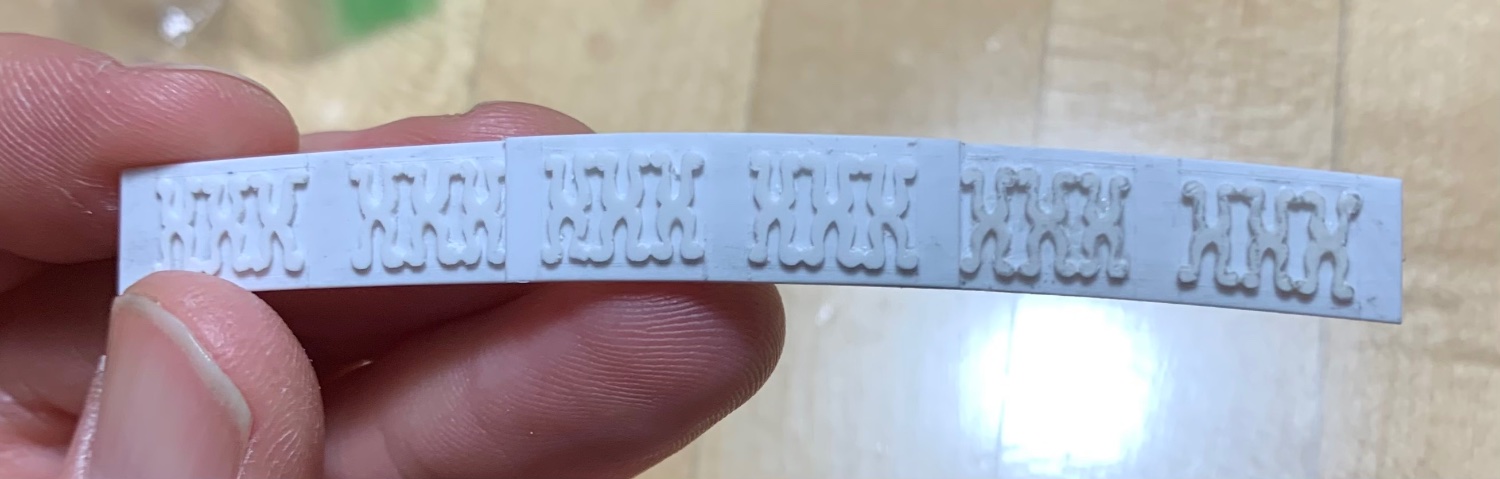
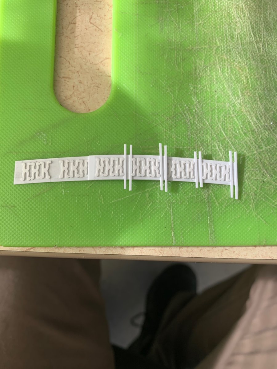
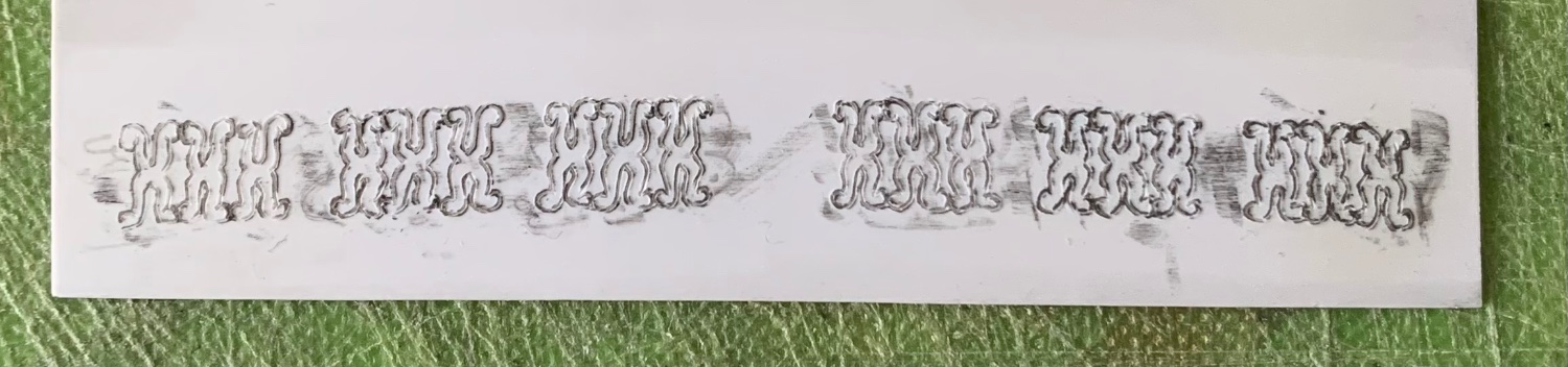
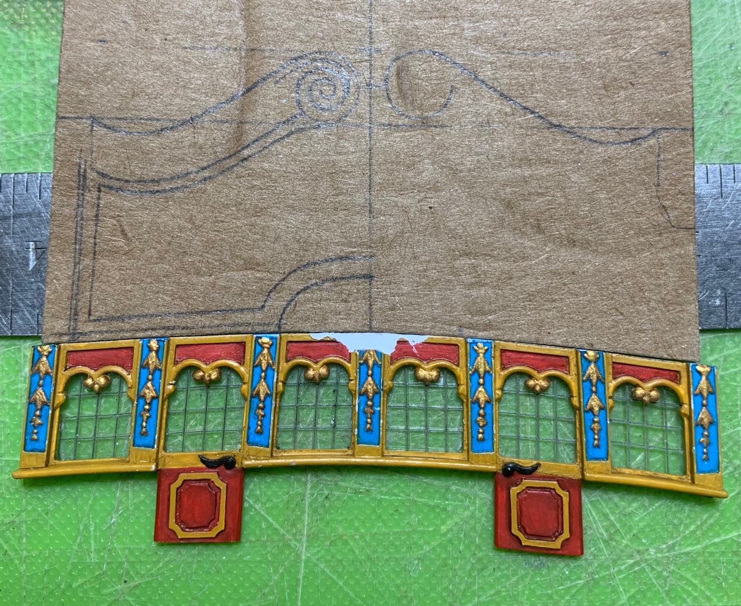
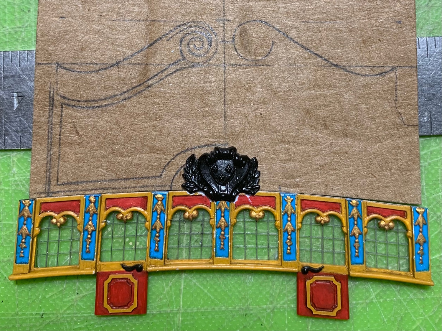
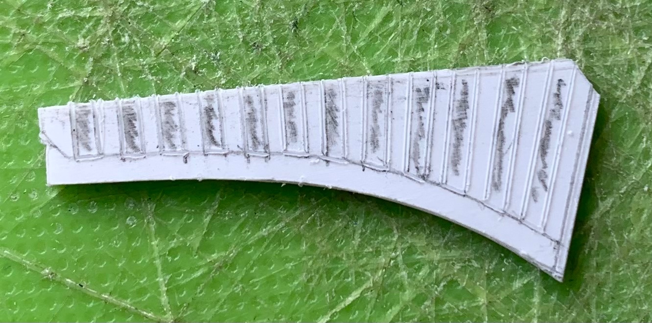
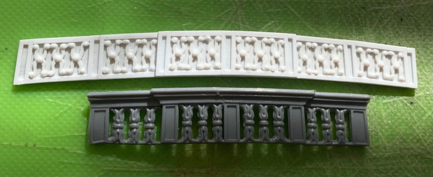
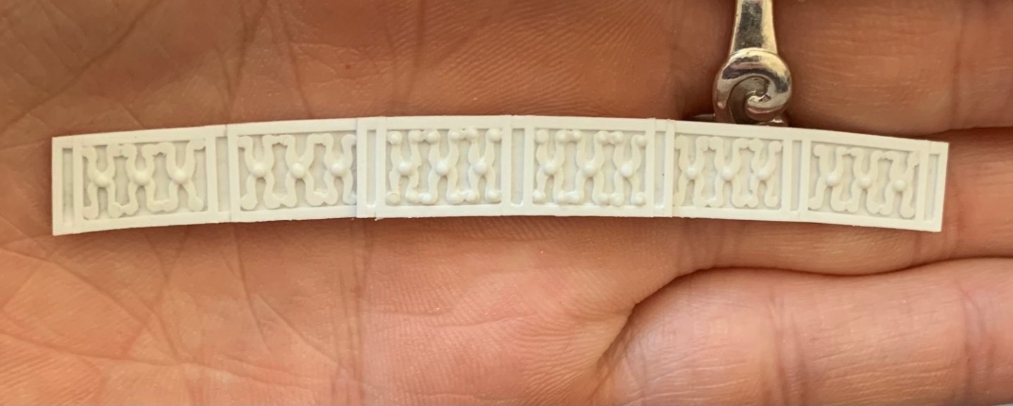
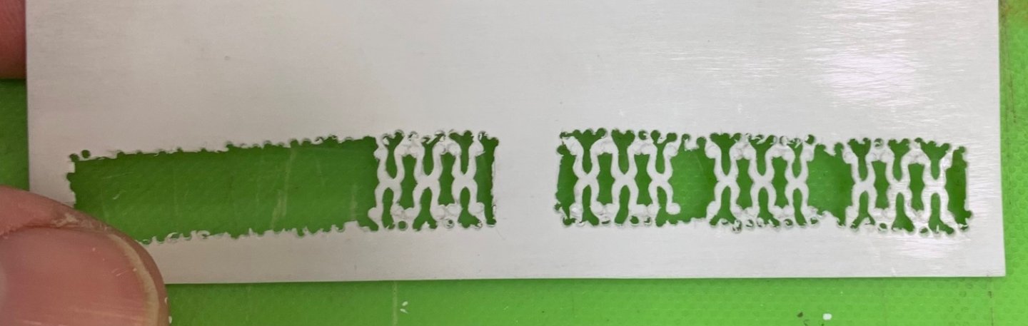
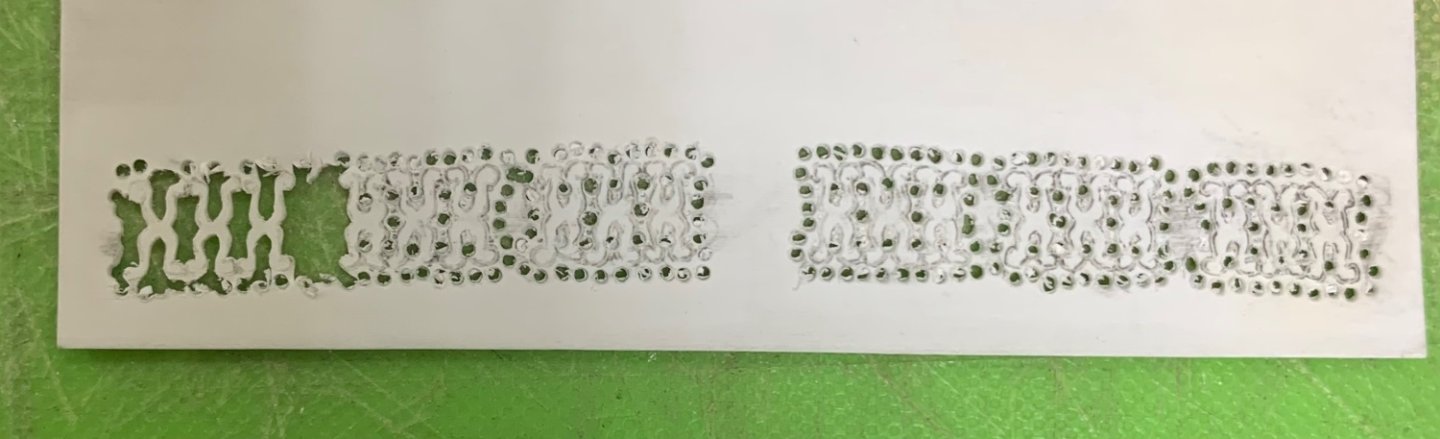
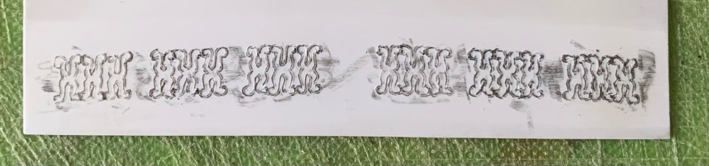
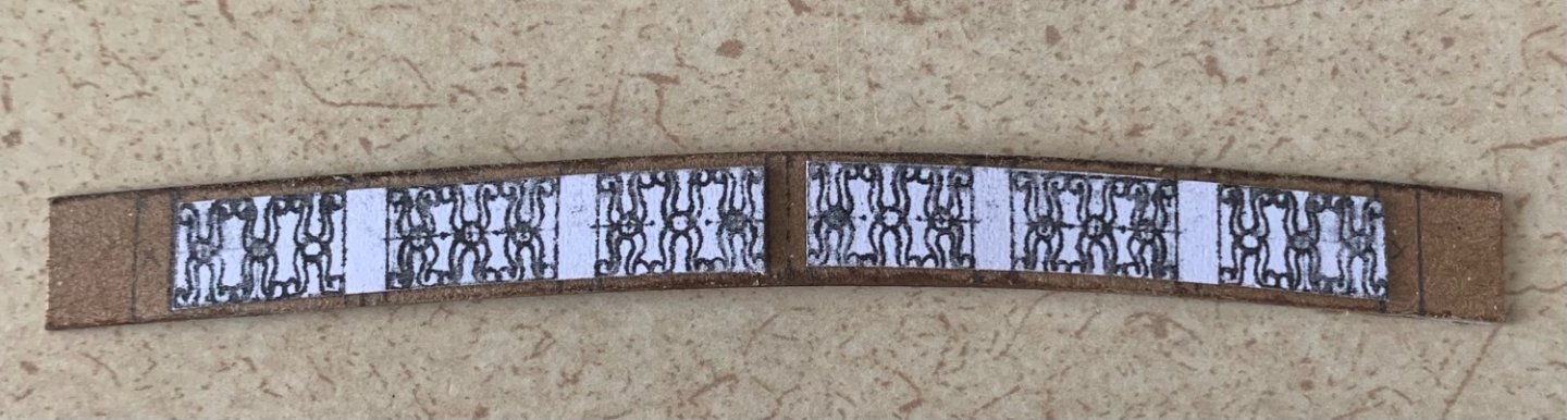
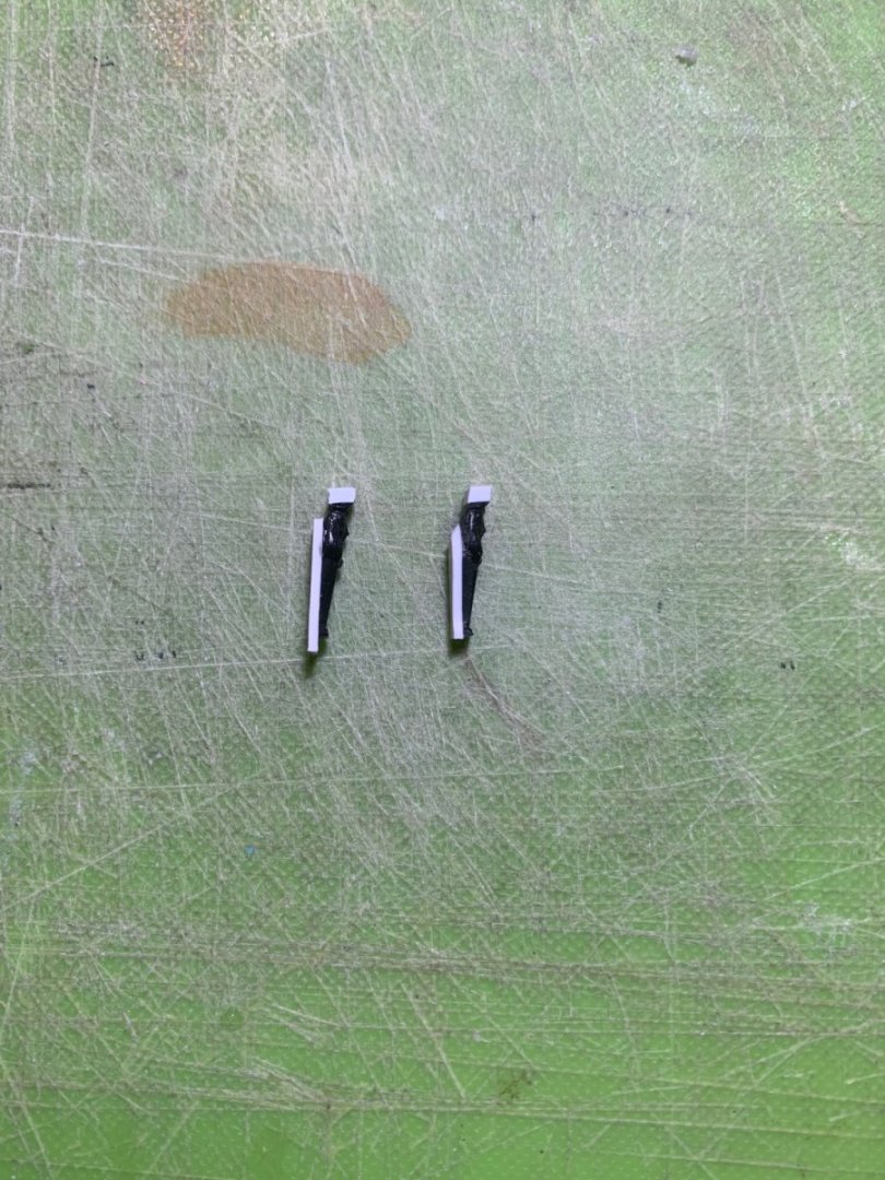
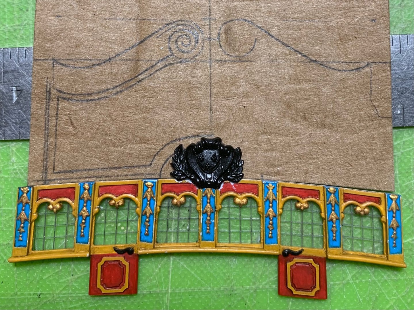
Here is a decent back-lit shot that shows how well the CA fog disappeared: I’ve modified the supporting pilasters for between the middle and upper balconies. Owing to all of the modifications and scratch-work, the height between balconies is a little different. This necessitated adding plastic, top and bottom, to make up the difference, but I also added a strip of .032 to the backs of these because I felt they were too spindly and slight looking to be doing the support work they represent: The other little side project was to create a glue lip to make it easier to mount the upper balcony bulwarks; I did this with a bit of the smallest quarter-round strip that I had: With that in place, it was much easier to make a cardboard template that followed the camber of the balcony, at the appropriate raking angle, fore and aft. This also enabled me to lay out the 3/32” pilasters. I should mention that my final attempt at heat-bending the stock balcony bulwark was a failure. I filled a large pasta pot with water and heated to a near boil. I rubbed some olive oil on the side of the pot, and attempted to gently induce a curve. Unfortunately, there’s no getting around the fact that the ornamental spindles of the railing are much thinner than the caprail. As such, they flash malleable much sooner and then become irreversibly distorted. Given that, I realized there was no way to get around making the balcony bulwarks from scratch. For whatever reason, this is a detail that was very difficult to draw. Irrespective of what exactly is happening with the pilasters below, the only way to draw a repeating element like this is to ensure that the panels for the spindles are all the same uniform size. After much re-drawing, I got the port half down to an acceptable draft, which could be improved upon with the making of the thing: For some reason, I just could not get the spacing right for the first panel, starboard of center. So, I made a mirror photocopy of the port side and this seemed to work perfectly. The guaranteed symmetry between sides also helps smooth over some of the hand-drawn imperfection of the thing: As I say, I’ve found that, if I can get the drawing layout reasonably close, then I can bring it home with the tools. My drawing is no worse than the stock rendering of this detail, so that’s a go for me.


- 2,699 replies
-
- 17
-
-
-
- heller
- soleil royal
- (and 9 more)
-
She’s rounding into form beautifully, J.D.
-
I will say that these kind of clamps are worth the small investment, as they have good clamping pressure and are non-marring. You will find many applications for their use. Without clamps, I would be inclined to use moderately quick-set CA glue and hold with finger pressure until they set. That would not be ideal, on the other hand, if you have already joined the fore and aft bulwarks together; not enough open time. The problem is that these parts have to flex a fair amount to fit into their rabbets. This is why I used additional glue tabs, both so that I had something more substantial to clamp to and a broader glue surface-area for a stronger bond.
- 1,508 replies
-
- 1
-
-
- Le Soleil Royal
- Heller
- (and 1 more)
-
Just incredible!
-
I’m a firm believer that we’re just on the periphery of some of the most galvanizing and creative music that we’ve seen in decades. Unrest has a way of releasing those lions into the wild.
-
This looks far better than most efforts, Vic! I think I hear Coltrane somewhere off in the middle distance..
-
This is just an impeccably finished piece of work and a well-deserved victory lap!
- 607 replies
-
- 1
-
-
- winchelsea
- Syren Ship Model Company
- (and 1 more)
-
I’m sorry for the sad news, John. I’m hoping for better days ahead for you and your family.
-
I’m not exactly sure, but given that gasoline will dissolve CA, and petroleum jelly is a petroleum product, I suppose that is sufficient to remove the fog/mist.
- 2,699 replies
-
- 3
-
-
- heller
- soleil royal
- (and 9 more)
-
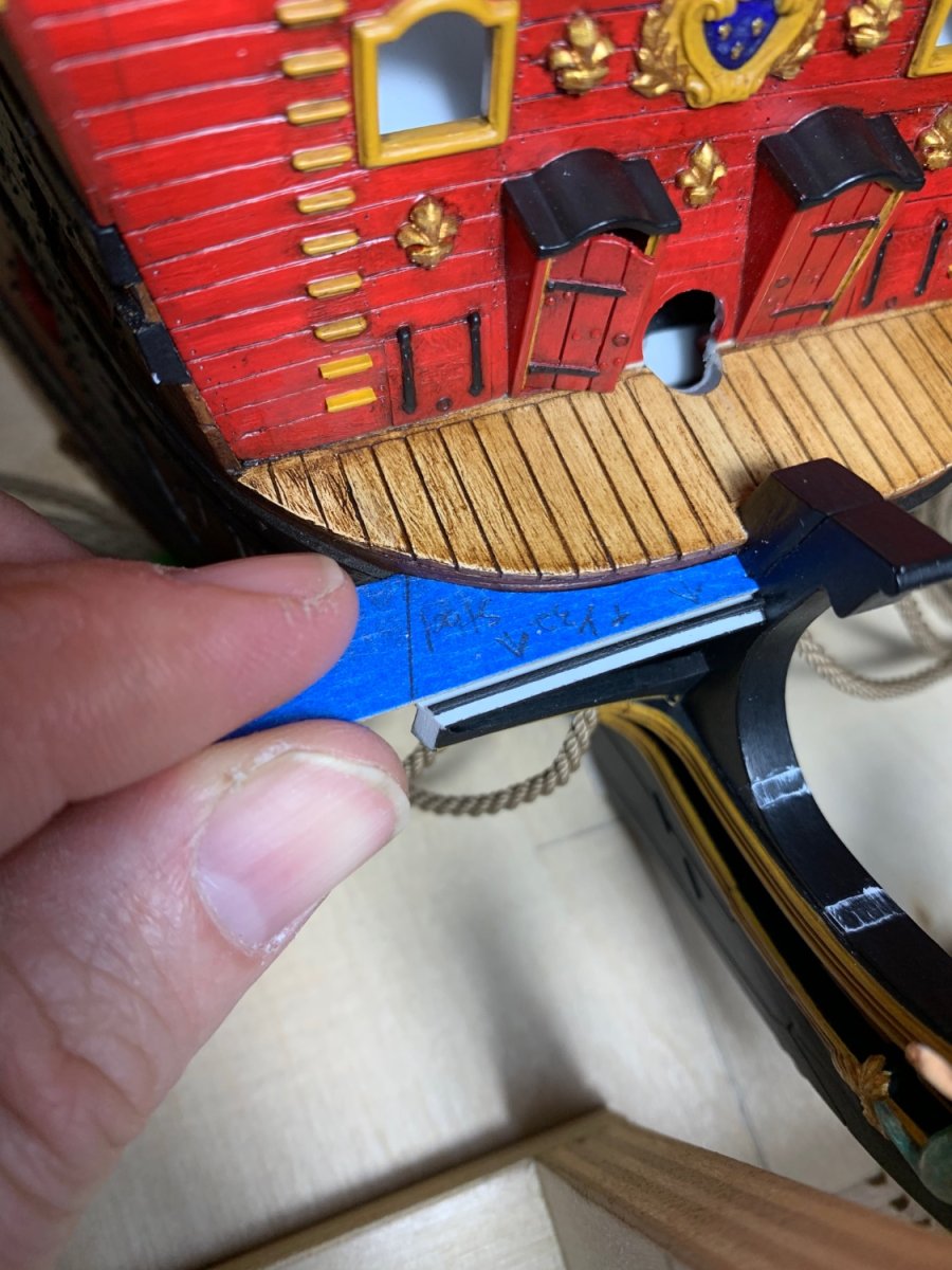
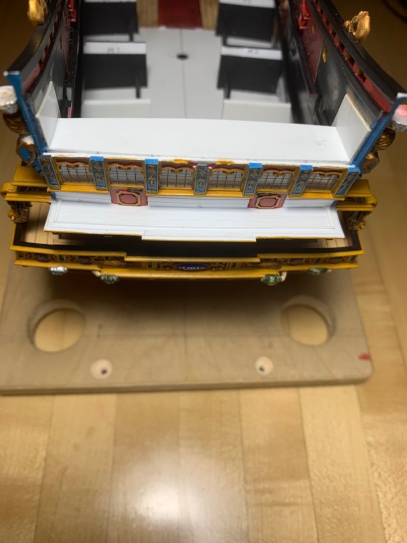
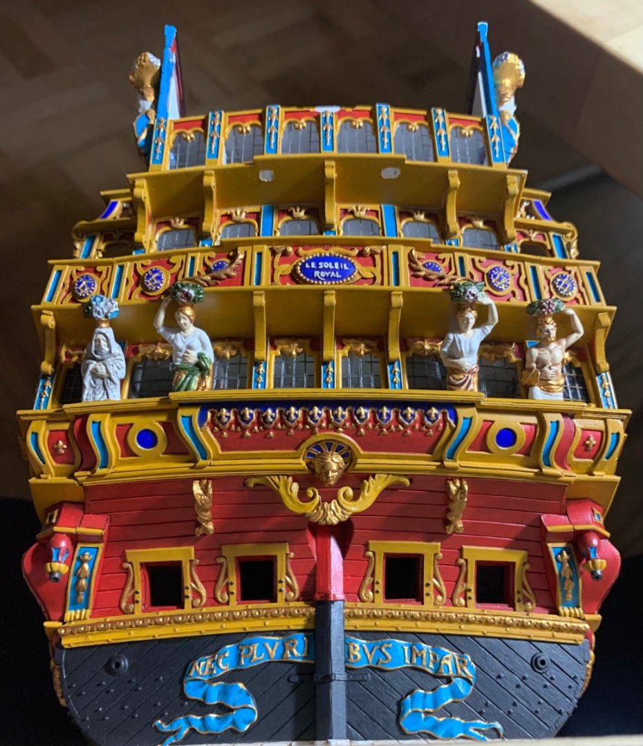
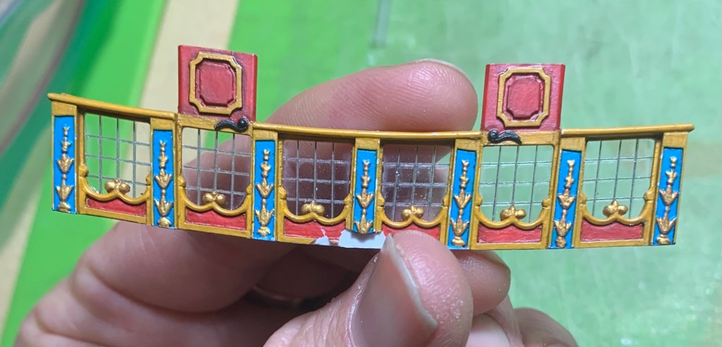
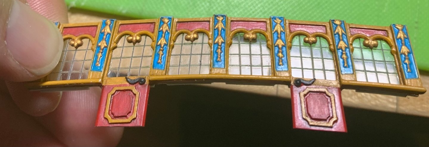
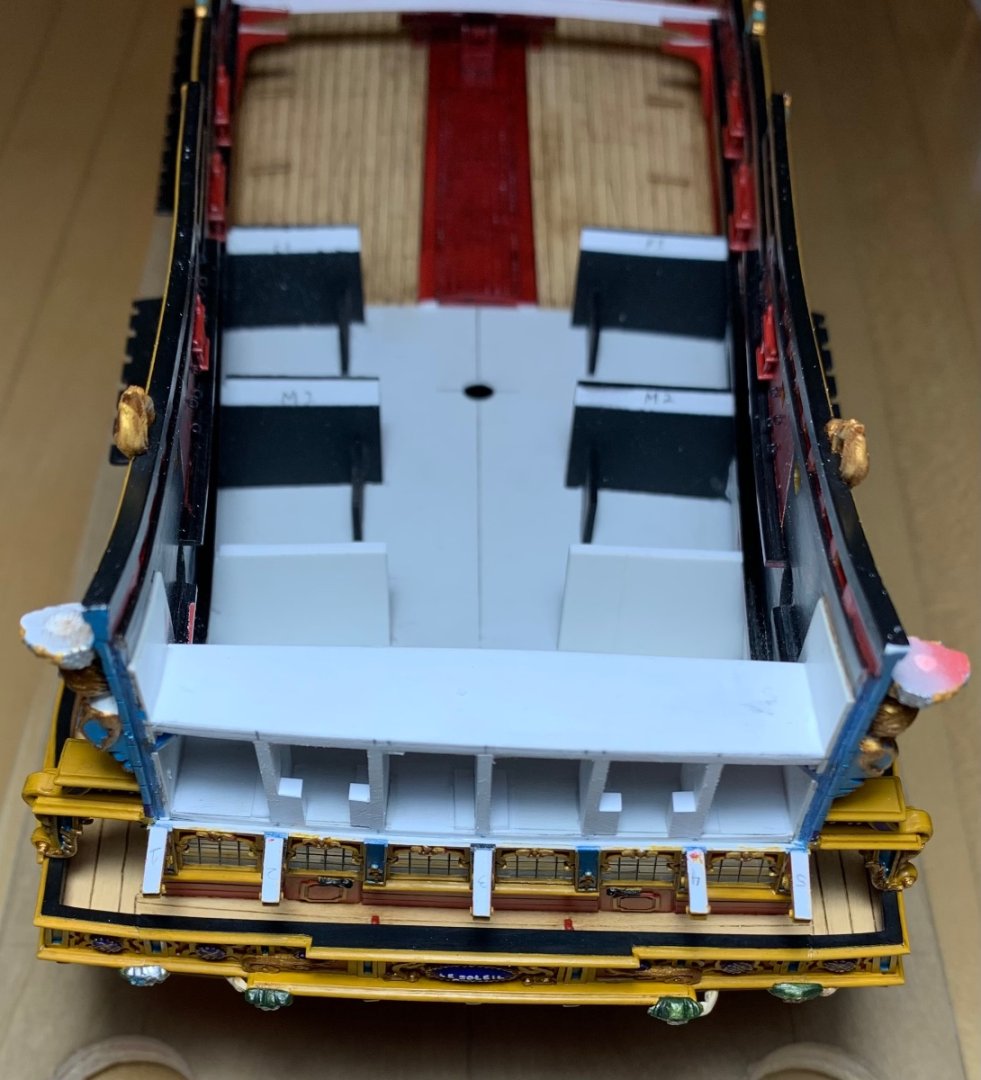
Given that this balcony doesn’t wrap to the quarters the way the middle balcony does, I thought it would be easier to first attach the corbels. Fitting these is a little tricky because they toe-in toward the centerline, a little, and they have to match the raking angle of the quarter gallery, fore and aft, and they have to be beveled athwart-ships to match the camber of the balcony platform. I thought I had done a pretty good job of matching all the angles, however the outside corbels looked a little droopy: Especially the port side: The solution was to add a piece of .030 styrene to the tops of the outside corbels and re-fair until the angle of the balcony platform matched that of the quarters. The hardest part of this was paring away the glue squeeze-out and repairing the paint. The window plate is probably the thing that gave me the most problems. It is very fragile, and I broke both doors off at different times. Then, when I CA’d the acetate in-place, I developed a little bit of CA frost on several of the window panes: I probably could have avoided this problem if I had either used a quick-set CA, or used an accelerant. I like the medium-set CA glues because they give you a small window to make sure the part is correctly positioned. The frost blooms were not super noticeable, but they were nonetheless disappointing. I kind of wanted to scrap the piece and start over, but that would also necessitate casting new pilasters in resin, as I did not have another scrap stern plate to pull from. Well, fortunately there’s a simple solution to this problem, and it works like magic. One approach would be to dissolve the CA with gasoline and re-paint/re-built. Or, I could simply paint a little petroleum jelly over the blooms and let them sit for 5-10 minutes. Then, I cover the head of a q-tip with a t-shirt scrap and wipe the PJ off the surface. An un-covered Q-tip gets into the corners. This simple trick worked perfectly! The next hurdle of this window plate was that I had pretty radically underestimated how much needed to be trimmed from the window edges so that they would fit within the transom framing. The only way to trim these, after they had been glued to the plate, was to grind the edges with a diamond-coated bur and sanding sticks. This was tedious, and I managed to dislodge one pane, but I somehow avoided breaking the plate, so I kept going. The next thing that had to happen was cutting back the center pilaster so that the Arms of France would not intrude into the space for the big tafferal carving: Again this is difficult to achieve without breaking the window plate because the blue plastic of the kit window pilasters is, for lack of a better word, chewy. With all of that out of the way, I could finally glue-in the balcony platform, and plank-in the transom bulkhead: There remain a pair of supporting balusters that I have to fit between the middle balcony rail and the upper balcony platform. Now, I can paint the transom planking red and figure out whether I’ll be able to salvage the kit railing, or whether I will have to make one from scratch. I’ll get all of that together, and then I’ll go back to the head to complete the headrail installation and head grating. That may be all I manage to accomplish before the show, but that will be significant progress, since the last time I showed the model. Thank you for looking in!


- 2,699 replies
-
- 17
-
-
-
- heller
- soleil royal
- (and 9 more)
-
So true! I don’t understand what is happening with maritime museums and their collections of ship models. What the public is able to view, these days, is comparatively spare.
-
Thank you for posting that link, Shipman. It is fascinating how the model maker did not attempt to fill-in the blanks in the decor. I can only imagine that the plan was to make carvings for the model as they made their way onto the actual ship. Somewhere, I have pictures from my own Science Museum trip, back in 1993. It would be interesting to see whether the model had changed in that span. I’ll keep you in mind, if I think to look for them in the near future.