


Hubac's Historian
-
Posts
3,220 -
Joined
-
Last visited
Content Type
Profiles
Forums
Gallery
Events
Posts posted by Hubac's Historian
-
-
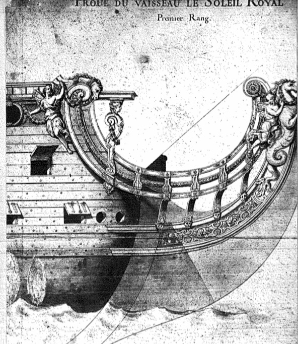
The “cascabel” to set on the “quoin.”
The incorrect trunnion location is not something I have considered. Fortunately, I have not painted my visible deck guns, yet, so I can move these. Doing so is a tremendous improvement.
One other fiction that was pointed out to me is where the trunnions rest on the carriages. Heller represents a short raised block, onto which the trunnions rest, and over which there would be cap squares.
In reality, such a small block of wood would never resist the tremendous recoil forces of firing a gun. Instead, the trunnions should be set into a continuous top edge of each cheek, that is only stepped on its aft edge. I have not decided what, if anything, I plan to do about this, as I have already painted my carriages.
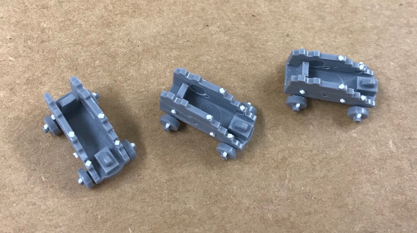
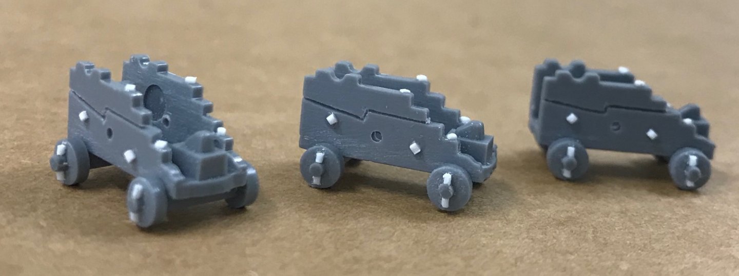
I could fill-in a little bit before and after the short blocks and that would be an improvement that doesn’t alter the height of the gun above deck. At some point, in the future, I will decide whether that extra effort is worth it to me.
-
-
As far as I know, that is correct for French ships of the period:

The Louis Quinze mode of circa 1710.
-
🐎🐎🐎 and 🥃🥃
Two things any self-respecting Kentuckian can not do without 😉
-
12 minutes ago, Veszett Roka said:
I like it especially for that taste. We are different, and this is what i love a lot in this site: No one say that 'this is a crap' or 'Laphroaig just for idiots' just that 'it is not in my tase'. Respect, Marc
Respect is always my intent.
-
Laphroaig is one that I could never adapt my palate to. The peat-i-ness of the Islays is a little much for me.
-
My favorite from that distillery is the Glenmorangie Sherry Cask 🥃
-
I’m enjoying a little blended scotch, myself - CHEERS!🥃
-
-
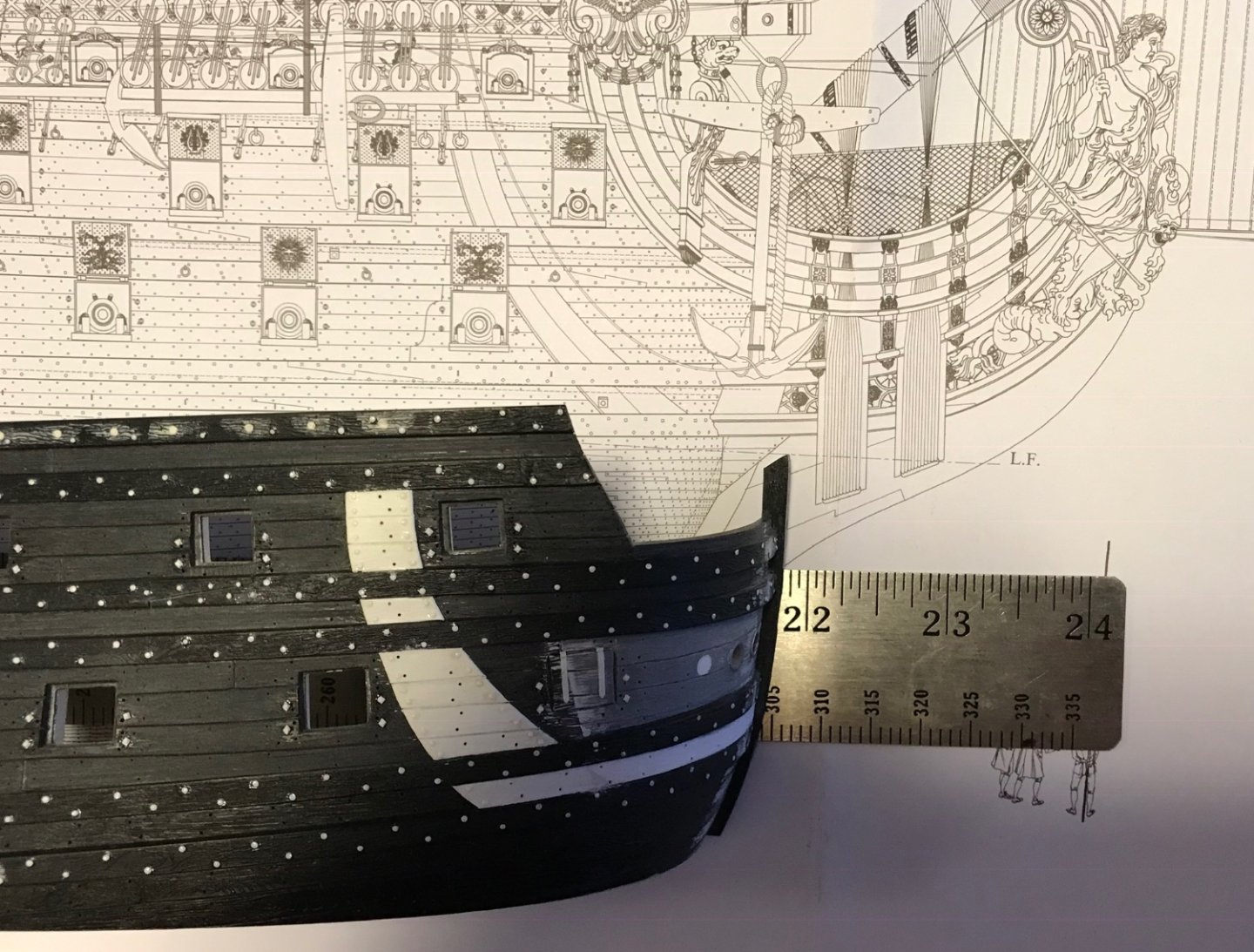
What the builder above did is a little bit better, in terms of pattern, but it is still out of scale.
As to whether it is worth the effort to go much smaller and represent many more bolt heads - I think that is a very individual choice; for me, adding these small custom modifications is what makes the hobby fun and interesting. I will easily spend absurd amounts of time on the smallest things. I can’t even tell you how many hours I’ve put into making my headrails and headrail support structure. For me, the rewards are in figuring out how to go about making something, and then enjoying the finished result. The time spent is almost irrelevant.
To other builders, though, it just feels like tedium. That choice is entirely up to you.
- popeye2sea, Jeff T and 72Nova
-
 3
3
-
Hi Bill,
Your paint looks really great! The wale bolting, on the other hand, does not look so good. Generally, I don’t like to levy harsh critiques, but I feel compelled to speak up, here.
The primary issue, here, is that the scale is much too large; at that scale, it would be better to not do the bolting at all.
When I did this, I used very fine styrene rod (.020):
https://evergreenscalemodels.com/products/218-020-5mm-od-rod
Also, the layout matters. Although it is not critically important to change it, Heller represents butt joints on the wales, which is a complete fiction. These large structural timbers would have been scarfed together with, approximately 4’ long scarf joints. The bolting pattern, though, should be alternating top and bottom (zigzag), and closely spaced. If you zoom-in on this Puget drawing of the Royal Louis, you can even see this:
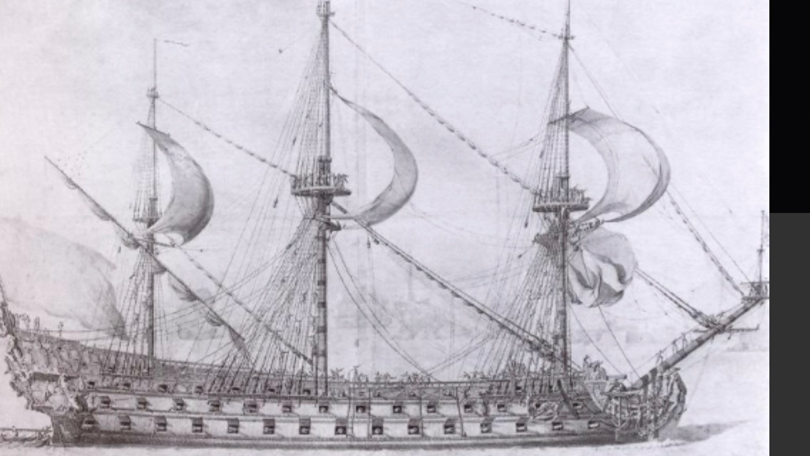
Or, perhaps better seen on the Berain drawing of the SR:
I don’t mean to be a rivet-counter, Bill, but scale does matter, here.
-
-
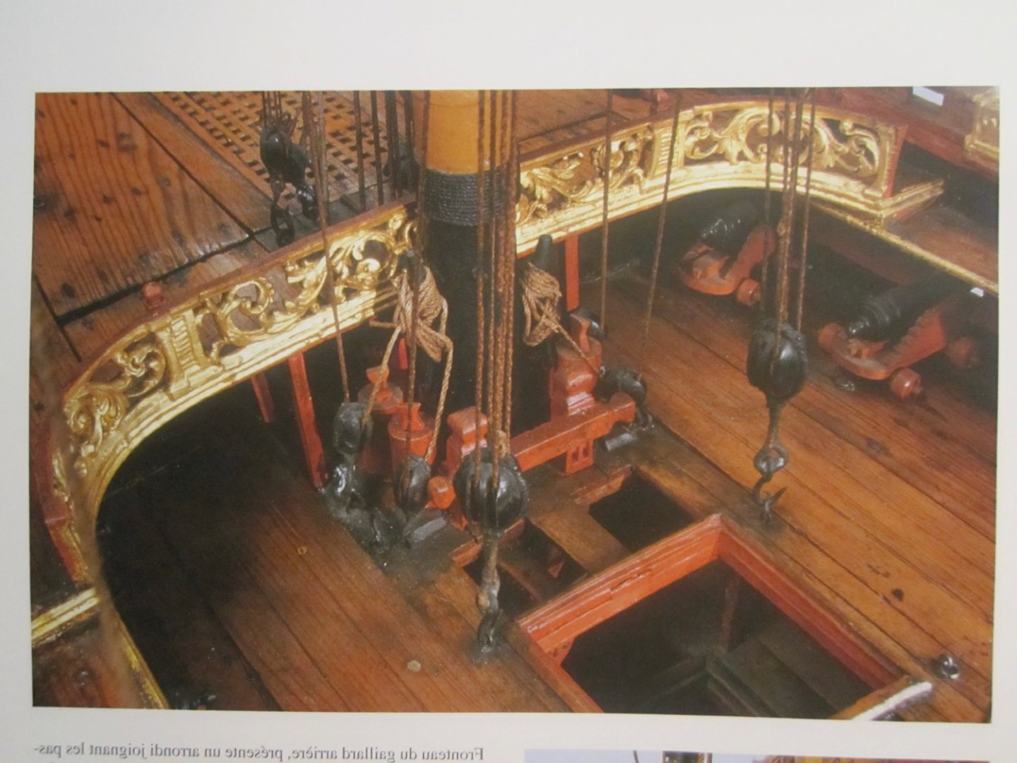
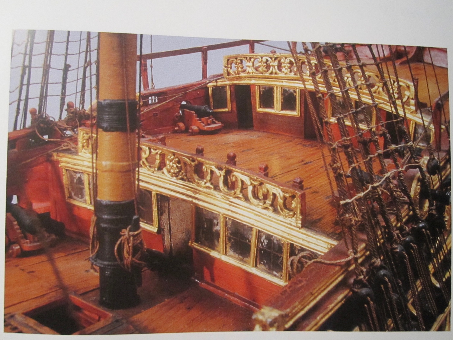
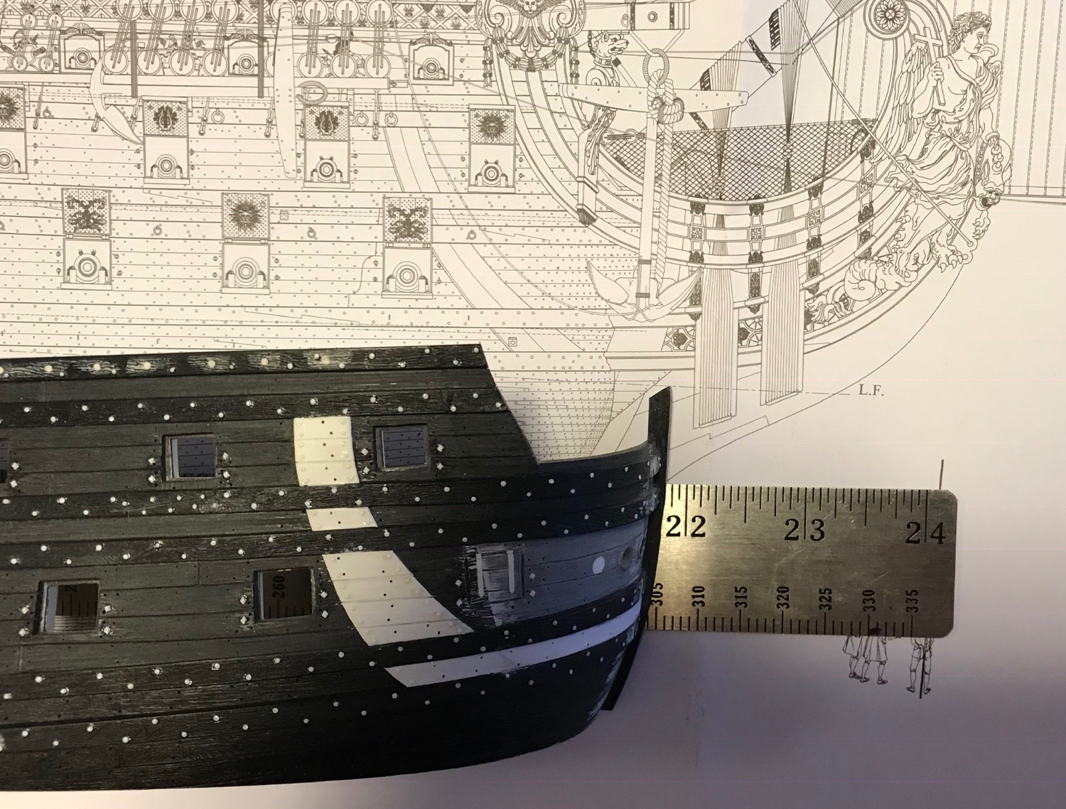
The anchor lining stands proud of the hull planking, but is flush with the wales, wherever it crosses a wale. It is only on the lower main wale that the lining extends forward to the stem.
-
Yes, precisely. That photo was from pretty early in the build. One of the nice things, before I painted the model, was to see all of the modifications as they were mostly made from white styrene. Part of me wishes I could see the current status of the model without any paint whatsoever.
-
I think Henry is right, that this line represents the anchor lining. However, it doesn’t really follow the path or sweep of the anchor flukes during the catting process. I added an anchor lining because it was a relatively easy modification. As was pointed out to me, back then, the space between the lower main wales, from the aft edge of the anchor lining to the stem, should also be filled flush. This is a particularity of French design.
- dvm27 and Bill Morrison
-
2
-
This is a fascinating project, Ian. I will enjoy watching your design evolution.
All the best,
Marc
- mtaylor, Ian_Grant and Glen McGuire
-
3
-
1 hour ago, Bill97 said:
Thanks Marc. You think the hawsers look OK with a little more refinement?
What you have done is above and beyond what most do. At this early stage of paint, it is not too late to use a little putty to fill the last traces of that joint. All you have to do, after leveling the filler, is re-scribe the plank seams, and spray a little touch-up paint. That’s totally above and beyond, but if you are planning to use distress washes - they will show up in that shadow of a crack.
While you are it it - just as you scraped away the moulded waterline, you may choose to scrape away the vertical raised line that runs upward from the aft corner of the hawser piece.
I suppose it is intended as a marker for where the headrails line up, but it doesn’t really need to be there.
- Ian_Grant and Bill Morrison
-
2
-
Nice work with the file, Bill - a great result!
-
Ultimately, Bill, you’re going to want to make a tighter radiused loop on those chains. Most builders set up a fixture board with pins driven at a distance you want your chain segments to be. You then wrap your wire tightly around these pins and snip the wire in the middle of the chain plate.
- Bill Morrison and Ian_Grant
-
2
-
-
On 10/14/2022 at 11:54 AM, Blue Ensign said:
Post One hundred and Seventy-three
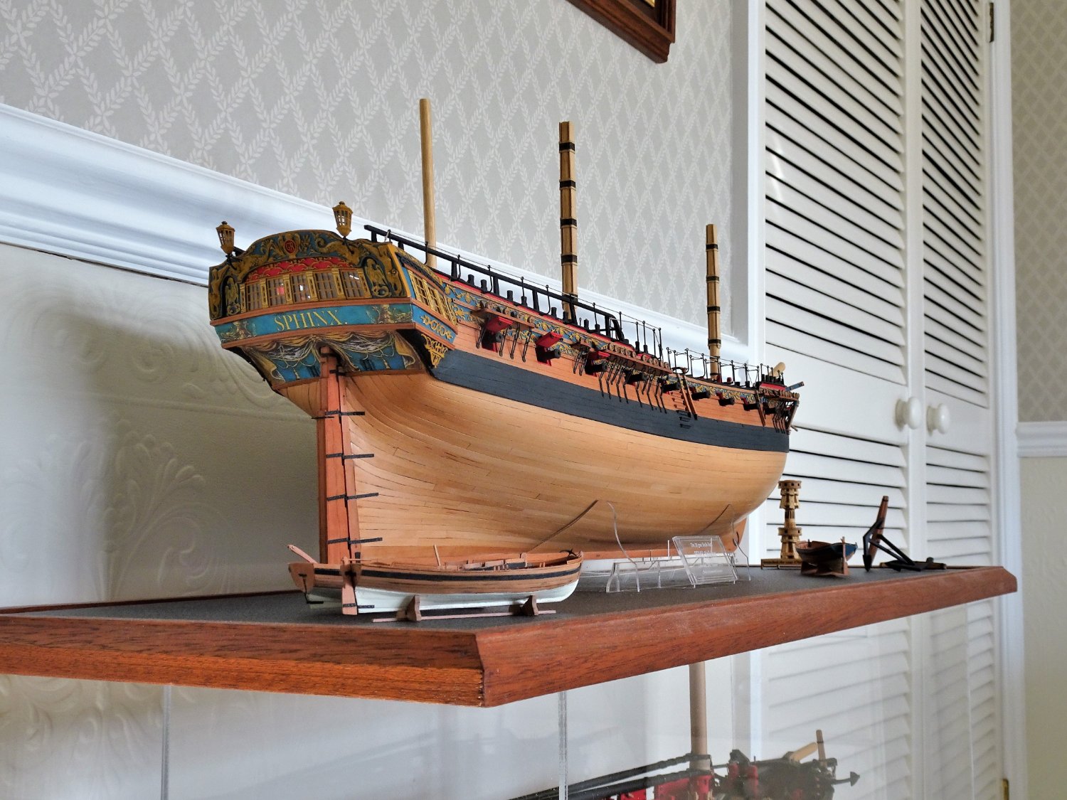
A question of display
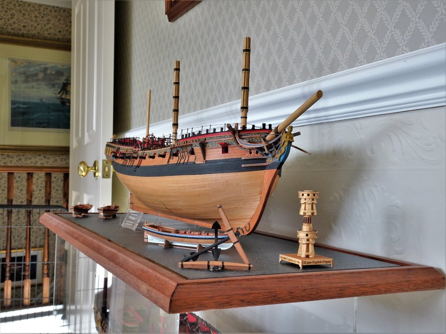
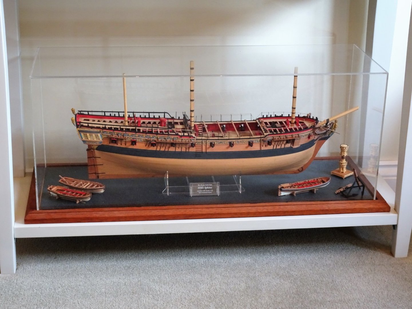
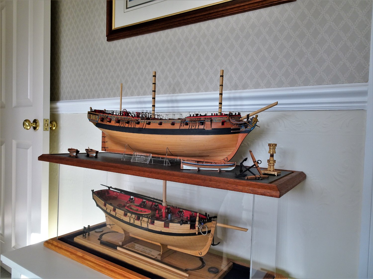
I thought about making a support arrangement of keel blocks supplemented by small cradles much in the way that I did for Pegasus. (below) It is quite a time-consuming set-up and has implications for Sphinx where the display case height is already fixed.
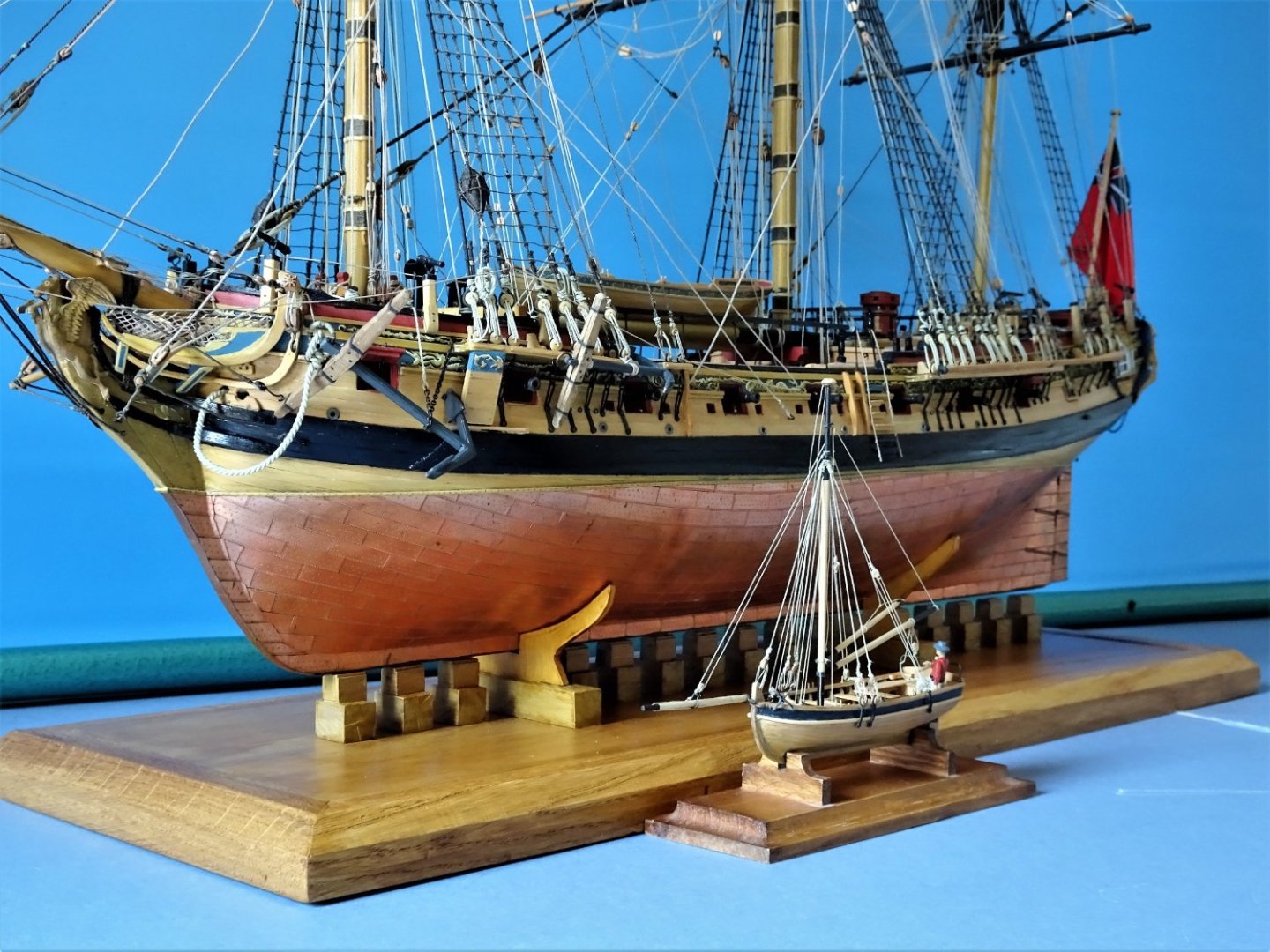
5408
Fortunately, I rather like the clear acrylic stands provided by Chris, they are nicely designed, unobtrusive, and fulfil the purpose.

8794
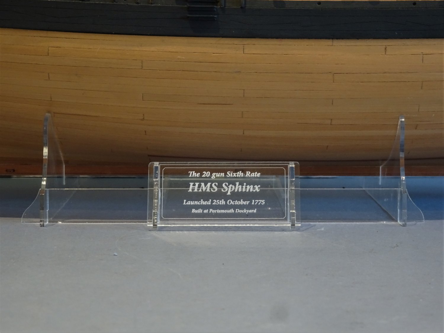
The engraved nameplate for Sphinx I like very much.
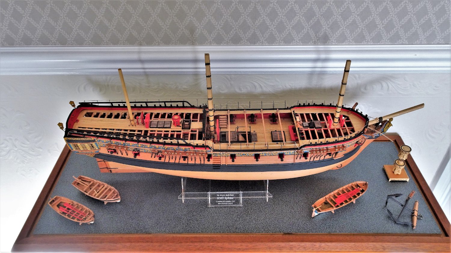
How to display the other items within the case is also on my mind but having made them I certainly don’t want to omit the three ships boats.
8777
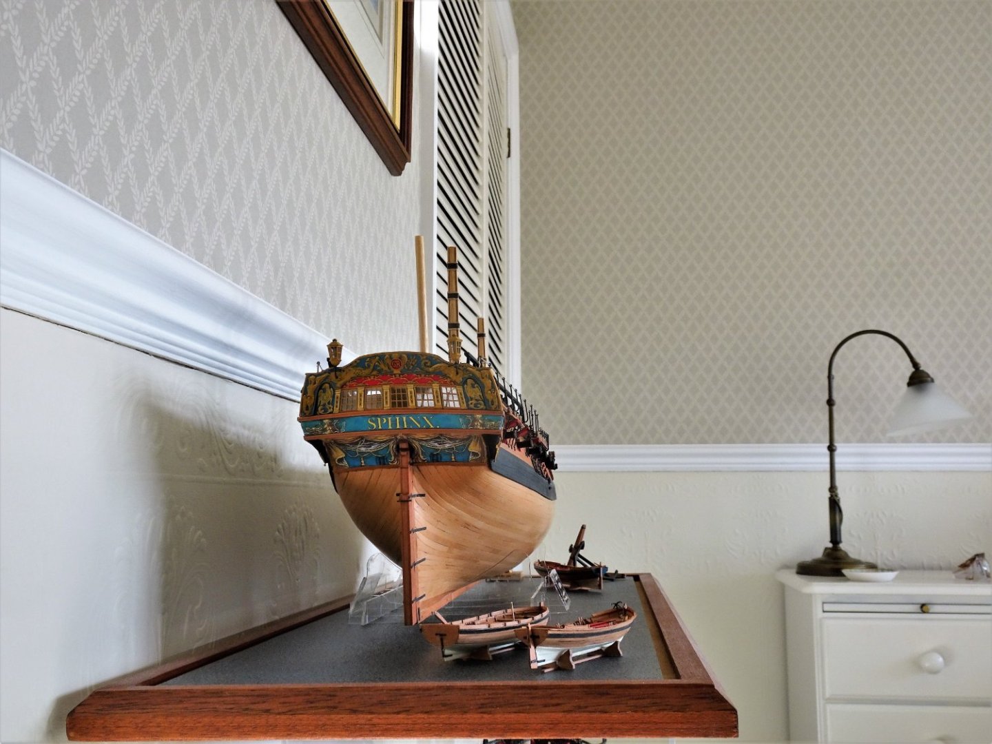
At present Sphinx sits atop Cheerful purely for convenience but this won’t be the final display location.

8768
I could play around endlessly with positioning the other items within the case, but this is fairly pleasing on my eye, and Life is simply too short.
8775
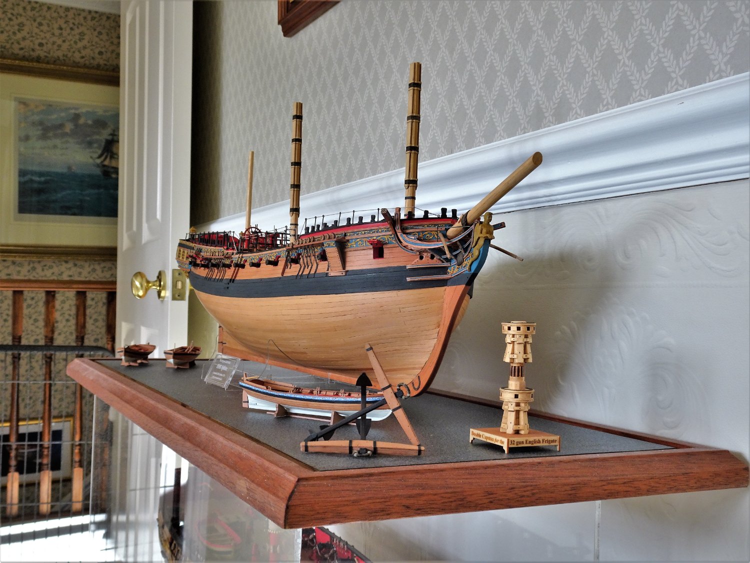
The case also provides a convenient home to display Syren’s splendid little Double Capstan model.

8773
8774
.thumb.JPG.955f8aaa36d05bb1cd395f68d3c703b3.JPG)
8761(2)
Cover on time….
8800
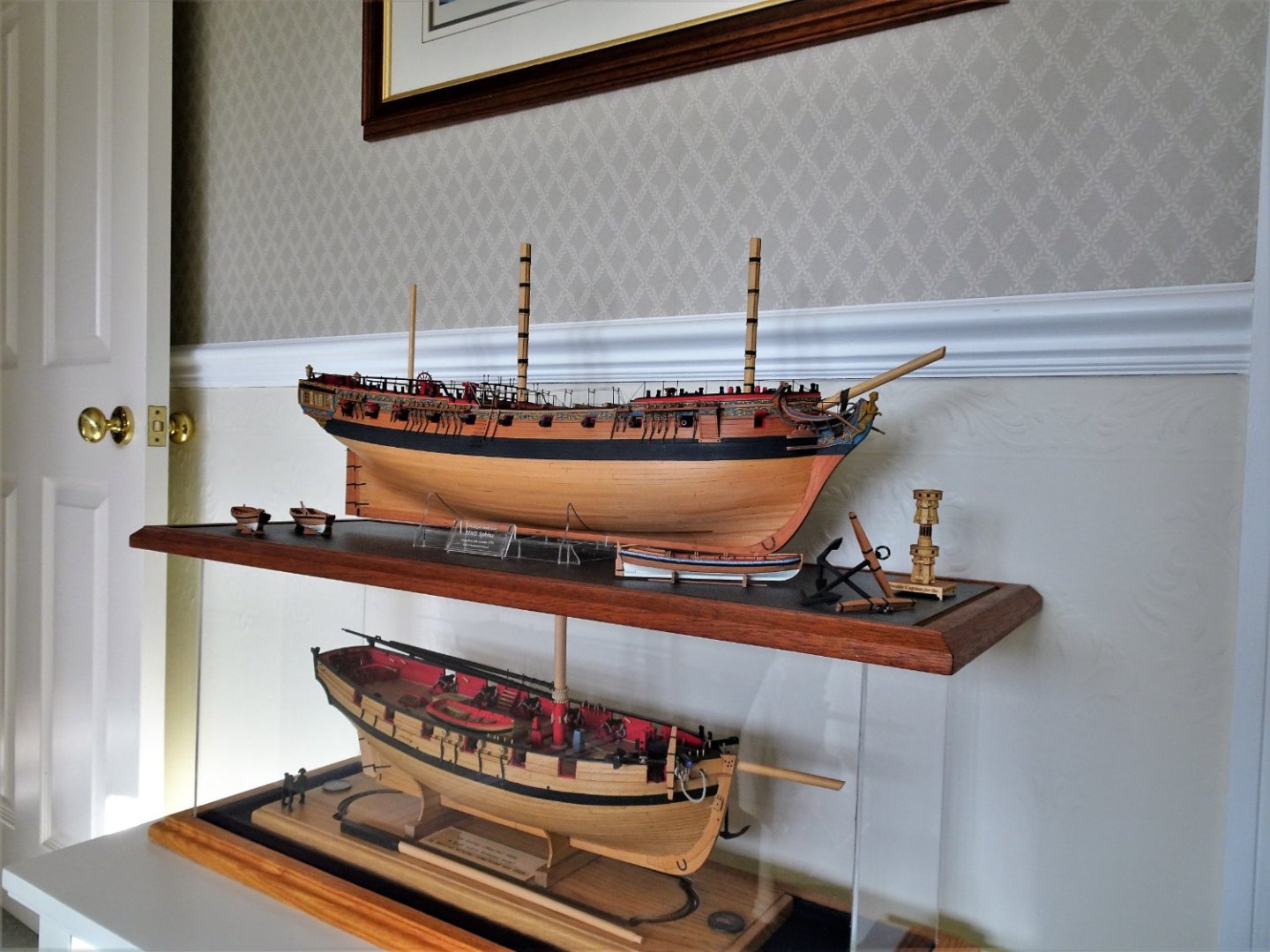
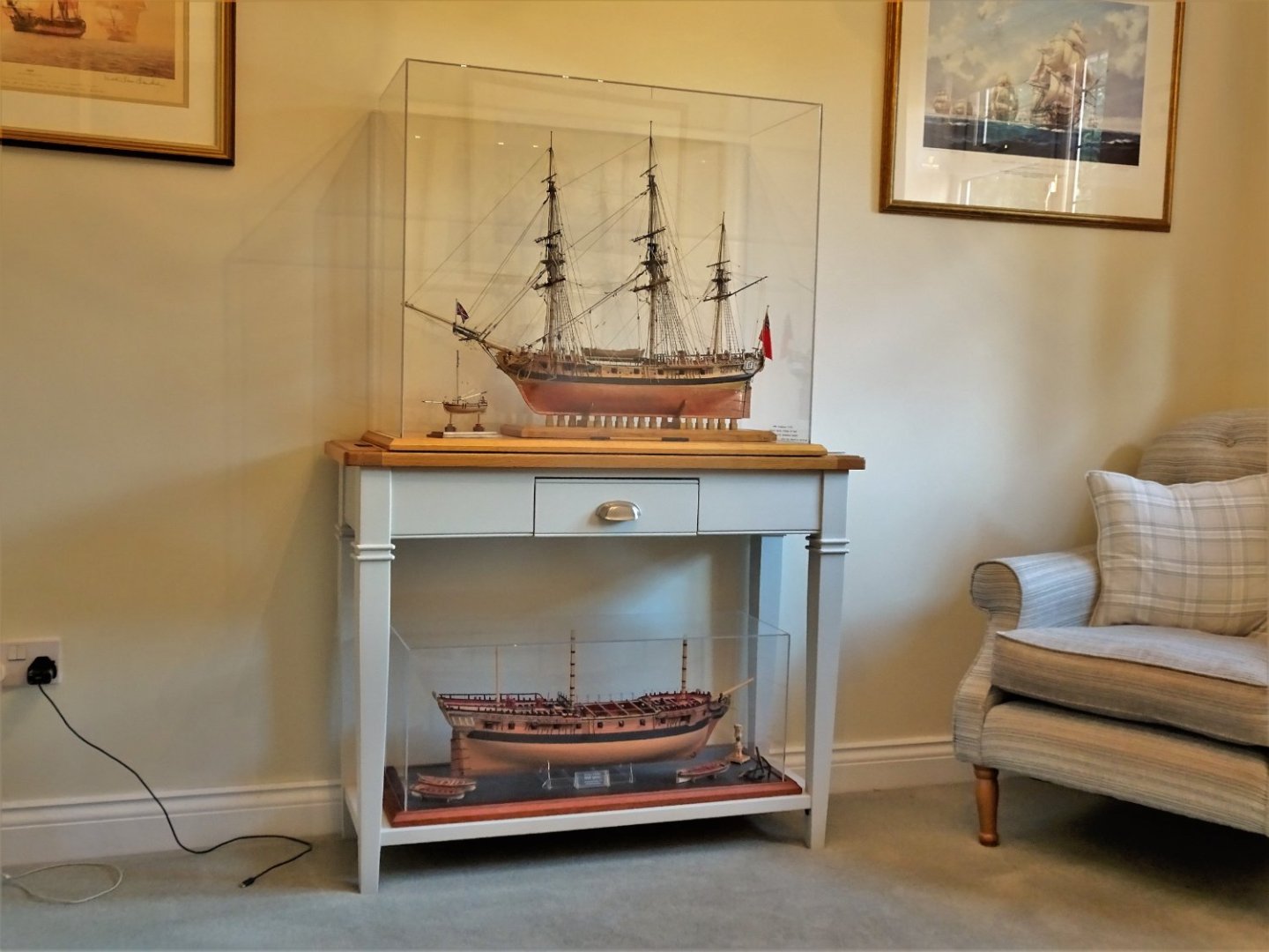
This is where Sphinx will be displayed at least for the present.
Not ideal as the low level means clear viewing of her highly decorative stern is tricky. Not that it matters as I’m not open to the public, and I know what it’s like.😉
8808
By pure good fortune the base slips neatly between the legs of the Console table currently displaying Pegasus.
It is perhaps appropriate that the two ships are displayed together, both being sixth rates of the same era.
The models also share a common heritage, both being designed by the talented Mr Watton, altho’ with a good number of years in-between.
It was partly that I already had a fully masted and rigged Sixth rate that I didn’t feel too badly about consigning the kit masting and rigging elements to the spares box.
This is not quite the end of my Sphinx journey as I now have to move onto compiling a pictorial build record book as I have done with all my builds.
I will return with something considerably smaller for my next project.
Regards,
B.E.
14/10/2022
This is such a remarkable build across the board, and as you always manage to do - the bar is set high. You are creating an incredible collection of work, and my hat is off to you, once again, B.E.
All the best,
Marc
- hollowneck, Blue Ensign, Dave_E and 2 others
-
4
-
 1
1
-
Hi Michael! Thank you for the nice compliment. For all of these carvings, I primarily use a curved chip-carving knife, a #11 EXACTO, a shallow 1/8” gouge, a 1/16” veiner, and an 1/8” straight chisel. Here and there, I’ll use small Dremmel burrs to waste material and approximately define shapes.
- mtaylor, Keith Black, FriedClams and 2 others
-
5
-
I’m a little stalled on the head construction, this past week; I just haven’t had much evening time to focus on it, unfortunately.
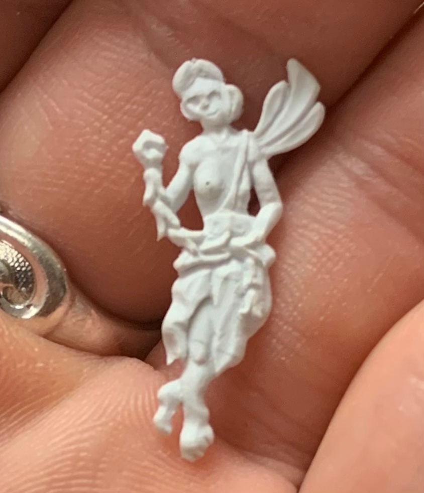
I have, though, been trying to carve the bow angels that sit right behind the headrails. I had the hardest time carving this, considering the scale:
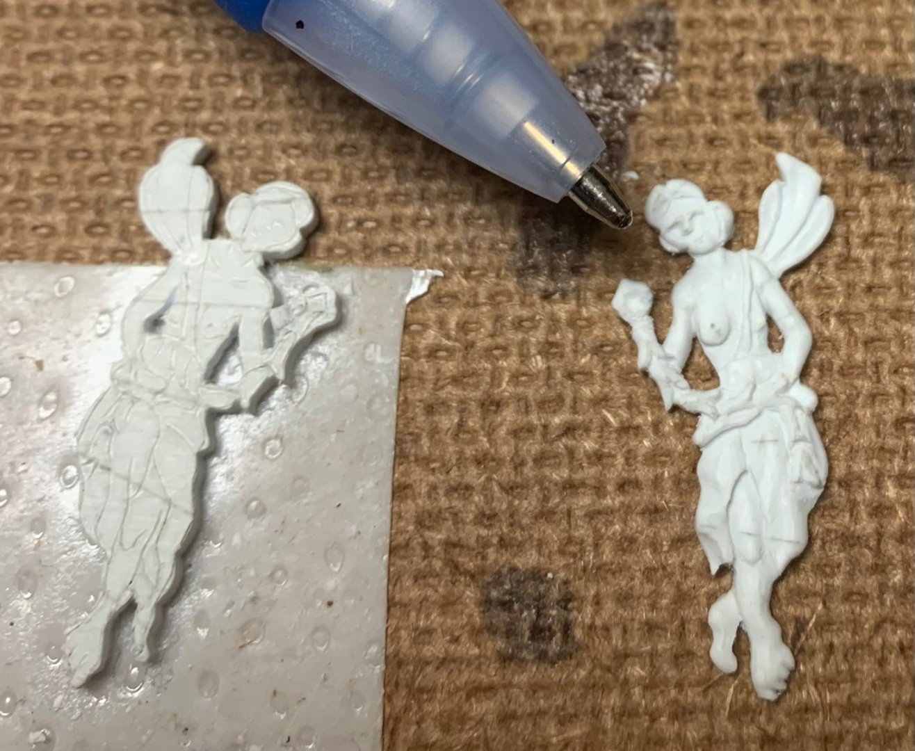
As before with the stern angels, the faces are not great, but I can live with them.
- EJ_L, Keith Black, No Idea and 12 others
-
15
-
This is all very much appreciated, Gary. Thank you!
- mtaylor, Keith Black and FriedClams
-
3


.JPG.9f9c92d7f134f644dfe9d148949b4def.JPG)


Making ship drawings in the seventeenth century Dutch Republic.
in Nautical/Naval History
Posted
Perhaps drawings made after the build were part of a larger effort to document and re-produce successful designs.