


Hubac's Historian
-
Posts
3,220 -
Joined
-
Last visited
Content Type
Profiles
Forums
Gallery
Events
Posts posted by Hubac's Historian
-
-
What about tape-clamping your spar parts together in a continuous spiral of painters’ tape?
-
It’s hard to explain without pictures. Here’s an excerpt from my log:
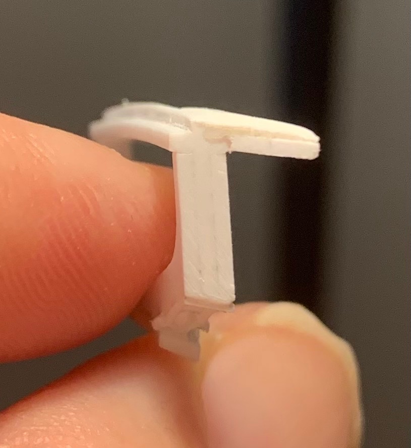
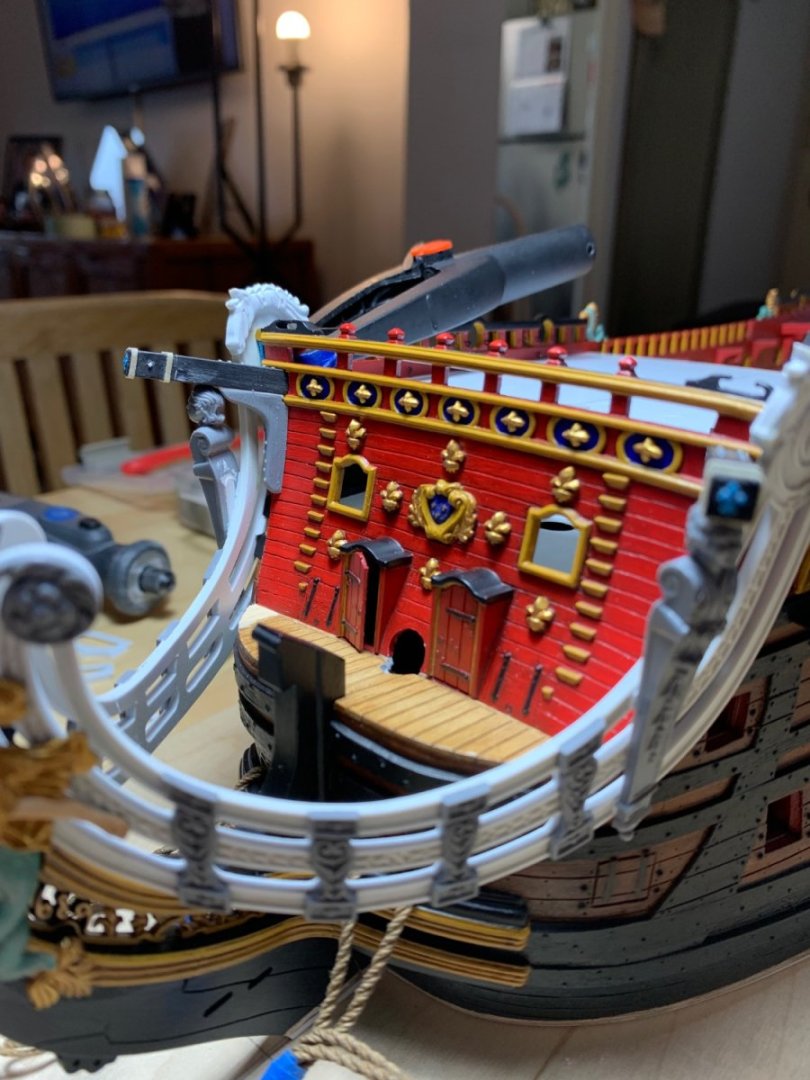
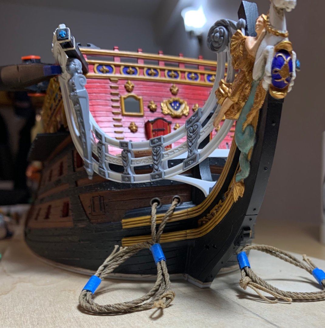
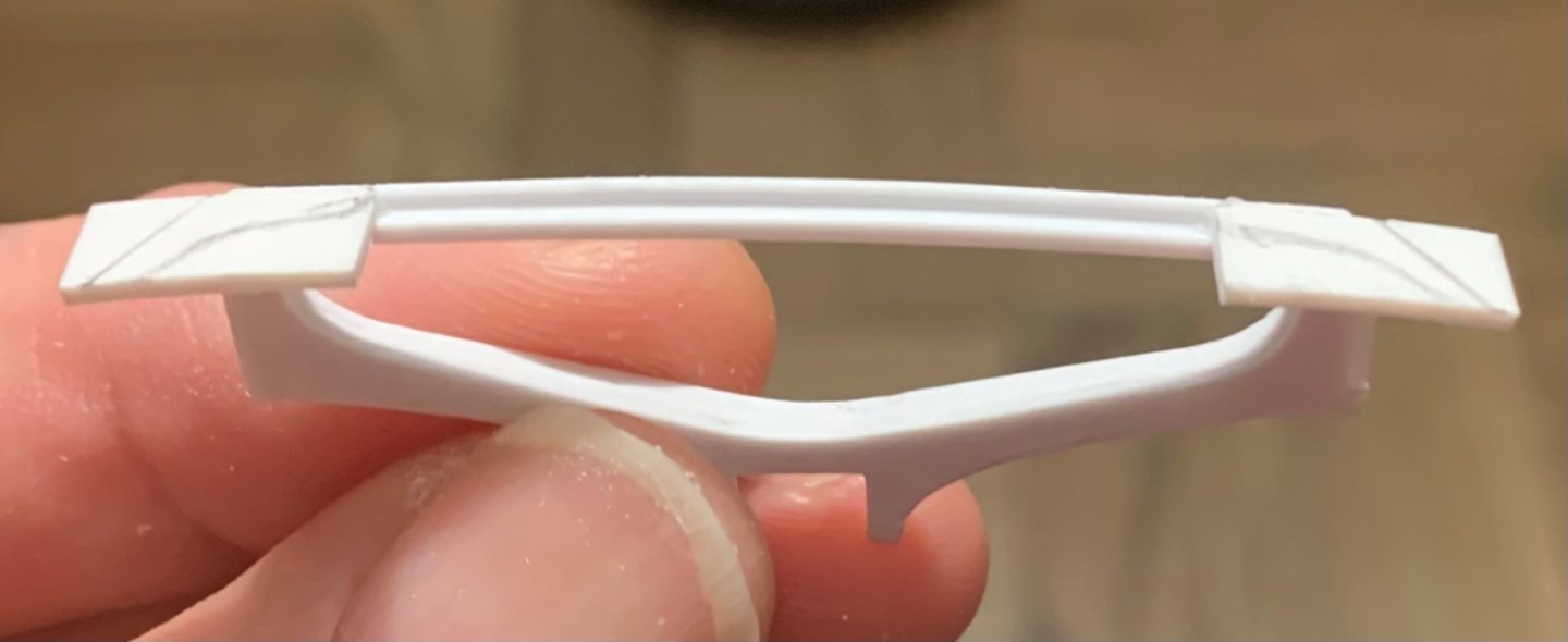
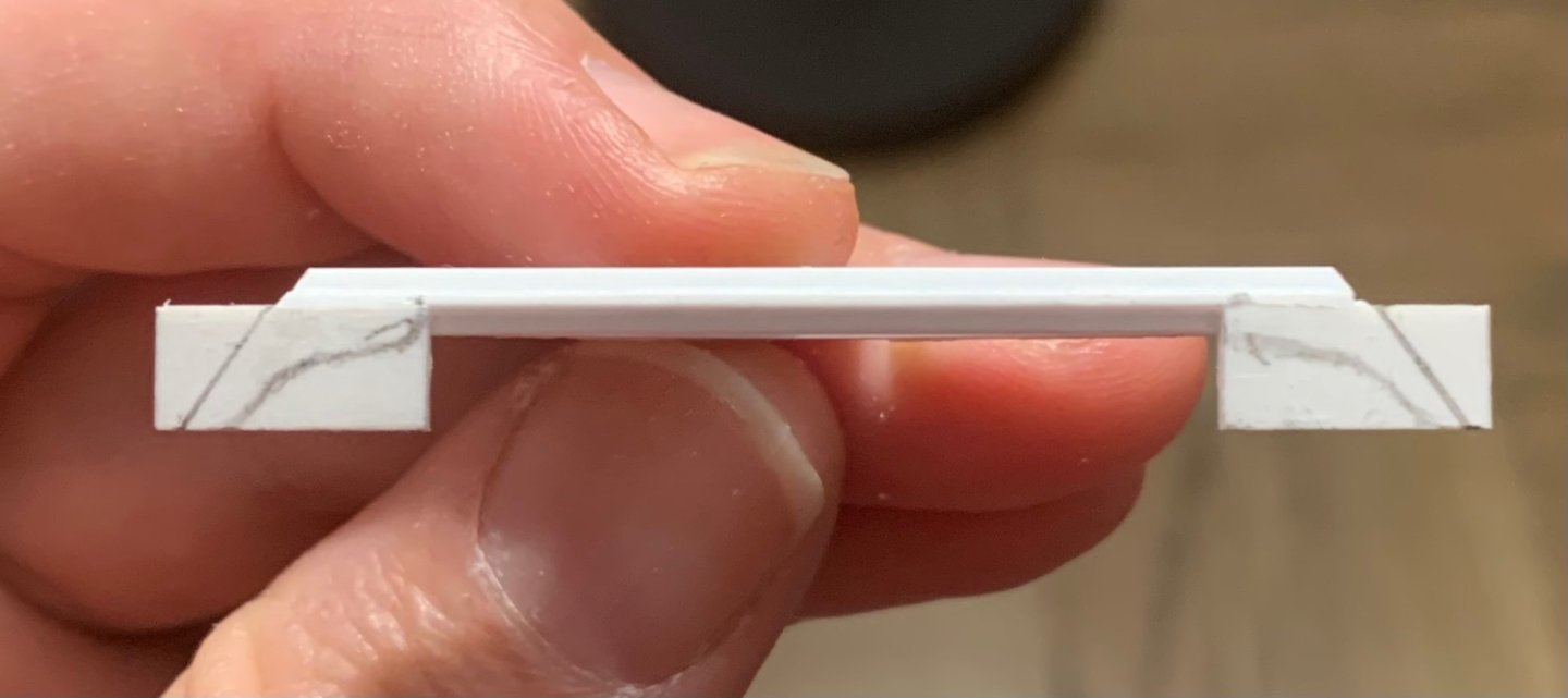
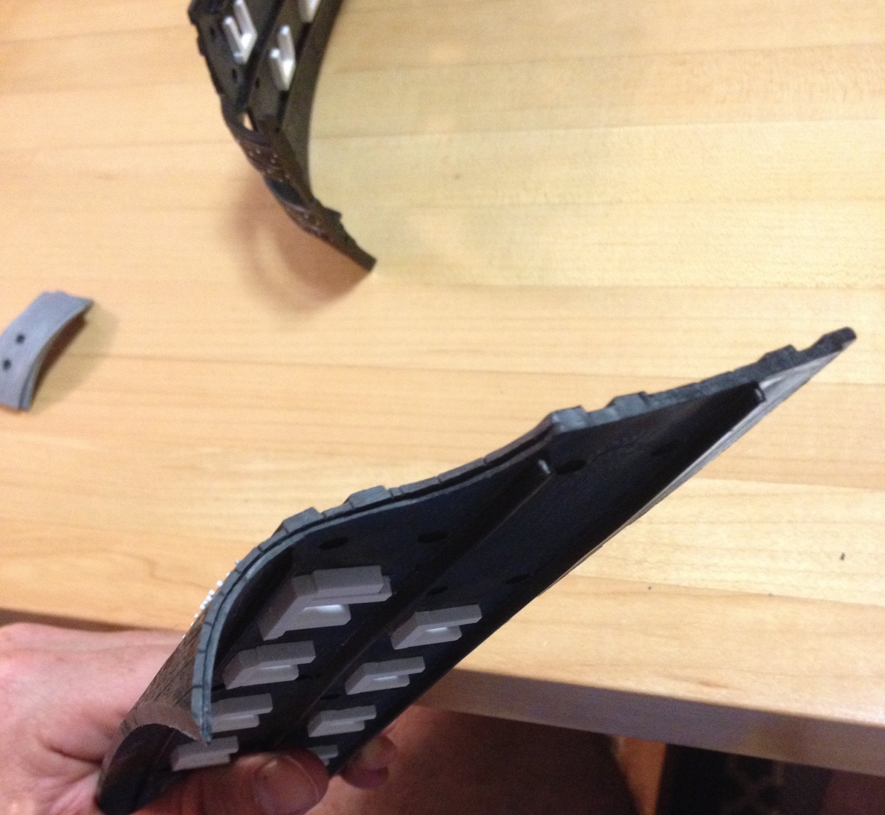
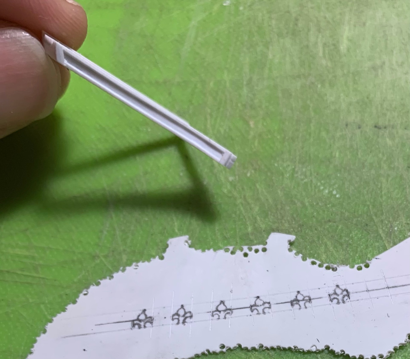
With the continuous bolting of the wales complete, I turned my attention to the hawser insert pieces, and I think I've done a fairly Doogie Hawser job of surgically in-letting the port side hawser piece.
The issue at hand is the dark ridge that you see, here, on the starboard side. The planking is moulded and intended to be a smooth continuum, but the piece does not fit flush, and this is unnatural.
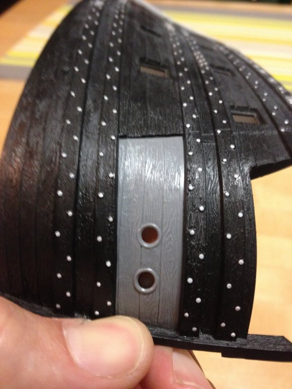
However, after using my fabulous Dremmel Micro to cut a diminishing rebate into the mounting edge of the piece, the aft edge sits flush with the rest of the planking.
This is not at all difficult to do, it is simply a matter of holding the piece in place, as you scribe the lower edge of the upper wale into the plastic, and the upper edge of the lower wale, with a single edge razor blade. An emmory board cleans up the transition and the piece fits perfectly. A little work on the aft joint, where it meets the hull, is required in order to minimize the need for putty - a touch of Squadron, though, and a little judicious leveling should make that transition line completely disappear.
I will have to do the same on the starboard side, obviously, and I will also have to fill and re-drill the hawse-holes, back closer to the stem, after I have performed my magically surgical widening of the hull, at the stem.

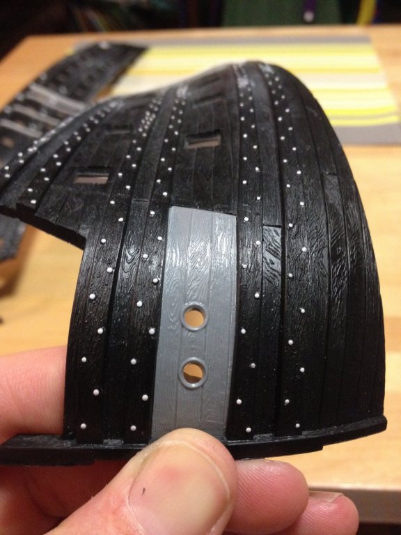
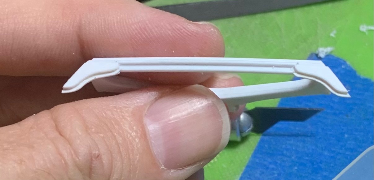
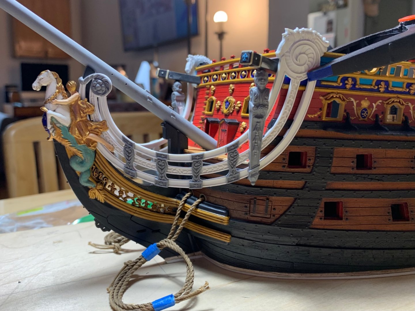
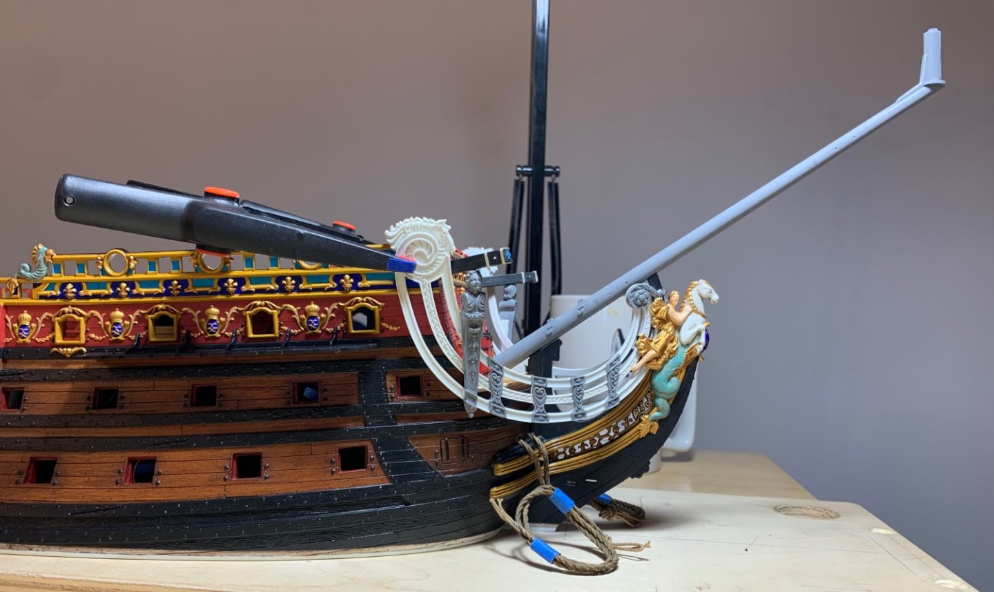
Just as the prior example illustrates my desire to make this model look less like the plastic kit that it is, the next example strives for a greater verisimilitude with real practice.
Here, I am showing the transom profile, which previously, I had trimmed back a generous 1/16", to the mounting ledge for the transom piece. That's why the hull thickness seems so exaggerated, below the main wale, because it includes the mounting ledge. The reason for doing this was so that I can model-in the round-up of the square-tuck stern.
However, even after grinding away the existing mounting ledge, the side planking still is way out of scale. Ordinarily, with plastic models of this type, one would glue in the transom piece, and then fill-in any gaps - and then maybe, maybe scribe back in the partially filled plank lines. As I will be building up the transom and stern from scratch, on the other hand, I saw this as an opportunity to thin the hull wall at the transom edge to a more scale-realistic plank thickness.

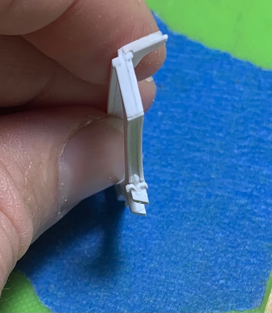
Into which, I then engraved the plank butt-ends

This process also creates, on the inboard hull a new mounting ledge for the transom planking that will be installed later. Rinse, and then repeat on the starboard side!
Following that, I will glue in the hawser pieces, and then scribe-in and detail the 15th "hunting port," at the bow of the lower battery. As this is already a fairly long build-log, and I've only just gotten started, I will periodically mention "the truth," or what "should be." What the first battery should consist of is 16 piercings (to be consistent with what is known of SR1), with 15 armed at all times; the 16th "hunting" port at the bow would only be armed by shifting the next gun, forward, into position when SR (and La Reyne, for that matter) were appropriately in pursuit of the enemy. For my purposes, even a vestigial scribed 15th port - while it's not 16 - is still closer than 14. Comme-ci, Comme-ca; a compromise of sorts.
- Baker and Bill Morrison
-
 2
2
-
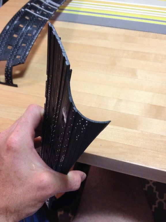
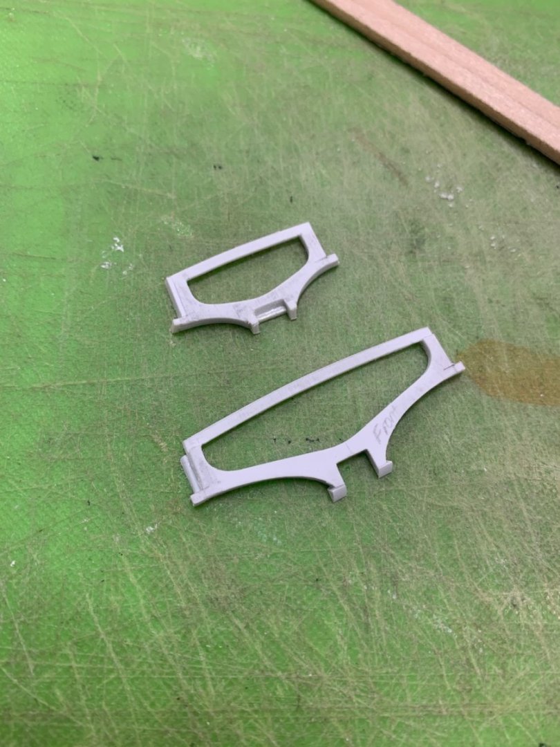
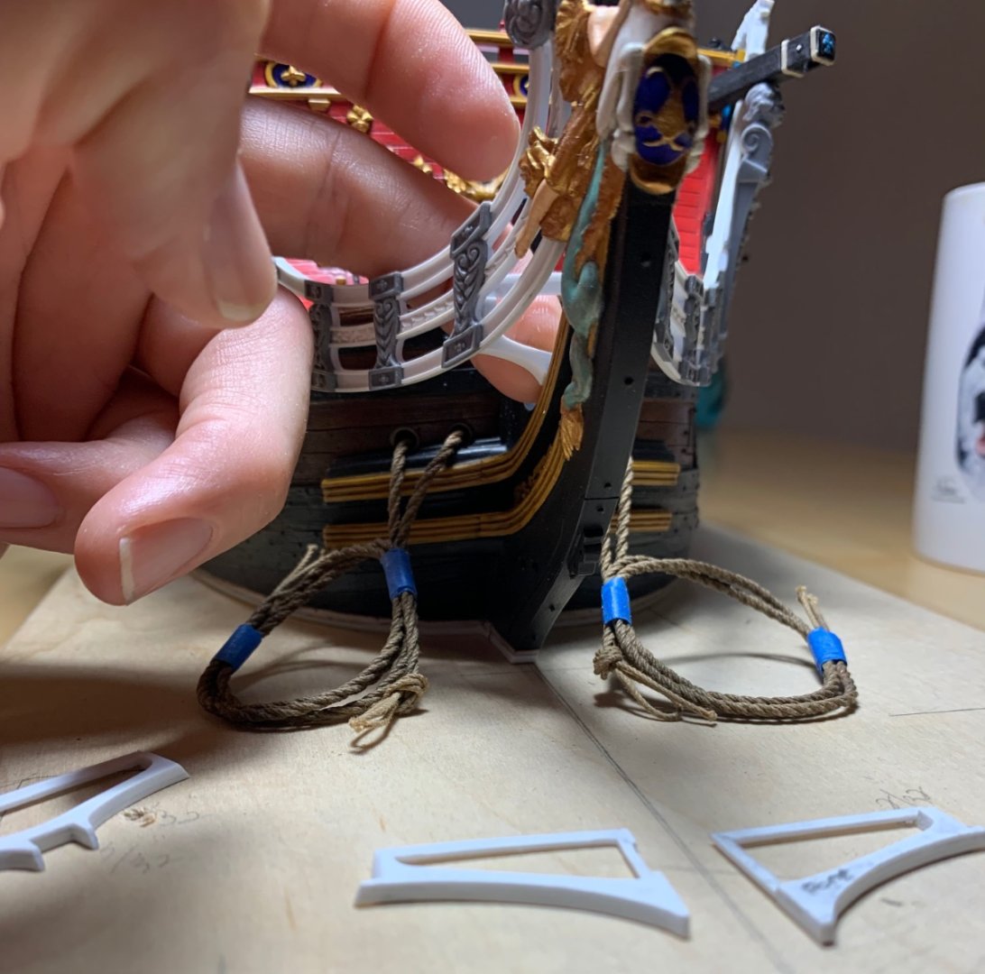
It has always annoyed me that Heller made these hawser pieces separate from the hull halves. If you glue them-in, as is, you are left with a step on the outside of the hull, where the aft edge of the insert joins the hull. I decided to create a half-lap joint on this aft edge and a tapering lap on the top and bottom edges of the hull opening, in order to eliminate this step. It was very fiddly, but it enabled me to scribe the “hunting” port on the lower battery.
-
Take a look at the hawser inserts before you do anything. I forget exactly how they fit in there, but you might want to check to make sure whatever you do doesn’t complicate their installation later.
- Bill Morrison, Bill97 and Ian_Grant
-
3
-
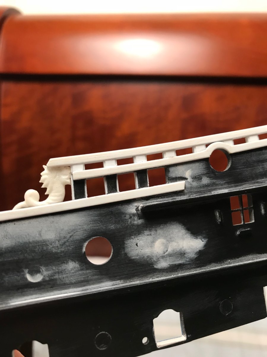
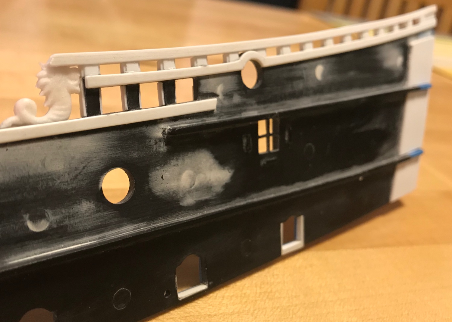
It’s a combination of strip styrene and evergreen sheet of the same thickness. First, I glued pie-wedge pieces of sheet plastic over the round port openings, so that the edges land where a natural joint should exist. I then ground away the excess plastic, and then I simply cut strip stock to meet the miters. I am glad that I took the time to do this. The caprails are of an un-convincing thickness, as they are.
-
I added evergreen to the caprails to give them better scale when you are looking down at the sheer rail from above.


- ScottRC and Bill Morrison
-
2
-
I may be wrong, Bill, but I think Ian is referring to the sheer railings on the upper bulwarks. Maybe he was assuming you would be attaching the upper bulwarks early.
-
Are your hull halves warped along the keel?
-
As a broad rule of thumb, I think this comes down to whether you are going to airbrush or hand-paint. For hand-painting, I have found the hull halves to be easier to handle, un-assembled. I just putty and touch-up after assembly.
- Ian_Grant and Bill Morrison
-
2
-
No, I think your eyes are seeing the reality, there. I think I may have placed the port side a little too far forward. I’ll have to pay more attention to that as I get closer to final assembly. At this stage it is all dry-fit.
- Bill Morrison, druxey and Keith Black
-
3
-
Actually, Bill, I’m amazed it hasn’t happened sooner. March of 2020 was the first time. But, school-age children and the coughing sneezing, sometimes sleezing, populace of NYC offer endless opportunities for contamination. Fortunately, I’ve always been in pretty good shape, and the infections never got into my chest.
-
Thank you all for your well-wishes and for your kind comments. Although, I have generally felt pretty ok, throughout (congestion, mostly), today was my first day where I tested negative. It was nice to have a little time to rest, but my compulsive nature has me bouncing off the walls, at this point.
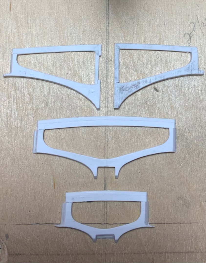
So, after much fiddling/fettling, I finally have the forward and mid supports dialed-in where I want them:
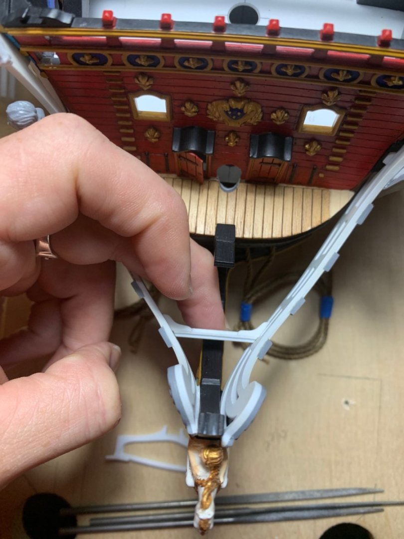
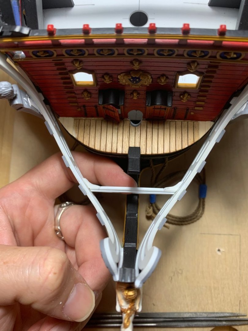
But, for the fact that I underestimated the angle of the buttressing knees on the forward support:
Okay, not a big deal; I added some plastic underneath the knee, so that I could fair the top surface flush with the headrail profile:
After fairing, and adding the support ledge for the grate slats:

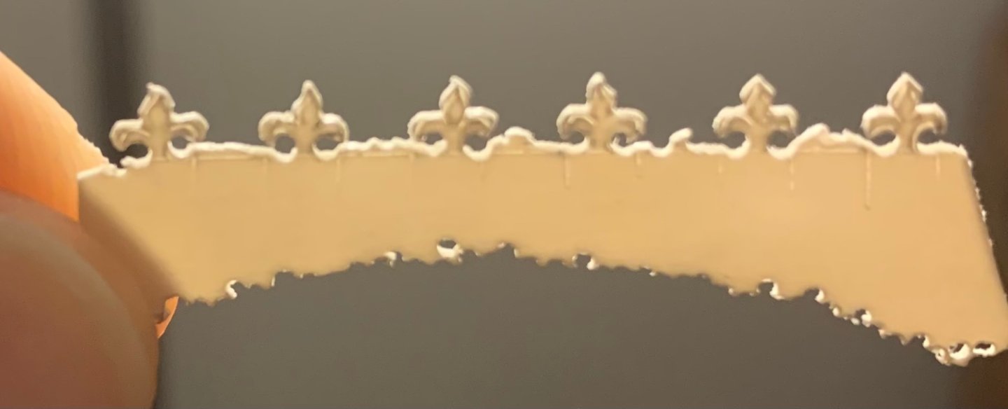
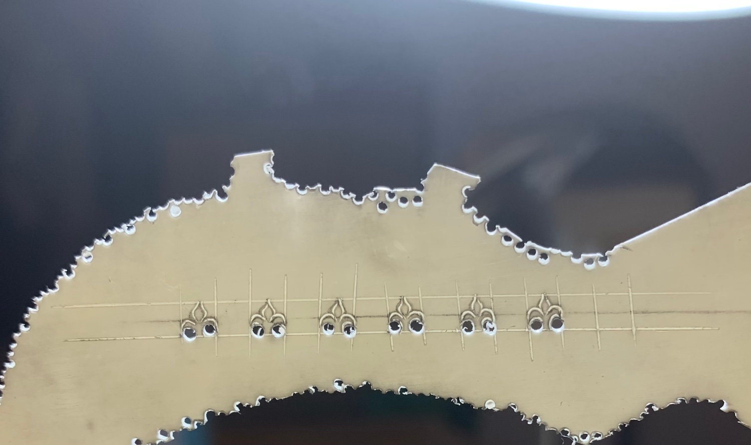
I think the fleurs shaped up nicely, especially considering how small they actually are:
I had to add some plastic to the foot of the split supports, in order to raise them up about a 1/16”, but that is not a big deal either. This is the beauty of a plastic build; you can make these mistakes and still salvage the part.
The next tricky bit of business is to fashion the forward terminus for the head grating, which fairs into the upper head knee.
More to follow..
-
-
Very good, indeed!
- 72Nova and Old Collingwood
-
2
-
Hello!
The difficulty I’ve been having with these headrail supports has to do with my fidelity to the idea that some portion of the support should fit beneath the lowest headrail.
I started by first adjusting the adjoining angles on the starboard side. I found that I had to add plastic shims, here and there:
This all worked out well enough on the starboard side, but I was not having nearly enough of a supporting ledge, when I shifted over to the port side.
More-over, when I positioned both headrails at the same time, I realized I was going to have to add significant plastic the the lower coved profile, in order to create a port-side ledge. Rather than continue to add plastic, I decided to let the matter rest for a few days. I am glad I did.
In the days that followed, my second bout with COVID (pretty mild) has afforded me the time to really think this through. I remembered that I had already set the position of the headrails so that the forward medallion was below the sprit mast. That was the whole impetus for re-designing the headrails, in the first place.
Further, I had set the cathead supports to meet neatly beneath the cathead timbers. Despite all that forethought and pre-work, I had only visually placed the starboard cathead, before fitting the supports, on the assumption that my glue blocking would locate them properly.
Wellllll, that was not a safe assumption to make. My forward medallions were actually encroaching above the spritmast, and when I put the cathead timbers in place, I could no longer fit the supports beneath them.
Once I could see the proper positioning of all of the affected elements, I knew what I must do:
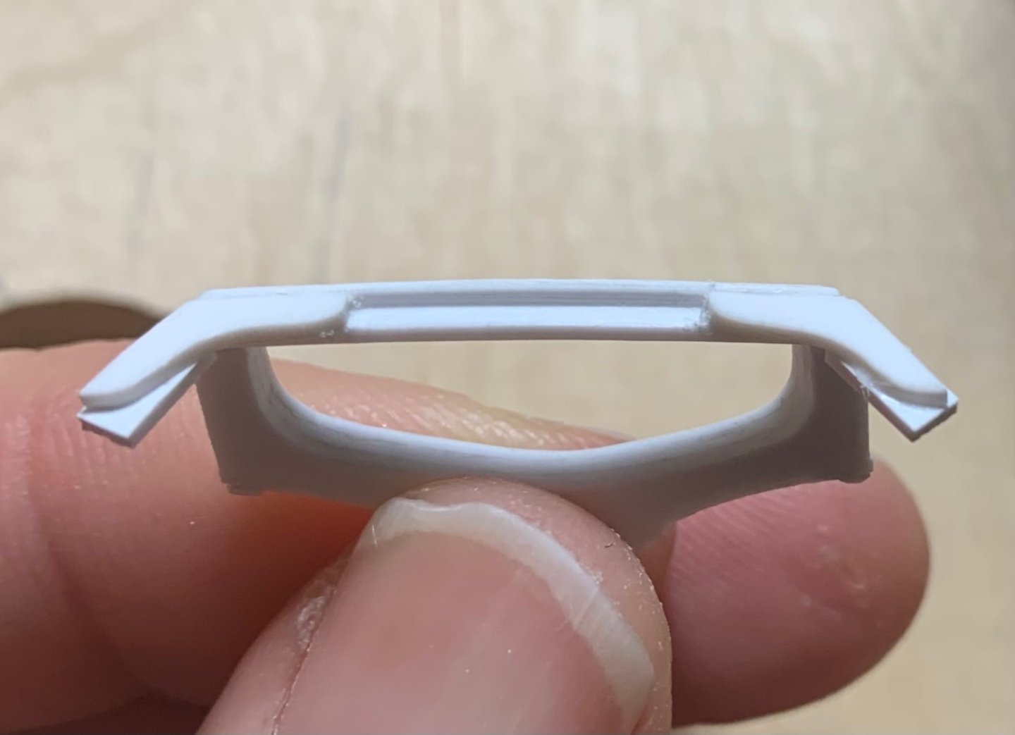
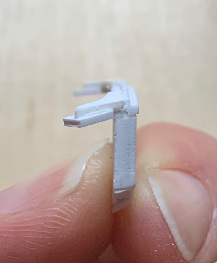
The way forward would be to lop off these supporting ears (middle support)
Note: The vertical web you see on the split supports, closest to the hawsers, are only temporary for the sake of strength while I make and fit these parts. Once I did that, the support pieces nestled against both sides easily:
I can simulate that under-connection, a bit later, with an applied scroll-head.
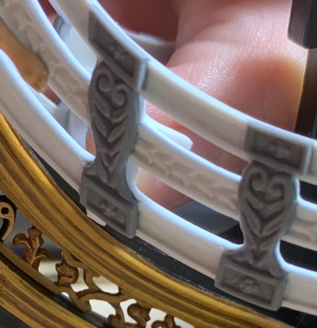
From there, I focused on what sort of decorative embellishments I would add to the exposed face of these supports. I settled on a raised lip moulding:
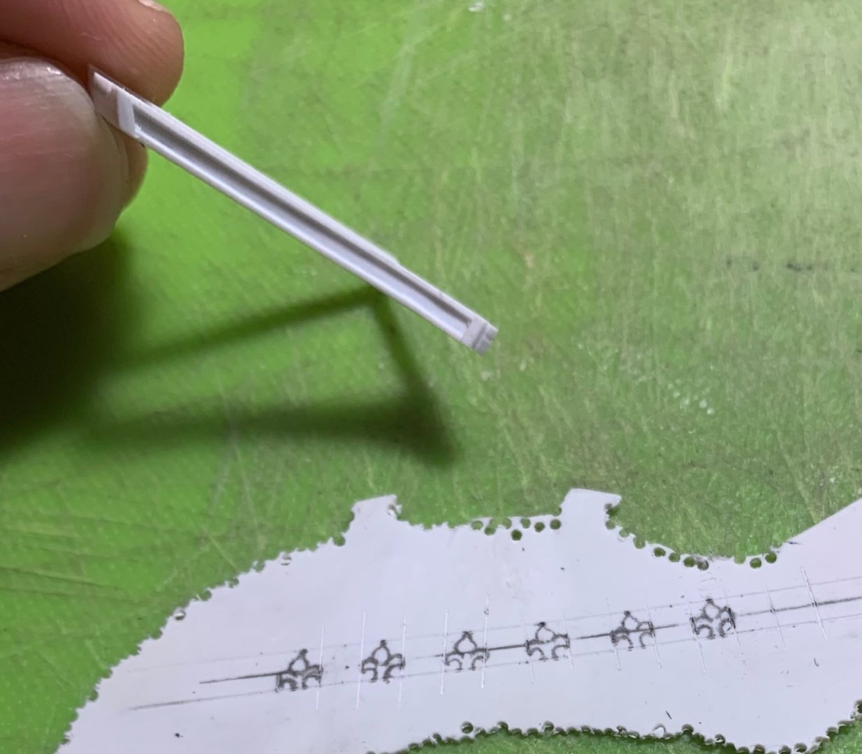
I am playing with the idea of applied fleur ornaments at the base of each support. These will extend out beyond the sides of each support, which may or may not be pleasing. So far, though, they are coming along nicely:

The other tricky bit is that these cambered transverse supports for the head gratings have buttressing knees, running aft.
I had applied a glue ledge for the grating slats, and at the ends I have applied these blocks that I will fit to the headrails, and then file to shape. What I have drawn upon them is only a rough approximation. Again, these details are always easier to dial-in with the files:
Steadily, now, the bow is rounding into form. Thank you all for your likes, your comments and for looking-in.
- mtaylor, GrandpaPhil, popeye2sea and 16 others
-
13
-
 6
6
-
-
-
Agreed - the pins are very convincing at this scale.
-
Ha! You may have to wait a bit longer as these headrail supports are proving more difficult to fit than I anticipated. The starboard side is fitted, but it required significant padding out with extra styrene to make good connections; this, despite making what I thought were really good patterns.
Anyway, it will all come together in the end.
- BLACK VIKING, 72Nova, Nek0 and 6 others
-
9
-
Yeah - at this scale, that will be a challenge. Maybe wire and glue-sizing to make the bulbous heads of the pins?
-
I’m not sure what language that is, but not French.
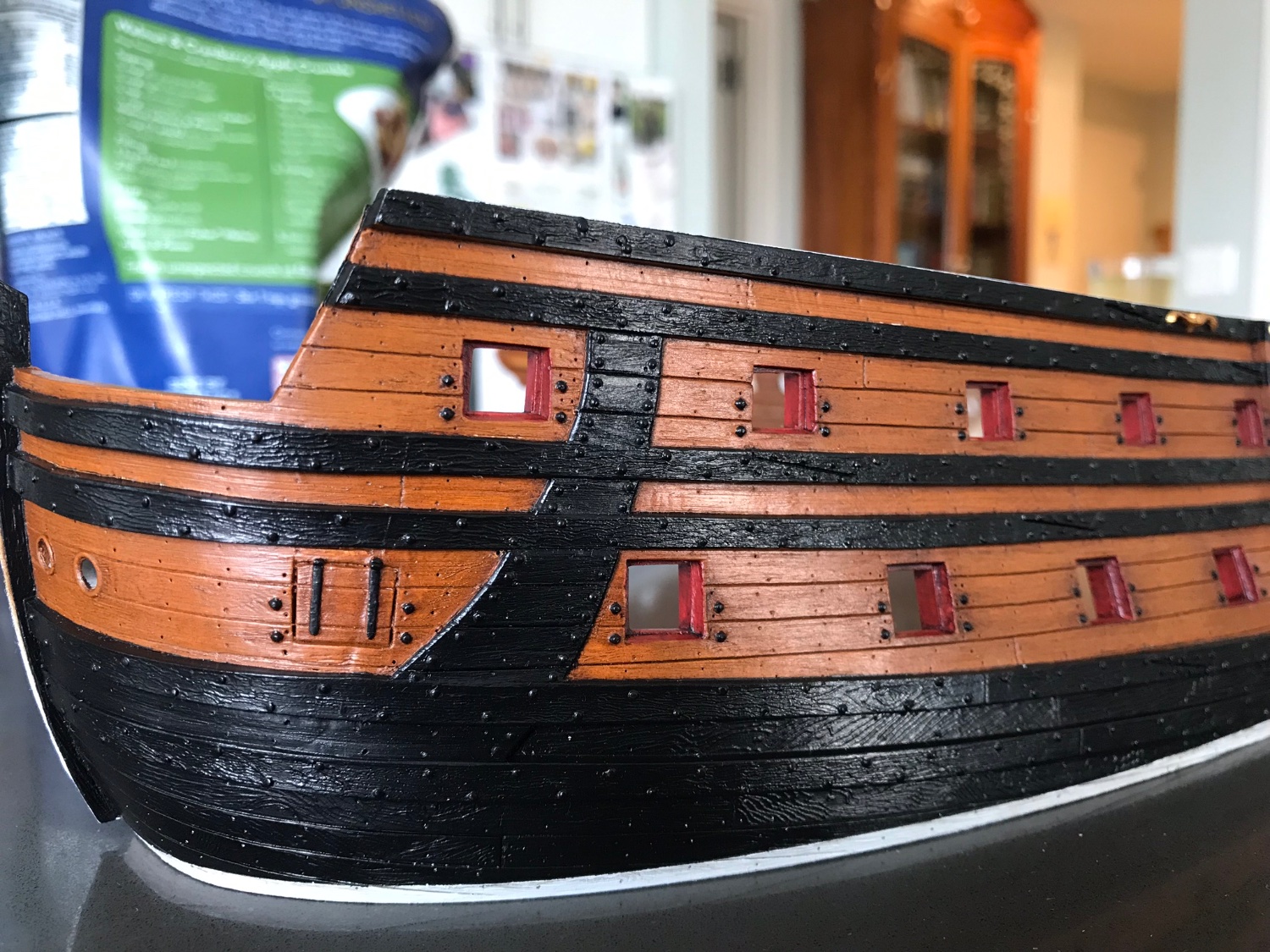
”Ventre de biche” is a French name for this particular color that they painted between the boot topping and the upper main wale. It resembles the tawny color of a deer hide.
My “deadworks” (another funny French-ism associated with ships: the underhull below the waterline is the “liveworks” because that is the part of the ship that is engaged with the sea, its kinetic medium. Everything above the waterline is the “deadworks.”) started out more ventre-de-biche:

But, then, I overdid the distressing:

I was forced to darken the port side (lighter, above) to match the starboard (darker, behind).
-
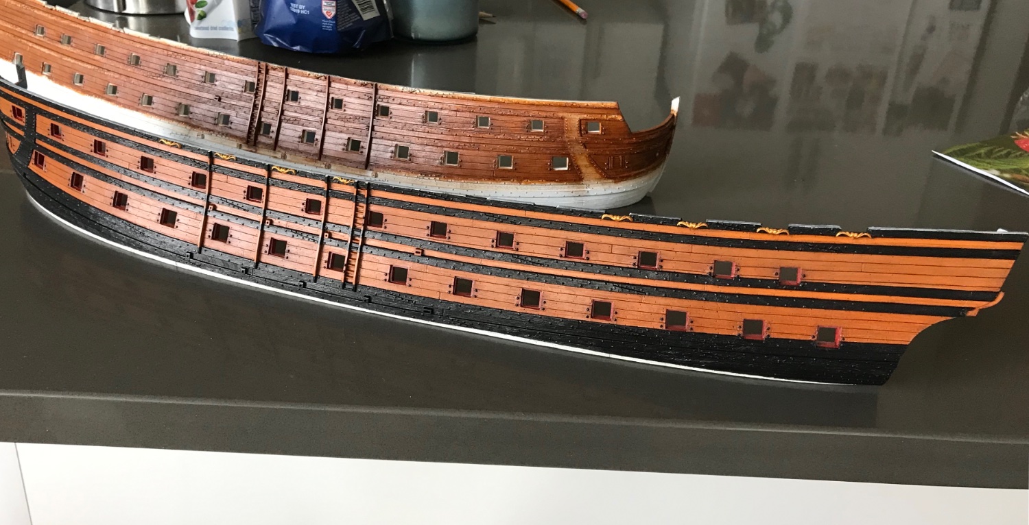
Without the black boot-topping, the waterline issue is not a problem, but you’re still gonna want to scrape away the moulded waterline, cuz it’ll definitely show up as a distraction. This is if you opt for the natural wood bottom.
If you look closely, you’ll see that this builder scraped it away.
I’ll also mention that this person made pretty good and convincing cloth sails. AND, the so-called “ventre-de-biche” color (belly of the doe) is a pretty close approximation of historical accuracy.
-
Thanks for the extra pics of that model, Bill!
-
At the end of the day, Bill, it is your model and you should build it according to your preferences. I have seen most Heller SR builds in the public domain, but that one above, I haven’t seen before. The natural wood bottom is interesting.
Main thing you definitely want to do, as others have said, is to raise the water line to just below where the lower main wale sits lowest, at mid-ships. Without that modification, the model just looks top-heavy.


Le Soleil Royal by Bill97 - FINISHED - Heller - 1/100
in - Kit build logs for subjects built from 1501 - 1750
Posted
You can definitely still inlet the hawser piece into the hull-half so that the outer-surface is flush because the modification happens to the hawser piece; you simply hold the hawser piece in-place and scribe the wale boundaries (top and bottom) into the surface of the hawser plate. This will give you the reference you need to cut a tapering shoulder into the hawser plate (top and bottom). From about mid-plate, your shoulder should taper from zero to about a heavy 1/32” - whatever it takes to bring the aft edge flush with the exterior planking. Of course, you don’t have to do this and very few that I have seen have ever bothered to. It’s just a personal bugaboo of mine and one of the modifications I have found that reduce the plastic feel of the model.
I describe the wale bolting in detail, not many pages from where I pulled the hawser excerpt. Basically, I cut really thin slivers (-1/32”) of .030 styrene rod onto my plastic cutting matt. I separate them (they tend to want to clump together) and then flash them with a wand lighter (flame is about a 1/4” above); this melts the dots, slightly, and causes them to form a slightly domed appearance. I tried a number of things, but this was the method that gave me the scale appearance I was after.
I sharpen a toothpick and use the tip to apply a small dot of liquid plastic cement (I like Testors) where I want the bolt head. You can then “pick up” each bolt head and place it with the very tip of a sharp Exacto blade.
Once in-place, I just press the dot with my finger tip for 5-7 seconds to get a firm weld. Once these are on, they’re really ON, and you’ll have to shave them off, here and there, where you might need to as the build progresses.
It sounds extremely tedious, and it is, but you’d be surprised how quickly you find a rhythm. Just don’t task yourself with trying to do one whole side in an evening. Do a wale, and then take a break. Do something else.