Hubac's Historian
-
Posts
3,308 -
Joined
-
Last visited
Content Type
Profiles
Forums
Gallery
Events
Everything posted by Hubac's Historian
-
 I appreciate that you are taking the time to read through the log, again, Bill. The one thing that will not be possible to do as a full-hull model will be to increase the width of the hull, at the bow. That can only be done, if you cut away the lower hull. Everything else, though, is eminently possible. And Vic, you're right - that scribing technique is a quick and easy way to go about making windows.
- 2,699 replies
-
- 6
-

-
- heller
- soleil royal
- (and 9 more)
-
Congratulations on your fine presentation Msr. Huc. Thank you for sharing!
- 2,699 replies
-
- 4
-
-
- heller
- soleil royal
- (and 9 more)
-
This is a treat for the eyes, Marc! I really like the pictures from above, starboard stern quarter; they really give a strong impression of the arsenal that was Soleil Royal. Love it!
- 208 replies
-
- 5
-
-
- le soleil royal
- 104 guns
- (and 2 more)
-
Fabulous! The teak has that really nice sun-bleached effect.
- 444 replies
-
- 2
-
-
- Cutty Sark
- Revell
- (and 2 more)
-
Thank you all very much, Gentleman! And, Bill, I appreciate the thought, there. Some day, Nek0’s Soleil Royal will far eclipse anything that’s happening here, and I personally can’t wait for that to happen! In my opinion, his model is the king of all current Soleil Royal builds, and there are a number of very good ones out there.
- 2,699 replies
-
- 6
-
-
- heller
- soleil royal
- (and 9 more)
-
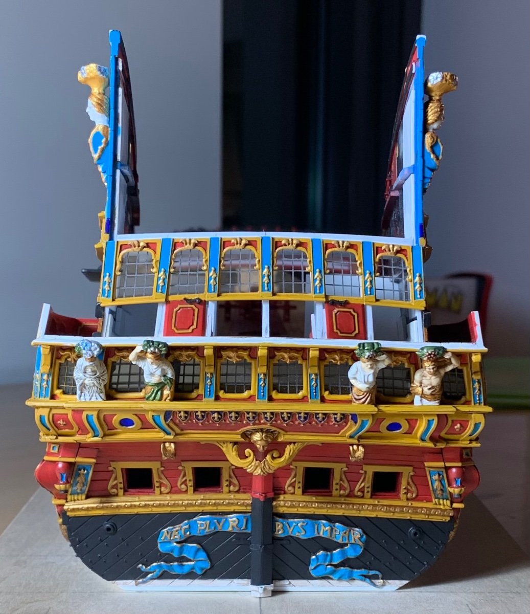
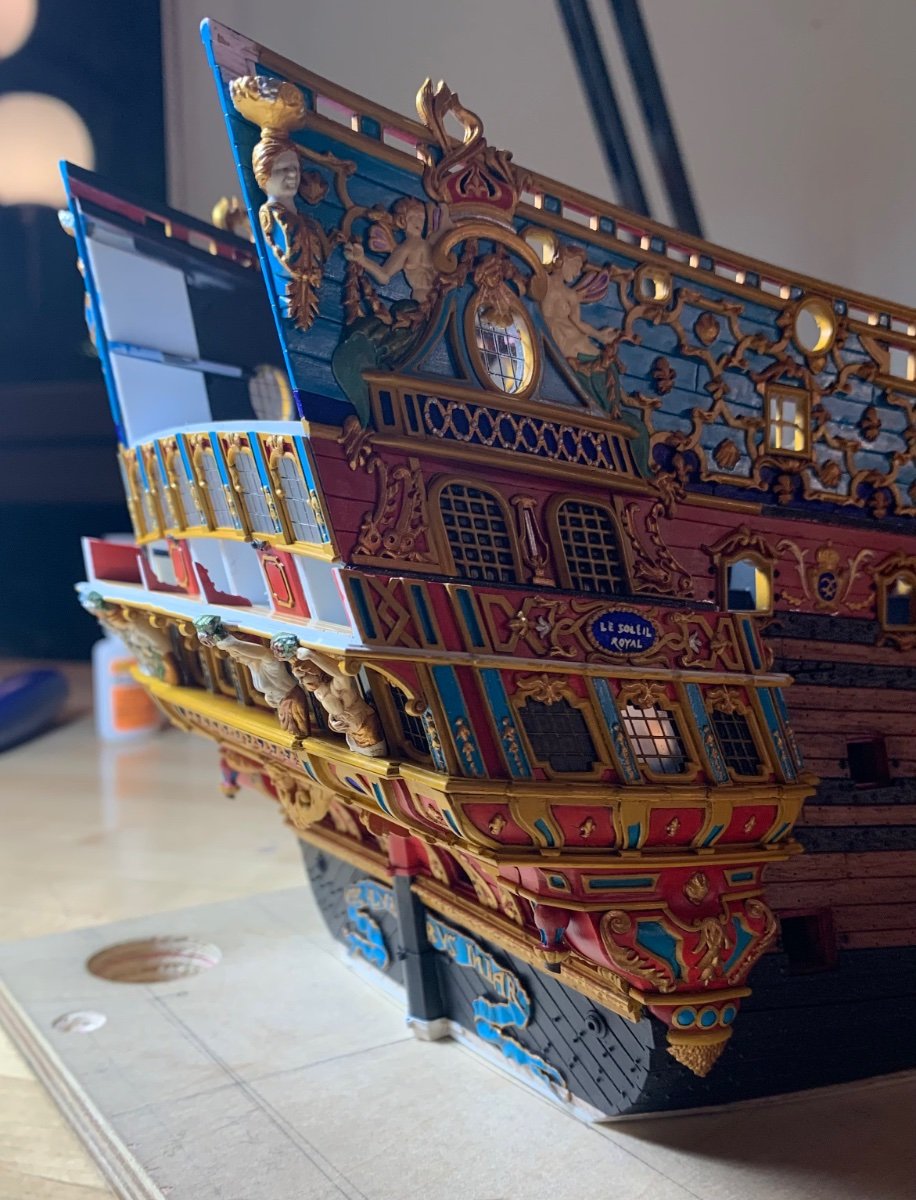
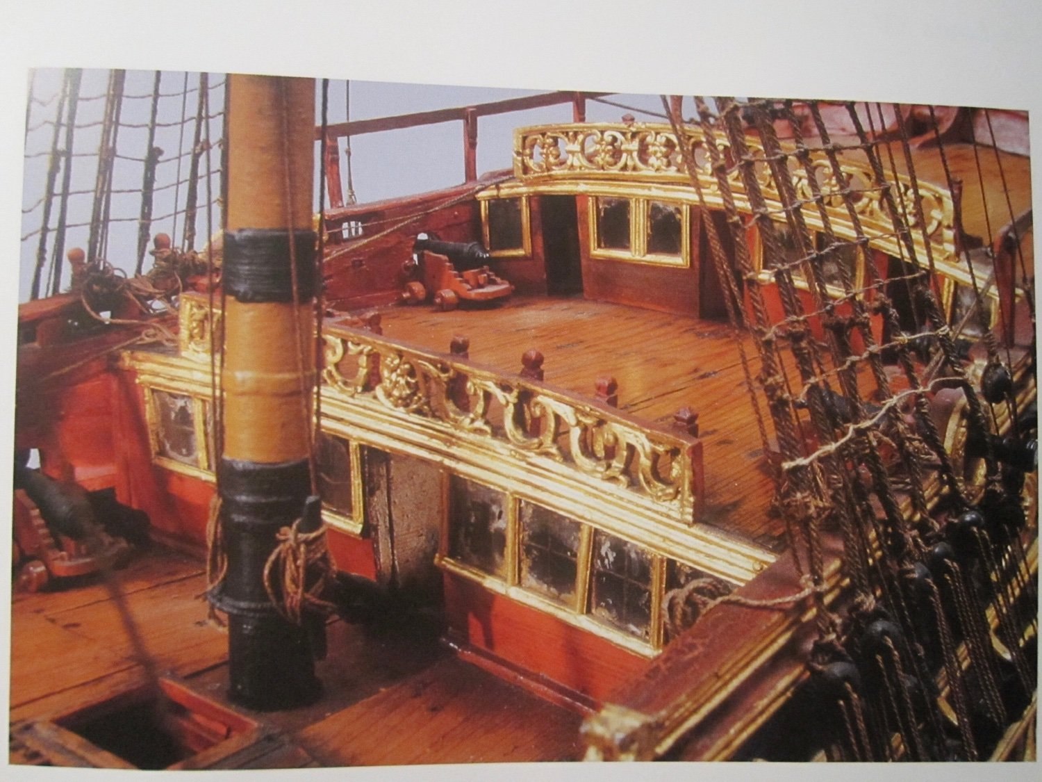
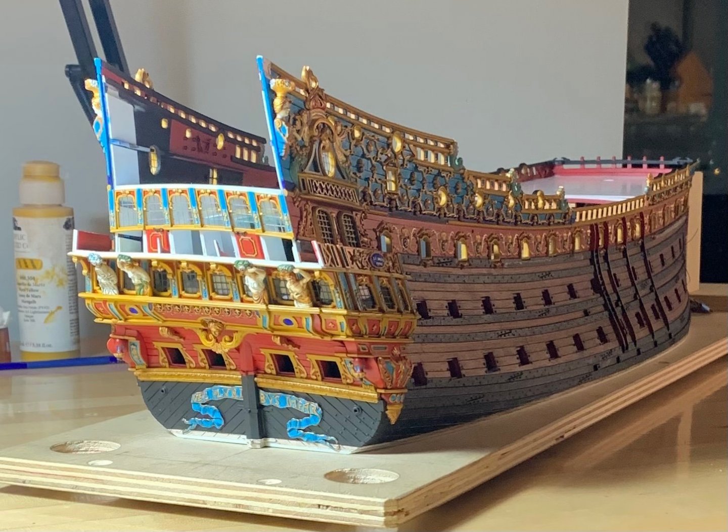
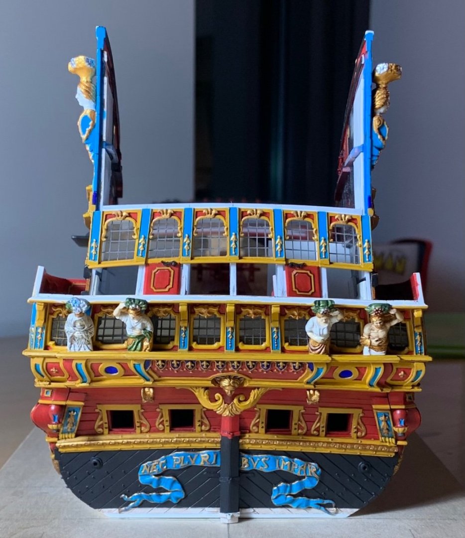
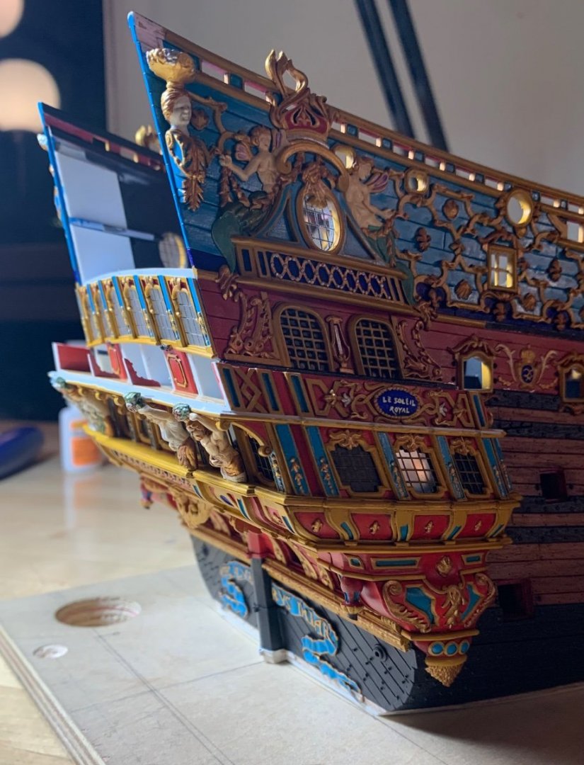
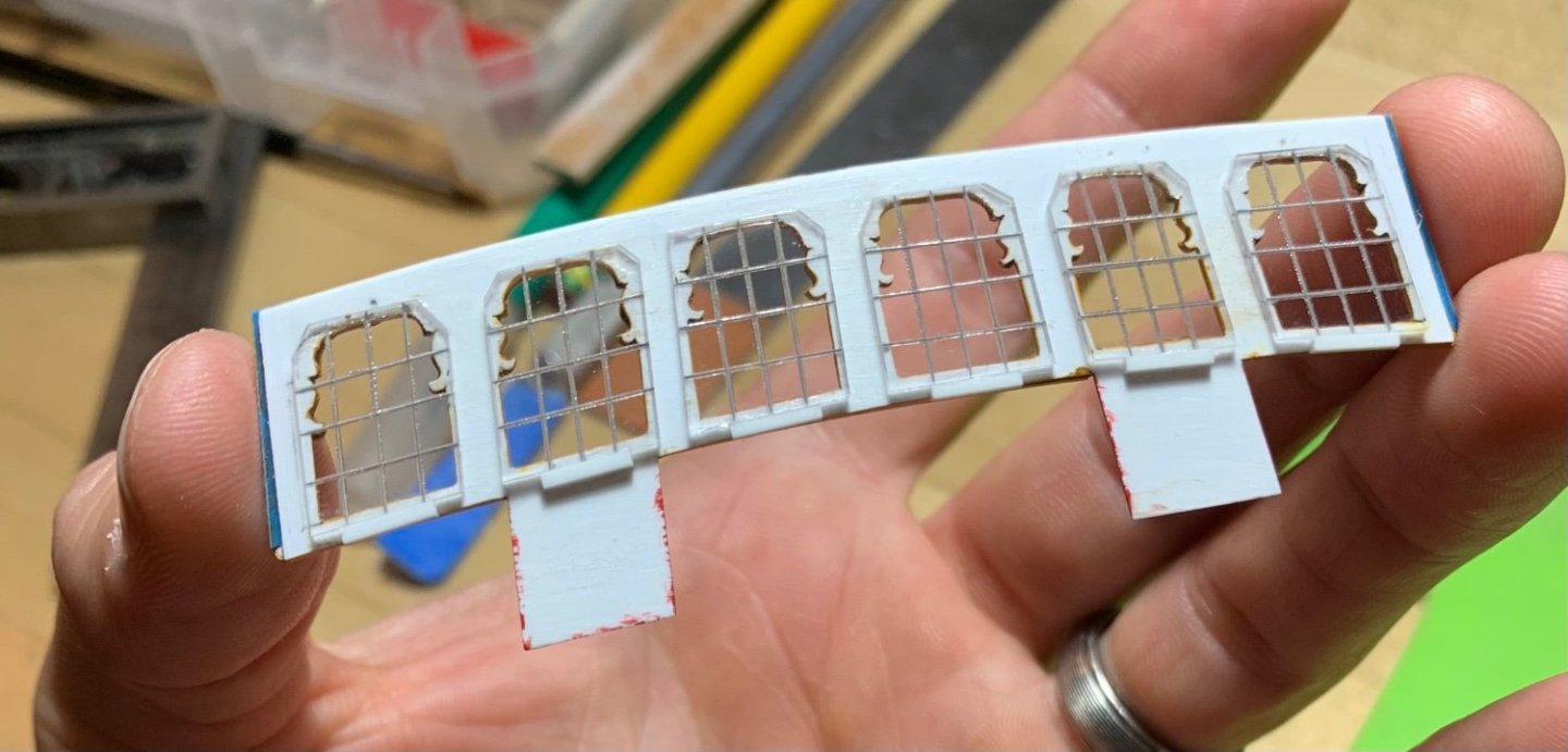
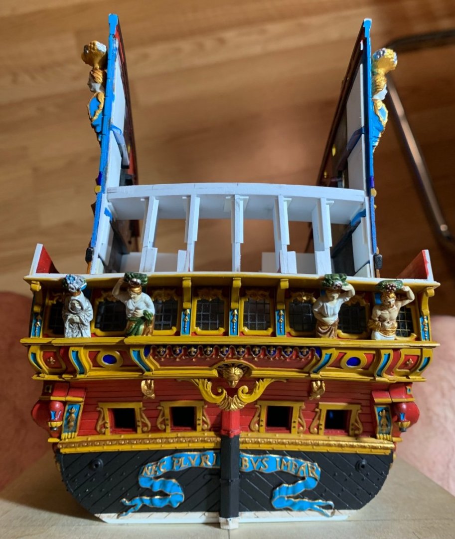
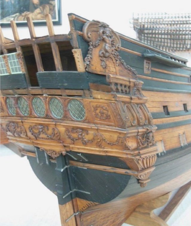
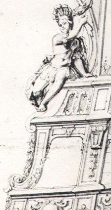
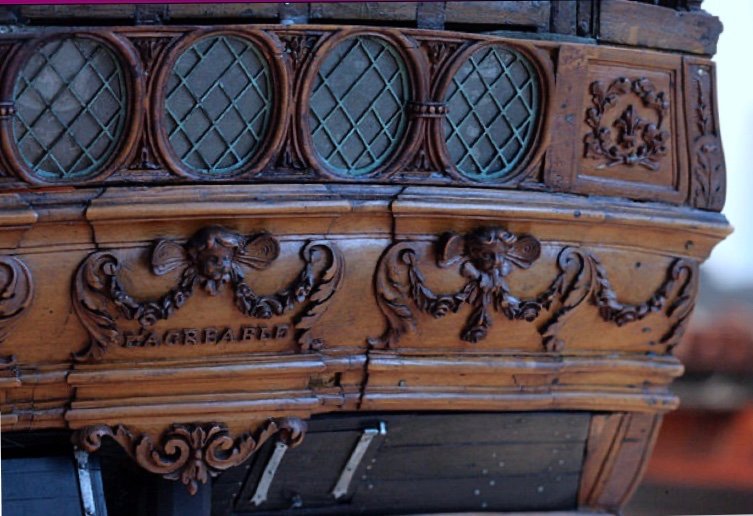
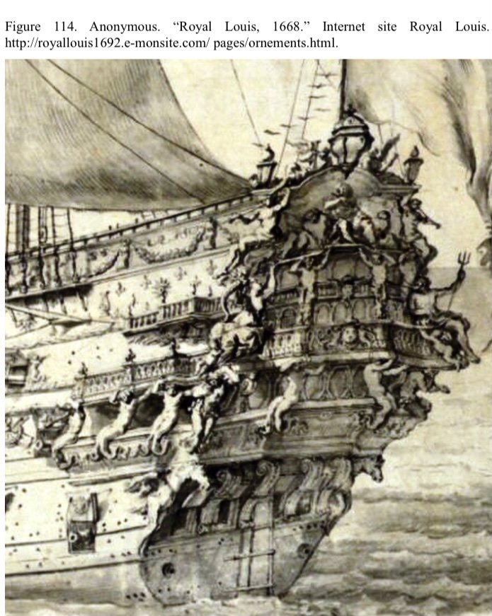
These window banks are incredibly labor-intensive, but the process of making them has been very enjoyable for me. What I am doing, here, essentially mirrors what Tanneron did for the sterns of his models. The damaged stern of L’Agreable illustrates how his windows are all pierced into one plate, as seen with the lower bank of windows: Considering the density of detail in such a small space, this method seems far easier than framing each individual window. Getting all of the elements (window frames and pilasters to flow harmoniously would, otherwise be quite difficult. As I have done previously, I add window backstops to the bulkheads as added insurance that the windows can’t drop out of their frames, if the CA bonds should ever fail: I remain indebted to Druxey for showing me how to make really good acetate windows by simply scribing the mullions into the acetate, and then filling those engravings with medium grey acrylic paint: It really is simple and it just looks so much better than anything else, at scale. Of course, I will next plank-in beneath the windows, but I am pleased with how the stern is rising: One detail that isn’t so apparent now, but will become so after planking, is the chamfer I filed into the door sides; this chamfer will create a shadow relief that will more clearly delineate the door opening. For the door handles, I recycled a pair of my frieze scrolls, which had the right shape and were sized closely enough. The round-up really helps to minimize the warped geometry of my stern: At this stage, it is becoming more apparent how the increase in hull-width has established a more ship-like impression of a stable gun platform: This is quite a difference from the stock kit. So, I will plank and paint beneath the windows, install the balcony bulwark, and create the cap-rail for the balcony bulwarks. I will then take a break from the stern so that I can focus on finishing certain details. I need to paint and install the starboard spirketting on the main deck. The f’ocsle beam needs re-touching, where I installed the moulding. The starboard bulwark joint needs to be puttied and painted. I need to fit, paint and install the quarter deck beam. Then, I need to retouch the exterior joint for the starboard aft bulwark. Finally, I need to install the starboard channels and fit all of the buttressing knees. When all of that is ship-shape, I will return to the stern. One fun thing to make are the pass-through archways that support the figures of Africa and the Americas: On the back-burner of my mind, I’ve been thinking about how best to make up this piece so that I can represent the delicate acanthus carvings. I think I know what to do now. The most important thing is getting the scale and shape of the opening right. Following that, I’ll tackle the third level of stern lights. Thank you for your interest, your likes and comments, and for looking in!
- 2,699 replies
-
- 18
-
-

-

-
- heller
- soleil royal
- (and 9 more)
-
Your resolve is admirable, but I will tell you that I have watched many accomplished modelers who don’t come close to the fair run of your ceiling planking. Having never done it, myself, I can only guess at the difficulty of it.
-
MONTAÑES by Amalio
Hubac's Historian replied to Amalio's topic in - Build logs for subjects built 1751 - 1800
A better example of the shipwright’s art, there is not. -
Roter Löwe 1597 by Ondras71
Hubac's Historian replied to Ondras71's topic in - Build logs for subjects built 1501 - 1750
Super precise work, Ondras! -
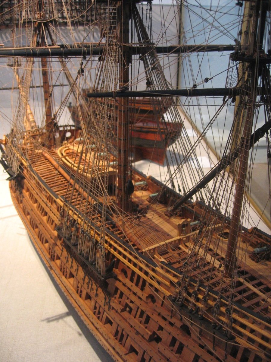
What the French have to offer, in the way of primary sources of 17th C. French practice is unique among European nations of the time. First, there is the pictographically complete Album de Colbert, which illustrates the complete timbering and process of constructing an 80-gun, three-deck ship. As I understand it, there are a few small anachronisms between what the artist drew and what actual practice would have been in 1670, but the liner notes clarify these discrepancies. Then, there is the Chevalier de Tourville, 1680, which is a distillation of Colbert’s son Seignelay, and Hubac’s son Etienne’s study of the English and Dutch construction practices, combined with Tourville’s conception of the ideal three-deck ship. The resulting plans are what Frolich used to create his model of L’Ambiteaux. So, while complete sets of plans for actual ships in this period do not exist, it is possible to draft a credible reconstruction with accurate timbering, and in accordance with the known dimensions and armament of any given ship; this is the best educated guess that is possible.
- 208 replies
-
- 4
-
-
- le soleil royal
- 104 guns
- (and 2 more)
-
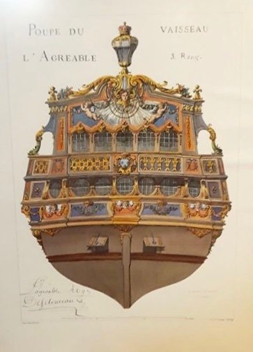
Also, would it be fair to say that the collection of Tanneron models were commissioned, in the first place, to be the visual expression of the more evolved and codified Second Marine of the 1690’s? I don’t have good pictures of L’Agreable’s stern, so I can’t tell whether he modeled her with the pre or post 1673 stern: Like SR, though, her 1697 refit drawing shows the early stern: As you know - notwithstanding all of the problems you mentioned - I also agree with your basic premise that the Berain/Vary drawing must exist for a reason. From an evolutionary standpoint, this particular arrangement of the quarters is consistent with other examples that are better understood from the late 1680s/90s; lower gallery closed, middle gallery open and walkable, upper gallery a trompe l’oeil amortisement.
- 208 replies
-
- 9
-
-
- le soleil royal
- 104 guns
- (and 2 more)
-
Well explained, Marc! Do you hold a position on the pinrail debate?
- 208 replies
-
- 3
-
-
- le soleil royal
- 104 guns
- (and 2 more)
-
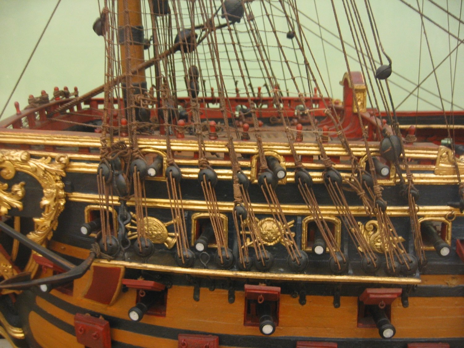
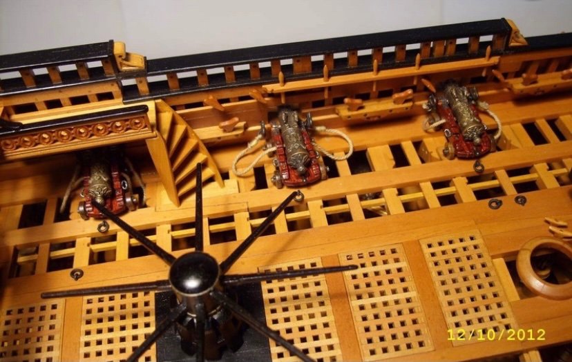
I dunno’ Bill - relative to the men sitting on the poop deck, those pins don’t seem too impractical to my eye.
- 208 replies
-
- 4
-
-
- le soleil royal
- 104 guns
- (and 2 more)
-
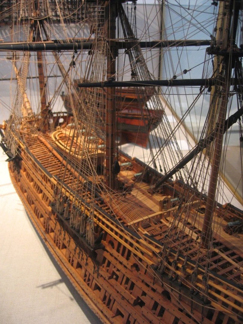
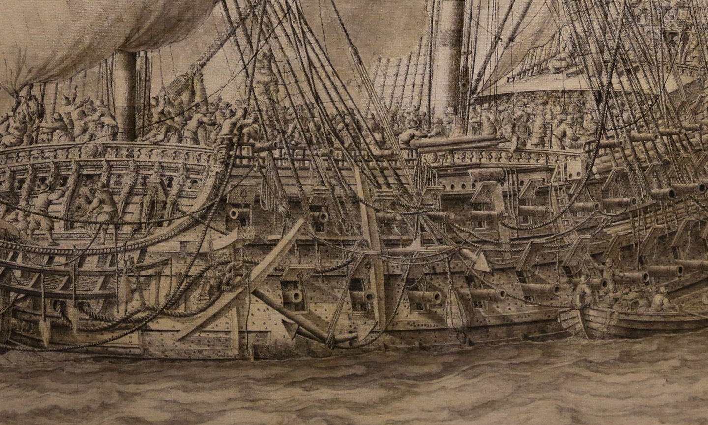
They also appear on the contemporary-build Louis Quinze model: And actual pinrails on Frolich’s L’Ambiteaux:


- 208 replies
-
- 9
-
-
- le soleil royal
- 104 guns
- (and 2 more)
-
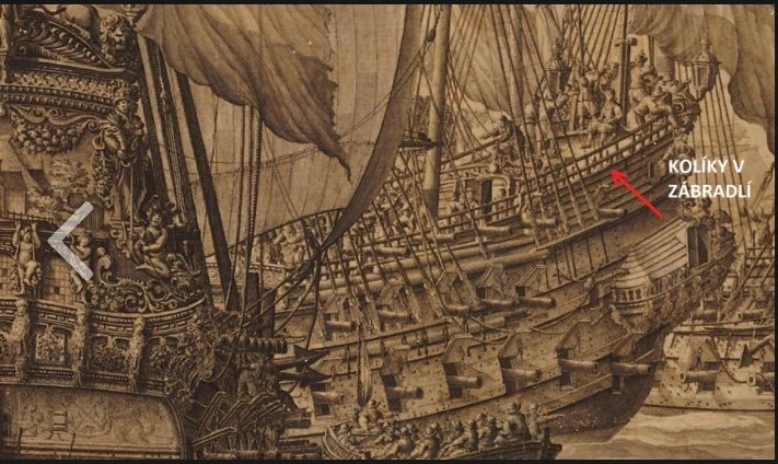
Look at the area referenced by the red arrow; there are pins between the sheer railing and the top fighting cloth rail. One last reference - the poop sheer of the Monarque appears to have pins:
- 208 replies
-
- 7
-
-
- le soleil royal
- 104 guns
- (and 2 more)
-
Respectfully, I am more inclined to believe that the simple utility of belaying pins would have been universally understood much earlier than that. They show up in this Van de Velde sketch of a Dutch warship, following a battle: And another ship, where they are evident along the forecastle sheer rail.

- 208 replies
-
- 6
-
-
- le soleil royal
- 104 guns
- (and 2 more)
-
I am glad to hear you are still modeling, Vic! To be honest, I’m not sure about the question of belaying pins. I don’t think the French employed pin rails, at this time (1670-1700), but I do think it likely that pins were used along the sheer rail, as Heller shows. Then again, for his SP monograph, Lemineur does show pinrails. He also shows them for his Le Francois of 1683, monograph:
- 208 replies
-
- 7
-
-
- le soleil royal
- 104 guns
- (and 2 more)
-
I know of one English modeler who has purchased this kit and plans to correct the length of the hull, the spacing of the guns, the sheer-line, deck furniture, etc. He’s quite talented, so I am sure he will make excellent work of it. I also believe that there is solid potential in that kit to produce a fairly representative ship, but it would require a tremendous degree of reverse engineering.
- 208 replies
-
- 4
-
-
- le soleil royal
- 104 guns
- (and 2 more)
-
Simply one of the best resources on the subject.

- 208 replies
-
- 5
-
-
- le soleil royal
- 104 guns
- (and 2 more)