Hubac's Historian
-
Posts
3,308 -
Joined
-
Last visited
Content Type
Profiles
Forums
Gallery
Events
Everything posted by Hubac's Historian
-
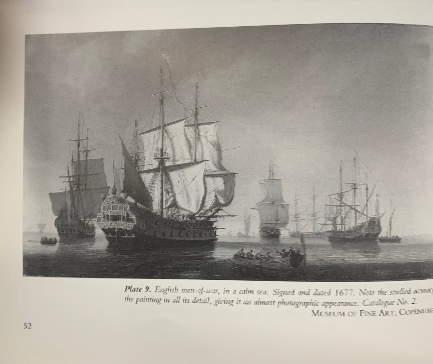
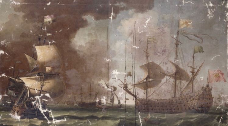
 Okay, so, here are my thoughts. One point I was hoping to illustrate with the above exercise is that, sometimes, two portraits of the same subject (the Vienna portraits) don’t always perfectly agree with each other in all details. Given that Puget was such a scrupulous draftsman, it is interesting that the fleurs are missing from the lower stern counter on the port Vienna portrait. Perhaps, with the vantage point of the light being what it was, he chose to simplify this area in shadow. More to the point, though, Hyatt’s monograph is a highly scrupulous first-hand account and quite a lot of what he describes corresponds with Van Beecq and not Vienna, or visa-versa. Which brings me to my next point: I have no way of determining, as of now, the date of this VB portrait, so it probably falls somewhere within the first 9 years of the RL’s existence. I make this assertion on the basis of my belief that this represents the post 1677 appearance of the RL: While I don’t know this for fact, my inference is that while this later version of the RL still displays a profusion of figures, even on the QGs, the sheer is appropriately lower and the QGs, themselves, represent the beginnings of the evolution from terraced galleries to fully closed bottles. The head structure also represents an evolution in style. Lastly, and related to this broad 9-year time-frame, ornament is the most ephemeral aspect of the entire construction. While it certainly would seem a monumental effort for any of us to carve even one figure, in our modern times, the artists of this time churned these works out with surprising efficiency. What Van Beecq may have been looking at, at any one time, could be vastly different from the way the ship actually appeared in 1668 or 1677. Also, I might add that the LeBrun drawing probably represents more of a proposal than an as-built and decorated representation. In the end - for me - it comes down to the guns, and the allegory, and the specific domed shape of the taffrail (which, it seems to me, is also a characteristic of the Monarque): there is just no way the Monarque carried that many guns, let alone guns on the poop. Unfortunately, VB’s forecastle is too damaged to interpret. My other curiosity with this portrait is the flag carried on the Mizzen; the “L” with a crown. I do not know whether this flag only alludes to Louis, or whether it specifically represents the Levant, or Mediterranean fleet, that the RL was the primary representative of. Very lastly - I really wonder whether it is VB’s portrait that Bakhuizen referenced for his depiction of Soleil Royal: I have previously discussed the many anomalies of this portrait in earlier posts, but there is no mistaking that this is the RL’s tafferal allegory and domed cornice. Even the figures reclining on the tafferal are very similar. Also, there appears to be an allusion to the swagged garland, beneath the stern chase ports. And, so, that is what I have to say about that. What say you, friends?
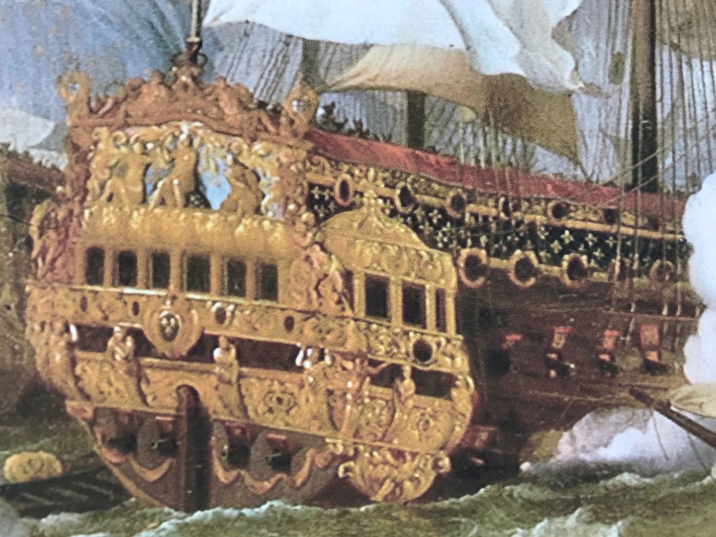
- 2,699 replies
-
- 12
-

-
- heller
- soleil royal
- (and 9 more)
-
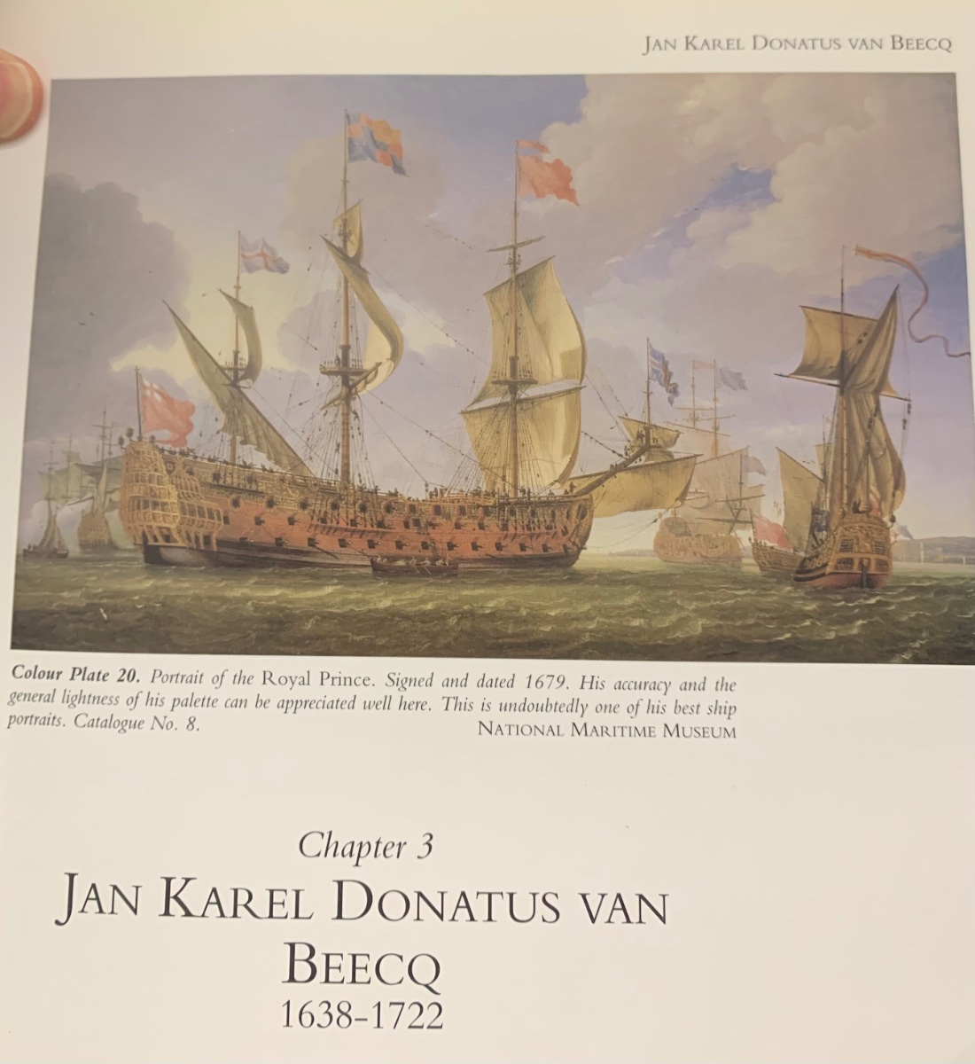
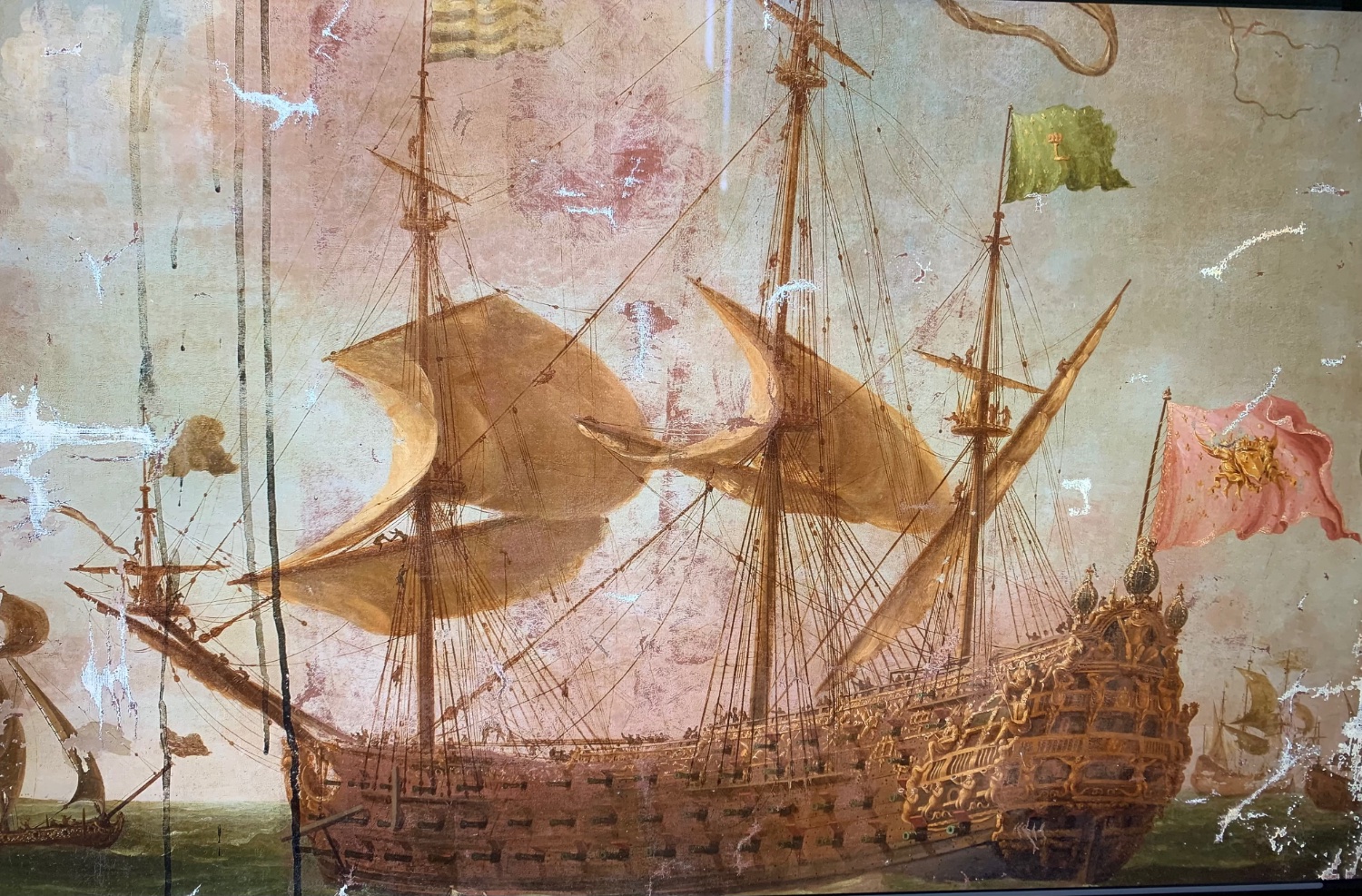
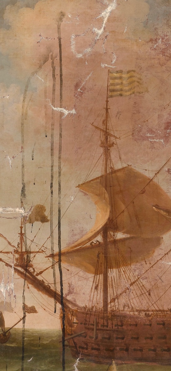
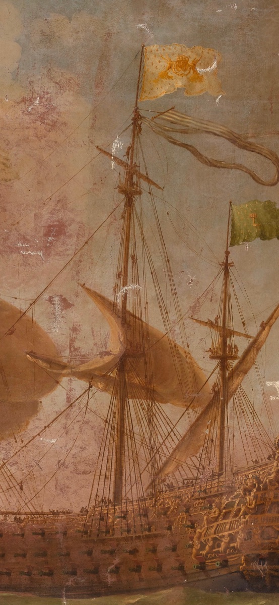
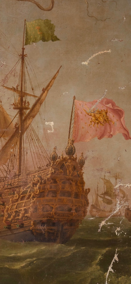
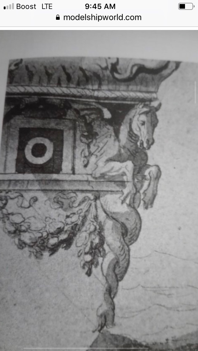
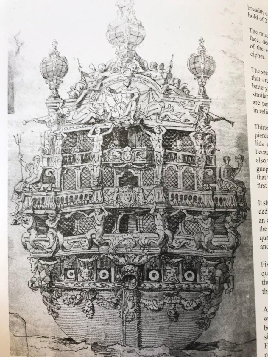
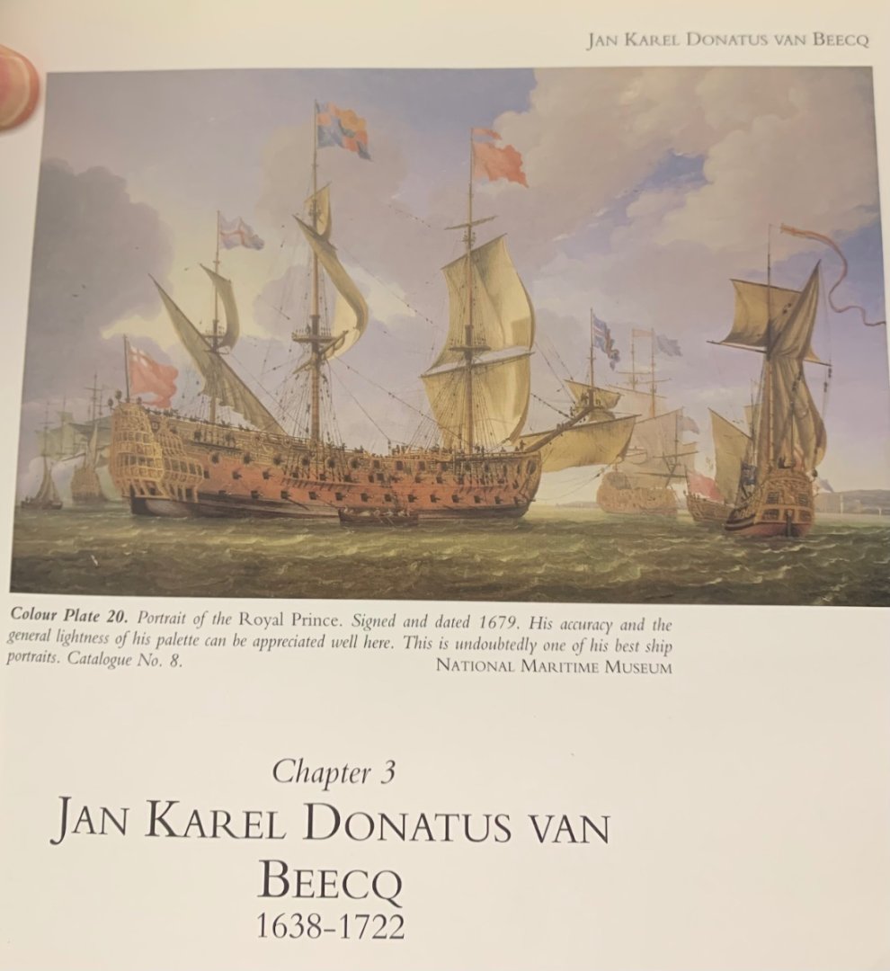
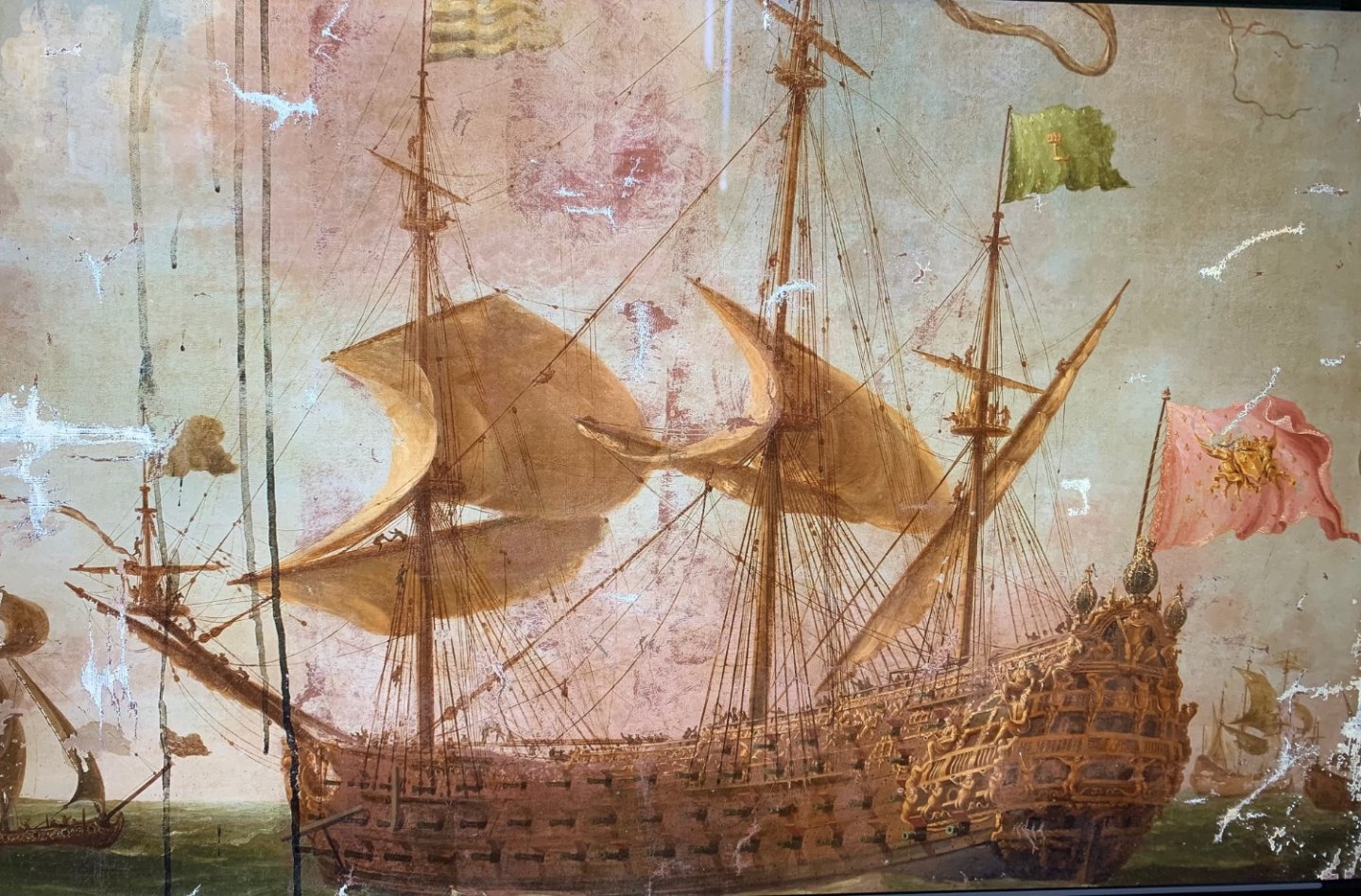
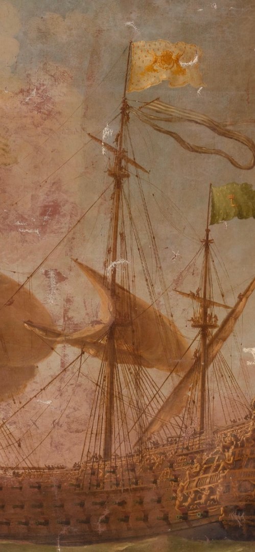
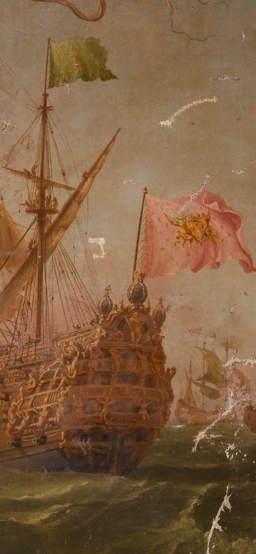
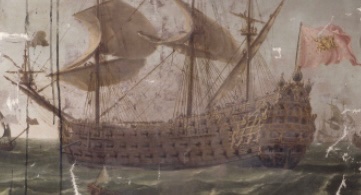
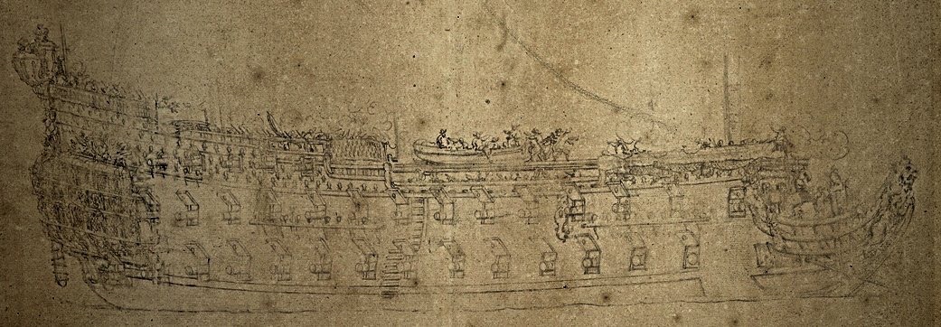
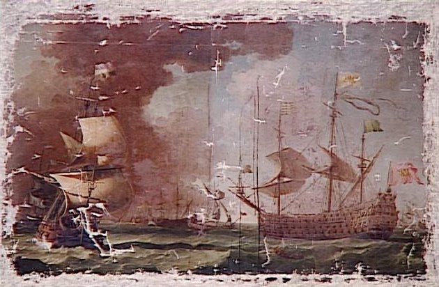
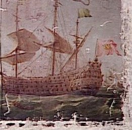
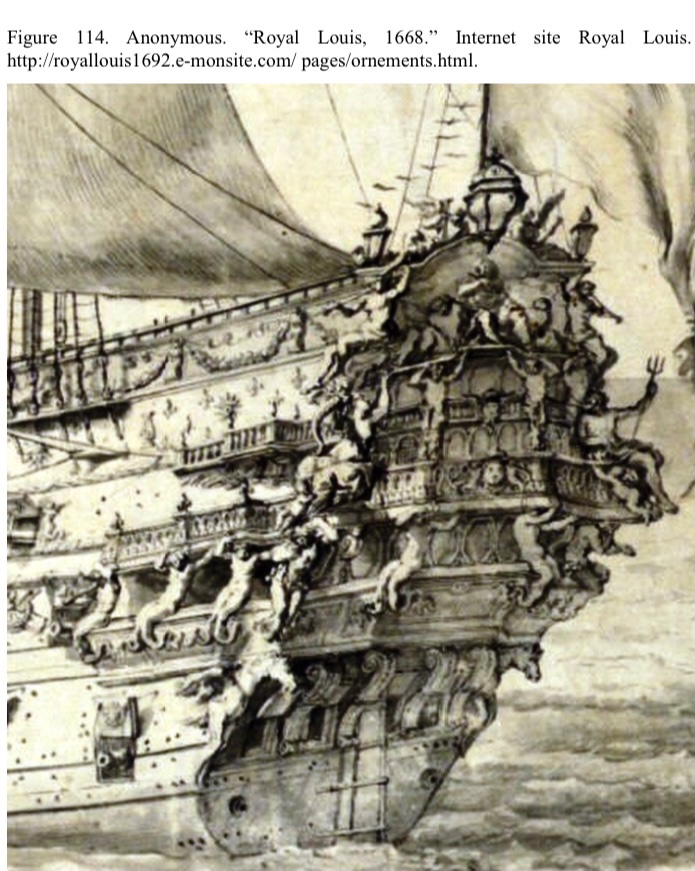
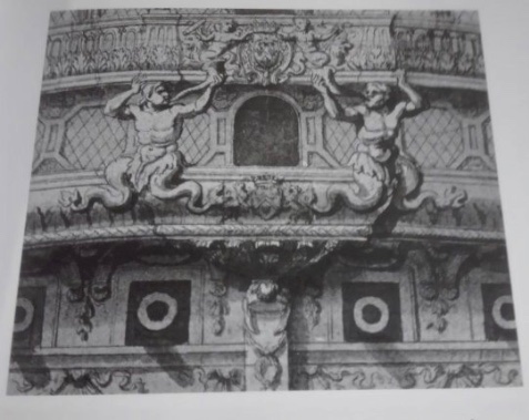
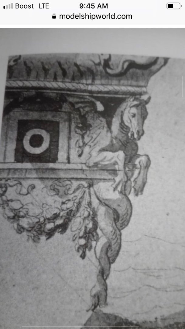
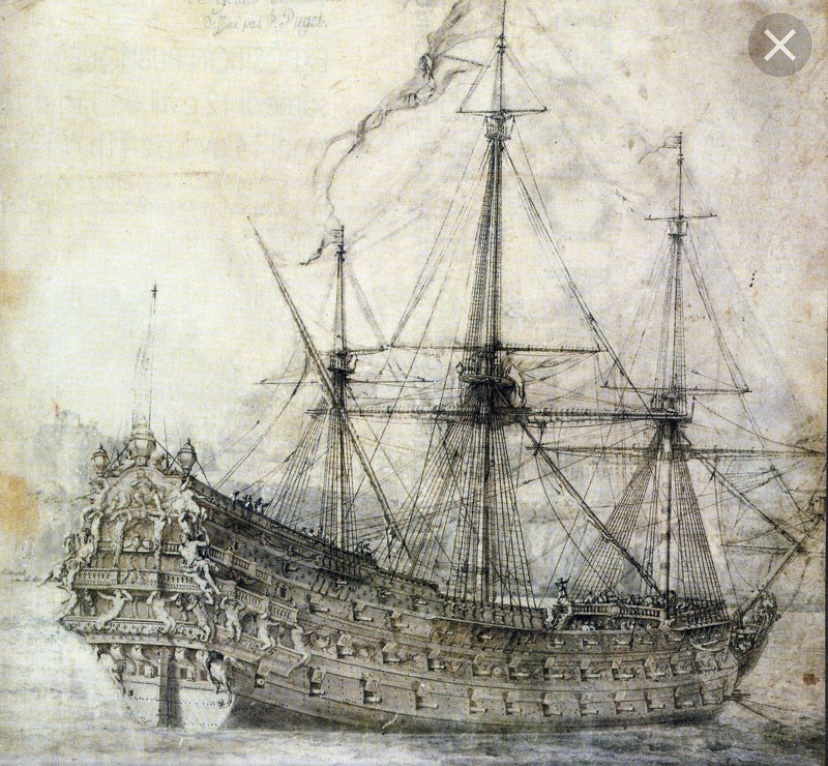
When I first found this thumbnail, over five years ago, I didn’t know what it represented, nor who painted it, however, I had a strong sense that whatever was there was important. Having finally located the portrait, I decided to treat myself to an early birthday present. Fifty dollars yielded a super high-resolution (pixelation is 9,528 x 6,489) digital file of this portrait. I was correct. There is, indeed, something of great significance, here. To begin with, the portrait was painted by the renown Dutch marine artist Jean Karel Donatus Van Beecq. His early career spans from 1672 - 1681, when he left France for England, at the invitation of Charles II who wanted to encourage Dutch marine artists to expatriate. Although the Van de Veldes dominated the patronage scene, during this time, Van Beecq was also highly regarded for his technical mastery and his lively color palate. He was no slouch: And, his best-known and most brilliant portrait of the Royal Prince: Well, it turns out that it is Van Beecq, to whom this mystery portrait is attributed, and despite the horrendous damage to the portrait, you will soon see the many parallels to his other, better known work. I can only guess that this portrait - clearly of a French First-Rate - was done before he left for England. On the other hand, it may have been done upon his return to France, where he benefited from the patronage of his friend, the Duc de Vendome. And so, without further ado, I present to you Le Royal Louis of 1668, at some point in her early career between 1668 and 1677, as seen through the eyes of Van Beecq: Of course, my hope was that this portrait would reveal itself to be Soleil Royal. I am not the least bit disappointed, though! The reasons for this are several. From a dimensional standpoint, the RL 1668 and SR 1670 are only nominally different, with SR being slightly longer overall (1.5 French pieds), and with a deeper draft (1 pied). Their breadth is the same, though, at 44 pieds. Given that, I think there are reasonable grounds to assume that Soleil Royal 1670 would have had a similar “presence” on the water, sheer plan, distribution of armament, and underlying structure for the stern and quarters. The chief differences would be a lesser profusion of monumental figures for SR, and the defining allegory would be very similar to Berain’s re-working of Puget’s original design. Make no mistake - any future attempt I make at representing SR 1670 can only by its very nature be a product of conjecture and artistic interpretation, within the known dimensional parameters of the ship. I am more confident than ever, though, that I can accomplish this with a high degree of fidelity to the artistic sensibilities of the time. So, why am I so certain this is the Royal Louis? Well, the main reason is the profusion of guns, if not their exact number and distribution. Also, and just as importantly, the known allegory of the RL is very much in attendance, and overall - while their are certain key differences between this portrait and the Hyatt monograph, which do correlate in certain aspects more directly to the Vienna portraits, the important elements agree really very closely to this portrait. I am excerpting a German to English translation of Hyatt’s monograph from the excellent Versailles de Mer. German to English translates more coherently than French in Google Translate. Within the text, I have inserted [..], where I attempt to clarify what specific element or area is being referred to. In a few instances, here, I am guessing a bit, and welcome any insight. Also interspersed between paragraphs are my notes in italics. ___ ABOUT THE SCULPTURES Presentation of the transom of the ROYAL LOUIS. The large transom is richly decorated on the outside with laurel leaves, garlands and shells underneath, all in perfect gilding [lower transom]. Above are a seahorse on each side and four large brackets supporting the first battery [lower stern balcony]. Underneath there is a very beautiful pendent decorated with foliage [covering the jaumier, or tiller opening]. This description corresponds very closely to LeBrun’s drawing, and Van Beecq’s portrait, as well: The first gallery at the level of the support is covered with gilded Bourbon lilies. On it [the gallery] sit four sirens who serve to support the second gallery. On the sides [quarters] are three sea gods and two consoles, as well as an all-encompassing frieze [middle balcony/main deck level]. On it are the coats of arms of His Eminence the Duke of Beaufort, also supported by two sea gods holding an anchor. The arms of Beaufort do not appear to be present on either Van Beecq or the Vienna portraits. Only on LeBrun are they shown, and in that instance they appear on the lower stern balcony. The fleur-de-lis do not appear on LeBrun or Van Beecq, yet they are apparent on the starboard quarter portrait of the Monarque: Any, yet, not on the port quarter of the same: Next to them sit Neptune on the starboard side and Thetis310 on the left with a Cupid at their feet offering the aforementioned deities the treasures of the sea and the earth. These in turn are offered to the figure of the king seated on the throne of justice above the third gallery. In this aspect Hyatt agrees with the Vienna portraits, while Lebrun and Van Beecq have Neptune and Thetis reversed. The entire stern is in the same gold relief, with a slave on each side and a gilded cornice running the length of the ship. Along with trophies, everything adds up to the aforementioned gods. At the top of each corner is an allegory of renown with a trumpet. Above the second ledge on the portico, which gives the same impression as the other, sit two figures holding in their hands a laurel wreath on one side and an olive branch on the king's head on the other. On these points, everyone agrees. On the third gallery there is a balcony projecting two feet where the king's arms are set in a medallion. On it are four capitals with four gilded half-figures representing the four continents. All gunport covers are decorated with gilded Bourbon lilies, king's monograms, lyres and suns. And at a distance [above] from this arrangement of clasps described above, there is a gilded frieze between the mountain timbers [upper bulwarks?] which runs the entire length of the nave [upper bulwarks from Q-deck aft?] with also gilded intertwined Bourbon lilies. This may, indeed, be what Van Beecq is showing just beneath the timberhead sheer railings. Between the gunports of the second battery are gilded naval trophies, even with fiskers and anchors woven into them. Here is an important variance where Hyatt is in agreement with the Vienna portraits. Van Beecq places these trophy carvings even above the main deck guns. I still do not think that negates my distinction between the Royal Louis and the Monarque, which I will explain more fully in a moment. Those of the third battery are decorated with frames of foliage with griffins³11 on the sides, all finished in gilding. It is not possible to discern what ornament Van Beecq has placed here, while on the Vienna portraits, the flanking figures are cherubs with triton tails. On the highest mountain wood [poop royal level upper bulwarks] there are consoles, the spaces between which are golden Bridging garlands. Clearly evident on Vienna portraits and not at all on Van Beecq. The sides of the nave are richly decorated on the beams with gilded Bourbon lilies and mouldings. The entire mirror - in other words, the patron saint of this ship - is painted in blue and dotted with golden Bourbon lilies. This is one important detail where Van Beecq stands apart from all the other representations. I am always worried I might lose a really long post, so I am going to post this much, before continuing with a few observations…


- 2,699 replies
-
- 12
-
-

-
- heller
- soleil royal
- (and 9 more)
-
Persistence, Vic. I just keep digging. I just sent an email to the Louvre to see about obtaining high-res images of this portrait. We’ll see what they say.
- 2,699 replies
-
- 4
-
-
- heller
- soleil royal
- (and 9 more)
-
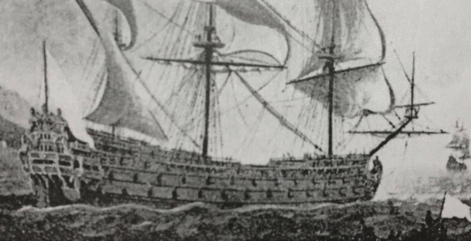
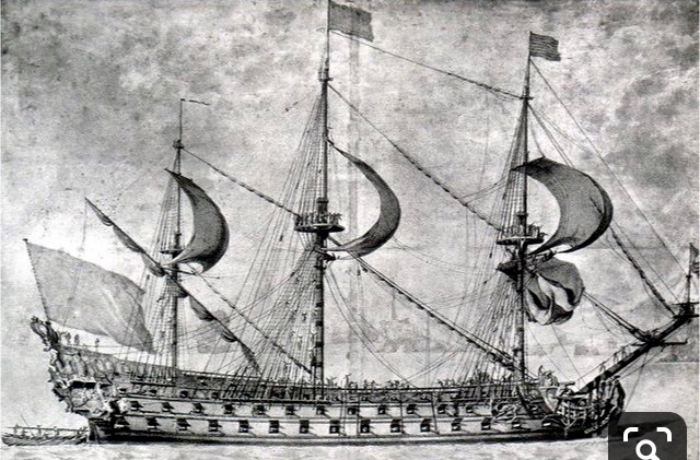
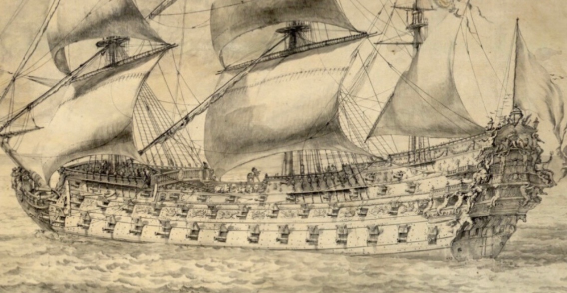
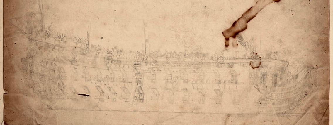
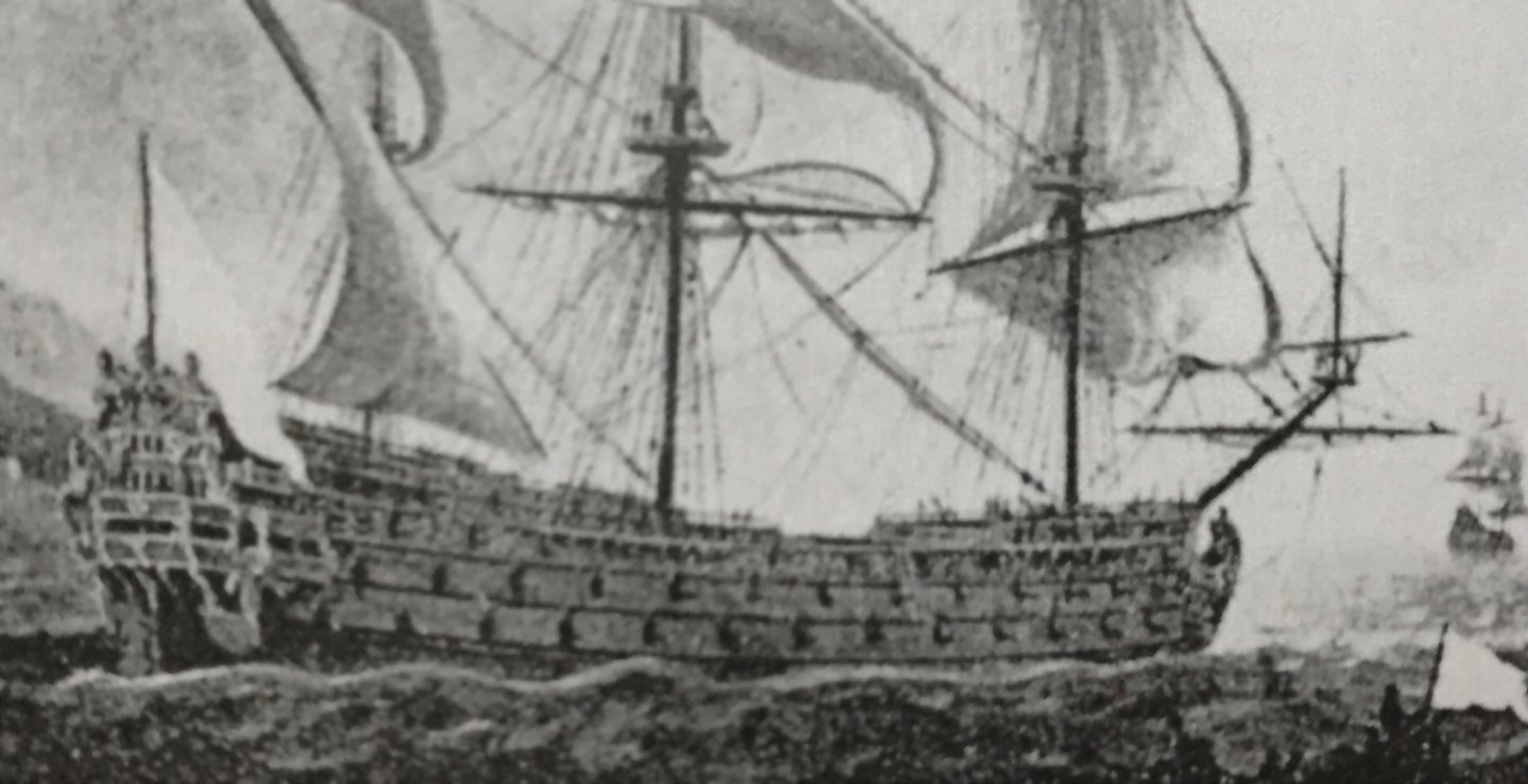
This morning, the idea occurred to me to do a reverse-image search for any number of images that I was hoping to find better resolution for. I tried a few different image checkers, but the one that loaded results for the greatest number of search engines was DupliChecker: https://www.duplichecker.com/reverse-image-search.php In particular, the Yandex search engine seemed to pull the broadest range of related images. Now, while I didn’t hit upon my “Gilded Ghost” portrait nor my Battle of Barfleur VDV portrait, I did have one fascinating hit. Here is the original fuzzy image I found years ago on some corner of the internet: And then, via Duplichecker/Yandex: A fuzzy enlargement of the ship: A sharper resolution enlargement: Okay, now that is really interesting! I still can’t tell whether this is the Royal Louis or Soleil Royal (both pierced for 16, initially, and poop guns are visible, here), but I can at least get a clearer sense for the ornamental tableaux and the structure of the quarter galleries. I can say this, though, the deadworks are not painted white, as was the case for the RL, according to Hyatt in 1677. What is of particular interest to me are a series of figures that appear to be seated on the main deck-level, gallery and balcony rails. The foremost figure on the quarter gallery has no corollary on the Vienna portraits of the Monarque. The aft seated figures, at the turn to the stern balcony, do not resemble the Neptune and Thetis figures that are associated with both the RL and the Monarque. In fact, the starboard figure appears to have an up-stretched arm that is reminiscent of the “seeking” posture of the Africa figure of Soleil Royal. While that is nothing to draw any firm conclusions from, it must also be noted that the overall structure of the stern and arrangement of statuary has much in common with that of the RL, including what seems to be a swagged-garland ornament beneath the stern chase ports: My hunch, more-so than before, is that these two portraits are directly related: On a separate note, I churned a pair of low-res VDV drawings from 1672 through the DPI enhancement app. Although it is very hard to see much appreciable difference, the DPI supposedly increased from 92 to 5000. Before: After: Before: After: The second, clearer VdV sketch is nearly identical in identifiable details to the much less clear portrait, above. Perhaps the second is simply a more finished portrait of the same subject. ‘Nothing earth-shattering, here; just playing with tools at my disposal. Work on the model continues at a moderate pace. Progress update to follow in the not too distant future. All the best, Marc


- 2,699 replies
-
- 10
-
-
-
- heller
- soleil royal
- (and 9 more)
-
Truly delicate work, B.E. I love that idea to use sectioning clips for clamps.
- 857 replies
-
- 3
-
-
- Sphinx
- Vanguard Models
- (and 1 more)
-
What impresses me most is the work you did at the bow. Somehow, you appear to have re-cycled the middle gallery railing into your trailboard to brilliant effect. It looks like it grew there. You also managed a very nice sweep to the transverse supporting timbers of the headrails. My supposition, here, is that Nek0's lines lowered the knee of the head, allowing a little more clearance beneath the headrails. Did you also move the turreted head seats a little further in-board? As you are well aware, these are all of the difficult problems I've been trying to suss-through myself. I also really like your decking; the shift pattern and nailing look very realistic with appropriately spaced beams. It really is incredible to me that you started this whole thing just a couple of months ago, and it has all come together so beautifully.
-
There are so many good things to say about this, Vic, and I will share my thoughts tomorrow, when I have a little more time to focus. As you yourself might say - "good sheww!"
-
Well, it sounds like good things are happening in her life. Doris looks happy and healthy!
- 1,035 replies
-
- 6
-
-
- royal katherine
- ship of the line
- (and 1 more)
-
This is very high praise coming from a person who’s work I very much admire - thank you B.E.!
- 2,699 replies
-
- 3
-
-
- heller
- soleil royal
- (and 9 more)
-
Absolutely, when it comes to scraps of plastic and off-cuts from nice furniture projects; one never knows when they may have to splice a dutchman with perfectly matching color and grain - kids being kids, and all. I do at least go through my plastic scraps and use the just big enough piece for the next little thing I’m making.
-
Yeah, weirdly, mica was something readily available in the ground where I grew up (Northern Westchester County, NY). I wasn’t a hoarder back then, or I might still be carrying around chunks of this remarkably useful material.
-
One of the most brilliant talents out there. I hope she is well and looking for her next inspiration.
- 1,035 replies
-
- 8
-
-
- royal katherine
- ship of the line
- (and 1 more)
-
Acetate sheet is always a good option for glass. It is usually obtainable in a good art supply store like Blick. It can be cut with a matte knife.
-
Really beautiful work, overall. I love the mast detailing.
- 857 replies
-
- 1
-
-
- Sphinx
- Vanguard Models
- (and 1 more)
-
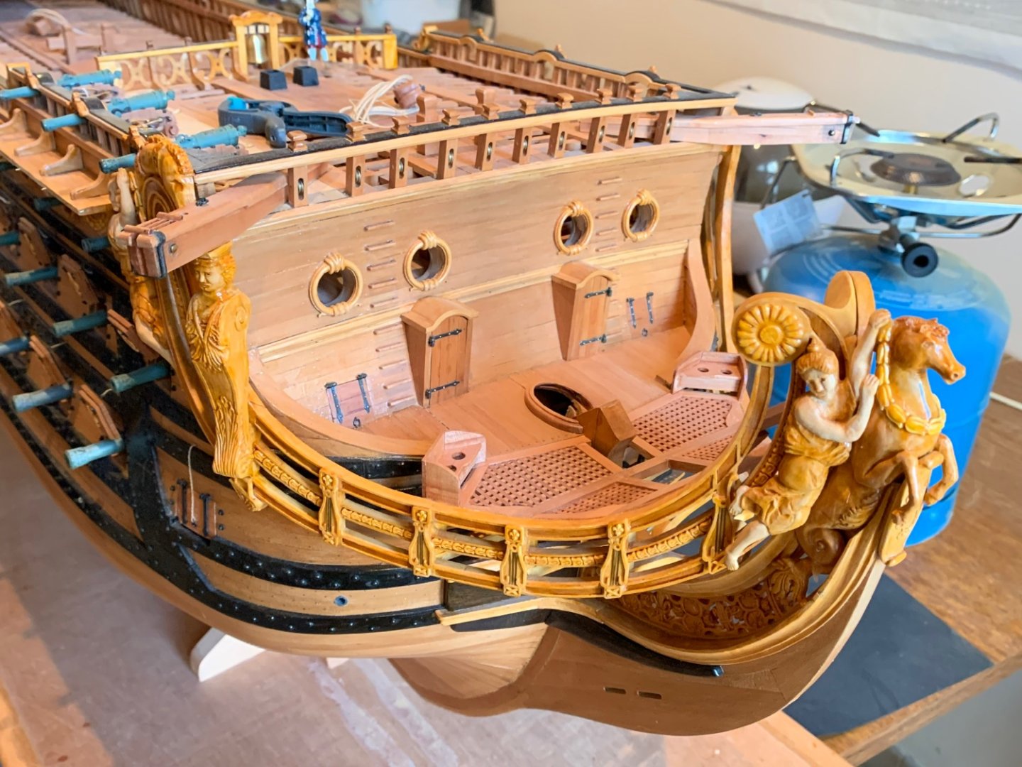
This is an interesting move to lower Africa and the Americas figures; it does seem to lower the whole center of gravity of the stern in a pleasing way. Arguably, they have a more reasonable perch, given the scale of the figures, upon the mid-balcony rail.
-
Thank you very much, Dan! You know, Druxey, I can see a path toward what you are suggesting, but I have too much time invested in them to risk messing them up for a 1/16” gain. These horse carvings will look good leaping over the beakhead rail.
- 2,699 replies
-
- 5
-
-
- heller
- soleil royal
- (and 9 more)
-
I come to your build log to be amazed, Mark. You never disappoint! The most impressive thing to me is your out-of-box thinking, yet methodical approach to devising the plan for execution. The superb results pay homage to this at every stage of the build.
-
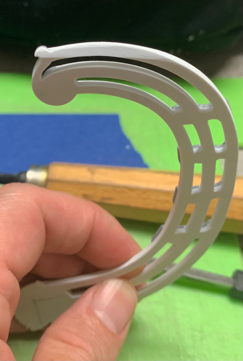
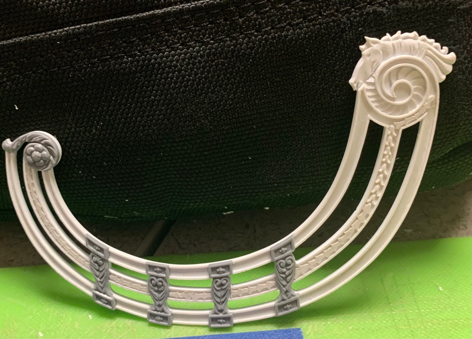
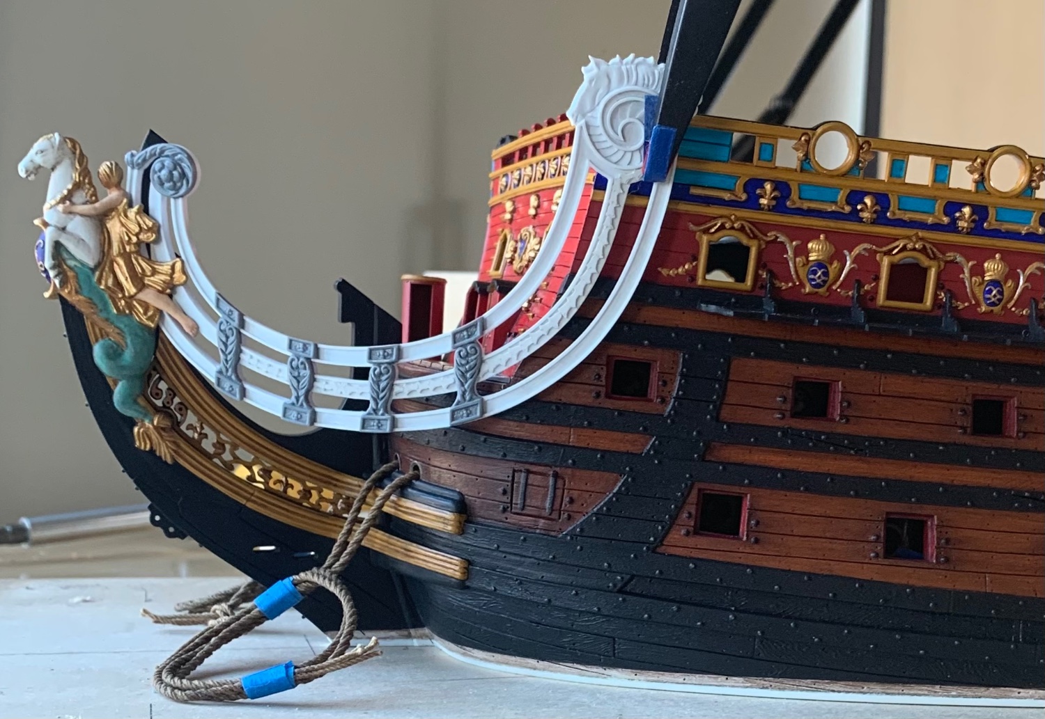
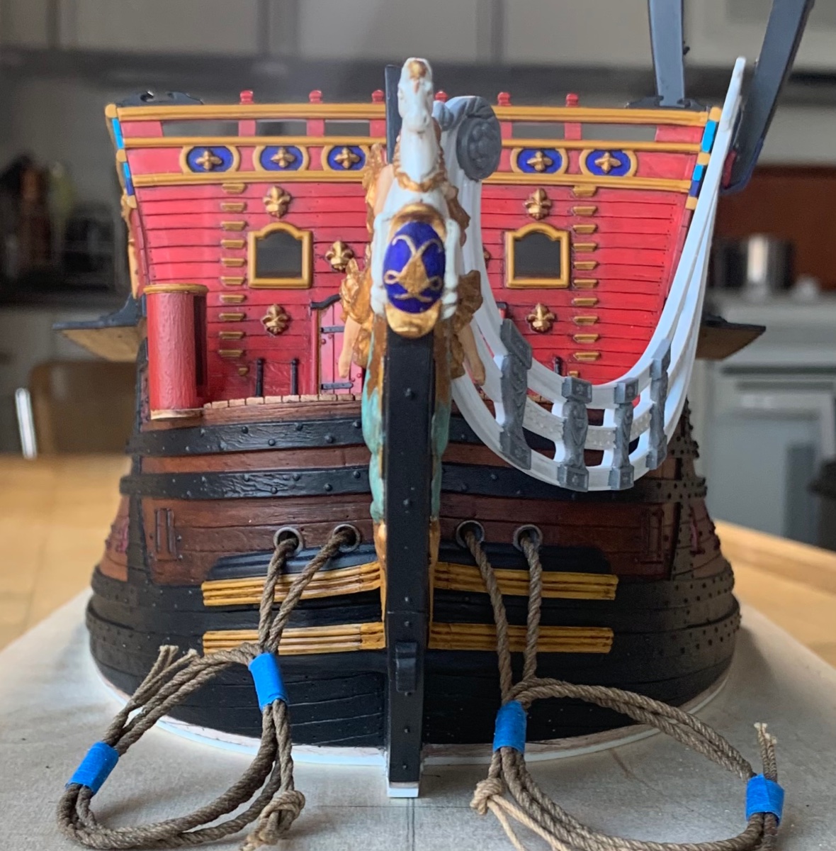
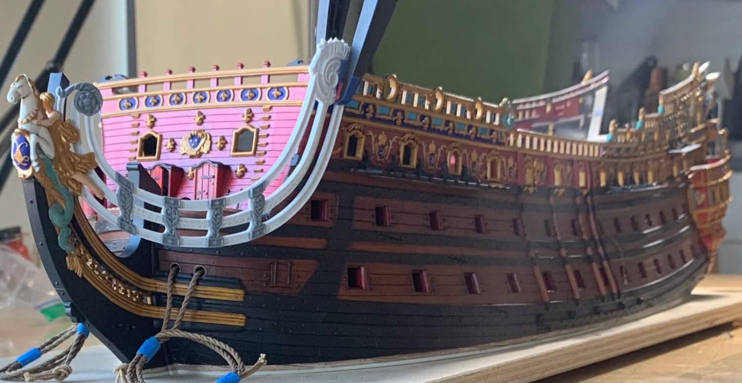
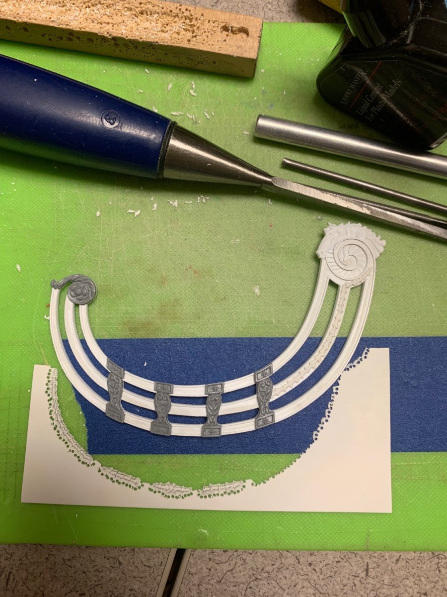
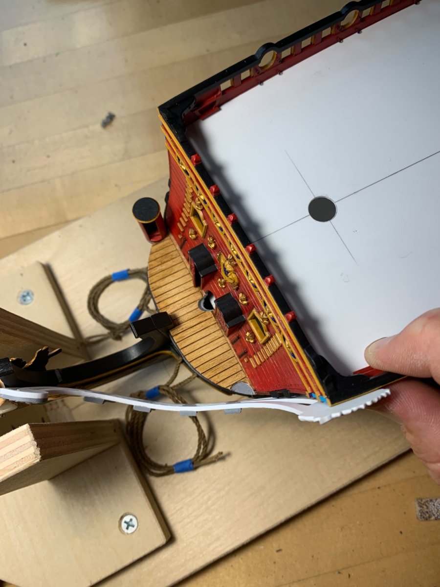
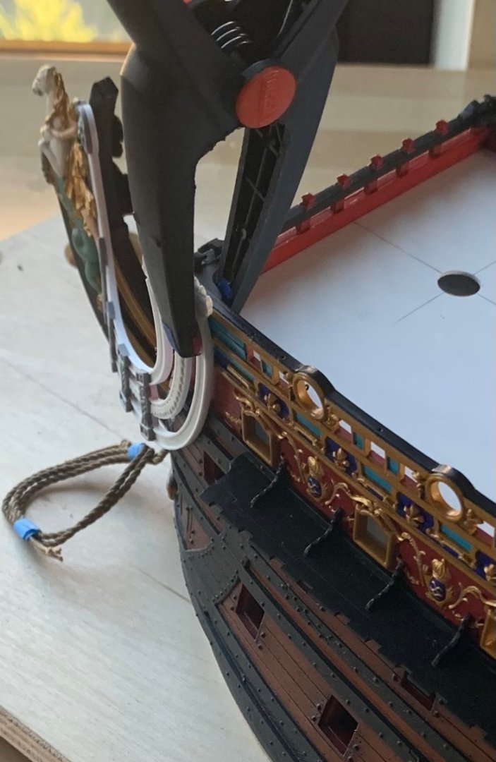
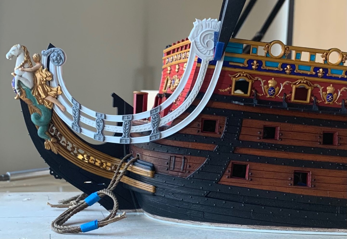
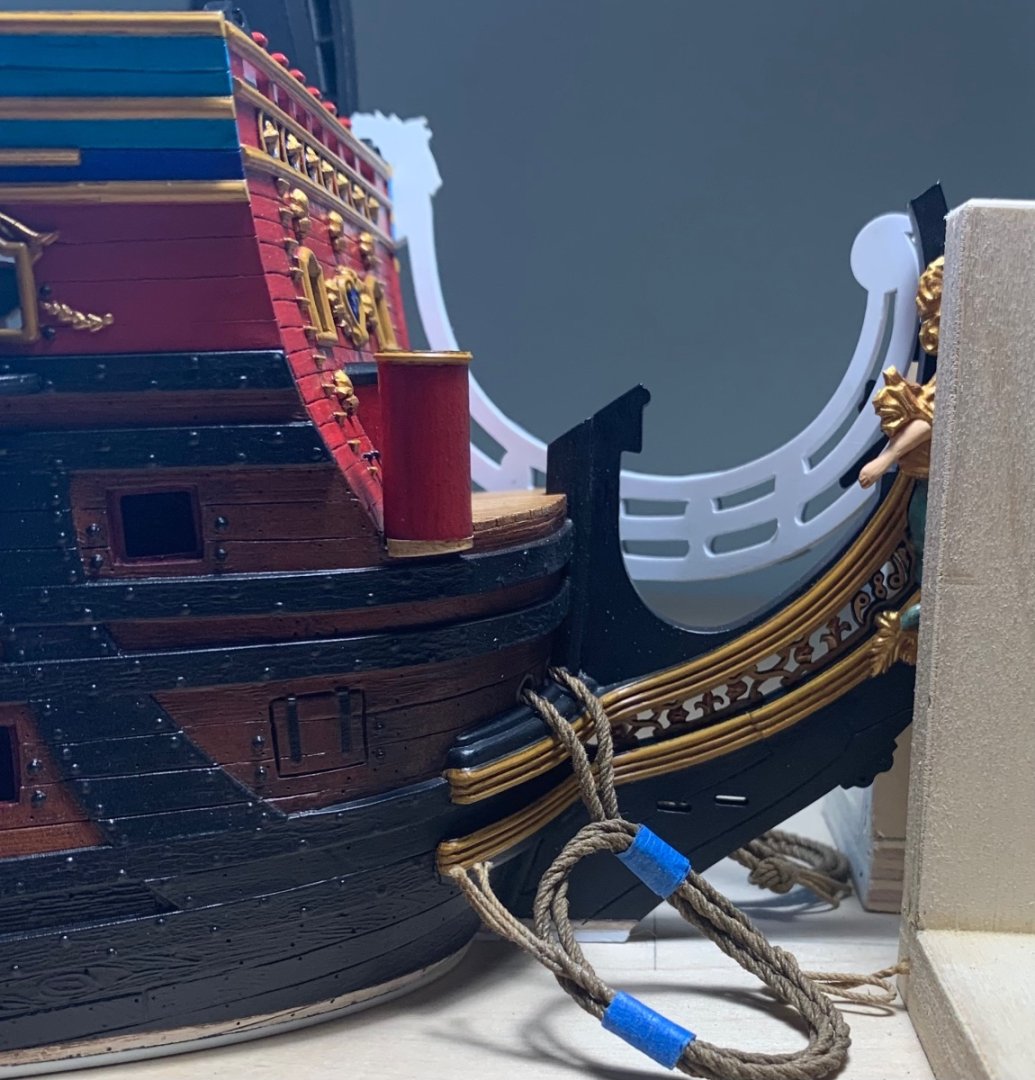
Well, Ian, thank you! I have been known to practice a little home dentistry, when necessary, so I suppose those abilities see some light of day. There hasn’t been a whole lot of time to put into the ship this past week, as a dear friend from Sweden has been visiting. It has been an extremely social and active time for me. I have managed to continue detailing the port headrails. This is very time consuming because all of these fine border mouldings have to be cut and fit by hand. I decided that the best course for the middle rail was to affix the top moulding and leave the bottom moulding off until I had fit and secured each section of the bellflower garland: The forward end of the headrails gets an inside bevel so that I will have some glue surface to attach to the upper knee of the head, just behind the figurehead: As it stands, I am modeling the bellflower garland. This is, naturally, time-consuming, but the effort is always worthwhile: After that is complete, I will make the inside lamination for the horse carving from 1/16” styrene. Most of this figure, as you will see in a minute, rests above the f’ocsle sheer rail. As with the drift-rail serpent ornaments, I want a more 3-D appearance for this carving. It will make a tremendous difference, in the end. So, at this point, I wanted to really suss-out what my exact headrail positioning will be. It is complicated by numerous considerations and hard realities of the kit. It is impossible to do this perfectly, and according to actual practice of the times. What I can do, however, is prioritize those aspects of the construction that I most want to improve upon. To that end, I have already lowered the forward scroll below the level of the sprit-mast. Next in importance are the transverse support timbers for the headrails: I wanted to create enough open space for elegantly arching supports, instead of something that was more flatly aligned with the horizon. I think that this spacing provides for that: The fundamental problem with the kit architecture is that the forward sheer of the lower main wales rises too dramatically. The whole knee structure of the head should, in fact, be a good bit lower. Consequently, I am having to choose to position the horse carving a little higher on the f’ocsle sheer rail than I would ideally like. I can live with this. There is another important implication concerning the run of the beakhead grating that I will discuss in a moment. On the plus side, the lowest point of the headrails does not dip below the level of the middle main wales. I also really like the harmonic sweep of the knees and the headrails: Really keen observers will note that the Berain/Vary drawings show the forward and aft headrail medallions in the same plane: However, super-keen observers will note that both of these drawings mysteriously and completely ignore the presence of the f’ocsle deck, which would have raised the f’ocsle sheer a step. So, I don’t think I am wrong to represent the aft medallion as being in a higher plane. Although, as discussed, I still find it necessary to incorporate some shape to these headrails, I do not find it to be terribly exaggerated or noticeable: And, finally - the second complication of the abruptly rising sheer of the lower main wales; the beakhead grating on French ships of the period should run behind and follow the curve of the upper headrail. I, on the other hand, have chosen to prioritize the sweep of the headrail support timbers. Consequently, I will run the beakhead grating in-line with the middle headrail: It isn’t exactly correct, but it will make it easy to tuck my new seats of ease between the beakhead deck and the headrails, as Michel Saunier did here: Photo, courtesy of Marc Yeu Next, I have to pierce the beakhead bulkhead for the cathead timbers, so that I can figure out the ideal placement for the cathead support carvings. None of this is exactly right or perfect, but considered in its entirely it will be better and closer to the truth than what Heller has presented out-of-box. As always, thank you for stopping by. More to follow…


- 2,699 replies
-
- 23
-
-
-
- heller
- soleil royal
- (and 9 more)
-
Vic, I think you are being critical to a fault, here. This work is excellent - close enough for Jazz, certainly, and even Classical!
-
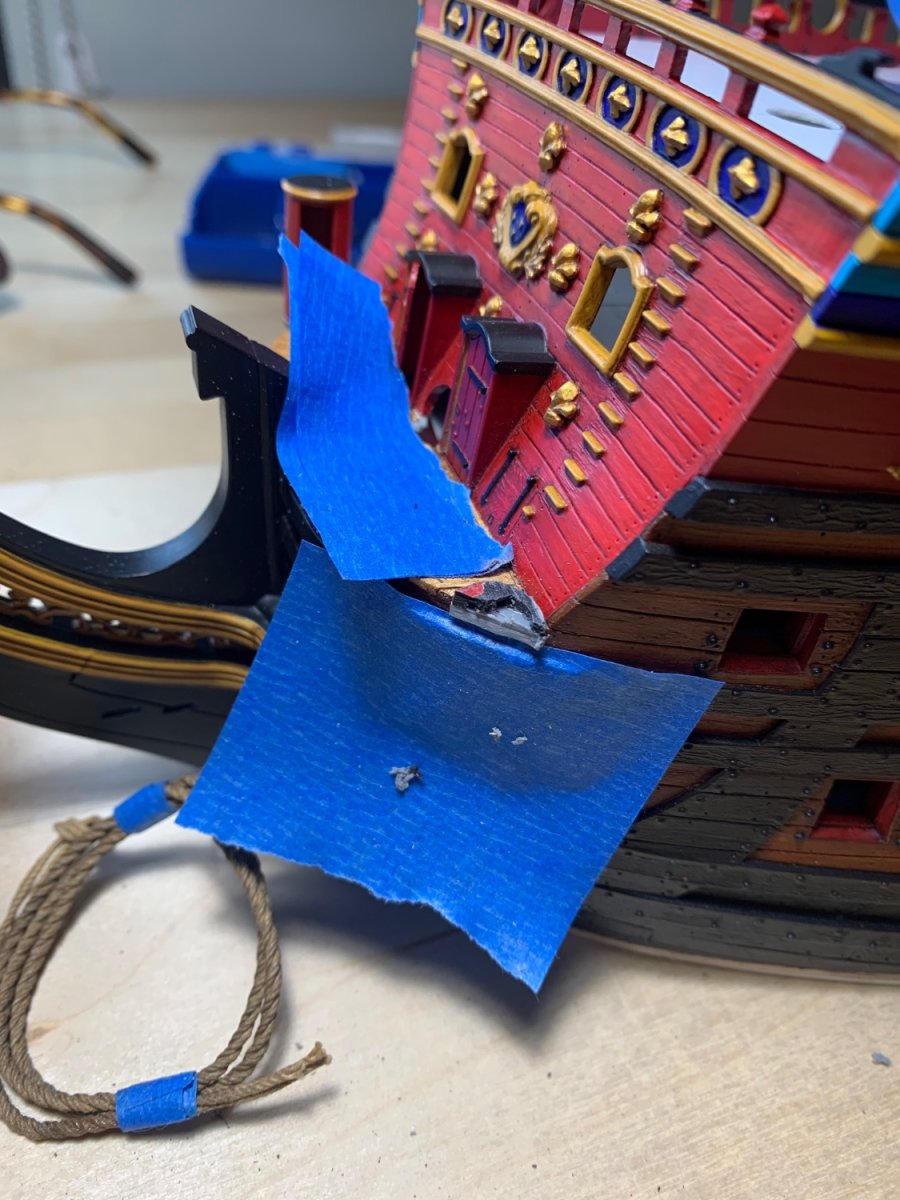
Well, I've had to make that angled bend that you're suggesting, but the available space behind the figure head is just too tight for a flat entry; without modifying the figurehead, itself, it's a choice between concave entry of the headrails, or inducing the reverse-curve that I've pictured. It's just one of those things, where the kit was designed a certain way, and one has to decide what degree of plastic surgery they are comfortable with. I like my figurehead and don't want to start messing around with those delicate bits.
- 2,699 replies
-
- 7
-
-
- heller
- soleil royal
- (and 9 more)
-
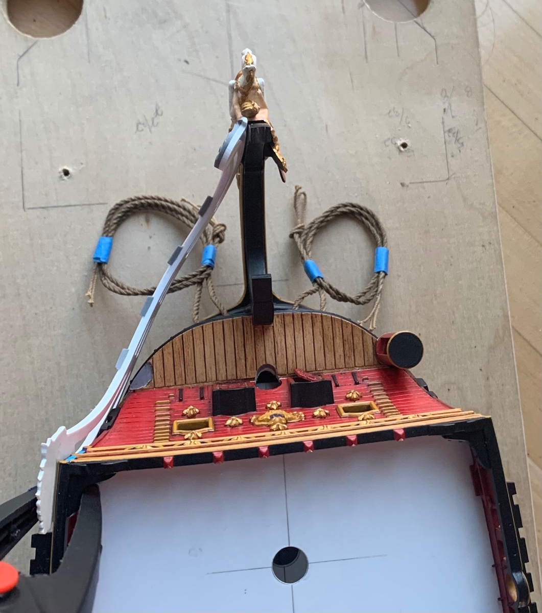
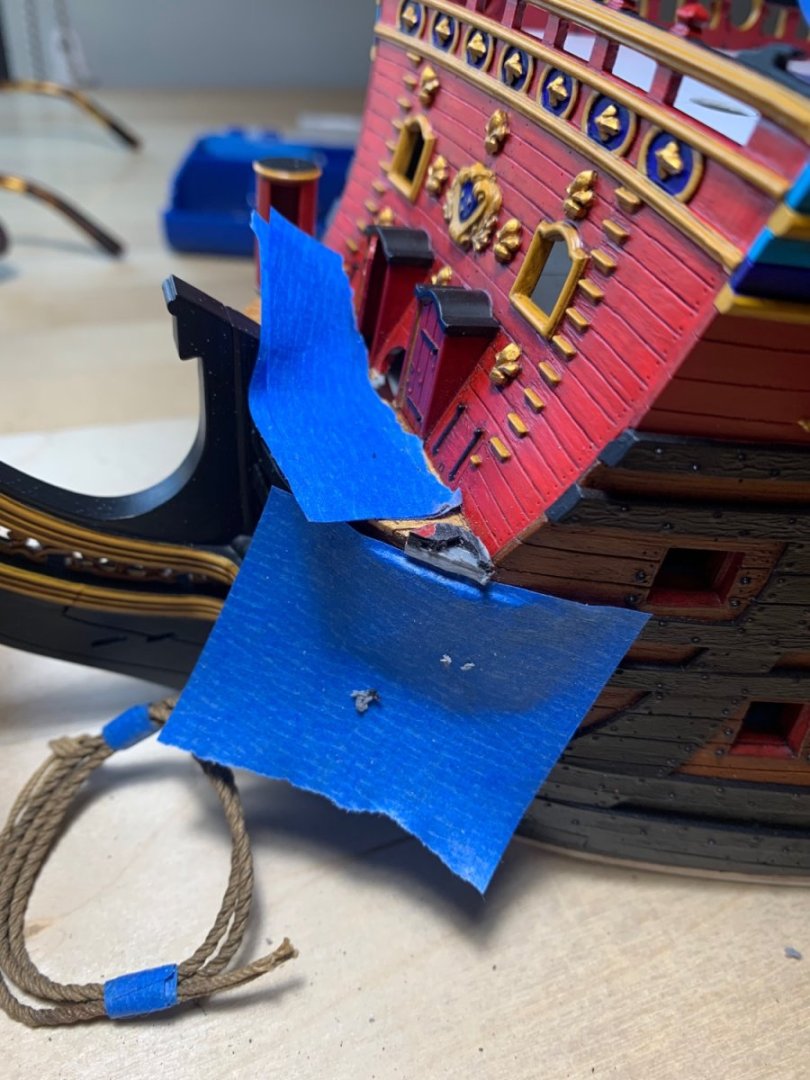
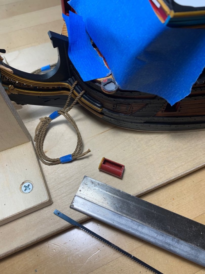
In answer to my own question: a welded bond can be quite difficult to break free. Honestly, I expected that the turrets would pry loose fairly easily. It soon became clear that wasn’t going to happen without something breaking where I didn’t want it to. So, I used a series of implements to winnow away the problem: It will only require a little putty to come flush with the plank surface of the beakhead deck; engrave a plank line, paint and it will all disappear. With the turret out of the way, I could now get the headrail to seat where I want it: Because of the angle of entry, behind the wings of the figurehead, I still will not get away with flat headrails. I am okay with this concession, though, as I have at least corrected the problematic turret placement.
- 2,699 replies
-
- 16
-
-
- heller
- soleil royal
- (and 9 more)
-
No worries, Keith - it is all of interest to me. As far as I’m concerned the discussion is pertinent to what is happening on this build page.
- 2,699 replies
-
- 5
-
-

-
- heller
- soleil royal
- (and 9 more)