Hubac's Historian
-
Posts
3,308 -
Joined
-
Last visited
Content Type
Profiles
Forums
Gallery
Events
Everything posted by Hubac's Historian
-
 As always Victor, I appreciate your continued interest in my log! I would especially like to highlight a new project that Vic has begun, because I think it presents a really interesting approach to the ever-vexing problem of what Soleil Royal may have been:
- 2,699 replies
-
- 5
-

-
- heller
- soleil royal
- (and 9 more)
-
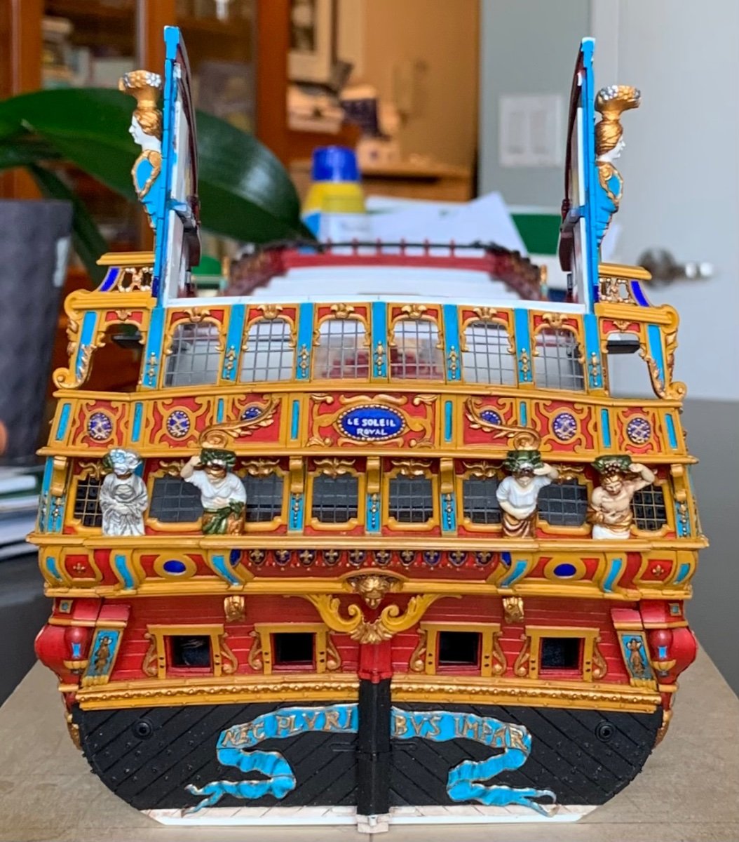
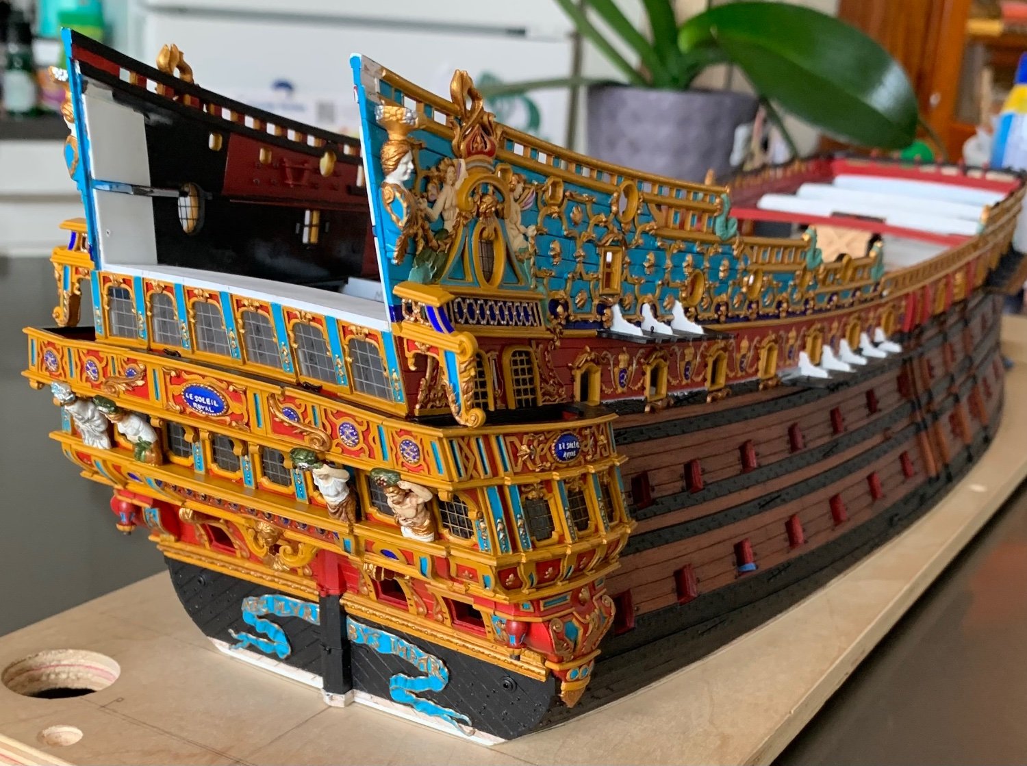
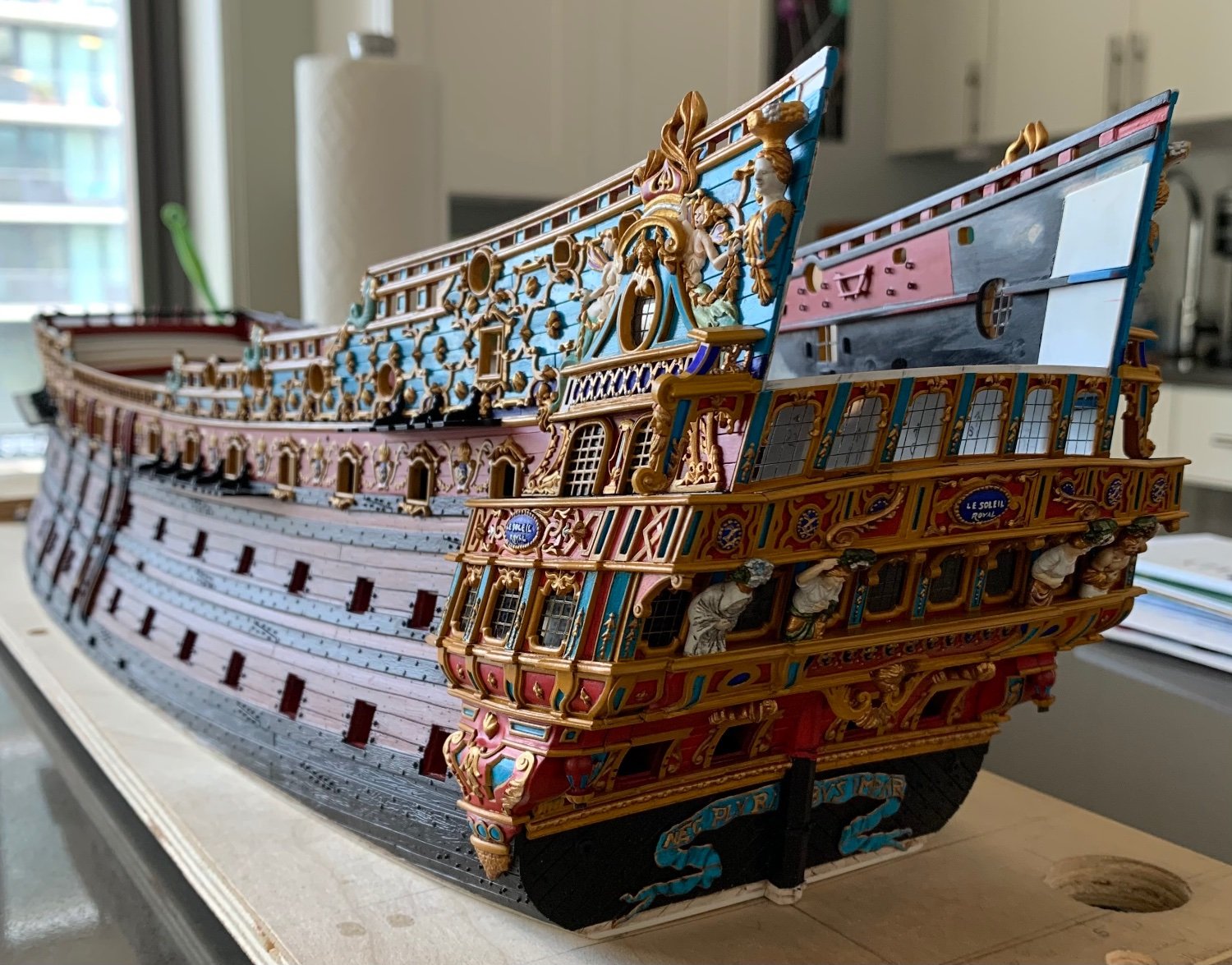
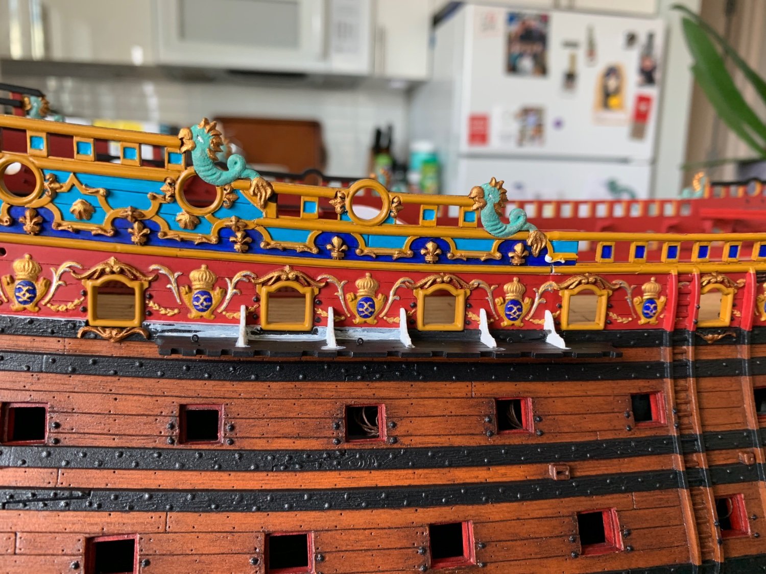
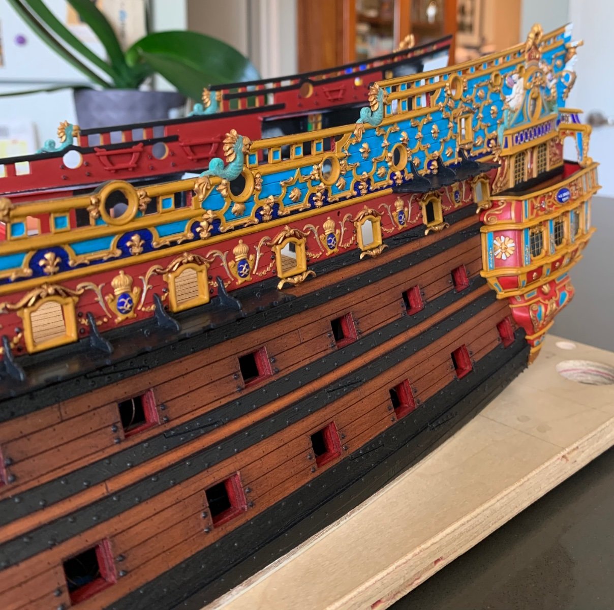
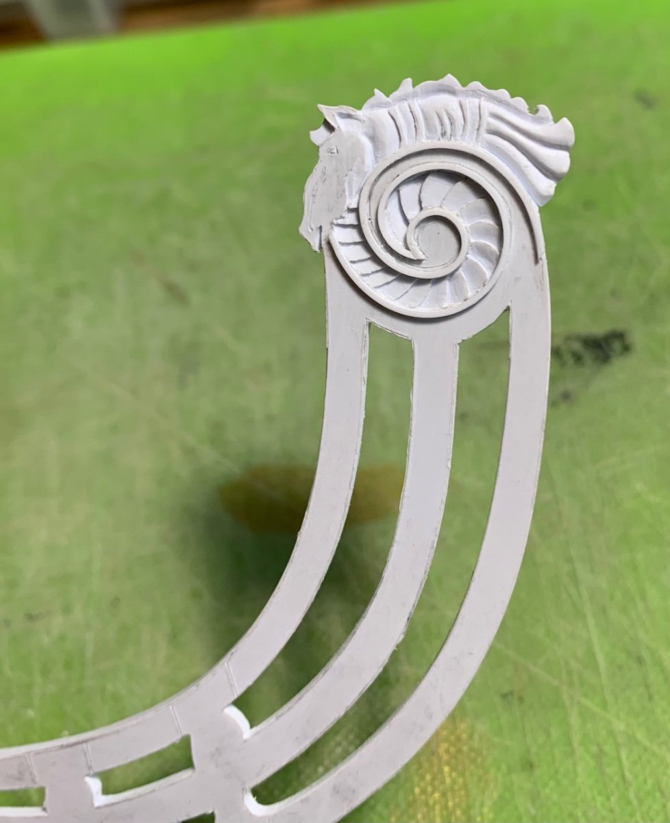
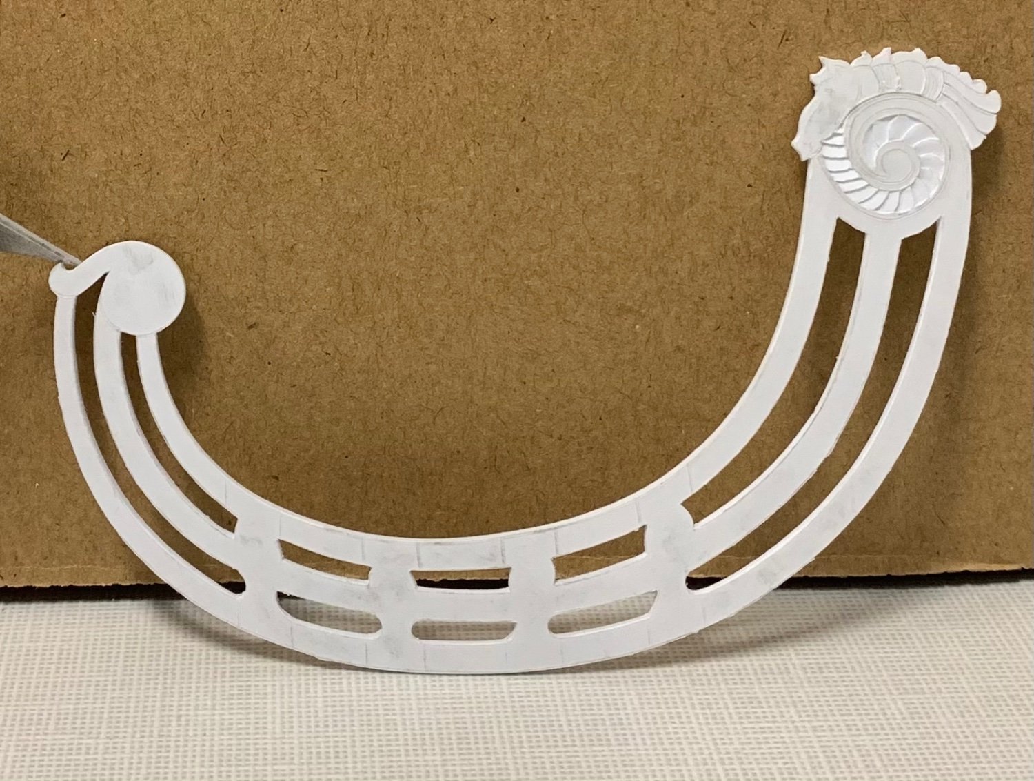
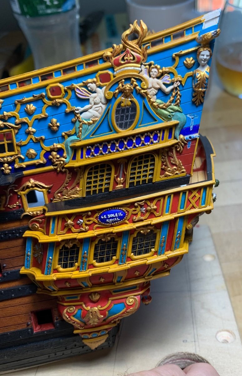
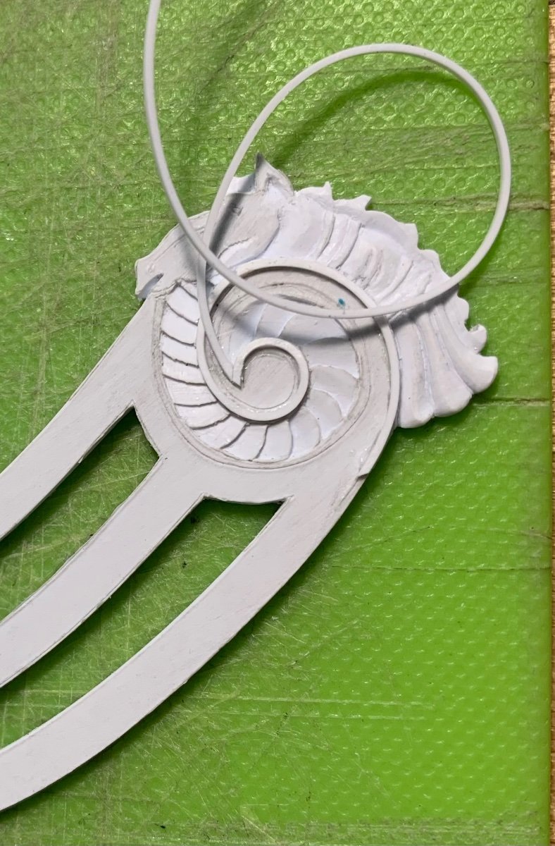
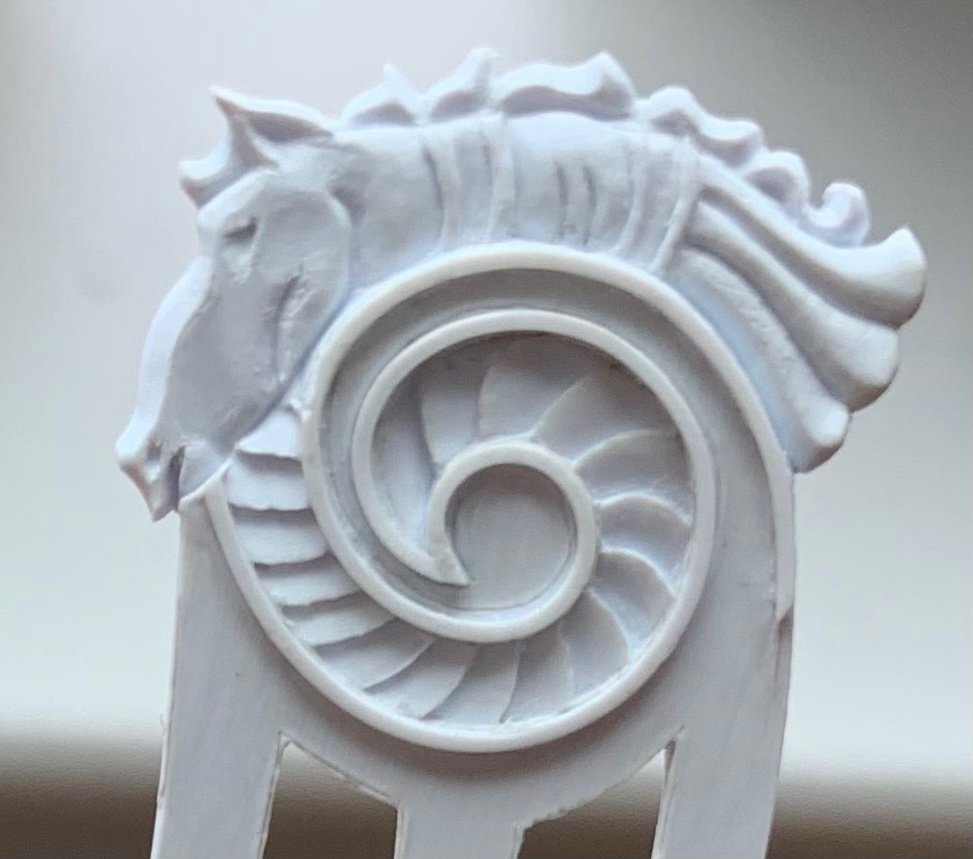
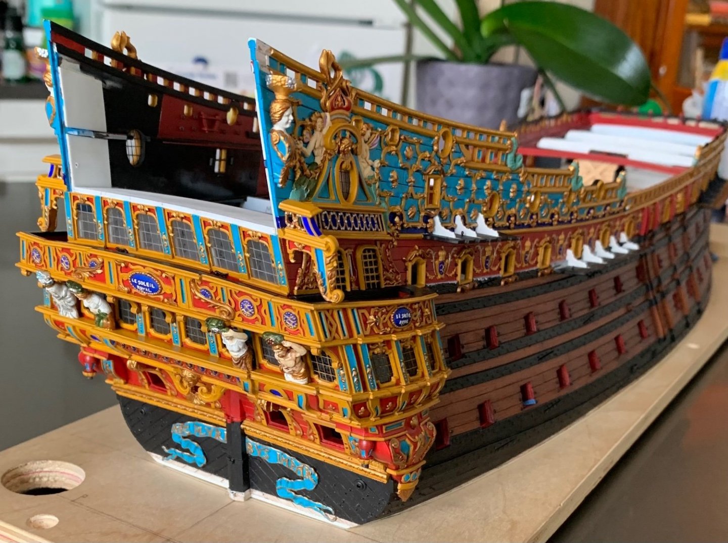
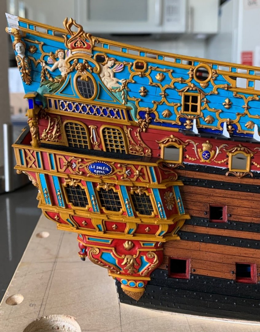
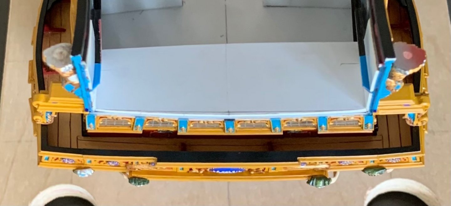
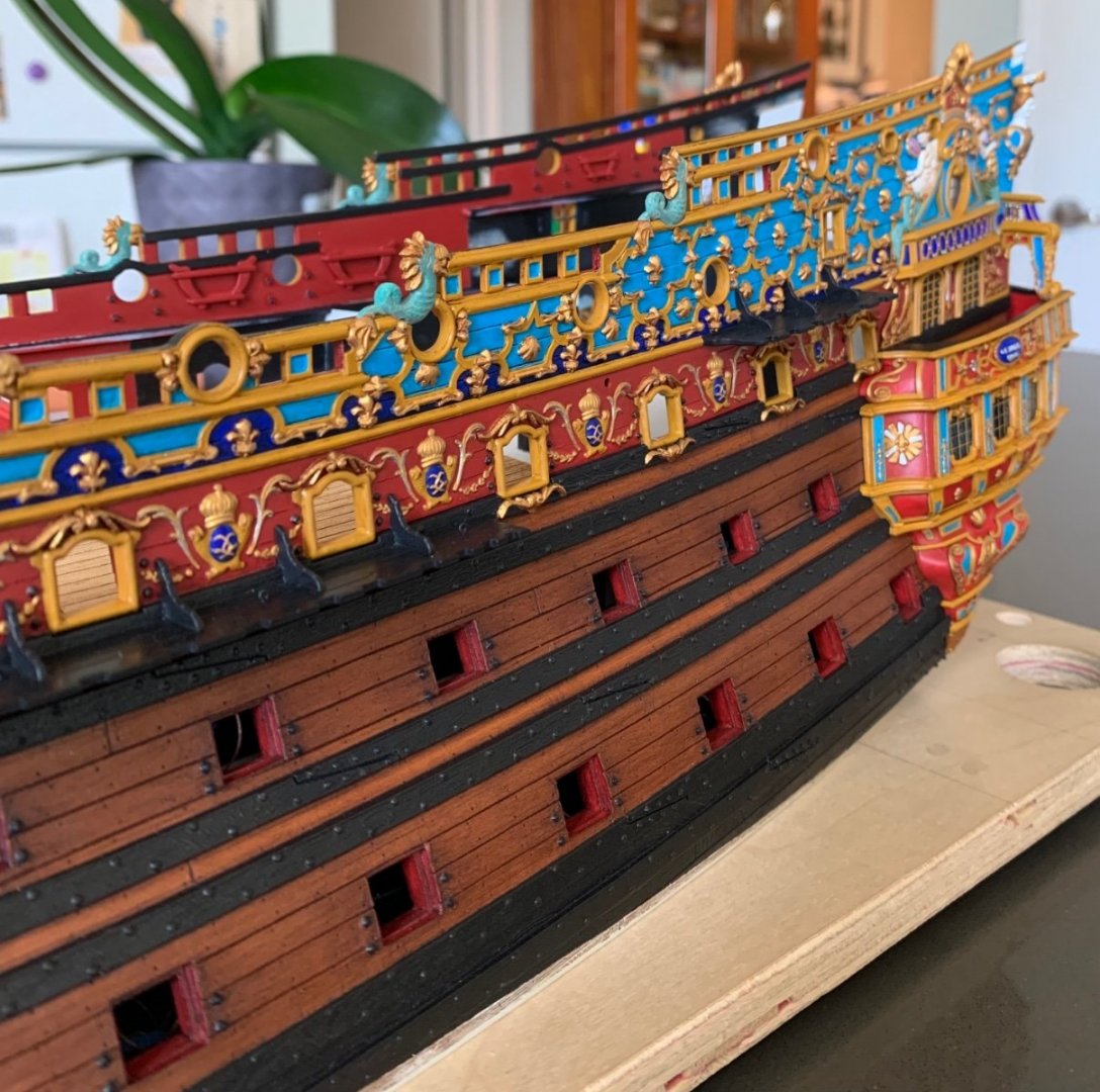
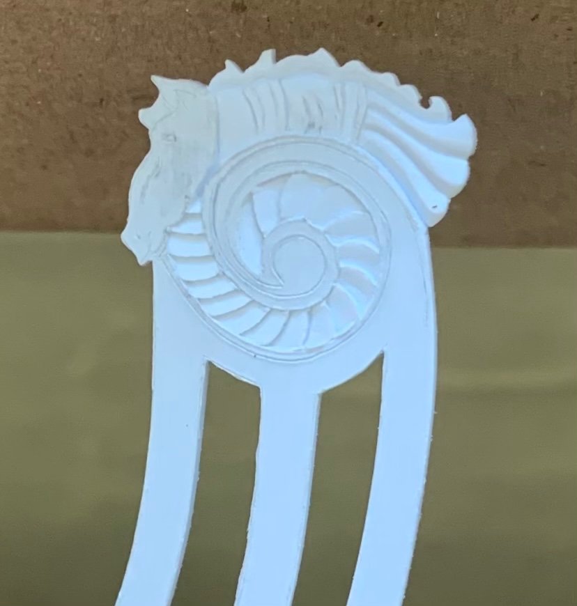
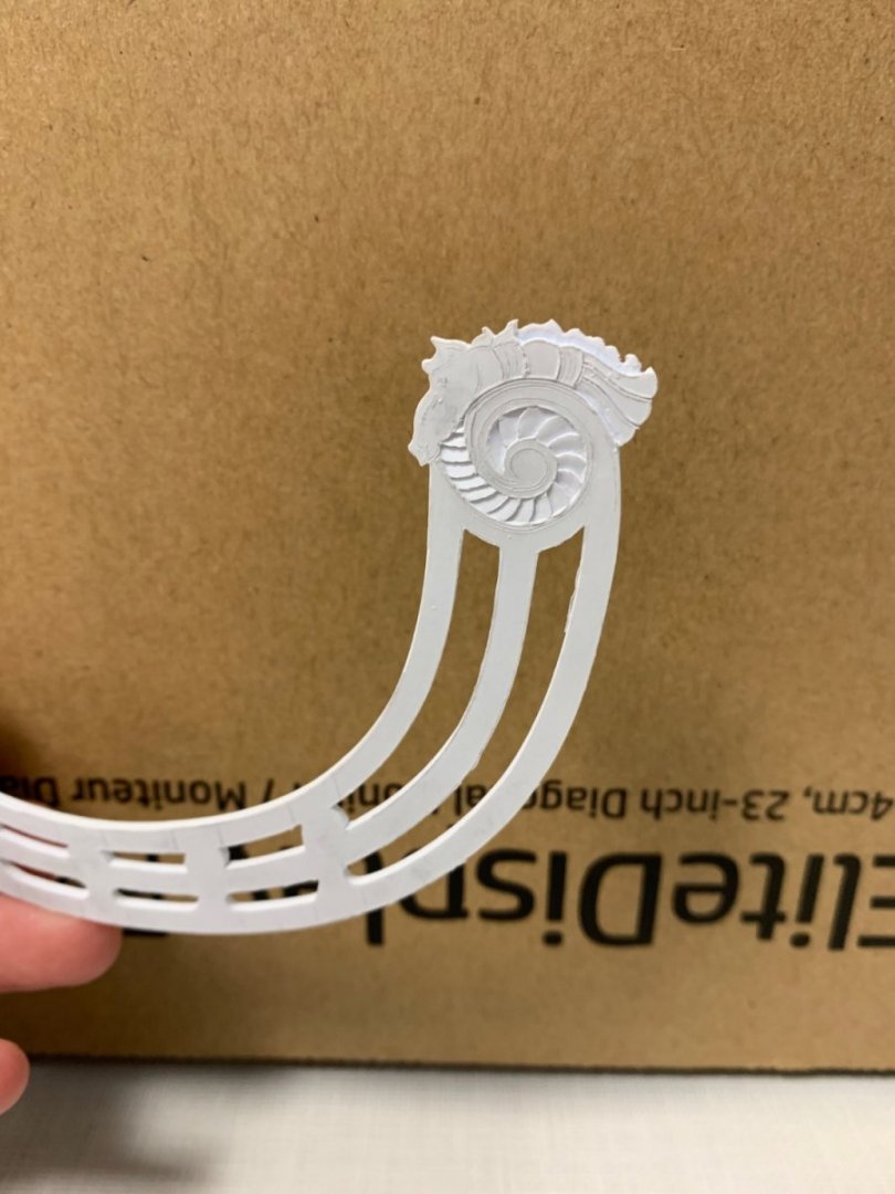
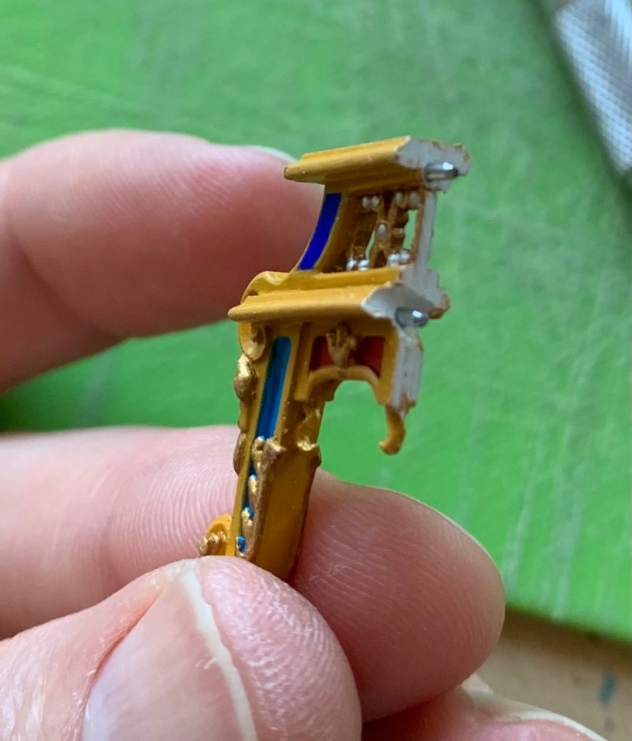
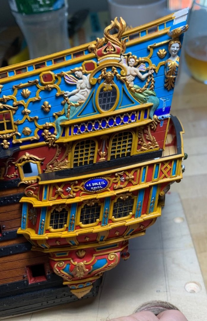
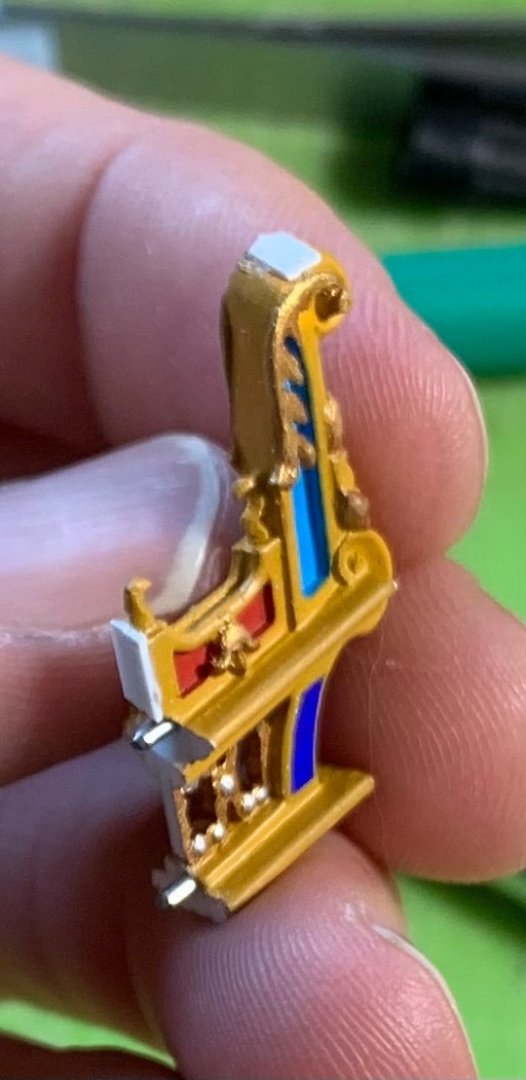
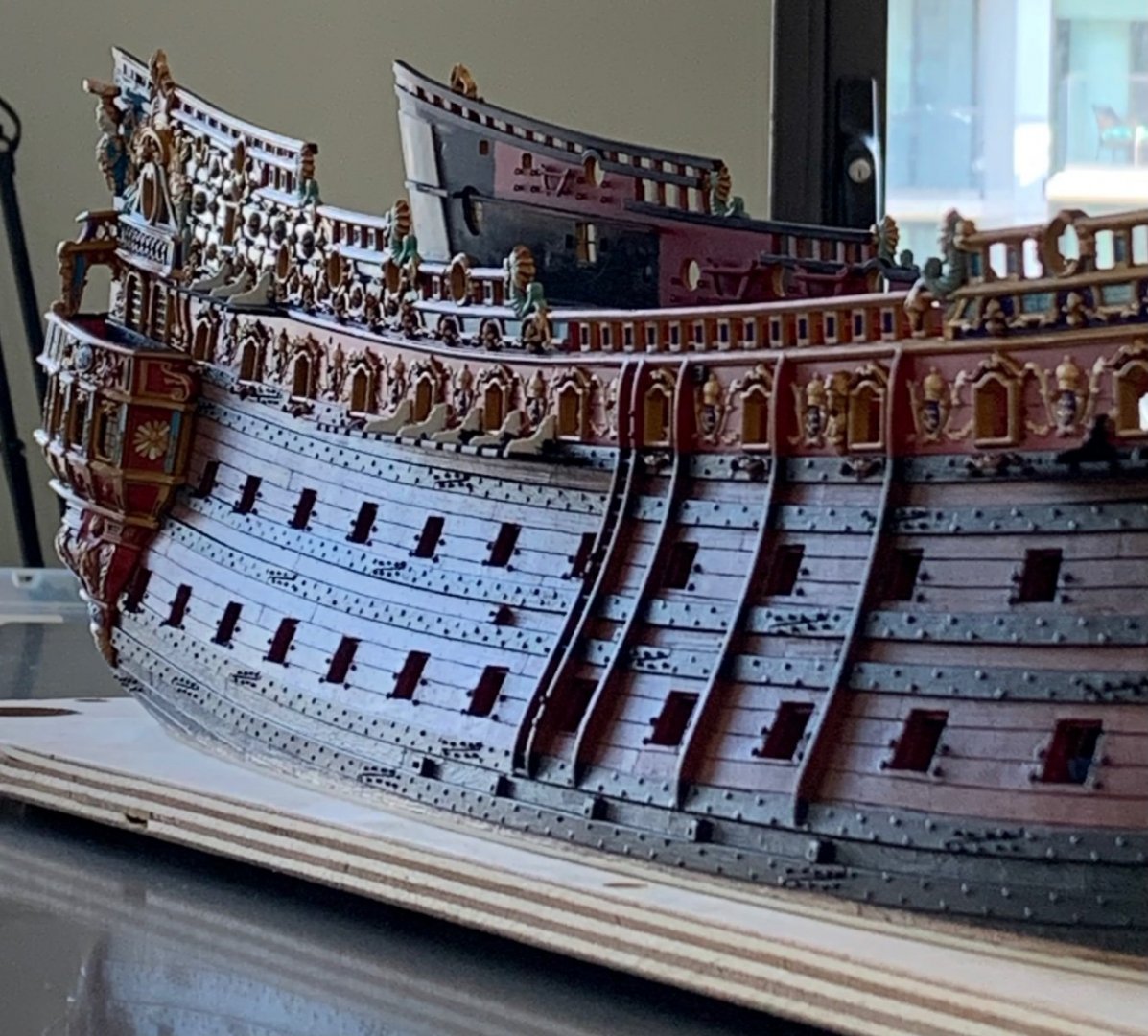
In consideration of Thomas’s request, I’ve been photographing the headrails as I carve the horse ornament. The starting place was to carve the fanned relief in the inner scroll: From there, carving the horse is mostly about establishing levels within the carving. Here, I’ve determined that where the mane meets the horse’s back will be the lowest-depth cut of the carving, my baseline: After undercutting the mane a bit, which helps give dimension, later during the modeling of the mane, I decided to proceed from the tail to snout, as this Roman skirt was an easy thing to understand and model: It all proceeds smoothly enough, until the head, which presents some challenges. For the record, I have not done any involved study of horse anatomy. I am merely attempting to hint at the major muscle groups that animate the animal’s jaw and face. I wanted to experiment with my idea to add the bordering of the headrails. It was easy enough to induce a curl into this square styrene strip (.020) with my finger nail. I anchor the starting point with thin CA, and then I work my way around the scroll, 1/4” by 1/4”, with liquid styrene cement. It turned out about as well as I could have hoped. Today, I finished up with the modeling of the head and mane. I still need to add a few applied “buttons” to the two bands that wrap around the horse’s body, but this is a simple thing. It is not an anatomically perfect study, but there is shape and movement that will catch the light and create shadows when painted. In other news, I have installed the pass-through archways. Because boxwood carvings will sit upon these, I wanted to ensure that they were very securely affixed. After much fitting and strategic scraping of paint, I fit two pins (from a paper clip) into each bracket: The plan was to glue these in using CA in the sections where the pins are, and liquid styrene cement in-between and at the foot. I got the correct rake and alignment for the port side, on the first try. There were, however, a pair of gaps that needed filling for a secure welded bond: I added styrene pads to the foot and below the lower pin and then faired these to fit seamlessly. With these brackets in place, my conception of the way Berain’s stern relates to these quarter galleries can be clearly understood: As a side note: it was really challenging to get the foot of each bracket to align with the pilaster of the gallery bulwark beneath it. The starboard side is acceptable, but the port side (showing the merely acceptable side) came out perfectly: I also wanted the brackets to follow the round-up of the stern, so their in-board surfaces had to be beveled, accordingly: In natural light, this is a very accurate reflection of my colors. Presently, I continue to do all of the necessary touchups, distress washing (not applied to brackets yet, in these pictures), and blackening of the upper main wales and channels, on the starboard side. My least favorite aspect of this build is attempting to cut super-clean lines directly onto the model. The plywood base is a tremendous asset for these circumstances, but it is always awkward and difficult. Here, my line began to waver, after I had been at it for a few hours: The back and forth process of revision is on-going. The Heller kit has many flaws, but I do think it is fair to say that they get the aft sheer, pretty close to the mark: More to follow!


- 2,699 replies
-
- 29
-
-

-

-
- heller
- soleil royal
- (and 9 more)
-
Ditto to that, Kevin. Setbacks like these really sting, in the moment. You seem to be handling it all with admirable equanimity. If it were me - and it almost has been several times - my swearing would resurrect the ghost of George Carlin.
- 444 replies
-
- 1
-
-
- Cutty Sark
- Revell
- (and 2 more)
-
Your work is looking very good and clean! I think it is good to do as you are, which is to take whatever small mistakes there may be in-stride. Your next models will be better and better still. This one is shaping up beautifully.
- 84 replies
-
- 2
-
-
- Statenjacht
- Kolderstok
- (and 1 more)
-
Yeah, sorry about that, Bill.
-
I am 13 1/2 interminable years away from retirement. My personal life is just ripping by, but work feels like time has just stopped.
-
You know you have my full support, Vic, and it will be fascinating to see what the Heller model looks like with a correct hull volume. You’ll have some interesting work ahead of you at the head, but I know your artistic talents are up to the task!
-
Beautiful progress, EJ!
-
Mark, I am enjoying your sense of milestone achievement because I know that feeing when you finally get past what you initially estimated to be a huge hurdle, and you stick the landing without any lean or falter. Congratulations, Man! This truly is an inspirational log and certainly one I will be referring to, down the road.
-
As always, Frank, beautiful and patient execution. Personally, I’d be inclined toward simple circle coils, but I’d make them off-model in a form, so that I could induce a drooping shape with dilute PVA.
- 510 replies
-
- 2
-
-
- reale de france
- corel
- (and 1 more)
-
Soleil Royal 1/72 - Artesania Latina Ref.22904
Hubac's Historian replied to modeller_masa's topic in Wood ship model kits
I am not permitted to specifically reference the builder or forum, however, one builder has undertaken a "re-engineering" of the "Artesania Latina Soleil Royal" that shows exactly what is possible with this kit. And let me tell you - it is surprising! Out of the box, on the other hand, there are nuuuuuuuumerous problems with this kit. It's chief benefit is the fact that the bulkheads, as drawn, are actually pretty faithful to a first-rate of the period. The ornamentation, particularly of the stern, is very good - far better than anything yet produced (apart from Heller, which copies Tanneron directly). Overall, the kit more closely resembles Michel Saunier's model of SR. I am a proponent - and since I know they are paying attention to this forum, at least - of AL doing a re-design of their own release. IT COULD BE SO MUCH BETTER. It should be so much better. Do it better, AL! People pay a lot of money for these kits. -
I don’t mean to be a thorn on your vacation, Bill. I just think you might have second thoughts, once all the yards were up on the model, if you were to proceed with these particular wooden blocks.
-
I think it is a matter of relative and proportional size. Attached to the mastheads, the blocks seem less girthy. The yards are relatively narrow, though. I think, if you reduced these blocks to the next size down they would look right. Or, maybe try the printed blocks. If they are the ones that Kevin made, they will be proportional, overall.
-
Hi Bill, before you get too far into it, I would like to gently encourage you to re-consider the scale of your yard blocks. They appear considerably too heavy for their respective applications.
-
Will you begin the Francois, while this project progresses? Many guys like to have simultaneous builds going. This is something that I personally lack the discipline to do. None of my projects would ever cross the finish-line, if I did that.
-
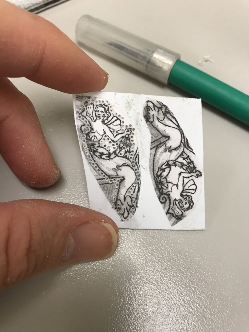
Hello Thomas, Of all these kinds of reliefs I’ve made for the model, I did a pretty thorough review of my relief process for the amortisement mermaids. Beginning with the post cited above (post#1218, page 41) I go through the entire process, and discuss the particular tools that I use to get there. The beauty of styrene, as opposed to wood, is that you really don’t need many knives to get really good results. You will see each of these discussed in the subsequent posts, but I essentially use two Exacto blades - one more accute than the other - a hooked chip-carving knife, a short and shallow sweep gouge, and a fine veiner. That’s basically it.
- 2,699 replies
-
- 7
-
-
- heller
- soleil royal
- (and 9 more)
-
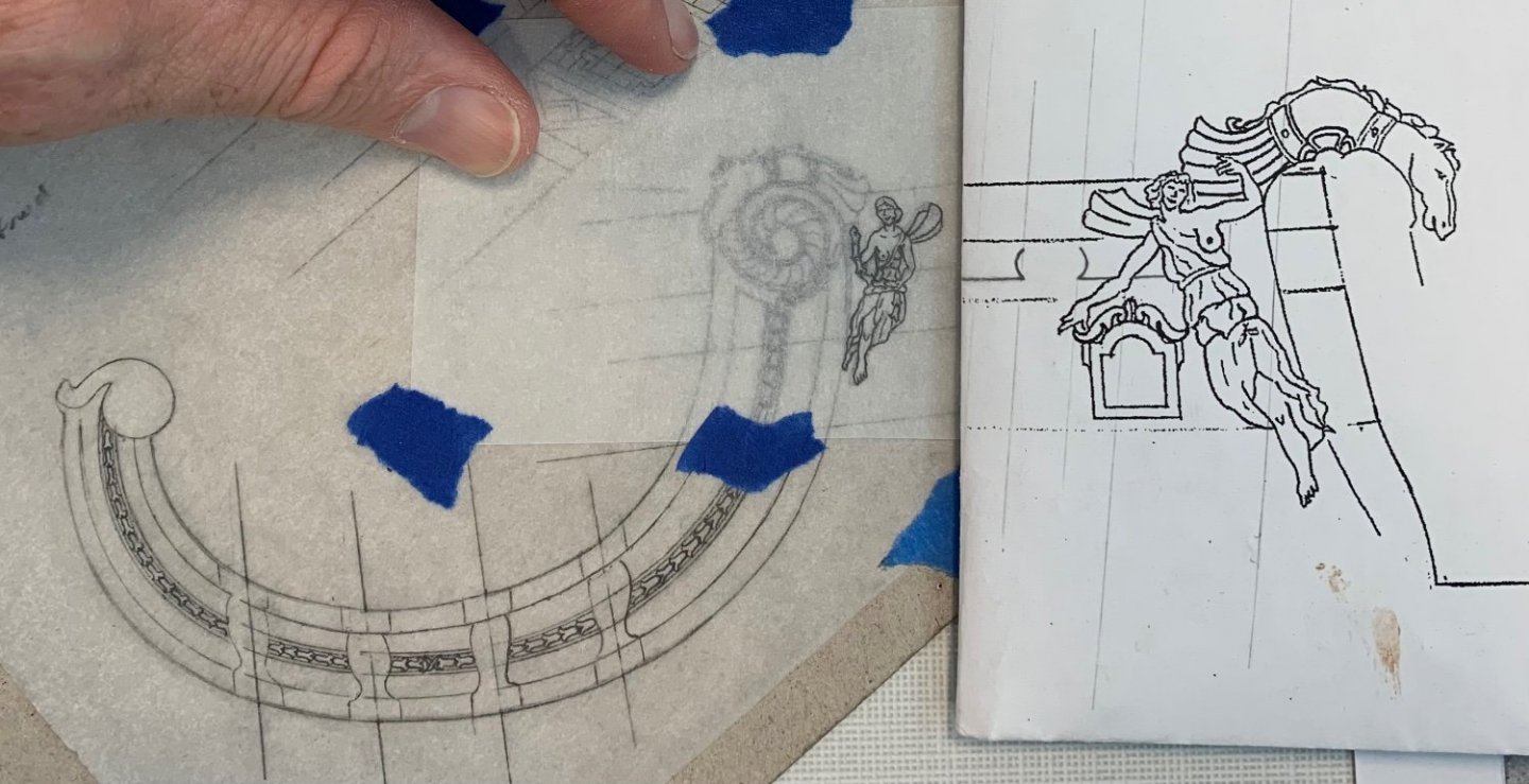
I took measurements off of the model, and transferred them to my drawing, which I had sprayed with hairspray to fix the graphite before proceeding with the pixie figure. I expected to be erasing a lot, and I was correct! Unfortunately, the hairspray altered the “tooth” of the paper, and I just could not draw clean lines, so I taped an overlay for the pixie. This was helpful, in revising my earlier attempt because I could re-plot elements I wanted to maintain, while making spatial assessments of what needed to be changed. It took a while to get the proportions of her limbs where I wanted them. You can see, in comparison with the drawing I made at the start of this project, how scaled-down the horse and pixie now are: I am satisfied with all of this, so tonight I will paste a photocopy to a blank of 1/16” styrene sheet, and I will begin making the port headrails. The horse figure will be integral to the headrails, while the pixie will be a separate part. I expect each headrail side to take a couple of weeks to make, but this is an enjoyable and portable side-project. As always, thank you for the likes and for looking-in. More to follow!
- 2,699 replies
-
- 12
-
-
- heller
- soleil royal
- (and 9 more)
-
Beautiful work, JD!
-
Or, is the “funky seat” that bulges out from the starboard beakhead railing? I’m not positive, but I think that may be a pissdale for quick relief.
- 1,784 replies
-
- 1
-
-
- winchelsea
- Syren Ship Model Company
- (and 1 more)
-
At scale, I’d say the nailing effect is very pleasing; large enough to be seen, but not at all too large.
-
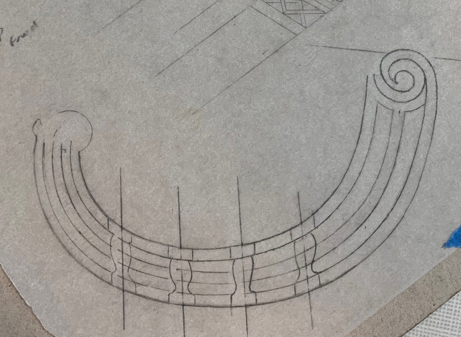
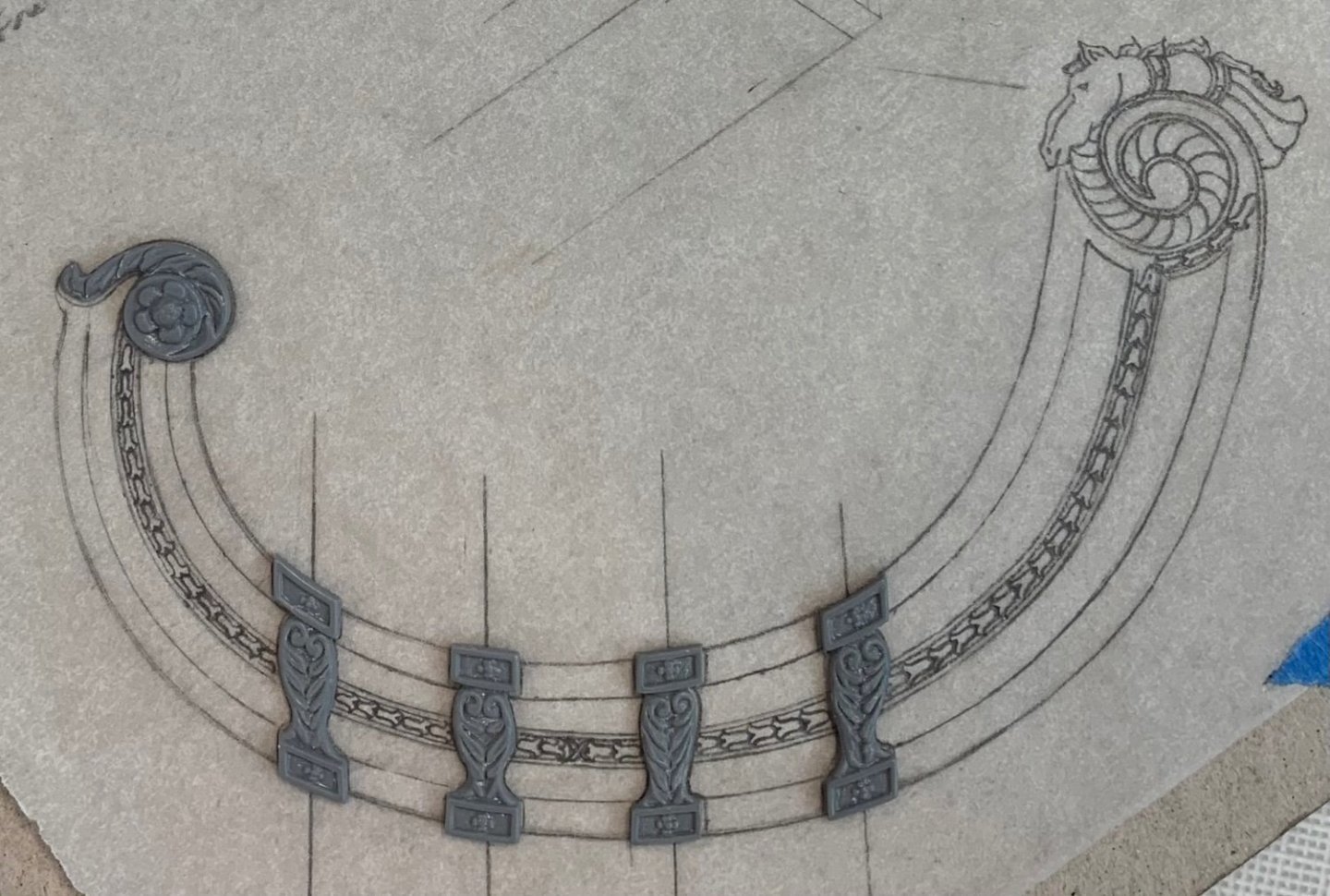
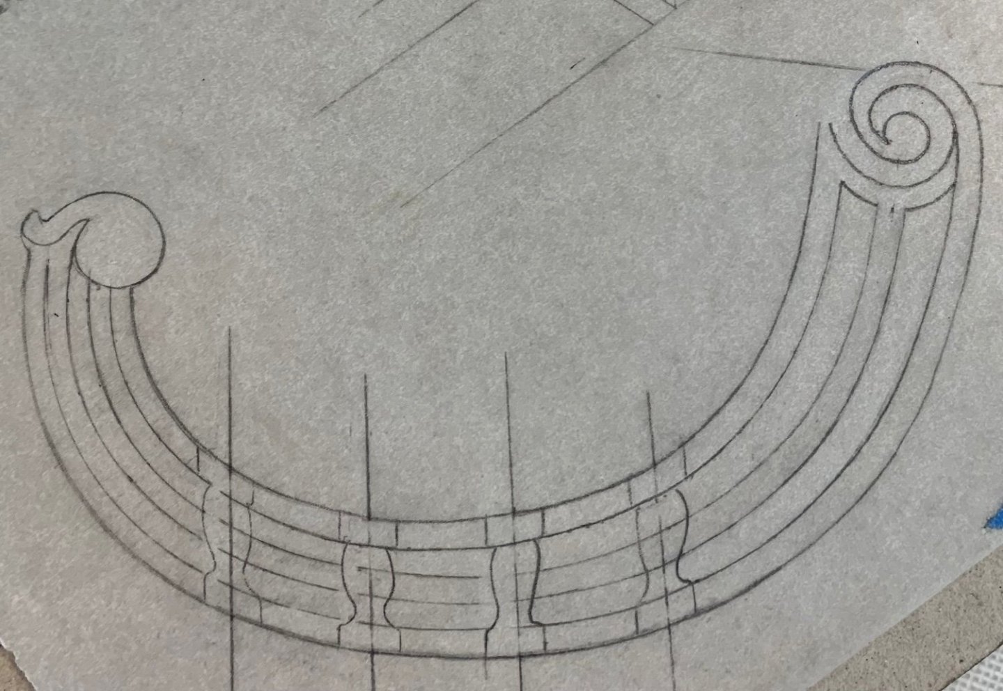
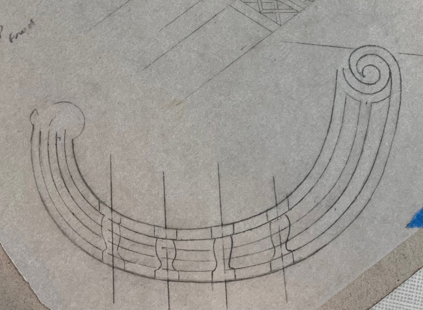
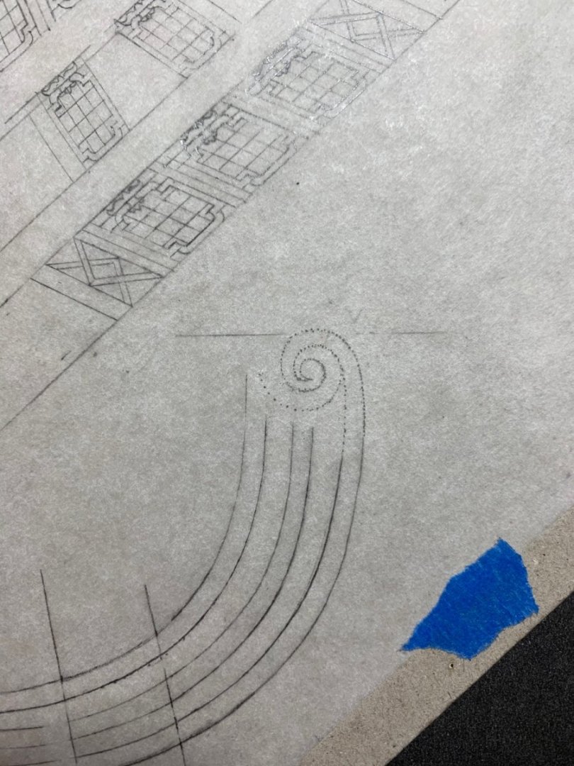
The design process continues. After checking against the model, I realized after all, that I would have to shift the front three pilasters aft by about 1/16”. Now the gammoning will pass cleanly between the ‘thwartship supporting timbers. I took this opportunity to mark the cardboard template for the height of the aft rosette. In doing so, it dawned on me that I could do exactly as Druxey suggested, and make additional room space beneath the headrails. His annoying😜 voice kept rattling around my brain, as I kept thinking to myself “you know he’s right!”. In the end, it was a simple matter of lifting the aft rosette until I was satisfied with the spacing. Now that I had determined to copy the Berain design more closely, I did a little more refining of the rail widths, and then set about drawing the aft, scrolled rosette; it is simple-seeming enough, but I spent hours trying to draw this volute. My pointillist-mapping technique for drawing irregular curves looks like this, just before I trace over the dotted line: I thought this looked pretty good until the next day, when I realized that the volute should be as closely centered on the middle rail as possible. More hours were spent drawing and erasing: This was much better, however, the scroll within the scroll needed a little re-balancing, especially in consideration of the way in which the horse’s snout nestles into this open area: Okay, now I could start penciling in only the necessary mouldings to help me determine the size of the bellflower garland: I am making small alterations to Berain’s design, as I see sensible and/or necessary; in the original drawing the garland runs all in one direction, aftwards. I have decided to make a transition between the second and third pilasters, so that half the garland runs forward toward the reins of the figurehead. Here is where the drawing stands, as of now: At this stage, I can photocopy this drawing and paste a copy to my cardboard template, so that I can take precise measurements of where my pixie figure will fit-in without the whole thing looking un-balanced. Drawing all of this, is one matter. Figuring out how exactly to apply my layered approach to part-making so that there is the appropriate sense of relief and overlay will take some thought. If that weren’t enough, the headrails bow out, around the beakhead grating, and then reverse inward to tuck-in behind the figurehead. I don’t think heat-bending is the way to go, here. I will, instead, induce these curves over a form, over a period of a few days. I hope everyone has a happy and safe holiday weekend! More to follow…
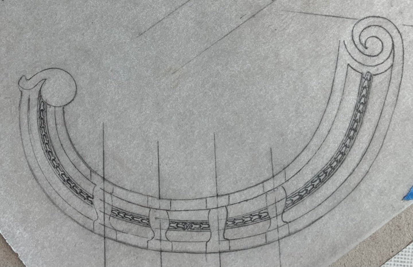
- 2,699 replies
-
- 13
-
-
-
- heller
- soleil royal
- (and 9 more)
-
I’m blown away by your patient resolve and the beautiful, clean work you are doing.
-
Roter Löwe 1597 by Ondras71
Hubac's Historian replied to Ondras71's topic in - Build logs for subjects built 1501 - 1750
You have been quite busy, Ondras, since I last checked-in. All of the work is superb, but your cannons are very finely detailed and finished. I really admire your metal skills!