


Hubac's Historian
-
Posts
3,220 -
Joined
-
Last visited
Content Type
Profiles
Forums
Gallery
Events
Posts posted by Hubac's Historian
-
-
-
-
Thank you very much EJ! I’d like to say that my time away from the project has been restorative, but we have been busily figuring out managed-care options for my Dad, who turned 87 this summer. All of that is, naturally, stressful. Everything at its appointed hour, I suppose.
-
-
-
-
-
I’ve been pre-occupied with numerous things lately, Bill, but I am floored by your tremendous progress. She’s really rounding into form now!
-
-
In the link you just sent, Eric, the first interesting thing I noticed in the very first image is that the room is painted in this really difficult to define green/grey/blue. The period is a little later, but this is exactly the color that I believe the great cabin interiors of SR1 would have been painted.
So, yeah, I’m sold on a visit!
-
Well, Eric, as I just mentioned in my log, I was really pretty nervous, but the fact that you had been following the project and were clearly interested did a lot to calm me down. I really appreciate that and your kind words of encouragement!
-
The show was really very good - a near-record turnout, with about 110 guests, and I believe 105 models. Toms10 (Szabo) earned the Jim Roberts award for his HMS Leopard, and the recognition is well-deserved.
My only regret of the show is that I somehow missed Fried Clams’s Stonington Dragger. I only realized this after the fact when going through pictures of the show that our club member Vadim had taken (see below). That really is a terrible oversight, on my part, because I would have really liked to see the model and to meet Gary, in person. I’m really sorry about that Gary.
SR was, indeed, well-received! I gave about a 20-minute presentation, following Chuck’s excellent ropewalk demonstration - which is a hard act to follow. At first, I only had a couple of new friends from the Jersey club at the table, but Mike Swanson did some rustling for me, and I ended up with a very engaged group of 10-12. This was about perfect for me, as it has been a long while since I did any “public speaking” - my voice didn’t quaver much, but my hands sure did!
Many thanks to our club president Dan Pariser who took the time to mount five specific images of SR and her contemporaries, which very much helped with the story I was trying to tell about the ship and this model. Without these visuals, Dan, the presentation would have been a very different experience.
I owe my wife and two children many thanks for coming out to the show and supporting/enabling Dad with his obsession. They enjoyed themselves, and I think they were surprised to see the range of talent and subject matter on display. Many thanks to them, as I know they hear and see quite enough about ships at home.
After quite a bit of traffic, we made it home, we ate and then I went to bed and slept for nearly 12 hours. Today, I am clear-headed for the first time in ages. I will still leave the model alone for a couple of weeks. I want to be excited about it, when I take up with it again.
- John Clements, GrandpaPhil, Jeff T and 6 others
-
 9
9
-
Congratulations, Tom! This is a well- deserved recognition of your talent and your careful work on the Leopard.
- Ryland Craze, mtaylor, hollowneck and 1 other
-
3
-
 1
1
-
I was so glad to meet you today, Eric. The Dapper Tom looks like a wonderful project and I will gladly follow along. Thanks, again, for being such a gracious listener at the presentation, today!
-
-
Thank you, John! I am glad to hear that you will continue with your beautiful model. I’ll look forward to seeing your updates,
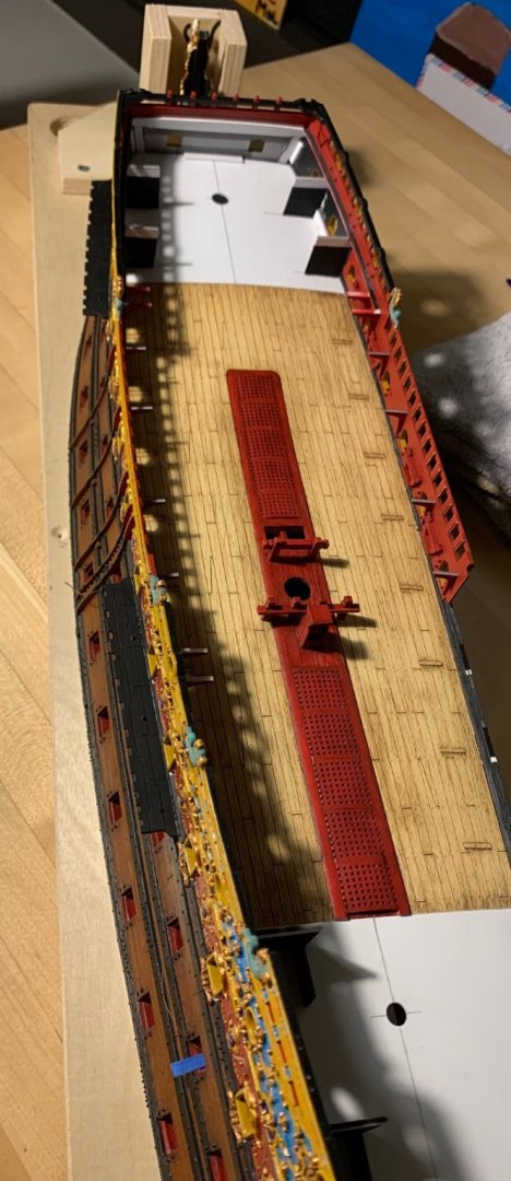
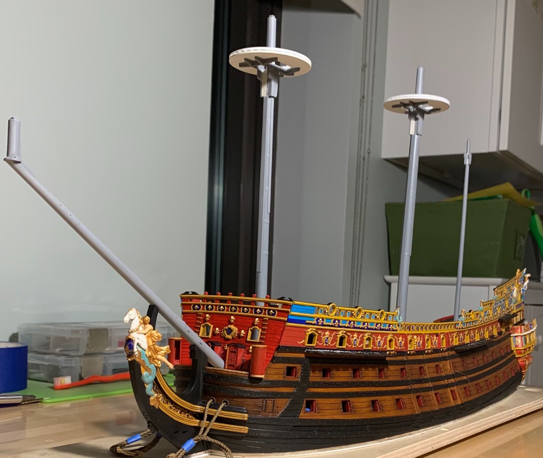
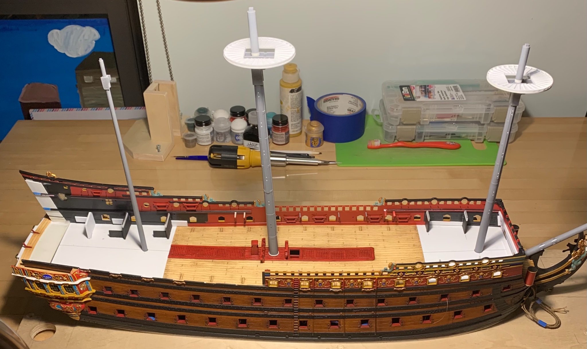
Well, last night I completed all of the port side touchups and got the last of the channels installed. The upper main wale and the lower port enhancements still need re-touching, but I won’t bother with that until I have fit all of the buttressing knees of the channels.
For a change, I’ll let the pictures do the talking:
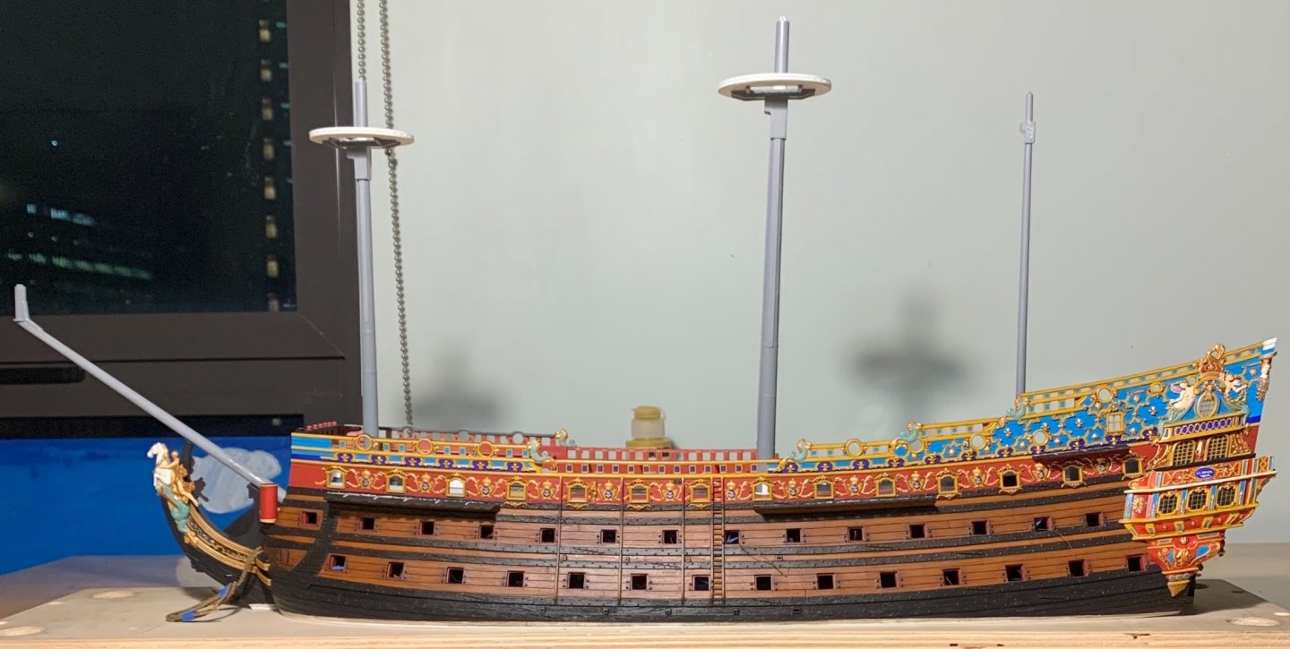


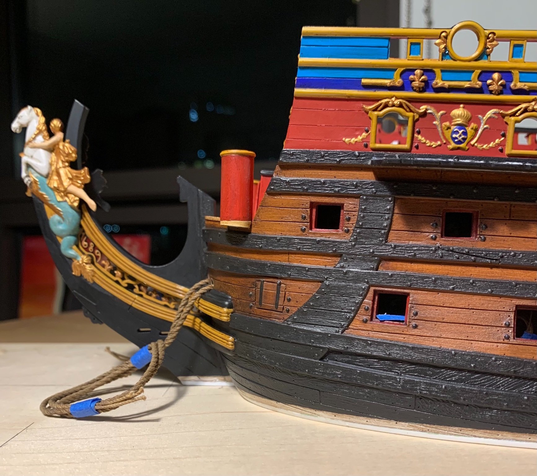
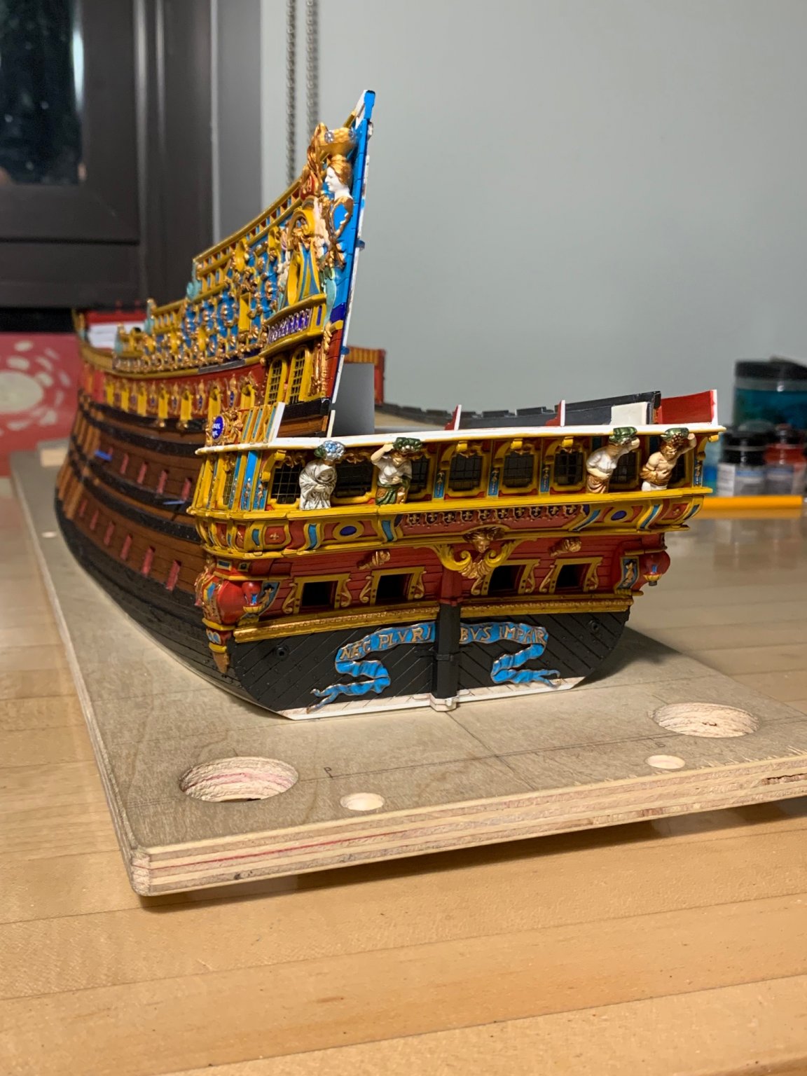
Interestingly, the walnut ink is not as reversible as I thought, in all cases. To some degree, it permanently stains the red ocher, in particular. When I did the QGs, there was some blotchiness in the wash-coat that I thought I’d soften later. Well, I couldn’t even out the tones as well as I would like, in all places:
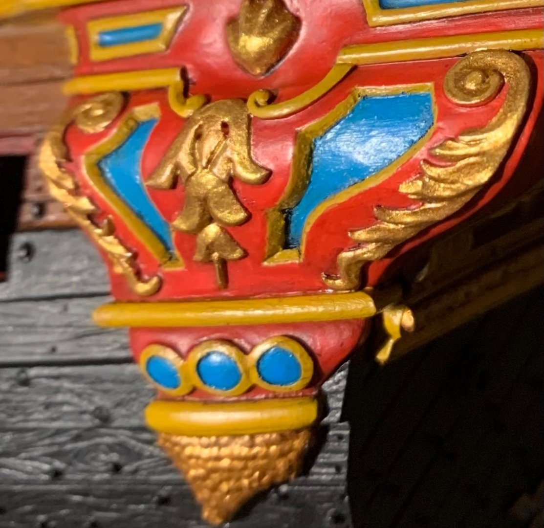
‘Not a terrible concession to a lesson learned, though.
So, we are off to the show! If you are there, please stop by and say hello. At 10 am, I’ll be giving a presentation on the model, as a representative of the Shipcraft Guild of New York City.
After the show, I’m going to take a few weeks away from the project, as I’m a little burnt from the past three months 🥴
Be well, and more to follow!
- Bill Morrison, yancovitch, rybakov and 12 others
-
14
-
 1
1
-
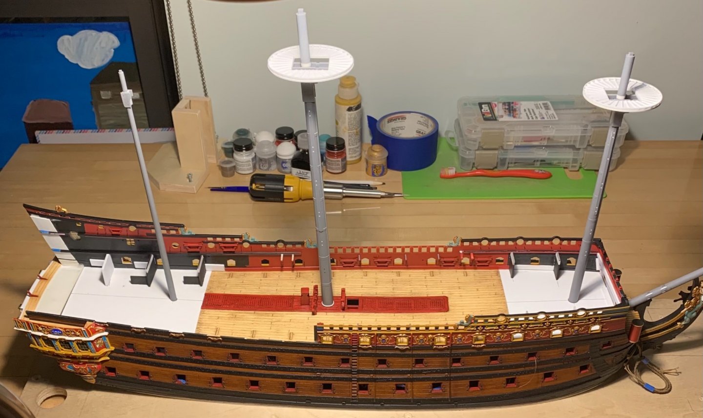
Thank you, Druxey! Before the show, I’ll photograph the model with the lower masts, sprit-mast, main top, and rudder, in place. This is how I will display her at the show.
At the moment I’m doing all the fill work that is necessary on the inside face if the bulwarks, touch-ups elsewhere, and so forth.
The past two and a half months have been intense and the show has given me the motivation to really propel the project forward, far beyond where it would be otherwise. It is immensely gratifying for this thing inside my head to now become sensible to everyone else.
-
Thanks, TC!
Well, Kevin, I’d be lying if I said I wasn’t a little concerned about that. When I brought the model to the last Joint Clubs in 2019, I did a presentation on the oil-wash technique that I learned from Herbert Thomesan. The model was just a series of un-assembled parts, back then. Afterwards, a number of people were coming over and picking up a hull-half for closer inspection. Everyone means well, of course, and I appreciate any interest in the project, but a painted surface is a painted surface, and hand-oil washes are NOT part of the Thomesan formula.
- Bill Morrison, EJ_L, mtaylor and 1 other
-
4
-
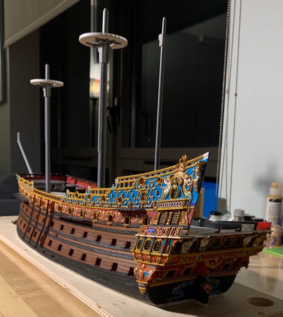
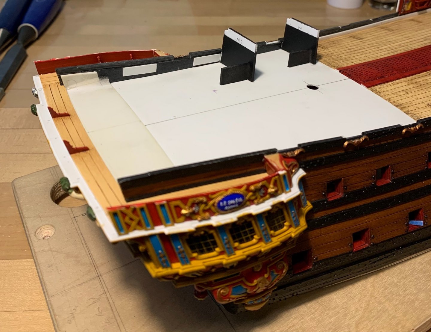
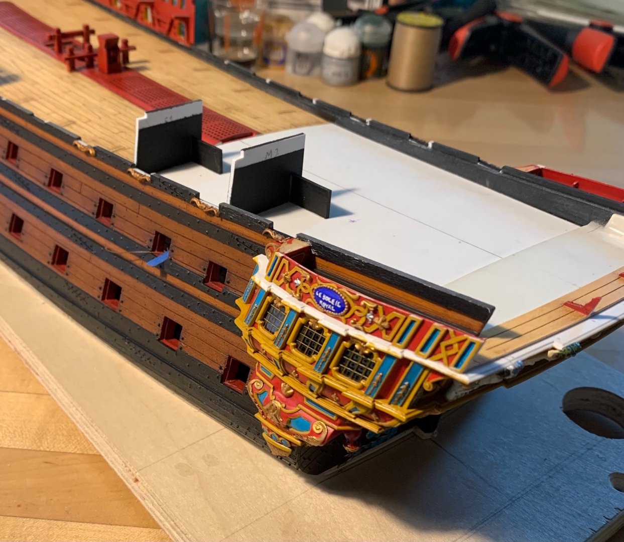
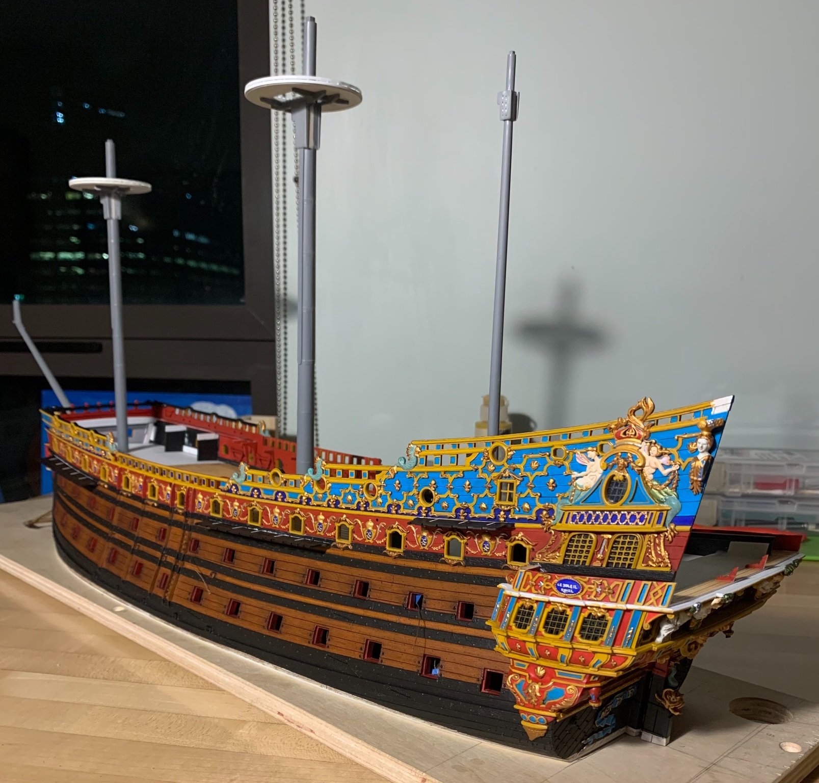
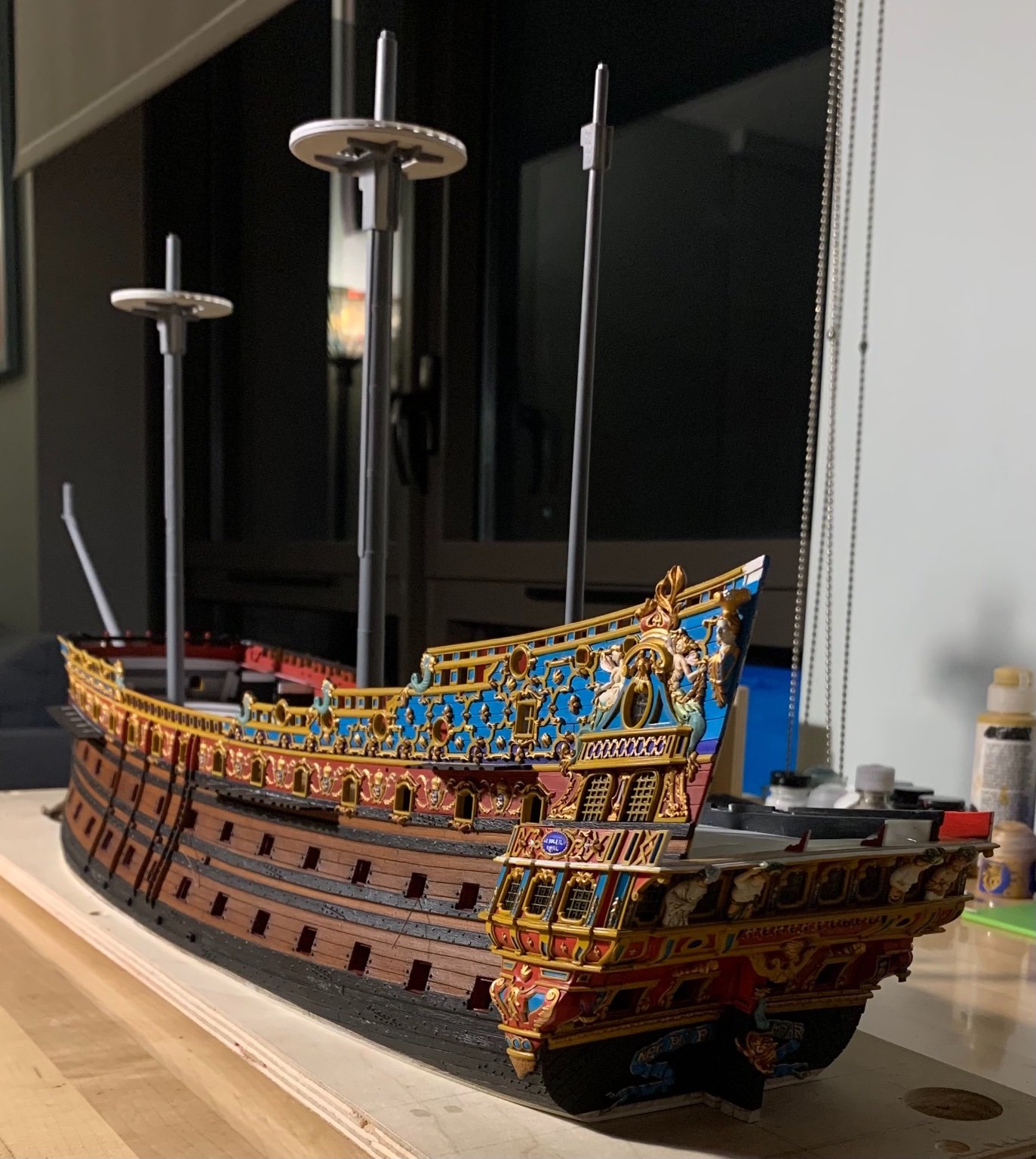
The aft bulwark is in! I’ll do a multi-perspective photoshoot after everything is prettied up, just before the show, but here’s a sneak-peak preview that illustrates the improved tumblehome:

The three gusset supports make for a very sturdy construction!
I’ve also begun patterning the new channels. The Lemineur monograph for the SP is a great help with these small details:
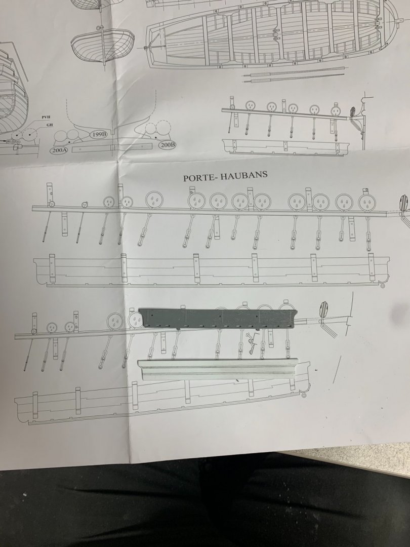
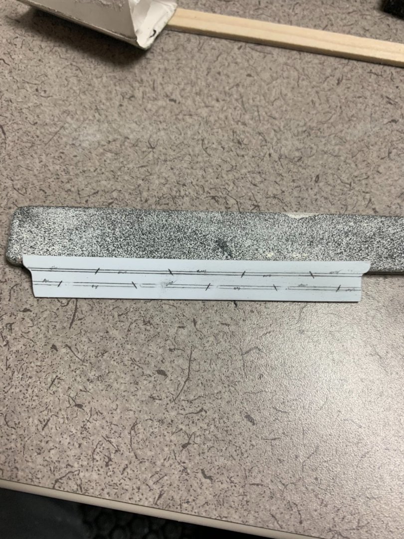
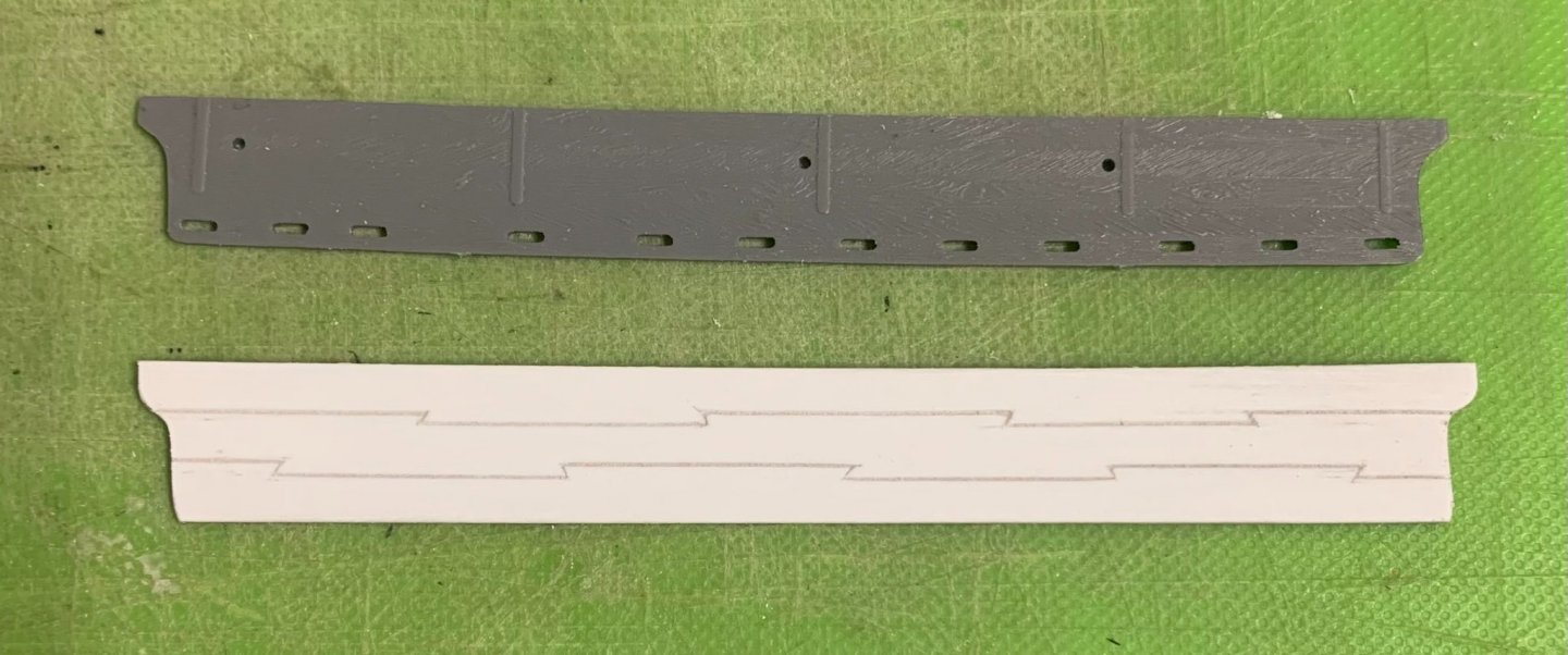
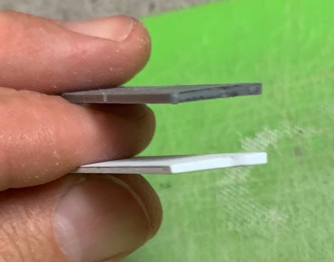
It is hard to photograph, but the new channels are tapered for watershed:
I’ll have to layout the shroud and stay locations, in relation to the guns. There’s a possibility I may have the main channel in place for the show.
-
Like all good repairs, yours will be un-detectable when the model is finished - sooner, even, after a sanding. I was losing sleep over small gaps of my own before I finally decided to fill them because I knew that I should, even if it made more paint work for me. Well done!
-
-
It certainly is amazing, Kevin! The side taper of these outer two windows is only 1/32” over a 1/2” span, but the spread seems more expansive.
- mtaylor, druxey, Bill Morrison and 1 other
-
4
-
The particular challenge of erecting the aft bulwark pieces is that I don’t have the stock stern plate, in place, to guide their placement. It is helpful that the forward bulwarks are in place, as they provide an anchor point, but they do nothing to help establish the slope of tumblehome that should be present.
The first step was to spend as much time as necessary fettling the lap joint to ensure that the part seated snuggly, along the upper main wale. With that much established, I could secure additional glue tabs to the inside face of the bulwark, just as I had done with the forward bulwarks. It was also necessary to fir-out, behind the upper main wale, so that these glue tabs had a firm landing spot.
Whereas with the forward bulwarks, I glued the bulwarks in-place, and then secured the gusset pieces, afterwards - the process reverses for the aft bulwarks because it is the gussets that establish the slope of tumblehome by providing a positive stop to clamp against.
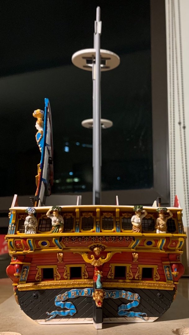
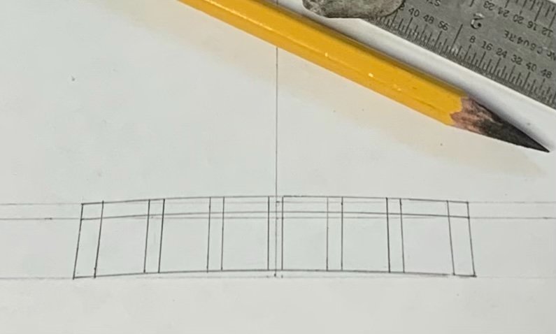
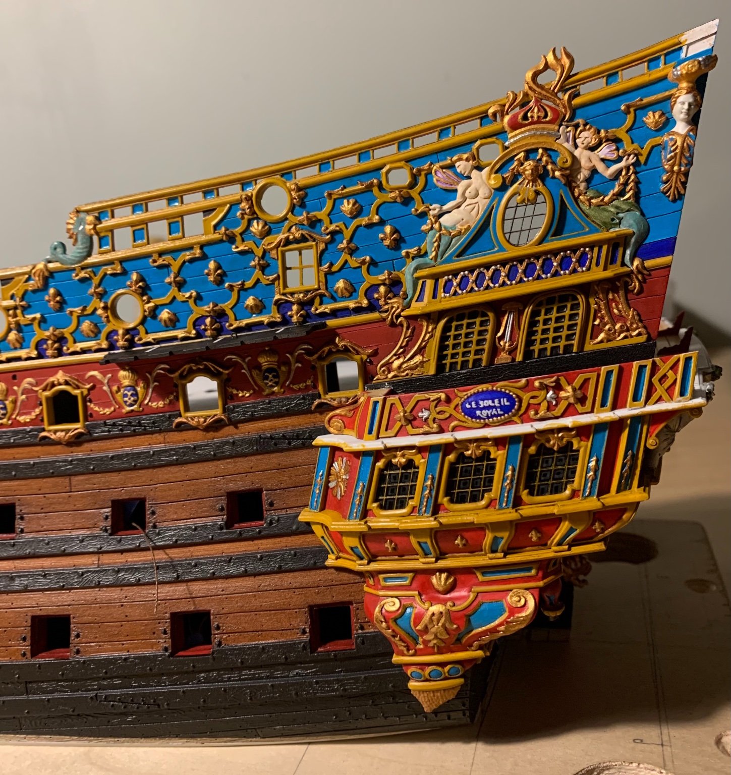
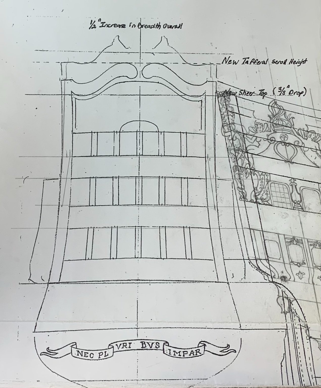
At the very beginning of this project, I drew the transom by simply tracing the outer profile of the bulwark ends to the increased breadth of the transom; the additional 1/2” would enable me to add the missing 6th window at all three levels. This was my initial drawing:
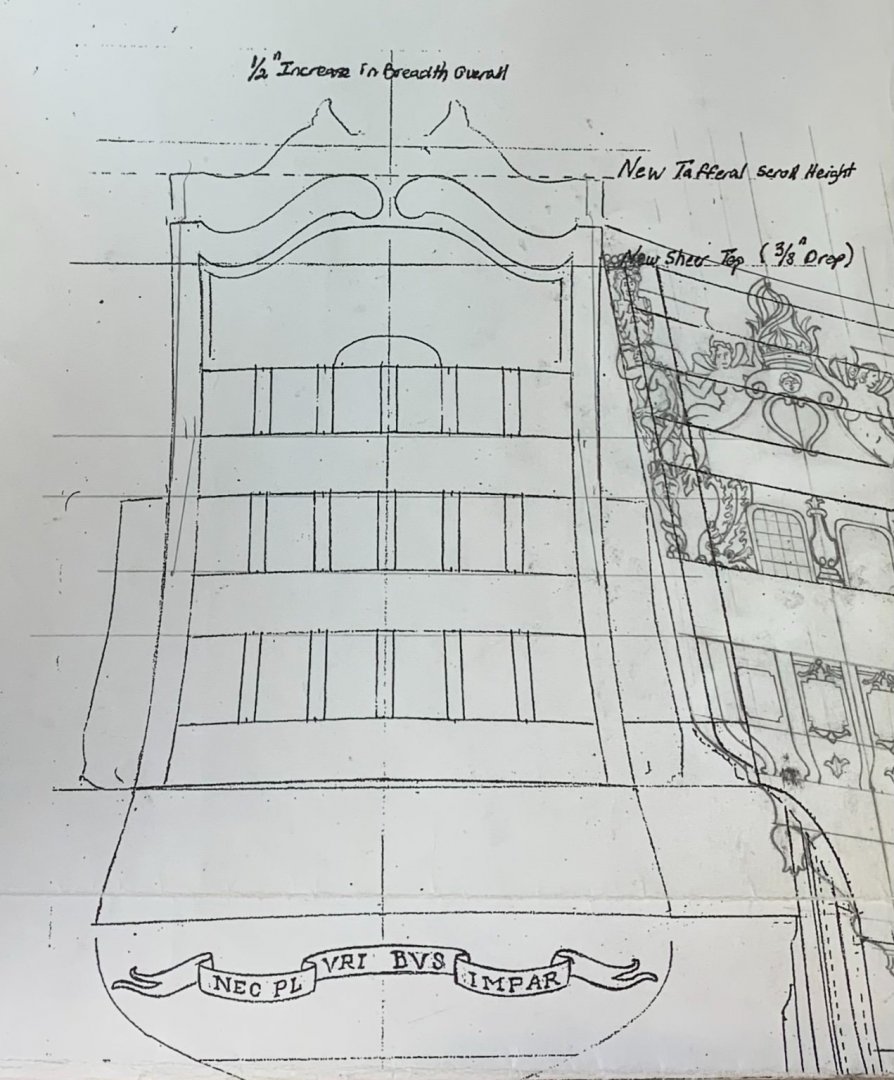
As a side note, it is funny to look back at my first attempt to draw the quarter galleries; the results were poorly scaled and relatively crude, as I was attempting to include all five false windows along the lower tier if the QG.
Anyway, at the time that I made this drawing, it was pointed out to me that the top of the bulwarks appear to flare outboard, again, at the very top. Back then, I was not too concerned about this.
At this stage, though, I can see that the finished bulwark piece does not look right at all, if I allow it to flare out at the top; the whole upper structure of the ship changes in a way that is neither pleasing, nor reflective of actual practice. The only thing to do, here, was to shape my gussets in a way that would pull these bulwarks in more, thus providing a nicely sloping tumblehome.
Frankly, this is more art than science. I simply manipulated the bulwark, inboard towards the centerline, until I had a pleasing profile. I then took a measurement from the bulwark rabbet to the centerline, along the bottom edge of this window tier: 1 1/2” to center, and 3” overall. This seemed like it would be adequate.
So, I clamped and taped the bulwark in this attitude, so that I could make card gusset templates. I then made the gussets with all necessary beveling, and added a prop leg to make them a little stiffer for the eventual glue-up of the bulwark piece:
I went to bed feeing really good about this. The part would have some minor tension, but I had increased glue surface area significantly enough to cancel out those forces. In fact, there will be a third, aft-most gusset fitted after the glue-up.
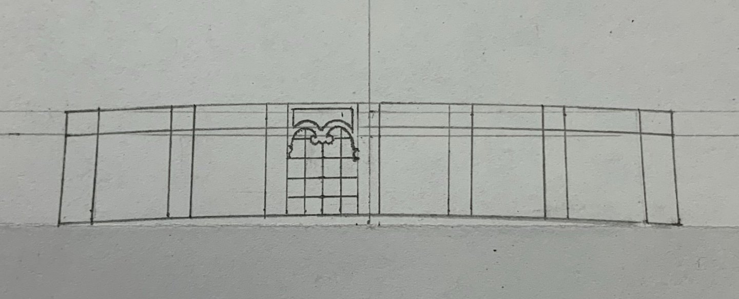
Then, I woke up the next day and remembered my original layout drawing. I took some measurements and found that I had effectively reduced the available space for this top tier of six windows by 1/4”. In fact, my new stern, at this top-most level, won’t be much broader than the stock kit stern-plate, which only has five windows. I began to feel a bit of panic creeping in.
Before glueing-in the bulwark piece, I thought it might be prudent to take some really good measurements, and do a little drafting to see what a revised window layout might look like. One quarter inch doesn’t sound like much, but it is quite significant across this short span. If I found that the reduced breadth resulted in a cramped window layout, I would be forced to buy back at least an 1/8”, in breadth, thus compromising my ideal tumblehome. This would require very fiddly firring of the gusset pieces I had just glued-in, so my fingers were crossed tight.
Here is the new layout that I arrived at this morning:
And here, I’ve detailed one pane to get a better sense of the proportions.:
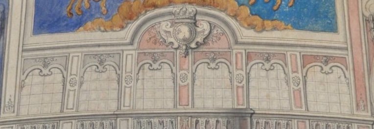
The original by Berain:
Mine isn’t the best drawing, but it’s good enough to get a sense of proportion. I’ll do a much better vellum drawing, when the time comes for it. I found that I only had to reduce each window pane by 1/32”, and each pilaster by a heavy 1/64” to get back the heavy 1/4” I had lost.
And so, I will go ahead and glue-in the upper bulwark, in the next few days. I’ve been busily filling the skid joins, touching up the bulwarks, and establishing the location of the mizzen chanels. A whole lot still has to happen in the next two weeks, but I am confident that I will be on-track for the show.
Thank you for stopping by!
- Baker, Bill Morrison, mtaylor and 10 others
-
13
-
Just venturing a guess, here: because the gap is so consistent, I am wondering whether your problem resides at the very ends - the vertical timbers; perhaps the whole assembly is just fractionally over-long. I also may not be understanding whether you have glued-in the keelson, in which case, you are really looking for in-fill advice.


Soleil Royal by Hubac's Historian - Heller - An Extensive Modification and Partial Scratch-Build
in - Kit build logs for subjects built from 1501 - 1750
Posted
I appreciate that very much, Mark and David. It’s all a bit overwhelming, but my sister and I are a team, and I think we are on the right track.