


Hubac's Historian
-
Posts
2,946 -
Joined
-
Last visited
Content Type
Profiles
Forums
Gallery
Events
Posts posted by Hubac's Historian
-
-
Thank you, John. It is the challenge of figuring out how to do something, and present a picture of the ship that is both functionally practical and beautiful. I am determined to show a coherent marriage of the Berain stern to these quarter galleries, in the hope (perhaps vain) that some may finally see that they have more in common, than not. It is a passionate argument that propels me forward in a way that is hard for me to explain.
Yes, I will incorporate a radiant burst of sun energy emanating from all around Apollo and his horses, against a deep ultra-marine ground; this will be a nod to the artistic portraiture of this particular subject that I think will be a fitting coronation to this magnificent work of art that LeBrun/Puget/Berain evolved over time.
I sympathize with you, re: Brexit. I have a hard time understanding how insular politics benefit anyone in the modern age.
- mtaylor, EJ_L and John Clements
-
 3
3
-
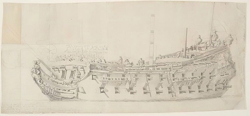
I have always thought that La Reyne was the most suitable subject for a Heller SR conversion project. The three broadside drawings of the ship, together with the survey drawing of the stern provide more than enough information to represent her with a pretty high degree of accuracy.
Cedric has chosen an interesting and extremely challenging path; he is re-locating decks, guns and wales.
Much of that effort is in anticipation of creating the particular head structure of these First Marine ships, which is quite different from that of the late 1680’s
The head will be quite difficult to construct, given the existing Heller architecture, but not impossible. The other significant decision is whether to scrap the kit upper bulwarks, and simply construct everything above the main deck from scratch.
It can be done either way, I think, but it may actually be easier to go the full-scratch route. It would be great to see where Cedric is at with all of this, but I know he is quite busy with professional and family life.
-
-
Tom - I’m glad to hear that you are recovering and that your determination, resourcefulness and resilience are vying to carry the day. Obviously - not too much too soon.
I am wishing you luck!
- FrankWouts and wyz
-
2
-
They are one and the same. The ship was launched as Le Royal Duc, and re-named La Reyne in 1671. At that time, I think it likely that the entire stern and quarter galleries might have been altered for a more sober ornamental program.
-
I understand the confusion because the presentation of the stern and quarters is so similar, among these ships, but the ship you are picturing in the post above is the 102 gun La Reyne.
So, just to be clear:
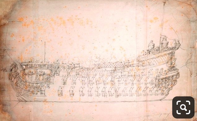
Almost certainly Le Terrible of 1670:
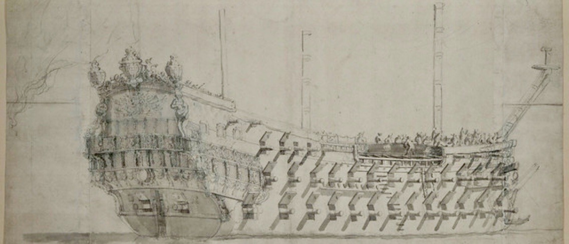
Probably also Le Terrible of 1670:
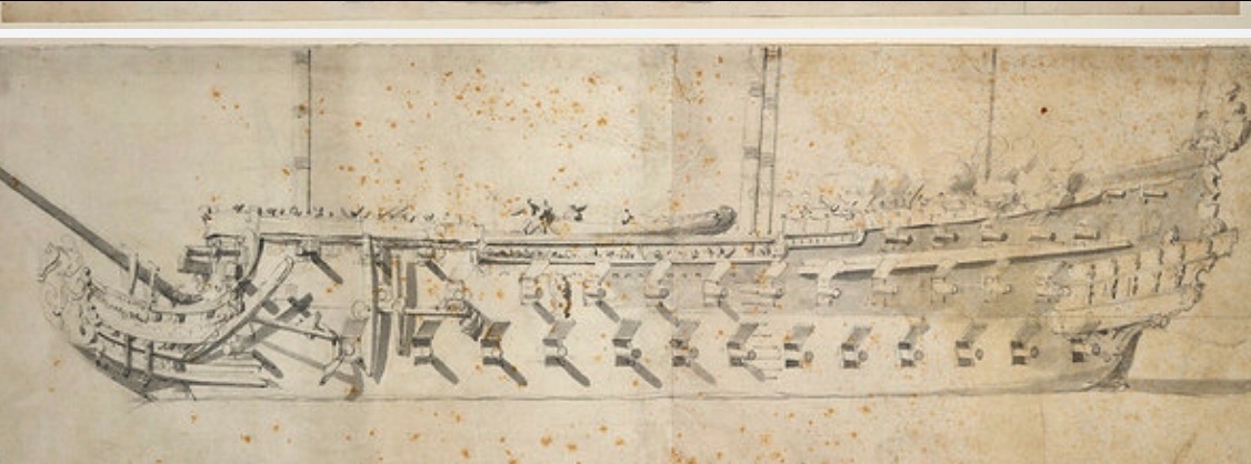
Possibly Le Terrible of 1670????:
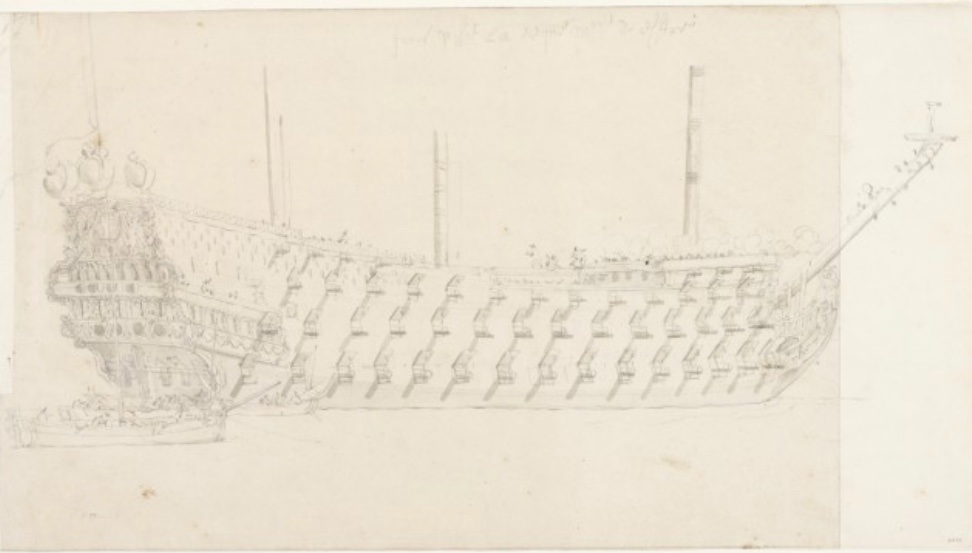
Definitely La Royal Therese:
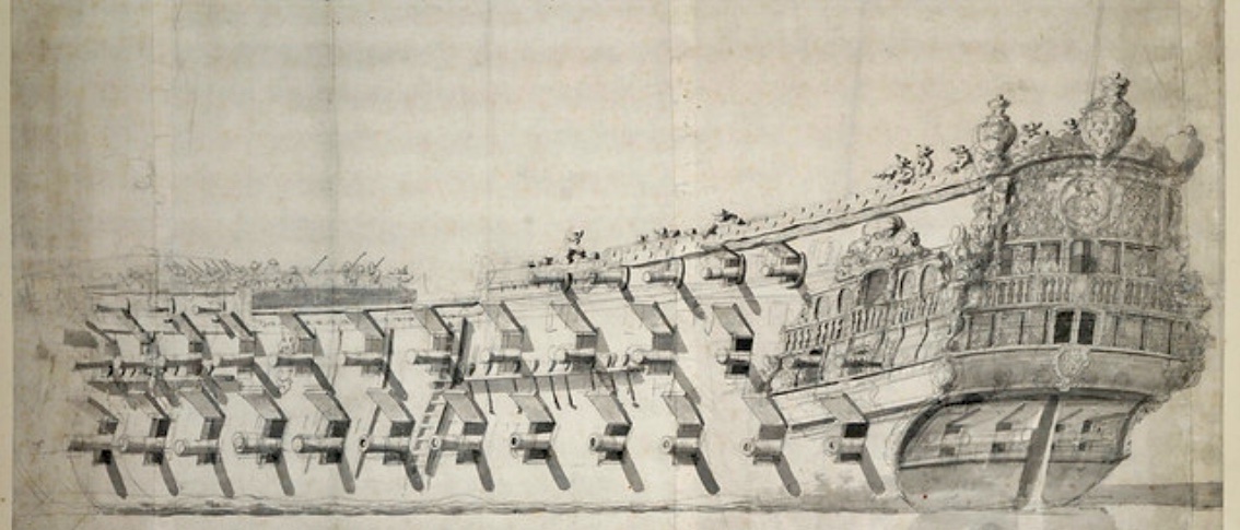

Definitely La Reyne:
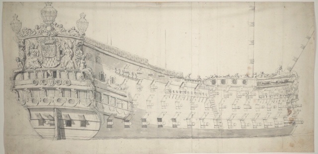
As a side note: La Reyne is the closest known corollary to Soleil Royal. Same yard, same designer, built a year apart, and only slightly shorter in length and breadth.
The sheer presence of SR would have been very similar to this vessel. Perhaps, she was a little bit taller at the stern in 1670, if she carried a poop royal deck.
- mtaylor and GrandpaPhil
-
2
-
I realize, now, that I did not answer your question, Chris.
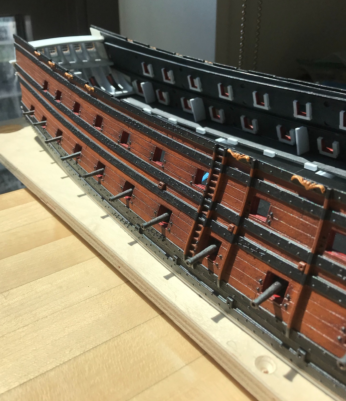
I am not fluent in metric, so I will explain my thinking in imperial measure. At 1/96, 1/8=1’. On the lower gun deck level, the exterior planking, framing and interior planking would amount to something like 14-16” thick.
When I was doing this, I used 1/8” square styrene for the lower deck ports. Strictly speaking, if the hull plastic is about a 1/16” thick (6” at scale), I ended up with 18” hull thickness, at scale. This is maybe a little heavy, but that is not so critically important at 1/96.
Then, when I did the middle deck ports, I used .100 square stock. What matters is the sense of depth and the apparent graduation, in frame thickness, from the lower deck to the middle deck.
Often, when I think about these issues of scale, I have Dan Pariser’s voice in my head: “if it looks right, it is right!”
So, an 1/8=1’, a 1/16”=6”, a 1/32”=3”, a 1/64” is completely and utterly irrelevant! Nobody is splitting hairs beyond a 1/16”.
If you want to scale interior planking, .030 would be just fine. When in doubt, go a little lighter.
As for port framing...
Sometime in the past year, I noticed on Andre Kudin’s magnificent Fleuron that the port sills were visible through the exterior planking. I had never seen this detail before, and so, it looked egregiously wrong to me. I also know, though, that Andre is not someone who would arbitrarily do something that wasn’t grounded in actual practice. Subsequently, I have come to understand that this is, indeed, an element of French practice; with the port sill extending over the top edge of the exterior planking, it creates a better gasket for keeping water out of the framing. It makes good sense!
For all practical purposes, this would be the only visible port framing convention that anyone might represent on a model. At 1/48, and maybe 1/72, it makes sense to show this on a wooden model. However, I don’t think that engraving this into textured plastic, at 1/96 makes any practical sense; it would be a significant labor, and it would be very difficult to make it look good.
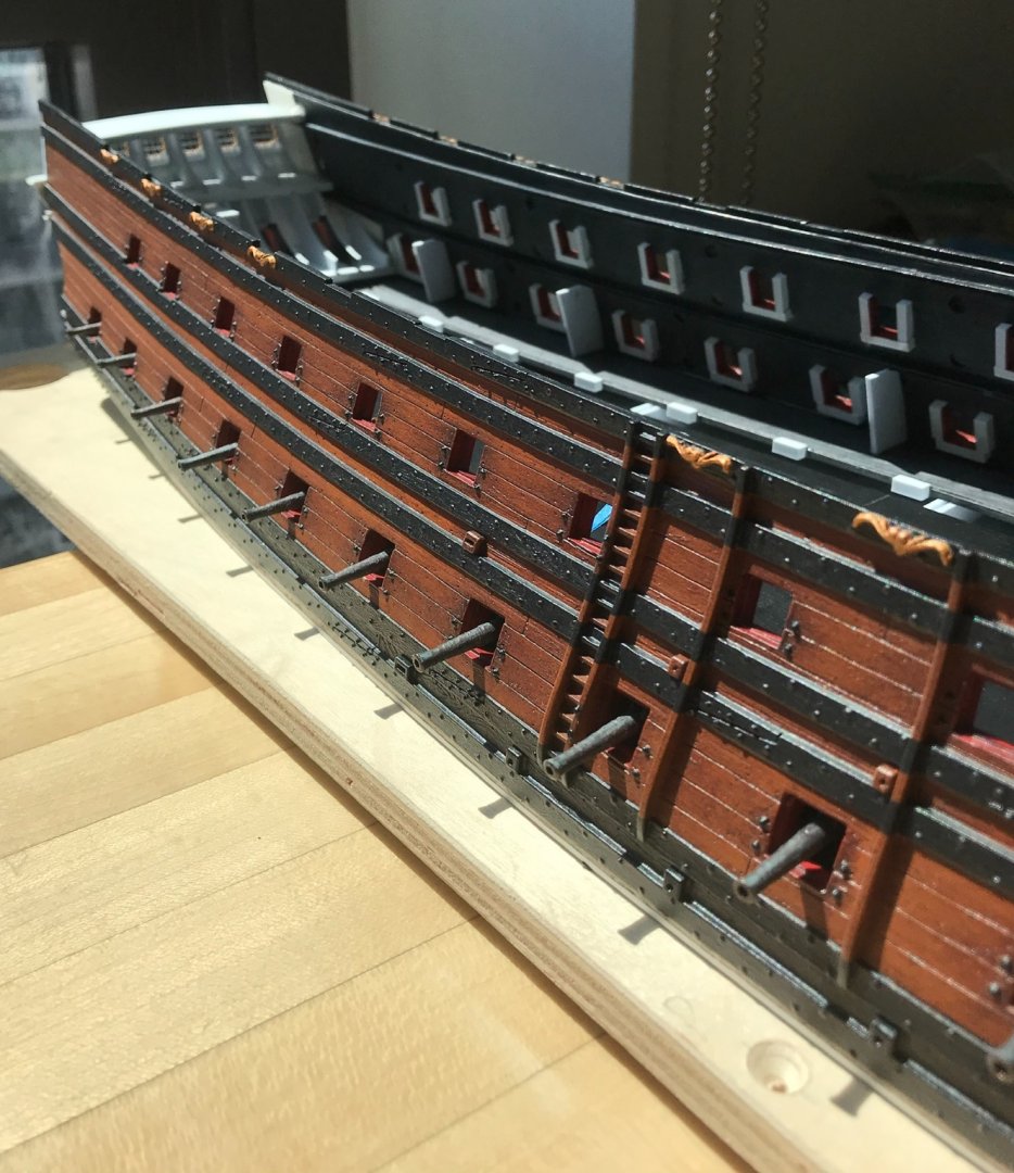
As for aligning port openings with the SP plans, this is another monumental labor. I think it is useful to keep in mind that the height between decks, on the Heller kit, is pretty exaggerated; a 7’ tall person would be quite comfortable manning the guns.
So, if you truly feel compelled to move port openings, then that will necessitate re-locating decks, and completely relocating the run of the wales; you will, invariably run into problems where the pre-existing kit architecture is not amenable to this kind of reverse-engineering; so, for example, your port alignment and broadside deck heights may look right, but the stern chase ports have been re-located too far up the transom and your hawse hole entries are now on the middle deck level.
Maybe not exactly these problems, but something significant like that, for sure. If you choose to accept it, the beauty of the Heller kit architecture is that it is consistently wrong, in this regard, across all of the decks, and the spacing between the ports is sufficient that this doesn’t look so wrong, in isolation. It is only when you place the Heller kit right next to something credible, like the SP monograph, that these exaggerations jump out at you.
Consider, also, that legions of serious model people adore the Tanneron model, as they should. Yet, many of those same are quick to point out the flaws in the Heller kit, which are real. They are not making it up. However, very few of those critics acknowledge how closely the Heller kit mirrors the Tanneron model, structurally. It is a very close copy. In my opinion, Heller did an admirable, if seriously flawed, job of reconciling all of the fragmentary primary sources for SR and filling in the blanks. The Heller Victory is still the gold standard for an accurate plastic sailing ship model, but the Heller SR is not such a poor consolation prize.
SIDE NOTE: If anyone has an unbuilt Heller Victory laying around (mine is in PA, at the moment), it would be interesting to measure the distance from moulded decking ledge top to the underside of the next moulded decking ledge. There are approximately 70 years between these two first-rates, and it seems reasonable that the height between decks - even among separate nations - would not have changed much, if at all. Because the Heller Victory is based on something concretely measurable, it would be interesting to note the difference.
So, I guess what I am trying to say is that struggling so hard to try and make the Heller kit conform to reality will ultimately be a frustrating experience. I think you will have more fun with this, if you embrace certain realities of the existing kit architecture.
If you have simply increased hull depth, through the ports, you have done more than enough to improve the scale realism of the model, IMO.
- EJ_L, mtaylor and Heinrich der Seefahrer
-
2
-
 1
1
-
that sounds like an organized way of working through the port lids.
-
-
Hello, Chris!
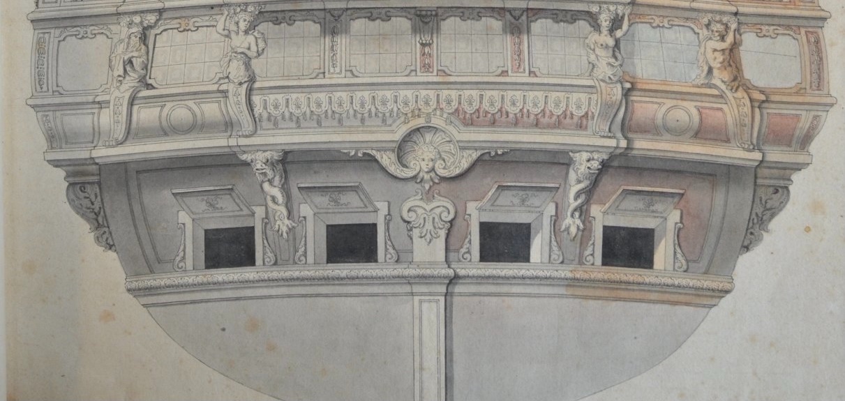
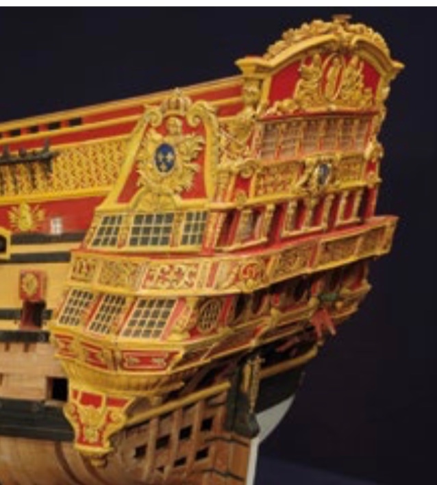
As Berain originally drew the QG, the five windows of the lower tier appear to be a kind of artifact of the First Marine design conventions.
Following the early freedom and exuberance of Puget’s early work on the Monarque, the Paris, the Scepter, and other early ships, Colbert and the crown decide that they must reign all of this in, so as not to literally embarrass themselves on the world stage. Louis and Colbert are particularly concerned with how the new French fleet will be perceived by the English.
By the time, the Van de Veldes are making the following portraits in English waters, in 1672, many of these ships had been cut down, their ornament reduced and their names changed.
The Paris becomes the Royal Therese:
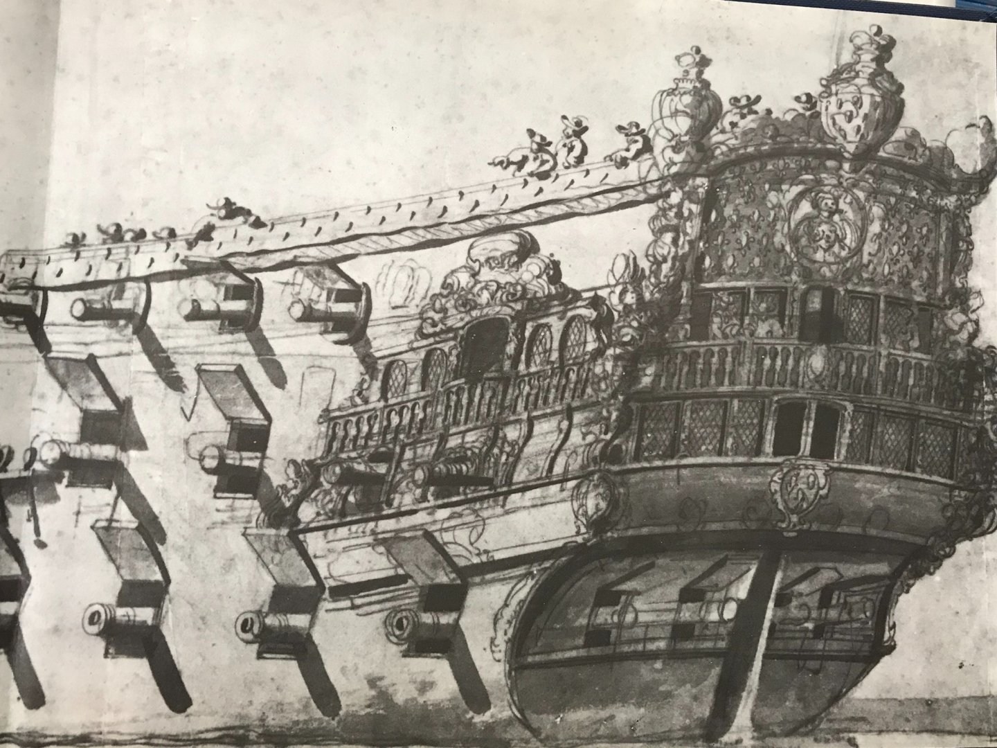
Le Royal Duc becomes La Reyne:

Who knows what Le Royal Duc looked like in 1668, but by 1672 La Reyne is a fairly sober looking vessel that is mainly notable for her impressive size and armament.
Here, the lower quarter of a large second rate:
By 1672, the open walkable quarters, on this lower tier of the QGs are now closed in. Gone, are the massive split-tail tritons supporting the open walk, above. By 1672, most French ships display this multiplicity of “windows” on the lower level. Their number varies from ship to ship, but it hardly matters from an architectural standpoint, because it is all a facade.
On the other hand, as French design approaches the dawn of the second marine, there is a shift toward a more orderly and balanced presentation of the QGs. This is what we see, manifest in the QGs of the St. Philippe of 1693, for example.
That Berain, apparently, chose to draw this earlier structure, in 1688/89, muddles their credibility for this later time period. This is but one example of why scholars of the period do not believe that these QGs belong to this period.
It is hard not to sympathize with that point of view, however, I see too much corollary - even where others do not - with the stern ornamentation to conclude that these quarters are anything but the rightful companion to Berain’s stern.
That being said, the original drawing - even if it is a facade - is cluttered and problematic. I chose to de-clutter and reinforce harmonies with the stern ornament.
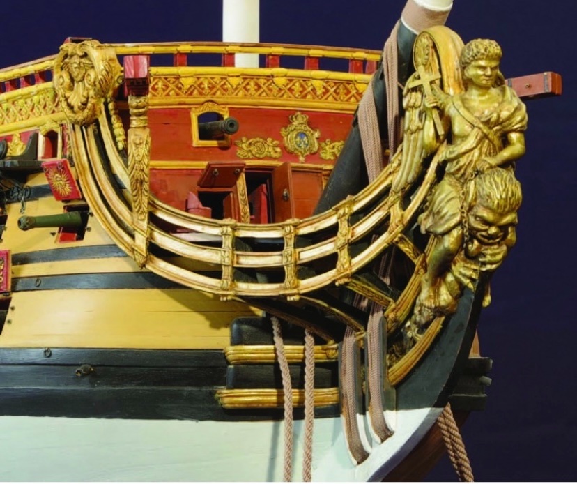
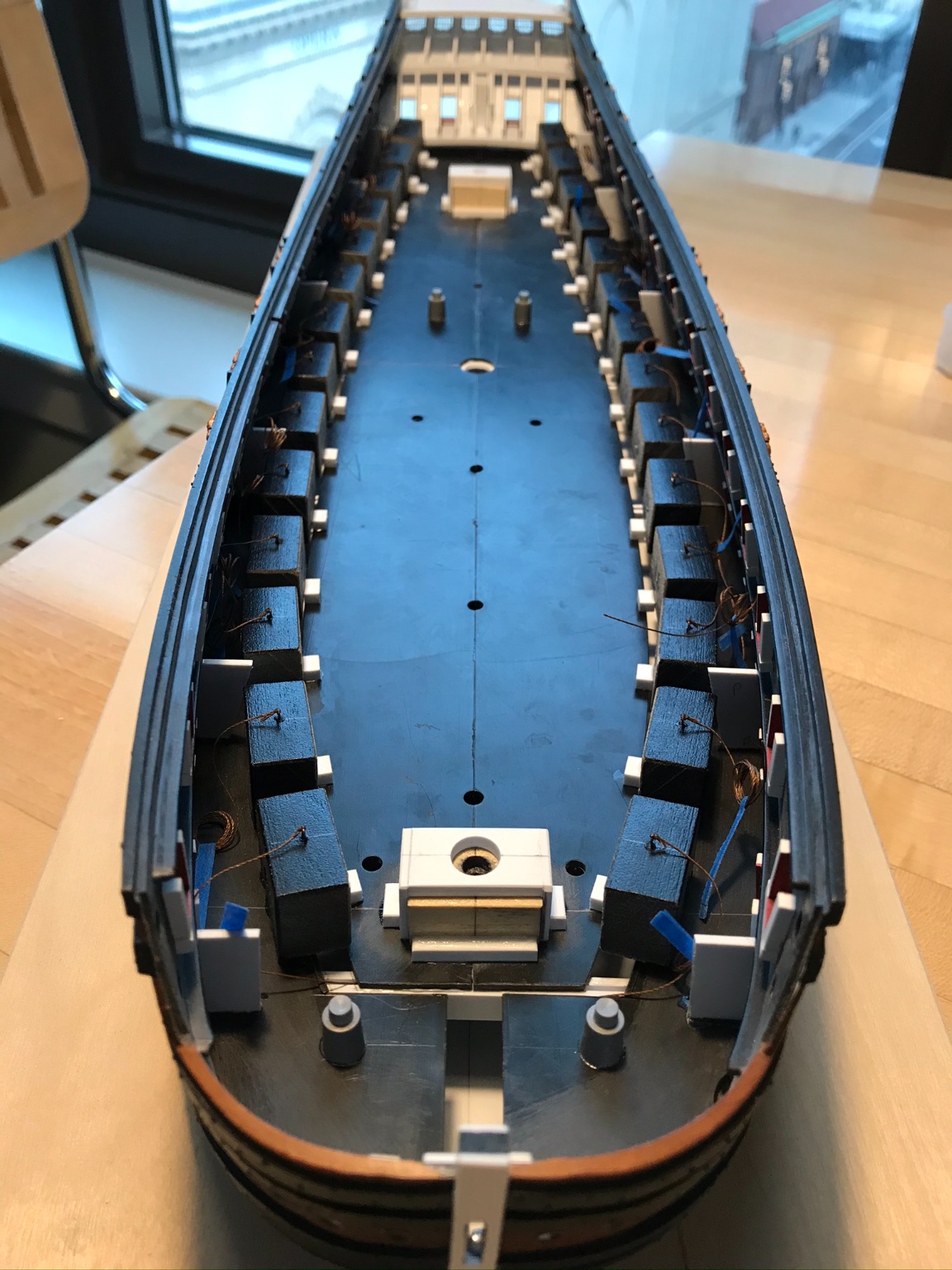
As for the guns, I designed this build to make it easy to install the guns after the model is complete.
On the lower decks, I have installed dummy carriages that are pre-drilled and positioned to point the guns in the desired attitude:

I found with my Airfix Vasa that I was constantly breaking off the gun barrels as the build progressed, which really annoyed me.
Unfortunately, I will have no choice but to mount the upper deck(s) guns, as the build progresses, but there will be less to break away.
For the same reason, I won’t put the port lids on until the end of the build.
The model will be displayed with all guns out, and ready for action. My nod to historic reality will be that there are no bow or stern chase guns mounted.
- GrandpaPhil, shipmodel, rybakov and 3 others
-
6
-
-
-
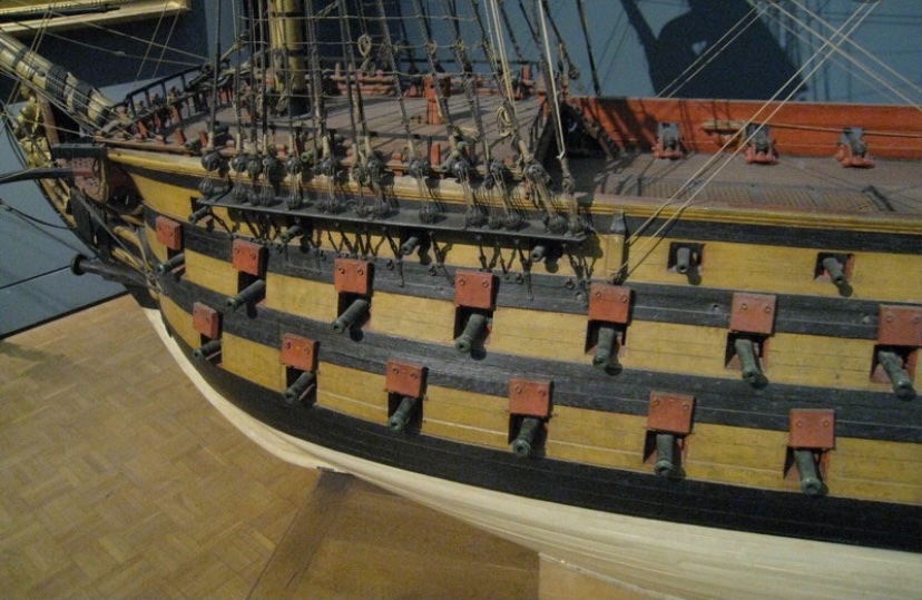
WOW, Michael - that was absolutely worth the visit! Your 1765 Victory is a remarkable achievement!
Everything from the quarters to the figurehead to the masting and rigging is just extremely well done. I love your natural wood tones. This is just an excellent example of how much more dynamic and interesting the hobby becomes, when you incorporate some scratch-work into the build.
I am curious to know what material you used for your sails, and what technique you employed for such realistic furls. Please feel free to post within this log.
This was your first foray into that kind of build, and it came out so well because you took your time. I think, sometimes builders become intimidated by the scratch work, but there are a handful of easy to acquire skills, like scribing for example, that make anything possible.
I heartily encourage everyone here to check out Michael’s Victory (see the links at the bottom of the prior page), and don’t miss out on his Heller Reale:
Of course, there is immense talent, technique and skill involved, but mostly - this kind of work is the product of patience and time. Thanks for sharing, Michael!
- EricWilliamMarshall, kirill4 and EJ_L
-
3
-
Thanks, Michael! I am likewise enjoying your Reale; your paint effects and build-quality are outstanding. I am in the intensive phase of it, right now. Total commitment is the truth!
Did you do a build log for that 1765 Victory? I have that kit in my stash and had the same idea - that it would not be crazy difficult to convert her to this earlier appearance. If no build log, can you PM me some pics, please? I would love to see that.
-
As for forecastle deck integrity on the Quinze model, there would be full scantling beams, fore and aft of the capstan drum. I would also think there would be at least a boxing between those beams, and more likely a solid blocking, in order to provide a secure mount for the drum axle.
- Old Collingwood and EJ_L
-
2
-
I just did a search and found picture of the 1758 model of the RL, at the Musee de la Marine:
Stove pipes don’t appear to be addressed here, either, but forecastle-mounted capstans do appear to be a practice that continued into the 18th Century.
- zappto, GrandpaPhil, Elijah and 2 others
-
5
-
Hello, EJ! Your stern carvings look wonderful; your carving skills are improving with every piece.
Like you, I am also grappling with this question of a forecastle deck-mounted capstan. The time period is earlier, but the Louis Quinze model shows the capstan pawls on the deck, even though the drum is absent:
On the other hand, there is no apparent accommodation for the galley stove pipes, nor the galley stoves. The main deck gratings continue under the forecastle deck, and the heavy stove would not be built over gratings:
photos courtesy of Marc Yeu
So, I’m not sure what to make of all of that. At the moment, I favor the notion of a capstan on the forecastle deck, as there’d be more free space to operate the capstan bars between the foremast and the galley stove pipes. The stoves, themselves, take up considerable space. I haven’t scaled any of this out yet, so it remains an open question for me.
A part of me wants to include it as a visible detail simply because a capstan would be a fun thing to make.
-
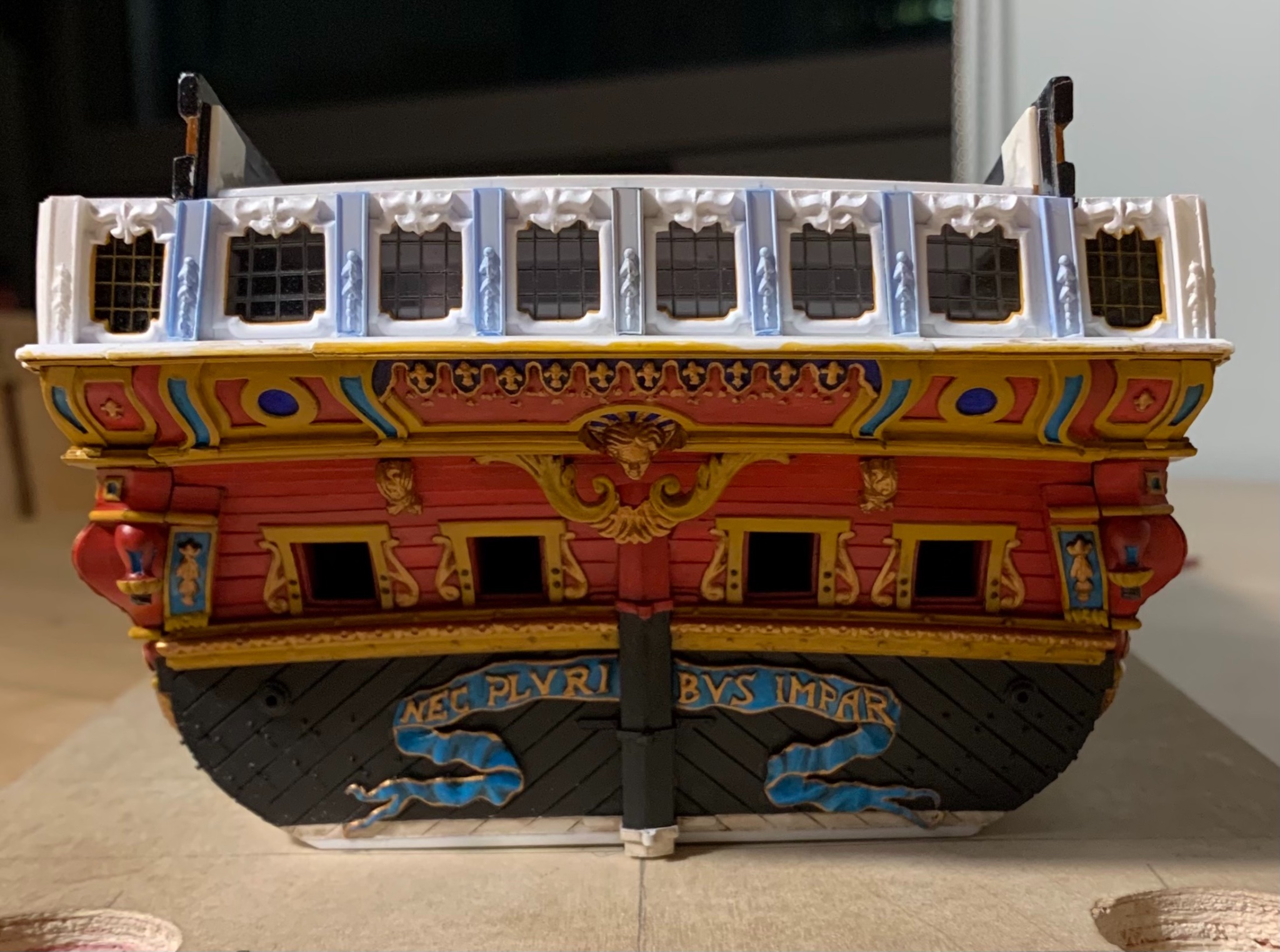
Indeed, Chris, the Tanneron tafferal appears much more rounded than Heller’s version. I like your idea to add an additional layer for the two forward-most horses. That will probably create the illusion of depth that I am after.
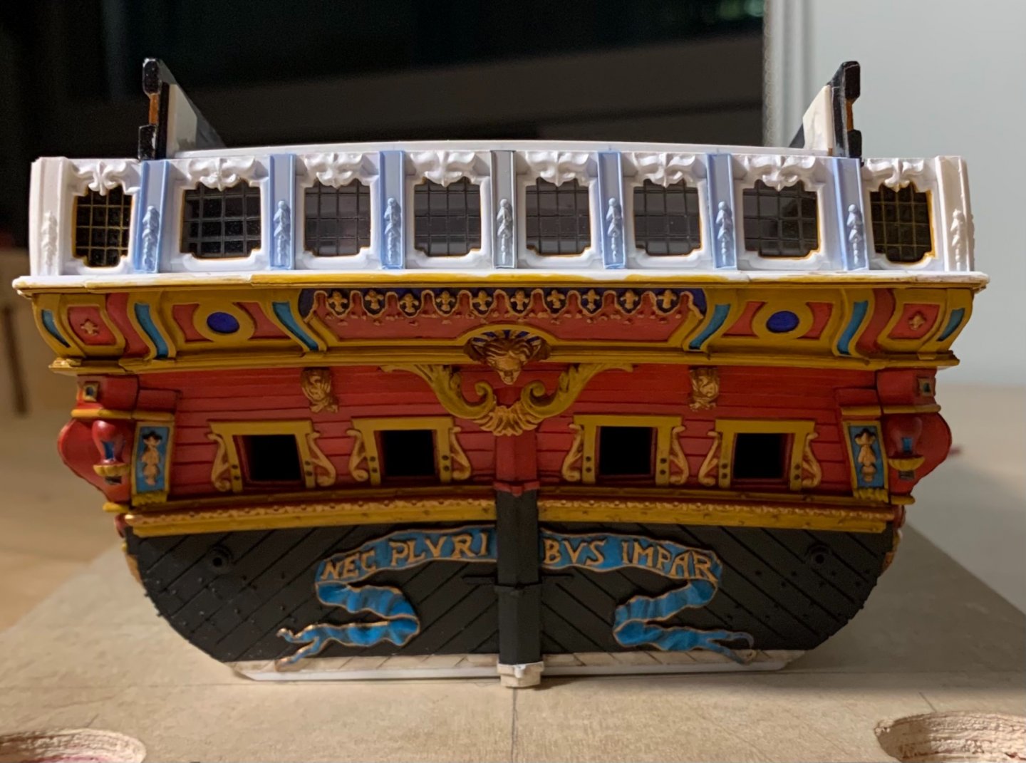
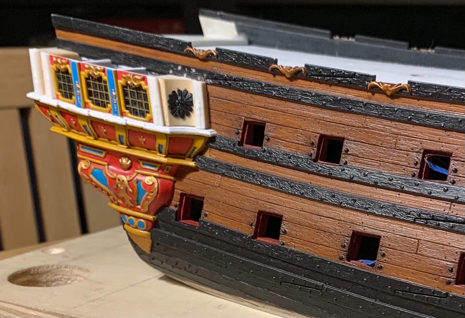
It was a good week, tying up loose ends on the starboard side QG.
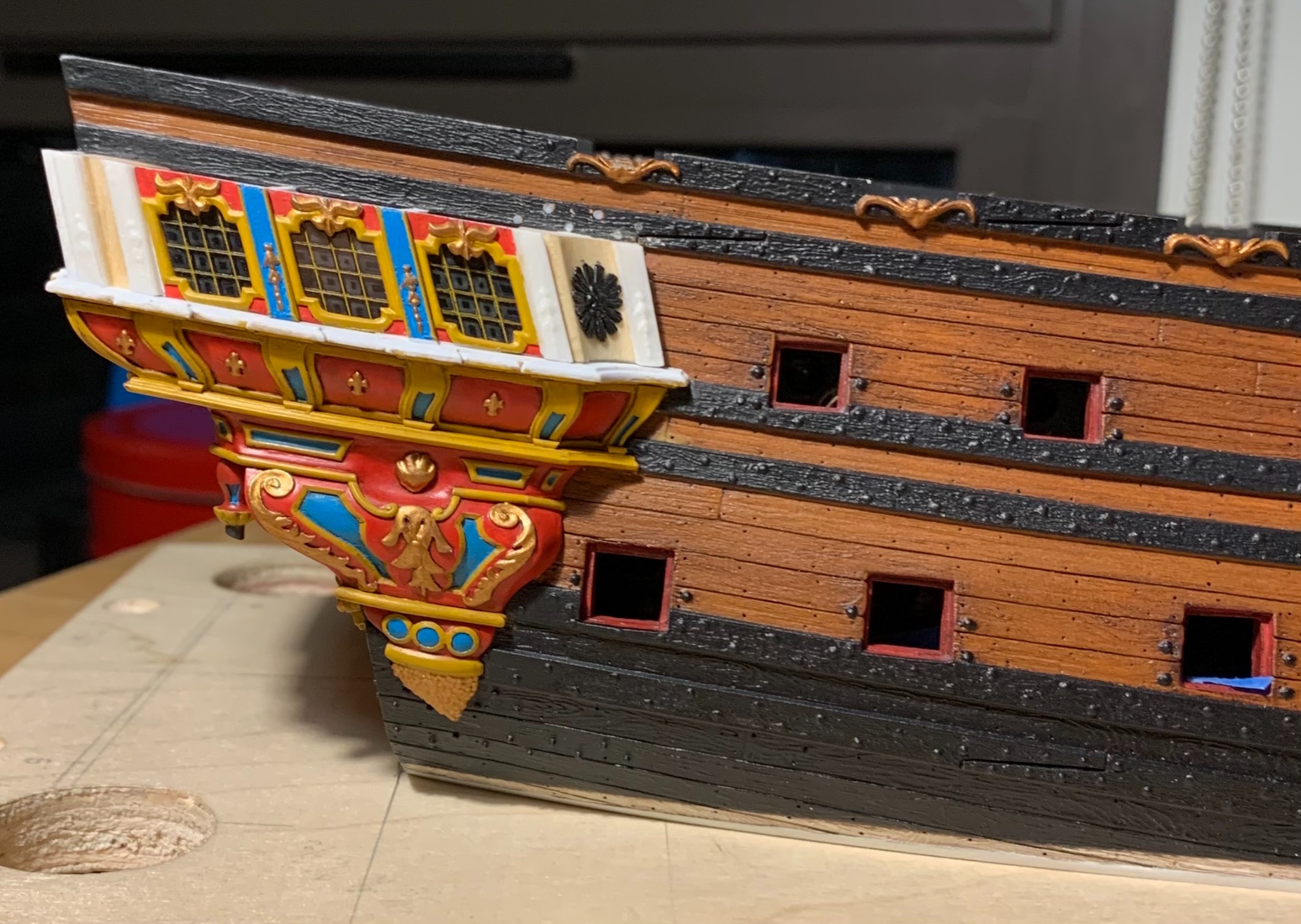
The windows are tacked in place with a little cyano before gluing-in the window plate. As I did for the stern lights, I took a little extra care to back the window panes with stops; in the event that the cyano fails, at some point in the future, at least the stops will keep the windows in place, mechanically. Empty eye-sockets are daunting repairs.
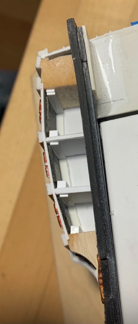
This overhead shot gives a sense for the multiplicity of rebates that were cut into the aft blocks - particularly, clearance had to be cut for the aft window pane, itself, effectively making a window stop of the block.
One can also get a sense for the asymmetry of the transom, which I described in earlier posts; this reality has made coping the whole thing together more challenging, but the variance is not apparent from the outside. It is fortunate that the wrapping stern balcony happens at this level, rather than above, where this variance will increase, somewhat.
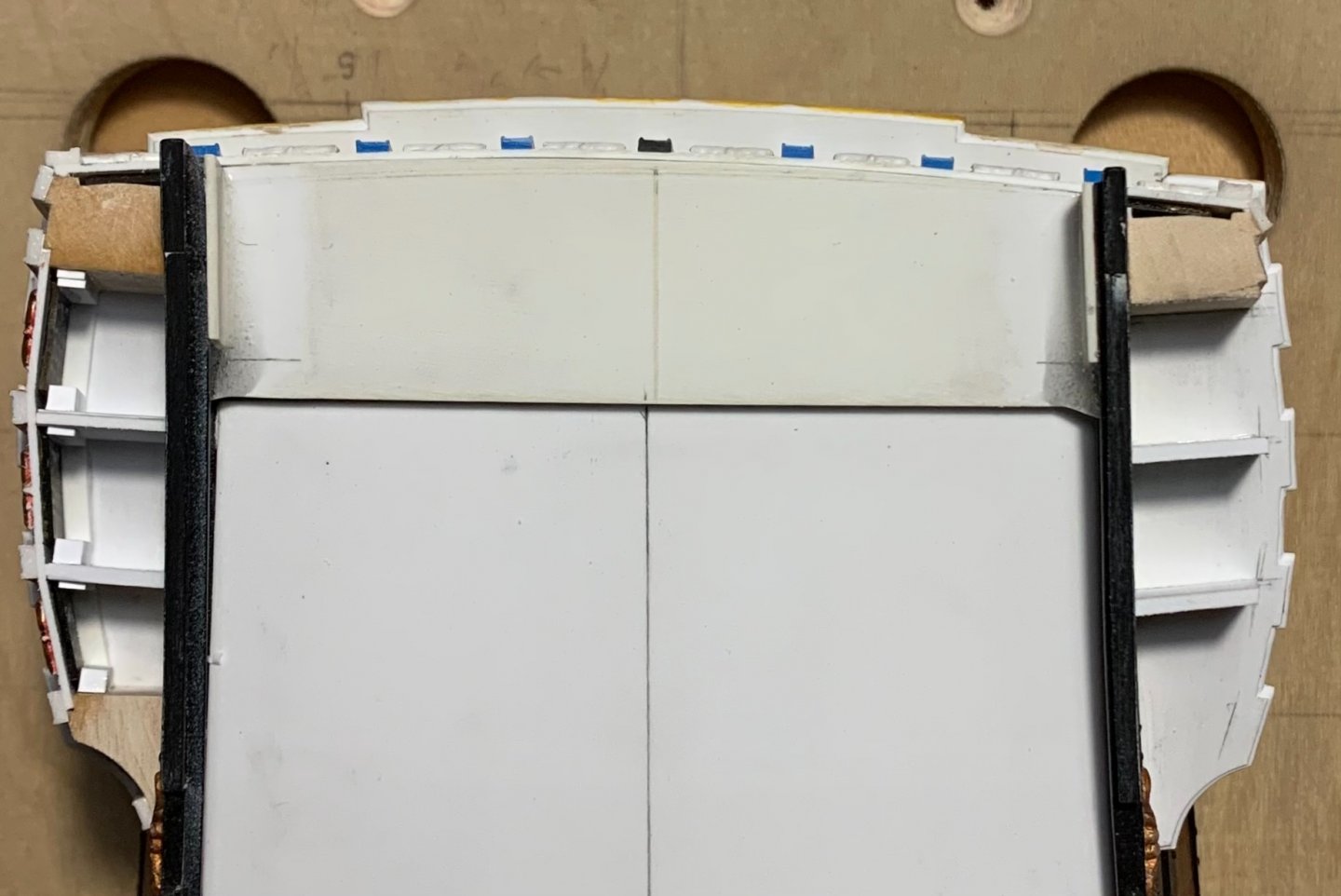
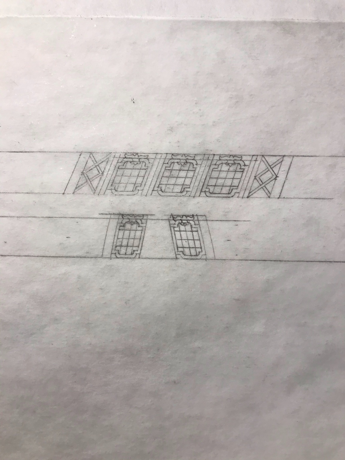
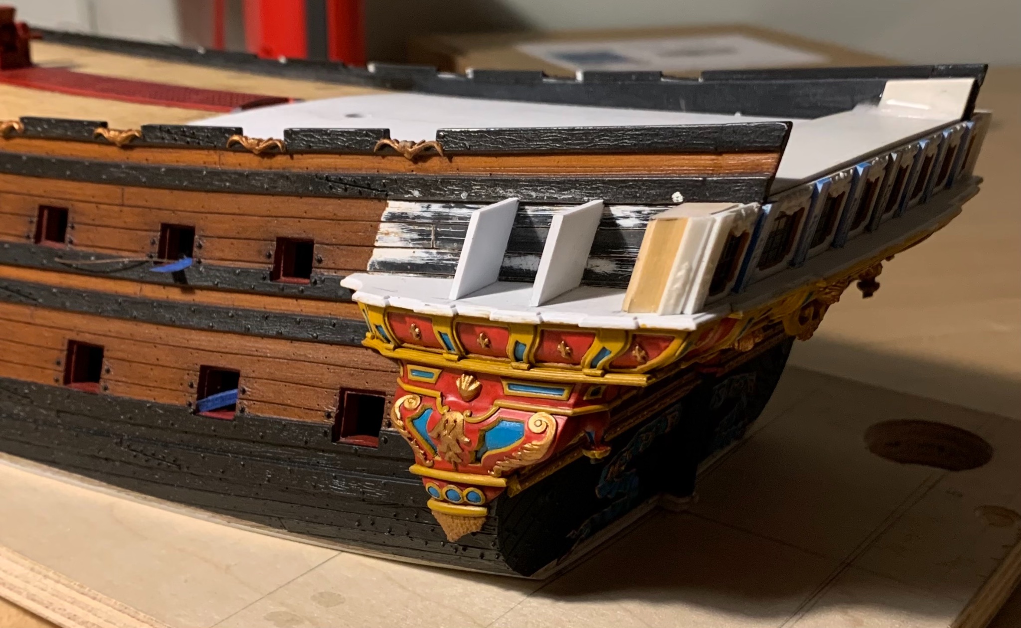
Having learned my lesson, I pre-painted the window plate, off the model. The reality of what ends up being constructed is sometimes at odds with the one-dimensional plan I drew. Initially, I thought I would book-end the three windows with these diamond-hatch motifs:
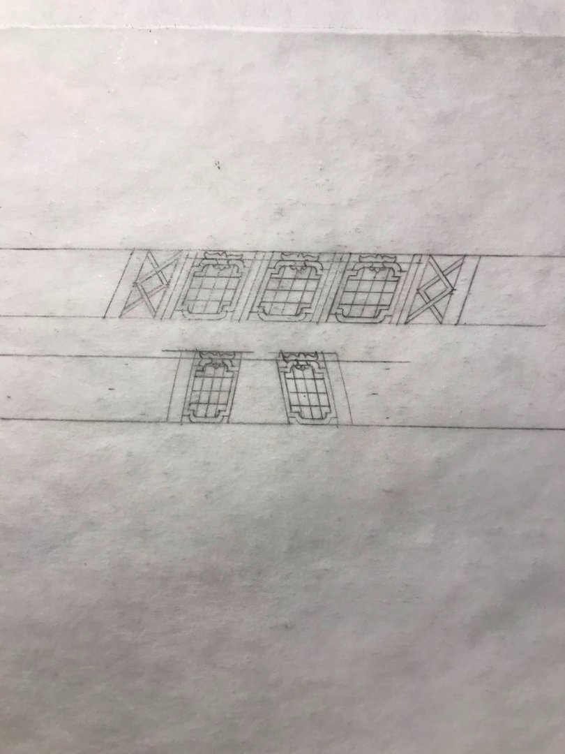
It looks well on paper, but in reality - the coved forward block feels too expansive for this to look good, while the space between pilasters, on the aft block, turned out to be much more narrow than I expected:

I’ll mock up the aft diamond-hatch in card, just to be sure, but I think it will look too cramped. For the forward block, I decided to extract the radiant fleurs from the upper finishing of the stock QG plate:

I had to make these a little more oval, than round, to fit the available space. When I paint these, I will pick out the rays in gold, silver and white, which I think will create the right impression, while mirroring a similar treatment to the backdrop of Apollo’s horse-drawn chariot on the tafferal.
Having worked out all of the problems on the starboard side, the port side is moving along much more quickly:

Soon, I’ll be coping together the base walkways of the wrapping balcony, which will then enable me to pattern and make all the pieces of the balcony railings. At this level, these are very involved and will be time-consuming to make well.
So far, so good - a reasonable facsimile, up to this point:
Thank you all for the likes, and your gracious comments!
-
Wow - well, that is impressive indeed! How do you brush the varnish onto these complicated shapes - without bleeding onto the carving ground - and still have enough open time to apply the leaf? In other words, how much open time do you have before the varnish won’t still be tacky enough to hold the leaf?
Or, do you simply blanket the part in leaf and then go back and carefully - ever so carefully - paint the ground?
-
You are doing a fabulous job, Michael. Is that real gold leaf, or a really good facsimile?
-
The 1:10 museum model at Vasa Museet remained unpainted for many years. Eventually, micro-analysis of paint remaining in the ship’s timbers revealed her true colors. You can not hope for a more historically accurate guide to painting the Vasa than the museum model, itself.
Fortunately, the AIRFIX kit is among the most finely detailed of all plastic sailing ship kits - at least, with regard to the sculpture work.
Although Rex chose to do her topsides in blue, he is a true professional who achieved remarkable results with detailing this kit:
This is an indication of what is possible with some research and extra effort.
I wish you luck on your build, and look forward to watching it unfold.
-
Congratulations on a job well done!
- Bill Morrison, Baker and Jeff T
-
3
-
Well, Chris, I think this all sounds like a reasonable plan. The colors that Lemineur arrived at seem to change, a bit, depending upon the conditions the model was photographed in. Here, the colors seem a little too bright:
Yet, here, the red seems to take on just slightly more of the orangey cast of the dry pigment you have pictured above:
Neither representation is displeasing, or fails to represent the period, IMO.
It is unclear to me whether you plan to purchase raw pigment powders and bind them in linseed oil. I will advise against doing that on a plastic model. Without driers, the oil will remain tacky for an inordinate time, and in any case - you are sure to obscure whatever fine detail you want to represent. This is also the reason that I don’t like enamel paints for wooden ship models. They are too heavy bodied.
For plastic ship models, acrylics are the way to go - even if you find you must mix several colors to arrive at the shade you want. I like Testors Model Master for my red, random tan, black and white. I can modulate these colors with my wash coats, and their ease of application can’t be beat. Vallejo acrylics are also excellent and come in a broad spectrum of colors. Lastly, I like Citadel for their metallics and ver-de-gris, and other wash coats.
I think, with these French Baroque warships there can be a tendency to become overwhelmed by the sheer volume of details that exist for consideration.
I encourage you to NOT try and figure out every last thing, right at the start. This was advice given to me by Herbert Thomesan, of Artitec renown. You have a solid foundational plan. You have made a good start of it. Just keep going. So many of these questions and considerations become clearer as you build.
In the end, our models are an amalgamation of detail that - considered as a whole - strikes an impression of mostly correctness, or some lesser variation. If you consider the two models that were constructed for the SP monograph, Jose Tusset’s fully-rigged version is vastly superior in the overall standard of execution. Nevertheless, the impression cast by the admiralty version (pictured above) is highly representative of the period.
Don’t sweat it too much. If you break it down into manageable chunks, and take your time, the results will be very good. Trust your sub-conscious to incubate the nitty gritty, while your hands are busy with the broad strokes. This has been my guiding philosophy with woodworking, and it applies equally well to ship modeling.
-
If you look at Lemineur’s overhead plan view of the QG, in fact, you can see that he has pierced the ship side - just forward of the entry to the QG - with a gun port.
It seems that stowage of the gun would not present any issue in peace times because it would not be present. In war times, though, if the navy were willing to subject all of their beautiful ornament to cannon shot, I don’t think they would worry too much about the truck wheels scuffing the parquet.
- EJ_L, mtaylor and Heinrich der Seefahrer
-
2
-
1


MONTAÑES by Amalio
in - Build logs for subjects built 1751 - 1800
Posted
This is an interesting presentation of sistered pairs of spindles. I really like the uniqueness of the design, and I may find a way to incorporate this into my ship’s quarter deck companionway.