Kevin-the-lubber
-
Posts
1,233 -
Joined
-
Last visited
Content Type
Profiles
Forums
Gallery
Events
Everything posted by Kevin-the-lubber
-
 Thanks Ian, that makes absolute sense now. And presumably those coming along the lower yard (which appear to be chains) go down to blocks, which are in turn connected to the spider band, which in turn is tied off to the fife rail? I think I may have had my first of many rigging related light bulb moments 🤪
- 444 replies
-
- 3
-

-
- Cutty Sark
- Revell
- (and 2 more)
-
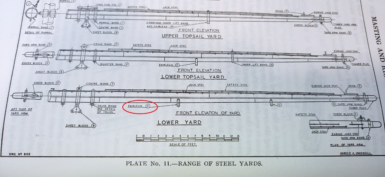
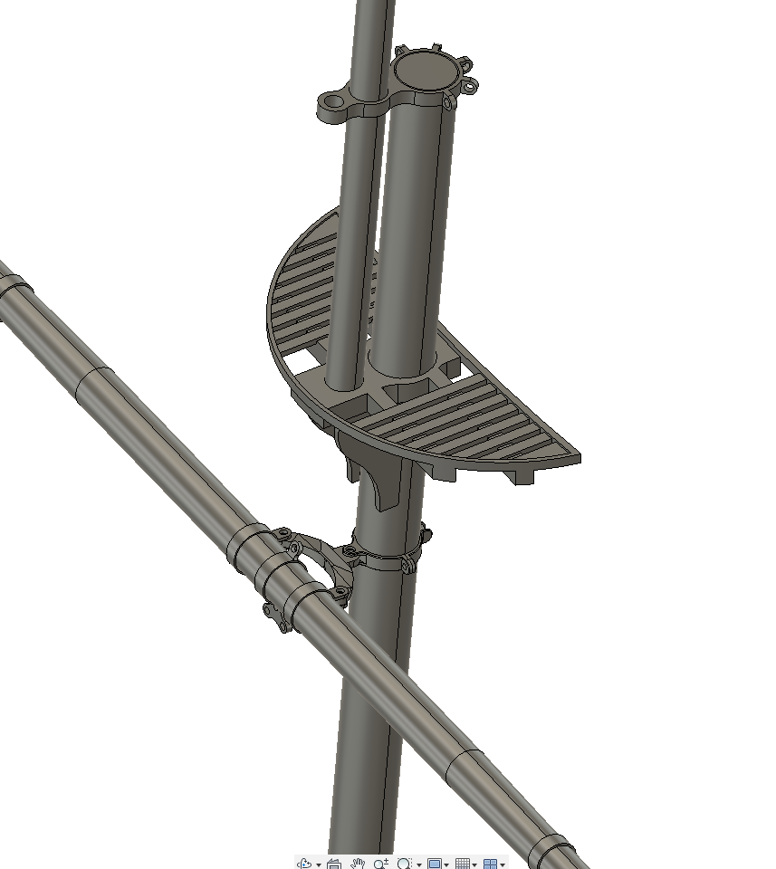
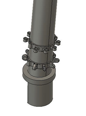
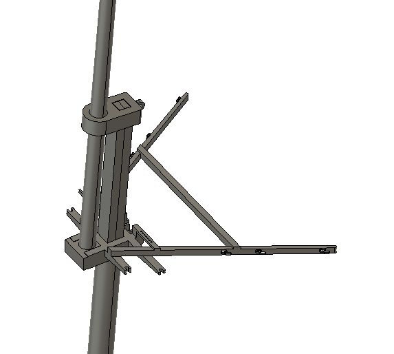
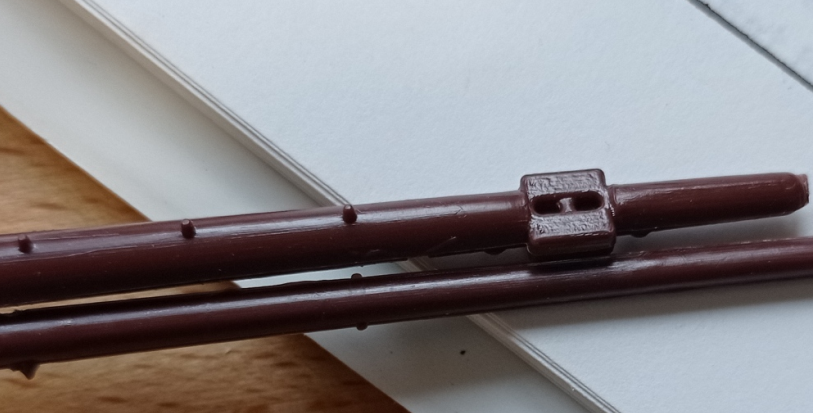
Super slow progress at the moment - I'm still developing the foremast and yards, trying to make sense of the various texts I have on these, which I'm finding difficult as I have no previous experience of sailing, masts, yards or any of the other gubbins that are part of the array. The trouble with multiple sources is they each provide slightly different accounts of a typical mast and spars, and I have no base knowledge to help sort this out. But I suppose this is no different to the experts on here who scratch build based on pure research. I'm mainly basing my models on Underhill's 'Masting & Rigging The Clipper Ship & Ocean Carrier' as this is very detailed, but adapting them where need be to make them practical at a 1/100 scale. Anyway, I'm getting there bit by bit and am fairly close to doing a first print. I suspect I'll go through quite a few iterations until I get to the finished article; there will be the usual fiddling around to find the best way to print the parts - this will be more challenging as they are long, thin objects - but I'll no doubt also discover down the line, that such and such a fitting is needed but currently omitted, etc. Why bother, you may ask, when I have kit parts; well, partly 'why not', partly because I think I will learn the rigging much better this way, partly because the kit parts are a bit wonky and generally not that great and partly for the challenge. A few people, myself including, have thought resin printing is not really suitable for masts and yards, so I thought I'd give it a go and see what happens. Which brings me to a couple of questions, if anyone would be kind enough to chip in; 1) What are these square blobs on the lower yards meant to represent? Cheek blocks? 2) What are these Fairleads for? Bruma, if you're reading, I've been studying your yards and, more particularly, your sails again this week. I'm going to try the 'half-hauled-up' look using modelspan, which I've ordered today, as ordinary tissue just tore when wet, but if I can't get what I'm aiming for, I think I may copy yours and try fully rigged.

-
Thanks for looking in Bill, I always seem to have a lot going on these days so my progress is painfully slow. Some weeks it can be one tiny element completed, but that’s life! This is in part because I need to avoid letting modelling take up all my free time - it’s very easy to become over-engrossed in these projects. Yes, it would be great to be doing this all together somewhere. I wonder if we’d be faster or slower?
- 444 replies
-
- 1
-
-
- Cutty Sark
- Revell
- (and 2 more)
-
Clever stuff! Not just the coding, but the manufacturing.
- 536 replies
-
- 1
-
-
- Quadrireme
- radio
- (and 1 more)
-
Alan, I really wouldn’t have believed this is mostly printed on a filament printer if I hadn’t seen it grow through the log. I’m mighty impressed with e end result and my interest in buying an e-kit, rather than doing all the 3D work myself, is piqued. So I’ll be very interested to see what you make next.
- 460 replies
-
- 3
-
-
- Finished
- Flower-class
- (and 1 more)
-
Just in passing. I'm doing some painting and decorating this weekend, so had a rummage through the shed this morning to see what paint I have that needs using up; kind of makes you wonder why you bother, doesn't it. I bet it can even be airbrushed if you thin it enough🙄.
- 444 replies
-
- 4
-
-
- Cutty Sark
- Revell
- (and 2 more)
-
Bob, I know exactly where you're coming from. I stopped enjoying my work on the Victory last year and parked it. I still haven't regained the motivation so it can stay parked until I do, or possibly forever. Good luck with what you do next, post a link, I'm sure I'm not alone in sometimes thinking it's be nice to build a car, a train or (in my case) a bike. Heck, it'd be nice just to not be fighting the thing most days!
- 481 replies
-
- 1
-
-
- Cutty Sark
- Revell
- (and 2 more)
-
Fantastic achievement Bill, just fantastic. And not just finishing the model and to such a high standard, but between you and others, Ian in particular, maintaining a build log that I'm sure is going to be one of the key resources for many that follow, me included.
-
Another follower here Bill, sorry I'm late, I got caught up on some chaps' finale on Victory 🙂. Wow, this kit looks far better than I was expecting, I wrongly had the impression that the mouldings were quite poor now, but they look at least as good, if not better than, Victory's. Didn't Daniel show how he made chains for Victory? Anyway, eagerly watching to see how it goes.
- 1,508 replies
-
- 2
-
-
- Le Soleil Royal
- Heller
- (and 1 more)
-
That sounds unpleasant and probably a bit scary. I loathe cities, there always seems to be a fizz of danger about them and even though we are only 40 minutes from London I only go there maybe once a year. Anyway, good to see you getting back into the groove, I always enjoy looking at what you're up to. I'm no historian but, for what it's worth, until I read the narrative I assumed the drawings were of french ships since that's what they look like. Case proven, methinks. Otherwise, you're probably right, I should hang onto my machines. And my telescopes, despite the lousy eyesight for astronomy and no longer liking being awake at 3am on a freezing night. Maybe I'll get cataracts, have them done and suddenly see a whole new Saturn or Jupiter 🙂.
- 2,699 replies
-
- 7
-
-

-
- heller
- soleil royal
- (and 9 more)
-
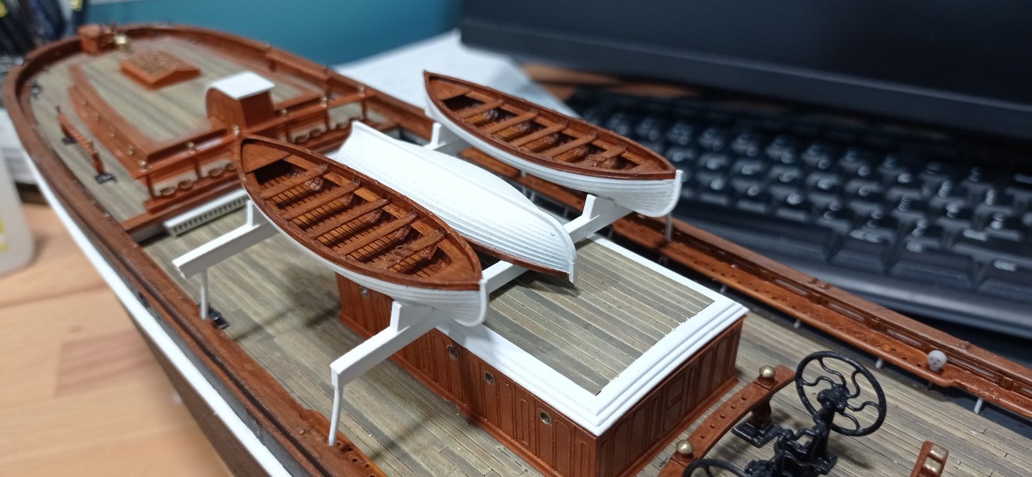
The boats are finished now, along with new skids to accommodate the jolly boat being in the middle. I'm still fiddling with skids on the fore cabin roof as the kit parts are all wrong for a gig. In other news, I've been working on the foremast and spars, coupled with the deadeyes as these are all part of a piece, over the last month while waiting for boats to print, paint to dry, summer to return etc. It's another good exercise; I'm already beginning to learn the names of rigging parts and understand how some things relate to others. It may be a while until I'm ready to post on that though and I'm reconciled to this project running well into next year. I still have no idea how I'm going to make sails though!

- 444 replies
-
- 5
-
-
- Cutty Sark
- Revell
- (and 2 more)
-
Credit where it's due, I think those were the hands of the original builders as all I've done is copy from the plans, with some important help from your good self. But it's surprising how chubby and crude the kit part looks against the 'plans' version, isn't it. This is the pick of the litter for me though, the gig, which has the most beautiful lines. I may make this one a little side project and do it separately at about 1/30 or 1/40. It would make a very nice windowsill ornament with all the trimmings. I'm hoping to find time to pop up to Greenwich next week for another photo session and this would be on the 'to-do' list.
-
And..... breathe top = kit; bottom = mine left = kit; right = mine
-
Jesus Boat ... Rhino
Kevin-the-lubber replied to tabycz's topic in CAD and 3D Modelling/Drafting Plans with Software
I think we're using quite similar methods, tailored to our respective CAD packages. As mentioned, I also corrected the two ends manually. I didn't find this too time-consuming in F360, I think it was mostly a case of projecting the guide rails onto a flat sketch, then correcting the two ends, plotting their positions on the end profiles, then remaking the guide rails to incorporate the ends. This is what I did at the ends, compared to the centre profiles: I used exactly the same overlapping approach as for the centres, but without the clinker offset. I didn't shape the frames to the strakes, the strakes just sit on the frames. I don't know if this is how it is in real life? At this scale (1:100) you wouldnt be able to see the notching anyway.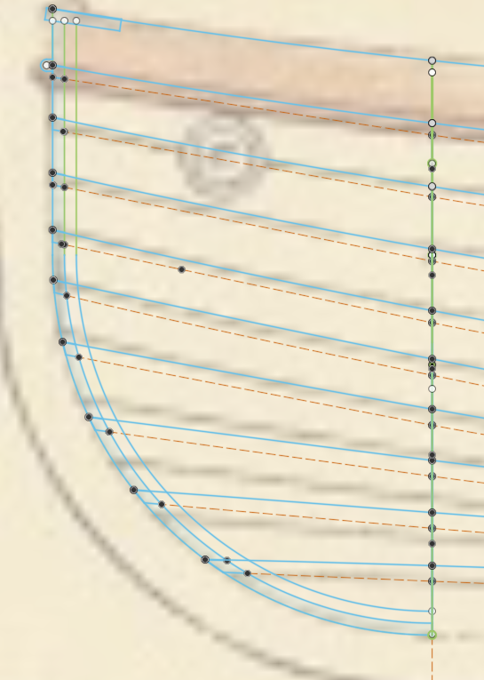
-
Jesus Boat ... Rhino
Kevin-the-lubber replied to tabycz's topic in CAD and 3D Modelling/Drafting Plans with Software
ps. sorry, I meant to ask - what's wrong with your planks, they look pretty good from here? In fact your model looks way better than mine, you've already sorted out the tricky sections at the ends. Whatever you're doing, I'd carry on with that. -
Jesus Boat ... Rhino
Kevin-the-lubber replied to tabycz's topic in CAD and 3D Modelling/Drafting Plans with Software
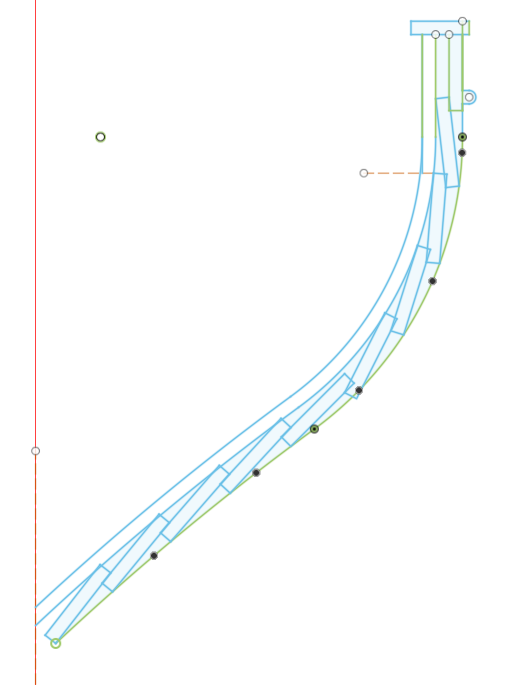
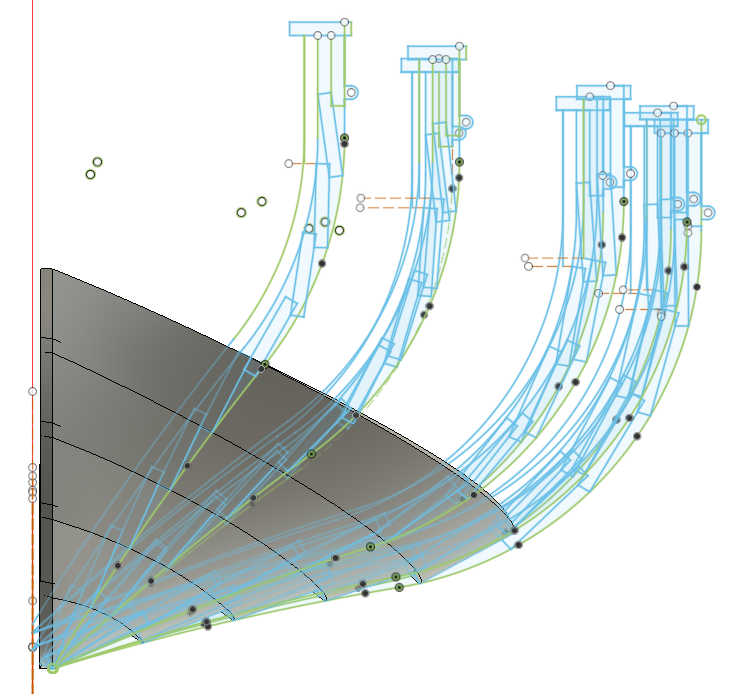
I fudged it in the end. I really wanted something that was mathematically driven - I'm sure you know what I mean - but I couldn't figure out a methodology for the end profiles. I basically did what you see below; I got a smooth skin by lofting a whole-mould-based set of profiles (the green lines here) which I used to fair the shape. In faact I had very little fairing to do as (I think) whole-moulding generates smooth curves. I then drew strake profiles in a clinker pattern, evenly spaced in the station profile, and lofting rails for each strake, otherwise it all goes a bit mis-shapen; and lofted each strake individually. I had to abandon the maths at either end as the end profiles are perpendicular and don't lend themselves to mathematical segmentation, so I projected the rail lines and extended them to get the placings for the strakes and tweaked by eye until they looked right. (It gets more and more like real shipbuilding as you go along!). I tried to make a single clinkered station profile i.e. to loft all 10 strakes simultaneously, but got nowhere, I think this geometry was way too complex for F360's engine. Last but not least, and I'm guessing you've done something similar, I did another shell (one of the inner smooth lines on each profile), thickened, then split it (intersected actually, in F360 speak) to get the frames.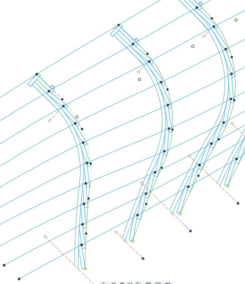
-
Jesus Boat ... Rhino
Kevin-the-lubber replied to tabycz's topic in CAD and 3D Modelling/Drafting Plans with Software
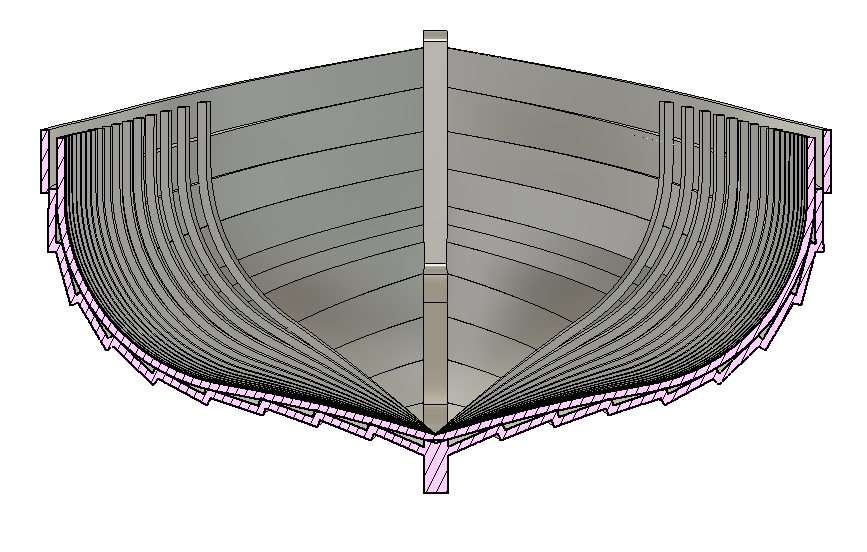
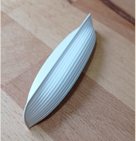
Tabycz, are you interested in talking geeky methodology? I know this can be very boring for some 🙂. I've just finished modelling a clinker built boat in F360 and had to jump through hoops to loft the planks, would be interesting to compare notes as I doubt my way was the best. Waldemar, that's the lifeboat you helped me with, couple of quick snaps below, whole moulding was perfect. I'm in the middle of painting them so the seats are not yet glued in but (IMO) these little boats look gorgeous once they're all painted up. I'll do a proper log entry when it's finished but I've posted photos of the gig and jolly boat on my cutty sark log.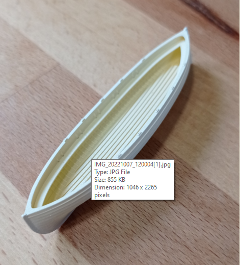
-
Very well done Bill, you’ve got that done far more quickly than I expected. Everyone talks of it taking years! Boats…. they’re my current preoccupation too.
-
Bill, I just did a good catch up on your build, it’s looking fabulous with all that rigging. You must be quite close to finishing now?
-
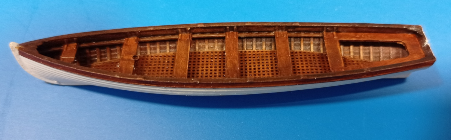
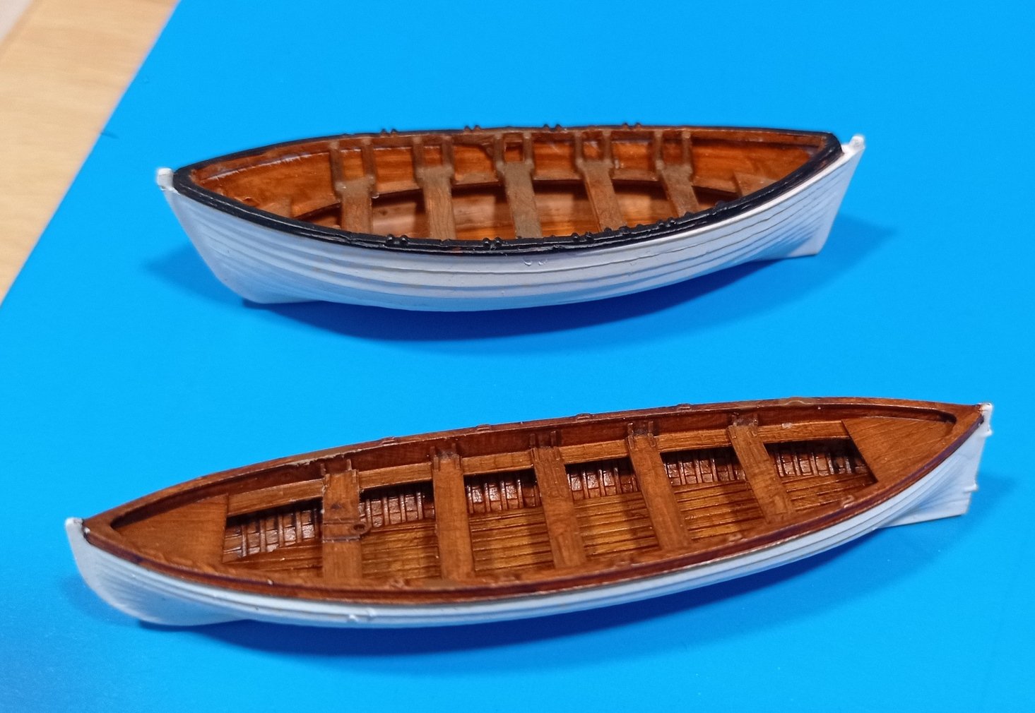
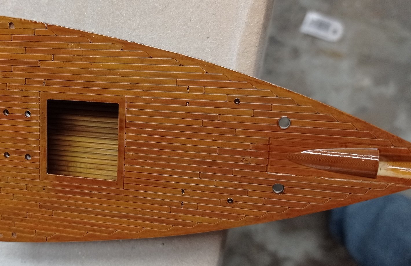
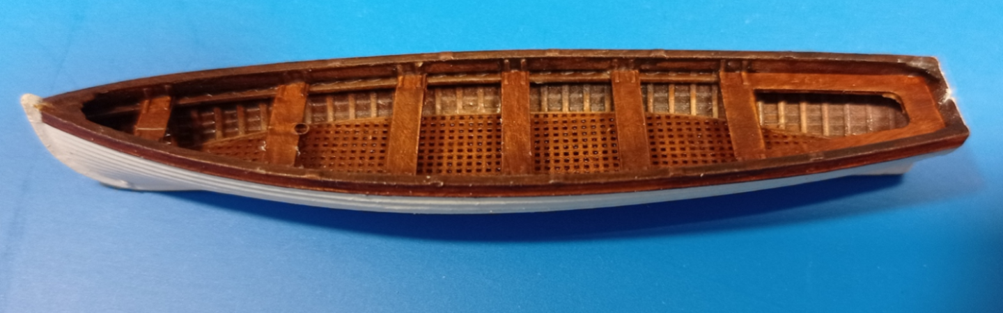
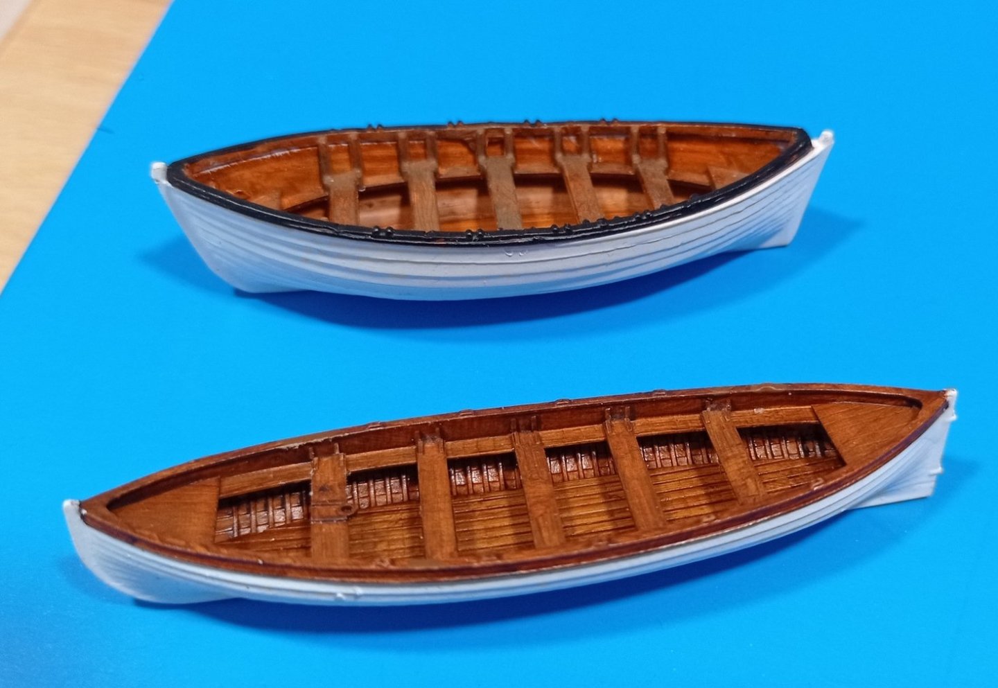
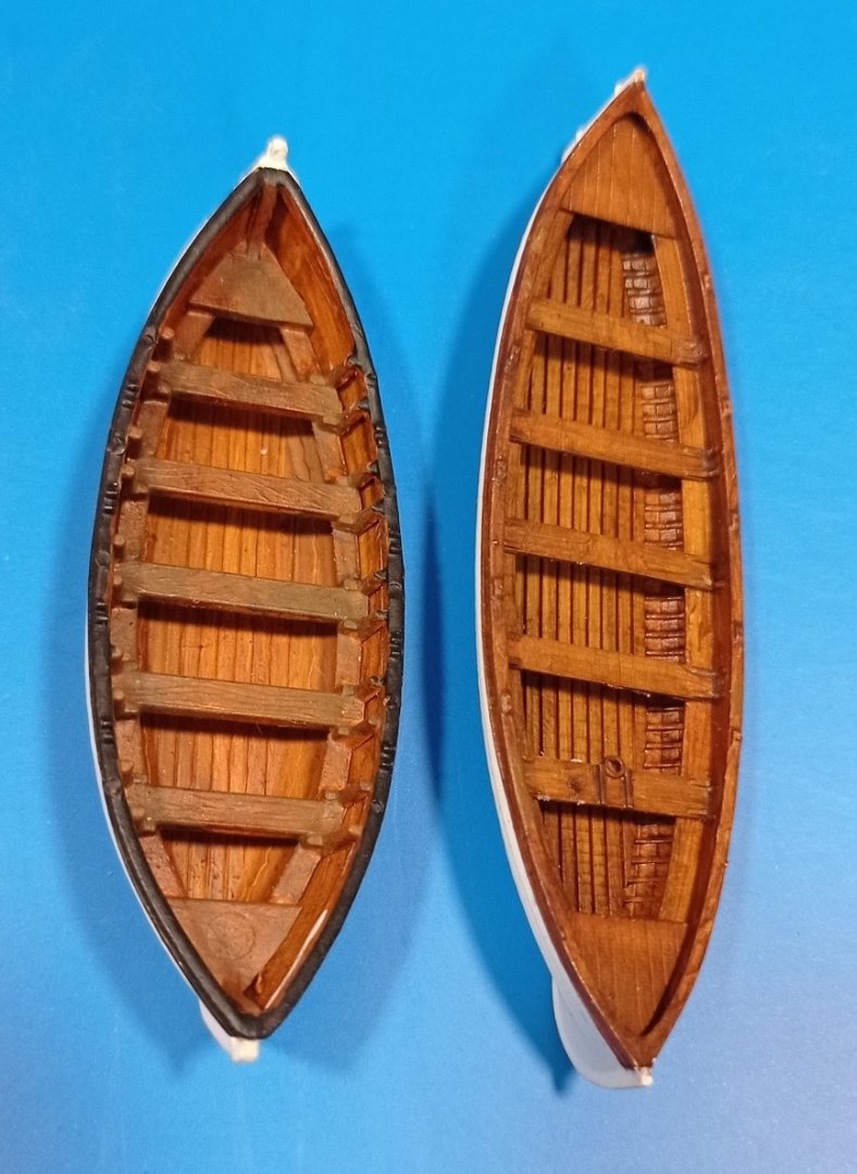
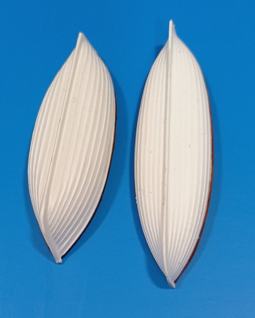
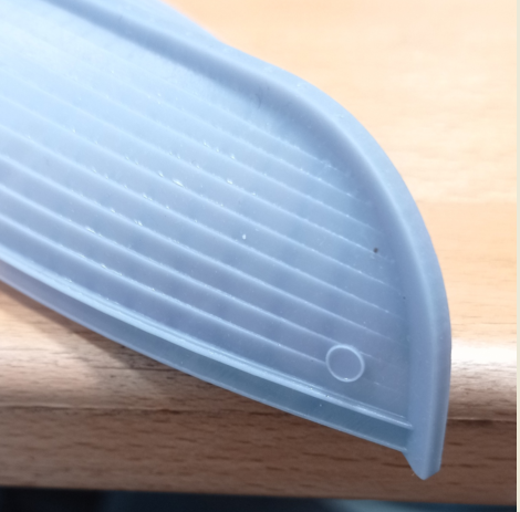
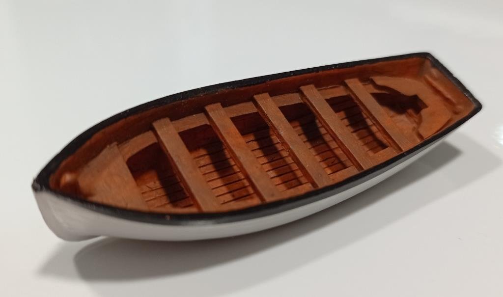
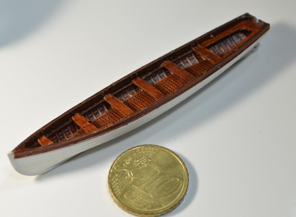
I've spent far more time on these boats than I should, but it's been interesting and enjoyable. I'm still working on the lifeboat but here are the jolly and gig (which is omitted from the kit). For info, I had to fiddle with the thicknesses of several areas including the hull because scaling down to 1/96 resulted in paper thin parts, but I think the end result is a pretty fair representation. Revell's jolly boat. Not too bad, a bit crude and clunky though. The real jolly boat The model. The paintwork is much darker in the flesh, similar to the real thing; I over-exposed the photo just to show the detail a little more clearly. I omitted the little circular badges on the prow, too small for painting. The sleek gig; if I was a sailor this is what I'd want to drive 🙂
.JPG.9128d76ceba41171f251e947b3b717e8.JPG)
.JPG.1f93289ba42231ab85cfac77f8e61272.JPG)
.JPG.959535d02b16a2e83a00dda6904e8b1e.JPG)
- 444 replies
-
- 8
-

-

-
-
- Cutty Sark
- Revell
- (and 2 more)
-
Ian, I tried using handheld scanning with a phone to map Hellers victory quarter galleries last year, but for reasons I forget I gave up on it. I think I was only able to get the rough shape but I’d need something better for the level of detail I was seeking. I imagine a proper 3D scanning setup might be better, but that’s way too expensive for this hobbyist. Modelling the boats has been an education in this respect. I was gifted a full size, finished 3D model of the jolly boat, but making that fit for my purposes meant recreating it entirely in Fusion 360. Essentially, I could only use it ‘as is’ or as an excellent reference. I think photogrammetry may be similar, for modelling: an approximation, but you’ll have to do so much post-scan work that you may as well do it by measurement, if that’s possible. But I’m all ears if anyone has had more success with it.
- 444 replies
-
- 1
-
-
- Cutty Sark
- Revell
- (and 2 more)
-
Thanks Bob, I saw your Robert E Lee on your CS log, looks lovely and that’s fast work! I’ll have to take a look at the build log. I hope you’re making a good recovery - spinal surgery is serious stuff. I’m having an ankle fused in two or three months time, and even that makes me nervous. On the bright side I should have some recovery time to spend on models! I’m just finishing off the replacement boats and will post some photos soon. It’s been a lot of work, most of which won’t even be seen since they’ll be upside down, but I wanted to understand how to model these in the software and to have ‘stock’ clinker built boats that I can recycle on other models. I’ve started modelling the masts and yards so I’ll be behind you on rigging as modelling anything from scratch always takes a lot of time. In fact I’ve started modelling the hull, which would mean nothing on the ship would be revell, but as that will be a project in itself I’ll do that as a separate build down the line, possibly at about 1/75 or even 1/50.
- 444 replies
-
- 2
-
-
- Cutty Sark
- Revell
- (and 2 more)
-
Redoing Oseberg
Kevin-the-lubber replied to KrisWood's topic in CAD and 3D Modelling/Drafting Plans with Software
My view is this: whatever looks most right and gets you closest to what you want with the least amount of work. In other words, the line of least resistance. I don't know about you but I find fairing on a computer to be much more difficult than if I was doing it to a piece of timber. No options here to run your hand along it with your eyes closed, feel the little bumps. -
Redoing Oseberg
Kevin-the-lubber replied to KrisWood's topic in CAD and 3D Modelling/Drafting Plans with Software
I don’t know if this will be at all helpful as I sense you really do want a true scarf joint; but me, I would fake it, and engrave the lines into the wood. (Actually, since I 3D print everything, I would just design them in). I don’t know how rhino works but in f360, if I wanted a true scarf, I would loft one part from top to bottom using guide rails, then cut the matching half with the lofted one and probably offset the face of one of them by a little for a bit of clearance. -
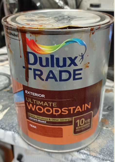
Easily done, isn’t it, I glued the catheads on wronghanded last week. Bill, the ink I’ve mostly used is Windsor & Newton Peat Brown, but that was because I particularly wanted a reddish hue to mimic varnished teak. I also have a pot of W&N nut brown which is similar, I suspect, to walnut. The only reason I bought W&N is because that’s what’s in my local art store 300 yards away, and I like to support local shops wherever possible instead of adding to Jeff’s obscene levels of wealth. (Why would anyone want so much money - as my gran used to say, there are no pockets in a shroud). And I’m in a similar place to many of you when it comes to doing jobs around the house. I find myself looking at all my machinery - the planer/thicknesses, the saws, bench drill, biscuit joiner etc etc and thinking, shall I sell them now, am I really going to do the remaining jobs if I retire next year. You lose the enthusiasm once there’s more pain than gain 🤕
- 2,699 replies
-
- 7
-
-
- heller
- soleil royal
- (and 9 more)