
wefalck
-
Posts
6,651 -
Joined
-
Last visited
Content Type
Profiles
Forums
Gallery
Events
Everything posted by wefalck
-

HMCSS Victoria 1855 by BANYAN - 1:72
wefalck replied to BANYAN's topic in - Build logs for subjects built 1851 - 1900
I gather I should finally get a resistance soldering kit ...- 1,013 replies
-
- 4
-

-
- gun dispatch vessel
- victoria
- (and 2 more)
-
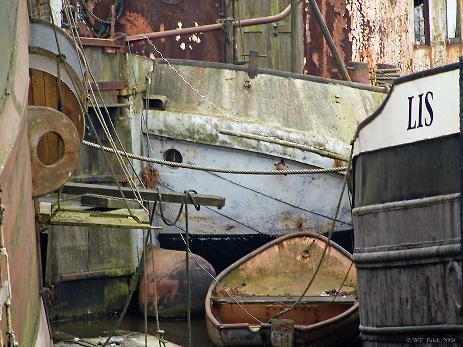
Engineering textbooks on seagoing ships from around the 1860s onwards usually show double-walled stacks. If there were several boilers, the outer pipe would enclose the smoke pipes of up to four boilers. I gather these river craft were constructed as simple and cheaply as possible. The draft then was ensured by the very high stacks. A bit off the actual topic, but as smoke stacks became very hot, the stacks could not be painted directly in the colours of the line, the paints of the day would not survive the heat. Therefore, a separate sleeve for that was often attached with some distance from the actual stack.
-
Were these stacks simple pipes ? At that time double-walled stacks were common, as they improved the draft (because they stayed hot inside) and reduced the fire-hazard to adjacent supersctructures.
-
HMCSS Victoria 1855 by BANYAN - 1:72
wefalck replied to BANYAN's topic in - Build logs for subjects built 1851 - 1900
At 1:72 scale perhaps I would brush over the fact that the sheaves were in slots of these battens and just set them into notches.- 1,013 replies
-
- 6
-
-
- gun dispatch vessel
- victoria
- (and 2 more)
-
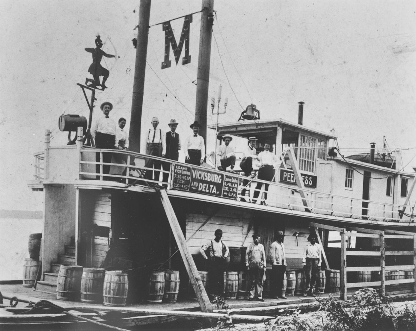
Apologies, Eric, for not looking/reading carefully ... What actually puzzled me on this photo with all the ladies on the boiler deck is that they are all rather precariously perched there with no rails around the deck. I am aware that risk awareness dramatically changed over the centuries, but when the boat is moving, the boiler deck may have not been a very stable and safe place. Perhaps the ladies and others just posed there for the picture, but would not normally be admitted there - hence, some simple ladder or the like for the crew may have been sufficient at the time of this picture.
-
Aren't there stairs going right up the front of the deckhouse, under the searchlight and between the barrels?
-
On lateen-rigged boats the halyard usually serves also as a back-stay, sometimes the only one. Given the moderate performance expectation of these 'canoas' By the same token, on lateen-rigs the sails are still fixed to the yard using short lashings, not continuous ones as on more 'modern' rigs. On such 'artisanal' boats, belaying points where typical chosen wherever convient at the moment.
-
That, of course, is another option. Thanks!
-
Yes, but how do you get the curves into the parts?
-
The question was: how did you shape the brass pieces, over wooden formers?
-
I suppose you worked the brass-sheet over wooden formers?
-
Learning about another piece of local nautical history - I don't mind these accounts of research at all. In fact, I think this is a very laudable undertaking 👍. It deserves to written up properly somehow. It could go eventually into the Journal of Nautical Archeology, I think. You should at at least make a PDF from it (an for your other Mexican boat as well)! I would be quite curious about the design history of these boats and where possible influences came from. Flat bottomed-designs are quite frequent all over Europe, but this combination of flat, broad transom and rather more elegant bow, probably has some (forgotten) functional reason. For instance, net-fishing over the stern would require a reasonably stable platform and sufficient buoyancy. The high bows could help parting the reeds in the swampy areas ... Given that the main colonial influences would probably be Iberian, the origin of Spanish who came to the region of the lake could be interesting, as they may have brought with them local building traditions. For instance, I am currently just at the edge of a major flat-bottom boat area in Spain, the Albufera lagoon south of Valencia. However, the boats here are virtually all double-ended and have no flat transom. One may need to look around a bit in Spain, but literature on such local craft is equally scarce. One would need some more photographs (if available) on how the thatching was done, but British railway modellers may have some ideas for its representation, as they often depict thatched cottages on their layouts. Some approaches may be more approximatives, but other are more detailed. At 1:32, one could almost go for the real thing.
-
Very nice project, of which I have not been aware of before! I suppose her name refers to the port of Mahón on Menorca, rather than to mayonnaise 😉 Regards from Valencia too ...
-
I gather, the Victorian men never kissed their brides/wifes ...
-
Harriet McGregor by Boccherini
wefalck replied to Boccherini's topic in - Build logs for subjects built 1851 - 1900
Looking good after those challenges ! -
👍 , yep, that adds significantly to the 'historic' look!
-
Incidentally, one 'bling' thing seems to be missing: brass oil-caps (or glass vessels) on the main bearings ...
-
Very nice result, looking (almost) like the real thing! I said 'almost', because the hand-crank and the flexible drive shaft in brass are give-aways that it is model ...
-
That's an interesting approach, washes with paints that contain flakes of metal. Have to keep this in mind for certain applications ...
- 2,699 replies
-
- 3
-

-
-
- heller
- soleil royal
- (and 9 more)
-
Yes, of course, it has to be half the included angle of thread. Many (most) toothed wheels have a pressure angle of 20°, that's were the included angle of 40° comes from. Incidentally, one can cut a worm-wheel with a tap as a cutter. There are various examples on the Internet for this. I have not done this myself, but I have made hardened concave knurling wheels in that way: https://www.maritima-et-mechanika.org/tools/attachments/attachments.html#Knurl. The matching worm would be exactly the thread of that tap.
-
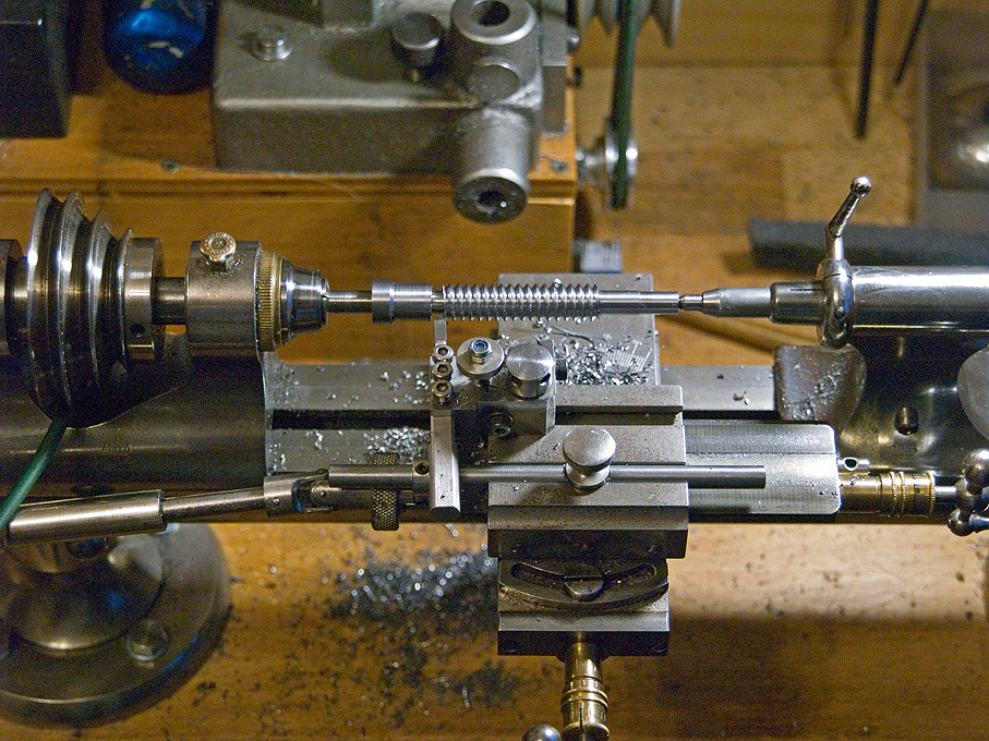
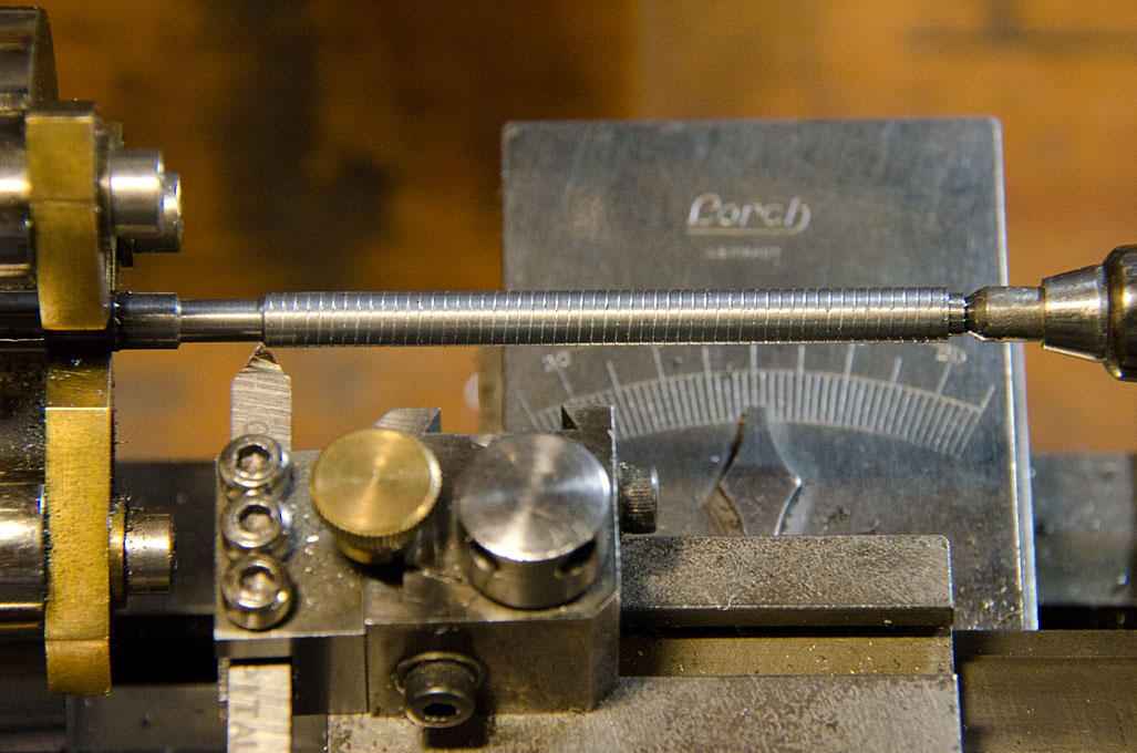
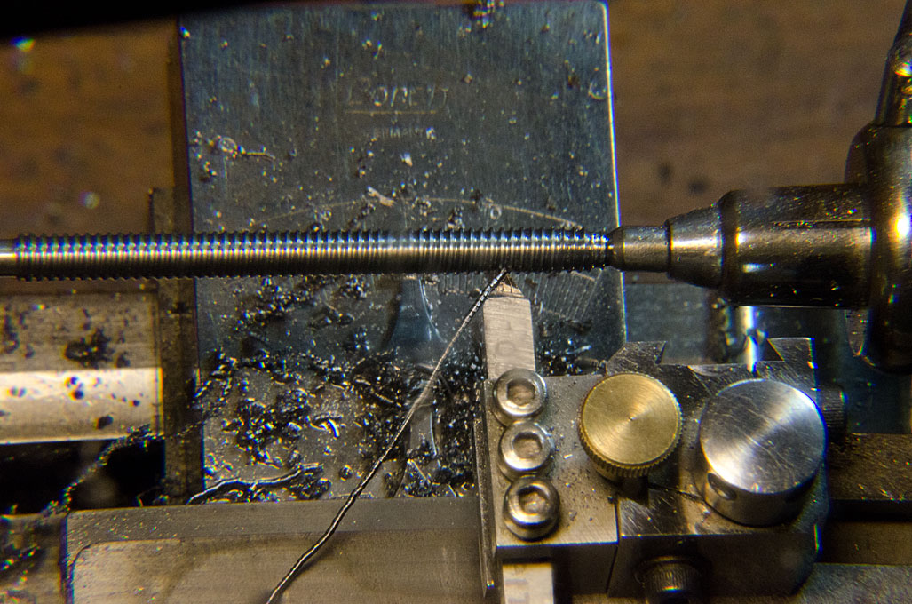
Many of these old books were written for bench-lathes, marginally bigger than my watchmakers lathe with 50 mm centre-height. The watchmakers lathe probably isn't much more rigid than the SIEG, though manufactured to much higher standards. Here I am cutting the worm for the milling machine mentioned earlier. The cutting tool is actually a brazed carbide one as used on so-called Swiss automatic lathes. Their shaft is smaller (4 mm square) than the usual ones and hence better adapted to these small lathes. Below I am making a lead-screw for a home-built micro-milling machine. I am not claiming any specific accuracy, but it works well enough for my modelling projects. In this case I used a home-ground HSS 5 mm square cutting tool: First pass to check that the pitch is correct Last pass before chasing the thread with a die
- 118 replies
-
- 10
-
-
Well, these banjo arrangements for the change-wheels haven't changed much in the last 150 years or so ... I have the same on my old watchmakers lathe. My set of change-wheels includes a 62 teeth one, which is the common option for converting imperial lead-screws for metric pitch cutting or the other way around. Given the low torque of my lathe, I made myself a crank for working the spindle by hand (Sherline offers such an option commercially) and am working with very small cuts, say 0.05 mm depth. I use an appropriately angled tool with a slight top-rake and with side clearance. The cutting speed naturally is very slow then. I have made a replacement worm for the turn-table of my watchmaker's milling machine in that way. A left-hand thread I would cut from left to right. As your lathe has a top-slide, I would set this to angle and feed in with this slide, rather than the cross-slide. In this way the cutting tool effectively only cuts on one side, which greatly reduces the cutting forces. If I have a suitable die, I would use the die for a finish cut to make sure the thread has the correct profile.
-
Absolutely, patience is the most essential ingredient ... many problems people struggle with arise from the lack of patience, from wanting quick solutions ... you are not doing it to get it ready fast, but to do a good job.