


Hubac's Historian
-
Posts
2,951 -
Joined
-
Last visited
Content Type
Profiles
Forums
Gallery
Events
Posts posted by Hubac's Historian
-
-
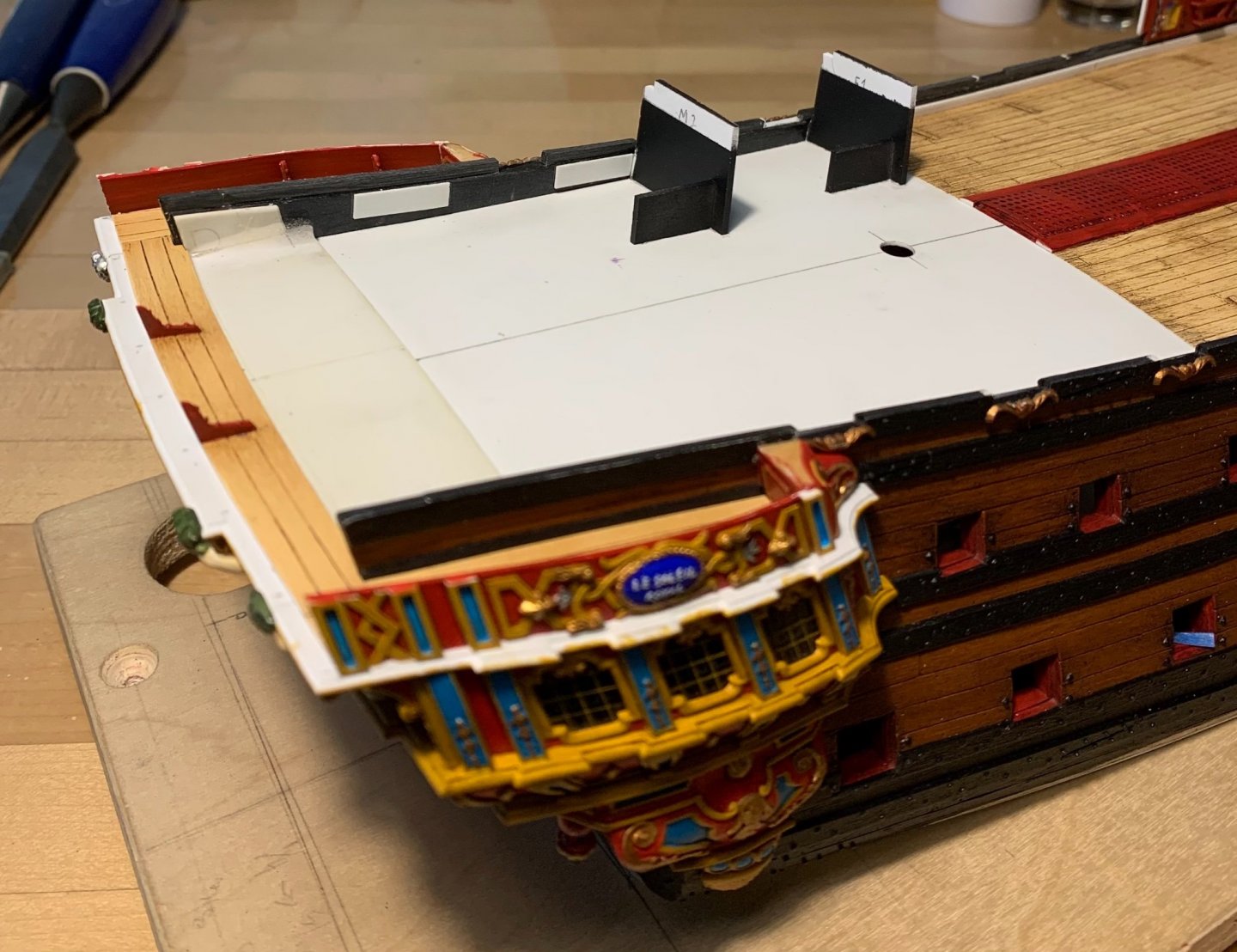
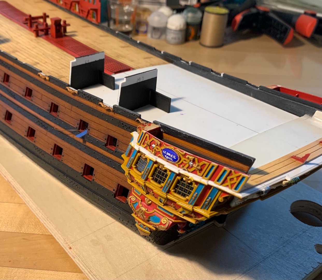
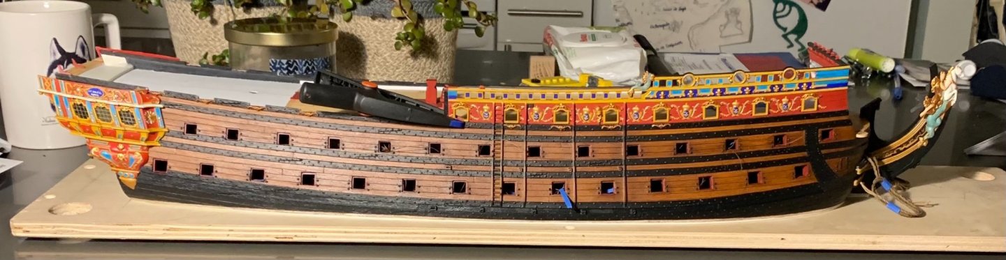
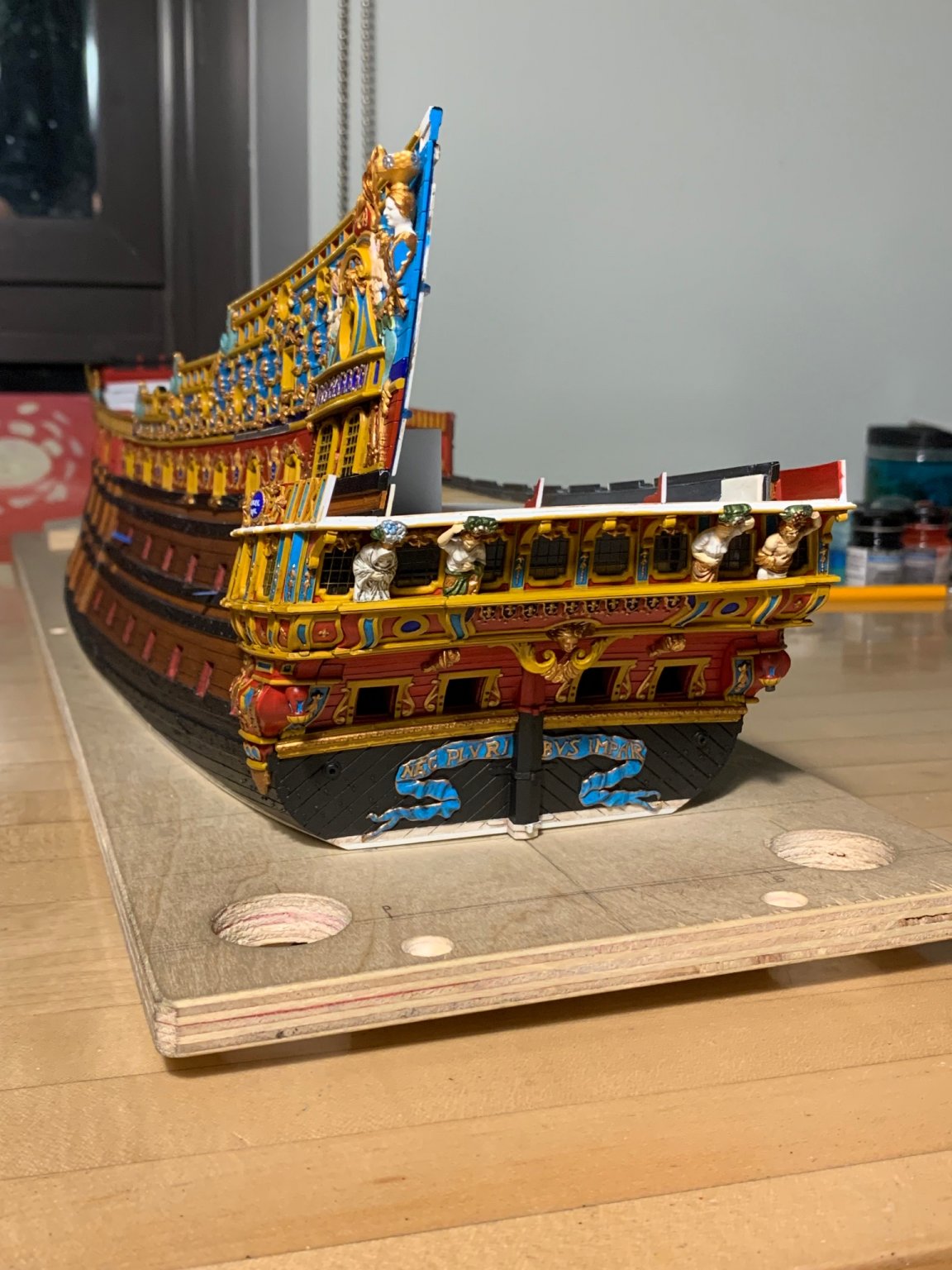
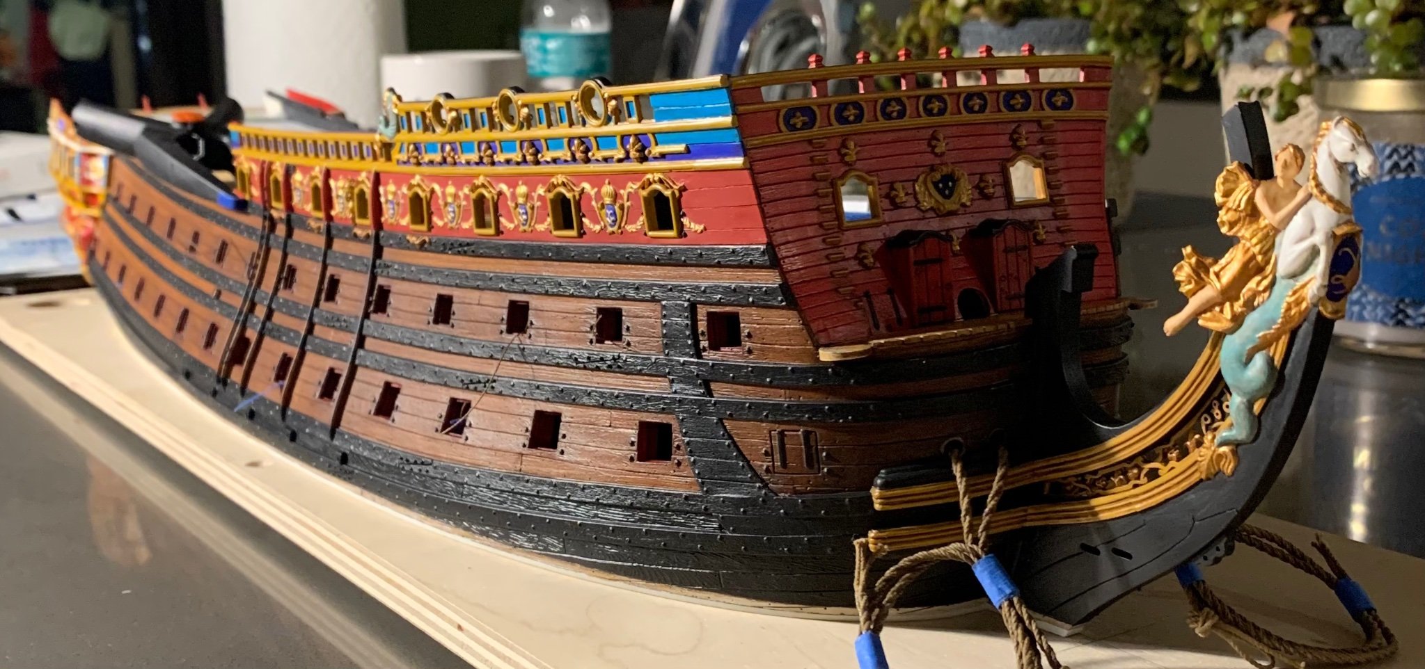
The aft bulwark is in! I’ll do a multi-perspective photoshoot after everything is prettied up, just before the show, but here’s a sneak-peak preview that illustrates the improved tumblehome:

The three gusset supports make for a very sturdy construction!
I’ve also begun patterning the new channels. The Lemineur monograph for the SP is a great help with these small details:
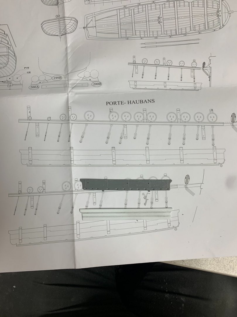
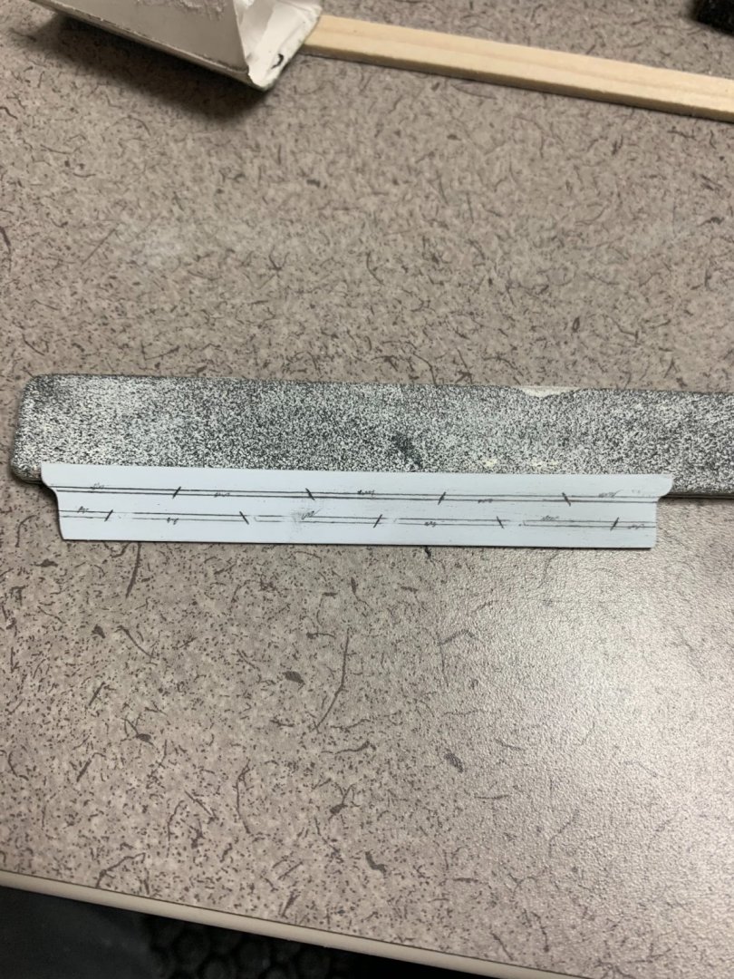
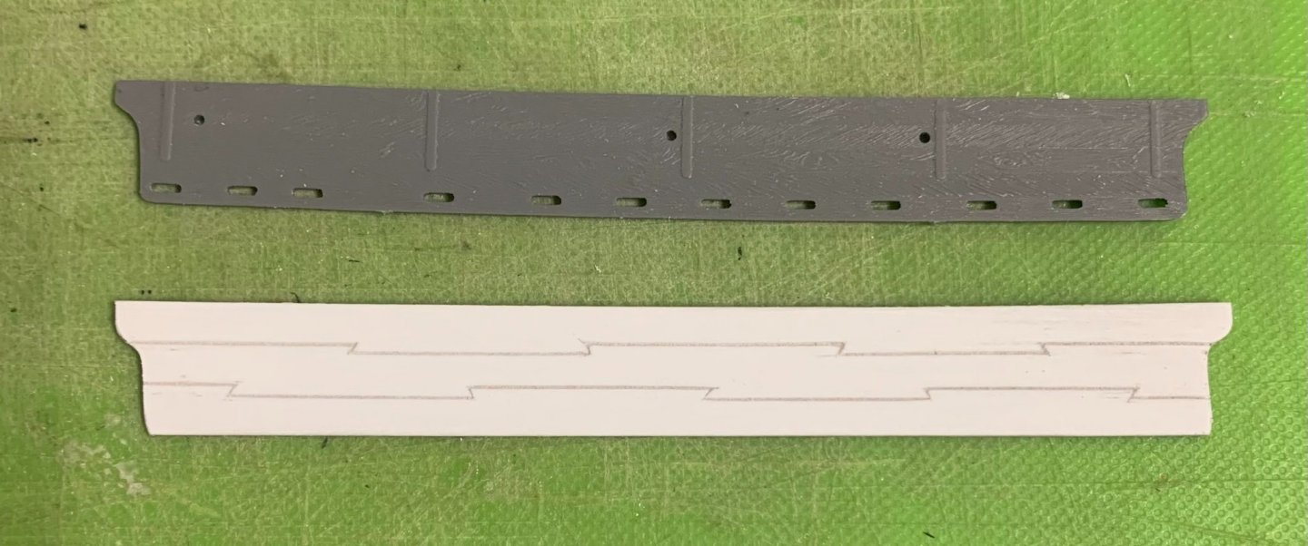
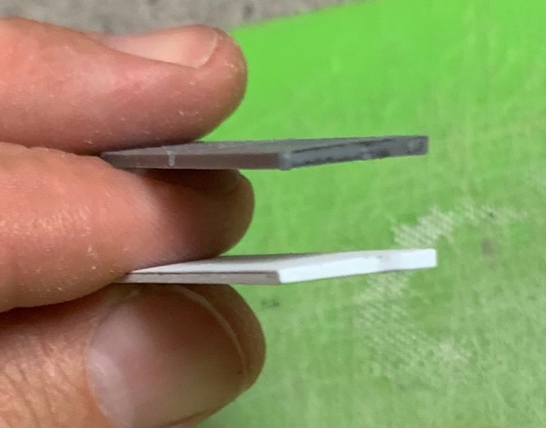
It is hard to photograph, but the new channels are tapered for watershed:
I’ll have to layout the shroud and stay locations, in relation to the guns. There’s a possibility I may have the main channel in place for the show.
-
Like all good repairs, yours will be un-detectable when the model is finished - sooner, even, after a sanding. I was losing sleep over small gaps of my own before I finally decided to fill them because I knew that I should, even if it made more paint work for me. Well done!
- dvm27, druxey, AnobiumPunctatum and 2 others
-
 5
5
-
I’d been laying awake for several hours with many anxious thoughts racing through my mind. Finally, I resigned myself to a very early rising. Looking in on your cheerful model, just now, really put me at ease. Your frieze-work is just outstanding.
- md1400cs, Keith Black, mtaylor and 4 others
-
7
-
-
The particular challenge of erecting the aft bulwark pieces is that I don’t have the stock stern plate, in place, to guide their placement. It is helpful that the forward bulwarks are in place, as they provide an anchor point, but they do nothing to help establish the slope of tumblehome that should be present.
The first step was to spend as much time as necessary fettling the lap joint to ensure that the part seated snuggly, along the upper main wale. With that much established, I could secure additional glue tabs to the inside face of the bulwark, just as I had done with the forward bulwarks. It was also necessary to fir-out, behind the upper main wale, so that these glue tabs had a firm landing spot.
Whereas with the forward bulwarks, I glued the bulwarks in-place, and then secured the gusset pieces, afterwards - the process reverses for the aft bulwarks because it is the gussets that establish the slope of tumblehome by providing a positive stop to clamp against.
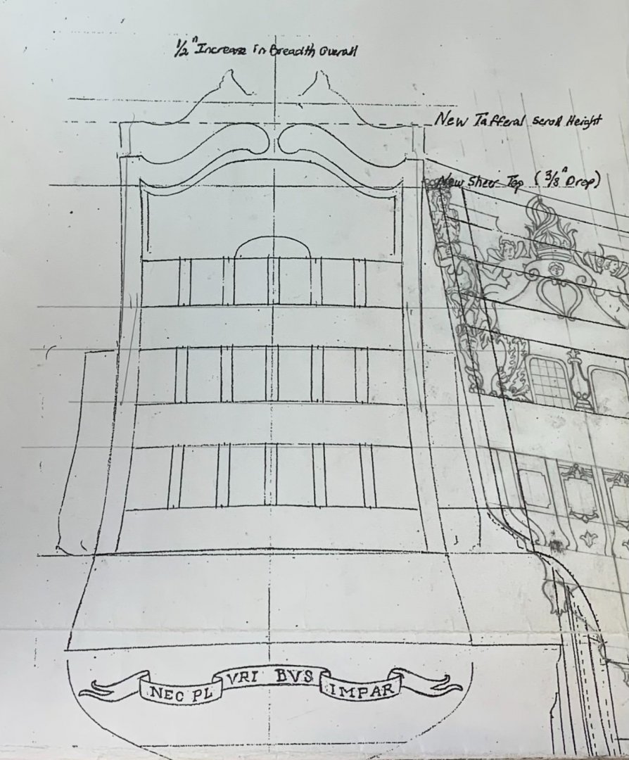
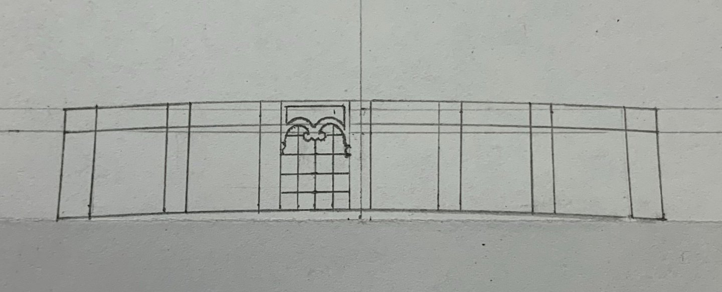
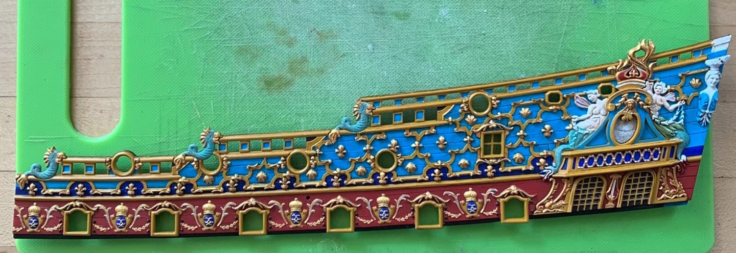
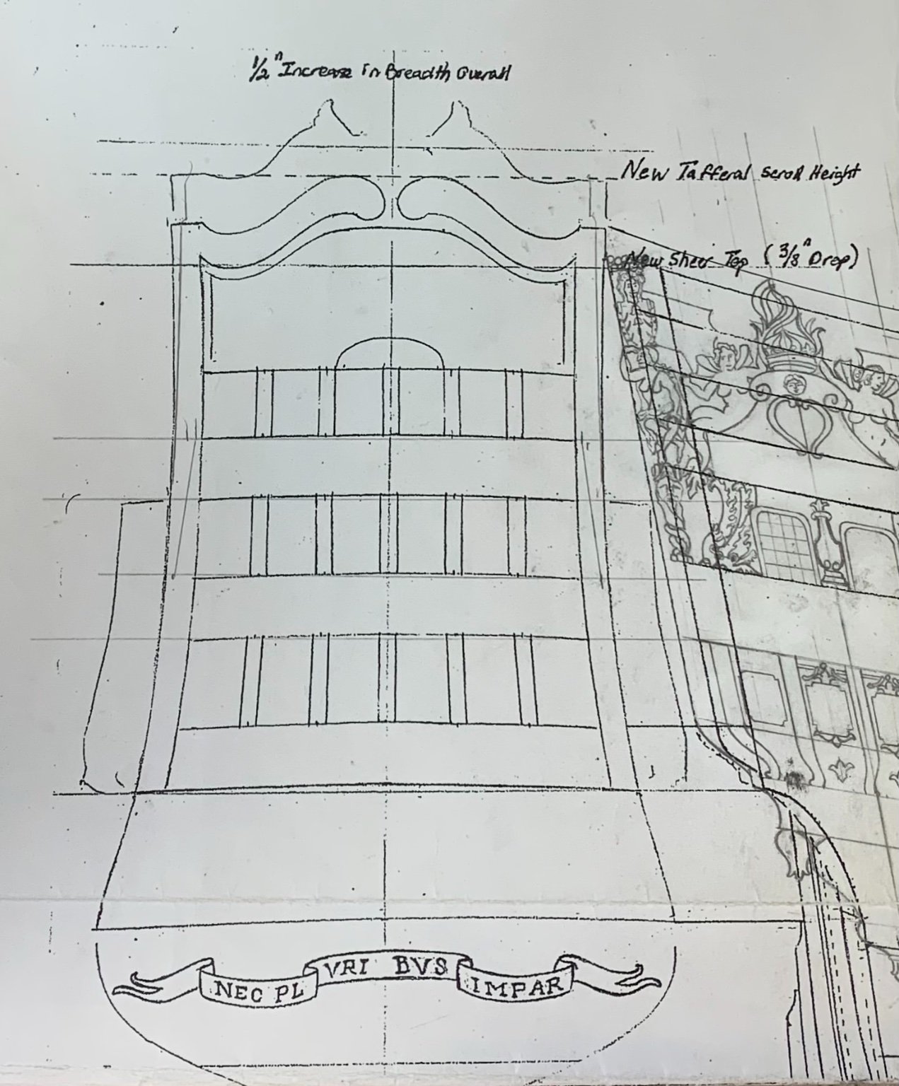
At the very beginning of this project, I drew the transom by simply tracing the outer profile of the bulwark ends to the increased breadth of the transom; the additional 1/2” would enable me to add the missing 6th window at all three levels. This was my initial drawing:
As a side note, it is funny to look back at my first attempt to draw the quarter galleries; the results were poorly scaled and relatively crude, as I was attempting to include all five false windows along the lower tier if the QG.
Anyway, at the time that I made this drawing, it was pointed out to me that the top of the bulwarks appear to flare outboard, again, at the very top. Back then, I was not too concerned about this.
At this stage, though, I can see that the finished bulwark piece does not look right at all, if I allow it to flare out at the top; the whole upper structure of the ship changes in a way that is neither pleasing, nor reflective of actual practice. The only thing to do, here, was to shape my gussets in a way that would pull these bulwarks in more, thus providing a nicely sloping tumblehome.
Frankly, this is more art than science. I simply manipulated the bulwark, inboard towards the centerline, until I had a pleasing profile. I then took a measurement from the bulwark rabbet to the centerline, along the bottom edge of this window tier: 1 1/2” to center, and 3” overall. This seemed like it would be adequate.
So, I clamped and taped the bulwark in this attitude, so that I could make card gusset templates. I then made the gussets with all necessary beveling, and added a prop leg to make them a little stiffer for the eventual glue-up of the bulwark piece:
I went to bed feeing really good about this. The part would have some minor tension, but I had increased glue surface area significantly enough to cancel out those forces. In fact, there will be a third, aft-most gusset fitted after the glue-up.
Then, I woke up the next day and remembered my original layout drawing. I took some measurements and found that I had effectively reduced the available space for this top tier of six windows by 1/4”. In fact, my new stern, at this top-most level, won’t be much broader than the stock kit stern-plate, which only has five windows. I began to feel a bit of panic creeping in.
Before glueing-in the bulwark piece, I thought it might be prudent to take some really good measurements, and do a little drafting to see what a revised window layout might look like. One quarter inch doesn’t sound like much, but it is quite significant across this short span. If I found that the reduced breadth resulted in a cramped window layout, I would be forced to buy back at least an 1/8”, in breadth, thus compromising my ideal tumblehome. This would require very fiddly firring of the gusset pieces I had just glued-in, so my fingers were crossed tight.
Here is the new layout that I arrived at this morning:
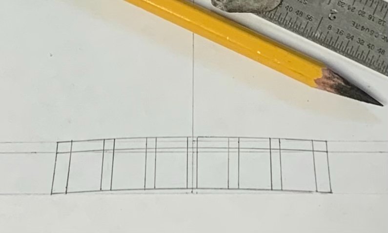
And here, I’ve detailed one pane to get a better sense of the proportions.:
The original by Berain:
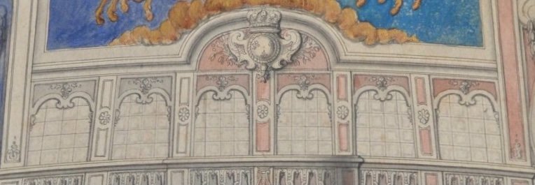
Mine isn’t the best drawing, but it’s good enough to get a sense of proportion. I’ll do a much better vellum drawing, when the time comes for it. I found that I only had to reduce each window pane by 1/32”, and each pilaster by a heavy 1/64” to get back the heavy 1/4” I had lost.
And so, I will go ahead and glue-in the upper bulwark, in the next few days. I’ve been busily filling the skid joins, touching up the bulwarks, and establishing the location of the mizzen chanels. A whole lot still has to happen in the next two weeks, but I am confident that I will be on-track for the show.
Thank you for stopping by!
- shipmodel, marktiedens, rybakov and 10 others
-
13
-
Just venturing a guess, here: because the gap is so consistent, I am wondering whether your problem resides at the very ends - the vertical timbers; perhaps the whole assembly is just fractionally over-long. I also may not be understanding whether you have glued-in the keelson, in which case, you are really looking for in-fill advice.
-
As for deck furniture, Bill, I’ll make a forward capstan for the forecastle deck, deck railings at each upper deck break, numerous cleats for tying off, ladder access to the poop and poop royal decks, and spare topmasts and main yards for the waist. I am glad that the color scheme is pleasing to you.
Thank you for the links, Chapman; those are the clearest images I have seen of these DR drawings. The quarter view is particularly instructive for the stern architecture of an early First Marine vessel. ‘Much appreciated!
- EJ_L, Bill Morrison and mtaylor
-
3
-
On 1/22/2021 at 5:43 PM, Hubac's Historian said:
Hello Kirill!
Yes, I suppose this presentation of Soleil Royal is maybe a little jarring, as we are all so accustomed to thinking about French capitol ships as being almost entirely "royal" blue and gold leaf.
I've been ruminating over color choices for the entirety of the build. Lemineur's research and work on the St. Philippe has had much to do with my choices, here. It seems pretty clear that true ultra-marine was cost-prohibitive for use beyond the national coat of arms, the King's coat of arms, and a few other select areas, like the tafferal. Other blues were likely significantly lighter and the product of copper oxides. By the dawn of the early second marine, concurrent with Soleil Royal's rebuild in 1688/89, the liberal use of gold leaf would have been greatly reduced. This was particularly so, as the re-build survey of the ship had so drastically underestimated the extent of rot. While the ship would certainly have been lavishly ornamented, it is much more likely that much of the rails and moldings would have been painted in yellow ocher, in order to keep costs down. In fact, SR went off to Beveziers without even having completed the new ornamental program; her stern carvings were merely primed in pearlescent grey paint, according to Winfield and Roberts.
What will eventually become apparent, when I get to painting the upper bulwarks, is that this lighter blue will predominate, above the main deck guns. By treating it with the walnut ink, it loses it's cerulean brightness, and instead, takes on a slight brown/green cast that is more period-appropriate. I have chosen to use red vermillion as a prominent unifying color, throughout the ship, for several reasons.
Firstly, and not least important, I am bored with seeing essentially the same representation of the ship, over and over again. Also, as I discuss somewhere earlier, the recent discovery of Vasa's true colors only seems surprising to us because we had become conditioned to think of her as only being painted in blue and gold. In the high baroque period, it seems perfectly fitting to me that vivid colors would be used to further embellish the carved works of the ship. Hyatt's description of the Royal Louis certainly seems to support this possibility, and the French palace interiors re-enforce this idea.
I have read a very brief description of Soleil Royal's colors from the Intendant at Brest, D'Infreville (if I remember correctly), who lists her primary colors: white, black, ventre-de-biche and blue, with gold throughout. Presumably, this is a banded description from the waterline, up, but there is nothing of any great specificity, there. On that basis, alone, the popular scheme for Soleil Royal could never be said to be "wrong." As I say, though, I no longer find it interesting to look at.
On the other hand, Berain's drawing of the stern has a red wash applied to the "ground" areas for the starboard side of the drawing. There does appear to be historic precedent for painting both the stern and beakhead bulkhead in a red vermillion. My idea is to unify these areas, along the band of main deck guns with this red vermillion color. It is a superb backdrop for the yellow ocher, and the monogram cartouches between the guns will show more impressively in a combination of yellow ocher, ultra-marine and gold.
After spending so much time to create the ornamental program from scratch, I do not want the details to disappear in a sea of gold. The choices I am making are stylized, yet they exist within the realm of plausible deniability.'
Lastly, I recently found again these pictures of a model of the Royal Louis. I will post a link to them, as I can't re-publish them here. If you scroll down the page, you will find an image of what appears to be a contemporary model of her from the starboard quarter. It is most definitely a first-marine representation. I don't know who made the model, or when exactly. It is somewhat primitive, but the use of red vermillion, throughout is instructive.
https://www.kalpana.it/photographs/italy_bologna/city13.htm
and here:
Hi Bill - thank you! See above, from an earlier post, where I discuss the rationale behind the paint scheme.
- EJ_L, Bill Morrison and mtaylor
-
3
-
-
Thank you all for the likes and kind comments! Rob - honestly, I think I’m only scratching the surface of what the reality of the ship may have been. I am sure she was a spectacle in every way. In fact, I suspect there was a significantly broader color palate, in use, but I feel that I would really only be guessing, beyond what I’ve laid out so far.
- EJ_L, Bill Morrison, robdurant and 2 others
-
5
-
Hey Dan, These were photo-etch pieces. I’ll show you what I mean at our ZOOM meeting on Tuesday.
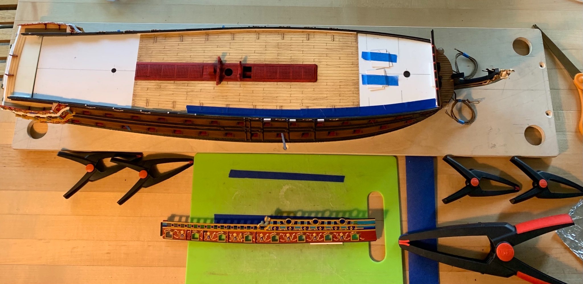
Leading into Labor Day Weekend, I realized that I would need to cram-in a ton of hours, if I had any hope of getting where I wanted before the Joint Clubs meeting. And so, my wife and kids went off to CT to stay poolside, with family, and I got to work.
The primary objective of the weekend was to erect the forward bulwarks. I gave the lapping joint of each bulwark piece a third going-over to ensure absolutely the best fit possible. Unfortunately, it cannot be avoided that the part will always be under tension, as it must bend significantly to conform to the run of the hull.
Anticipating this, I had affixed a styrene tab at the point where tension is greatest. My glue plan was to cement a welded bond along the rabbet with liquid styrene cement, but also to apply CA to the additional tab for a contact bond that would assist the tweezer spring-clamps that I bought for this purpose.
Where the bulwark joins the beakhead bulkhead, I similarly used styrene cement below the forecastle deck ledge, and a spot of CA above the ledge. There was simply no good way to clamp this corner, owing to its extreme tumblehome, so I used a tape clamp to assist during drying.
First, I put some blue tape down to protect the deck from any errant glue drops:

I also applied two layers of blue tape to the clamp jaws, as these particular spring clamps apply a really strong bite onto the material; I was hoping not to mar my paint.
For better leverage with the smaller clamps, I made up small styrene clamping cauls that hooked beneath the wales to which they were taped in-place. As with any significant glue-up, a dry-run really helps steer you away from potential pit-falls; before making the cauls, I found that the small clamps only had a tenuous grip on what is really a very shallow lap-joint.
With only a few small gaps that touch-up paint will fill, I ended up with really tight-fitting joints and enough small squeeze-out to convince me that there is a strong welded bond along the part’s entire length:

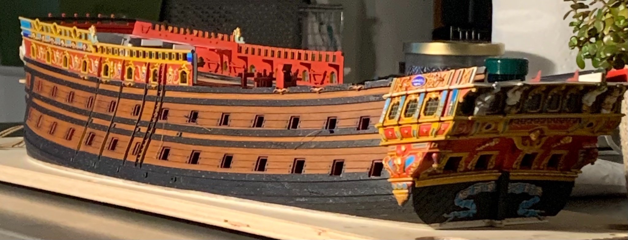
The relative mass of the model is becoming apparent now:

I will say that while the skid segments lined up near perfectly, I will still have to fill a few gaps, here and there, with sanded shims of styrene strip. This is not a big deal, and I prefer to use plastic, rather than putty, wherever possible. Also, the squeeze-out is not a major chore to clean away. I have a purpose-ground #11 blade that works like a semi-sharp glue chisel to scrape away the excess.
Now that the bulwarks were up, I could install the gusset pieces that serve a dual purpose: they re-enforce the lap-joint by increasing glue surface area between the deck and the bulwarks. Also, they will eventually serve as mounting points for my deck beams. After scribing-in and glueing, the bulwarks became notably stiffer:

Unlike the lower decks, this time I thought to black-out these gusset pieces, as more light will penetrate below these upper decks.
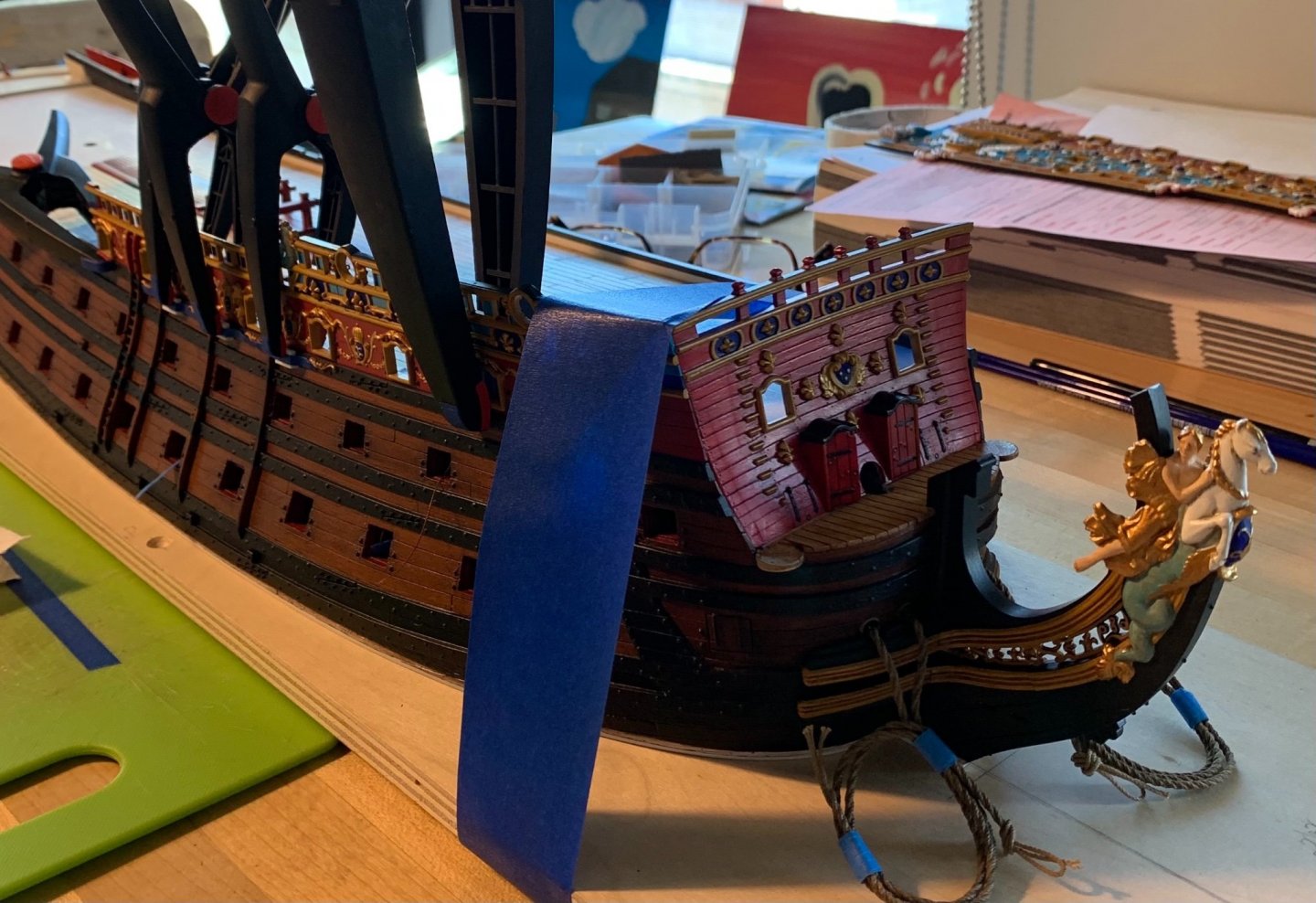
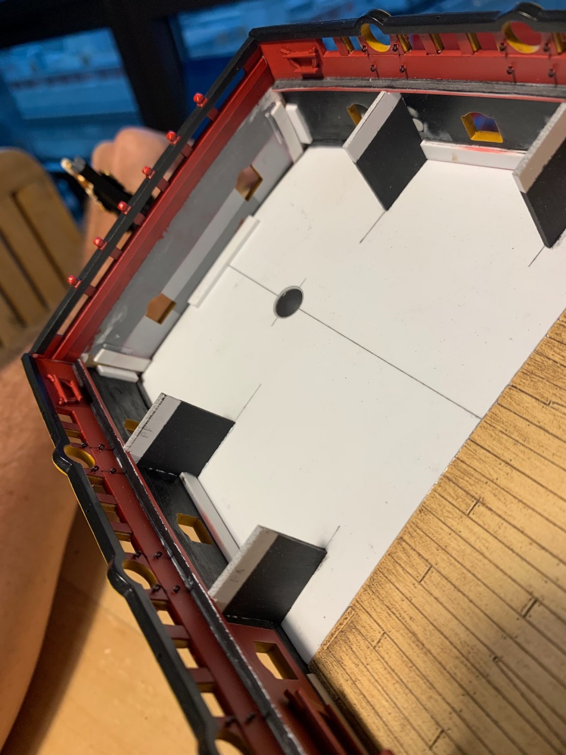
Next, I wanted to final fit the open sheaves I made for the top corners of the beakhead bulkhead rail. I also wanted to make knees for these corners. While the sheaves are a contrivance, on my part, to cover for the height discrepancy between the bulwark top rails, these knees were an actual feature of real practice. Just as they do on a real ship, the knees I made increase surface area and do quite a lot to strengthen the area. Frankly, I just don’t trust CA to do the hevy lifting of holding these corners together, over time:
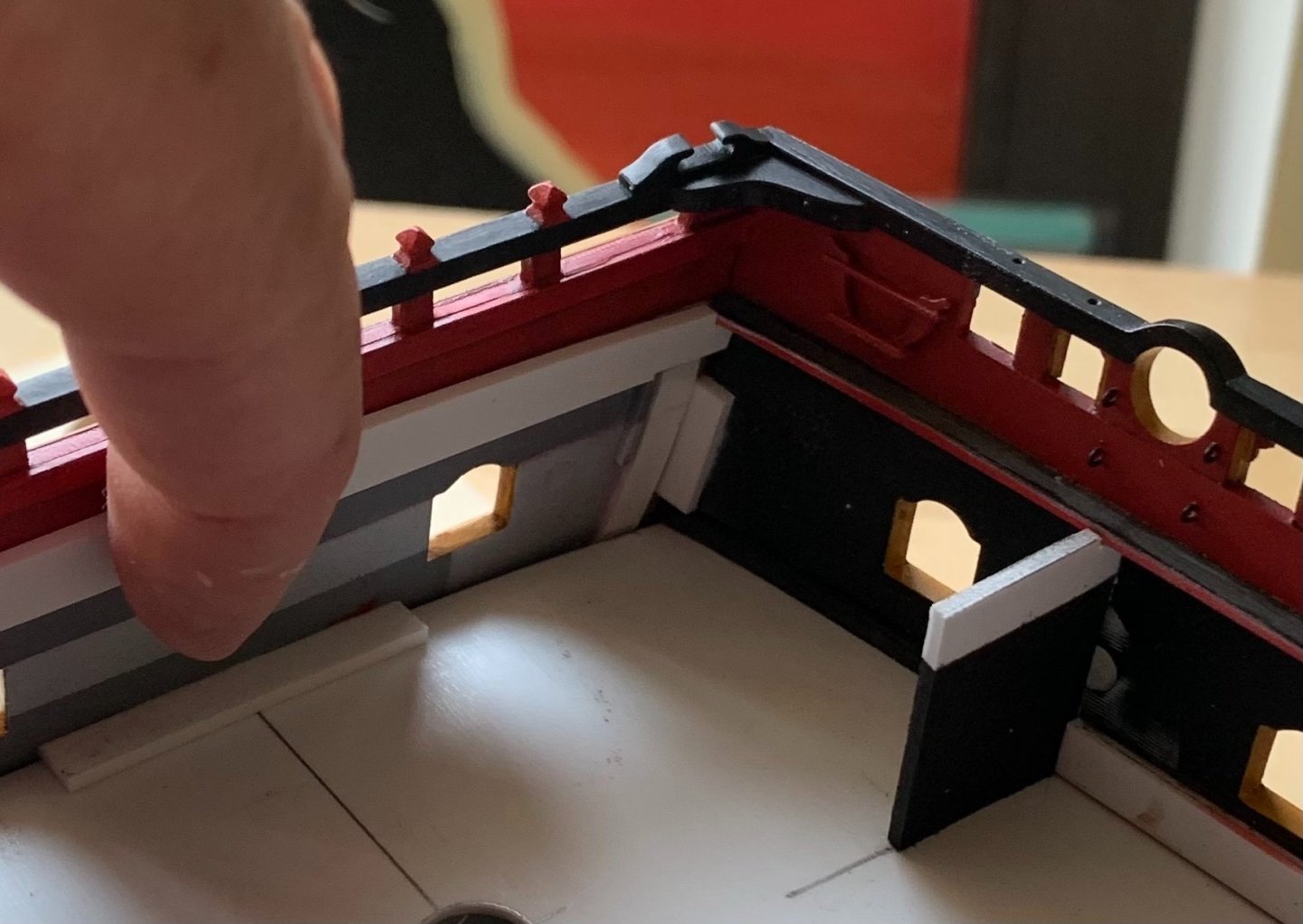
Although it is not readily apparent in the picture above, I simulated the bolt heads that hold these knees in place. Also, above, I am holding in-place the forward beam ledge for the forecastle deck.
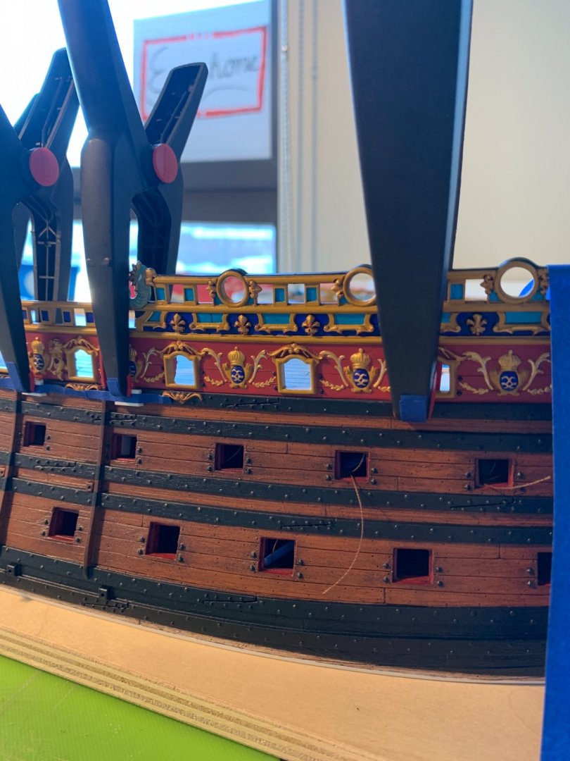
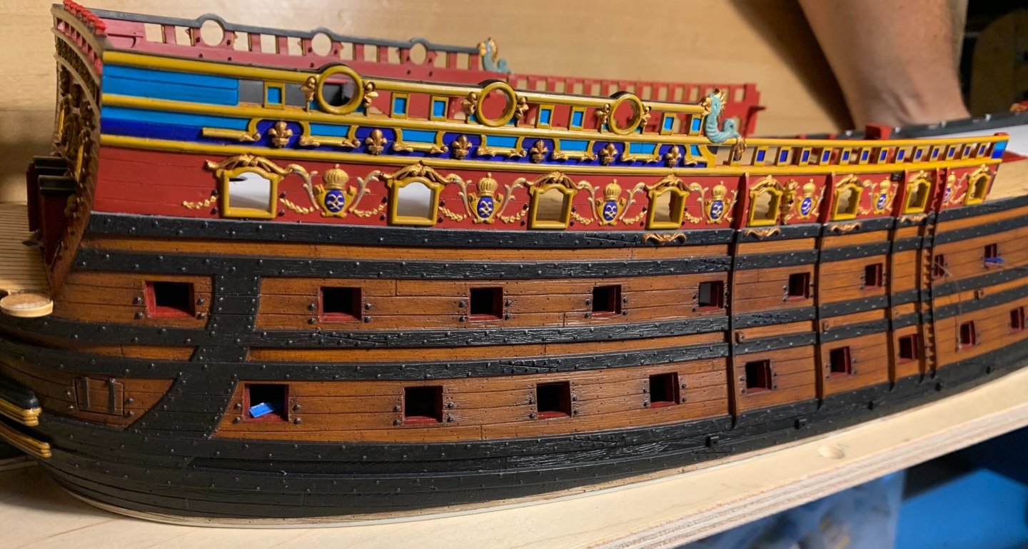
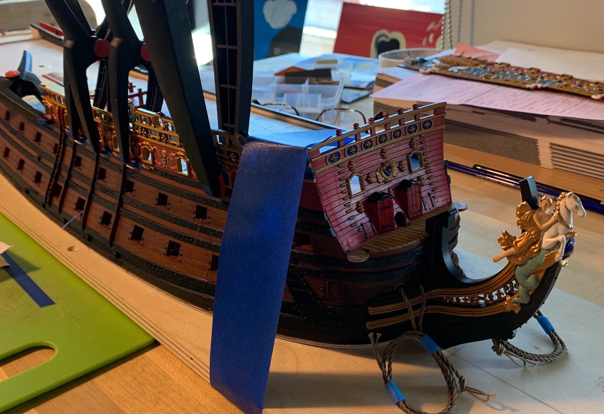
So, finally, I’m approaching the finish-line for painting of the aft port bulwark piece. There is still some gold work to do on the siren figures, as well as the quarter piece, but now the full color scheme comes into clear focus:
My objective with the paintwork, because I have chosen such a vivid scheme, is to identify areas where I can replicate the same colors and techniques, in order to create a sense of continuity. All throughout the ship, anything with a fishtail gets painted first with a grey enamel under-wash, and then top-coated with the ver-de-gris wash.
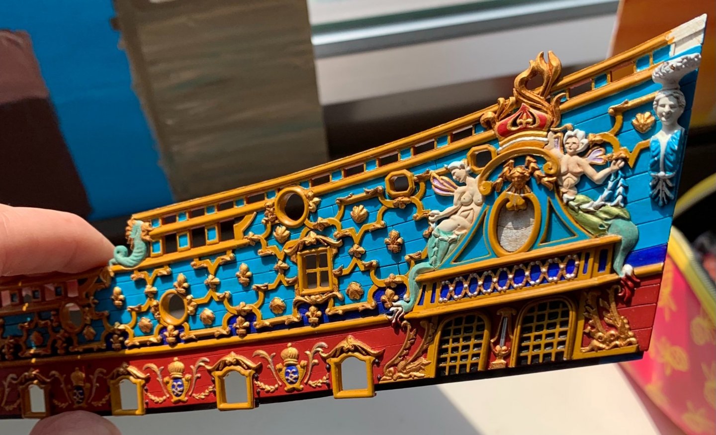
I also really liked the use of silver metallic beneath a more natural green wash, that I used for the female Four Seasons figures, on the stern. The siren on the aft end of the amortisement received this particular treatment for her dress, and the wash-coat really highlights the sculpted folds of the dress very nicely.
For the face and neck of the quarter piece, I decided to use the same enamel grey wash and wipe-away technique that I applied to the horse-head of the figurehead. It’s subtle, but it really brings out the small facial features of these sculptures. The four Continental figures will also receive this treatment. I think it lends these statues a sense of aged neo-classicism.
So, soon I will make and fit the gusset pieces for the aft bulwark piece, and hopefully get the whole assembly glued-up and touched-up in time for the show. Thank you all for the likes, comments and for looking in!
-
-
-
43 minutes ago, James H said:
The stand is actually quite nice but it's difficult to capture with it being clear. I do think it's far nicer than general fare you get in kits these days....if indeed you get anything.
Fair enough. Pictures often don’t do justice, so I will definitely give you the benefit of the doubt.
-
-
-
EJ, your carving skills are improving exponentially! Fantastic work on the headrails and figurehead!!
- Old Collingwood, EJ_L, Edwardkenway and 1 other
-
4
-
I think this will work out just fine, Bill.
-
I believe the head rails wrap behind this opening and conceal it.
-
Not having built the kit myself, yet, it’s a little difficult to say with certainty, but I believe the lower extension of these round houses is deliberate, so that the waste pipes have a means of ejecting through the headrails.
-
-
Chuck, this is all as good, or better than the original.
- FrankWouts and Chuck
-
2
-
-


Soleil Royal by Hubac's Historian - Heller - An Extensive Modification and Partial Scratch-Build
in - Kit build logs for subjects built from 1501 - 1750
Posted · Edited by Hubac's Historian
Thanks, TC!
Well, Kevin, I’d be lying if I said I wasn’t a little concerned about that. When I brought the model to the last Joint Clubs in 2019, I did a presentation on the oil-wash technique that I learned from Herbert Thomesan. The model was just a series of un-assembled parts, back then. Afterwards, a number of people were coming over and picking up a hull-half for closer inspection. Everyone means well, of course, and I appreciate any interest in the project, but a painted surface is a painted surface, and hand-oil washes are NOT part of the Thomesan formula.