Hubac's Historian
-
Posts
2,946 -
Joined
-
Last visited
Content Type
Profiles
Forums
Gallery
Events
Everything posted by Hubac's Historian
-
 I think the primary difference among Vallejo formulations is their viscosity. I find that I have to shake my mix in the shot glass, frequently, because the pigment falls out of solution. Overall, though, the Vallejo paints are excellent. I needed an alternative to Tamiya, which I found almost impossible to brush.
- 2,444 replies
-
- 2
-

-
- heller
- soleil royal
- (and 9 more)
-
TAKE TWO: The walnut ink was something suggested to me at an art supply store. It has numerous advantages over ready-mixed acrylic washes - chief among them is that the product is fully reversible right up until the sealer coat goes on. In the early days, I applied this stuff straight out of the bottle and wiped away the excess using a Q-tip wrapped in old cotton t-shirt scraps. This worked well, but you couldn’t do much surface area, at a time, because the ink dried so quickly. This wasn’t a big deal because the ink is re-activated with only a little water on a damp brush. Anyway, my early applications to the gunport linings were probably a bit on the heavy side. I discovered that not all acrylic paints are as sturdy, when it comes to wiping away the excess. The artists’ acrylic yellow ocher that I use - from Vallejo - is pretty soft and fragile for a good while after application. In the interest of time and a desire to not have to retouch the yellow paint all of the time, I developed another, much simpler approach. Over time, I arrived at a protocol that allowed for a greater working area and much more easily modulated results. Here is what I do. First: Shake the ink bottle thoroughly; there is a fine sediment that settles to the bottom, and I am certain that this lends some beneficial result to the final effect. Step 2: Mix a 1:1 ratio of ink to tap water in a shot glass. Shot glasses are great for mixing small paint batches because they don’t allow the mix to spread out too thin and dry out prematurely. What you are aiming for is a mixture that resembles Soy Sauce. Step 3: Use a wide, flat brush to work the mixture into every crack and crevice. Don’t worry at all about doing this carefully. Just cover everything in a 2-3 square inch area. The result will be too dark, blotchy and it will begin to dry on you before you can even get to the next step. Don’t worry - this is all okay! Step 4: Dampen a smaller flat brush in clean water, and float a layer of water over the entire area you just covered. This will instantly dilute and begin to homogenize the ink. Blot your small brush onto a smooth-finish table napkin (unlike paper towels, they don’t release loose lint), and then very lightly draw up any loose liquid still floating on the surface, blotting the excess as it becomes apparent that the brush isn’t taking up any more excess. Don’t over-worry the cracks and crevices, these are the places you want the ink mix to wick-in and dry. The long mouldings take a little patience to find that right balance of fluid so that just a little color is left in the hollows. If, ever, you feel you messed up, just re-saturate the area and start over. Interestingly, the next section seems to blend seamlessly into the previous section. There’s a little art to it, but it is really a pretty simple process to master with absolutely zero permanent risk to the model. One thing to try and avoid is allowing air bubbles to collect on the surface and dissipate on their own, because they will leave ink freckles after they dry. Not a big deal, if they do, but smoothing them away with the damp blotter brush eliminates this problem. All of this being said, I haven’t even tried model purposed washes, and they also seem very easy to use and modulate - at least on the various YouTuber channels I watch. Walnut ink just happens to be what I started with and it is working so nicely for me.
- 2,444 replies
-
- 3
-
-
- heller
- soleil royal
- (and 9 more)
-
Thank you very much, Kevin, for the kind compliments. I was in the midst of composing a very lengthy and detailed response to your question about the walnut ink, when my thumb pressed something, and I was shifted out of my composition editor. When I tried to backtrack, I had lost the whole post. That’s a little frustrating, so I’m going to step away from the phone for a bit, lest I throw it against something hard. I promise to return, in a bit, with an answer.
- 2,444 replies
-
- 2
-
-
- heller
- soleil royal
- (and 9 more)
-
Thank you, gentlemen, very much! Wefalck, you make an excellent point about oxidation - something I had not considered. I will continue with the silver in limited use, though, because it really makes certain details pop. Victor, I’m afraid that if you were to watch me for a week, you would certainly fall asleep, since the process of watching me paint (or do anything, really) is glacial in its pace. That really is the only mystery to it - heaps and heaps of time. Sometimes, I’ll watch Andre Kudin’s YouTube videos and he works with marvelous efficiency, while creating extremely clean work. Learning to speed up my process without sacrificing quality is a goal of mine.
- 2,444 replies
-
- 3
-
-
- heller
- soleil royal
- (and 9 more)
-
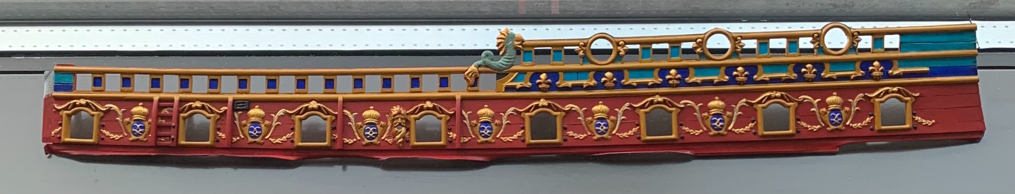
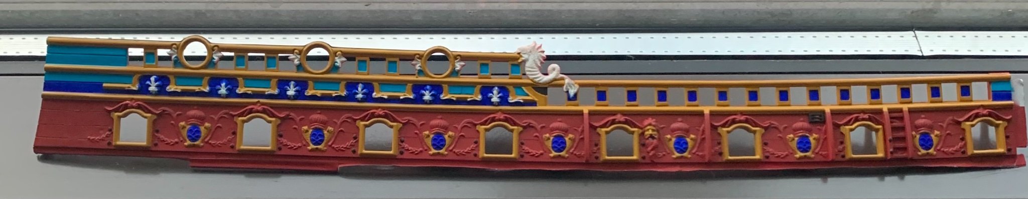
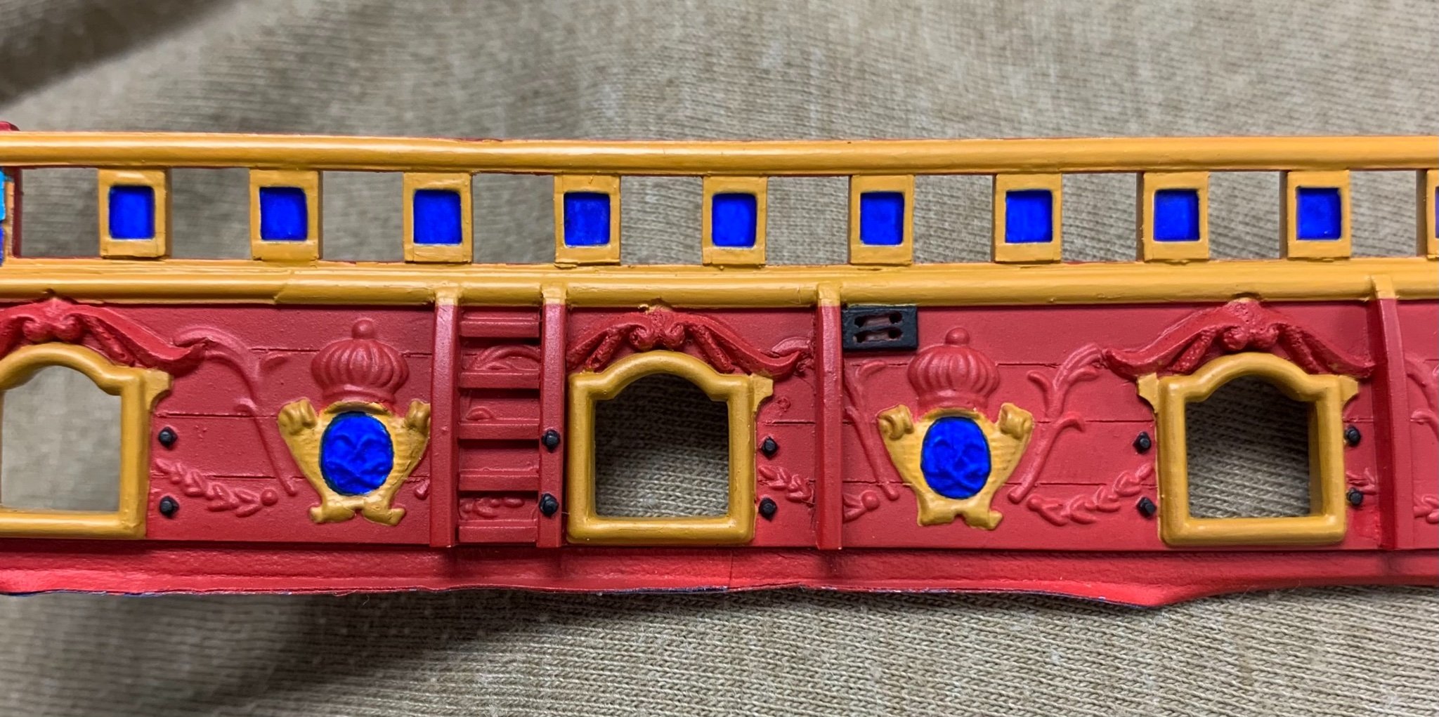
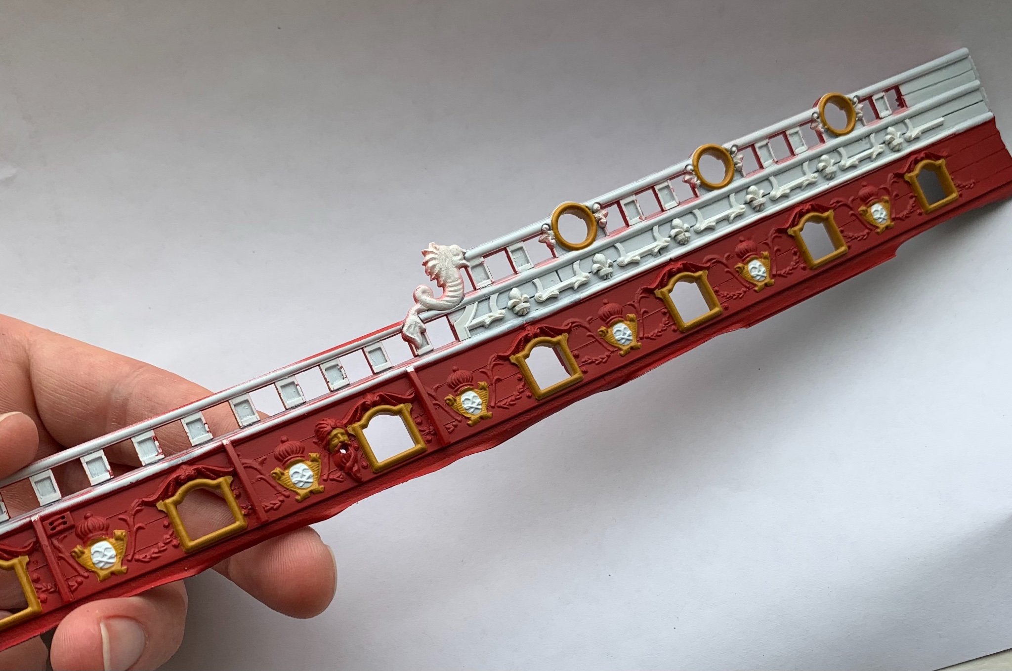
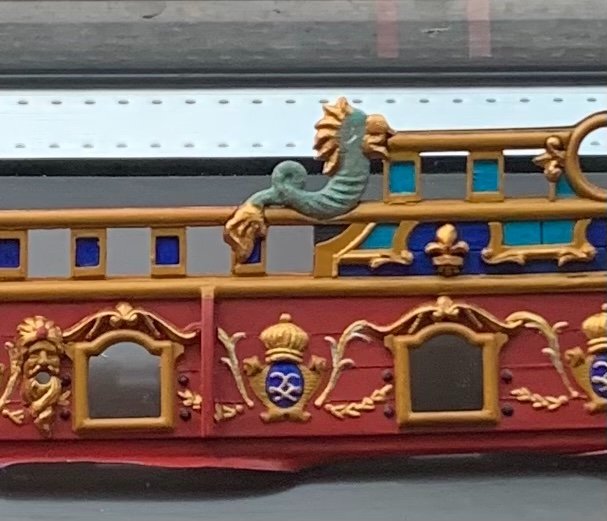
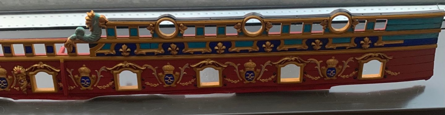
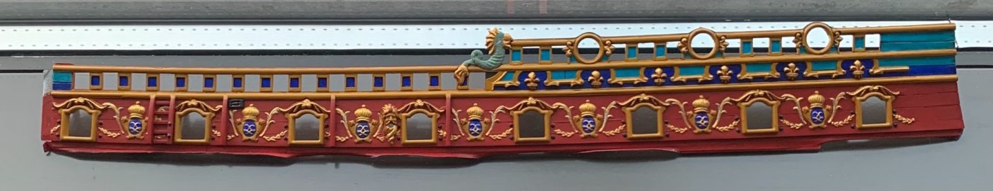
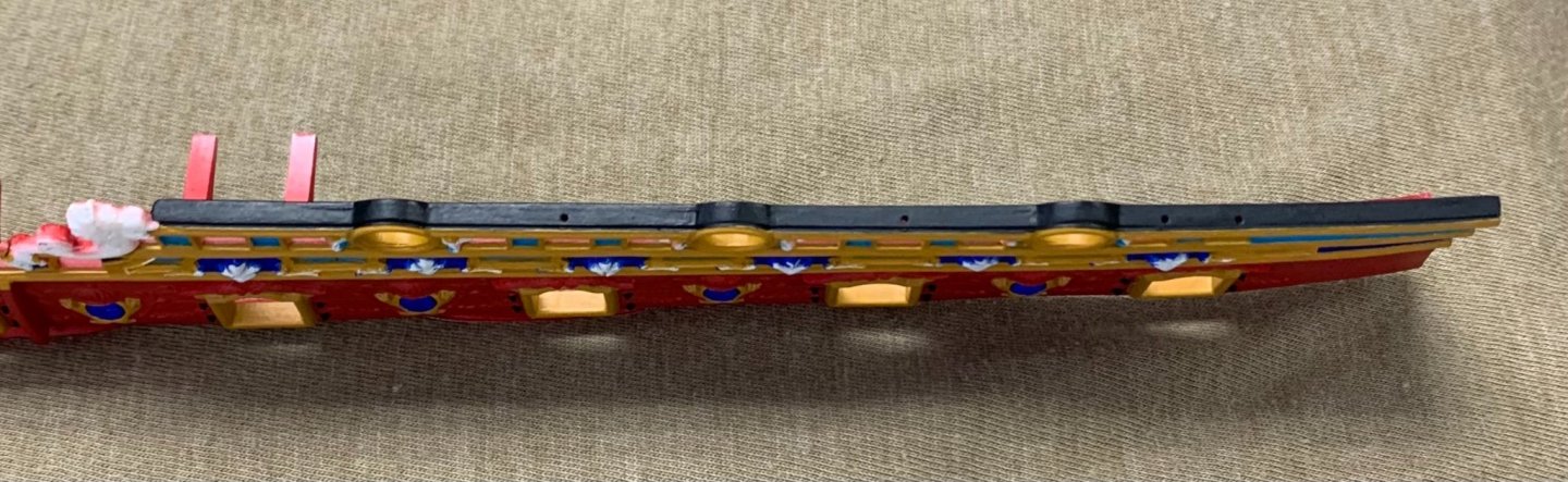
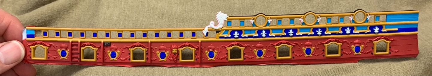
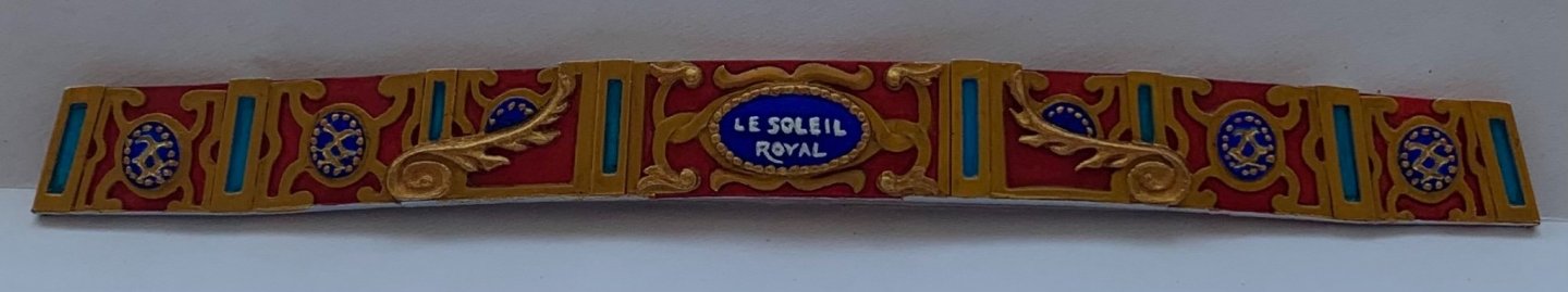
It has been about two and a half weeks of very focused and intensive paint work. The starboard, forward bulwark is fully painted, and I have the base colors down for the port side. Here is an illustration of the effect that the walnut ink has in muting the intensity of the base colors: These pictures give a sense of the difference, but the effect is more clearly apparent, in person. The brown of the walnut ink lends just enough of a green cast to the lighter, cerulean blue to better approximate a period French blue. It also has the effect of transforming the darker cobalt to more of an ultra-marine shade. The following closeup gives a good sense for the interplay between the darker old gold and the brighter gold used to highlight all of the larger ornaments: It is also more apparent in that picture, the way the ink gets into the moulded depressions of the yellow ocher trim; they dinge-down just enough to have credible depth. While it may or may not have been a feature of actual practice, in the 1680s, I have made an artistic decision to incorporate silver leaf into areas of the ornamental program where it adds emphasis and clarity to the carved works. Here, I’ve decided to highlight the under reliefs of the acanthus branches: I am pleased with the dolphins, and even used silver to pick-out the eye relief. One thing to note, this is the one dolphin hancing piece where the hancing moulding is located properly beneath it; on the aft bulwarks, owing to the layout of the sheer steps and the timberhead railings, that is not the case. I included the mouldings there, anyway, because they added more than they detracted from the overall design. Well, after very much retouching, this is the highest quality brushwork I can produce. I will methodically continue along this path, right up to the show in October. At the least, I am hoping to have one full broadside installed. We’ll see. It is a very busy summer, and the days and weeks are just ripping by! Today, I am giving myself a little break from painting, and am making the hanging knees that are just visible beneath the break of the quarter deck. Thank you all for looking in!

- 2,444 replies
-
- 19
-
-

-

-
- heller
- soleil royal
- (and 9 more)
-
Regarding what other modifications can be made - and, certainly, this is entirely a matter of personal preference - you might consider sanding down the Heller wood grain structure. You don’t have to sand it away completely, necessarily, but the paintwork looks better when it is muted. This is kind of a big undertaking, which is better done before Daniel’s PE parts are applied. Anyway, I thought that now would be the time to consider it. I, personally, did not realize this until after I had applied simulated through-bolt heads to all my wales. I was simply unwilling to sand all that work away, so I compromised and sanded the planking between the wales. In the end, it isn’t exactly perfect, but worked out just fine because it is the bolt-heads that draw your eye.
-
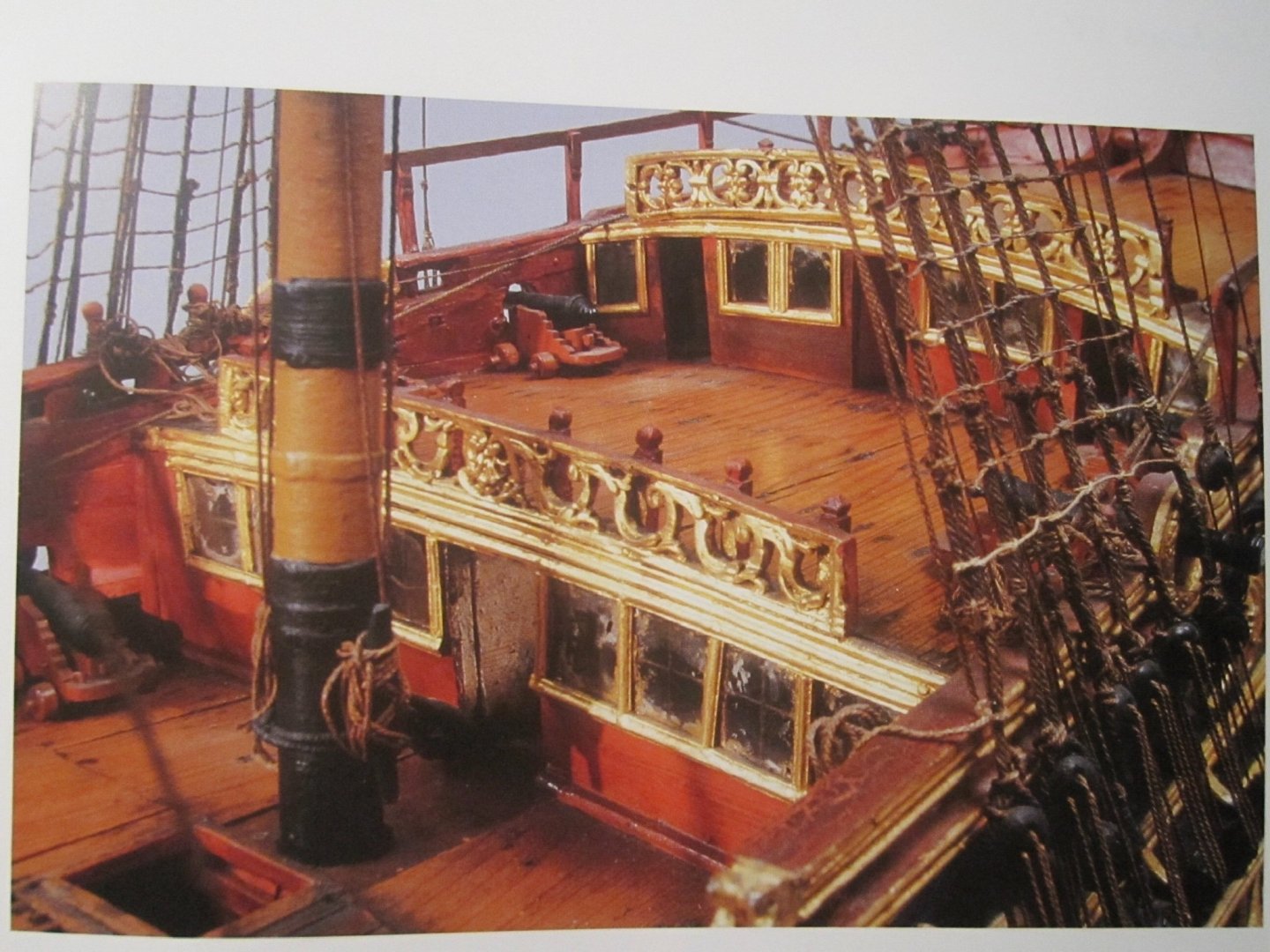
Exactly! Yes, the evergreen cuts smoothly and I end up doing a lot of scraping with the edge of a honed knife, in order to arrive at softly rounded surfaces. I haven’t had much success with heat-bending, though. I’ve tried curling irons, hairdryers and open flame. In each instance, there is a flashpoint where the Evergreen sheet goes from bendy to a misshapen mess, in an instant. Sometimes, I’ll laminate a bend into the plastic, over a form. Often, as with my stern gallery bulwarks, I’ll induce a bend simply by taping the part around the outside of the breadcrumb canister and leaving it there for a few days. When I remove the part, there is very little spring-back. And, often enough, bends can be induced with your fingers. Like you, I am intrigued by the use of metallic gilt foils. I would think that it is quite tricky to get the foil only where you want it. There is one very talented builder here, SafeMaster, who manages the art to perfection. His Heller Reale looks as though it sailed right out of the 17th C. into modern times. The gilt work is extraordinary, as is absolutely everything else about the model:
-
Yes, for whatever reason, the moulded waterline on the Heller Soleil Royal creates the impression of an excessively shallow draft. With her exceedingly tall stern, she looks as though she’ll capsize the instant she lets loose with a rolling broadside. Raising the waterline 1/4 - 5/16” does much to correct this anomaly, visually. I found it more expedient to simply cut the lower hull away and make it a diorama model; of course, doing so was the only way for me to even entertain broadening the hull, at the bow. So, not to hijack your log with my project, but that is what I was referring to. Most of my carving work is with evergreen sheet styrene. It is lovely to carve, as it is considerably softer than the kit styrene, and you don’t have any alternating grain issues, as you do with wood. If I don’t have sheets thick enough for the part I’m making, I simply laminate stock until I arrive at the dimension I need. That being said, I will have to make a full figure relief for the Africa sculpture, and I do not think that I will do that in plastic; too much lamination required, so I’ll carve that one in boxwood, or pear.
-
Thank you very much, Kevin! The SR project began with certain very specific alteration objectives, but it quickly took on a life all its own, once I realized how relatively simple it was to make parts and details from scratch. Like you, I’m simply applying my trade skills as a woodworker and woodcarver to this smaller scale. Fortunately, this project is the perfect outlet for my OCD and obsessive love for the ship. The Heller SR makes into a very nice model, even if you do little more than raise the waterline and thicken the gunport openings. It would, of course be completely fascinating to see you remake the stern through the application of your CAD skills. That is an interesting detail, where Vic’s lower finishing joins the counter. I have never seen that before, myself. Also, it is heartening to see that the original builders were, themselves, prone to a little fudgery, here and there, to make things work.
-
I think the answer may be “who knows, for sure,” but the journey sure will be interesting!
-
That is a nice touch to file a deeper relief so that they eyes snug into the carriage sides! The photography is also excellent, per usual. This is truly a model that will hold up to intense scrutiny 🔎
- 607 replies
-
- 3
-
-
- winchelsea
- Syren Ship Model Company
- (and 1 more)
-
All of this is very precisely done, EJ. I really like the scale of the gratings and the stairs. Well done, my friend!
-
Thank you, Michael! Yes, there is certainly a lot going on, there. It will eventually become clear, but these colors and patterns were chosen to emphasize certain aspects of the frieze and to unify the whole ornamental program into a coherent tableaux. It looks a little crazy, right now, but it will all come together. Thank you John, but the truth is that my hand is not nearly steady enough to hold these lines, unsupported. I like to think of my painting hand as though it were a rock climber; I use the pinky and ring fingers to nestle into crooks of the piece I’m painting, or to anchor into the fingers of my part-holding hand. In doing so, I create an absolutely steady frame that frees the three brush-holding fingers to move without tremor or strain. Usually, when I mess up, it’s because I miscalculated the amount/flow of the paint on my brush tip. I always roll excess paint from my brush before applying to the model. This removes excess and refines the shape of the brush tip. I’ve learned to do this paint rolling on a ceramic plate, instead of paper towels because the paint invariably picks up lint from the paper towel and transfers it to the model. I’ve also learned not to swipe excess paint from the paint pot lip, as the excess quickly crusts, and then your brush eventually picks up crust flakes and deposits them in your finish. My approach wastes paint, but produces cleaner results. If I mess up, I always keep a wet brush nearby to mop away the mess, and that minimizes touch-ups. That is the real beauty of acrylic paints. In the end, it is mostly a test of time and endurance that leads to these results. I think it is fair to say that I averaged five hours a day, over five days for this bulwark piece, so far. Thank you, EJ! I think I will remain consistent with my beakhead bulkhead, and paint the quarter and poop deck bulkheads the same red color. This is what was done on the Louis Quinze model, and I think it makes sense to do so.
- 2,444 replies
-
- 9
-
-
- heller
- soleil royal
- (and 9 more)
-
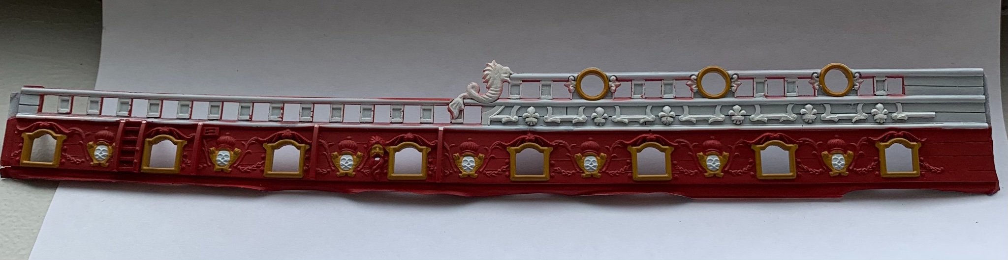
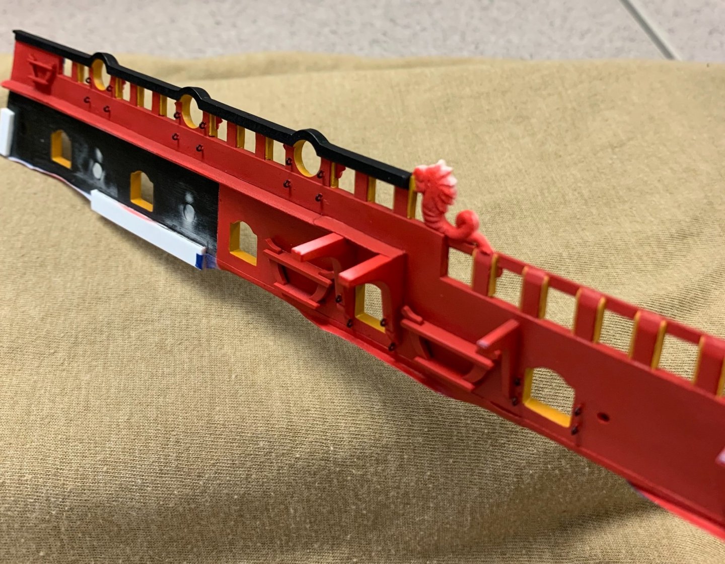
To say that my self-imposed deadline has lit a fire under me would be an understatement! It has been a week, now, and I’ve been painting in the day AND in the evenings. At this stage, all of the primary colors are down and I am ready to spray the ink wash before the gilding of the ornaments. It is all extremely vivid, right now, but these pics will give a sense of how the frieze will come to life on the aft bulwark pieces: Yellow ocher, I think, is a good unifier of these three colors as they all seem to play nicely with the yellow. Figuring out exactly how I wanted to highlight the timberheads took a minute, and execution of the painting took many more minutes! I wanted to draw attention to the fore and sprit sheet block entry, so I painted it black. It seemed unlikely that the sheaves, at this time, would be cast bronze, so I painted them a dark wood brown. Merely by padding the thickness of the sheer railing by 1/32”, I have created a much more realistic sense of scale for this detail: So, I will finish up the wash and ornamental paint for this piece at home. Incidentally, the dolphin hances will get the same aqua treatment as the figurehead, and this will be a consistent theme that runs through the ship, all the way to the dolphin on the rudderhead. Tonight, I’ll airbrush the red base-coat for the port side bulwark piece, and the whole process will begin again! Despite my urgency, this is the standard that I will doggedly maintain. Thank you for the likes, comments and for looking in.
- 2,444 replies
-
- 17
-
-
- heller
- soleil royal
- (and 9 more)
-
Well, color me impressed! This is going to be a fabulous model!
-
I agree with Druxey - you sure seem to know what you're doing! I'm in!
-
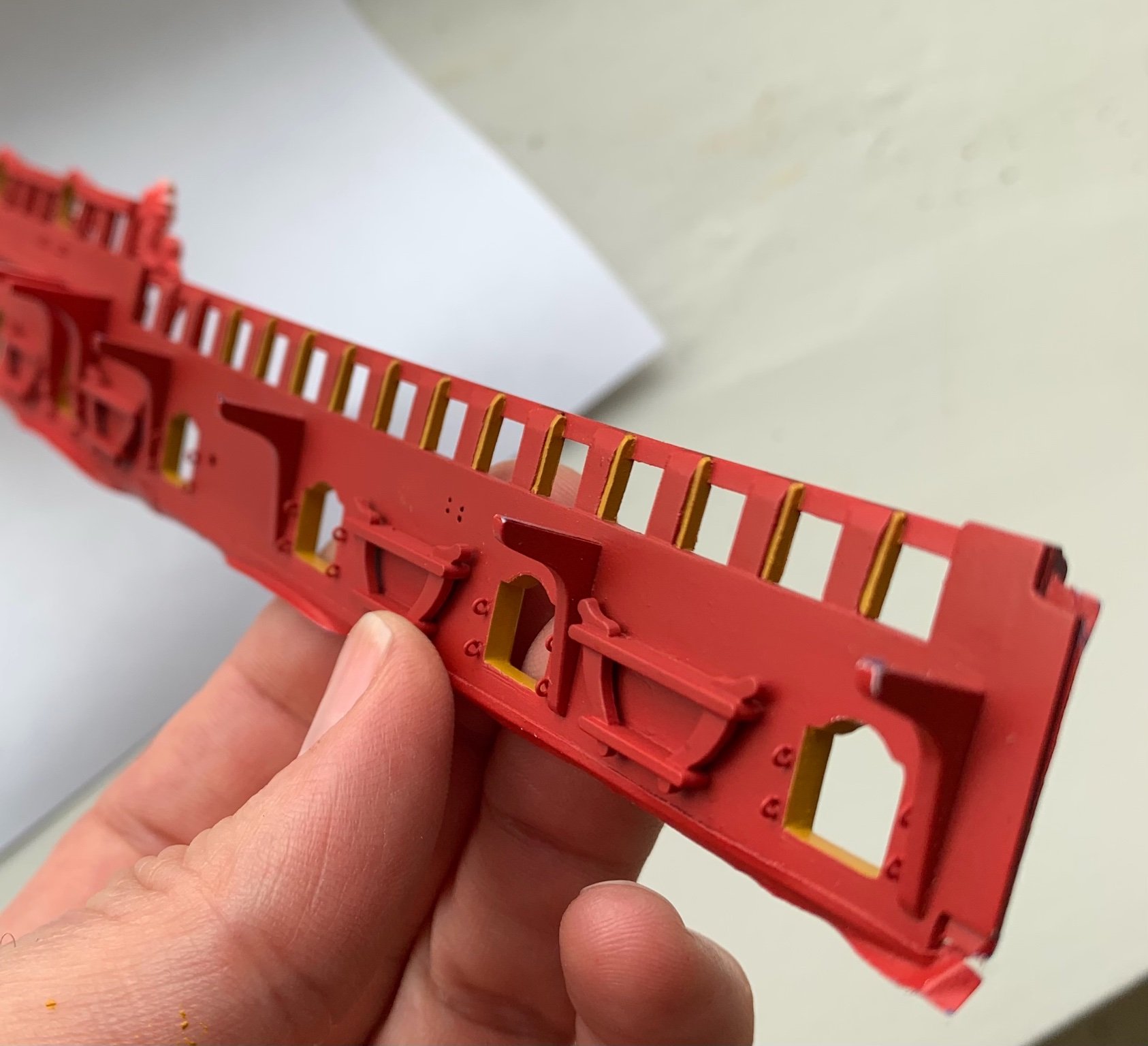
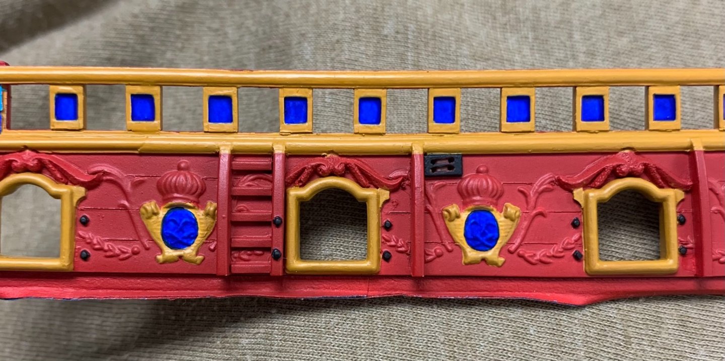
Thank you guys so much for your kind compliments! And, so, the elephant eating contest goes into full swing. Fortunately, because I was such a good little brother, when we were kids, and I let my (now) superstar makeup artist sister use me as a hair and face model, my sister has agreed to let me borrow her airbrush and mini compressor that she sometimes uses to apply makeup. One hand washes the other! Buried, somewhere in the boxes from our move to Brooklyn, is my own Badger airbrush, but for the life of me - I can’t find it. Anyway, it has been such a wonderful rediscovery of the magic of airbrushing. There is simply no better way to paint broad, highly detailed surfaces. Early returns on the forward bulwark pieces are looking very good, so far. I was careful to mask off the monogram escutcheons - the crossed “L”s - because an undercoat of red would make the cobalt look dark and purplish - definitely not what I’m after. I am also very pleased that I took the time, during the modification stage, to engrave plank lines between the main deck guns. Without a doubt, it will always be the yellow ocher that is the most time consuming stage, but I have determined that a 2:1 ratio of paint to tap water is the perfect viscosity for even application with good coverage. It still takes 2-3 applications, over a color like red, but that is far better than the 6-7 I was averaging before. The most fiddly painting is the timberhead trim that I applied to box-in the timberheads. It is exactly as tedious as painting a picket fence: Eventually, the walnut ink wash will work its magic to lower the volume on these colors, while adding depth and dimension to the surface. Whereas, in the past I cringed at the thought of traveling with these fragile, bigger parts that I already have invested a huge amount of time in - I have now acquiesced to the reality that that is the only way I will be able to jam-in the number of hours it will take to cross the finish line (of this build stage), by October. Wish me luck!


- 2,444 replies
-
- 12
-
-
-
- heller
- soleil royal
- (and 9 more)
-
Exquisite work, Matiz!
-
Yes, I absolutely think you can add detail at your will. I think what you may find is that making these additions has a cumulative seductive effect. The improvements you make might motivate you to continue making improvements, so that gradually you totally settle into the process of making the model, without stressing too much about the finish line. Everyone finds their “hard-line” when it comes to adding/changing this or that. Some things will be worth the effort to you, personally, while some will not - and all of that is perfectly okay.
-
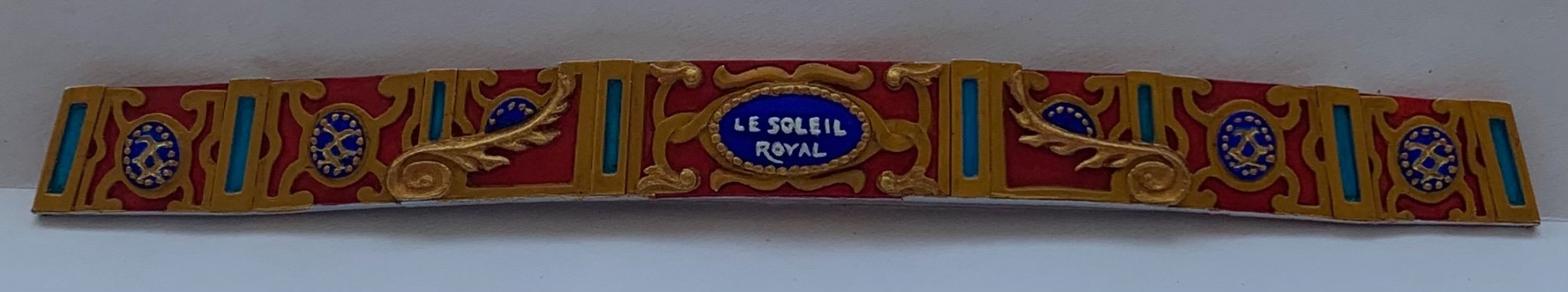
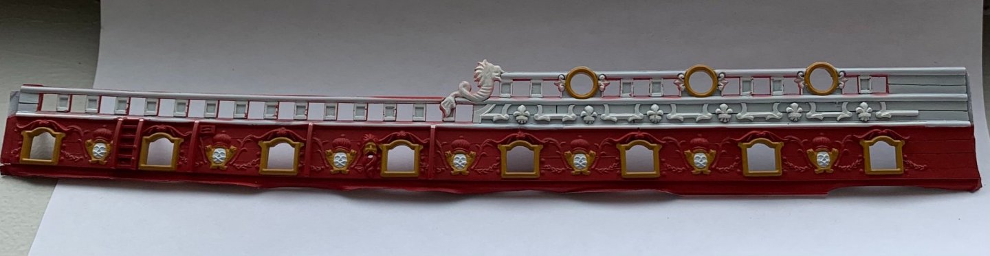
‘Much appreciated, Michael! Well, it was a sweltering and otherwise frustrating day, but I managed to finish painting the stern gallery bulwark. My moment of zen: Interestingly, the brighter gold highlights only seem to pop in muted natural light. The monogram escutcheons were interesting to paint because the carved detail is incised; I first fed gold into the V-channel, and then veeery carefully painted the cobalt color up to the edges. I can’t say with absolute authority that this color scheme is completely authentic to the times, but it does make for a very vivid display. It is just time consuming. I have three complete months until the Joint Clubs conference in New London. Completing the bulwark painting and installing them in time for the show seems like a daunting task. The paint work must be impeccable in order to show the frieze and amortisement to best advantage. At the least, maybe I’ll get one completed broadside. I will try. We shall see.
- 2,444 replies
-
- 12
-
-
-
- heller
- soleil royal
- (and 9 more)
-
If it works out for you, Henry, it’d be nice to meet you. I’ll be there, so stop by and say hello, if you have the chance. ATB, Marc
- 2,444 replies
-
- 2
-
-
- heller
- soleil royal
- (and 9 more)
-
Beautiful care and attention to the carved works, BE. They really clean-up nicely!
- 185 replies
-
- 1
-
-
- queen anne barge
- Syren Ship Model Company
- (and 1 more)
-
It may seem surprising, but for sanding grain effects into plastic - that will show through paint - you have to go pretty coarse; 60 grit minimum, but 50 grit picks up the wash-coats nicely.