
Thukydides
-
Posts
1,363 -
Joined
-
Last visited
Content Type
Profiles
Forums
Gallery
Events
Everything posted by Thukydides
-
 You could also try a middle road and wait till after the lower shrouds and ratlines are on. They are are the main reason why you would want unimpeded access to the area. Also they are pretty strong so if you bang them a bit there is not as much risk you will cause damage unlike single lines that are going everywhere later in the build. Though I would fit the PE associated with them before doing the shrouds. Just another option
 -
I like the modifications you are making, they do add some visual interest to the ship.
- 63 replies
-
- 2
-

-
- Lady Eleanor
- True Vine
- (and 2 more)
-
That is a fantastic display. The root ball really adds to the overall look.
- 109 replies
-
- 7
-
-

-
- Ghost Ship
- Jenny
- (and 2 more)
-
You could definitely do this. There is a cheerful log somewhere (I can't remember which one now, I think the name started with a j) where they did this which might give you ideas. It would be a nice way to make your model a little unique. Back when I was thinking about doing speedy as my second build I did have some thoughts on doing something like this.
- 114 replies
-
- 1
-
-
- Vanguard Models
- Speedy
- (and 1 more)
-
Welcome to the forums. That is a nice looking model you have there.
-
Great job, the flag looks really nice. You should be proud of her.
- 152 replies
-
- 2
-
-
- Vanguard Models
- Cutter
- (and 2 more)
-
She looks fantastic BE. Another great build.
- 648 replies
-
- 4
-
-
- Indefatigable
- Vanguard Models
- (and 1 more)
-
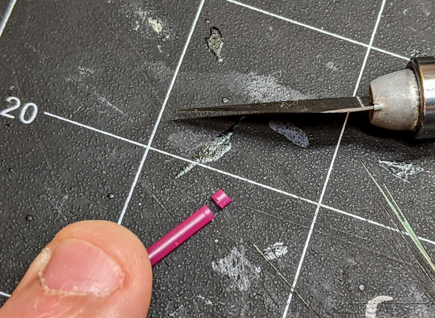
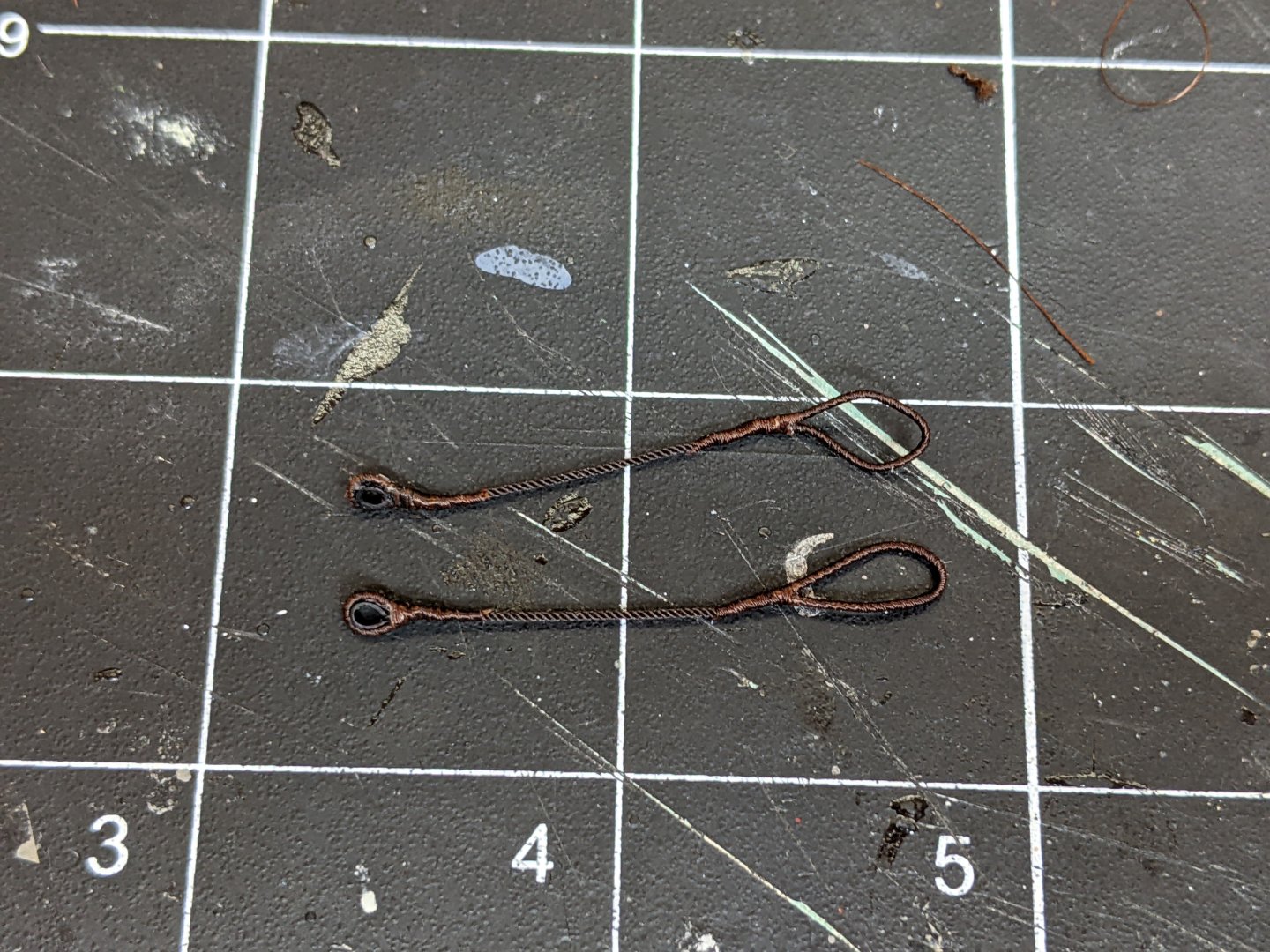
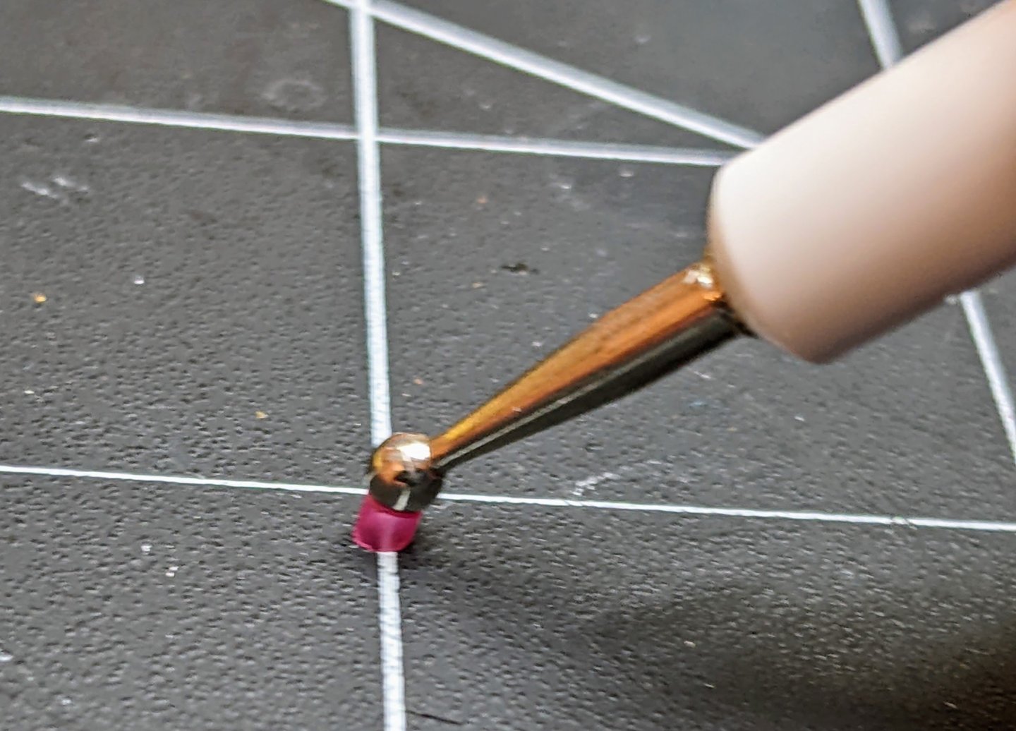
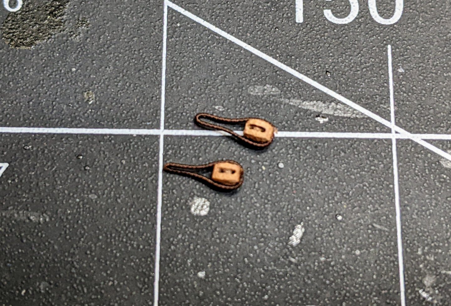
No actually there wasn't it is fairly soft and I just pushed it down and it held its shape. It is not particularly strong and I had to use some super glue to hold it in place in the eye splice. As I mentioned I am not sure I would recommend the method. If I was going to do it again I would probably use a harder plastic and heat or just go with brass. I should also say that the pictures are not of the actual thimbles I made as they were too small to really get on camera. So I cut an example thicker slice just to document the process.
- 562 replies
-
- 6
-
-
-
- vanguard models
- alert
- (and 2 more)
-
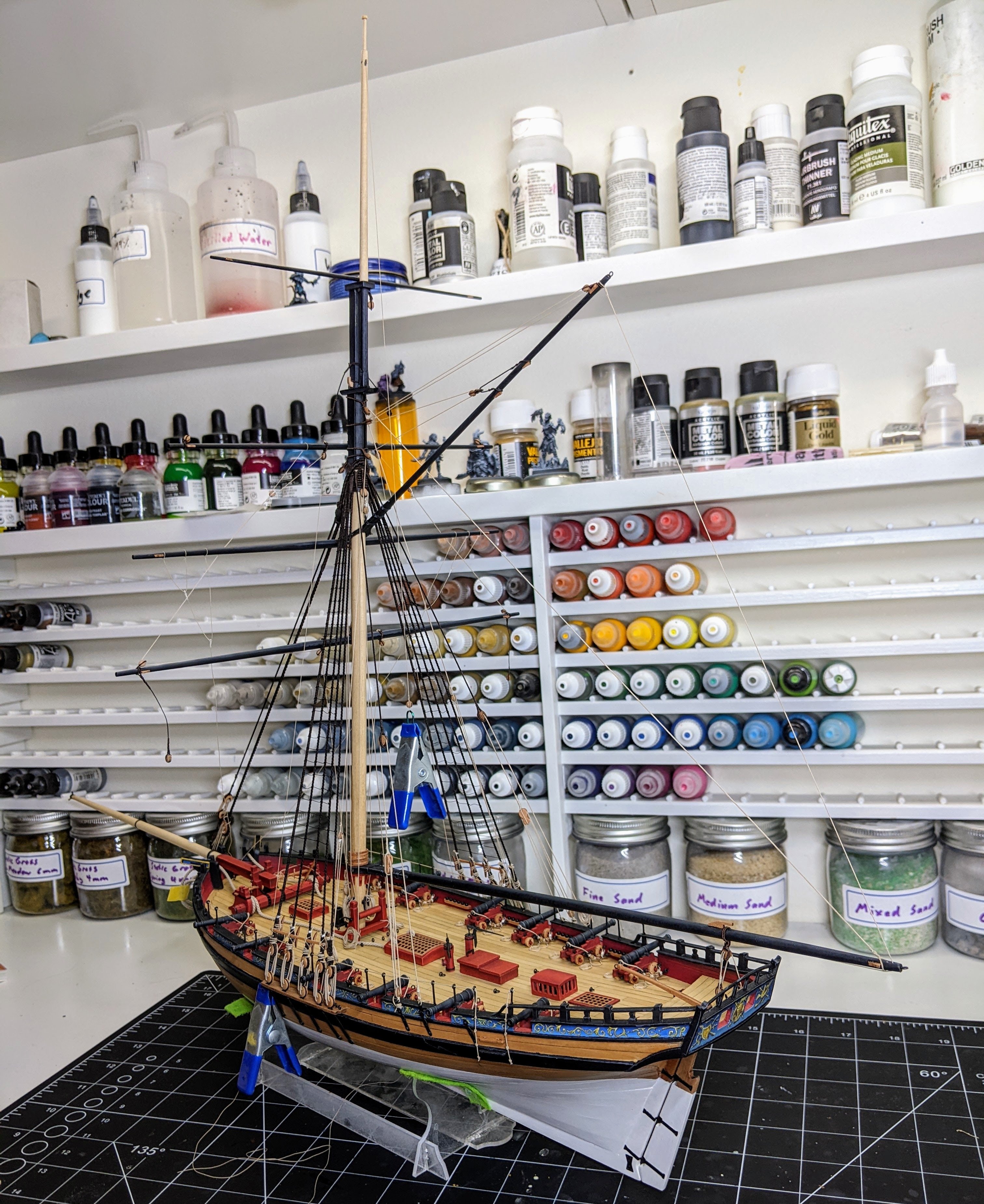
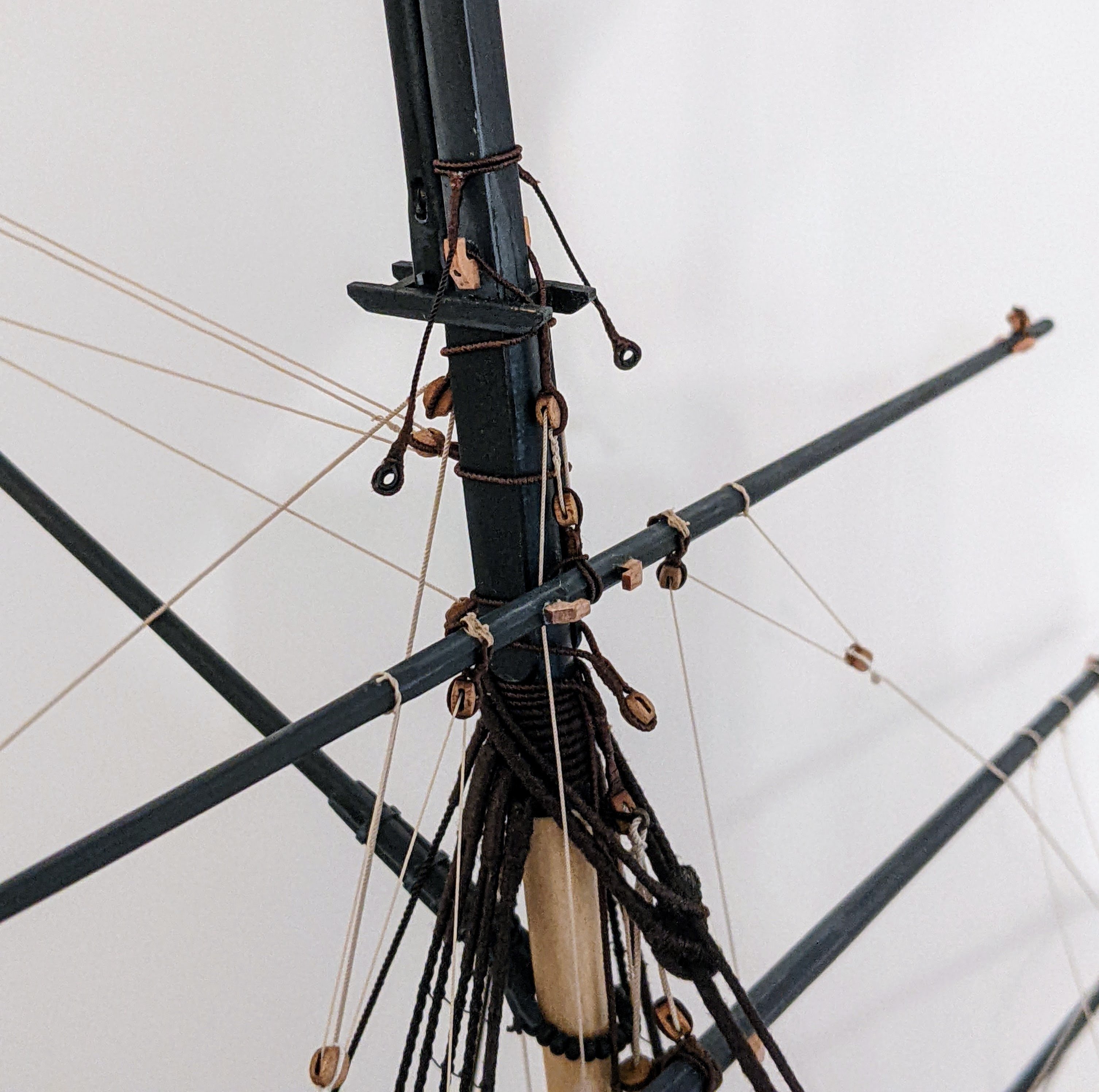
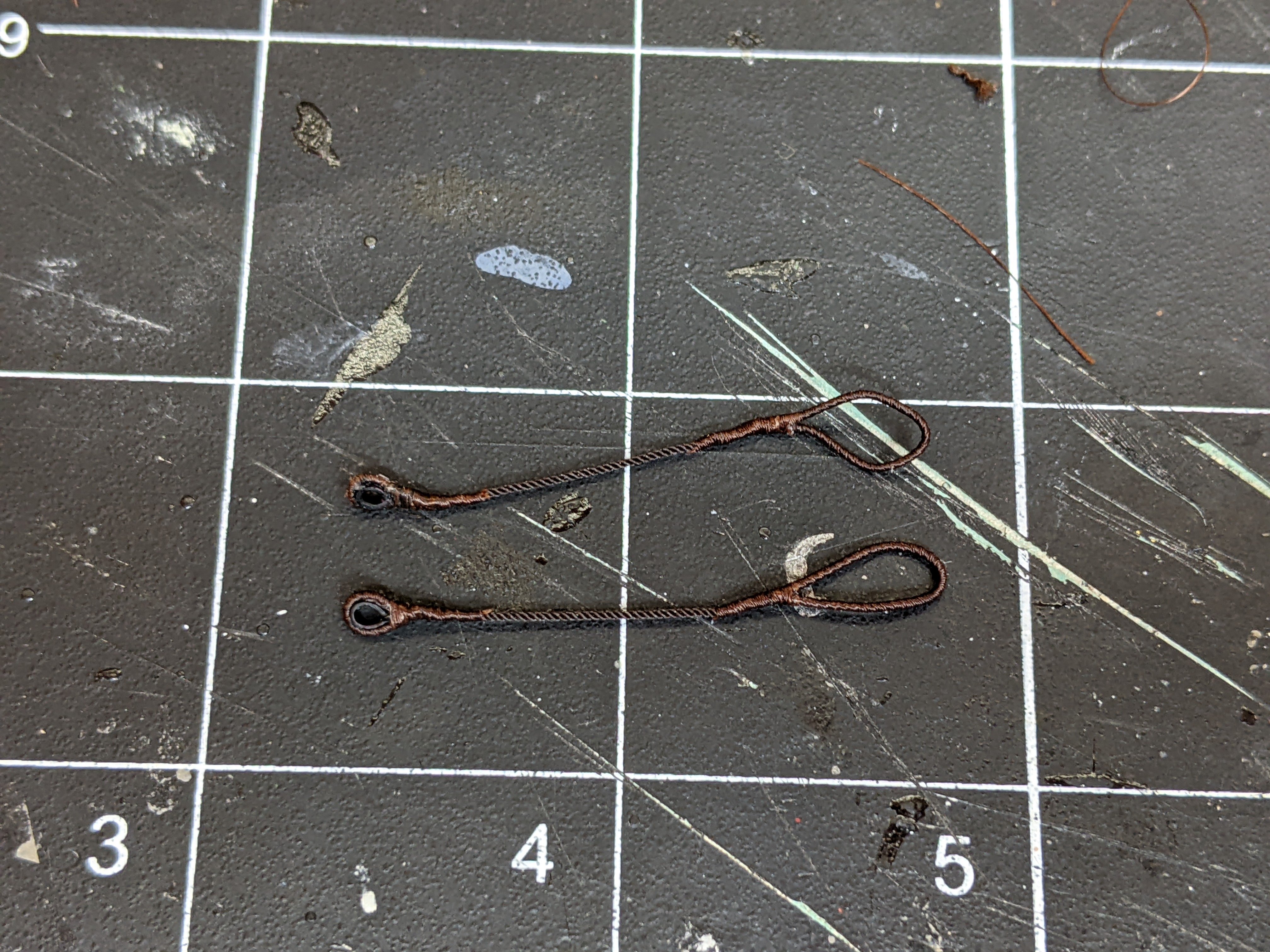
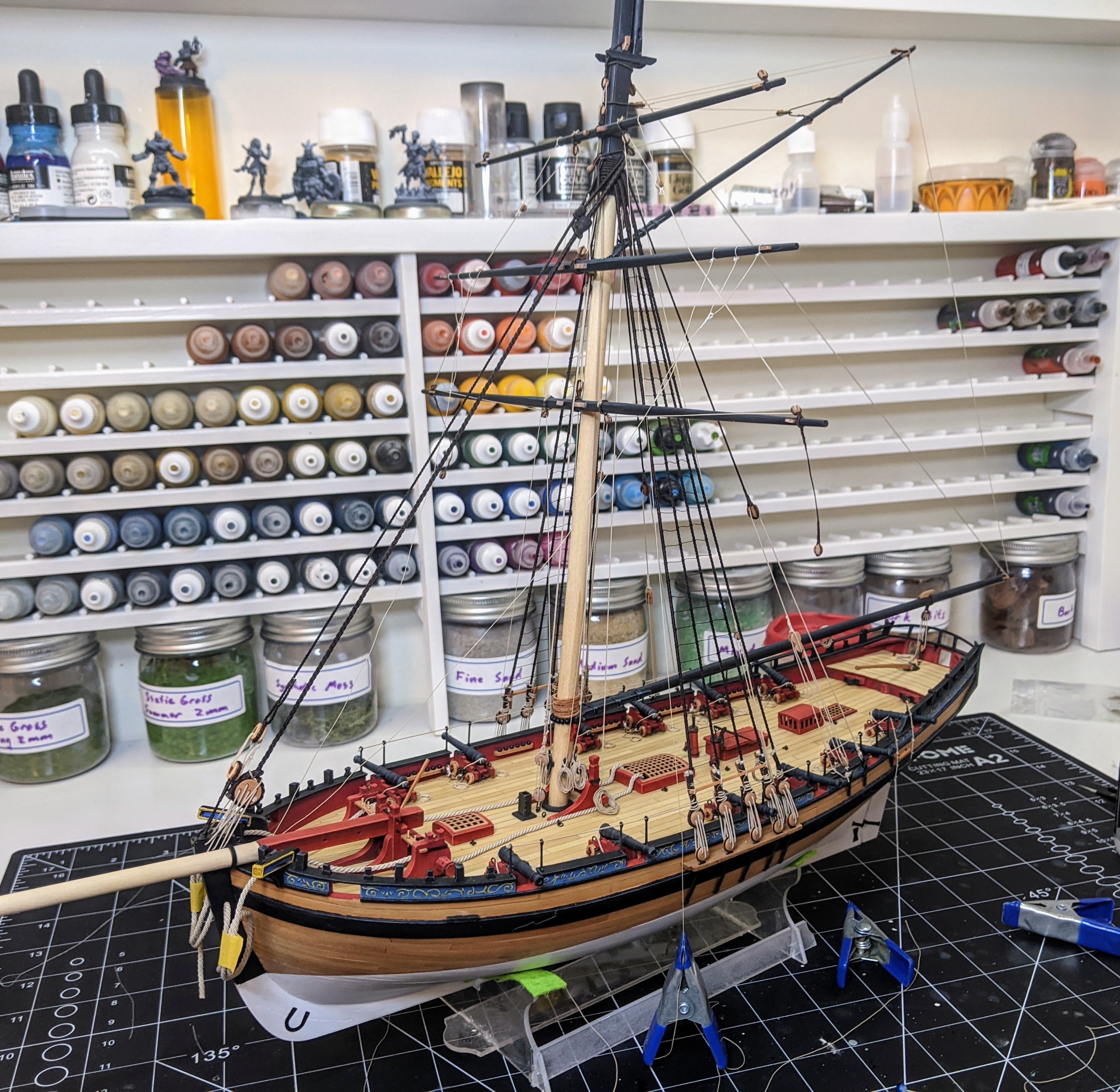
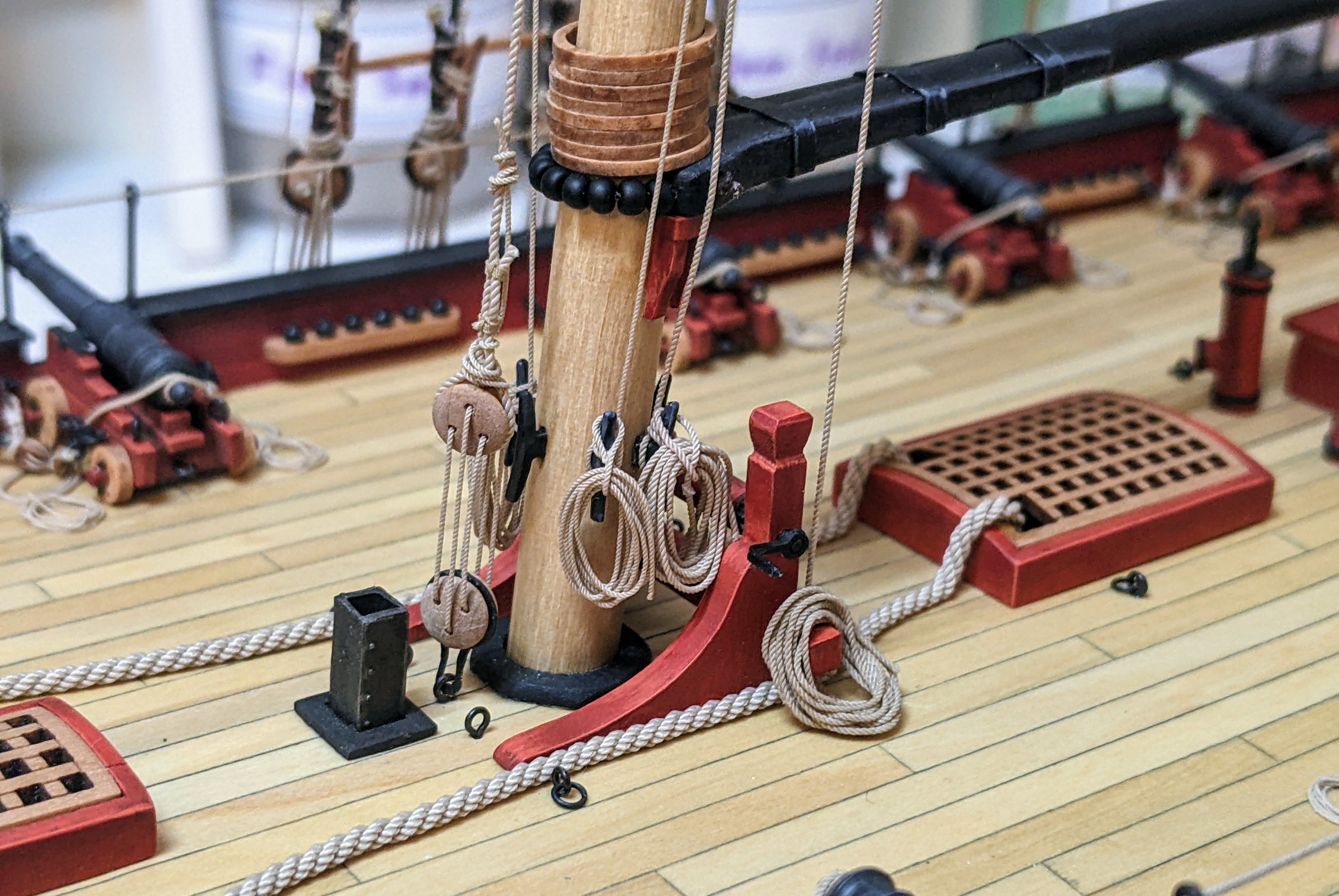
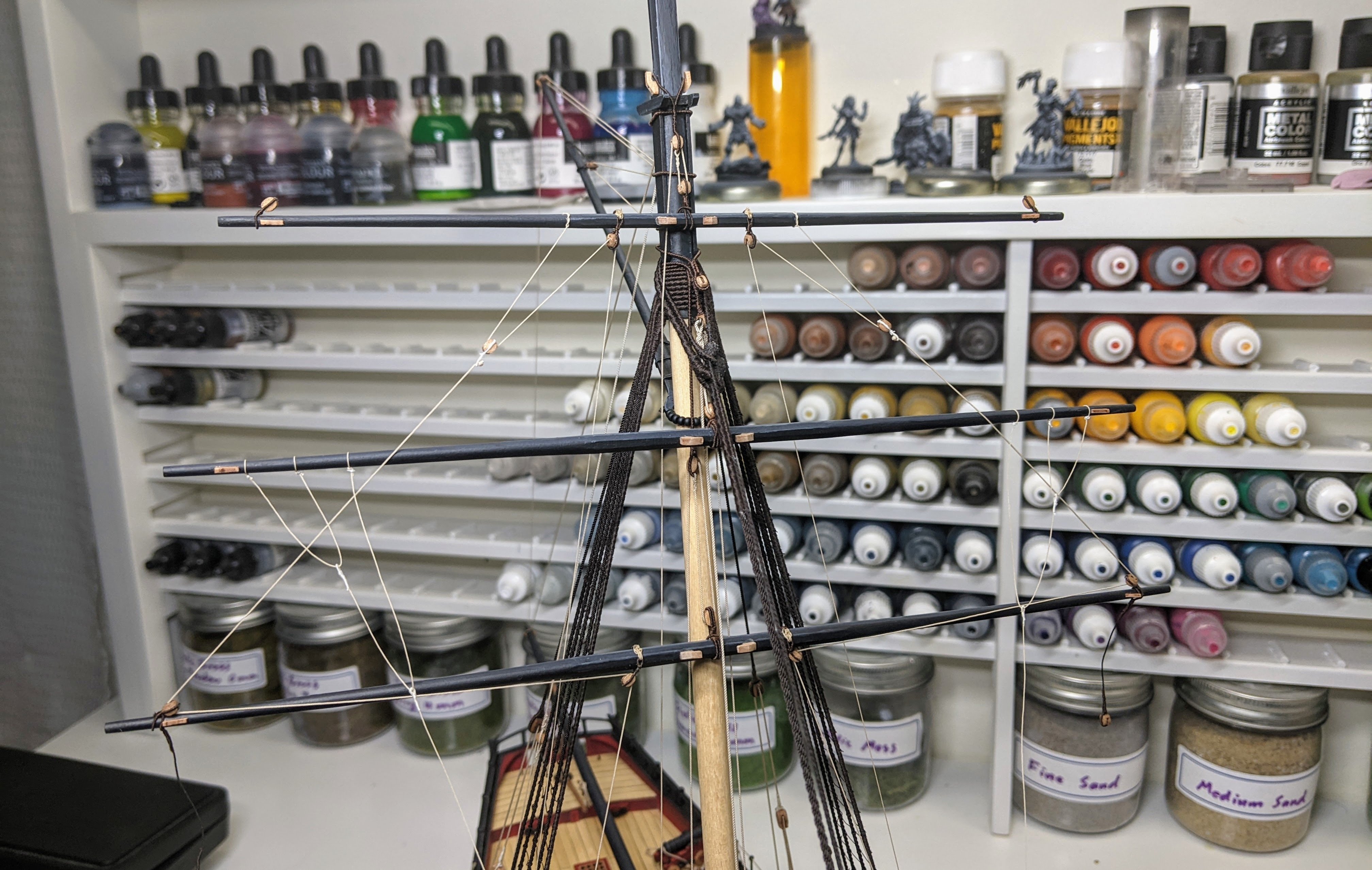
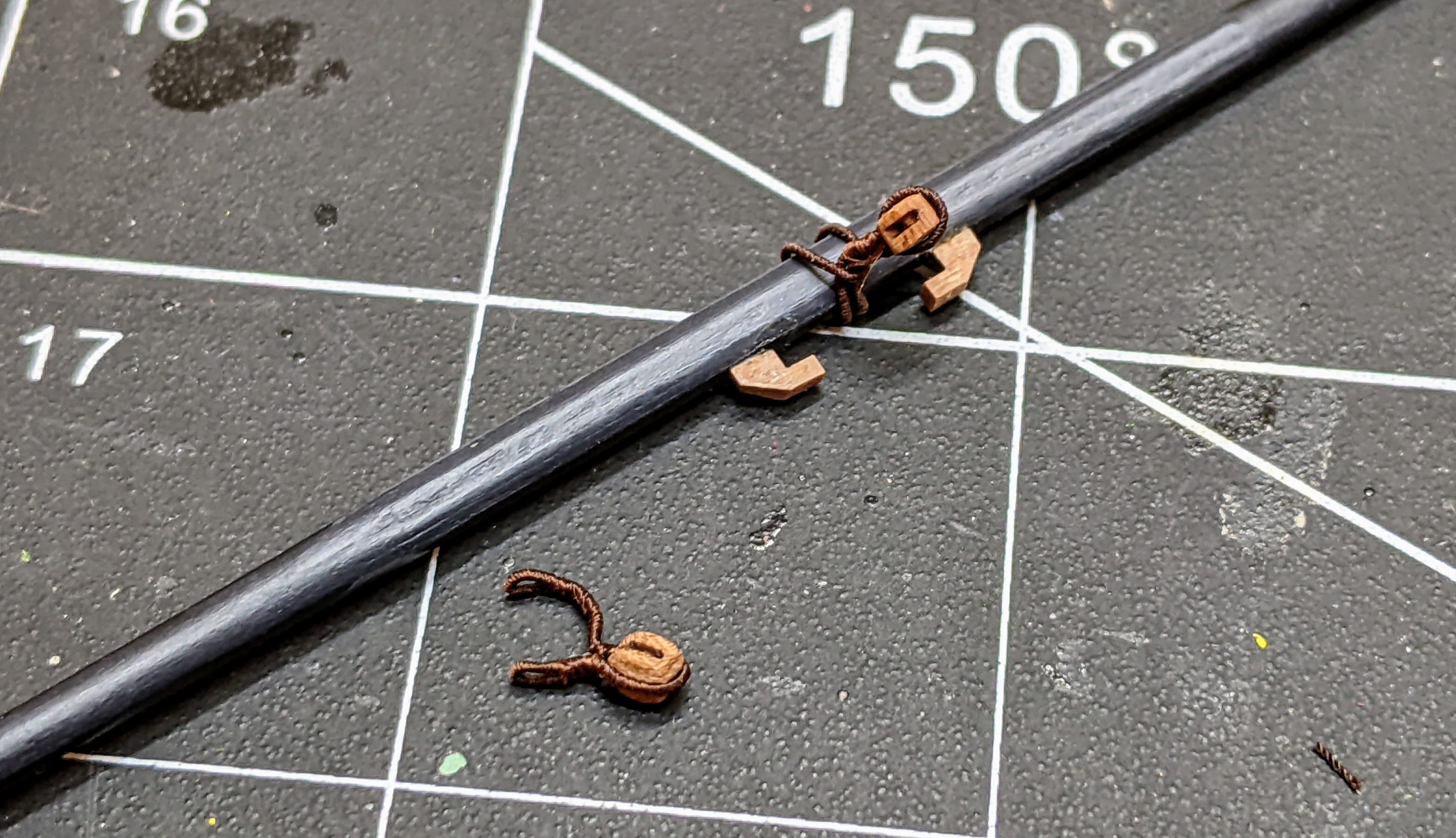
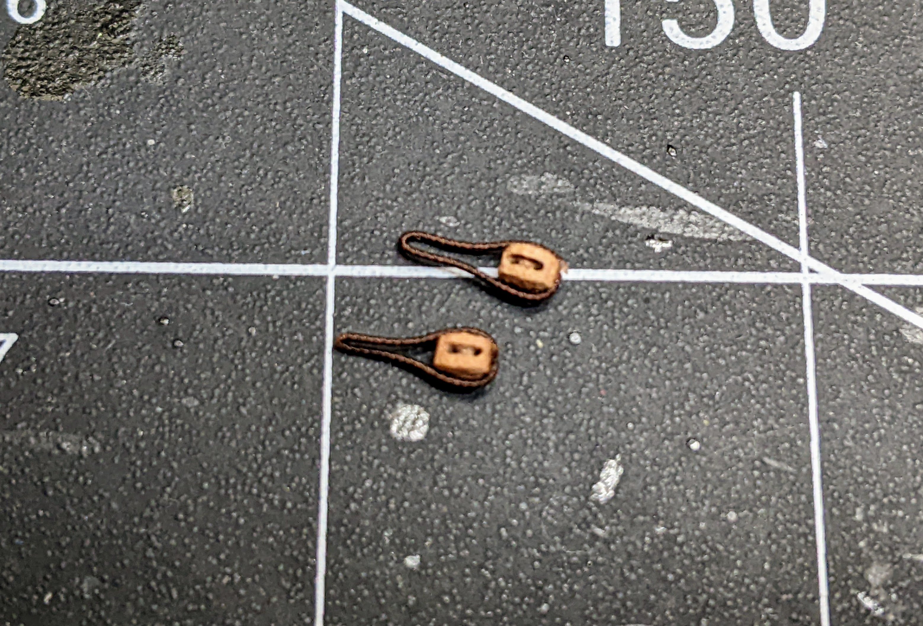
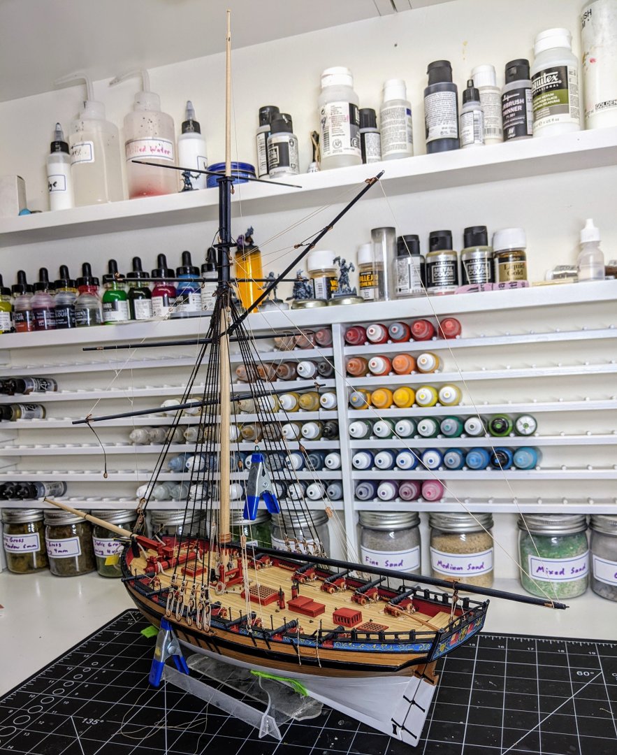
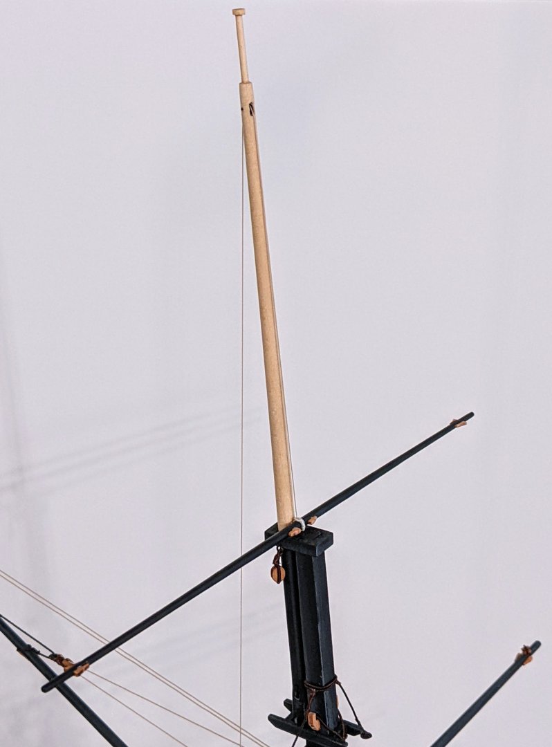
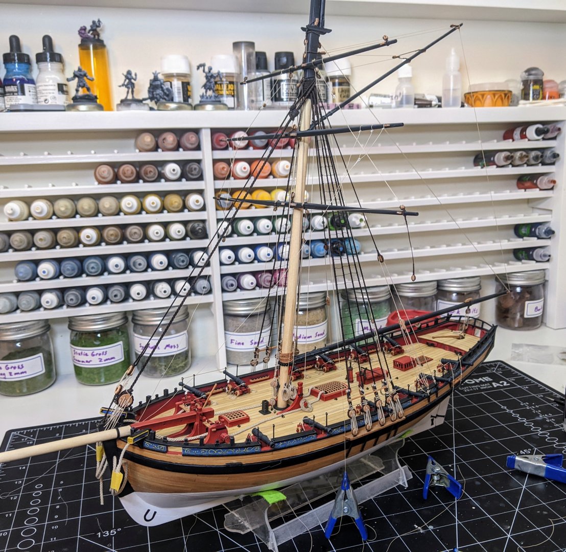
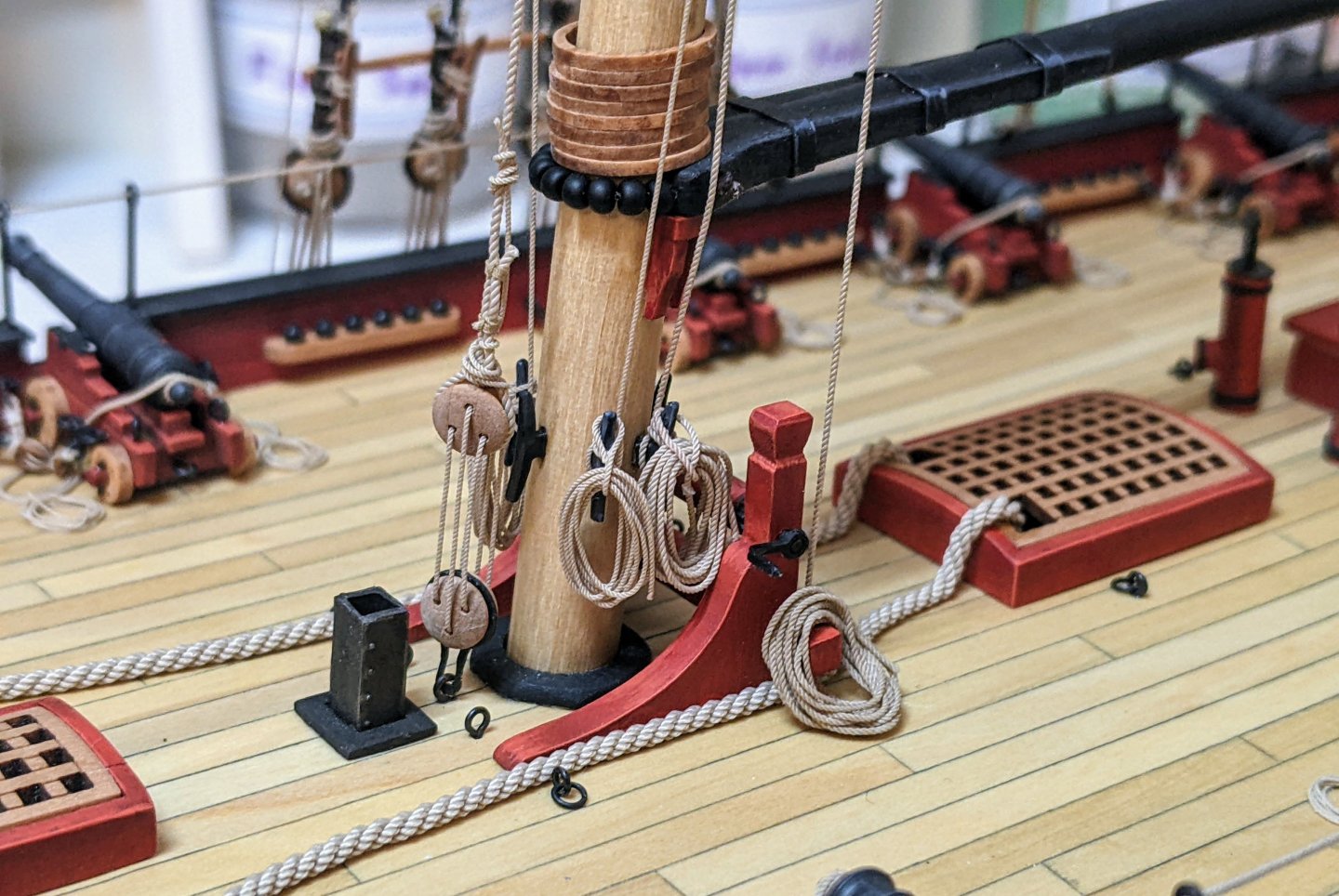
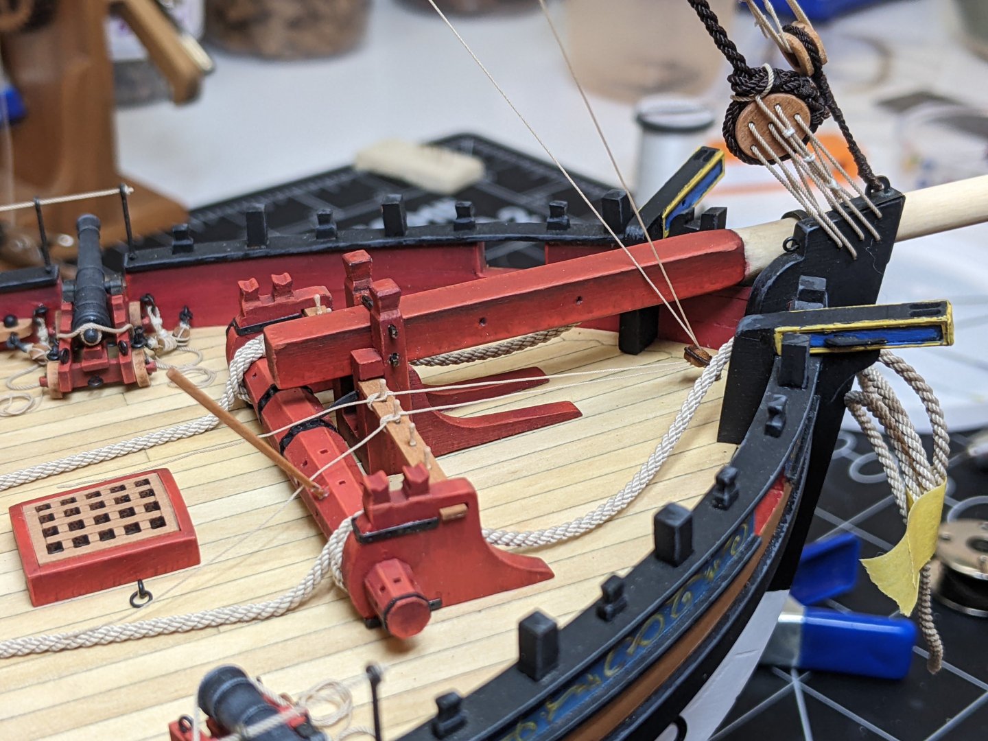
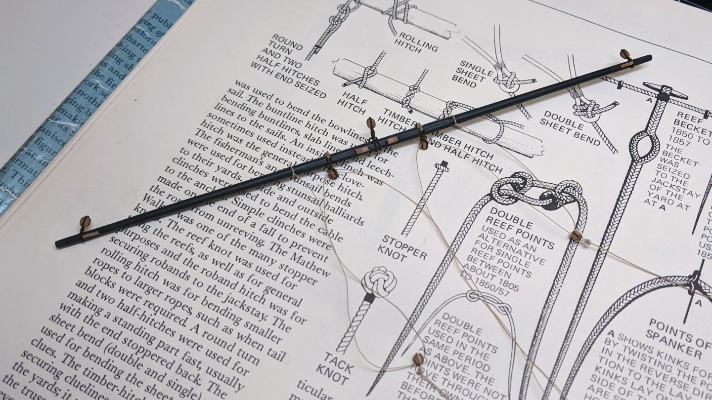
Log #84: The Topgallant Yard I continue to slowly pick away at the mainmast. Things are getting really delicate now as there is so much to catch an errant hand on. I have pretty much run out of 0.25mm rope and so had to order some more. As I need this for the topsail bowlines I have two wait before I can finish up the topsail yard. In the meantime I continued to work my way up and next up were the pendant for the topgallant sheets. I had originally planned to use one of the kit provided thimbles, but when I put it on the model it looked completely out of scale so I decided to improvise. First I took a plastic tube I had on hand (I believe it came from a water balloon) and cut off a small piece. Then I used a sculpting tool to press out the sides to make a thimble. I then held these on a pin and painted them black. I cut a piece out of each to make them smaller and open on one end so they bended like a teardrop. Then I sized around them. This was quite a fiddly process and in the end I probably should have just looked harder from some metal I could do this with, but in the end I got them to look ok. Here they are on the model. Next up was the topgallant yard. This was straight forward with an eye splice that I served over to hold the yard. I used 0.25mm rope based on the steel table. The line runs through a sheave in the topgallant mast and down to the base of the mainmast. Here there was a bit of a canundrom. The kit calls for it to be attached to a 4mm double block which then is paired with a 3mm single with a hook attached to the deck (note this double plus single arrangement is also what Peterson describes). However this doesn’t make a lot of sense to me as all the other yards only have two single blocks and they are much bigger and heavier than the topgallant. Furthermore the 0.25mm line looks tiny on the 4mm block. If I had a 3mm double I probably would have used it but in the end I decided to just use two 3mm single blocks. This is also consistent with the Steel table as it only seems to list single blocks for the topgallant halliard. You can see below the upper of these two blocks. As I ran out of 0.25mm rope I can’t finish the tying off of this line until I get the extra I ordered in the mail. And here is the model in her current state. I am getting close to the end now. Just a few more lines to tie off on the mainmast and then I will be on to the bowsprit.

- 562 replies
-
- 26
-
-

-
- vanguard models
- alert
- (and 2 more)
-
Maybe better to hold off on the glue till all of them are tied. That way if you need to go back and fix one it is easier. You are making good progress. Ratlines are also not my favourite part of the build.
- 125 replies
-
- 1
-
-
- Trial
- Vanguard Models
- (and 1 more)
-
This is true of a lot of the PE. You can make it look significantly better by filing them or in some cases glueing two pieces together to make them thicker.
- 60 replies
-
- 3
-
-
- vanguard models
- cutter
- (and 1 more)
-
What size were the carronades on the niagra? If you look at the topic linked below I posted the size of the blocks and rope and the number of them as of 1798 for the British. Now this is a little earlier than your time period, but by that 1790s it seems the mounting systems for carronades has begun to solidify so it is likely still applicable. That being said as @allanyed notes American practice may have been different. https://modelshipworld.com/topic/36354-gun-positions-and-their-associated-tackle/?do=findComment&comment=1042700
-
GIMP is free if anyone is looking for a Photoshop alternative. And it does most of what Photoshop does.
-
I only just stumbled across this build. I see you are following your usual practice for insane detail at a tiny scale. It is looking great.
-
Nice fix, one of the great things about wood is there is almost always a way to fix just about any problem if you are willing to put in the time.
-
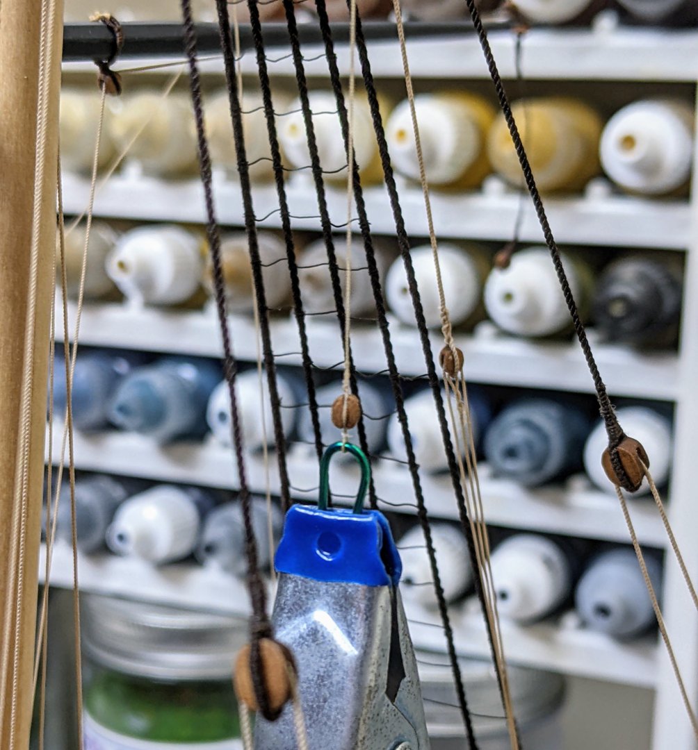
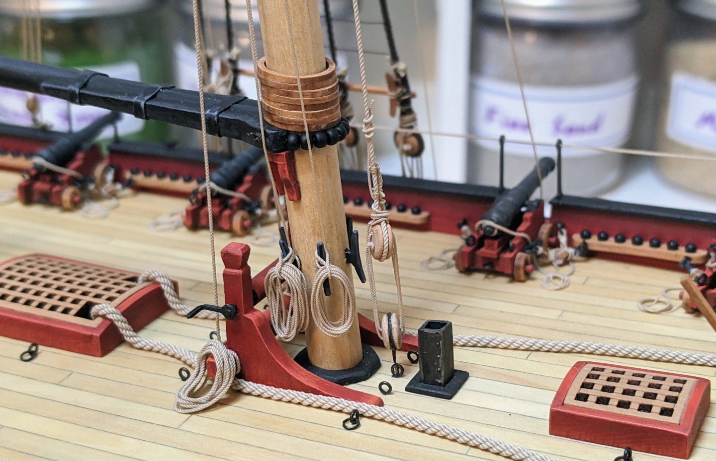
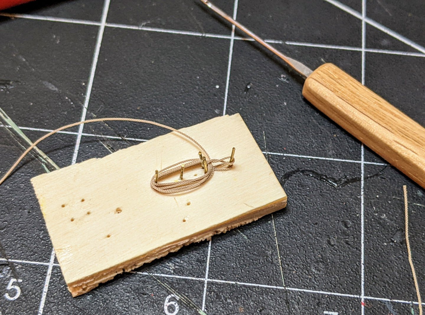
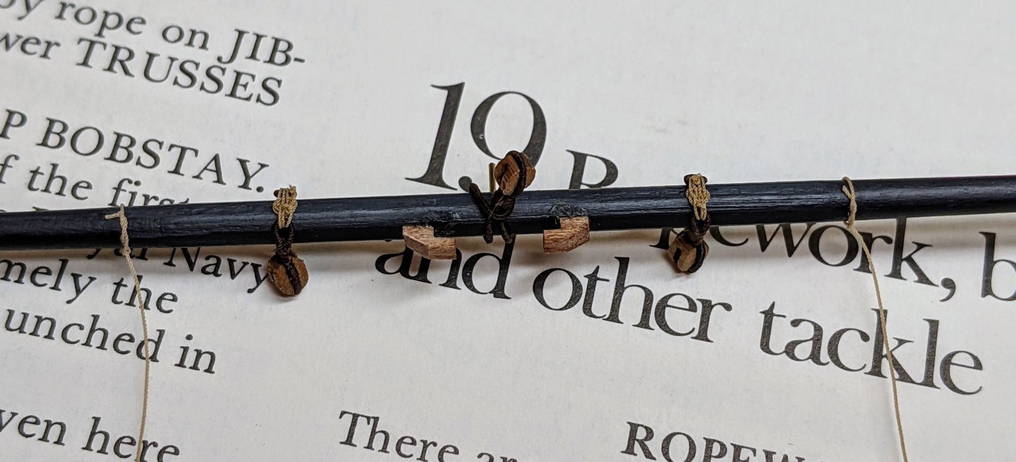
Log #83: Tying off the Ropes Thank you to everyone for looking in and for the encouragement. I always like this stage of the build as the tying off and making rope coils goes very quickly, and so you get lots of visible progress after a long period of preparing the yard off model. I believe I have shown this before but here is my jig for making the rope coils. The top loop starts out on the pin that in the picture has nothing on it. Then once I have done a few loops I twist it and fold it over. Then I finish the hank by continuing to loop the rope and insert the end into the gap between the two loops for the cleat. Once it is done I use a dab of super glue to fix the loops together and the end of the rope in place and then give it a few blasts with the hair dryer to try and get it to stay in shape. I then slip it onto the cleat and use super glue spots to tack it into place. You can see below I have belayed the topsail lift to the mast cleat on the left and the starboard topsail sheet to the cleat on the right. Then the larboard topsail sheet was belayed to the left cleat in the below picture. The right cleat is holding the previously belayed squaresail yard. I am going to hold off on belaying the clewlines until I get the topgallant sheet lines in place so I can make sure they avoid each other. Below you can see the current state of affairs.
- 562 replies
-
- 23
-
-
-
- vanguard models
- alert
- (and 2 more)
-
Great job. Your planking turned out really nice.
- 16 replies
-
- 1
-
-
- half hull
- Half Hull Planking Project
- (and 2 more)
-
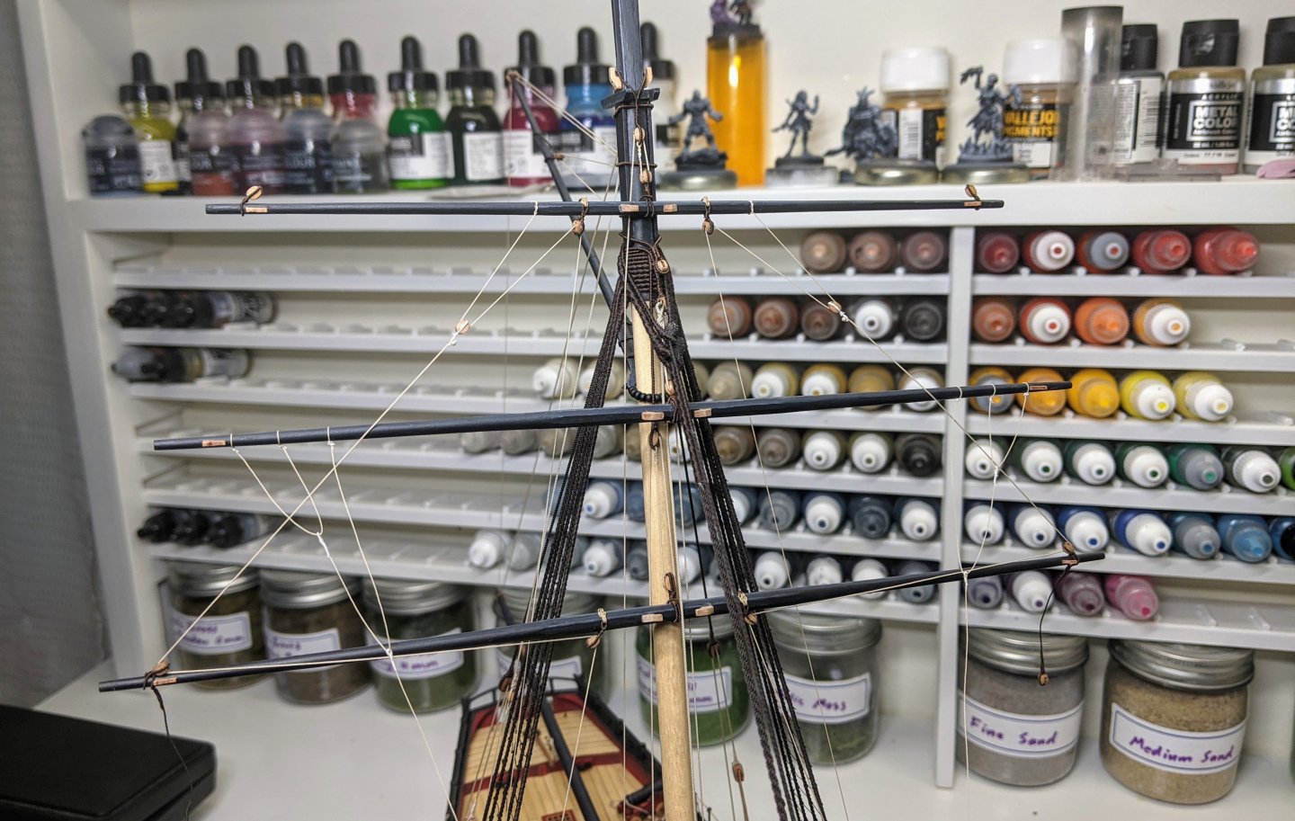
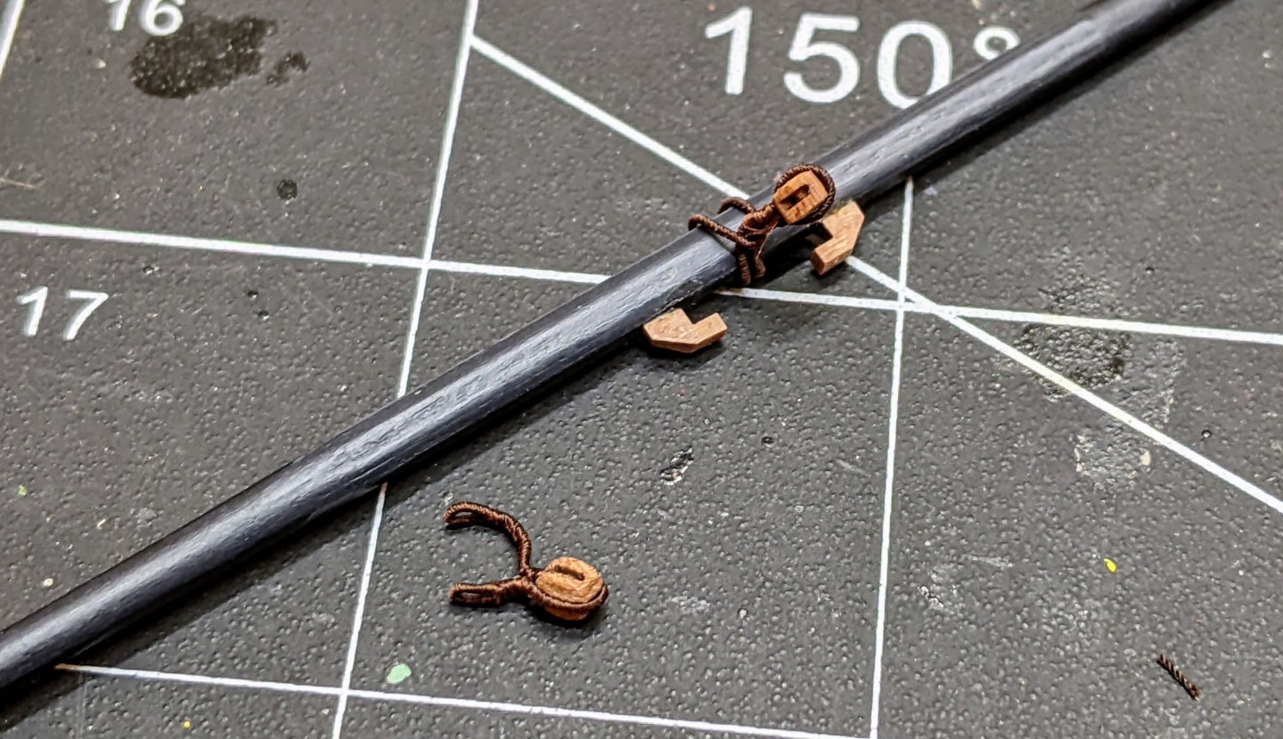
Log #82: The Topsail Yard Following up on the question of what to do with the bowlines I decided to go with the kit arrangement and belayed them to a double block at the bow and then to the pin rack on the windlass. These are just loosely in place so I can adjust everything once all the yards are fully in place. In the meantime I continue to work my way up the mainmast and next up is the topsail yard. This necessitated the stropping of a number of blocks. You can see below my new method for doing this. I simply serve a long length of line, use thin super glue to secure it at the appropriate length and cut to size. I then glue both ends to the back of the block forming the loop. If I am careful and do a clean cut you can barely see the line and this I have found seems to be the most secure way of doing this. Once the loop is on the block I can use the serving machine to do the seizing. I have found that I can now make the block right first time as opposed to my older methods which inevitably necessitated a number of remakes. I also made two blocks with eyesplices in the ends to be lashed to the yard. I then lashed them with a rose lashing. Now that I am starting to get the hang of them they are not that hard to do. The ends of the clew lines are secured with a timber hitch knot as per Lees. This is much less complicated than the arrangement shown in Goodwin. And with that the yard was done. For the clewlines I used 0.25mm thread and for the sheets 0.35mm. The blocks were all stropped using 0.35mm line sized with the fly tying line. The rose lashing was done with 0.2mm line as previously described. For the lift I also used 0.35mm line. All of the blocks on the topsail yard were 3mm. Ideally I would have used 2.5mm blocks for the clews, but I didn’t have any so I had to make do with the 3mm ones from the kit. I decided to hold off on the bowlines for the topsail as I found I can slip the loops on the yard easily and then pull them tight and this way I don’t have to worry about another set of ropes to snag. You can see below the yard hanging on the model. Nothing is permanently secured yet as I have clamps hanging from the falls to make sure everything stretches properly. As is my usual practice I will go back in a few days and start securing the lines one by one. I will discuss where I am belaying everything to at that time.
- 562 replies
-
- 17
-
-
- vanguard models
- alert
- (and 2 more)
-
Great job. You should be proud of her. Do you have plans for what you want to do next?
- 177 replies
-
- 1
-
-
- Perseverance
- Modellers Shipyard
- (and 1 more)
-
Looks great. One thing you can experiment with next time is putting even more blue in the shadows. If you look at icebergs in real life they look bluer in the shadowed lower portions and whiter on the top.
- 109 replies
-
- 6
-
-
-
- Ghost Ship
- Jenny
- (and 2 more)
-
Caruana does reference ADM 160/150, but it is a fairly large document with many tables that cover the pages. I have had it since late December and I only just noticed these details. The blocks for the guns are hidden in these tables and you have to do a bit of analysis to get the sizes based on seeing what guns and what blocks / breechings / tackles a given rate was assigned. There is no place that lists this size of block for this size of gun. So you could be right that it represents a change at this point or I could also easily believe that in the many documents he was reading he missed this detail.
-
Your best bet is to just get some milliput or similar epoxy putty and use that to fill the gap. The nice thing about milliput is you can thin it down with isopropyl to create a slury that flows into gaps. Also can use sprue gue (take some small pieces of sprue, put it in a old plastic glue bottle with plastic glue). I have used both to great success. In a pinch you can also do the super glue thing.
-
So this is a bit of a dangerous subject with more opinions than their are paint brands, but I will throw in my two cents as someone who has been painting miniatures for almost a decade and has tried many of the paint brands out there. When it comes to paint for models the most important thing is that it uses a small pigment size. Any of the major brands (Vallejo, citadel, army painter, kimera, two thin coats, P3, AK, etc…) all should do the job. I have never used Tamia so I can’t comment on it. All acrylic paint should be interchangeable, it just depends on which ones you prefer. So really it comes down to the individual paints. There are variations in thickness, flow, gloss vs matt etc… Much of this is personal preference. I have certain paints that I find are better in different brands. For example my favourite black is the vallejo model colour one, but I also love citadel’s incubi darkness for darkening red. AK has a really nice flat white, while the citadel one is awful. When it comes to citadel the main downsides are the price point ($$$$$) and those awful pots they come in (buy some dropper bottles and transfer the paint to them). But that being said at least half my paint collection is citadel because they have some really nice colours (I love their reds). All paints need to be thinned down (my general rule of thumb is 1 part water to 1 part paint, but it will depend on the brand), you can test this by painting a little on the side of your hand. If you can still see the lines then you are good, if you can’t your paint is too thick. Also make yourself a wet pallet (google it and thank me later).