
Thukydides
-
Posts
1,363 -
Joined
-
Last visited
Content Type
Profiles
Forums
Gallery
Events
Everything posted by Thukydides
-
 It's looking good. Keep an eye on the bow, I think it is just the angle of the photograph (not completely straight on), but, it appears that the strakes meeting the stem are starting to get a little bit out of line with each other.
- 152 replies
-
- 2
-

-
- Vanguard Models
- Cutter
- (and 2 more)
-
For what it's worth I don't think the mark will be that noticable. It is hard to tell from the picture of it is an indent or a bump. If it is a bump you could o as you said masking off the area. Note this doesn't have to be perfect as the line is already established. Just mask off the specific area you want to work on. If it is an indent what you could do is brush on some varnish on the area. This will level and fill the area. Then sand and mask and paint again. In either case give it a few days before trying anything. It is looking really good.
- 122 replies
-
- 1
-
-
- Artesania Latina
- Pen Duick
- (and 1 more)
-
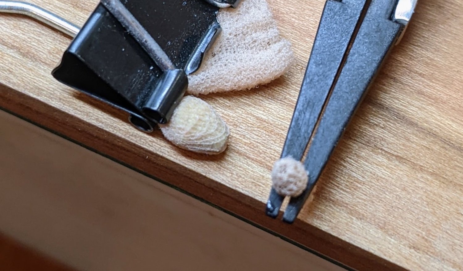
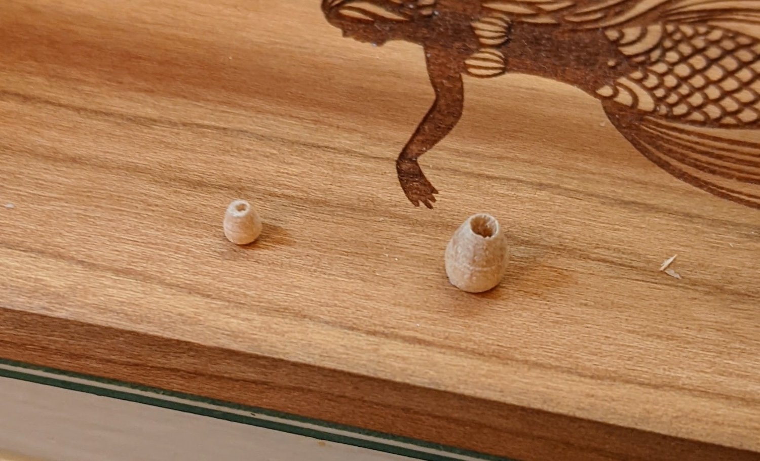
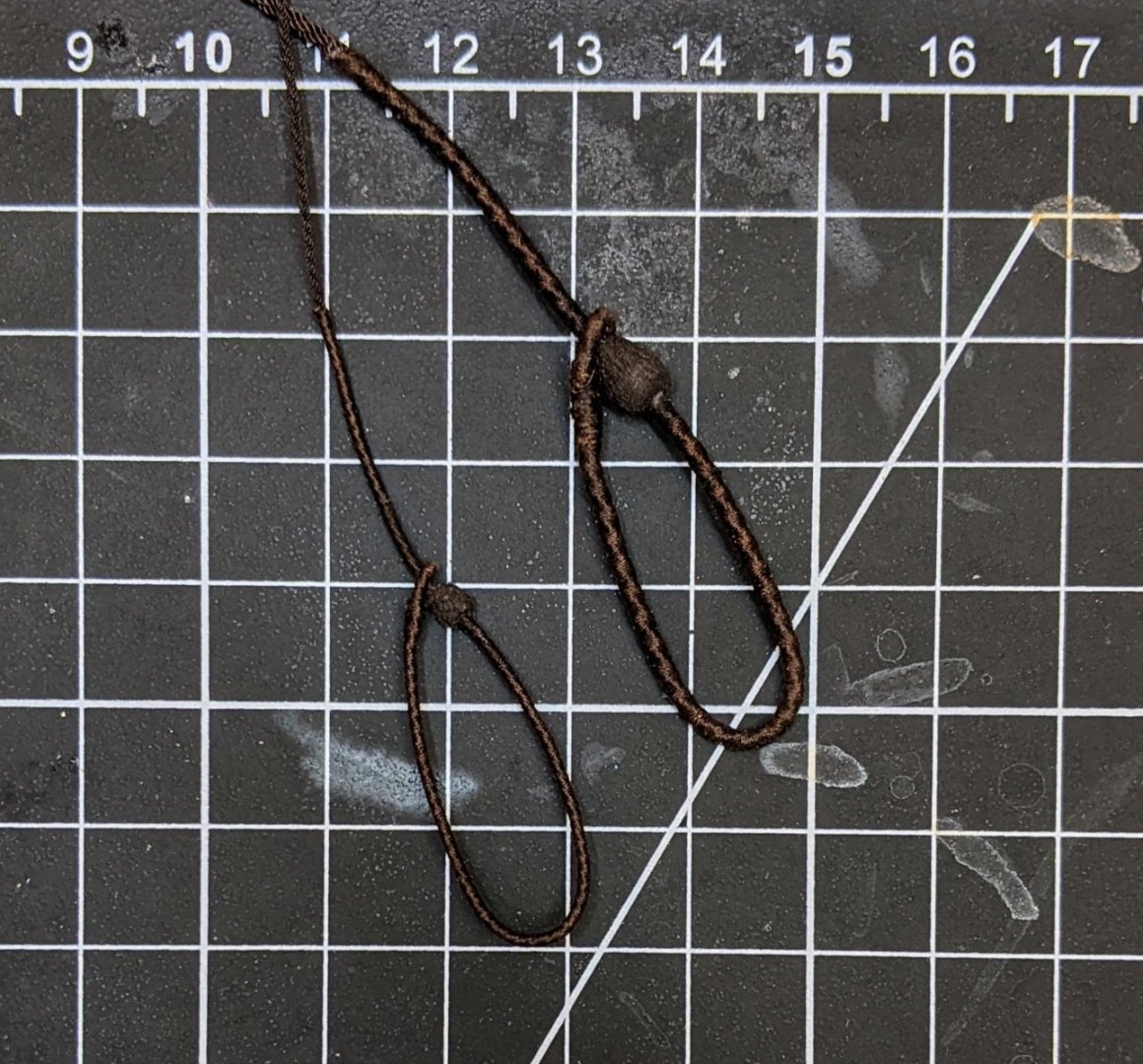
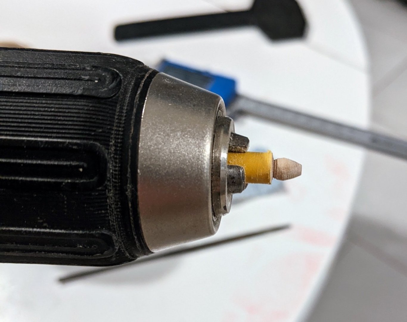
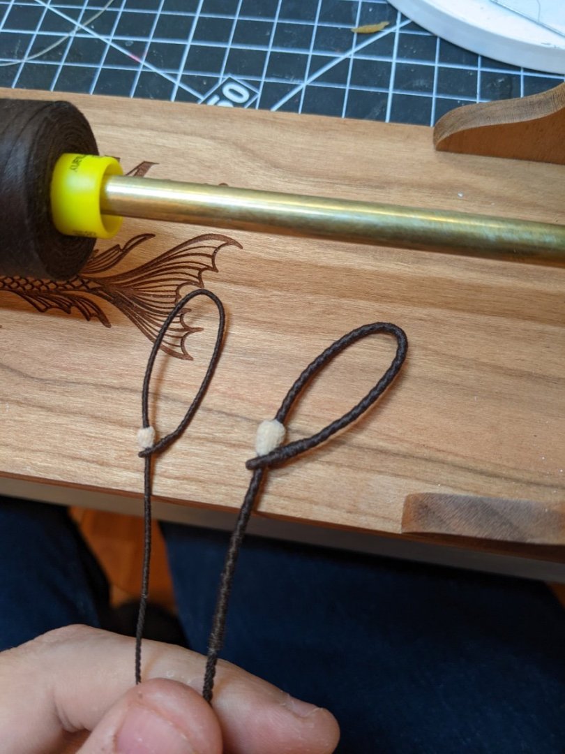
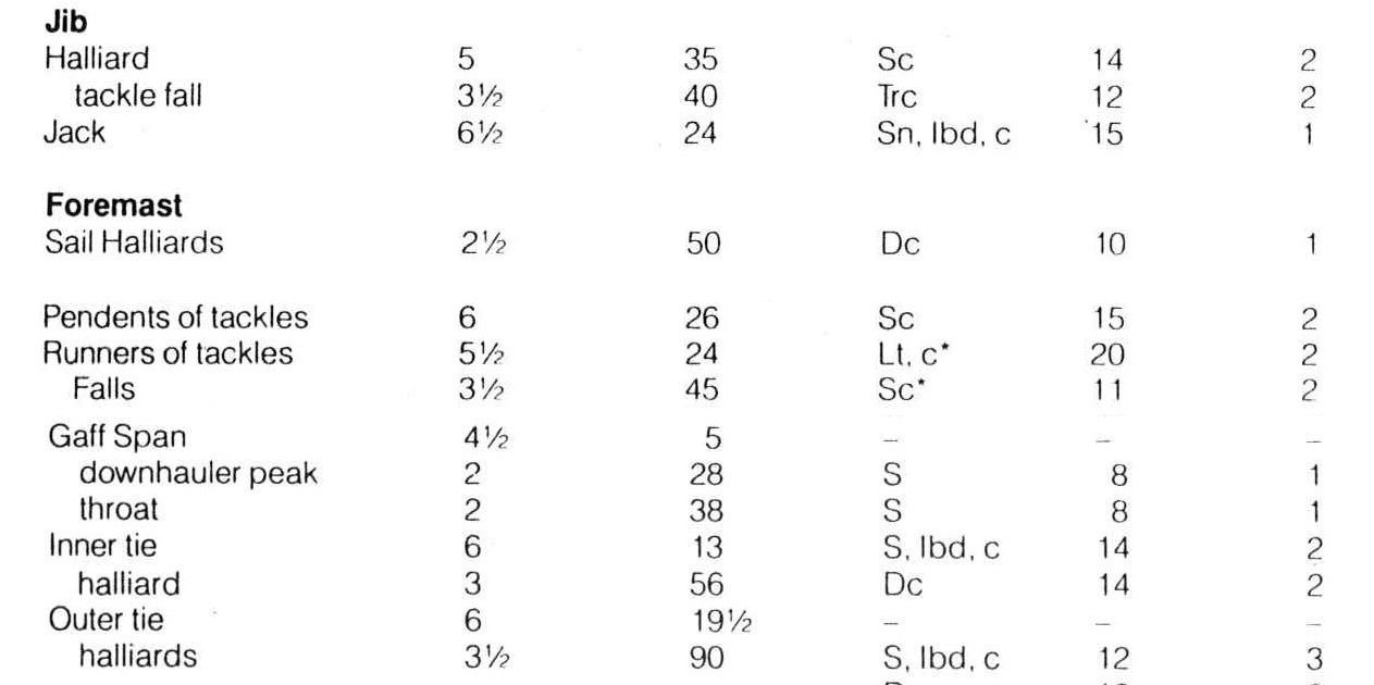
Log #54: The Mainstay and Preventer Stay Having settled on a plan of action (see previous post) I realized that I didn’t have the correct sizes of rope and so while I wait for another rope order to arrive, I started work on the stays. The mainstay is listed by steel at 13 inches circumference which works out to 1.6mm at our scale. As noted by BE in his log, this seems a bit on the chunky side, but after some thought I decided to stick with the steel tables. As the cable laid rope has larger gaps between the threads I decided in this case to worm it first. This helps the served portion to look rounder and particularly on this large rope I think it helped. I used beige thread as it is very hard to see what you are doing with the darker thread. For the mouses I decided to copy the example of @DelF in his speedy log where he turned them using a piece of dowel. Not having a lathe I had to use my drill. I marked off the length with tape and then used sandpaper and a file to get the right shape. The diameter of the mouse should be 3x the diameter of the rope so in this case this worked out to 4.8mm for the mainstay and 2.4mm for the preventer stay. I then drilled holes in them starting with a smaller bit size and then slowly increasing the size until it was correct. Then I covered them in watered down p a and stretched some tights over them holding them tight with clamps. The excess was then cut away and a spot of super glue was used to secure them in place on the stays. I then painted them with a very watered down (2 parts water to 1 part paint) 50-50 mix of citadel rhinox hide and VMC flat black.


- 562 replies
-
- 20
-
-

-
- vanguard models
- alert
- (and 2 more)
-
Thanks @Gregory for the suggestions to look at cheerful. I did find it helped clarify some things in my mind. @Blue Ensign I appreciate the encouragement. I do consider your log the gold standard when it comes to rigging alert and the care and detail you put into your explanations is fantastic. That is why whenever I am not sure I am arriving at the same conclusions as you or I can’t figure out why you decided to do things the way you did it gives me pause. I am hesitant to deviate from what is so clearly meticulously researched :). I think after much consideration I have a potential plan (see the picture below). Basically I have made a compromise between what the kit says (partially due to the blocks I have on hand), @Blue Ensign’s log and my own musings on Goodwin and the Steel tables. The running part of the rigging I still need to give more thought to, but I think this is a reasonable plan for the standing part of the rigging.

- 562 replies
-
- 8
-
-
- vanguard models
- alert
- (and 2 more)
-
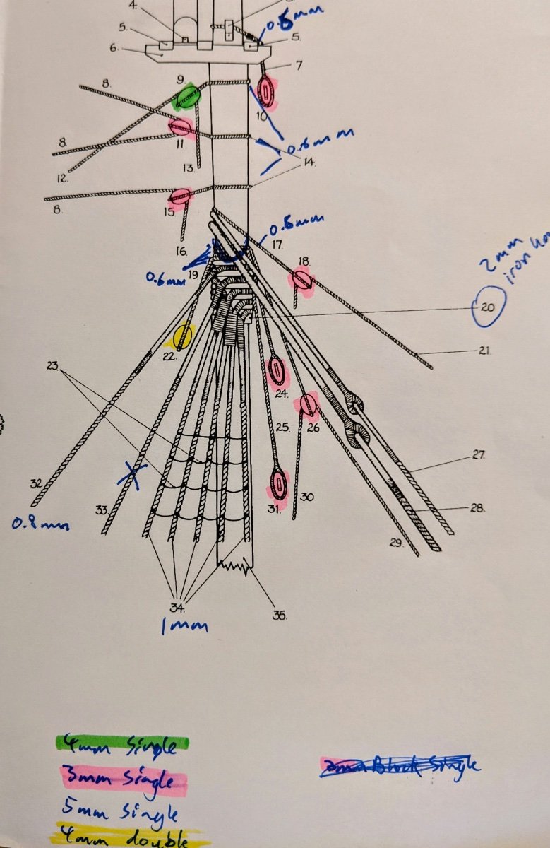
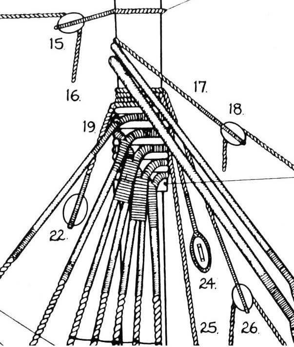
Log #53: Puzzling about the Mainmast Standing Rigging I have not gotten much done since my last update as I have spent most of my time trying to plan / understand what should be going on with the mainmast standing rigging. The problem is exacerbated by the fact that there are some inconsistencies in Goodwin and as far as I can tell, names for these sections are not always consistent. My main confusion comes from trying to figure out the sizes / seizing for the pendants just above the shrouds and backstays. My main reference has been this diagram from page 117 of Goodwin. You can see above the shrouds and backstays there are four smaller lines. These are labeled: 19) Standing gaff jeer tackle 25) Spreadyard standing tie pendant 24) Square sail yard standing tie pendant 26) Foresail halliard pendant Goodwin seems to use the term haliard and tie interchangeably (he explicitly says this earlier in the book). From this diagram we can also observe that these pendants are all drawn around the same size, but are smaller than the shrouds. As a note, the running backstay (the very top of the heavy lines falling away to the left) is slightly smaller than the shroud lines. This may not be on purpose, but is one of the reasons I decided to go with a slightly smaller line for it as articulated in my last post. Below I have copied sections of the steel table. This is where things get confusing. The names used do not always match and even when I think I have a good guess as to which is which, the line/block sizes don't really line up with either @Blue Ensign's very detailed rigging explanations or the kit plans. Since my default assumption is that I know less about rigging than either of these two, I am having trouble reconciling everything. So here are the questions I am mulling around in my head and am hoping anyone reading might have some insight on: I had assumed (see my last post) that the pendents of tackles referred to the ruining backstay. My reasoning for this was (a) there is no mention of backstays in the steel list (b) the fact that it had both runners and falls along with a fiddle block lined up very well with Goodwin's wording for the various parts of the running backstay (c) the size seemed about right as I imagine it would be slightly thinner than the shrouds. However, Blue ensign in his blog references them as a completely separate piece of rigging and googling the matter it seems that pendants of tackles might have been used to lift stuff. So are these not the running backstays and if not then where in the table are the running backstays referenced. Either the inner tie or the outer tie seems to me the best fit for the three ties, but a few issues with this come up: The size of this line is the same as the pendants of the tackles that I used to size the running backstay. From the diagram they are depicted as thinner than the backstay. Both Blue Ensign and the kit plans appear to depict this with a much thinner line and smaller blocks than indicated by the steel tables if I go with the assumption that the inner/outer ties are referring to these pendants. The foremast sail haliard appears to match the name for #26, but if true then the rope size for this one is much smaller than for the other ties. Maybe this is only referring to the ruining part of the rigging and not the standing part? The Gaff Span appears to me to be the best match for #19 and I assume that it is referring to the standing part of the rigging while the downhauler peak refers to the running parts that go to the end of the gaff and the throat refers to the running part of the rigging that goes to the base. However this brings up the question why the standing rigging for the gaff is thinner than that for the square sail spars. Any insight anyone is able to share on this would be appreciated as I really want to get this right even if it means I have to go back and redo some stuff.
- 562 replies
-
- 3
-
-
- vanguard models
- alert
- (and 2 more)
-
New member with questions about first kit options
Thukydides replied to HeyIwanttolearn's topic in New member Introductions
Yes, he is located in UK. I believe he also has a German distributor, but the instructions for those ones I believe are in German. -
New member with questions about first kit options
Thukydides replied to HeyIwanttolearn's topic in New member Introductions
Yes the list is a bit dated. The hard thing with recommendations is it is impossible to do so without knowing more about the builder. What is your comfort level with modeling in general, do you have any experience with wood, what catches your imagination, how determined as a person are you (do you need to see results quickly to keep yourself motivated), how much does price matter to you. All of these factors impact what sort of project you should do for your first one. That all being said if you want to build a warship that covers all of the basic skills you will eventually need to build something bigger I would recommend starting with a cutter (speaking as someone who is working on his first model ship). If you are more unsure or have limited experience modeling then go with something smaller such as a fishing boat. Some options I would recommend are below: Non Warship: The beginner three boat series from Model Shipways Vanguard's Nisha Warships: Vanguard's Alert Vanguard's Trial Cutter Amati Lady Nelson - This is much cheaper in the short term, but you may find yourself spending money in the long term upgrading the parts. Vanguard's offerings let you make very nice models out of the box. -
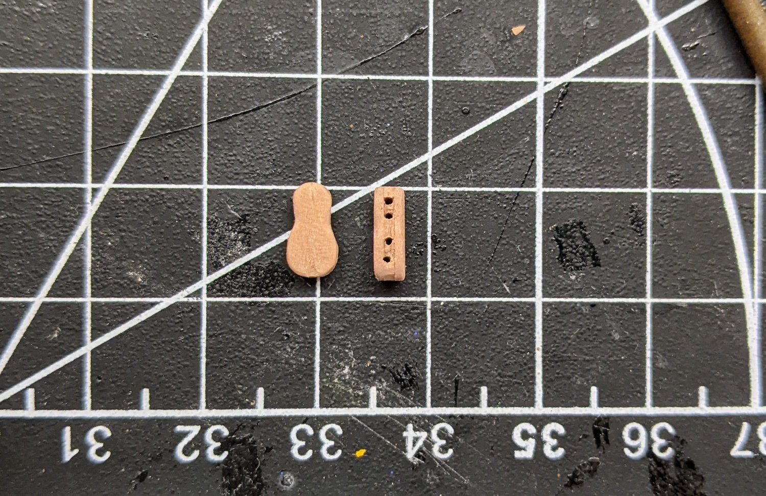
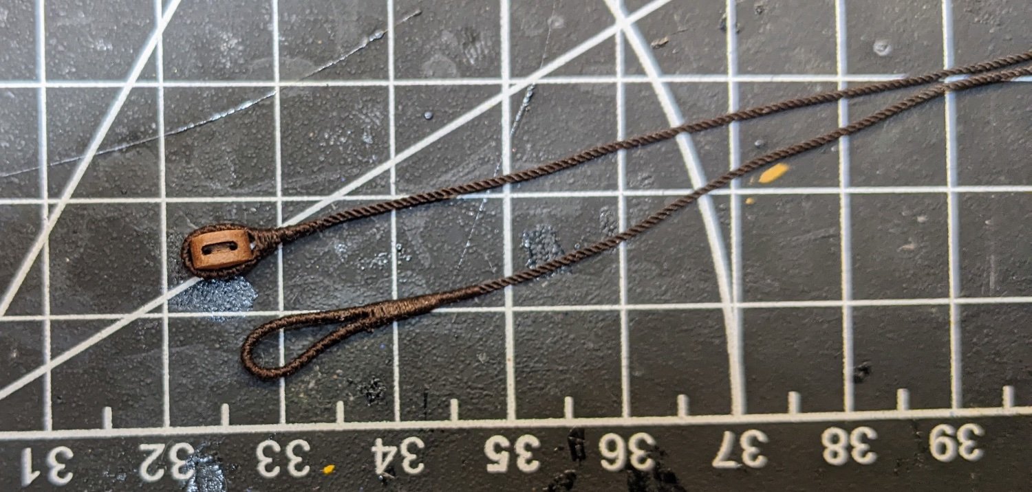
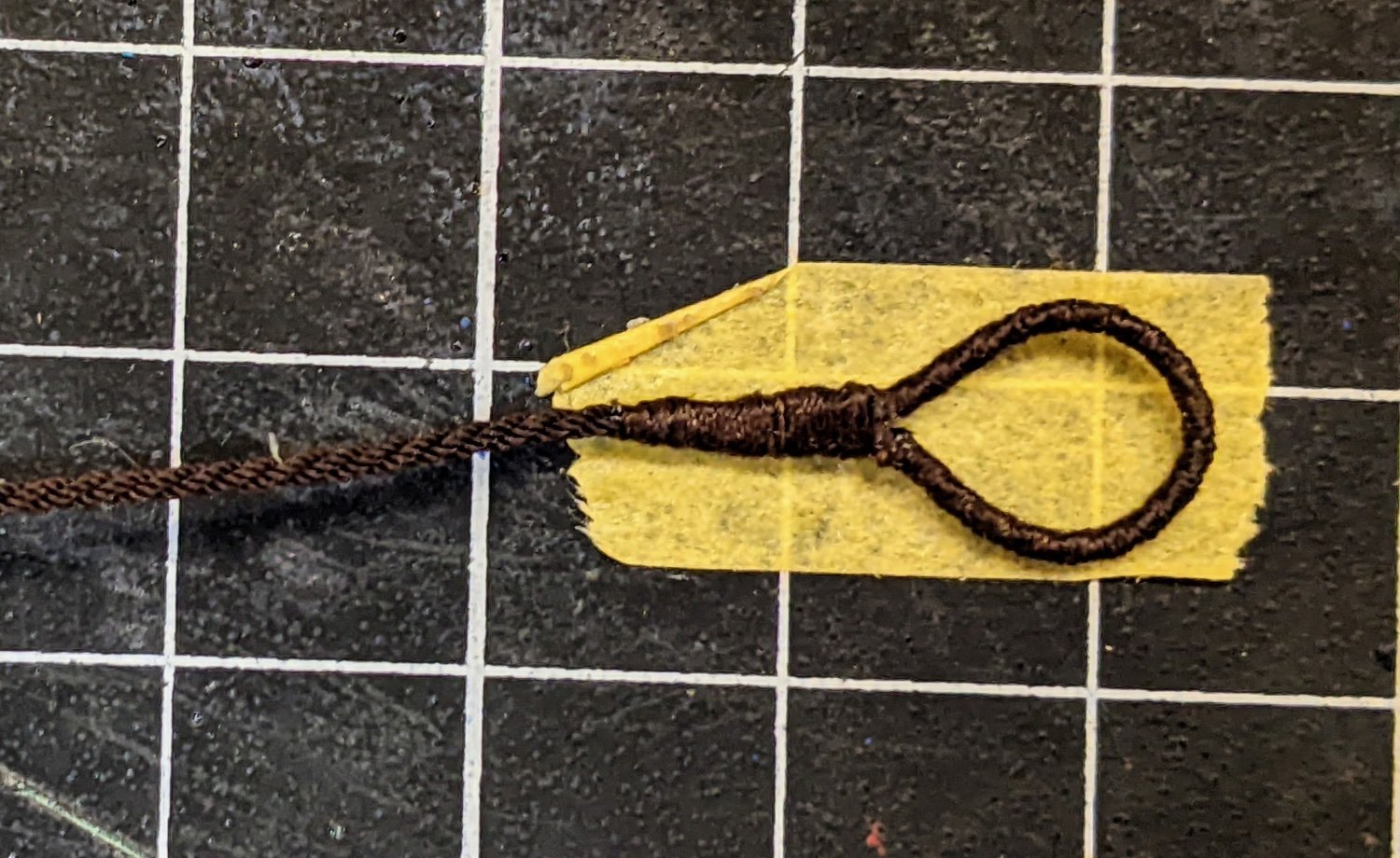
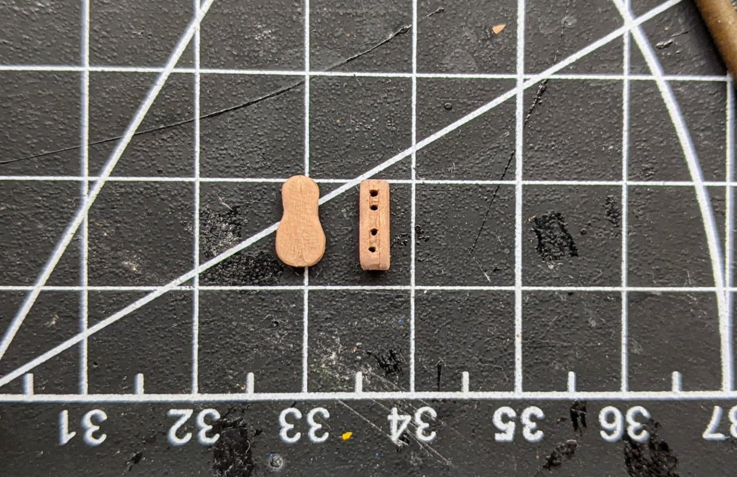
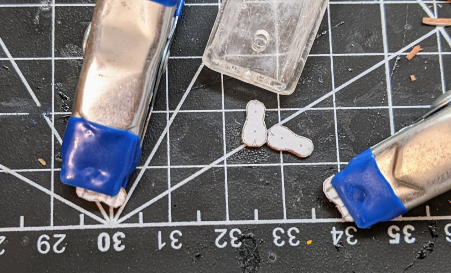
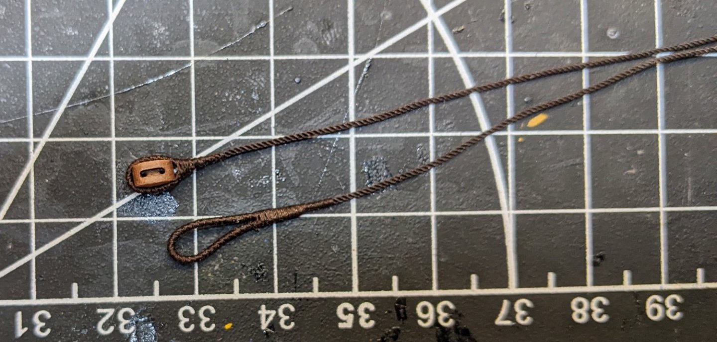
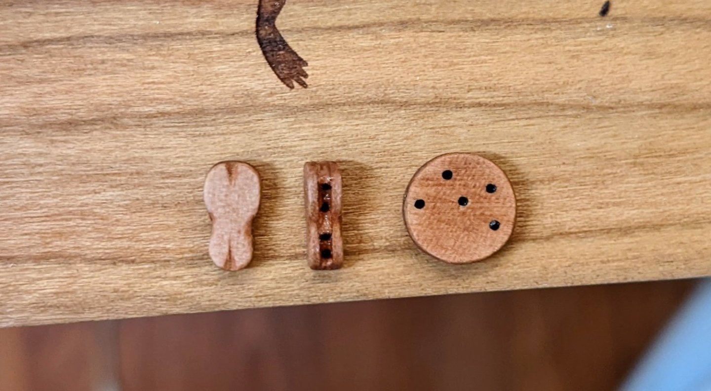
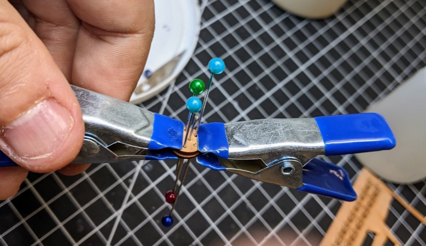
Log #52: Running Backstay and Fiddle Blocks Thanks @jpalmer1970 and @glbarlow for the caution with regard to the rigging. I will keep that in mind when I eventually get to actually fixing stuff in place. With the shrouds done it was time to move onto the backstays. I have decided to copy @Blue Ensign’s arrangement for these as in my digging around I came to many of the same conclusions he did and aesthetically I like the look of his arrangement the best of the options. I will not go through this as he already covered it so well in his log. The main posts on the subject you can find here and here. The question I ran into was what size of rope to use. The running backstays are not listed (at least under that name) in the Steele tables. However after looking back and forth between the table and the rigging descriptions in Goodwin, I think that the “pendants of the tackles” is referring to the pendants for the running backstays. My main reason for thinking this is that they reference a long tackle block (fiddle block) which I know is used on the running backstay. So using this assumption I went for 6” rope which equates to roughly 8mm at our scale. I like that this also differentiates the running backstays from the shrouds as I imagine they would not need to be as thick. I served the end of the line around a 5mm single block and then also served the eye that goes over the mast. In line with how Goodwin depicts the running backstay I did not serve as far down the line as I had done for the shrouds. Again not 100% sure this is correct, but I like asthetically how it differentiates the running backstays from the shrouds. I also took some time at this point to make the five hole deadeye for the mainstay. I used pins to make sure the holes were aligned as I glued the pieces together. It was at this point I had to make a decision regarding the fiddle blocks. I knew that I didn’t want to go with the kit arrangement of just sticking two blocks together, but if I was to say buy them from Syren, they only come in boxwood (and so wouldn’t match the rest of my blocks). So I decided to try my hand at scratch building them. Goodwin helpfully has drawings of fiddle blocks in the Alert book so I just scaled an image of that page until I got the correct size for my scale. The steele table has these at 20” which works out to 5/16 at our scale. Using a glue stick I attached these to some of the offcuts from the 1mm sheet. I then glued two of these together and cut lines with my razor saw where the holes would be. You can see on the below picture where I have drawn in pencil where these cuts will go. I then carefully widened these cuts and used a chisel to cut in the edge to form the middle of the block. I then removed the paper and glued the last pieces on top. I drilled through with my pin vice to make sure the holes were the correct size and used my exacto knife and files to carefully shape and adjust them. Then I gave them and the deadeye a coat of WOP to darken them. In the end I am pretty pleased with how they turned out. I don’t think I would want to mass produce my own blocks, but doing one or two like this was an interesting project.

- 562 replies
-
- 11
-
-
-
- vanguard models
- alert
- (and 2 more)
-
I would encourage you to start a build log, it is the best way to get ongoing feedback and help. Welcome to MSW.
-
You are correct, I got it confused in my head. I have corrected the post . Also Alan also caught too. When you say it is tempting to secure everything too tightly are you referring to the final tension or just that you tightened stuff to much when you were first putting it on? I agree on this being a great part of the build. It might even be my favourite part so far. I really enjoy playing with the rigging and watching it all come together.
- 562 replies
-
- 1
-
-
- vanguard models
- alert
- (and 2 more)
-
As many others have suggested, if you have limited experience building wooden ships I would recommend you start smaller. That is not to say it is not possible to do any of the ships you listed (if you had to pick one I would suggest maybe doing speedy), but especially if the idea of rigging intimidates you, starting with a one masted ship might be better. I like you when I first jumped into this wanted to do something bigger (closer to the ship of my dreams so to speak), but in the end after much reading I decided to start with a cutter. And I will be honest, I do not regret that choice in any way as the learning curve was steeper than I expected and I will be better prepared when I move on to my next model to do something more in line with what I imagined when I started this hobby. With that I would recommend you take a look at either the Trial or Alert cutters from Vanguard for the following reasons: They are solid kits with great instructions that means you won’t be fighting with the kit itself to get a good result. Though starting with something even smaller (like a fishing boat) would probably be a better idea, whatever you do needs to inspire you to some degree and so this does offer a ship with guns etc that I get the sense you seem to want. One mast means much simple rigging which will allow you to focus on it more to get the skills down. The kits have a lot of scope for improvement if you find you want to push yourself more. You don’t need to do this as you will produce a great model out of the box, but having a simpler model lets you consider adjustments as an option. This can be done in very minor ways or bigger ways. Check out Blue Ensign’s Log or mine (see my signature) if you want to see some ways you can modify the Alert kit. This can be done to a greater or lessor degree depending on your desire/skill level.
-
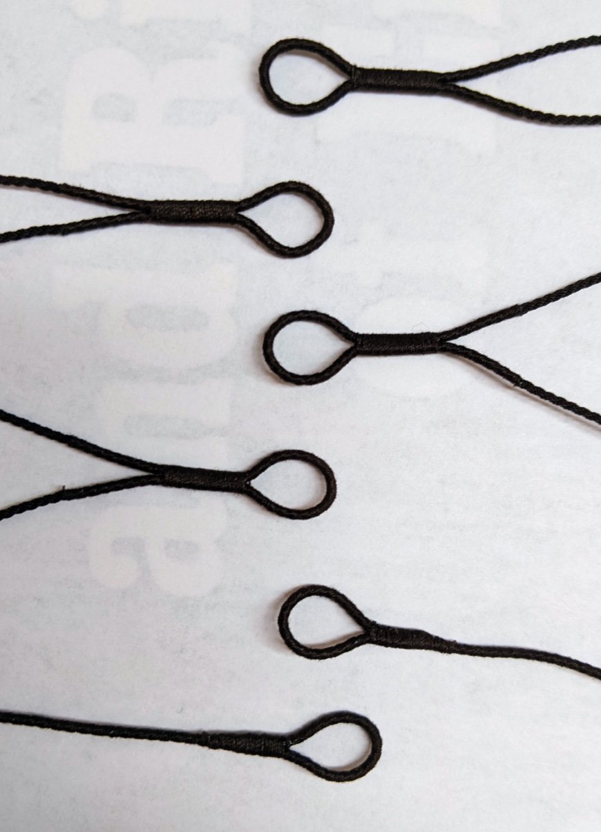
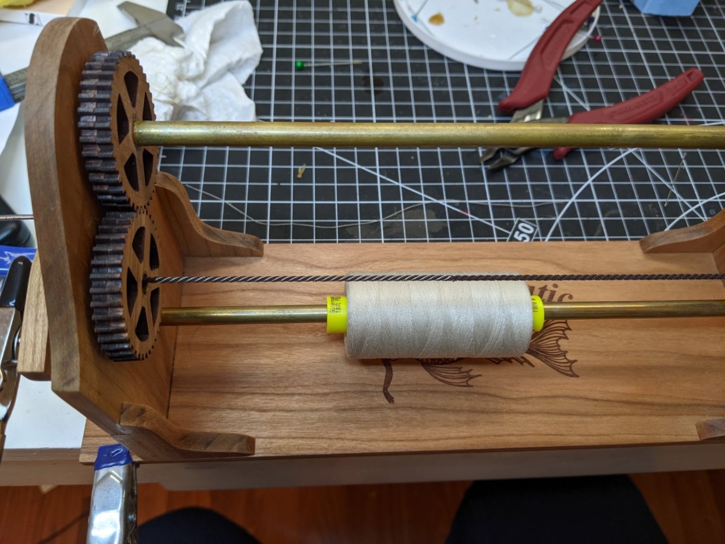
Log #51: The Shrouds and Standing Backstay Thank you to everyone for all the comments and suggestions. With more practice under my belt I was ready to begin work on the shrouds. According to the steel tables in Goodwin, Alert’s shrouds were 8’ circumference cabled. This equates to roughly 1mm at our scale and @BenD was kind enough to do me a custom order of cable of the appropriate size. The serving for the shrouds is 1’ circumference and I used Mara 150 thread for this as it works out to around the correct size. According to both Lees and Goodwin, the foremost shroud was served all the way down. You can see below the arrangement of the shrouds in order. From bottom to top they are The starboard 1st shroud The larboard 1st shroud The starboard 2nd and 3rd shrouds The larboard 2nd and 3rd shrouds The starboard 4th shroud and standing backstay The larboard 4th shroud and standing backstay As I went along I also regularly test fitted them on the mast. None of this will be secured in place until I have the running back stays and pendants in place so I know how much room I need above the stop. For the moment I have them hanging in place while I start work on the running back stays. It is interesting to me how just the tension and pressure stop the eyes from sliding down the mast. It almost doesn’t even need a stop.


- 562 replies
-
- 13
-
-
- vanguard models
- alert
- (and 2 more)
-
For someone who is “not very good at painting” you have produced a really good smooth base coat on the hull. I am not sure I believe you :).
- 122 replies
-
- 2
-
-
- Artesania Latina
- Pen Duick
- (and 1 more)
-
Thanks, I am already finding that things are getting much better. Just being able to feel the right tension or knowing which side is easier to start from. I don't think I would mind the larger calibers as much part of the difficulty is how small the blocks are. Yes I plan to do this. Lees mentions this. I followed along with @DelFs log, but I should take a look at it again.
- 562 replies
-
- 5
-
-
- vanguard models
- alert
- (and 2 more)
-
Thanks BE. Yes I have probably read this section of your log about 10 times at this point. I am attaching nothing permanently until I am absolutely sure that everything I need is on the lower mast.
- 562 replies
-
- 3
-
-
- vanguard models
- alert
- (and 2 more)
-
Minor update from this morning. I realized that I made a mistake with the first shroud I did. Thankfully this mistake will not prevent me from refusing the rope. I will just have to cut off the seized part and start over. At the same time I am much happier with my next attempt and so in the end I would have had to replace it anyways.
- 562 replies
-
- 9
-
-
- vanguard models
- alert
- (and 2 more)
-
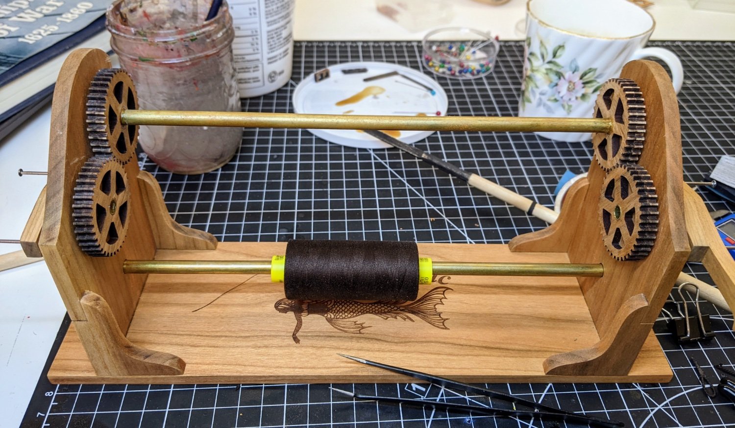
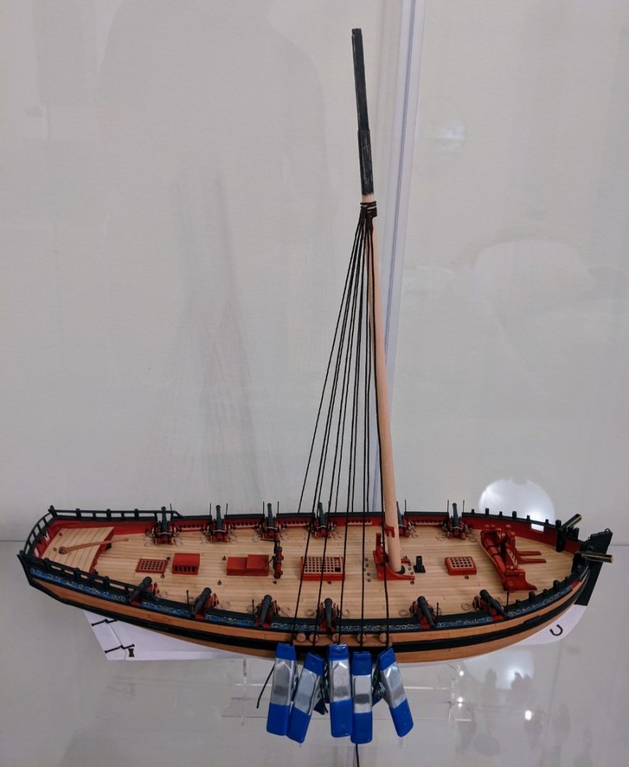
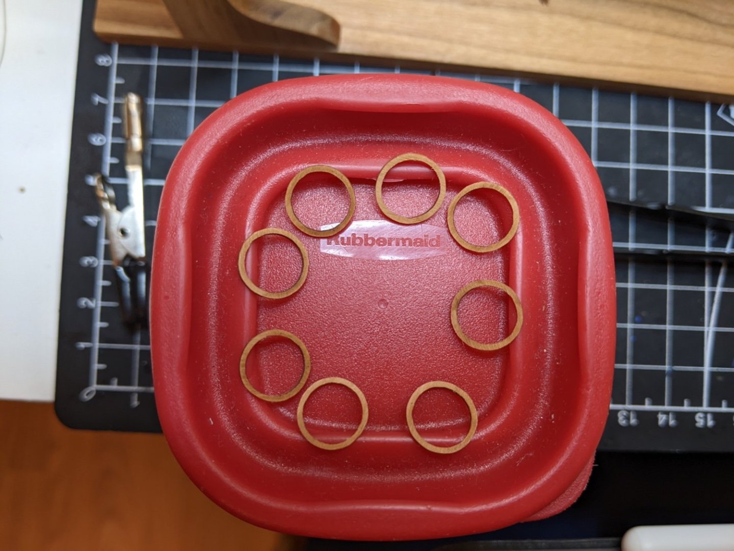
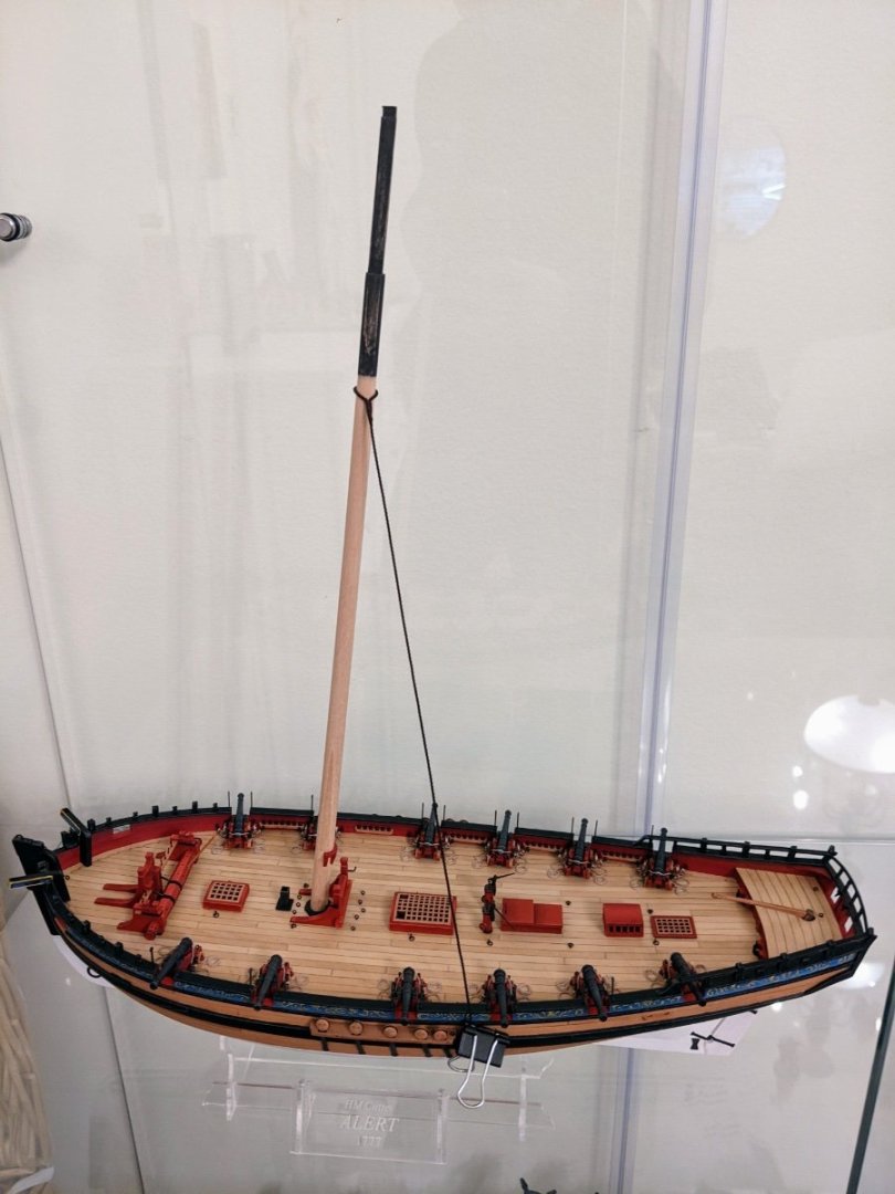
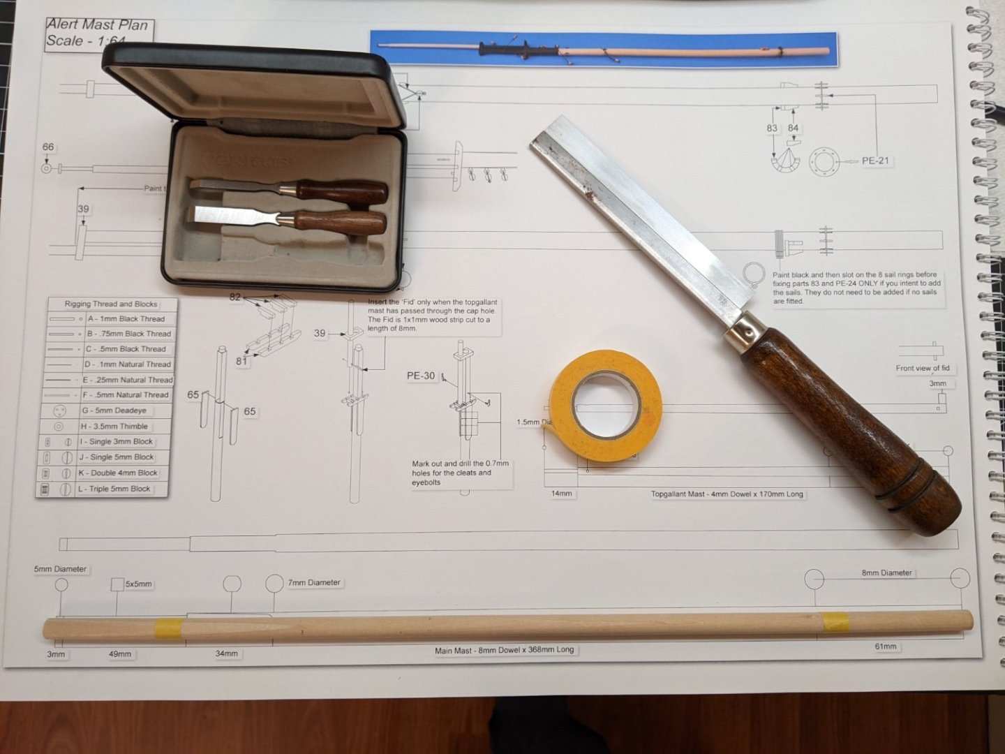
Log #50: First Attempt at Serving After over two years and over 300 posts in the thread we have reached Log #50. It feels so very long ago that I started this project and I want to take a moment to thank everyone who has offered suggestions, corrections and encouragement along the way. I very much doubt I would have made it this far without all your help and certainly Alert would be a much poorer model without all your contributions. Work continues on the mainmast, but I have nothing to show as most of the work happened in my head (lots of reading) and the rest I am saving until I have it finished to show (painting and WOP). One thing I can show is I finished the mast rings. Instead of making them from scratch I ordered them from Vanguard a while back, but I cut off the small bits that stuck out the side of them. Every depiction I could find of ships of this period seemed to just use plain hoops. Then there was a loot of very gentle and careful filing to remove the laser char and then a quick coat of WOP. As I was waiting for things to dry I started work on the shrouds. I purchased the Syren Serv-o-Matic a while back and I found it was surprisingly easy to use. Despite this my first few attempts did not turn out so well as I discovered two key things: More tension is better than less, though whatever tension you use, it needs to be consistent. Trying to secure the serving line as I went along using an adhesive (in this case matt vanish) was not a good idea. There was ultimately no need as the whole thing holds itself together well as long as there is sufficient tension and you super glue and securely fasten both ends of the serving line. It worked out much better if I waited till the whole thing was done and then add a careful thin coat of matt varnish. I found if I tried to do it as I went along I inevitably ended up with lots of little white bits from vanish coming off everywhere. Below you can see the first one I managed to get done that I was reasonably happy with. There is still definitely room for improvement so I will work on doing up some of the other lines and then I may redo this one if I feel it is not up to par with the rest. See below for it attached to Alert.


- 562 replies
-
- 14
-
-
- vanguard models
- alert
- (and 2 more)
-
Welcome to MSW, as Mark suggested, one of the best ways to connect with other builders and to get help on your journey is to start a build log.
-
That is how I feel about most of my work. But to make matters worse, the better you get at it the higher your standards get, so it is a never ending cycle of disatisfaction 😃.
-
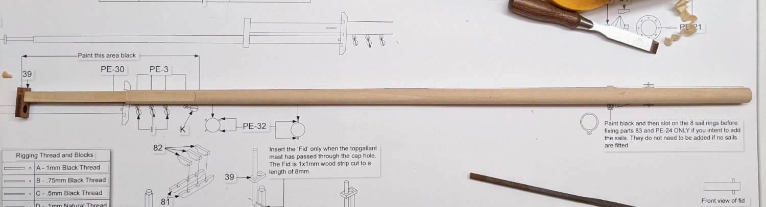
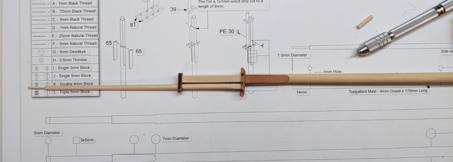
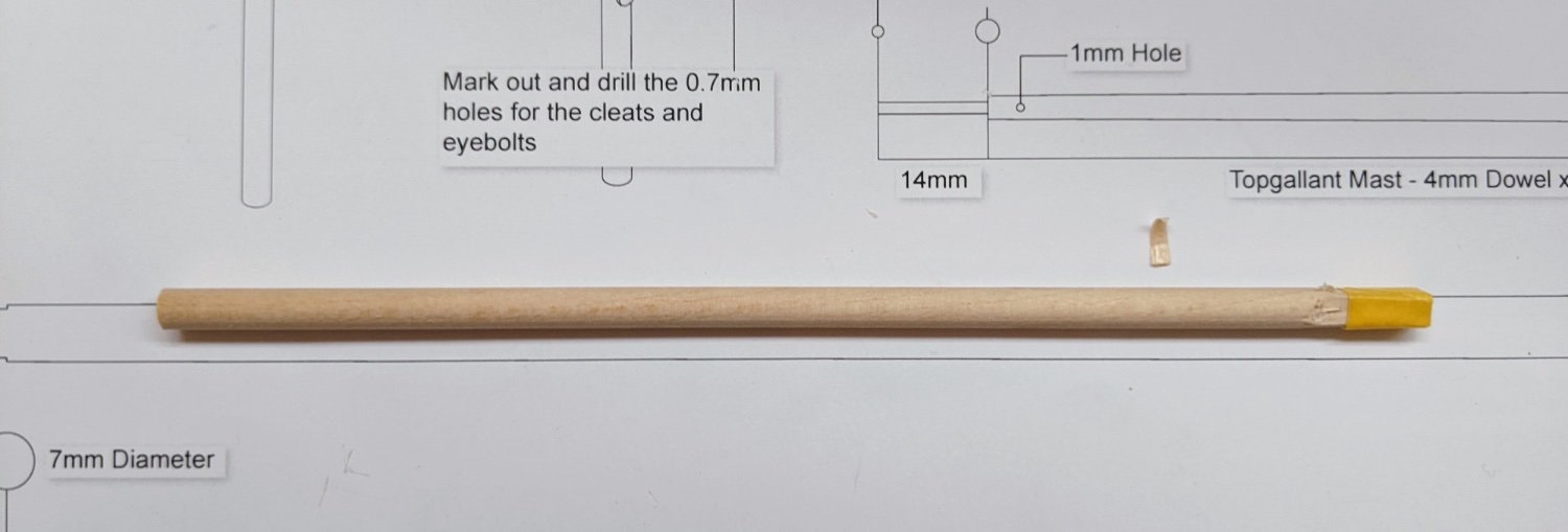
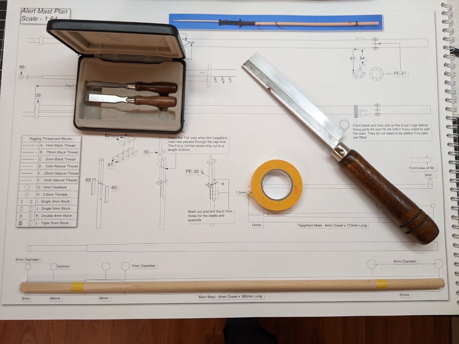
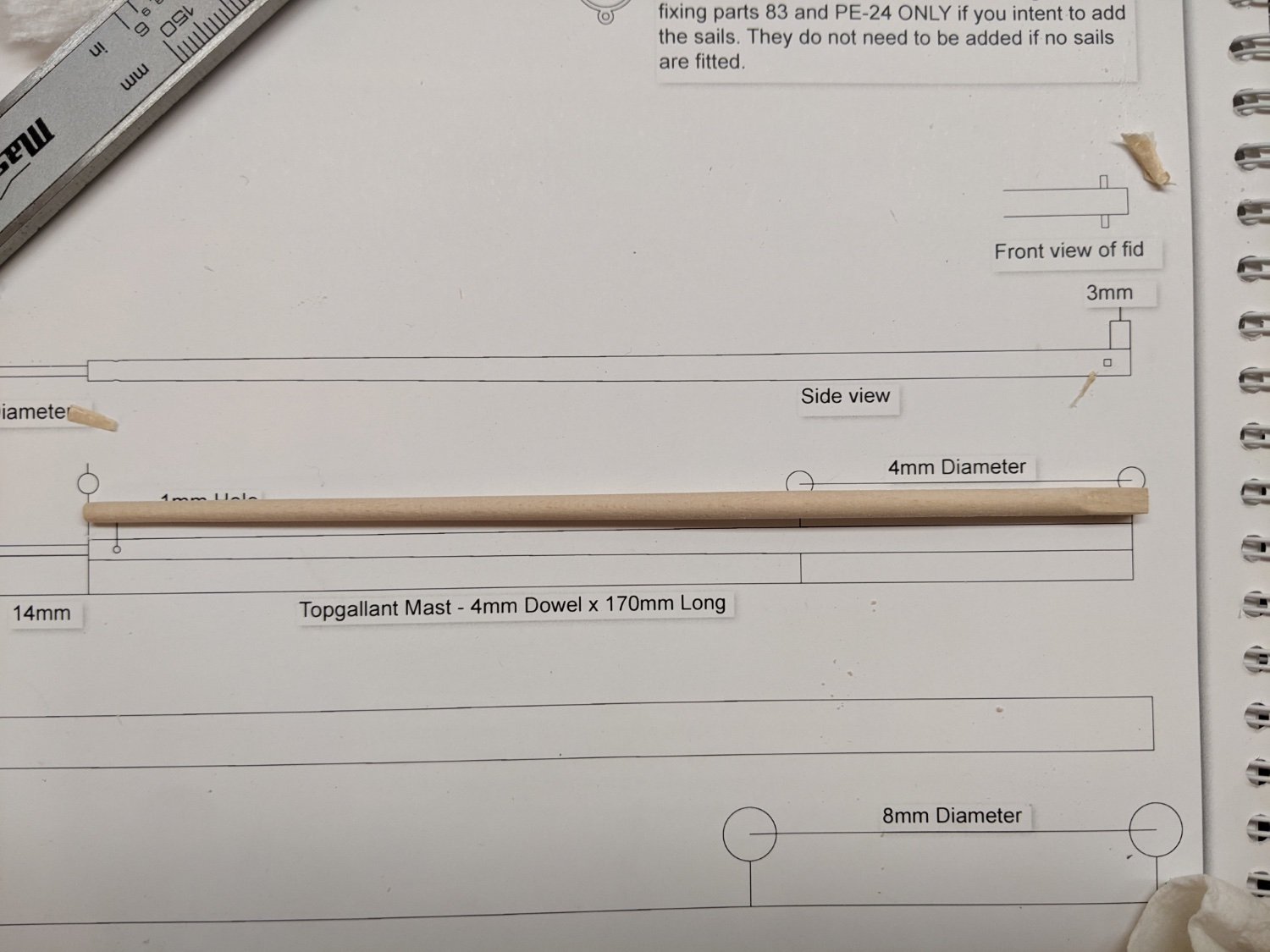
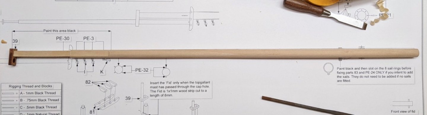
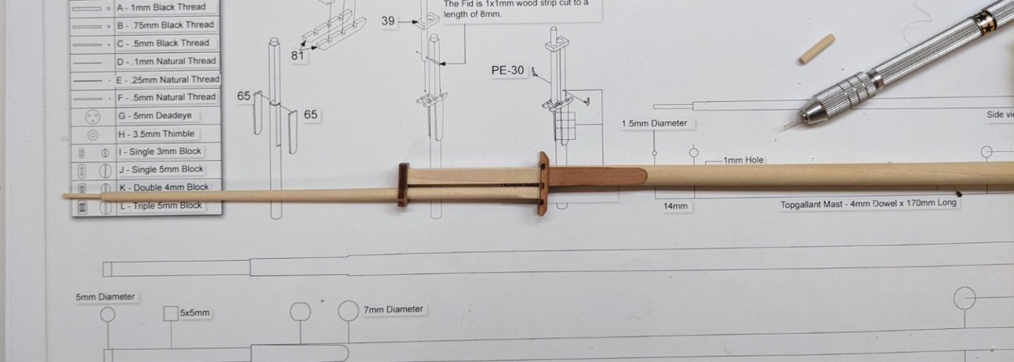
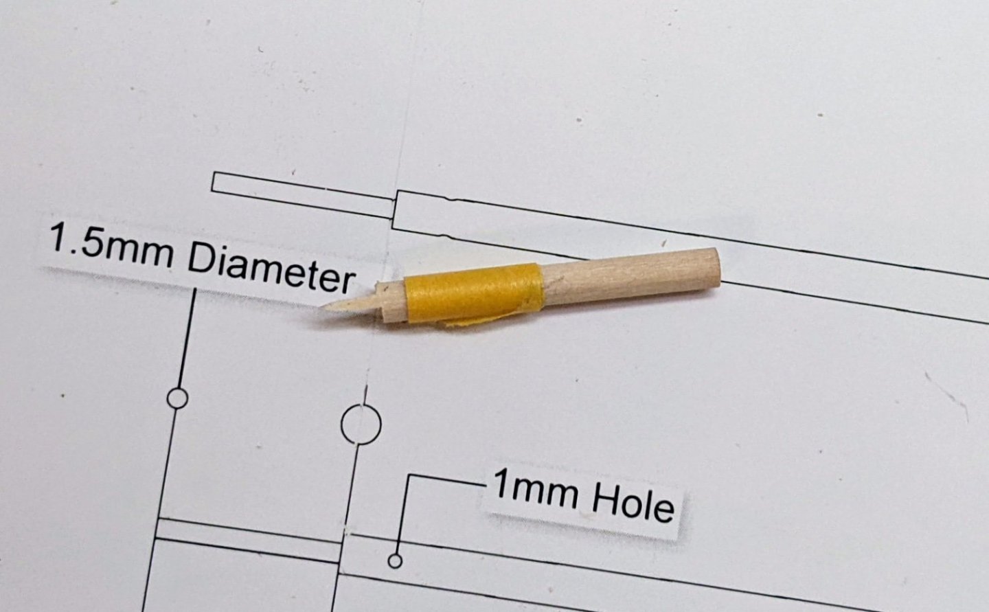
Log #49: The Mainmast Thank you to everyone who chimed in to let me know the polls are called stancions and for all the kind words. I have been looking forward to this stage of the build for a while, the point at which this starts to look like a sailing ship. Before beginning I did a bunch of reading, both of the kit instructions, books and build logs. The goal of this was to: Identify if there were any potential problems I could run into, such as what order to do things in. Identify if there were any kit parts that with some minor modifications I could make more historically accurate. Identify if there were any decisions made by the kit regarding the rigging that I wished to deviate from that might have implications for how I made the masts. Since making changes once things are glued together and on the model will be difficult, I figured it was better to take the time to consider all this before making anymore sawdust. As a general rule, I am planning to stick fairly close to the kit arrangement for the rigging, but I may make a few adjustments in certain places. So with lots of reading under my belt I began to work on the mainmast. Using a razor saw I cut the 8mm dowel to the correct size and then tapered it using my drill. Doing it this way made me wish I had a lathe, but the drill seemed to work ok. I used masking tape at various points and lots of checking with the callipers to make sure that I thinned it correctly. One technique I found worked really well was to start with the sandpaper at the thinnest end, then I would slowly move it part of the way towards the thicker end, then back to the thin end, then back a little bit further and so on. This ensured an even transition. With the drill work complete I then set about squaring the top. I made a small cut with my razor saw at the top of the curve to be a stopping point for this process Slow and steady with a sharp chisel was the name of the game here, constantly checking the thickness and the angle. Once the correct depth had been achieved, I used my smallest chisel to carefully cut out the curved bit. I then proceeded to square out the upper section. As a note, the connection between the cap and the mainmast is meant to be square, but the kit has made this round. Though not exactly correct (it ends up being a bit too big), I squared off the cap by cutting corners into the circle and then shaped the mast to correctly fit into this new joint. The topgallant mast has a similar problem in that at the point where it sits in the trestle tree, it is meant to be square. The kit simplifies this by leaving it round, but I decided I wanted to portray this more accurately. However this left me with a problem. The bottom of the topgallant needs to be a 4mm square, but the dowel provided is only 4mm. Looking through the kit supplies, I realized you are also provided with a 5mm dowel which is only used for the main boom. This means there is sufficient extra to use for the topgallant. So I cut off a piece and then I realized I had cut it too short. Measure twice cut once, whoops. Unfortunately there was not enough dowel to cut another piece so I had to do a workaround which I will describe further down. I squared off the end with my chisel and again put it in the drill to thin it out. The tape on the end is to protect the square part from my sandpaper. You can see how I have enough length for the main part of the mast, but not for the small thin bit at the top. To correct this I simply cut off a small piece of the 3mm dowel and thinned it with the drill to the appropriate size. This picture is before I stuck it in the drill. You can see how I have put the tape at the exact length necessary so that I sand the appropriate amount. I didn’t take any pictures of the next step where I attached it to the topgallant, but I simply drilled a whole in both this extension and the topgallant and inserted a pin to strengthen the bond. Below you can see the entire assembly dry fitted. I have still not completely decided on the order of operations and so I am being cautious about gluing anything until I am 100% sure that it is ready.


- 562 replies
-
- 13
-
-
- vanguard models
- alert
- (and 2 more)
-
How is the build going Ken? Any updates to share?
-
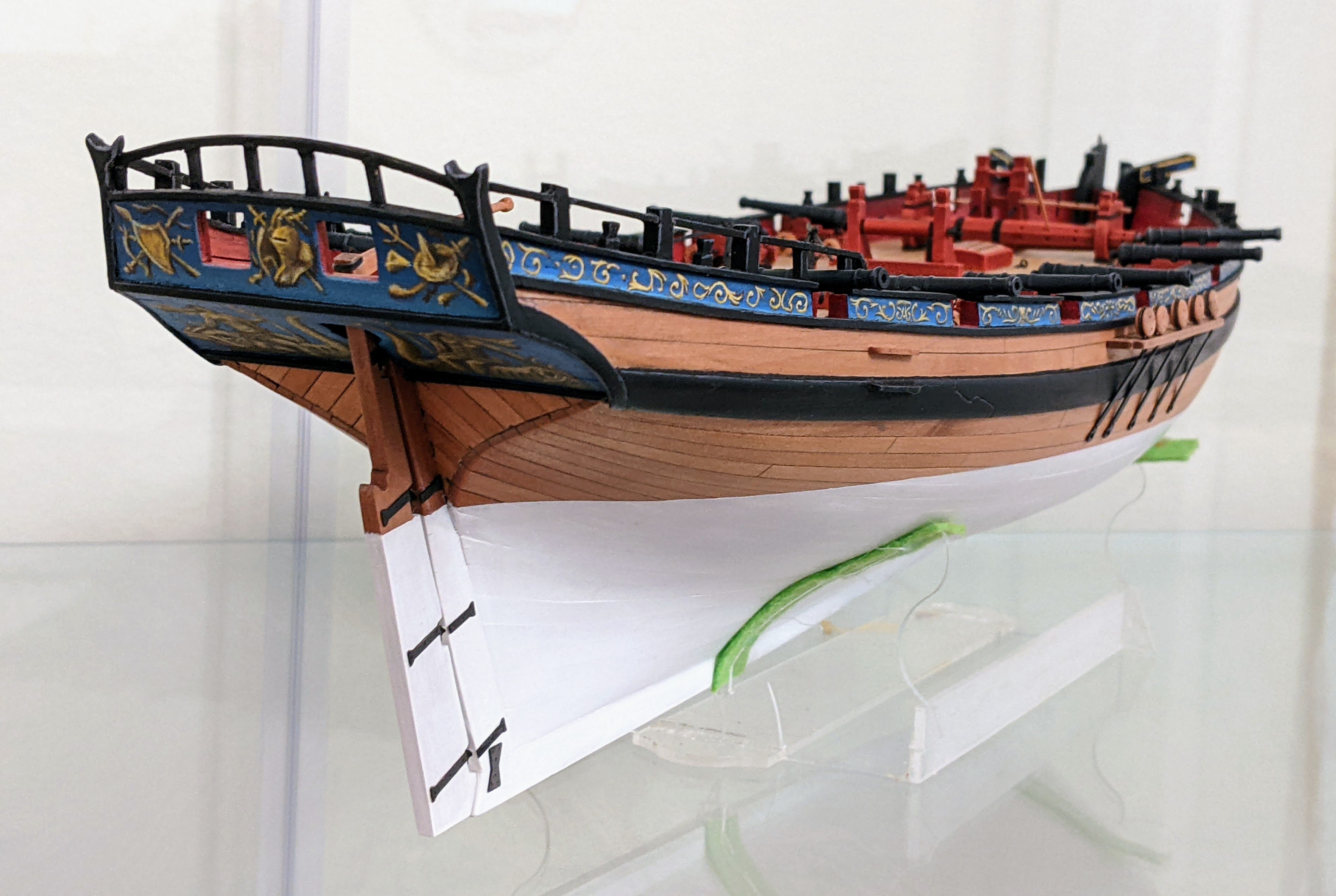
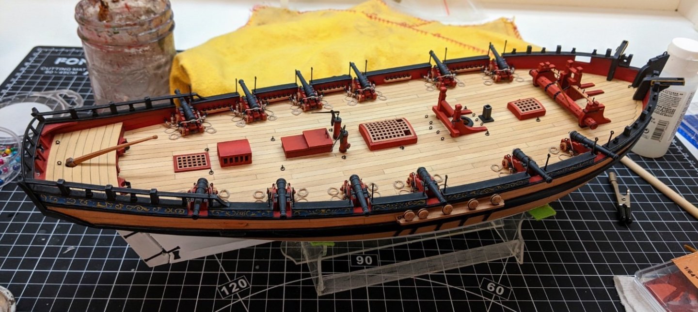
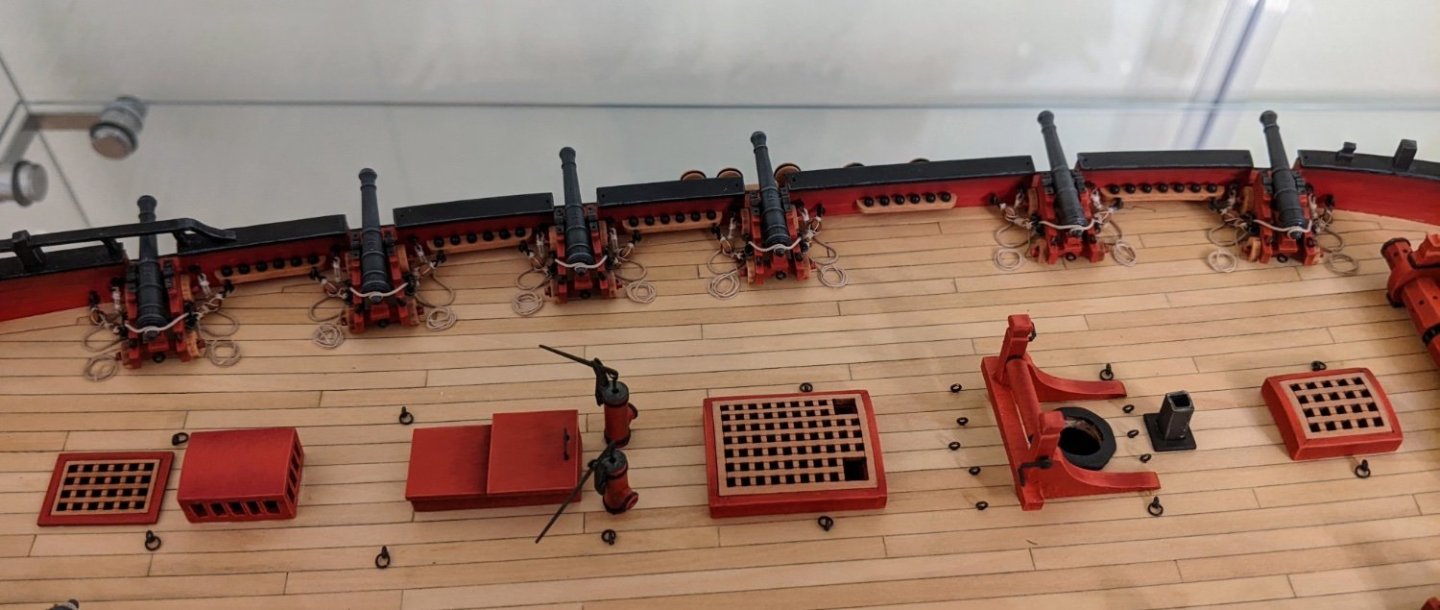
Log #48: Hull and Fittings Complete Thank you to everyone for all the suggestions regarding line for seizing etc… I have obtained a number of different sizes of fly tying line and it seems to me that it will work much better than the thread I have been using. In the meantime I have finally completed rigging all the guns. I also took the time to attach the polls that hold the railing rope (feel free to let me know the correct term for these). This brings the second phase of the build to a close (deck fittings etc…) and now I am preparing to begin work on the masting and rigging. I need to review some of the build logs again before I start on the shrouds. Also I have some books I need to take a look at more closely.
- 562 replies
-
- 18
-
-
-
- vanguard models
- alert
- (and 2 more)
-
Stunning work! I think what amazes me is the excellence you demonstrate in so many different skills that surpasses what most could hope to achieve in any one of them.
-
Time for another progress update. I continue to rig the guns and tonight reached the milestone of half of them done. It is a bit of a fiddle process and I found early on that if I attempt to rush it, I only end up making a mess of things. Some of them did not turn out as well as others, but you have to look really close to see the problems and none of them were bad enough that they stand out (at least to me). One jig was not enough so I had to make a second to speed up the process. I am getting really close at this point to having the hull and fittings completely done. Once the guns are finished being rigged I have a few more pieces of PE to attach and then it will be on to the mainmast and the shrouds.
- 562 replies
-
- 15
-
-
- vanguard models
- alert
- (and 2 more)