Hubac's Historian
-
Posts
3,311 -
Joined
-
Last visited
Content Type
Profiles
Forums
Gallery
Events
Everything posted by Hubac's Historian
-
 I posted a test message because your previous post - for which I received an email notification did not appear, when I went to your page. No number of refreshes brought it to light. So, I posted a test message to see whether the page would refresh that way. Whatever you wrote this morning still isn’t visible to me. I deleted the test message, though.
 -
With a hundred years separation between them, I am curious as to how the Confederacy will inform your SP build; the head structure is completely different.
-
What do you mean by a “furring deck”? Do you mean the beakhead grating?
-
Your last edited photo with the gammoning going through the trailboard is even less structurally sound. All I’m trying to advise, here, is that if you are going to go to the trouble of making something immensely complex, like the SP, then try to avoid glaringly wrong work arounds. If it were me, I might redraw the timbering, so that the gammoning didn’t pierce at an awkward place below the lower cheek, and I would probably cheat the waterline down by a 1/16” - 1/8”. It may not be exactly right, but it is more correct LOOKING than what Lemineur provides for.
-
As you are still in a conjectural planning/spitballing phase, I would like to chime-in on your proposed re-gammoning location. From a timbering standpoint, running the gammoning above the trailboard creates a vulnerable weak spot that jeopardizes the bowsprit. Also, it just wasn’t done, so the wrongness of its appearance, here, would look even more wrong than the gammoning soaking beneath the waterline. It seems to me that, while you may have to re-think the timber joinery beneath the trailbord, there is ample space to locate the gammoning above the waterline, but below the lower cheek.
-
That is also an interesting idea, Mark. Future Floor Finish sounds like something I could easily find at the hardware store. Thanks for the tip!
- 2,699 replies
-
- 3
-

-
- heller
- soleil royal
- (and 9 more)
-
Michael and Dan - thank you for the suggestions. I’m going to order a bottle of this BSI release agent. If it doesn’t work, I’ll experiment with your ideas. In the end, the best thing may be to leave it alone. Thanks for weighing-in guys!
- 2,699 replies
-
- 3
-
-
- heller
- soleil royal
- (and 9 more)
-
Not to derail your log, Michael, but this is really worth a look for anyone who hasn’t seen it:
- 222 replies
-
- 1
-
-
- reale de france
- heller
- (and 1 more)
-
The Blue Ensign log us a now completed build of a Heller kitbash into La Superbe. It is a spectacular piece of work, and his tutorial on sailmaking is very thorough.
- 222 replies
-
- 1
-
-
- reale de france
- heller
- (and 1 more)
-
In my SR log, I asked Micheal to post links to pics of his 1765 Victory build. It was there that I first noticed his sail furling technique and asked him to describe it. Between Michael and Blue Ensign’s methods, I should eventually arrive at a dynamite suite of sails!
- 222 replies
-
- 1
-
-
- reale de france
- heller
- (and 1 more)
-
I’m glad that you posted these pictures of the sail, in process. Now I can see what you were describing in another thread about their shape. Would you say that the same shape works regardless of whatever type of sail you are trying to mimic - square, lateen, etc? All of that just really looks fabulous!
- 222 replies
-
- 1
-
-
- reale de france
- heller
- (and 1 more)
-
WOW!! That is just completely fascinating and incredible.
-
“CLINK”
-
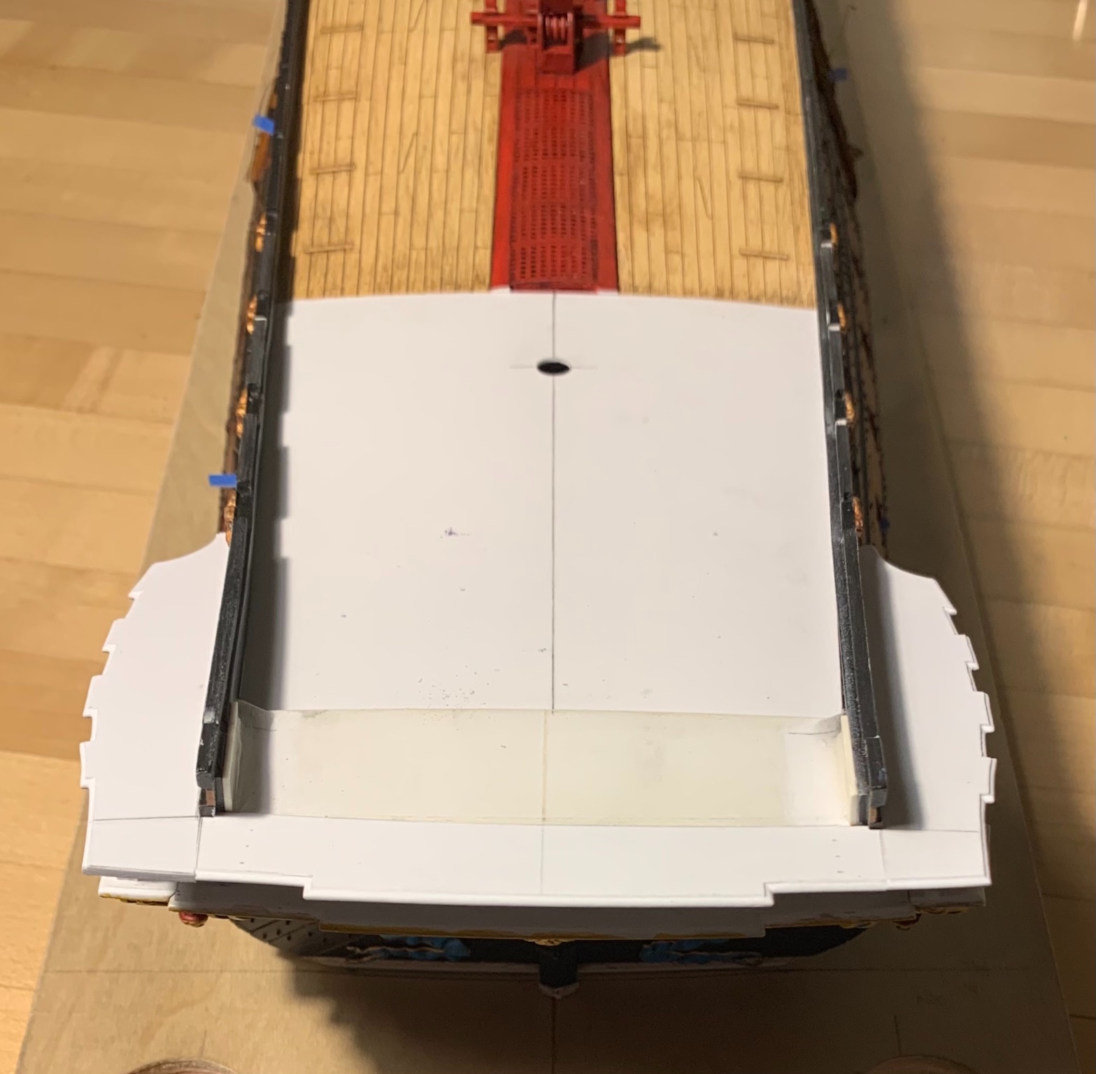
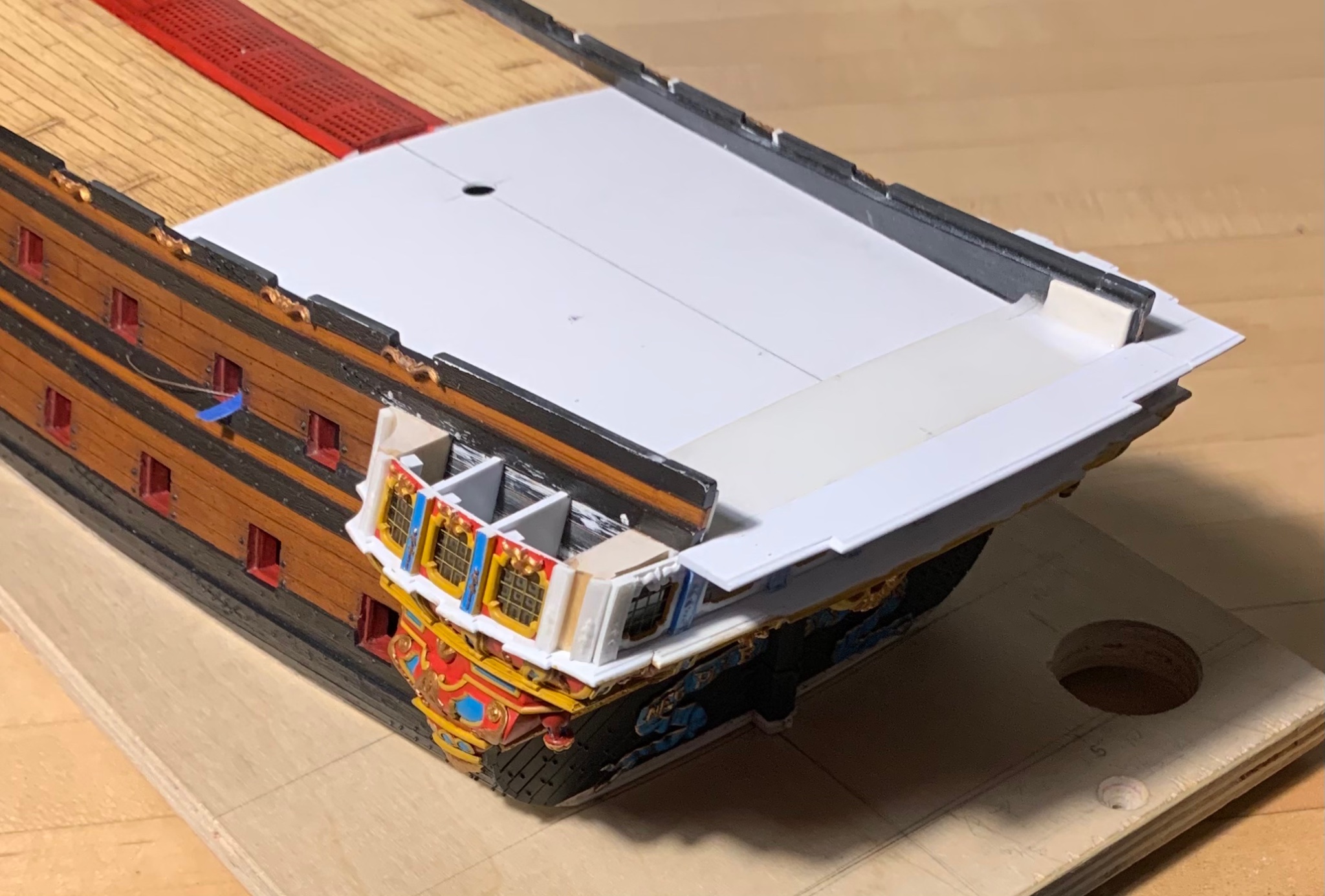
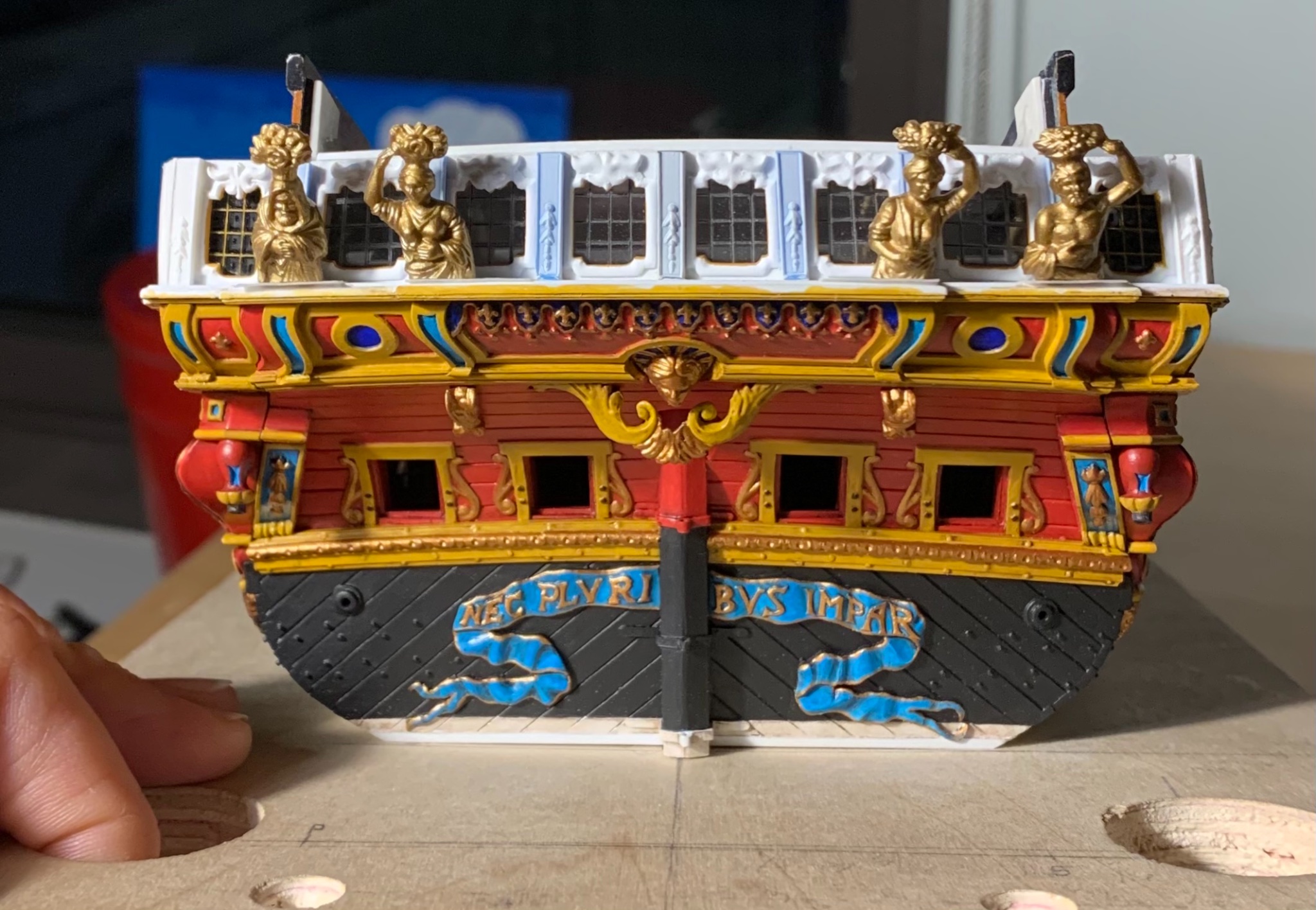
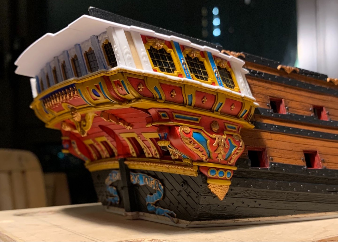
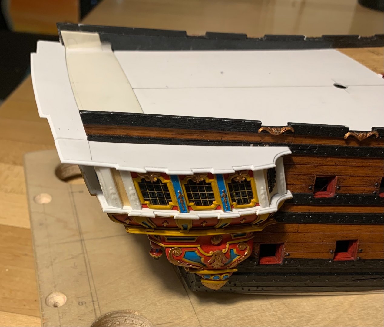
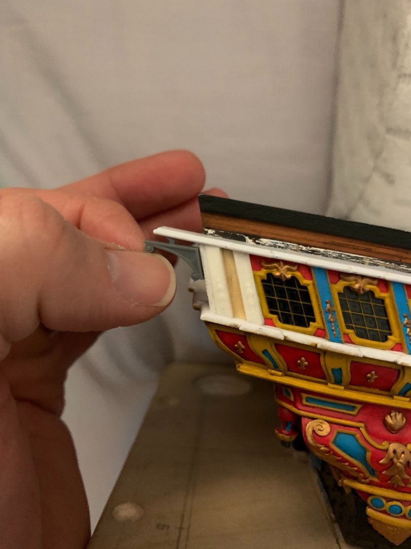
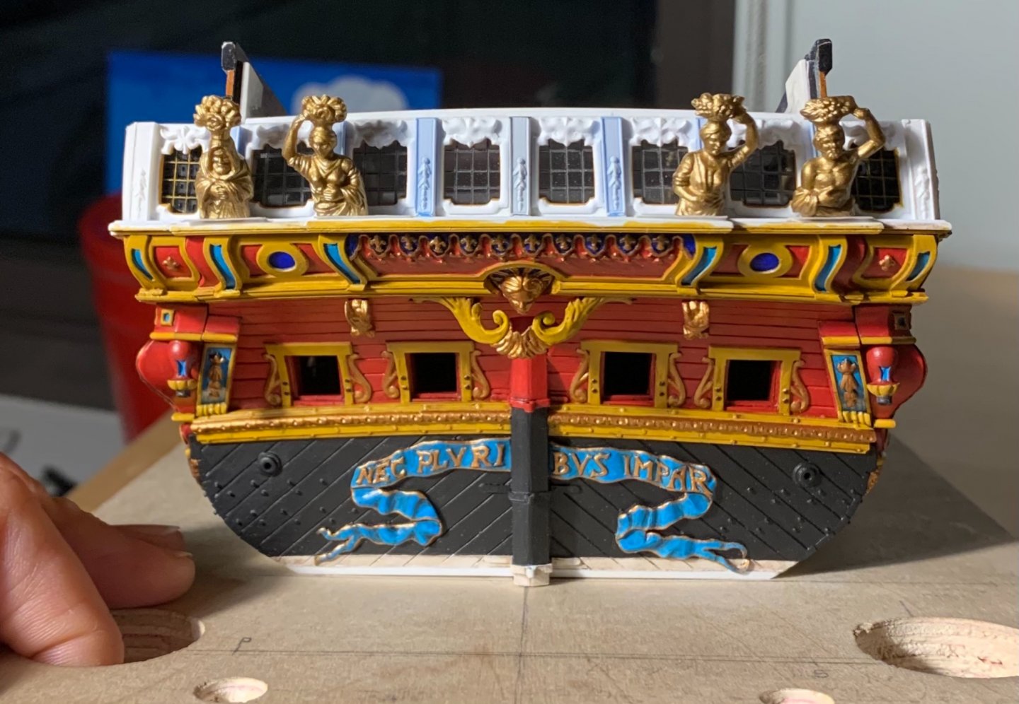
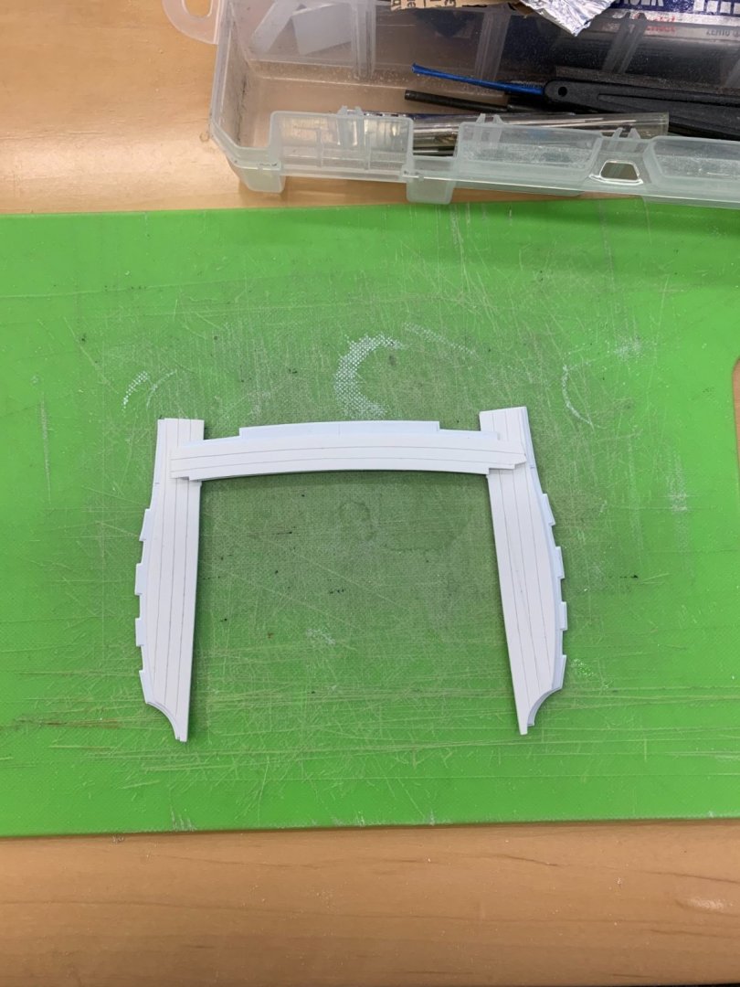
A sudden rush of “affordable” housing opportunity has slowed me down considerably, this past week, but I have managed to make some progress. I’ve closed-in the port side quarter gallery. In the process, I left a small CA fingerprint on one of my glass panes. It isn’t terrible, but its presence annoys me. I haven’t tried acetone for fear that it will mar the acetate. Isopropyl had no effect after a half-hour of effort. Does anyone have any experience with using this product from BSI on plastic? https://www.amazon.com/Bob-Smith-Industries-BSI-161-Debonder/dp/B0000DD1QS/ref=asc_df_B0000DD1QS/?tag=hyprod-20&linkCode=df0&hvadid=198100706044&hvpos=&hvnetw=g&hvrand=3451084920448221665&hvpone=&hvptwo=&hvqmt=&hvdev=m&hvdvcmdl=&hvlocint=&hvlocphy=9067609&hvtargid=pla-379516931894&psc=1 If need be, I can live with the blemish, but I would rather remove it. Any other ideas? Otherwise, I’ve been coping together the parts for the wrapping balcony: After I secure these, there are planking overlays that complete the illusion, while also providing a glue-lip for the balcony rail. As they are really quite good, I still plan to use the stock Four Seasons figures: They will require some delicate chiropractic surgery in order to reach the new geometric relationship between the lower false balcony and the wrapping middle balcony. I’m not sure yet how I will go about this, but I have a spare set, in case I mess up. I am debating placing corbel support beneath the outermost extension of the walk. It doesn’t make sense to me that there wouldn’t be additional support, here. My walk is not quite as deep as the stock kit part; I recognized that there would be limitations to how far I could stretch the Four Seasons figures, so I made the walk a little more shallow. The unintended result of that, though, is that even the smaller of the stock corbels are too big for here: It is not a big deal, though, as I would only have to make one pair from scratch. Today, I was near the WarHammer shop, so I picked up a vibrant silver metallic and a plant-green wash coat. My idea is to incorporate silver leaf into the build, in select spaces, and to even use a faint green over-wash, on top of the silver. One possible application for this might be the acanthus-flanked monogram escutcheons between the main deck guns; I’ll experiment with greened silver on the acanthus branches. Maybe it will look terrible, but it might be interesting. I took the idea from the elaborately painted and gilt interior of St. Francis de Sales church on East 96th Street. In other activities, I picked up what is actually the Grand Chaloupe from my father’s house, this past weekend. It is significantly larger than the one I did earlier. I am detailing as I did before: There is a significant warp in the hull, but the thwart insert piece straightens this out, for the most part. Well, that’s where things stand, for now. Thank you for the likes, comments and for stopping in.


- 2,699 replies
-
- 11
-
-
- heller
- soleil royal
- (and 9 more)
-
I would say it was a bit lazy on their part. If I were making this part, in this scale, I would first scribe a bulkhead out of 1/16” styrene sheet to fit the space. Then, I’d layout the pilasters and waste out the open spaces with drill bits and a sharpe EXACTO. To finish, I’d use styrene strip to increase the thickness of the top and bottom rails, which also gives the impression that the pilasters are set into the rails. I hope that makes sense. One thing to keep in mind is that the bottom rail rests on top of the cathead timbers.
-
There should definitely be a rail there, yes.
-
Michael - will you present your model in the dark colors of the preserved Vasa timbers?
-
Now I see where you are headed. I had thought, perhaps that you would not paint between the guns. Personally, I liked the variation and grain of your chosen material. Be that as it may, she will look very smart fully painted.
-
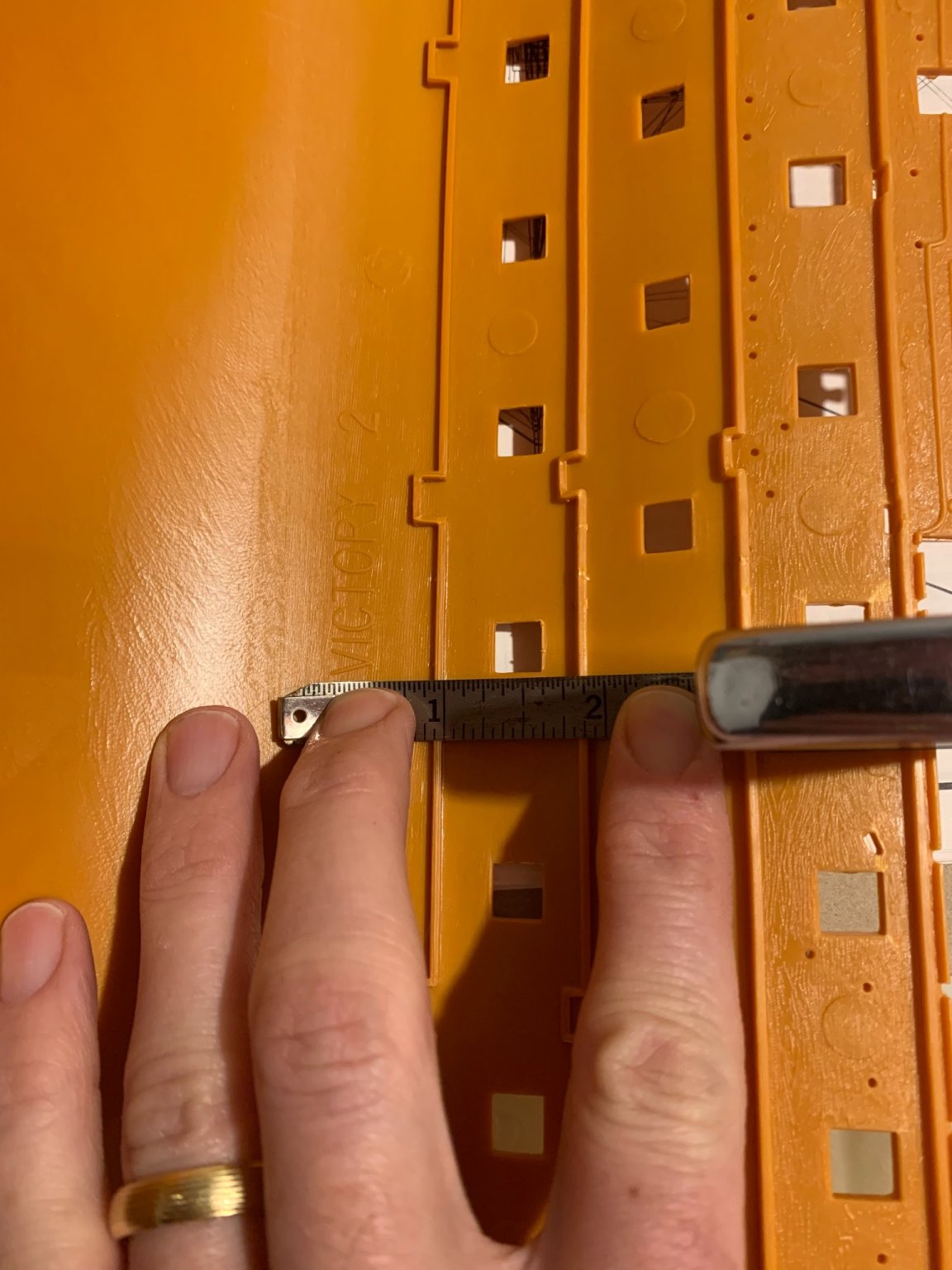
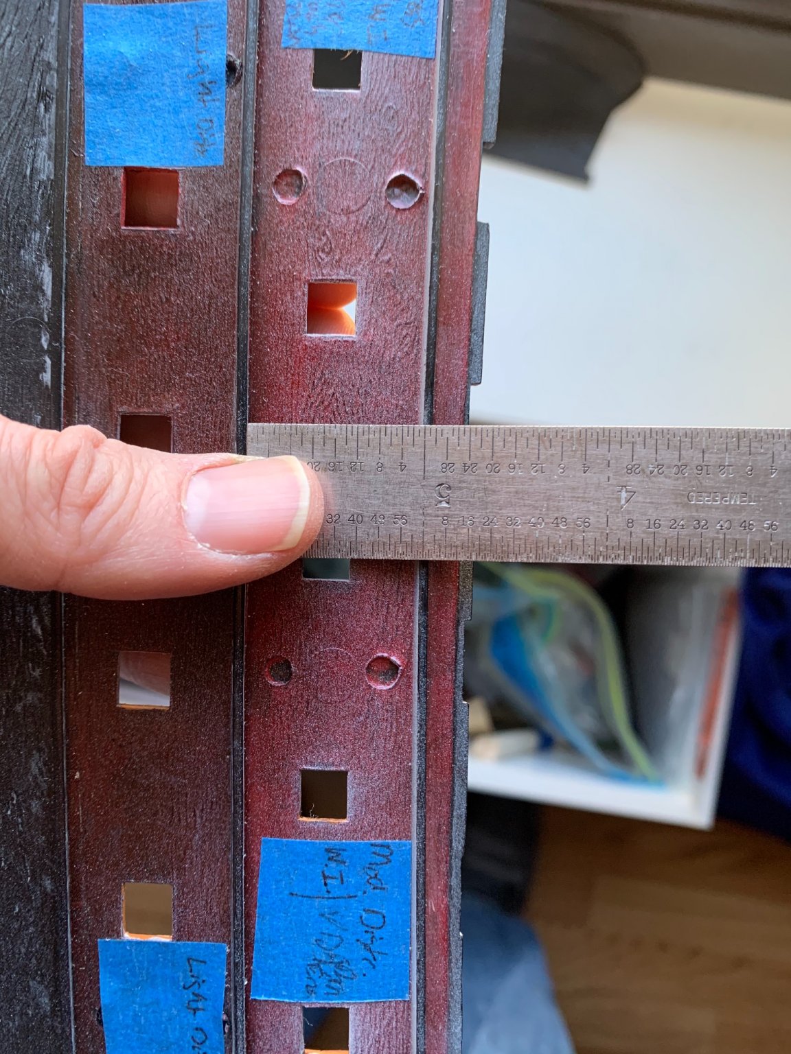
Per, this earlier comment on Heller deck heights, I was at my father’s, this past weekend, so I took a measurement of the Heller Victory: From the top of one deck ledge to the top of the next (or, in terms of the real ship - underside to underside of deck planking) measures 7/8”, or 7’ at scale. Subtract 8-10” (approx.) for the sided beams, and 3-4” for the decking thickness, and one arrives at a clear headroom of just under 6’, which corresponds with my recollection of visiting Victory in 1994. At the time, I was just a hair less than 6’ tall. I am shorter, now. That same exercise applied to SR results in 17/16”, or 8’6” from deck plank underside to plank underside. Ultimately, that allows for a comfortably clear headroom of 7’+. The 17th C. seaman’s diet was not robust enough to produce giants like that. As I say, though, the interspace between gun ports is sufficiently long to mitigate the impression of incorrect deck heights.


- 244 replies
-
- 4
-
-
- heller
- soleil royal
- (and 1 more)
-
WWII was such an interesting time period in battleship development; every nation had their version of the super-ship. I read recently that the US Navy is trying to develop an effective projectile range of hundreds of miles, as opposed to the obsolete Iowa class range of 25 miles. If they can achieve that, we may yet see an era of the deluxe super-ship extraordinaire!
-
She’s an interesting fish, out of water; I had no idea how full she was below the waterline. The ship looks so sleek in period footage. I will gladly follow along on this one, as you are doing some really nice, clean work.