Hubac's Historian
-
Posts
3,220 -
Joined
-
Last visited
Content Type
Profiles
Forums
Gallery
Events
Everything posted by Hubac's Historian
-
 Chuck, do you use any kind of sealer before your color coats - thinned shellac, or something like that?
- 1,784 replies
-
- 1
-

-
- winchelsea
- Syren Ship Model Company
- (and 1 more)
-
This is truly wonderful execution and attention to detail!! I am loving what you have done here. The gratings and sheer-run of your planking are particularly good. This will be a fun build to follow!
-
Pure model-making magic. I defy anyone to do it better in full-size!
-
Beautiful finish planking! I am always amazed by the quick progress and lovely workmanship.
-
Hi George - I hope all is well, and I would also love to see an update on this project. One of my favorite things about this model is the way that you represented the nailing, above the waterline; at scale, this just looks fantastic! BTW, in the interim, since last speaking about this subject - I have come to the conclusion that a forecastle capstan is, indeed, likely. I am basing my observation on the allowance made, for such, on the Louis Quinze model at the Musee: The capstan pawls are clearly evident, as is the hole in the deck for the drum. Admittedly, the inclusion of gratings without coamings is curious.
- 22 replies
-
- 5
-
-
- royal louis
- heller
- (and 1 more)
-
EJ, this is all off to a smashing start! I have really enjoyed watching your skill progression, from one build to the next, as you are never daunted by the opportunity to try something new, and you always finish with a model that is way better than the sum of it's parts. I'll be following with great interest!
-
As long as it isn't eye-poking, then we are headed in the right direction, me hopes.
- 2,623 replies
-
- 7
-
-

-
- heller
- soleil royal
- (and 9 more)
-
Leetle by leetle, Soleil Royal rises from the ashes. This will be my best paint work, yet:
- 2,623 replies
-
- 19
-

-
-
- heller
- soleil royal
- (and 9 more)
-
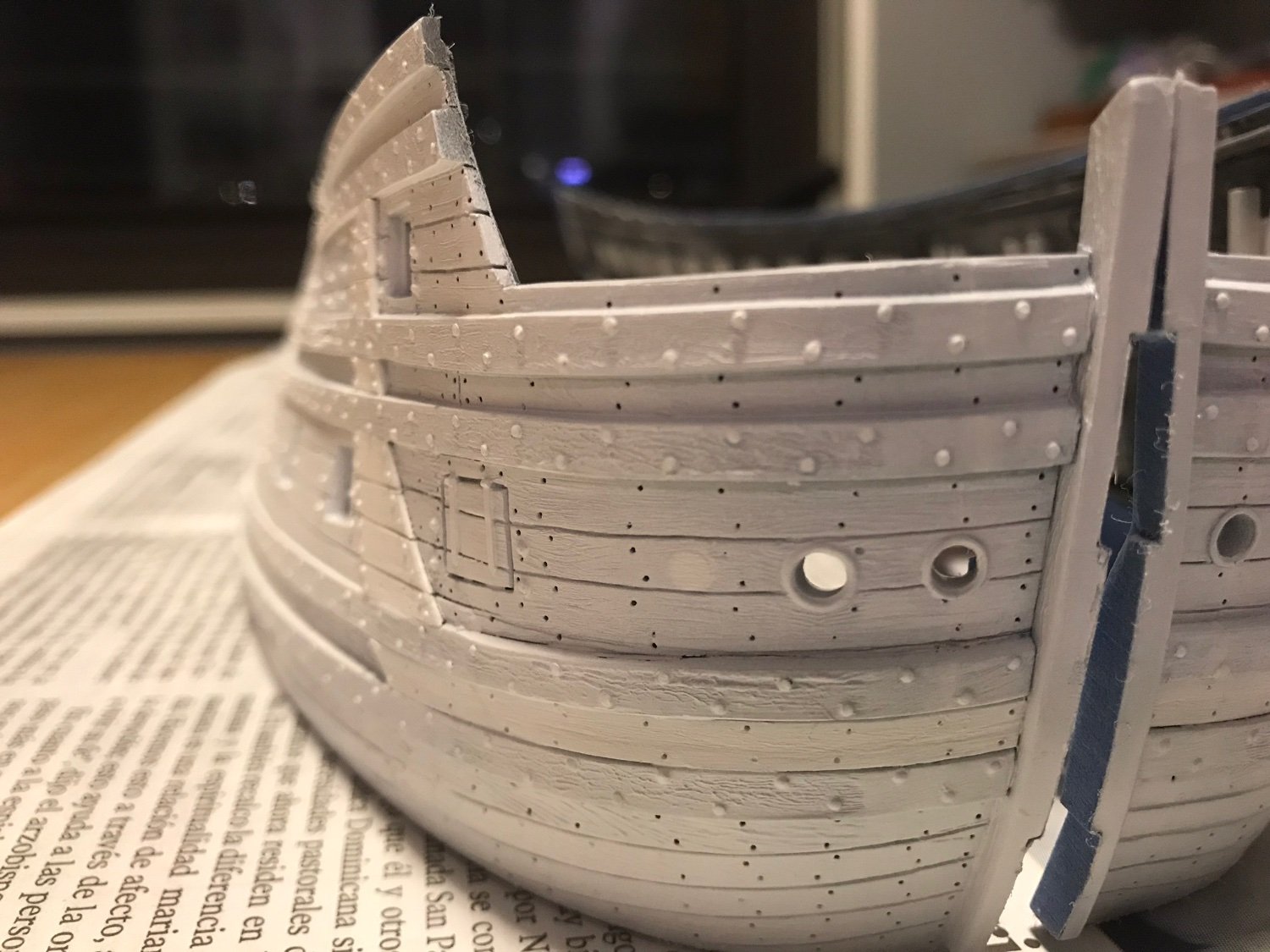
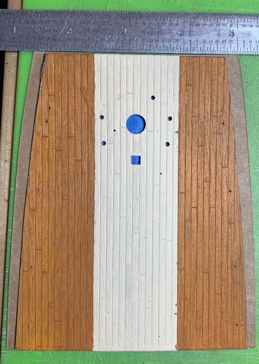
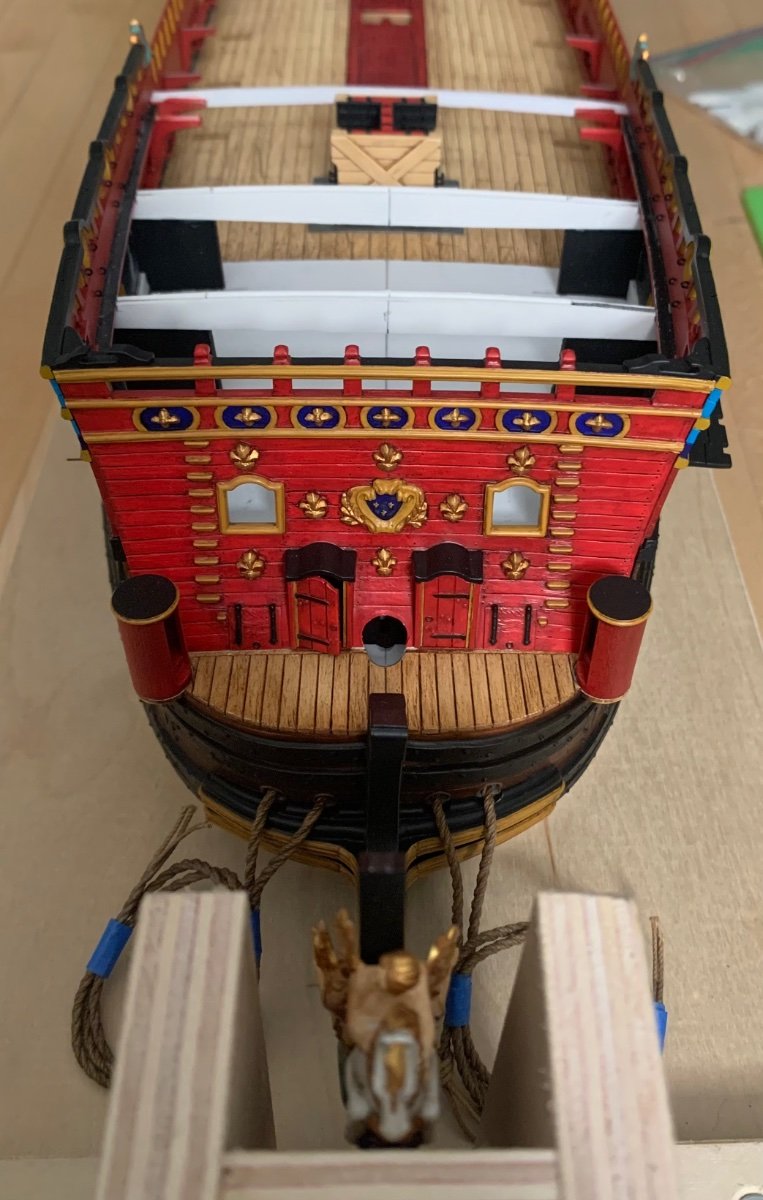
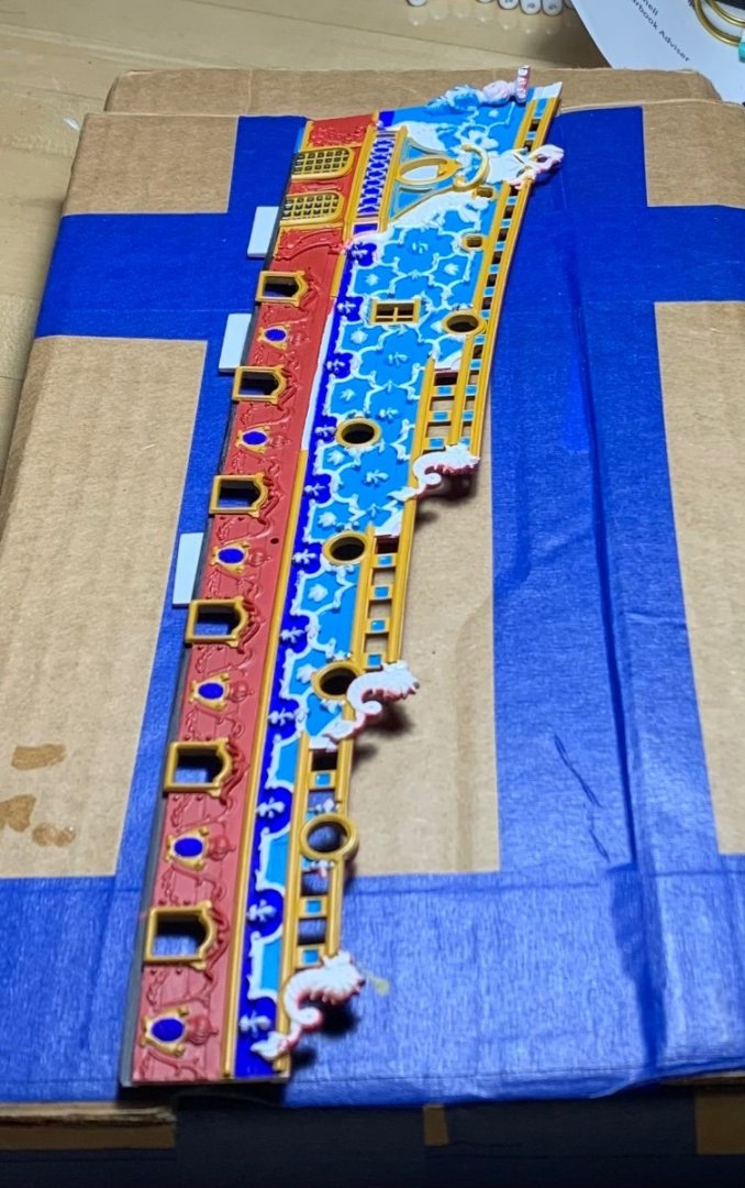
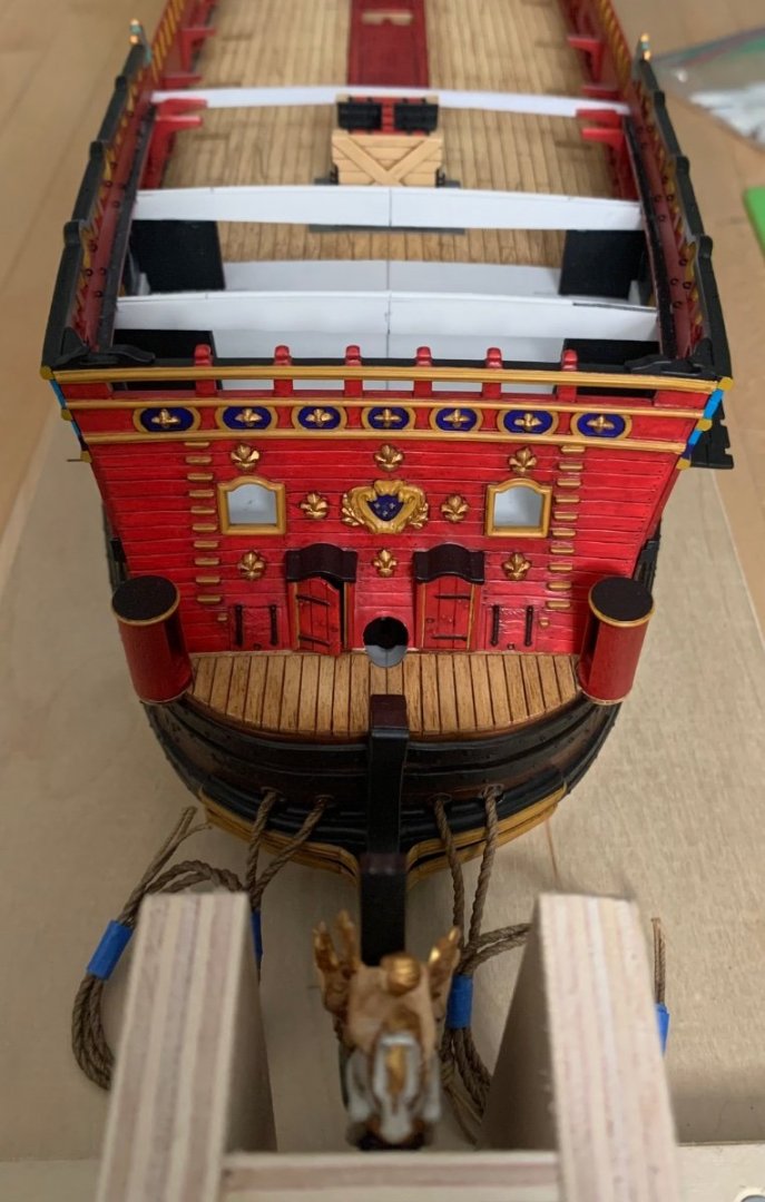
Making new decks was necessitated by the extensions I placed to either side of the stem, which made the whole hull wide enough to include the missing sixth stern light. Incredibly (considering how many I took), I don’t have pictures of this plastic surgery on my phone still, from before priming, but you can still faintly make out the join-line 5/16” to the left of the stem. It runs right through the center of the near hawse hole: In fact, you can see how I filled-in the outboard stock hawse hole because it was now too far outboard. This was THE critical stage of the build because if it didn’t work convincingly, there wasn’t going to be much sense in moving forward. It was tricky, but it worked out better than I could have hoped, at the time. Anyway, what I was illustrating in the post above is just how much wider my new forecastle deck is, as opposed to the stock deck. And, if one is going to go to the trouble of making new decks, one might as well include a ton of more realistic detail. The timbering of the Heller decks is all wrong. I mean, for an out-of-the-box build, it’s fine, but in real practice the deck strakes would not have been parallel strakes that disappear into thin points at the margin; they’d be a fixed number of strakes that tapered from wide, at mid-ships, to narrower at the ends. I mapped out reasonable beam-locations, based on the deck openings; a realistic plank-butt shift; I included the scarfed, wider binding strakes; and I made cambered, instead of flat gratings. The stock gratings, which I used anyway, were now too narrow for my wider deck, so I deliberately made wider hatch coamings to influence the overall perception of scale, since the hatches and coamings would all be painted red; like many details on this bash, it isn’t exactly right, but it gives a more correct impression than the stock kit parts do. As for the new rigging guide, I haven’t studied it too closely because I don’t think I will be referencing it much.

- 2,623 replies
-
- 11
-
-
-
- heller
- soleil royal
- (and 9 more)
-
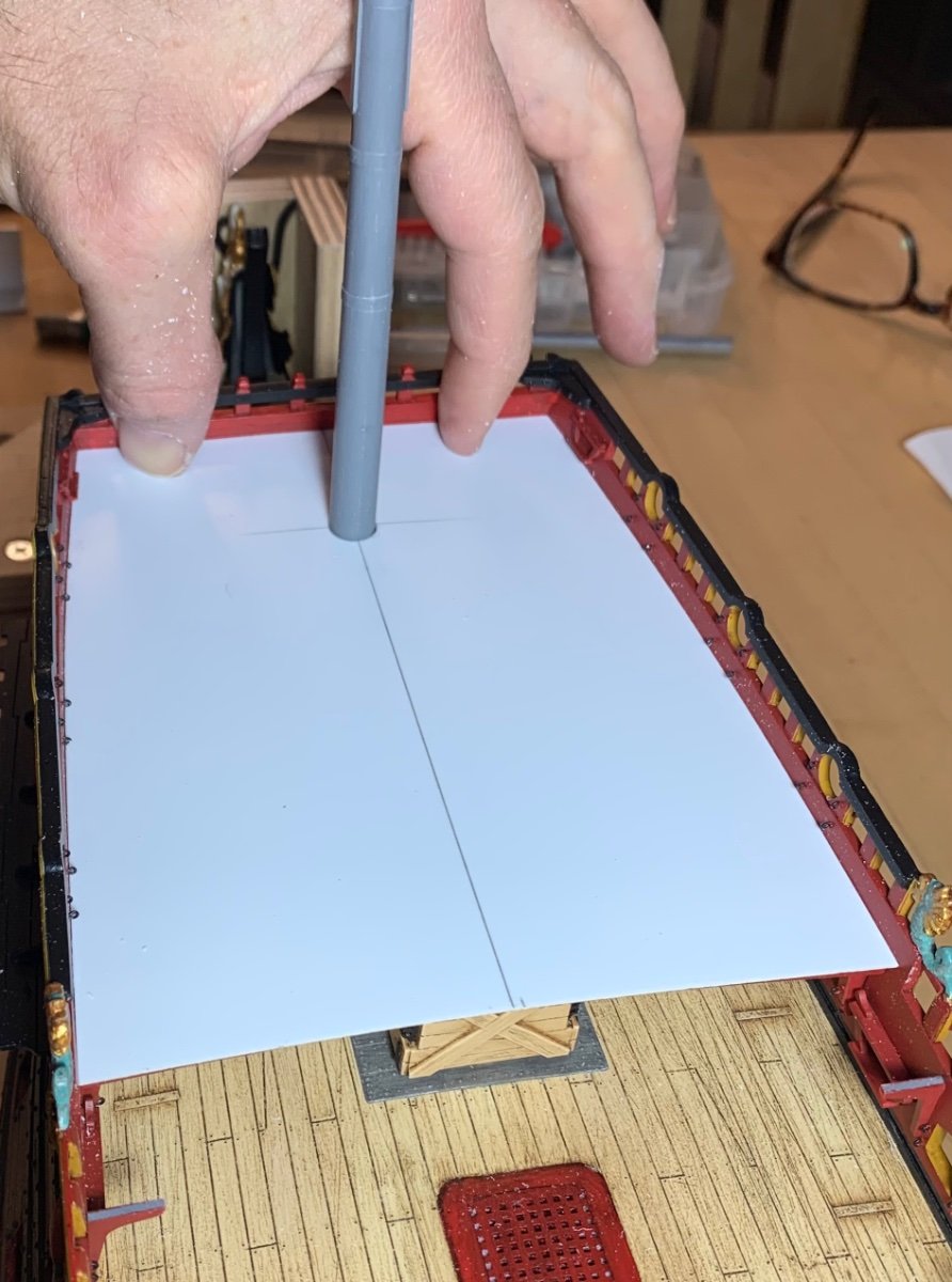
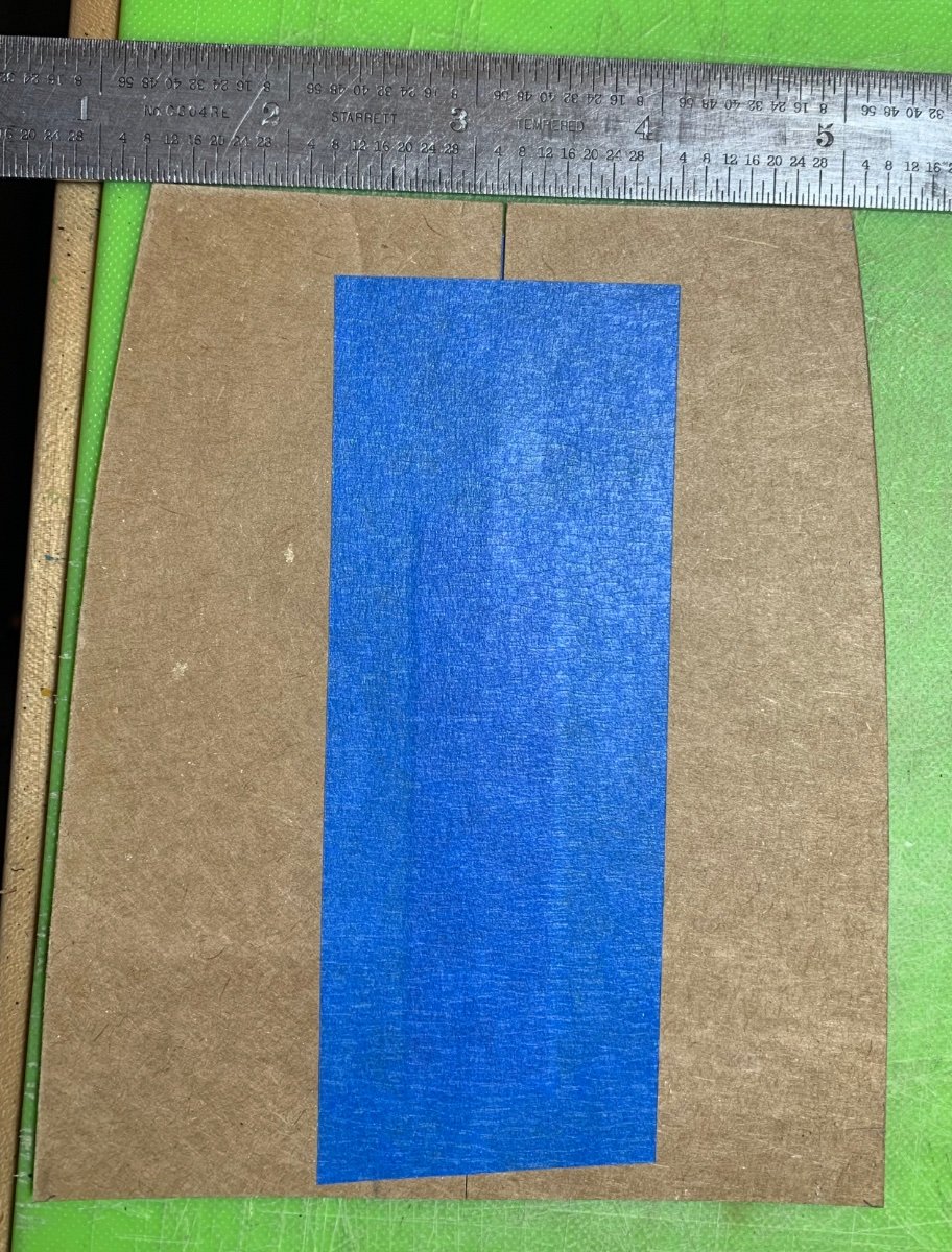
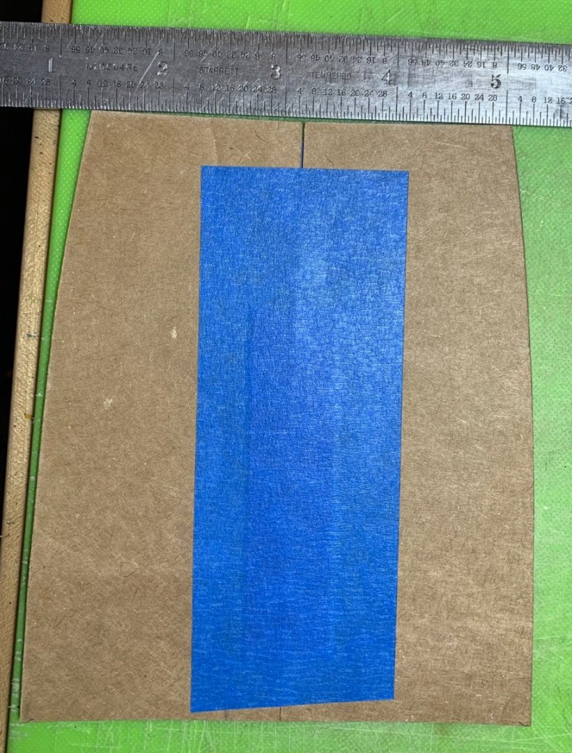
Thank you for the new instruction notes on rigging, Bill. You will see what I mean, eventually, about the single-post belay points. The process of making new decks is somewhat complicated by the fact that the centerline reference for the line of the masts does not neatly correspond with the width of the decks, at any given point, owing to the hull distortion discussed earlier. I make perfectly scribed half-patterns that correspond with the centerline of the masts: Above, the deck length is over-long for the time-being. Below, you can see how adding width extensions to the beakhead bulkhead resulted in a slight concavity that the deck must scribe to: Here, you can get a sense for just to what degree the early bow extensions increased the width of the hull: I use the stock decking to find the new scribe for the bulwarks, since the profiles are reasonably close; it only takes a little re-shaping to get the pattern right. I then transfer that profile to my cardboard and refine each half until it is a perfect scribe. As a side-note, the painting on that kit deck was part of a tech demonstration I did for the 2018 NorthEast Joint Clubs demonstration. I was showing how I wash and weather these two different base coats to arrive at the effect seen on the model. The darker brown would be what the pristine, freshly painted deadworks would ordinarily look like. The color is referred to, by the French as Ventre de Biche, or belly of the doe, in English. The lighter tan is the base-coat for my decks. Here is the new deck, before layout and scribing, with the foremast properly located: There will still be a mast plate and mast collar to follow, but the opening for the mast is, for now, as tight as it needs to be. Little by little, we are getting there! Thank you for the likes, comments and for looking in. More to follow…


- 2,623 replies
-
- 16
-
-
- heller
- soleil royal
- (and 9 more)
-
I appreciate the thought, there, Bill. It’s difficult to watch someone’s mind disappear, yet he seems happier in his new home than he has in years. I’ll follow your SR build whenever you get around to starting it. As with Victory, the rigging is the daunting aspect. RC Anderson is the best resource for figuring out all of that, but the biggest question is where, exactly, all the belay points should be. I’m not convinced that Heller’s series of individual belaying posts is accurate. It seems more likely that running lines were sheaved through a block, at deck level, and then belayed to either kevels on the bulwarks or cleats on the deck. The St. Philippe monograph is also an excellent resource for figuring all of this out, but the rigging plans require close study to understand what is what. Fortunately, I can kick that can down the road just a little further, as I still have plenty of exterior structure to deal with.
- 2,623 replies
-
- 7
-
-
- heller
- soleil royal
- (and 9 more)
-
Welcome, No Idea! Thank you for taking the time to read through my build. It was a slow-starting project, but now things are starting to come together.
- 2,623 replies
-
- 5
-
-
- heller
- soleil royal
- (and 9 more)
-
Well, I’ll save those dreams for another day. In the meantime, I’ll enjoy watching you build the Sark.
- 444 replies
-
- 1
-
-
- Cutty Sark
- Revell
- (and 2 more)
-
I suppose the paradox of aging is winning despite the losses - Druxey, you’re a triple-crowner any year.
- 2,623 replies
-
- 7
-
-
- heller
- soleil royal
- (and 9 more)
-
‘Much appreciated, Richard! That is a very good explanation, indeed. I can appreciate your point about the lines being lost - appreciation of the hull as a whole. I laughed at your wet sponge comment - here’s an emoji proving so 😄 Regarding the absence of models in these historically model-heavy museums, I also wonder where all the models have gone. Does someone have the H.M.S. Prince dockyard model sitting on their IKEA hutch, somewhere? The models weren’t thrown away. Personally, I cultivate elaborate fantasies of selling my eventual 1:48 model of Soleil Royal, 1670 to La Musee de la Marine, to be displayed right alongside Tanneron’s model into perpetuity. If this is the trend in maritime museums, it doesn’t seem likely that there will be any interest in that! Dare to dream, prepare to cry 🥲
- 444 replies
-
- 3
-
-
- Cutty Sark
- Revell
- (and 2 more)
-
Well, London may not be particularly tall, but it is sprawling. I remember being amazed by the sheer size of the place and the diversity of its different neighborhoods.
- 444 replies
-
- 1
-
-
- Cutty Sark
- Revell
- (and 2 more)
-
That is certainly something to consider, Druxey. I didn’t even know that exists until you mentioned it.
- 2,623 replies
-
- 3
-
-
- heller
- soleil royal
- (and 9 more)
-
Okay, well, that makes a ton of sense. Thank you for clarifying, Ian. I hope, some day, to visit her again. It was 1995, when I last passed through that area. The ship wasn’t open to visitors, back then, as I recall.
- 444 replies
-
- 1
-
-
- Cutty Sark
- Revell
- (and 2 more)
-
Well, not exactly - for the longest time, I had this pedestal lamp with a shade that swiveled up or down. It was a pretty cheap lamp, but it gave decent light, until the poor casting that connected the shade to the swivel just sheered off one day. We finally bought a grown-up lamp that does an excellent job of lighting the living room, but I still need that focused light for close work. All that being said, my eyes have changed significantly, since I began this project. My distance prescription has hardly changed, over a 10-year period, or more, but I can no longer focus up close with my glasses on. I suppose bifocals are in my near future.
- 2,623 replies
-
- 6
-
-

-
- heller
- soleil royal
- (and 9 more)
-
Thank you, Keith! Yes my whole modeling life happens on our kitchen table. I’ve even built a finely carved wall cupboard on that table. I’ve just purchased a clamp-able Swingline lamp, so my lighting will improve dramatically, very soon. Of course, one day in the future, I hope to have a little true shop space, at which time I will crossover to arsenal-style modeling. I feel you very strongly, re COVID. My Dad is 87, and I feel that COVID had very much to do with his mental decline, these last few years; the dementia was probably inevitable, but the pandemic likely accelerated that process. It is true that human-kind is killing the planet, though, and that all of these things are inter-connected. I was reminded, recently, of just how prescient a movie Soylent Green really was in the year that I was born. If one wants to make a DoomsDay Double Feature out of a Friday night, just add Mike Judge’s Idiocracy to the viewing queue. That movie used to be funny, now it’s just terrifying.
- 2,623 replies
-
- 6
-
-
- heller
- soleil royal
- (and 9 more)
-
I’m up to date, now, Kevin. I am fascinated by your inability to resist the well-trod path. I always liked this kit, and I can already see that you are going to transform it into something much better than the sum of its parts - because the model will be made, mostly, of your printed parts. The deck housing looks super-clean! Bon courage!, as the French say 👍
- 444 replies
-
- 1
-
-
- Cutty Sark
- Revell
- (and 2 more)
-
That is fascinating, as I was just recently marveling at the museum display of the ship, with viewers able to walk right below the ship. I thought the plating seemed extra-bright, but I figured that had more to do with the camera than the actual color. Richard, as you seem to be a Sark enthusiast, can you offer any insight into the engineering behind the current museum display; one would think that this kind of suspension might cause undue stress on an old wooden hull. Obviously, people much smarter than myself have put engineering thought into this, so I wonder how it works. Hands-down, though, it is a spectacular and inspiring display.
- 444 replies
-
- 1
-
-
- Cutty Sark
- Revell
- (and 2 more)
-
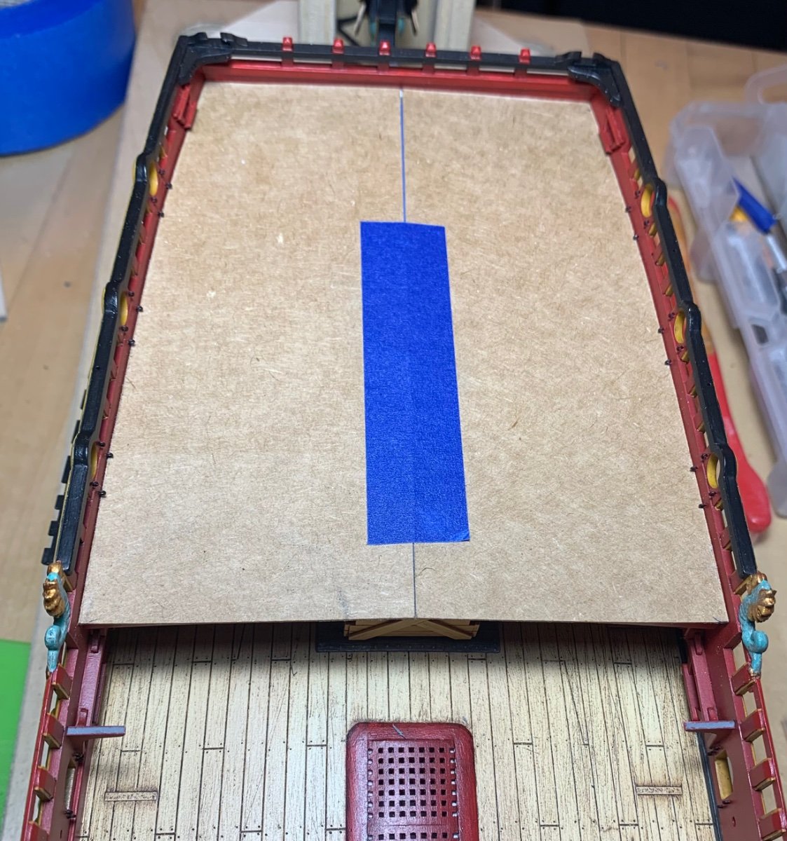
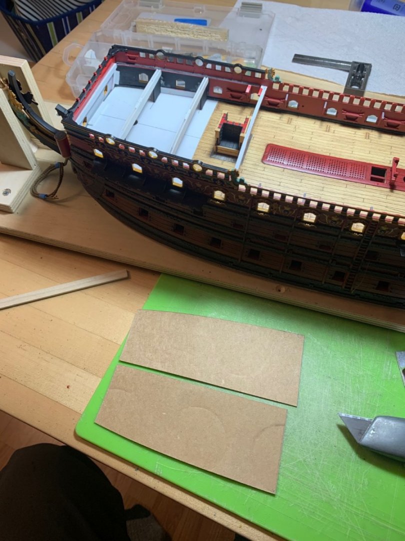
Thank you, Eric! Yes, that does seem to work whenever that server error pops up. This is just an alive’n kickin’ post to say that work has continued, albeit at a meager pace. I am starting, though, to regain some of my former momentum. I made the starboard channels, and I have all of the ground colors painted for the starboard, aft bulwark. I won’t bother posting pictures of those items until they are installed on the model, as it is nothing new to see. Last night, I made and installed the lam-beams for the forecastle deck: Tonight, I can sand them fair and then make a cardboard pattern for the forecastle deck. More to follow. Try not to let COVID overwhelm your thoughts and emotions - despite the grind we are living through now, life won’t always be like this. All the best, Marc

- 2,623 replies
-
- 13
-

-
-
-
- heller
- soleil royal
- (and 9 more)