
.jpg.1f80adf1a9b14a937cfcf2ca6af0f0d4.jpg)
WalrusGuy
-
Posts
1,007 -
Joined
-
Last visited
Content Type
Profiles
Forums
Gallery
Events
Posts posted by WalrusGuy
-
-
Hi Michael, my jaw dropped seeing the boxwood gratings. Amazing!!
- mtaylor, thibaultron and Canute
-
 3
3
-
1 hour ago, realworkingsailor said:
Looks really nice and tidy!
Sounds like we’re having the same thoughts regarding the bulwark planking; get as much of the heavy work done before the fragile stuff goes on.Andy
Thank you, Andy.
I saw your recent post and that's where I got the idea of finishing the planking. It's nice we are at the same stage of the build! 🙂
Harshil
-
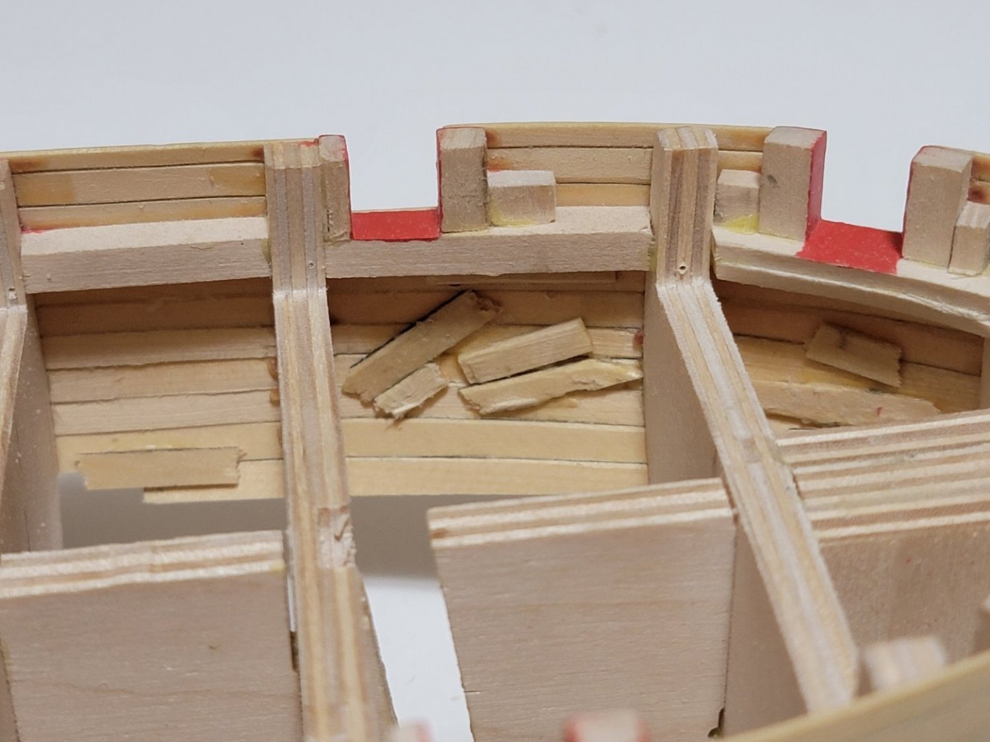
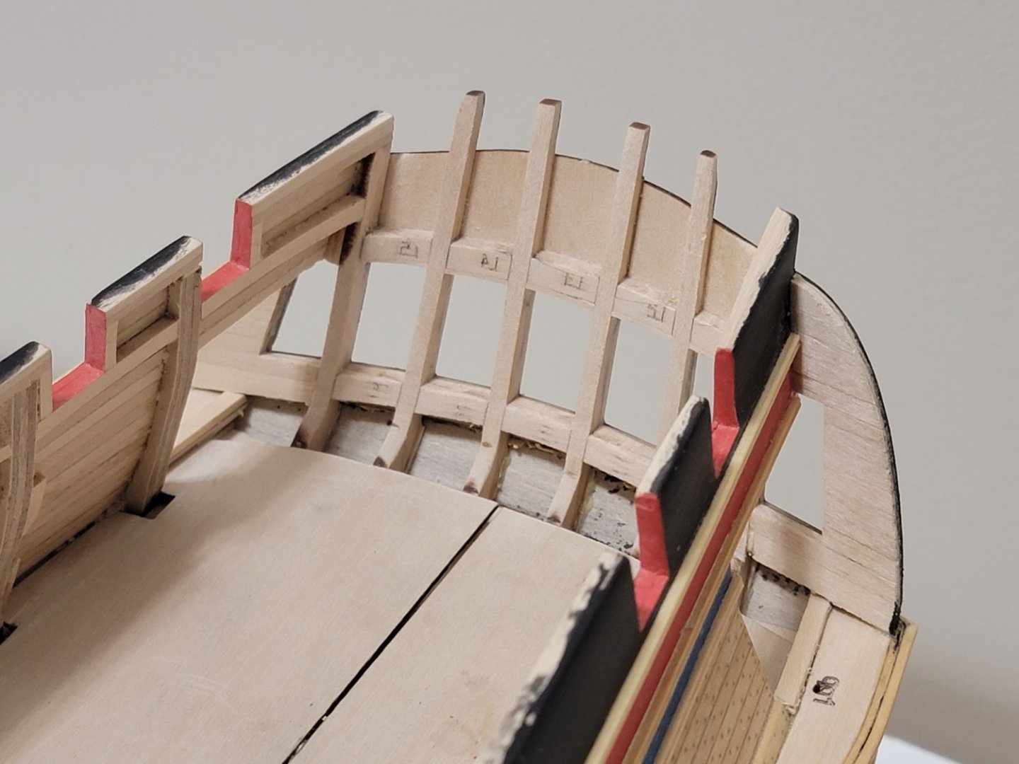
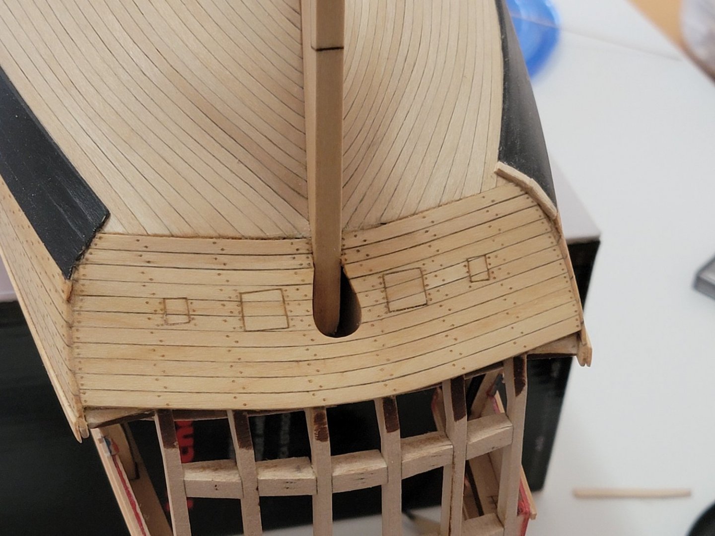
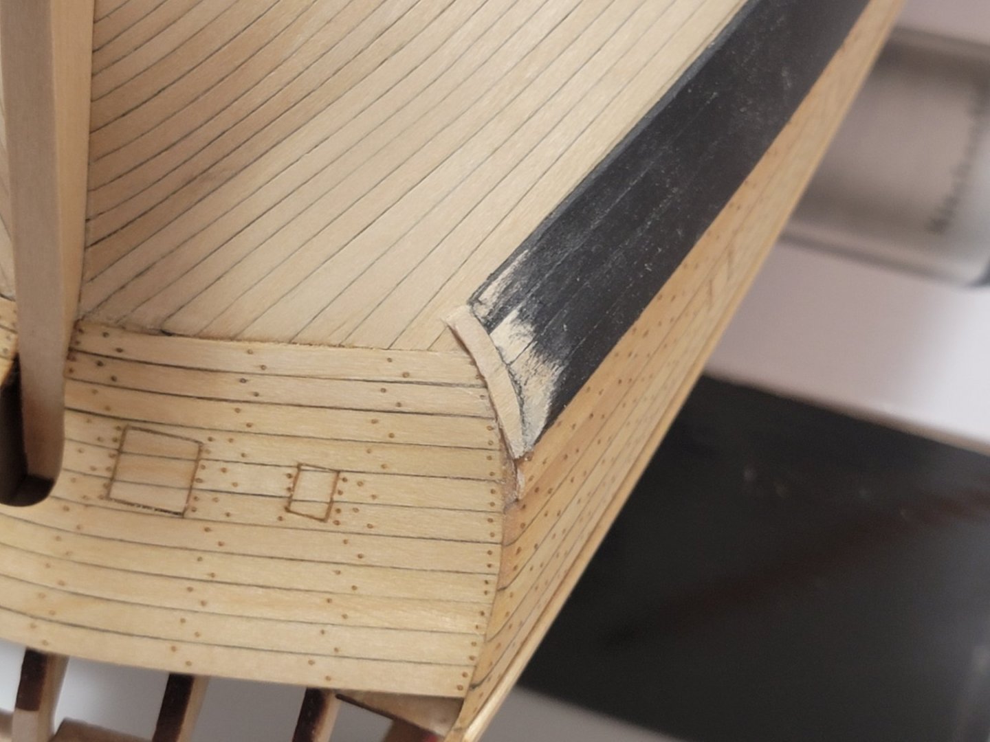
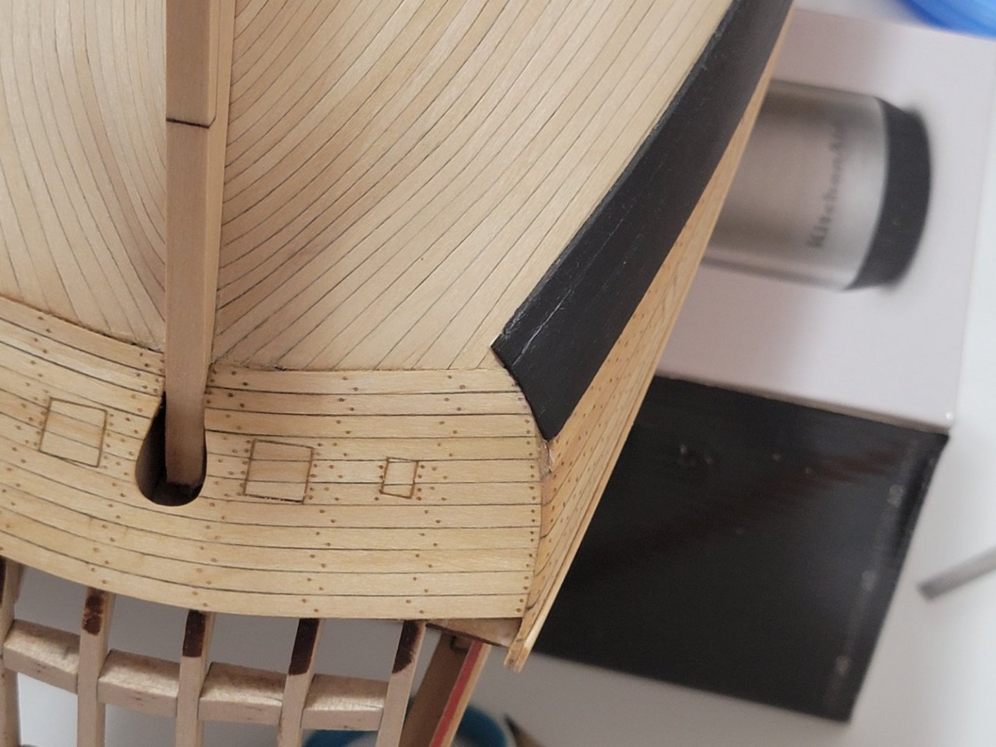
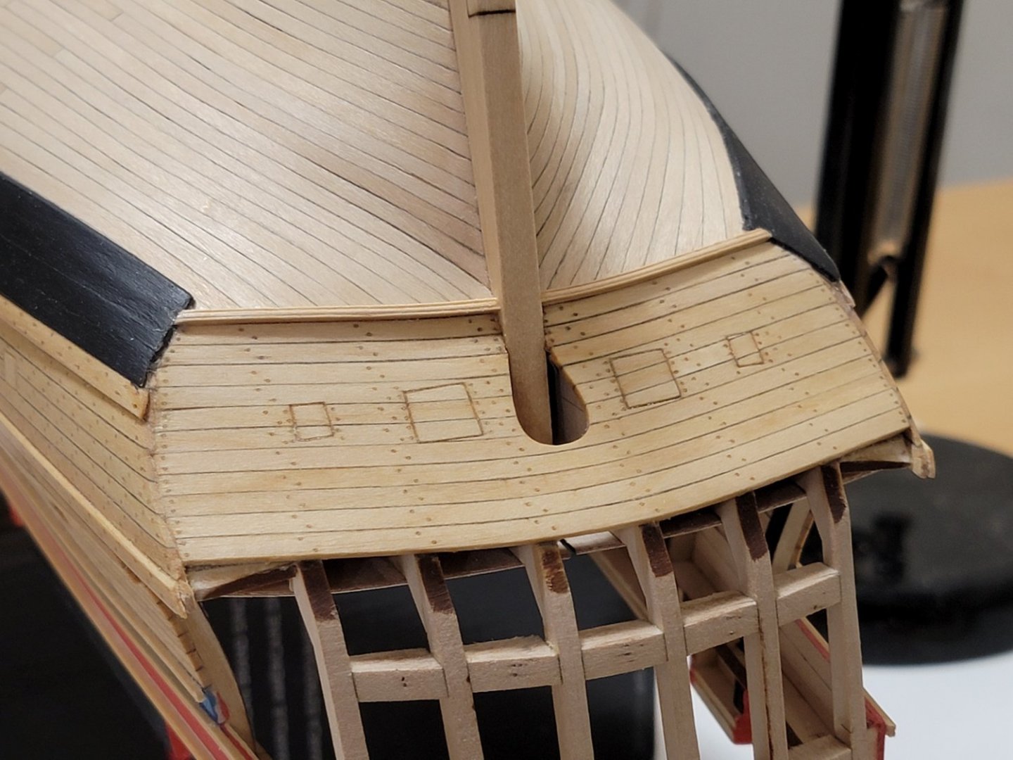
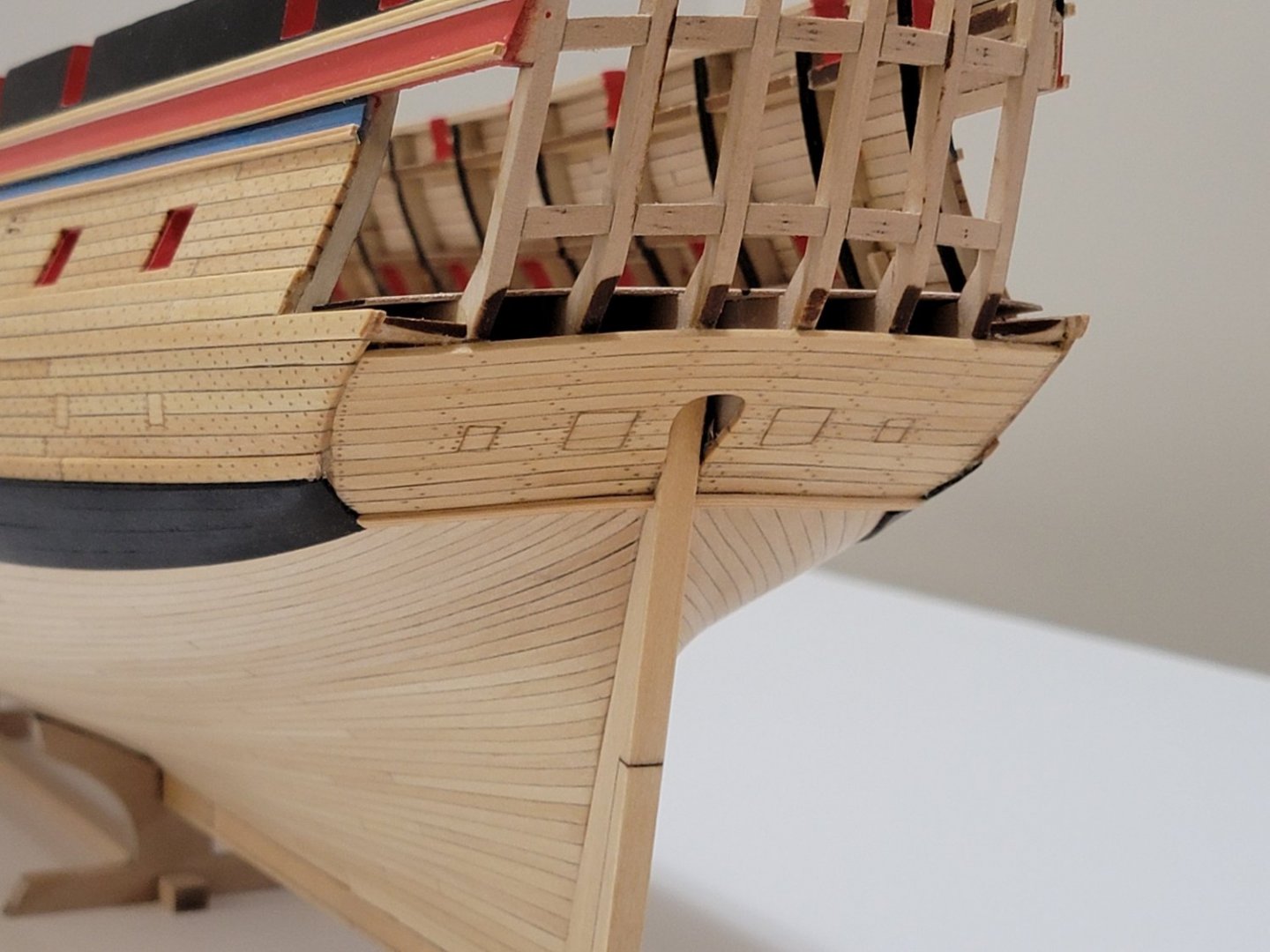
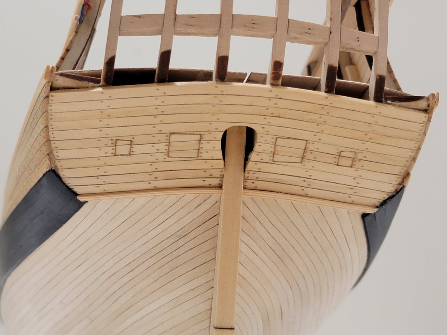
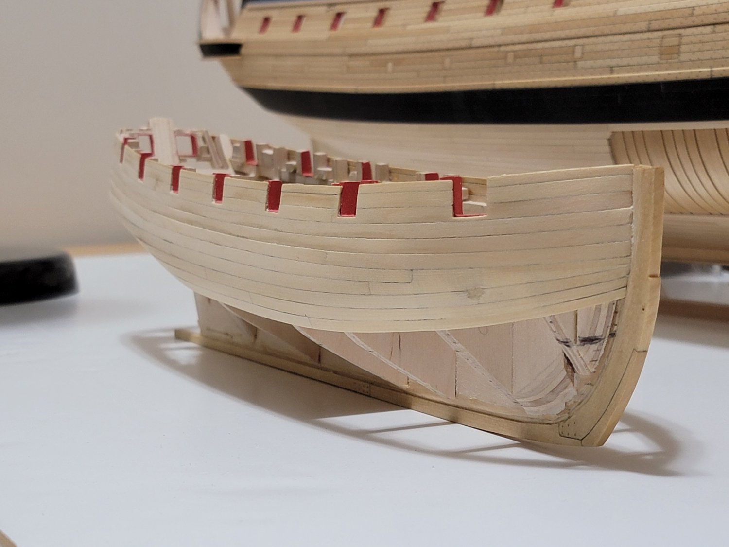
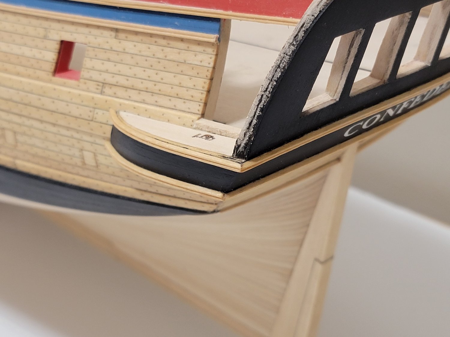
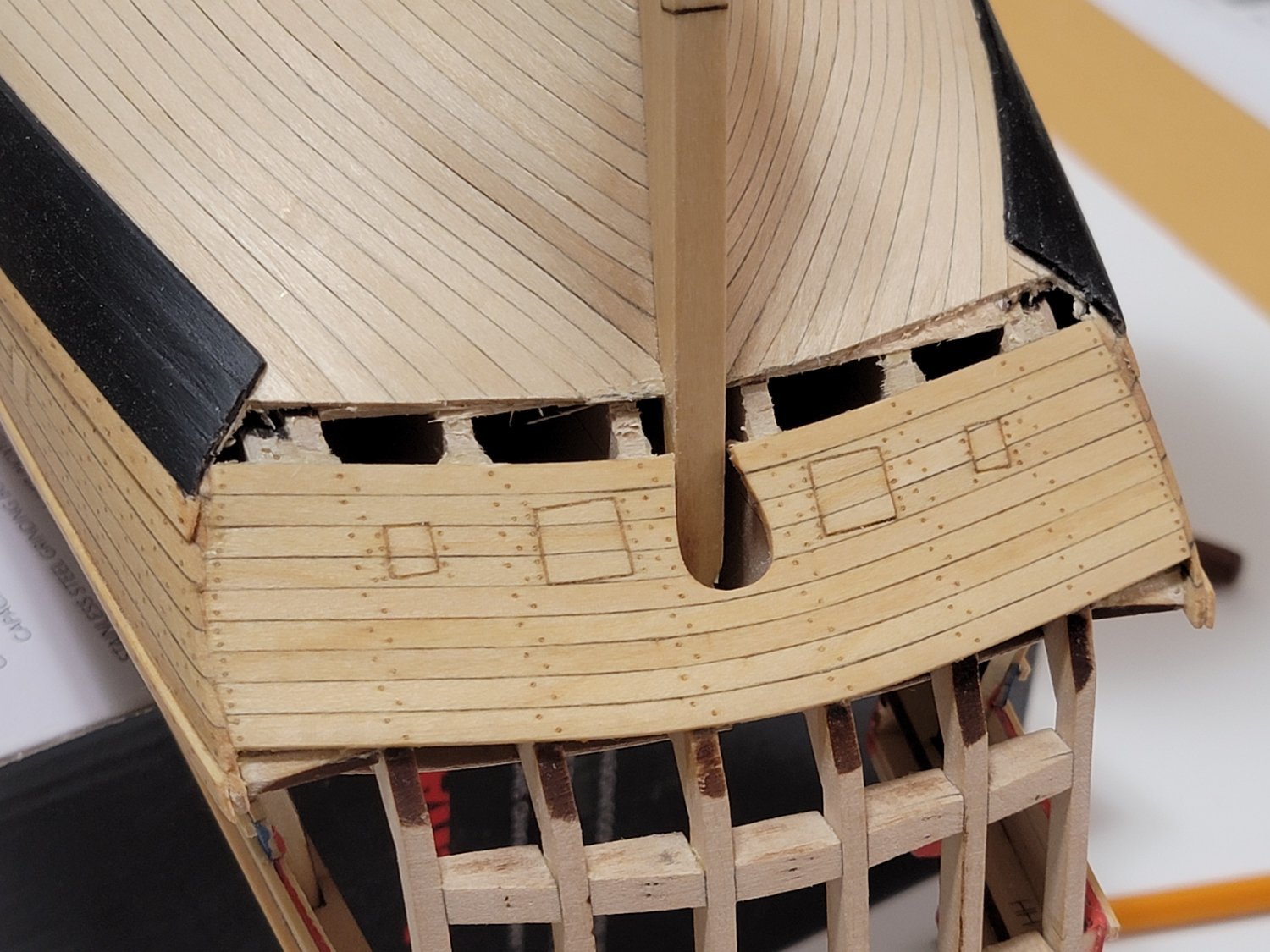
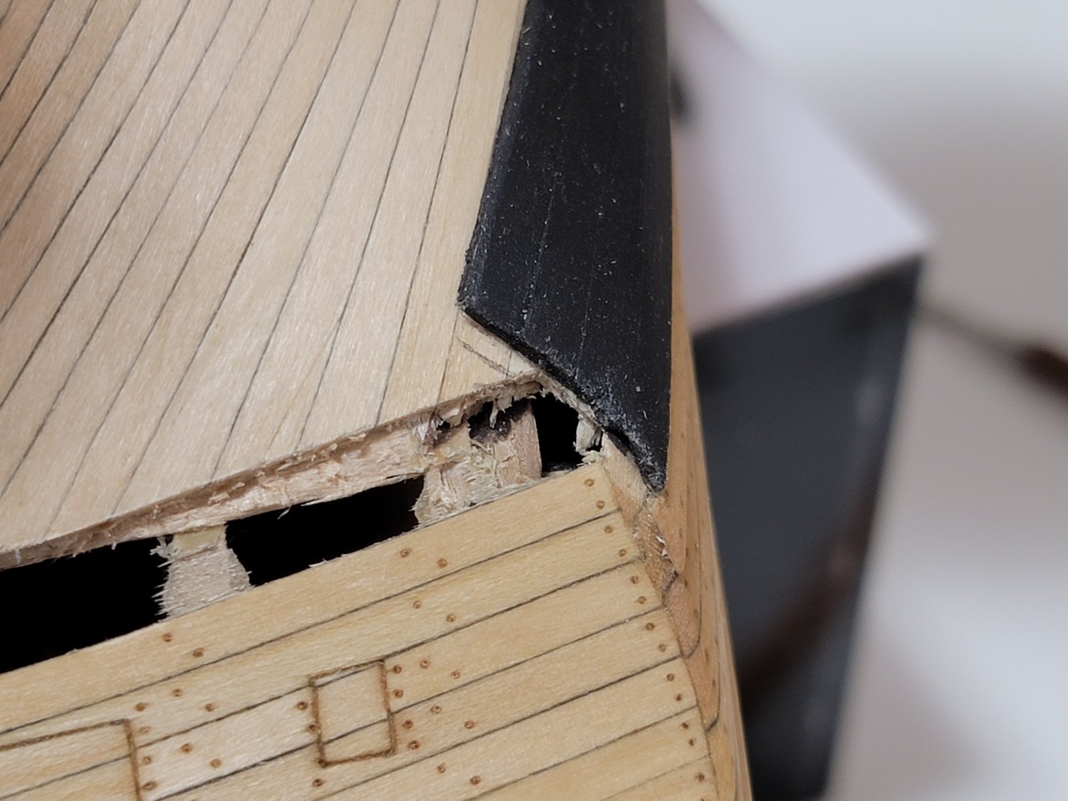
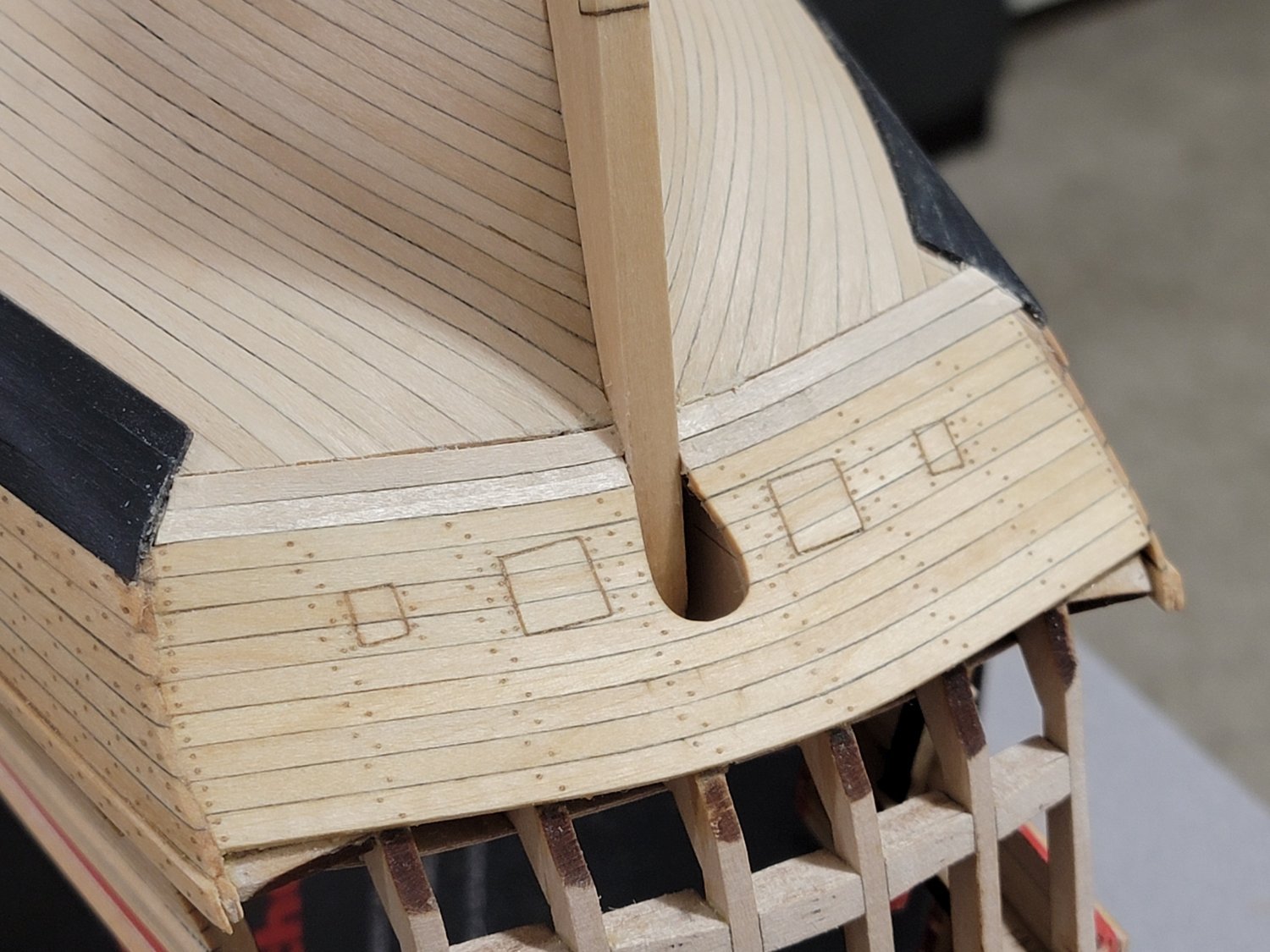
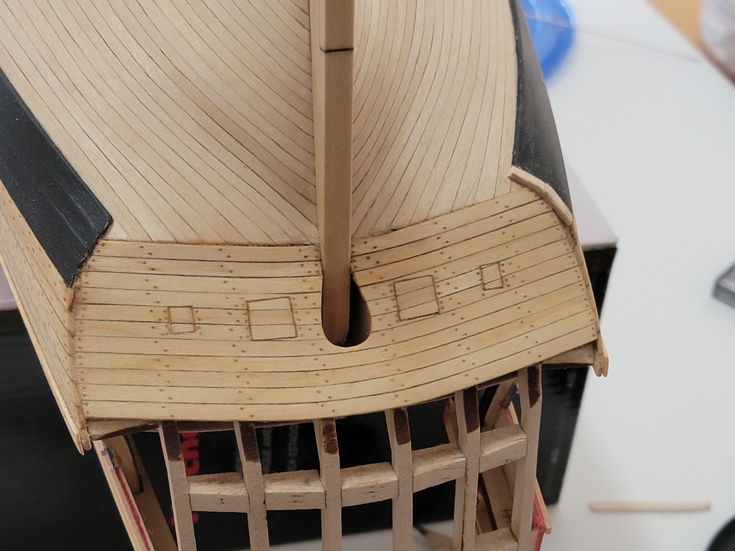
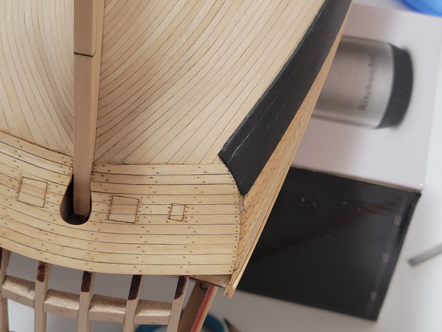
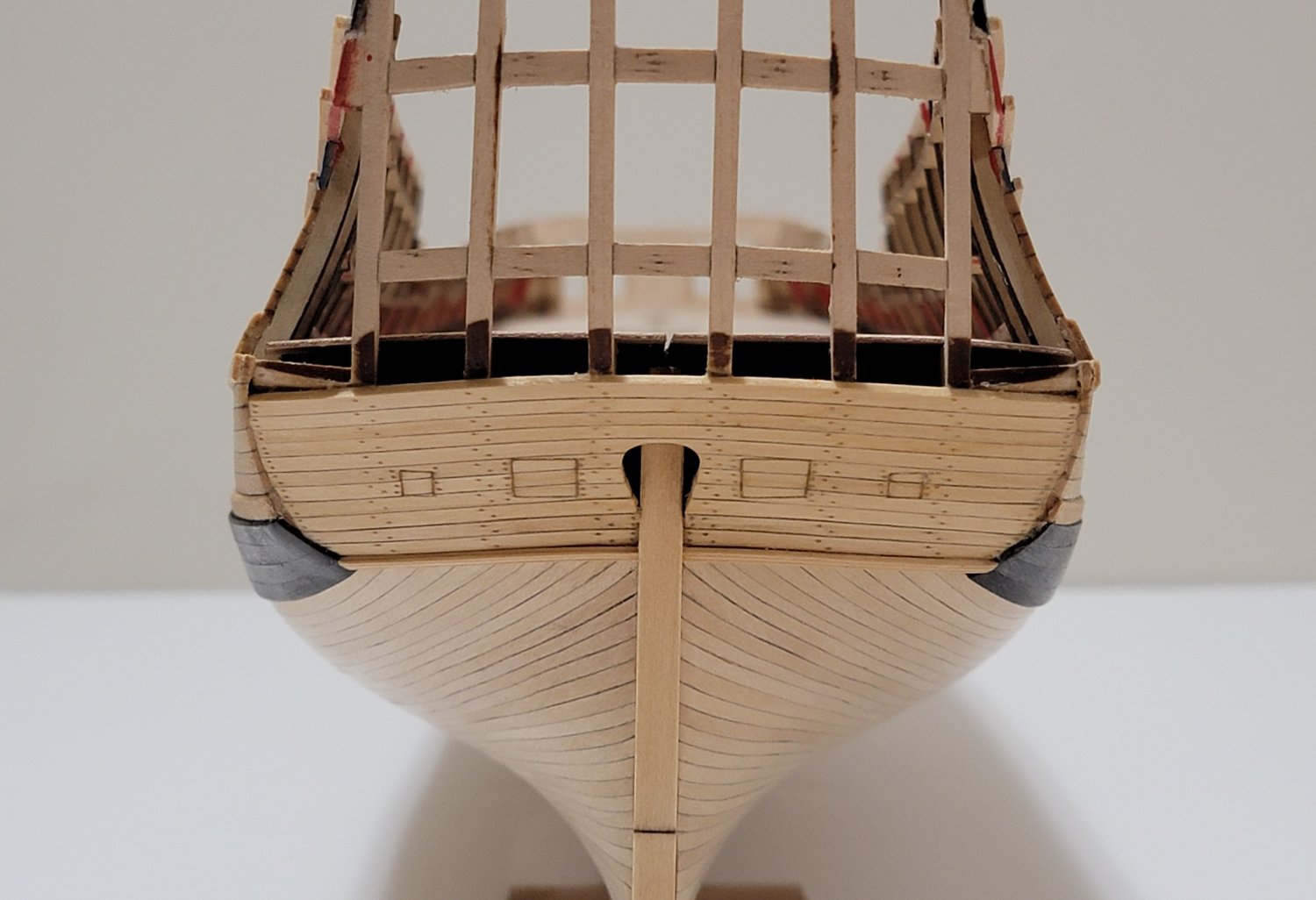
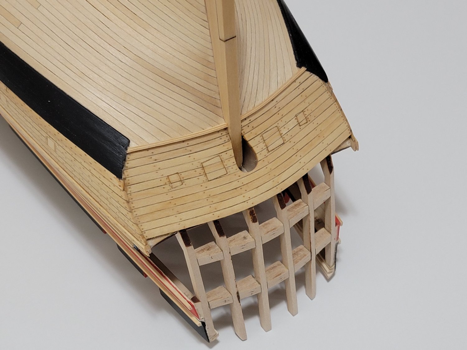
The stern area is now planked and sanded smooth. Glad I did it now than later on since I felt very cramped holding the planks in place. The opened area on the sides were very helpful to get a grip of the planks and for easy access to sand them.
Also, I had to edge-bend the planks before gluing them since there are two axis that each planks bend in for them to match the light sills. I used filler wherever I saw some gaps between the frames and the planks.
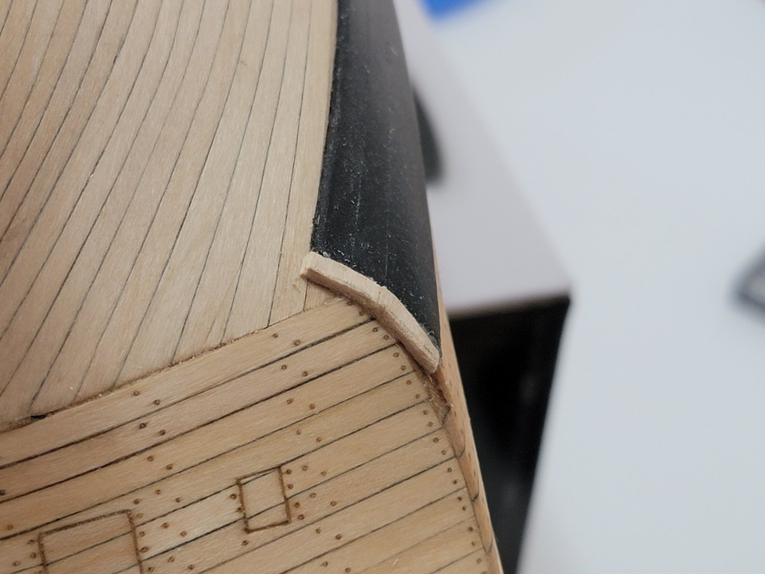
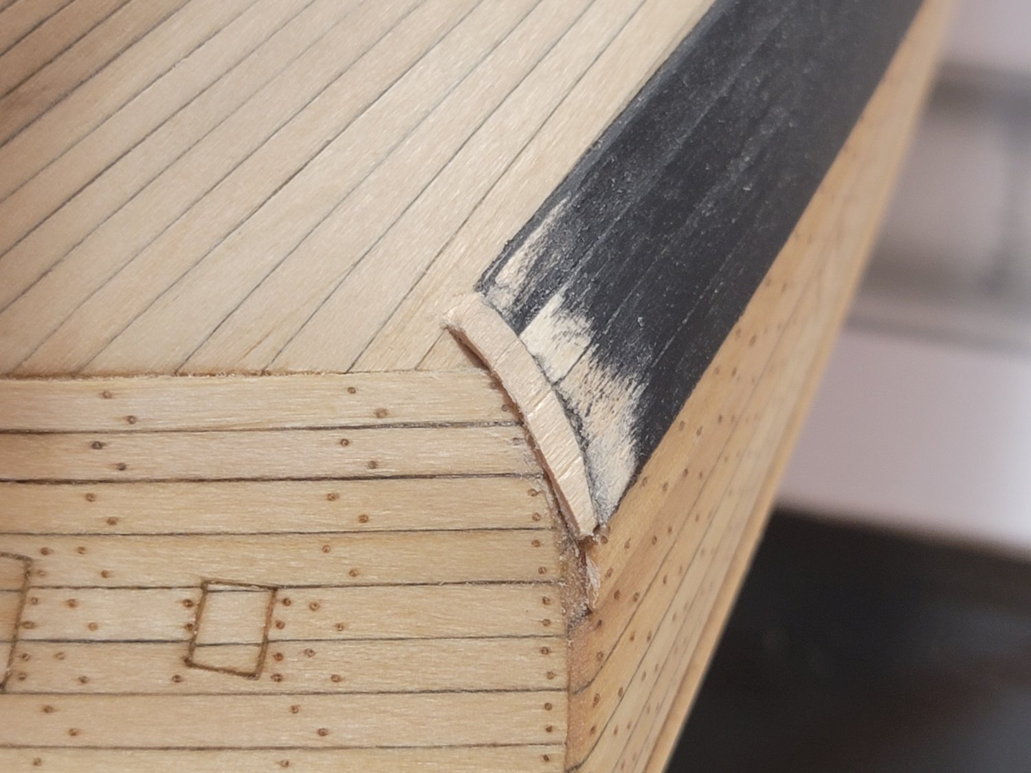
The molding strip was added next. The edges were first softened. Then, I glued the center part first and waited for the glue to set before bending and gluing the rest of the strip.

I was first considering to continue on with the quarter gallery. Now after thinking for a bit, I am considering completing Chapter 9 to plank all the bulwarks. IMO, it seems to be the logical option as it would be better to finish the "messy" work before moving on. I know sanding the planks smooth will generate a lot of sawdust and it might be difficult to clean up from the lights. Once I finish planking, I'll paint the planks in the stern area white, and the rest red.
I wanted to also note, the supplied shells for the quarter gallery do not fit my model at all so I will need to scratch build them. Something I need to think about while I plank the inside of the ship.
-
I hit a bit of a snag when further planking the Pickle.
First, I was not too happy where the butt joints of the lower planking band was located. So I removed it and I am now following the Cheerful monologue to have a similar planking run.
Once I deconstructed, I started planking the upper band. I have been using a lot of scrap wood to glue the neighboring planks.
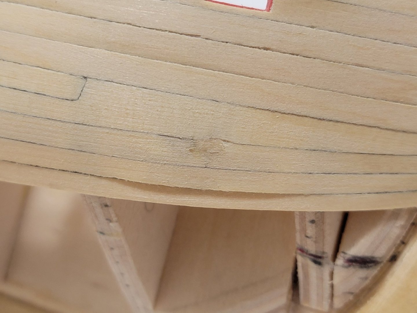
After reaching halfway, this method was not working. The curve of the planks was hard to achieve since there was little to no surface to glue them on, especially at the bow. Because of this, when sanding it, some planks at the bow became too thin and I sanded right through them:

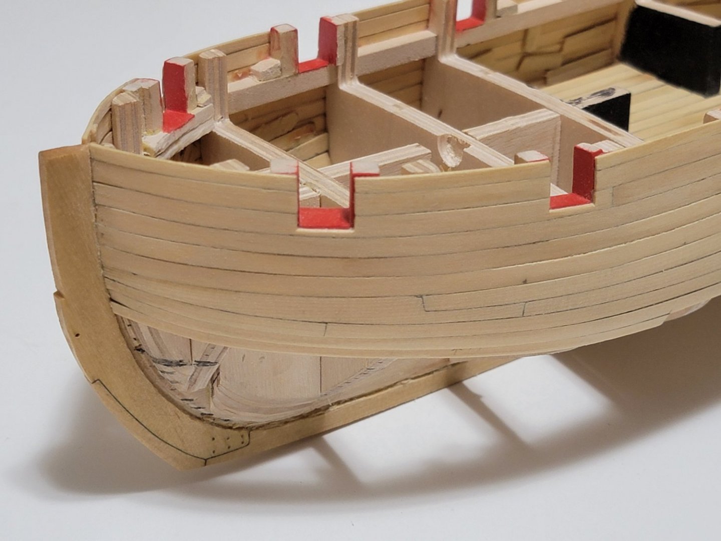
Here is a photo of the opposite side. I did not face this issue here.
So now I am thinking of deconstructing the planking again, and will use balsa blocks to fill up the space between bulkheads. This way I will treat it as a solid hull model and will hopefully have an easier time planking.
-
Hi Steven, I am so sorry to hear of your loss. My sincere condolences to you and your family.
You are doing a beautiful job with the rigging.
- Overworked724, Dave_E and abelson
-
3
-
On 2/12/2022 at 3:40 AM, Theodosius said:
Beautiful! 🙂
On 2/13/2022 at 4:49 PM, desalgu said:Looking very, very nice!
On 2/14/2022 at 4:31 AM, Gahm said:Beautiful work, Harshil! A pleasure to follow your build log!
Thomas
8 hours ago, wernerweiss said:Hello Harshil,
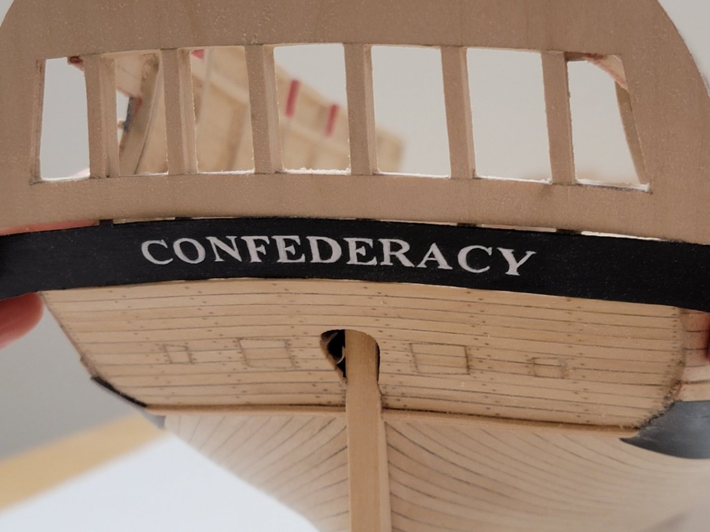
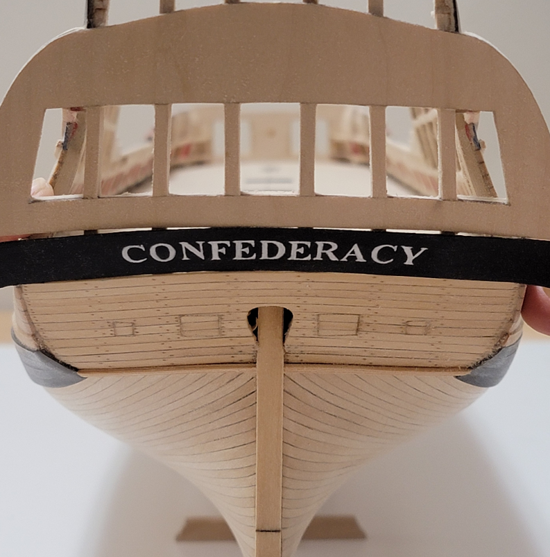
your gallery counter and the painted-on ship´s name are excellent work!
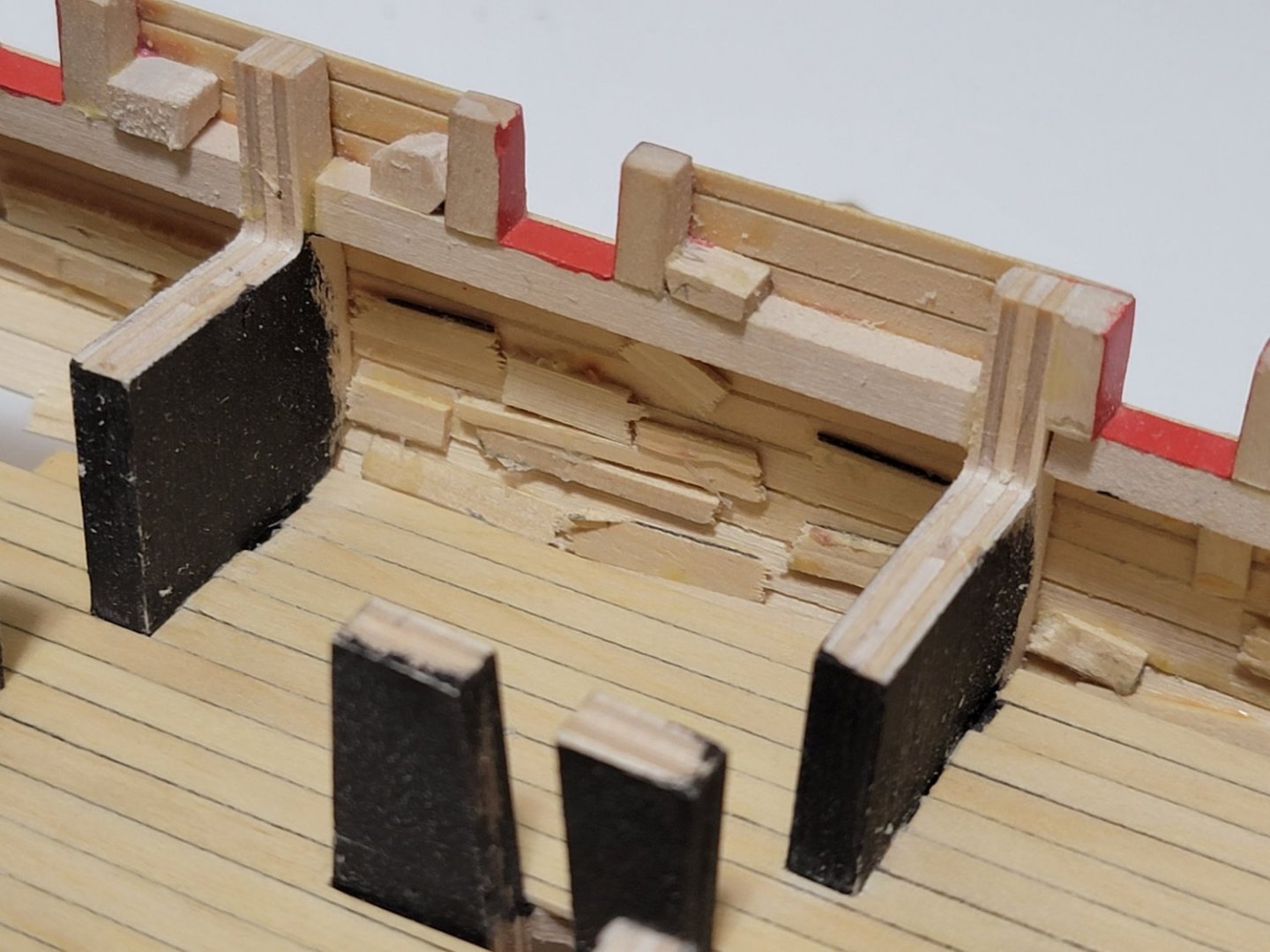
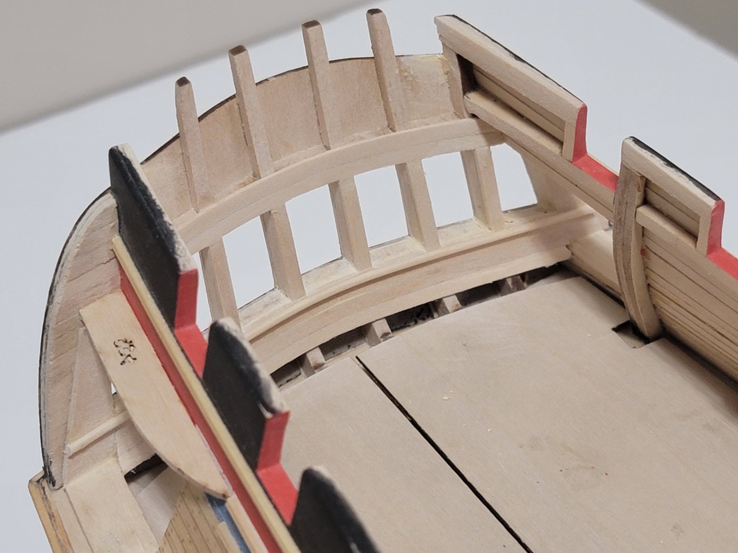
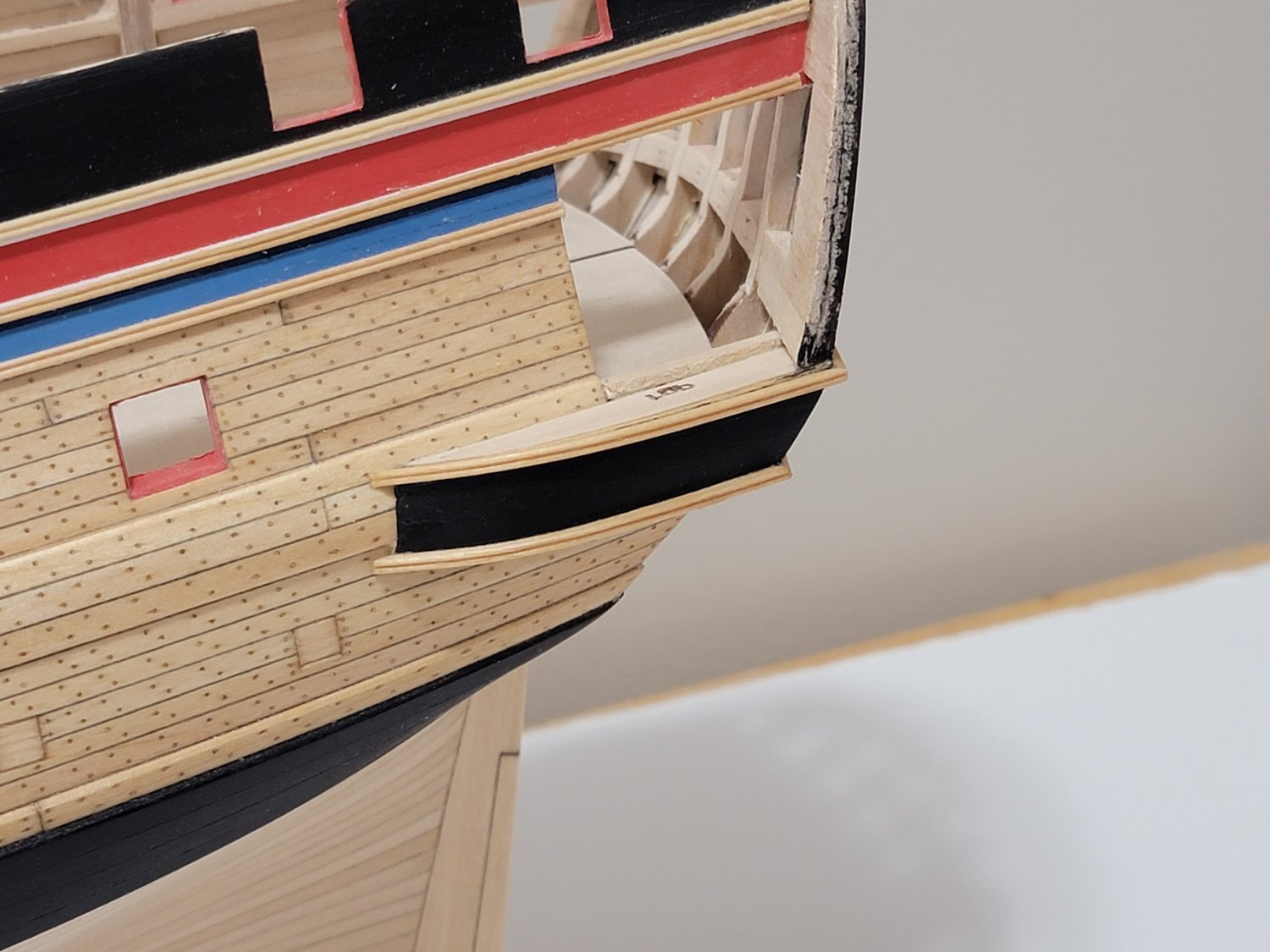
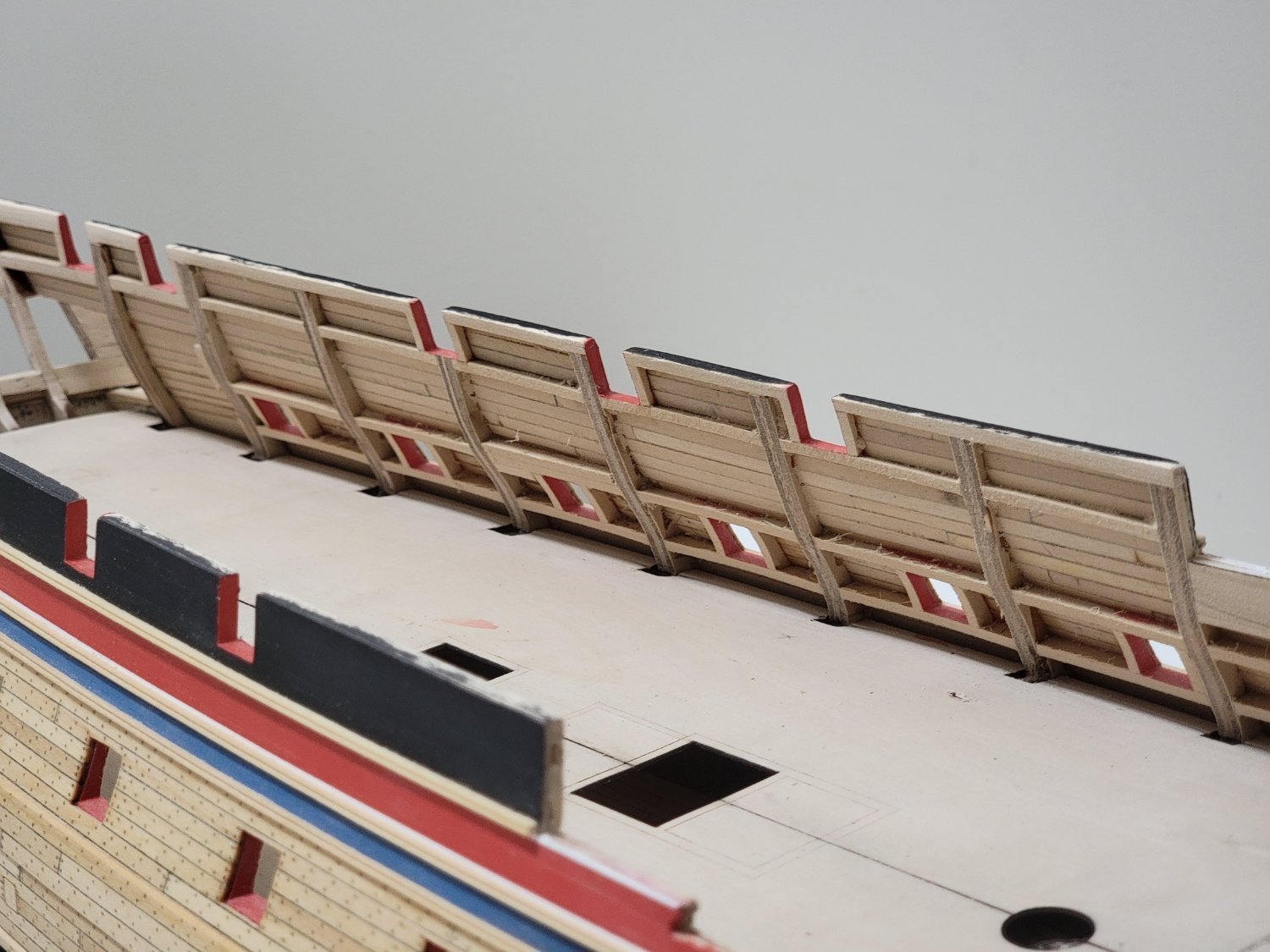
Let me draw your attention on the picture above (4th from the bottom) where you show the inside of the bulwarks on the port side of the bow area. What caught my eye is the shape of the gun port sills and lintels, the gun port uprights and the frames. Imo they are too much sanded and show a too deep concave curve, viewed from inside. Furthermore I think you tapered the frames too abruptly from the gun port lintels upwards, they should be tapered more gradually beginning on the deck level.
Thank you, Theodosius, David, Thomas, and Werner!
Werner, thank you for pointing that out. I will rectify the error before planking the bulwarks. I found that the basswood sands much easier than the plywood pieces, so it is a bit difficult to get a consistent surface throughout. I'll try not to apply too much pressure now to obtain a gradual taper.
-
-
Thank you for the encouragement, Steven and Michael. And thank you all for the likes! 😁
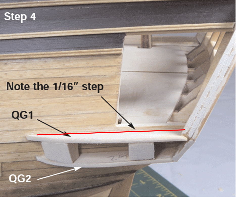
I continued some more with the quarter gallery construction. Some scrap wood was inserted to create the 1/16" step since my planking was too low.
Some scrap was also used to fill in the larger gap between the upper counter and transom:

The other smaller gaps were filled in using filler:
The quarter gallery counter was then planked, sanded, and painted black:
I next worked on the mouldings. I used masking tape to act as spacer between the top and bottom mouldings. I applied tung oil once the glue was set.
The mouldings for the quarter gallery counter were first bent then glued in position:

Here are some photos of the initial steps completed:


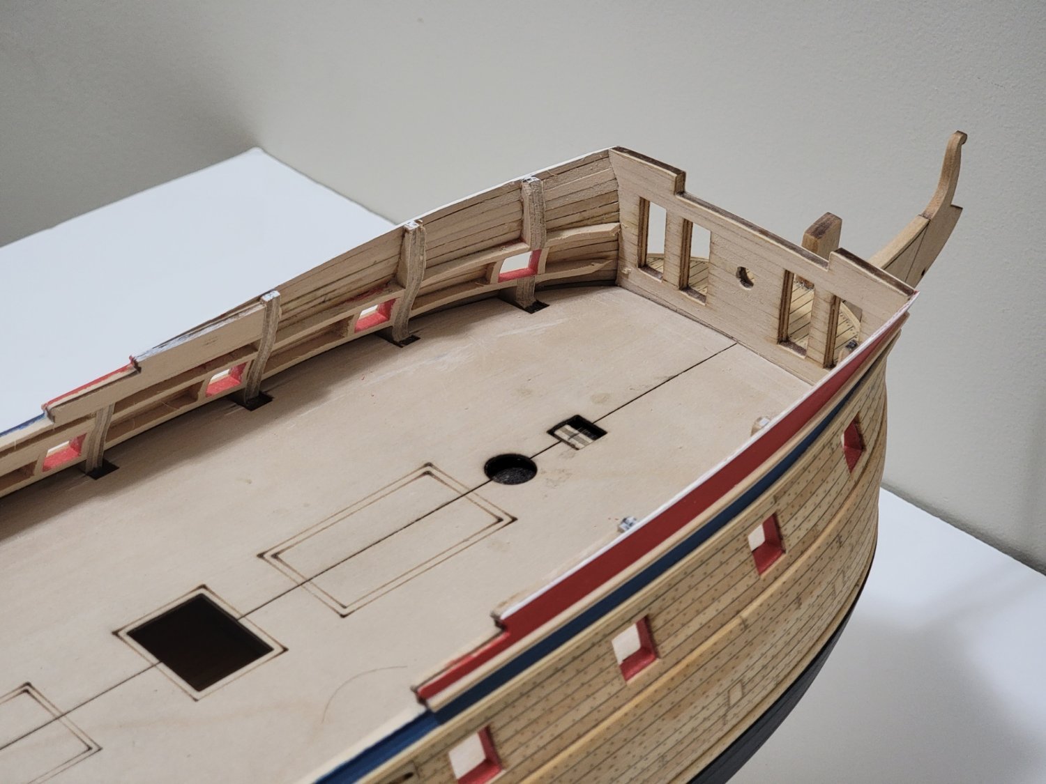
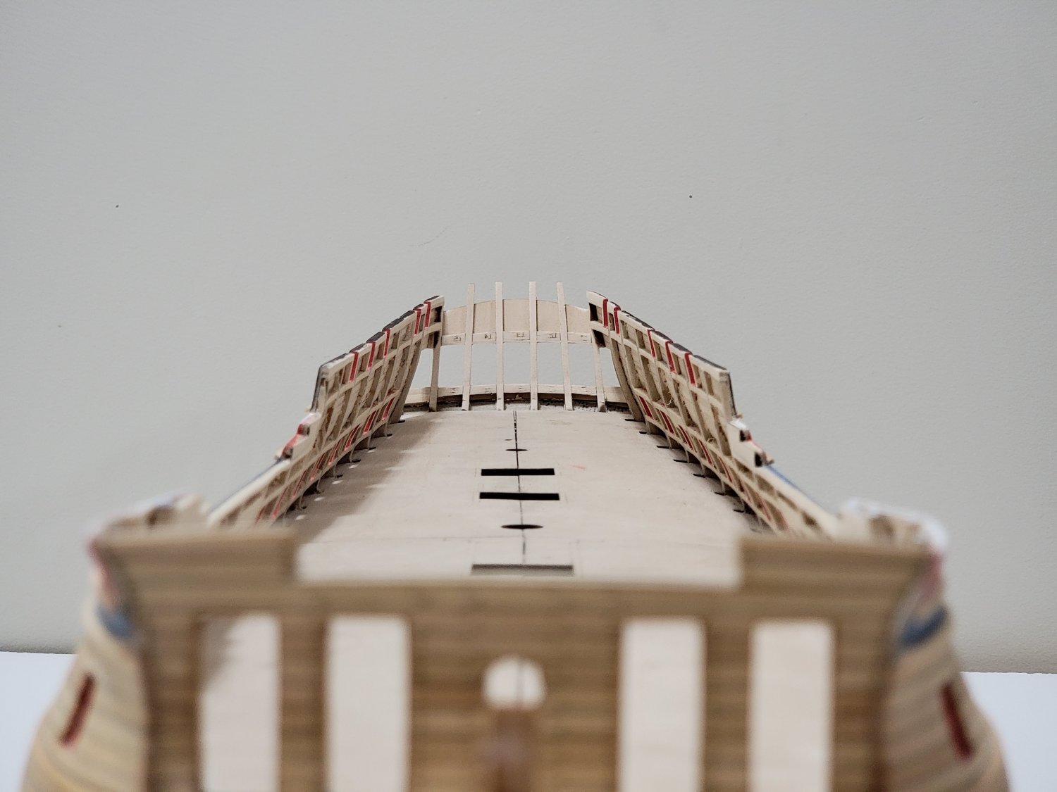
All the bulwarks have also been sanded to a maximum of 5/32" at the top and 7/32" at the deck level. Glad to have this part done with!!
 .
.

I am thinking to paint the interior of the great cabin white, as well as the light frames. So I will start planking the bulwarks at the stern before continuing on with the quarter gallery.
-
Beautiful planking job, Andy! Very nicely executed 🙂
-
Thanks all for the feedback! It's much appreciated!!!
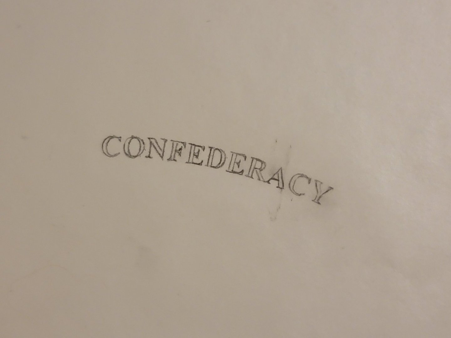
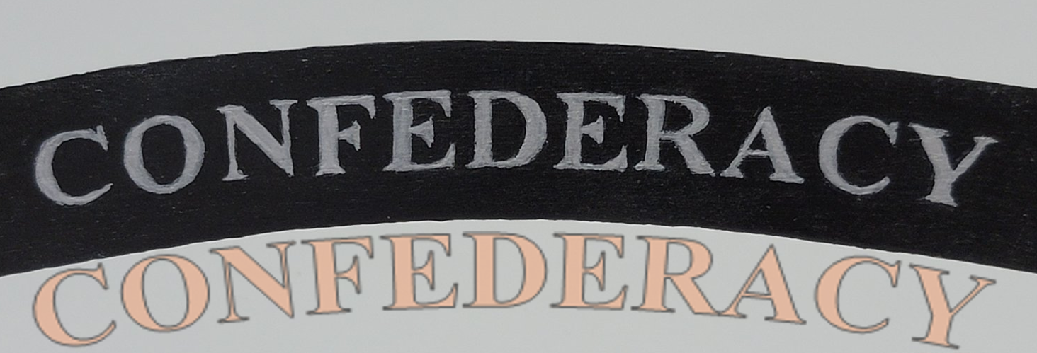
I overlaid text (with a slight contrasting color) on top of the painted area, and made the text slightly transparent so I can see the potential problem areas. It seems that the spacing was related to the font choice. The spacing may have been further amplified from both the curvature of the text as well as the shape of letter A because of the slanted lines.

-
-
On 2/5/2022 at 12:05 AM, michael mott said:
By putting the letters on a thin strip you can simply cut between them. Do a quick test with some printed letter from your printer to get a feel for what I am describing.
Cheers I'm off to bed.
Michael
On 2/5/2022 at 6:59 AM, Cathead said:I must agree with Michael. While the individual letters are nice, there's a pretty clear unevenness across the word that stands out to the eye, particularly when the rest of the model is so crisp and pristine. Although if his suggestion is to just cut between letters and transfer panels, I wonder if that would produce an uneven surface look that would also stand out?
Here's another thought, since we're spitballing. Would it work to print out the actual lettering you want (white on a black background), then cut and transfer the entire piece of paper to the wood using something like diluted wood glue or another fixative? This would eliminate any unevenness from hand-drawing (however careful) but would give a smoother surface and perfect layout.
I know you said you didn't want to print because getting the letter sizes right would be difficult, but my suggestion would be to make a number of different sizes laid out on the same page (small adjustments to the font size), print them out as blank ink on white paper to save ink, choose the size that fits best, then redo that one as white lettering on black ink within the overall outline you wanted.
On 2/5/2022 at 8:25 AM, wernerweiss said:Hello Walrusguy,
in a ship model kit many details are simplified, and so are the letters of the ship´s name. They come as etched brass parts which have only to be painted and glued on. This is the simple way and I did so.
I admire you for choosing a more ambitious way and trying to have the ship´s name painted on, and I think with your tries you are on the right way. I guess you have the model of Harold M. Hahn as your example?
(I turned the picture, the original is upside down)
On 2/5/2022 at 8:52 AM, Moonbug said:I wish I had a clever solution WG - but I'm really just waiting to see which one of the ideas from our smart compatriots works best so I can steal it as well.
On 2/5/2022 at 9:11 AM, No Idea said:Personally I think that looks amazing - Even better its your own work
") On 2/5/2022 at 12:05 PM, desalgu said:
On 2/5/2022 at 12:05 PM, desalgu said:I think your painted letters look real good. Getting spacing and curvature right is very difficult. It might be worth trying printing them out and seeing what it looks like to glue the entire strip on all at once. Chuck does this for friezes on the long boat I made. I had my doubts about how well it would work, but it worked much better than I expected. Just make sure and spray on some fixative before handling printout.
I also liked the idea of 3D printed letters, but like PE or metal lettering in kits, you still have the problem of gluing them along curvature, aligned and spaced correctly. I have a feeling 3D printed parts will begin to replace PE in kits. They don't have to be one-sided.
If I can tease you a bit, you might as well go all out, and carve letters out of boxwood!! 😂
Thank you for the suggestions and comments 🙂
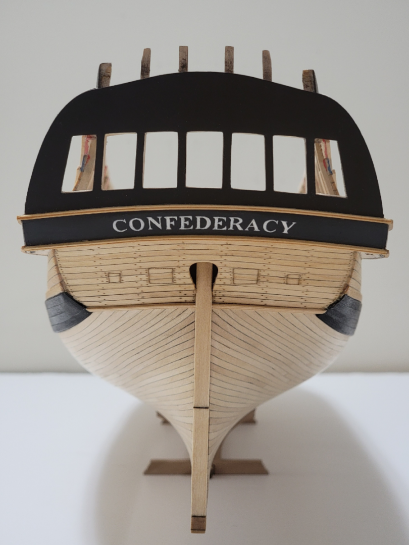
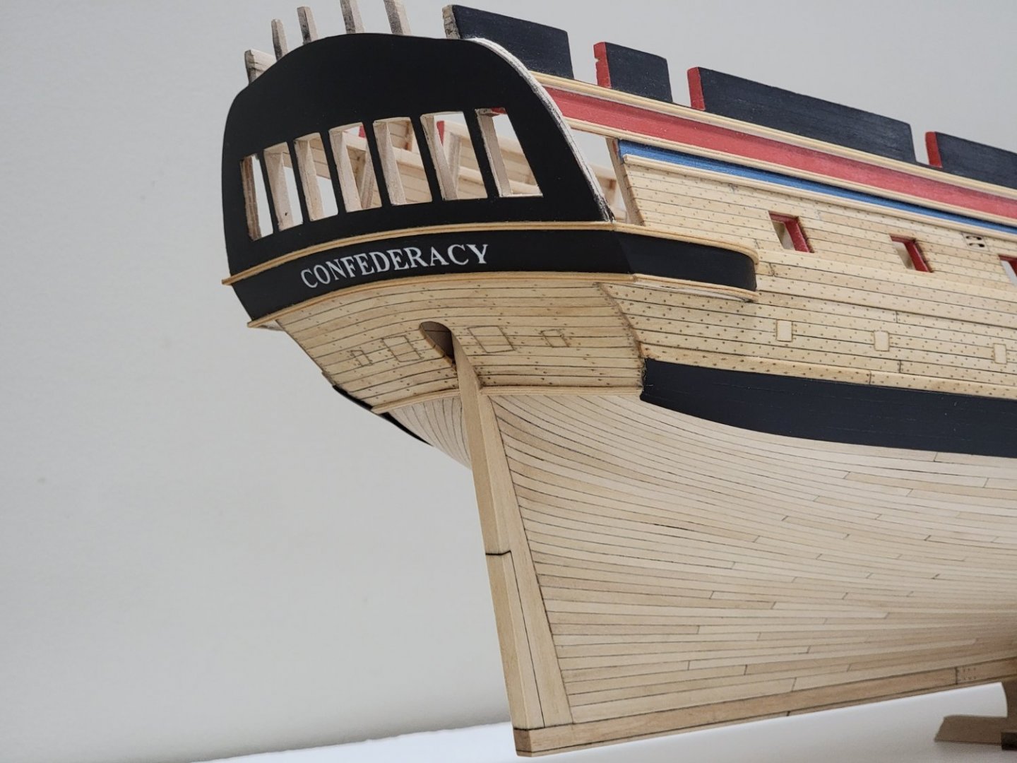
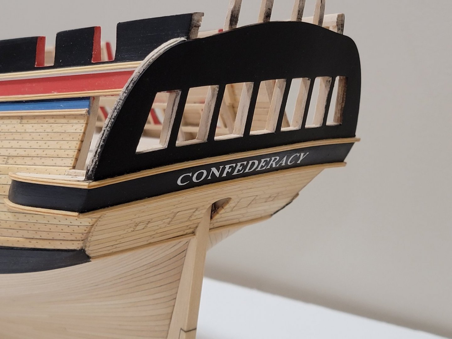
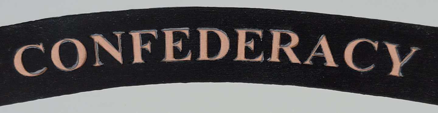
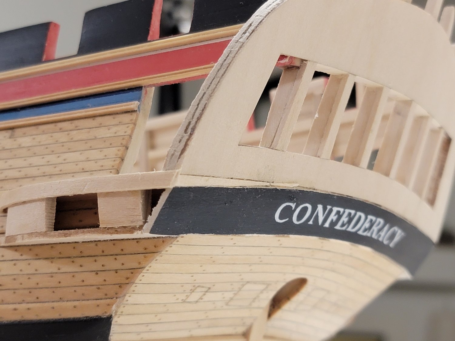
The main reason I chose not to go ahead with the brass letters is that I wanted to try out new techniques. And I read somewhere (I can't remember where though!) that ships before 1800-ish had the ship's name painted on. Also, the brass letters looked a bit small on my model's counter. So as Werner pointed out, I based mine on Hahn's lettering when it comes to sizing.
I took all of your suggestions and tried them out. I changed the font slightly by decreasing its height. Looks a lot more proportioned to my eye now!
The first technique I tried was printing the white letters on a black background. This resulted in perfect lettering (of course!) but.. the black printed background did not match the acrylic paint in texture. So I tried different solutions like matte medium, but later learnt that printer ink is water soluble since everything smudged. I could have tried a matte fixative but I wanted to try out other techniques before going this route.

Next, I tried to cut out a stencil on label paper. The paper just tore since the letters are so small to cut precisely.
Then, I thought of printing out only the outer borders of the letters, then painting the surrounding black by hand. This resulted in a lot of brush strokes going in different directions which were clearly visible. Maybe this idea may have worked if I sanded inbetween each coat, but I wanted to try out other ways before doing more trials with this method.

I also considered painting individual letterings (as panels), but as Eric pointed out, I was not too sure how to go about the uneven surfaces.
Lastly, I considered purchasing the Roman R.R. Gold letters, but I was not too sure how to align them properly to have the proper kerning.
So......
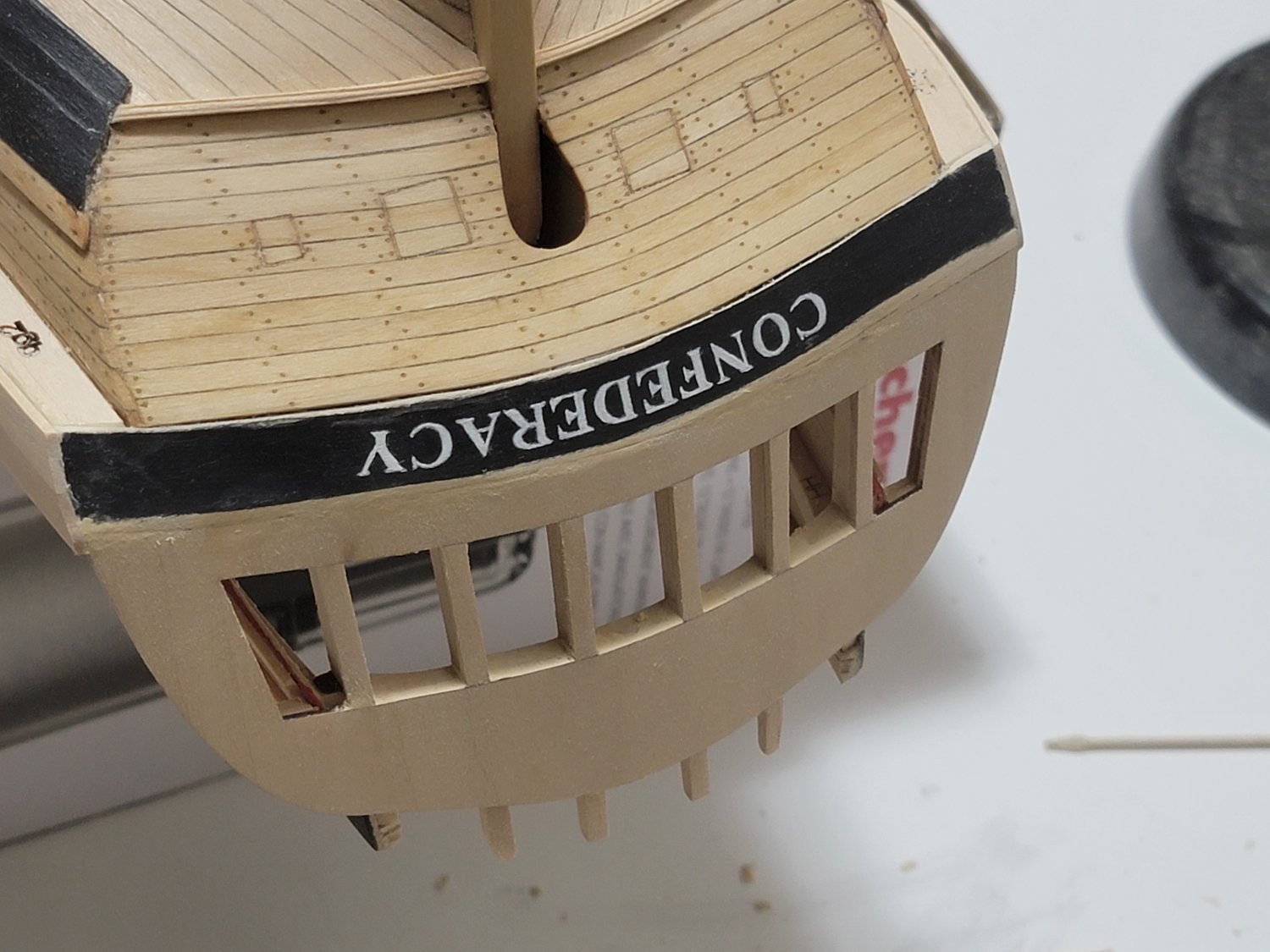
I thought I would try out the the painting technique again that I used previously before diving deeper with the other techniques.
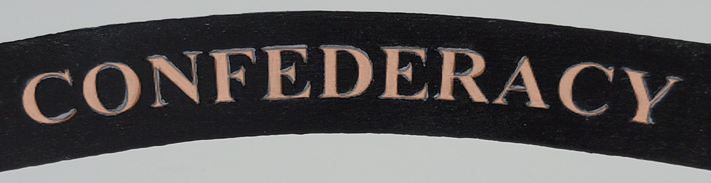
For this trial, I took more a lot more time with rewriting the letters on the white graphite paper (this time with a compass point for more precision) and even more time with each brush stroke when painting within the graphite marks. I applied 2-3 coats of white paint.
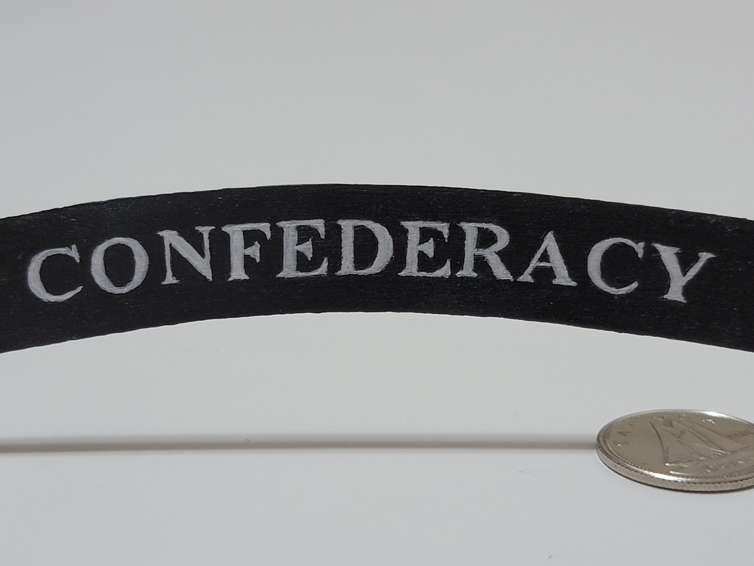
I think it looks much better than before, and does not have the "funky" look that my previous attempt had. The decreased text height may have also helped with this. Any comments on this trial would also be appreciated. I think I am now tempted to glue this on (but I'll do it after I sleep on this decision!)

-
13 minutes ago, michael mott said:
To be perfectly honest I think you are capable of doing a better one. (you did ask) Might I suggest something that might be thought of as completely bonkers. If you were to paint the letters in a straight line on a thin material of the background colour and just paint each letter several times. Then you could transfer all of the best ones to a curved line so that you can adjust the letters so that the (kouerning) Sp? can be tweaked. Sort of like setting out waterslide transfers. Remember how we practiced our cursive writing in school.
Michael
Thank you for the tips, Michael. I'll try doing that. What would be the best way to transfer the lettering? Would it be by cutting around each letter carefully?
-
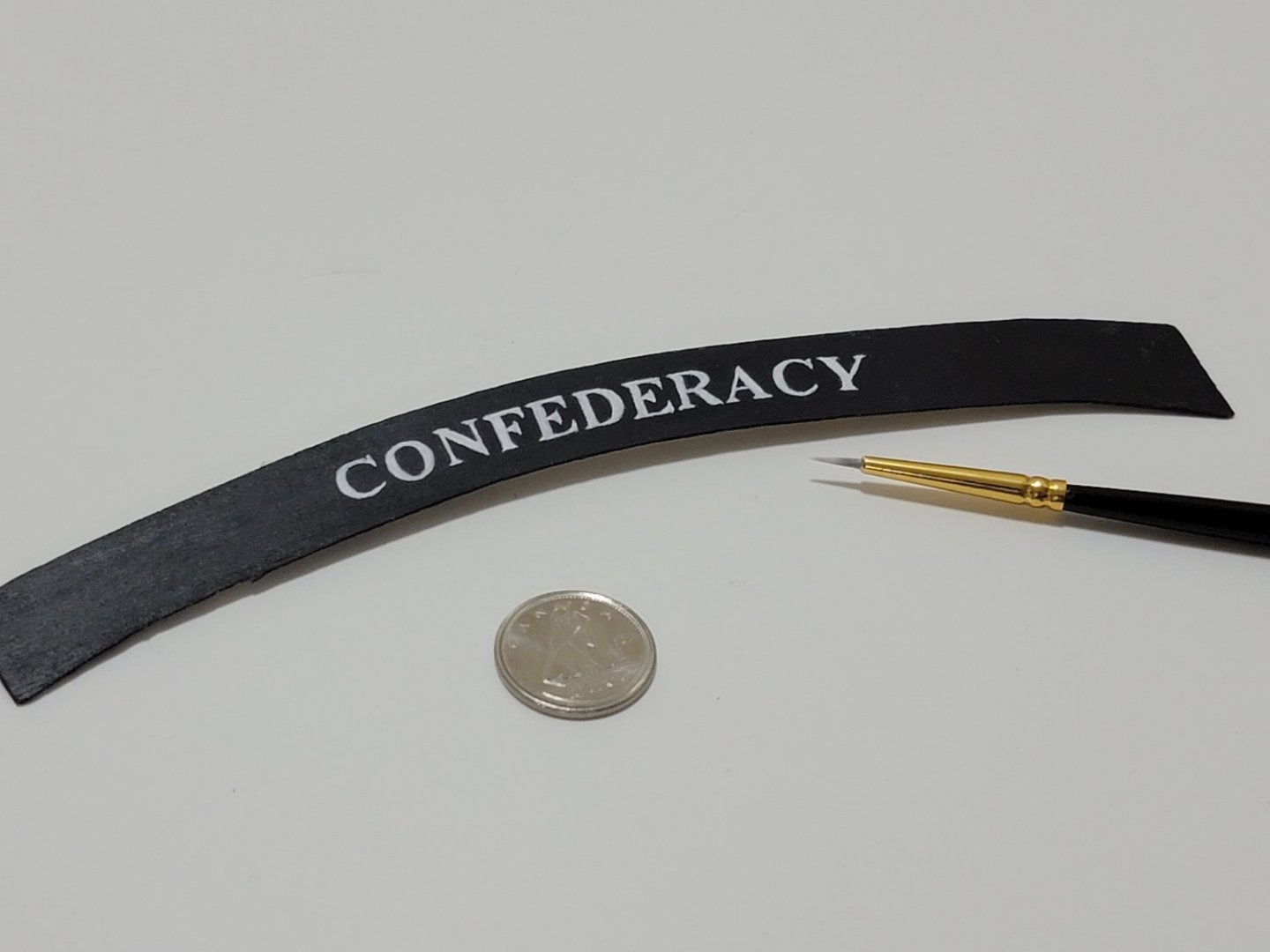
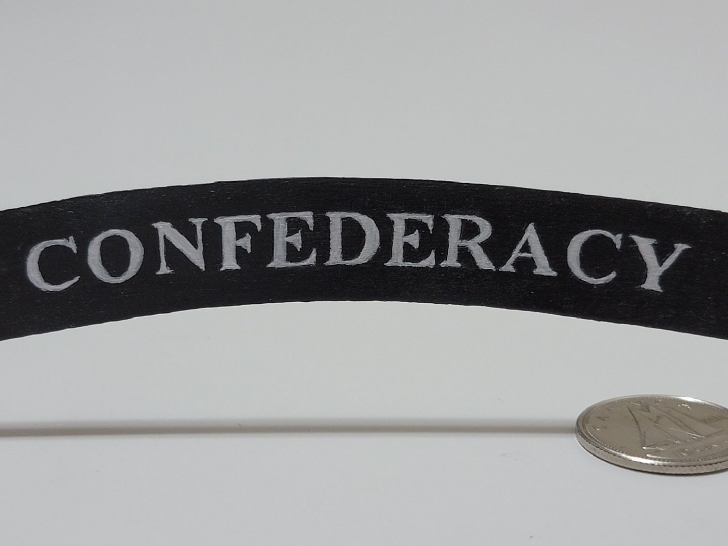
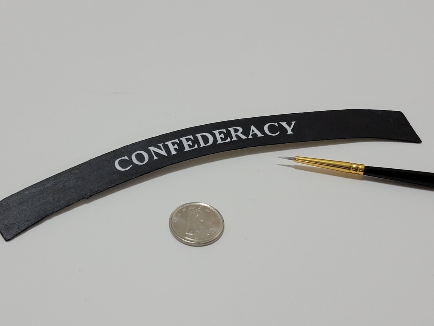
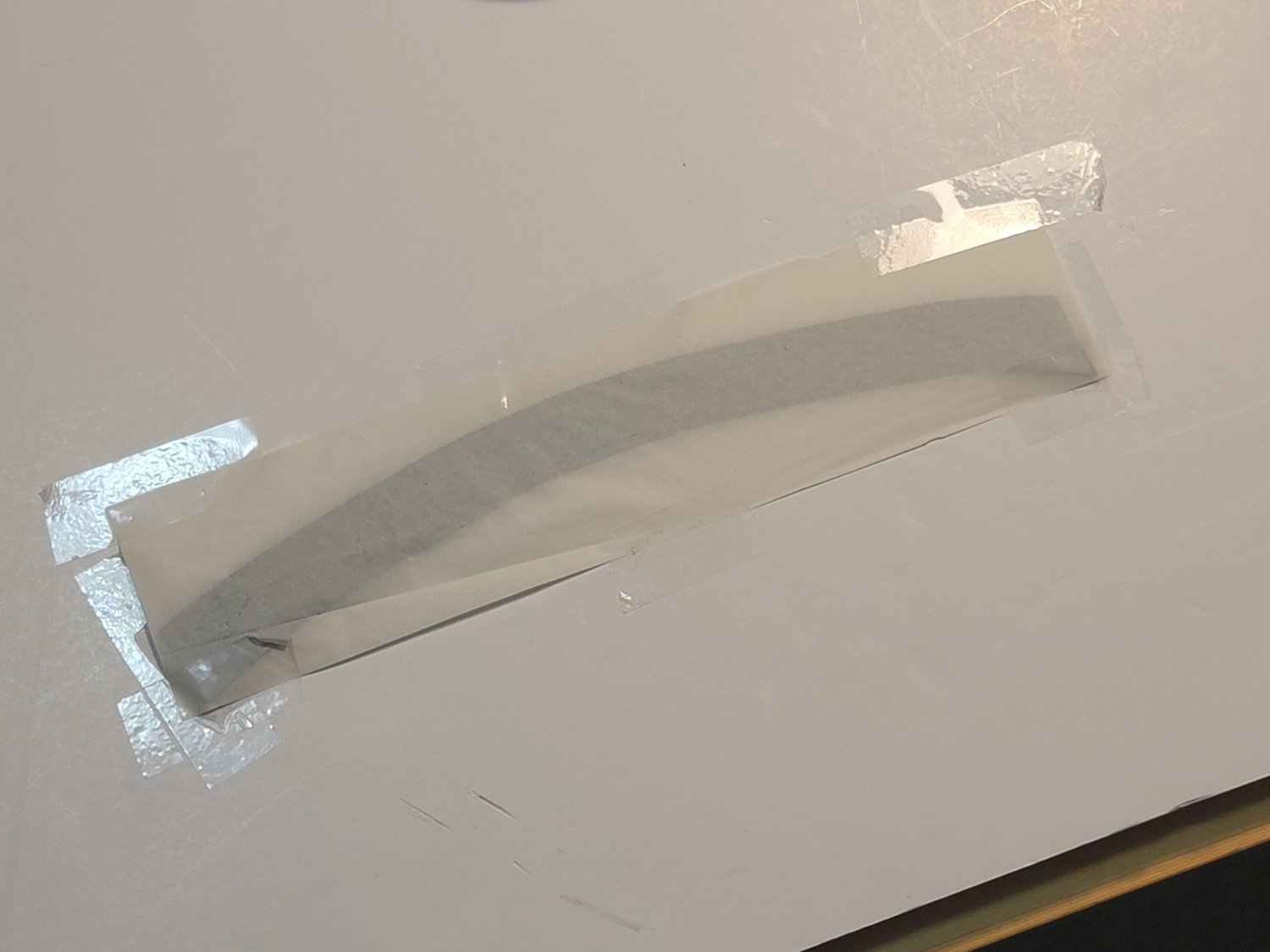
After a few more trials of using the acrylic paint pen, I decided to switch things up with a paint brush. I found the pen to be too wide for some parts of the letters. The brush allowed for more control.
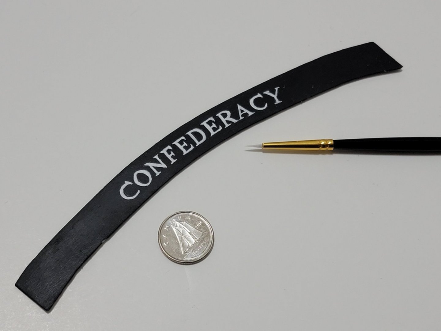
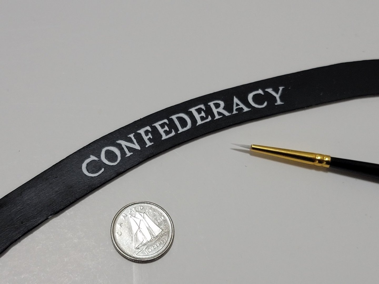
I would love to hear opinions on this trial. Does this look good? Should I go ahead with gluing it permanently? Or are more trials/fine tuning needed?
-
7 hours ago, Cathead said:
Here's an outside-the-box suggestion on lettering: have you considered getting a lettering stencil/template 3D-printed? On my steamboat Arabia, I designed the lettering I wanted, then paid a friend's teenager to make it on his home-built 3D printer. If you don't have access to such a teenager, there are numerous websites where you can submit a design and they'll make and ship you the print.
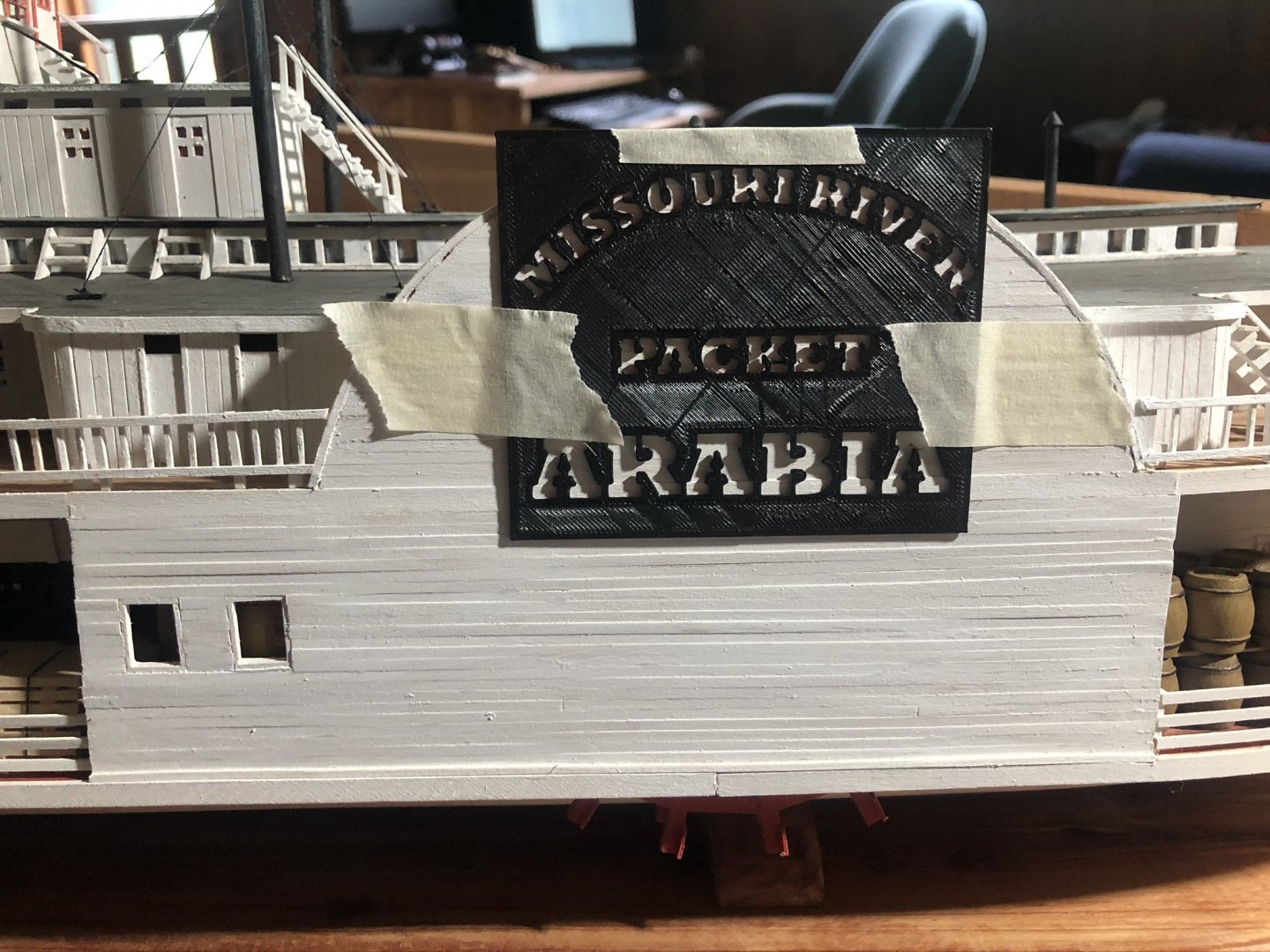
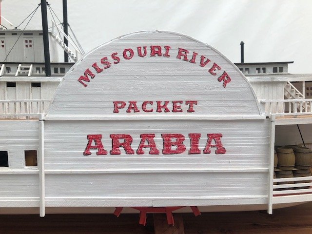
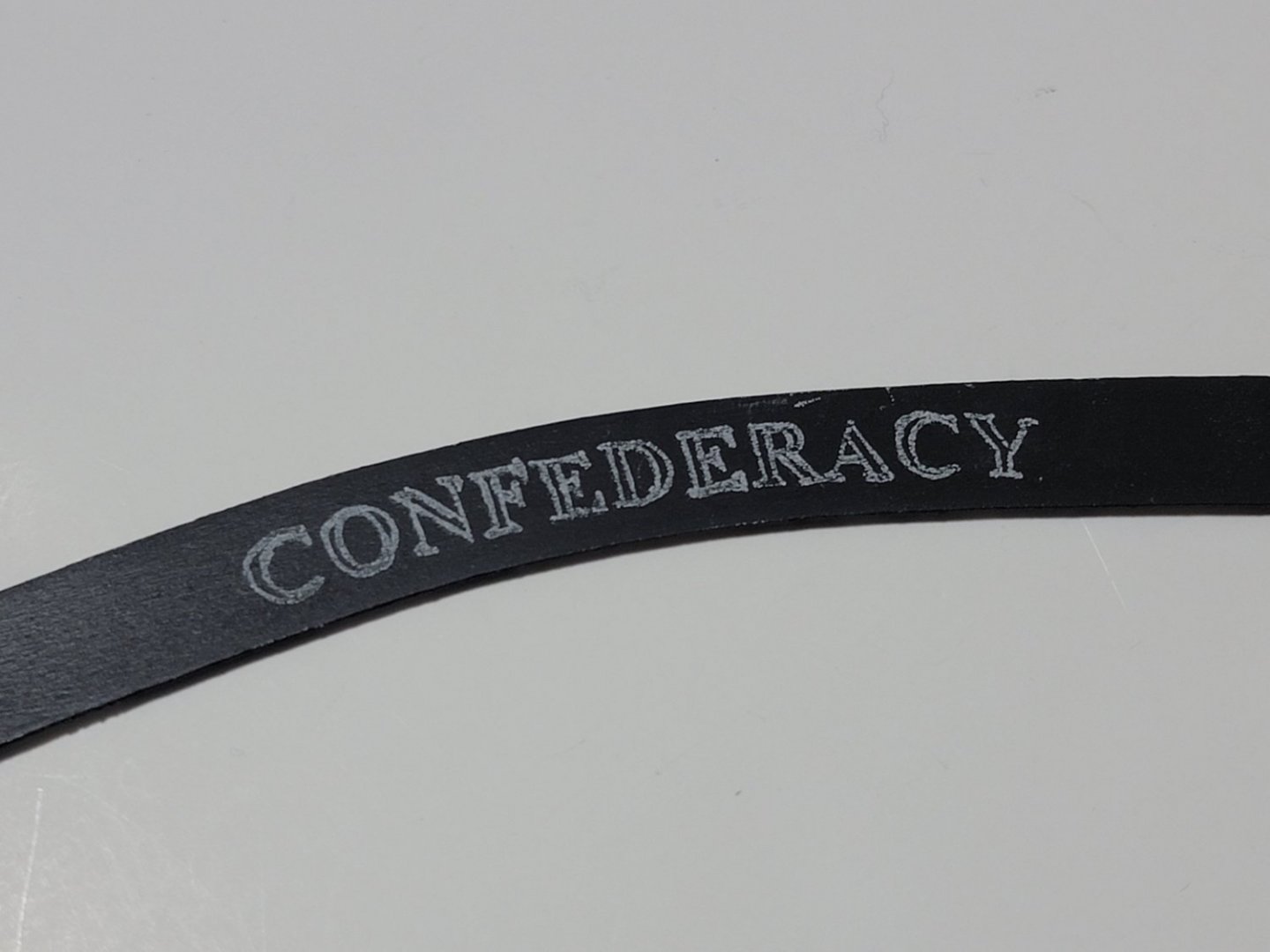
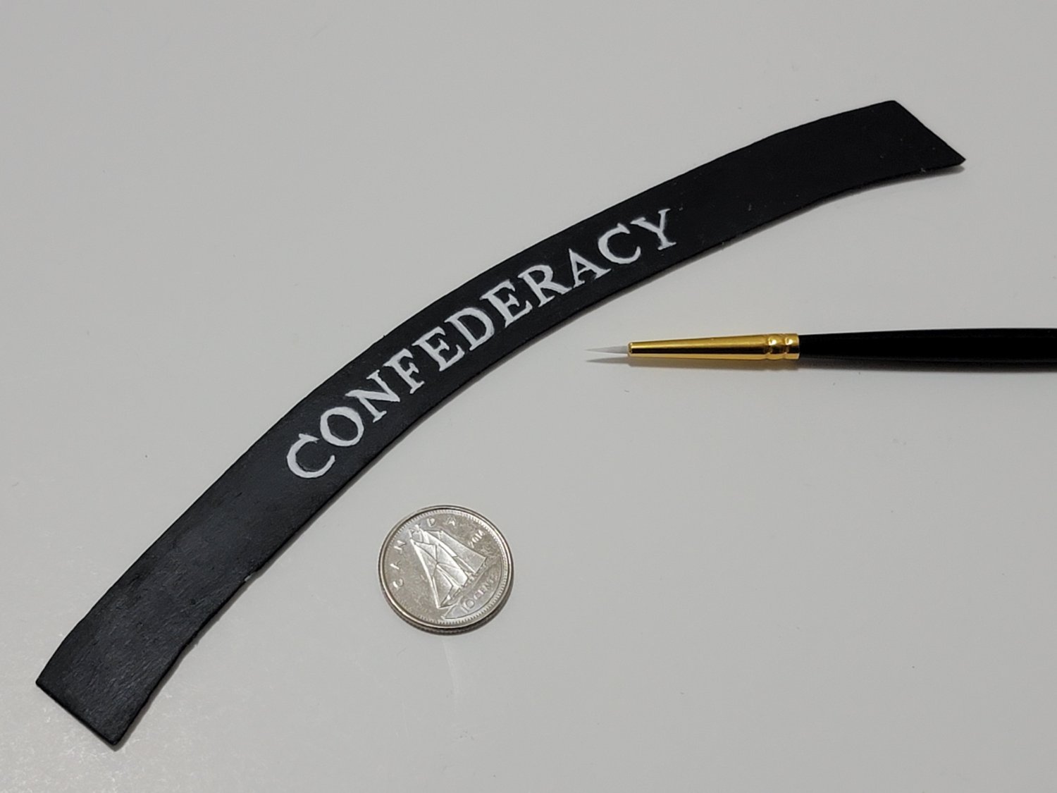
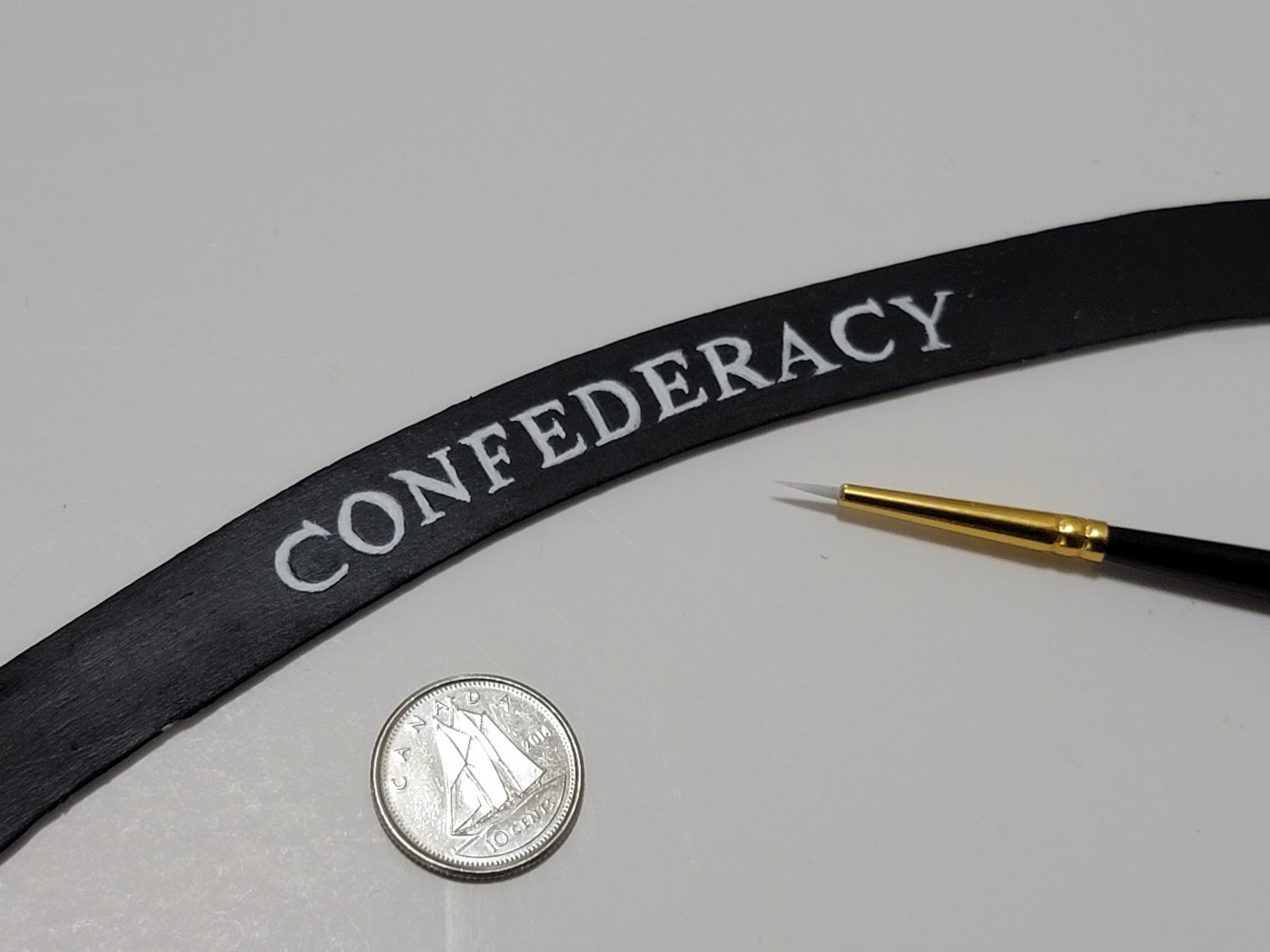
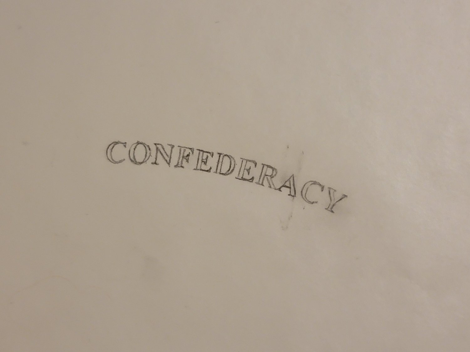
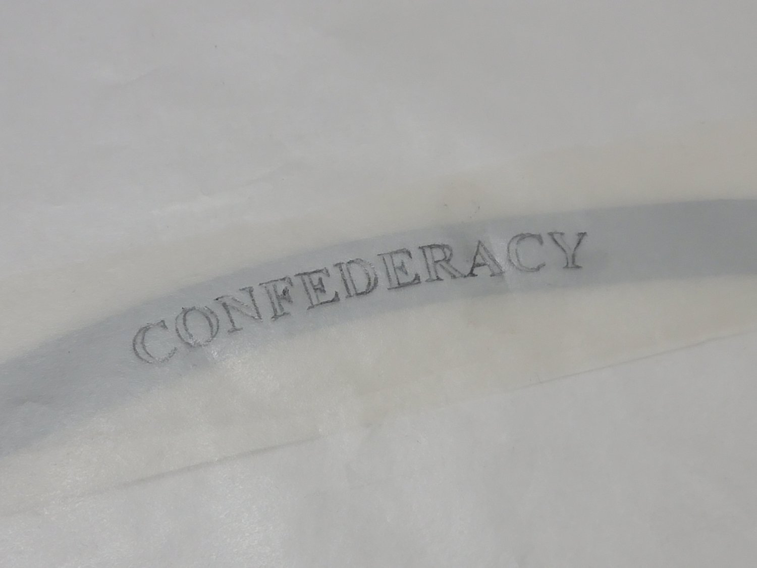
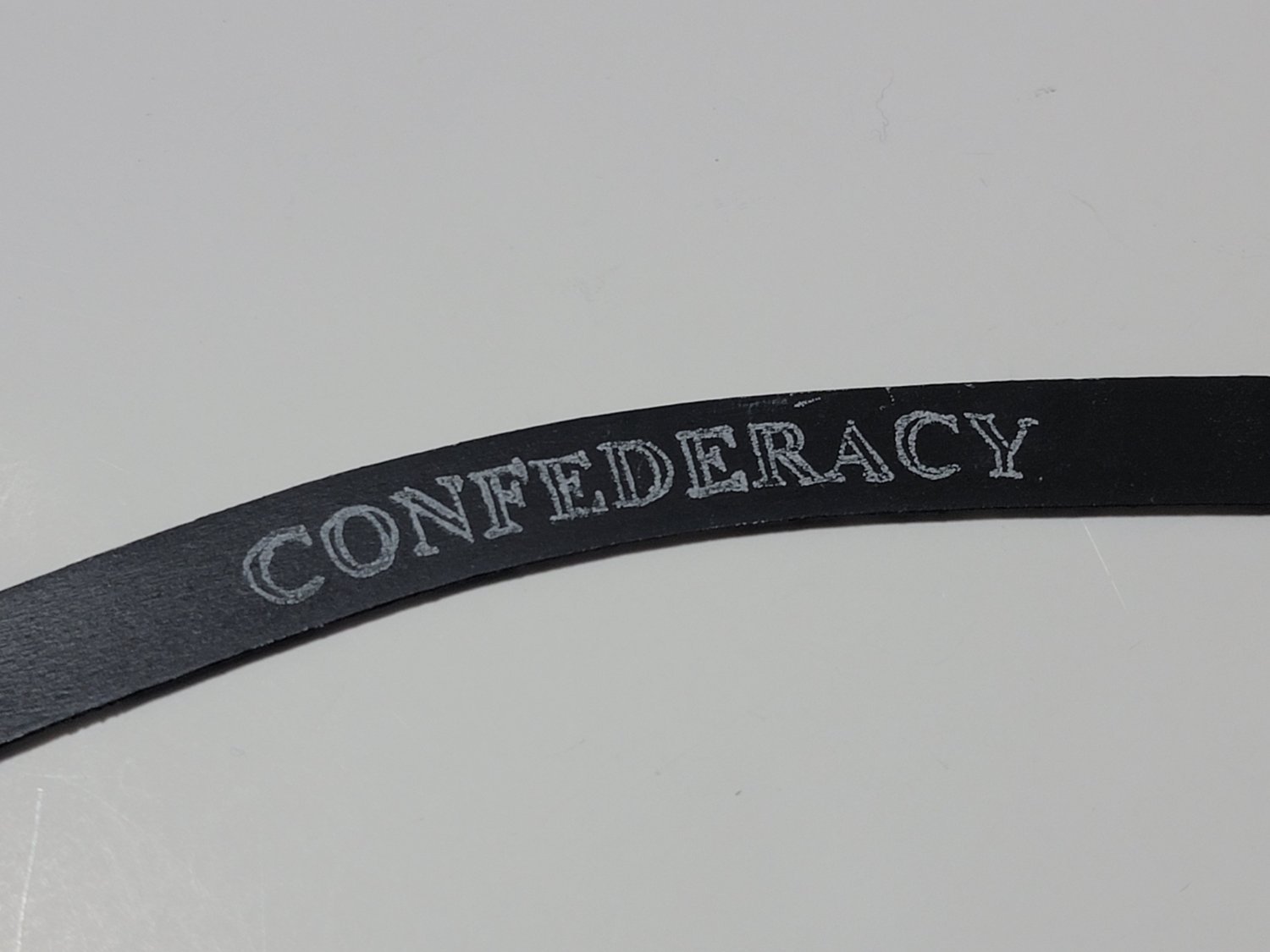
I have never thought of making a 3D printed stencil, I am definitely saving that idea! It's very innovative. The lettering turned out perfect.
-
On 2/2/2022 at 9:25 AM, wernerweiss said:
Hello WalrusGuy,
I have no doubt you will fix this issue as well.....but I think that painting the ship´s name by hand instead of using the etched brass letters is a challenge, I didn´t even think of it....
On 2/2/2022 at 9:54 AM, JohnB40 said:Hi Walrus Guy,
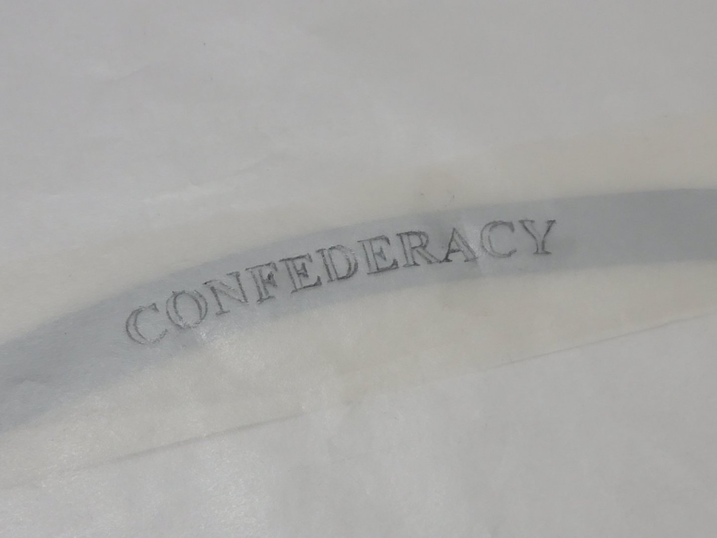
Instead of painting the letters I have used dry transfer decals with good results. I used Dulcote to fix in place and protect after applying. Make sure you order enough for Confederacy in the right size with some for possible mistakes. These are the ones I used...
Thank you for the comments, Werner and John.
John, I'll look into the decals if I am not satisfied with my paint trials. Thank you for providing the link 🙂
1 hour ago, Cathead said:In your last post, did you mean "transom" rather than "transform"? Not intending to be pedantic, it genuinely confused me and if you did mean the latter, can you explain?
Apologies for the confusion, Eric. That was a mistake on my part. It should be "transom" not "transform". I'll edit my post.
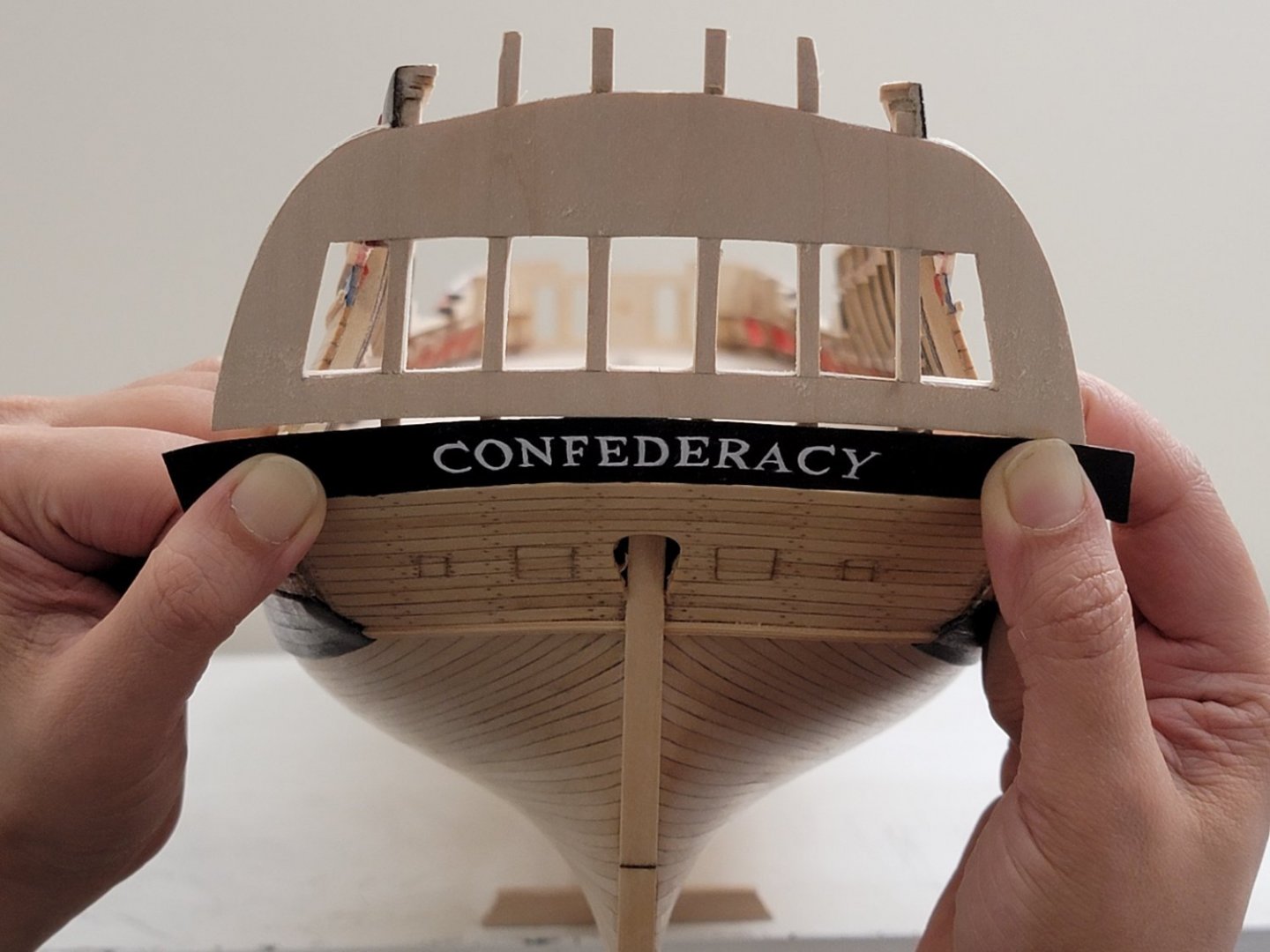
Here is my process for the lettering. This is my first try and hopefully I will get better results as I do more trials.
1) I traced the lower counter profile onto a paper, and used the curve as a guide to write the ship's name (this was done using the "Follow path" tool within "Text Effects" in PowerPoint. I placed the sketched image over my monitor and acquired the correct curvature needed. I have attached the PPT slide below if it helps anyone. The curve can be modified by resizing the textbox. I went through each font to see the one I liked best and ultimately picked Times New Roman in bold. I'm all ears if anyone has any other font suggestion!
2) I took my sketch of the lower counter, placed it on the screen, and zoomed in and out to obtain the correct letter sizing (by height and overall distance of the entire name)
3) Tracing paper was taped to the top and bottom of the screen, and I lightly used a pencil to get the correct letter shape. I did not want to print as getting the correct letter sizes would be more difficult than simply zooming in and out.
4) Next, I taped the painted upper counter piece in place, taped a white graphite paper around it, and then taped the tracing paper over that ensuing the text is centered.

5) Using a stylus, I rewrote the letters over the tracing. For this first trial, the tip was a bit blunt, and that caused the white lines to be a bit too thick. I will use a pointier tip for my next iteration.
6) Now for the hard part! I used a white acrylic pen (0.7mm is the smallest I could find) to "paint" inside the letters. Since the pen uses acrylic paint as ink, I used a toothpick to neaten some areas. I may have used a bit more force and that caused the visible lines in the photo below. After the paint dried up, I lightly used an eraser to remove the white graphite. I found the curved letters the trickiest to do.

I sanded down the text area and will try again, hopefully clearing out some blotchiness having more consistent line thickness in the letters.
- Cathead, ccoyle, chris watton and 5 others
-
8
-
A very fine and beautiful model. Congratulations!
Thank you for posting the progress of your build here. I find myself coming back to read your log as I progress with my own build.
- Brucealanevans and Moonbug
-
2
-
Very crisp work and craftsmanship! I realized the gun port lids have functioning hinges. Amazing!
-
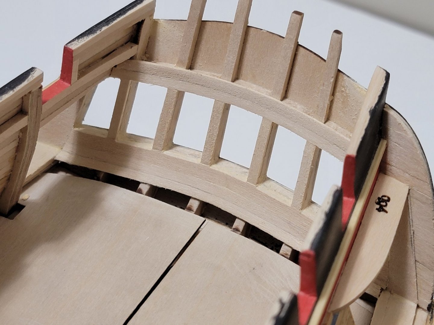
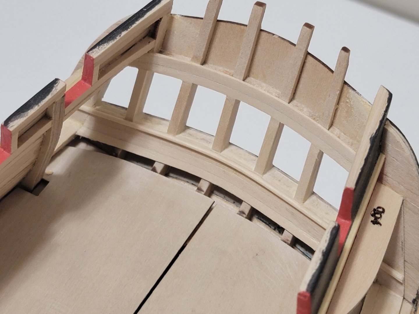
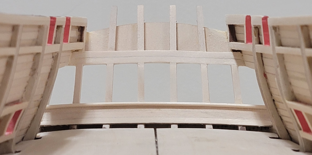
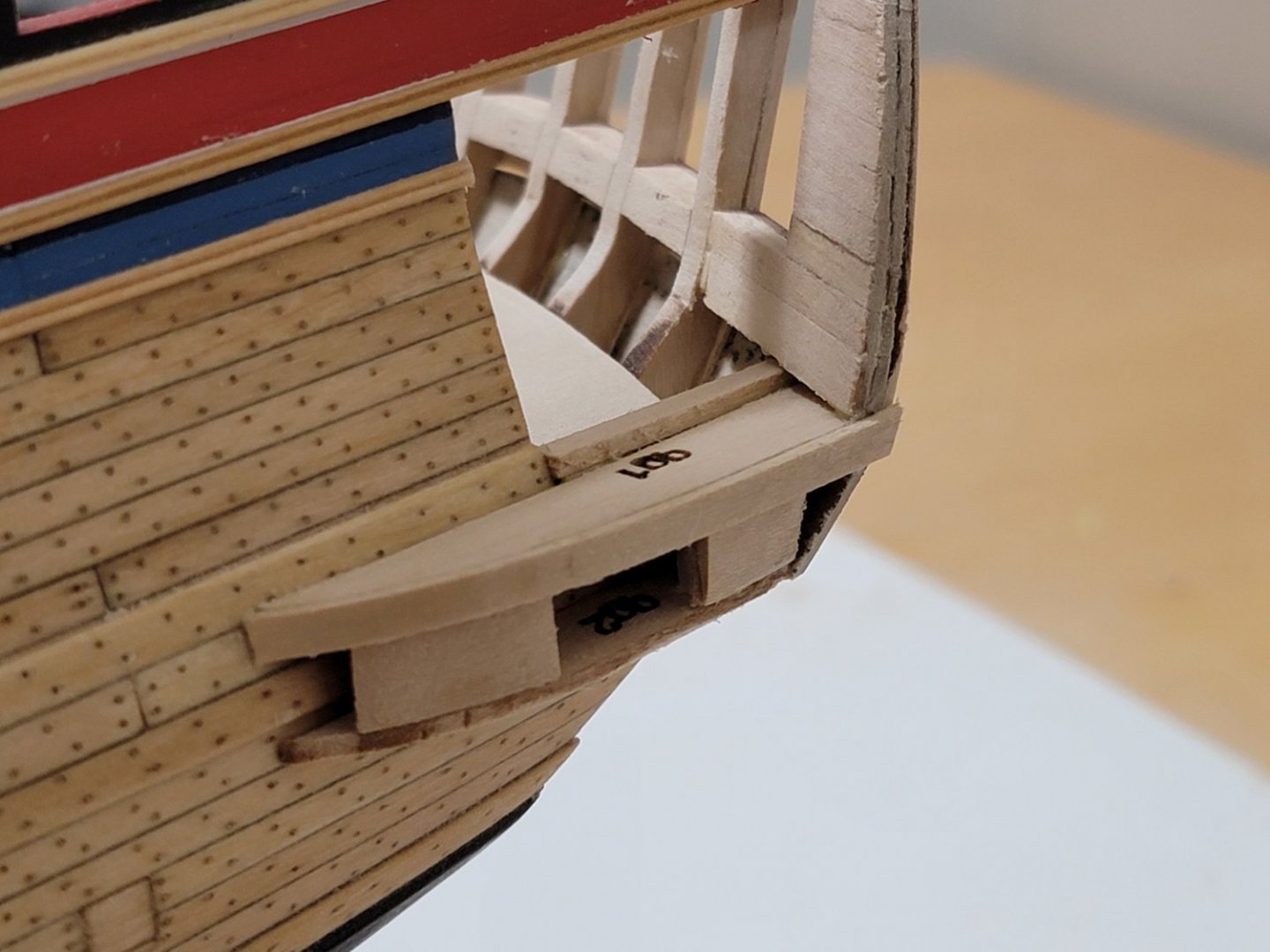
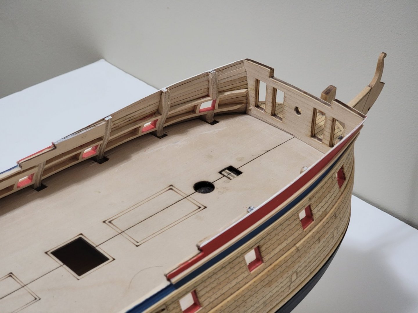
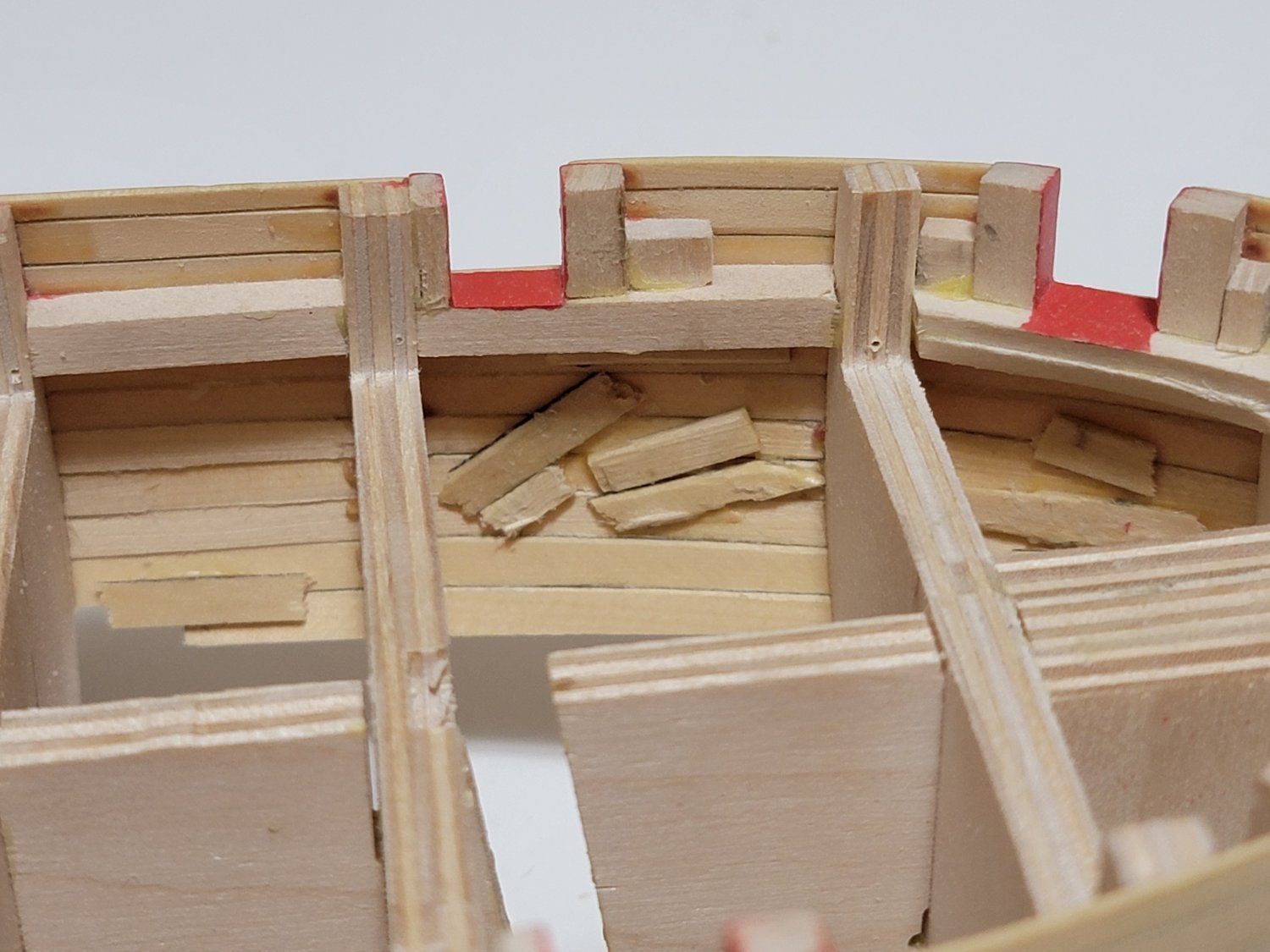
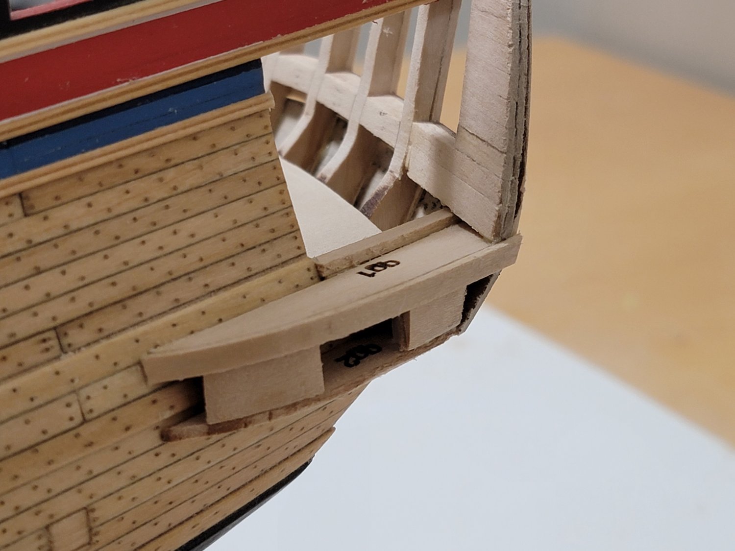
The quarter gallery construction is a lot more challenging that I initially thought! I am facing a lot of discrepancies when trying to construct the initial assembly.
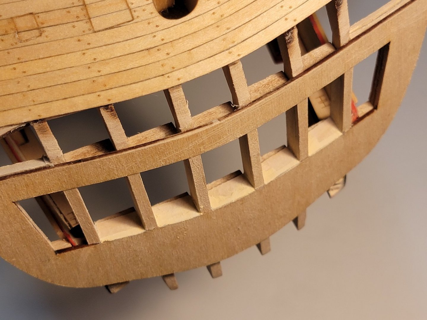
Even though the laser etched marks on the transom is aligned with the inner two frames, the distance between the transom and the counter planking is different on both sides. I think this will be hard to notice once it is all painted and the decorations are applied.
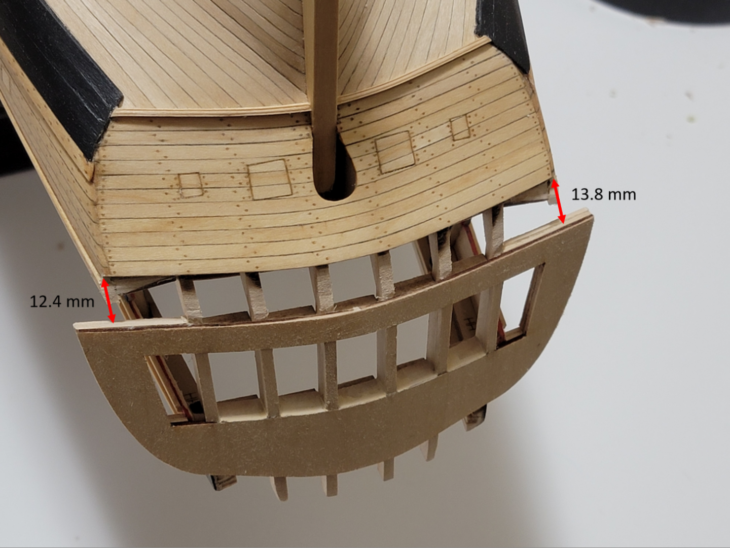
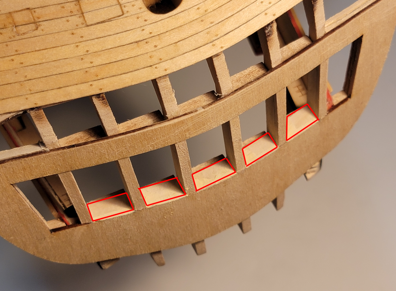
The lintels were positioned slightly higher than the transom lintels. I have no idea why this happened since I used the plans to make sure they were right in the first place 😅. So I just added some thin wood pieces (shown in the red boxes) and applied filler to hide it. I hope this does not affect the construction of the upper deck...

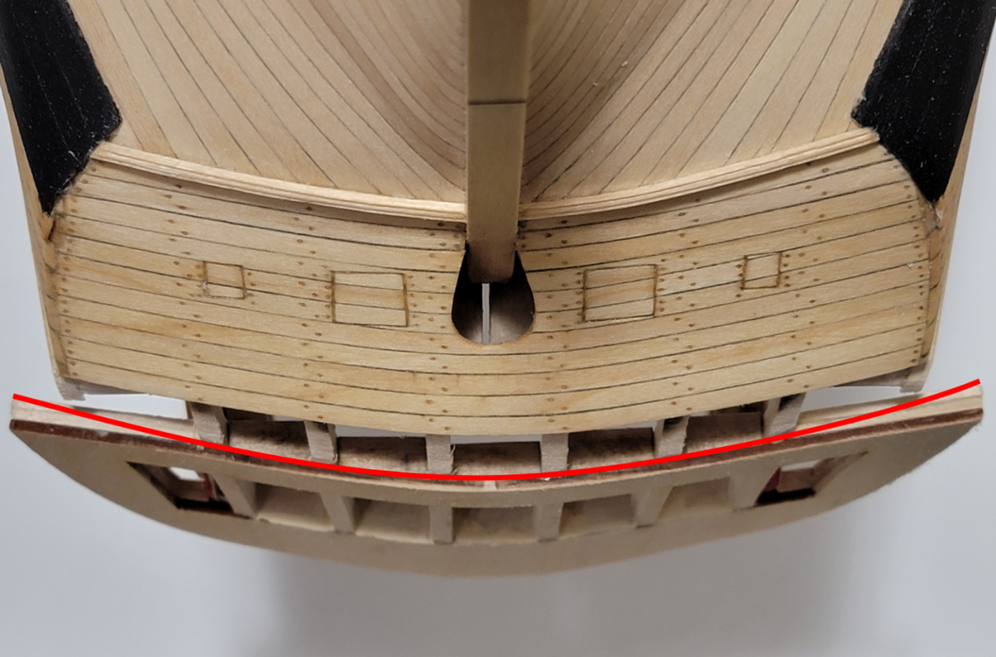
When looking vertically at the transom , it does not have a smooth flow. This is because of the filler strips that were added on each side were thick, so that prevented the transom to have its natural curved shape. Sanding it to shape might help with this. The red line shows the shape it needed to be:
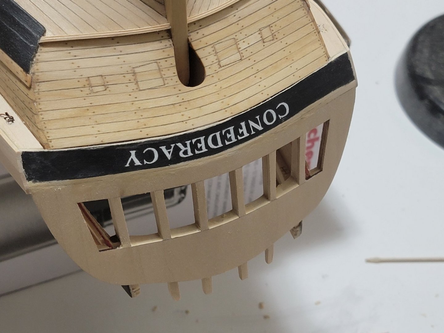
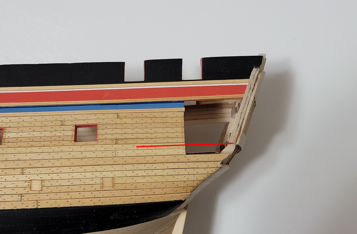
Lastly, the counter for the quarter gallery sides also are way off that the instructions show. I saw this happen to other builds too, and filler planks were used to cover the gap. The red line shows where the upper part of the side counter should go for it to meet the lower part of the transom. My model shows the line much higher than the channel wales, and the instructions have it below the wales:
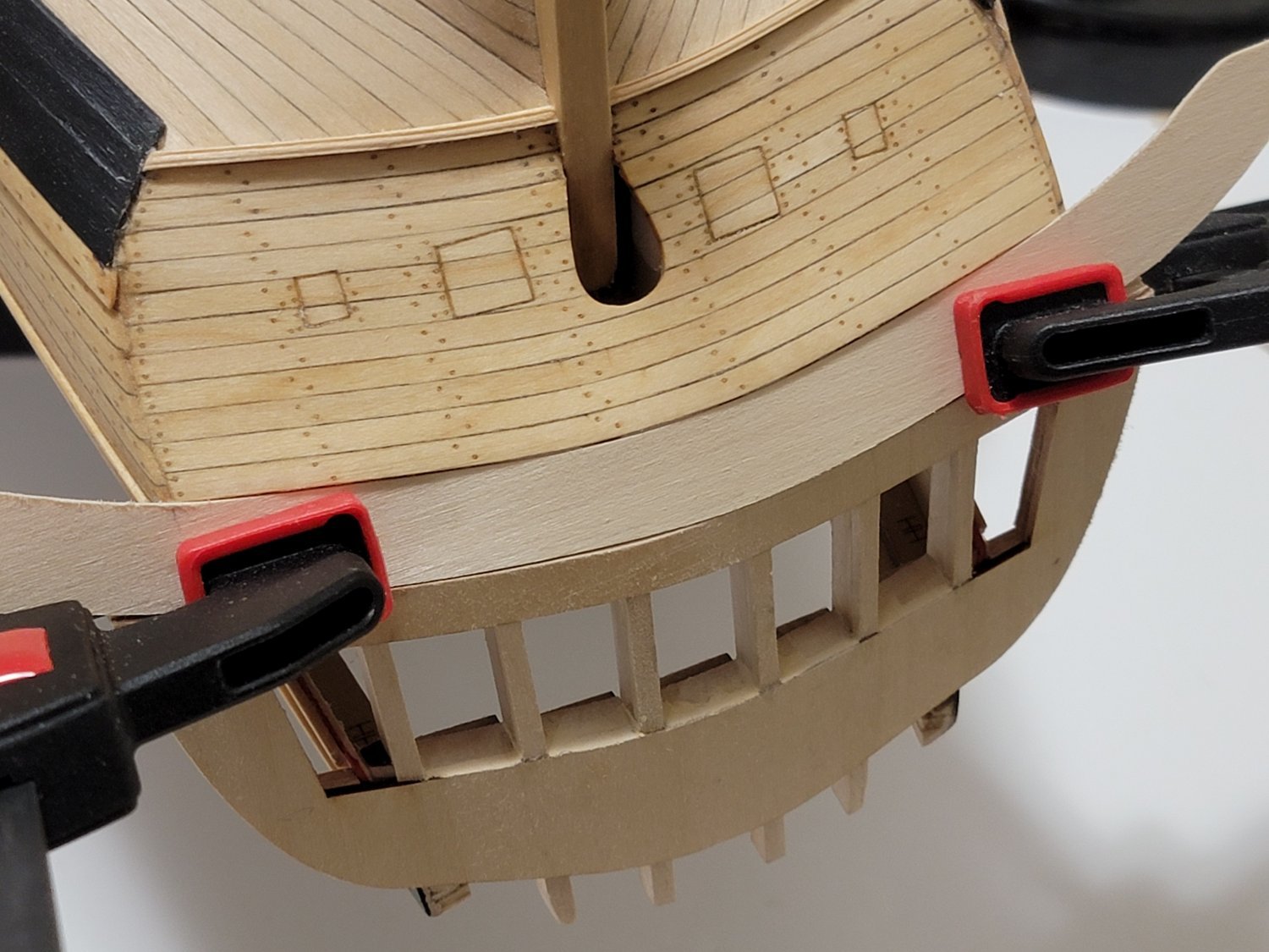
After a lot of thinking on how to solve all of these issues, I decided to go about making the upper counter. I used card stock to get the general shape, then cut out the section on 1/16" basswood. I have used the clamps to hold the piece in position, and it is not glued yet. It seems a bit too wide, but it matches with the dimensions from Hahn's plans. So I think I am safe with that part. I also want to try have the ship's name painted, so having a thicker section will help with larger letters.

- KurtH, toms10, chris watton and 10 others
-
13
-
I think that's a bug on the platform MSW is on. See this thread:
When I get the error I use the "Snipping Tool" and paste the snapshot. That seems to work for me.
-
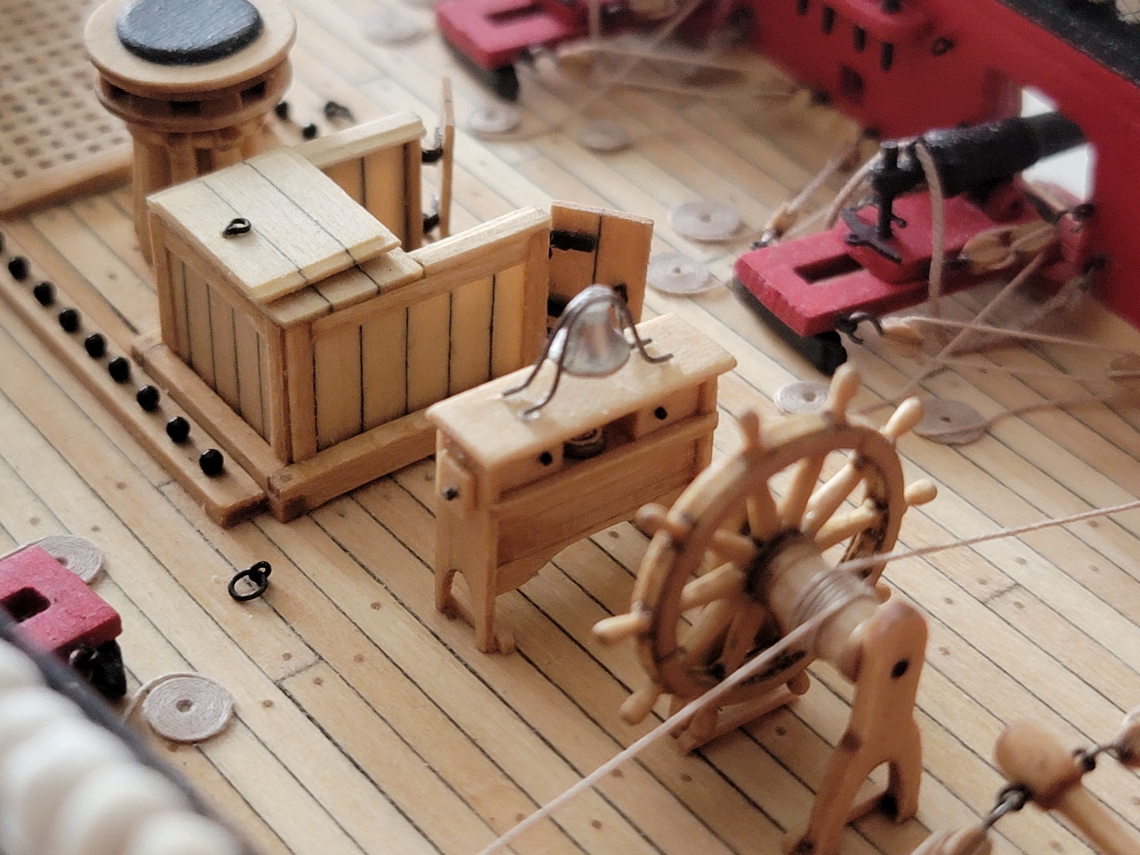
Hi Werner, thank you for posting the photos here. I have been actively checking the German forum to see if you have posted updates. The 12 pounder guns look really good. Did you use the kit supplied guns? And did you make the rope yourself?
The furniture in the great cabin look amazing. Beautiful build!
-
20 hours ago, BobG said:
I think you could have been a good neurosurgeon! Nicely done!
18 hours ago, wernerweiss said:It is a pleasure to see how you fixed it, Bravo Zulu!
Greetings
Werner
17 hours ago, toms10 said:Hi Walrusguy
just looking at your build and it is really nice. The planking and joinery is top notch. As for doing a scratch POF… are you kidding? I am no expert but from what I see you should definitely take the leap to scratch building. It would just be a small hop for you!
Tom
Bob, Werner, and Tom, you are very kind. Your words are much appreciated 🙂
-
1 hour ago, No Idea said:
Fits like a glove! Beautiful and precise work, Mark!
- chris watton, mtaylor, Hubac's Historian and 6 others
-
7
-
 1
1
-
 1
1
-
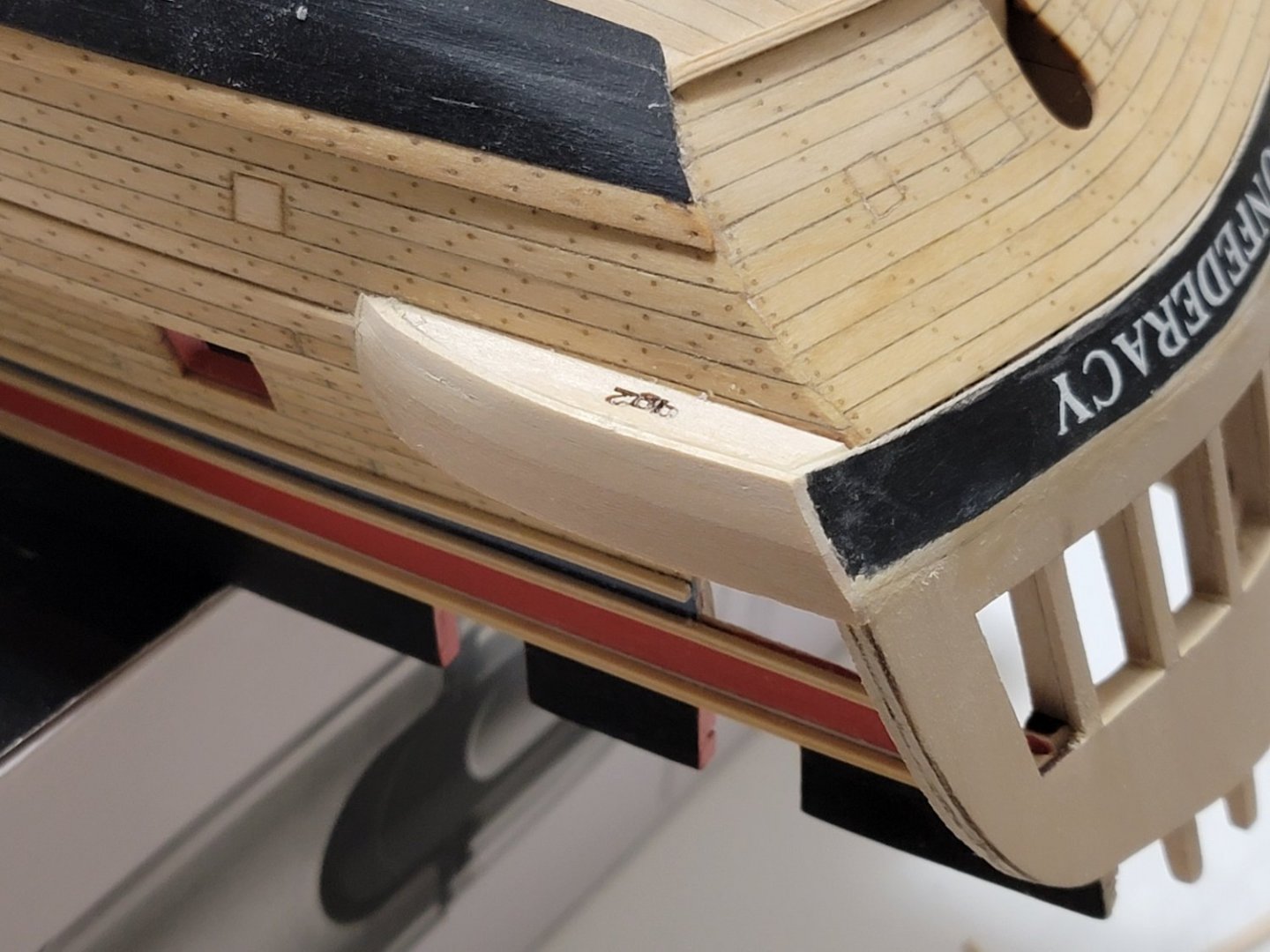
Thanks all for the generous comments! Werner, I wish I had thought of planking it separately. I think the overall process would have been easier than to plank on the model itself, and I would have avoided this mistake.
So... I managed to fix the counter area without too much of a problem. Truth be told, I enjoyed the process! Makes me believe I'd love to do a scratch POF build some day.
First, the location of the curve was marked using a compass where the width was set to two plank widths:
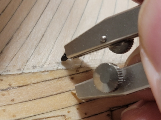
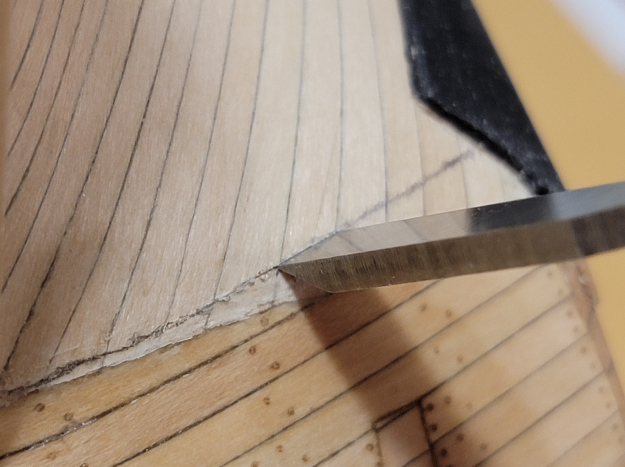
Then, the curve was scored lightly using a sharp chisel. After I got the general line, I progressively used a bit more force for a deeper score.
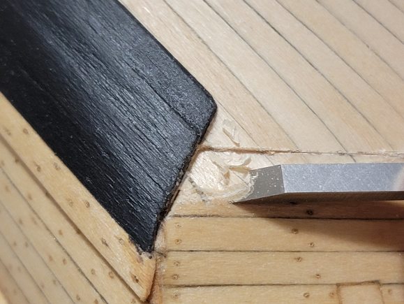
The two bottom most planks were then removed, as well as the hull planking below the scored line:

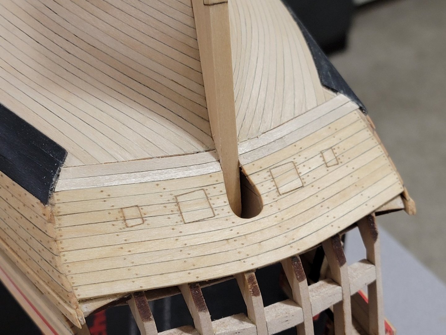
Here, I noticed the portside wale was not extending all the way to surround the counter planking. So I marked the location of where the wales need to end:

I then planked, treenailed, and finished the planks with tung oil:
Here, shims of wood was used to extend the wales:

I sanded it to be the same thickness of the wales and then filled it with glue mixed with sawdust. I also scored the wood to follow the run of the wale planks:

Depending on lighting, I can still see a very faint line where the two woods meet. But I think it will be harder to spot once more details come in.
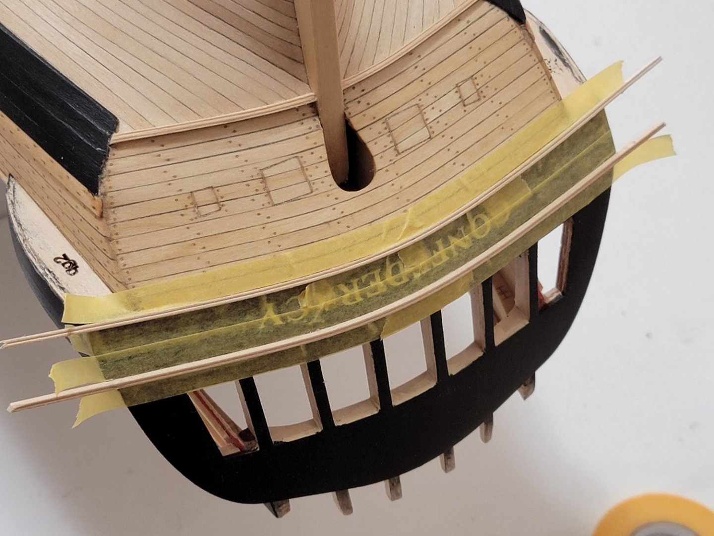
Lastly, I glued in the moulding strips. I had to bend these similar to how I bent the counter. Once bending, the mouldings became flat, so I used a scraper again once the wood was fully dried, and I used the metal bit of a compass to widen the lines.
Here are some photos after the surgery:


I am still deciding whether to paint this section blue. For now, I am leaning on the current finishing with tung oil.


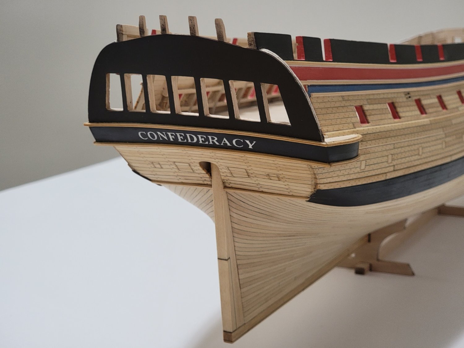

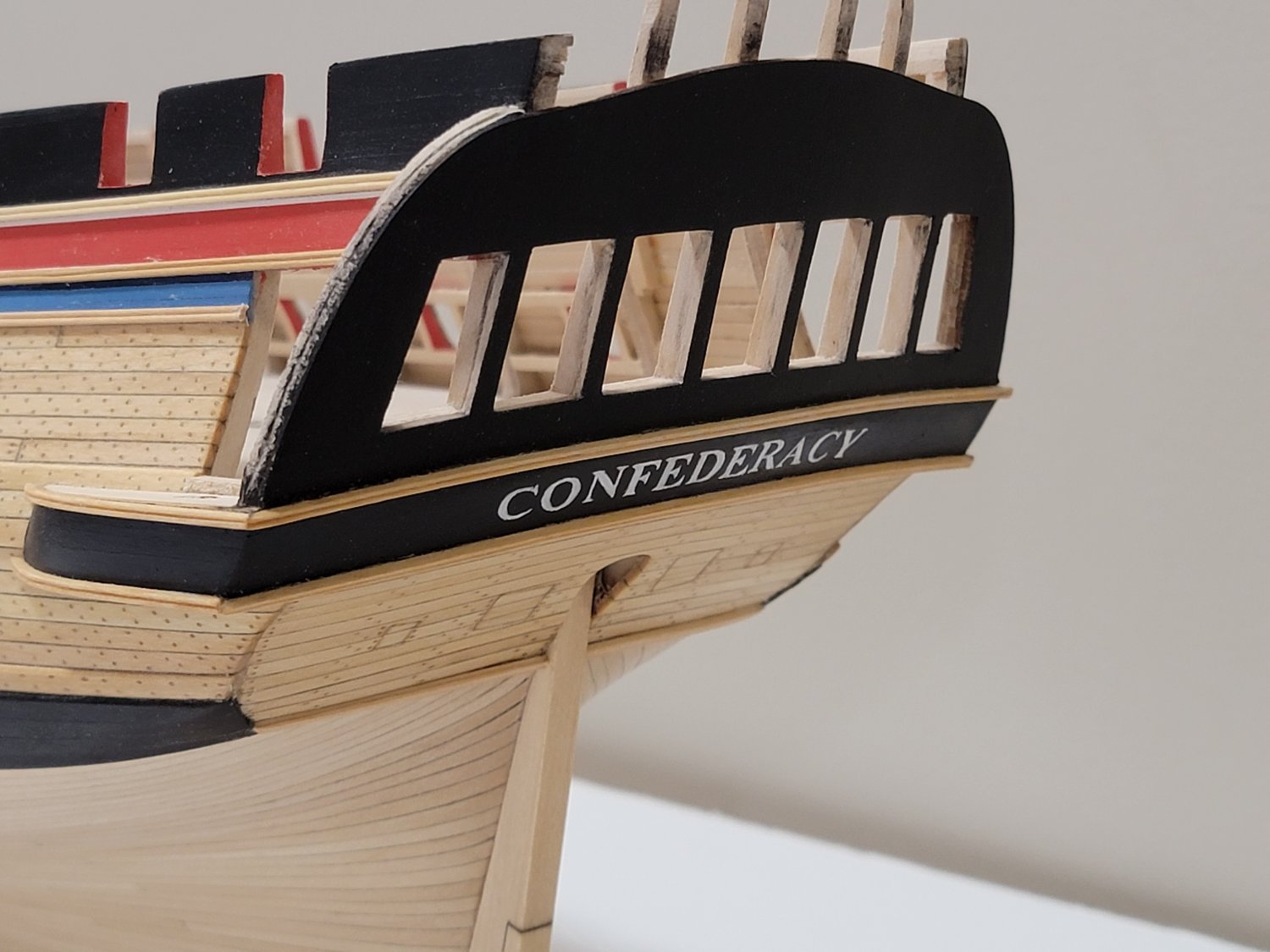


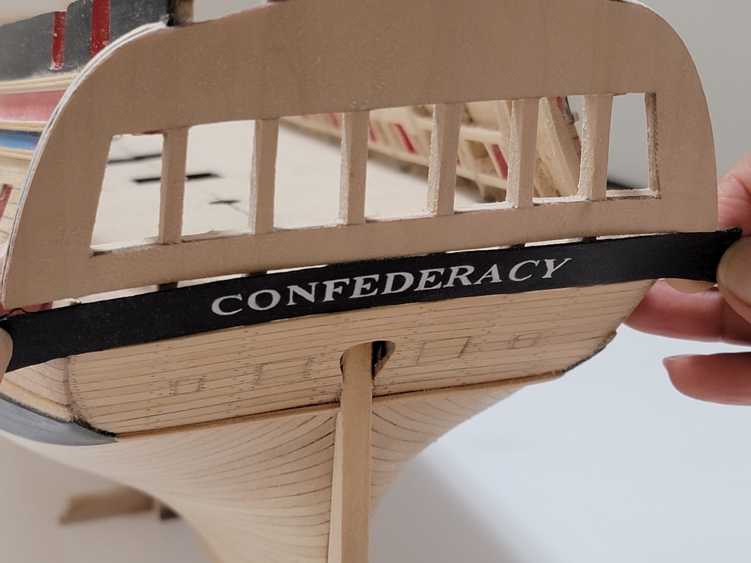


USF Confederacy 1778 by WalrusGuy - Model Shipways - 1:64
in - Kit build logs for subjects built from 1751 - 1800
Posted
Thank you, David! Now I'm also considering finishing the decking before moving onto the details 😅