


Cathead
-
Posts
3,522 -
Joined
-
Last visited
Content Type
Profiles
Forums
Gallery
Events
Everything posted by Cathead
-
Willkommen an Model Ship World. Meine Frau hat noch Familie in Baden-Württemberg, und wir haben beide in der Schüle Deutch gelernt. English is the default here, but I can't help greeting German members, I so rarely get a chance to use the language here in the American Midwest.
-
 Glad you checked out the planking tutorials and looking forward to seeing your skills progress! You'll end up with something you're happy to display.
 -
Endurance by john D - OcCre
Cathead replied to john D's topic in - Kit build logs for subjects built from 1901 - Present Day
You're not kidding, you're rattling right along. She's starting to show some personality. -
Lynn, it's in their print catalog (which you can download from their site) but you're right that I can't find it on the website listings, either. Odd. Interested to hear what you find out.
-
Planking's always a challenging part but also potentially really rewarding. Good luck!
-
Bingo, there's your problem! By the way, both brass and pewter solutions look the same (clear blue), at the ones I use do. You can't tell them apart that way, the core point is that they're chemical-alteration solutions rather than paints, so neither will look anything like the intended outcome (unlike paint). Here's a product that claims to handle both brass and pewter in a single bottle, though I've never used it. Any such product is nasty and should be handled with care. My stuff came from BlueJacket and I'm pleased with it: PN0051 (Pewter & Brittania) and PN0052 (Brass & copper).
-
Lynn, a few trouble-shooting questions and potential advice on your cleats. Forgive any implied condescension if any of these are obvious to you, they aren't necessarily so from here. (1) Are you sure those parts are brass rather than pewter? In the photo they look silvery, which implies pewter. Brass would be yellow and shiny. If they're pewter, you need a different blackening solution. (2) The blackening solution I use (though a different brand) is indeed bluish, like windshield wiper fluid. It isn't like paint, it generates a chemical reaction with the metal that actually turns the outer surface black (rather than applying a layer of black over the metal, as paint does). This is why you need a different solution for pewter than brass, the chemistry isn't the same. (3) Any part that's intended for blackening needs to be cleaned well, as residual oils from manufacturing and even skin oils from being handled will block the chemical process (again, it's not adding a layer like paint, it's actually altering the part's physical surface). I do this in a small dish of warm, soapy water, using tweezers and an old toothbrush to avoid skin contact. I then rinse each part in another small dish of warm water, then set them out to air-dry on a smooth towel. (4) I find that blackening works best when the parts are submerged in the solution and it's given time to work. Swabbing them may not give sufficient time or contact for the alteration process to work. I fill a very small container with a bit of blackener (you can often dilute it) and place the parts in there to soak, occasionally stirring them around to ensure full contact. You can see the change happen over a course of minutes; once they look black enough, take them back out and let them dry on another absorbent surface. (5) I find that sometimes blackening doesn't always fully take, leaving a few patches of color that flake off or never altered in the first place, possibly due to poor pre-cleaning. In such cases I apply a thin layer of black paint anyway; the blackening acts as a sort of base layer that holds the paint and ensures no hint of shiny metal peeks through the paint. This lets you use less paint than you might otherwise need, so the part stays closer to its original shape and surface. You can also use paint or ink markers to touch up any gaps, again minimizing the layering added to the part. Hope some or all of this is relevant to figuring out your problem.
-
Try searching in 1:64 scale, a far more common scale for broader modeling. It's also S scale in model railroading, which although not as popular as others, still means things are made for that scale. I did a quick Google search for "1:64 dog" and found various results. I doubt the size difference will be significantly noticeable, especially for dogs.
-
We've all had those days. So frustrating.
-
If you'd like to expand beyond Euro-American horizons, I'd personally suggest the Museo Marítimo Nacional in Valparaíso, Chile, which has a broad collection of maritime models relevant to historic and modern Chilean history. Overall, if you're looking for private models, a good place to start would be to browse the galleries and scratchbuild threads here at MSW as there's some obscure and fascinating stuff in there.
-
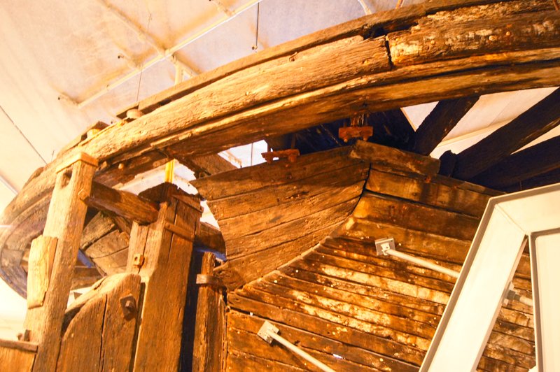
Looking at that sketch reminded me of the stern of the steamboat Arabia. This was a Western River sidewheel steamboat built in 1856, a very different context than yours, but the geometry is somewhat similar. The Arabia's stern was recovered and is now on display at a museum in Kansas City, where I took a bunch of photographs of it (both exterior and interior) while planning a scratchbuilt model of her. If you're having trouble conceptualizing the stern of your vessel, perhaps it'd be helpful to look at these photos, since so few real-life examples of these hulls remain? I wrote a whole thread on researching that model, here's the relevant post where I share all the stern photos, and below is one just for an example (I don't want to spam your thread with lots of these):
-
You independently invented a very common solution to that problem, I too have a similar setup. If you search through MSW you’ll find various threads on wood storage with all sorts of creative solutions.
- 158 replies
-
- 1
-

-
- chaperon
- Model Shipways
- (and 1 more)
-
Cool idea, count me in.
-
Thanks and you're welcome. I actually finished the Arabia in 2020, you can read the build log at the link in my signature and there's an album of completed images here. Be sure to check out Brian's current project, too, he's got a beautiful Cairo going (see link in his signature).
- 158 replies
-
- 1
-
-
- chaperon
- Model Shipways
- (and 1 more)
-
I'm not an expert, but here's a perspective in lieu of any more informed responses that might arise. Sailing ship crews could rig block&tackle in a variety of places in order to lift and move items like boats, upper masts, replacement yards, cargo, etc. The very nature of a masted ship with yards and stays gives you all sorts of options to work with and seamen were geniuses with the geometry required. Many repairs could be carried out this way without the need for dockyard cranes. Here's a thread on MSW about how boats were moved around. And here's an image shared there that shows one possible method: So you don't need to show any special details for lowering and recovering boats. I'm not sure when davits came into common use but as far as I know it was normal in the Age of Sail for boats to be stored amidships and deployed without them.
-
One way to start is to buy a kit from a reputable manufacturer who bases their models on actual research, like BlueJacket, Vanguard, Syren, Model Shipways, etc. Although not perfect, their standards are high enough to instantly set you on a higher path. And you can always make additional changes/upgrades to the kit (like better rope and fittings).
-
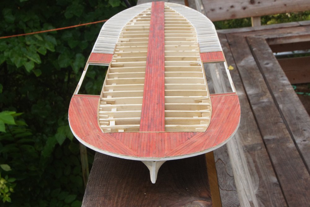
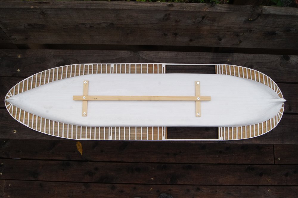
To follow up on what Brian said, here are a few photos showing how the deck extensions (called "guards" on riverboats) were structured. Beams ran outboard from the hull at close intervals, forming a solid structure supporting the decking above. Here's guard planking partly completed on my scratchbuilt Arabia: And here's the completed underside: And if you want a real-world photo, here's the Arabia wreck; look just aft (left) of the paddlewheel and you'll see the beams supporting the guard beyond the hull: This is a sidewheeler but the concept was the same. I don't know exactly how it was on Chaperon, but you wouldn't go wrong adding a series of these beams if you're worried about strength and/or want to add some reasonably authentic detail.

- 158 replies
-
- 4
-
-
- chaperon
- Model Shipways
- (and 1 more)
-
A method for making panelled sails using paper
Cathead replied to Cathead's topic in Masting, rigging and sails
I think this ties back into a discussion ongoing elsewhere on MSW about what models are for. If the intention is a high-end museum-quality professional presentation, then I agree with you. But there are other goals and perspectives. For example, on my fictional revenue cutter that is the foundation of this thread, I'm quite aware that the sail-sewing is out of scale. But to non-specialists it's also visually engaging and representative of the real thing. A viewer here in land-locked Missouri isn't likely to know (or care) about the proper scale of bolt ropes, they're far more likely to think "Oh, so that's how sails were made" or ask "what's that stitching for?". Leaving that detail out may be more accurate, but it also eliminates the chance to learn because it'll never occur to the viewer to ask the question about a detail they "shouldn't" see. For most of my models, my goal isn't to be 100% accurate, but rather to be representative and engaging. This comes from my perspective as an educator, where sometimes the perfect is the enemy of the good. Models are both engineering AND art, and some artistic license should be allowed for most of us without being disparaged by the idea that the only good model is a perfect replica. There's a balance to be found between reasonable accuracy and bean-counting, and it'll be different for different modelers and models depending on context.- 49 replies
-
- 9
-
-

-
- sails
- sail panels
- (and 1 more)
-
Cool, it's been a while since someone tackled Chaperon, the best riverboat kit out there. Looking forward to your progress.
- 158 replies
-
- 1
-
-
- chaperon
- Model Shipways
- (and 1 more)
-
Posting video
Cathead replied to Valkyrja68's topic in Using the MSW forum - **NO MODELING CONTENT IN THIS SUB-FORUM**
Interesting question. I also suspect there are differing views in membership on whether they'd prefer to watch a video or view still photos. If nothing else, video results in further demands on members, whether on their internet quality (my rural American internet sometimes struggles to load large photos on MSW, much less play video, and I'd bet that's true for some international members as well) or their personal space (does having a video play out loud or having to find earbuds cause problems?). I think my instinct would be to avoid using video alone unless it's a really relevant way to show something; text and photos are a much more accessible default. -
I can't quite tell from that photo but you almost certainly need to shape the planks for them to fit the required geometry. If you're just trying to bend consistent-width planks into place it'll be especially hard. Right at the stern, where they start to splay out again, you may want to consider a couple "stealers", which are shorter planks that take up that extra space. Review some planking tutorials to see what I mean. But I can't be sure from the single photo. Also, and again I may be being misled by the perspective of the photo, but I wonder if that last bulkhead needs to be faired down more? It kind of looks like your planks, when they sit flat against your faired surface, are being directed away from the counter at an angle, producing an extra-hard last-minute bend that would give anyone trouble. That bulkhead should gently guide the planks into place, rather than being a barrier over which they need to be forced.
-
That's where I put mine, too. There are several logs, you can find them by searching that forum for appropriate key words.
-
There’s almost always more than one way to do things. Glad you found a solution you’re happy with!
