Cathead
-
Posts
3,558 -
Joined
-
Last visited
Content Type
Profiles
Forums
Gallery
Events
Everything posted by Cathead
-
 Agreed, nicely done. Glad to see you're keeping at it.
- 362 replies
-
- 2
-

-
- active
- revenue cutter
- (and 1 more)
-
As a geologist, I love the idea of building the Beagle someday, so I'll happily follow along with this. I like your lumberyard; I did something similar by gluing a series of short PVC pipe sections into an upright cluster; the wood flop around more but it takes up less space on my workbench.
-
Cool, you're using the Doctor from Arabia as a guide. Your result will certainly look nicer than mine will!
-
The fact that you felt the transom did not have problematic movement during fairing while braced that way supports the view that a few top braces are all that is required for the rest of the hull. Glad it worked fine for you.
-
If this is your first ship build, what have you been doing with that fine workshop up until now? Whatever it was, I hope you enjoy this fun hobby.
- 34 replies
-
- 5
-
-
- kearsarge
- first build
- (and 1 more)
-
A quick update as planking progresses: I've developed a steady and efficient approach to this tedious task. Every so often I pre-paint a bunch of planking strips so they're available in bulk, doing this lightly enough so the paint doesn't soak through to the bottom where it would look wrong on the underside of the guards. I've been working from the inside out, one side at a time. In a given work session, I do the following: Measure and cut a full hull's length of individual planks along one side. Dip these in my dissolved steel wool & vinegar solution, wipe excess liquid free to avoid spotting, then set aside to dry. This darkens the paint and stains the underside a weathered brown. Take the strips I previously cut & soaked for the other side (in the last session), sand smooth any rough spots on edges or ends, rub on varying amounts of dark pastel (sometimes none) to vary the coloration and texture, then glue in place. This makes for a consistent rhythm and a manageable set of tasks whenever I can sit down at the desk. For example, in the photo above, the top (port) planking line has just been laid in place, while off-screen the pre-cut planking for the bottom (starboard) line is drying after the vinegar soak. It'll start going a bit faster once I each the guards, as half of the hull's length is already done from then on. Progress will slow down for a few weeks as I'll be out of town visiting family in western NY, and may even get to attend part of this neat event hosted by the Model Shipwright Guild of Western NY.
- 599 replies
-
- 16
-
-
- sidewheeler
- arabia
- (and 4 more)
-
Bob, your points are well taken, but it does really come down to modeler's preference. The vast majority of us aren't building for museums and public display. I'm not sure what you mean by a "serious" modeler, but plenty of folks willing to devote years to a detailed and reasonably accurate model still aren't doing so for the museum curator crowd, but for family/friend home display. To non-sailors or non-enthusiasts, a ship with sails often looks far more interesting and recognizable, as the web of rigging goes right over their head anyway but the sails are more easily comprehended. Speaking personally as a moderately skilled amateur, I'm happy to learn about what's considered "perfect", but may still not choose to apply that standard to even a "serious" model if my goal is to please a less picky audience and work to a standard that makes me happy rather than drives me crazy.
-
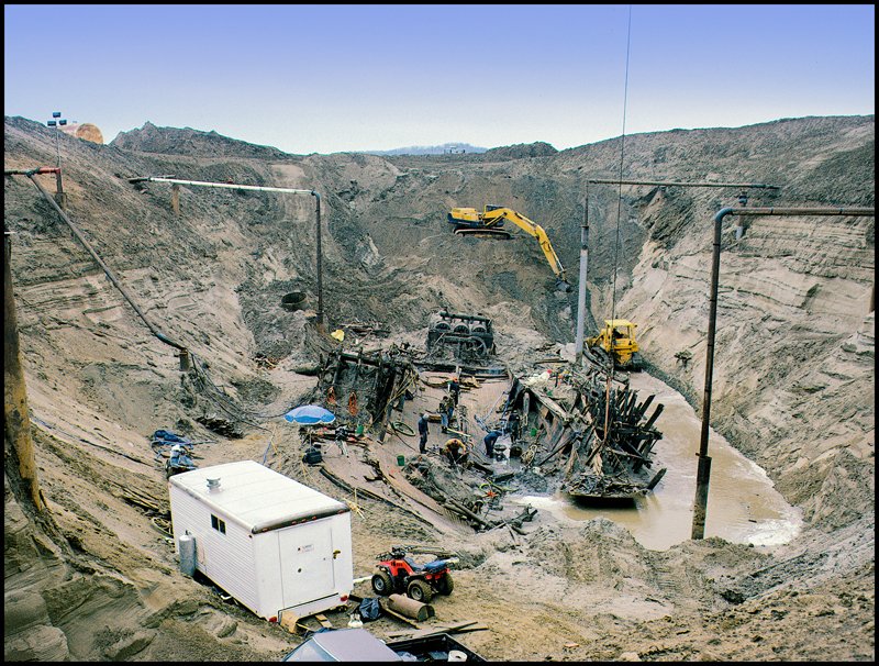
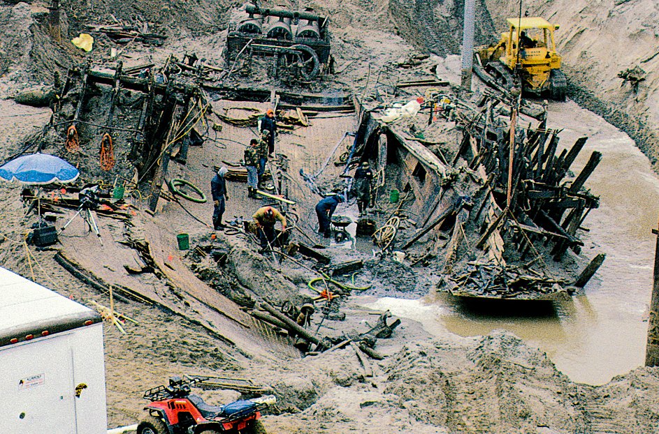
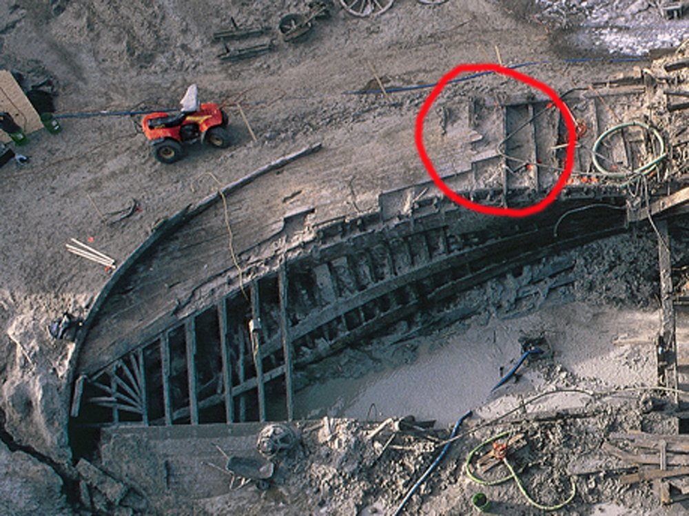
Michael, you're not kidding. For those who never saw the original, the photo I used above was cropped to emphasize the actual wreck. Here's the full context of the excavation; notice all the pipes constantly pumping out water. Remember, this is in the Missouri River floodplain and well below the groundwater table (one reason it was so well-preserved).
- 599 replies
-
- 9
-
-
- sidewheeler
- arabia
- (and 4 more)
-
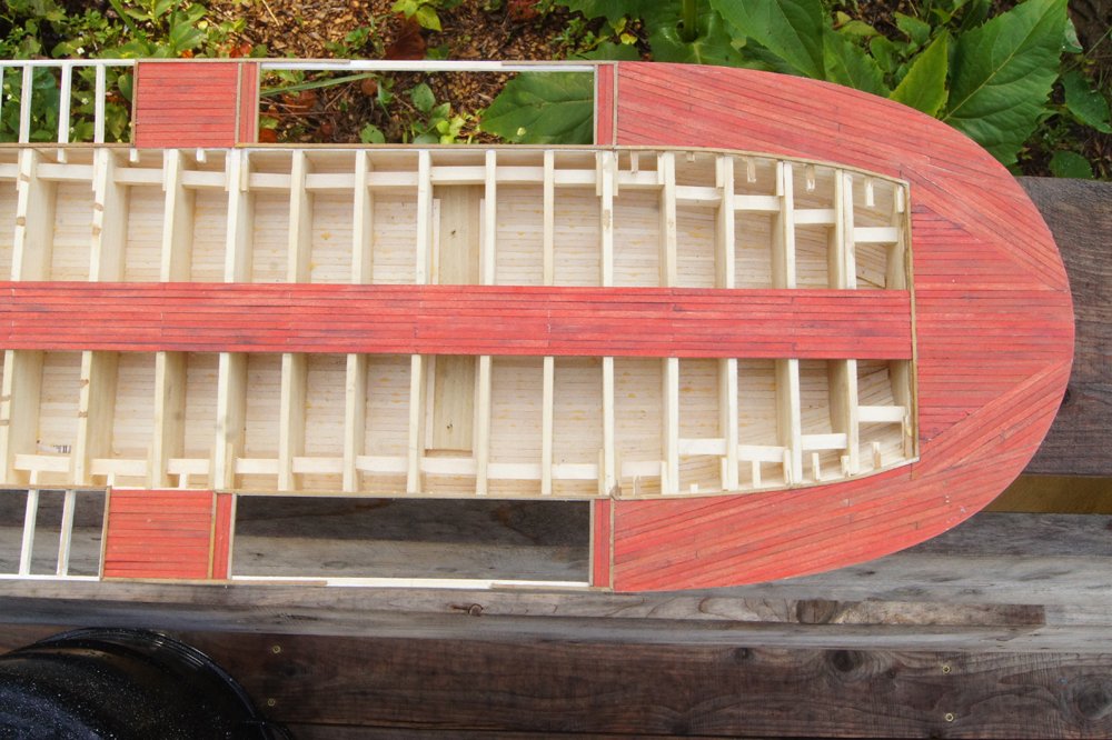
I've finished the stern guard planking and am quite pleased with it. I think it captures the feel of how this area was done nicely. You'll also see that I've started planking in front of the paddle boxes as well. Here's another view that focuses on the area of earlier discussion at the same angle, with the original photo below it for comparison: And here's a view forward from the stern, again with a comparable excavation photo below. Things will get easier for a little while here, as I simply progress slowly with filling in the nice, straight hull planking. If you're wondering what happens at the bow, well, there are no photos or records to my knowledge of the Arabia's bow, but other boats I have more evidence for (like Chaperon or Bertrand ) didn't do this sort of angled planking at the bow; everything just ran straight. So that's what I'm going to do. I'll give another update when significant progress has been made. Thanks again for all the input to that lively discussion of how to get the stern right. I hope you're reasonably pleased with the result. EDIT: I meant to thank Steve (steamschooner) specifically for reminding me of that last shot's existence. I had used it in my design thread but forgot that it gave a useful perspective on the stern decking.

- 599 replies
-
- 12
-
-
- sidewheeler
- arabia
- (and 4 more)
-
Thanks for the update. That's some great carving with a nice result. Have a lovely trip and wave if you pass through Missouri!
-
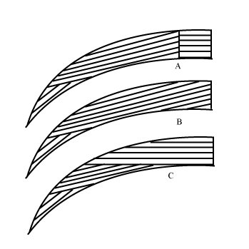
Carl, C is probably how I would have done in real life (possibly using even more straight planking), but the visual evidence shows that it wasn't done that way; only B and A fit the available evidence but I can't prove either one with certainty. Thus I've chosen to follow B because it introduces fewer angled butt joints and frankly looks better than a big seam running across the deck. I'll be posting photos by this weekend of the updated planking. Dan, Arabia was most certainly a work boat, very different from the "floating palaces" of the lower Mississippi River. These boats operated in rough, dangerous conditions and had short lifespans; many were wrecked within a year or two. However, one or two trips up the Missouri could pay off the initial investment. Arabia actually made it to Montana, a relatively unusual achievement for a sidewheeler (most "upper river" boats were sternwheelers). As such, she was certainly built quickly and cheaply, the opposite of an ocean-going vessel. As for the decorative side, even rough work boats carried passengers and desired a certain amount of flair, as competition along the rivers was intense. That being said, this area of the deck wouldn't have been frequented by many passengers (especially not higher-end ones) and so appearance wouldn't have been a primary factor. Strength does matter as the main deck guards carried bulky and/or heavy cargo, although there was also extensive bracing from above to distribute the load. So again, I've decided to go with B, as in the absence of definitive evidence it looks nicer than A to my eye (I just don't like having that full joint running across the deck). In any case, this area will be partially hidden behind railings and the boiler deck above. Thanks to everyone for chiming in, it's been a really interesting discussion. Photos coming soon.
- 599 replies
-
- 6
-
-
- sidewheeler
- arabia
- (and 4 more)
-
Why do you advise that the hull must remain perfectly symmetrical? Is this for aesthetics, or is there a structural argument? This would seem difficult to achieve in practice unless one made templates of every half-frame to check back and forth.
-
Michael, your comment made me realize I'd omitted an important point about plank length; see the now-edited post above.
- 599 replies
-
- 3
-
-
- sidewheeler
- arabia
- (and 4 more)
-
Thanks to everyone for continuing to chime in; I had no idea this would generate so much discussion. I've prepared a schematic to work through this once and for all. (A) is what I initially thought needed to happen, but I didn't like its look or structural integrity, though Roger makes a good argument that this may not matter. (B) is what Michael and Kurt (edit: and Steve, originally) are suggesting, which has the benefit of a clean, strong pattern overall, though I wonder why they would have chosen to make so many angled cuts, when (C) could also have been the approach, keeping the planking straight for as long as possible and only angling it right at the stern. They could even have kept the planking straight in that middle portion without too much fuss. Obviously (C) isn't how they did it given the visual evidence, but I'd like to understand why they chose (A) or (B) instead. I'm inclined to choose (B) over (A) because it seems more structurally and visually appealing to me. I suppose it has the additional benefit of reducing the number of angled butt joints against other planks. Edit: Keep in mind that I didn't show plank length in this schematic, in all cases any given line would have multiple planks butted up against each other. A downside to B is that those joints would have to fall on a guard timber at an angle, making it harder to attach the ends properly, thoug even in (A) this would be true over most of the area. Another reason I wonder why they did so much angling. Last thoughts?
- 599 replies
-
- 7
-
-
- sidewheeler
- arabia
- (and 4 more)
-
Ah, yes, there is some slight deformation there but I don't think it changes the fundamental geometry of the planking.
- 599 replies
-
- 3
-
-
- sidewheeler
- arabia
- (and 4 more)
-
Steve, I'm sorry, I'm not sure what you mean? The guard timbers are perpendicular to the hull until just before the stern. Thus it's clear that the planking on the guard is at an angle to those timbers (and thus to the straight planking over the hull). The paddle box is actually correctly in line with the hull. I cropped the photo to focus on the area of interest, but that may be creating an optical illusion; here's the full view available: Lay a square piece of paper over the screen at the angle between the guard timbers and that planking and you'll see that it's angled. So the options as I see them are to continue that angled layout all the way to the paddle box, which seems unnecessarily fussy, or use a line of butt joints as Roger suggested.

- 599 replies
-
- 4
-
-
- sidewheeler
- arabia
- (and 4 more)
-
Probably not a lot, as noted above, since it's only ten feet or so from the paddle box and the guards rapidly narrow heading aft.
- 599 replies
-
- 3
-
-
- sidewheeler
- arabia
- (and 4 more)
-
Mark, I'm still not sure entirely what you mean, but I'm going to guess. I think you're referring to the straight decking that can be seen along the bottom of the original photo, especially at lower left, which is arranged differently than the angled, splayed-out planking that can be seen along the upper part of the original photo. In that view, the port and starboard sides are essentially inverses of each other. On the starboard side (lower in the photo), you see all the straight deck planking over the hull, but the guards are buried beneath mud so you can't see their angled planking. The hull's centerline is right where the straight planking becomes missing and you can see down into the port side of the hull. On the port side (higher in the photo), all the hull deck planking is missing, but you can see all of the port guard extending beyond the hull with its very different angled planking. On the model photo, the hull's centerline is actually down the middle of the completed planking so far, not at the edge of the planking as in the original shot. But you can still see the line of the hull and how the straight hull planking would inevitably butt into the curve of the variably angled guard planking. I don't know if that's clear, or even what you were referring to. If not, can you clarify your question further?
- 599 replies
-
- 3
-
-
- sidewheeler
- arabia
- (and 4 more)
-
Mark, I'm not sure what you mean, can you clarify? Roger, that's logical, though as the guards were still used for carrying heavy cargo I'd think that the planking would provide at least some additional stiffness, given that there's not much structure underneath (unlike deck planking on a hull), even accounting for the additional support from the boiler deck above. Of course, even if that's true, in this case the joint in question is maybe 10 feet from the paddle housing, so there isn't much scope for heavy flexing on that joint (unlike, say, halfway forward from the wheel housing). Maybe I'm just hesitant because it would "look" wrong to have a straight line of butt joints given that almost all nautical planking tends to stagger joints. I suppose I could always partially cover it up with a bit of cargo.
- 599 replies
-
- 3
-
-
- sidewheeler
- arabia
- (and 4 more)
-
Carl, are you saying make all the butt joints in the same line? The problem here is that the original builders seem to have complicated things! Steve, that's a very interesting idea I hadn't considered. But if there's no transition there, why would they have angled the planks in the first place, creating lots more angled plank ends? At that point, they could have just started them perpendicular to the paddle boxes and had essentially the same angled joints closer to the stern when the planking started taking the curve. Not saying you're wrong, I just wonder why they would have done it that way.
- 599 replies
-
- 3
-
-
- sidewheeler
- arabia
- (and 4 more)
-
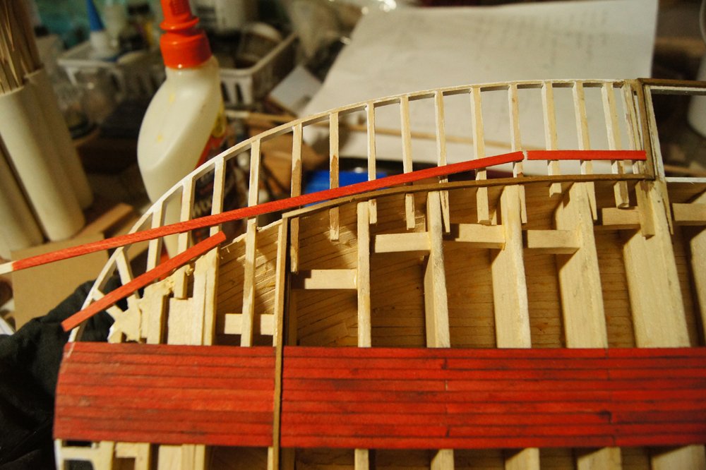
So I have a deck-planking question. The builders of Arabia seem to have adopted a somewhat complicated planking style at the stern. The planking over the hull itself is straight, as one would expect, but that over the guards seems to curve inward toward the stern, with the boundary between the two following the line of the hull. See the image below from the excavation (I'll explain the red highlight in a moment): I started playing around with how to lay this out, and ran into a dilemma that the missing planking makes harder to answer. There's a big block of planking at a single angle, maybe 20° away from the keel, then a few shorter blocks at more severe angles right at the stern. What stumps me is how that bigger block transitions to straight planking once the guards straighten out. The joint has to fall where I've circled in red (right where some preserved planking would be really useful), but I can't tell how it was done. If the plank ends are staggered, there would be some fairly complex joinery. If they aren't, everything would be butted together along one guard beam, which isn't how most planking is done. So what do I do in this transition area? Below is roughly the same view on the model, with a few loose planks laid out to match the rough angles in the photo above: So, again, how do I make that rightmost (foremost) joint? The other joins seem more straightforward, but I can't decide how to proceed with the area circled in the first photo. Neither quite makes sense; I can't see the builders doing that much fancy joinery in a quick-built riverboat, but it seems unnecessarily weak to place all the butt joints in a single line. I've been browsing archival images and haven't been able to find any clear images of how deck planking was laid out in such areas. Thoughts?
- 599 replies
-
- 7
-
-
- sidewheeler
- arabia
- (and 4 more)
-
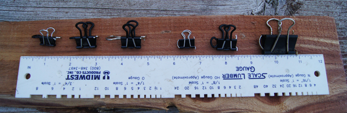
Some simple clamps will hold a fairing strip in place while you handle the model and check it, no need to use two hands. I like using modified binder clips, which also work well for holding the actual planking in place while it's shaped or glued. Although these are common, the first reference that humbly comes to mind is a post I wrote up while working on the MS Bounty Launch, showing different sizes of clips and how to set up the proper style planking clamp from them: You put the main part of the clamp over the bulkhead or frame, then the "eye" or "wings" naturally clamp the perpendicular plank/strip in place. I find that having a fairing strip clamped in place near where I'm working can sometimes help me visualize the proper shape; the strip can easily be moved as the work progresses so it stays out of the way.

-
Gerhard, thank you for the update and best wishes for getting through this stretch of time.
-
Nice detail, looking forward to using this as a reference if I ever get to try this kit.
-
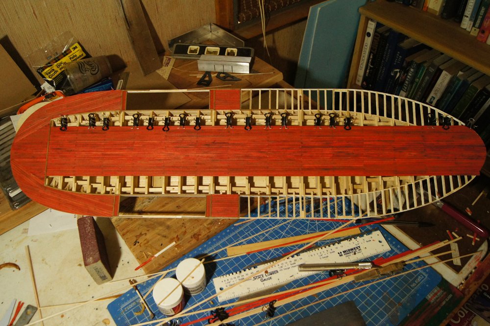
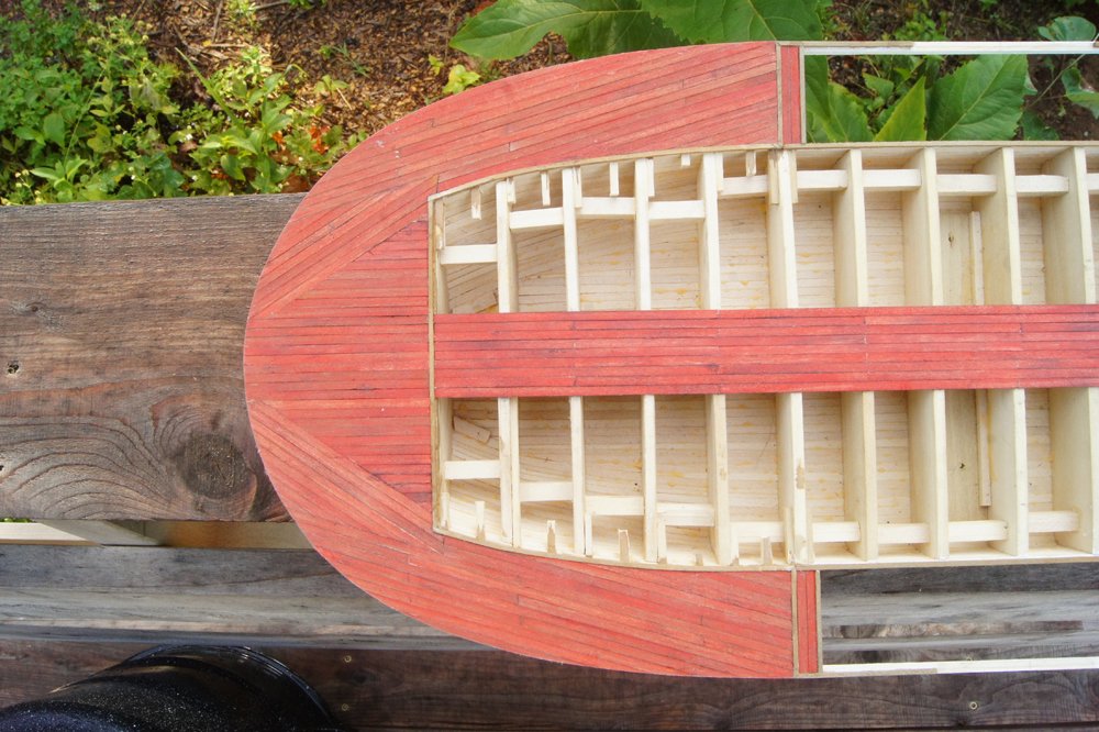
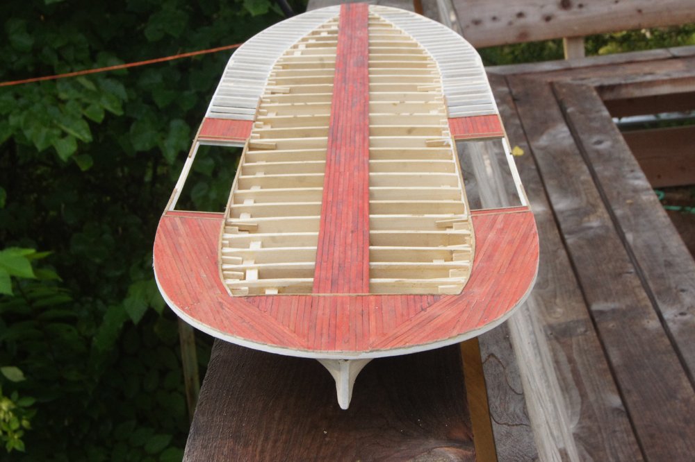
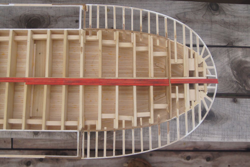
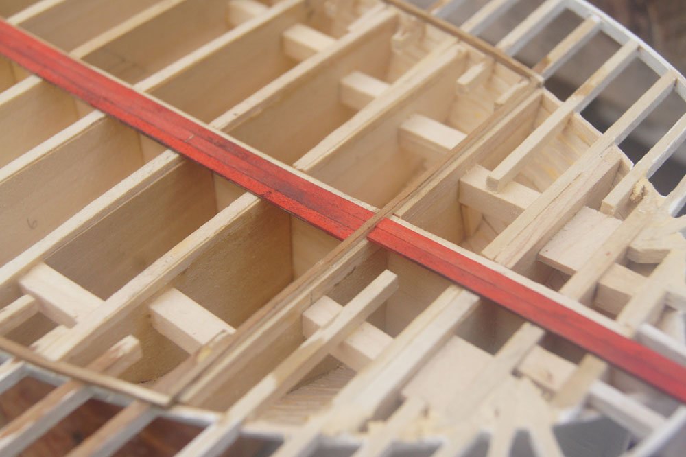
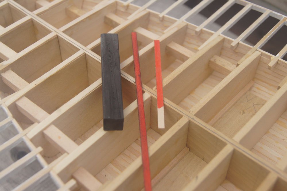
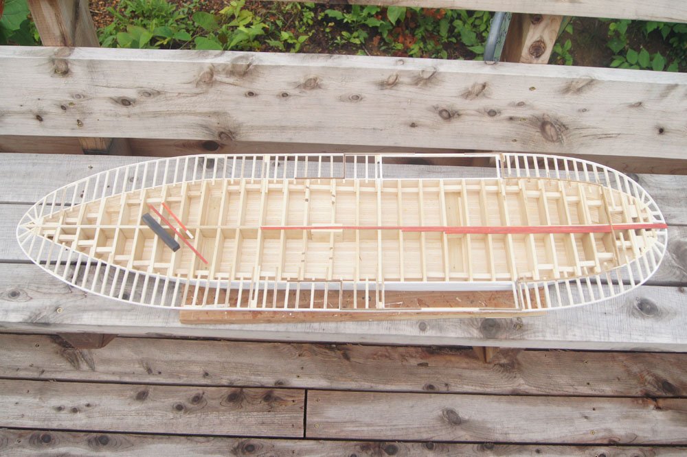
Roughing out the superstructure got me interested in moving forward on that aspect, so I decided to proceed on the main deck. On the stern half of the vessel, the superstructure follows the curve of the hull where it meets the guards (see photos in last post), whereas roughly forward of the engines there is no proper superstructure on the main deck, just open posts supporting the boiler deck. In reality, the main deck was almost certainly laid before any structure was built onto it. I decided to alter this slightly and lay a thin baseline of wood where I wanted the walls to be, then plank around these. This way I could be sure to align the superstructure with the lines of the hull, which would otherwise be obscured below the planked deck. I used square strips just a hair thicker than the deck planking so they'll be almost invisible when finished. Here's a look at this near the stern: The darker brown strips are the lines of the superstructure. I think the natural color of the wood is too bright, so I "stained" these by dunking them in a solution prepared by dissolving an old piece of steel wool in vinegar. It only takes a momentary immersion, then the wood darkens to this rich, weathered color/texture over the next 10 minutes or so. I love the look of it and will probably use this approach for most of the exposed wood where I don't use white paint. It's a bit subtle in the photo but I think you can pick it out. I also started some deck planking. I used a long metal rule to lay out a perfectly straight line from bow to stern, then laid the first center plank along this line to ensure that I'm starting from a straight orientation. After that it's just the usual slow cut-and-fit method of deck planking, nothing exciting or innovative. If you notice that the planking seems to curve a little from the internal longitudinal bulkhead, it's the latter that has a curve in it rather than the former. That's why I used the ruler; the slight twist in the hull will be invisible as long as the planking is straight. As for color, red was a common deck color and I like the look, but pure red looks too bright and false to me whether or not it's realistic. I like my models to have a patina of weathering that dulls the inherently false look of pure colors. So after I pre-painted long strips red, I cut each plank to length and weathered it using the dust from a black pastel stick, rubbing with my finger to get a smooth but variable coverage. Doing this for each plank ensures a subtle variance between plank that looks far more realistic than rubbing a whole finished deck at once (I paint the strips separately for the same reason). Below is an example of this planking butting up against my stained superstructure guides, followed by a closeup of a pre- and post-weathered planking strip. You may also note that I darkened the edges of each plank to emphasize the seams slightly. Finally, here's an overview of the hull: Doing this will occupy me for some time. While that's going on, I'll be mulling over the engine question. I have to admit, I'm considering starting over on them. It'll take another post to explain why, but the short version is that the out-of-scale aspect that I thought wouldn't be very noticeable becomes a real problem when the assembly is installed on the hull due to tight clearances. They look fine on their own, but basically don't fit where they ought. More on that when I have the heart to photograph and explain it clearly. For now, decking is a salve to my grief.
- 599 replies
-
- 13
-
-
- sidewheeler
- arabia
- (and 4 more)