HOLIDAY DONATION DRIVE - SUPPORT MSW - DO YOUR PART TO KEEP THIS GREAT FORUM GOING! (Only 20 donations so far - C'mon guys!)
×


Hubac's Historian
-
Posts
3,292 -
Joined
-
Last visited
Content Type
Profiles
Forums
Gallery
Events
Everything posted by Hubac's Historian
-
 Spectacular carving, Drazen! The thinner profile is excellently rendered and your lettering is really superbly done. I am very impressed with this!
- 487 replies
-
- 2
-

-
- ship of the line
- 80 guns
- (and 1 more)
-
Hi Dan and Vic! Yes, thank you for the kind words. Vic, the scraping is a process: Dremel round burr, Dremel bottom cutting straight bit, scraping with chisels and knives, and finally, smoothing with the coarse side of an emory board. The most time consuming aspect is cutting away waste around the borders of what’s staying. This old plastic is, for lack of a better word, chewy and tough to work with knives. As always, thanks for looking in!
- 2,696 replies
-
- 1
-
-
- heller
- soleil royal
- (and 9 more)
-
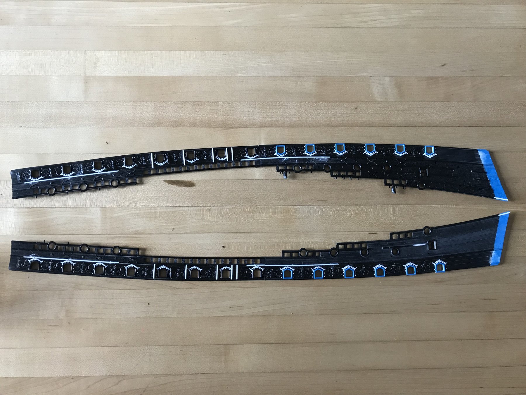
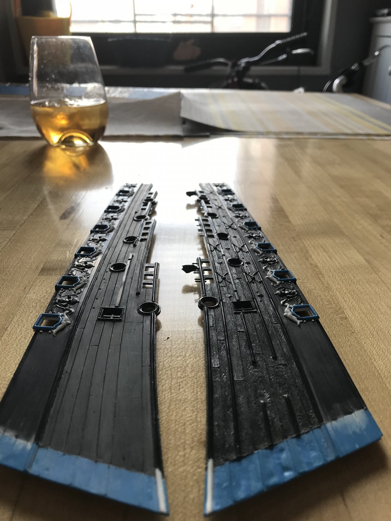
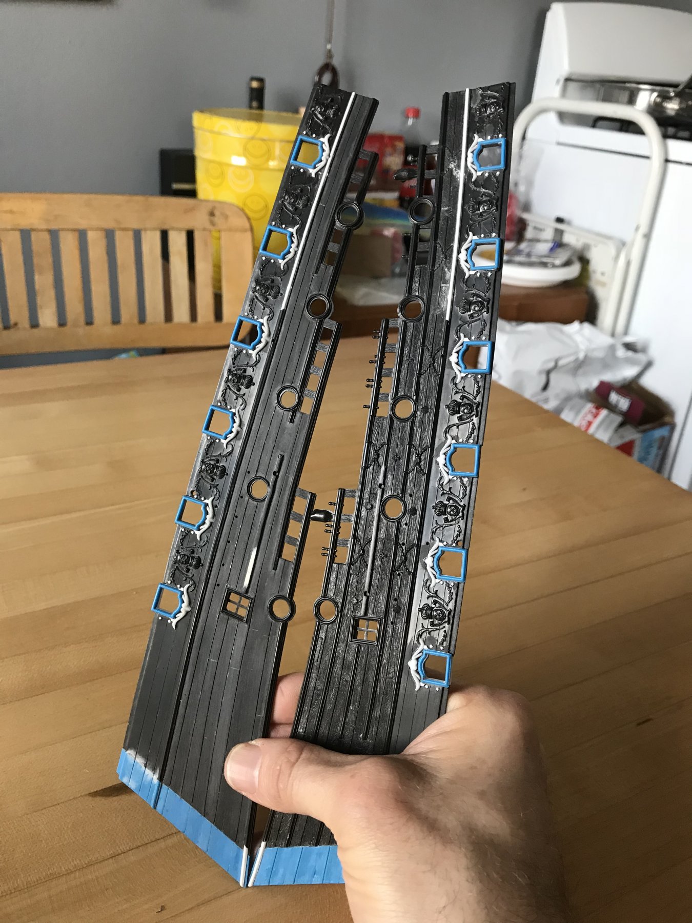
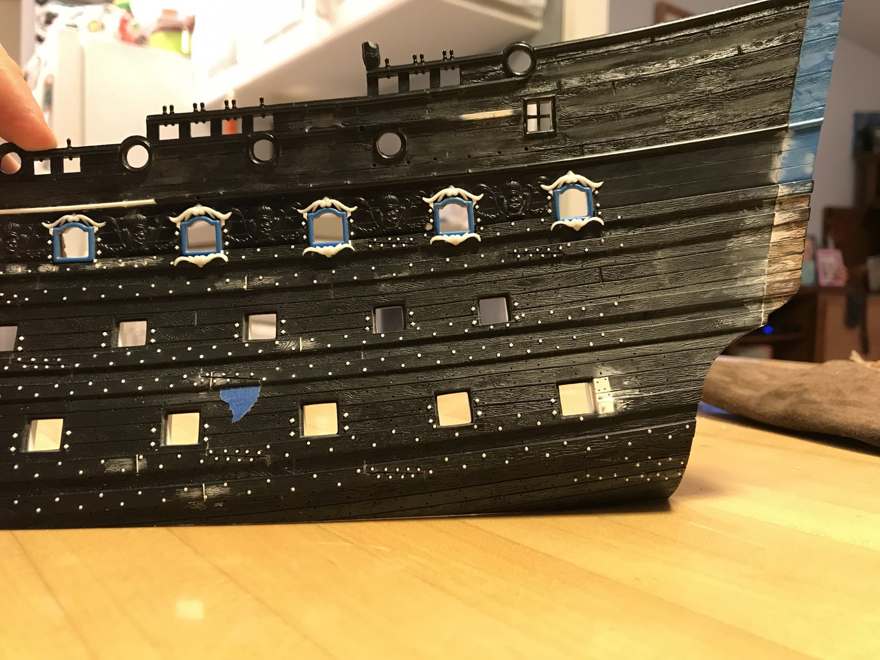
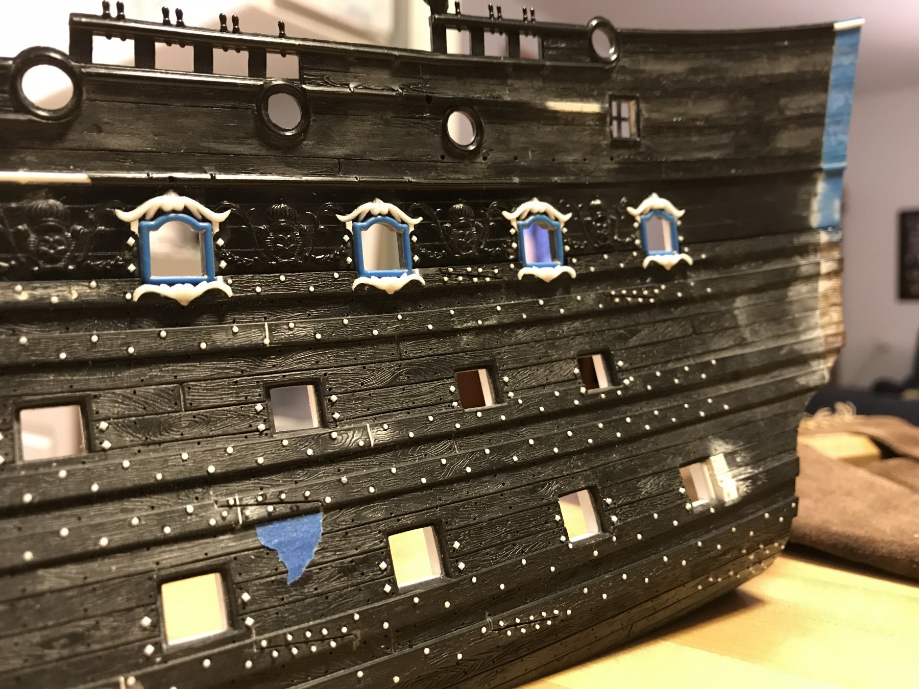
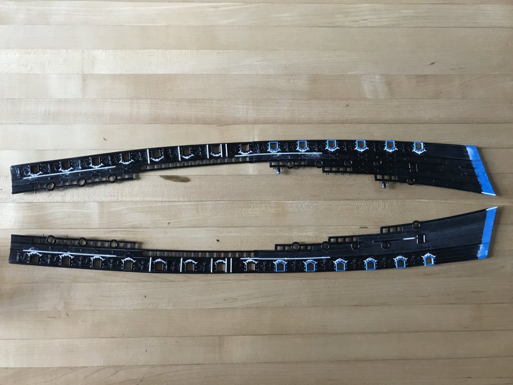
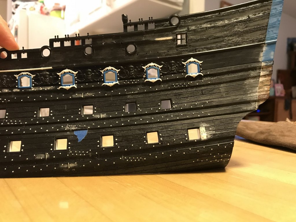
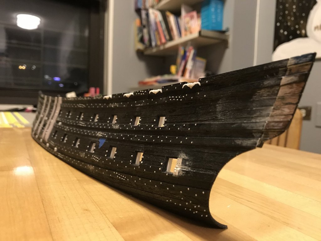
Well, it has been slow-going and it may not seem that much has changed, but actually quite a lot has been accomplished. All of the main deck port enhancements are now in place: It is interesting to me that, despite being cast from the same single master, most of the enhancements are different enough to appear as though they were individually carved. This owes to varying finger pressure while sanding away the backgrounds, as well as the gouge and knife cleanup around the scrolls. And, ocassionaly, specific scrolls were deliberately shortened and/or flattened to better fit the space they were going into. The effect is not unpleasing to my eye. I, however, will strive for better uniformity for the cast pieces that make up the frieze ornaments; because these pieces are much smaller, any variations in their size and profile will be much more evident. Here is a closeup of the area surrounding my new chesstree. This illustrates how the chesstree and skids, which serve a functional purpose, take precedence over the purely ornamental port enhancements; in accomodation of these functional elements, the ornamental scrolls have been shortenned, where necessary. I can only imagine that this must have been what was done, for all practical purposes, on the real ship. In the following shots, you can see how the port stern quarter, upper bulwark has been scraped clean of the stock bulwark frieze. All that remains are the necessary sheer strakes that frame the caprails and the basic, round ports of the quarter and poop decks. I now have a clean canvas for building up the new frieze and adding in the round port enhancements. One detail that I found necessary to include were plank lines in place of where the standard sheer strakes had been. To do this, I took centers between the two existing plank lines and engraved a new plank line between them (work in process). I was able to use curves, for the aft-most 3”, or so, but the rest had to be cut by hand and eye. As the existing plank lines are, themselves, a little wobbly and less than fair, my new lines reflect those irregularities. I have tried, though, to minimize that as much as possible. In the end, though, these imperfections will be mostly concealed under the lattice of the new frieze. It will only matter that plank lines are represented. Lastly, I’ve cleaned up the cap rails by removing the tree sprues and all traces of the pins, which will eventually be re-centered on the soon to be thicker caprails, with something better and stronger. The inside faces of the bulwarks are also now scrubbed clean of any remaining evidence of the injection moulding process. This is a step that is often ignored on this kit, but shouldn’t be. In Maslow’s Lower-archy of tedium, this task is actually not as horrible as many others on this build - like, say, assembling all of those gun carriages. As a side note, I discovered that the starboard upper bulwark assembly is a good 1/8” longer than port. This is a bit of a mystery to me, as the lower hull was extended by the same 3/8”, and the upper bulwarks were indexed on the lower hull, according to the location of the mid-ships gangway ladder. The pieces should have just lined up with the ports in their correct place, but in fact, they did not. I had to shift the starboard stern bulwark forward by 1/16” just so that the ladder would align. this adjustment accounts, in part, for why the starboard upper bulwark extension appears longer than 3/8”. When I put the lower hull halves up to each other, I could see that the starboard lower hull is 1/16” longer than port. I suppose this is all reflective of the 1970s handwork involved in creating the kit, in the first place. They weren’t using computers, back then, to design the model. Anyway, these differences shouldn’t be apparent in the finished model. So, I’ll just keep on keeping-on, and I’ll repeat that process for the other three upper bulwark pieces. Fortunately, the forward pieces, that include the forecastle, do not have much surface area that needs to be scrubbed.


- 2,696 replies
-
- 8
-
-
- heller
- soleil royal
- (and 9 more)
-
WOW - these funnels really are the stars of the show and you are nailing it Dan! Beautiful work, ingeniously done.
- 287 replies
-
- 4
-
-
- michelangelo
- ocean liner
- (and 1 more)
-
Hello Patrick, Your interior bulkheads are really coming along nicely! I love the cartridge cache - superb detailing! Is that a sho brush you are using to leave a patina of black wax on the surface of the bulkheads?
-
Okay, Mark, if stain provides the blackened finish you are after, then what about this: First, thoroughly mask off the wales that you want to stain, so that you have a very clean tape line of demarcation between what will remain natural and what will be stained. Next, spray a few mist coats of the same thinned finish you intend for the unplanked lower hull, in order to seal the grain along your line. Next, tape the lower hull right up to the wale taping. Burnish the new tape. Finally, remove the first tape so that you can mist light coats of your stain onto the wales until they are sufficiently blackened. This is all theoretical, on my part, but this would be an experiment I would try, if I were attempting to blacken my wales with stain. I think that by scribing your line with a sharp knife you are only inviting stain to bleed unevenly into the grain fibers. I have no experience with doing this, though, so I can only guess.
-
Well, another great build of yours to follow, Mike! Your change of wood only underscores your dedication to what you think is best for a project. That's why your builds stand-out. I'll be following along with great interest.
- 607 replies
-
- 8
-
-
- winchelsea
- Syren Ship Model Company
- (and 1 more)
-
Sorry, Druxey, I just read your comment more carefully, in which you basically answered my question. Thanks for that.
- 1,035 replies
-
- 6
-
-
- royal katherine
- ship of the line
- (and 1 more)
-
Is it fair to say that canvas would only be used on the roof, or upper/lower finishing, while the sides would still be light board or paneling?
- 1,035 replies
-
- 4
-
-
- royal katherine
- ship of the line
- (and 1 more)
-
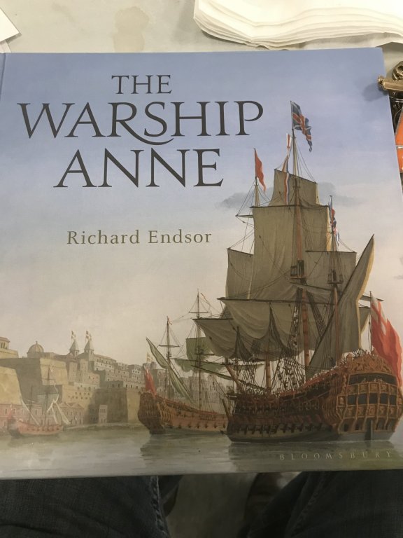
Hello Doris, First if all, thank you very much for taking the time to make that video. This was incredibly instructive and interesting in that you only need the small steam from a cup of tea to do this shaping of the card. I was envisioning a boiling kettle, or something like that. And the results are so perfect! I am reading, now, Richard Endsor’s excellent book “The Warship Anne”. In the book, Mr. Endsor makes mention of canvas purchased for the covering of the quarter galleries, during the construction of the ship. This detail of the text made me wonder whether it was this flexible medium (canvas), that could more easily be stretched over the light framework of the QGs, thus creating these complicated, faceted shapes - maybe, at least, for the top upper finishing. The canvas could then be sealed with paint, or some form of “black stuff” for water proofing. I had always assumed that the “skin” of the QGs was made entirely of wood. Anyway, not sure what to make of that, but an interesting possibility. Perhaps you understand this more completely. The other detail that is of particular interest to me, Doris, is your round-up of the stern - from the counter timber, up through the tafferal. Let me preface the following observation by saying that this is not a criticism, but merely my desire to more fully understand what I am seeing as it relates to known period practice. My observation is that the arc of round-up, in the hotizontal plane, is most pronounced at the stern counter, just above the stern post. As your eye travels up, toward the tafferal, this arc APPEARS to flatten out a bit, yet it is still there. I can see the upper arc of the stern, as it is reflected in the aft deckline of the poop. What I can’t figure out is whether this arc actually diminishes, as the stern rises, or whether this is just an optical illusion created by the rising tumblehome of the ship sides cutting the arc on a continuous taper towards the centerline of the ship; in other words, as the ship’s sides rise, the segment of arc at any given point gets smaller and smaller, thus, perhaps, appearing flatter when, in reality, they are all arcs of the same curve. How’s that for a run-on-and-on sentence?! With all of the ornaments in place, I think that this apparent difference is not noticeable at all, really, but the bare architecture makes it more visible. What you are doing, Doris, looks right to me, but I’m just trying to understand why so that I can re-create it on my model.
- 1,035 replies
-
- 14
-
-
- royal katherine
- ship of the line
- (and 1 more)
-
That’s a fearsome broadside, Mark! I apppreciate the excellent work you have done on her so far. Incremental progress; little by little you are getting there.
-
Excellent detailing, Dan! That pool slide is impossibly small. At first, I was thinking that you should keep trying to install ladder rungs, but then that dime put everything into perspective for me; at that scale, ladder rungs are just are not necessary.
- 287 replies
-
- 6
-
-
- michelangelo
- ocean liner
- (and 1 more)
-
If I had a home shop like that, I would never go to work. But, then, I guess I wouldn’t be holding onto that shop for too long
-
Your ship is so fair, I believe she could just sail right over those mountain tops. No problem. That’s some good troubleshooting, you managed, there.
-
If you go that way with the Spanish windlass, maybe set winding sticks at regular intervals across the top of the sheer rails, and then you could see what kind of distortion your pressure is introducing to the hull 🚬
-
Beautiful work, Sigi! The black alder gives nice tonal variations that would be evident in a full size ship - at least while on the stocks. Eventually, these wood tones will pop even more next to the painted lower hull and upper bulwarks. Beautiful lines, and lion and super clean work!
-
Would it be possible to double-stick tape a temporary spacer, on the interior, next to the deck clamp so that the jaws of the clamp are equally supported?
-
MONTAÑES by Amalio
Hubac's Historian replied to Amalio's topic in - Build logs for subjects built 1751 - 1800
There are so many truly excellent models on MSW, right now. While I am partial to the very excellent work of Marc Yeu, AKA Neko, this model that Amalio is making is simply the most astounding, IMO. Everything from the uniqueness of the subject, to the fairness of the hull, to the completeness of the detailing, to the total care with which every single detail is consistently rendered presents a feast for the eyes! -
Sounds like a plan, my man!
-
Aaah, now I see! The eyeball test says that’s too short a span to fair the bulkhead - for the sake of glue surface - and to also have a fair run of planking to the transom; you would definitely have to fair the two preceding frames, IMO. If you didn’t do so, I strongly suspect that that would result in an abrupt and awkward rise of the planking to meet the transom. I would, instead, add material to the bulkhead and fill the gap.
-
Wow - jackpot!! Interesting? To say the least! Thanks, Chris!
-
I’m not entirely sure if I understand what you are grappling with, here Mike, but with a square tuck stern, it is adviseable to plank the transom and counter first, so that your hull planking can overlay the transom/counter plank ends, and be cut flush with their outboard surface.
-
Thank you, guys, for your likes and comments. And thank you, BW, for that tip on the picture - it worked! I don’t know what I’m doing to create that problem, in the first place, but it only seems to happen when I post from my phone. That’s an interesting idea about scraping away excess resin, Dan. I think, though, that because the stuff begins to cure so rapidly, that doing so might compromise the quality of the casting. Last night, I got a perfect cure without even the assist from a blowdryer. And the first mould was already hazing over before I topped off the last mould. That said, it might still be worth an experiment, and I appreciate the suggestion. So, I probably won’t be posting much in the coming weeks, as I continue along with these main deck port enhancements. Following that, I will just slog through the clearing and surface prep for the new frieze ornaments. However, before tackling the frieze, itself, I will concentrate on my cap rail enhancements. While I won’t be increasing the thickness or the appearance of thickness for the upper bulwarks, I will almost double the thickness of the sheer railings, from their backsides. I will also be adding ornamental panelling to the frame extenshions that make up the sheer railing supports. I will add back a little height to the top most “poop royal” level of the sheer, in the form of a low, open railing, per Berain’s drawing. This is necessary because the shortenned poop royal deck will now sit virtually flush with the reduced sheer line - which was often a real feature of period practice. Lastly, I will carve and cast masters for the ornamental sheer cap “dolphins.” Following all of that, I will build up the new ornamental frieze because I should be pretty good at this casting business, by then. AND FOLLOWING ALL OF THAT - I will begin assembling all of this into a ship, and I’ll begin the painting, and the making of a thing that resembles my interpretation of Soleil Royal. Thank you to everyone who has stuck by me from the beginning, and to those newcomers who are now following along. This is about to get much more interesting!
- 2,696 replies
-
- 3
-
-
- heller
- soleil royal
- (and 9 more)
-
Frustrating, for sure, but the fix will be well worth it. Middle balcony really came out nicely, EJ. I’m still puzzling as to how to write the Ship’s name in such a small space. This may be an application for photo-etching.
-
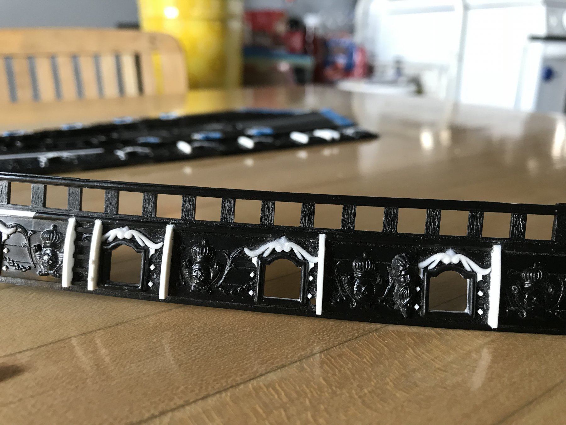
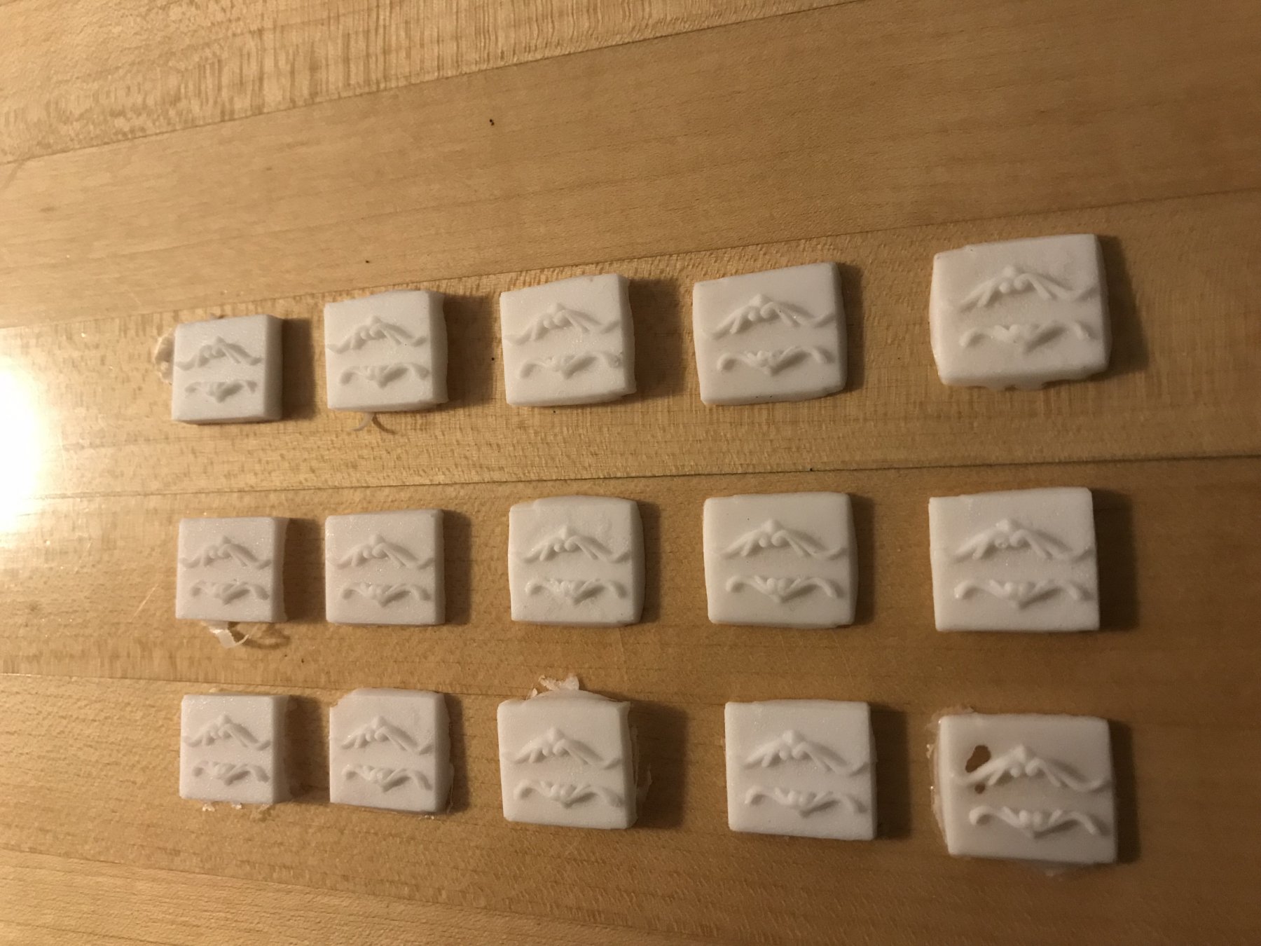
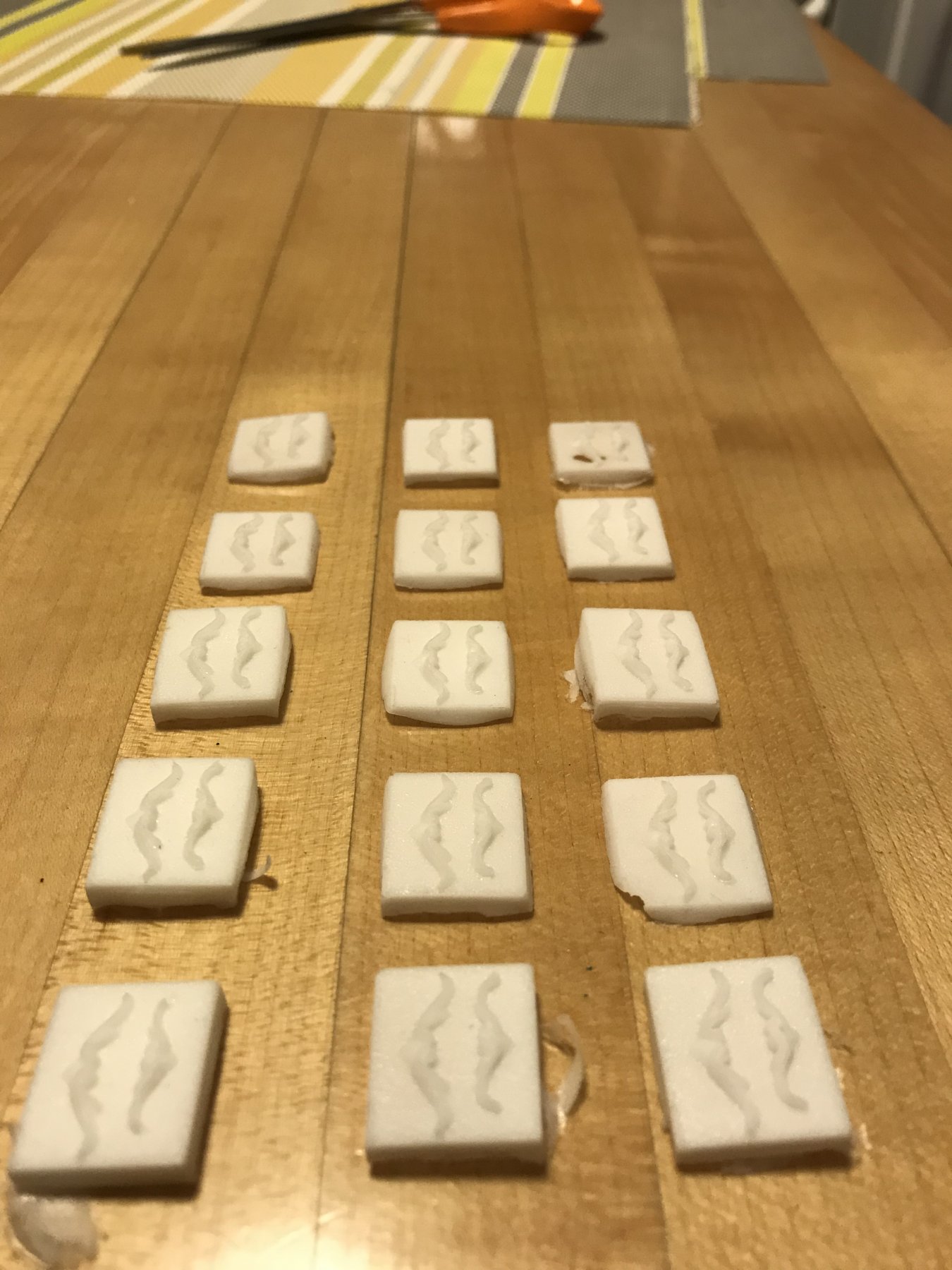
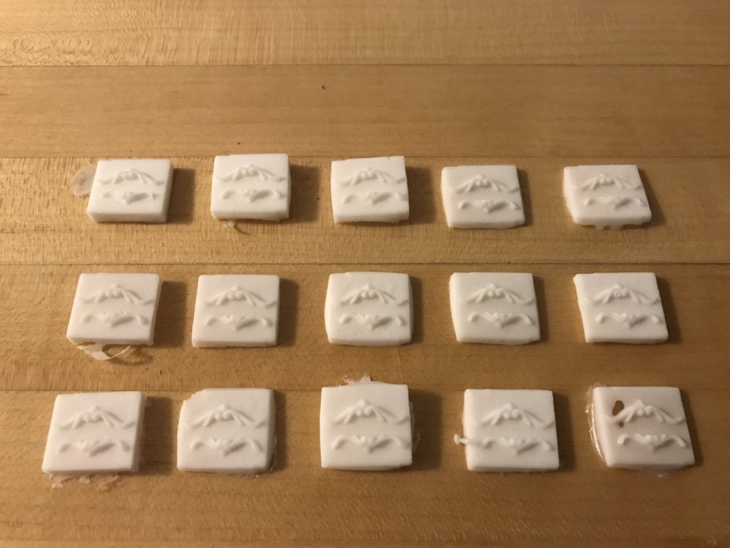
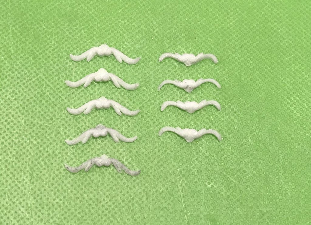
Including last night, I’m four rounds of casting into this process, but I think the first round (top row) is a total discard: It’s hard to see, but there were a lot of air pockets in the volutes of the scrolls, and also at the tails of the scrolls. After this first round, I found it helpfull to first prime the mould with resin, and then press the resin into the mould with a gloved finger. Then, I would top off with just enough resin to get a good cure. Lastly, I lightly drag a tooth pick into the crevices of the mould to draw out any remaining air bubbles. You have to work quickly because the resin really does cure rapidly. You have three minutes from the time you start mixing. A little low heat from a blow dryer ensures a thorough cure. The other good reason for discarding the first castings (left line) is that, initially, I was mixing twice the amount of resin that I really need. That produces blanks that require a lot of wasting, just to remove the ground. I found that even with the Dremel, the wasting step is a bit time consuming. Drum sander, first, to reduce the perimeter and then roughly reduce thickness from the back of the blank. Next, I use a cylindrical burr to get a little closer to the margins of the ornaments. Finally, I take each blank to a board that I’ve double stuck 100 grit paper to. This whole process has been trial and error for me, but that’s what learning is, I suppose. The resin sands briskly, which is great. My plan, however, to sand until the ground just falls away, was not so good. The unnevenness of a single finger concentrating pressure in the center of a smaller carving, reduces the center faster and thins the carving too much in an effort to free the ends: The ornament in the lower left corner is notably thinner than the others because of this. Its bottom port corrollary was too thin to even use, so I threw it away. I found it better to sand from the center until I just broke through between ornaments. Then, I’d apply a little sanding pressure on each end, for a few strokes, but not breaking through. Finally, I freed the carvings from their ground with an Exacto. What you see above looks pretty decent, but I still had to do a significant amount of cleanup and a little re-shaping with blade and gouge. The necessity for this varied with each port location: Here, to the left, you can see the thinner top ornament. Even though the weight of the ornament is noticeably lighter than the others, it works here because the available space for the ornament is smallest in this location. Fortunately, this is a location above the new location for the main channel, so losing the bottom ornament didn’t matter. Similarly, the aft most port cuts significantly into the wale, leaving only a small ledge for the lower port enhancement to sit on. This is why, to the right, this lower port enhancement has been noticeably reduced. For the aft-most three ports, I found it useful to hedge a little bit and to split any overhang of the ornament between the bottom edge of the wale and the lower edge of the port frame. I don’t think this is too noticeable. On the whole - despite small variations - I am pleased with the results. I may, yet, swap out a few ornaments for better balance, and I might extend a few ears that look a little short. It’s more work than I anticipated, but the results justify the effort for me.


- 2,696 replies
-
- 11
-
-
- heller
- soleil royal
- (and 9 more)