
.JPG.ca33079f5815b861e67b9c2cccd37982.JPG)
Blue Ensign
-
Posts
4,570 -
Joined
-
Last visited
Content Type
Profiles
Forums
Gallery
Events
Everything posted by Blue Ensign
-
 Love those full shots of your Pegasus Nils, she is an impressive build. Interesting comment of yours re use of polyester thread. I have a full set of Morope lines which have great definition but I find them more elastic than natural fibre lines. Because I like to impart some sag into certain lines, something almost impossible to do with polyester I will probably revert to the natural stuff when I get around the rigging business. I find a well stretched natural line is easier to handle, and will take a natural looking sag, imparting a weightiness to lines such as the Main Stay and braces. Regards, B.E.
 -
Nice looking Capstan Martin, like your contrasting woods. I did connect the two capstans on my build, it required cutting a half round in the deck beam. It gave me a small pleasure but as Alistair says it makes no difference once the qd is in place. B.E.
- 467 replies
-
- 1
-

-
- fly
- victory models
- (and 1 more)
-
Your build is coming together very nicely Rob, Pickle is such an enjoyable kit even allowing for those tiny carronades. B.E.
-
There is no mention of a taper of the Main Wale in The Construction and Fitting of the English Man of War 1650 - 1850. In Volume 11 of the ffm it is noted that the top strake of the wale tapers from 41/2" to 3" in thickness to accommodate the fit into the rabbet of the stem. There is no indication of taper in the width of the timbers. Cheers, B.E.
-
Copper plated ships in NMM
Blue Ensign replied to Gaetan Bordeleau's topic in Nautical/Naval History
Hi Gaetan, The Bellona model is a contemporary model which I believe was coppered to to demonstrate the procedure to King George111 This is a slightly more detailed shot As the copper is also contemporary, I suppose the answer as to colour is as is. B.E. -
It's always such a pleasure to see your updates Doris, and I love your little 'how to' videos. B.E.
- 883 replies
-
- 1
-
-
- royal caroline
- ship of the line
- (and 1 more)
-
Hi Nils, re your lift/yard question. All the yards were raised to set sail, and lowered to the caps when bare stick. The lower yards were not normally moved once in position, but they could be using the jeers. Commercial sailing ships of the mid 19th century such as clippers often had split topsails with one fixed lower topsail yard and a moveable upper topsail yard. I understand this was to make for easier handling with the fewer crew available on such ships. B.E.
-
Hi Nils, those tops look a much better proportion You will find the dimensions of my Topmasts on pages 11 and 12 of my log, I essentially went with Steel but the topmast lengths were less than on the kit plans. Cheers, B.E.
-
Thanks Mike, a lot can be done with these small models if you have the bloody minded persistence and the information to convert (I had Jean Boudriot) I still have a companion Frigate, La Flore that I had originally intended to be part of the diorama, but I'm not sure the old eyes are up to it now, I struggled with the Longboat for Pegasus. Still think about it tho' B.E.
-
Great modification to the carronades Thomas, they really look the business. A fine job B.E.
-
Glad you found my work on the mast tops of use Nils, I think the kit Mizen top in particular must have been a mistake, it was far too small for purpose. Nice bit of hand squaring on those mastheads. Regards, B.E.
-
Impressive work Bob, and those catheads look wonderful B.E.
- 1,477 replies
-
- 1
-
-
- essex
- model shipways
- (and 1 more)
-
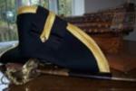
The British were cheapskates when it came to fitting out their ships for creature comforts, painted canvas for the floor covering, rather than a nice bit of parquet flooring as in the Great Cabins of French ships. I couldn't believe that on French ships they had a separate Pastry Oven for the benefit of the Officers. In the day I believe the British Navy were rather disparaging of anything 'Frenchified' but individual officers did take on the use of Epaulettes long before official regulation, Although Nelson initially condemned the adoption of a Frenchman's Uniform, referring to Officers who wore them as Coxcombs he also took to them once the they were made 'official' in 1795. Still I digress..... sorry Mark. B.E.
-
I think that probably is tarred rope but salt stained and faded, hence the greyish look. Could you perhaps stain it in situ to avoid having to do the job over, but it's really down to your good self as to whether it bothers you that much or not. B.E.
-
Those close-up shots show the excellence of your rope work Mike, you're doing a great job. A point of curiosity, I note you have used 'untarred' rope for the Gammoning; I've always understood that as part of the Standing Rigging this would be tarred? Regards, B.E.
-
Very nice work Peter, and great photo's; she's going to look wonderful when she's finished. B.E.
- 431 replies
-
- 1
-
-
- pegasus
- victory models
- (and 1 more)
-
Hi Nils, re your question on the Violin block or Fiddle Block. More properly called a Long Tackle Block, which had two sheaves set on the same plane but contained within the same cheeks. My understanding is that it was used where there was a risk of line fouling were the traditional double block with side by side sheaves be used. They were commonly used for the Yard Tackle pendants on the Lower Yards, and also Stay Tackles. B.E.
-
Moving along a quite a pace Nils, good find with the stern lantern, it fits in very well with your scheme. Can't really help with the capstan bar storage question, but I suspect that with an open railed ship like Pegasus, they were probably stored below, in my case out of sight, out of mind. Not something I recall seeing on any contemporary models. B.E.
-
Hi Tom, I use Letraset gold rub on lettering either Times New Roman or Helvetica depending on the size required. I think I used Helvetica on Pegasus because I couldn't get Times NR in the size required. Those cleverer than me produce their own transfers in which case the world of fonts and sizes is all available to them. To complete the historical context; in 1771 names were to be painted on the second counter in letters 1 foot high to be enclosed in a compartment. The order was amended in 1772 whereby the letters were to be as large as the counter would allow, without the compartment. Not all Admirals agreed with having the names on their ships, and I suspect there was a period when both forms or none could be found on British ships. Cheers, B.E.
-
Hi JP, regardless of any historical accuracy aspects, I don't like those brass etched letters which themselves are not correct as raised lettering was not used on British ships of the period; the names were painted on. Initially set in compartments (as shown on old photos of Victory) and then as large as the counter would allow ( as currently shown on Victory.) Personally I think white painted names do not suit period models, and the kit provided style is too modern. Don't seem to recall seeing any contemporary models with white lettering, I think the model of Bellona in the NMM indicates the style perfectly. I tend to use dry transfer rub on lettering on my models which have a more 18th century look about them. Regards, B.E.
-
Hi Mike, I only removed the three waist extensions once the outer planking had been completed. I did partly cut thro' the pieces from outboard before planking and I added a strip of double sided tape to the outer face of the extension pieces. With the aid of a veneer saw it was then easy to remove them cleanly and without splintering. I left the final deck planking runs until this had been done. Veneer saws are a very handy tool for this job. Cheers, B.E.
-
Hi Mike, I used walnut planking for the wales on my Pegasus, and although it is painted black it sits well against the rest of the boxwood planking. I didn't have any problems with splitting or forming around the tricky stern section and a good edge was formed when making the top and Butt planks. With masting at least with Walnut you have half a chance of getting straight dowels for the Lower masts. I didn't favour Walnut because of it's dark colour which went against the overall effect I was after. I tried both Lime and Birch, which had warping issues over the required 400mm lengths, and finally settled on Ramin, a mid tone fine grained wood which provided more colour options, and most importantly gave me straight lengths. B.E.