
Beef Wellington
-
Posts
2,249 -
Joined
-
Last visited
Content Type
Profiles
Forums
Gallery
Events
Everything posted by Beef Wellington
-
HMCSS Victoria 1855 by BANYAN - 1:72
Beef Wellington replied to BANYAN's topic in - Build logs for subjects built 1851 - 1900
Hi Pat, catching up and glad to see everything coming together so well, nicely done. Very interested to see how the capstan works out. Beautiful model.- 1,018 replies
-
- 3
-

-
- gun dispatch vessel
- victoria
- (and 2 more)
-
Love it Siggi, so glad to find your new model. Love the figurehead and the lines of Tiger are very pretty indeed. Can't wait to see more.
-
Really nice progress Mark, love the work on the cannons, should look really sharp when all finally assembled. Oh, and Licorne is looking pretty good too.
-
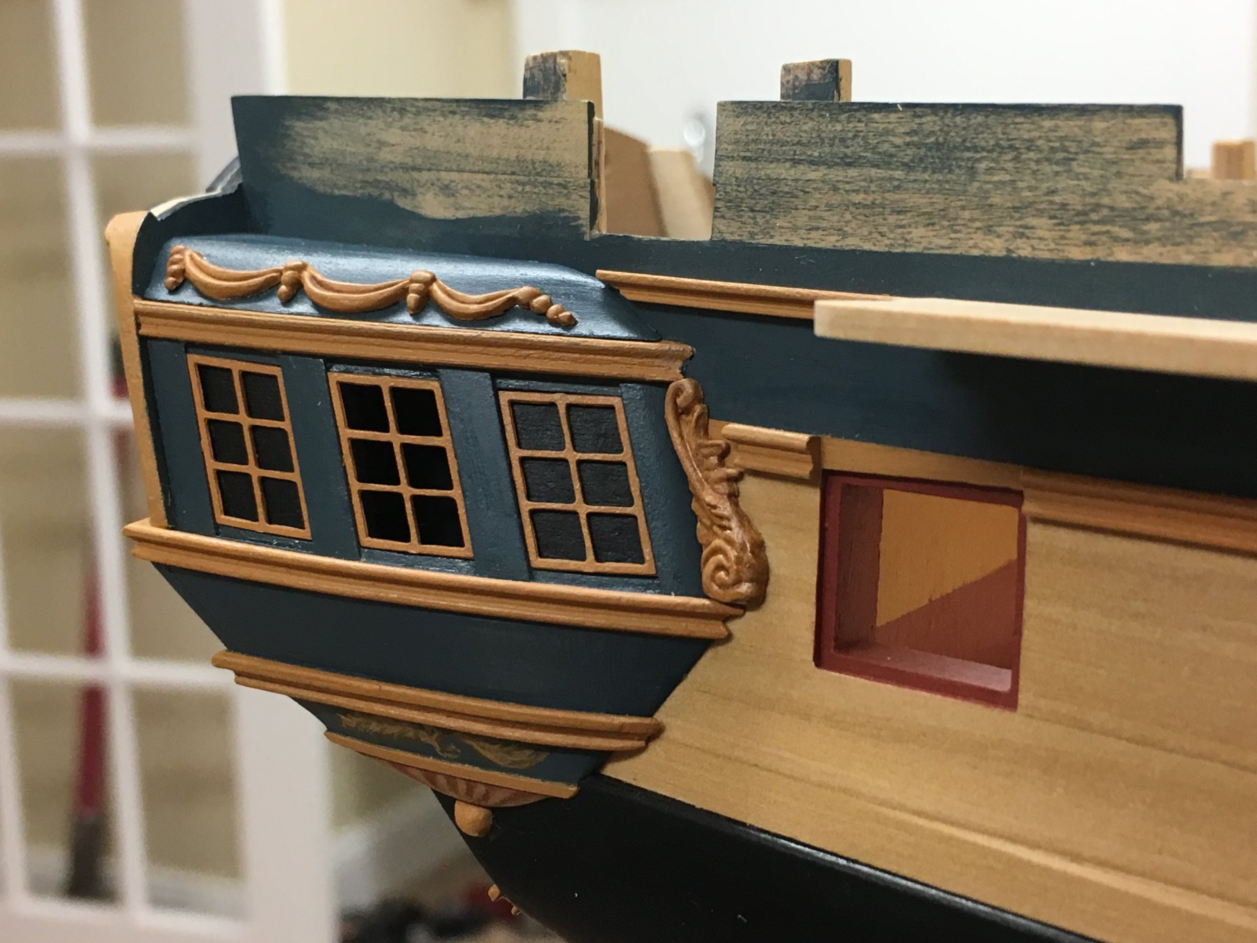
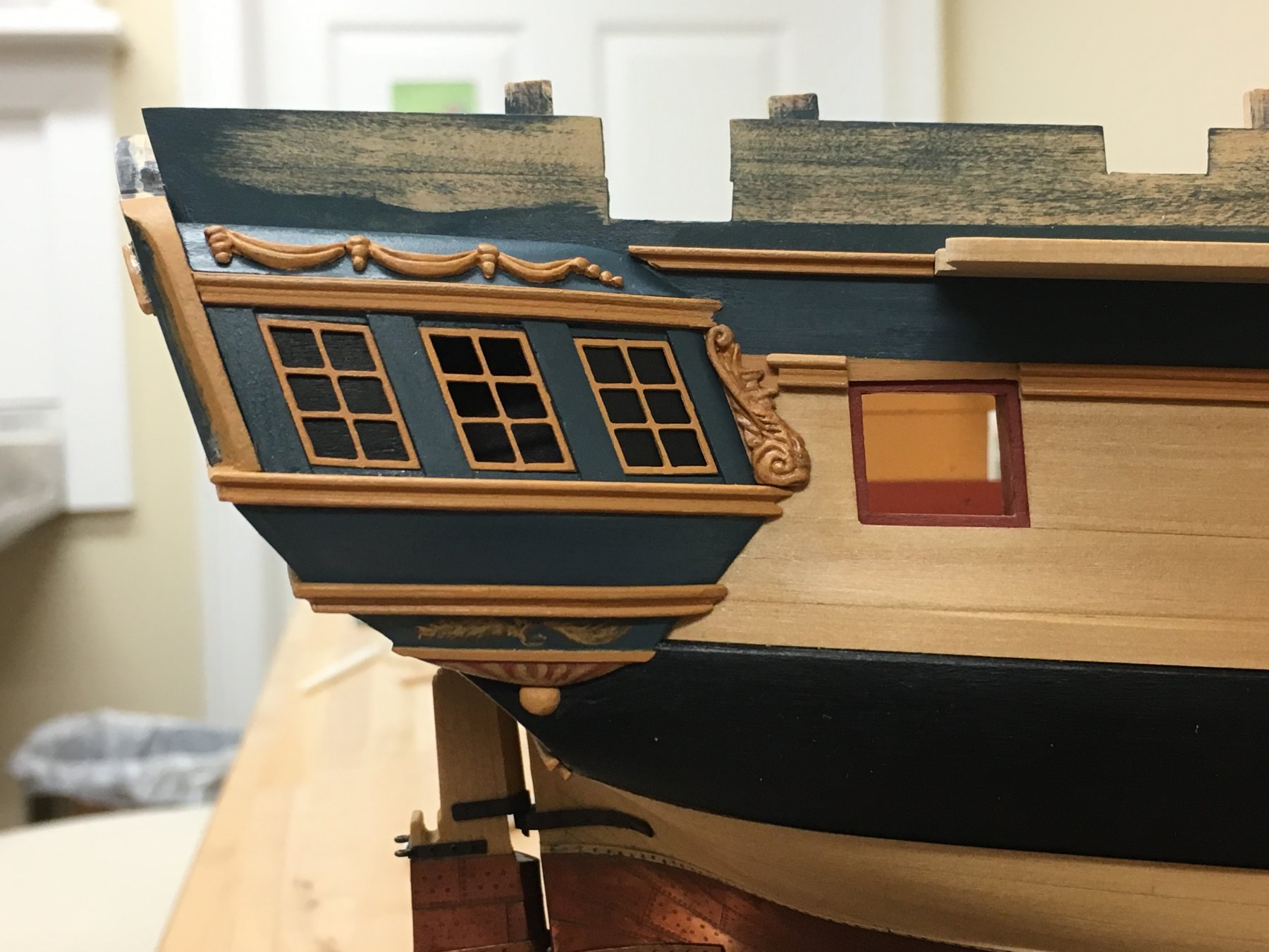
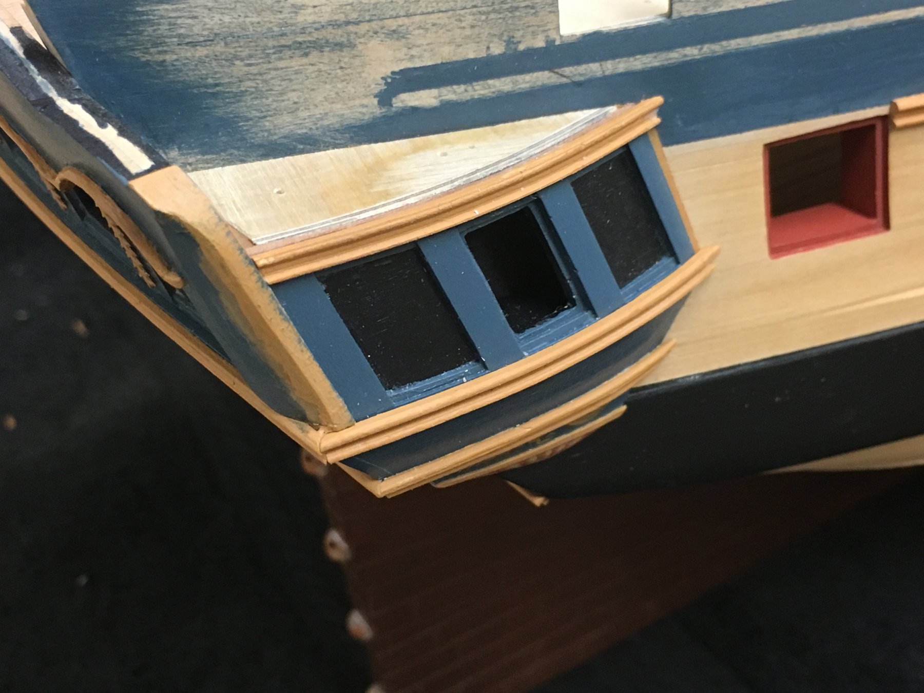
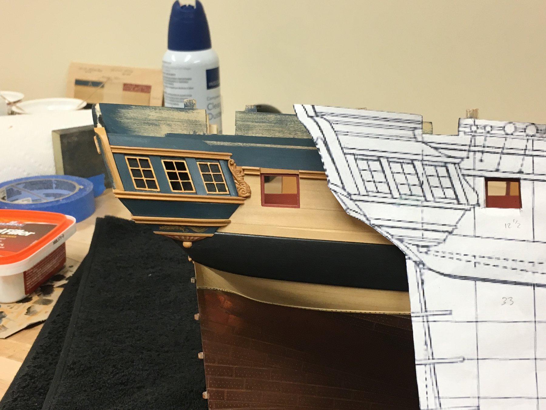
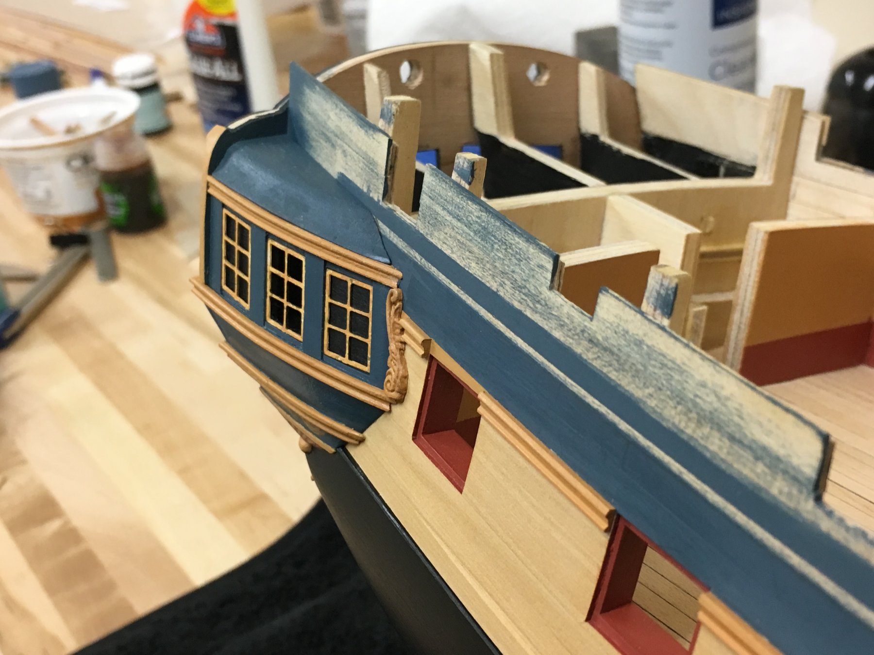
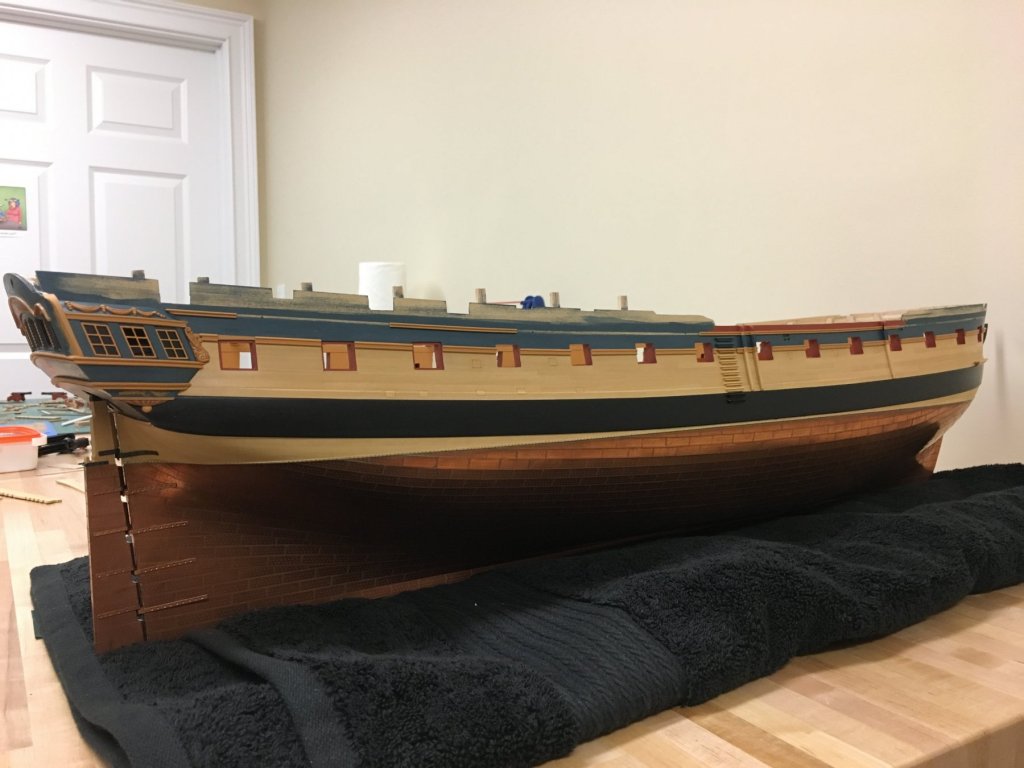
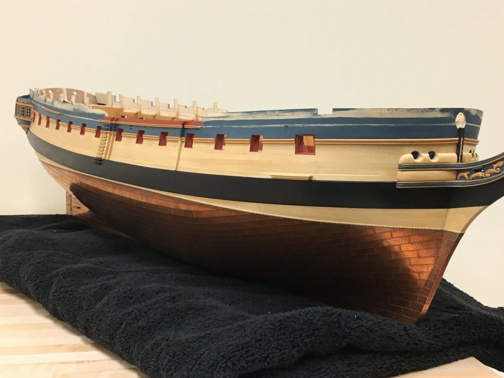
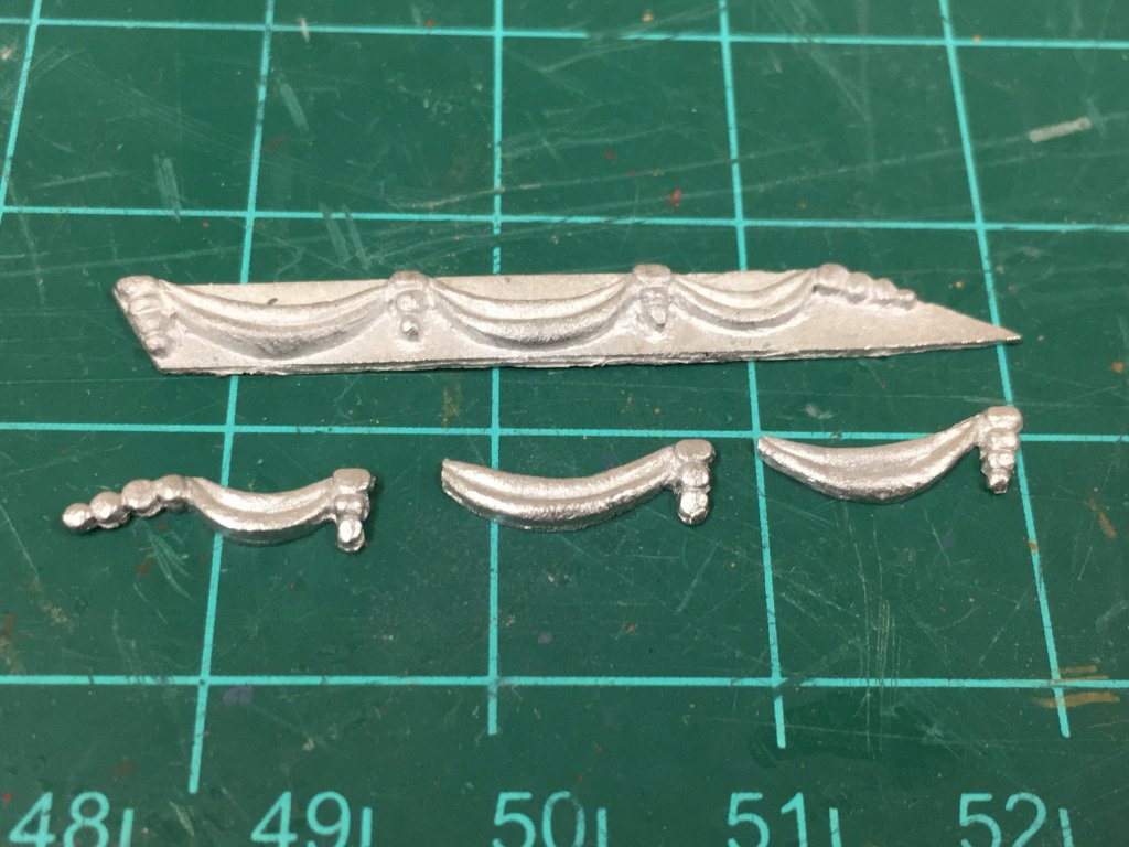
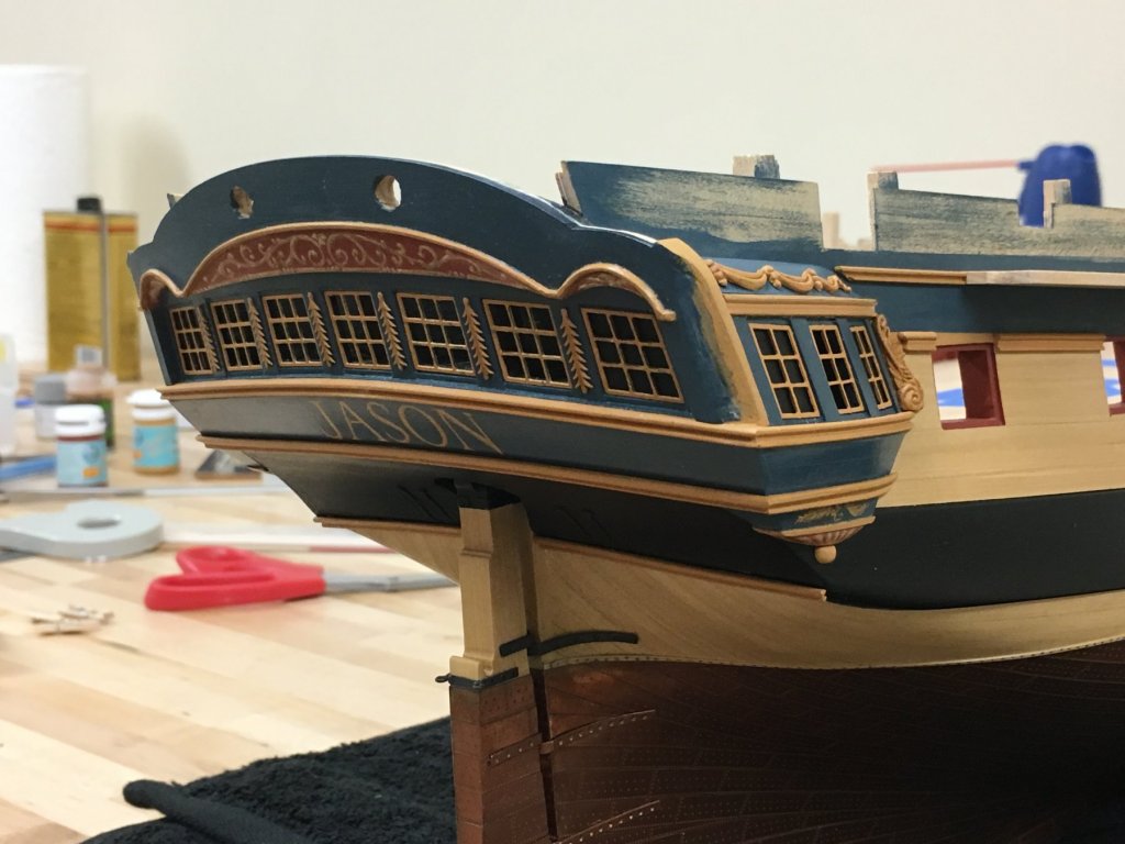
Thanks everyone for interest and kind words Frolick - thanks for posting the history of that action, always very interesting to read. Final comments on the stern, brief notes, and pictures thrown in just for spice: The roof of the quarter galleries was really the last major hurdle to getting the 'look' of the stern as I wanted it. This did pose a conundrum, as options abounded. Other frigates of the period typically seemed to have the more classical fluted columns between lights and shingled 'roof' to the quarter galleries, and the contemporary models of Diana have a highly decorative roof and columns which Christian (Barbossa) has replicated so beautifully on his Diana. In the end, just decided to follow the AOTS book and its distinctly Georgian look which I like and use some of the kit supplied mouldings. The roof itself was made from some spare stock and shaped to dimensions less that that suggested by the instructions using the plans. The kit provides some soft metal decorations, although how they are supposed to be applied is a mystery as the roof has a quite fine, but pronounced convex-concave shape. I very carefully attacked this with a dremel and removed the thickness of the metal backing to leave the decorative elements which felt a little more in keeping with the scale. This was less challenging that at first thought, though care is certainly required and fine tuning with a sanding stick. The only problem was that the these did have a tendency to break, although these can be reassembled without too much difficulty in situ. With the roof in place the stern seems to have acquired its (almost) final form, some decorations between the lights need to be applied still as appear on the stern, and a molding will ultimately the placed on top. Overall, I am very happy with the way this turned out, and proved to be more challenging than I had initially thought. I've talked at length at some faults with the dimensions and shapes of the provided PE parts but I think these can be used to provide reasonable results with some planning. These do look much better to the human eye, the camera seems to highlight the slightest misalignment The sheer rail could now be placed, and fortuitously this landed almost exactly where it should lining up with the top of the quarter gallery roof. Gaps have been left for the channels which will be positioned later. Steps, fenders and chesstrees have also been attached after reducing slightly to the expected level of the deck. Not much else to say so I'll leave with some pictures...


-
Very good Stergios, just catching up on your work. I really need to get back and finish my Snake...
- 1,144 replies
-
- 1
-
-
- snake
- caldercraft
- (and 1 more)
-
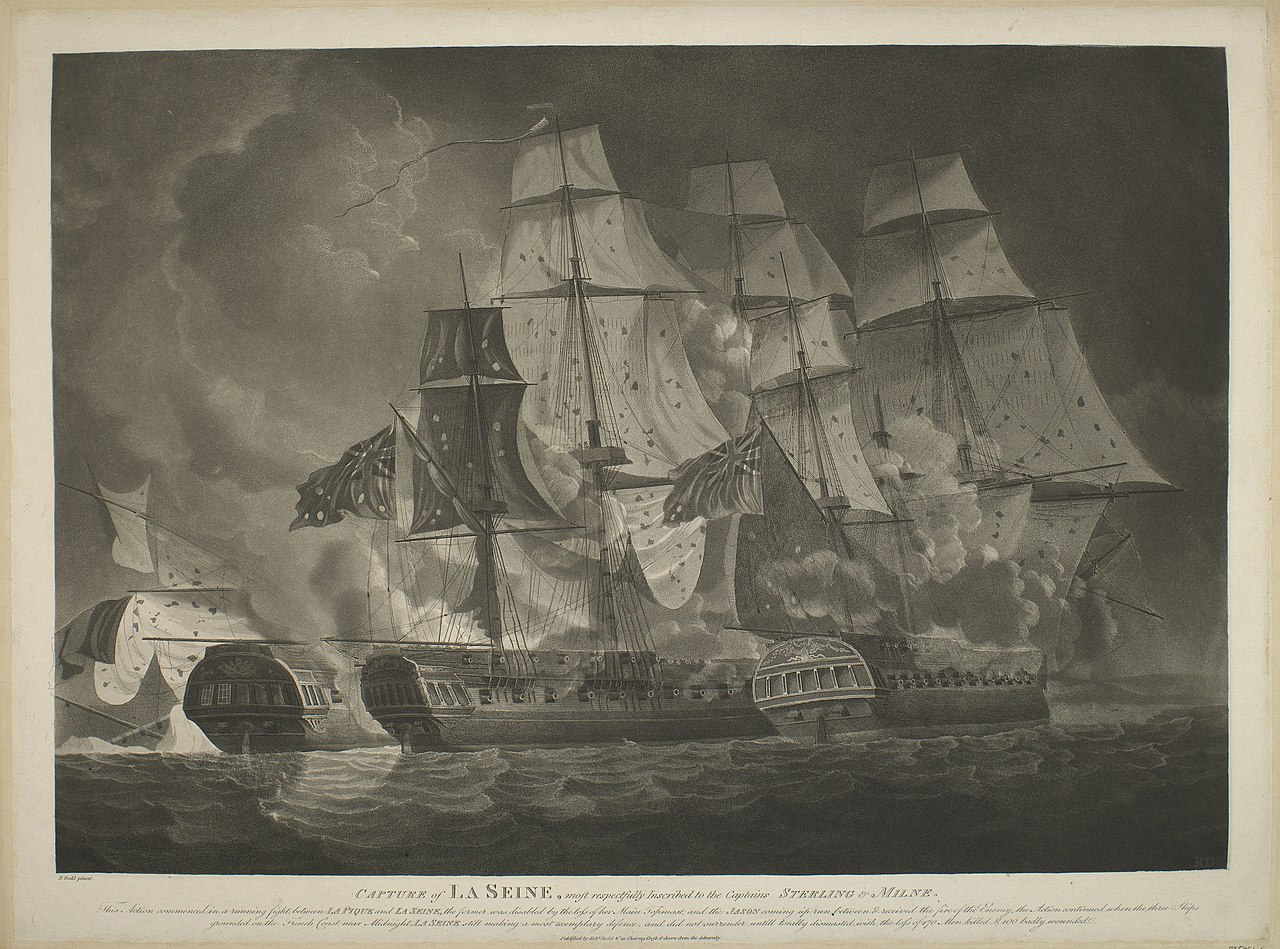
I admire your passion for the subject, turning over every stone and sharing with us. I wonder if its possible to reconcile some of the visual elements to other sources to get a sense for how these reconcile and the reliability of the artists eye portraying what was there - for example using sources for masting dimensions for the period (if any?) to get a gut check. I always think of a classic painting by Turner - clearly impressionistic to highlight the majesty of the ships, containing a lot of detail that could arguably be relied upon based on his familiarity with ships of his day. However, the proportions and scale of the figures, ports and small boats are incredibly misleading. Looking at the masts, he has made them too short in proportion to he height of the hull which is greatly exaggerated, this seems to be a trend in all his works. Just food for thought.
- 2,699 replies
-
- 6
-
-
- heller
- soleil royal
- (and 9 more)
-
Love the last photo with the yellow robe Nils with, he fits right in to the look of the ship.
- 692 replies
-
- 6
-
-
- eagle of algier
- chebec
- (and 2 more)
-
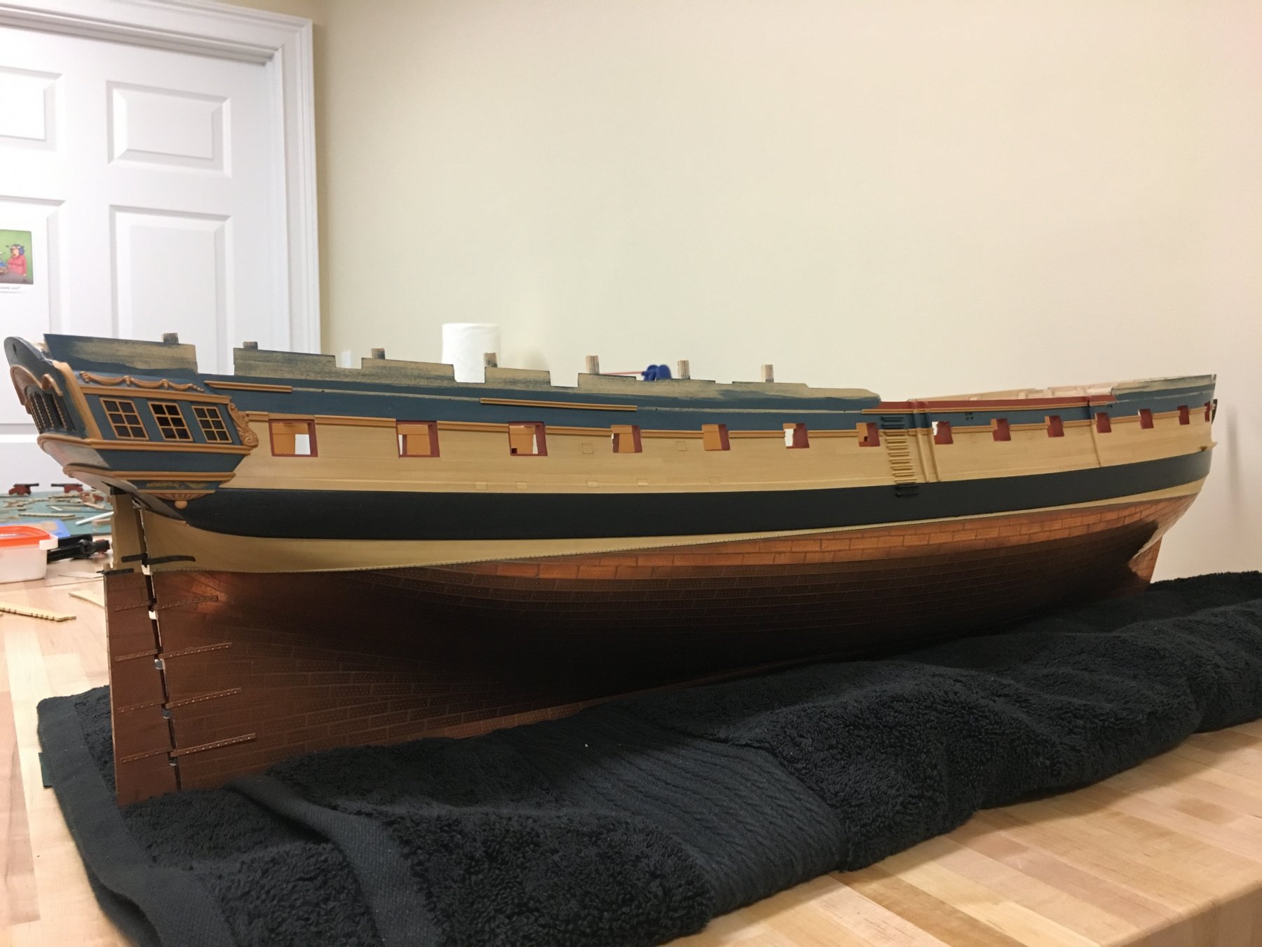
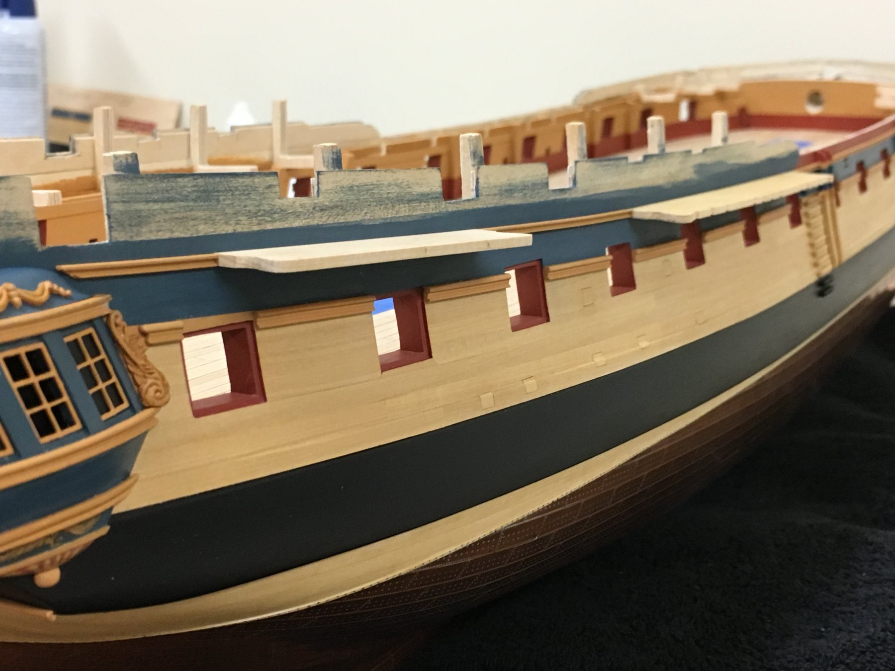
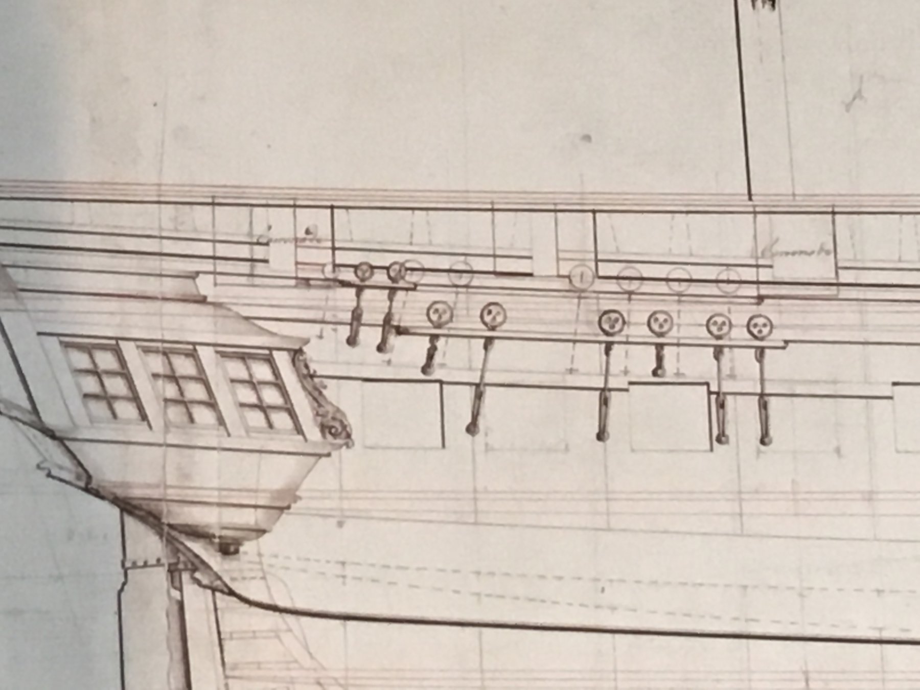
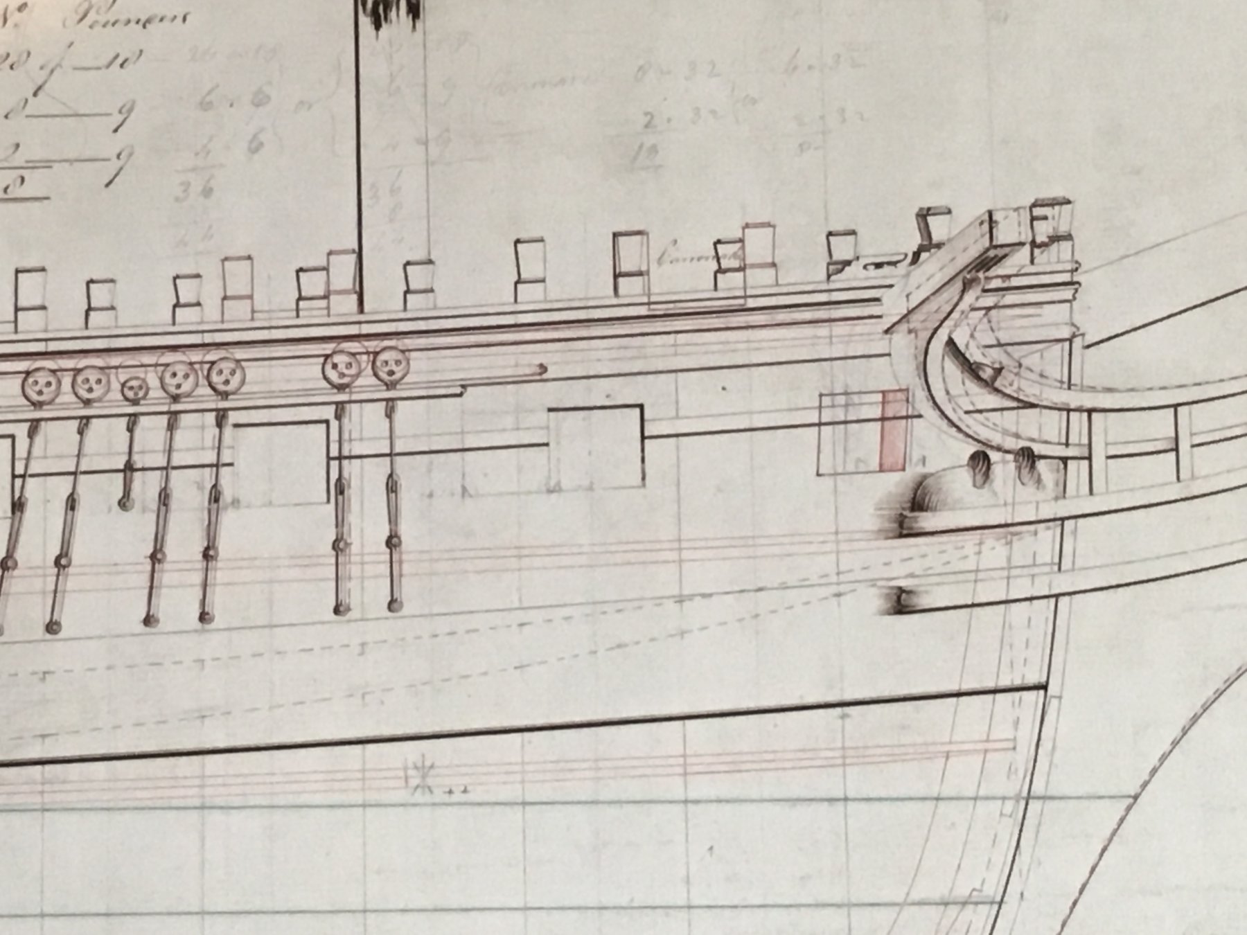
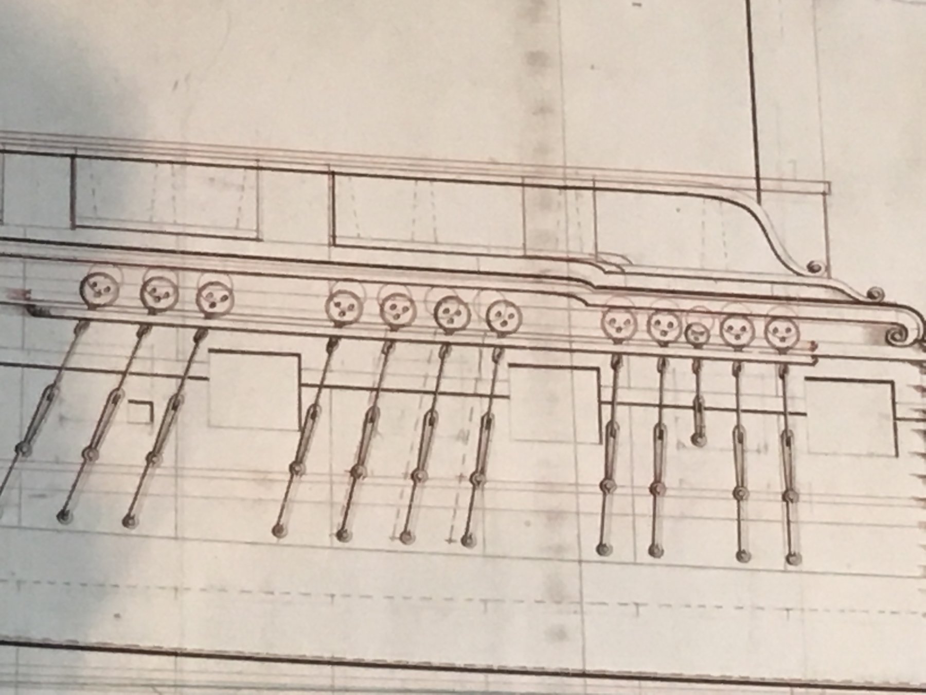
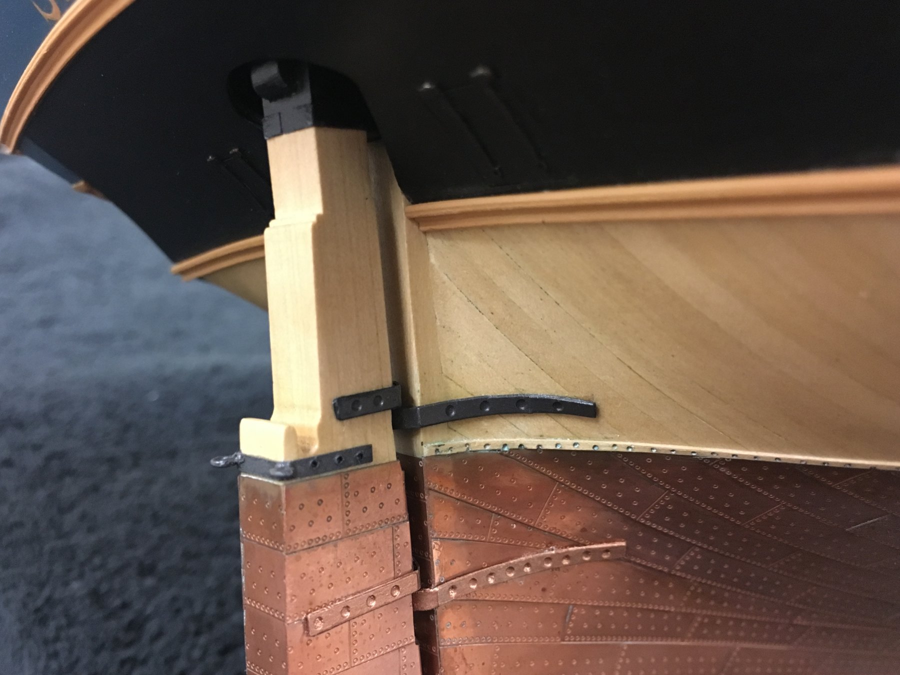
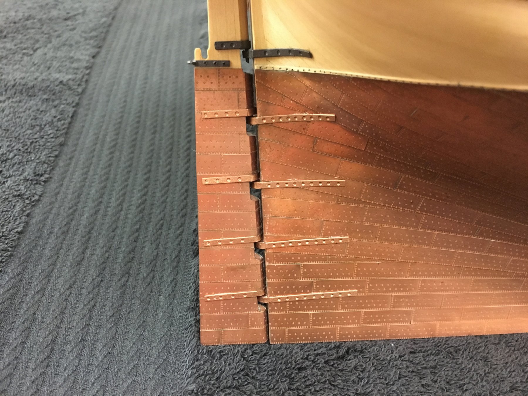
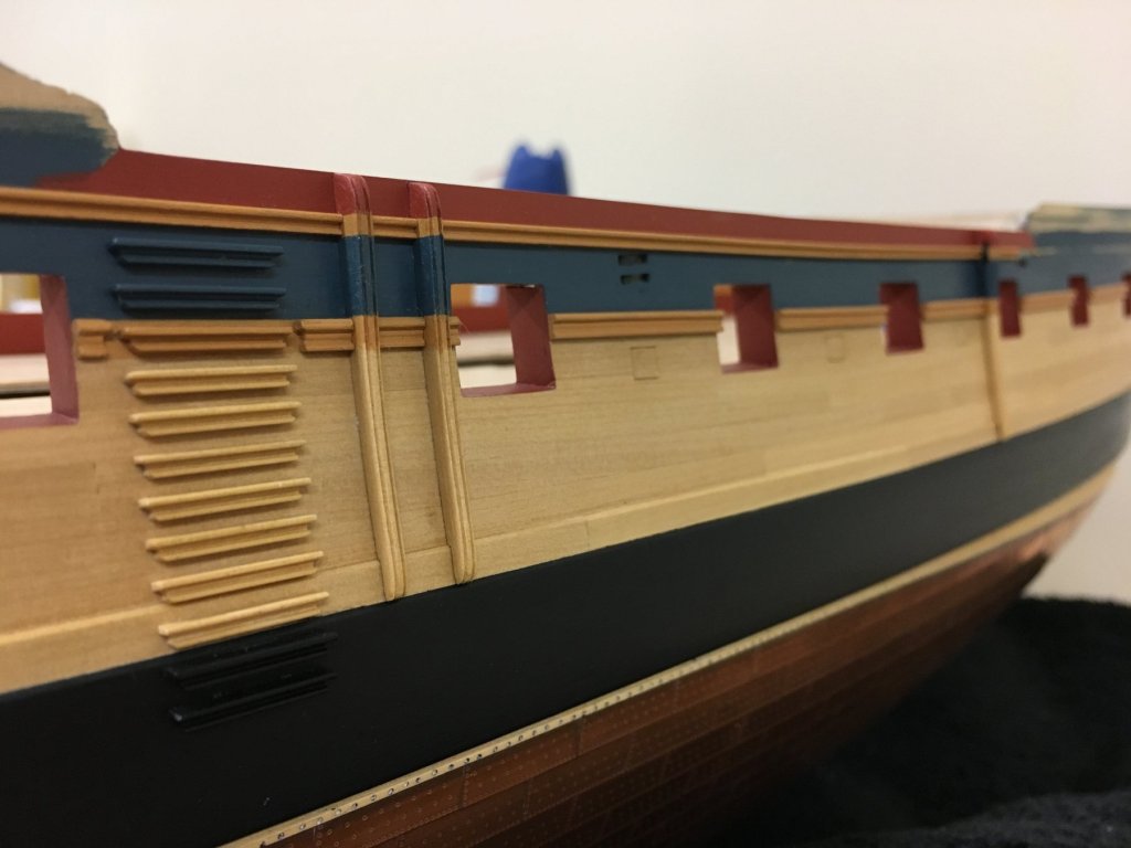
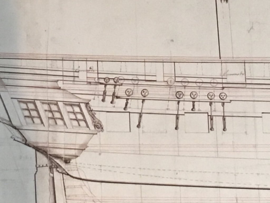
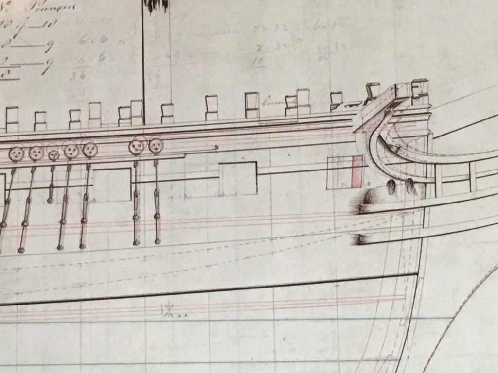
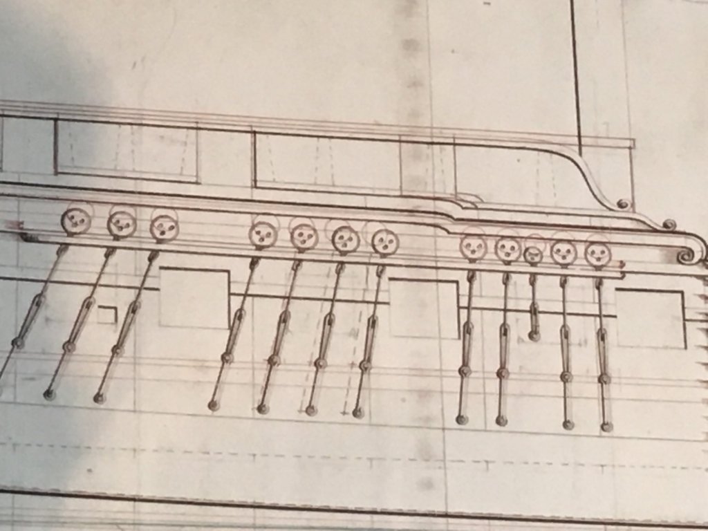
OC, Thomas, Eamonn, thanks for kind words. @ BE - jury is out on a rudder coat, I've seen the great result you achieved, what I'm wrestling with the aesthetic and the quality of the result I might achieve. In the event I don't, I did simulate the end of the tiller @ Carl - You reiterated my dilemma 1:64 is a scale where it seems sometimes that details are a question of compromise. The downside of using raise pins is that to my eye, they appear more obvious and overscale - and also runs the risk that it would be hard to get these positioned accurately Staying with the indentations, from typical viewing distance it is not obvious to the eye that the indents are in fact indentations rather than raised (think of the classic 'hollow face' optical illusion). The rudder straps were unaltered and show how these parts came. Anyway...I was very excited to finally receive my copy of the Diana plans from NMM. WOW! I've never had a chance to see these types of plans before and I'm very impressed, not only will it hopefully become a nice decorative piece, but its very informative. Even though the plan indicates it's 'Diana' (non-contemporaneous pencil annotation), it appears to me that these should be considered to be more generic to the Artois class as a whole - there contemporary are annotations indicating that the foremast on 'Jason' and 'Diamond' were moved forward 6 1/4" - but, I'm not going to make any changes at this point as its quite subtle. There are so many details that are much clearer than in the AOTS or kit plans, but few items just for starters...(the poor quality of my photos do not do justice to the print and colours didn't come out well.) Given I'm building roughly 'as designed', I will need to reconsider a few things: The position of the mizzen channels, these are placed lower than the kit plans and AOTS which reflect the 'as built' higher position. Looking at the classic Diana models, I now see this is indeed where they are positioned. The structure of the chains is also very different to what is provided in the kit. This view also shows evolutionary changes to the positions of the cannon and carronade ports. To hopefully resolve a discussion/dilemma experience by Diana builders...my opinion estimating from these plans (and assuming plans to be correct scale) is that the kit stern frame are too wide at the top of the rearmost bulkhead by about 5mm. Not too significant, but enough to cause the misalignment with the stern fascia and light positions experienced by all builders it seems. Correction of this and other bulkheads would not be hard when starting out on the kit, but would need to be done prior to planking. The main channels are shown positioned below the sheer rail 'as designed'. Unfortunately I've been working to have these in line with the sheer rail (as built it appears), but am not going to make changes as the difference is quite subtle. The built up bulwarks are also clearly shown, the kit provides for, and reference made in AOTS to Diana having a more decorative style consistent with the open bulkhead profile - the plans show these as the more standard, utilitarian square profile that later became standard. The bow sections shows a number of interesting aspects: Changes to positions of timberheads to accommodate evolving cannon/carronade compliment Inclusion of a forward port (as built) which I suspect would have been for access to the cathead/anchor rather than including a cannon. This would have been a nice feature to add, but would require significant rework earlier in the build (more than I did) to allow this as it aligns with the foremost bulkhead Also seems that there was some variations on the profile of the stem, and position of the cathead
-
HMCSS Victoria 1855 by BANYAN - 1:72
Beef Wellington replied to BANYAN's topic in - Build logs for subjects built 1851 - 1900
Catching up Pat, great progress. I'm similarly pondering the rudder chains so will be interested to see what you uncover. I wonder how much history there is of rudders becoming unshipped, intuitively it just seems very improbable considering the length of pintles and the fact that the motion would need to be perfectly in line with the hinge line. The photo of the chains with multiple attachments is very interesting, way more than I've seen on most ships. Is it to minimise drag caused by the chain being in the water?- 1,018 replies
-
- 3
-
-
- gun dispatch vessel
- victoria
- (and 2 more)
-
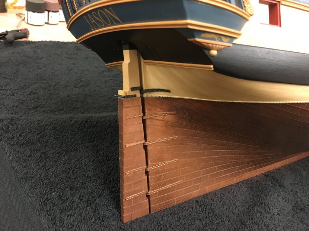
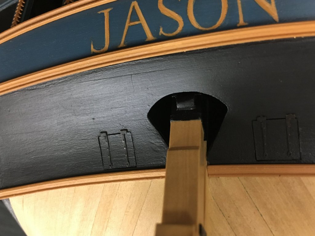
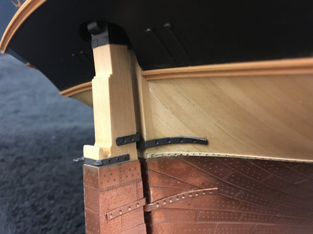
Thanks all for the nice words, likes and continued interest. Know its been a while, seems as if I hit some sort of 'modelers wall'. Before I can really continue with the topsides, I needed to turn my attention to mounting the rudder. This is something I've been putting off for quite a while, and proved to be a very frustrating experience. I had initially delayed doing this to allow the copper to oxidize as much as possible just in case of any errant CA glue and prevent shiny spots. The kit provides PE rudder and pintle straps, but for some reason I couldn't get comfortable with them. On Snake, the staps come with holes and pins were inserted, but this was something that in retrospect look a little too clunky and out of scale. Looking at pictures of period ships, the bolts/nails are quite a subtle feature similar to treenails in visibility. I experimented with card and styrene strip to make these from scratch, but in the end decided to go with the supplied PE parts. I forgot to take a picture, but instead of premade holes, these have rather large circular indentations in them, I'm guessing to simulate the bolts. To my eye they looked to far apart, and the holes too big. I made a slight alteration to increase the number of bolts/nail heads by drilling additional indentations to simulate what was already there. The rudder straps also needed to be shortened quite considerably to eliminate overhang at the rear of the rudder. These were painted with "Admiralty copper" paint after experimenting with other similar Tamiya colours. The main challenge I found was to attach these without marring the copper plates, and this proved to be quite the challenge as at first the CA glue wouldn't provide a good bond and needed to be reapplied. Scratching the hull plates and inside surface of the PE seemed to get things strong enough. The rudder proved quite the challenge to mount as this had been made with a low (for me) level of tolerance following the AOTS plans which is documented earlier in the log. Interestingly, the box artwork shows a spectacle plate, but there is nothing in the kit nor instructions. This was simulated using painted card and eyebolts, but interestingly there is very little room for this, however this seems consistent with AOTS diagrams. The ironwork on the lower counter ports used some PE parts from the "Badger" set which I had bought a number of years ago. These looked a little more in keeping scale wise than what is provide in this kit. I may add ring bolts and rings to these, but will likely not rig with line as I'm concerned this may be a visual distraction - personal preference of course. Next up will be to attach the rudder chains which, nicely, are provided in the kit.

-
Very nice start on 'Cheerful'. I like your heat bending setup!
- 574 replies
-
- 3
-
-
- cheerful
- Syren Ship Model Company
- (and 1 more)
-
Hi Stergios - I got them from Blue Jacket Shipcrafters. I seem to recall they were the 'bullseyes' - but don't recall which ones exactly... http://www.bluejacketinc.com/fittings/fittings4.htm
- 800 replies
-
- 1
-
-
- snake
- caldercraft
- (and 1 more)
-
Looks good Rob...and I like the blue! Glad it wasn't just me that had a bit of a tough time figuring out the stern, but looking very nice. Interested to see how the lights turn out. I agree with you, the width of the stern frames do not tie in with the projections in the AOTS. I have the 1:48 plans on order from NMM so will be interested to see which proves most accurate. You look to be on track making sure everything aligns nicely, trial and error seems to be the only way and recognizing where compromises are needed to keep the 'look and feel' - even when the projections are scaled to account for the curve and the angle, it doesn't account for the curvature of the fascia in 3 dimensions and how the lower curve appears.
-
Thanks for sharing this so far, looking forward to seeing more like so many others!
- 47 replies
-
- 2
-
-
- queen anne barge
- Syren Ship Model Company
- (and 1 more)
-
I'm glad you corrected the signal deck, the details you added make it looks so much more authentic and visually appealing. Nicely done!
-
I am really happy to see this, and most importantly, that everyone can work together for the benefit of both companies concerned and the broader ship modeling community.
-
Lovely work Jesse, seems like I've missed a fair amount of progress. Love the way the hammock nettings turned out.
- 1,306 replies
-
- 5
-
-
- syren
- model shipways
- (and 1 more)
-
Thanks Pat, Stergios, Jesse and the 'likes' for your continued interest, it is a great motivator. Rob - glad the pictures are helpful, that's exactly why I think I tend to err on the side of posting too many pictures... Carl - there is a pair, how "matching" the pair is open to debate, but luckily they will never be seen side by side Mike - here's where I describe how I did the lettering, the filigree was done in exactly the same way. Everything is pretty much free hand so I'm not sure I could replicated again if I tried. Just jump in and realize there its just paint so nothing really horrible can go wrong!
-
Nice clean start Valter, I'll pull up a first row seat and follow as this is a very nice kit.
-
Will most definitely be making the trip down to Mystic to see this exhibit and 'Terror' in person - can't wait until November!
- 346 replies
-
- 4
-
-
- terror
- polar exploration
- (and 2 more)
-
Yes, it should. I don't think the step should be quite so pronounced, and the right stepped section should thin gradually as well. I think you're clearer than the plans at this point so just ignore them!
-
Mike - I think its a view from above, and it looks to be correct. The widest part is where the bowsprit sits, and the thinner part is the top of the knee of the stem. The reason for the jump rather than smooth transition is that it accounts for the difference in width between those two points. Hard to describe, but clear in my mind :-) Nice work BTW, good to see some progress.
-
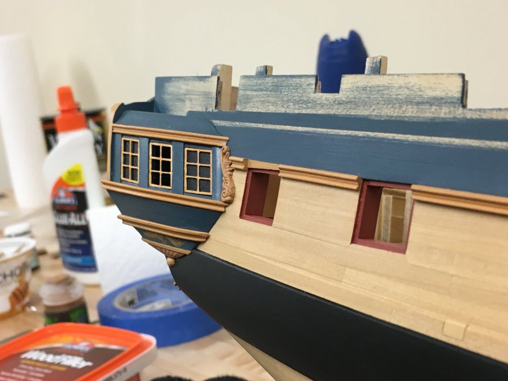
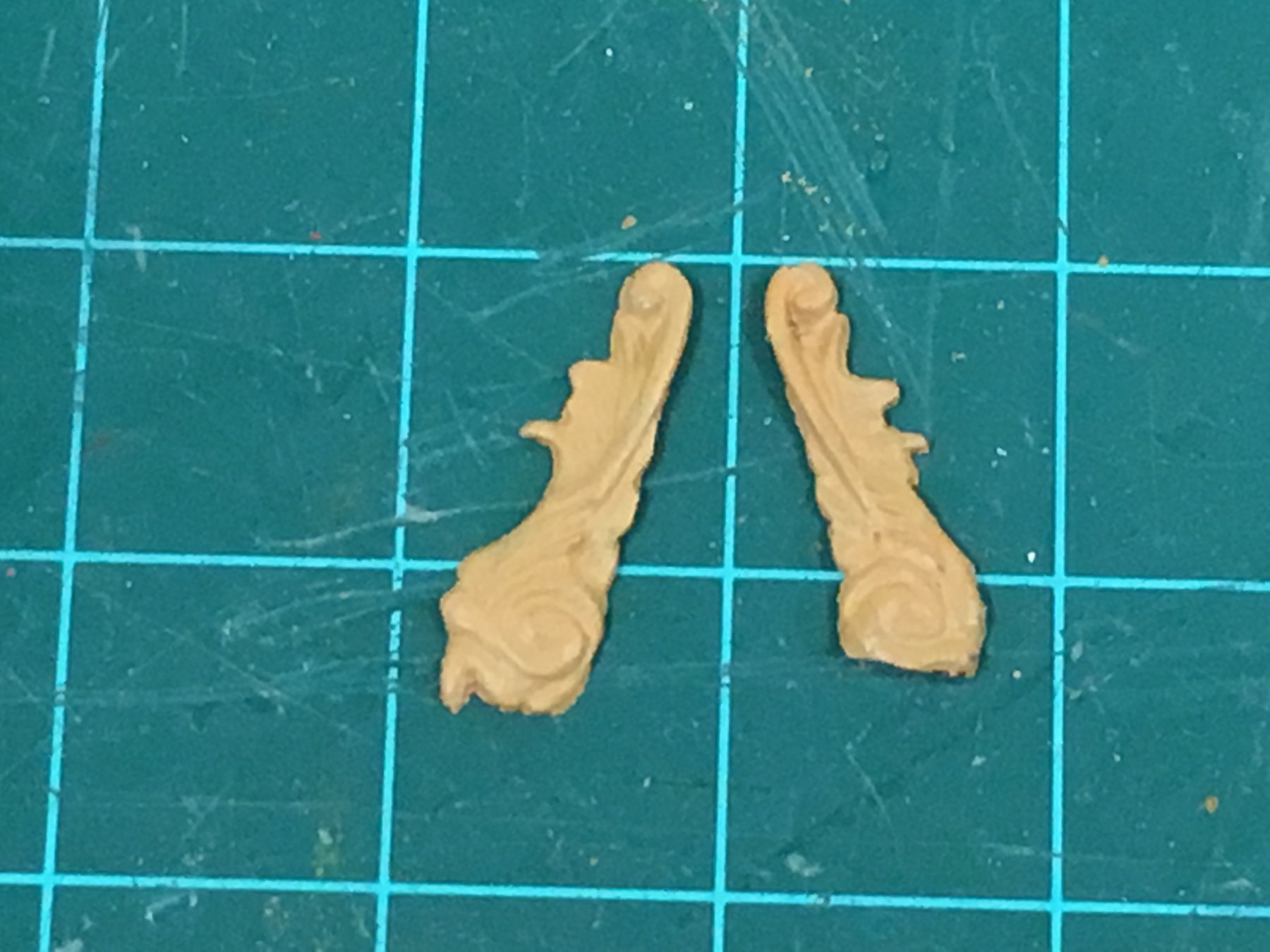
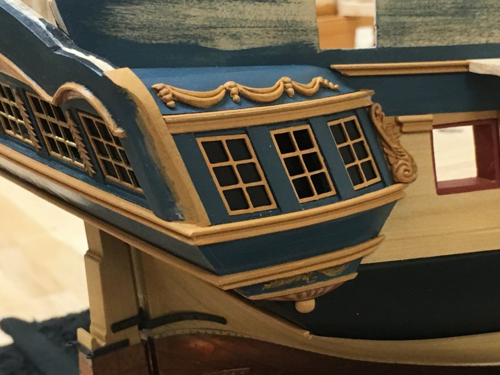
Happy New Year to all! Not too much to show for a little bit of extra time in the shipyard, but have put a bookend on the work at the stern and quarter galleries for now. Basically, all I've done is glue the quarter gallery sections in place together with the various rails (Upper stool, rim and lower stool rails). This took much longer than expected as I had so many pieces of rework, either because if breakage when shaping, fitting or by trimming a little too much (despite reciting 'don't take off too much' continually under my breath) and needing to restart. It was also challenging as the quarter gallery rails needed to match as well as possible to the upper and lower counter rails. Anyway, don't think the pictures need much additional explanation - other than that some are taken without any touchup, but the extra time afforded by the site outage allowed me to get a little more done. Suffice to say, I'm very pleased with the way the quarter galleries turned out, definitely challenging, but worth the extra time. The PE lights still require some work and these will not be put in place yet, but I wanted to get a sense for the overall look and the lines. Of course final judgement is left to others The kit supplied console brackets proved to be a little oversized, to keep the same feel as the plans I wanted these to fit snuggly between the upper stool and the rim rails. For comparison, you can see the adjusted starboard side bracket to the not yet adjusted port side on the left. Taking a step back to compare to the plans and assessing varied angles I think I've done as much as can be done to bash any provided parts into something a little more consistent. As always, the human eye is a little more forgiving in person. The plan profile is enlarged from the AOTS book. The quarter gallery sculptures now have a definite 'ledge' to visually support them and I'm glad I invested the extra time here.