
Beef Wellington
-
Posts
2,249 -
Joined
-
Last visited
Content Type
Profiles
Forums
Gallery
Events
Everything posted by Beef Wellington
-

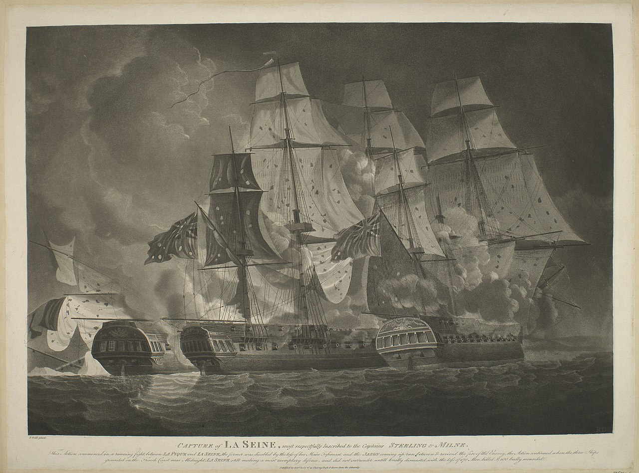
1814: British vs French Frigates!
Beef Wellington replied to uss frolick's topic in Nautical/Naval History
You need to define 'best'...the criteria for which will vary significantly given that every aspect of ship design is a trade off and ever country had different design priorities - e.g. Cruising endurance, cost, manning requirement, firepower, speed, stability, strength, longevity....etc etc etc -
Arriving late I see, but, at least I'll see the finish. Lovely boat Mobbsie and great artistic choice for the woods and colours. Looks huge!
- 129 replies
-
- 5
-

-
- armed launch
- panart
- (and 1 more)
-
Great result. In my opinion the fact that they are difficult to see, yet subtlely apparent, means that you've achieved just the right balance if the photo is anything to go by. That side view shows your planking off really well.
- 156 replies
-
- 4
-
-
- pinnace
- model shipways
- (and 1 more)
-
I agree wholeheartedly with Martin, a waterline set too low creates an unbalanced look in my opinion, a higher line, besides being more historically accurate, provides more of a sense of "heft". On my Snake the waterline is in my opinion too low (but not horribly so) which I did in blissful ignorance, but I see it everytime I look at her.
-
That looks awesome and looks like it'll work, great solution! I'm intrigued as to where you'll go with the stern decorations, its a great excuse to get familiar again with Greek mythology (for fun out of school). A final suggestion would be to check out is the alignment with the anticipated lower cheek placement, you'll probably want to ensure that the bottom of the figurehead (or tail!) aligns with this. You should have some wiggle room, but if there is one thing I've learned is that on this ship it takes a lot of forward planning to avoid getting sucked into problems when its too late, especially with making custom modifications.
-
Looking great Dave, very nice indeed.
-
Very innovative solution Rob, looks great. Not sure if you've done it already but it could be worth checking the bowsprit alignment if you can. I seem to recall that the plans show this presenting a smaller angle than the AOTS, but even with a steeper rake there is precious little room between the bowsprit and the top of the figurehead, even the supplied Diana figurehead. Now get back to those gunports!
-
Very nice progress Sjors with the planking, and very brave to not do double planking! So no stripes? At the stern I wonder if you will need to do a little spiling or thinning to get the planks to sit properly around the sharp angle at the stern. Otherwise the planks may become harder and harder to bend until its impossible, but of course it is difficult to judge with only seeing pictures.
-
Count me in as well, great start! I think you are referring to HMS Belfast, a Town class light cruiser which has a very storied history being also involved in the sinking of the Tirpitz. Her largest guns are only 6in , so maybe 'big gun warship' is a little bit of a stretch
-
@Sjors - I had to close the shipyard early to run all the needed errands and finish work to allow me to go on holiday....we leave tomorrow.....early....very early What is a Ketelbinkie? - Kettle blanket?
-
Awesome work Jesse, everything has already been said!
- 1,306 replies
-
- 8
-
-
- syren
- model shipways
- (and 1 more)
-
There are a number of pretty well documented Snake builds on this site so you should have plenty of reference material. This was my first build (and still not quite finished), but its a great kit and you should have lots of fun. There are definitely some challenges with the kit and options for improvement. Good luck.
-
That's a really nice looking model you have there Duncbe, great work! I see you have already started your Snake, so need to head over there....
-
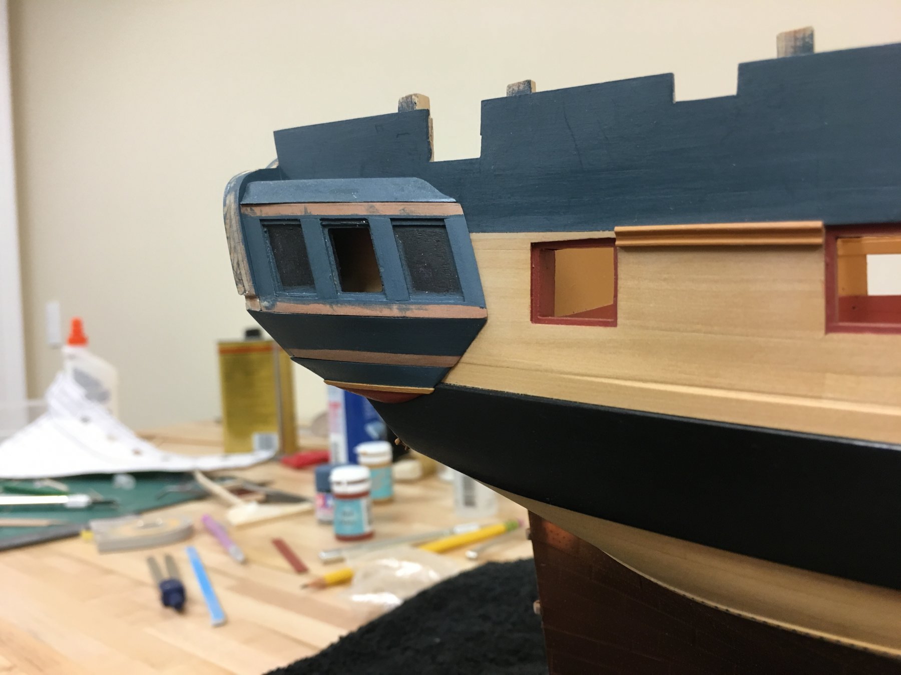
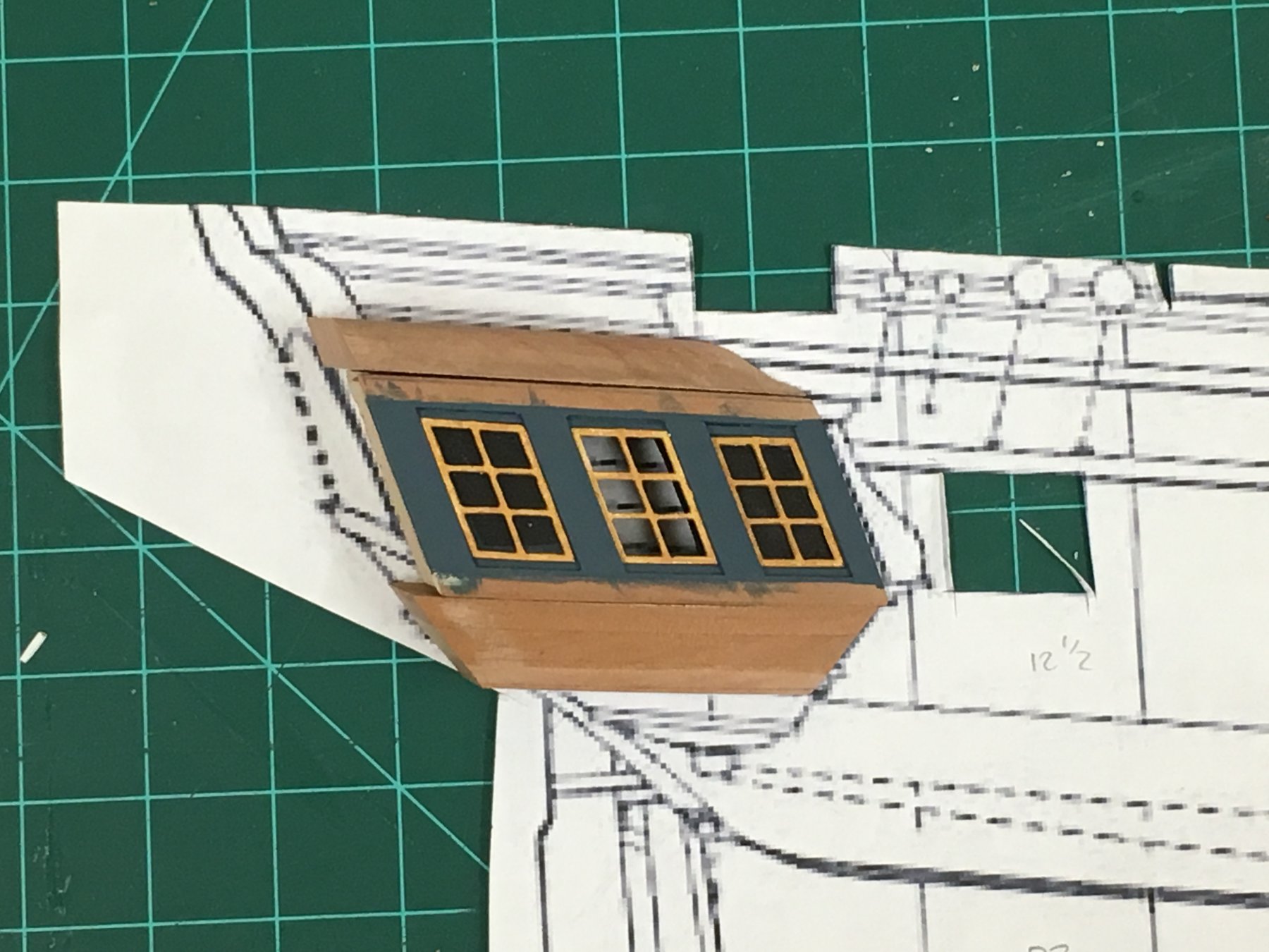
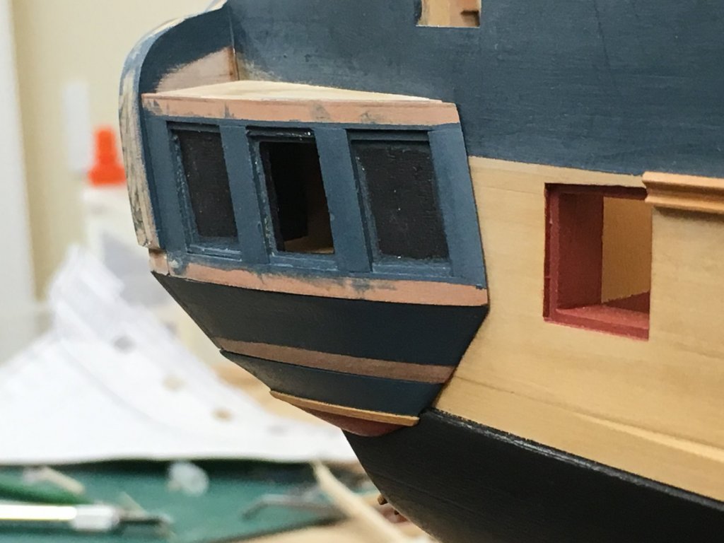
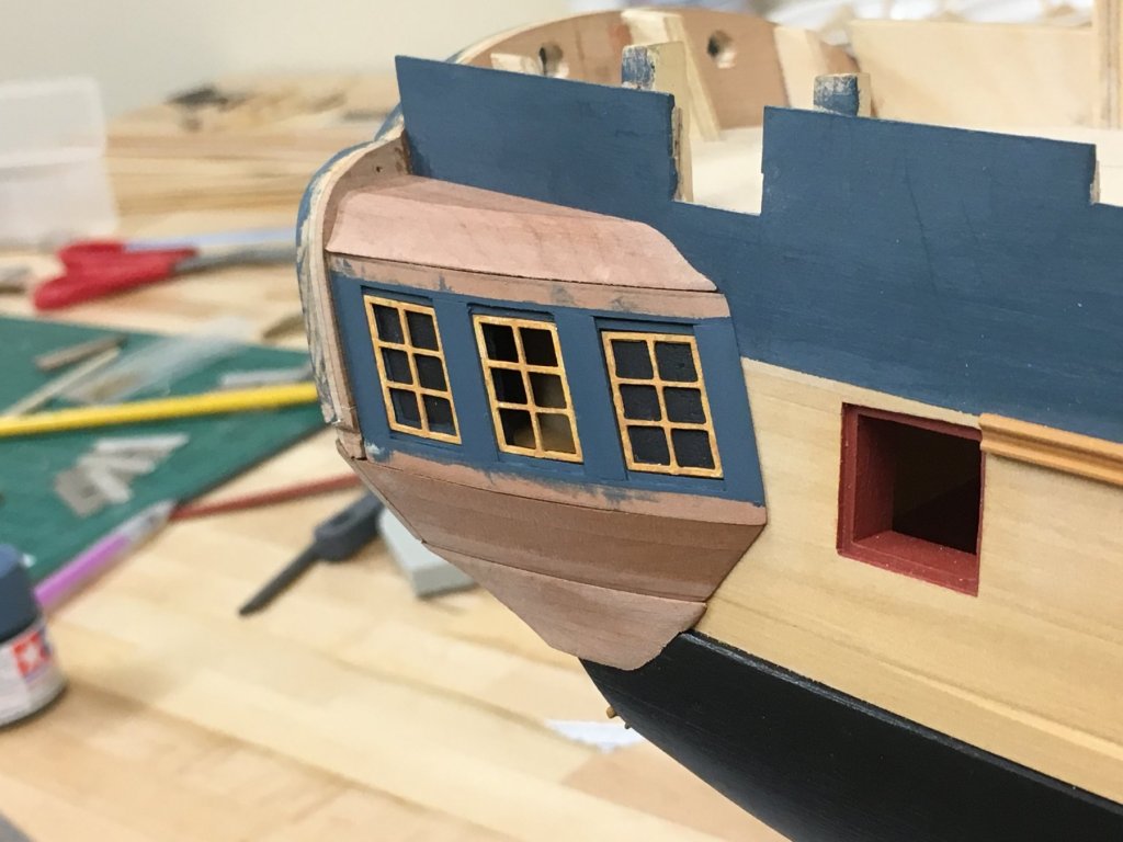
So will be off on the family holiday for a few weeks this weekend so needing to step away. Here's where things stand, not wanting to jump into anything else as I know I'll be rushing, so "down tools" it is. The quarter gallery berthings are both now glued and the edge with the upper counter tidied up, everything else is dry fitted. The lower finishing proved to be quite the interesting pieces to make. The profile is very clear from the stern and side elevation, so combining that with the curve of the quarter gallery berthing and the straddle over the wale edge meant plenty of shaping, and checking to see things looked OK from all angles which was more of a challenge than I would have expected. Decided to dispense with the kit supplied metal molding for the drop as this didn't seem to match, and anyway seemed easier to take my own approach than fight with that. Drops still to be made. The provides a PE "X" for each side, which I think is an approximation for some decoration looking at some of the Diana models. I'm leaning toward painting my own decorations here but will think a bit. Hopefully pictures speak for themselves from the various angles...the macro gods are surely against me as the finish looks more acceptable in person

-
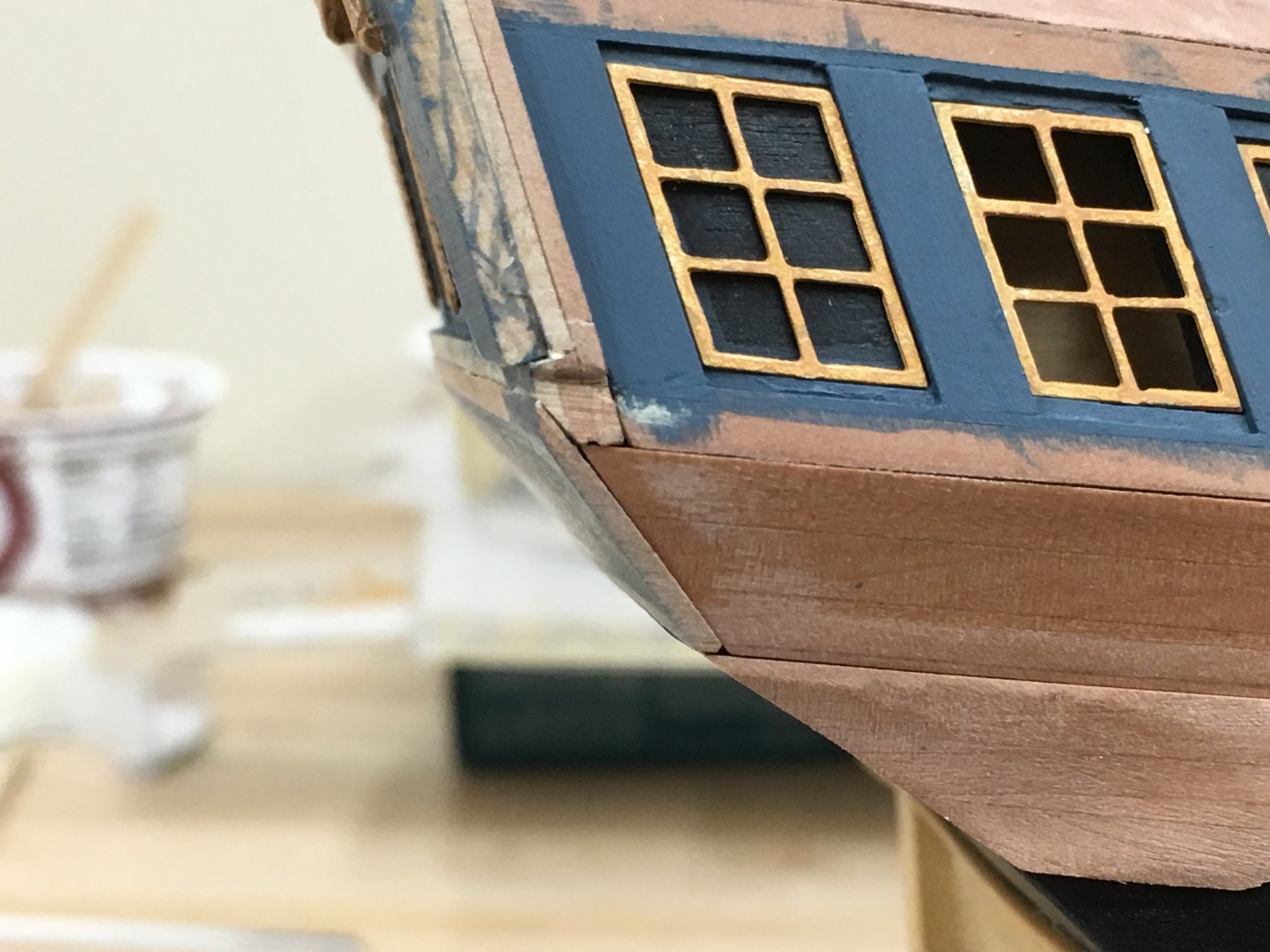
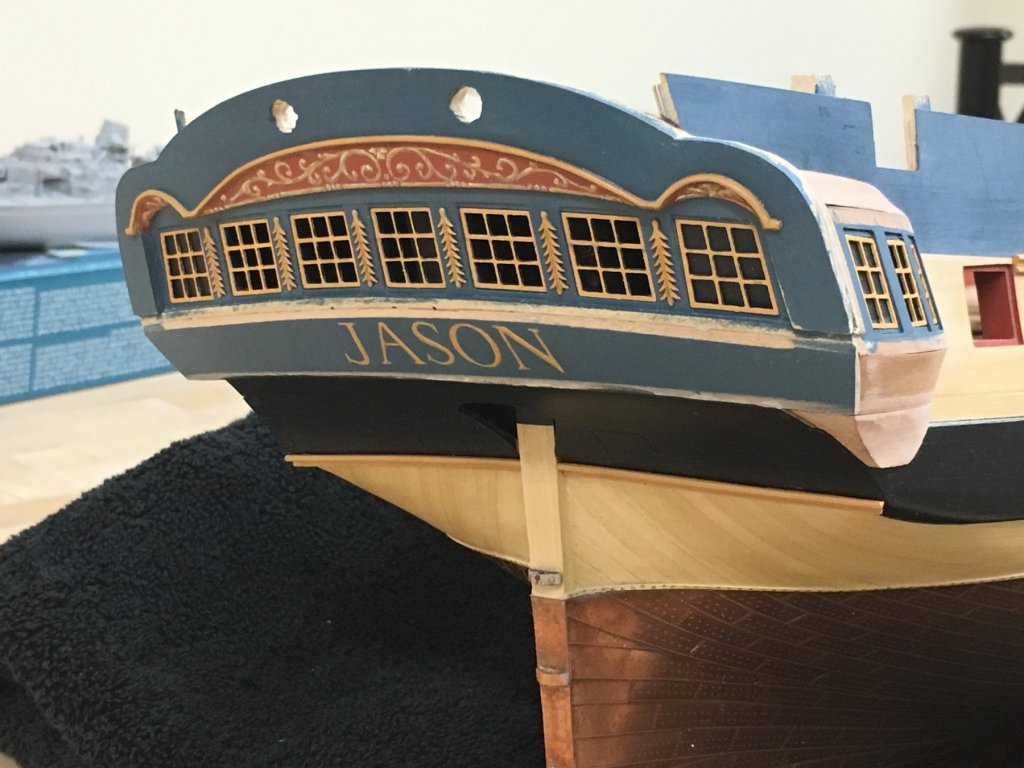
Cheers guys. @Christian - I think the stern and side galleries are the right of passage on this build. Hopefully have an update soon. @Mike - It wasn't very scientific. I created a template from one of the prints I thought had the best fit, and made pin pricks at the extremities of the letters to get a rough layout using a dry brush and brown paint. I couldn't get chalk to work consistently. After a coat of wipe on poly on the blue to protect it, the letters were gradually outlined with diluted paint and the smallest brush I had. Starting off with a darker brown, then yellow ochre and finally ivory highlights in very small amounts. The ochre had many dilute layers. It's pretty easy to cut in with blue if mistakes, resizing or realignments are necessary. I tried not to over think it and it just let it appear.
-
I love seeing models that really give a feel for what it would be like to be on the real article, really nice progress. I hadn't really thought about the access to the rear cabin area, will there be a companionway from the upper deck to help access or is access only from the hold?
- 682 replies
-
- 5
-
-
- halifax
- lumberyard
- (and 1 more)
-
Looking great Rob. As I'm sure the other Diana builders will attest, I'd suggest double checking the stern fascia and window position as well just to make sure of placement.
-
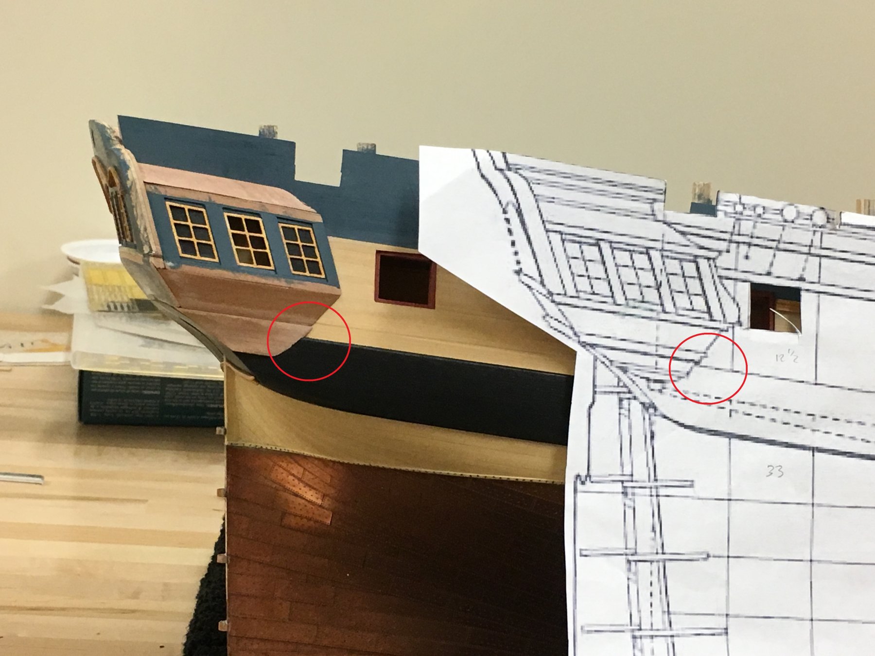
Pat - The more I think it through the less I'm thinking of creeping error. The line and height of the gunports is pretty much set by the sheer of the deck, and it would look odd to move the wale up 3mm as it would be wider at this point because the bottom of the wale can go no higher than the bottom of the lower counter. The only proactive solution would have been to adjust the height of the lower counter which would then have resulted in other proportional issues...Bottom line, the kit parts do not match the true shape of the plans, but don't think the differences are unreasonable and I don't think impact the look of the model - unless you are really looking. Similarly, the aft gun port is a little too far forward even in its rearmost possible position, another difference of probably 2-3 mm which again doesn't impact the overall feel. If I've learned one thing, its that this can be a tricky little kit!
-
Very interesting model Kevin, always been intrigued by these Fleetscale offerings.
-
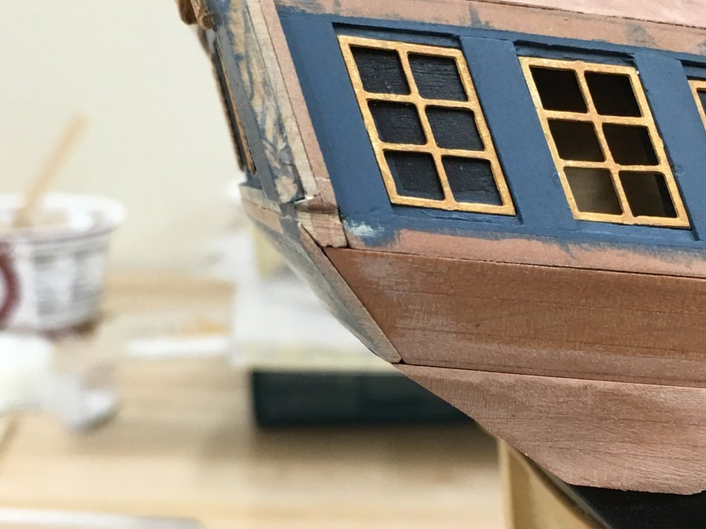
Thanks for the comments and likes everyone. I did step away from the paintbrush. Lot of work and a little progress. The upper counter has been glued in place and trim added to the bottom of the lower counter. These were once again pre-shaped and as it was can be a handful. They highlight a few errors in the hull shape but shouldn't be noticeable to most (I hope). Now the work on the side galleries can continues in earnest. The main pieces had already been made up and just required a little fettling for now. The lights are all in temporarily as I find they do alter the perception of the surfaces. Following a similar approach to that laid out in the instructions, the lower counters were made up from laminating some spare 3mm pear, there's nothing wrong with the kit supplied mahogany parts its just that I messed up the first time and there wasn't enough spare, something for others to consider. None of these items are glued in position yet. The lower gallery piece was made up first, these were given a slight concave curve to avoid them appearing to sag, may need to do a little more here but I'm leaving alone for now. The drop is proving the most challenging because its so fiddly and needs to follow the lines of the lower counter - this is still work in progress and have a few mistakes already behind me. The upper finishing was cut from a 5mm pear which matched the ATOS profile dimensions best (the kit calls for 2x3mm laminated pieces) - this piece was a practice to get a sense for the suggested shape and will need more work. Overall, everything seems to be fitting together as planned - although looking at the close up photos the camera is definitely not being my friend. The bottom of the gallery should be parallel to the wale, also match the angle of the stern fascia...which needs to match the angle of the rearmost false light. So now things are now being positioned, the first non-fixable alignment issue becomes apparent! Looking at the AOTS profile, the bottom of the lower gallery should meet the top of the wale. The bottom of the trim will sit at the top of the lower gallery - so this is out by 3mm. Not much, it just means that the top of the drop will straddle the wale, and I'm not overly concerned as it seems looking at many other profiles that this positioning can be above or below the wale. As for the reason for those also building the kit, there are probably many contributing factors - and I'm sure its a cumulative effect from positioning of the stern fascia where I estimated it needed to go, the wale could also be slightly out of position, the kit sheer of the deck could be different and the bottom of the counter way back when framing could also have been out. Interestingly, had I used the 3mm strip above the wale for the black strake, and had this been painted black, this would have met exactly - but that I suspect would have been a lucky coincidence. Bottom line, could be a lot worse, and I'm happy for now Onwards!


-
That boat looks great Jessie. I can't believe how thin you must have been able to get the base structure to allow you to double plank inside and out, sure patience played a big part. Very nice work.
- 1,306 replies
-
- 9
-
-
- syren
- model shipways
- (and 1 more)
-
Looks wonderful Bob, really nice joinery, there must be quite a few complicated angles to deal with.
- 682 replies
-
- 5
-
-
- halifax
- lumberyard
- (and 1 more)
-
Just amazing Greg, the weathering and the PE detailing just look awesome....picks chin off floor....