
HOLIDAY DONATION DRIVE - SUPPORT MSW - DO YOUR PART TO KEEP THIS GREAT FORUM GOING! (Only 13 donations so far - C'mon guys!)
×
.JPG.ca33079f5815b861e67b9c2cccd37982.JPG)
Blue Ensign
-
Posts
4,564 -
Joined
-
Last visited
Content Type
Profiles
Forums
Gallery
Events
Everything posted by Blue Ensign
-
 Shrouds and ratlines look spot on to my eye now Christian B.E.
 -
Neat work Andy, hull looks in fine fettle for the next stage B.E.
-
This project is so fascinating to follow Nils, wait impatiently for the next update. B.E.
- 2,625 replies
-
- 7
-

-
- kaiser wilhelm der grosse
- passenger steamer
- (and 1 more)
-
Love these snippets of information about life on the plains B.E.
- 467 replies
-
- 2
-
-
- fly
- victory models
- (and 1 more)
-
Our discussions regarding pennants has led me here Pat, don't know how I missed this one but what a treat to read your log, and what a fine model you have created. Your Ensigns look good to my eye, nice work. B.E.
- 517 replies
-
- 4
-
-
- Endeavour
- Artesania Latina
- (and 1 more)
-
Pennants Flown from Mastheads c1770
Blue Ensign replied to BANYAN's topic in Masting, rigging and sails
I'm a bit confused Pat, as far as the 18th century is concerned my understanding is that the 'commissioning ' pennant is raised at the start of a commission and is kept aloft for the duration of that commission. That pennant took the form of either a common pennant or one of the squadron colours. I am not aware of a separate pennant also being at the masthead, nor have I seen such an example in contemporary art of the period, I would be interested if evidence of this is available. Cheers, B.E. -
Pennants Flown from Mastheads c1770
Blue Ensign replied to BANYAN's topic in Masting, rigging and sails
Sorry, sloppy English, I was of course referring to the Common pennant, which is the subject of this discussion. B.E. -
Pennants Flown from Mastheads c1770
Blue Ensign replied to BANYAN's topic in Masting, rigging and sails
Hi Pat, Commissioning Pennants came into use around 1661 probably earlier and continued to 1850 (Flags at Sea) As for size, there were given proportions based on breadths of cloth at given widths used to make up the flag size. - see. (p87/88 flags at sea) As an experiment I took the given 6th rate breadth of 9" x the number for the largest Ensign (14) which gave me a depth at the hoist of 50mm (at 1:64 scale.) I then used the drawings in the book on page 20 to work out the length to breadth (fly to hoist)) ratio in percentage terms - 68.42% which gave a scale length of 85mm. So my Ensign had depth at the hoist of 50mm and length at the fly of 85mm. Same principal applied to the Jack drawing which gave me scale size of 30mm x 45mm For the Common Pennant I used the given figure of 16 yards which scaled to 230mm. The depth of the Pennant I estimated at 12mm which gave me 4mm for each of the three colours. The acid test is how they look on the model for size. The first important factor is how do they relate to the Ensign and Jack staffs. Here's a trial fit on my Pegasus, not too bad to my eye for an opening attempt. The jack could be a tad smaller I think in relation to the staff, but the Ensign looks close. The Pennant looks ok to me for length, maybe needs tweaking a tad in the hoist depth, but not much. (A tricky issue if trying to replicate the Common pennant.) Endeavour and Pegasus were close in size, so if you scale up for your build this may at least give you a starting point. When I get around to it I will make the flags out of tissue, but they will be draped rather than flying as I prefer the look. Hope this helps. ps: If you would like to contact Robin, you may get to him thro' his web site. http://www.robin-brooks.com/ Cheers, B.E.
-
Nice work Martin, neat job on those stanchion sheaves and I love the belfry. Great view from your window, looks just like an English woodland scene I am so familiar with. Ps: Where is the rolling prairie and corn as high as an elephants eye B.E.
- 467 replies
-
- 1
-
-
- fly
- victory models
- (and 1 more)
-
Pennants Flown from Mastheads c1770
Blue Ensign replied to BANYAN's topic in Masting, rigging and sails
Hi Pat, One of my main reference sources for flags useage is Flags at Sea by Timothy Wilson, well worth getting if you don't already have it. The Common or Union Pennant was apparently a feature of an independent command, so may well have been worn by Endeavour. The Main masthead was the usual place, and it was kept flying at all times, unless struck on the raising of a command flag or a broad pennant. (not applicable in the case of Endeavour.) On a bare stick model I would certainly add the Jack, Ensign, and Pennant at the Main, but Pennants at the Fore and Mizen are less clear to me. There is a reference in the book to the wearing of Vanes (short blunt pennants) at empty mastheads, and many contemporary paintings show shorter Pennants at the Fore and Mizen, usually red in colour. (Charles Brooking / Nicholas Pocock) There is also mention of Vanes being of squadron colours, and sometimes of different colours to identify a specific ship. All a bit of a fog I'm afraid, and a quick check of contemporary paintings of Endeavour lack detail in this area, -isn't it always the case. I don't think anyone would gainsay you if you had the Common Pennant at the Main, and in the absence of any specific evidence, smaller Red Vanes at the Fore and Mizen, if you choose to do so. Regards, B.E. -
Pennants Flown from Mastheads c1770
Blue Ensign replied to BANYAN's topic in Masting, rigging and sails
Hi Pat, I rather think that the Commissioning Pennant would have been worn at the Main Masthead. As the Endeavour was on a scientific expedition under the auspices of the Admiralty I would think she would have sailed under the Red Ensign and worn a pennant of that squadron colour. As an alternative she could I suppose have worn the Union Pennant at the masthead. I have read that for sixth rates, (smallest rate I have information on) a pennant of some 16 yards in length was authorised for early in the 19th c; would probably have been somewhat longer in the 18th c. Ensign sizes on models are always a little tricky, and trials with paper templates are necessary to suit both the model and your eye. Cheers, B.E. -
What is your preferred work height?
Blue Ensign replied to Nirvana's topic in Modeling tools and Workshop Equipment
Mine is height adjustable, which I have at the maximum of 36.75" which suits me for standing work, but it will lower to 31" For seating I use a height adjustable draughtsmans chair which allows for most of the height variations I require. The bench is 5' long x 2' deep, ideally I would have preferred one 3' deep, but that would have restricted other working space. B.E.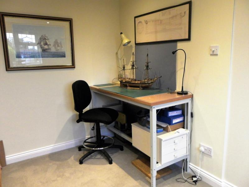
-
lovely detailing Bob, upgrading the key fittings from the generic kit stuff really enhances a model. One question, are there ringbolts missing from the aft lower step of the carriage cheeks, or haven't you got around to fitting them yet? B.E.
-
Wale looks good Doug. Your proposed technique with the Quarter lights is one I have used in the past, and light reflecting off the acetate does give an impression of depth. Cheers, B.E.
-
Beautiful, beautiful work Thomas, your attention to detail and cleanness of work is clearly apparent in the macro photography. B.E.
-
I believe those to be Top Rope scuttles Daniel, I scribed them into the decks on my Victory. Wouldn't normally be in use except when raising or lowering the topmasts. M.
-
Nicely done Jason, the coppering looks excellent. B.E.
-
very nice work Bob, and your planking in close-up looks excellent, great headshot photo's. B.E.
-
looking very good Eamonn, a great little model. B.E.
- 1,039 replies
-
- 2
-
-
- ballahoo
- caldercraft
- (and 2 more)
-
Great idea for making the vents Nils, and just love those etched benches, will suit your model a treat I think. B.E.
- 2,625 replies
-
- 5
-
-
- kaiser wilhelm der grosse
- passenger steamer
- (and 1 more)
-
Nice work Martin, I would have gone with the NMM plan Chimney as well for Fly. Incidentally the NMM plan for Pegasus shows the angled cowl arrangement, but it's nice to reflect these little differences between ships of the same class. I must admit I went for a simplified arrangement for the hances on the drift rails, I ruthlessly suppressed any 'puritanical' ideas. B.E.
- 467 replies
-
- 3
-
-
- fly
- victory models
- (and 1 more)
-
Lovin' the colours Mike. I seem to recall That I coppered my hull once I had finished the outer planking including the upper rails, but before I added the stern and Quarter lights. Didn't want to risk any damage to the glazed areas during the coppering particularly as I was using ca to fix the plates. B.E.
-
The completion of your wonderful Morgan seems to have slipped below my radar John, what a fine project she has been, and such an inventive display. Congratulations, and very well done Cheers, B.E.
- 2,250 replies
-
- 2
-
-
- model shipways
- Charles W Morgan
- (and 1 more)

